I M OKAY

first sketch

The initial sketch of this garment drew inspirations from the dramatic styles of Alexander Mcqueen and John Galliano, almost mocking the state of the pandemic through the moodboard of fashion. It serves as a counterbalance to the relatively tamed versions of the other 9 pieces as part of my FYP project.

cotton prototype

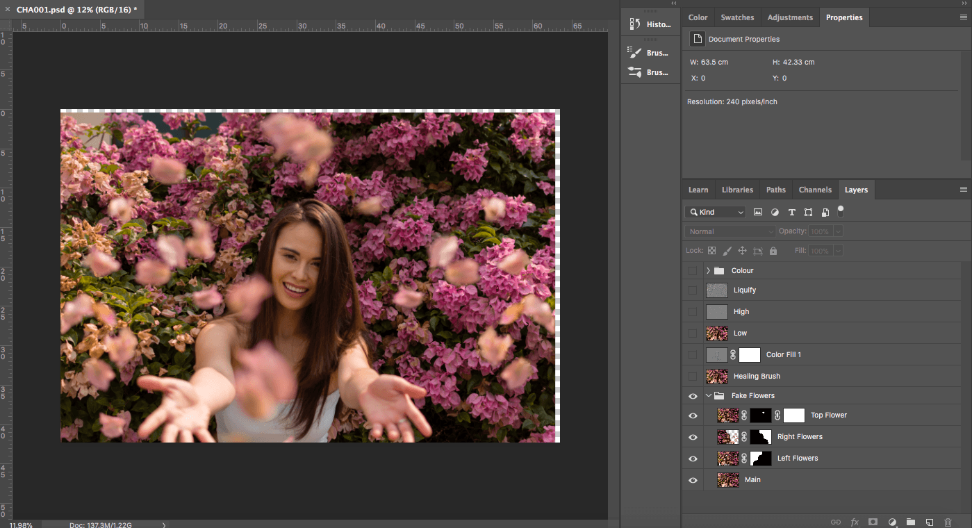
This prototype was crafted entirely out of cotton to finalise the patterning required as the skirt and jacket requires extensive patterning to give rise to the architectural shape. It was lined over the boning skirt that was made to hold the “petticoat skirt” in place.

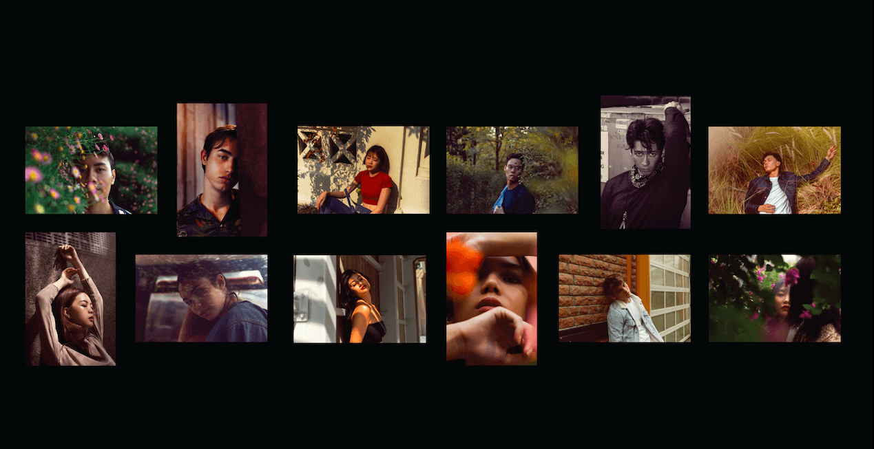
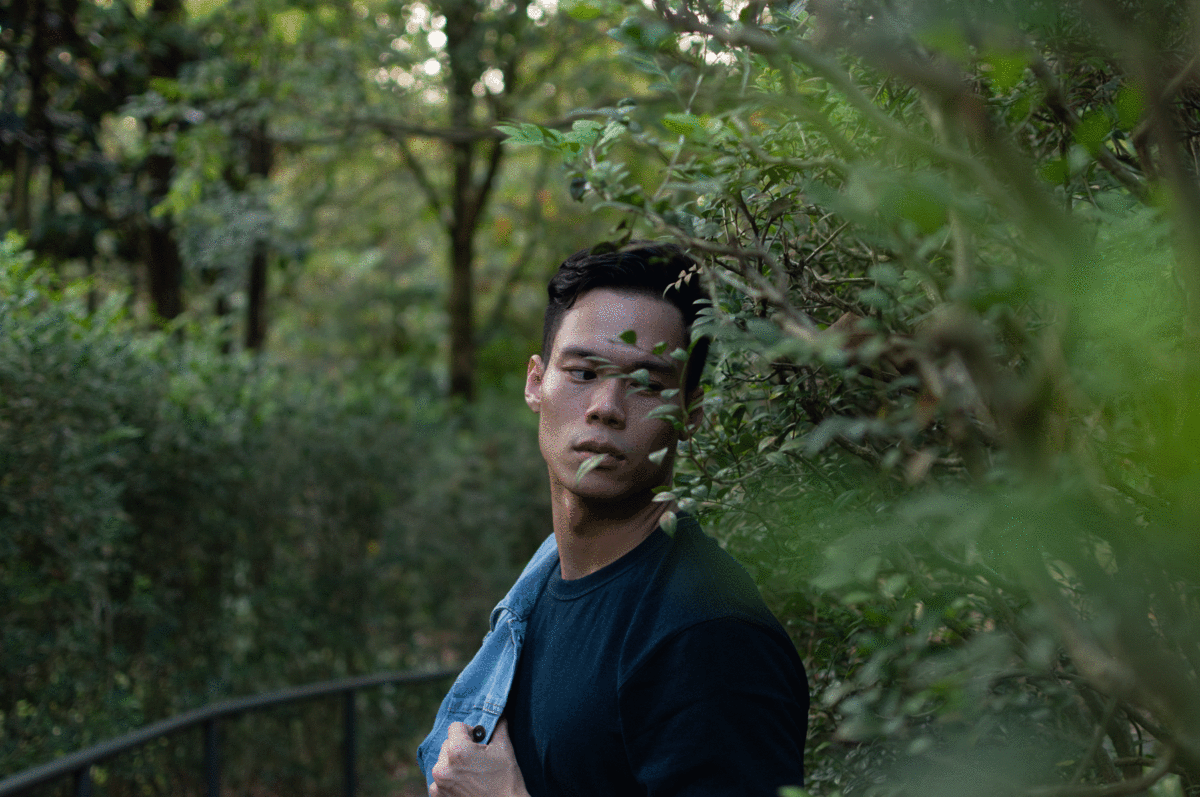
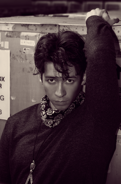
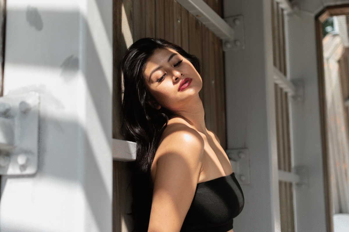
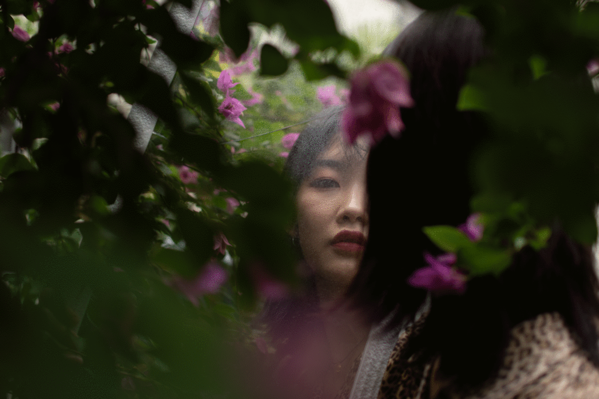
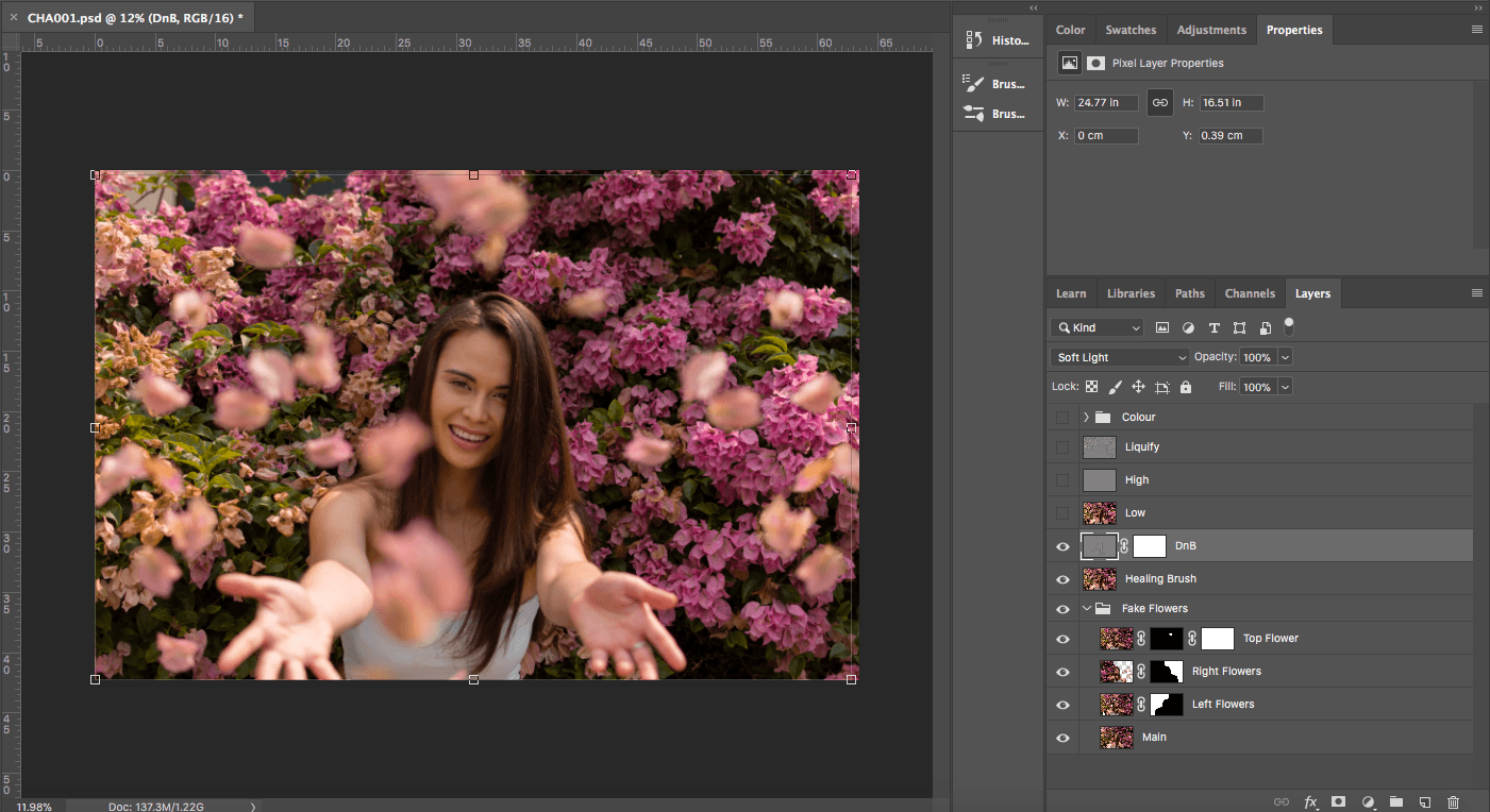
After the patterning has been made, the rest of the garment was materialised through the relevant fabric type- which will be explained further down. The first fitting was down with the model Gerald as shown below.

——————————————————————————————–

Crafting  Process

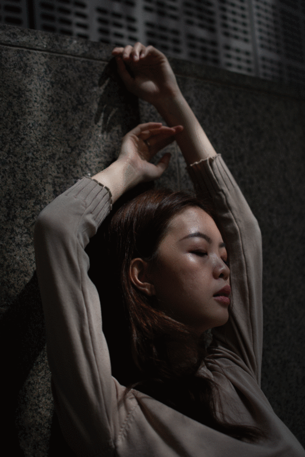
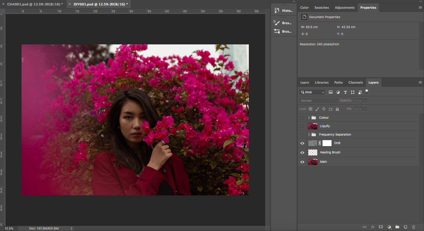
As shown above, the garment is mainly crafted with sultan satin as the main body. It comprised of :

An angular shoulder jacket with two crepe flowers as the elbow patch.

A petticoat inspired skirt that is covered with ruffles that goes in different directions and wavelengths, ending with a big ruffle on the bottom. It is hand tacked  with thermochromatic prints.

A black crepe tube top

A blue corduroy tunic

A red acrylic wings laser cut to the patterns of barricade tape

A 3D printed headgear

——————————————————————————————–

Technology Development

Initially the idea for this garment was to have three spikes at the top of the headgear (shown below) that would rotate when the proximity sensor detects anyone coming too close. However, the aesthetic of the garment would fall out of balance with the three spikes as the bonnet inspired headgear looked cleaner without the adornment. Hence, the idea of the technology was changed as well to an alternate location of the garment.

An unspoken technology used within the collection would be the 3D printing utilised, a passive parallel to the wearability of technology.

3d printed headgear
(Input) proximity sensor to (Output) light

The sensor would be placed at the back of the petticoat and the lights would light up around the exaggerated buttocks of the skirt (Displayed by the two rounded alternate coloured  organza) It indicates that safety distancing should not be an individual practice but a communication between two people. If said model was walking, I am practicing safety distancing to the people i am walking towards and could see. Therefore making the responsibility of other people walking towards me of whom I cannot see to practice safety distancing towards myself. It would be a panel of blue LED to establish strong contrast but also draw reference to the blue highlights of the collection.


Concept Explanation

The concept of this piece is an amalgamation of the other 9 pieces of the FYP collection, serving as a visual summary of many other motifs. The three main concepts would be the motifs of covid19, the relationships of public versus private, and the parallels of futurist versus modernity versus tradition. Ultimately an exploration of time and space during covid19.

Within this piece, the mnain covid19 motif is the idea of fur stringing within the 3D print as well as the fabrics of the satin and crepe. It resembles the stringing that facial masks have at the surface of the wearer. It draws a strange reference to the clinical usage of masks as it serves to protect the person from the virus, as though the stringing is alive and detect the illness in a tendril-like manner.  It is shown mostly in the two images below: the petticoat skirt and the elbow patches. The purple 3d prints on the skirt serves as passive protection as it changes colour with temperature, drawing reference to the social distancing motif. Another motif would be the exaggerated skirt, making a sarcastic remark of the sedentary lifestyle many people led during the pandemic.  Last but not least, the motifs of the barricade tape is shown in the red laser cut wings don by the wearer as an obvious physical symbol of social distancing.

The idea of the barricade further evolves into the exploration of space within covid19. The idea of space and time was greatly impacted during the pandemic as people could no longer move around freely. As mentioned in Bradley Quinn’s book “Architecture and Fashion”, both fields serves different purposes but also aim to solve the same issues when one could not. During covid19, many people’s field of location was affected and fashion serves to solve that. The idea of private and public is shown in the play of opacity and translucency within fabric, as well as the layering of said fabric.


And last but not least, the idea of traditional versus modernity versus futurism is most obvious in the shape and design elements of the garment. The bonnet and petticoat-esque design serves to draw inspiration of tradition. The material and crafting process serves to introduce modernity into the exploration. While the futurist themes come in forms of the concept as well as prospect of the whole project.


final look

Week 4/5 Biomimicry Research

Biomimicry in fashion refers to the process of paralleling biological motifs and processes with wearable garments, in attempt to create an augmented relationship of the wearer to their environment. Transhumanism is an offshoot of the process of biomimicry, referring to the philosophical advocation of a transformed human condition where modification increases quality of life through enhanced genetics. It is difficult to separate the process of biomimicry with the purpose of transhumanism.

A recent jaw-dropper was Yuima Nakazato’s Spring Couture 2020 that has left indelible mark on audiences’ eyes. Inspired by Osamu Tezuka’s Astroboy manga, Nakazato brings about a line of otherworldly collection that came directly from the red planet. This collection utilises a specially brewed protein (biomaterial producer Spiber) that comes in different texture and form that is completely modifiable- this draws a new frontier for post-covid fashion as we abandon fast fashion. We look back at couture and attempt to bridge technology with the luxurious style of customizable fashion. Native to Nakazato’s repetoire of techniques, he utilises bio-smocking, which is a technique where he digitally control the shrinkage rate of the bio-fiber, fitting rectangle pieces that ensures efficient tailoring that brings little waste.

“Tales of the legendary phoenix have persisted across diverse cultural traditions since ancient times. The depiction of the phoenix in the works of Osamu Tezuka, flying through space and time, speaks to both the strength and folly of humanity and calls us to contemplate the preciousness of life. On a personal level, the tales of this legendary bird have deeply influenced my perspective on the contemporary meaning of beauty,” said designer Yuima Nakazato.

closeup
closeup

Week 3: Moodboard Development

Since this project is an offshoot of the current ongoing FYP collection, the following moodboards have been recycled from the FYP presentations 1 and 2.

word cloud


inspiration moodboard


textural moodboard
textural moodboard


style moodboard
style/textural moodboard
style moodboard
style moodboard
style moodboard


shoot moodboard
shoot moodboard
Fashiontography: All Dressed Up With Nowhere To Go
shoot moodboard

Week 3: Research Project Presentation

This week’s assignment is to present the research conducted on the course syllabus- wearable technology. One of the main themes we concluded from the presentation is the amalgamation of technology and nature as a source of inspiration for many designers. However, there is a contrasting difference of using technology & nature as an aesthetically-driven thematic inspiration as opposed to using technology & nature as a medium of conversation- both of which we would classify as wearable technology albeit of different intentions. We would use designers Iris van Herpen and Hussein Chalayan to draw the point across.

Hussein Chalayan is  eponymous with wearable technology, famous for his bold and inventive incorporation of mobility into fashion. In his iconic pieces “Robotic Dresses”, he takes inspiration from the eras of change within fashion and allows this collection to metamorphosize right in front of the audiences’ eyes. The dresses unravel, unzip or rise with fluid movements as each of them are embedded with highly technical drafting of motion technology. Chalayan’s work is representative of the notion of wearable technology, that being a conversation of how we engage in using newfound technology to subserve traditional fabric. We can parallel this conversation to a variety of topic we find contentious- such as modernisation and globalisation in the “Robotic Dresses” shown below. Certain archetypes of wearable technologies that speak directly through the robotics are aimed to have a substantial benefit on a certain problem that the designers aim to address, be it conceptual or actually viable. “Nomadism” is a popular theme highlighted within many wearable technology designers’ scope.

Hussein Chalayan 2007 Spring Summer Collection. (Above)

Other designers like Iris van Herpen tend to approach the idea of “wearable technology” differently. Herpens’ work uses technology as a tool to mould the design but in most cases the technology does not impart as much value in the due process of assimilating the garments effect. In other words, there lack an agent of serendipity within Herpens’ work (meaning technology), but in place stands an aesthetic value derived from said technology. An example of garments embedded with Herpen’s design DNA is the syntopia dress shown below. She uses technology to achieve impossibly tailored garments that are visually groundbreaking and causes audience to question their visual understanding of the pieces. Subcategories of wearable technology like these applies the “technology” in the preproduction process, using the visual cues as the firestarter of the concept instead.

Iris van Herpen Syntopia dress

Final Project Part ll: Highlights Popping, People Sobbing

https://drive.google.com/open?id=1o7lOAqRAuH4ZJwfKBMs-rPXFDZwg422X

For the final curation of the photoseries, I have decided to organise a set of portraits that highlight 12 different individuals, be it orientation of landscape or portrait. The 12 different portraits aim to show the mood of introspection and melancholy- in particular, the inner mindset of a city dweller lost in the bustling of life. With 12 different people, I aim to highlight their individual personalities, especially with different postures, composition and background. A suggestion by Bryan was to edit the photographs differently, each with their own set of presets and layers. And here they are:

ps some other considerations were the number of male/female or portrait/landscape as well as negative space.

This is a landscape shot of Ethan in front of two panels of flower wall within Gardens by the Bay. I tried to keep the editing to as minimal as possible, with most of the colour grading concentrated on bringing out the highlight on the face, and shadow in the background. The greenery was also untouched as the contrast between the pink and green really popped.

This portrait was probably the one I took the longest to edit. This was because the terrain of the shot (random staircase in SOTA)  was dark and dimly-lit. However, the mood portrayed by Eduardo was great and really suited for this photoseries. The main issue was to bring out the natural highlight on the models face but the bad lighting killed it, so that took awhile.


This shot was taken on a bright afternoon day in Outram park and that really brought out the shadow of the trees nearby. Because Chloe is really fair, there had to be some effort in terms of bringing out her skintone in comparison to the backdrop, mainly in terms of shadow and highlight as well.

This shot had more colour grading compared to the first photograph in the series as I wanted to mix in some yellow to create a triadic colour scheme, complimenting the blue outfit on Dustin. I masked out the fence and coloured the leaves over the fence, making it seem like he is stuck in a forest of greenery. The natural highlight also reduced the need to mask out the channel highlight.

This is an interesting shot as it is the only black and white-sepia shot in the entire series. Shot with the intentions to be black and white, I used a portable flash to really draw out the natural highlight within the dimly lit Golden Mile Complex. I put in a thin layer of red and brown over the black and white to give it some pop. Martin posed in front of the mail box and I aimed to highlight the natural contours of his face with the direct light from the high ceiling windows. Bryan advised me to crop it in to focus on his face and it really helped.

This one was shot outside ACM where the lalangs were. It was interesting as this piece is one of the few photos in this series that focuses an equal amount of attention on the model as well as the landscape. It took 3 tries before I found the right angle to crop in to focus on Luke. I gave this a reddish and faint colour grading to accentuate the dreamy effect propped by the lalang.

This shot was done in front of a random office building by One George Street. Nadia saw a really interesting stream of light popping out of the trees and suggested to shoot there. The stream of light really brought out the introspective mood of her posture.

Taken on top of Mount Faber, Camila and I found this abandoned cable car and we decided to take some shots in it. I walked around and really liked the retro colour scheme given by the cable car aesthetics. However, I did not pursue this retro look as it did not fit the series. The shot was taken by focusing through the window and aiming at her face, creating the faint bokeh of the light. Not much editing was done except for trying to bring out her contours and highlights.

This was a rather simple edit as well, focusing mainly on the balance between the highlight and shadows. Kimberly had a really natural pose just laying on the walls and really merged in with the natural light.

Out of the entire series, this is one of the most abstract in terms of composition. I focused mostly on Sheryl’s face and it became quite edgy in terms of the mood. The colour patches are out of focus flower petals, which gives the picture a surrealistic colour scheme.

This picture was taken outside Clarke Quay, in front of a red brick wall that again had this retro looking aesthetics because of the plastic frames garage door. Colour grading wise I gave a thin layer of highlight and brightened shadow, giving it a bright appearance as Cooper stares outside of teh frame.

Last photo of the series, I wanted it to compliment the first photo as much as possible, thus choosing this one with Marui within greenery as well. A big difference between this to the first one would be the usage of a mirror to show Marui’s face even though her back is facing the audience, this is a hint of the introspective element of how the entire series is people looking into the camera or looking away, whereas the last piece is one person looking away but looking into at the same time.


red dot trip


Out of all the products showcased at the red dot, I was most amazed with the shaking baby cradle. This product is part of the human-robots exhibition, indicating a lifestyle where humans can coexist with the presence of robots to enhance quality of life.

What amazed me was how simple the concept is, yet how much time can be saved, amplified with the reduction of effort this product brings about. From the perspective of the paradigm of design, I would say this piece stands more towards human and function rather than emotion. Maybe the design would change to the needs of the baby, such as the inclusion of air ducts/gaps that cool the baby as babies need to turn around in case their backs get rashes due to overheating. Emotions wise, the cradle could be designed into something more colourful since it houses newborns and colours stimulates brain activity.

And I would definitely get one once they have an adult sized version.

Final Assignment Part 1

This series picks off a theme that I have been exploring for a while now, which is portraits of people juxtaposed in front of nature. I like the solemn and moody look of people engaging with the camera, as if a silent conversation between the audience and the subject- an intense, introspective look of an urban dweller in mother nature. The moodiness is derived from the colour grading as well, generalised into a points like purple-orange gradient, selective colour of red in shadows and a pinkish hue layered over the picture. More on how below!

Base

This is the first photograph of my series, starting off with something more positive. However because the camera captures best when objects are static I thought I could just photoshop in the other petals from the other attempts to capture the thrown petals, shown below in a step by step basis.

Left Side of Flowers
Right Side of Flowers
Last petal

Now, I feel like the composition is slightly tilted, so I pulled it outwards to balance it slightly. I moved on to dodge and burn, where I pulled contrast to the hair and facial features, exaggerating the highlights and shadows accordingly.

Liquify and Frequency Separation

After that I cleaned up with frequency separation to clear up tiny pores or rougher textures. And because of the angle, liquified a few exaggerated parts.

Colour Grading

gif
Final for pic 1

Before
Healing brush and DnB

Same goes for the previous picture, I used healing brush and DnB as the base layer of editing, making the models even more perfect than they already were. Using healing brush to clear off any rougher texture from teh camera and DnB to create a stronger tonal and 3-D appearance on camera.

Next is frequency separation and liquifying, but this was done minimally as the model has really clean skin. The bulk of the work of FS was done on the jacket, wanting to give it an ironed look as if a clothing campaign.

Last but not least, the colour grading. The colour grading for this is similar to the previous picture as I wanted to give it an overarching autumn-ish colour theme. This one compared to the previous picture has a stronger introspective look, hence I adjusted for a stronger purple and red hue within the shadow, attempting a balance between the red and green grading.

The last picture for this half of submission would be the one as follows,


The first few steps of the correction is similar to the first few, starting with minor edits with healing brush I then moved on to DnB. However because of the conditions where we took the pictures, where it was raining, there were much more mud and dirt that had to be cleaned with FS. (Same goes for the T-shirt) Colour grading wise I lowered the intensity of the purple-orange hue and increased the white in shadows with colour balance.

thank you for browsing.

field trip part 2

Products 1.

This microwave seems to be designed for less of aesthetic appreciation rather towards functional design. It has a clean sleek design with little number of buttons, user friendly for all. Compared to the design below, it has lesser of an emotional trait.

Product 2.

This design is much more emotive in nature, having Japanese paper lamp influence that emotes a quiet and soft environment. Function wise, it is specific for dim room lighting as it is not as bright as a generic lamp.

Digital Photography Assignment 2: Landscape

https://drive.google.com/open?id=1o7lOAqRAuH4ZJwfKBMs-rPXFDZwg422X

After
Before
changes

 In assignment 2 we focused towards landscape style photography and editing with colour grading, on top of the previous lessons on cleaning up an image. I chose this golden hour shot of my friend Theo right beside a carpark in Little India. My style of photography and editing tends to be moody and drizzled with warm tones. I love to make the subject matters look they are in their own world of introspection and I found this image to be quite useful in terms of that. I would aim to accentuate the colours of the architecture outside as well, bringing out the smooth tones of the golden hour. The main colours I focused on were purple, orange and pink.

Firstly, I began by editing out any parts of the image that had any visually hindering details, such as dark corners of the feet.


I started the next process by masking out everything individually. I saw this process as a taxing one as the image can be split up into many layers: the indoor architecture, the outdoor architecture, Theo’s dress and skirt, as well as her body.

Colour Grading Outside

The reason of my grading was to increase the warm tones within the sky and how it lands on the red tiled rooftop of Little India. I believe that the golden hour ray at that point of time was merely bright but not sufficiently warm enough, so I added some pastel golden hues as well as increasing its contrast, to give it a stronger aerial perspective. This included the interior of the carpark as well, albeit the colour being much orange already. I wanted to add that pink hue that gives it a fantasy like structure. An issue I had was the density of the shadow within the indoor architecture, I wanted something much more wholesome and gives a strong contrast to the outdoor. I did so with layering of gradient map, switching between the light and dark tones, specifically orange and purple.

Indoor Grading
Overall Environment Colour Grading


Next segment would be colour grading Theo herself, being the main subject, she should stand out from the environment. Hence, I asked if she could lift her legs up and actually form this hook shape, which made the image structurally interesting. It gives an additional albeit subtle different of introspection. (in my perspective) Colour grading wise, I lifted the tones with selective colour as well as a little bit of exposure to the blouse, as i realised only exposure could give it that additional jazz unlike selective colour, gradient map or level toggle. The masking of Theo was really difficult as I found the hair to be difficult to manoeuvre.

Just a little notes on my selection of toggles and layers.

I primarily used only a few adjustments to treat the image, mainly selective colour, gradient map, black and white as well as levels. With a few exception layers that needed some exposure adjustments as I didn’t want to compromise the entire colour grading for the segment without raising white tone across. I used selective colour to raise brightness of most areas as it focuses on the coloured tone and act on it. I used selective colour and black and white to layer colours over the segment, after which lowering its opacity. I would use gradient map to drop colours into the shadow, to give density into the shadows like the indoors.

Final

Product Shopping as a Millennial

This field trip couldn’t have come at a right time as I needed to buy a hard drive and I used the opportunity of this field trip to do so. I happened to saw this microwave and was quite taken aback by the design, solely because it was the only bright red item in the entire aisle. 

https://www.nytimes.com/interactive/2016/11/13/magazine/design-issue-millennial-couches.html

Microwaves are probably the one item that stands as an emblem of the soft transition between teenage-hood and mature adulthood. They lie awkwardly between the fork road of commodified luxury and the  item you can’t survive without burning a hole through your pocket- heating up stale meals. Microwaves are probably the most popular product a “coming to age” adult would invest money in, and thus would be interesting to see how companies market them.

Looking at the designs above, I loved the take back of the semi geometrics contours and instead of the standard 4:3, this is geared towards 16:9, generally quite pleasing to the eyes. The buttons designed are also relatively simple, the beige with two while the red has five. However, I would suggest cutting it to two, heat and time because thats honestly only what I need. I believe if they had a target audience in place for any particular product, such as the microwave, they should tweak the visual qualities  accordingly. Yellowish beige and royal red are a bit too dull for my taste.


This is a lamp that I found really interesting because it has a certain animalistic quality that I tend to be drawn towards when I sketch up designs. (Insert my own drawings below) It is not only cheap at $30++ but it extends from being a table lamp into a full blown standing light stand as well. I found it especially interesting as it was a westernised brand with an oriental outlook on the concept of “soft light” Upon researching on the designer, Mia Cullin, I came upon her portfolio of work that focuses on softer aesthetics that finds an acute balance between the sensibility of the furniture as its own entity with the capability of interacting with the audience. Most of her work focuses on the curvilinear structure of the furniture or lighting, coupled with the minimalistic, almost skin-like quality of the surface texture, definitely a pointer I should note in my own designs.

Sourced from: http://www.miacullin.com/#lighting