Process
Progressing from colour harmony and colour psychology, we moved into the assignment of Ego, where we attempt to visualise our personalities in various settings. I found it hard to conjure up a specific memory where my personality is shown as I believe that the human mind is too complex to have a fixed personality. Hence, I decided to brainstorm for the settings first, deciding to explore on various important stages of my life so far. Important situations sprouts an emotional reaction from myself, revealing who I am as a person.
Furthermore, I decided to parallel the different stages of my life with a favourite music album of mine, of that particular year. In many music albums, artists tend to summarise a chapter of their life within the album, pretty much the same agenda as me in this assignment. Coincidentally, the music albums chosen had a strong parallel of the situation and difficulty faced by me, enhancing the motive of the artwork.
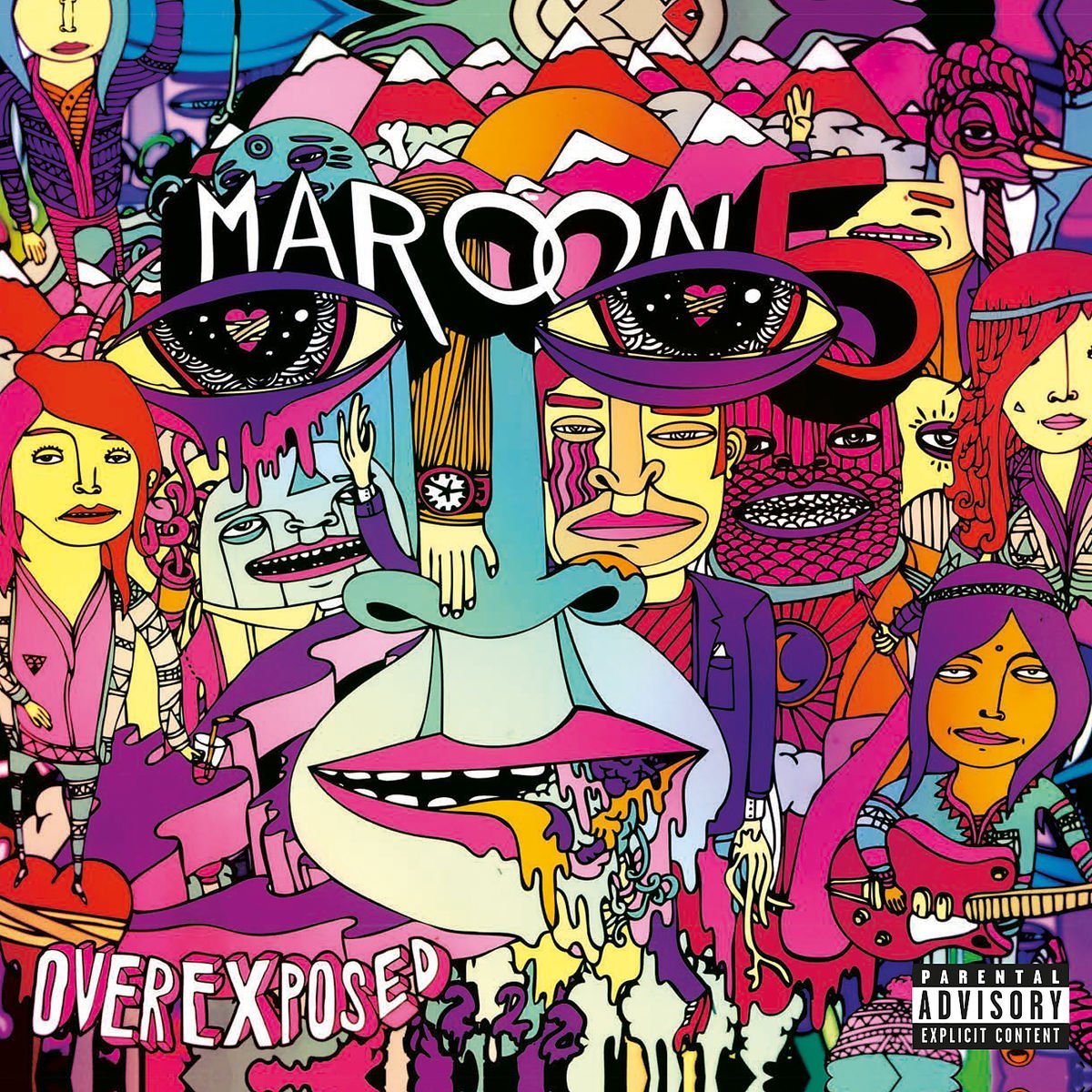
After a short brainstorming, I realise it was purely coincidental that important events in my life happened in even numbered years. I decided to explore on the years 2010, 2012, 2014 and 2016 specifically in accordance to the events that took place. The album art that I will be paralleling to the events would be Eminem’s Recovery, Maroon Five’s Overexposed, Coldplay’s Ghost Stories and Panic! At the Disco’s Death of a Bachelor respectively. The four series explores on the fear of embarrassment, the fear of risk taking, the fear of responsibility and the fear of the future. I would explore on the techniques of being literal, figurative, symbolic and hyperbolic.
________________________________________
X I V 2010; Eminem’s Recovery
Fear of Embarrassment
In this album, Eminem is trying to explore on the idea of personal courage as he attempts to build a music career while he struggles with issues like drug addiction, family matters and feuds with celebrities. It is about personal change and trying to break free of his status quo, keeping his head up in a dark situation. This is similar to my situation in 2010 as I found difficulty in upholding my position as a CCA leader, where I struggled with the fear of public speaking and being afraid of embarrassing myself since I was in the position of attention.
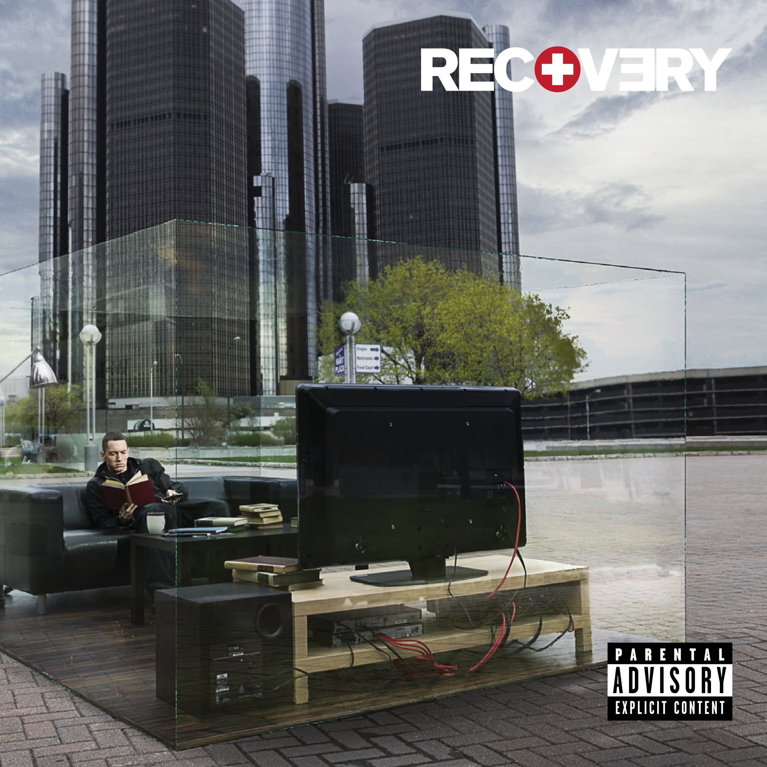
In his album art, Eminem is seen sitting in an enclosed glass room in the middle of the streets. He is reading a book in a living room setting, oblivious to the urban surroundings. He is seen isolated from the situation, indulging in his own world. This imagery speaks of Eminem’s attempt of recovery, being drawn out of the world and contemplating in a private space.
In the theme of using existing album art as artist reference, I decided to keep the techniques and mediums the same. In this series XIV, I decided to use manipulated photography as my medium, with the settings referencing the album art while the “me” and “reaction” mimicking a still from a music video.
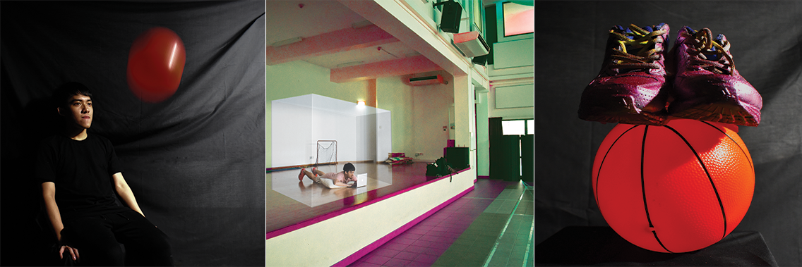
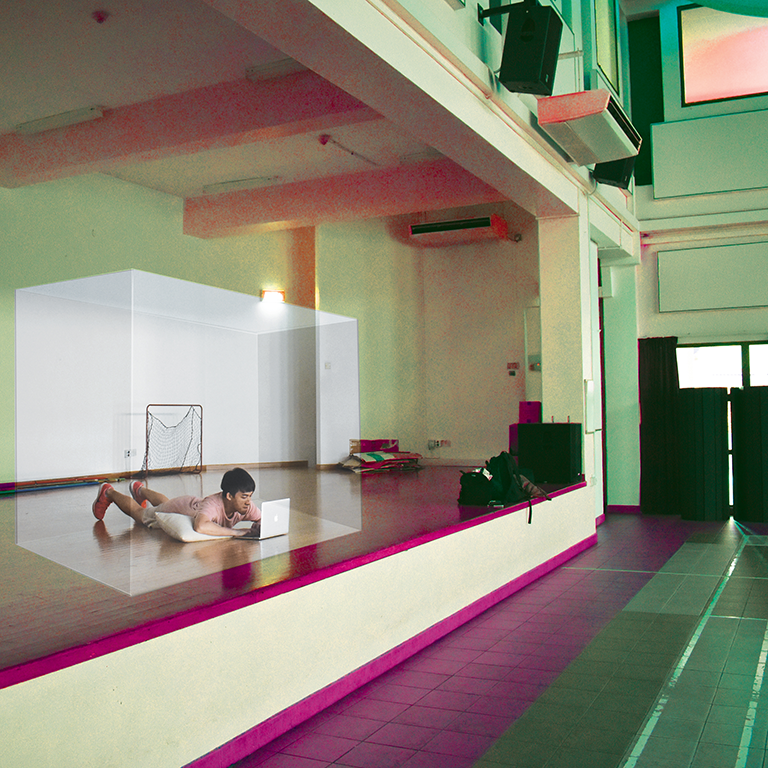
In this photograph, I showed myself lying down in a comfortable position in homage to Eminem’s album art. It is decorated with props like a pillow and a laptop to enhance the theatricality of the situation. It shows me lying down on a stage facing the front, doing my own errands, isolated in my own private space. The private space is depicted with a translucent box created with photoshop editing. This photograph visualises my situation of being stuck in a comfortable environment where I am forced to go out of, facing the crowd.
I decided to use a triadic combination of saturated magenta, teal and yellow to highlight the idea of an anxious environment since the saturated combination is visually unsettling. This contrasts to the translucent box I am in, which is limited to an analogous combination of desaturated red hue. The translucent box provides a calming effect due to the desaturation and harmony of analogous colours.
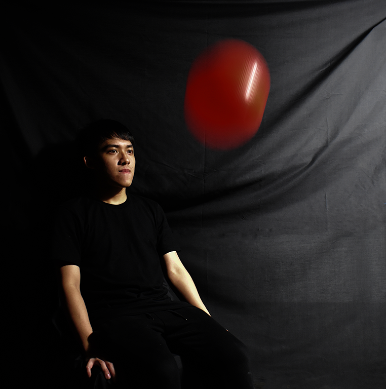
In this photograph, I wanted to capture the essence of a music video still, hence I incorporated the idea of a movement to engage a dynamic composition. This photograph follows a colour combination of black background with black outfit, contrasted with only a red ball thrown at me. It is done so with a black background with no details or objects, focusing only on the red ball and I. It is done so through the assembly shown below. I am seen holding a still expression with not much engagement with the audience, just in my own world, not expecting the red ball’s force at all. It shows how the outside world is throwing a curveball at me, disturbing my state of peace and private space. The red ball is a dense formation of the problems that the environment around me has created. This is an example of an experimentation with hyperbole, since I am playing with quote of the environment throwing a curveball at me but in reality it is not, and definitely not a creation of the environment.
This composition uses a mixture of black and red, a strong contrast of colours. The black enhances the theatricality while the red shows an intense energy with the plain background.
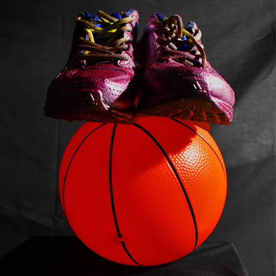
This photograph features my reaction to the problem, which was to accept the situation and take the problem as it is. The composition features a pair of magenta shoes with green lace, standing on an orange ball. This imagery shows an almost impossible feat of a pair of shoes balancing on a ball, hinting that I have achieved peace with the situation. The movement in this imagery is subtle as it is the visual anticipation itself. The audience would expect the shoes to fall and not be able to balance on the ball on its own.
In comparison to the first imagery of the triadic colour combination, this is placed over a black background. This creates a harmonious composition that is slightly theatrical, especially with the strong lighting placed at an angle.
________________________________________
XVII 2012; Maroon 5’s Overexposed
Fear of Risks
In this album, Maroon 5 is exploring a new sound and a new rhythm for their music. It is a struggle of finding their voice yet staying relevant since they have built up an identity already. It was their 4th studio album. This was similar to my situation in 2012 as I was struggling with the decision of taking H2 art as my subject combination in Junior College Year 1. It was a decision that was an attempt of trying something new and that decision was risky for my future.
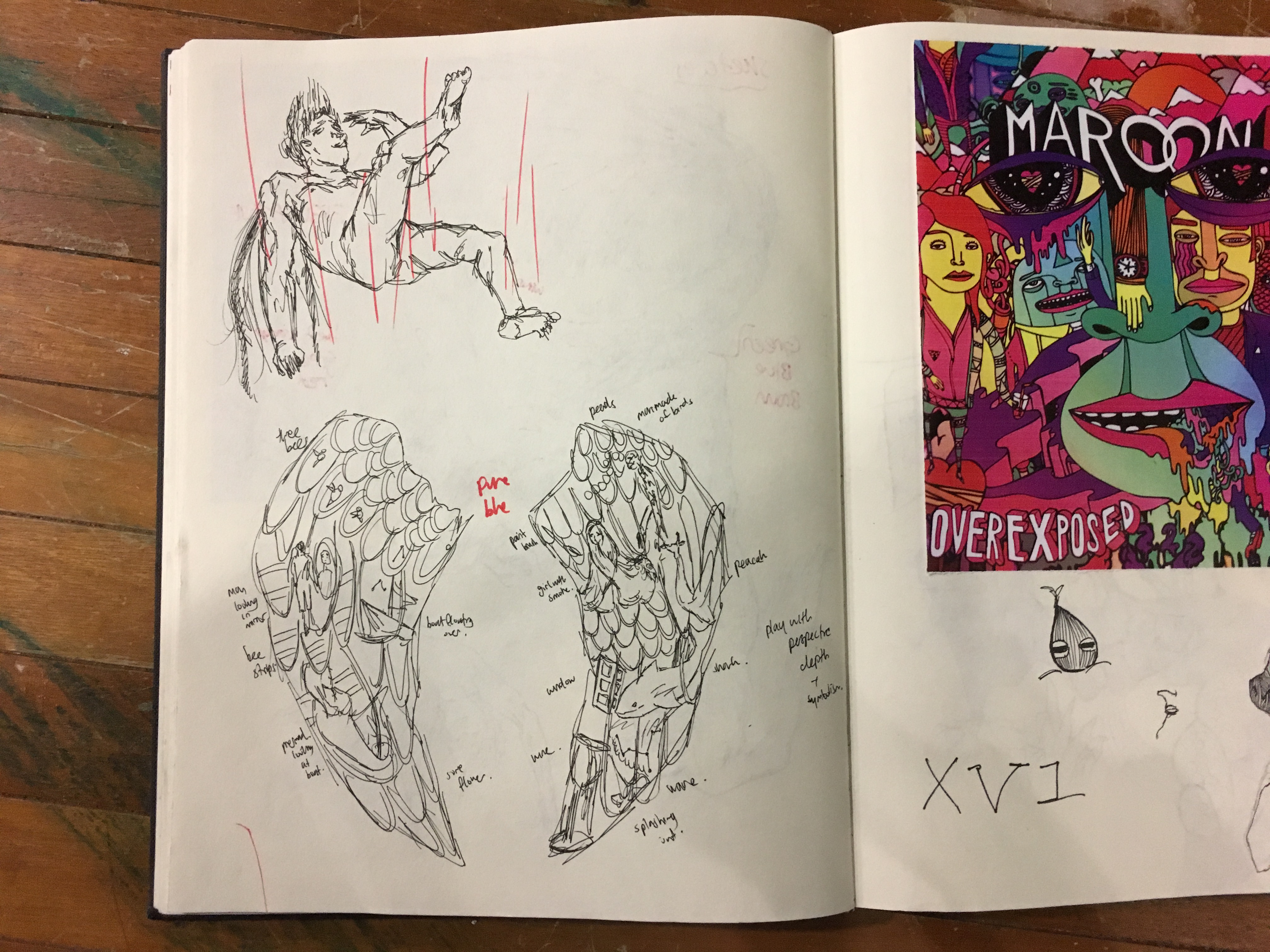
Maroon 5 decided to go for a colourful sound, choosing to represent that in their album cover as well. The album art depicts a crowded image of different egos popping out, trying to reach for the surface and getting a glimpse of the audience. It is saturated with different colours and personas, providing a visual confusion, which was their state of mind at 2012.
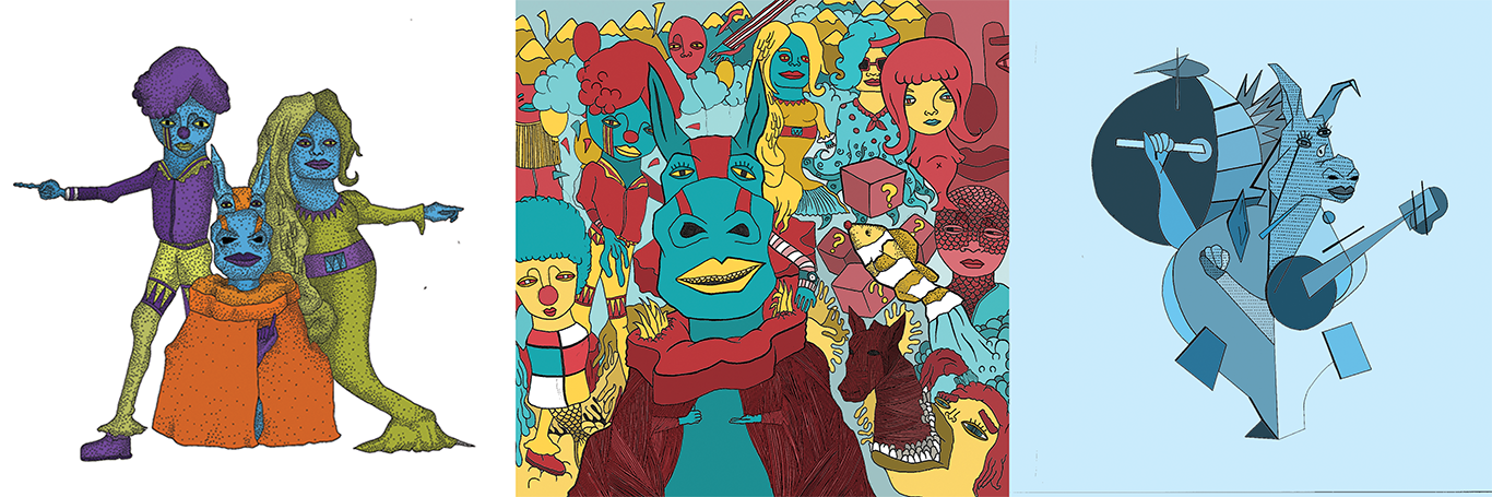

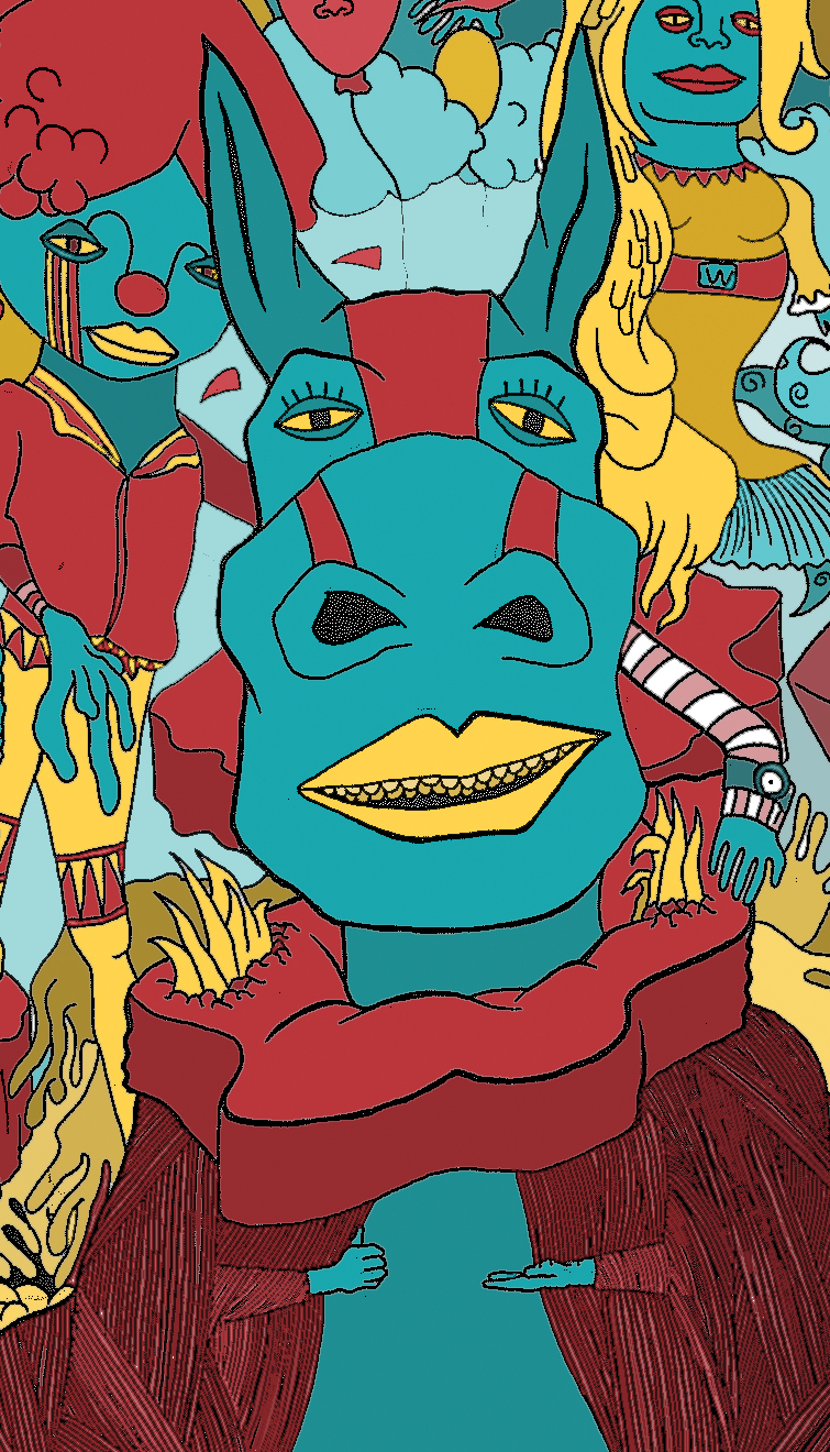
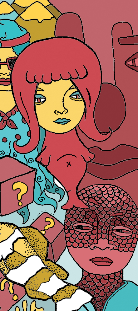
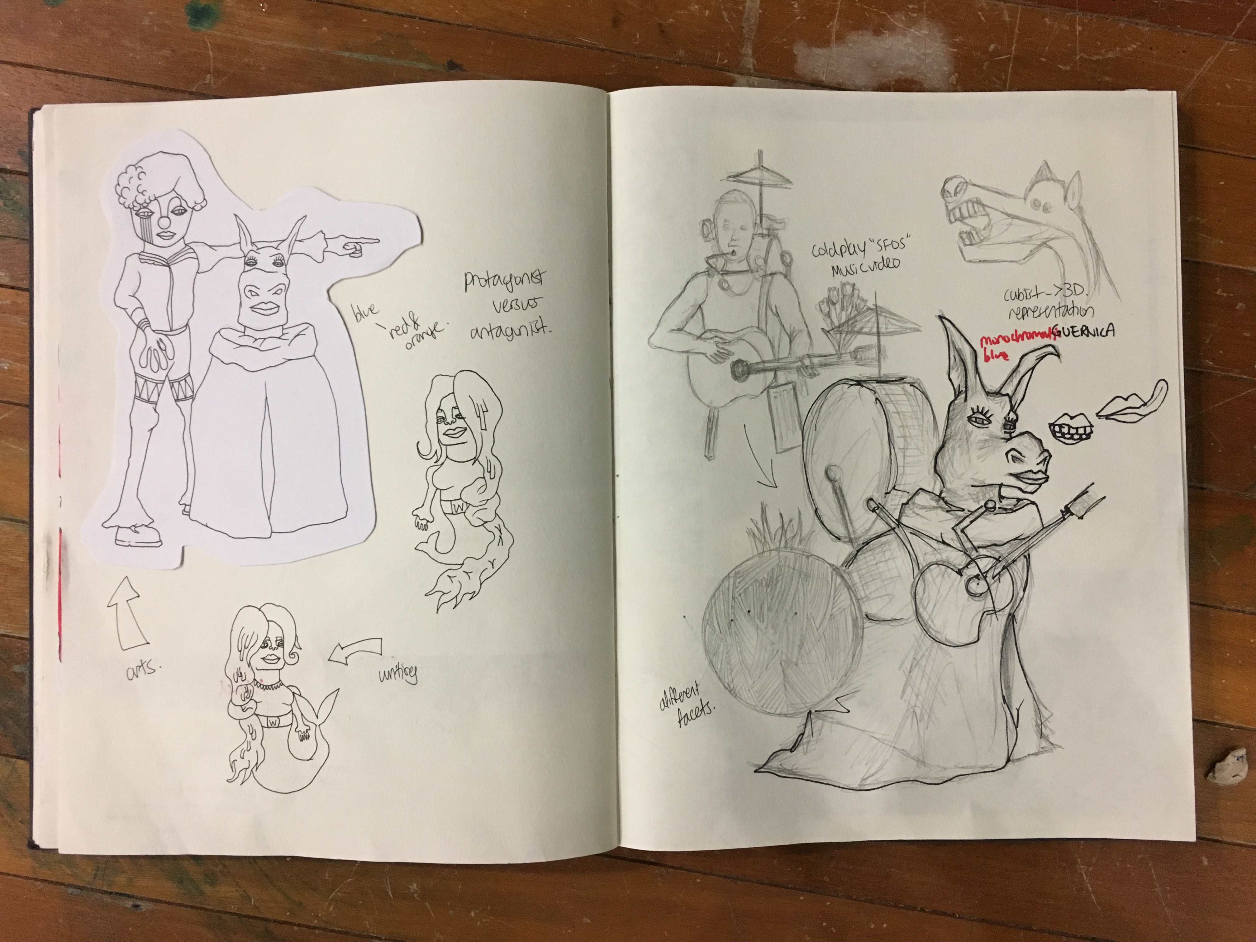
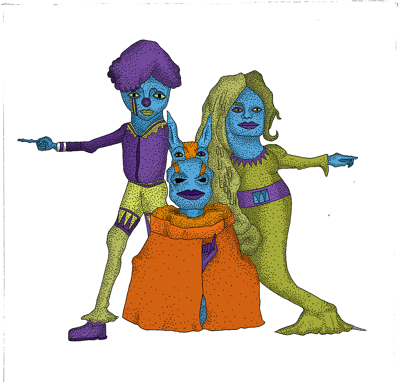
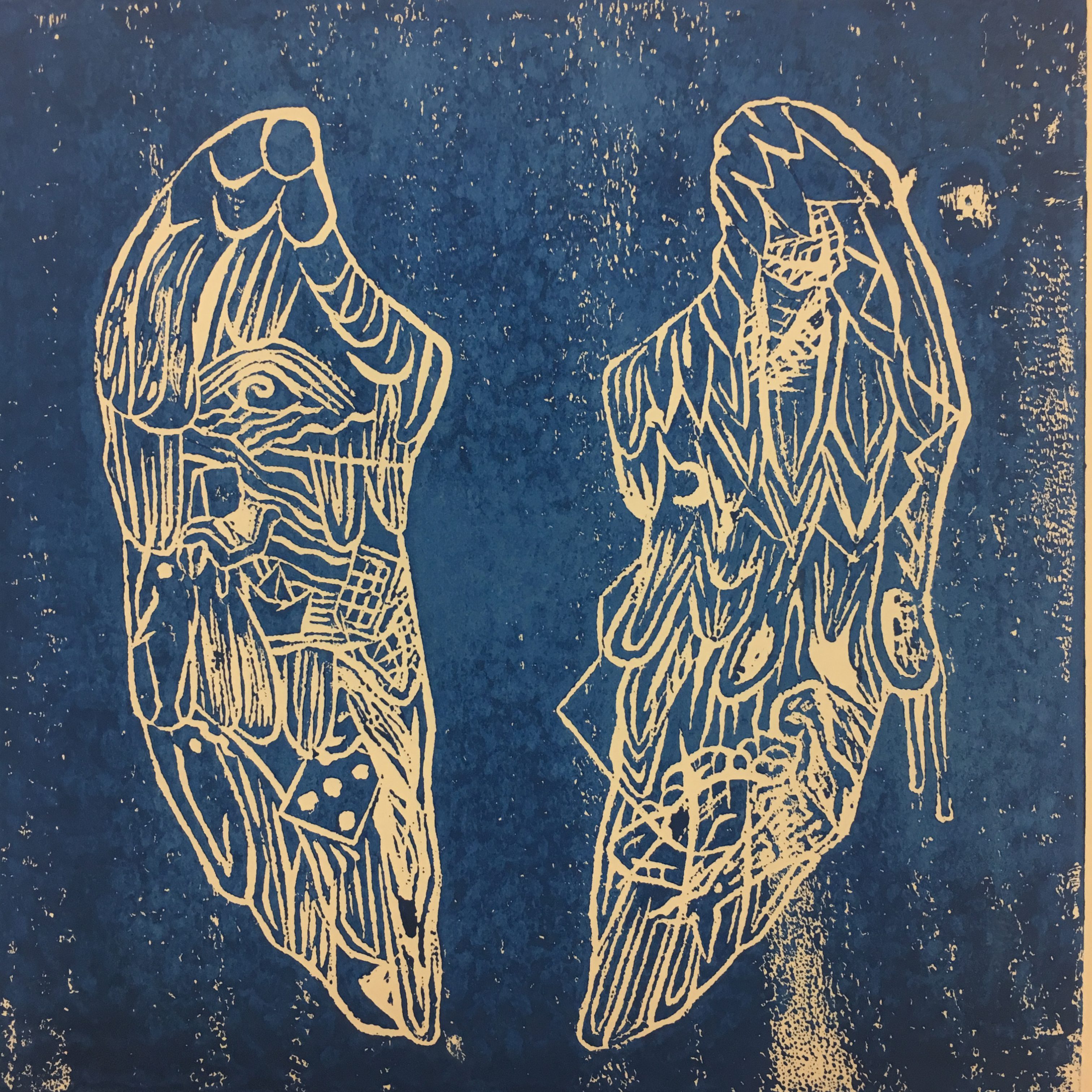
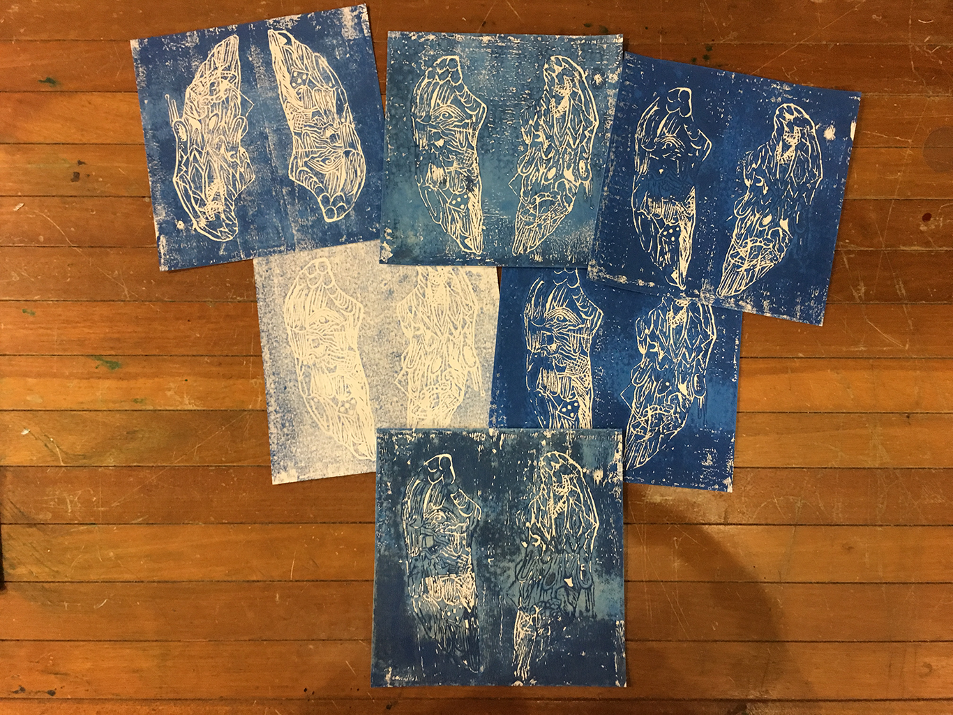
In this imagery, I used symbolism in homage to Maroon 5’s Overexposed. These characters are a representation of the different people who played a part in my life, and the decision I made in response to this setting. The characters are shown below. All three works are done through physical illustration, then adding colour through Photoshop.
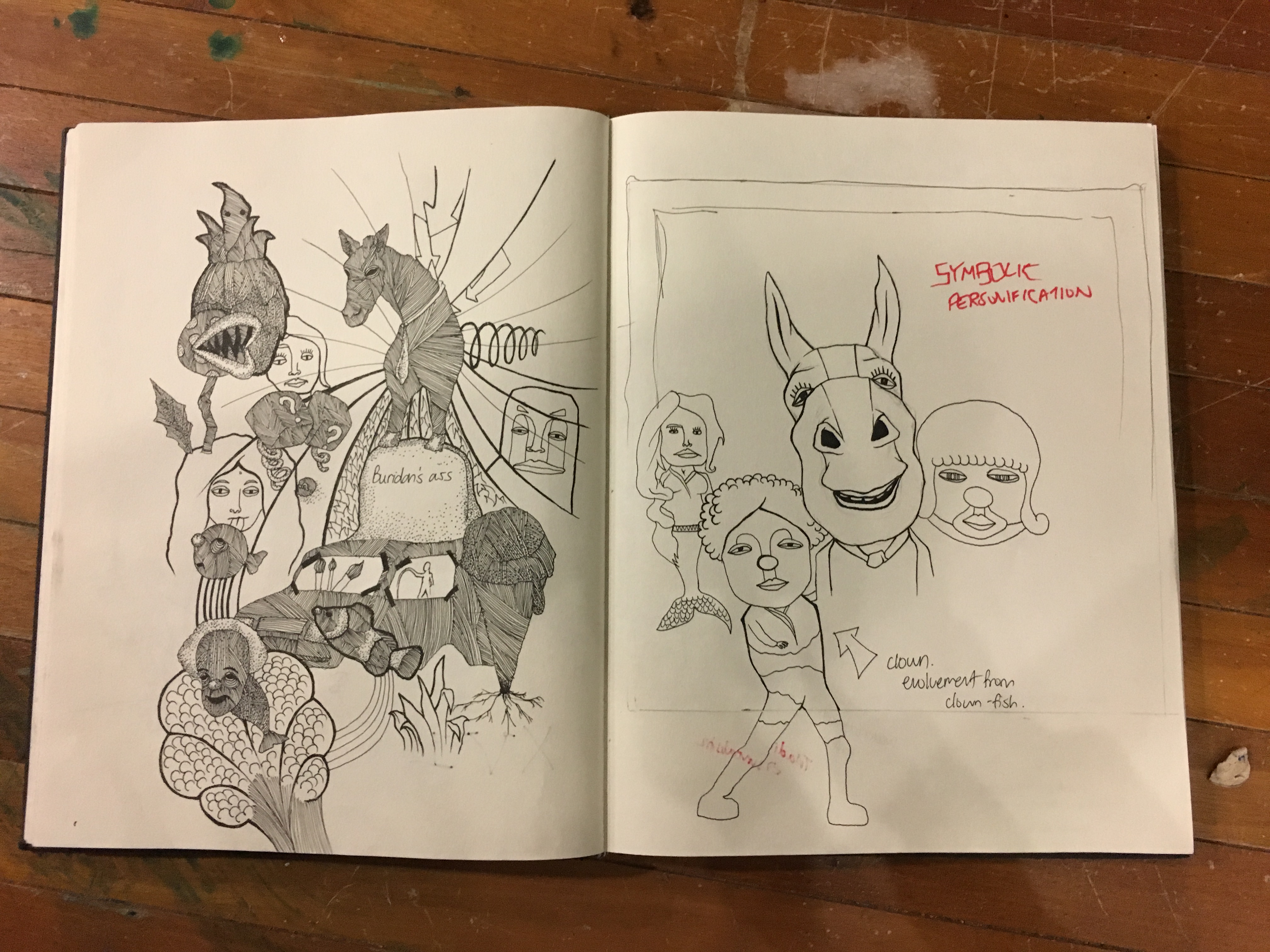
The first page shows a style of illustration I adopted back in Junior College, a style I would like to incorporate to dramatise the narrative of my decision of taking art. The second page shows a buildup of characters I wanted to portray in the imagery, the first being the donkey. The donkey represents the first step I took to take art in Junior College as it was the subject of the aptitude test. It was also a figurative representation of the Buridan’s (Brendan) Ass, which is a philosophy paradox of how one donkey would be stuck in the middle of food and water given its free will, not knowing where to go towards. The clown is an offshoot of the idea of clownfishes as clownfishes are an important aspect of my love for art. Clownfishes were subjects I loved to draw as a child. The mermaid is a representation of a teacher in my past who discouraged me of a career in writing, and vital aspects like belt and hair is caricatured to the character. I adopted the persona of a mermaid as they are seemingly nice characters but have a screeching voice.

I also played with different colours for this imagery as I found difficult in balancing out the composition with so many characters. Hence, I found a sequential way by allocating colours to different personas.
The donkey and other vital characters were represented in blue skin and accessorised with red and yellow as the blue was the main colour for the triadic combination. I wanted the idea of sadness and anxiety to come through with the colour combination. The donkey’s hand gesture is sign language for “Help”.
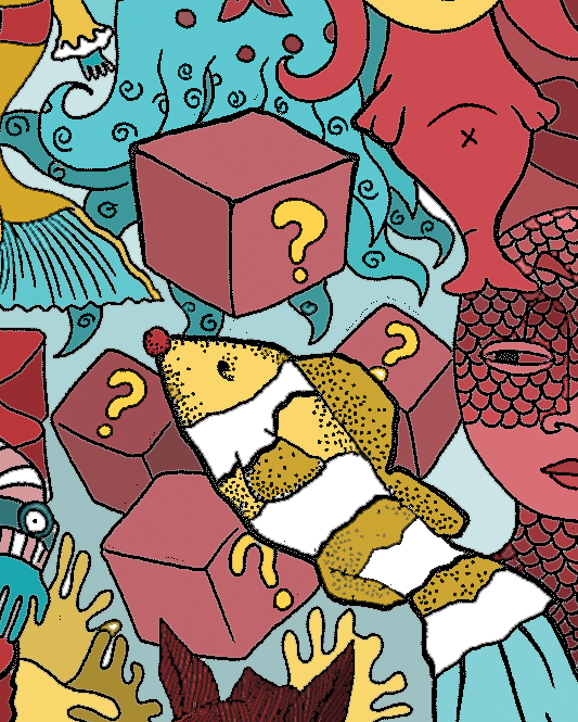
The clownfish makes an appearance in the imagery, seen jumping to hit a set of boxes with a question mark on it. It stands for the treasures in Super Mario’s world, a game I loved as a child. I represents my childhood passion coming through.

The clown and mermaid are seen staring at the donkey, as if waiting for him to make a choice, since he was seen making the sign language of “Help”.
Less vital characters who are deity-like in this dreamscape are shown with red skin. The scaley character is a representation of a recurring dream I have had as a child, which is an amphibian man who would stare at me from afar. The gigantic face in the sky represents the fate deity that lives in my dreamscape, looking down at the characters, watching life work out its magic. The face is only shown in glimpse to enhance the mysterious element.
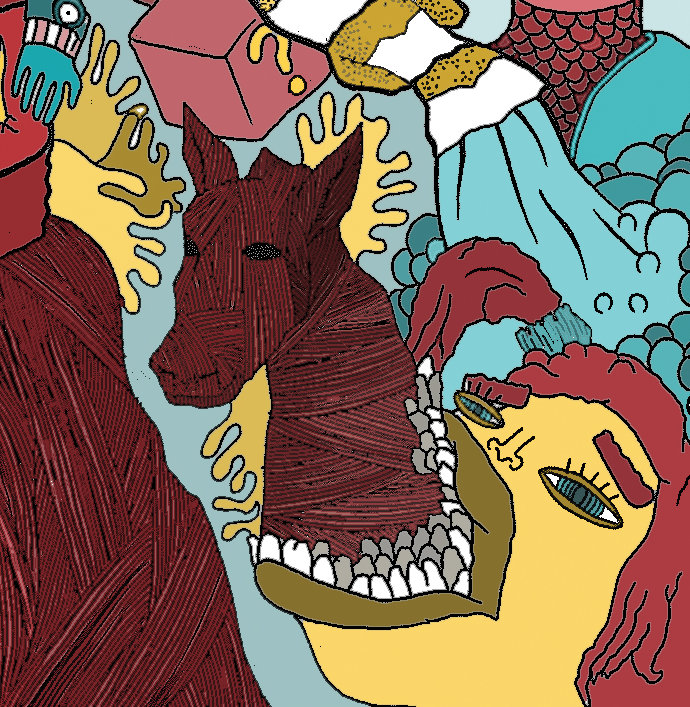
The other humans are shown in yellow to provide a sense of banality, much like the characters from the Simpsons. The horse is an artwork I made back in A levels, portrayed in the art style I adopted.
Overall, this imagery represents the setting I was in, which was being overwhelmed with the decision of me taking art in A levels. It was a private space of confusion, where my past childhood characters are coming back to me to question me if I had made the right choices. I am also torn with the presence of my current A level problems. The triadic combination creates a fantastical environment as the colours are saturated and eerie.
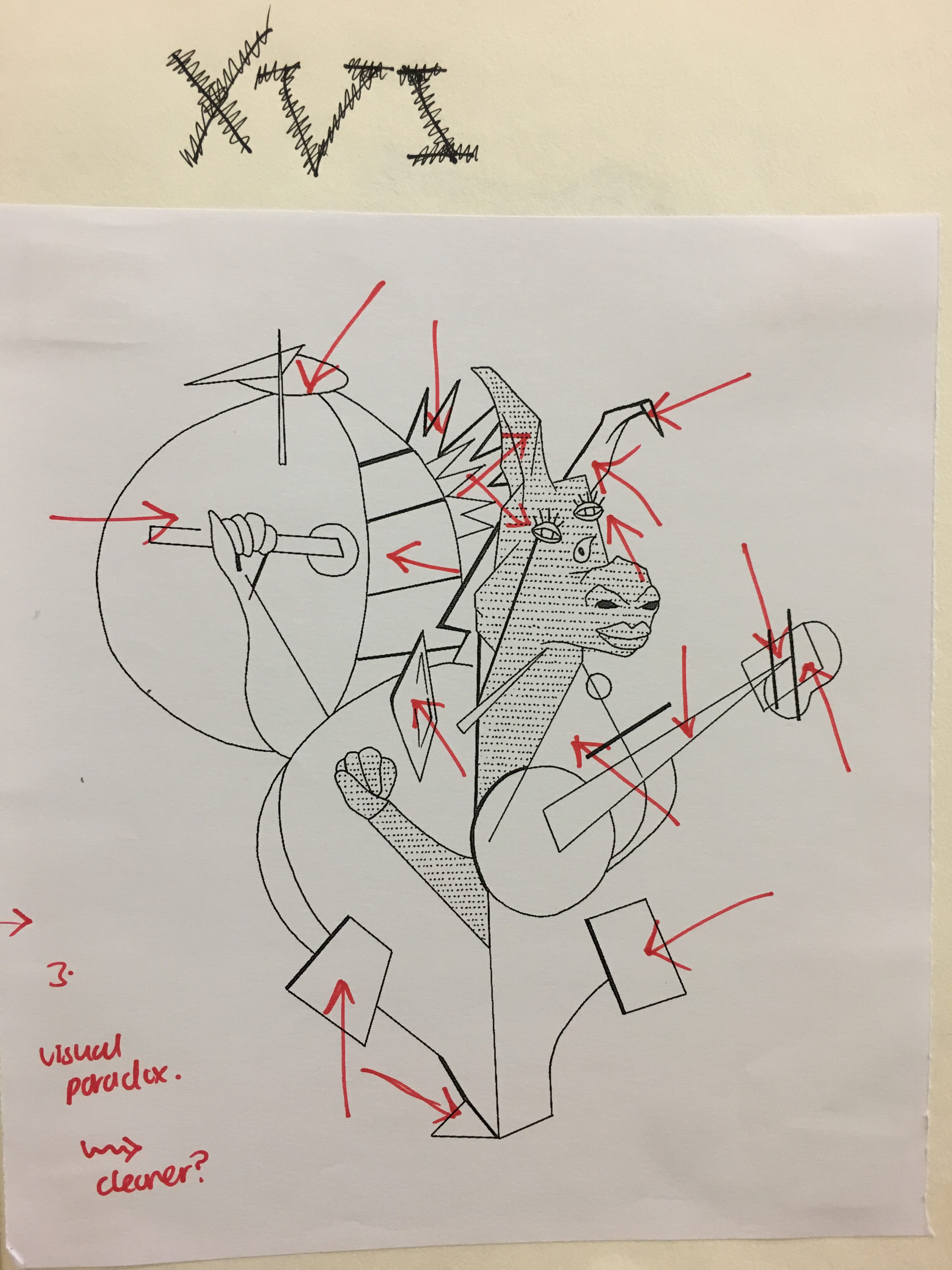
In this imagery, I chose to have a cleaner composition to show a stronger contrast to the settings imagery, enhancing the idea of confusion, that applies for the reaction imagery as well. I chose to use only the protagonist and antagonist in this composition, with the clown pointing in one direction , while the mermaid pointing at the other direction, causing confusion to the donkey, which is in the middle of the conflict. The donkey is seen pointing up, which is sign language for the letter “D”, hinting to take notice of the direction.
This image uses the combination of tetratic as it was intended to create an environment with tension however less jarring compared to the “settings” imagery. The clean white background focuses on the three characters that are in tetratic scheme, drawing focus to the narrative that proceeds down the series. This is because the “settings” imagery becomes more visually confusing than the “me” imagery. In the theme of creating focus, I used a technique of pointillism to create less jarring details, adopting a softer approach.
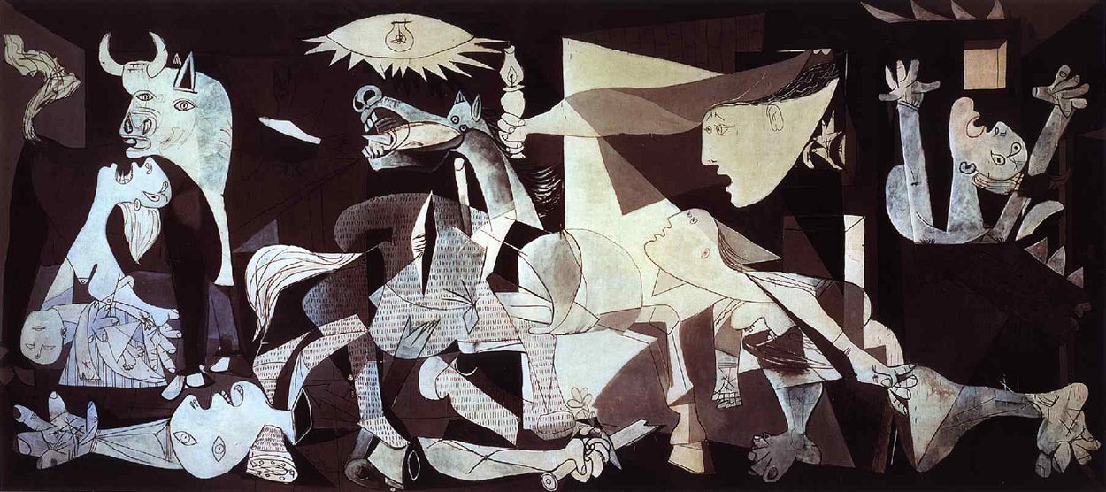
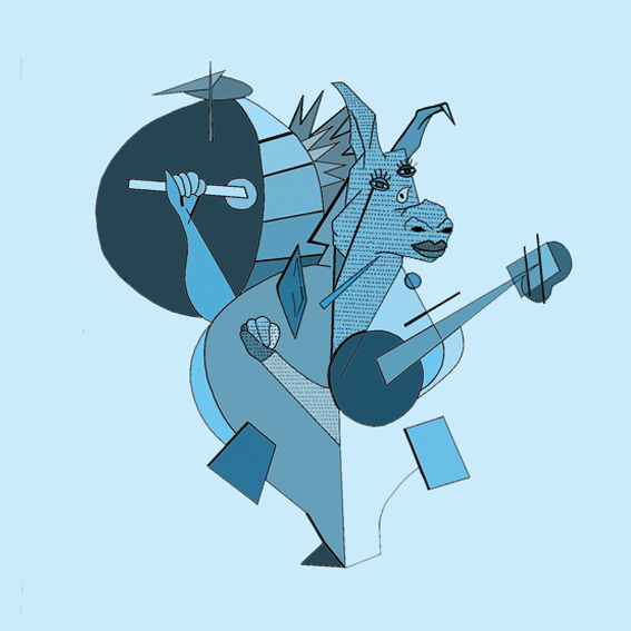
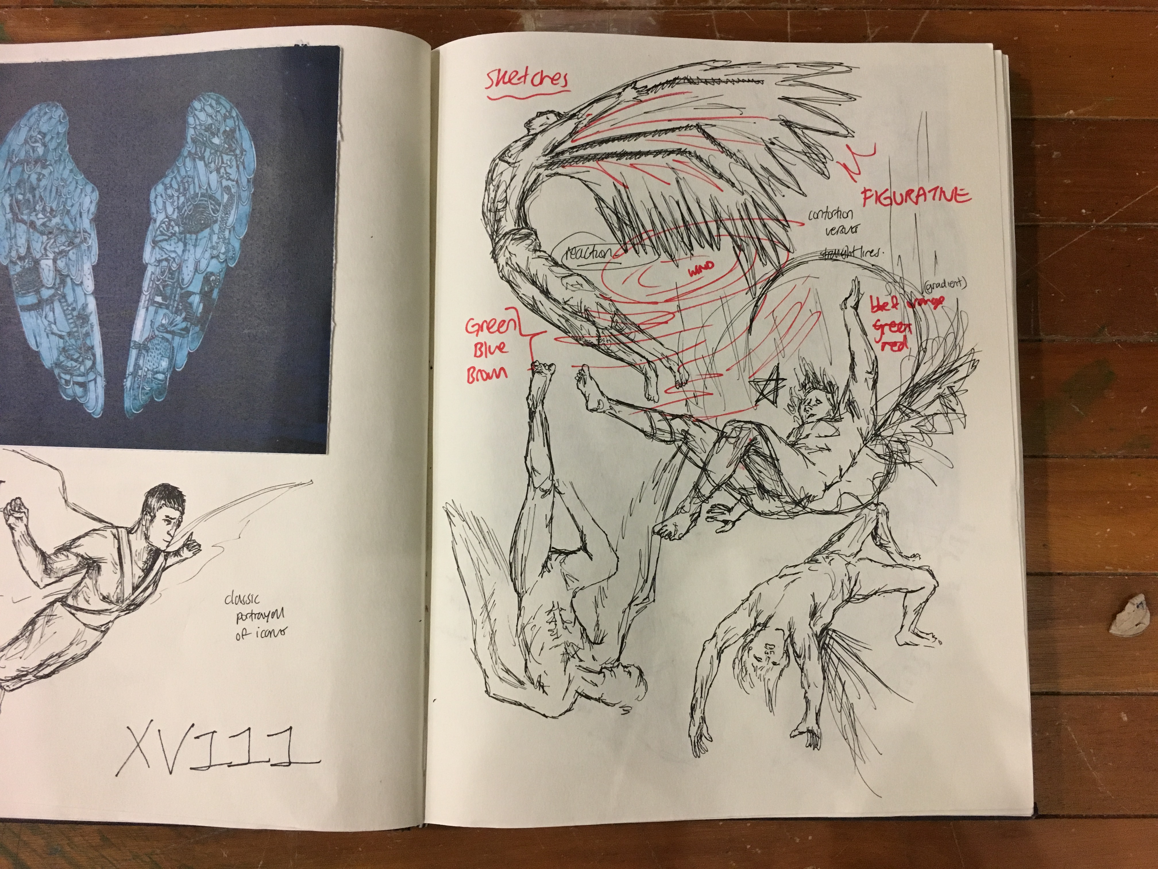
In the last imagery, I decided to adopt a clean and peaceful style, in hopes of portraying the idea of introspection and understanding. Hence, I decided to go with a Cubist approach as Cubism itself is an understanding of form and three-dimensional world. I took reference to the work Guernica by Picasso, arguably the most famous painting of a horse/donkey trying to achieve the idea of peace. In the first photograph, it depicts the donkey being pointed with many red arrows angled everywhere, it serves to identify how the various planes/sides of the horse an be seen in one visual direction, hinting of an otherworldly understanding of form. To relate to the music video, I captured the donkey in the position the artist was in in the music video itself.
I chose to represent my work in a monochromatic hue of blue to create a peaceful image. The blue used is also less artificial compared to the previous image, this blue is more soft and pastel based., creating a strong harmony. The donkey is also seen clenching his fists, depicting an idea of strength and resilience. The usage of Cubism and monochromatic tone serves to depict my attitude and situation towards art, which was finding peace with it.
________________________________________
XVIII 2014; Coldplay’s Ghost Stories
Fear of Responsibility
This album is spiritual and talks about the relationship between the past and the future. It revolves around lead singer Chris Martin’s struggle with the present, and how his ghosts from the past is catching up with him and therefore affecting his future. It is also spiritual in a sense where he tries to find solace with his relationships, be it family or friends. It is similar to my situation back in 2014 as I struggled with the decision of either joining Affordable Art Fair as an intern or working full time at an ice cream cafe. It was the decision that rattled me as I was afraid of the consequences ad responsibility, how it would affect my future and come off as a ghost in my past.
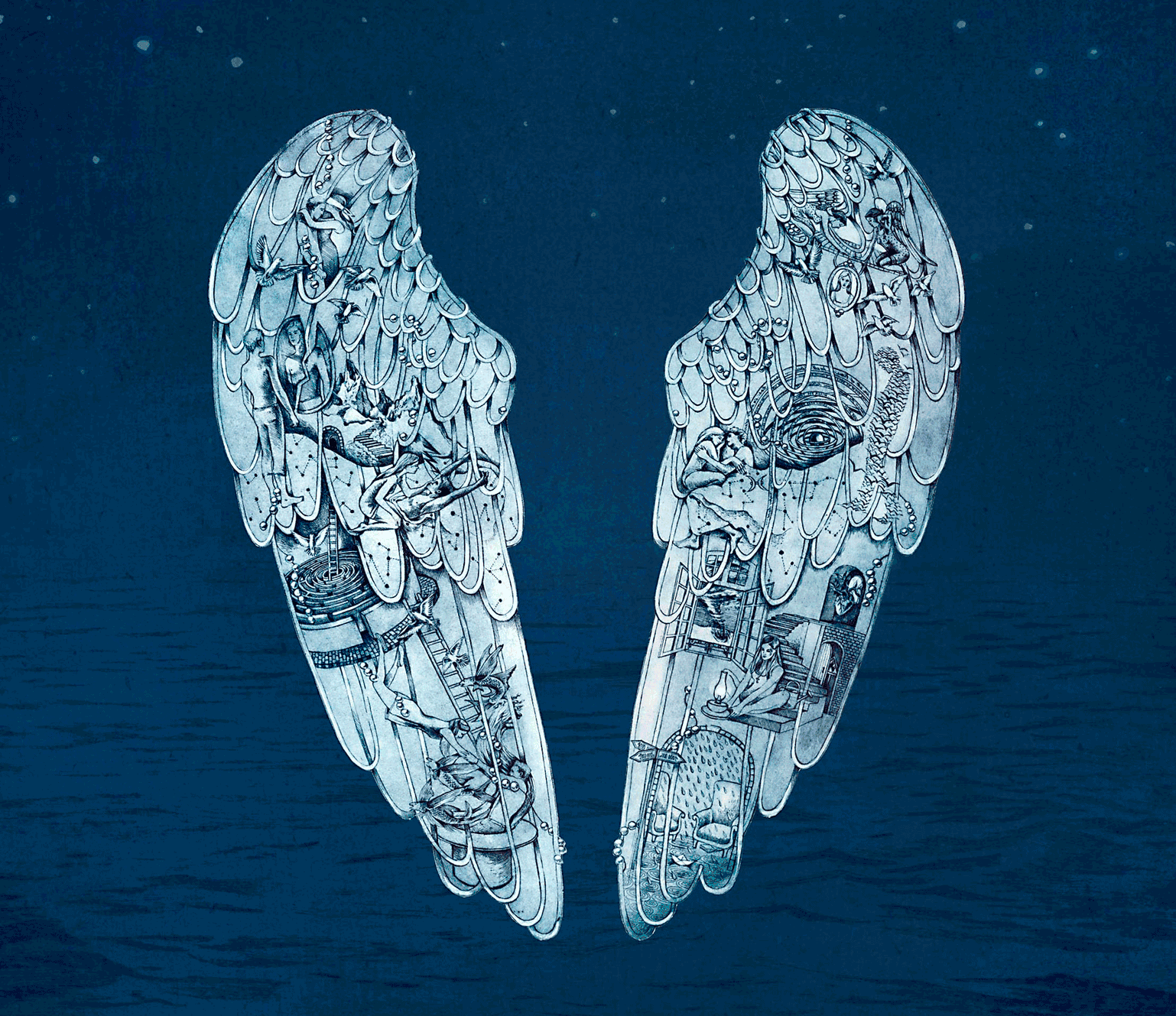
The album adopts a monochromatic blue with a lighter shade for the wings, while the backdrop is darker, creating focus. It is a etched artwork with many symbolic and figurative representation, such as an incoming tornado or a garden plant with ladders.
In exploration of the theme of wings, I decided to keep the initial design of wings for the settings, using symbolism to showcase the situation. I wanted to play with the idea of wings, thereafter moving to the narrative of Icarus, since the narrative of the album is about the past actions catching up with the future.
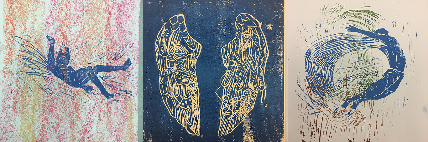
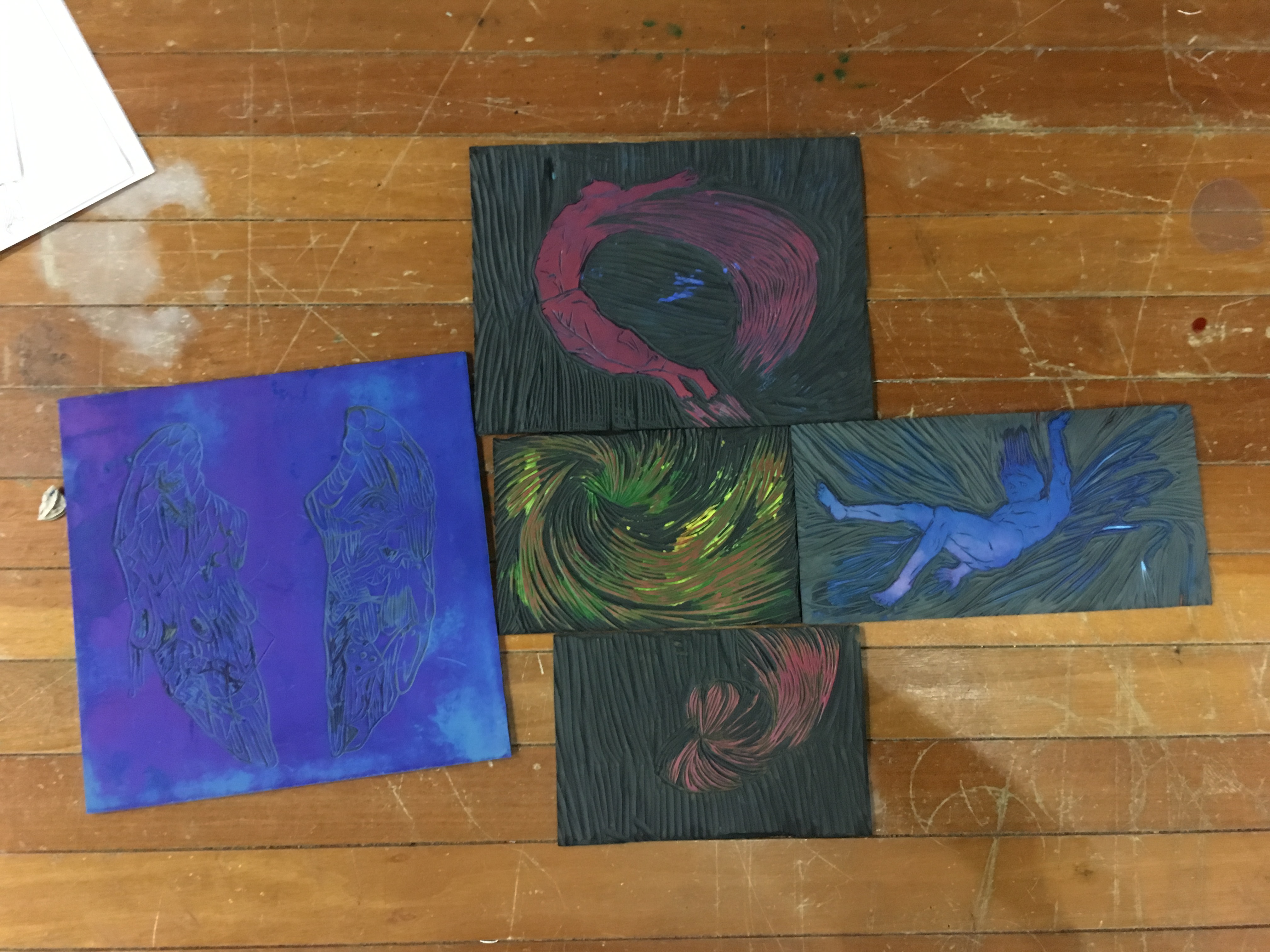
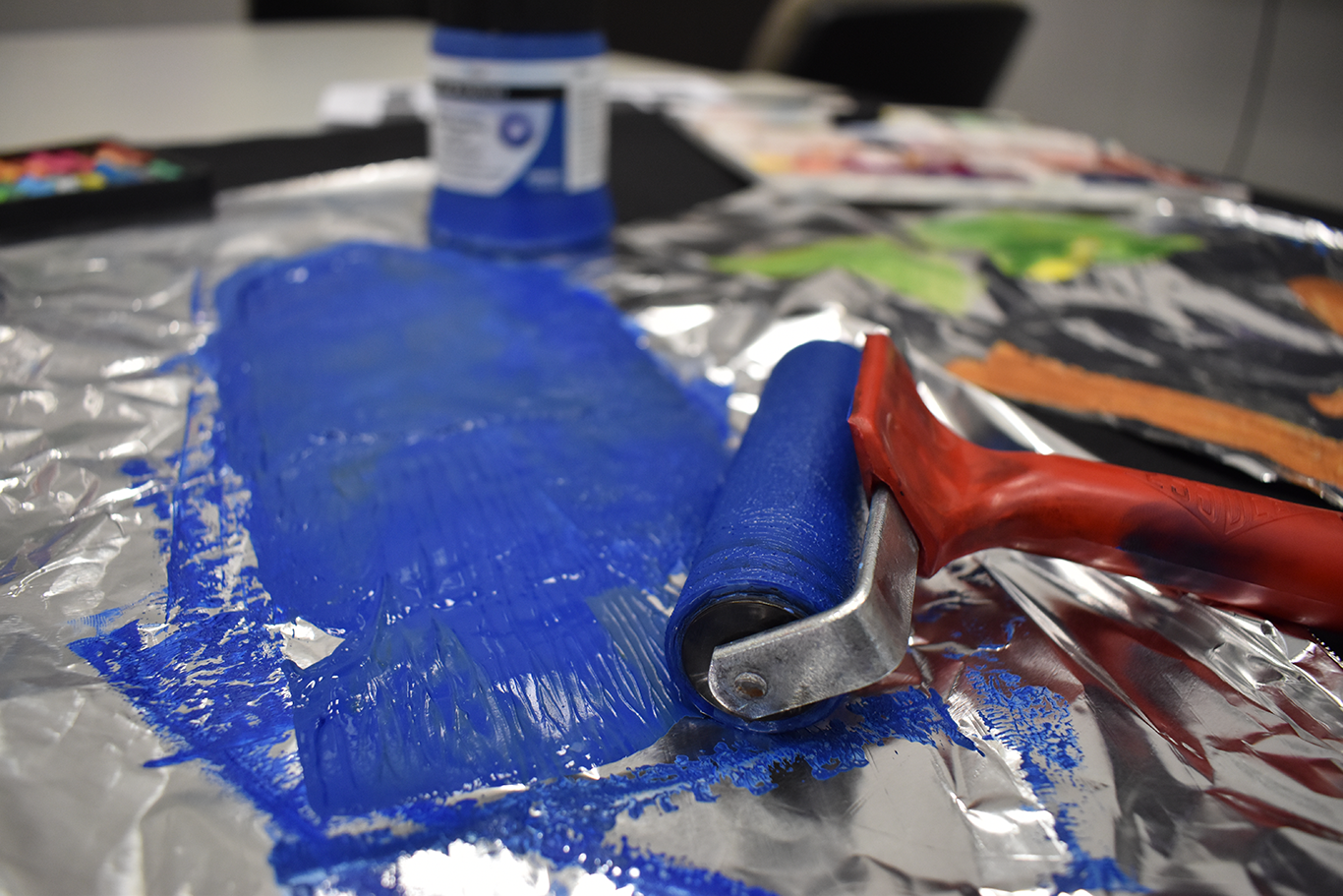
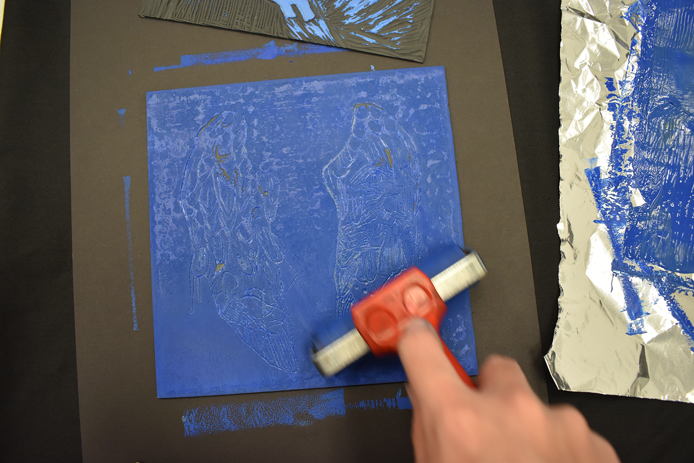
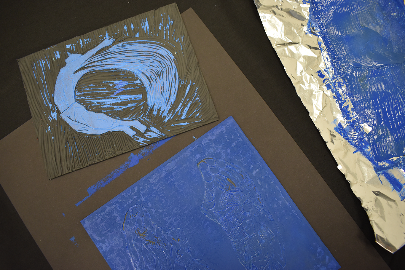
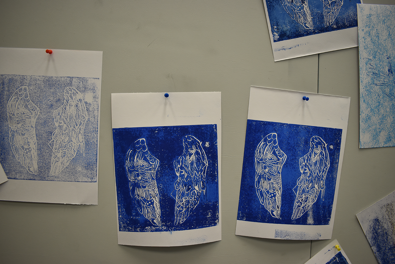
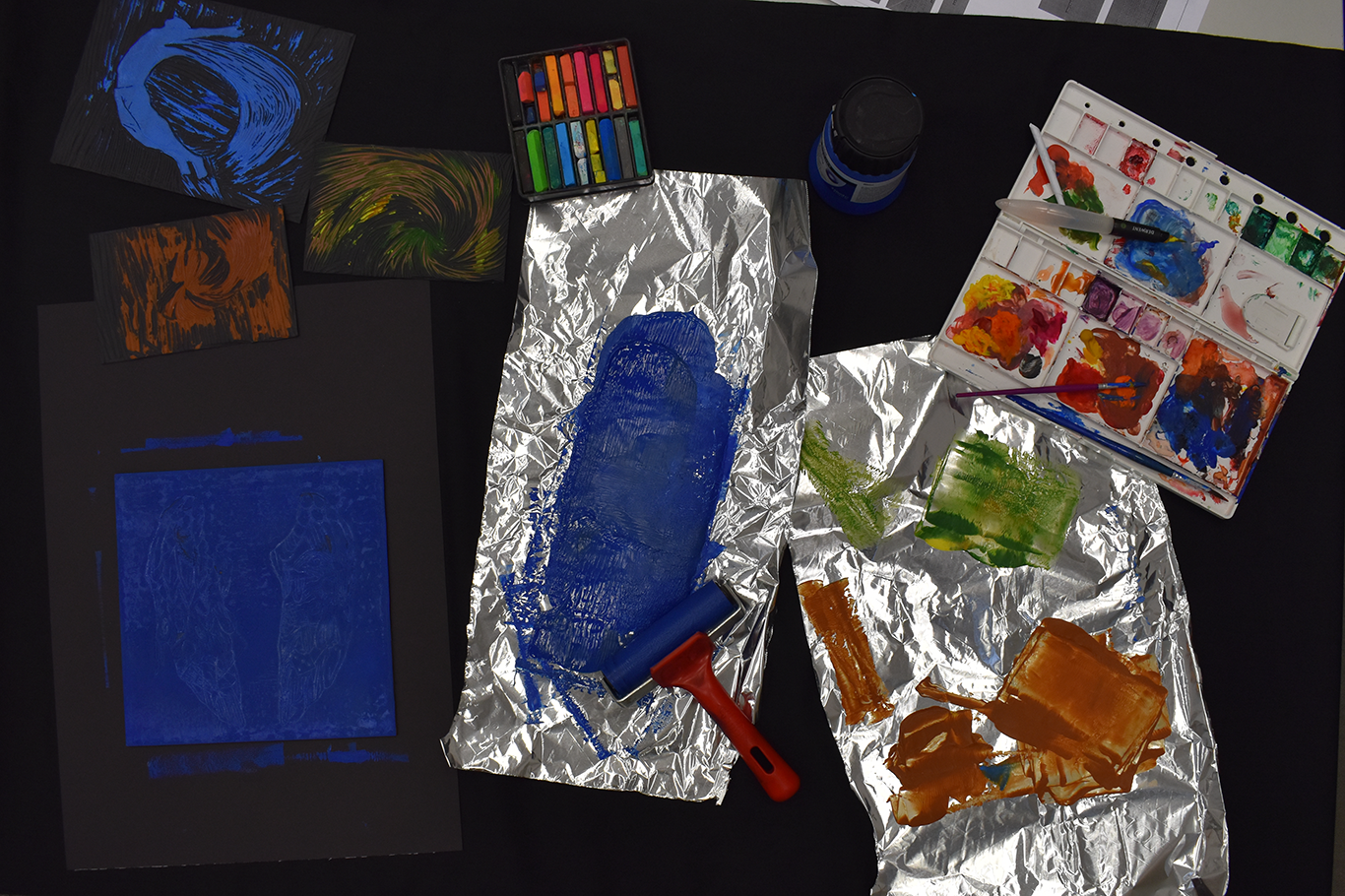
In this imagery, I used linocut to replace the etching used in the Coldplay album art. I used symbols like sharks, mermaids and spoons, etc in the medieval style adopted by Mila Furstova, the artist that created the Ghost Stories album art. The sharks are representation of the aggression and drive I wanted to have for my future. The mermaid representing characters from my past catching up with me. While the spoon represents the cafe I worked at. The dots represented the artworks I saw at the Affordable Art Fair, predominantly the dots of Damien Hirst’s works. I decided to use a plain blue hue to create the lino print, adding a little yellow to create a patchy effect for enhanced pictorial space. The white lines of the lino cut is contrasted with the blue background, giving a tranquil yet introspective quality. Each wings represented the two choices I was given, at which I could only make one choice and by default the other one would become the ghost in my past.
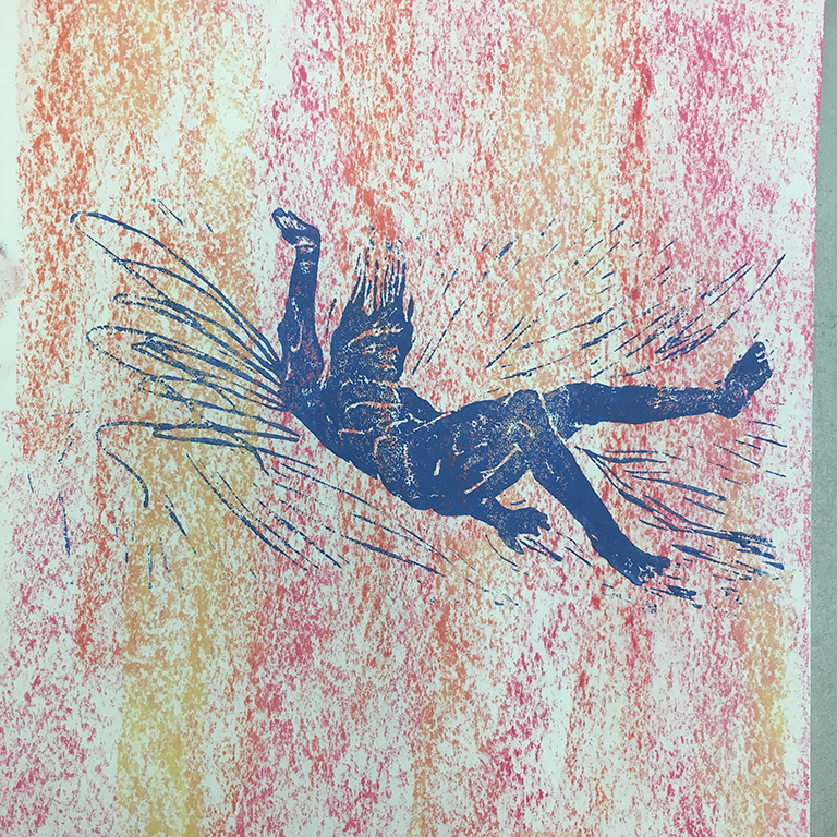
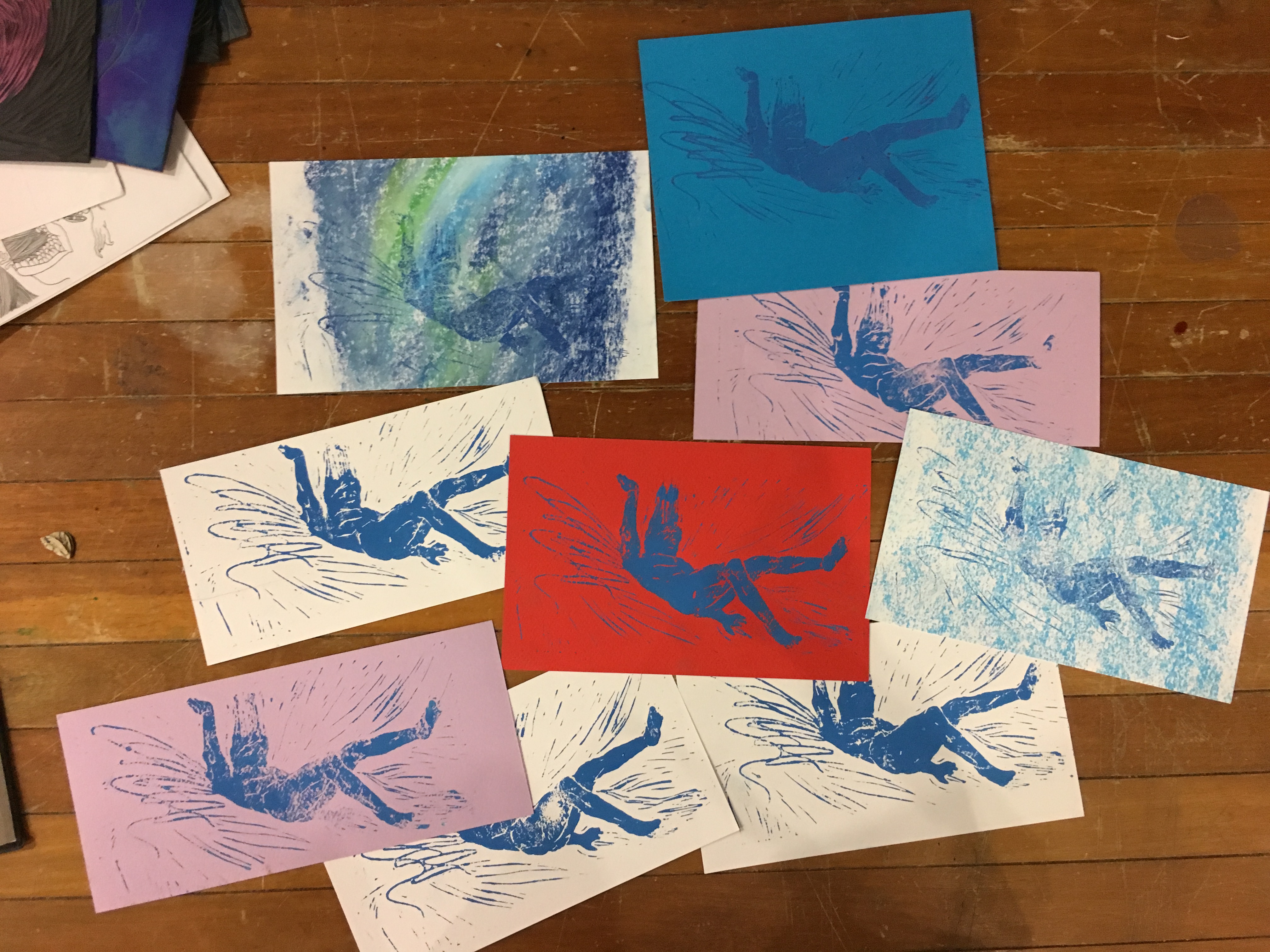
In this image, I wanted to start on the theme of Icarus and his choices, with me playing Icarus in this situation. I carved an image of Icarus falling down from the sky, with many wings sprouting from the sides. However, he is seen falling down despite having many wings. I explored on the human form in a falling position. In this series, I decided to use the same hue of blue to represent Icarus to create a stronger sense of a series, and using visually weaker colours to be placed at the background. In “Me”, I explored on many colour combination, from a pure red contrasting to the blue, to a patchy pastel blue, to light violet and even a galaxy-like combination. I decided to go with a pastel created analogous combination of orange, pink and red. This references to the colour of a sun setting down, which is a gradient of red, orange and pink- It parallels to the story of Icarus. I wanted the analogous combination to create an unnerving effect, with the warm hues creating an anxious environment. I used hard pastels and created the gradient background with no details, emulating the scenery of what you would see while falling down.
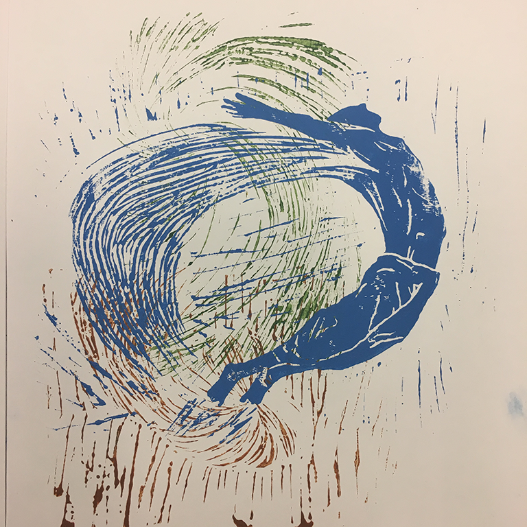
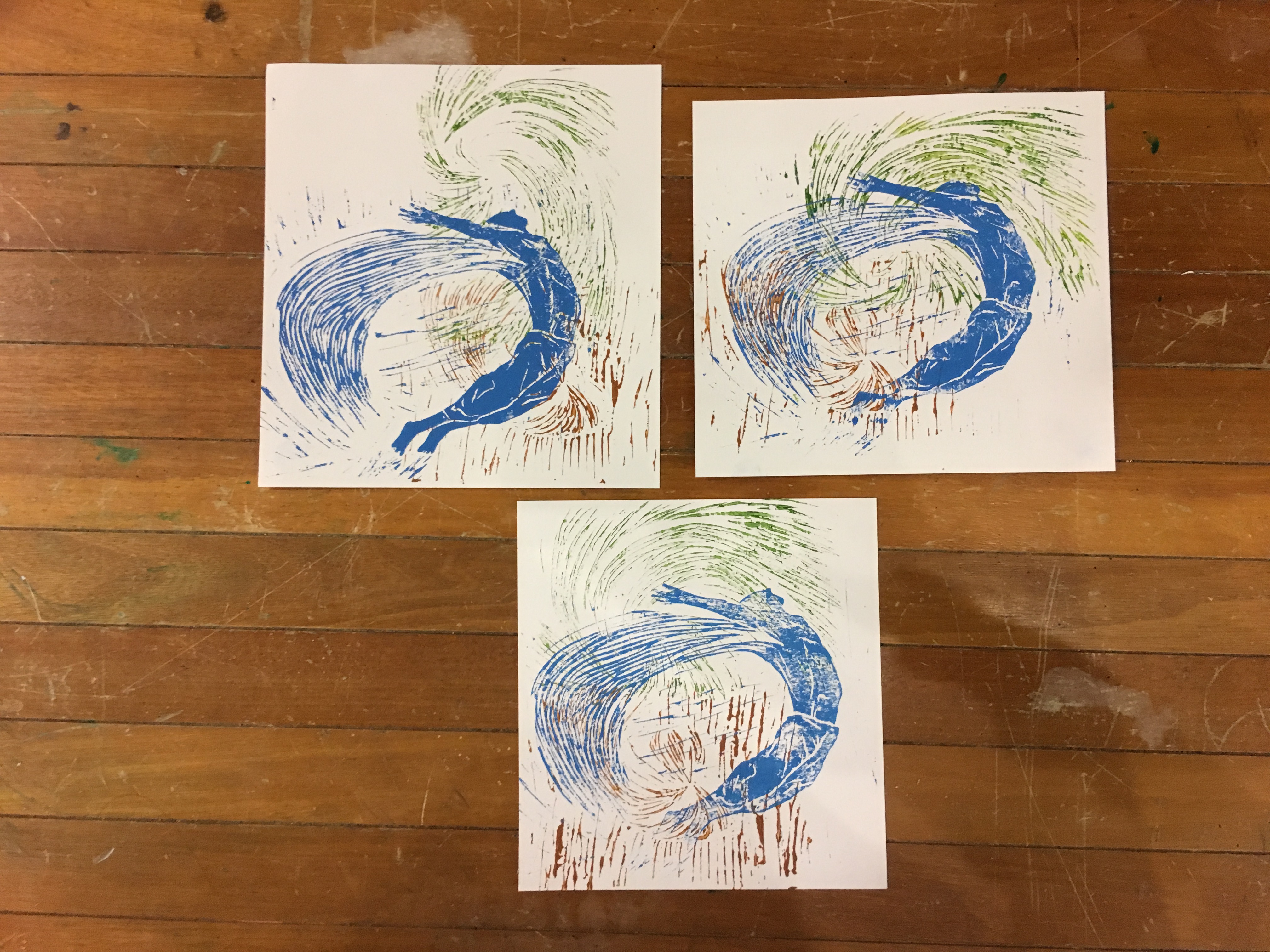
In the last imagery of “Reaction”, I decided to play with the idea of Icarus again, much like the “Me” imagery. This time I played with triadic colours, inclusive of the blue itself to create a stronger overall harmony. The colour combination is also naturalistic to pay homage to the classic narrative of Icarus. I layered the linoprints one by one, with the brown one pasted first, then the green one and lastly the blue one to create a pictorial space within the image. It explores on curves and lines, twirling into the said pictorial space. The human form shown in this image is more elegant and relaxed, giving a stronger sense of “in flight”. It is on the verge of contortion and curving in elegance. I wanted to depict how my reaction to the problem was ultimately settled in, and eventually I survived and was in fact, flying with one wing.
With the usage of three different colours, I created a pictorial space with the colours, brown and green being the background while blue pops out due to its bold hue. There is a visual zig zag crossing the image with the wings and wind, highlighting the full form of Icarus.
________________________________________
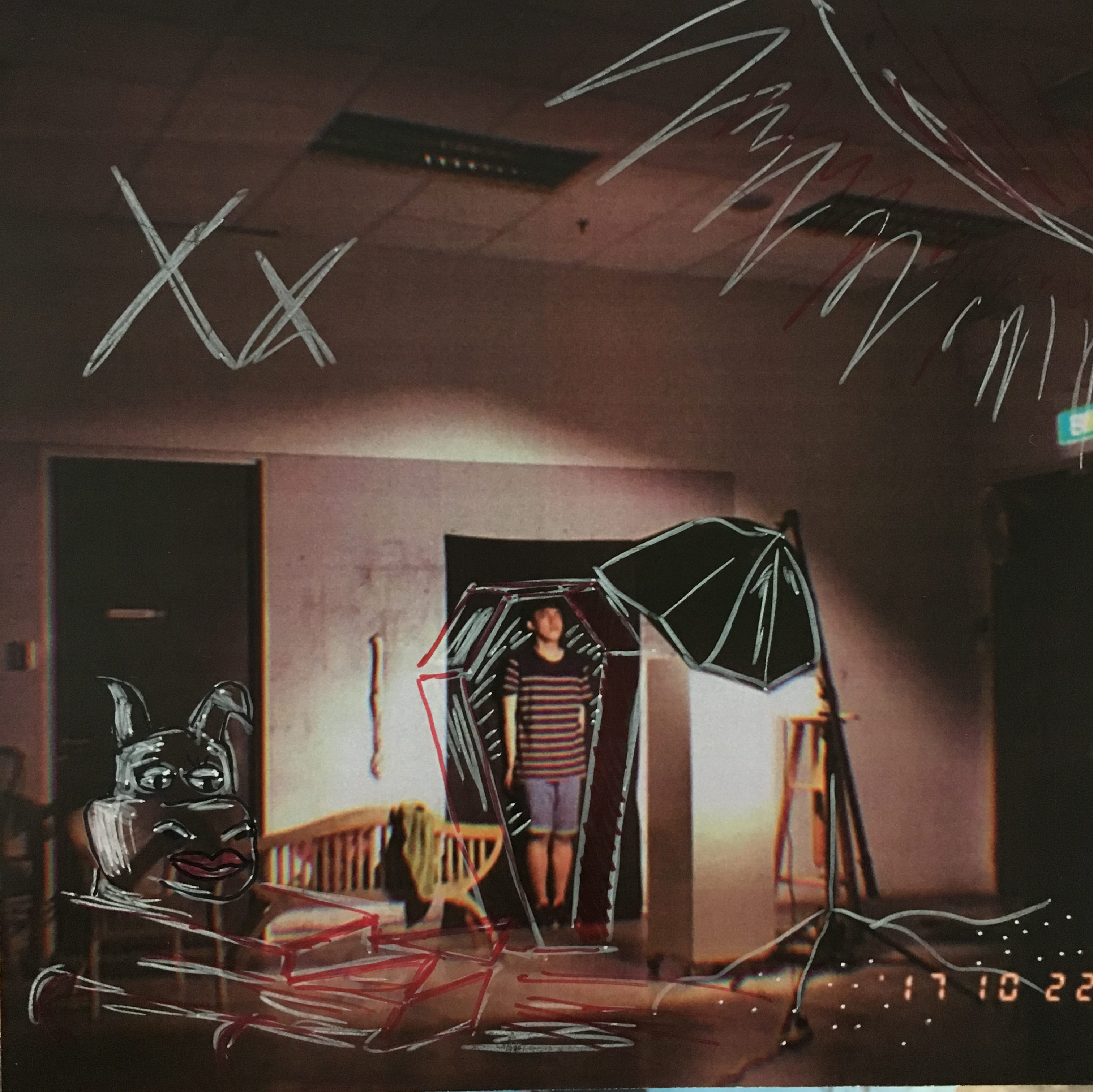
XX 2016; Panic! At the Disco’s Death of a Bachelor
Fear of the future
In this album, Panic! At the Disco (Brendon Urie) strives to depict his passion for music physically, aiming to visualise his consumption of music in this album. This album speaks about his passion for music, it was also a signifier of another era of his life as he transition into the next stage of life. It was a moment of bittersweet and sadness. This was similar to me as I was in a fork road of choosing my university course, fresh out of army. It was a point where my decisions could affect my future’s entirety, much like what the album speaks of.
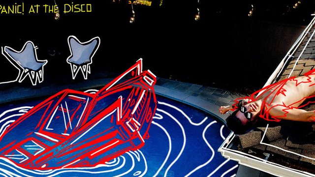
The album art is an actual photograph Urie’s friend took of him ,and Urie asked the illograph artist Nicole Guice to draw on the photograph to create the album art. It was symbolic in the usage of the Mustang, as it was from his previous album, another era of his life. The usage of only blue and red contrasted to the background of black and foreground of white creates a strong composition of focused subject matter.
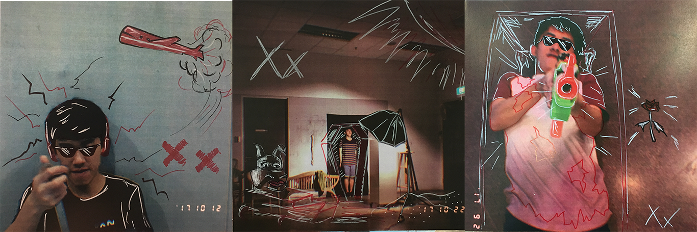
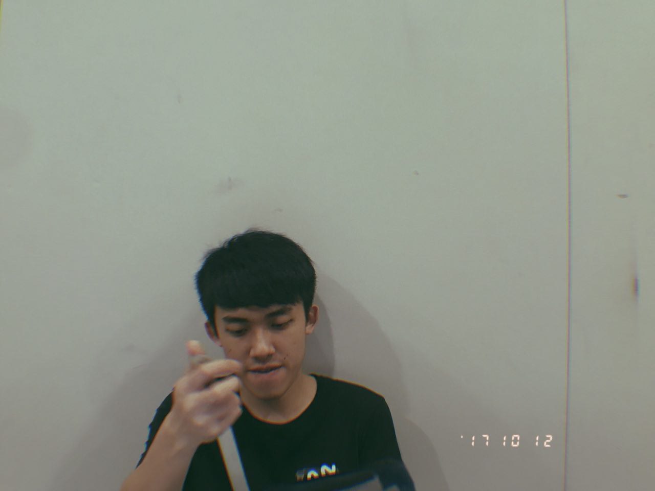
In the theme of using the official album art as reference, I wanted to pay tribute to the artist by using the same style of spontaneity in choosing the photographs for illography. Hence, I decided to use photographs that were not staged and had been taken recently, instead of staging it, which was my initial idea. This led me to the photographs taken by my friend Bryan through the application Gudak, which coincidentally has timestamps on it to officialise the spontaneity and concept of being unstaged.
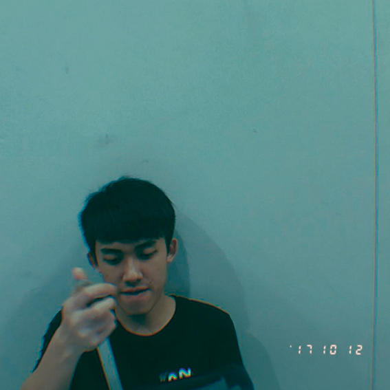
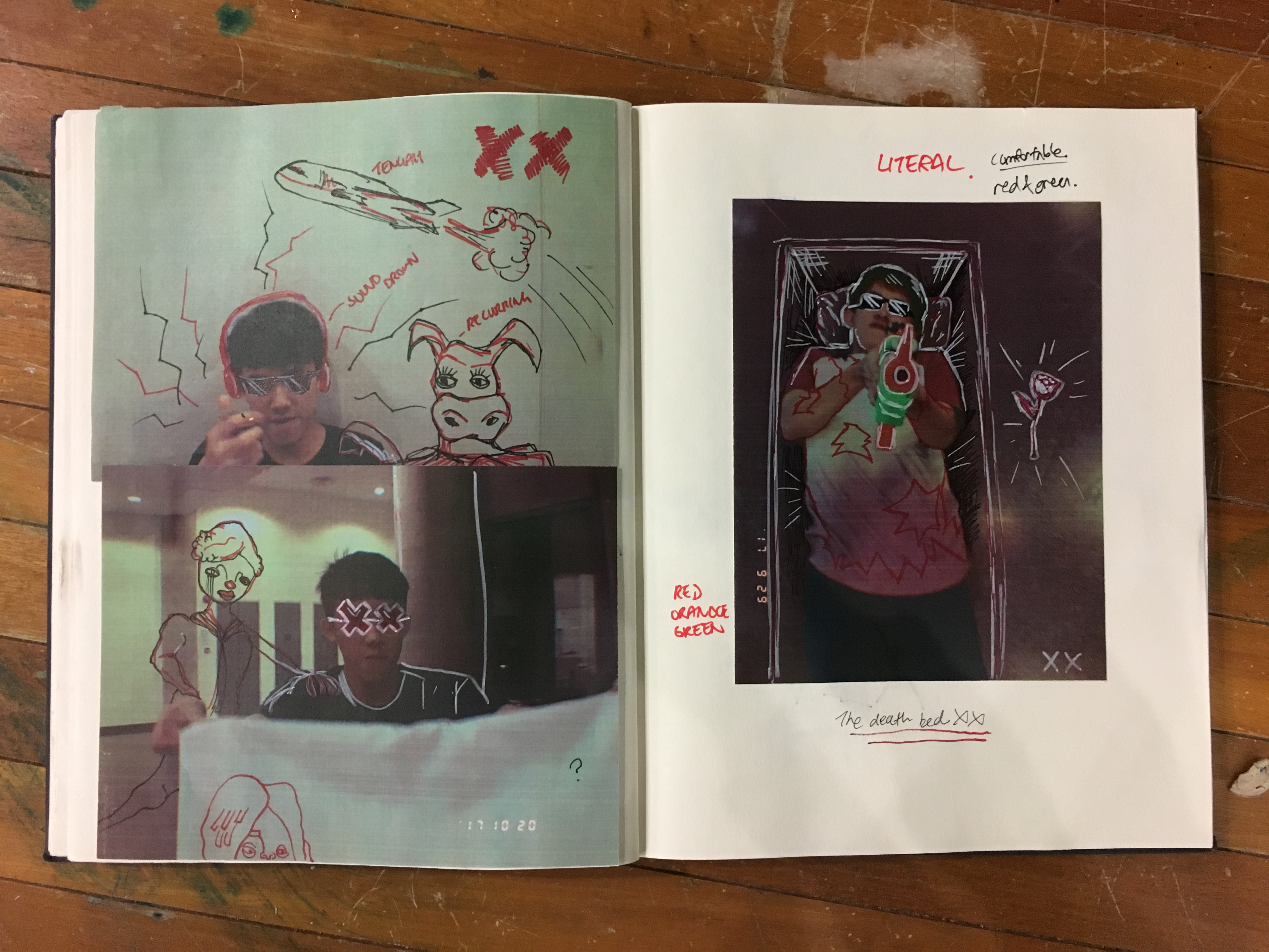
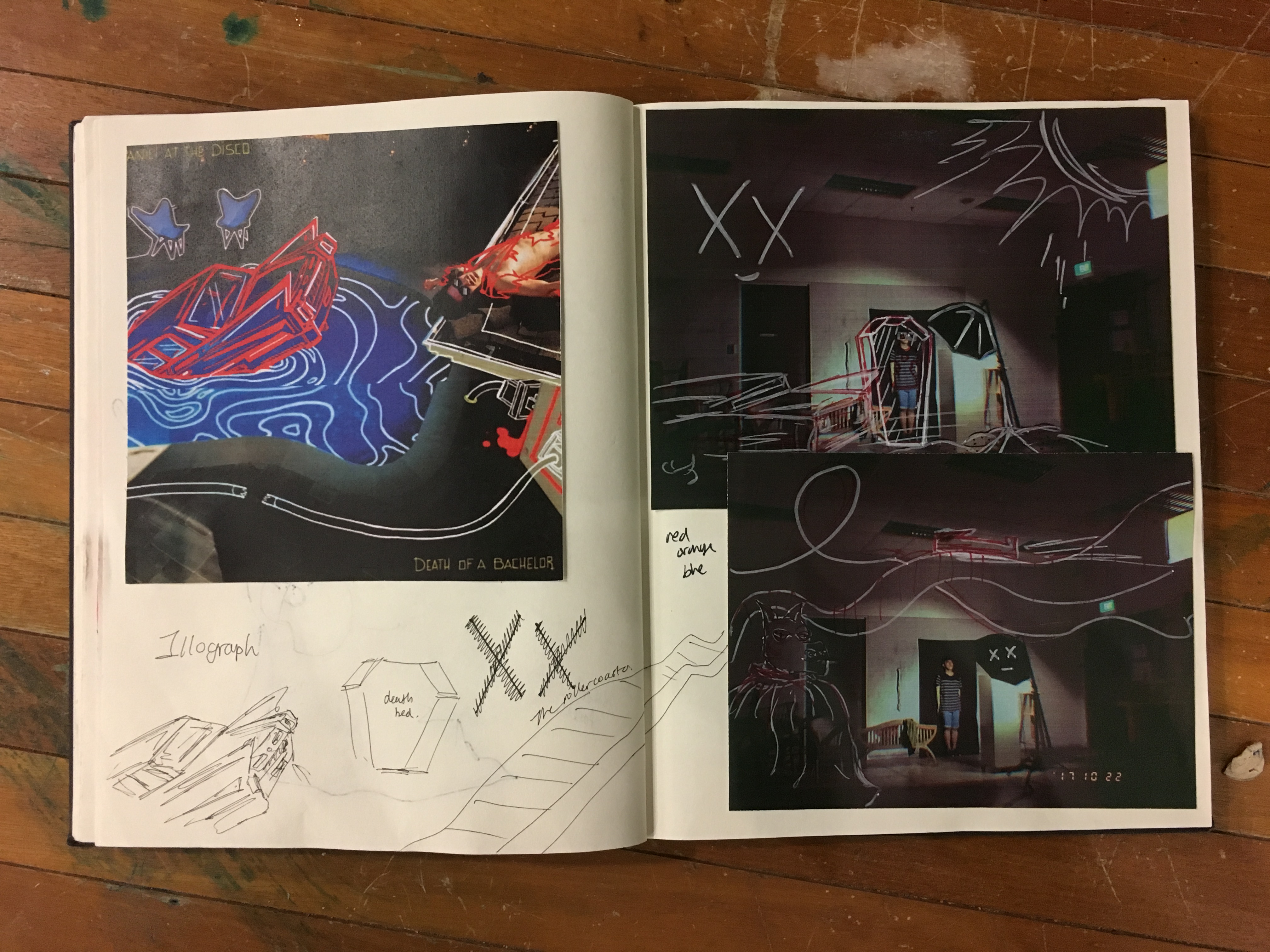
In this imagery, I played with the actual album art by closely imitating the colour scheme, with a dark background lined with white and red illographed sketches. I decided to use this photograph as it was a photograph of me lying down on the wall and not realising that my picture was taken, much like the album art of Death of a Bachelor. There is a recurrence of the character of the donkey, hinting of my situation of needing to wanting to choose art as a career. I caricatured the environment into a beach to feel a sense of ludicrous, and also out of spontaneous will.
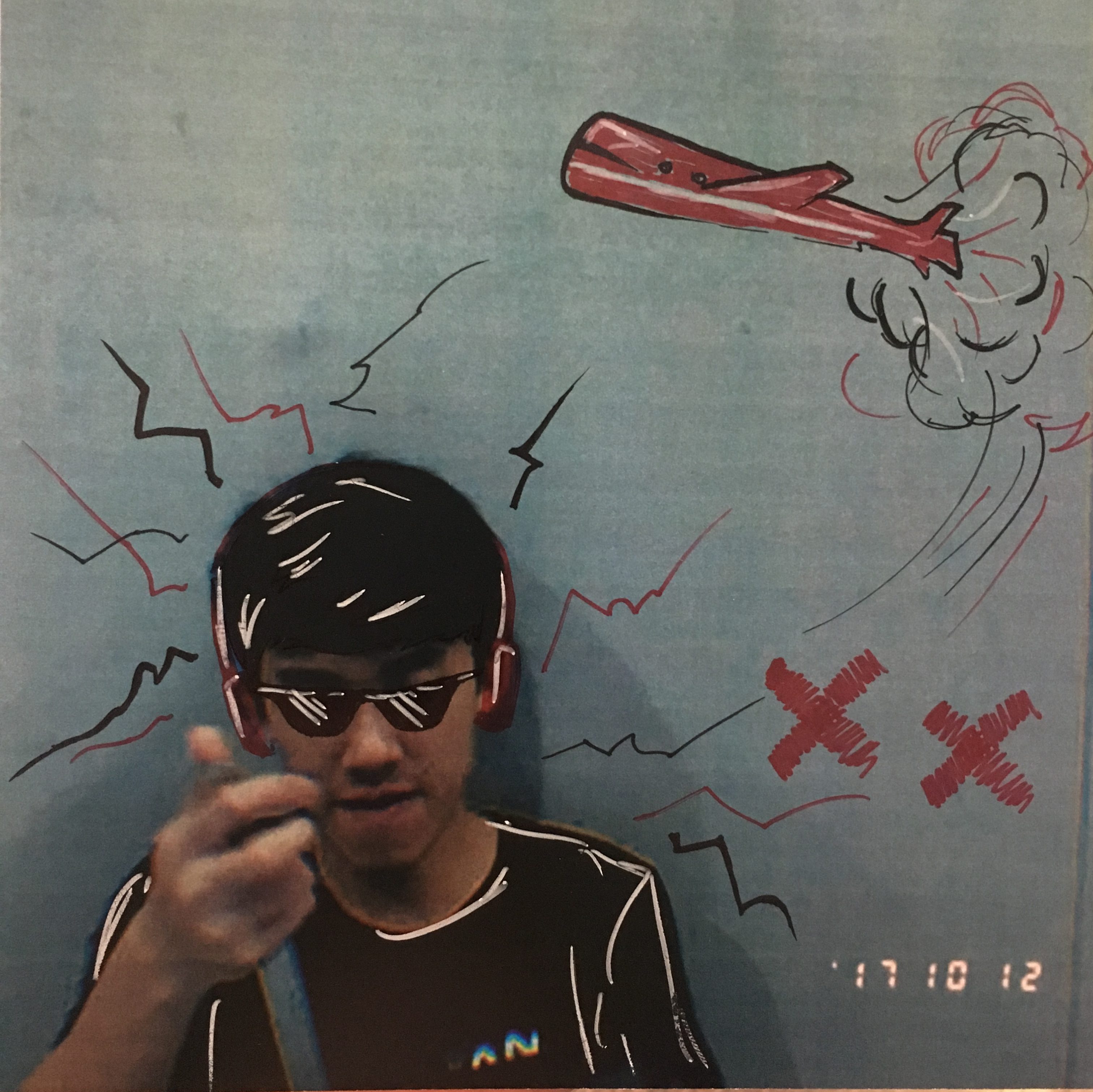
In the “Me” imagery, I depicted myself back in 2016 where I was based in Tengah Airbase. I am shown covered with a sunglasses and earmuffs, indication of the hot weather and loud noises. There is a plane flying over, while I am seen in contemplation. The colour scheme of this imagery is also simple, with a desaturated cool background lined with red, white and black marker to create a distinct foreground and background.
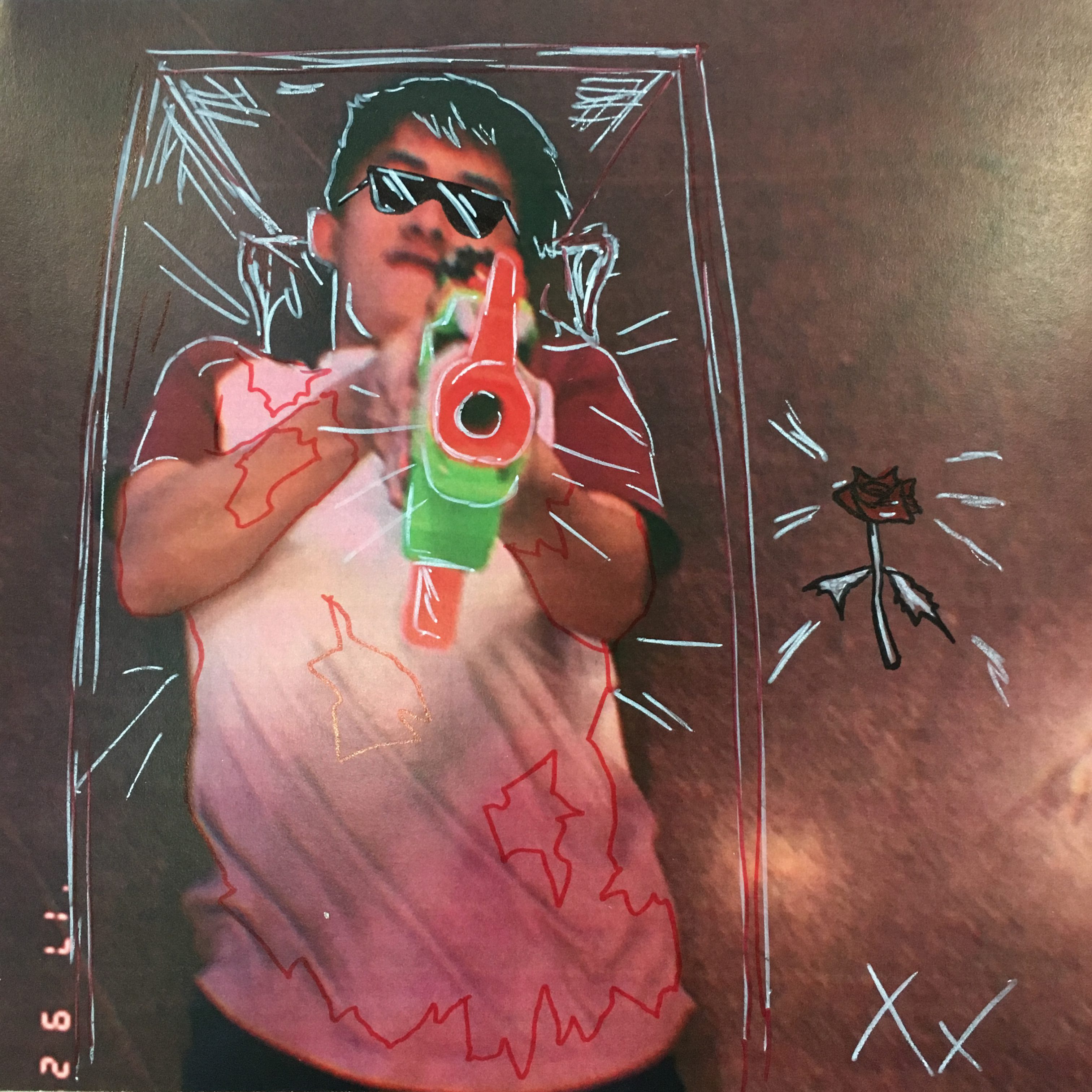
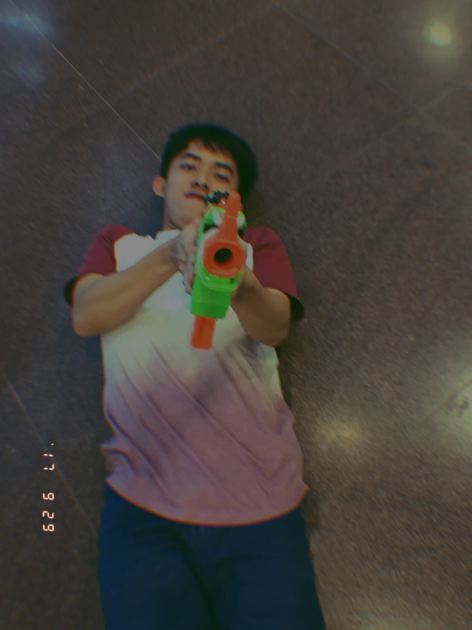
In the last imagery, I am shown lying down in a coffin, pointing a toy gun at the camera. This depicts my decision of choosing art as a course as I found solace in the idea of deathbed regrets. It was a decision making scenario where I place myself by my own deathbed and questioning if I would regret a particularly confusing dilemma. There is a less sinister tone in this imagery compared to the previous two as I wanted to portray the idea of solace through harmony. There is a play of split complementary in this image, with the warm tone of the environment set over a pink shirt and orange tinted green gun. This creates a visual harmony that balances out the dark tone of the photograph.
________________________________________
Final
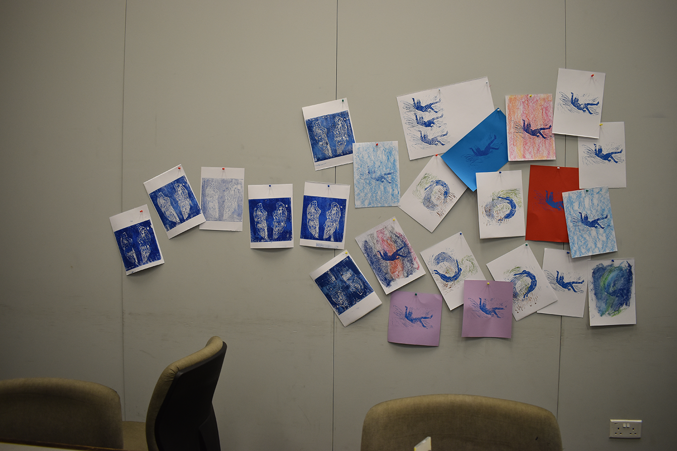
In the exploration of tying the series together, I decided to play with composition and colours. In the imageries under “Me” and “Reaction”, which are more tilted to the aspects of introspection and supposedly aesthetically resembling stills from music video, I kept the composition simple by limiting to one central character or a small group. This pulled focus to the central panels which are the “settings”, and are mostly confusing situations I was stuck in.
In each series, there would also be colours that guide into the next one. For example in XIV 2010, there is a combination of purple and orange that leads the viewers down into XVI which uses purple and orange predominantly as well. It speaks of how my position of comfort led me to the position of conflicted decision making. From XVI to XVIII, the last imagery of the blue Cubist donkey links up to the Icarus series of the blue flying man, speaking of the same subject matter in a different form.
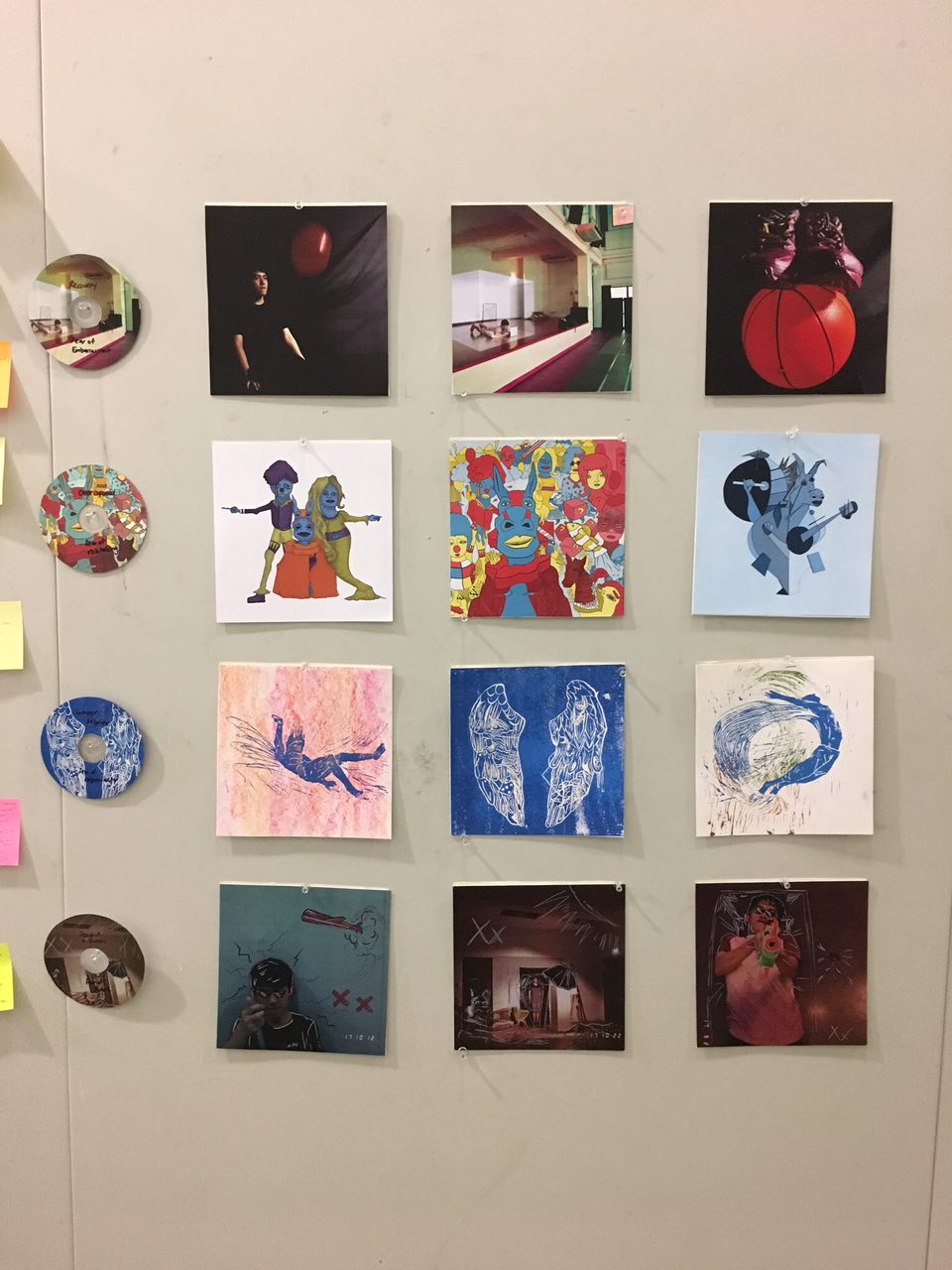
I also used self-crafted CDs to replace the caption required in the assignment layout.
Reflections
In this project, I have gone through quite a few mediums and that definitely brought new perspectives to each and every one. First and foremost, the conceptualising was difficult as I had to link up four different personas of me, settings and reaction into a gigantic series and correspond it to one another. It was also difficult in linking up the concept of album art and situations of my life, making sure there was not any loopholes.
In the technical aspects, lino cut was the most difficult to control as it was a test of dexterity. Then comes the illustrations as I had to think of the medium of illustration, be it hand drawn on paper or Illustrator or even Photoshop. Illograph was a style I have never touched on before. It was difficult in making sure the entire project seemed connected visually.
All in all, it was a great project in terms of exploring new mediums, new boundary of where my concepts can lead to and how much I understood myself. Really thankful for the tutelage provided by Joy for the past semester.