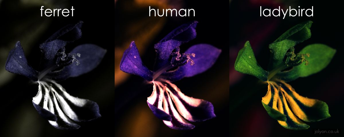
Moving on from Forrest Gump, we finally ventured into colours for Ego. Colour is a visual perception, projected through the wavelength of light against the biological structure of our eyeballs. There is a wide spectrum of colours that is humanly possible to see, shown below. Other animals like birds can see up to five or seven colours, compared to the three primary colours that humans can see. Some unfortunate ones, mostly sea creatures, can only see up to two, (blue or red) since the ocean has a limited colour scheme. The triptych below shows the comparison of vision between a ferret, human and a ladybird. In this comparison, the inherent feeling achieved from the same flower is different in the three subjects: the ferret sees a heavy setting with a depressed looking flower; the human seeing a purple flower with a pink interior; the ladybird seeing a saturated green flower with a yellow interior. This is the result of colour psychology.
Comparison of animal visions
Colour psychology is the effects of different colour on human behaviour and perception, with different colours having a different inherent effect.
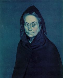
Blue is an intellectual colour that recedes into the background. This is because the colour is inherently cooling, hinting of strong clear thought and light calmness of mind. However, it can also remind people of coldness and loneliness, such as Pablo Picasso’s blue series.
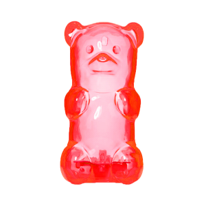
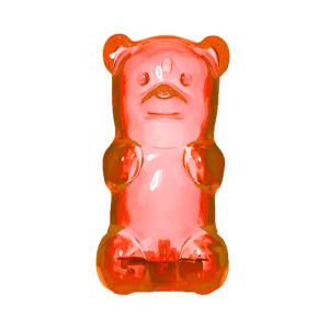
Red is a physical colour that pops out of the foreground, stimulating the eyes. It is visually strong and powerful, no subtlety in the traits. It can be perceived as either friendliness or aggressiveness, depending how the energy is perceived.
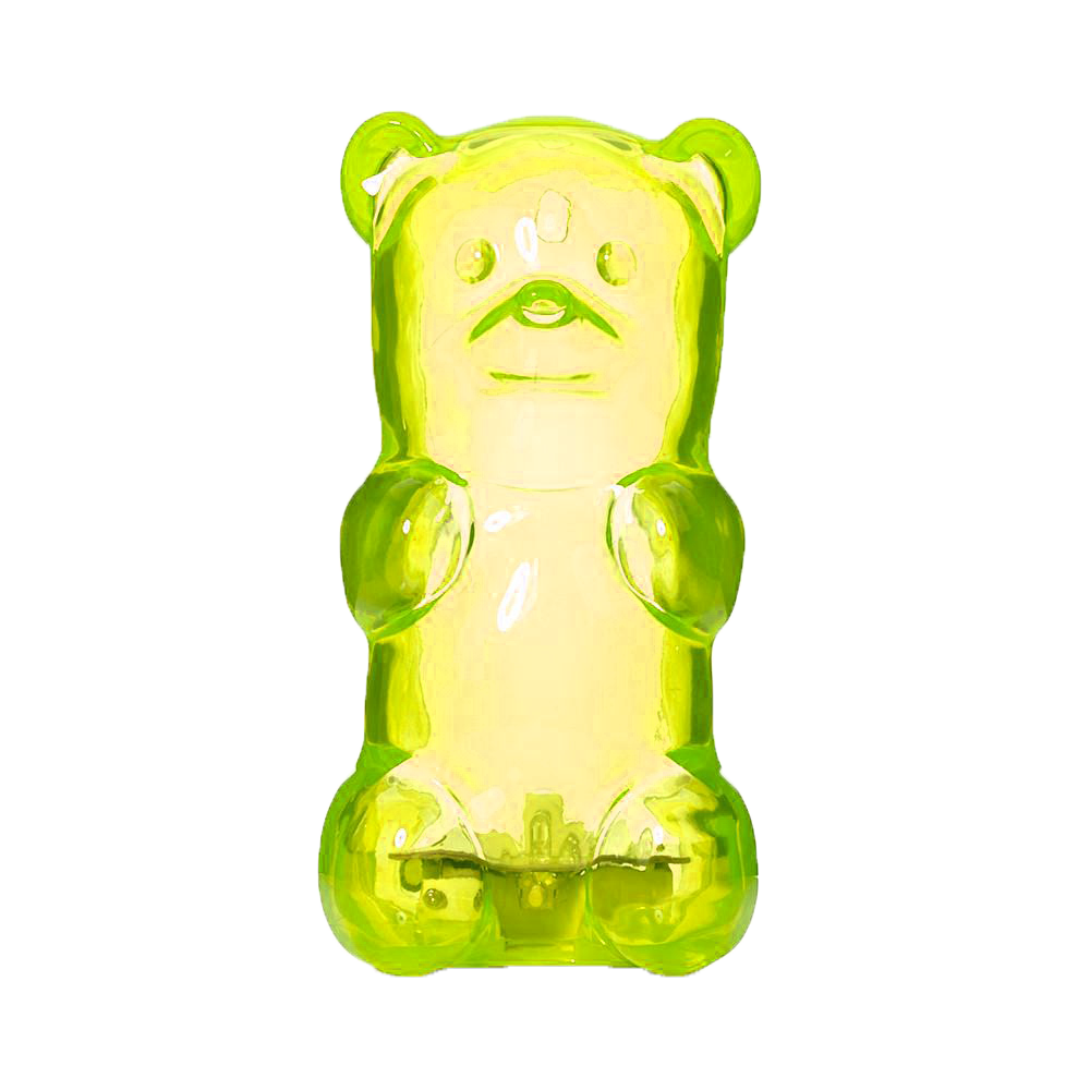
Pink is a colour derived from changing the tint of red, thus it is a physical colour. Pink soothes the viewer physically. However, over-usage of pink can be visually draining.Yellow is an emotional colour that stems from both spectrum. It is both optimistic and depressive. This is because the yellow light has the longest wavelength and is visually stimulating. The over-saturation of yellow would incite anxiety, commonly seen in traffic police coats.
Green is a balanced colour, seemingly because it is in the middle of the colour spectrum. It is harmonious, being found in nature. It requires no visual adjustments, thus easy on the eyes. It is a primitive reminder of humans of peace since a lush green reminds of food. water and settlement.
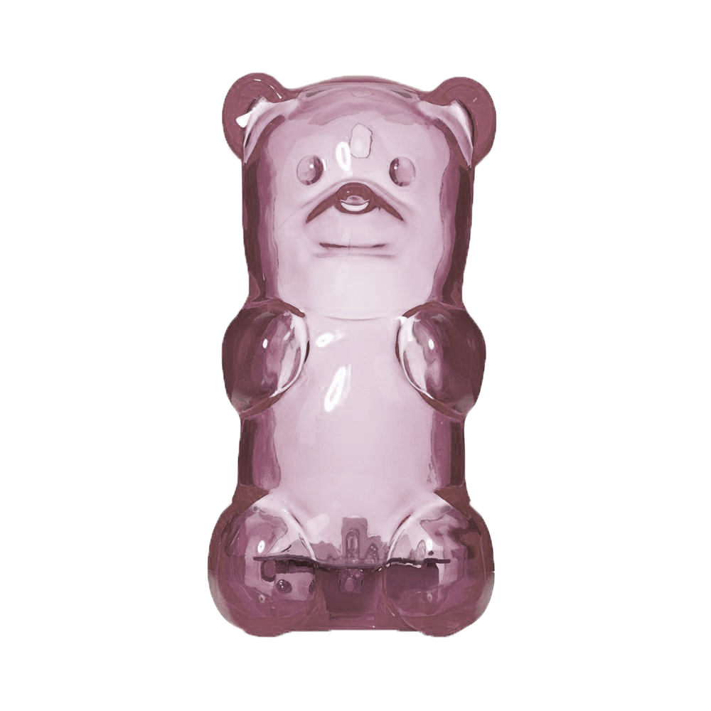
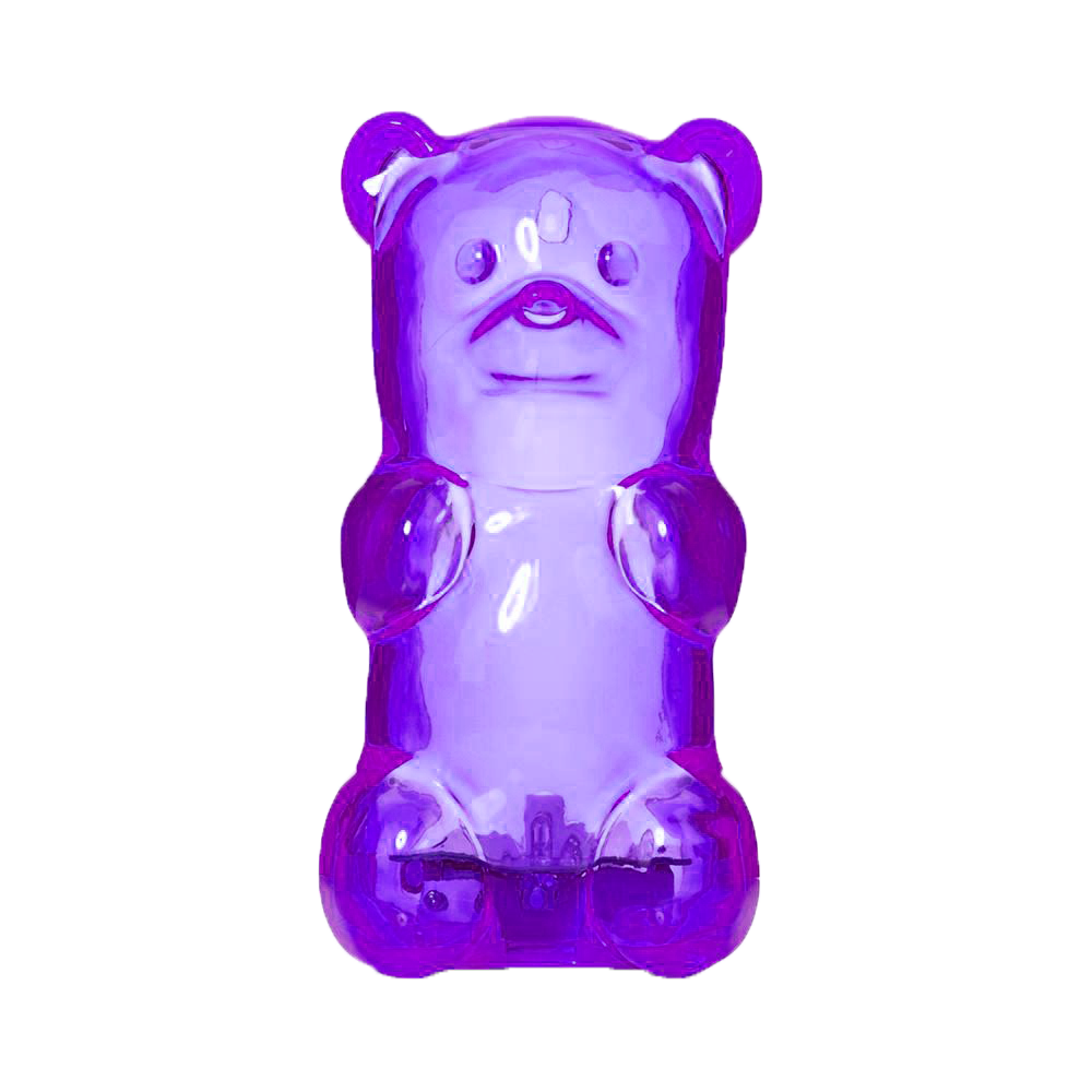
Purple is spiritually aggressive, but also suppressive. It has the shortest wavelength out of all the colours, but having the strong polarity in its effects. Purple can remind viewers of royalty and luxury, but excessive use can bring out introspection, and also inferiority.
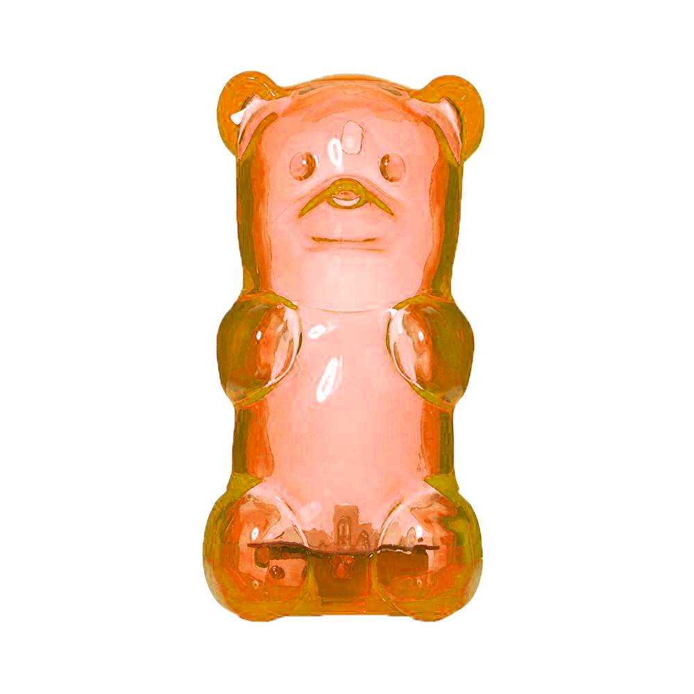
Orange is a passionate colour that can be derivative also. Since it is a combination of red and yellow, it is both a physical and emotional colour. It inherits traits of both yellow and red, mostly its vibrancy and energy. However, too much orange can bring frivolity, drawing out intellectual values.
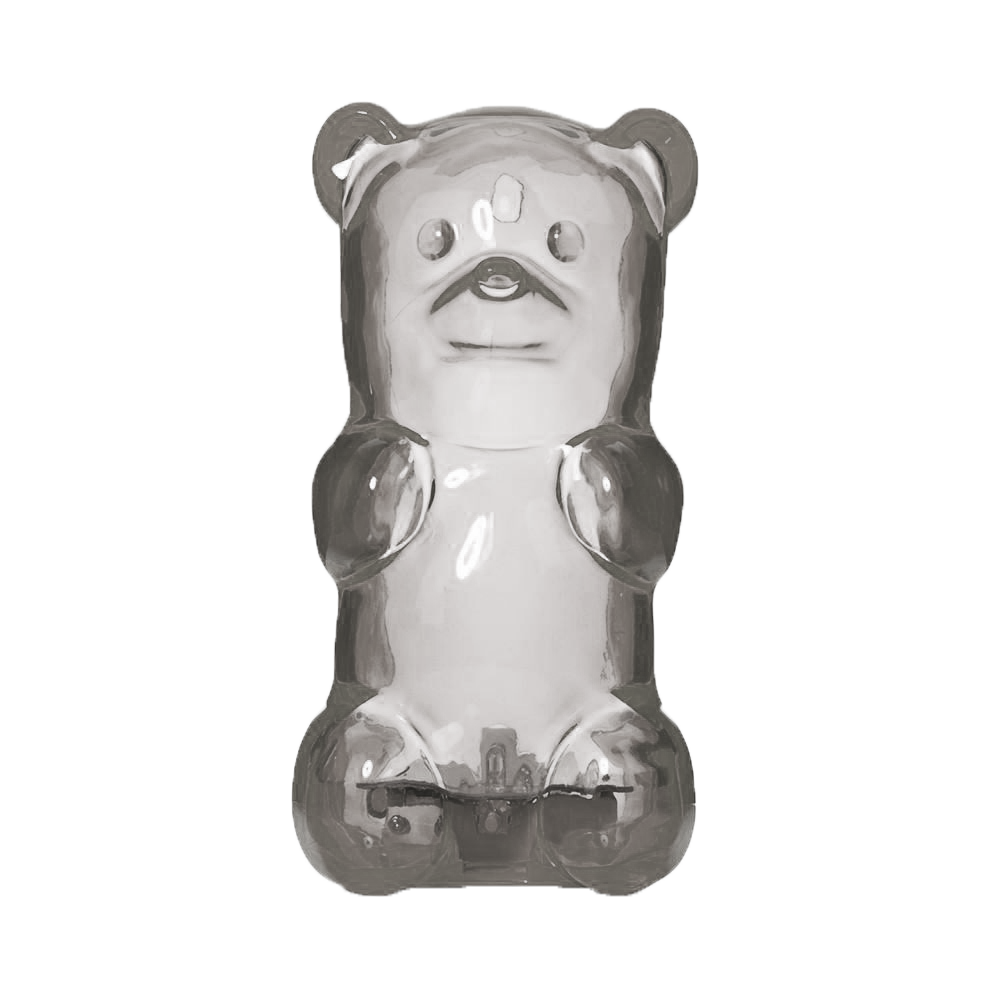
Grey is psychologically neutral, but is also suppressive in nature. It visually draws the audience into a murky space. However, it can be a sign of insecurity and fear of exposure, compared to black.
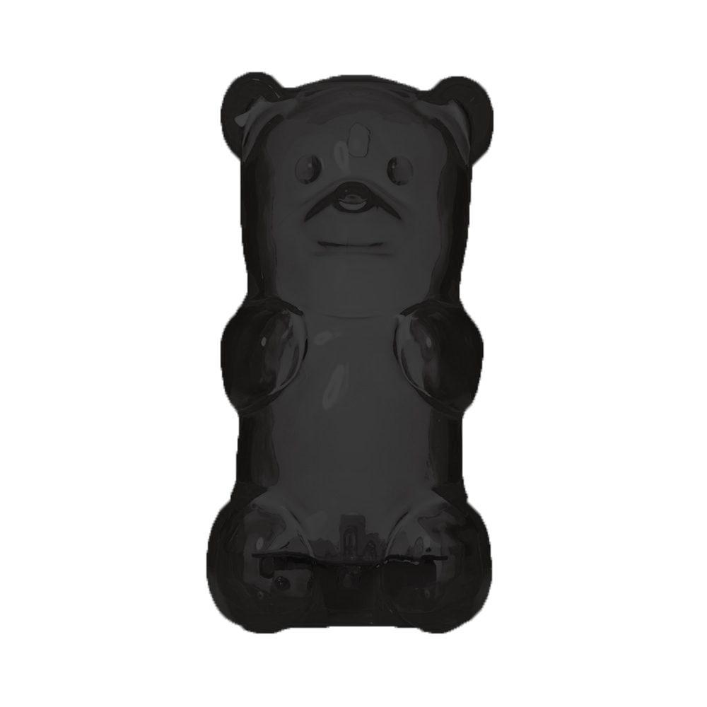
Black is a strong colour that hints of sophistication. It can also be menacing due to the lack of details. The bold body of black can absorb colour, becoming a protective barrier. There is an absolute clarity, with no subtle nuances in the colour.
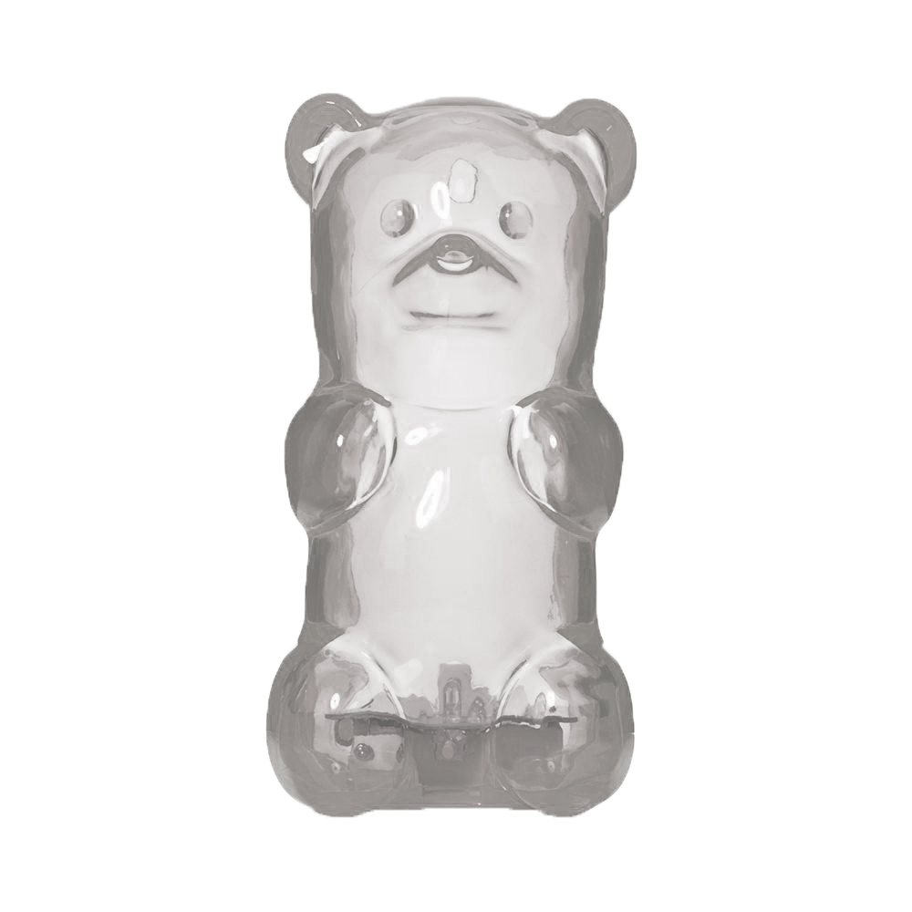
White is the opposite of black, being reflective in nature than absorptive. It is sterile and pure, giving a false sense of space, very much like black.
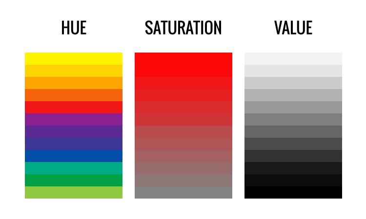
Saturation is the intensity of a colour, how red becomes pink when desaturated, then proceed to fade into a plan white.
Value is the brightness or darkness of a colour. When the value of black is increased, it becomes grey, then proceeding to become white.
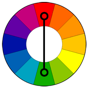
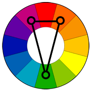
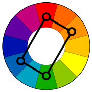
Complementary are opposing colours on the colour wheel, they are naturally pleasing to be paired off together. However, they tend to be used with one colour more predominantly than the other, especially the visually weaker colour.
Split Complementary is when one end of the complementary colour is split and accompanied with the other end. It creates a joyful and energetic composition.
Tetratic (Double Complementary) is two pairs of opposing colours, best used for background/foreground compositions. Although advised to not used with 25% for each colour.
My mama always said, “Life was like a box of chocolates. You never know what you’re gonna get.”
Forrest Gump 1994
In this project, we were tasked to reinterpret our chosen movie quotes and create imageries using Photoshop and found pictures. It draws inspiration from Surrealism and Dadaism, making imageries that transcends cliche solutions and responses, strongly based on spontaneity and randomness. (https://oss.adm.ntu.edu.sg/bren0022/a-surreal-nonsensical-dream/)
Brainstorming
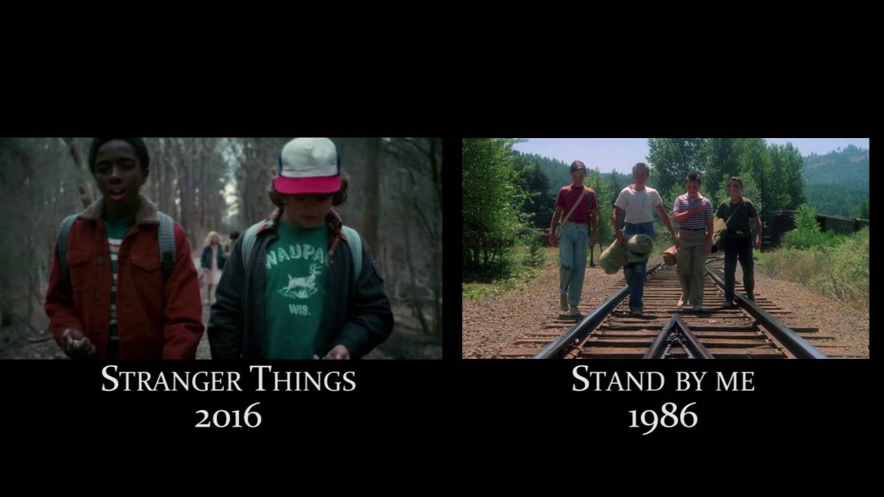
Before embarking on the tedious but fun journey of surrealistic image collaging, I thought through and brainstormed for a concise theme that summarises my love for film- and that answer is the 1980s movies. In the recent years, 1980s nostalgia has been on a rise and 1980s themed homages is prevalent in many films, such as the Duffer Brother’s Stranger Things, Andy Muschietti’s IT or James Gunn’s Guardians of the Galaxy, to name a few.
1980’s Homage
1980s
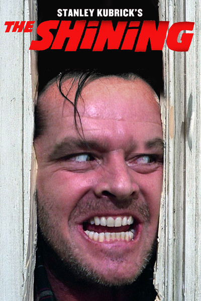
I decided to follow this theme since I loved watching 1980 blockbusters growing up as a teenager, movies like Ghostbusters (1984), The Shining (1985), or Nightmare on Elm Street (1984), etc. The 1980s was a special time as it was the aftermath following the wave of film popularity preceding Hollywood’s Golden Age. The film in this period of time was characterised as high concept films with a cinematic plot that could be easily distinguished by one or two sentences, typically with a few strong characters to build up a narrative. It was the rise of blockbusters, but not built on special effects like the films today. It was also a period with many political tension since it was the rise of political conservatism, particularly Thatcher and Reagan; Filmmakers pivoted to make their form of entertainment uplifting and joyful.
Before I begin, I would have to list out a series of movies I loved that were from the 1980s, and that was a long list:
Ghostbusters (Comedy) (1984),
Back to the Future (Sci-Fi) (1985),
Blade Runner (Neo-Noir) (1982),
The Shining (Horror) (1980),
Nightmare on Elm Street (Horror) (1984),
Honey, I Shrunk the Kids (Family Comedy) (1989),
Breakfast Club (Coming-to-age) (1985),
Dead Poet Society (Coming-to-age) (1989),
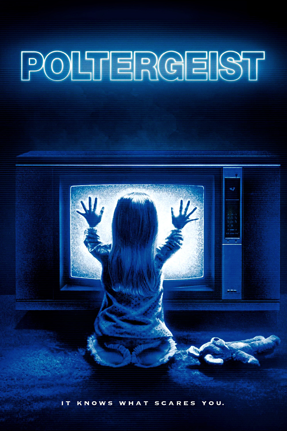
The Poltergeist (Horror) (1982),
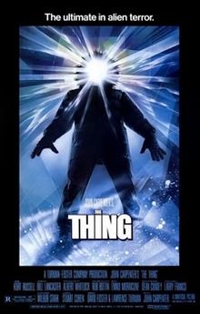
The Thing (Thriller) (1982)
Ferris Bueller’s Day Off (Coming-to-age) (1986)
The Evil Dead (Horror) (1981)
Predator (Thriller) (1987)
Etc
With a list of my favourite 1980’s movies, I had to come up with a few to quote from and that could only be done through re-watching everyone of them. After a few movie marathons, I realised that the movies that I quoted from were predominantly from coming-to-age related movies, which was a genre of film that focused on the protagonists’ growth into adulthood- to say the least, was relatable to me.
In spirit of Surrealism and Dadaism, I decided to incorporate an essence of a Surrealist/Dada artist for each imagery that I have, creating a 1980’s surrealism confusion.
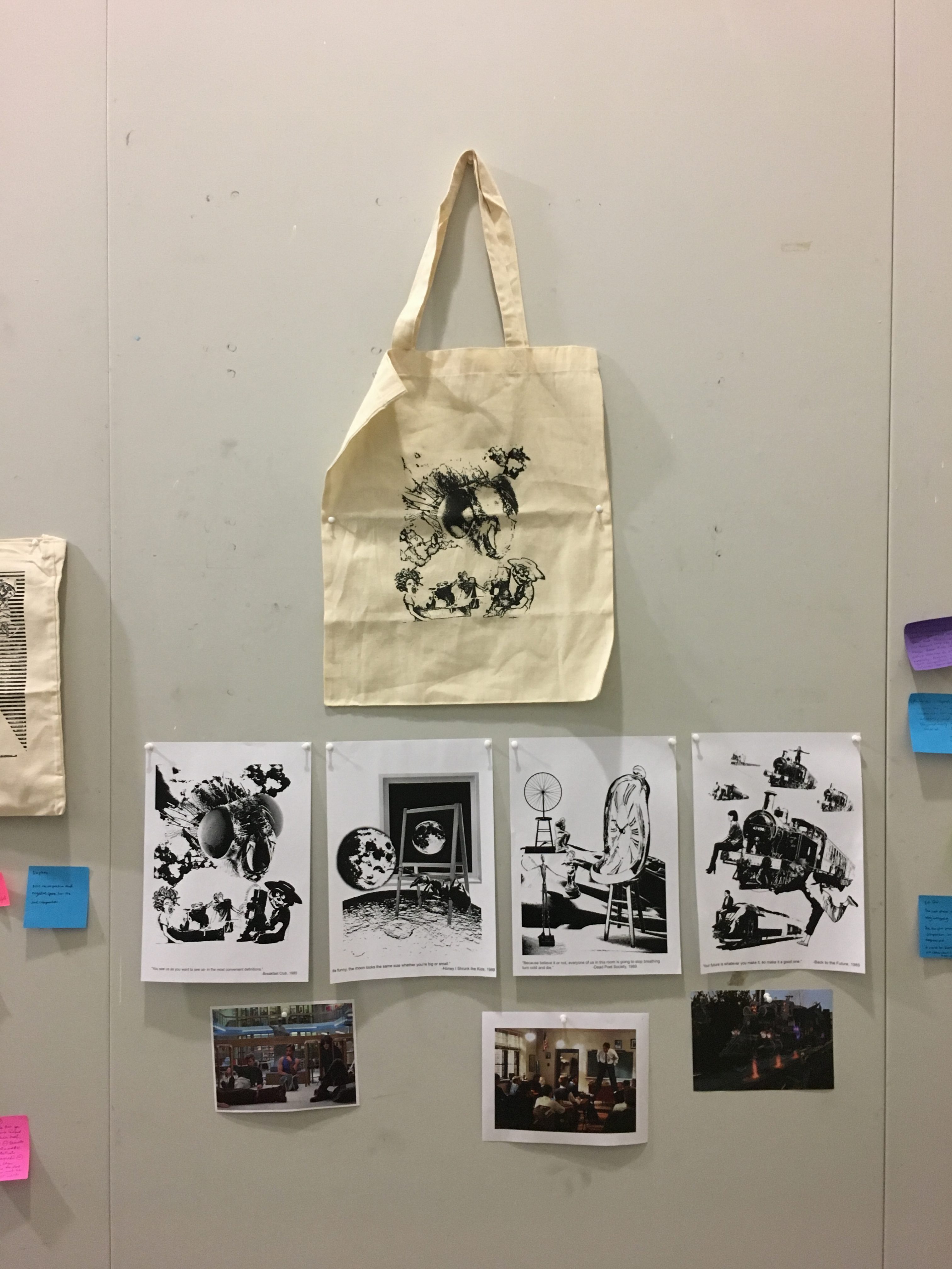
I also wanted to pay homage to 1980’s movie posters, particularly the usage of one central subject figure that plays along to the audiences’ perspective, acting out an action/narrative imperative to the film. With that, I would recreate any iconic scene within the movie, and retell it in my perspective in a fantastical context, like the movie posters below.
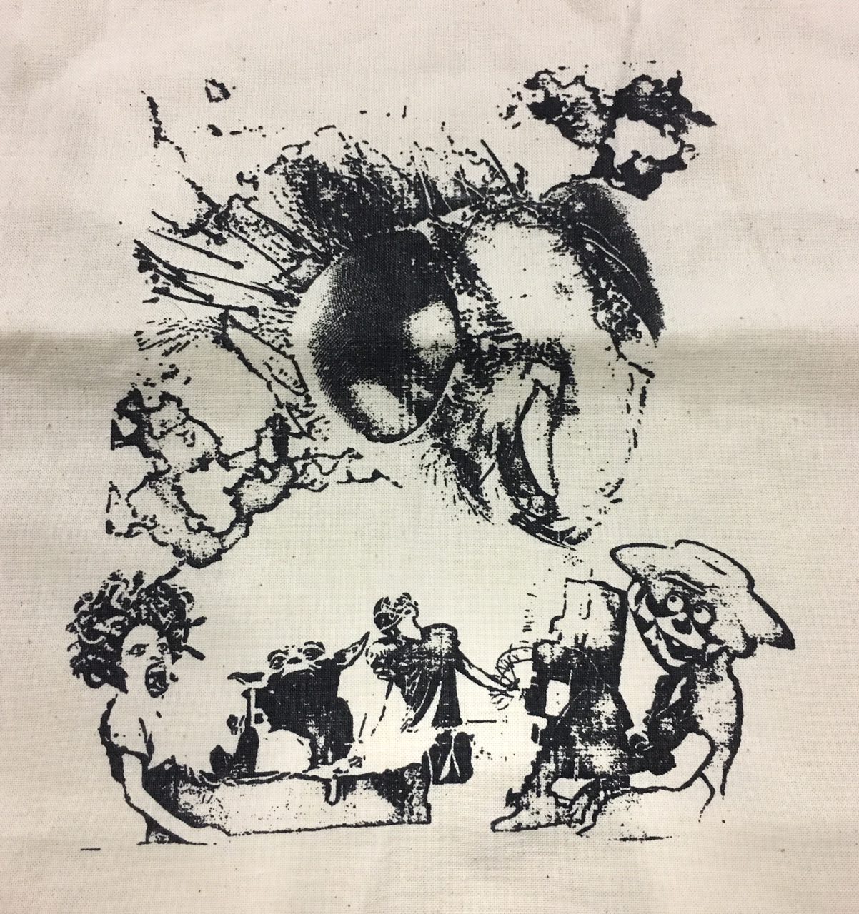
“You see us as you want to see us- in the most convenient definitions” – Breakfast Club 1985 + Lucia Hartini
Referencing the quote to the meaning I understood from the movie, I interpreted the quote as a summation of how the characters feel from the stereotype society places on everyone one of them, looking at their every moves. In the film still above, they are in a midst of confessing to one another regarding their problems and trouble, how they are fallen into a particular stereotype and probably cannot mix around as real friends when they are out of that tiny space.
In this work, I referenced to Lucia Hartini’s work “My Child”. She is an Indonesian artist that focuses on broadcasting sensitive subject matters like gender equality in a predominantly Islamic Community through surrealistic paintings. She focuses on symbols like clouds, horses and babies to communicate an idea of a bigger and almighty entity looking down on her without being crude in the context of expression. In the work “My Child”, she is seen looking up, interacting with the deity, which is also her child by blood, interacting through a thin veil of spiritualism and religion without being specific to any religion. The usage of clouds also enhances the fantastical aesthetics.
Lucia Hartini’s My Child 1989
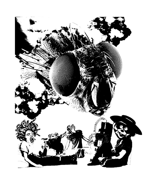
“You see us as you want to see us- in the most convenient definitions” – Breakfast Club 1985 + Lucia Hartini
Using the techniques I learnt from Hartini’s work, I created this collage referencing to the quote above. In this imagery, I wanted to exaggerate the stereotype each characters face from society, with the society imagined as a fly in this context- Flies see the world in a slower speed, giving them the ability to place judgement and react faster. I turned each character into a caricature: the beauty into Medusa, the nerd into Yoda, the jock into a football player, the crazy into a timebomb and the criminal into the hamburglar. The medusa represents a beautiful character that lacks of self confidence and leeches on compliments. The yoda represents a socially awkward character that is from another realm or environment. The football player, quite literally is a stereotype of a jock, one who focuses too much on sports and the events that come with it. The timebomb represents the quality of unpredictability and the damage it can do to people around it. And the hamburglar is the caricature of a burglar/criminal who is also the comic of the group. The fly (society) is seen coming out from the clouds like in Hartini’s works, it is essentially imagined as an almighty deity looking down and deciding the fate of the characters, with every facade on the compound eye looking at every directions. The characters are seen looking up at the fly, providing a visual direction for the audience. However, they are still in a comfortable position of leaning, unable to react to the impending judgement. The characters are also seen in a tight space, with the little breathing space implying the physical privacy that was seen in the film still, insinuating a conversation between them.
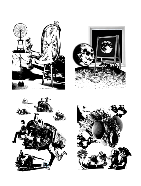
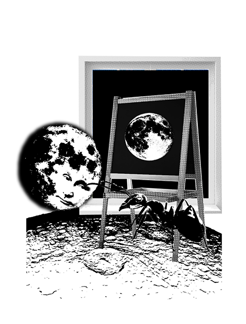
“Its funny, the moon looks the same size whether you’re big or small.”- Honey, I Shrunk the Kids 1989 + Rene Magritte
With my understanding of the movie, I interpreted the quote as an expression of figurative size. Throughout the beginning of the movie, the children are placed under a microscope of judgement by the adults, who fear that they are incapable of responsibility and protecting themselves. The adults on the other hand, are placed in a caricature of illogicality and insensibility. The quote expresses a paradox of “size”, the figurative size the characters felt and the literal size that they were in compared to the moon.
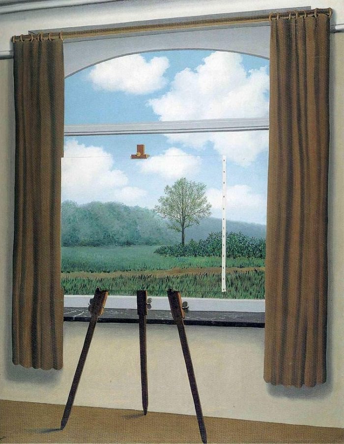
Rene Magritte’s Human Condition 1933
Hence, I wanted to play with the idea of a figurative and literal size, and this led me to the artist Rene Magritte. In Magritte’s work, he played with the idea of perspective and size. In this work, he places an easel in front of a window. The precise and intentional placing challenges the audience’s perspective of whether the tree stems from the environment outside the window or is the tree a physical painting. Hence, there is only two options for the audience, whether the tree is a few centimetres short or a few metres tall. The question is left unsolved and left for audiences to predict or think.
In my work, I wanted to play with Magritte’s perspective paradox and apply it to the moon and ant, which are the main characters apart from the children. In my work, I applied the same composition of an easel and a window, of which the subject matter is a moon. Hence, audience will question whether if the moon is the size of a painting or is the moon outside the window, broad as the space it is in. However, there is another moon right beside the window and easel, seen looking down at the ant. The conversation between the two characters leads to the question of which moon is of the real and actual size. The presence of the ant makes audience question if the moon is the size of an ant, or is the ant the same size as the moon. Further more, zooming out of the pictorial space, the ant is seen stepping on a ground that is textured like the moon, playing with the idea of three possible moons. This imagery references to the quote as to how there isn’t any real physical size, and the idea of “size” or “ability to withstand responsibility” is one’s entitlement and how you strive to achieve it.
“Your future is whatever you make it, so make it a good one.” – Back to the Future 1985 + Dede Eri Supria
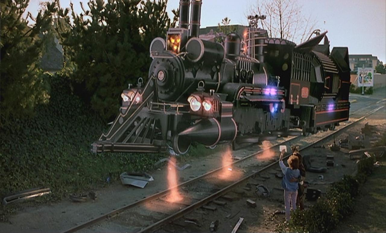
In the film still shown above, it is the last scene in the movie where Doctor Brown and Marty say goodbye. Doctor Brown was implied to have succeeded in his time travelling endeavors and had travelled back from the future with a time travelling train. I imagine the quote as an implication to wanderlust and passion, how Doctor Brown is encouraging Marty to chase his dreams and to never give up, as you are the one who decide where you are going.
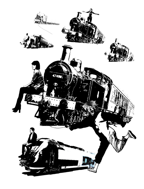
In my work, I wanted to reimagine the scene of Doctor Brown flying off in a train, with the train as a representation of wanderlust. However, I had to use another caricature to portray Marty and I chose to reference to another Indonesian artist named Dede Eri Surpia, with his usage of clowns are protagonists. I liked the idea of using clowns as the characters fighting for their passion as in Dede’s works, they are always seen in industrialised environment, struggling to pursue their passion in an ever confusing environment that is rapidly growing and moving. In the work shown below, the clowns are seen floating in the air, struggling to make ends meet in a ghastly background that is almost a caricature of an industrialized city, like Jakarta where Dede is from.
Dede eri Supria “Clowns in the Capital” 1999
Back to the Future 1985
In my work, I wanted to play homage to the original film of Back to the Future by placing all the direction of the trains following the original film poster, which was the left side. I juxtaposed the the trains with same sized human beings sitting on the train, looking at the left side, as if looking forward to something in the distance. There is a clown at the right bottom of the image, representing the essence of passion I wanted to draw from Dede’s work, making him hold on to a string that is being pulled by the floating train. The idea of clowns and train contrasts strongly as there is subtle difference of metal versus skin, passion versus robotic movements. In any environment, trains are supposed to be a logical mode of transport with only one direction at a time, implying logic. However, with the theme of floating, it can move to any direction at any given time, hinting of wanderlust passion. In pursuit of technical accuracy, I used motion blur to hint of visual space, depicting how the trains are moving from a distant location to the audience’s eyes.
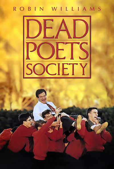
Dead Poets Society 1989Film still of Dead Poets Society 1989
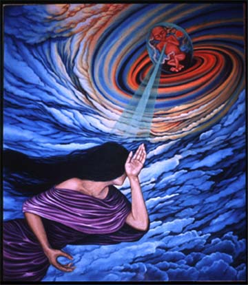
“Because believe it or not, everyone one of us in this room is going to stop breathing turn cold and die.” – Dead Poets Society 1989 + Salvador Dali
Last but not least, I have a quote from Dead poets Society as shown above. It is predominantly similar to the previous quotes as it is from a coming-to-age movie revolving around a group of teenagers with an inspiring teacher helping them pursue their passion. I wanted to bring out the idea of everyone being in a precarious position of “turning cold and die”, and emphasis on the aspect of time, since that is an element important in the movie itself since mortality is greatly discussed inside. In the film still and even the movie poster shown above, the teacher Mr Keatings is always shown with a certain level of hierarchy implying that he is a teacher and the guide to these children, via techniques in composition or colours.
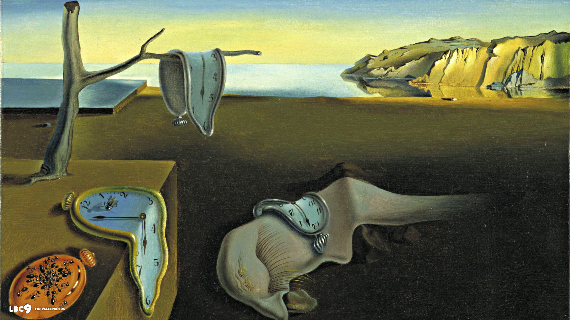
Salvador Dali’s Persistence of Memory 1931
In my work, I referenced to Salvador Dali as I found that his works to have an eerie sense of mortality without any physical depiction of death itself. There is a morbid language that is unspoken, through the symbol of a melting clock. Hence, I extracted the melting clock as Mr Keatings, overlooking the characters in a higher and bigger position then the rest, symbolising death of passion. The play of size allows audience to direct their gaze at the clock, which is the focal point of the image. I chose to represent each of the main characters as a sculpture as I found that sculptures tend to lose their visual value when they are placed in a 2 dimensional plane, effectively losing their life, much like the idea of “turning cold and die”. I represented each character as a sculpture using their personality: the fun and joker as Marcel Duchamp’s Bicycle Wheel 1931, the quiet but thoughtful as Alberto Giacometti’s Pointing Man 1947, the romantic and innocent as the Cupid and the goal-oriented dreamer as Auguste Rodin’s the Thinker. The sculptures are seen standing on a barren wasteland looking up on the melting clock, just wasting their time away until a perpetual mortality. In homage to the film itself, where the main character of the goal-oriented dreamer dying, I decided to blur the Thinker in the background, hinting that something is happening to it in a still wasteland, probably it being the first to die off in this scenario.
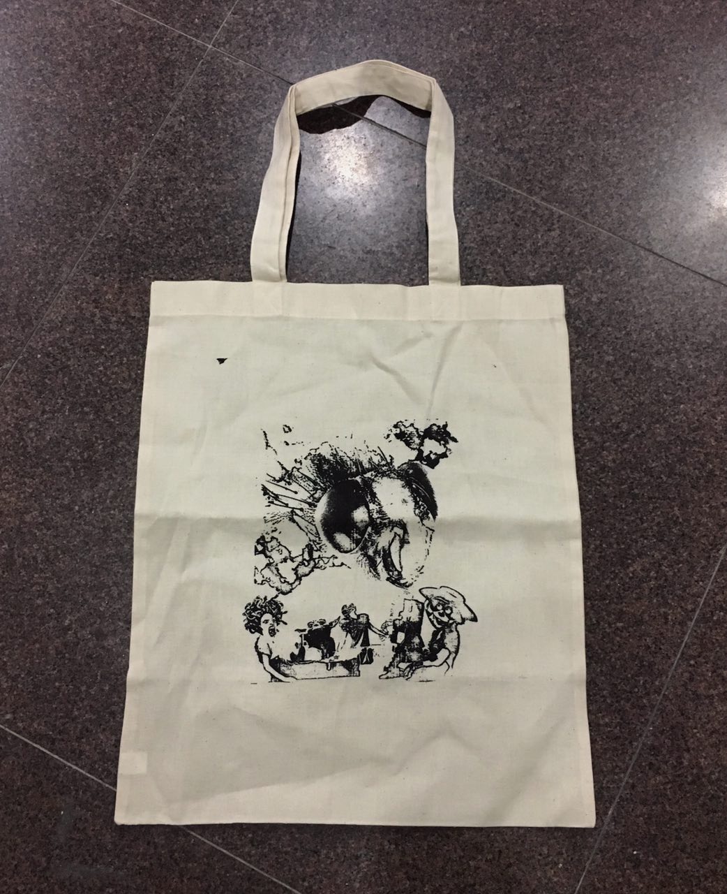
Following the process of Photoshopping and collaging the found images, we were required to silk screen the chosen quote onto a tote bag and present it. After a few attempts, the above photograph shows my final work of the quote from Breakfast Club, arguably my most favourited movie in the world. The process of silkscreen was tedious and difficult, especially since I tore one silkscreen board by accident. It is a process that is heavily underestimated, at which subtle difference in pressure and moisture can affect the final results.
Final Presentation
Throughout this assignment, I faced the challenge of patience and dexterity as both are tested in the context of photoshop and silkscreening. The journey of not knowing any Photoshop techniques to having tried both photoshop and silkscreen has been really challenging, but a fulfilling one nevertheless. From the comments I received from the post-presentation commentary, my main problems were technicality issues like the cutting of border from the Breakfast Club imagery, as well as the composition of the Back to the Future imagery.
Dada was a cultural movement that rose after World War 1, as an outcry against nationalism and violence. It is influenced by many avante-garde movements like Cubism, Expressionism and Constructivism. It mocked the materialistic conditions of a post-war world, driving away from contemporary focus on aesthetics, and towards purpose and introspection. Dada artists include Marcel Duchamp, Hans Arp and Hannah Hoch
Surrealism is a cultural movement that offshoot from Dada, featuring painting techniques that incites nervousness and illogicality, leaving audiences baffled. Surrealistic works feature elements of dreamscape, sorta fantastical with juxtaposition of different elements in one environment. There will be elements of surprise, jumping out of the convention. Surrealist artists include Rene Magritte, Salvador Dali and Max Ernst.
Duchamp was renown to be eccentric and loved to challenge the boundaries of art- and he did. He was a pioneer of ready-mades, which was the application of using found objects and changing its functions into aesthetically appreciated artworks. This idea of reducing or relating an object’s function to something else led to many people coining him as a Surrealist artist as well, challenging the frontier of human understanding of object mechanism and sexuality.
In his works like the Bicycle Wheel (1913), he uses found object like a bicycle wheel mounted on a kitchen stool to make a statement on the human condition, which is a broad and brief understanding of human life interacting with the environment. The movement of the bicycle wheel is perceptually halted by the mount, stripping away the functions of a typical bicycle wheel. The kinetic movement of the wheel is also suggestive of Duchamp’s interest in investigating human sexuality. This “suggested” kinetic energy contrasts with the static appearance of the stool, creating a dynamic composition.
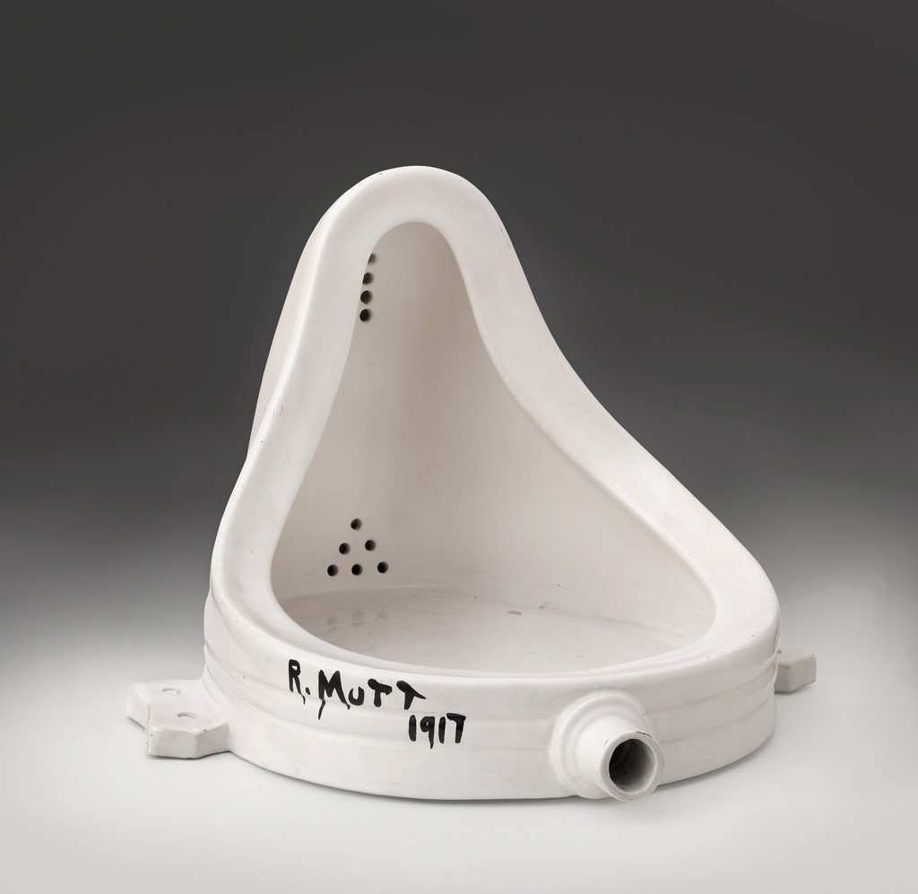
Also in the Fountain, he signs the initial R.Mutt (which is not his initials), and terms it as an artwork. This artwork is a classic Dada work until today, mocking high art with a common household item that collects waste. The name R.Mutt is suggestive of the many personas Duchamp takes on, even a cartoon character that he liked as a child. He satirically places an urinal that is supposedly meant to be placed in a toilet and enhances its status into a priceless artwork.
Rene Magritte is one of the most celebrated Surrealist artists, known for his heavy use of symbols and paradoxical composition. Magritte was known to play with the functions and meaning of objects, creating the paradox by going against the fundamentals of identity. This in turn leads to the displacement of symbols, replacing it altogether with the play of words, which supposedly pairs with the appearance.
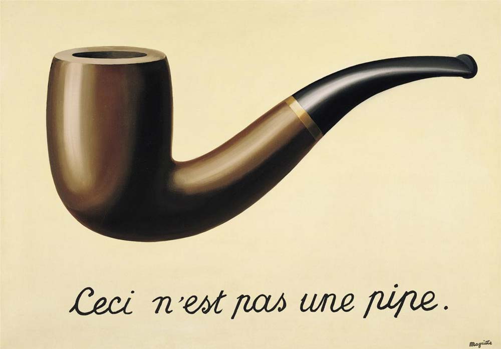
In works like “The Treachery of Images”, Magritte tries to distant the relationship between visual and text. In this attempt of depicting a visual paradox, he paints a illustrative smoking pipe. However, the text says “This is not a pipe”. This composition is a visual irony as on one hand, the painting is of a pipe and the text says otherwise. However, on the other hand, the painting really isn’t a pipe, and the text is correct. The visual dilemma intrigues the audience and is the intentions of Magritte.
In works like “The Human Condition”, Magritte questions the reality, or specifically the space within the canvas (quite literally). The painting depicts a painting by the window, tilted on an easel. The intentions of the painting is to make the audience question whether the easel is holding a painting and the painting mimics the environment outside, or whether the easel is holding a transparent screen showing the scenery outside. Magritte leaves the audience confused with what they are seeing, questioning the intentions and identity of an easel, since inherently people would think that it holds a painting, and not a supposed transparent screen.
Dali was infamous for being eccentric, even when he was a child, this oddity led to him being bullied by his peers and father. He was heavily influenced by his childhood encounters, battling themes of abuse and death (His brother and mother). Dali was influenced by Metaphysics and Cubism, also Sigmund Freud’s psychoanalysis of the mind and imageries. These brought him to the abstraction of the subconscious, painting sceneries that are fantastical and amorphous. Dali’s work can generally be categorised into: investigation of a man’s subconscious and environment, sexual symbolism and energy, and symbolic imageries. This would lead to Dali being a prominent Surrealist artist of his generation, but in 1934, a political argument led to his expulsion.
The Persistence of Memory 1931
This work parallels to Dali’s reputation as it is one of his most notable works. The iconic symbolism of the melting clock in this work depicts the “Melting of time” quite literally. It is Dali’s play between the mind’s ingrown perspective of object identity and its assumed characteristics. In this case, the clocks which supposedly solid objects are melting like cheese under the sun. This action warps reality and makes the audience question the environment that Dali had painted, challenging its validity and the audiences’ understanding of the mind. Taking a closer look, one would see a cluster of ants roaming around on one of the clocks, this idea links up to Dali’s obsession with the idea of mortality. This is a subtle hint of mortality as the ants look like they are in frenzy, feeding off the flesh of “time”. Through this painting, Dali brings the audience into a fantasy that he had conjured, playing with the power of the free mind.
Hannah Hoch was one of the few female Dada artist of her time, taking on themes like gender stereotypes, political issues and androgyny. She was one of the first artists who dwelled into photomontage, taking existing photographs and use it to her advantage. The act of combining photographs from different sources draws an link to many sources, referencing to the Surrealist ways of playing with object symbolism. Hoch uses found elements and elevate it into the statuses of higher art, very much similar to Duchamp. She also investigated the idea of “New Woman”, challenging the norms of gender stereotype.
In works like the Dada Puppen, it was a clear indicator of Hoch’s affiliation to Dada, ahead of her contemporaries. She was heavily influenced by figures like Hugo Ball, drawing relations to the costume Ball wore for one of his performances.
In “Heads of State”, Hoch used a newspaper photograph of then German president Friedrich Ebert and Ministry of Defence Gustav Noske and showed them in their bathing suits, posing in front of a decorated background. The background is embroidered and floral, contrasting to the serious tone of the politicians in the collage. This work serves as a satire, mocking the German politicians, ridiculing them by juxtaposing them in front of a comical context. The embroidery patterns serve to highlight the woman’s role in society, which is the “housewife”, and by placing the German politicians in the context serves strip them off their masculinity.
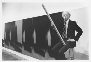
102 panels of silkscreen production, lined edge by edge to form a monumental installation series.
< A series of positive and negative imprints, alternating in colors lined together creates a strong sense of multiplicity, a common theme in Warhol’s works. However, the multiplicity in old works like “Campbell Soup Cans” conveyed the omnipresence of consumerism, while “Shadows” presented a menacing force with its repetition in one direction.>
<The subject matter is amorphous as there are no distinct features unlike Warhol’s old works, where he was particularly communicative regarding the subject matters, taking on Pop icons for controversial discussions.>
_________________________________________________________
Rorschach 1984. Any Warhol
<In exploring emotive lines, Rorschach’s ink blobs are the first of its kind, starting from 1921 by Hermann Rorschach. Its a visual test of paralleling perspective and emotions. It is a direct reference to the project brief of communicating emotions with ink, since the objective of the Rorschach is to identify emotions through the aesthetics. Warhol’s work, in irony, has never been officially confirmed to serve such a purpose. Warhol took on a psychologically charged subject, which is reminiscent of his earlier work’s like the Monroe series, where he strips off the individual intentions of an object. In Marilyn Monroe- a human being turned lifeless sex symbol; compared to Rorschach- a psychology test turned into a meaningless painting.>
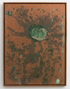
A series of painting created through the oxidation of copper paint and uric acid.
<This work is reminiscent of Abstract Expressionism painters like Jackson Pollock, using the spontaneous motion of the human body as a medium to create expressive works.Warhol uses the similarity to ridicule this high art expressionism by using human waste and sex organs, demeaning the hoity-toity reputation Abstract Art had built up over the decade.>
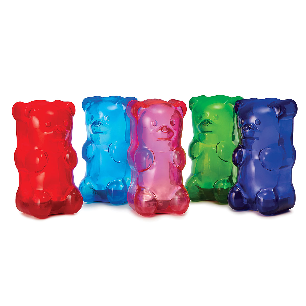

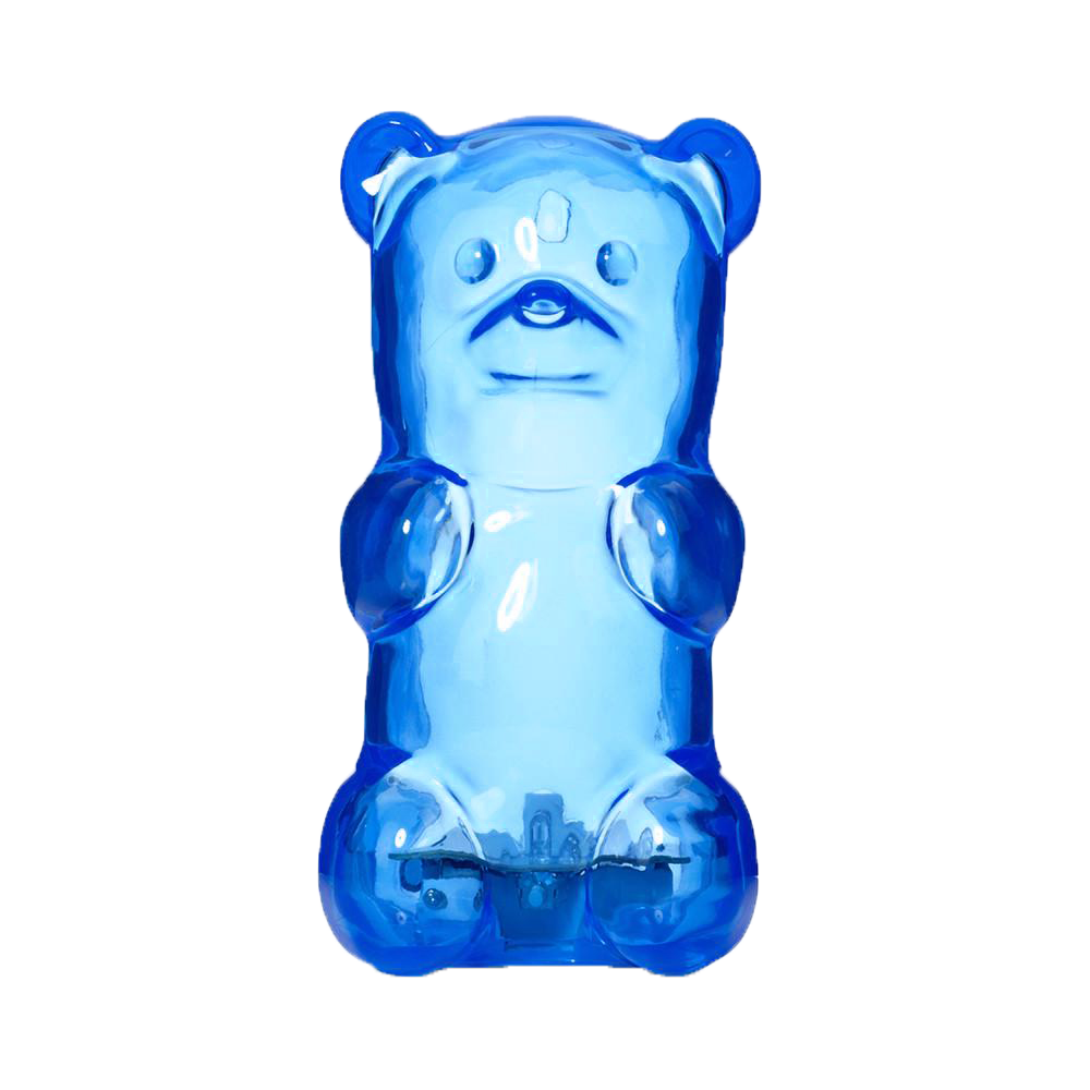 Blue is an intellectual colour that recedes into the background. This is because the colour is inherently cooling, hinting of strong clear thought and light calmness of mind. However, it can also remind people of coldness and loneliness, such as Pablo Picasso’s blue series.
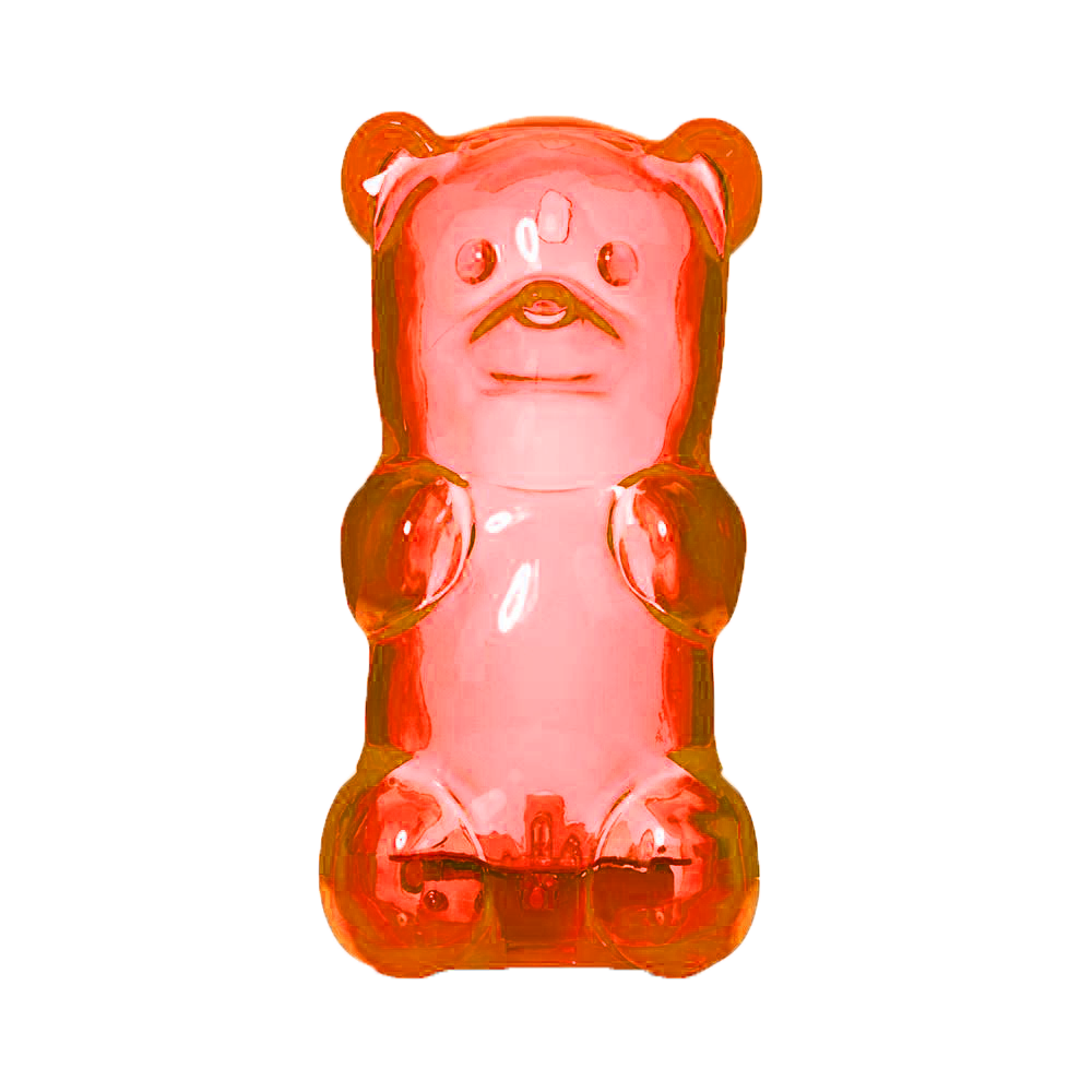
 Yellow is an emotional colour that stems from both spectrum. It is both optimistic and depressive. This is because the yellow light has the longest wavelength and is visually stimulating. The over-saturation of yellow would incite anxiety, commonly seen in traffic police coats.
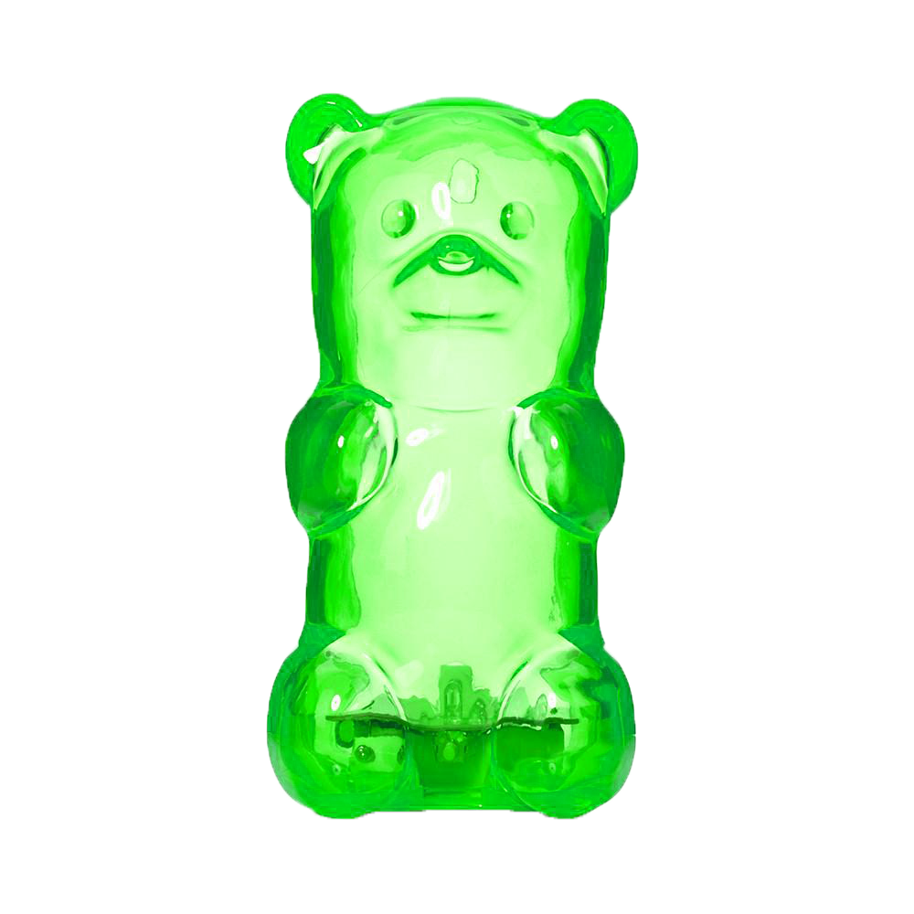


 _______________________________________________________


 With a list of my favourite 1980’s movies, I had to come up with a few to quote from and that could only be done through re-watching everyone of them. After a few movie marathons, I realised that the movies that I quoted from were predominantly from coming-to-age related movies, which was a genre of film that focused on the protagonists’ growth into adulthood- to say the least, was relatable to me.