
This series picks off a theme that I have been exploring for a while now, which is portraits of people juxtaposed in front of nature. I like the solemn and moody look of people engaging with the camera, as if a silent conversation between the audience and the subject- an intense, introspective look of an urban dweller in mother nature. The moodiness is derived from the colour grading as well, generalised into a points like purple-orange gradient, selective colour of red in shadows and a pinkish hue layered over the picture. More on how below!


This is the first photograph of my series, starting off with something more positive. However because the camera captures best when objects are static I thought I could just photoshop in the other petals from the other attempts to capture the thrown petals, shown below in a step by step basis.


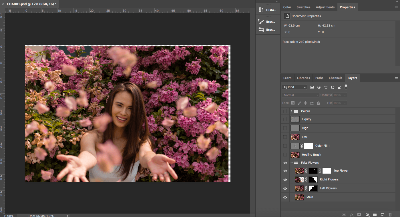
Now, I feel like the composition is slightly tilted, so I pulled it outwards to balance it slightly. I moved on to dodge and burn, where I pulled contrast to the hair and facial features, exaggerating the highlights and shadows accordingly.
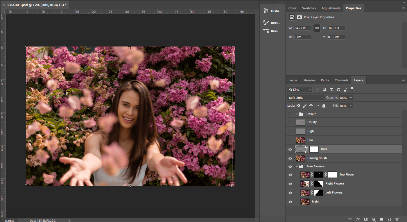

After that I cleaned up with frequency separation to clear up tiny pores or rougher textures. And because of the angle, liquified a few exaggerated parts.


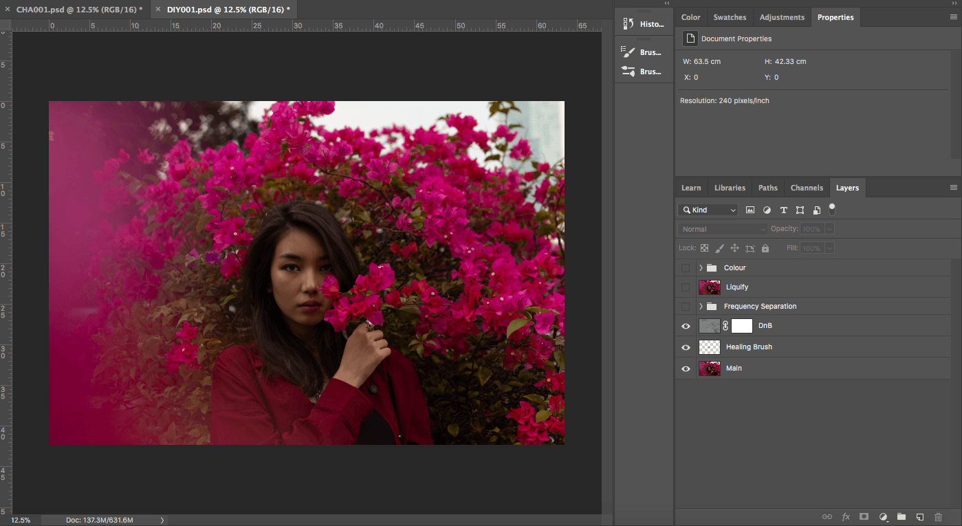
Same goes for the previous picture, I used healing brush and DnB as the base layer of editing, making the models even more perfect than they already were. Using healing brush to clear off any rougher texture from teh camera and DnB to create a stronger tonal and 3-D appearance on camera.

Next is frequency separation and liquifying, but this was done minimally as the model has really clean skin. The bulk of the work of FS was done on the jacket, wanting to give it an ironed look as if a clothing campaign.

Last but not least, the colour grading. The colour grading for this is similar to the previous picture as I wanted to give it an overarching autumn-ish colour theme. This one compared to the previous picture has a stronger introspective look, hence I adjusted for a stronger purple and red hue within the shadow, attempting a balance between the red and green grading.

The last picture for this half of submission would be the one as follows,


The first few steps of the correction is similar to the first few, starting with minor edits with healing brush I then moved on to DnB. However because of the conditions where we took the pictures, where it was raining, there were much more mud and dirt that had to be cleaned with FS. (Same goes for the T-shirt) Colour grading wise I lowered the intensity of the purple-orange hue and increased the white in shadows with colour balance.
thank you for browsing.