A coffin- Project 4: Poetics of Time

Brainstorming

In the assignment Poetics of Time, we were tasked to explore on the theme of time and space, manipulating it as measured time, edited time, biological time or experienced time. The project was broad in terms of its allocated theme, having no limitations on the topics we can discuss, hence I decided to progress from my previous assignment on the Impossibilities of Being: Morgue. (https://oss.adm.ntu.edu.sg/bren0022/a-morgue-project-3-impossibilities-of-being/)

The reason so was that a narrative was already built up in the previous assignment revolving around time before or in the midst of mortality, and there were interesting elements of the manipulation of time involved, hence, I wanted to build on that narrative to create a stronger timeline. With this in mind, I tried to project the idea of time after mortality in this assignment, playing with edited time and experienced time.

Still from Assignment 3: Impossibilities of Being
Moodboard
Moodboard

In the brainstorming of the narrative, I was conflicted in the decision of how I wanted to portray the theme of mortality as I did not want to show a gruesome and morbid perspective, hence I wanted to show something more experimental and almost abstract. I collated a series of images I envisioned  seeing in the project and placed it onto a mood board for the submission of the installation proposal. There are a few pointers that I would definitely want to incorporate into the installation: the play of sound and light, the persona for judgement and the idea of a tiny space.

Intentions

Because the intention was to progress from the previous assignment, I had to incorporate the theme of mortality within the installation. However, most artworks revolving around mortality tend to be visually jarring or brutal, almost too morbid to a certain extent. Hence, I decided to head towards the direction of an experimental portrayal of mortality, almost abstract like. This method would create an amorphous platform in scrutinising death, moving away from the conventional perspective of hell or heaven. In the theme of abstract, the portrayal would almost be a moving picture of geometric abstraction combined with surrealism, done so through lights, colours and props. Using these elements, it helps to create a space of introspection that manipulates time, which I will explain further in the final video writeup below.

Lighting, colour and props
James Turrel’s Wedgework Series 2016

An artist that I would reference t0 would be James Turrel in his exploration of light and space. Turrel’s works emphasises on the interaction between the power of a space and the light that permeates through it. He also explores greatly on the usage of light and gradient, creating a strong sense of space. In his “Wedgework Series”, the usage of black contrasted to a saturated hue of violet creates an almost visually perceivable breath of air, the air of interaction between the personification of the black and violet. The space created by the gradient also gives life to the space within the violet. This space instantly creates an idea of private introspection due to its lack of outside interference.

In my work, I wanted to play with lights as well, mainly a well assorted range of colours to create the intensity of existential introspection versus geometric abstraction. Hence, I decided to play with mounting board placed in front of a lamp shown below.

Lighting Setup

Because the mounting board itself has tiny cylindrical space within the plates, the light shone from the lamp is able to permeate the board and flash an intense burst of colour. The colour is intensified as the mounting board is a fixed and sharp rectangular shape, enhancing the idea of geometric abstraction when looked from one fixed vantage point. The mounting boards are held on by a string in place. There were three main colours used in the video, red, blue and yellow, coupled with the geometric shape, gives rise to an even stronger theme of stripping mortality down to the simplest form. Within the space, a bright light of blue is cast by the projector, creating a strong interaction between the red and yellow, trying to fight off the strong presence of blue hue.

“Plastic bag” Cellophane
Outcome

Furthermore, props like a mirrored mask was made to enhance the theme of light as mirrors tend to reflect light. The mask also serves as a personification of the actor’s character as the entity that judges in the afterlife, since mirrors are the truest object to judge. “Mirrorface” is made by placing broken mirror shards onto a plastic mask, contouring the face with the mirror to create a reflection at any angle. This multiplicity of facades creates the disco light effect.

When the mirror is hit with the projector light, it instantly creates a mirrored pattern of tiny reflections all over the room, very much like disco ball.

Mirrored mask reflection
Mirrored Lights
Exposure shot of the Setup
Actor and direction

In the consideration of the direction of the video, I decided to task the acting to someone else other than myself as I wanted the intentions and portrayal to be in its truest form, and by this stage of brainstorming, my portrayal of mortality would be thwarted by the conceptualising. The character in the narrative is labelled as “Mirrorface”, an entity that judges in the aftermath of life, playing around in the space where every soul goes to after mortality. I decided to play the song “Lucy in the Sky with Diamonds” during the video shoot, making the actor interpret his own actions according to the song. The only instructions given were to move according to the speed of the song: with the fast paced chorus accompanied with the twirling of the umbrella and the slow paced hook accompanied with the confrontational focus of the mask.

“Lucy in the Sky with Diamonds” was chosen due to its inherent meaning about a journey to an unknown fantasy land. In John Lennon’s explanation of the song’s meaning, he explained his love for Alice in Wonderland and paralleled this song to Alice’s journey. This song was also widely criticised for its relations to Lysergic acid diethylamide drugs, also known as LSD, which are the initials to the song’s title. It is said that the Beatles wrote this song while high on LSD, therefore creating the trippy and unorthodox rhythm and style of the song. This song related well to the theme of the video, being a trippy journey into the space after death, and being bombarded with colours and light.

The actor was then instructed on the intentions of the video, thereafter given different cues such as coming into focus of the camera or twirling the umbrella with greater intensity. Other than these, the entire video was up to the interpretation of the actor regarding an abstract form of a space after mortality, all shot with one take only and edited accordingly.

Actor Bryan Leow
Fast chorus- Focus of camera
Slow hook- twirling of umbrella
Editing and vantage point

After the usage of the song “Lucy in the Sky with Diamonds” in the production of the video, I decided to play the song in concurrent with the video to instil the same environment achieved during the video shoot in the video itself. Hence, I edited the video according to the song, playing with the rhythm and beats of the chords. I decided to play with the song in terms of building a sound narrative, letting the song play out normally until the middle, where I started to play with the imageries and building the tension from there.

Midpoint glitches shown in peaked soundwave

The midpoint where the imageries are altered with begins with the glitching of the music, which are actually natural glitches found in the sound file. I decided to play with the glitch by making sharp transitions of colours on the visuals, coinciding with the glitch sound to create a surrealistic imagery. I also applied the same technique in the strong beats further down in the song, visualising the chord beat. The switch of colours are done so through cutting segments of videos and changing the colour piece by piece.

Strong beats
Sharp transition from colours to black-and-white
Sharp transition from colours to black-and-white (2)

In the attempt of portraying tension in the video, I culminated the imageries with increasingly saturated scenes and increasingly desaturated scenes, creating visually jarring and calming conditions at the same time. Despite having multiple light sources, the lights are angled at one direction, casting over the shoulders with a theatrical tint.

Black and white for end of chorus

I also played with the song file as well, cutting out abrupt stops in the chorus to play with the build-up of the tension. The abrupt stop destroys the psychological tension the audience had build up.

Abrupt stop

I also layered the chorus to create a psychedelic effect of echoing voices.

Layering of chorus

Final

This installation features the aftermath of the events that took place in the Impossibilities of Being: The Morgue. It speaks about the theme of mortality in an unconventional manner, without depicting any trace to the concept of Heaven or Hell. The installation comprises of a video playing within a coffin-like structure, depicting a video of a character dancing to the song “Lucy in the Sky with Diamonds”. It features a play of tempo and light, creating a space that has altered time. The play of colours and geometric shapes creates a sense of geometric abstraction within the video, stripping down the theme of death into its most basic elements.

Setup of Installation

The moment the audience enters the room, the video from the previous assignment would be played in the background to reiterate the relations of timeline between both projects, inciting a link that the audience would be able to relate to. They would then look at the next video through the obelisk-like coffin.

Since this work is a progression from the previous video assignment, I decided to follow the narrative and create an obelisk-like coffin where the video will be played through. The installation would be placed in the same room the video is shot, as if the video is a memory that the obelisk is trying to project through its peephole.

The obelisk-like coffin is an essential prop to the entire installation, hence it was difficult in producing it. There were a total of three attempts in creating the obelisk since I initially wanted to create a collapsible structure that could be brought around. The project started with dexterous calculation of length and breadth of the mounting boards, as well as arduous attempts of spray painting. The first attempt was using knobs and ridges to create a collapsible panel of boxes to form the coffin, which would have worked if not for the unstable knobs that flew out of place easily due to its material. The second attempt was using strings that tied the boxes together to create the layering of the boxes from a height. This failed because of the strong gravity pulling the boxes apart slowly, and also how the aesthetics of the coffin was ruined by the strings. The last attempt negated the collapsible element, where I built the coffin structure straightaway, but limiting myself to light materials that makes it portable.

Peephole
Final Obelisk
Failed deconstructable version 1
Failed deconstructable version 2
Moving knobs


A timed research- Project 4

As we venture into the last assignment under 4D, we begin our investigation with time and space. This trait opens up the arena of art-making onto installations, kinetic sculptures and even performance art. We applied what we learnt from the previous lecture held by Lei and sieved out a few artworks that we enjoyed, paralleling its pros and cons.

Lintels- Gabriel Orozco, 2001

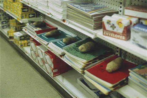
Gabriel Orozco is a Mexican artist who is fond of a wide genres of art, ranging from installations to photography to sculptures. He is a Conceptualist, juxtaposing the artistic traditions of his birth place to values he learnt from found object artists like Marcel Duchamp. In doing so, he extract everyday objects from their supposed environment and focuses on the fragile relationship it has to society. This can be seen in many works, such as Cinco Problemas (Five Problems) 1992, where he placed five potatoes on five different notebooks in a stationery store.

Cinco Problemas (Five Problems), Gabriel Orozco 1992

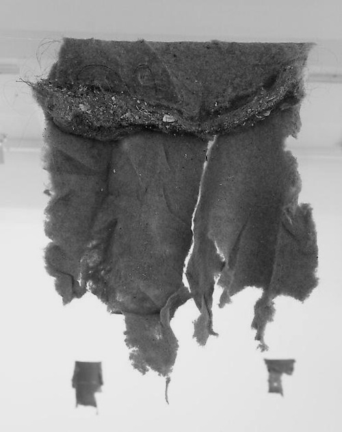
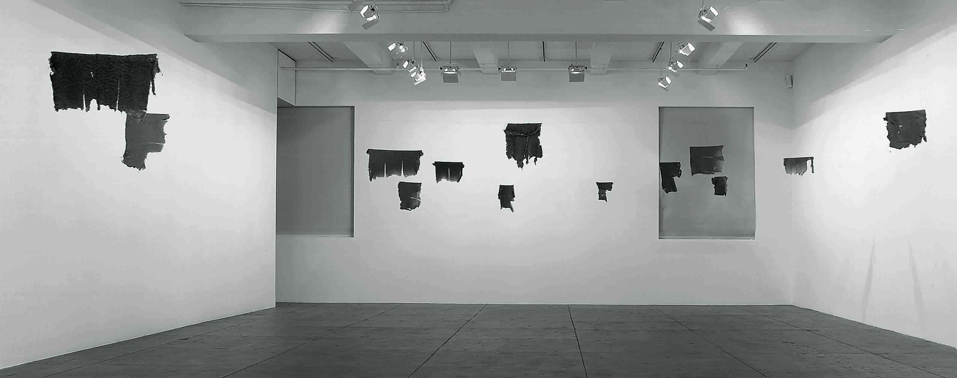
Orozco’s work may seem banal at first glance, but it always requires a second look or more. It harps on the idea that the audience would need to look at the work for an extended period of time, and gradually realising the intentions of the work. It is the simplicity of the aesthetics that creates a dramatic realisation of the themes, which can extend to ideas like mortality and the human existence. In Lintels 2001, Orozco hung up dried and torn lintels from the laundromat after the events of the September 11 terrorist attack. This work shows the tiniest strands of human hair and dust, hinting to the audience the idea of mortality in a subtle way. The audience question the origin of the torn fabric, whether the owners survived the attack or they are left because the owners have bought new clothes. The fragility of human lives is shown without the actual depiction of human blood, becoming a silent yet morbid approach. Furthermore, Orozco’s work dwell on the simplicity, telling the audience that introspection does not require a heavy aesthetics, even the simplest composition can produce the same effects.

Piece of lintel from Lintel, 2001
Lintels, Gabriel Orozco 2001
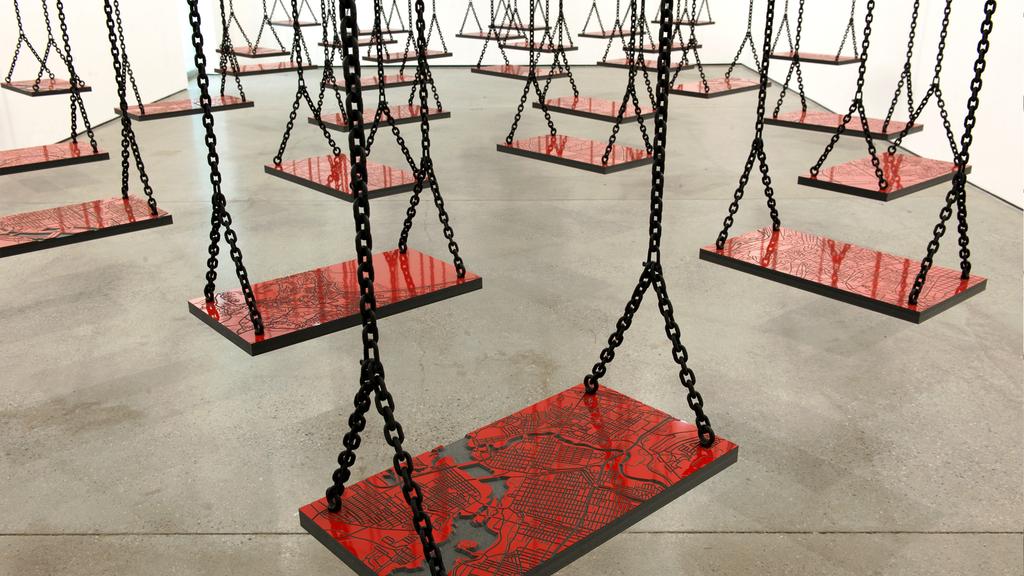
+ and –  Mona Hatoum, 1994- 2004 (Recreation)

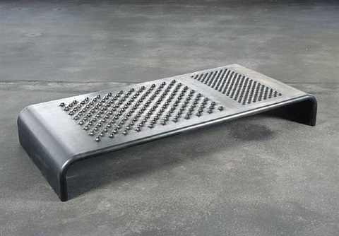
Mona Hatoum is a Palestinian artist who explores greatly with video and installation art. She is known to explore on themes of war and immigration given her exile from her home country. She is a Conceptualist who dwells on the fine line between visual and meaning, often using the visual characteristics of found object to intensify the meaning of her works. In works like Daybed, Hatoum uses the jarring visuals of a cheese grater and juxtapose these traits onto a bed, and created the eerie sculpture of the Daybed. It is inviting in a sense where it resembles a bench or a bed, drawing in audience to want to lie on it. However, as audience comes closer, the grating holes are apparent and it repels the audience thinking of the impending dangers of touching it.

Daybed, Mona Hatoum 2008

In + and -, Hatoum used a toothed metal arm and rotated it on a circular bed of sand, with exception that one side of the radius is covered with teeth while the other has a clean line. In doing so, one semicircle will have thin lines drawn on it as the metal arm moved while the other side gets constantly covered as the clean metal arm wipes over it, shown in the video below.

This artworks talks about the idea of displacement, a strong commentary by Hatoum since she was exiled from her home. The perpetual loop of making marks and cleaning it up speaks heavily of the problem from the displacement of war. It speaks of how war destroys the life of many people even as the try to rebuild said life, destruction happens all over again.

Time as an element

In both works, time is an important feature as it affects the outcome of the understanding by the audience.

In Lintels, the aspect of time is in the literal present, where the audience will have the take time in the specific space to understand the meaning of the artwork. They may be shunned from the work initially due to its banality and therefore misinterpret the artwork. The time aspect stems from the linear timeline that begins once the audience walk into the installation. Hence, as time progresses, the understanding and introspection of the artwork would set in, be it right or wrong.

In + and -, the aspect of time is metaphorical, where the audience will have to reference the kinetic sculpture’s perpeptual loop of time to Hatoum’s commentary of displaced war refugees. The sculpture loops continuously, meaning an infinite loop where one cannot get out of, such as the disasters of war that refugees are stuck in. The time aspect is circular in nature, a harsh commentary of a problem by depicting it as never ending.

Furthermore in both artworks, the aspect of time could be similarly interpreted in the way where it is symbolic in nature. This refers to the events that the work serve to remind and pay homage to. In Lintels, it represents the event of September 11, whereas in + and -, it is the event of Hatoum being displaced from her home country.

All in all, time is a versatile measure that can be depicted in a variety of manner, be it in a linear form, edited form or circular form. It is a psychological understanding towards the changing environment, and if utilised correctly, could change the meaning of an artwork completely.


A clock time

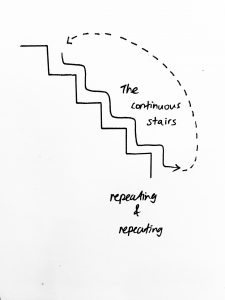
In preparation of the next project revolving around time, we experimented with clock time as a technique of our work. Clock time, also known as objective or actual time, is time quantitively measured by regularly recurring events of intervals. This stems out into both linear and circular time, shown by my short video below.

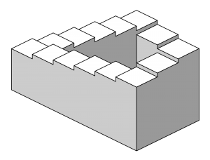
My idea stems from the penrose stairs, which is an infinite illusion of a staircase. I got the inspiration from the definition of circular time, which was an infinite cycle of a repetitive scene. The narrative goes along with a VR perspective of someone walking down the staircase, but the staircase keeps repeating itself as you descend it.

(vimeo.com/238897532)

A hammer- Project 2: The Subverted Object

“The utility of any artefact presumably depends on how well it performs a specific function. Apart from its utility, it may be emblematic of a way of life involving powerful emotional commitments.” -Project Brief

Research

In the investigation of objects and subverting its meaning, I was assigned the hammer. The hammer was a convenient tool being a hand held tool, purchasing it was easy as well, priced at $6.95. In my research, I found out many details regarding its origin and historical value, mostly its value as an emblem for the Soviet Union, presumably due to its labour-esque origins. I characterised the hammer as a tool that fixes items by using nails, also a tool that can destroy due to its heavy and strong exterior. I chose to investigate the latter for a dynamic approach and narration.

The below sketches are some exercises assigned to explore on some ways we can expand our vision of the objects, such as personifying the hammer in different situations.

Personifying the Hammer
Removal, Replacement and Redefinition

We also had a take on the removal, replacement and redefinition techniques, where we (quite literally) removed, replaced and redefined parts of the hammer.

The sketches below are a few concepts I envisioned in investigating the traits of the hammer under Task 1:Denotation. I wanted to investigate the duality of the hammer as previously stated, how it is both a fixer and a destroyer. In the sketches below, I wanted to highlight the contrast between the hammer’s heaviness with paper’s lightness. Also, how the hammer is a sturdy object compared to the items it fixes.

Artist References

In the process of brainstorming for Task 2: Connotation, I wanted to approach it with a performance element due to the dynamism of the Hammer. The element of movement with the hammer is inborn and cannot be replaced. As stated, I wanted to investigate the idea of healing and the first artist I thought of with both elements would be Joseph Beuys. In Beuys’s work, he takes on a shamanistic role as he “performs” a healing ritual for the audience. In “How to Explain Pictures to a Dead Hare”, he uses objects like honey and felt, items symbolically linked to healing, and interacts with a dead hare. This process hints of resurrection and communication with a spiritual side of Beuys. The ludicrous attempt of talking to the dead hare is as ridiculous as a hammer being a healing tool and that references to the Dada artists we researched for under this project brief. In Beuys’s work, he attempts to talk to the dead hare and even teaches the hare, creating a ridiculous narrative that builds up a fantastical meaning for the objects (Felt and Honey).

How to Explain Pictures to a Dead Hare 1965

After consultation, I decided to eliminate the mysticism side that is inherent in Beuys’s work as there is a gap in the conceptualisation between the object and its subverted meaning. I decided to explore on the idea of the hammer being an actual healing tool by enhancing its medical effects, such as it being a plaster cast. This subverts the hammers meaning as the hammer is inherently a tool to fix wooden or inanimate objects, and not human beings. The subversion is the change of the subject matter that it interacts with. Under this, I decided to explore on Damien Hirst’s Pharmacy, an installation work that features a clinical pharmacy that takes on the theme of mortality, healing and consumerism (a little bit on mysticism).

Pharmacy 1992

Referencing to Hirst’s works, I wanted to recreate the clinical environment to enhance the meaning of my object, in his case- medicines. In Hirst’s Pharmacy, he investigates mortality as the flies fly into the bug zapper and dies, in an apparent healing environment (pharmacy). He uses the conical flask filled with coloured water to represent mystical elements, redirected by the almighty entity (bug zapper), looking over the pharmacy of healing powers. There is an overall hint of sound element due to the visual implications that come with a bug zapper, a characteristic I want to achieve in my work with the hammer.

Clinic Sketch
Clinic Sketch

________________________________________________________

Task 1: Denotation

In Task 1, I wanted to feature the visual symbolism of the hammer. This meant that I wanted to bring out the physical qualities inherent with the hammer through the pictorial narration, e.g. weight, sturdiness, metallic exterior. For example in shot 1, I contrasted the heaviness associated with the hammer by placing it in a wide shot of flying paper. As you look down the series, the photographs become less apparent in movements, a trait apparent in a moving hammer (action to static).

Shot 1: Heavy-Light

In shot 2, I wanted to represent the power of a moving hammer compared to a still subject, hence I chose this image. The shot also links up to Task 2: Connotation through a unspoken narrative of the model’s legs being healed by the hammer.

Shot 2: Action-Static

In shot 3, I wanted to play with the audience’s visual symbolism of the hammer. In common understanding, we all know that a hammer is a relatively heavy object to hold. I played with this concept by taking a shot of the hammer “floating” with balloons. This references to Magritte’s work in Treachery of Images where the object’s visual quality hints of its supposed presence, how a curved wooden object in the shape of a pipe is or isn’t a pipe, as represented in Magritte’s work. In my work, I wanted the audience to know the hammer’s quality just by looking at it and understanding that paradox of quality, heaviness versus light-weight. However, by tilting the photograph in different orientation, the quality and focus changes. The first photograph highlights the lightness of the balloon as “floating” is its inherent background, then the audience’s visual focus moves to the hammer, and then questions why the hammer is floating. In the second shot, the hammer and balloons are facing down, this environment belongs to the hammer as the objects are pulled down by gravity, hinting of weight. The visual focus stands with the hammer due to its stronger visual weight.

Shot 3: Heaviness-Light-weight
Change of orientation

________________________________________________________

Task 2: Connotation

In task 2: Connotation, I wanted to create a narrative of healing, as referenced in Beuy’s work. In shot 1, I chose to represent a motion of the model jumping of the chair, playing to the duality of sturdiness versus vulnerability; the idea of the chair breaking off easily yet it is strong enough to hold a human’s weight. The hammer in this case is used to fixed the broken chair by its wooden handle, a function that it is not supposed to do. This photograph references a plot in comparison to the second shot.

Shot 1: Broken Chair

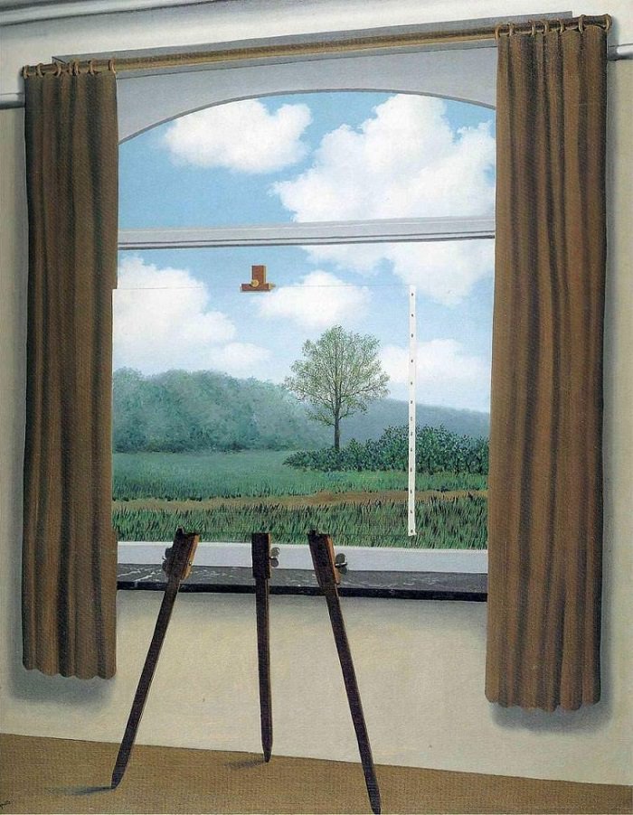
In the second shot, the hammer is once again used to heal, but this time it is placed on a human being. The narrative becomes more ludicrous as the hammer is not conventionally used to fix a broken bone like a plaster cast. There is an implied paradox as pointed out by Lei during critique as I wanted to reference to Magritte’s style of satire on an object’s identity. The paradox exists between the idea of a hammer healing wood and the hammer being a nursing tool, both of which heals. As pointed out by some of my classmates during critique, the idea of subversion in this theme of woodwork and nursing is questionable. However, the initial plan was to create a silent paradox that is apparent in Magritte’s works that audience will be led to believe because of how similar yet contrasting its functions are. For example in Magritte’s Human Condition, the similar square features of the object allows the audience to question if the subject matter is a window or a canvas, therefore questioning its intentions. In my work, I wanted to use the “healing” tool of inanimate objects (hammer) and juxtapose it into a clinical environment that doesn’t make functional sense.

Shot 2: Healing with a Hammer
The Human Condition 1933

In the last photograph, I wanted to achieve a unity to the series of the healing hammer, therefore I chose a wide shot of the patient-model in the waiting area of the clinic. The wide shot provides a visual culmination to the plot of the healing hammer, the conclusion of the patient being healed. In this photograph, there is an interaction between the patient and the outside world. The lady in camouflaged outfit stares at the patient intently as she tries to stand up. The idea of ridiculousness stands apparent as the woman in camouflage is not exposed to the idea of a healing hammer, and yet this fantastical function only exists within the realms of the patient-model.

Shot 3: Waiting Area

________________________________________________________

Task 3: Image and Text
Task 3: Text and Image

In my final task, I chose the shot 2 of Task 2 to represent the idea of the healing hammer. This task is inherently an extraction of the reality within the photograph into real life as a pop up sale. The text I chose was the price tag of the supposed healing hammers, sold in the context of plaster cast which are sold by its weight. In the final work, I presented the text in the pairings of red-white and yellow-grey to play with the composition of the photograph. With the price tag of the healing hammer placed on the photograph, there is an assurance in the reality of the photograph, whereby the audience can actually purchase the hammer if they want to, questioning the realism or surrealism of the context. ($6.95 was the actual price of the hammer)
________________________________________________________

Test Shots
Hammer hitting a wooden plank
Wide shot of Patient in Clinic
Movement of Patient


Patient staring at screen implies time within composition
Patient sitting on a red sofa
Patient waiting to be called

Juxtaposing a heavy hammer to a doctor’s table
Play on voyeurism
Patient interacting with an unknown character
Close up shot of hammer and legs. *would have chosen this shot if not for too many close ups in these series

________________________________________________________

Learning Point

In this project, I have found difficulty in achieving a balance between an adaptable function and a subverted function as the line of difference is really thin. There are however, many reference artists who provided good pointers to note, such as Duchamp and Magritte’s work.

https://oss.adm.ntu.edu.sg/bren0022/a-surreal-nonsensical-dream/

I also encountered problems in achieving a unity in the narrative since this project only allowed three photographs per series, thus choosing the right photograph was also an important decision that we cannot underestimate.