
I See You is a critique on panopticonism in Singapore, and it aims to draw a comparison between Singaporean society and other well known surveillance states such as China. With its recent implementation of a controversial social credit system, China’s government has come under criticism for racially profiling, and infringing on the human rights of those with low credit scores. The social credit system appears to come straight out of an otherworldly dystopian narrative, but would other countries (specifically Singapore) follow the same trajectory? Do we already live in a surveillance state without realising it? What does the future hold for us?
Research
There are 6 posts filed in Research (this is page 1 of 1).
Minimalism Exhibition
Barnett Newman, Mark Rothko & Abstract Expressionism
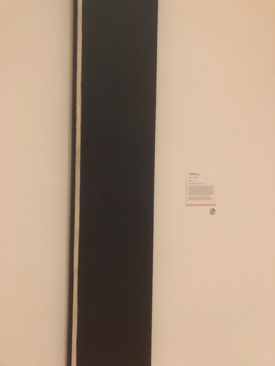
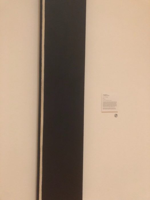
Barnett Newman, Queen of the Night I, 1961, Oil on canvas
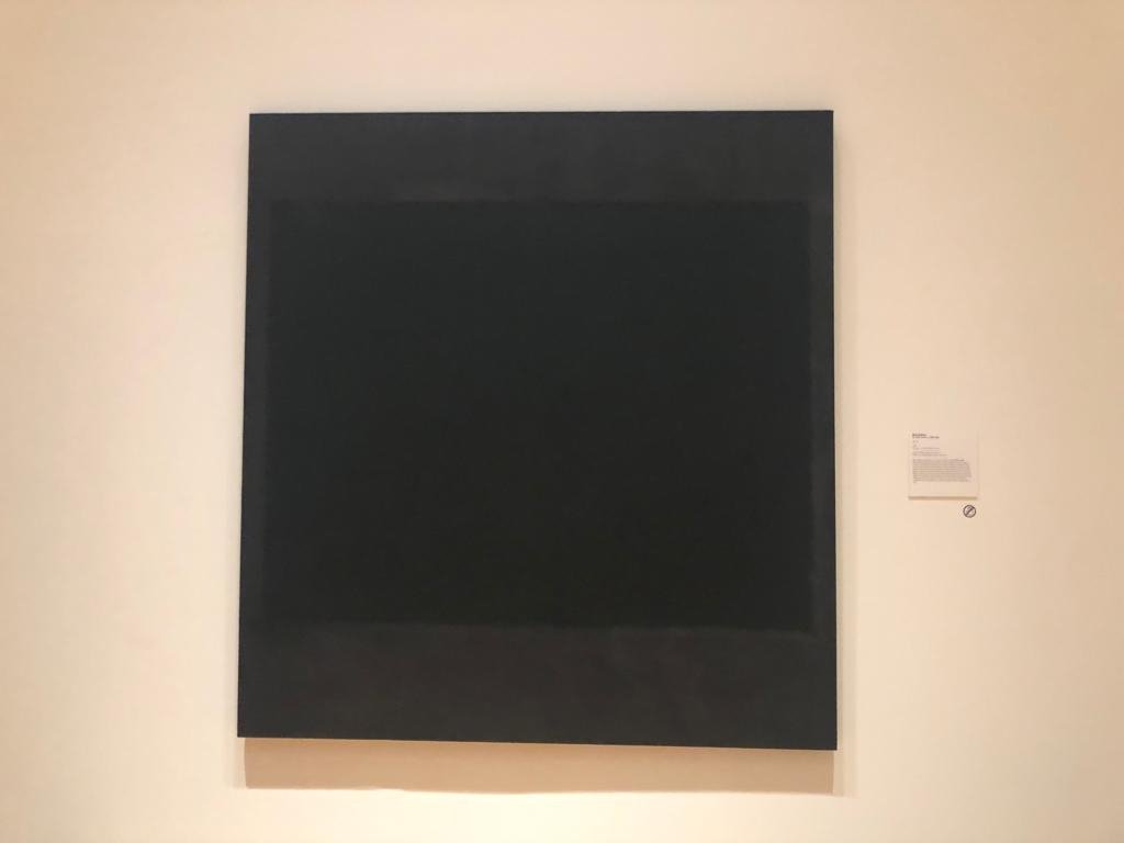
Mark Rothko, No. 5, 1964, Oil, acrylic and mixed media on canvas
I decided to research on Barnett Newman and Mark Rothko and Abstract Expressionism, after seeing the artworks above near the entrance of the exhibition. To me, Newman and Rothko are artists whom I consider synonymous to minimalism, hence I thought it was fitting that theirs was the first few works to be seen in the exhibition. I always assumed that artworks by artists like Newman or Mark Rothko were considered minimalist due to the simple compositions and lack of fine detail, but upon researching I found out that they actually fall under the category of abstract expressionism. For this review, I decided to do research to find out how abstract expressionism differs from minimalism, and how they are alike or influenced by each other.

Willem de Kooning, Untitled XXV
Abstract expressionism is a form of abstract art which was developed in the 1940s-50s, mainly in New York City. There are many prominent names associated with abstract expressionism that we will find familiar, such as Jackson Pollock and the aforementioned Rothko and Newman. Abstract expressionism stems from the surrealist movement with its aim being to create artworks that were abstract yet also conveying a great deal of expression and emotion. With this description, I find it fitting that one’s mind would conjure images of Pollock’s canvases of chaos or de Kooning’s vibrant, haphazard brush strokes. These are artists whose works convey strong emotion, not only through the painting itself but also through the artists’ process of painting the canvas. Looking at a Pollock piece it is easy to imagine the artist putting in dynamic and emotive movements into these brush strokes, literally painting his emotions into the canvas.
Mark Rothko, Untitled, 1968
Hence, it seems baffling to me that the works of artists like Newman and Rothko could even fall under this same category. Unlike the previous works mentioned, the works of Newman and Rothko consist of clean, straight lines and a minimal number of colours, hence it is hard see the similarities. So it seems like even under the umbrella of abstract expressionism, This is because abstract expressionism as a movement does not merely encompass one type of art. Under it, it encompasses two broad groupings:
1. Action Painters
This group consists of artists like Pollock and de Kooning, whose painting process consisted of gestural brush strokes, and dripping or splashing paint rather than carefully applying it onto the canvas. The artists painted in a state of spontaneity and improvisation, such as Pollock who was famous for placing his canvases on the ground and dripping paint on it from a can or stick.
2. Colour Field Painters
Consisting of artists like Mark Rothko and Barnett Newman, colour field painters’ works are characterised by simple compositions with large areas of colour. The artists were deeply interested in religion and myth and created simple compositions with large areas of colour intended to produce a contemplative or meditational response in the viewer.
Despite these blatant differences, I believe that at their core, both groups of painters had similar visions and intentions in their artistic practice. In Newman’s essay “The Sublime is Now” he suggested that art should be stripped down to only the essentials but that it still deal with “absolute emotion”. Colour field painters took this idea to a new level by concentrating fully on colour as their medium rather than the physical brush stroke itself. Both groups of painters do not attempt to represent physical reality, instead using shapes, colours, forms and gestural marks to achieve its effect (abstract) and seeks to articulate the inner feelings of the artist rather than the object of the art (expressionism).
Which then begs the question: what are these works by Rothko and Newman doing in a Minimalism exhibit? Upon doing the above research, I was quite sceptical about this because I do think there is a tendency for people to label something as “minimalist” merely because it looks simple and lacks embellishment. While colour field paintings are undoubtedly simple in their composition, that does not define them as minimalist art pieces. Minimalism means more than just simplicity. As artist Frank Stella states, “What you see is what you see”, meaning that minimalist art is about representing the art for what it is and not being an imitation of something else. Minimalism is not about black and white, empty rooms or straight lines. It is about representing art in its truest, raw form and nothing else.
In fact, minimalist art came about in the 1960s (at the peak of abstract expressionism), as a form of rejection of the ideas behind abstract expressionism, seeing it as superfluous due to the artworks’ reflection of the artists’ emotions. In this sense, I suppose, we could say that minimalist art is in fact influenced by abstract expressionism as its emergence was in response to the rising popularity of the latter. I doubt minimalist artists from the 1960s would have been very happy to see abstract expressionist works in a minimalism exhibition today, though the wall label at the National Gallery states that none of the prominent early minimalist artists accepted the label so perhaps they wouldn’t care.
To sum off, I am in no way implying that the minimalism exhibition was a flop! In fact I was delighted to see such an exhibit in Singapore that was so widely publicised because I do feel that artworks like what we have seen in the exhibition are something that Singaporeans sorely need to be exposed to. The artworks I have critiqued merely make up a small fraction of the exhibition and there are many impressive works in there that are worth making the trip down to see. I just think that as artist, curators and art viewers, we do have a need to do extensive research into artworks that we are looking at, in order to present or view them in a way that respects the artist and does the artwork justice as to what the artist intended.
References:
William Johnson, Comparing and Contrasting Expressionism, Abstract, and Pop Art
Tate Museum: Abstract Expressionism, Colour Field Painting, Minimalism
The Art Story Foundation: Color Field Painting
Minimalissimo Magazine, Introduction to Minimal Art
Thoughtful Interaction Design: Reflection

Thoughtful Interaction Design: A Design Perspective on Information Technology by Jonas Löwgren and Erik Stolterman was for me an invigorating read which affirmed many of my personal beliefs regarding my role as an artist/designer, while also bringing in new perspectives on how we can approach design in a responsible way.
Something I notice among my peers in arts & design is that many of us tend to fall into an erroneous mindset that anything we design should just look visually beautiful, be fun to interact with or display our technological prowess. These are things which a viewer, whether they are from a design background or not, can easily judge upon first looking at or interacting with the product. Hence any project meeting these conditions will be met with much praise and fanfare, which may lead the designer to consider it a “successful” design. If that is all it takes for a design to be successful, however, then I believe it would actually be preferable to aim to become a designer who is unsuccessful but rather is thoughtful instead.
Being thoughtful is about caring for your own design ability, the designs you produce, and how the world will be changed by your design ideas and decisions. A thoughtful designer is someone who takes on design as a serious and important task and who tries to become a designer with the ability to create fascinating, authentic, and useful digital artifacts.
The designer who is lauded merely for creating beautiful/fun/technologically apt projects will find that as fads come and go, by repeatedly doing the same kinds of things their designs will eventually become old and lose the attention and praise it once garnered. The thoughtful designer, on the other hand, understands that their worth goes beyond “creating pretty things” and that they possess a vital skill that makes them responsible for the lives and wellbeing of all who encounter their design. They will strive to constantly educate and improve themselves to ensure that their designs will always contribute to the improvement of society.
The thoughtful designer sees her own ability as something that has to be designed. The thoughtful designer understands that theories, concepts, and ideas about design are practical intellectual tools. The thoughtful designer dares to challenge her own thinking and assumptions as a way to develop her competence and design ability.
This notion of design as a responsibility is reinforced later on in the design theory and process sections of the chapter. As designers we are direct agents in shaping and creating the tangible world that we live in, be it in a digital or physical landscape, hence it has a direct effect on all aspects of society. Only by understanding this can we understand why we have an immense responsibility under our belt to put thoughtfulness into our designs, allowing them to create positive changes in society.
One way in which we can practice thoughtful design which improves society is by using design as a tool for critique. Critical design (http://www.dunneandraby.co.uk/content/bydandr/13/0) is a design “movement” I was recently introduced to which I feel encompasses most if not all aspects of Löwgren and Stolterman’s writings on thoughtful design and design theory. Coined by design professors Anthony Dunne and Fiona Raby, Critical design takes a critical theory based approach to design, using design fiction and speculative design proposals to challenge narrow assumptions, preconceptions and givens about the role products play in everyday life. From my understanding of the assigned reading, the aims of thoughtful design is quite similar to that of critical design in that it addresses the role of the designer as a person who uses their design ability to induce change in social issues.
There are many good critical design projects which share the views stated in the reading, but one which many of us may recognise is Foragers by Dunne & Raby, which was exhibited at the Artscience Museum’s Human+ exhibit several years ago. It is a design project that is based off the food shortage problem that experts envision we will face as a planet in future years, based on current global trade and environmental trends. As such, the designers have designed these devices which they envision humans might design in the future, which will help them forage food and extract nutritional value from non-human foods using a combination of synthetic biology and new digestive devices inspired by digestive systems of other mammals, birds, fish and insects.

Augmented Digestive System

Algae Digester

Grass Processor

To me, this project is one that is truly shaping the world we live in. While future humans will probably not use such devices to forage food in their day to day life, it is a design project which will bring up questions of morals and ethics in viewers. It is challenging existing conceptions and restrictions that are based on common false assumptions that food shortage is a problem only faced by those living in poverty. The reading mentions client-based design and the fact that the designer is responsible for the result they produce and hand over to the client. In my view, seeing that it also states that designers have a responsibility to society due to our skills to change the world, then we should also see society and the world at large as a “client” and design to better their lives to the best of our ability.
Michelangelo Pistoletto Presentation
https://docs.google.com/presentation/d/1-23gXHeHIdow-E5jA9RNJNL7LLEYB0FEP7kVGtykQfI/edit?usp=sharing
Presentation by Bridgel, Jake, Felix, Tristan, Ling Ern, Clarita
Week 2 Report

Upon first seeing Maestro Pistoletto’s Third Paradise artwork on the ADM rooftop, I was at first confused as to its meaning and purpose. My first impression was that the form of the tri-circular symbol was not particularly visually beautiful and honestly looked like some sort of cult symbol. There was a lot of speculation about it between myself and schoolmates, so I attended the documentary viewing and talk session only knowing that it was “by some famous artist”. It was only after the talk and after doing a lot of my own research that I got to fully appreciate the works of Maestro Pistoletto, and understand the meanings and value behind them.
To really understand the meaning behind Pistoletto’s work, I first had to understand Arte Povera. It refers to an artistic movement in the 1960s and 70s which explores a wide range of materials apart from traditional painting and sketching, such as using found items or objects not crafted by the artist, in order to create art. I was unfamiliar with Arte Povera before this and it is only reading up on it on the Tate Museum website, where it was described as “the Italian contribution to conceptual art”, that I was able to relate more to it since conceptual art was something which I was more familiar with.
As Maestro Pistoletto is a long-lived artist who has survived several different artistic periods, it was at first not immediately apparent to me which was the artistic movement which had inspired the creation of Third Paradise, or if there was one at all. During the talk and documentary, however, I noticed that while describing the Third Paradise, Pistoletto made many allusions to Arte Povera and even though the Third Paradise is a rather recent creation of the 21st century, I deduced that it probably still had its roots in conceptual art and its cousins Arte Povera. It is clearer to see as such when comparing the Third Paradise to other conceptual artworks.

Marcel Duchamp, ‘Fountain’

Michelangelo Pistoletto, ‘Third Paradise’
For example, comparing the Third Paradise symbol to Duchamp’s Fountain, which is considered an icon of conceptual art. The importance behind the Fountain is not in terms of the visuals, but rather the concept behind it as it represents the thought process and intentions of Duchamp in submitting the urinal as an artwork. Similarly, the purpose of the Third Paradise symbol is not to exist as a representation of the artist (Pistoletto) or as a show of his skill as a traditional artist, but rather to represent the concept of finding a balance between natural paradise and technological paradise.

Despite what I have mentioned about the main focus of conceptual art being the ideas behind the artwork and not the appearance of the artwork itself, this might be argued against by pointing out that Pistoletto had clearly made attempts in embellishing the Third Paradise symbol, for example as seen above. Personally I think perhaps he had done so in an attempt to spark more interest in the artwork, keeping it interesting and fresh for today’s fickle audiences, or perhaps to include more audience participation and contribution as the Third Paradise is today more of a social movement than an artpiece by itself. Nevertheless, we should always take into consideration the pure form of the symbol by itself and whether we love it or the meaning behind it totally befalls us, appreciate the noble intention behind the Third Paradise which is to remind humans that we should always find a balance between nature or technology instead of being totally besotted or trying to find happiness in just one of the areas.
Week 1 Assignment
Biography
Bridgel is currently a full-time student in her third year at Nanyang Technological University’s School of Art, Design and Media (ADM), majoring in Interactive Media. She is an aspiring artist and designer who has experience in a range of skills, such as digital illustration, interactive installations, motion graphics and coding.
Bridgel’s background is as a digital illustrator, as she has loved drawing all her life and created her own comics as a hobby before enrolling as an art student. Since coming to ADM, she has also found a passion in installation art and gained experience in different fields relating to art, design and media.
Bridgel is passionate in issues pertaining to society and this can often be seen in her works. She hopes that, through her arts and design practice, she can bring her audience to question their role in society and the state of the world today. As of current times, Bridgel has been fascinated about surveillance and its role as a tool of security or intimidation, and she hopes to explore more on the topic through her future works.
Sample of Work
https://www.behance.net/gallery/55514499/Light-Dark
Resume
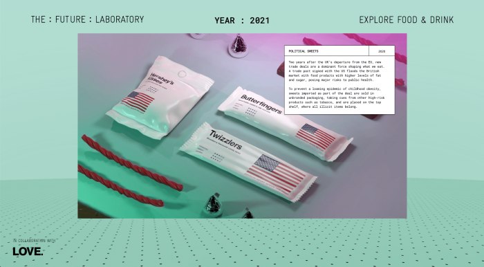
Inspiration: The Future Laboratory
https://www.thefuturelaboratory.com/food-and-drink-timeline

Click on the above link to view the full project!
One of my favourite studios that I draw inspiration from is The Future Laboratory. As suggested by their name their design philosophy is derived from speculative design, meaning that they would design things based on how they speculate the future would be like through their extensive research and observations.
The above project, Food and Drinks Timelines, is one of my favourite projects from them. It is about speculating how food and drinks will be sold and marketed in the future years based on our consumption patterns today, and on possible food shortages and trade agreements.
Since they are not really designing for a client per se but rather they are designing this in order to inform and educate viewers on the possible consequences of their habits, I feel that in a way what they do is an intersection between art and design. For me it really speaks to me because the subjects they touch on are things that I am interested in and care deeply about myself, and I feel that this has the potential to reach out to many people and change their mindset.