
I See You is a critique on panopticonism in Singapore, and it aims to draw a comparison between Singaporean society and other well known surveillance states such as China. With its recent implementation of a controversial social credit system, China’s government has come under criticism for racially profiling, and infringing on the human rights of those with low credit scores. The social credit system appears to come straight out of an otherworldly dystopian narrative, but would other countries (specifically Singapore) follow the same trajectory? Do we already live in a surveillance state without realising it? What does the future hold for us?
Project Pitch

For the final project, I have decided to go with preparing a projection mapping project for the Chinese Heritage Centre for the opening of Yunnan Garden.
I was inspired by this video I have seen many times (as I’m sure we all have) along the walkway towards the Esplanade. What I like about it is the fun and approachable look it exudes, and I feel that it is a style I would like to try to incorporate int architectural projection mapping as the ones I have normally seen are usually based on 3D animations and not exactly illustrative.
Moodboard


Concept
For the video, I wanted to go for a more hand-drawn illustrative style of animation as I felt like it has the potential to look more friendly and inviting. I would like to fill the composition up with people doing activities, as according to my research, Yunnan Garden is historically a place which is teeming with human activities on campus.
For the style I decided to go with a more contemporary Chinese/Asian illustration style as an homage to the Chinese roots of Yunnan Garden and the Chinese Heritage Centre.
Assignment 2: Process & Final
As per my previous post, since I already had reference photos which I took, I decided to base off those to start my illustration.
I started by vectoring out the HDB block, referencing the photo I took of the HDB. However when I completed it I felt that it was quite flat and there wasn’t much room to draw in more elements, so at this point I felt a bit stuck as to how I should continue.
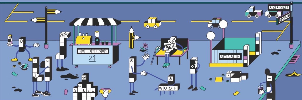
This is quite random but one day I was doing the New York Times crossword puzzle and I saw this illustration on the website. It actually inspired me in the way that it made me realise that I don’t have to draw everything properly to scale, I can actually play around with the scale of the elements and it can create a more interesting composition. With that in mind I decided to re-do my entire illustration!
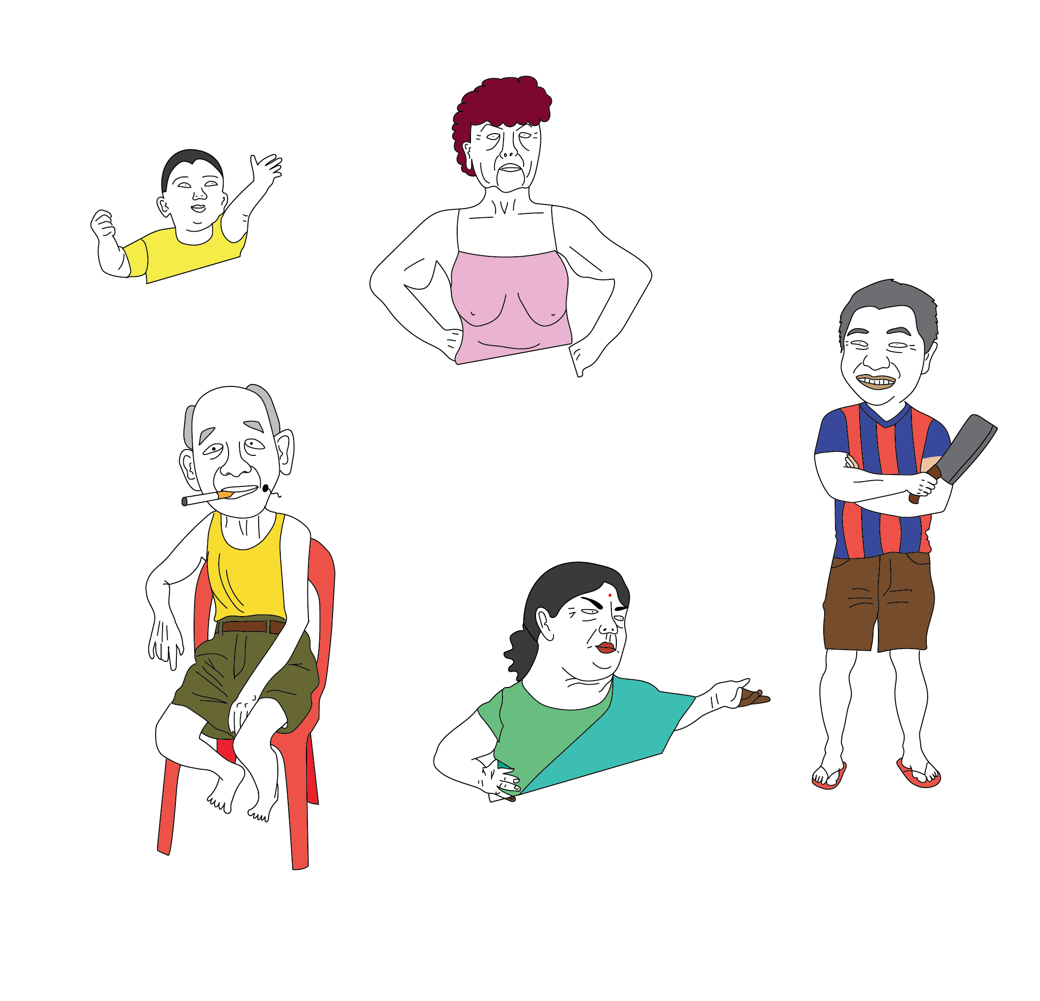
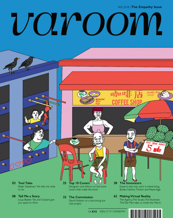
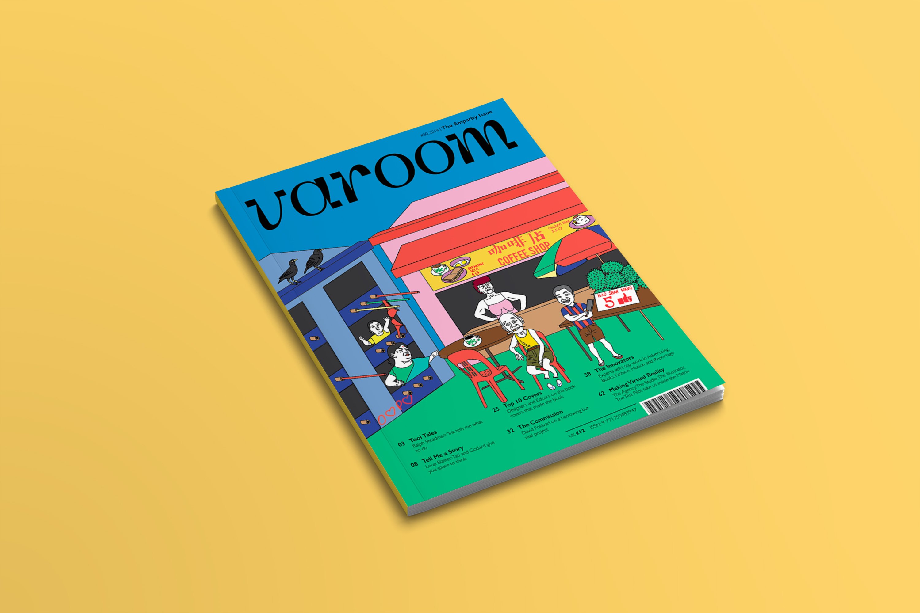
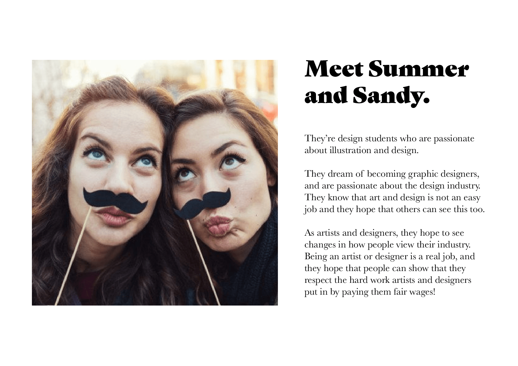
I started off my illustrating the characters that I wanted to have in my illustration. I wanted the people to be recognisable characters to Singaporeans, people that we see every day at our local coffee shop or hawkers centres, these people are our parents and grandparents and neighbours. So I had the annoyed aunty, the kopitiam uncle, the mischievous little boy, the durian seller, and the angry drink stall aunty!
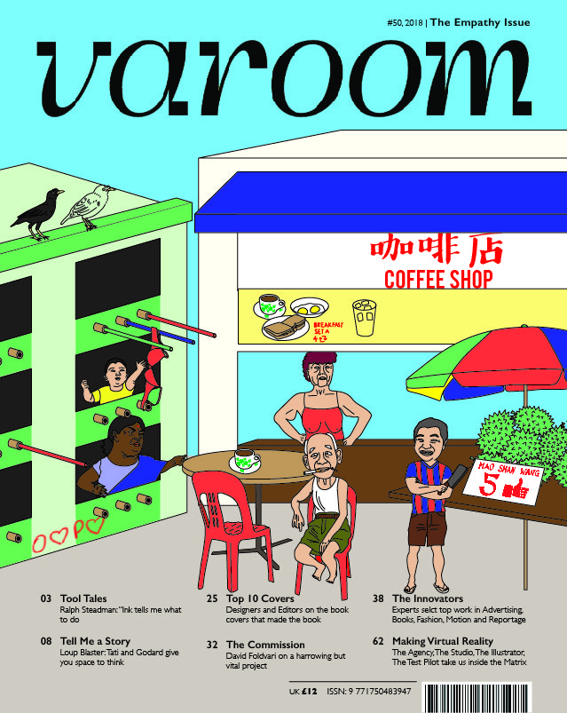
This is the composition and colour palette that I initially came up with. I added a lot of Singaporean elements, (the red coffee shop chair, durians, bamboo poles, the black mynah etc.) and I incorporated my idea of “people lacking empathy towards designers and paying us in exposure” by using the following elements:
- The typical “O$P$” sign, the $ symbol is changed to a heart to represent Instagram likes
- The durian is priced in Facebook likes (thumbs up)
- At the coffee shop, if you look at the sign board the food and beverage is priced as retweets instead of as money
I lowkey didn’t like it and I wasn’t vibing with the colour (OSS changed the colour and made it even worse but still) so I decided to change!
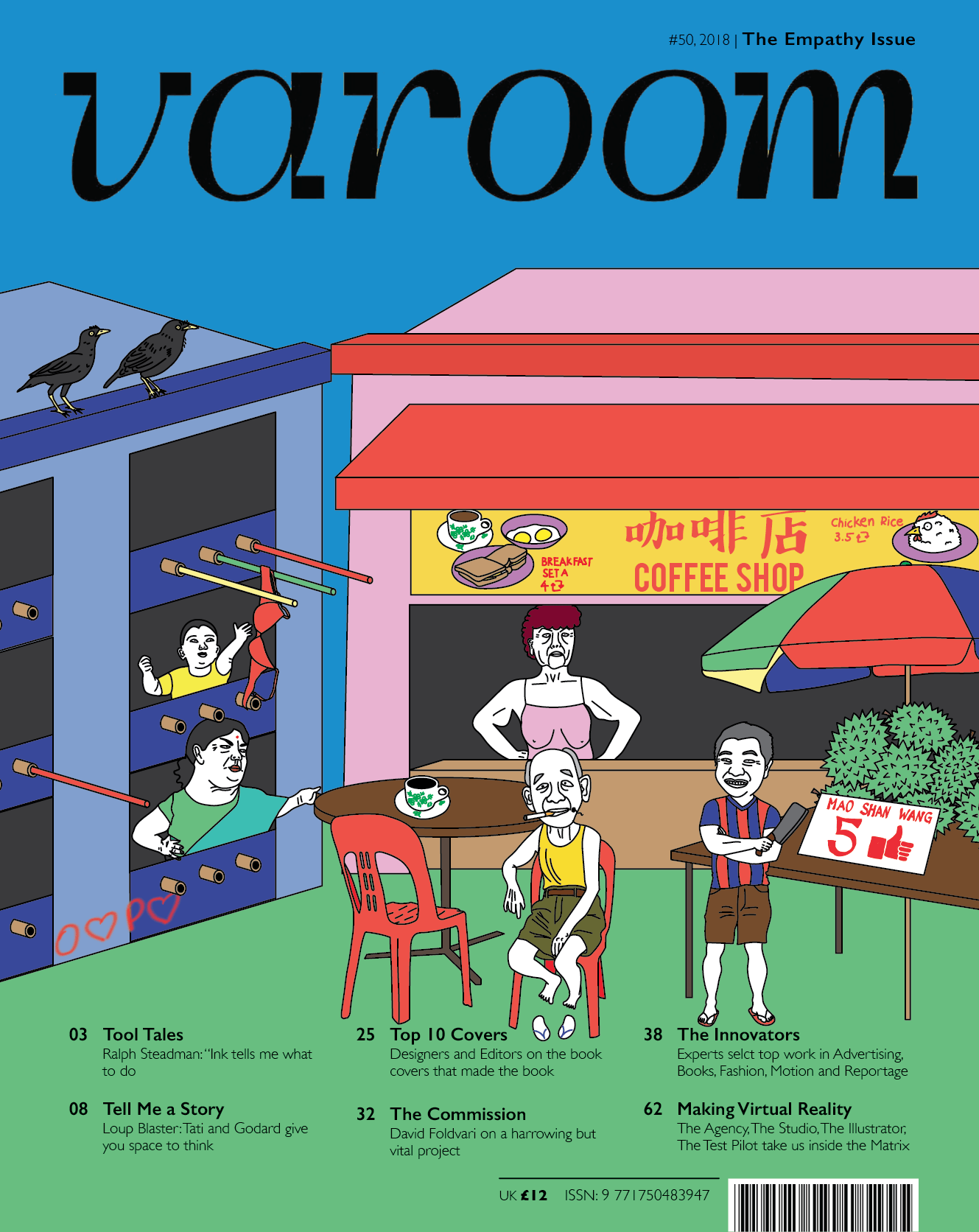
And here is the final composition which I came up with! I took Lisa’s advice to really focus on using less colours and focus just on primary colours and I think it made my illustration look much better. I decided the keep the humans as white because I feel that it makes them stand out more against the primary colour due to the contrast.
Assignment 2: Research & References
I was quite excited for this project because illustrating a magazine cover is something I’ve never tried before and I’ve always wanted to give it a go! Some of my all time favourite illustrations have been for the covers of magazines so I had quite a lot of ideas for this project.
Knowing that Varoom is a magazine targeted at designers and illustrators, I decided that would be my target audience. I chose the topic empathy and I wanted my illustration to show that people nowadays do not have empathy towards designers and illustrators, causing them to pay us in “exposure” rather than in money.
User Profile
I had the idea to draw a scene where there are things like stores, but instead of money being used, all the currency is in terms of “exposure” like Instagram and Facebook likes.


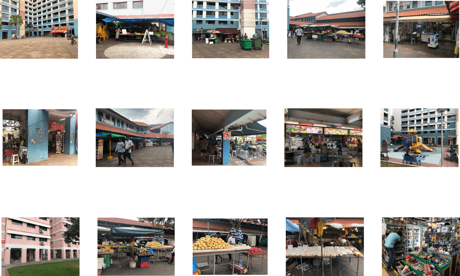
I went looking for references and decided I wanted to go for this style of illustration which shows a sort of town centre/city scene with a lot of activity and commerce. When I consulted Lisa about this, she suggested that as a Singaporean, I should try to illustrate scenes that are unique to Singapore because it is what I am familiar with. I agreed and started looking for more references to suit this.
Moodboard
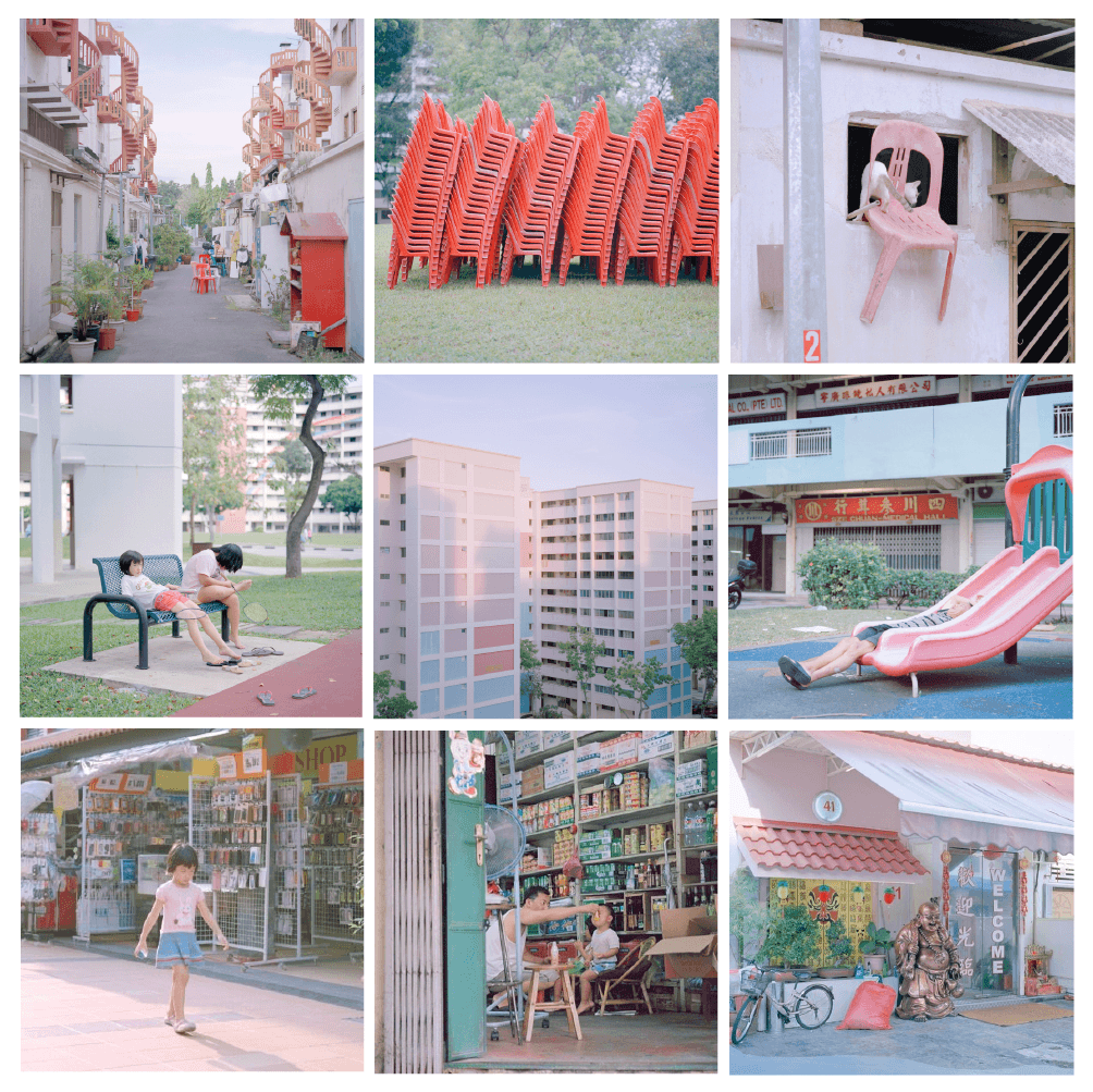
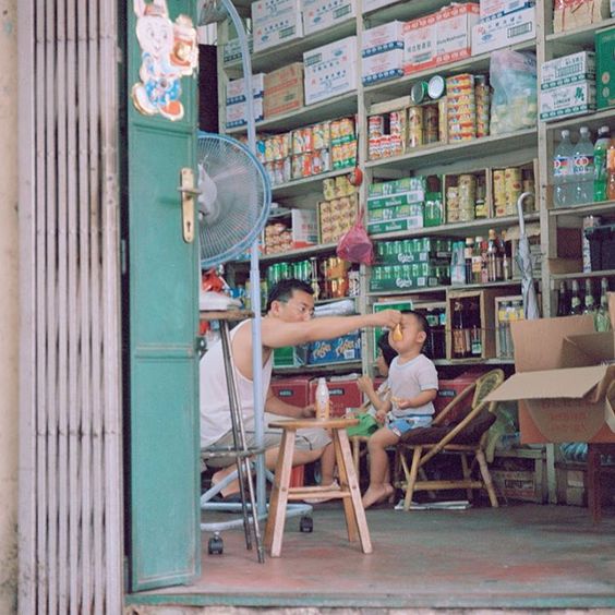
I went to take a look at photos by Nguan, who is a very popular local photographer who is known for capturing day to day Singaporean life. My purpose for referencing his photos was that I too wanted to capture this kind of Singaporean essence in my illustration, giving the viewer a slice of life in a normal day in Singapore. As such, for my thumbnails, I asked Lisa if it would be a good idea if instead of doing drawings, I went out to a nearby HDB area to take some photographs of local life, and she agreed! So I was also able to use these as reference pictures for drawing later on.
The Four Practices? Challenges for an Archaeology of the Screen: Individual Response

In the opening paragraph, Huhtamo states that “the overwhelming presence of screens in contemporary life was not accompanied by any systematic knowledge about their identities”. This sentiment, I feel, is quite true of people in our current society as most people, myself included, do not really see the significance behind screens as a media identity. Rather, we merely see screens as a medium which we use to view other forms of media (videos, games, text, etc.) and nothing more.
Huhtamo explores the historical and cultural significance behind screens by identifying 4 existing media practices (Touch, Mobile, Peep and Screen), and relating them back to screen practice. Today, the lines between these 4 practices are extremely blurred and arguably non-existed due to advanced technologies which provide us with screens and devices that satiate multiple senses and cross between the 4 media practices. However, as Huhtamo states, the 4 practices are not hard constructs that define and divide media practices but rather “give shape to traditions that have authentic historical currency”. Hence, I decided to look back into my childhood during the time before smart devices and widespread internet connections, and look into how the 4 practices are relevant in categorising devices that I used to own and play with, as well as other devices which we use today.
Touch

One of the earliest screen-based toys which I owned was the Tamagotchi. I feel that children’s toys are a very good example of early touch media, as many of them would want to include a tactile/interactive element to appeal to children. The Tamagotchi is a very simple example of a toy which has a touch-based element (the buttons) which plays a huge role in being able to interact with the device and make full use of its functionalities.
Nowadays with most phones and tablet being touch-screen with maybe only 1 central button, using buttons to control a device is a thing of the past and I imagine that for people born in this day and age, they might not even be able to fathom that in the past most devices including mobile phones were controlled through button keypads! Which brings me to my next point!
Mobile
Huhtamo uses the term”mobile practices” to refer to screens/devices which we must move around in order to view, and those which we use while being mobile and moving around, rather than referring to merely mobile phone based devices. For the former kind of screens, I wasn’t able to think of anything like it from my childhood, however it did remind me of what we see a lot of these days with large-scale installation artworks (such as in iLight & Night to Light).

As for the second kind of device, the mobile phones of my childhood, I feel, truly exemplify what it means to be a mobile device. Nowadays while it is true that our smartphones are portable devices that we can carry around with us, it is a device that we would use at any time (not just while we are out and about but also when we’re just chilling at home) because it has everything we need in it. The mobile phones of the past were truly a device that you would use to make calls and send texts only while you were out. Because there was no internet connection and mobile plans were expensive, people generally preferred to make calls from their home landline instead.
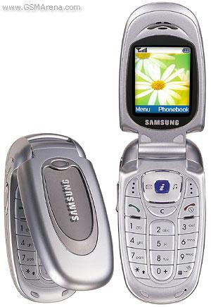
As I got older, mobile phones started to have more and more functionalities such as games, music and cameras. The mobile phone pictured in the photo above was one of my favourites, I remember that my mum had it when I was a kid and it was heavily marketed and advertised as being the first mobile phone with a colour screen or something like that! My favourite part about it was that it had a game where you could choose a virtual pet and take care of it. I would always beg my mum to let me have her phone while we were in the car so I could play that game and I remember always being frustrated that my virtual pet would run away because I couldn’t take care of it while my mum was away at work HAHA
Peep
To be honest, Peep Media kind of confused me at first because I felt like I wasn’t able to relate it to any devices that I had encountered in my life. After watching the above video by Professor Huhtamo, I came to the conclusion that the devices under “peep media” are generally quite 0utdated and not really things that we would encounter in recent decades.

However, going home over the weekend, I noticed one thing in my home which is sort of like a “reverse” peep device, which is a digital camera peephole viewer which many houses have these days. Instead of the traditional peephole where the person inside has to look into the hole in order to see who is standing outside, the person inside now views the outside of the door via a camera which is embedded into the peephole in the door. I was actually having an interesting conversation about this with my brother, where he mentioned that this is one of the items which we have input technology into where it doesn’t really need it since it works pretty much the same way as a traditional peephole (allowing the person inside to see outside). Which is something that I agree with and I feel we need to think about these days, with “smart homes” and the popularity of IoT devices. How many of these devices actually need to be “smart”, and does adding technology to everything necessarily make it better?
Screen
In the reading, Huhtamo does not allude much to screen practice. From my understanding, by screen practice he is referring to screens in general in its most basic form and how it relates to history and society. As I mentioned in the beginning of this review, it is undeniable that screens do have a lot of historical significance and they do have a role to play in society, not just the content that is displayed on them.

One example of how screens can be a part of everyday life can be seen right within our own NTU campus, namely the Media Art Nexus. While some people might think it is just a large screen showing random videos, it is something which transforms the entire corridor into an arts viewing space. Rather than being just a passageway for people to walk through, the entire mood and atmosphere in the corridor has changed because of the screen and when entering the corridor it is like entering a whole different room altogether. Because the aim of the Media Art Nexus is not commercial gain but rather to give a platform for students/artists to display their works, it is one of the few public screens I have seen which aims to display art and not just advertisements or marketing materials.
Because of its location, there are definitely many people who walk past MAN on a daily basis but they might not realise how much more interesting and meaningful screens like MAN make their daily lives.
To conclude, before this reading, I myself did not see how screens are a significant tool in society, and how they are the result of many historical media practices which we might not even recognise as screens as we know them. Screens are more than just a platform for viewing, but rather they have the power to shape how the media is viewed and regulate the audience’s interaction with the media. With current popular technologies like projection mapping, almost anything can be turned into a screen and it will be exciting to see how this plays out in the future, to find out and to experiment for myself as an artist on how the idea of a screen can be further developed and changed as technology advances,
Week 7 Class Activity

For this week’s in class assignment we were tasked to do a fake trade show campaign using 3 key words which were assigned to us! The words that me and Chloe were assigned were Scrunchie, Integrity and McDonalds.
So we came up with an ad campaign for McDonald’s which centres around showing that McDonald’s and its staff are a company with integrity. Many companies like to embody themselves with certain traits in order to seem more appealing to public, so we decided to do something similar with this! As for a scrunchie, all girls will know that a scrunchie is an item which we lose all the time and we don’t really think much of it as it’s mostly a functional object we use just to tie our hair. So, we went with the concept that McDonald’s employees have so much integrity that if you accidentally left something in their store they would return it to you, even if it’s just merely a scrunchie.
Experience 2 Proposal
Mavis, Viena and I were unable to complete Experience 2 in time because our materials didn’t arrive in time so we will submit the final next week, but in the meantime this is our concept!
Our concept is based on the idea of truth. We decided to use fake apples as our object since the apple is a symbol of truth in the Bible (Adam and Eve seeing the truth about the world after eating the apple). We purchased 50 foam apples in bulk from the internet and are currently waiting for them to arrive!
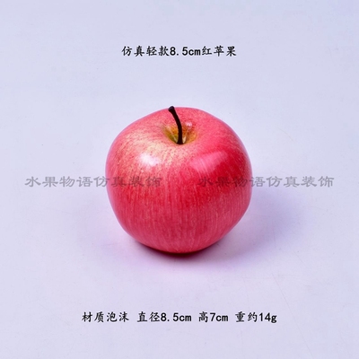
The fake apple that we ordered haha
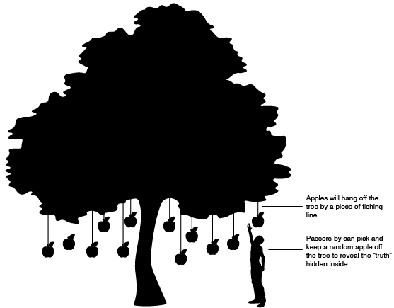
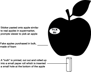
We have decided that we will be doing this in the form of an installation that engages the public. In each apple, we will be rolling up a small piece of paper which contains a “truth” about the world and placing it in a hole at the bottom of the apple. The apples will be hung from trees with fishing line in a public place, and a sticker will be placed on the apple saying “PICK ME” so that people know that they can pick and keep the apple and read the “truth” inside it.

That is it for now! Will update again next week when we have completed the project!
Mid Sem Presentation
Minimalism Exhibition
Barnett Newman, Mark Rothko & Abstract Expressionism
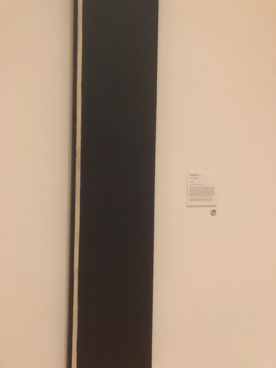
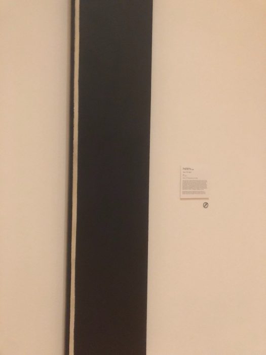
Barnett Newman, Queen of the Night I, 1961, Oil on canvas
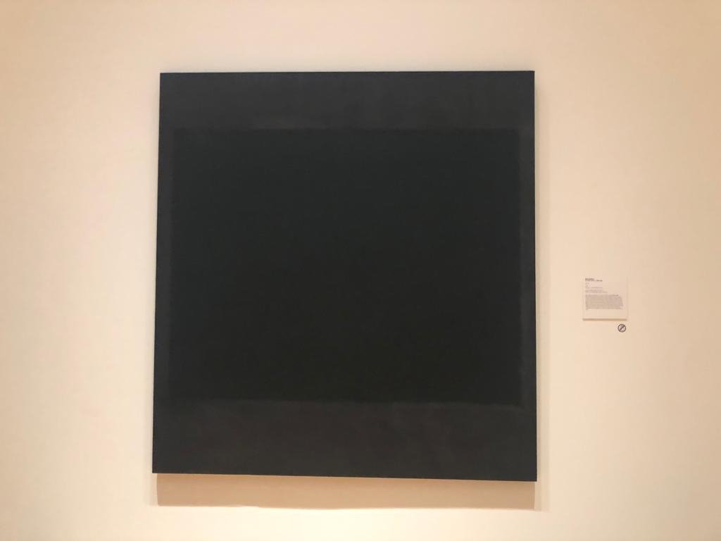
Mark Rothko, No. 5, 1964, Oil, acrylic and mixed media on canvas
I decided to research on Barnett Newman and Mark Rothko and Abstract Expressionism, after seeing the artworks above near the entrance of the exhibition. To me, Newman and Rothko are artists whom I consider synonymous to minimalism, hence I thought it was fitting that theirs was the first few works to be seen in the exhibition. I always assumed that artworks by artists like Newman or Mark Rothko were considered minimalist due to the simple compositions and lack of fine detail, but upon researching I found out that they actually fall under the category of abstract expressionism. For this review, I decided to do research to find out how abstract expressionism differs from minimalism, and how they are alike or influenced by each other.

Willem de Kooning, Untitled XXV
Abstract expressionism is a form of abstract art which was developed in the 1940s-50s, mainly in New York City. There are many prominent names associated with abstract expressionism that we will find familiar, such as Jackson Pollock and the aforementioned Rothko and Newman. Abstract expressionism stems from the surrealist movement with its aim being to create artworks that were abstract yet also conveying a great deal of expression and emotion. With this description, I find it fitting that one’s mind would conjure images of Pollock’s canvases of chaos or de Kooning’s vibrant, haphazard brush strokes. These are artists whose works convey strong emotion, not only through the painting itself but also through the artists’ process of painting the canvas. Looking at a Pollock piece it is easy to imagine the artist putting in dynamic and emotive movements into these brush strokes, literally painting his emotions into the canvas.
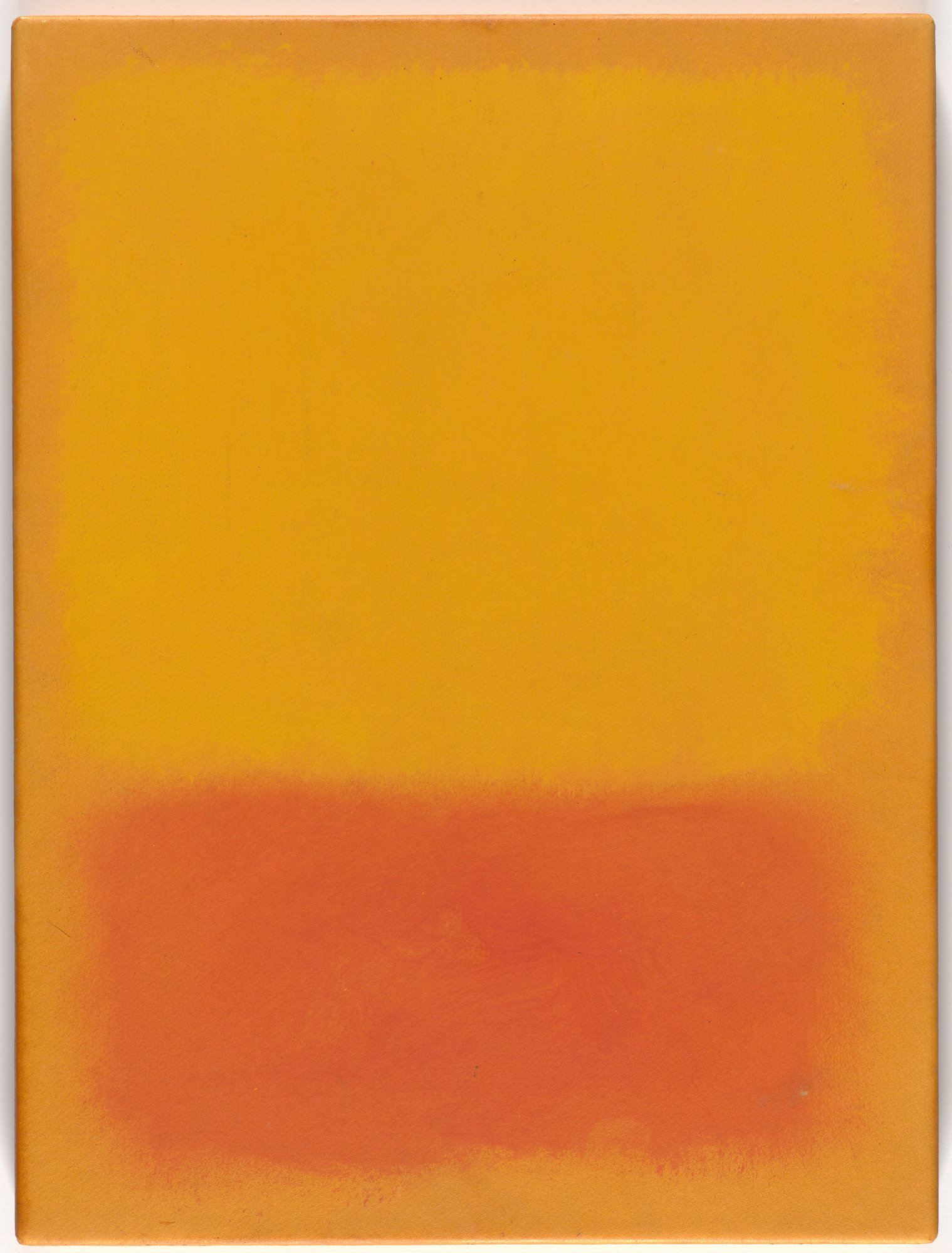
Mark Rothko, Untitled, 1968
Hence, it seems baffling to me that the works of artists like Newman and Rothko could even fall under this same category. Unlike the previous works mentioned, the works of Newman and Rothko consist of clean, straight lines and a minimal number of colours, hence it is hard see the similarities. So it seems like even under the umbrella of abstract expressionism, This is because abstract expressionism as a movement does not merely encompass one type of art. Under it, it encompasses two broad groupings:
1. Action Painters
This group consists of artists like Pollock and de Kooning, whose painting process consisted of gestural brush strokes, and dripping or splashing paint rather than carefully applying it onto the canvas. The artists painted in a state of spontaneity and improvisation, such as Pollock who was famous for placing his canvases on the ground and dripping paint on it from a can or stick.
2. Colour Field Painters
Consisting of artists like Mark Rothko and Barnett Newman, colour field painters’ works are characterised by simple compositions with large areas of colour. The artists were deeply interested in religion and myth and created simple compositions with large areas of colour intended to produce a contemplative or meditational response in the viewer.
Despite these blatant differences, I believe that at their core, both groups of painters had similar visions and intentions in their artistic practice. In Newman’s essay “The Sublime is Now” he suggested that art should be stripped down to only the essentials but that it still deal with “absolute emotion”. Colour field painters took this idea to a new level by concentrating fully on colour as their medium rather than the physical brush stroke itself. Both groups of painters do not attempt to represent physical reality, instead using shapes, colours, forms and gestural marks to achieve its effect (abstract) and seeks to articulate the inner feelings of the artist rather than the object of the art (expressionism).
Which then begs the question: what are these works by Rothko and Newman doing in a Minimalism exhibit? Upon doing the above research, I was quite sceptical about this because I do think there is a tendency for people to label something as “minimalist” merely because it looks simple and lacks embellishment. While colour field paintings are undoubtedly simple in their composition, that does not define them as minimalist art pieces. Minimalism means more than just simplicity. As artist Frank Stella states, “What you see is what you see”, meaning that minimalist art is about representing the art for what it is and not being an imitation of something else. Minimalism is not about black and white, empty rooms or straight lines. It is about representing art in its truest, raw form and nothing else.
In fact, minimalist art came about in the 1960s (at the peak of abstract expressionism), as a form of rejection of the ideas behind abstract expressionism, seeing it as superfluous due to the artworks’ reflection of the artists’ emotions. In this sense, I suppose, we could say that minimalist art is in fact influenced by abstract expressionism as its emergence was in response to the rising popularity of the latter. I doubt minimalist artists from the 1960s would have been very happy to see abstract expressionist works in a minimalism exhibition today, though the wall label at the National Gallery states that none of the prominent early minimalist artists accepted the label so perhaps they wouldn’t care.
To sum off, I am in no way implying that the minimalism exhibition was a flop! In fact I was delighted to see such an exhibit in Singapore that was so widely publicised because I do feel that artworks like what we have seen in the exhibition are something that Singaporeans sorely need to be exposed to. The artworks I have critiqued merely make up a small fraction of the exhibition and there are many impressive works in there that are worth making the trip down to see. I just think that as artist, curators and art viewers, we do have a need to do extensive research into artworks that we are looking at, in order to present or view them in a way that respects the artist and does the artwork justice as to what the artist intended.
References:
William Johnson, Comparing and Contrasting Expressionism, Abstract, and Pop Art
Tate Museum: Abstract Expressionism, Colour Field Painting, Minimalism
The Art Story Foundation: Color Field Painting
Minimalissimo Magazine, Introduction to Minimal Art
Light to Night Festival Review

I visited the festival with Mavis, Jinyee, Felix and Clarita after our field trip to the National Gallery!
The Resident
National Gallery Singapore (Supreme Court Wing, facing The Arts House)
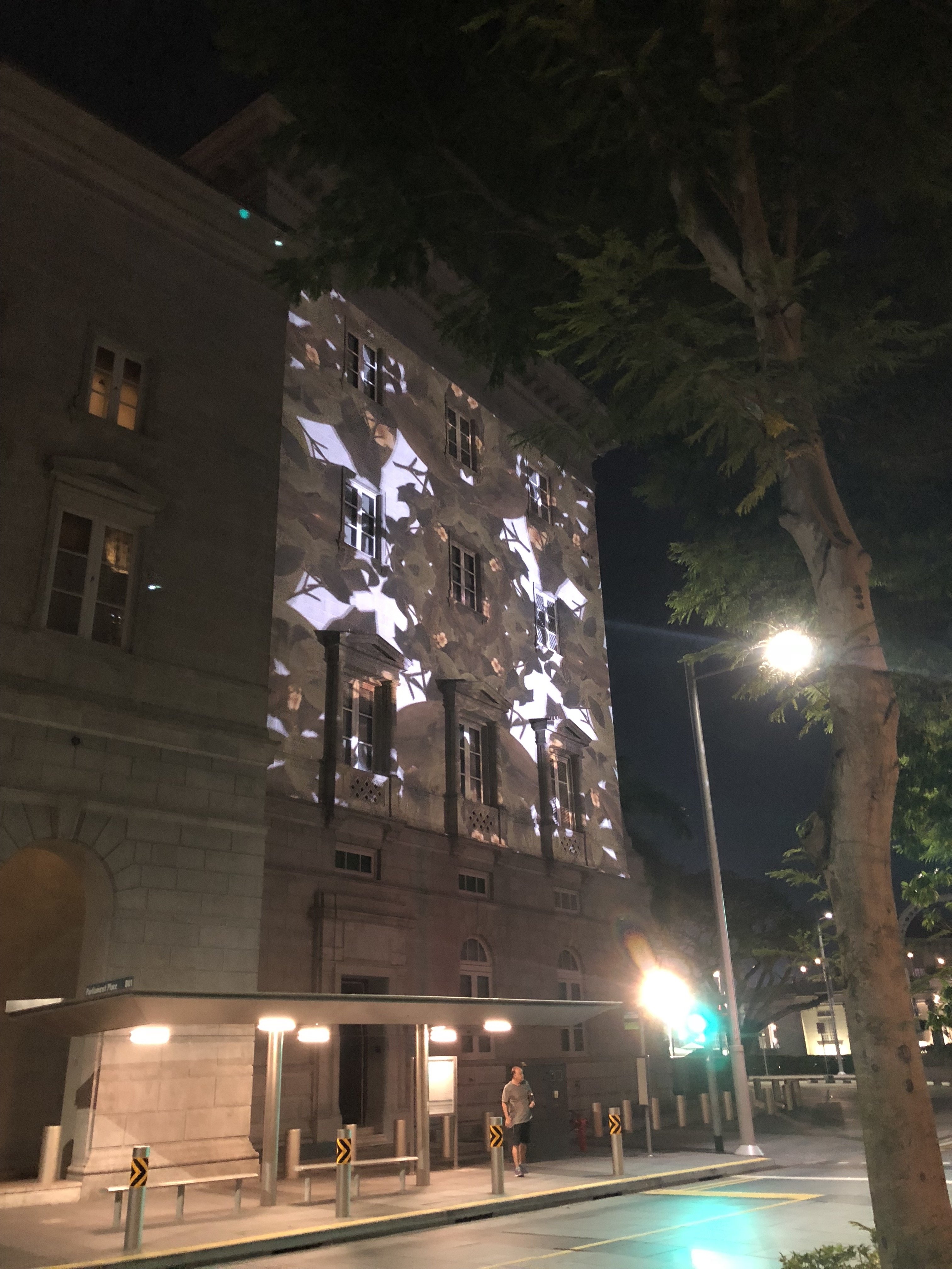
This was the first exhibit in Night to Light that I came across and I almost missed it because it was in such an inconspicuous location! I didn’t see the signboard for this projection hence I didn’t know it was a tribute to William Farquhar (it would have made more sense if I had known because Farquhar was known for his botanical drawings that he often commissioned). But I quite enjoyed it anyway, the symmetrical composition was very pleasing to watch and the plants were very beautiful.
Through Her Eyes
National Gallery Singapore(Supreme Court Wing)
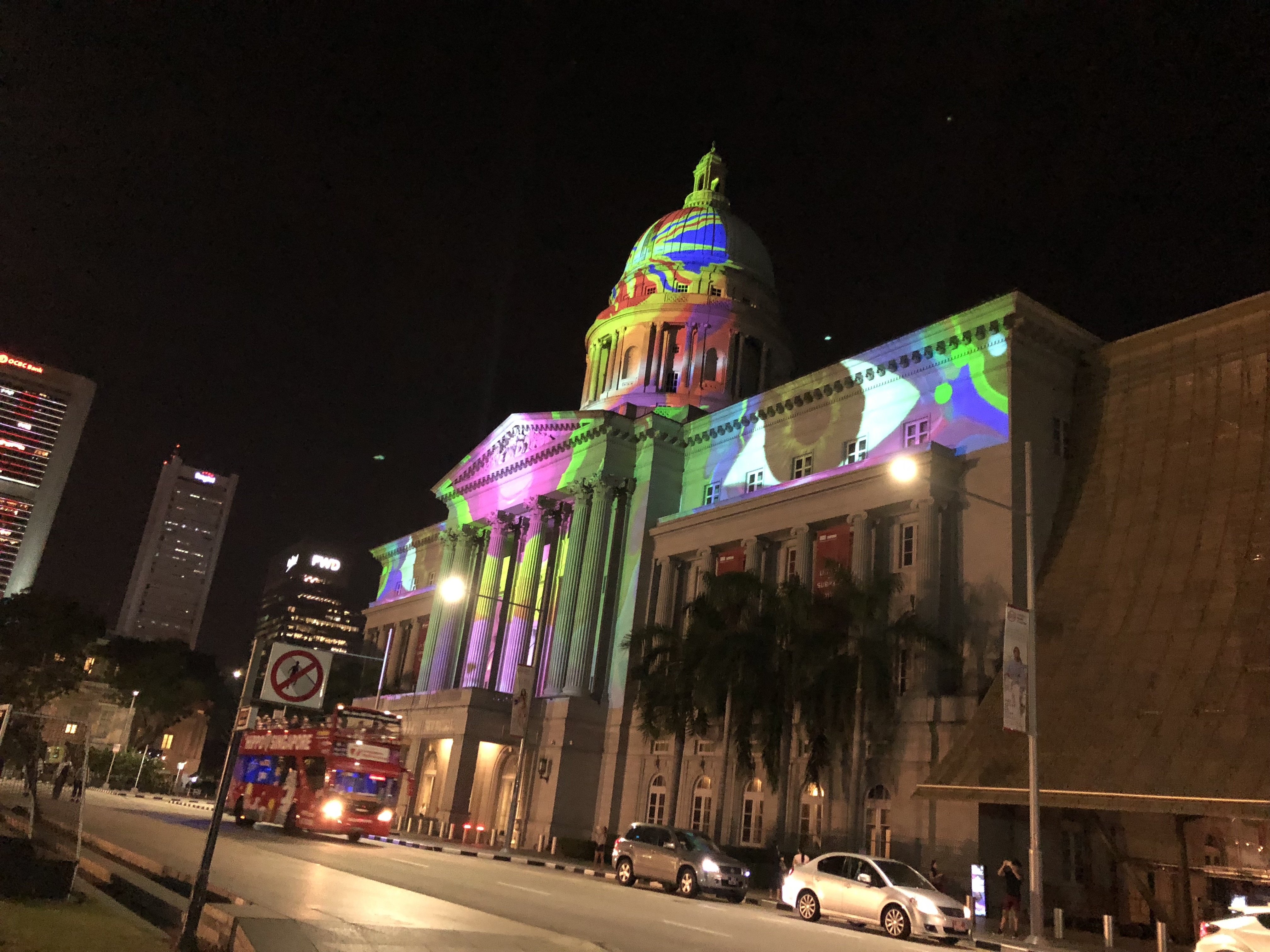
This piece started off as a black-and-white projection with text and the later part of the video was very colourful and vibrant. The 2 parts were extremely contrasting and I was a bit confused at first because I thought they were 2 separate artworks. However, since it’s about the history of the Supreme Court building, perhaps this contrast was intentional to show the contrast between then and now. Personally I liked the later half more because it was more vibrant and more easily visible!
I think due to the light pollution from external sources, the black and white projection wasn’t really visible so I could only see the text and I didn’t know there were supposed to be images until afterwards when I went home and saw the website. A lot of the details of the projection was lost due to interfering light from the sports field opposite.
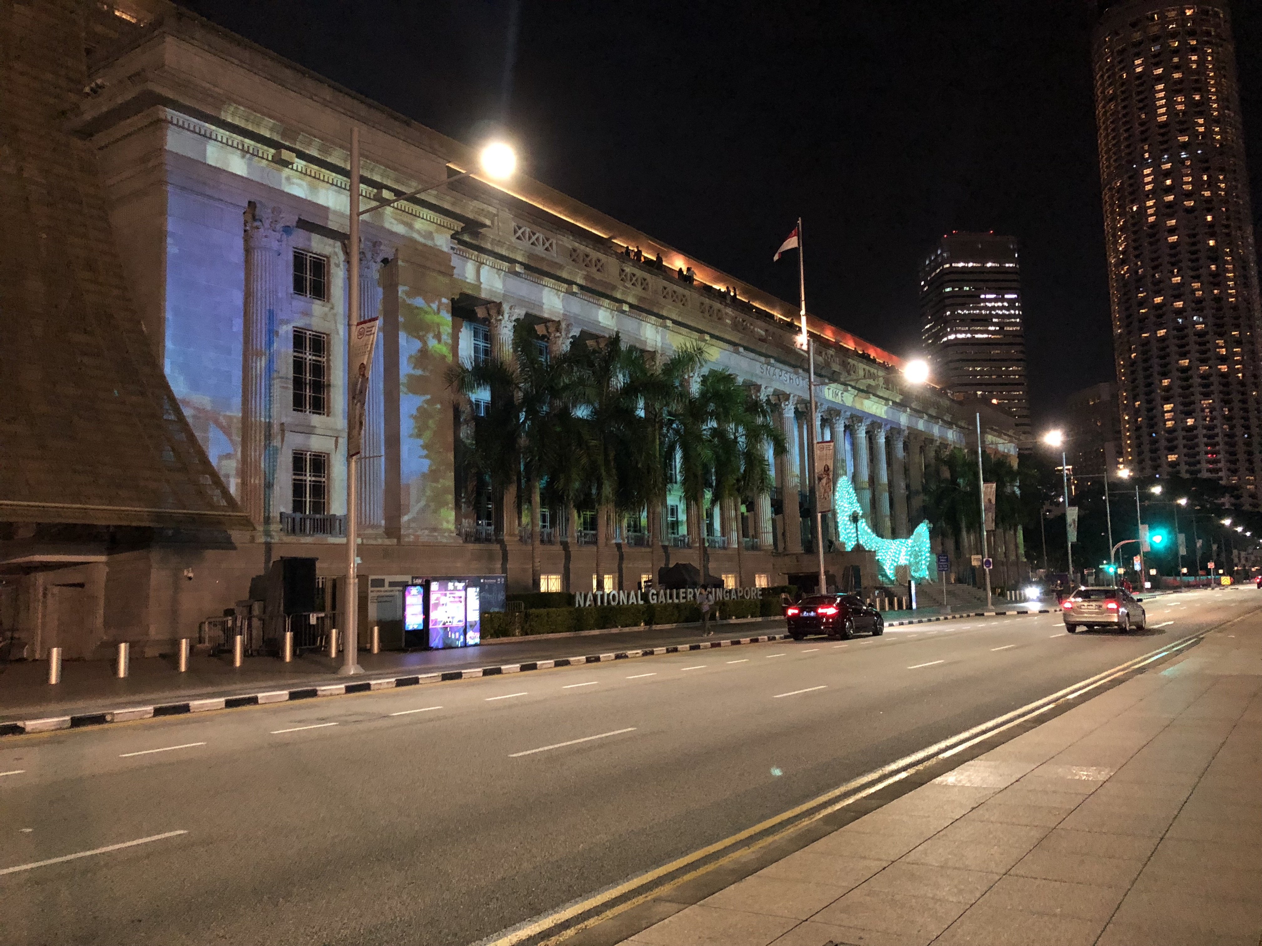
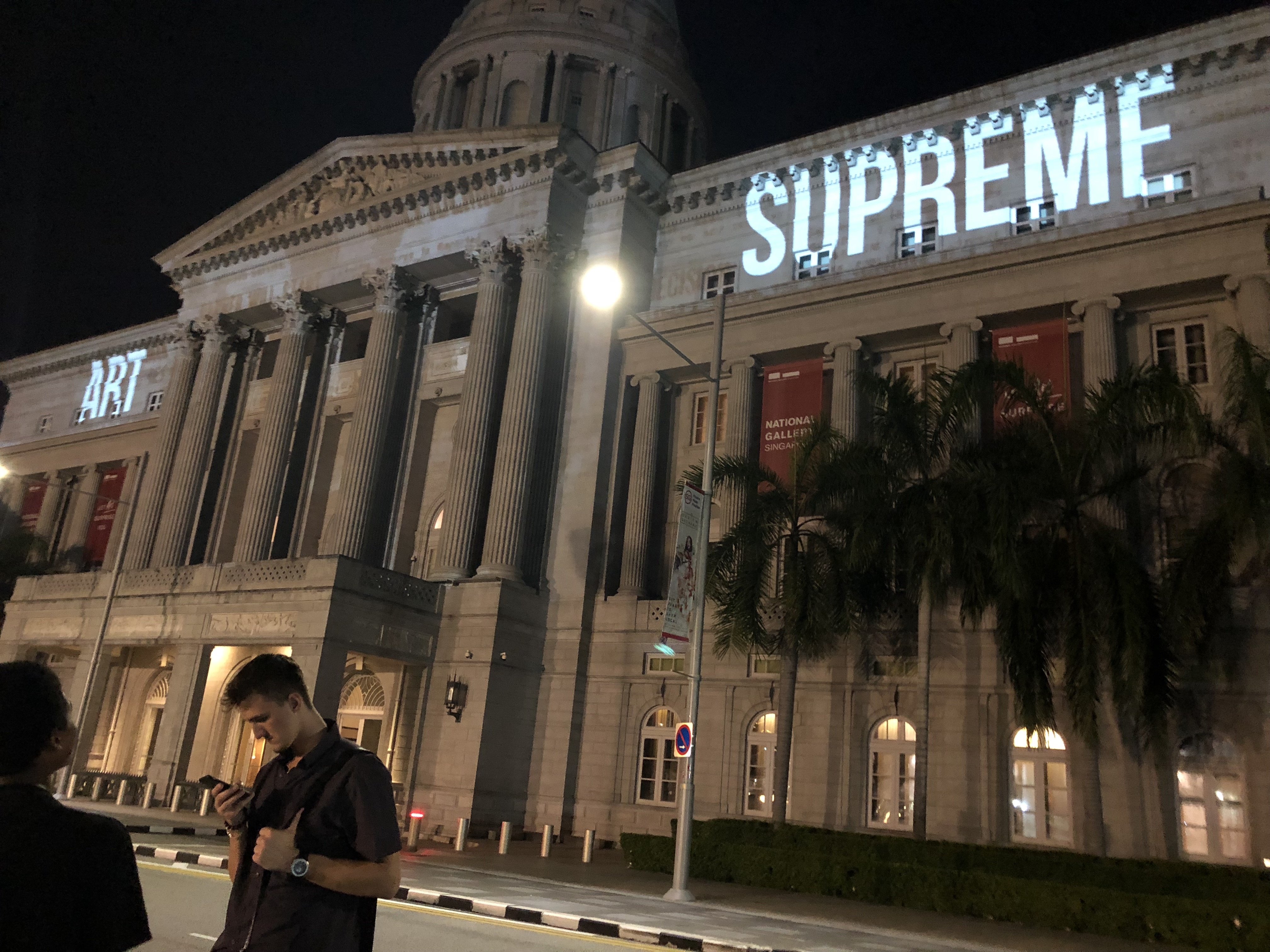
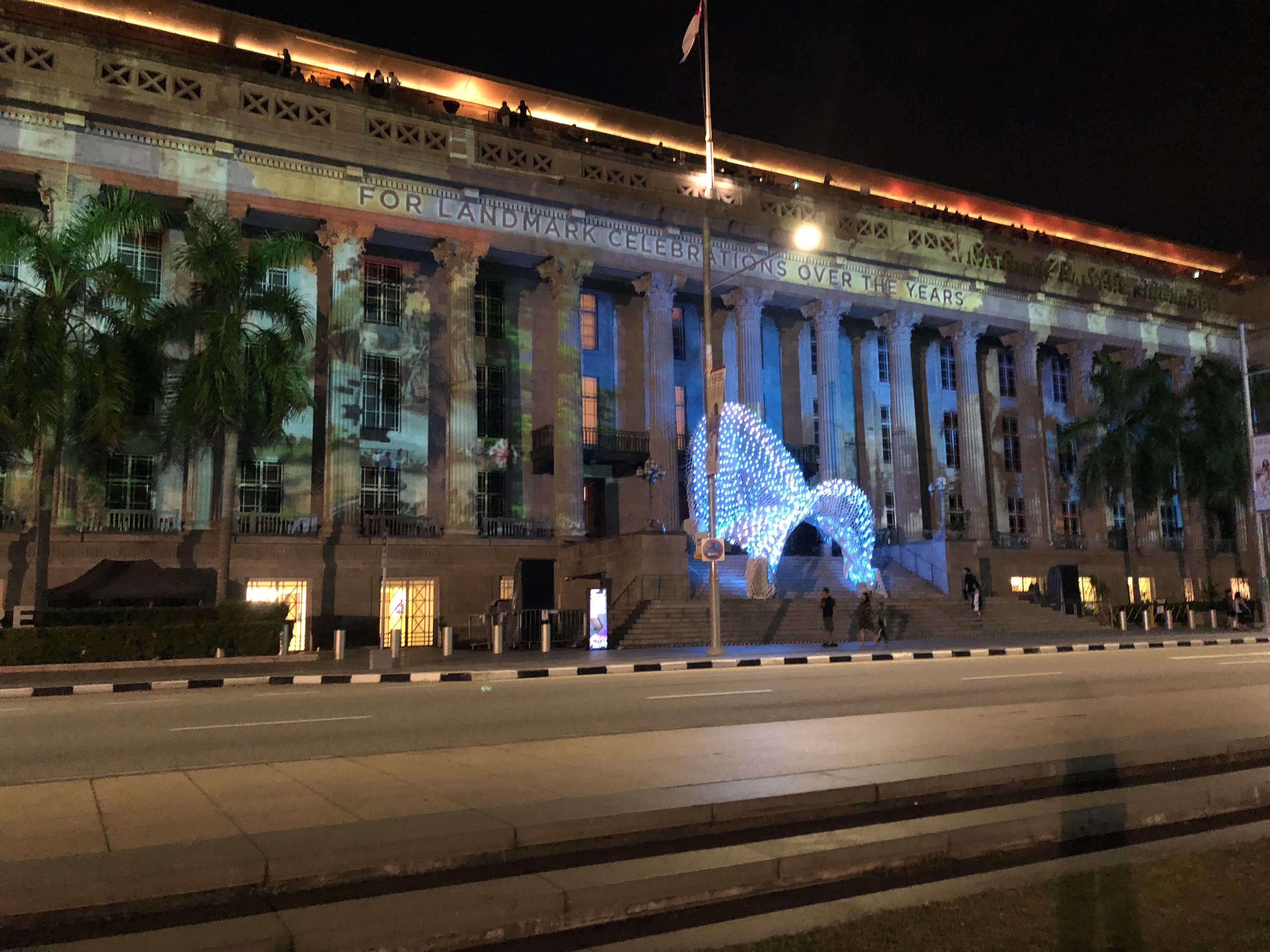
Secrets of the Sand, Written in the Stars, Snapshots in Time
National Gallery Singapore (City Hall Wing)
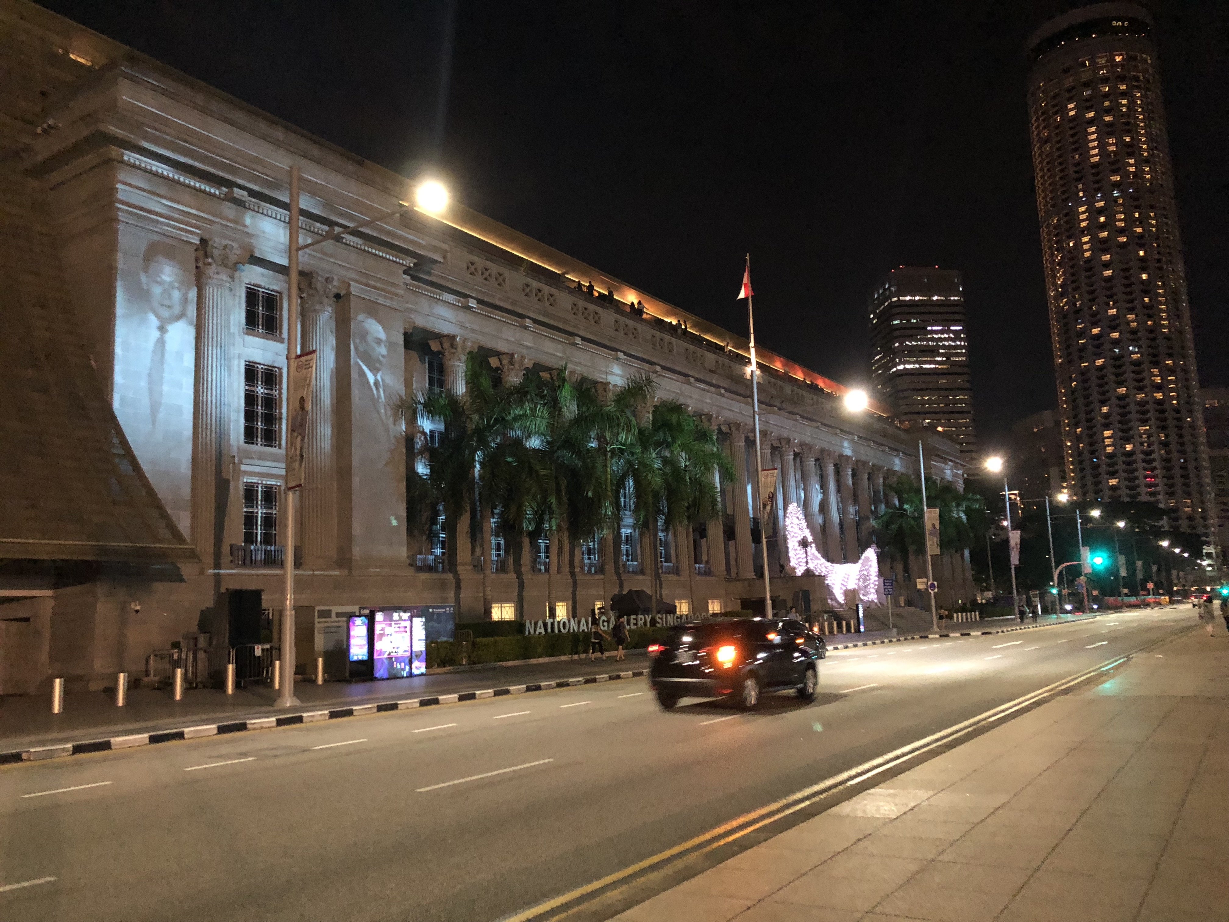
This was situated right next to the previous exhibition (Through her Eyes) and as such, at first I thought the 2 of them were a single artwork and was confused as I tried to view them at once as a singular art piece which didn’t work! Again, this was barely visible due to the interfering light but I managed to gather that it was a story about the history of Singapore from the images that I did manage to see. Some of the details of the video were very intricate and such such very hard to see because they didn’t show up well on the building facade, and also because the projection was so huge and we couldn’t stand far back enough to view the entire thing because there were activities going on in the field behind us. Because of this I felt like I preferred only the front part of the video which was more of a particle-like animation because it was simpler hence much easier on the eyes.
There was also a white structure at the front of the building facade which had colour changing lights that were choreographed to match the sound of the video. To me it was a bit unnecessary as it didn’t really look cohesive to the projection, so it looked like it was more of an afterthought or a separate art piece on its own. I felt the exhibition could have done without it, or it could have been matched with a different projection instead.
Stronghearts: The People of the Singapore River
The Arts House
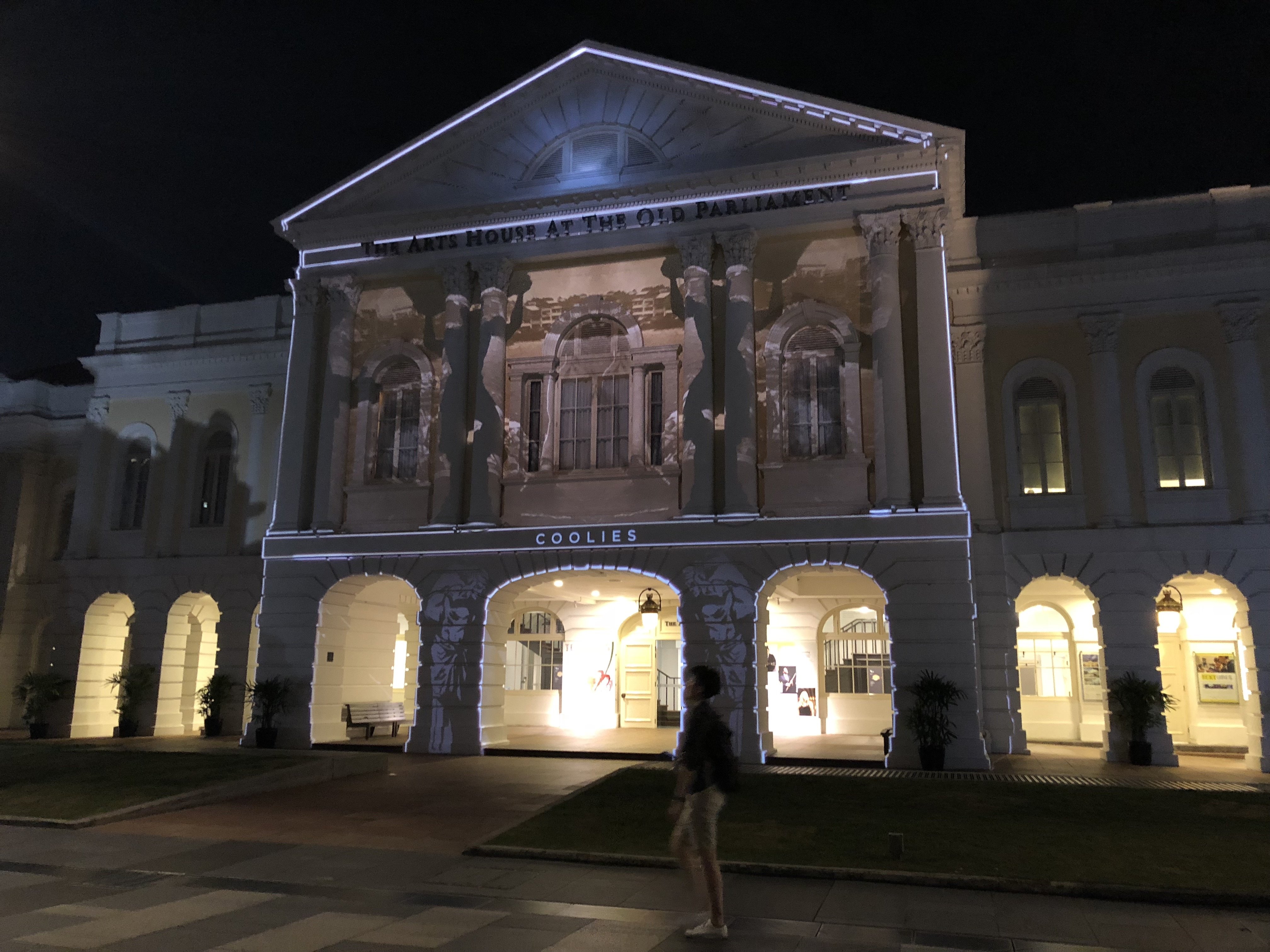
I really liked this piece because it was well mapped as well as the resolution was good and it was easy to view due to it being in a more intimate quiet location which was darker as well. This was about the history of the Singapore River and the kind of people we would have found along the river in the past, and it was very simple to understand and straightforward.
Open Books
The Arts House
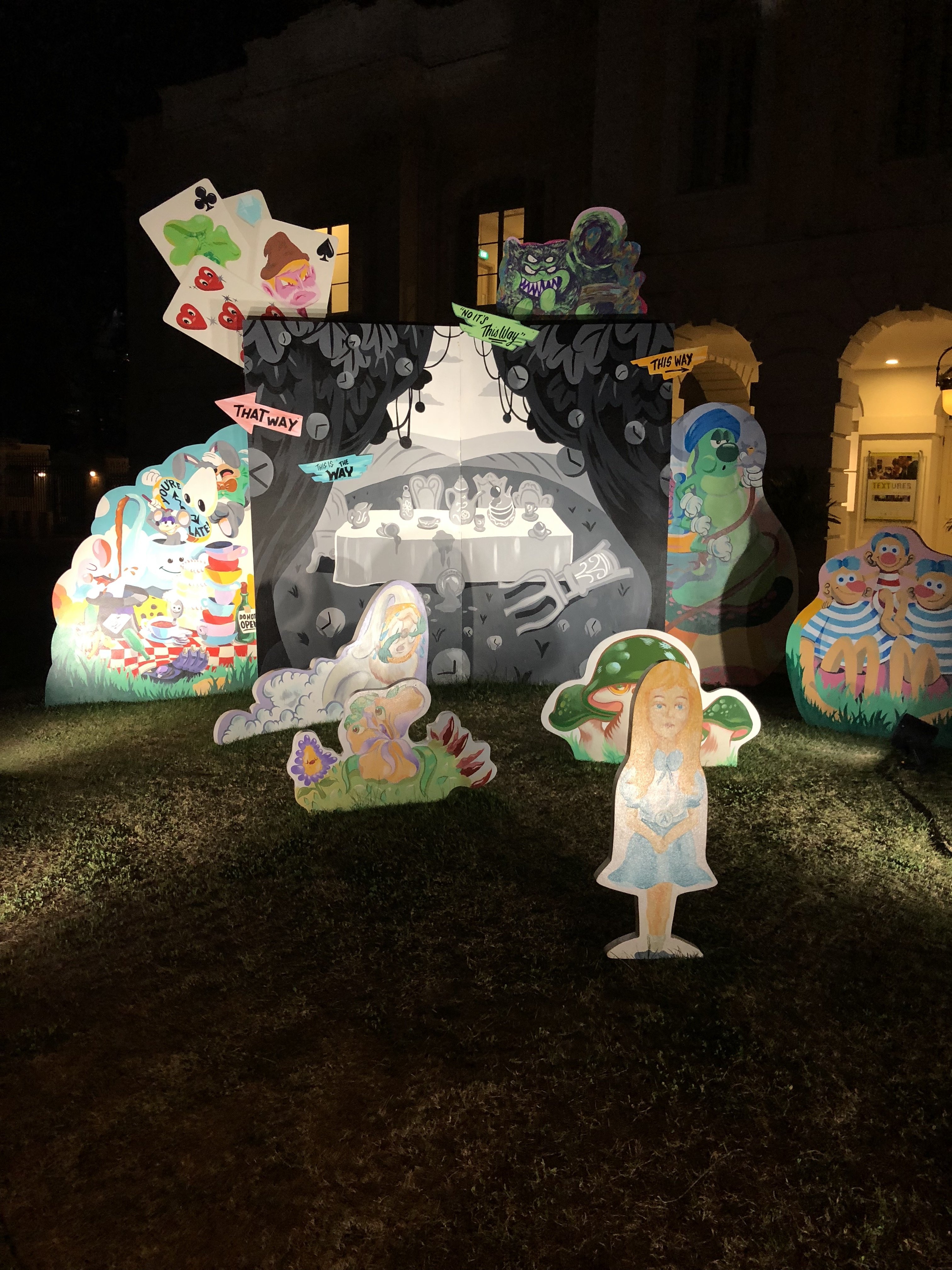
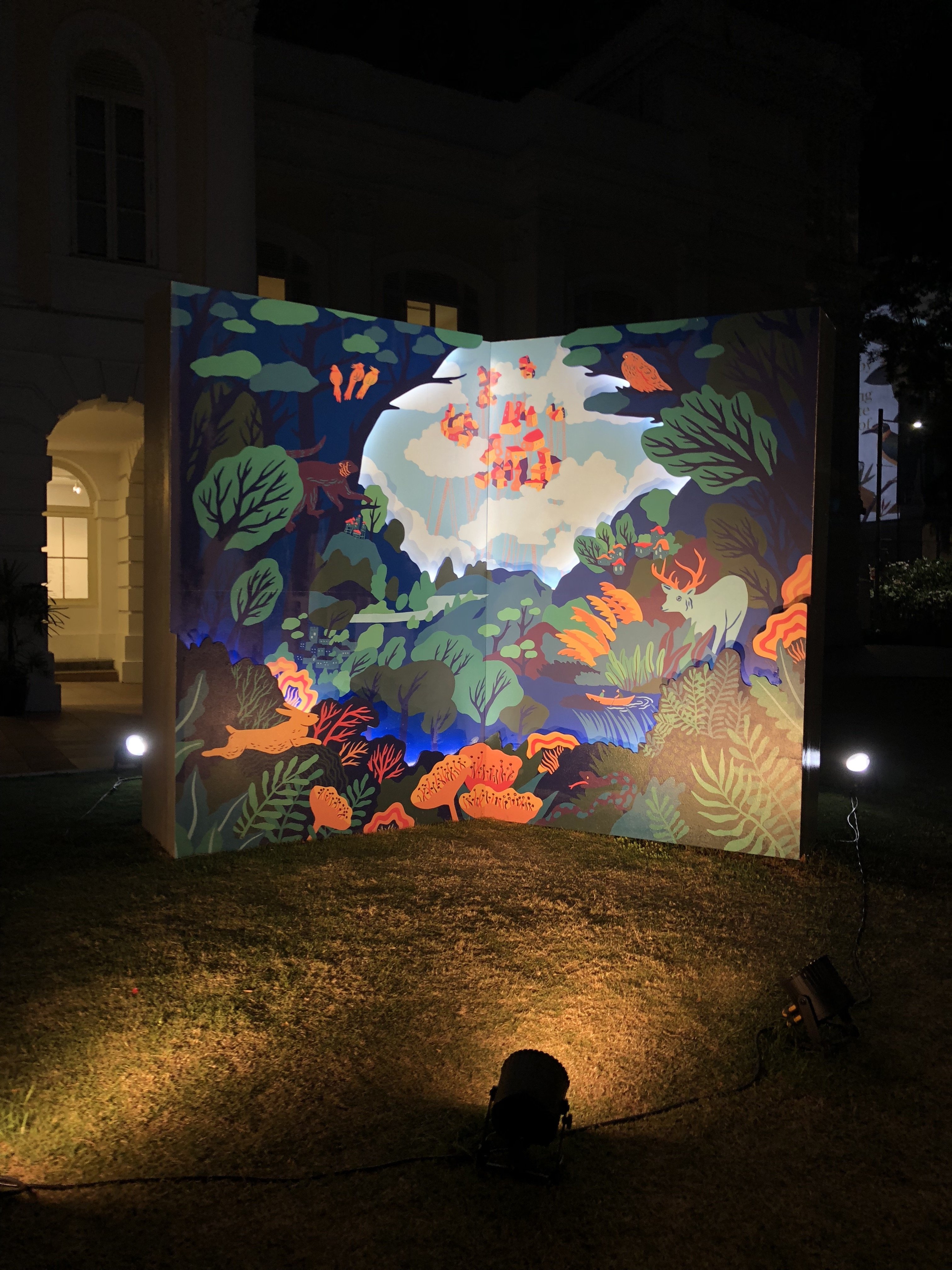
This wasn’t a projection mapping piece but it was nice to see! It consists of illustrated cardboard cut outs by local artist collective Tell Your Children. It added to the vibrancy of the festival and it’s nice to see support for local illustrators!
Portraits of Performers from the Past
Victoria Theatre and Victoria Concert Hall
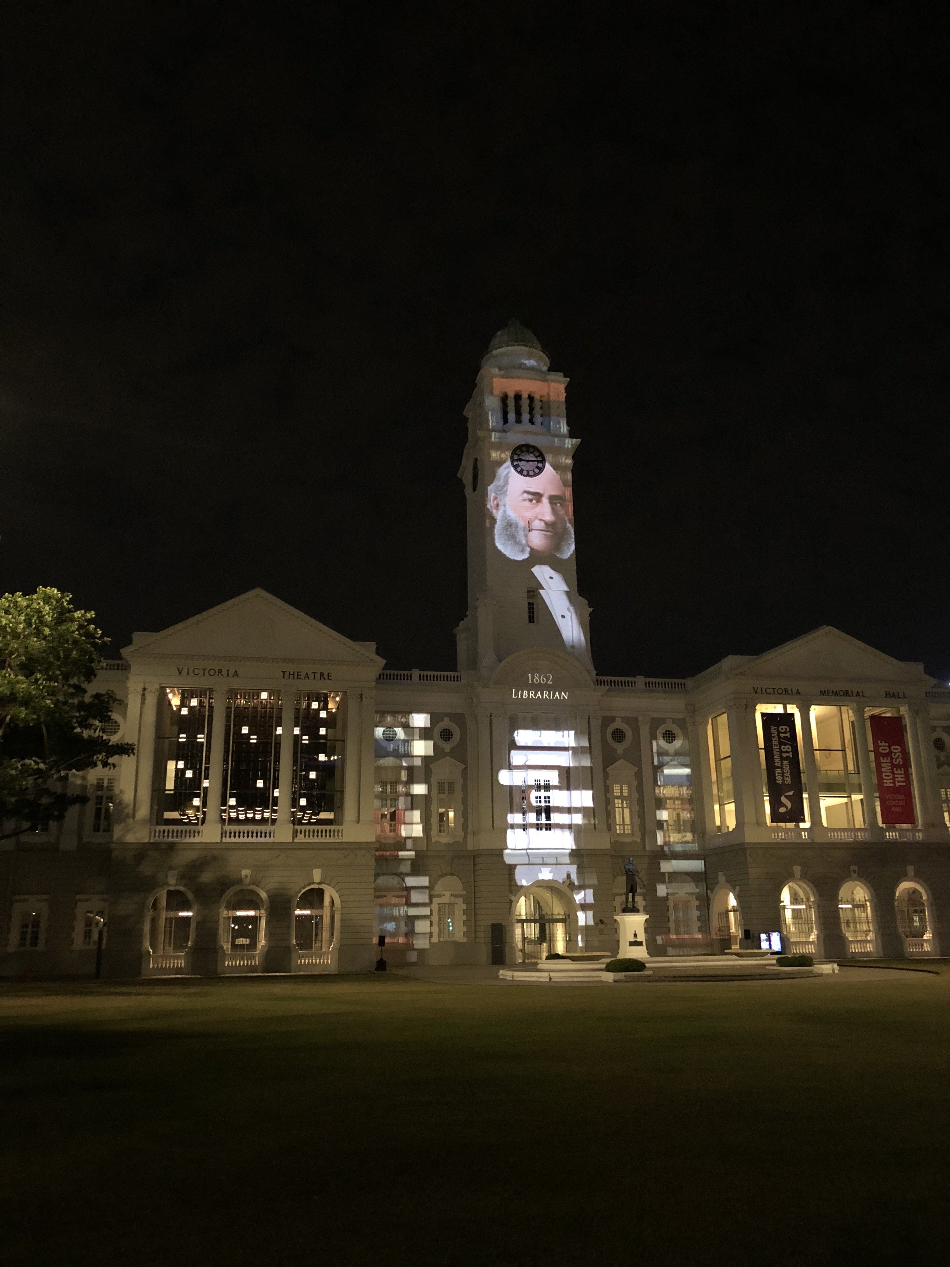
Coming from The Arts House, we very nearly missed this exhibit because it was blocked from our view by some trees. The animation and illustration style reminded me of the hidden object games that I used to play when I was younger!

Hidden object game haha
Sticks
Asian Civilisations Museum
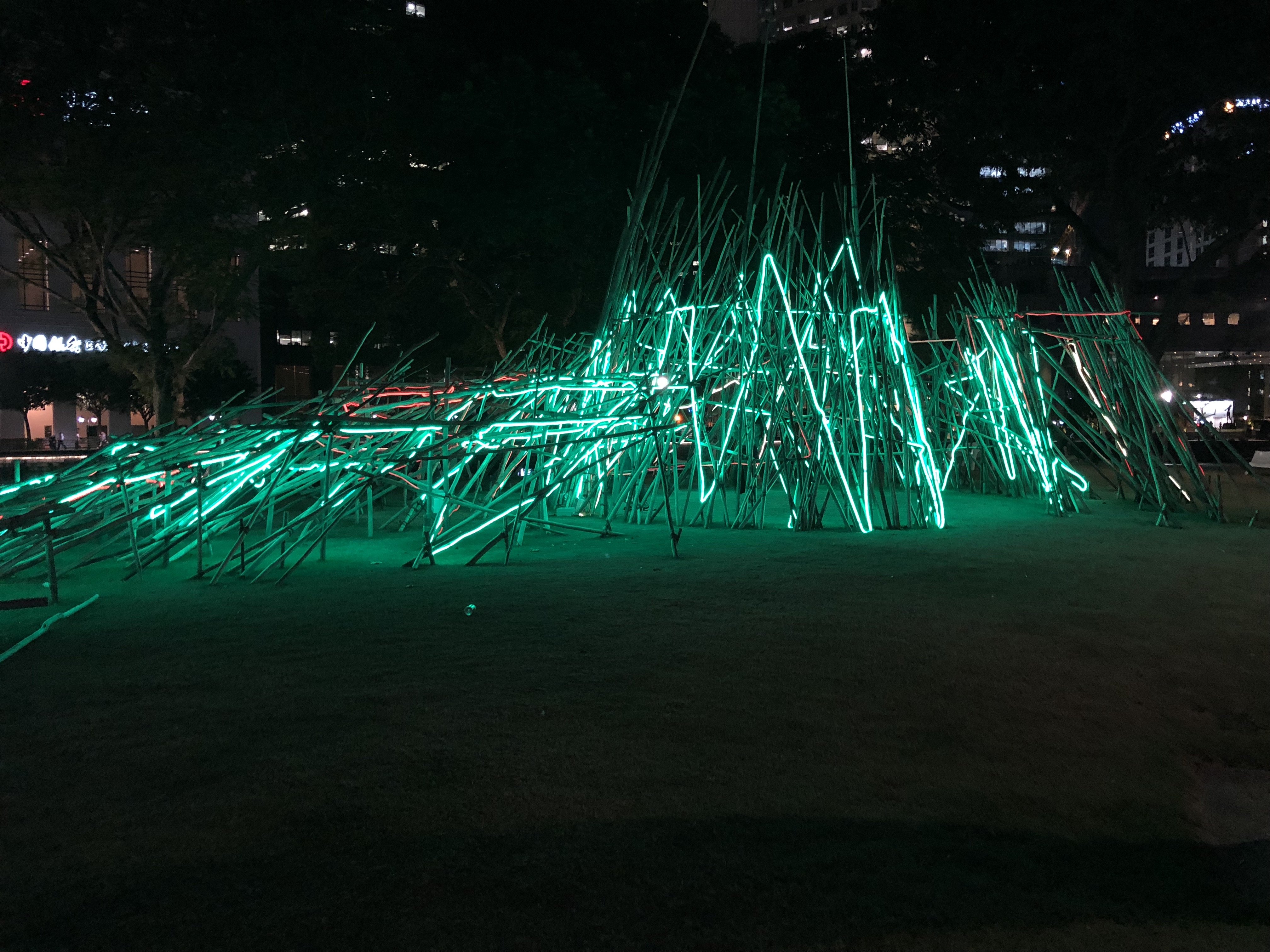
This was one of the only light installations that I saw in this festival, and I initially thought it was part of iLight. The concept behind this is quite interesting, the artist was inspired by pick-up sticks so I thought it was interesting how the lights flash different colours at night as the more modern versions of pick up sticks are made of plastic and comes in different colours whereas the traditional ones are made of plain wood with less colour like the installation. Hence I thought it was quite a fitting contrast to how one would view the artwork in the day and night, in the day without the colourful lights it would more resemble the traditional pick up sticks whereas at night it represents the modern version! But that is my own interpretation and I don’t know if the artist intended that!


Old vs New!
Intersections: The Story of Belonging
Asian Civilisations Museum
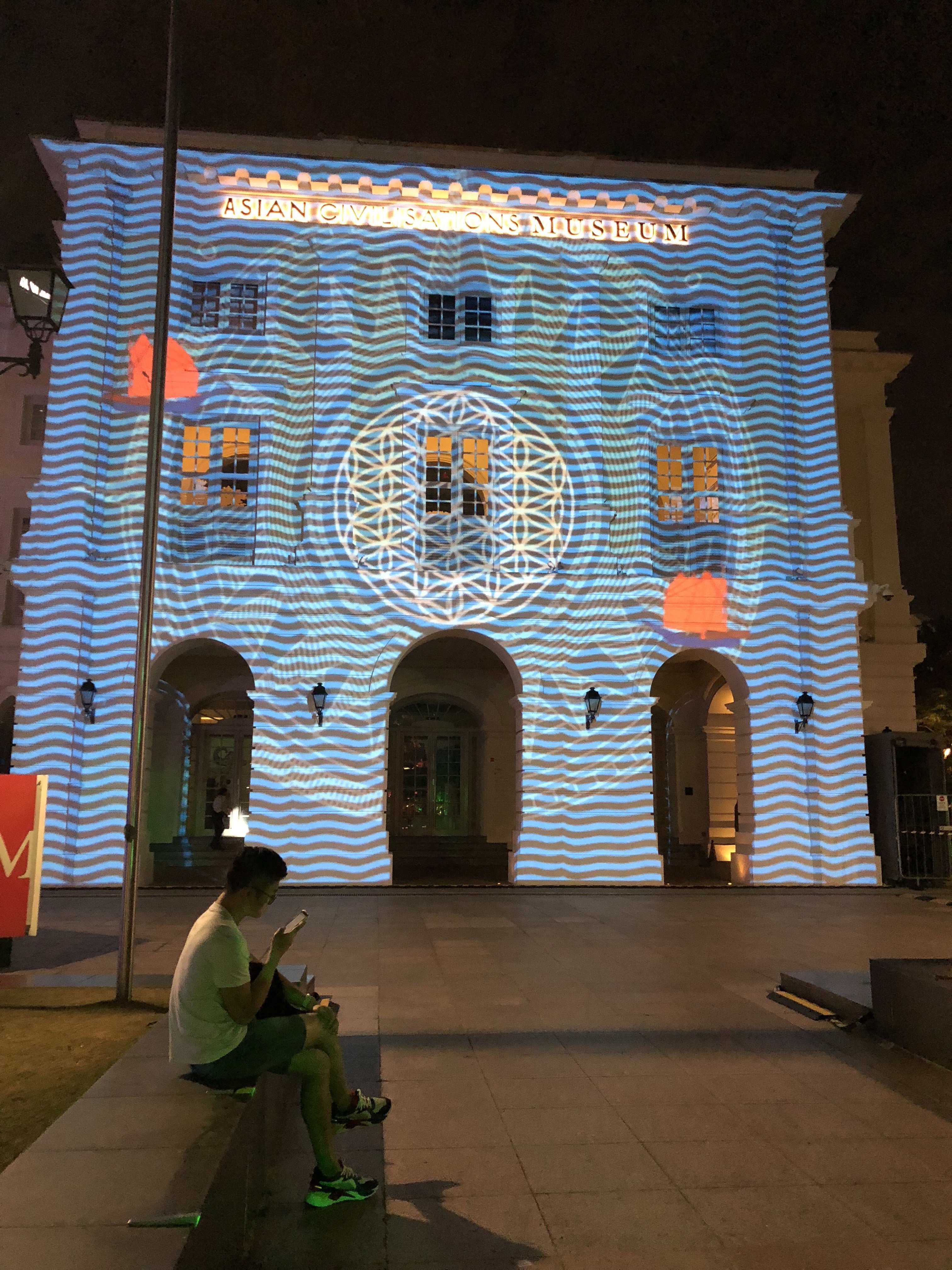
I think this was my favourite projection that I saw in this festival, because of the use of symmetry and vibrant colours. It tells a historical tale of Singapore’s origin story of Sang Nila Utama, in a fun and interesting way! It reminded me a bit of the projection which I saw at Wisma Geylang Serai. In front of it there was a canopy structure with scale-like pieces covered over it, not sure if it was part of this artwork or not but it seemed to be the best place to view the projection from so I assumed it was haha.
Overall Reflection
Overall for me the exhibition design and layout was a bit confusing for a few reasons. Firstly, it was spanning over several locations and some of the artworks were very hard to find as there was no comprehensive map of the whole area that we could access online. Because of this reason, we ended up forgoing all the exhibits at the Esplanade Park area as we couldn’t find them despite walking around the entire park!
Secondly, this festival was held in conjunction with iLight festival, and some of the areas were shared between both festivals hence we couldn’t tell if it was part of iLight or part of Light to Night festival. However Mavis pointed out that to a regular person who just wants to view some art at the civic district, it wouldn’t really matter to them to check which festival it is from as to them they are just viewing another artwork. It does make wayfinding quite hard though if someone is trying to view artworks in both festivals at once!
Thirdly, the placement of the signboards in this festival kind of bothered me. Because this festival was heavily based on projection mapping, I felt like they had to take into account that projection mapping is best viewed from a distance. Hence I felt that the signboards should have been placed at a fair distance from the building facade instead of directly in front of it, because the sign board acts as a placemarker to people that they should stand there to view the artwork. Furthermore some of the artworks like the ones on the National Gallery facade were not very friendly to be viewed from a distance due to events or structures that were in front of it hence maybe they could have done a smaller scale projection or chosen a different facade to project the video on.
I feel that when it comes to projection mapping, it is important to take into account the facade that it is being projected on and treat it was part of the artwork instead of just using it as a surface for projection for the sake of it. For some of the art works especially the ones at the National Gallery I feel there was a lack of consideration for the surrounding factors, such as the amount of detail in the building which disturbed the coherency of the video as well as interfering lights.
Nevertheless I did enjoy the festival overall and felt that some of the pieces were really good! It made me really happy to see that with Light to Night and iLight going on consecutively, the Singaporean art scene is really invigorated and exciting. I mentioned to my friend that if a tourist were to happen to visit Singapore at this very moment in time, they would be very lucky as they would have come at a period where there was a lot to see and do. I’m proud to be a Singaporean artist and can’t wait to start creating my own art to contribute to this vibrant scene (: