
Concept & Ideation
For this project, we were tasked to develop our idea based on some keywords about ourselves. Out of my list, the words I chose to develop on were:
Kardashian (because I am a huge fan of Keeping Up with the Kardashians)
Frogs (I have 6 pet frogs and they are my favourite animal along with other reptiles)
Taugay (bean sprouts, because I hate them and my friends keep tormenting me about it and trying to throw them into my food)
I wanted to include these things in my composition and I wanted the composition to tell a story and convey a mood to the viewer. I wanted my illustration to feel intriguing and yet also strange and unsettling, hence I knew that it was going to look a little disturbing but also spark interest. I feel this style represents me as a person, as I might seem like a normal or outgoing person on the surface but I am actually quite strange LOL. So im a lady in the streets but a freak in the sheets ((((: just kidding but basically that is what I wanted to convey, a slight sense of wrongness in the composition.
References & Inspirations
For this project I wanted to illustrate in the style of Japanese woodblock prints:

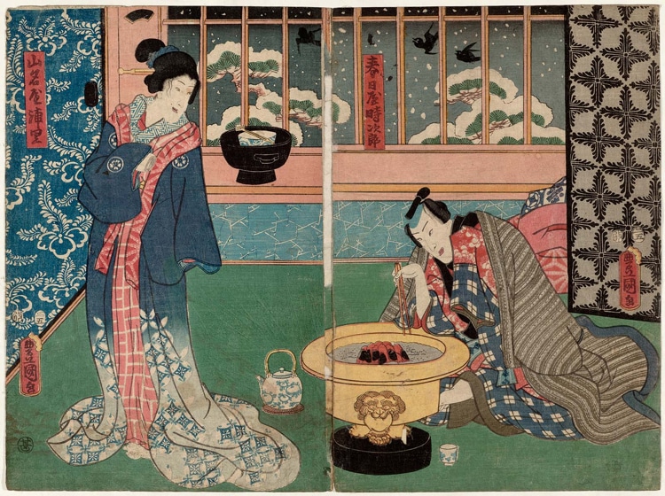
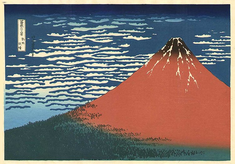
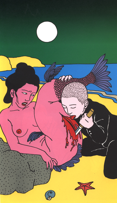
In particular I was inspired by the works of Toshio Saeki. While not all of his works are woodblock prints, his kind of unsettling illustration is the kind of emotion I am going for in my own portrait, and I like how he manages to use the illustration not to directly tell a story to the viewer but just to suggest what has happened in the image.


Process
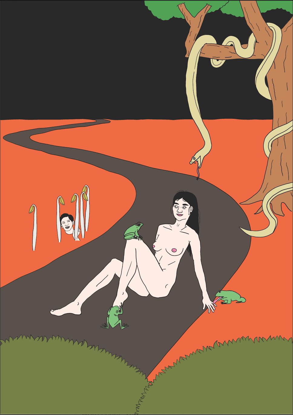
This is the incomplete drawing which I submitted for critique on Week 3. I wanted to try out this colour scheme because I thought it would give the composition this horror-like fantasy feel but the green bushes at the foreground were a little too dull! I placed the bushes there to give the viewer the feeling that they were peeking in on a scene that they were not supposed to witness. I also drew one of my friends and put his head behind the taugays at the side to show him kind of peeking out of them in a playful manner. I scaled down the size of the head on purpose and made it look like it was sticking out of the soil to give it a more cheeky, impish look.
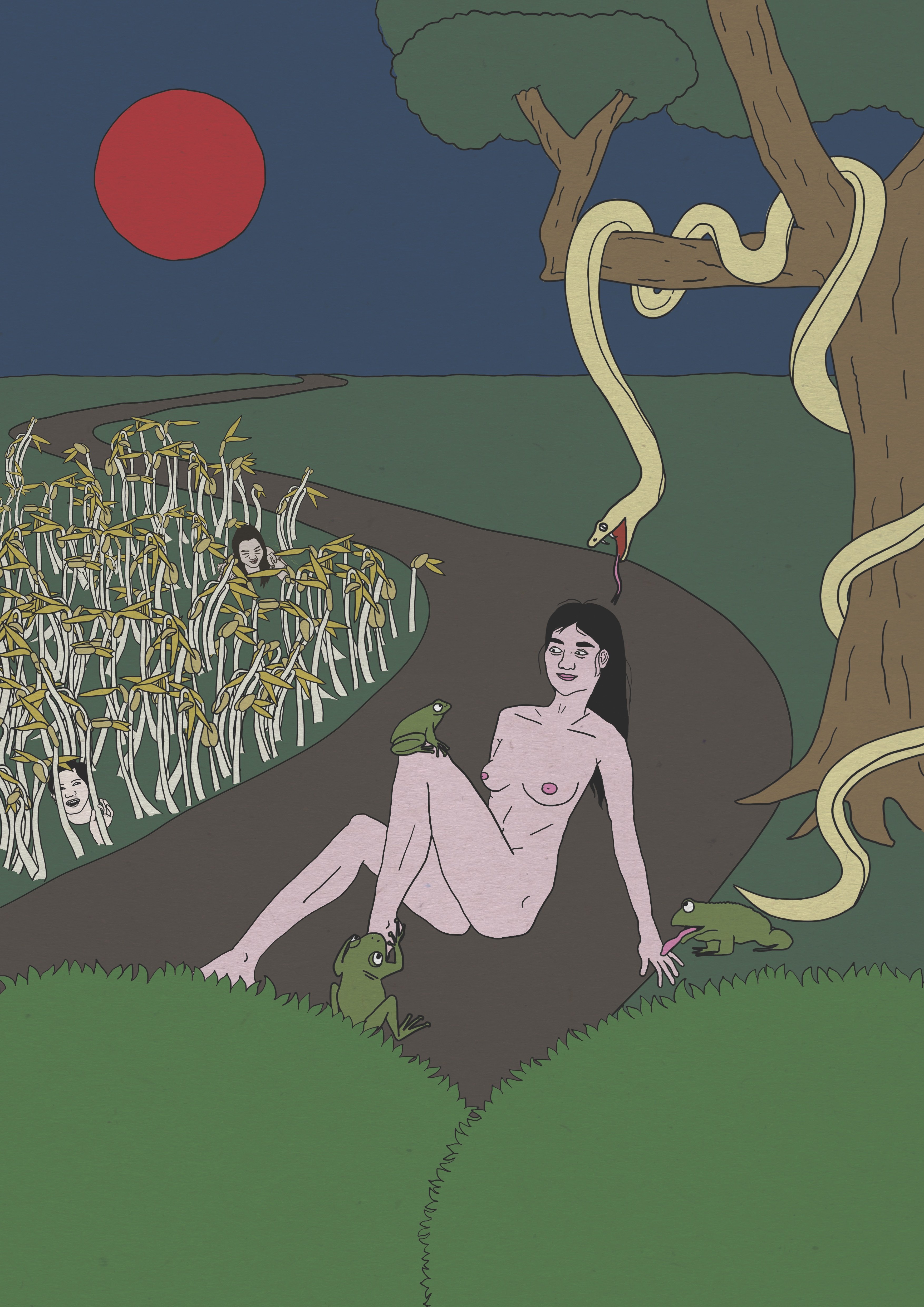
Finally, after the critique on week 3, this is the final piece which I decided to go with. I was not feeling the previous colour scheme so I changed to this palette instead with muted primary colours, which I feel is more fitting of the Japanese woodblock print style and also more symbolic of my personality. I also redrew the taugays and used more of them to crowd out that area of the composition to give it a more unruly and forest-like look. I added another friend of mine into the taugay forest because I have 2 best friends and I need to add both of them into the drawing to be fair HAHA. I also made the bushes bigger so they are covering my foot in the illustration slightly to give more off the voyeuristic effect, as well as making the eyes of the frogs bigger so the gaze is more apparent.
While the face part of this self portrait may seem quite small in scale compared to the rest of the portrait, which I was initially worried about, after consulting with Lisa I decided it was ok because since all the other subjects in the illustration are looking at the face, the viewer’s eye will be led there hence it is still the main focus of the composition.
Overall I am quite happy with my final product of this project! If I could change one thing about it I would have tried more colour combinations as I tend to rely a lot on primary colours as an illustrator, however since this is a self portrait assignment I guess the primary colours is also an important part of my self expression. Looking forward to presenting this to the class in the next lesson!
You must be logged in to post a comment.