Task: Pick 4 quotes from the same movie / 4 different movies.
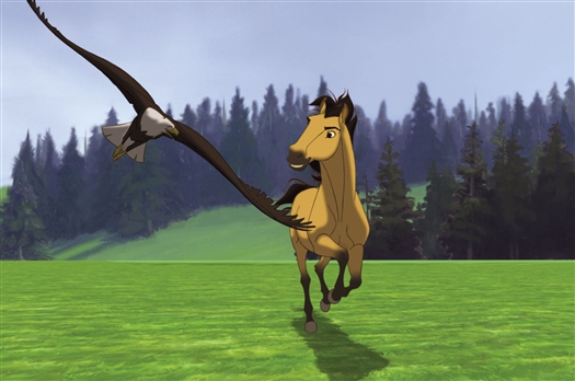
I selected the Dreamworks Animation Production of Spirit: Stallion of the Cimarron. For largely the fact that it was really the first movie that had brought me right into the heart of animation, and my love for animals. It was a classic, 2002-piece that spoke of the struggles between mankind and nature. Of how sometimes nature can simply not be tamed, no matter the feats of modern mankind.
The movie had little dialogue, where most of it was a voice-over from the inner narration of the Main Character (the mustang; stallion’s) thoughts and responses, making the words seem more precious to me.
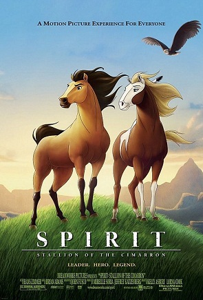 Movie poster for the Animation


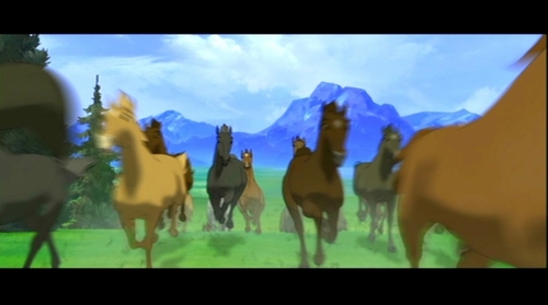
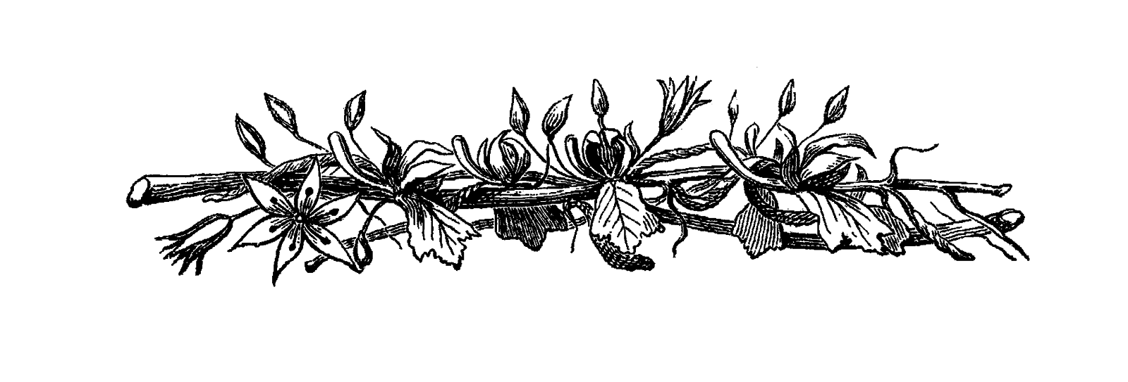
Screenstills from the movie
The 4 quotes I picked are: (the italic areas are the shortened ver.)
1) “They say the Journey of the West was written from the Saddle of a Horse, but it has never been told from the Heart of one.”
2) “I remember the Sun and the Sky, and the Wind calling my Name. In a time, when wild horses ran Free.”
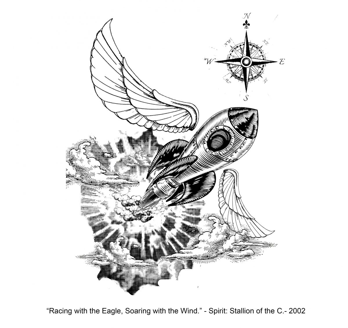
3) “Racing with the Eagle, Soaring with the Wind. Flying? At times I believe I could.”
4)“The hoofbeats were many, but our Hearts were One.”
I chose to focus in on the more visual aspects of the quote, and played around mainly with the elements through different interpretations.
Quote 1 Study)
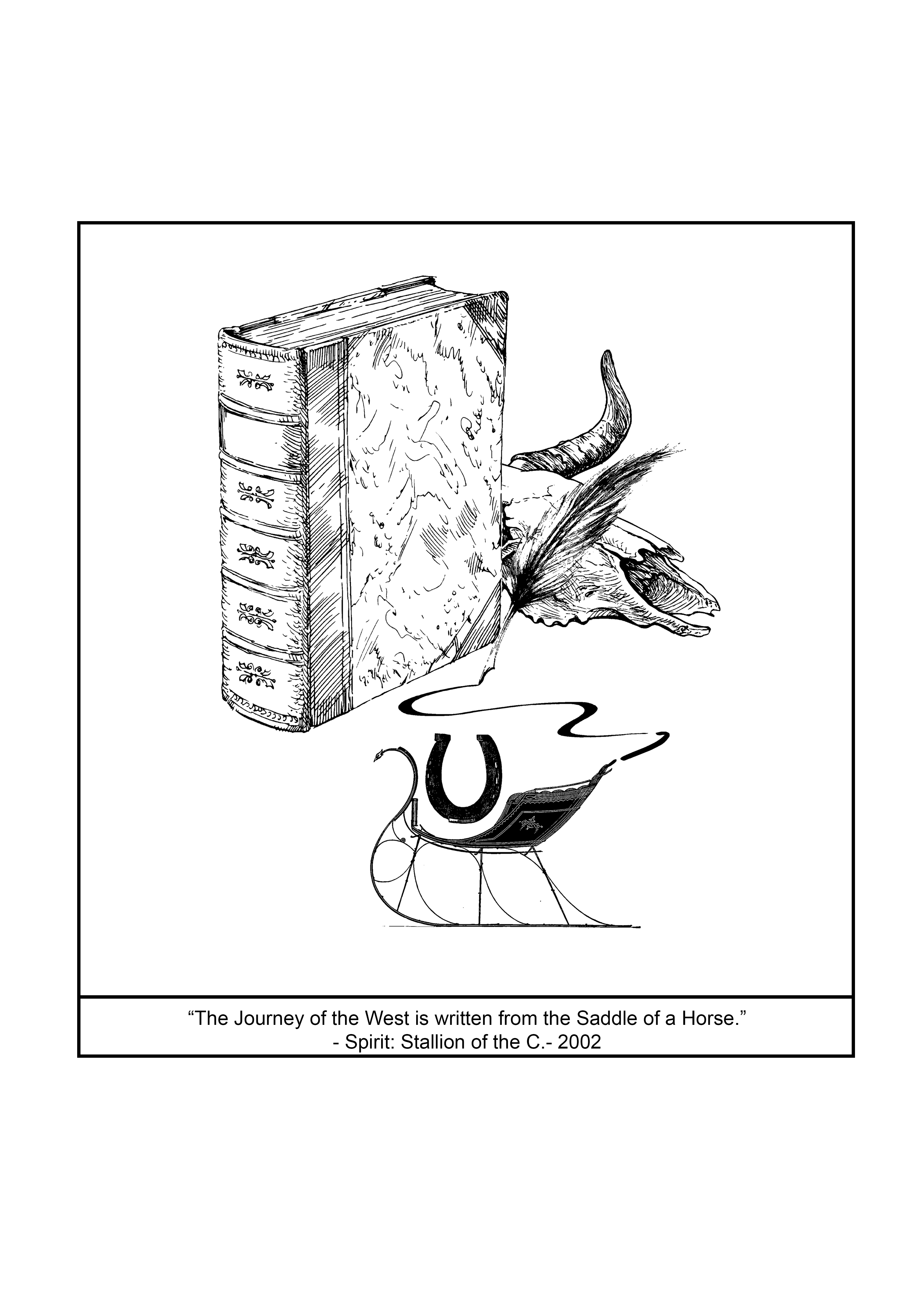
I selected the buffalo skull as the fastest symbol to represent the West (Wild West America), the book and quill as documentation and the carriage/sled as the horse figure (with a horseshoe to further its identity).
Buffalo Skull: The iconic imagery we would see regarding the Wild West.
Book and Quill: Standard forms of recording History.
Sled: Horses are effectively transport to us, hence I went down the line of thought using what the horses are made to do as a symbol of what they are in our eyes.
Thoughts: The piece seemed a little empty for me, and I didn’t like this quote as much as the others.

I went for a more map-looking feel for this quote, feeling more rather than thinking. Hence it might explain the arcs, wavy looking curves in this design since I was trying to capture the quickness of the wind. I tried to base it off a little more towards a tarot-card design, since there’s a tarot card that is genuinely called the Sun. I love the fact that tarot cards manage to bring out the appeal in the antique style as well.
The Sun: a literal representation (mimicking tarot style)

The Sky: The clouds and water (about how skies are blue due to the refraction of colour from the sea)
Wind: Wind vane supporting all the characters and the old man blowing the gust of wind (akin to a children storybook)
Thoughts: I felt that the design simply wasn’t representative of what I wanted; being something simple and to the point. It was a good exploration of different methods to present the meanings though.
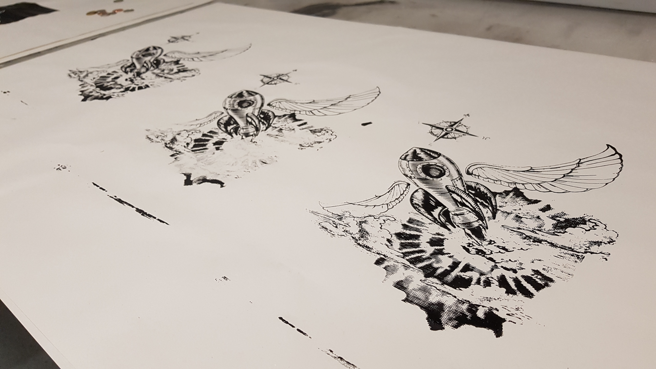
Quote 3 Study) [selected this]
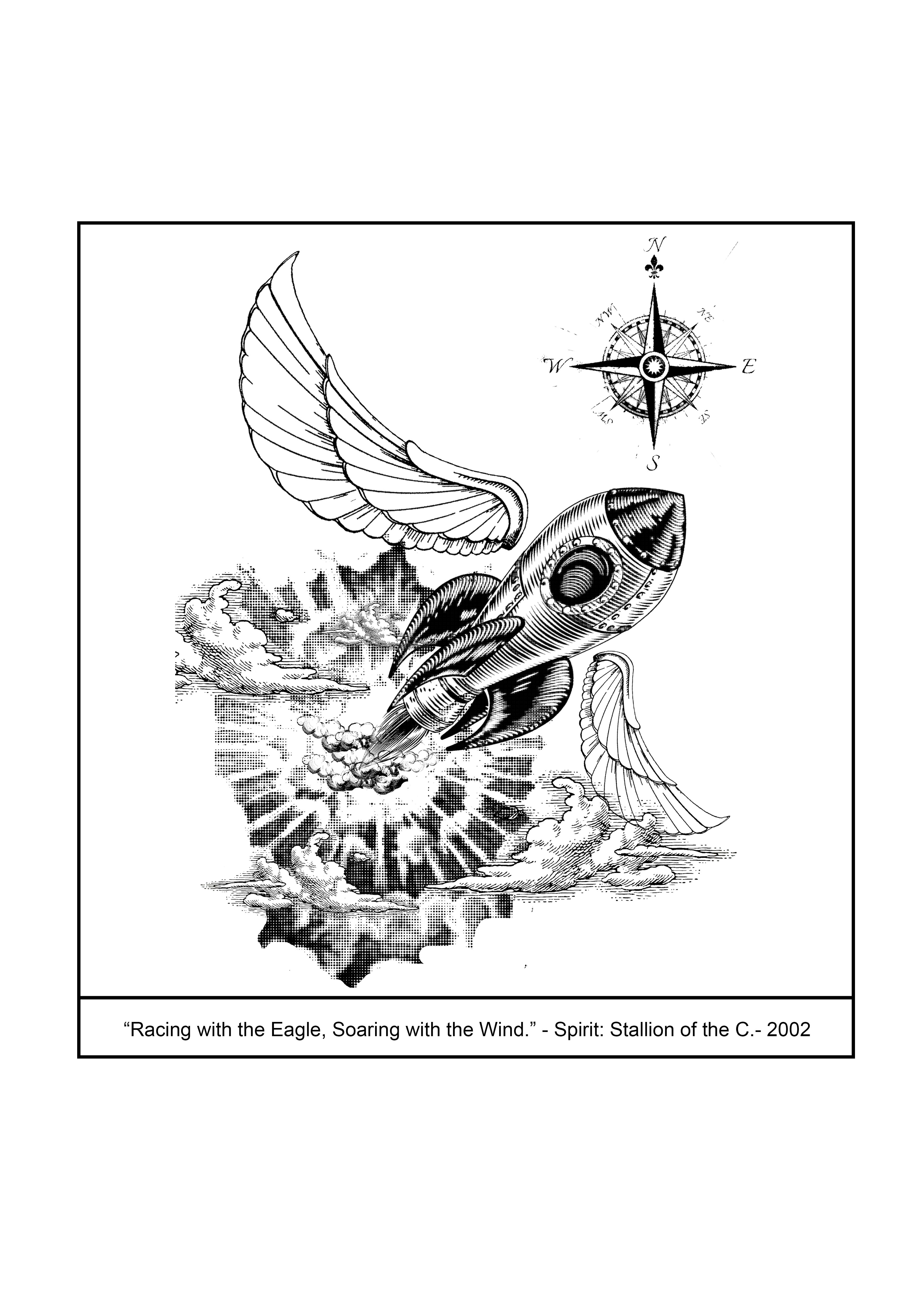
I adored the force behind the rocket and how well it represented the quote then. The rocket also clearly remained an area of focus, with the compass being above as though there was a map, yet not restricted to its confines.
The simple design of the wings also brought out the details more. I had initially planned to use :
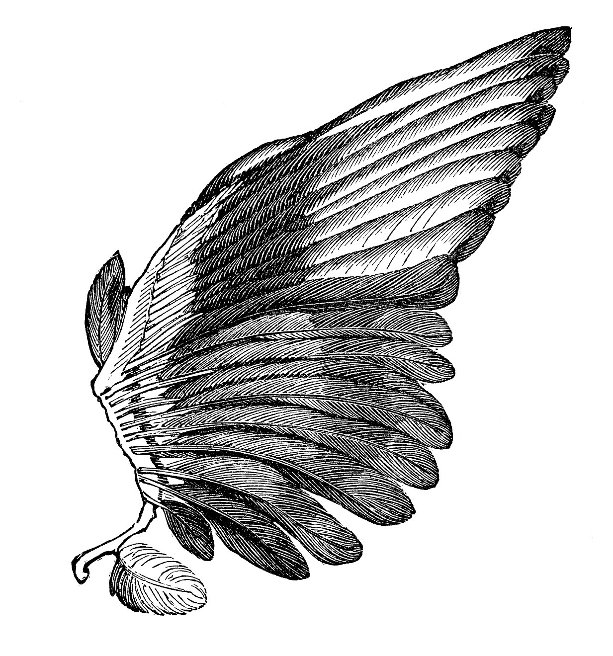
Eagle wing (PNG)
Yet, when I combined them together, it was overtly messy and it took the focus away from the rocket (which represented the main character as a horse, wild and free).
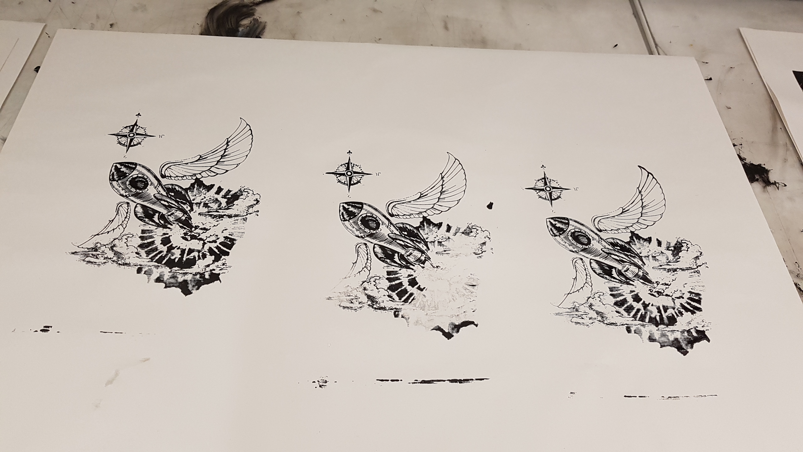
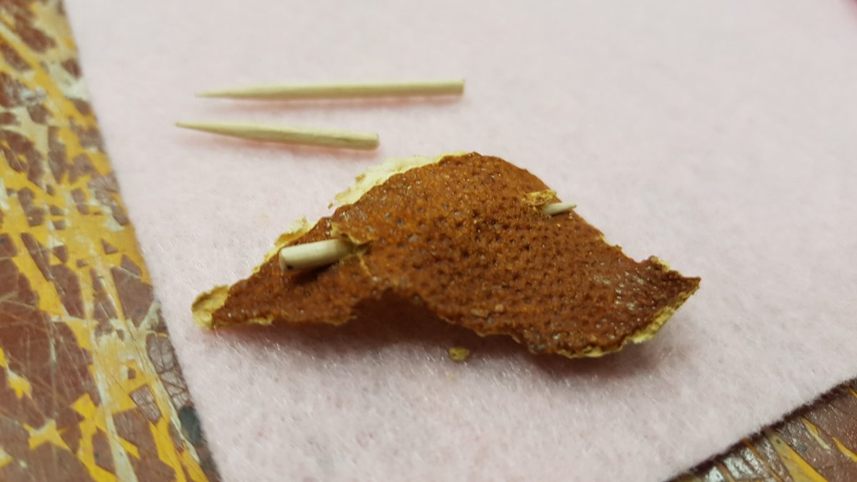
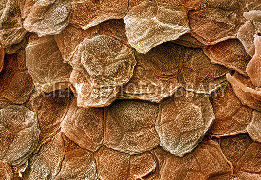
The background came from this:
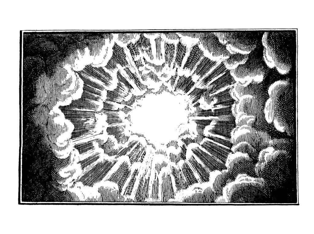 I colour-halftoned the picture, as thought to as as a technique to emphasise the picture. Cleaned up the border edges and made it less intense (dark) round the sides as well.
INITIALLY, I wanted to create a more emblem-looking design since I was more into the illustrative aspect of the quote:
 My professor suggested me to look into more abstract, less literal designs; which served as my yardstick through creating the other three designs.
Thoughts: I love the quote the most of the three, and generally focused on on bringing out the freedom and strength from the quote itself.
Quote 4 Study)
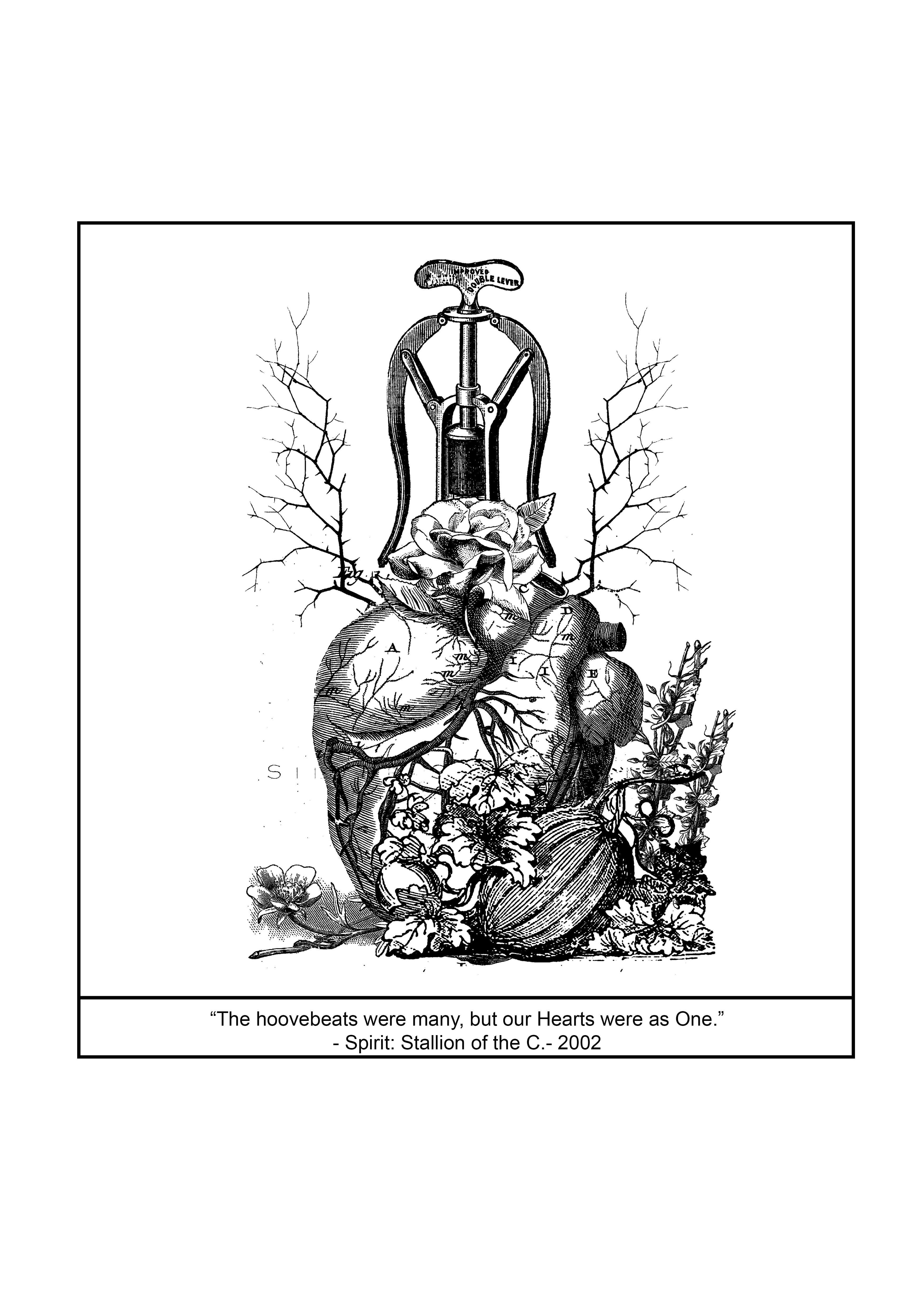
It was important to represent unity within the quote, as it was what I had thought would be the most appropriate, single word to describe the entire quote. I chose to add the heart in, since it is the crux the message for the quote. I adored the aesthetics of the final result, thought it seemed a little too cluttered for me, and that the details might get lost during the transfer to the silkscreen.
Plants at the bottom: (Fruiting) They are bunched together and gnarled together like a close-bunch of family members. I like how vines and the veins intertwine each other naturally as well.

The tap/ hose at the top was to represent the impending release/ gush of emotions for the family; largely towards feelings of elation.
Lastly, the most important aspect was the flower language behind the flower in the centre (the most crucial spot): Rose. Roses, in flower language; represents the meaning of unity. It stemmed from the heart, hence the feeling of unity comes from deep within.

Overall thoughts:
The search for appropriate pictures to match the rendering style and feel of the picture is a little taxing, since they need to be complimenting in order to look harmonious as a whole. The general gestalt of the composition have to be placed into consideration consistently as well. Infact, I collected so much more possible antique/ vintage styled art than I ever needed. It is truly an interesting project though nevertheless.
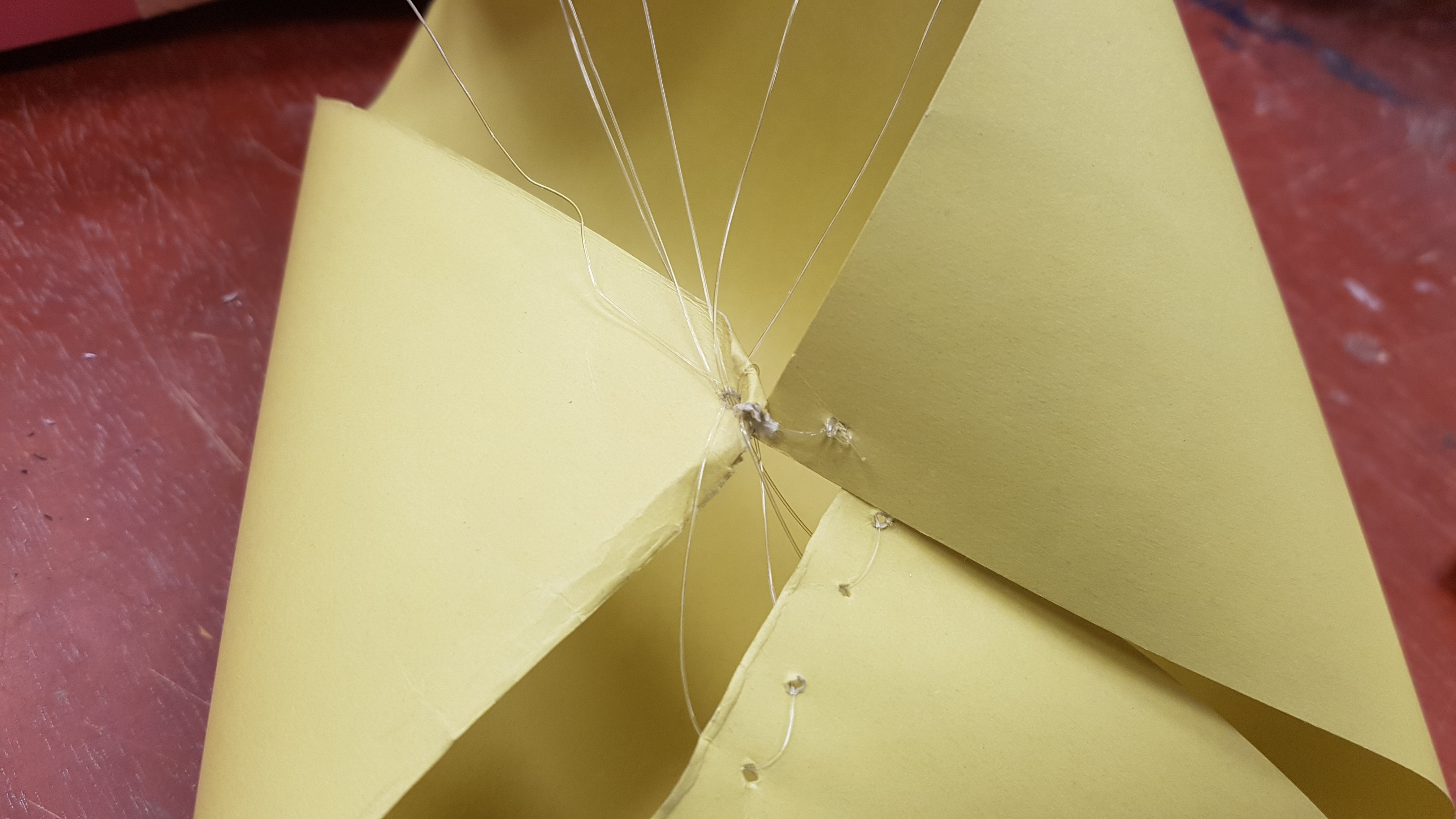
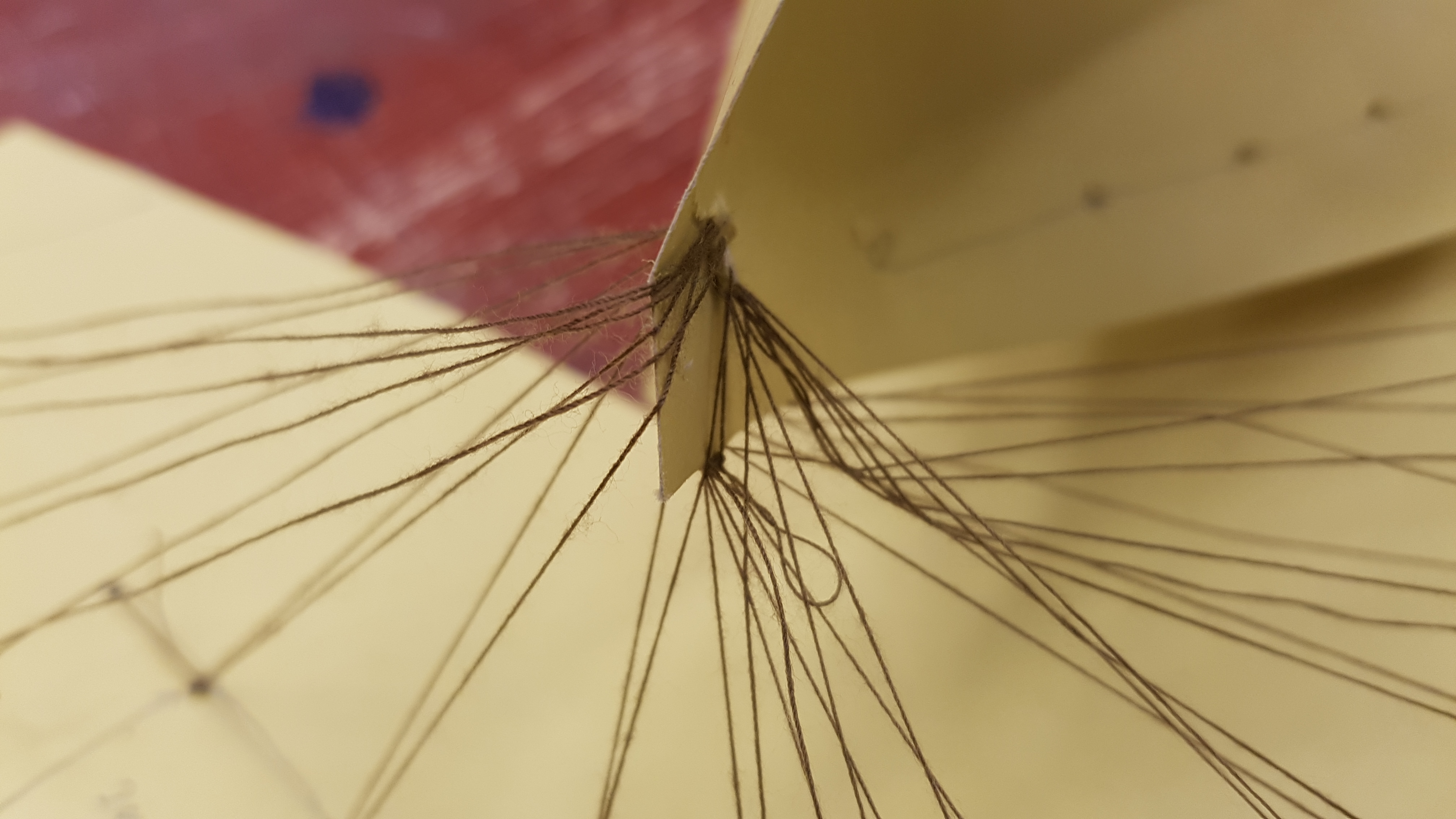
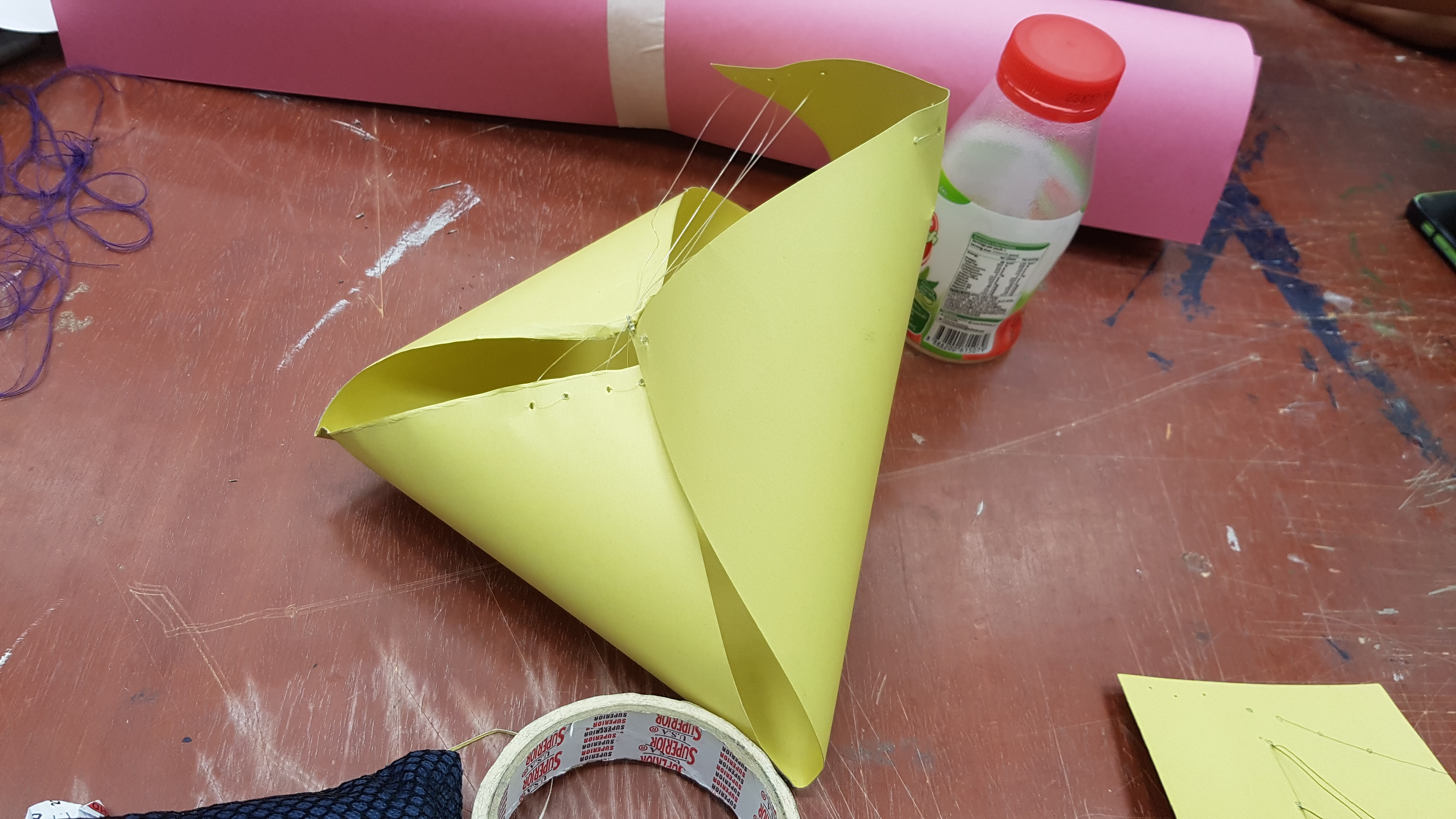
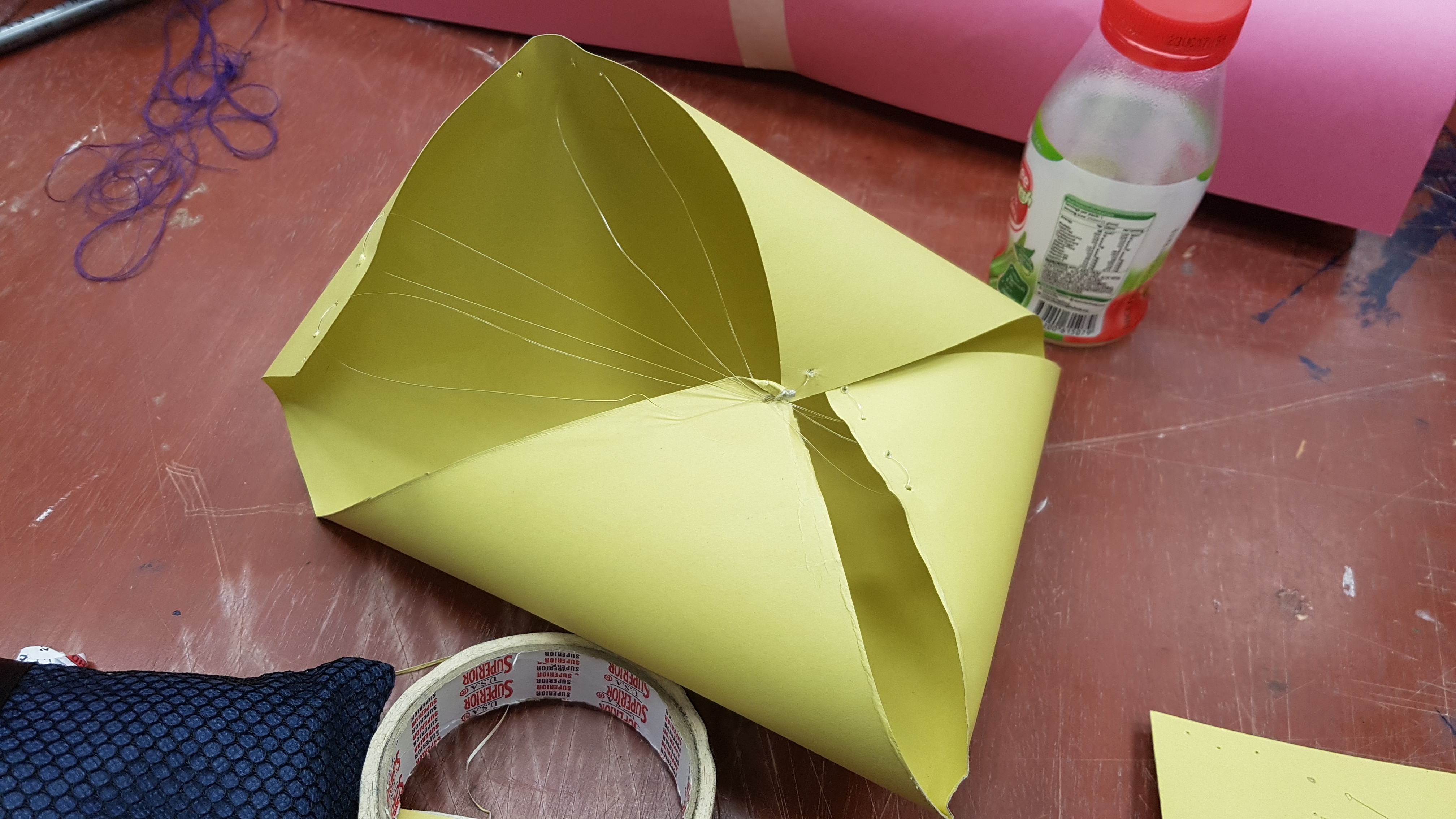
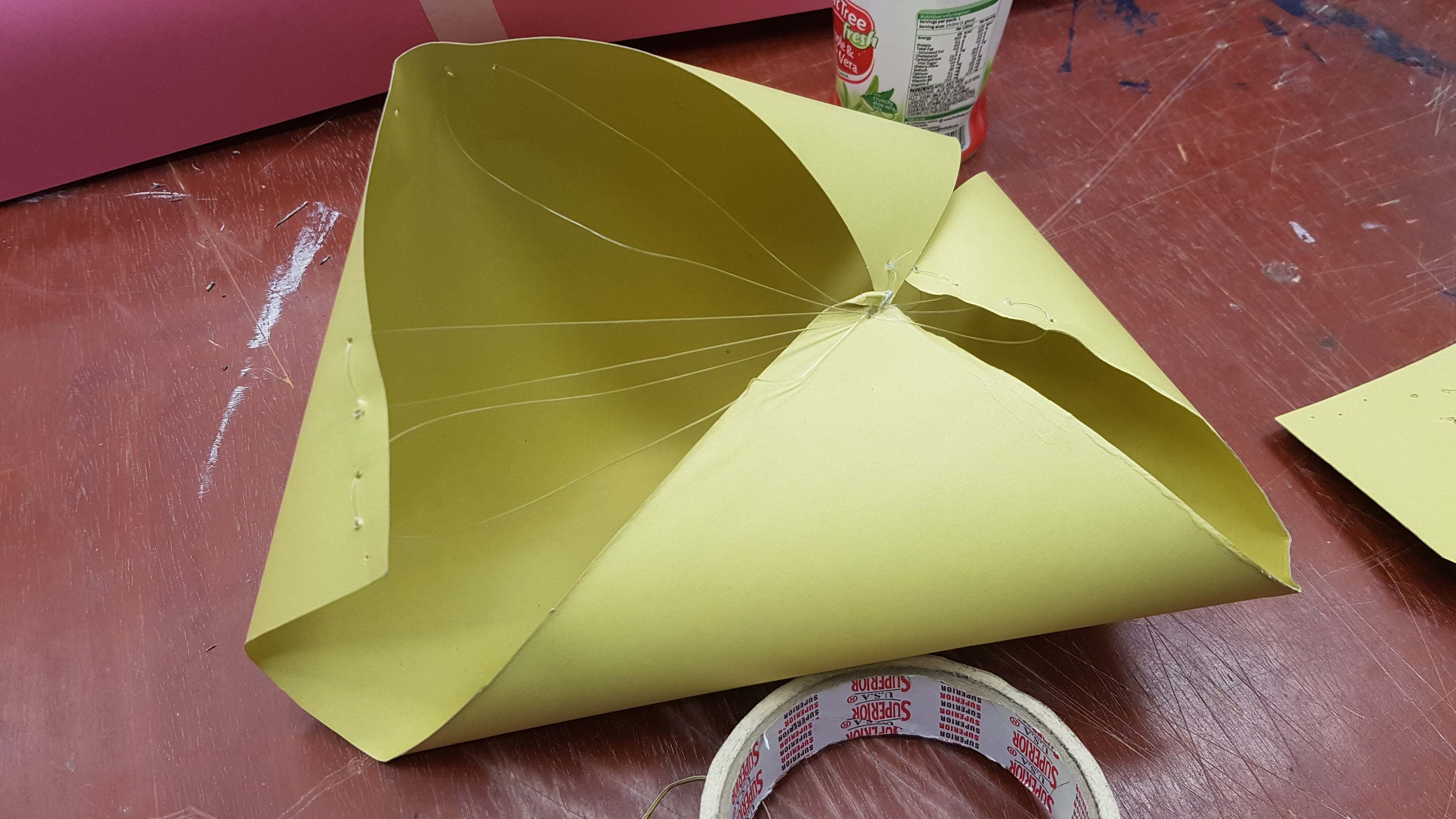
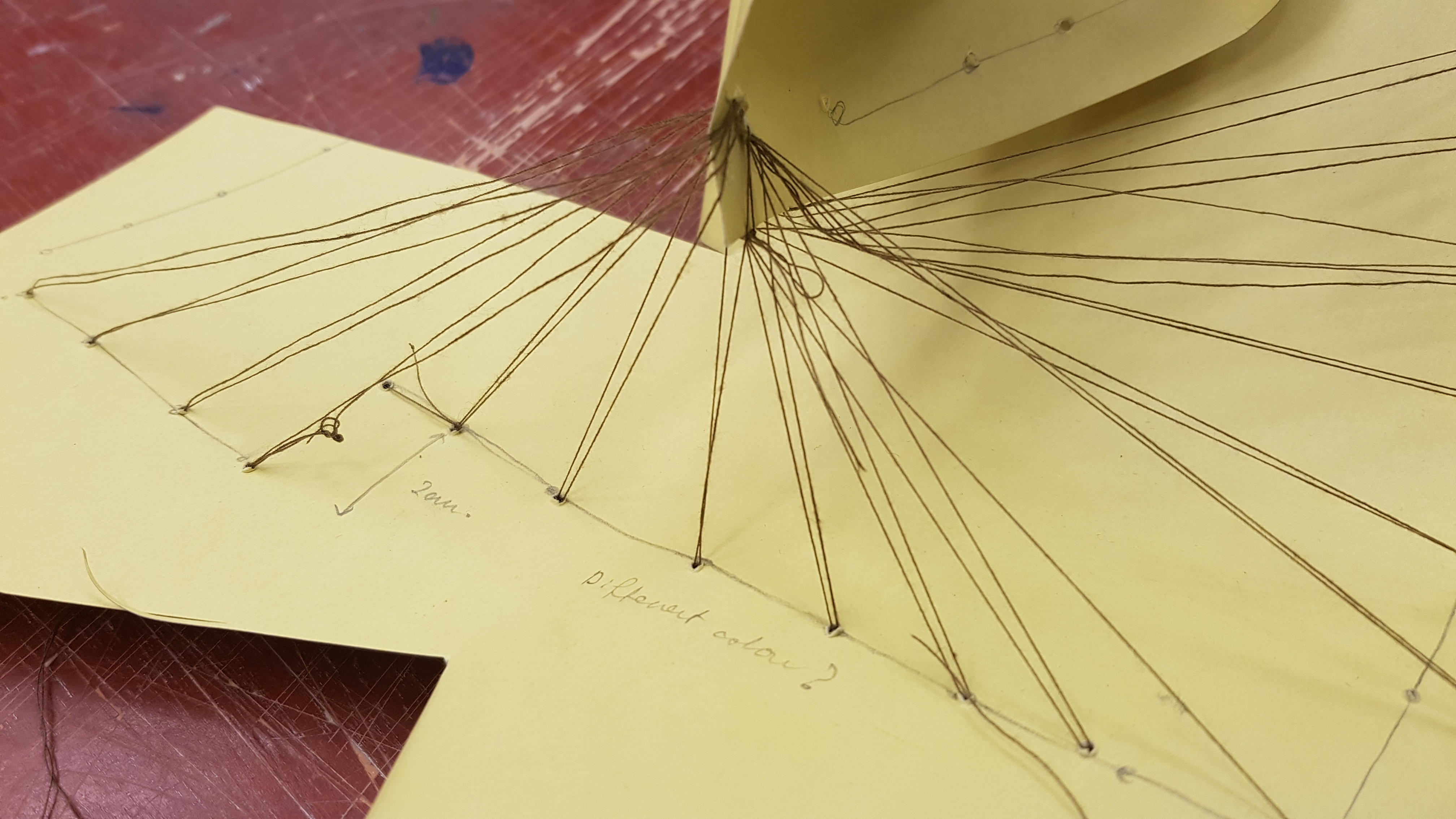
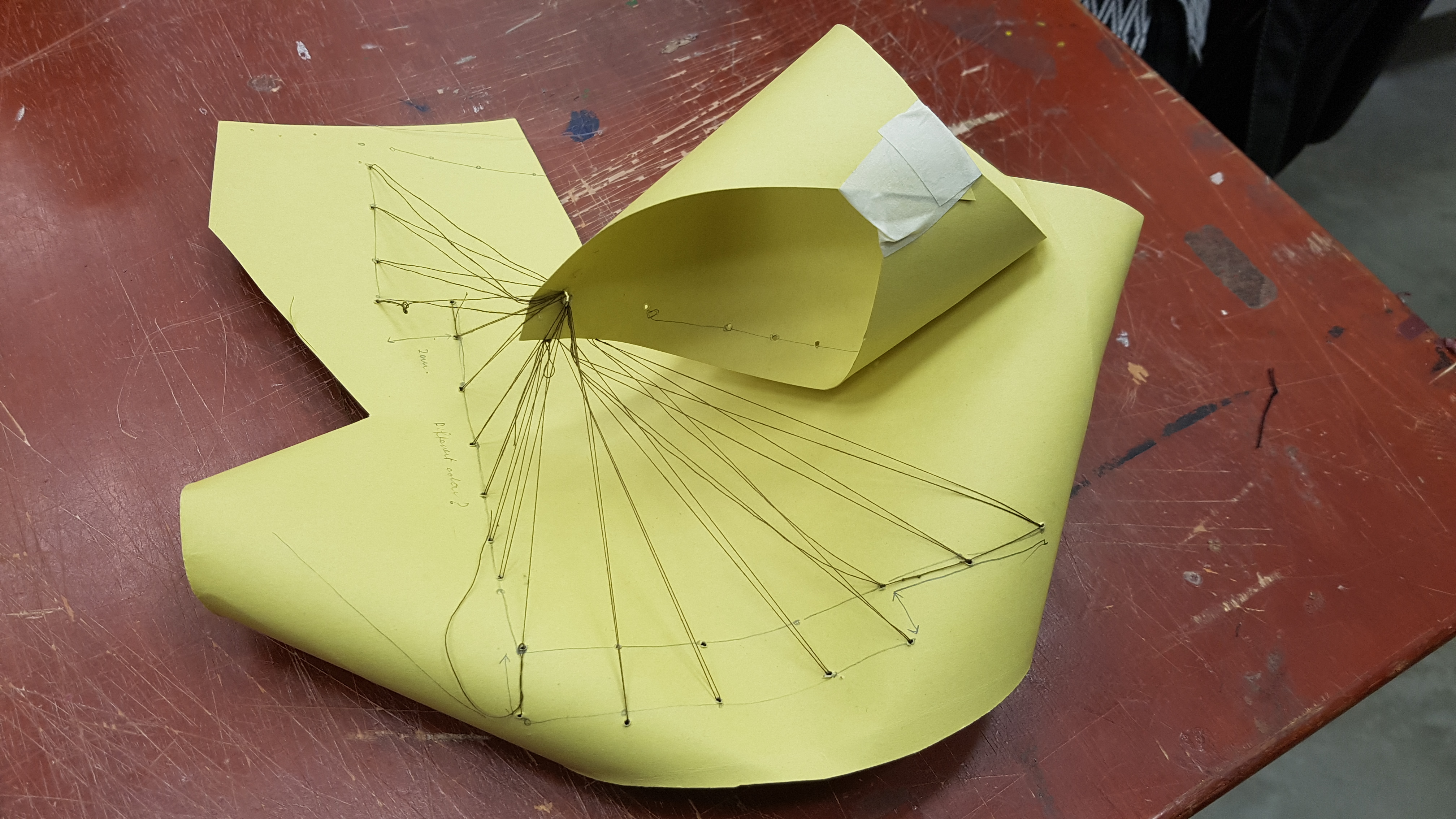
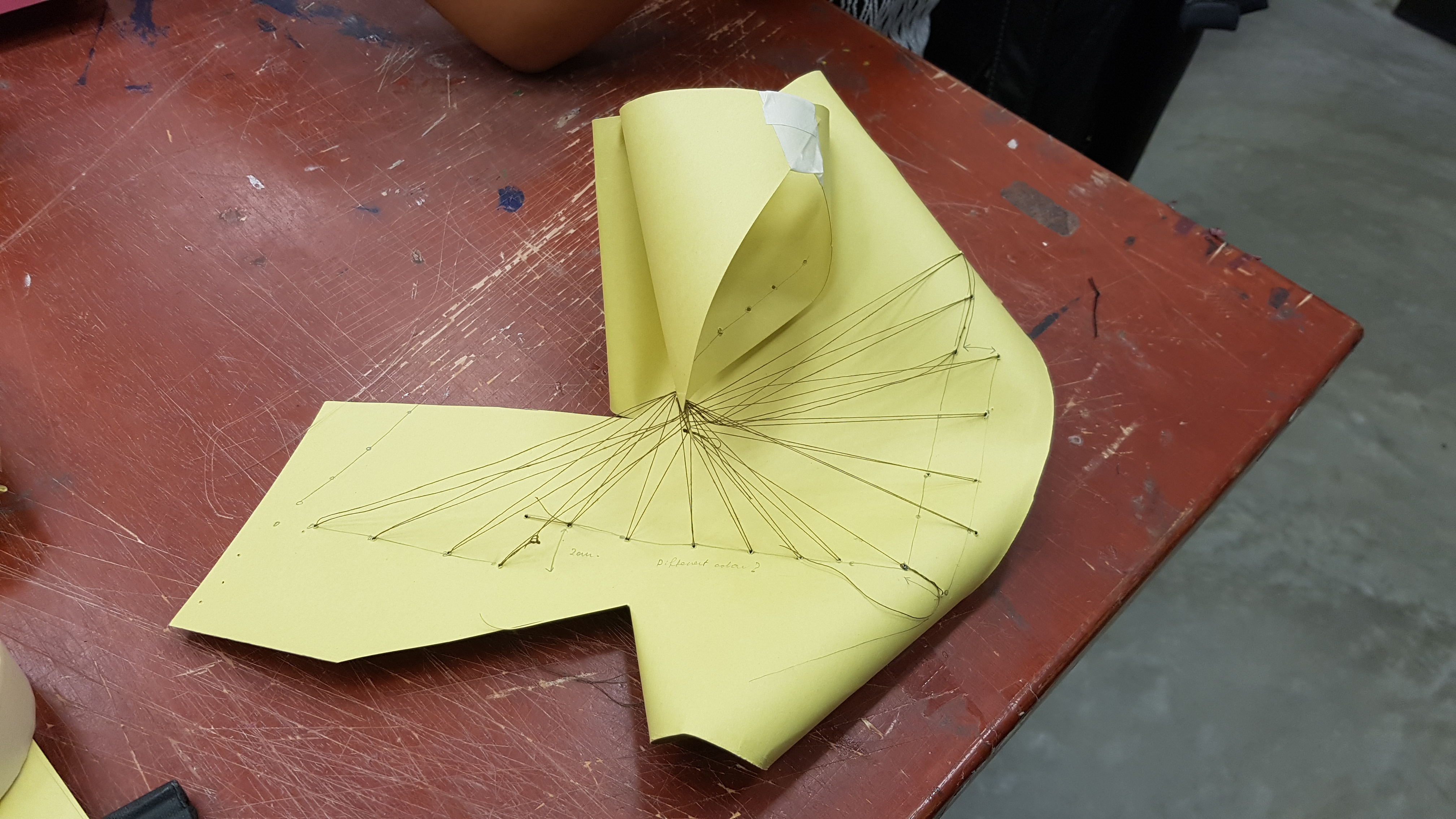
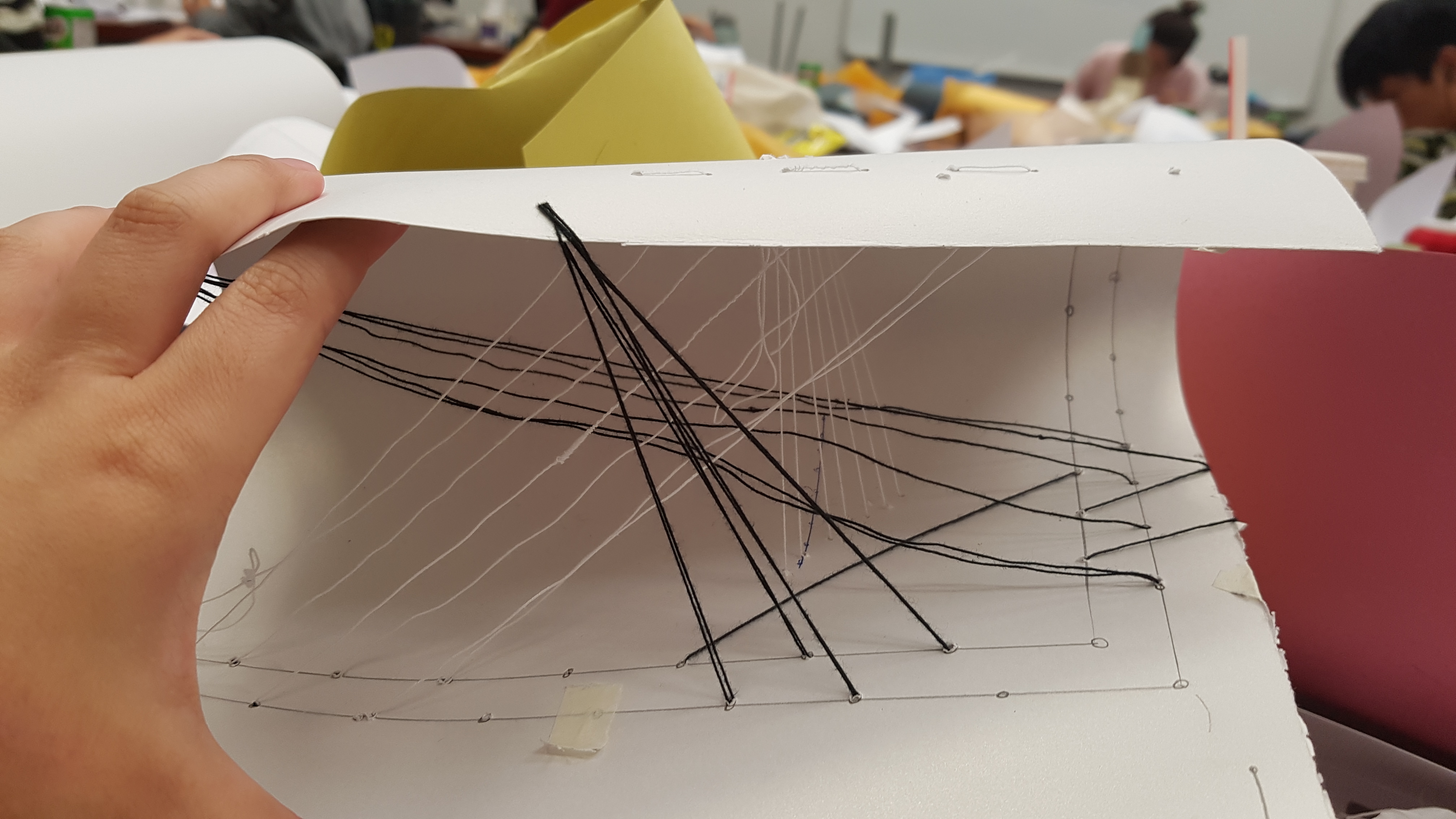
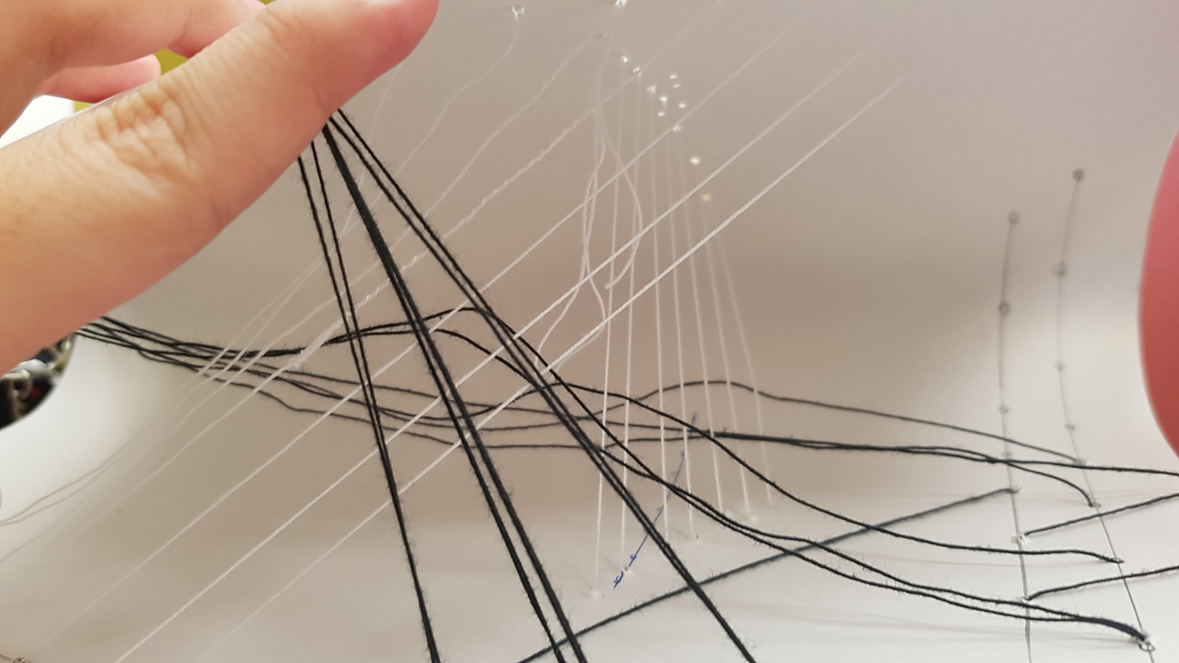
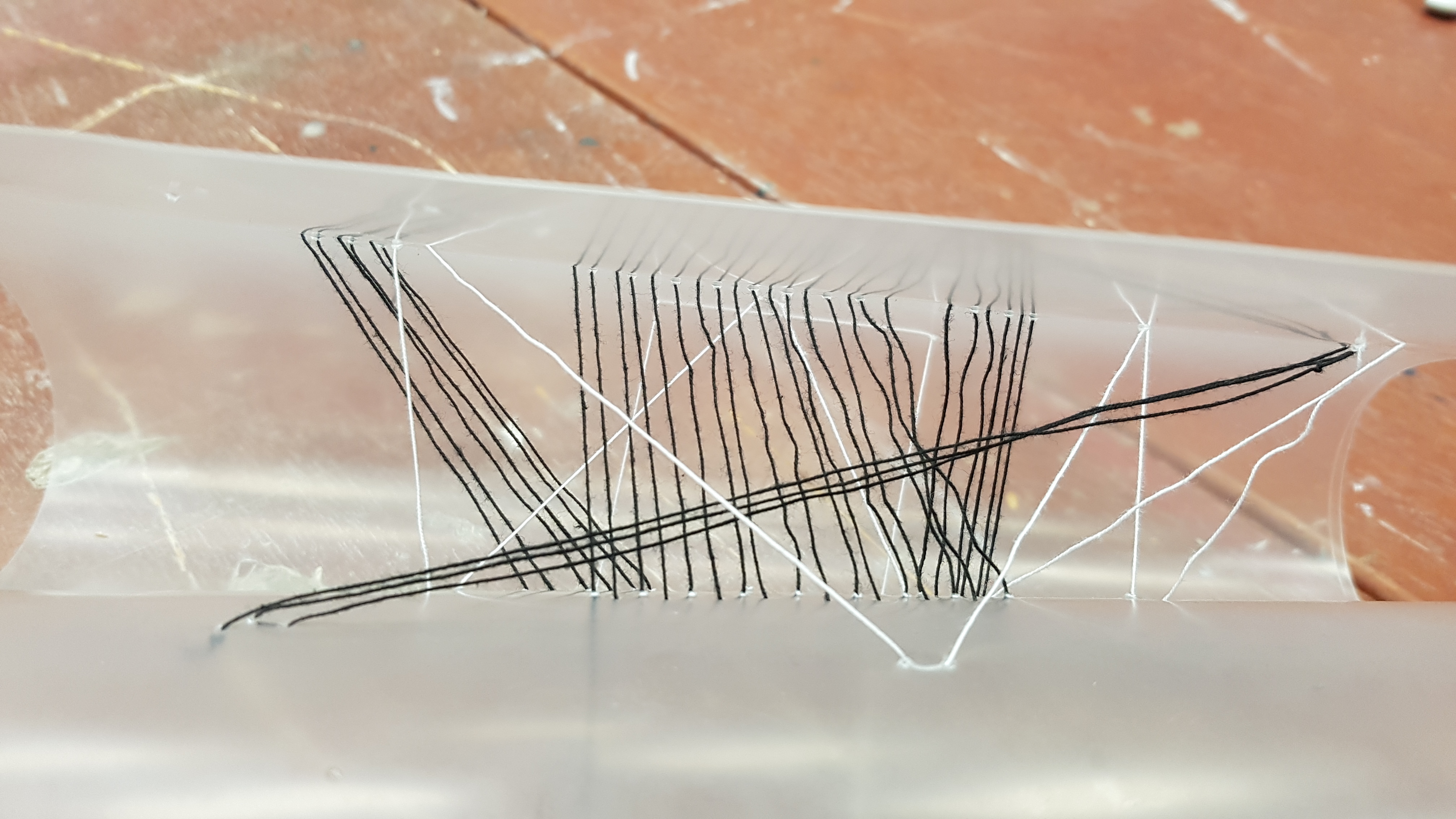
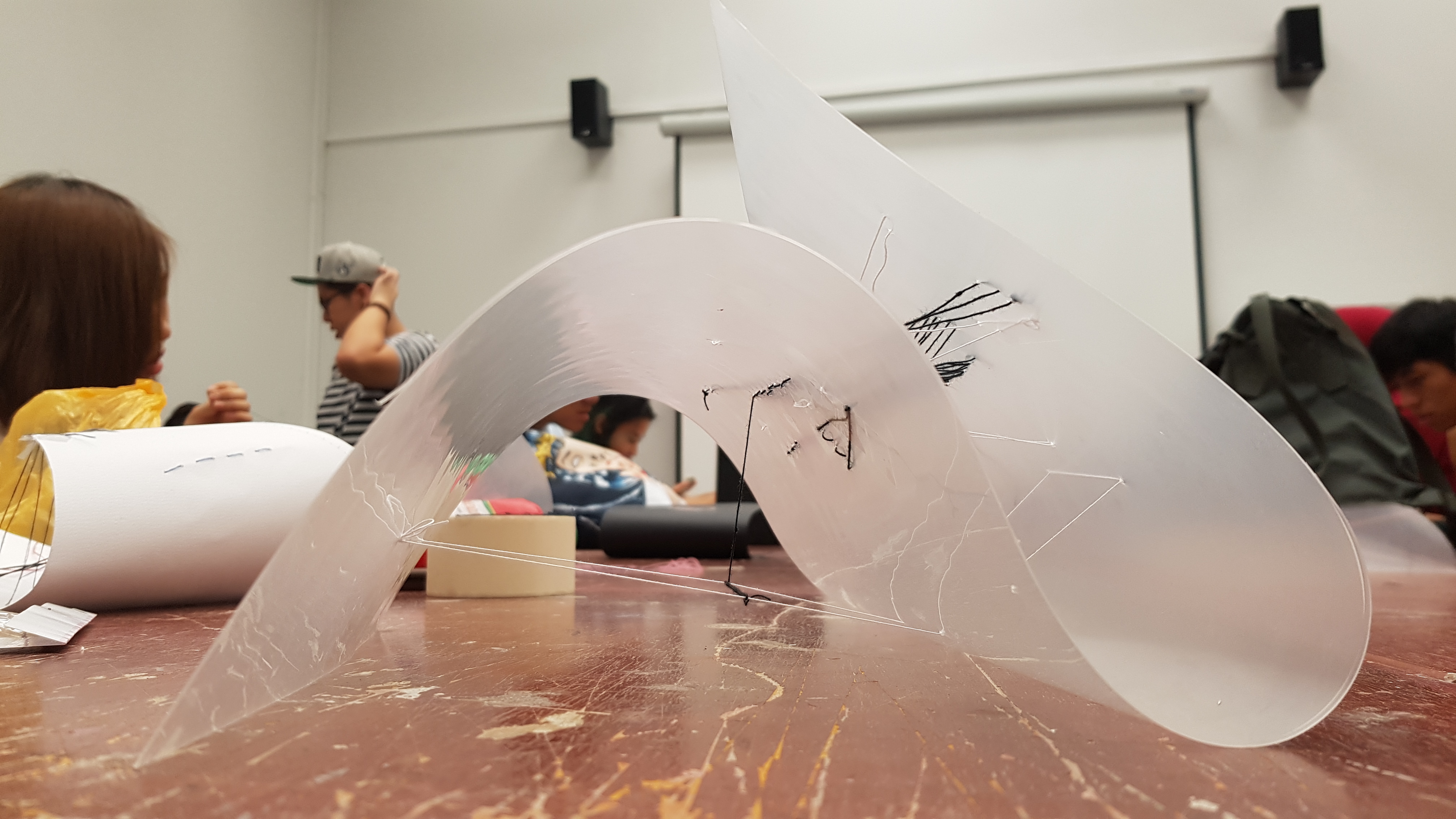
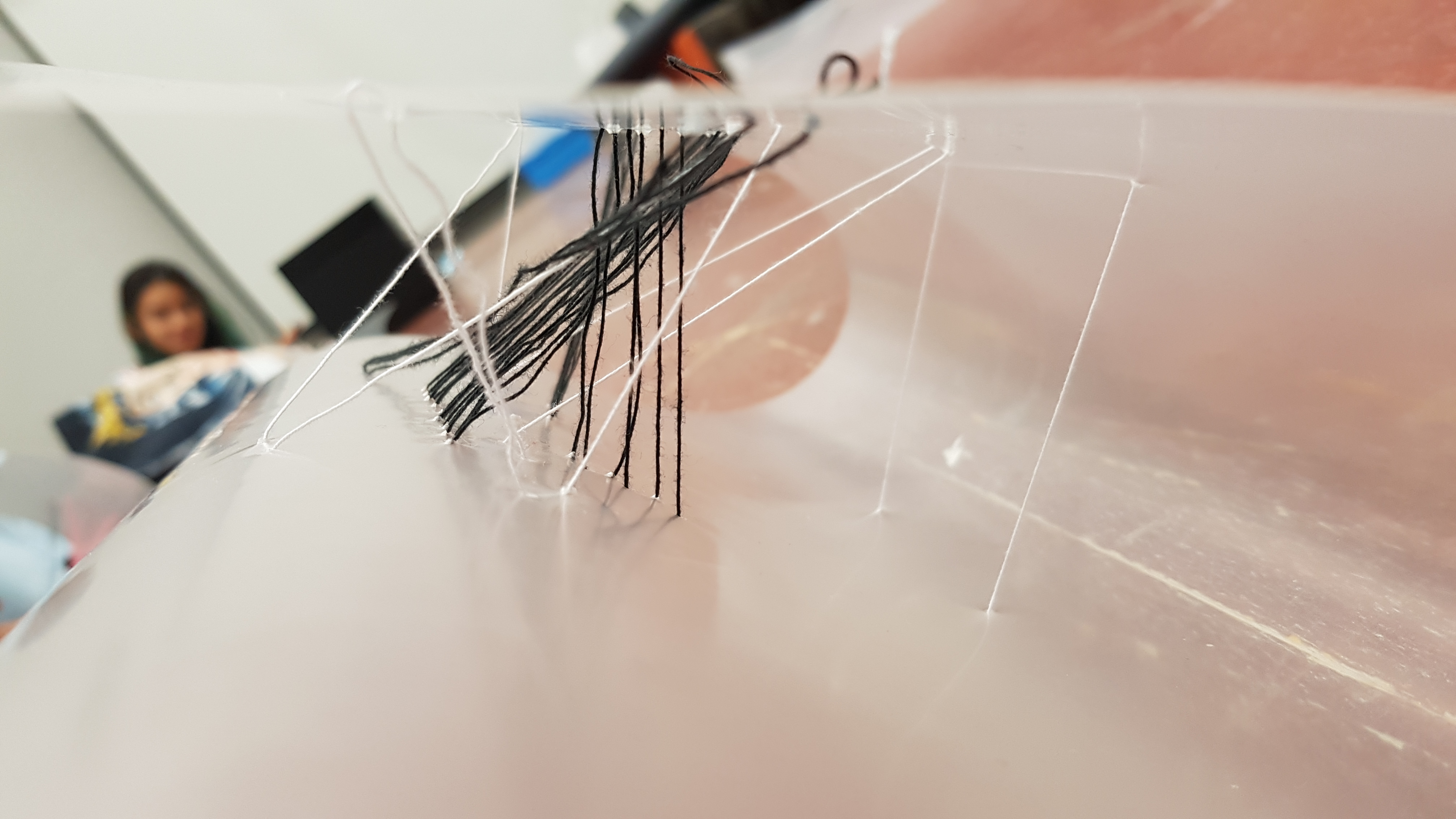
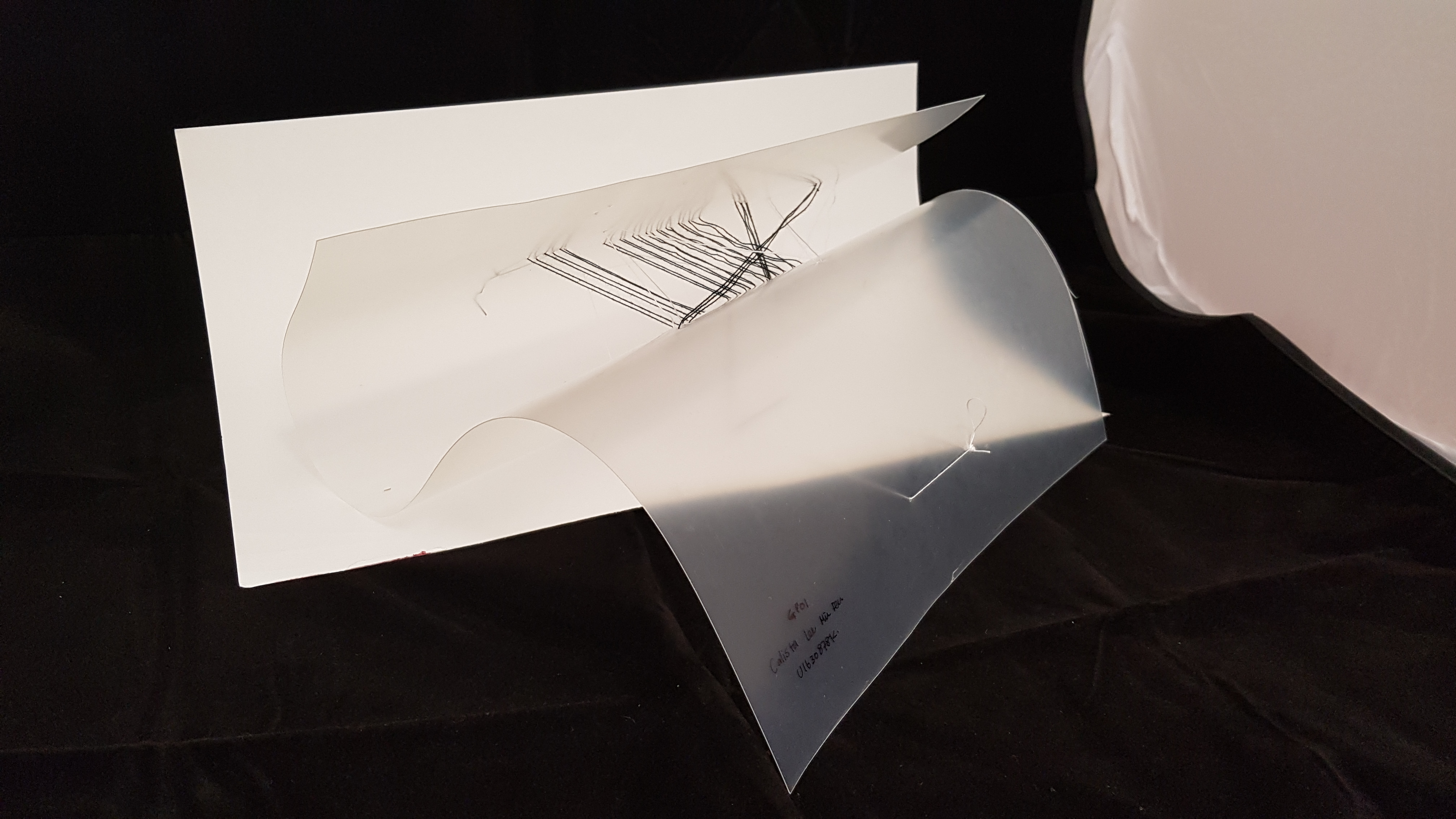
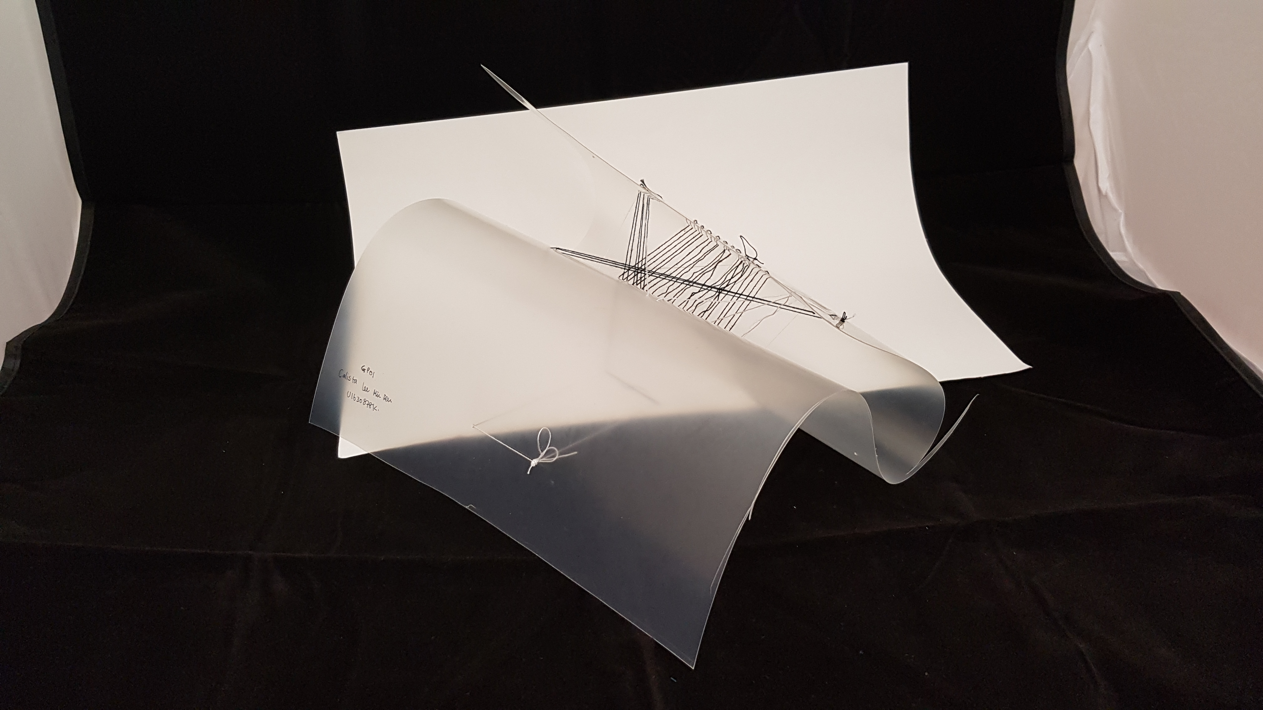
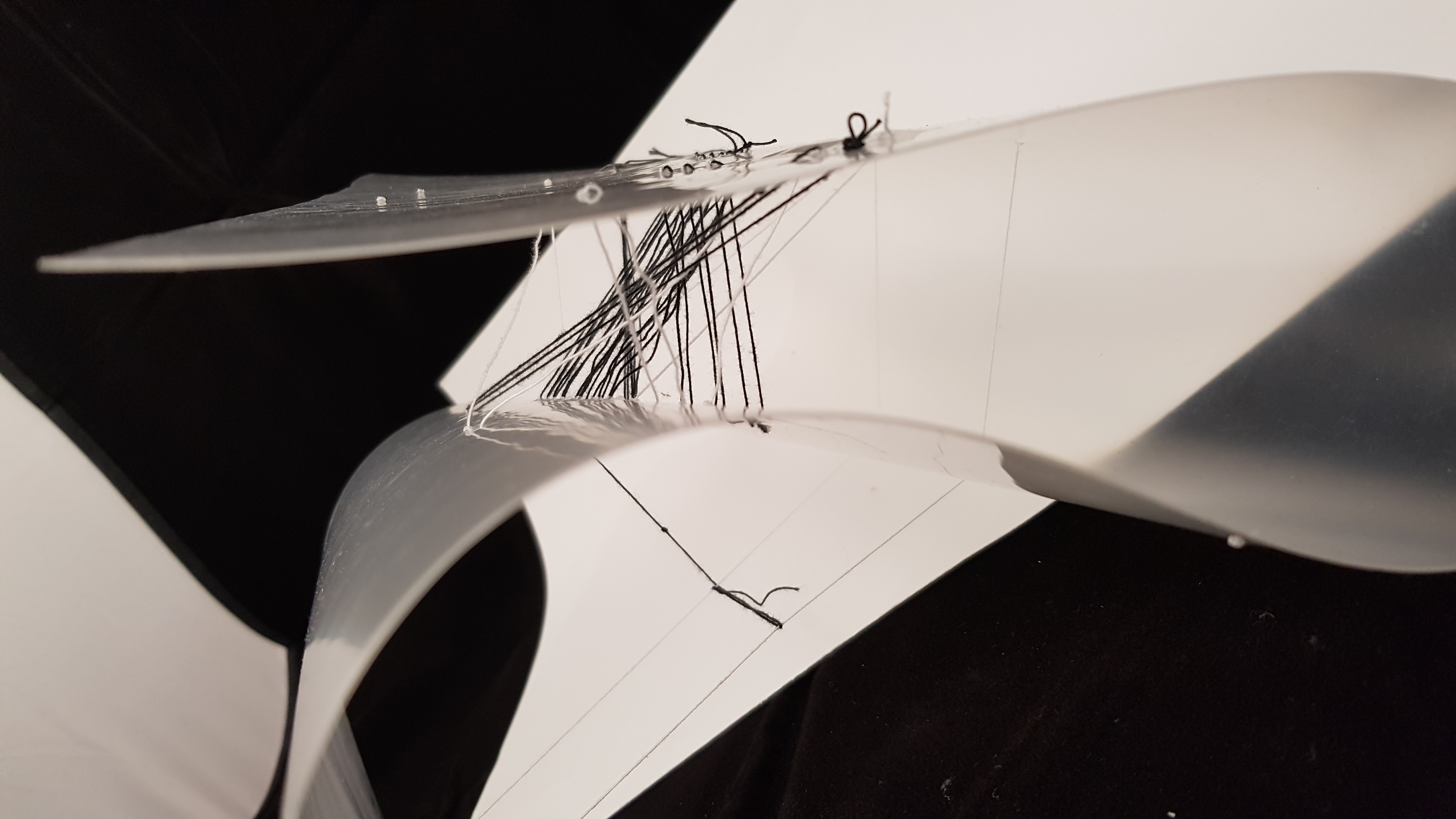
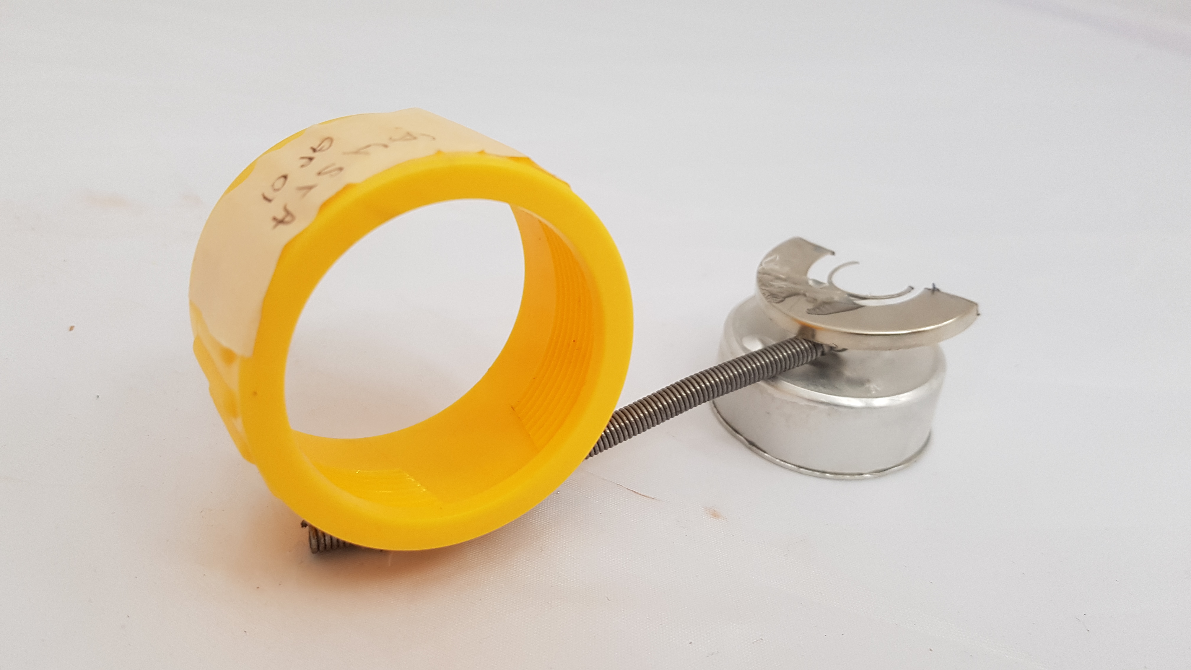
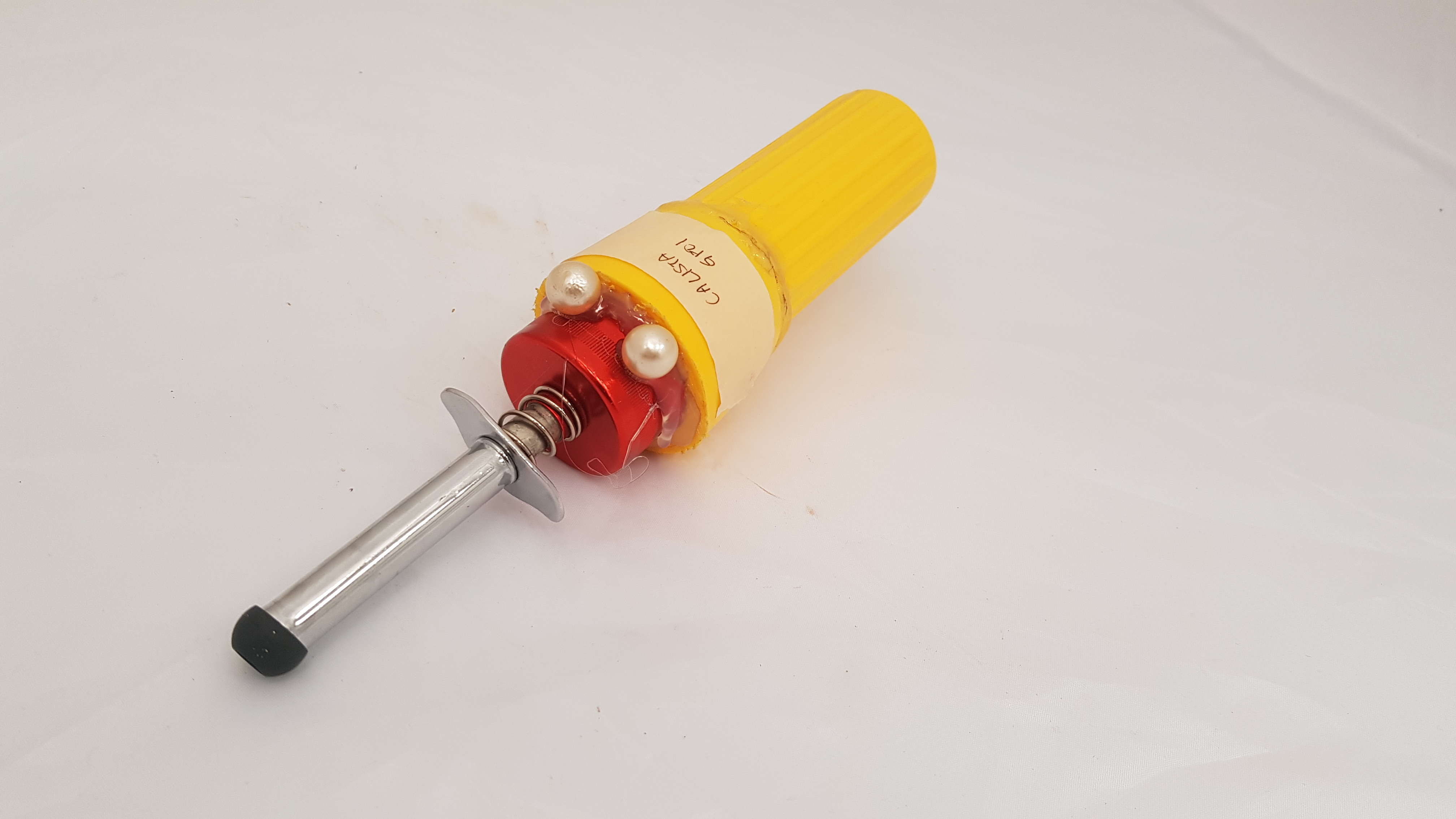
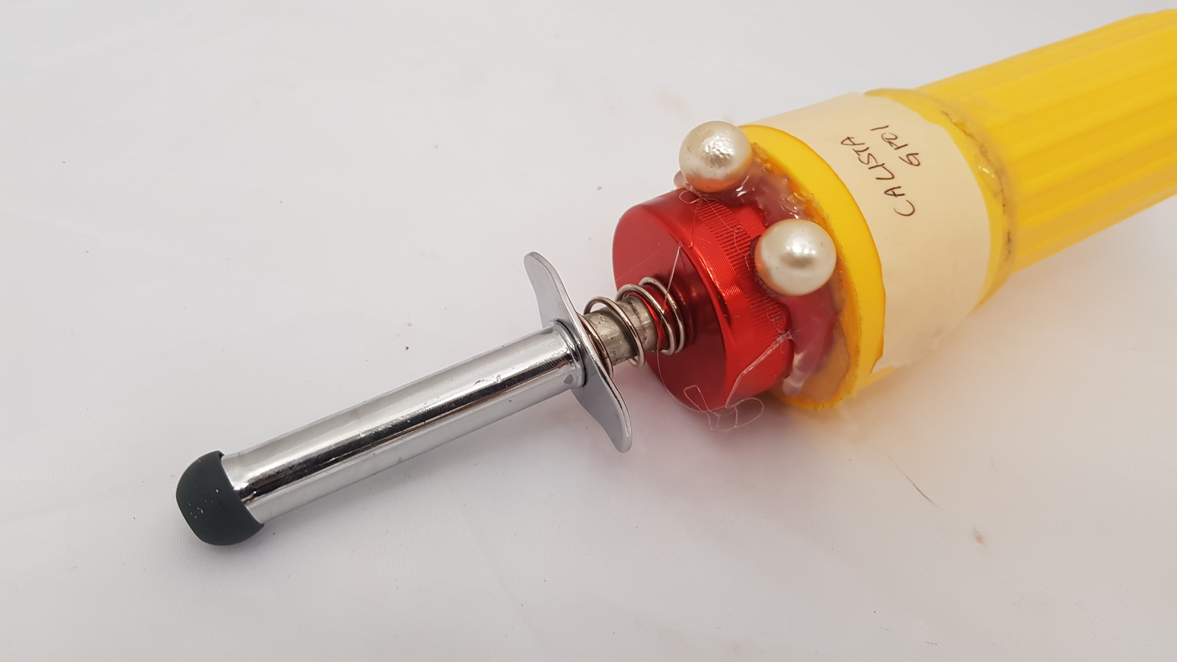
PROCESS (OF SILKSCREEN-MAKING)
After selecting the designs, we had to print it out on transparency. Layering it with two prints make the piece darker (better see through on the silkscreen).

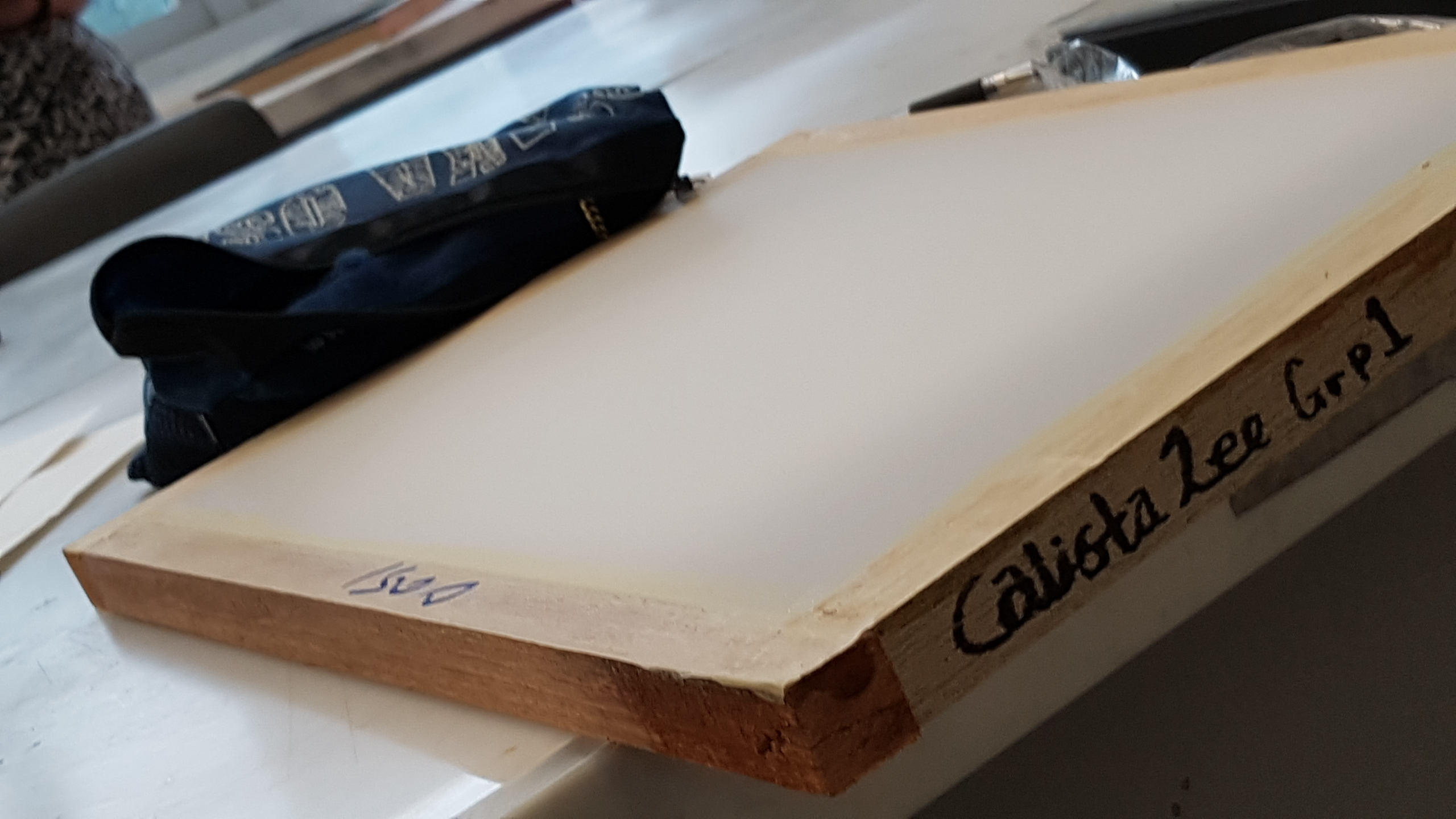
Silkscreen itself.
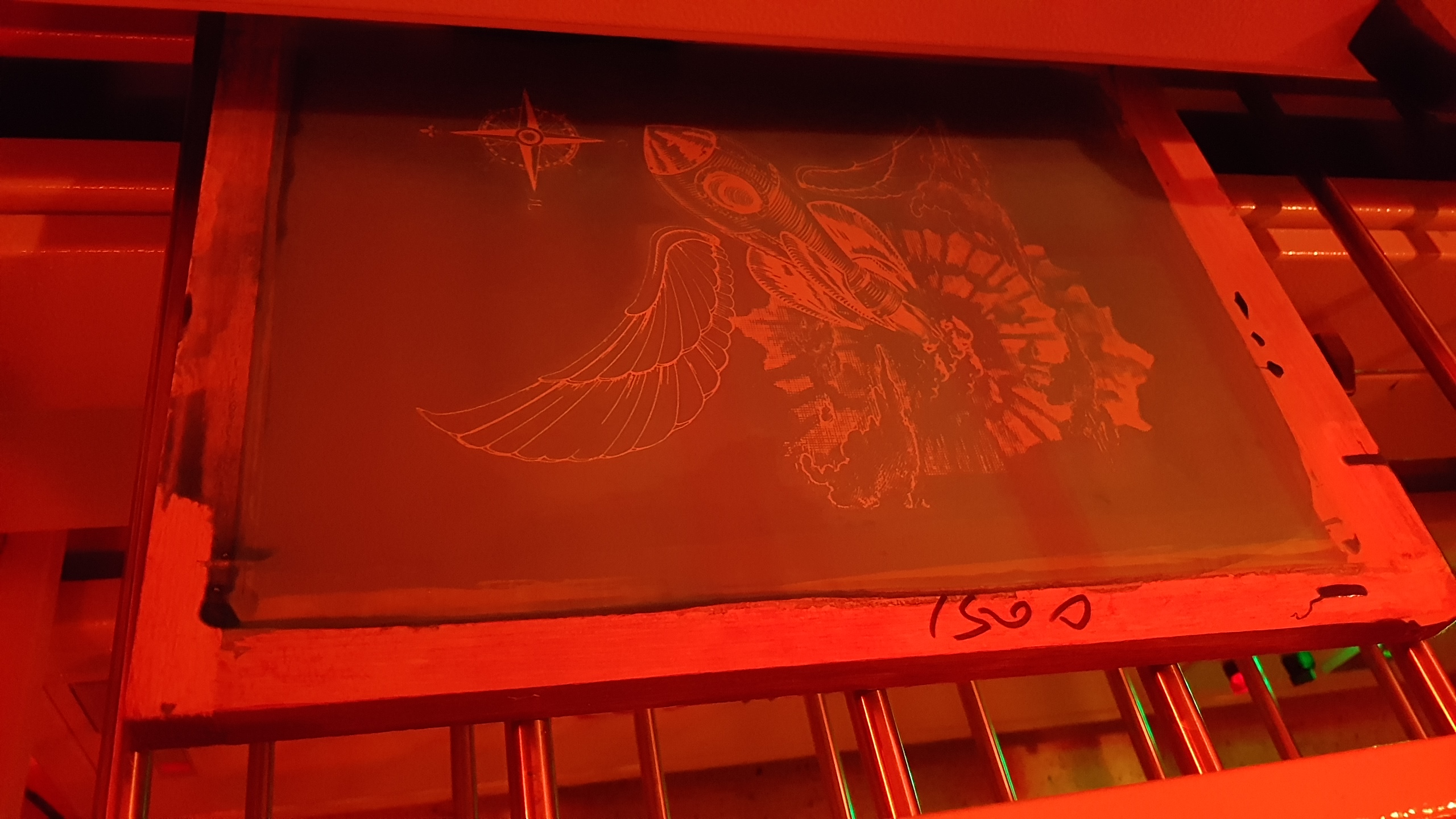 After applying the emulsion, we exposed the transparency through harsh light from a machine within the Red room.
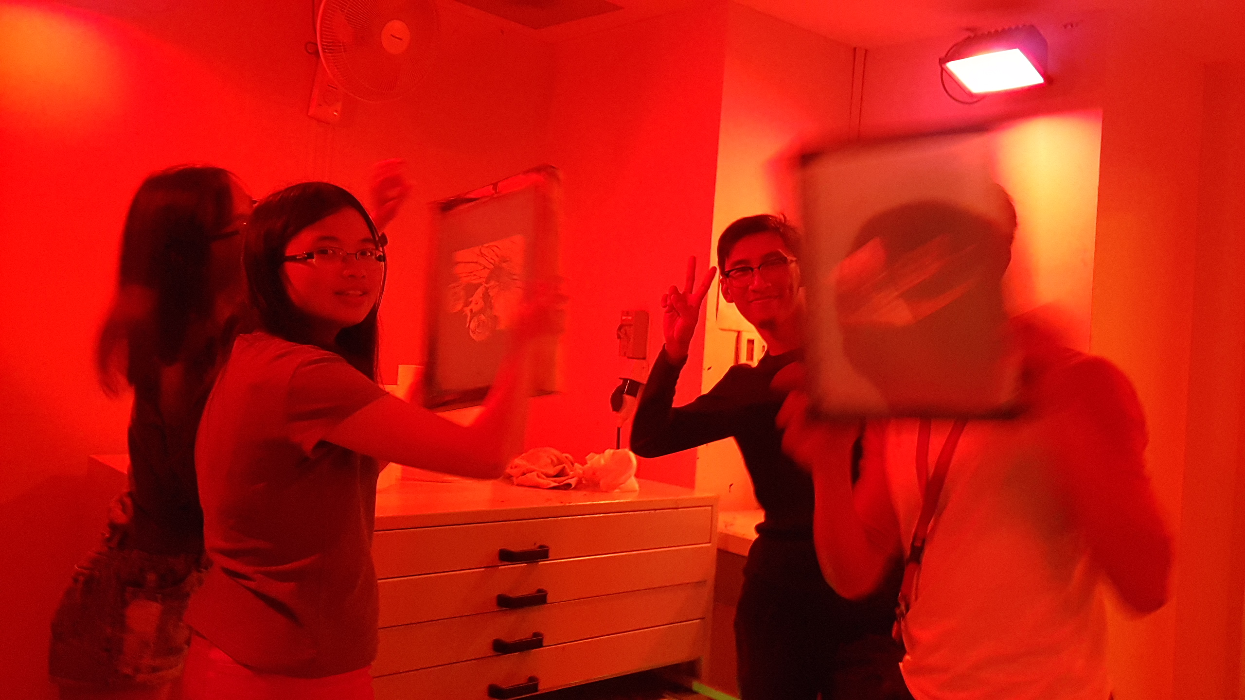
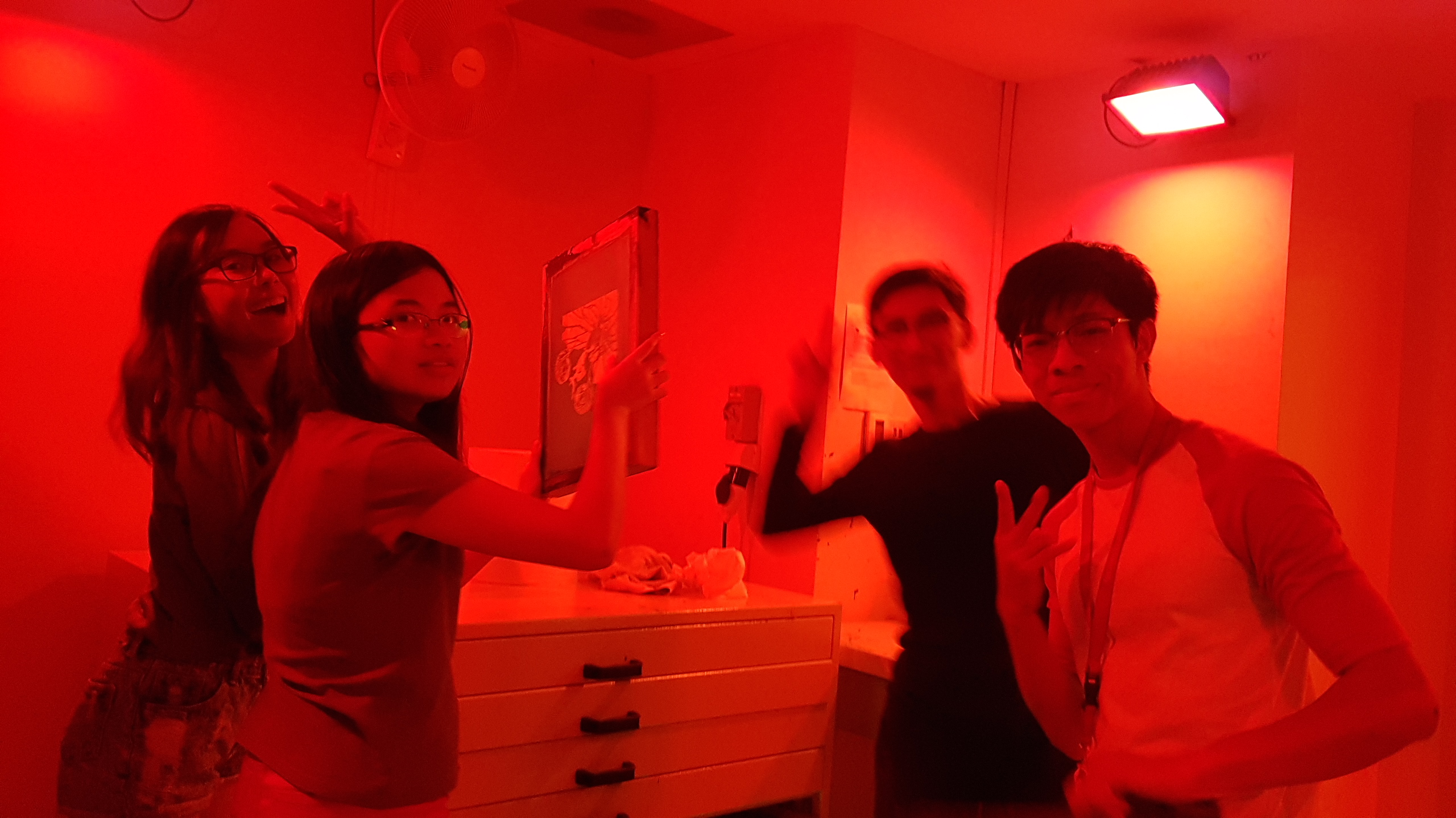
Had quite a bit of fun inside running in and out, say cheese everyone!
 Then, it was the test-prints. The feeling of printing on newsprint and on the actual tote bag was vastly different though (due to the rough texture)
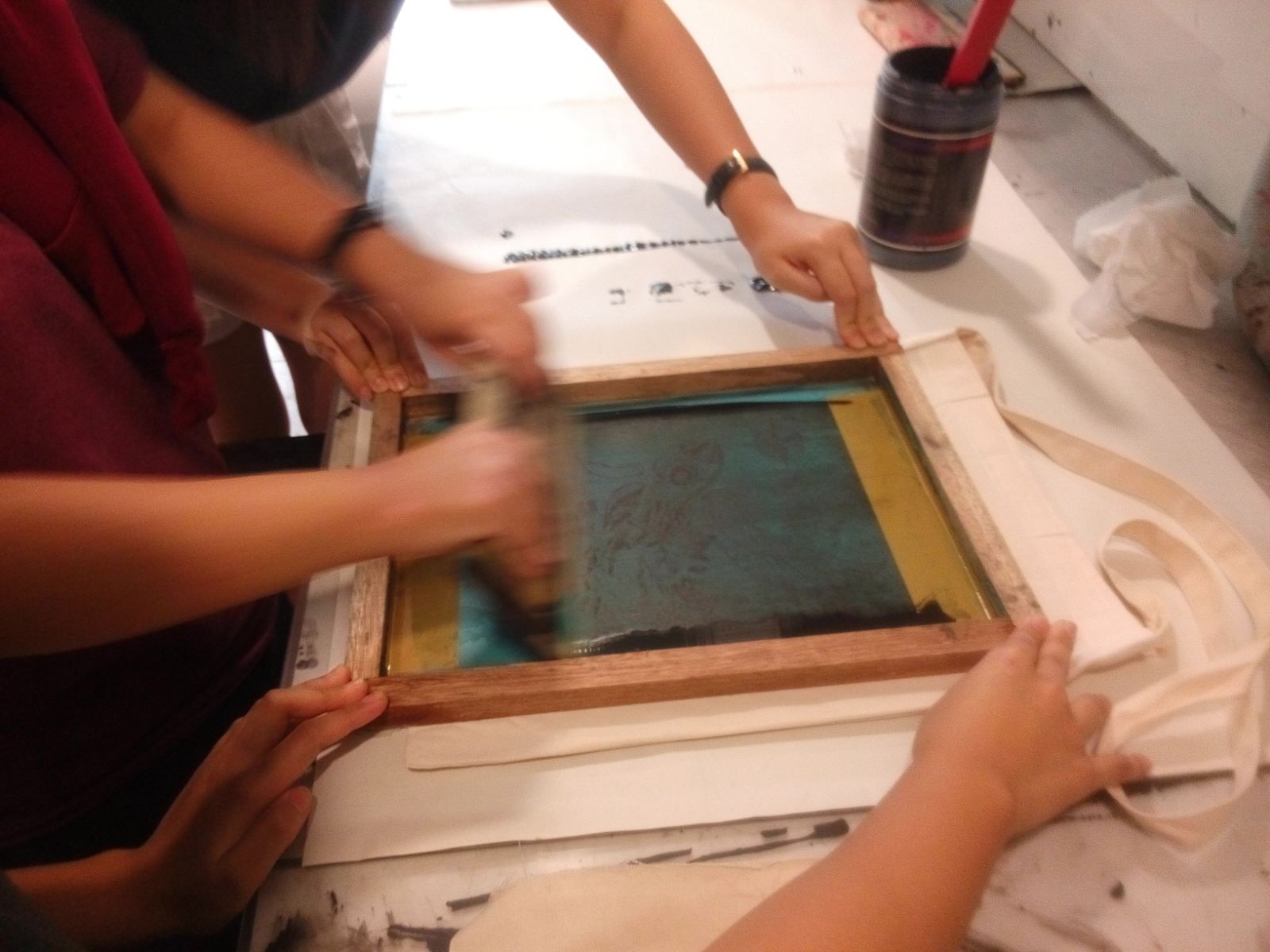
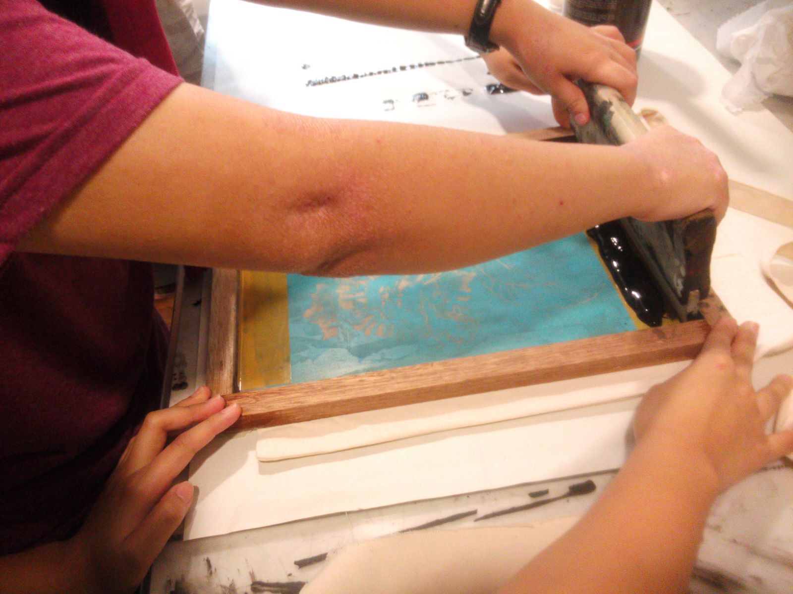 Add Ink at the top, then swoosh.
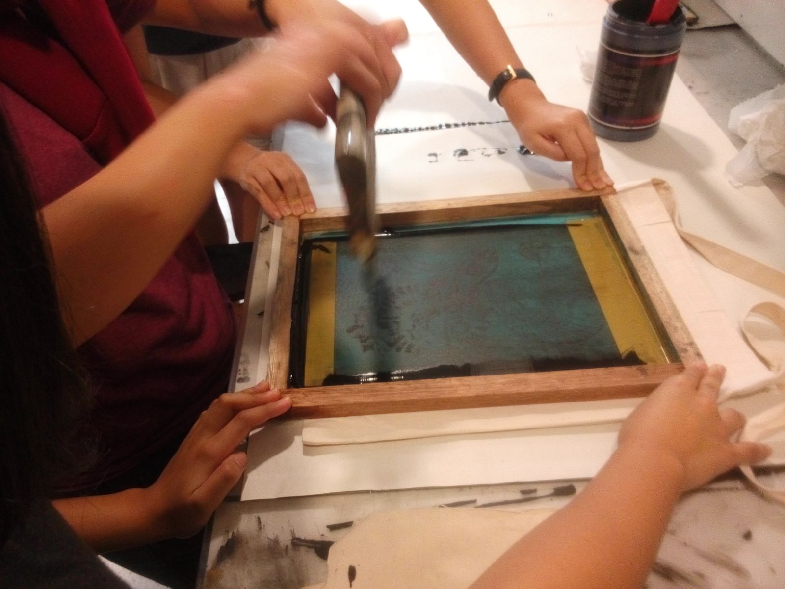
Then, peel it off slowly.
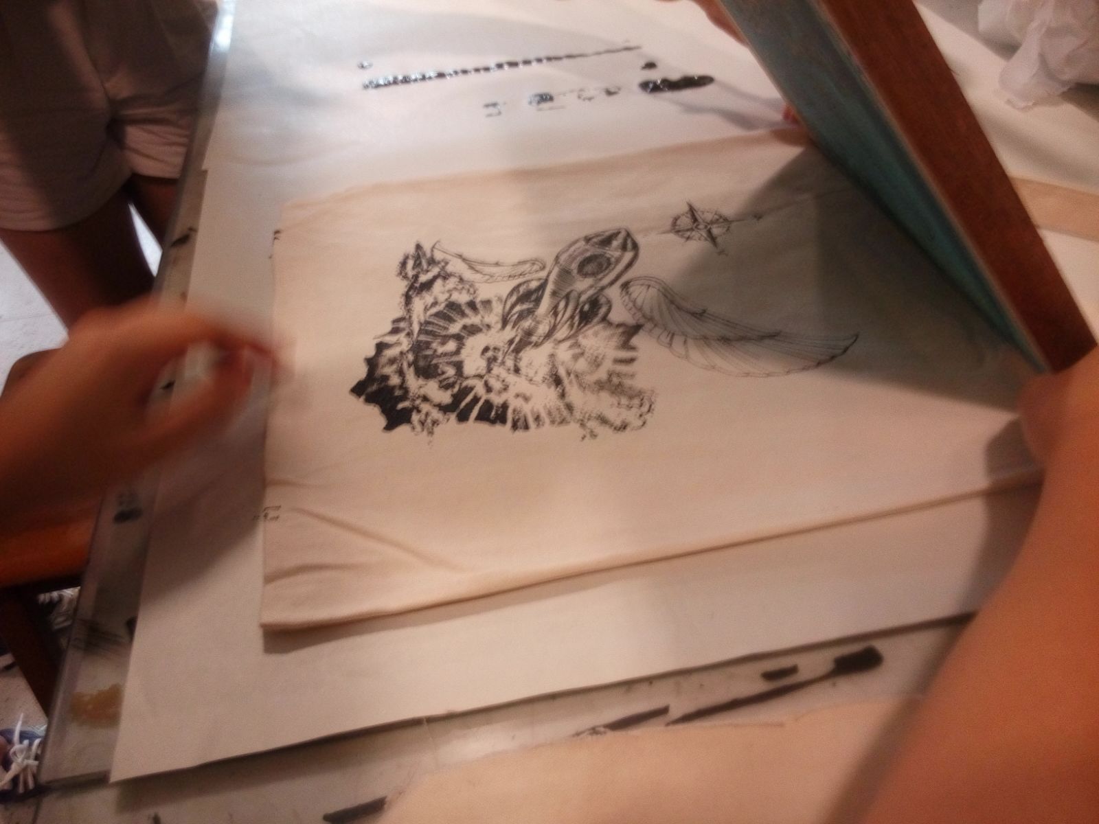

First Attempt: Too Dark!

Finally, on the second attempt. Satisfied!
Thoughts: Really interesting project, never quite did anything like it before. I know more about the silkscreen printing now; perhaps I will fiddle with it in the near future with personal projects if there’s time during the holidays. It is definitely fun and insightful!


