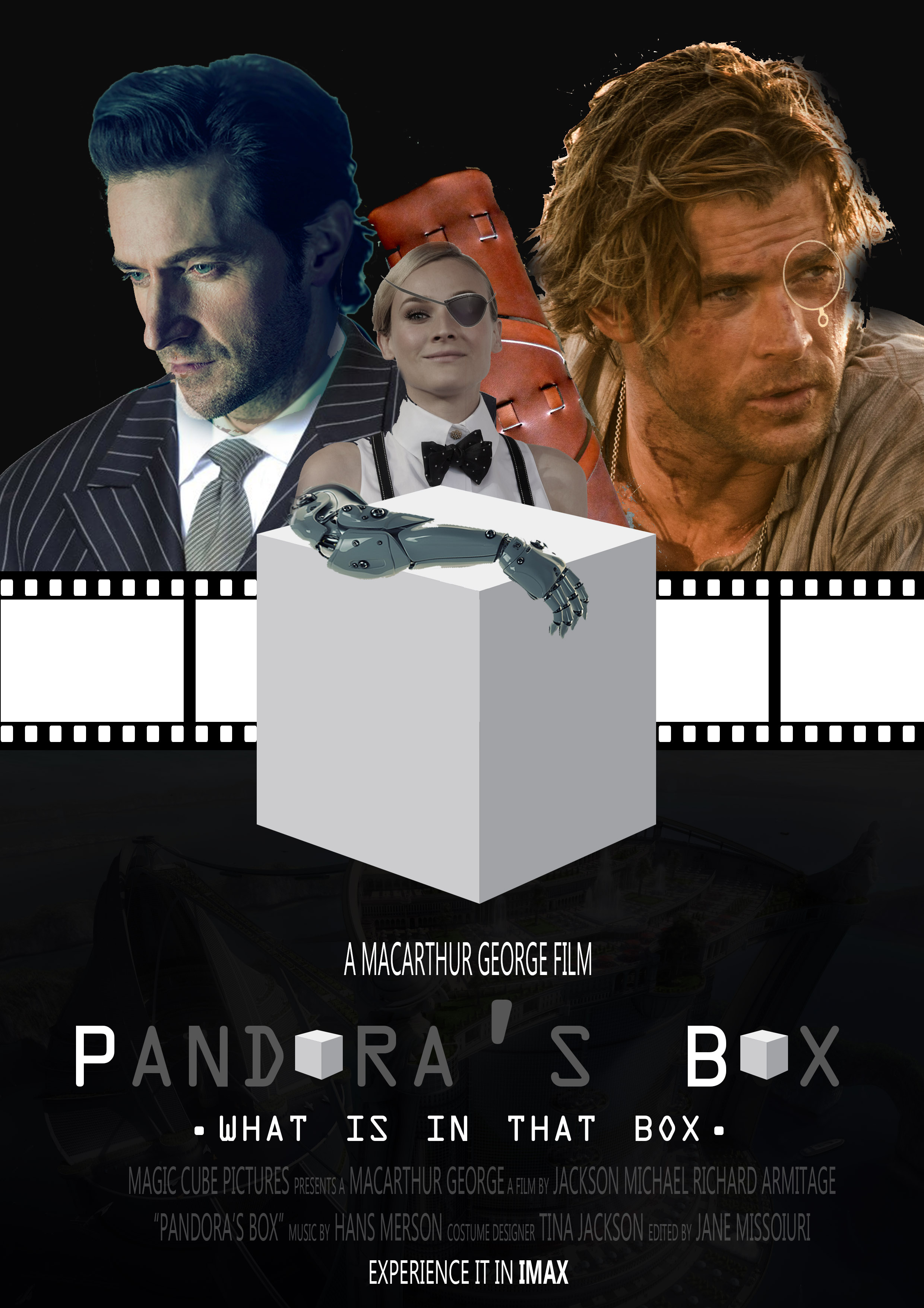
Final Project 3 : Ego


Final Project 3 : Ego
Final Project 2 : Forrest Gump
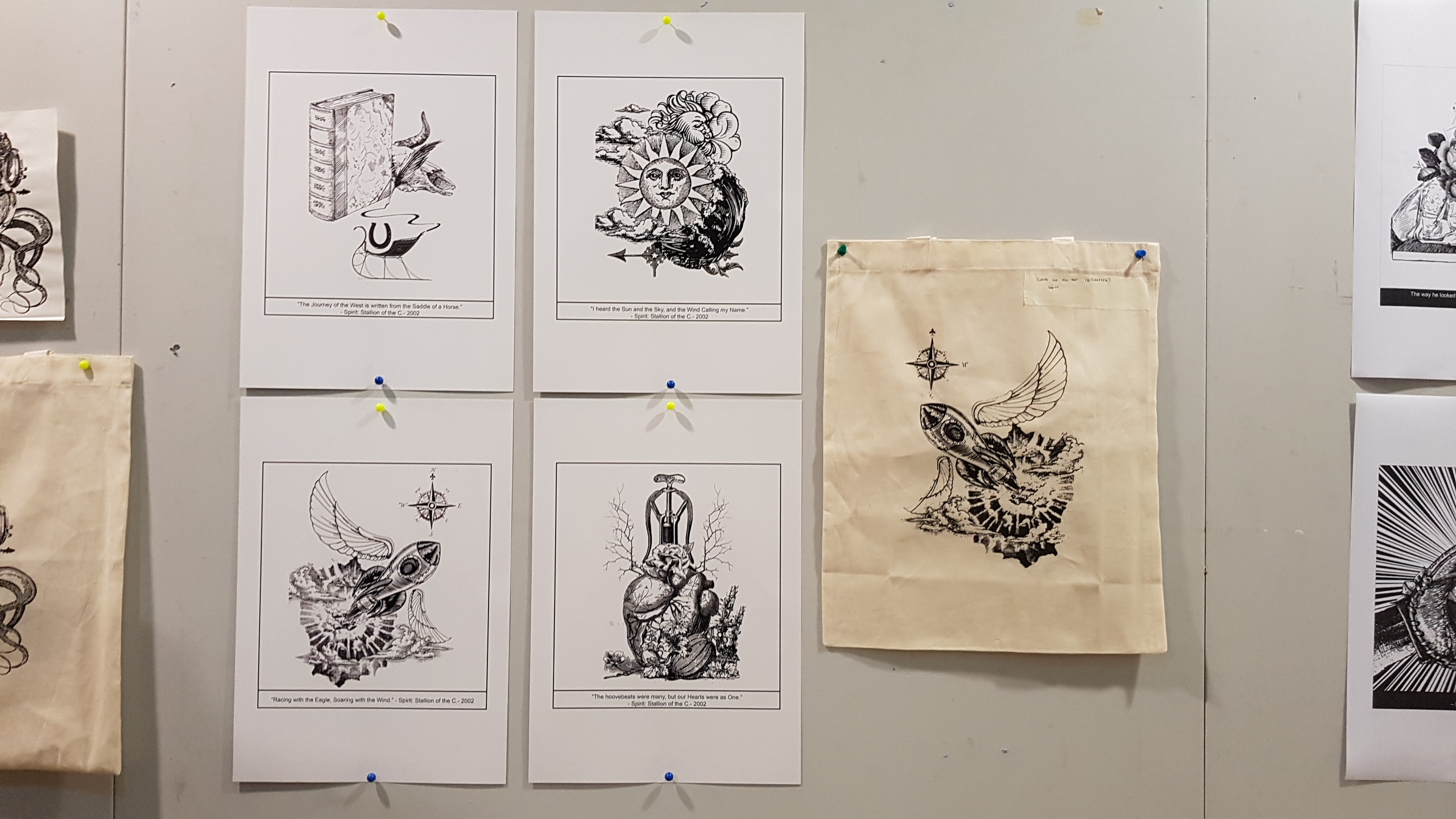
Quote #1

Quote #2
Quote #3
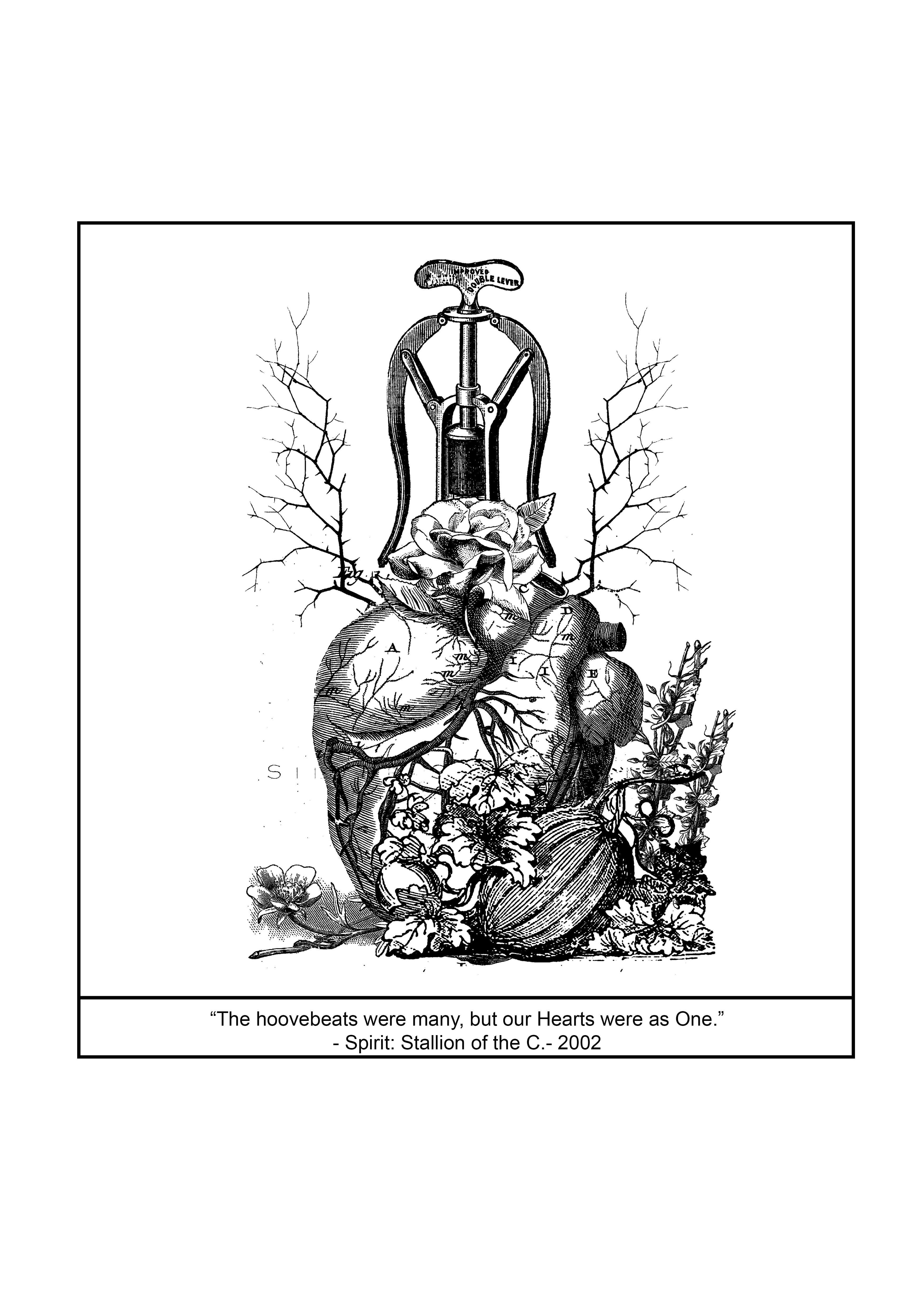
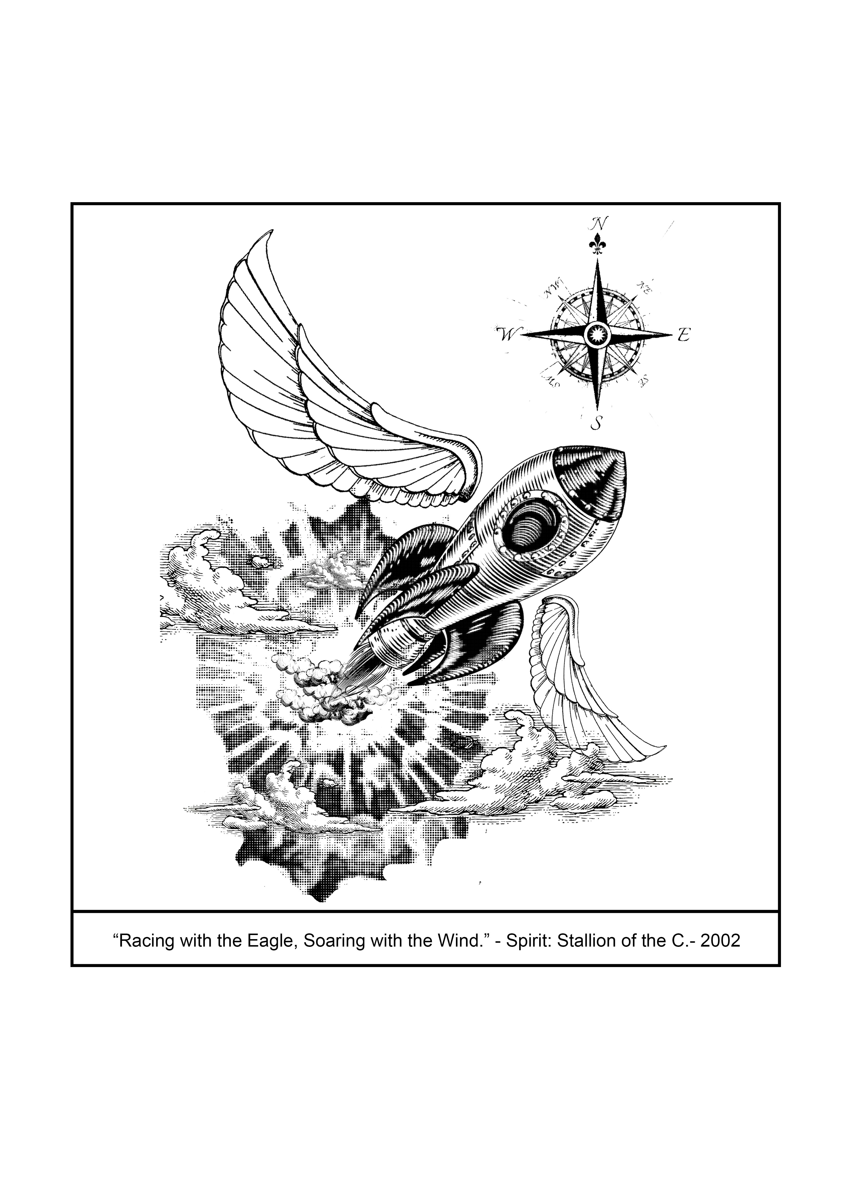
Quote #4

Final Work (My Lines are Emo)

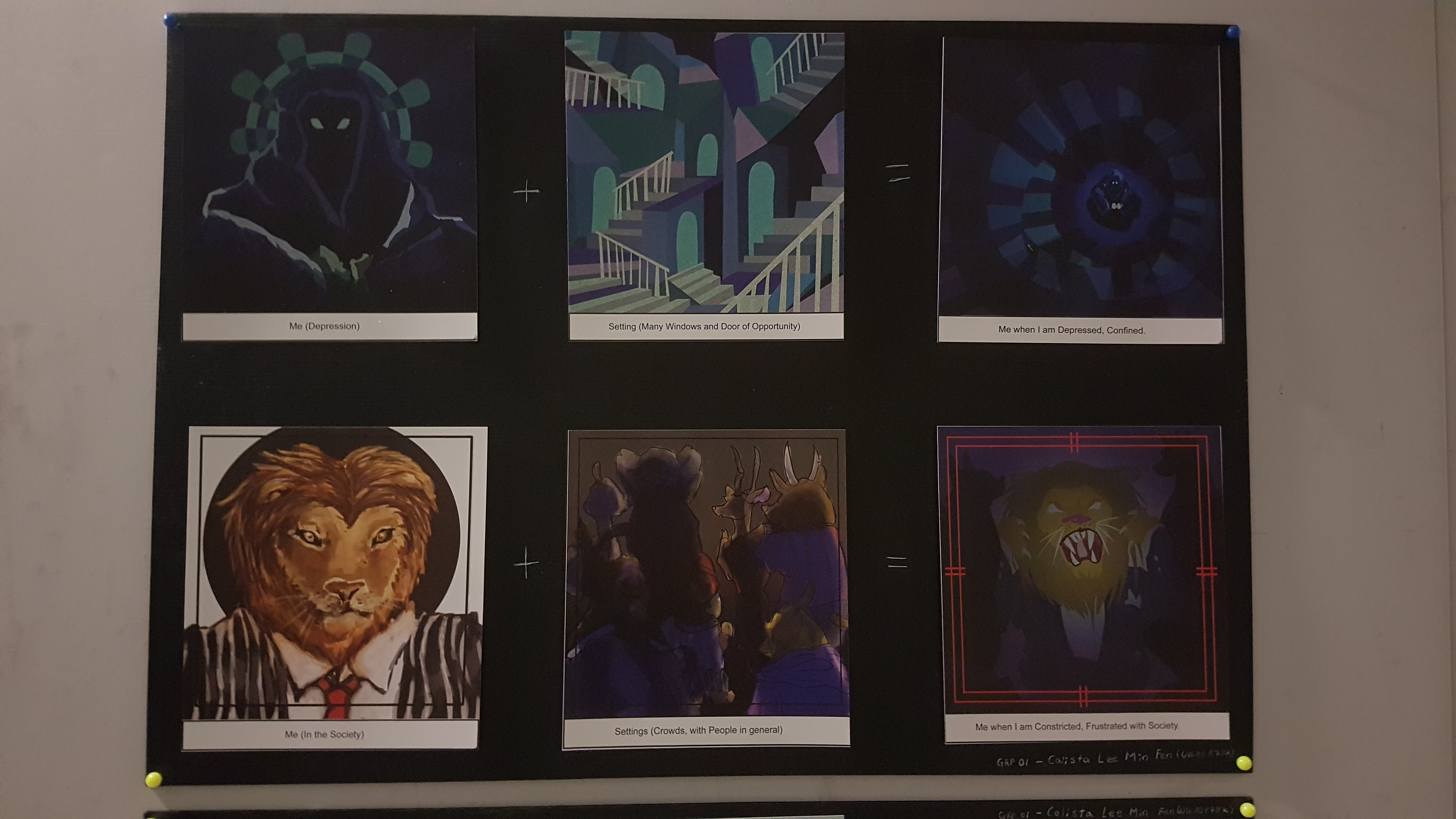
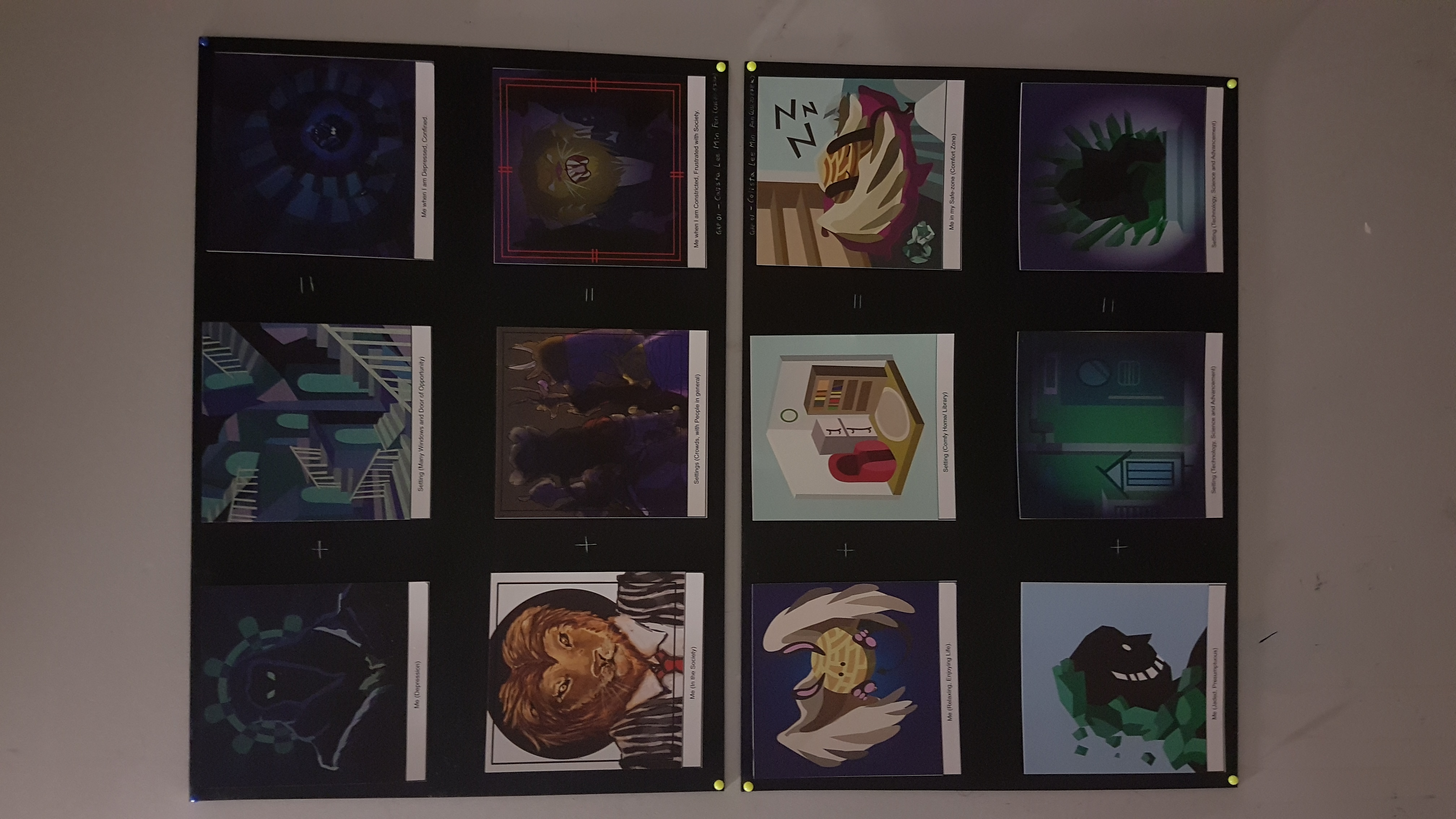
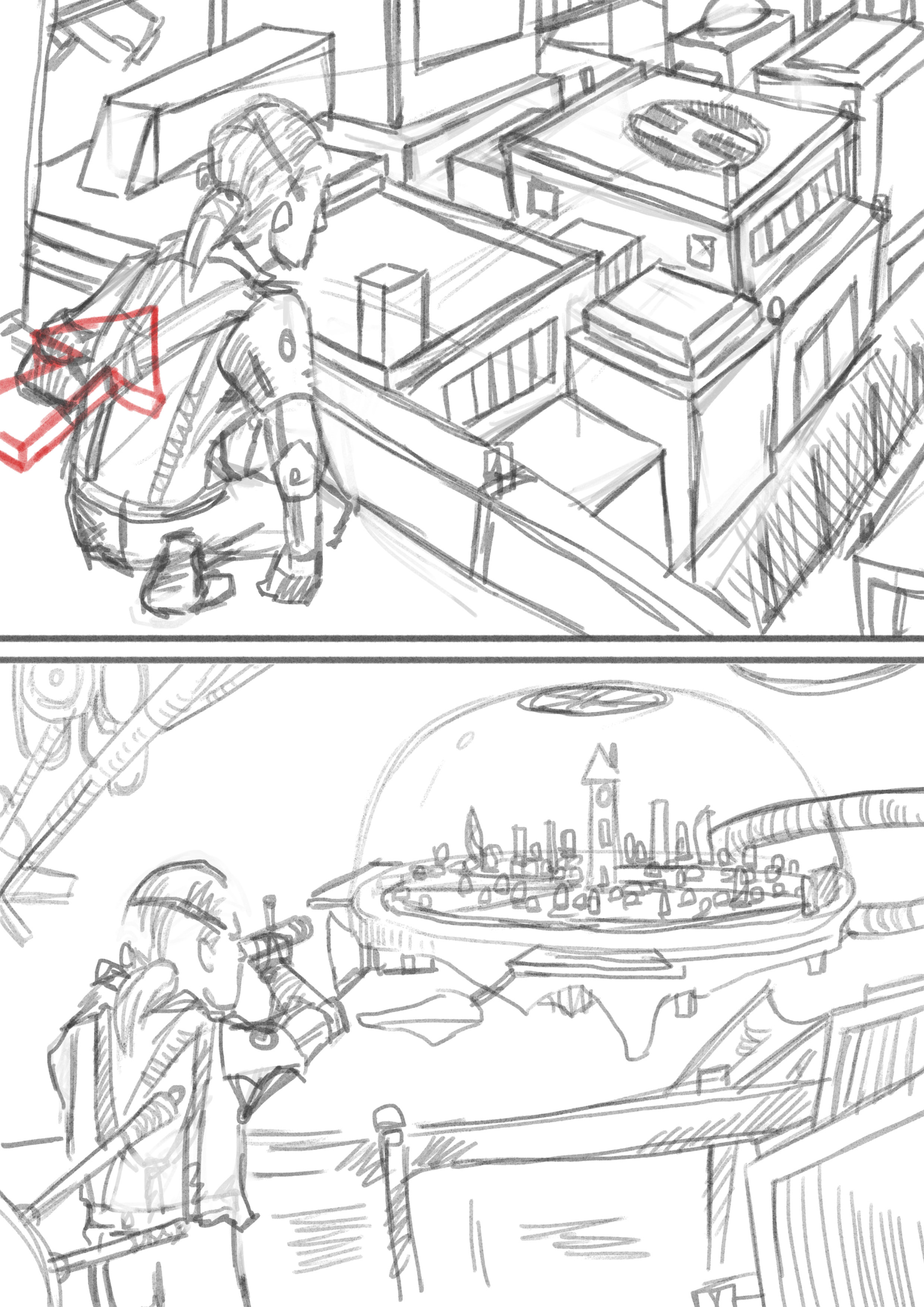
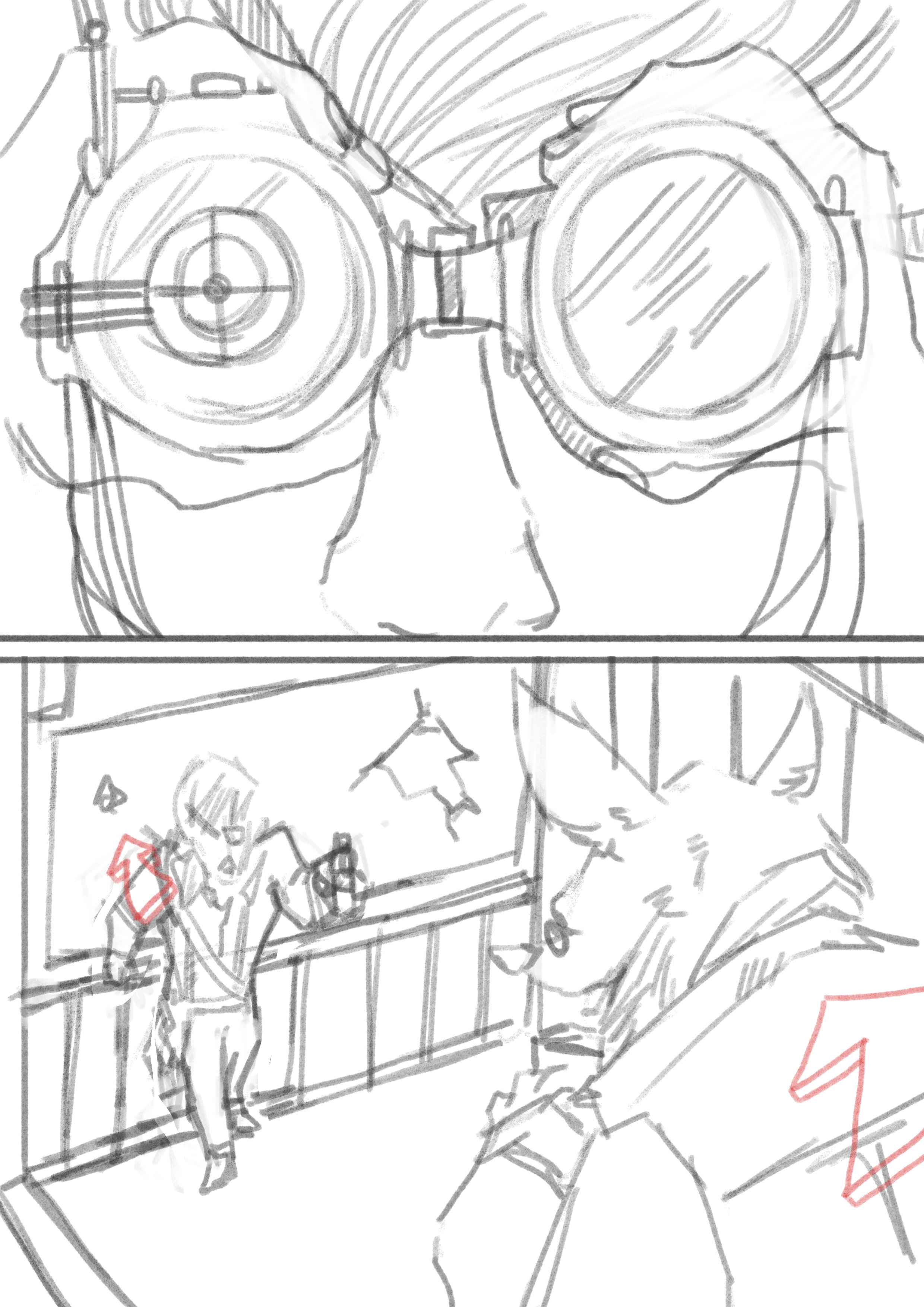
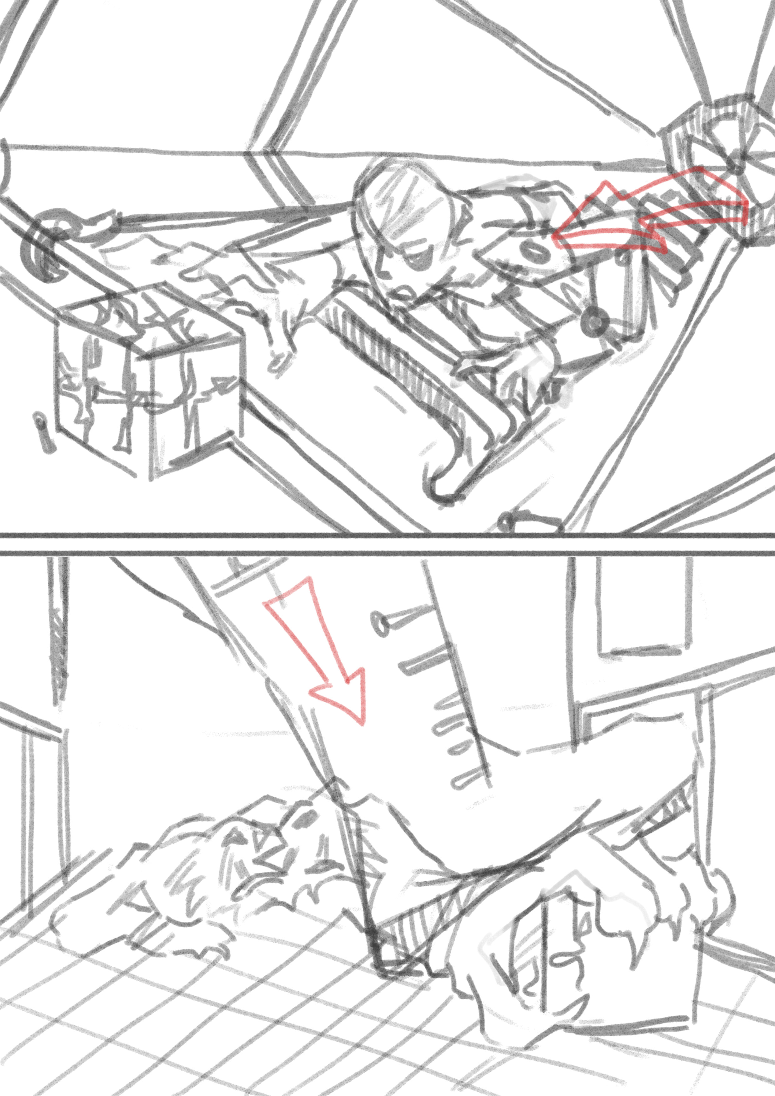
Board #1
Board #2

Overall: Board #1 (Top) & Board #2 (Bottom)
Task: Create 12 Panels depicting of (Me, Setting and Outcome), with any medium.
I strung together some quick development into style and colour research before I actually went into anything deep, in order to get a clearer picture of what I would be expecting for the end result of the 12 panels.

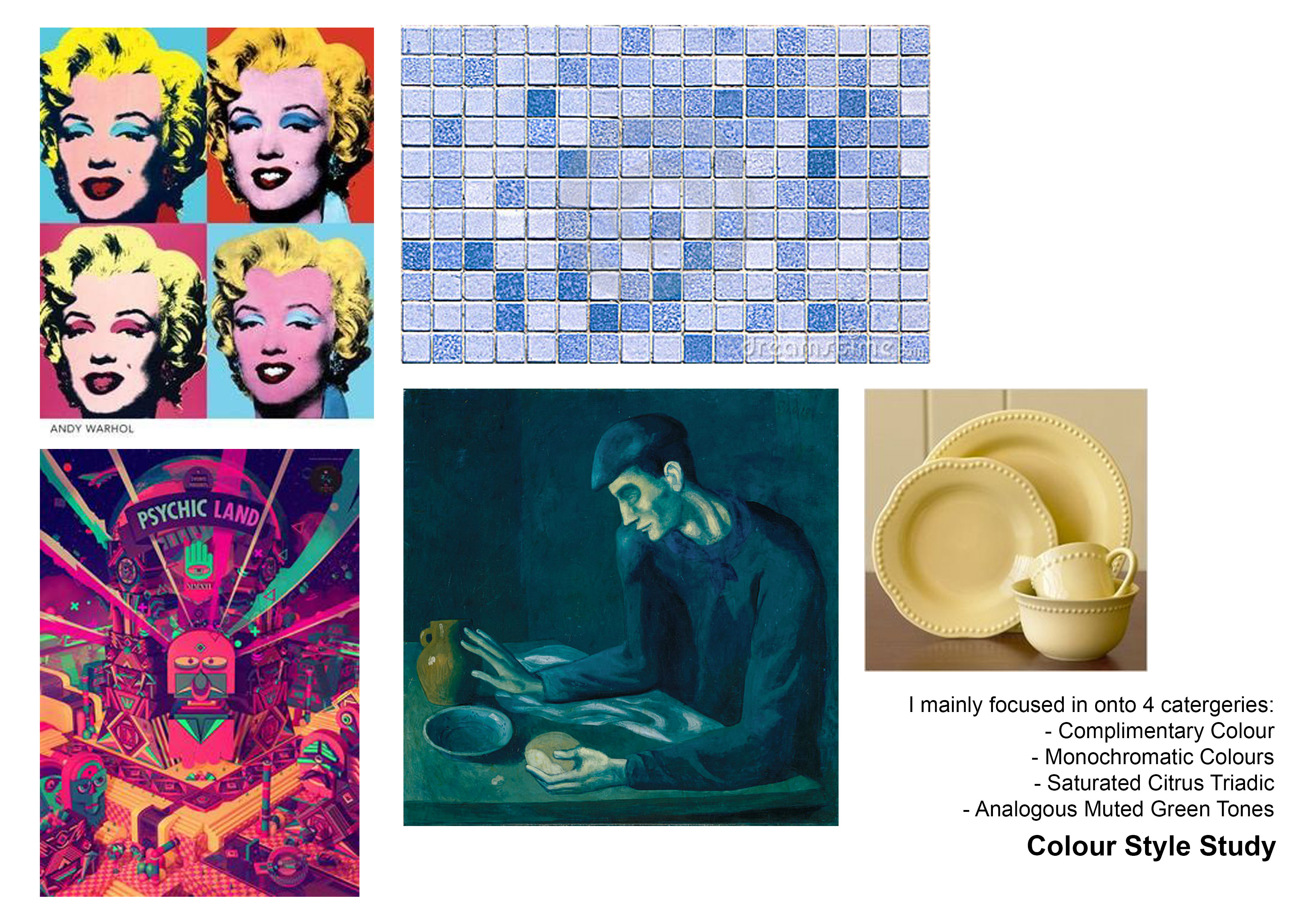
STUDY SKETCHES
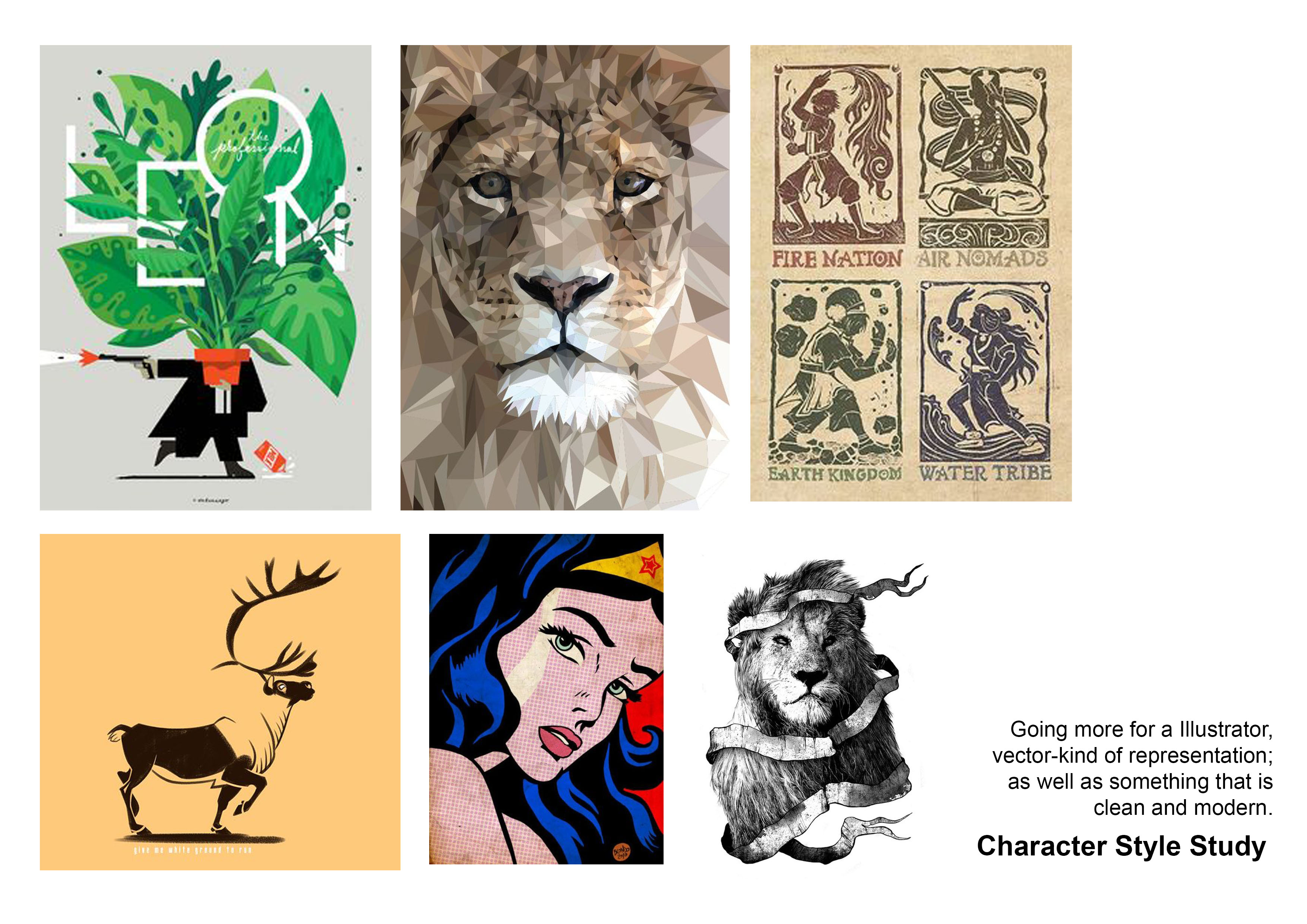
After researching, I decided that vector-style best represent who I am; for its varying ability to be complex yet simple at the same time. It will also bring out the colours most strongly in my opinion.

I did some quick thumbnails on some possible drafts for the 12 panels, and worked out the details from there. By deciding on a favourite/ particularly impressionable colour scheme, I then associated the feeling attached to the colour (e.g. Blue = Depression); and begin planning some compositions from there. The sketches above are for, more or less, the finalised drafts of the work.
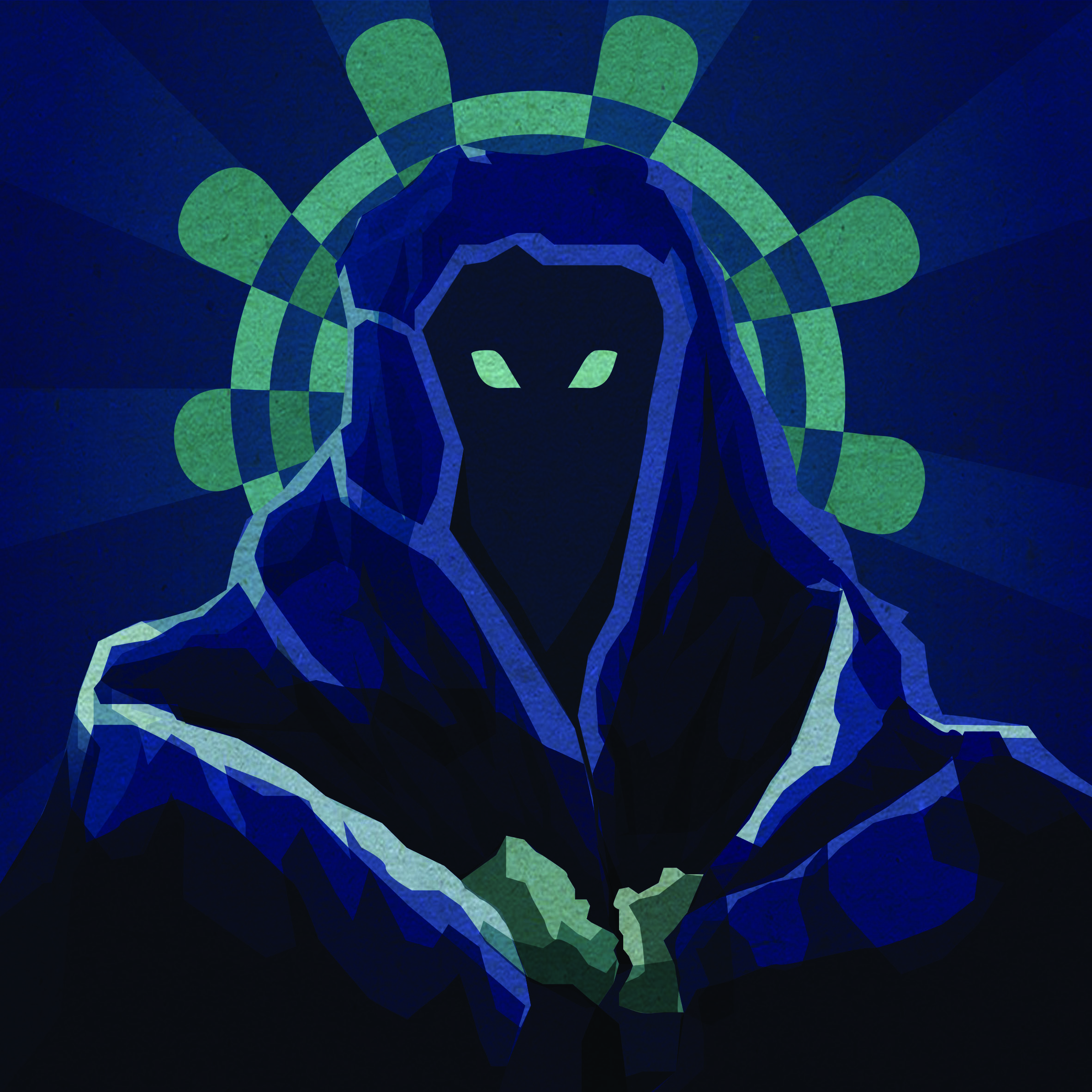
1) Set 1: Blue Analogous (Blues, Greens)
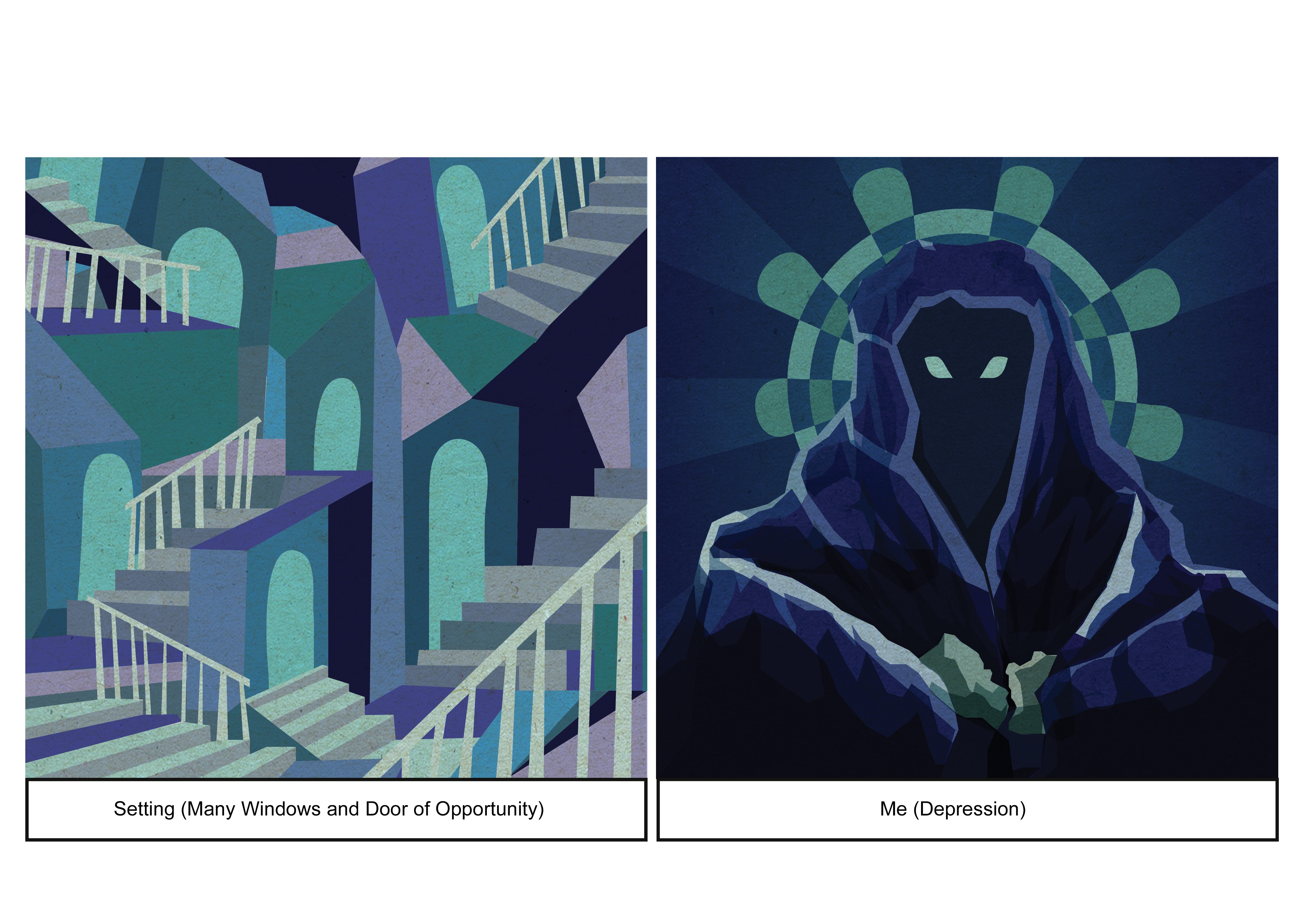
Me (Depression, Isolation)
I mainly drew inspiration from the Dementors from Harry Potter, as they give off the intimidating feeling wanting others to leave them alone; to which I feel a relation to.
Though I chose to reflect insecurity by getting the Me in the picture to grasp at the cloth as though concealing myself from the public eye, rather than the frightful imagery that the Dementors give off.
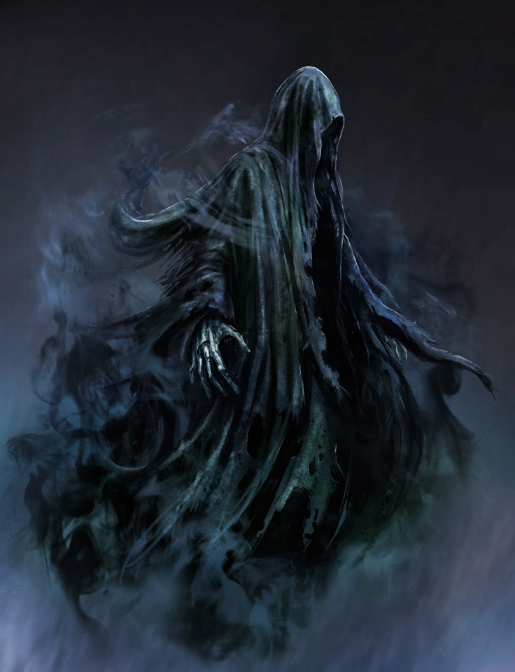

Description:
(Left: Dementor Concept Art, Right: Style Reference: Simon Delart – Tumblr Artist)
I went with a more fractured kind of vector to show the layers and turmoil one can feel during a depressive state, as well as the many layers people will chose to hide themselves in after finding themselves in such a predicament.
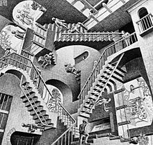
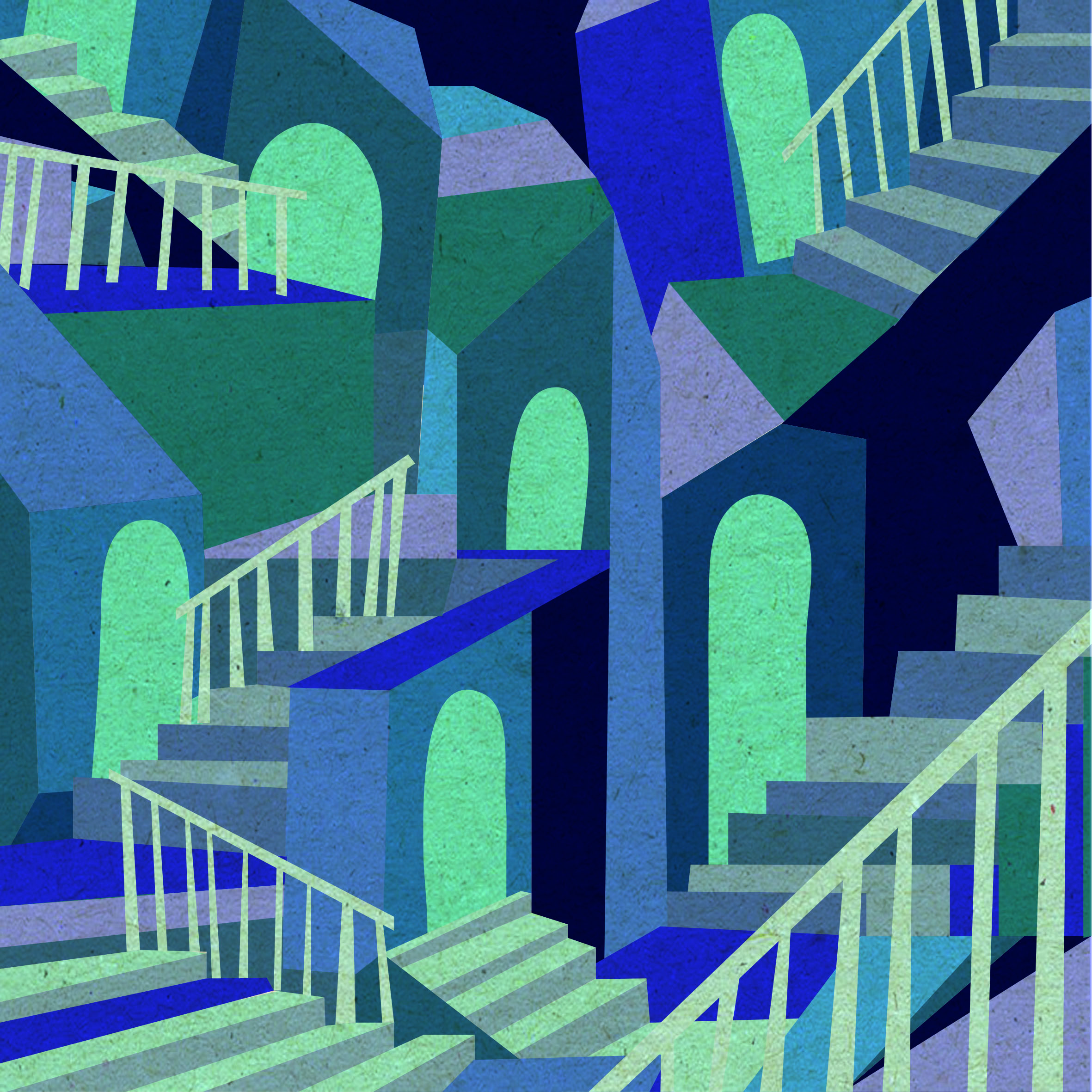 Setting (Many Windows, Doors Opportunity)
Description:
I went with Escher’s Maze-like design to show a myriad of pathways and choices, con-notating on how life has many possibilities one can take; and by entering one door it leads you to even more possibilities.
(Below: Escher’s Work)

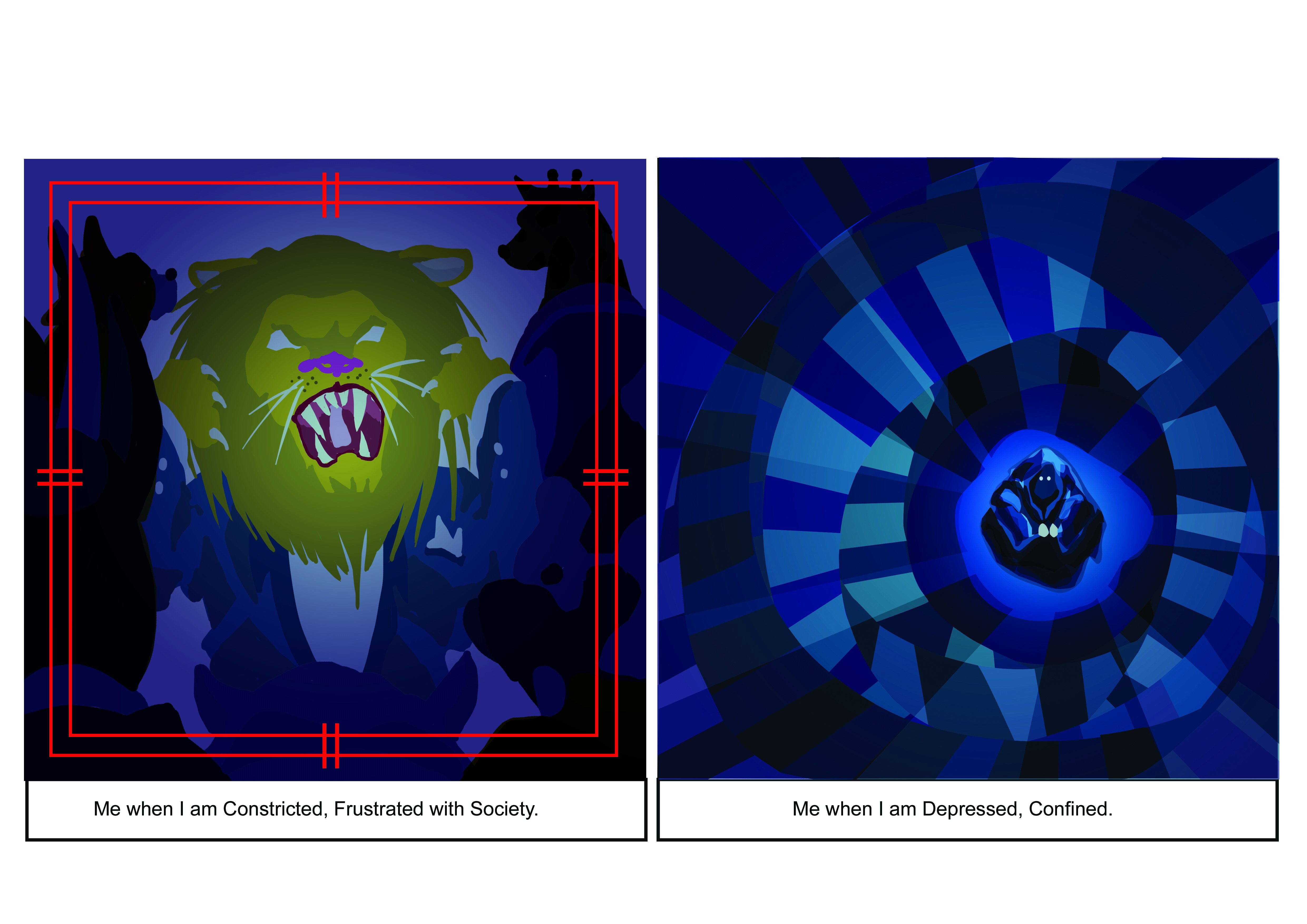
Outcome – When I am Depressed, Confined.
Description:
When I am depressed or confined, I tend to lose track of myself and hide back into my comfort zone (the shelter of the cloth) despite missing out on potential opportunities in various walks of life. The downward, spiralling staircase with me at the bottom also shows how I am at the very abyss, and when you stare at it; it stares back at you (aka. if you are stuck in a situation and if you do nothing about it, the situation won’t help itself improve). Inspired mostly from Picasso’s blue period for the colour scheme; from the Blind-man’s Meal (Below).


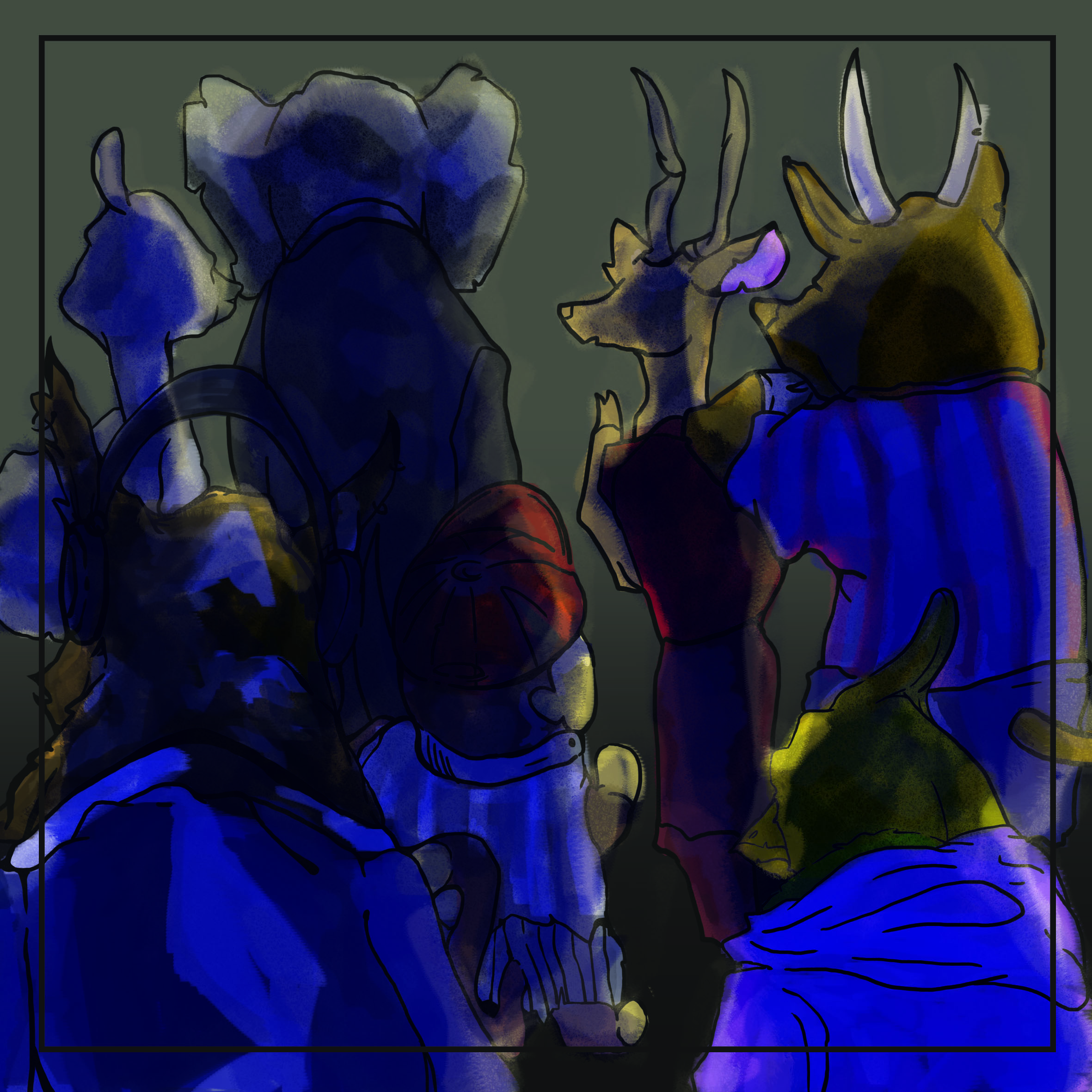
2) Set 2: Complimentary Colour (Blue and Yellow)
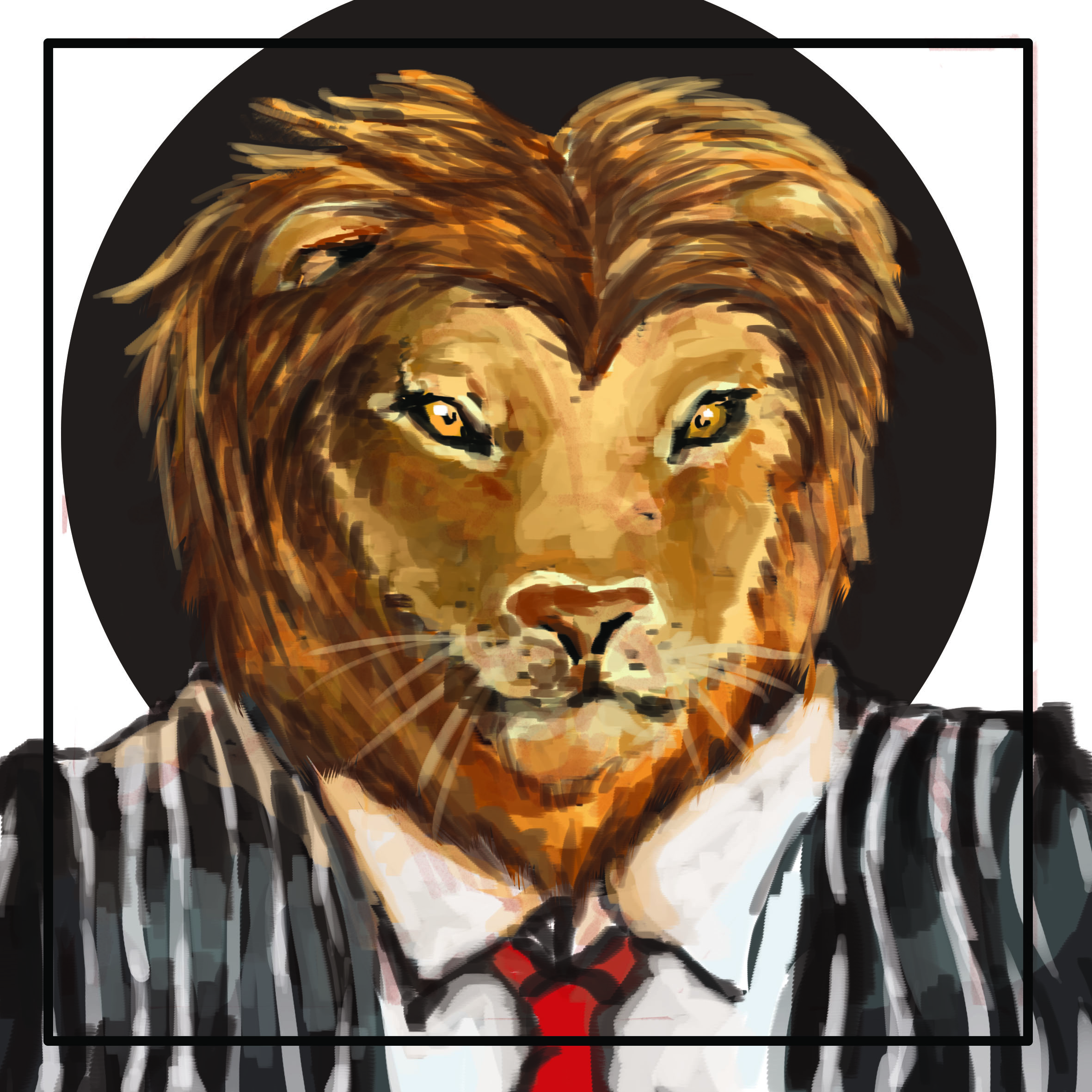
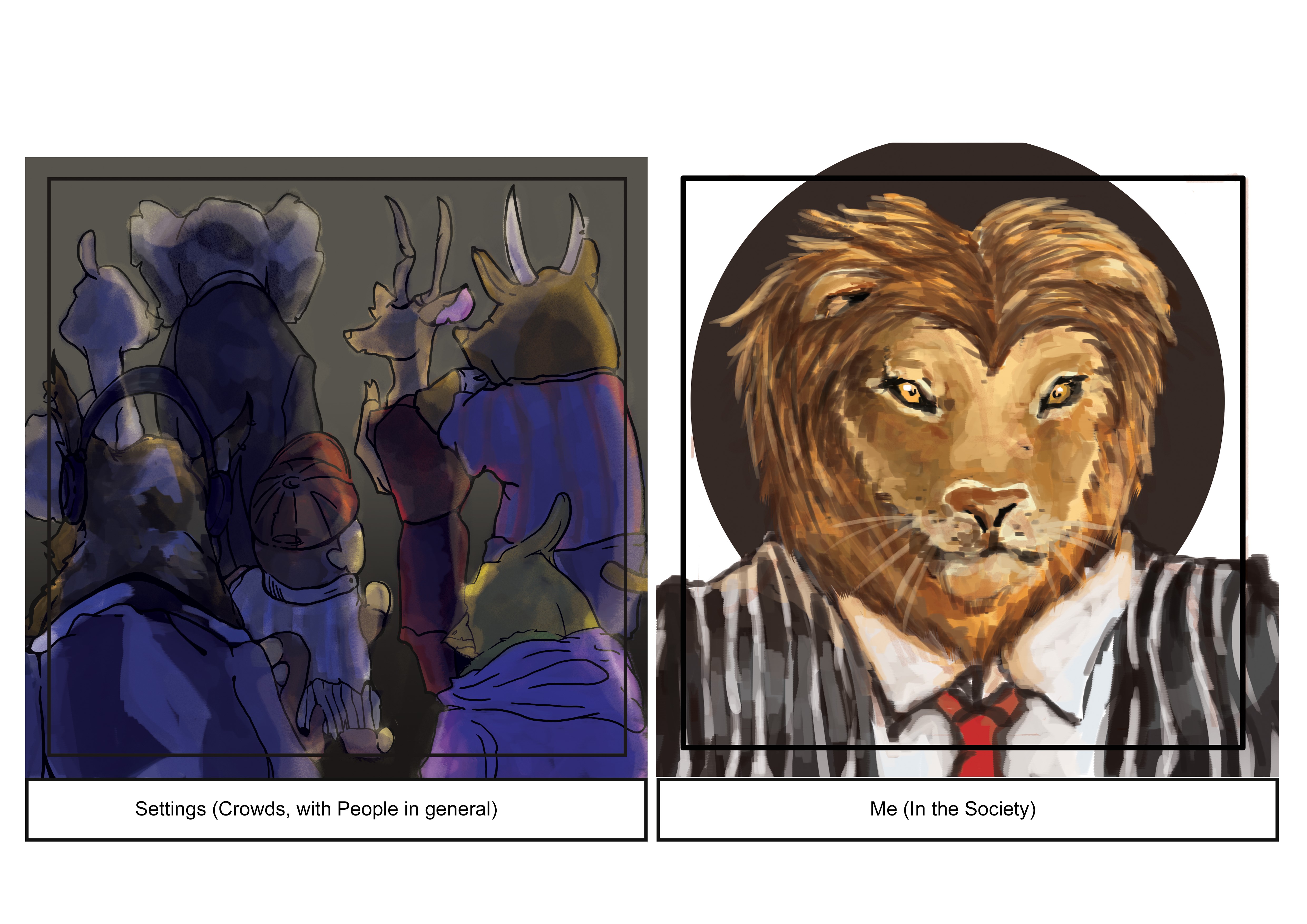
Me (As a Young Soul Venturing forth)
Description:
I choose to represent myself as a lion in a suit; for the fact that society favours courage and venturing qualities when it comes to the working life; as they always say “Go forth and Conquer”. Lions have been know as a symbol of courage, strength and tenacity since the medieval times upon European coat of arms and mythology. I drew inspiration from modern, oil-painting artist Ryohei Hase as well for the Animal-headed figures.
(Below: Ryohei Hase’s Works)
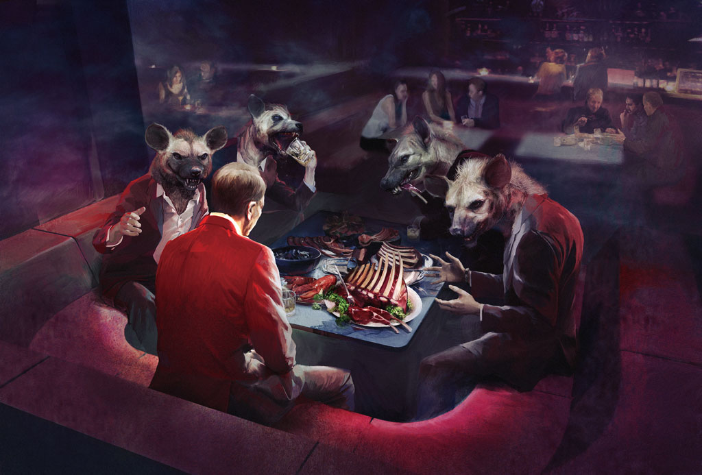
Setting : Crowds (With People in general)
Description:
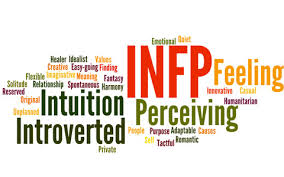
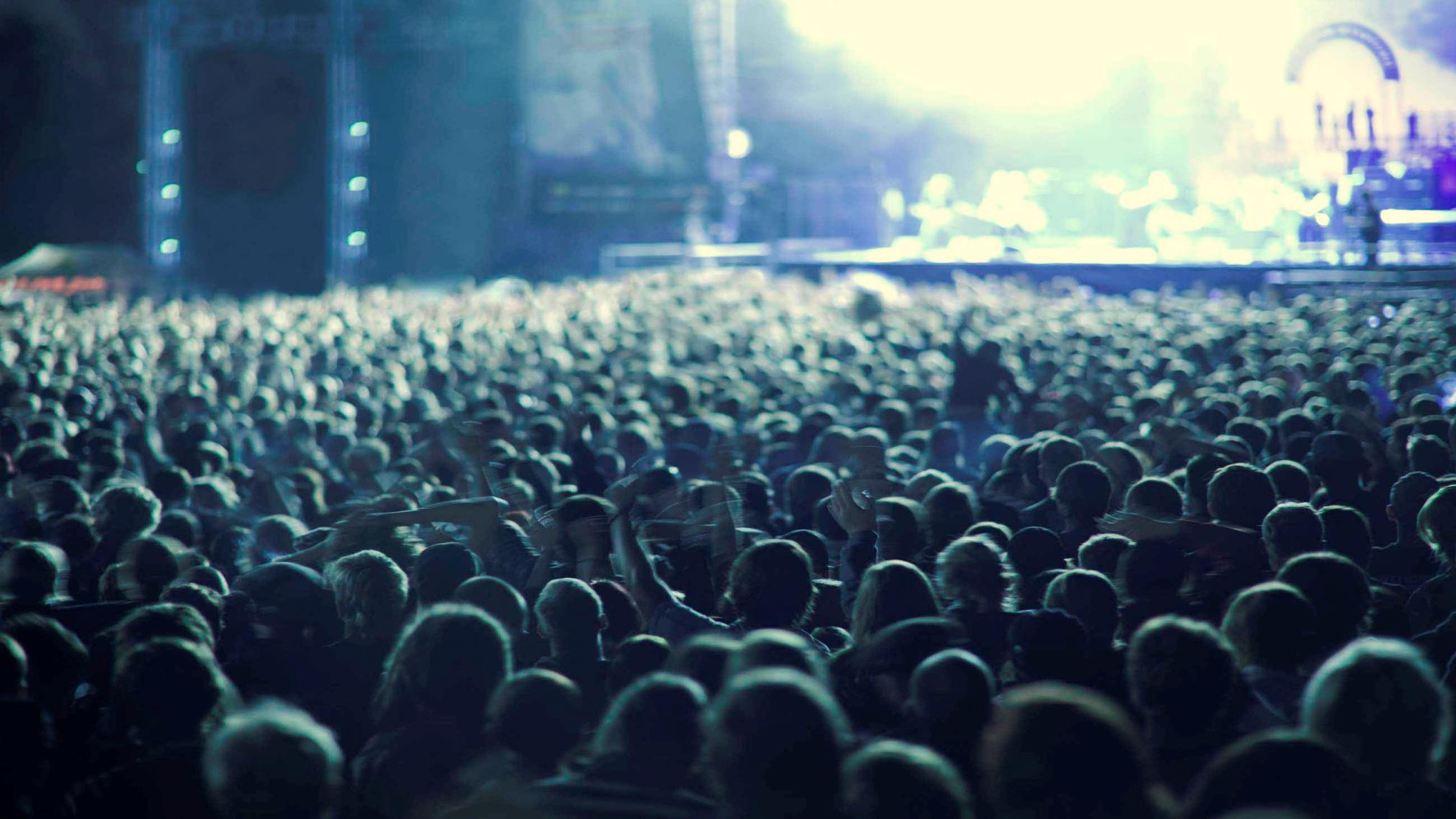
Being the introvert I am (based on the 16 Personality Test online that I am an INFP), I inherently dislike crowds and the hustle-bustle throngs of people bring forth. Hence such, I utilised the complimentary colour scheme since it meant general discomfort to me from its ability to disturb the eye.
(Below: Drew inspiration of the arrangement from concerts where there are many crowded into an area at once.)
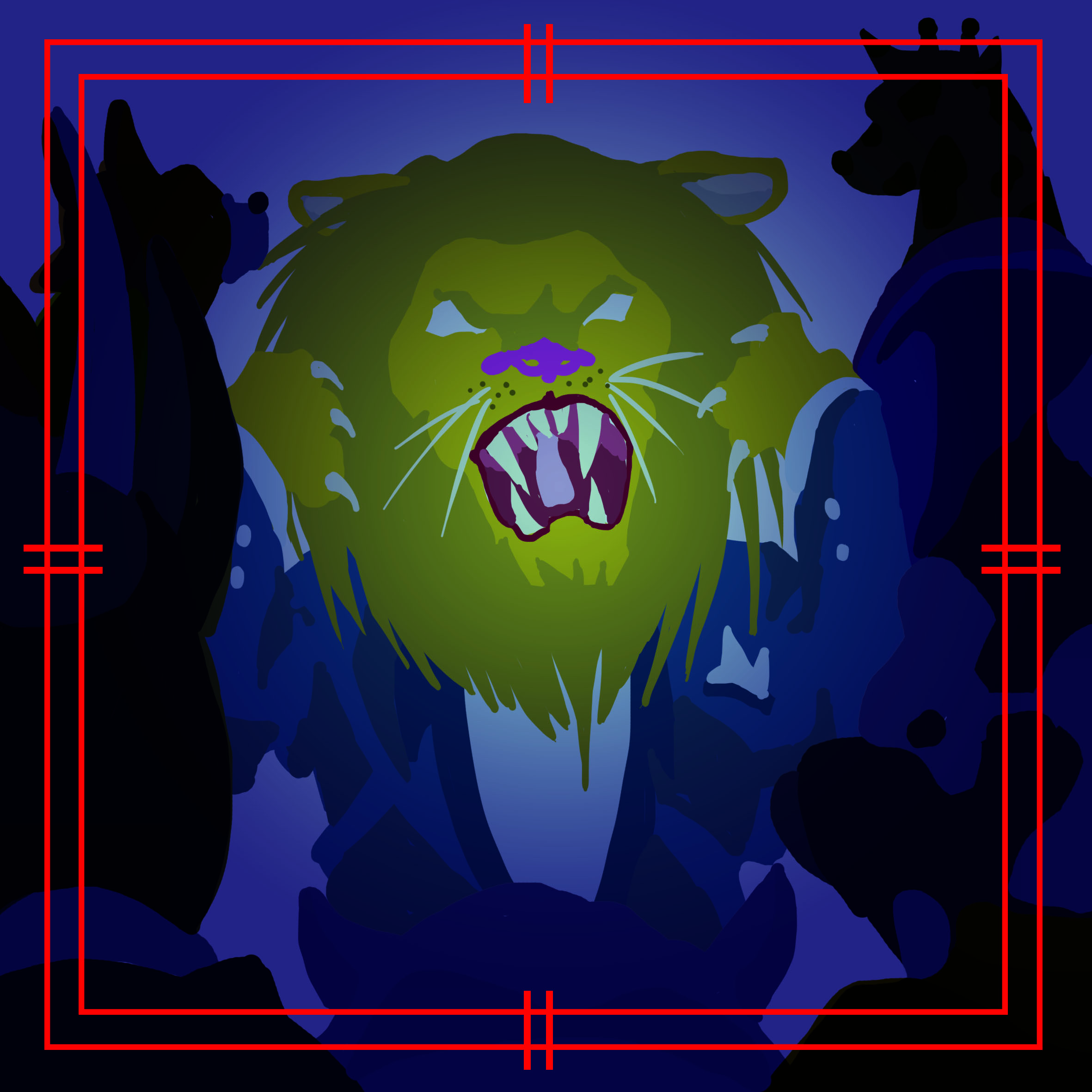 Outcome: Me (Constricted and Frustrated with Society)
Description:
For the final, I drew in the comparison of how society’s norm and expectation of how people are expected, naturally, to be going with the flow and play amongst company politics in order to find our place in life.
3) Pastel (Soft Colours)

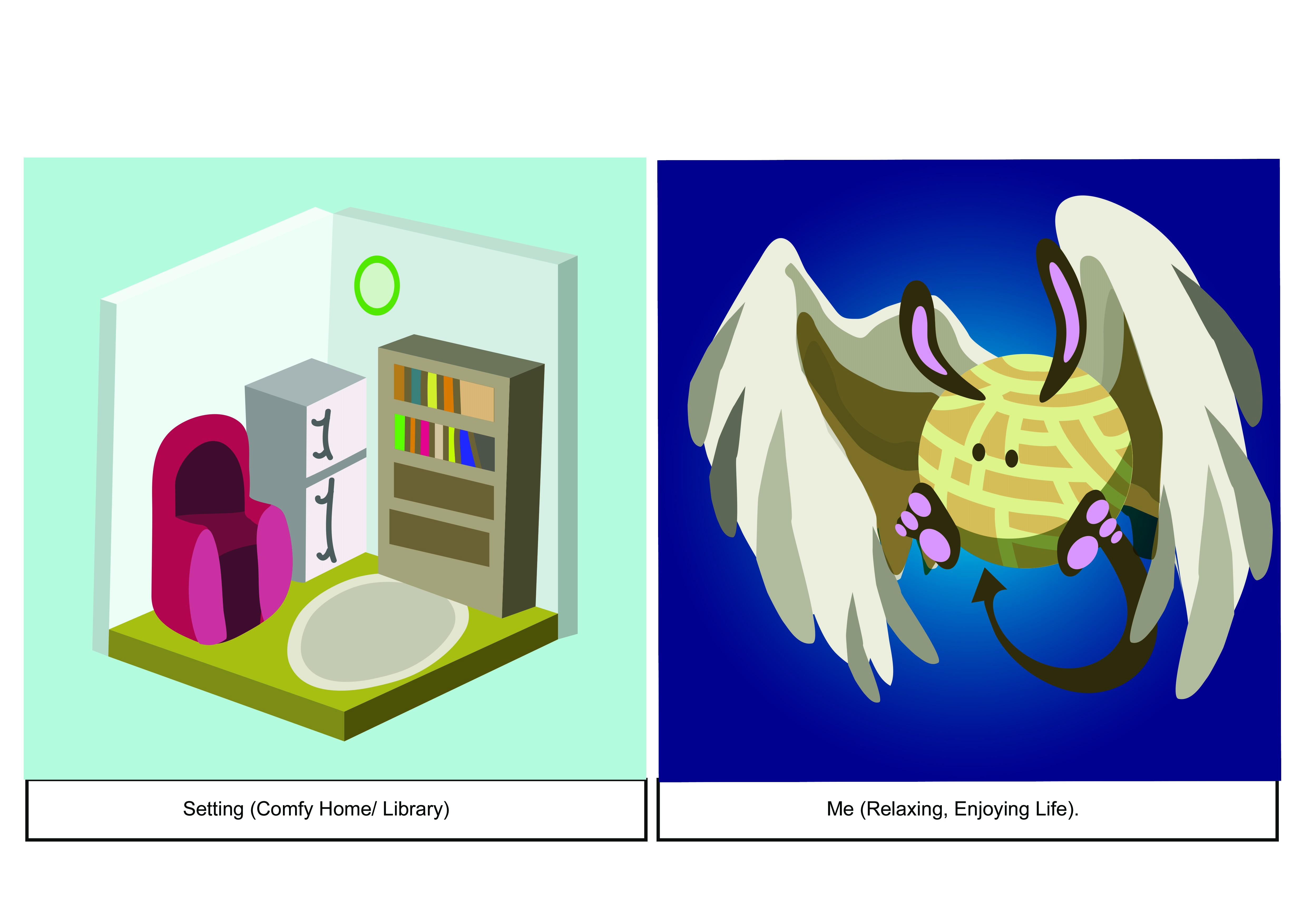
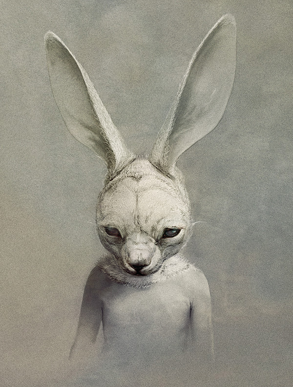
Me (Comfort Zone)
Description:
Initially, I started out with the drafts of an angel (Humanoid with Wings); and then I decided hey, why not let it go and see what my pen brings me to. Thus, I simply drew with a single thought in mind: to represent myself when I am feeling the most contented and happy.
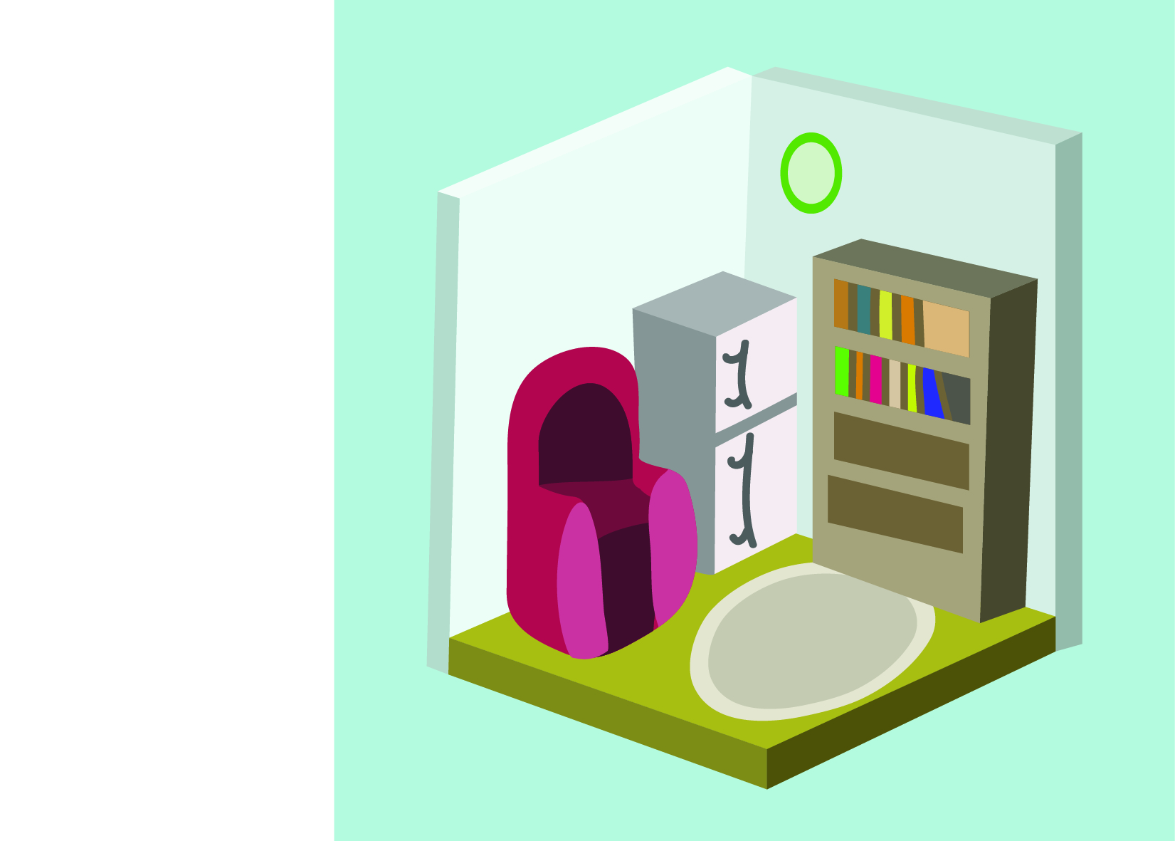
Setting (Home-ish, Warm Place)
Description:
I simply went the track of “how do I represent a comfortable area in a manner that is to the point”; and I came up with the game-ish concept of a mini-space of comfort.
 (Inspiration: GameUI’s Game Environment Setting)
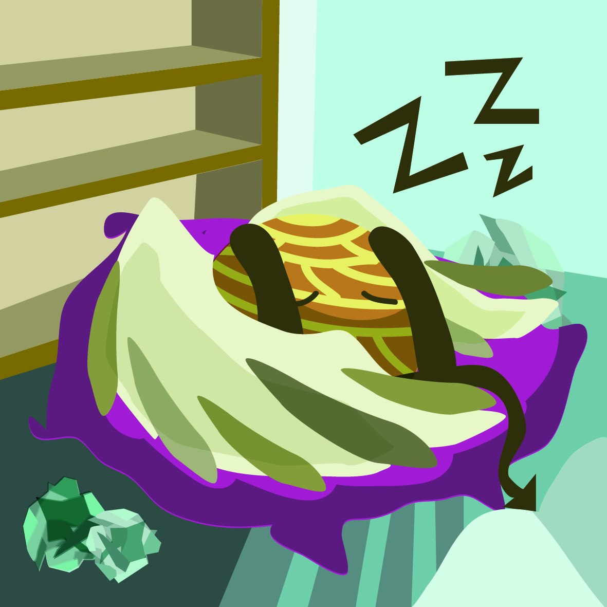
Outcome: Relaxed, Comfortable Me
Description:
I feel the happiest, and the most relaxed when I am resting within my comfort zone. Hence the soft colours and relaxed ‘mascot’-me.
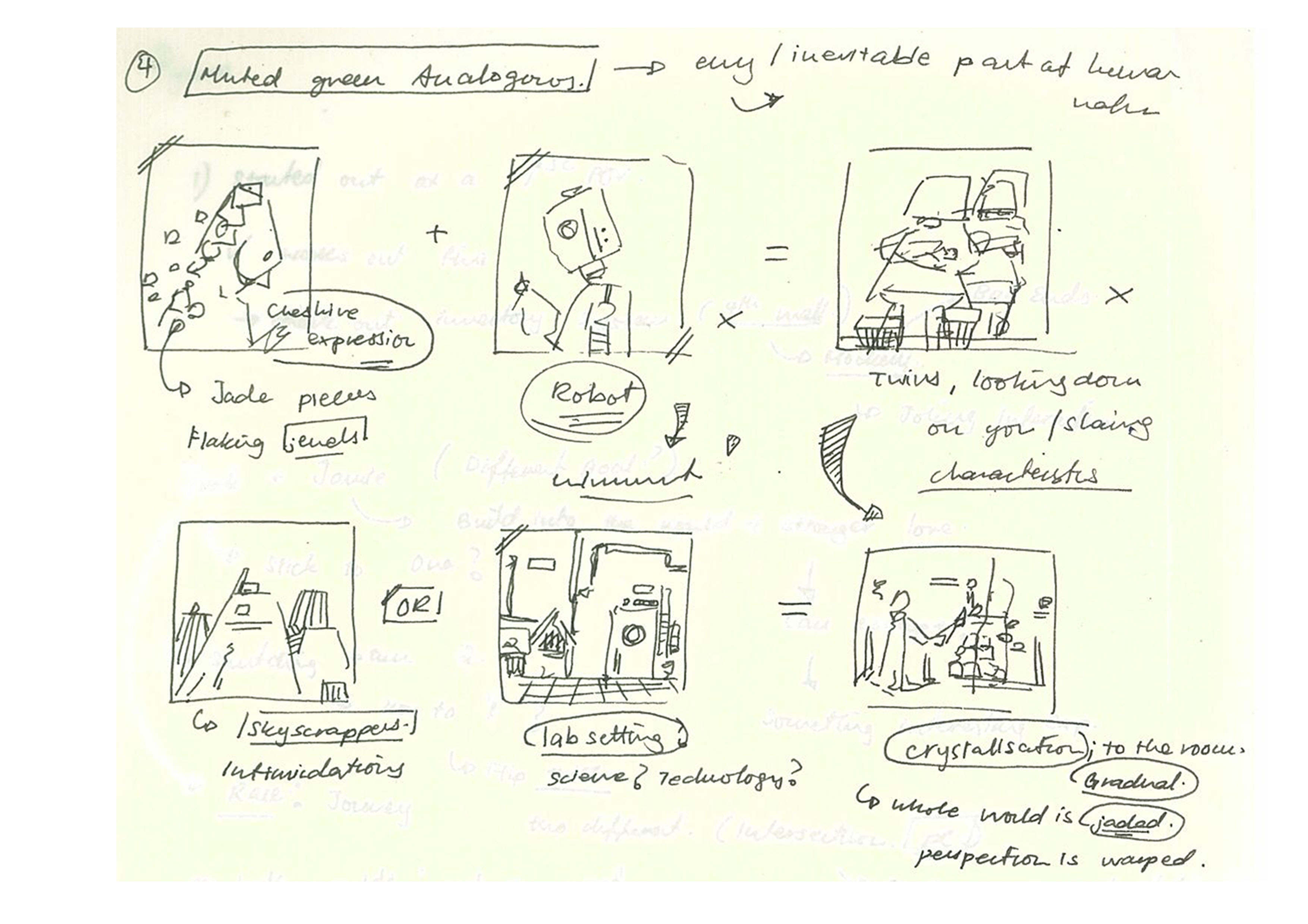
4) Green Analogous (Greens, Blues)

Me (Jaded, Over-Confident)
Description:
Green, to me as a colour, is the colour of Nature and Envy. And being envious of people is part and parcel of how humans naturally react, though whether we react negatively or positively to the emotions is another story. The pieces of Jade attached to me symbolises me hidden behind my own ignorance of Envy and Confidence.

Setting (Technology, Advancement)
Description:
Greenish, Lab setting to show the sense of Technology; and how technology is a double-edged sword. It can grant humble people the power to empower other’s lives, and yet destroys with people’s over-reliance on its omnipotence.

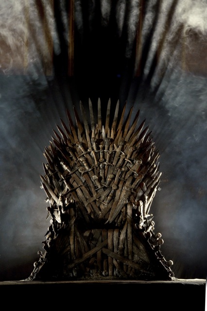
Outcome: Presumptuous Me, Overconfidence.
Description:
Inspired by the iron throne in the Game of Thrones, the final piece delved into the world of me being jaded and too overconfident in my work due to my past experiences (my knowledge over the others); resulting me in a sense of (dangerous) over-entitlement in myself. By placing myself in a laid back pose, it depicts myself in a state where I believe I reign supreme over all, the King of my own presumption within my own world.
The lack of details in the background shows that it is only myself that believes in such a fact, and that I have went too deep into my ego and need to bring myself back into reality again; to stay humble and steadfast.
(Below: Iron Throne from the Game of Thrones)
Final Works – (Digital Print Ver. Followed by the Physical)
Note: The colours are more saturated, off here due to the web colours not reading the CMYK files properly.
Board #1
Board #2
Reflection:
It is certainly an eye-opening experience for the EGO project; since we had to delve deep into our subconscious and truly LOOK at ourselves from exterior in. I definitely could have explored further in times of the mediums and ideas (food for thought for the future), and pushed myself beyond what I was expecting to reach another boundary.
Though so, it is safe to say that the project has helped me understand myself much, much more. In terms of self-reflection, concepts and art approach.
Stop-Motion Exercise Homework:
https://drive.google.com/open?id=0B2TMgVvl5D5BWkQwSW5fcU1LdW8
Project 1B : In a world (Creating Your Own Characters and Poster)
Task: Combine and create characters with either forms of mixed media for a Poster
Storyboard Panels:

Task: Create a 2-D Imagery that consider the use of the following action: ‘Add’, ‘Subtract’, ‘Substitute’ and ‘Superimpose’.
1) Adding to the Image: Smoking Your Way Though (Addition)

Description: I added in a man smoking right infront of the no-smoking sign; to show the blatant irony of how people seem to disrespect rules and signs nowadays almost to the point that it is a norm. I had to colour-tone the man in the picture since he was more orange than yellow originally, and had to turn up the highlights on him to attempt to make him match more to his background.
2) Through the Looking-Glass (Superimpose)

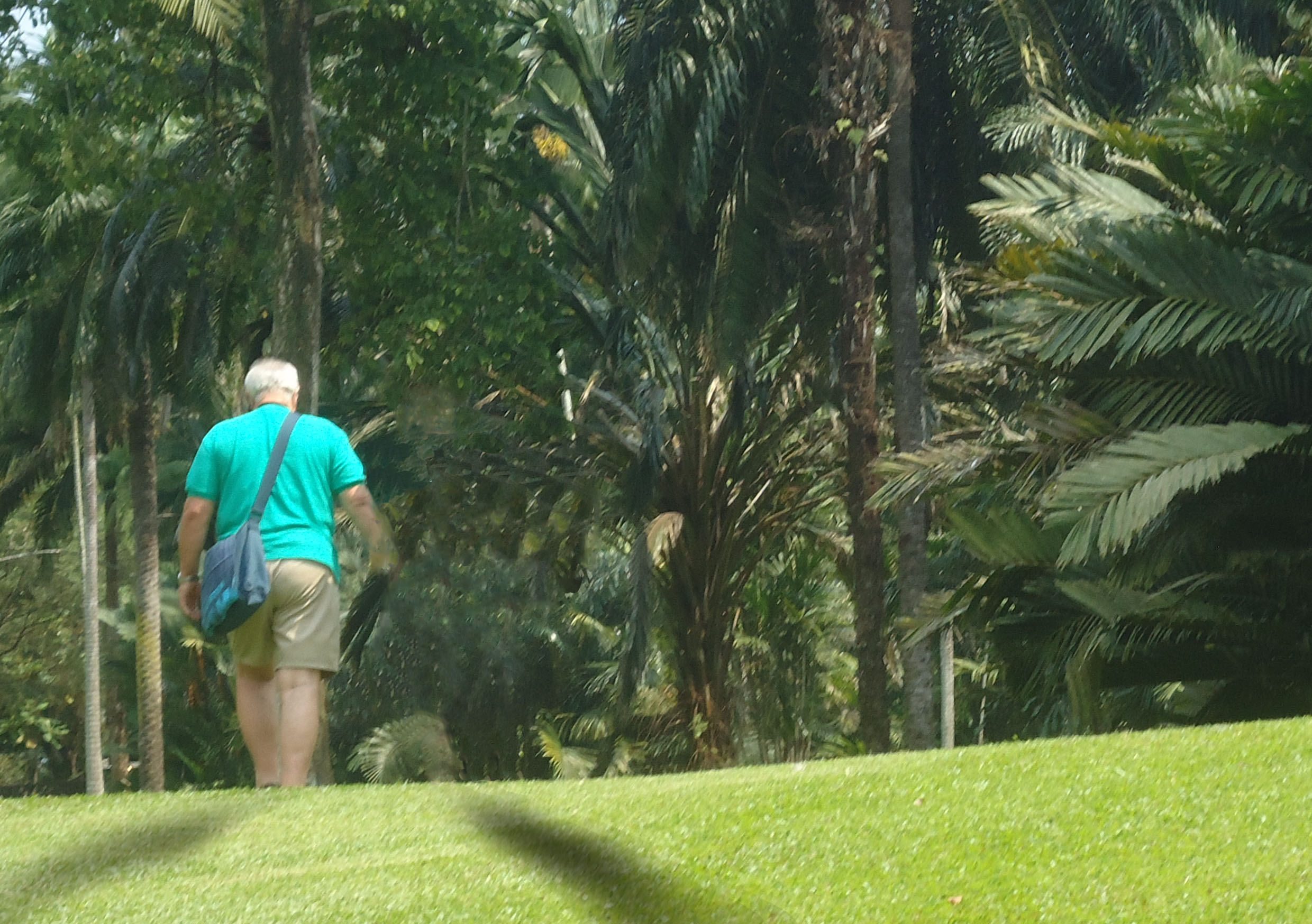
Description: Originally a shot peeking into the outside world from the National Museum, I switched the exterior to a more naturalistic shot to show the contrast between the cold, neutral world of walls as compared to the free, green grass on the other side; managed it through masking the green layer over the original.
3) Animal in Man Skin (Substitution)
Description: I substituted the original head of people viewing animals at the zoo with animal heads to show the irony of how humans are also animals themselves; and yet they choose to lock up other animals for their viewing pleasure.
The varying types of animals also show how different people in the society is similar to how animals behave in a safari-zone, many different people/ animals of different strengths and weaknesses living together in both harmony and discord.
4) Missing Someone (Subtracting)
Description: By cloning the tress in the background, I removed the original existing companion of the old couple strolling in the Botanic Gardens.
By adding shadows on the grass emphasised the fact that there used to be a person beside the other, despite the missing appearances.
Thoughts: The exercise further emphasised on the probable understanding of the human conscious towards connoted and denoted messages within pictures. People might interpret differently based on their personal perception and upbringing, owing it their culture and understanding of the particular subject itself.
It is interesting to see how people react differently to the same thing; akin to a devils’ advocate.
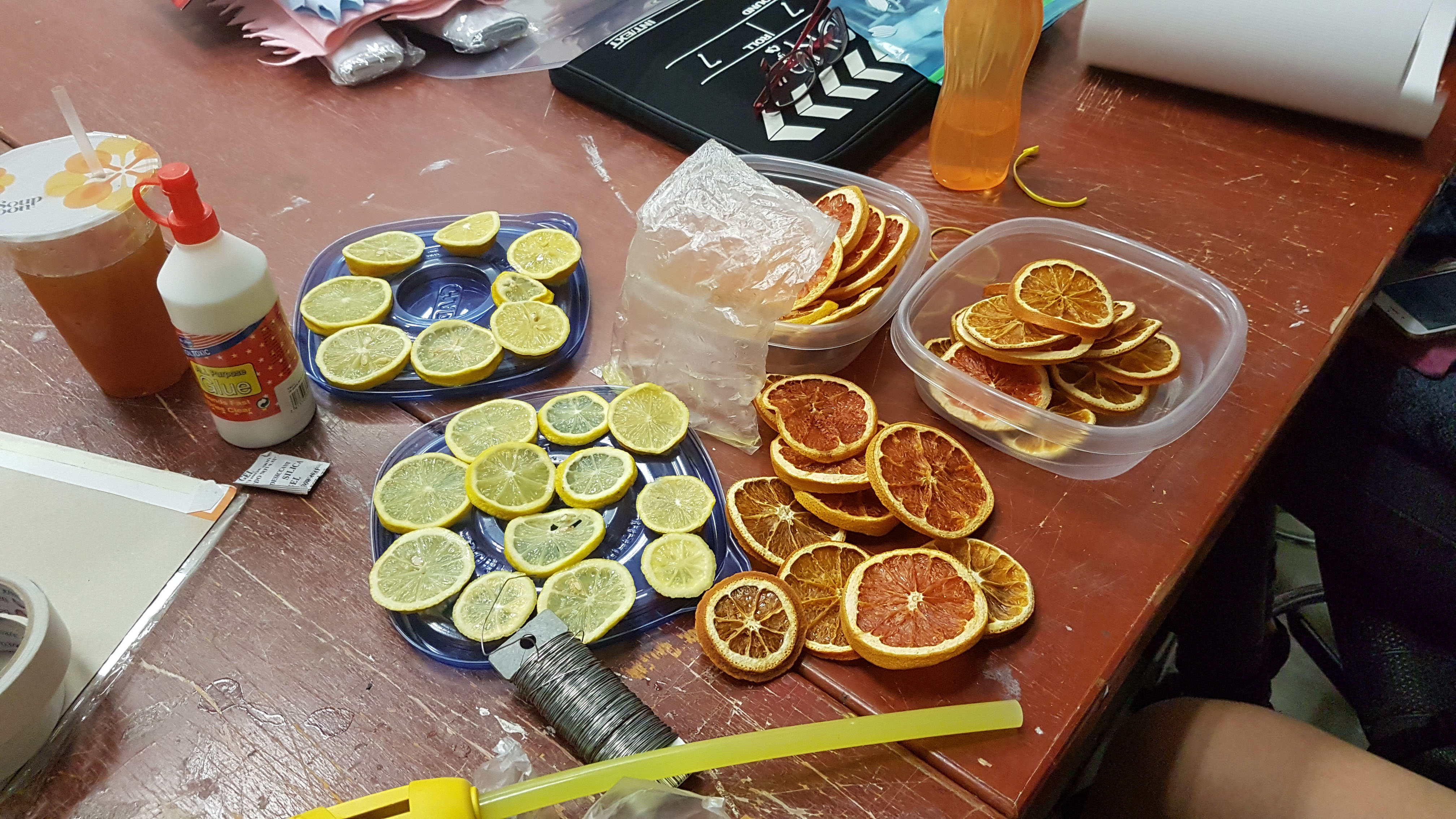
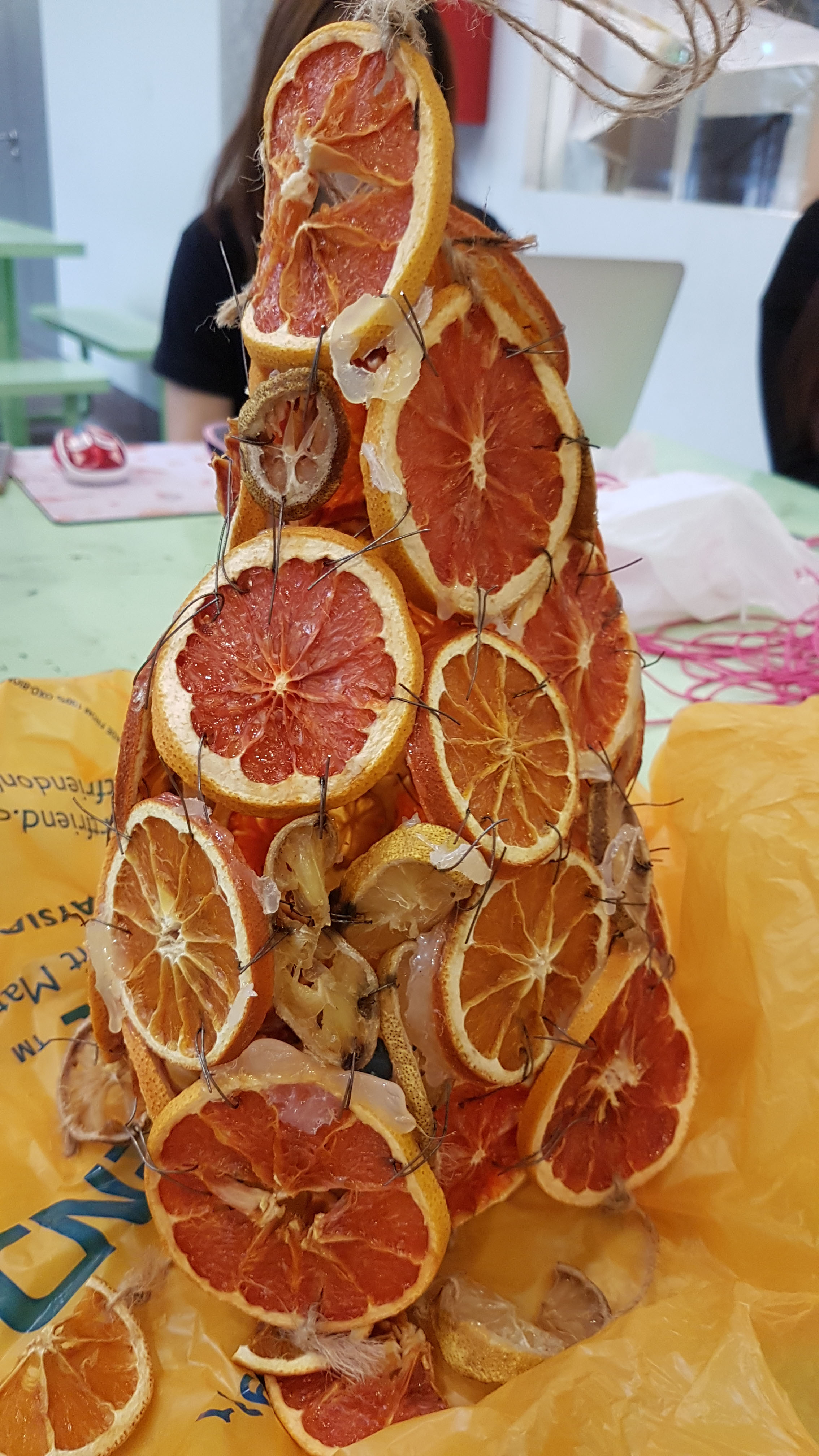
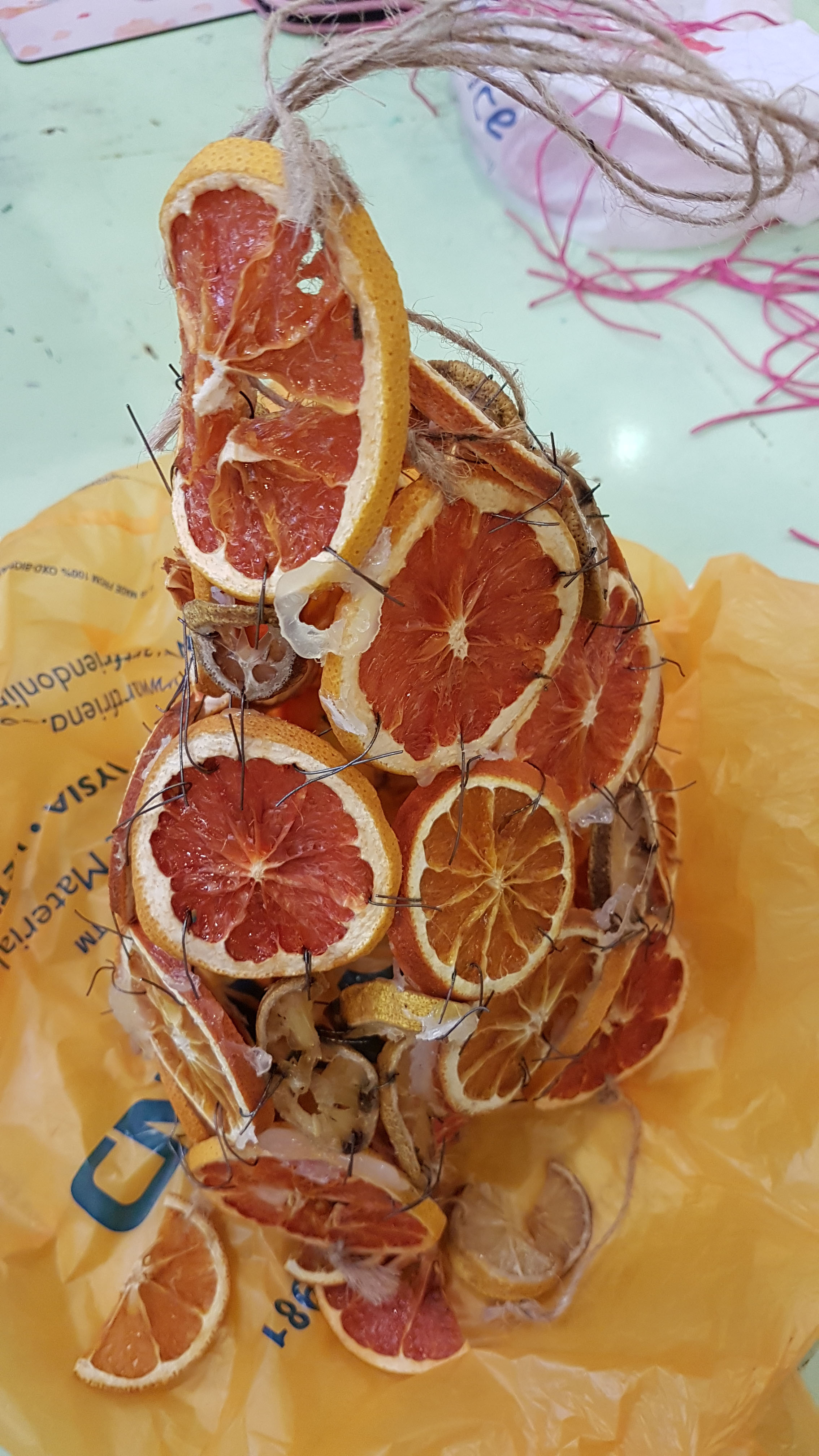
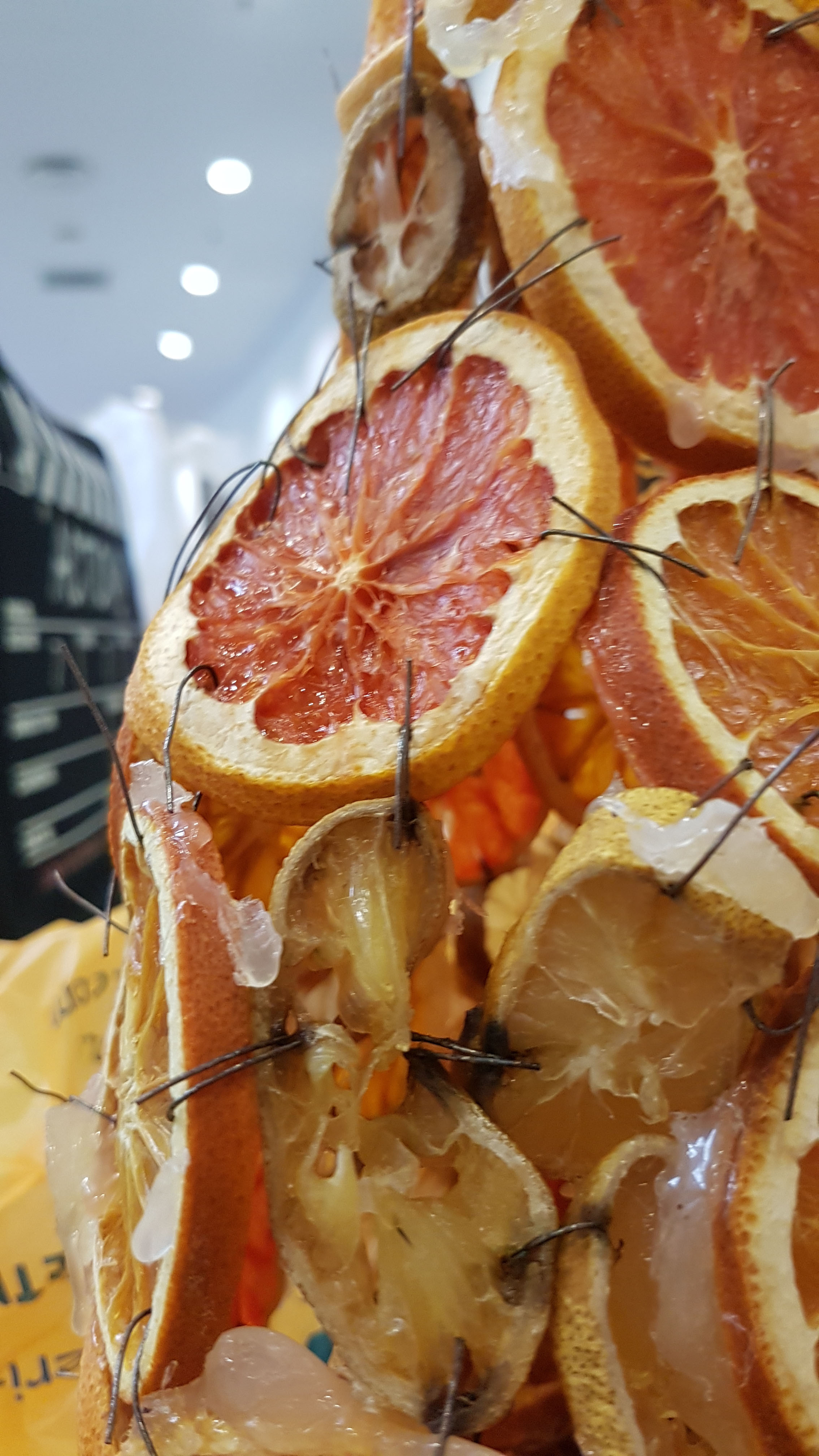
Final Project : Creating a Lampshade from SEM
The task given to us this time was to combine the aspects of the sculpture from the SEM of my partner and I; her’s being chalk and mine being human skin.
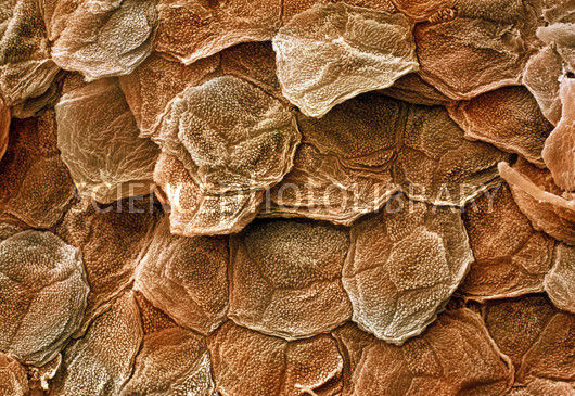
SEM of Human Skin – Adapted the slight stacking and flat texture of the human skin. Utilised the conical-shape of my previous project as well as the base shape of the structure itself.
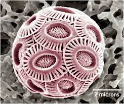
SEM of Chalk – We stuck to the roundish singular unit and developed from the object; perhaps varying in size and shape in the final product.
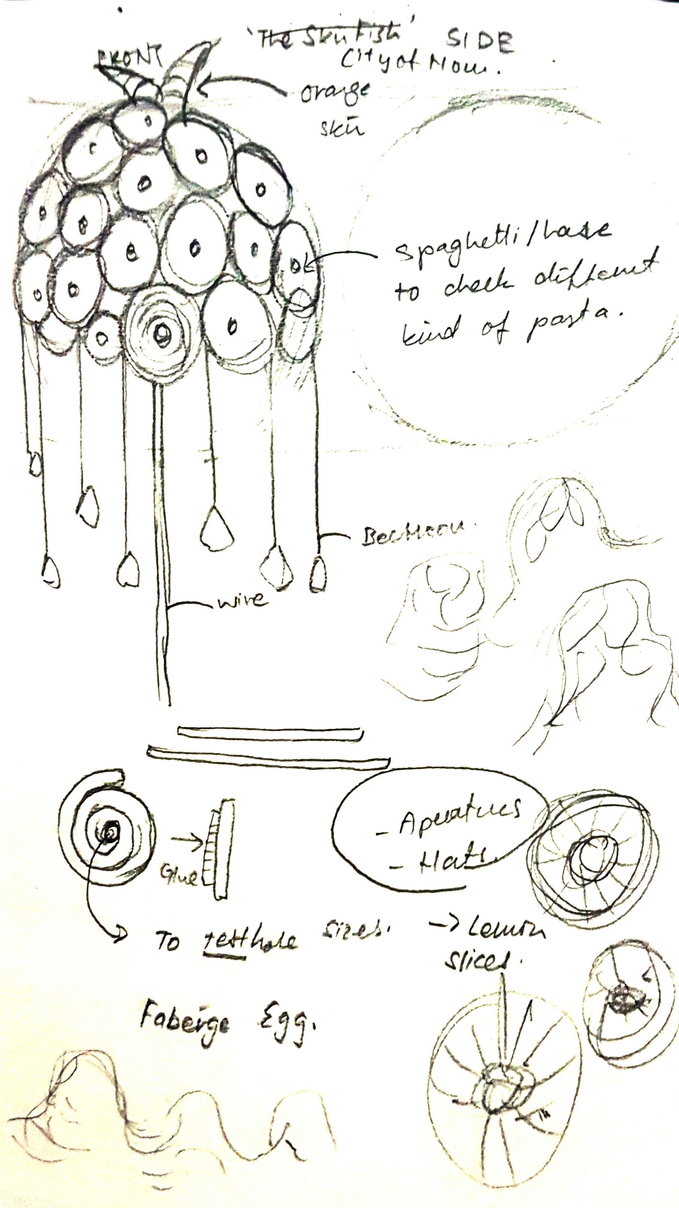
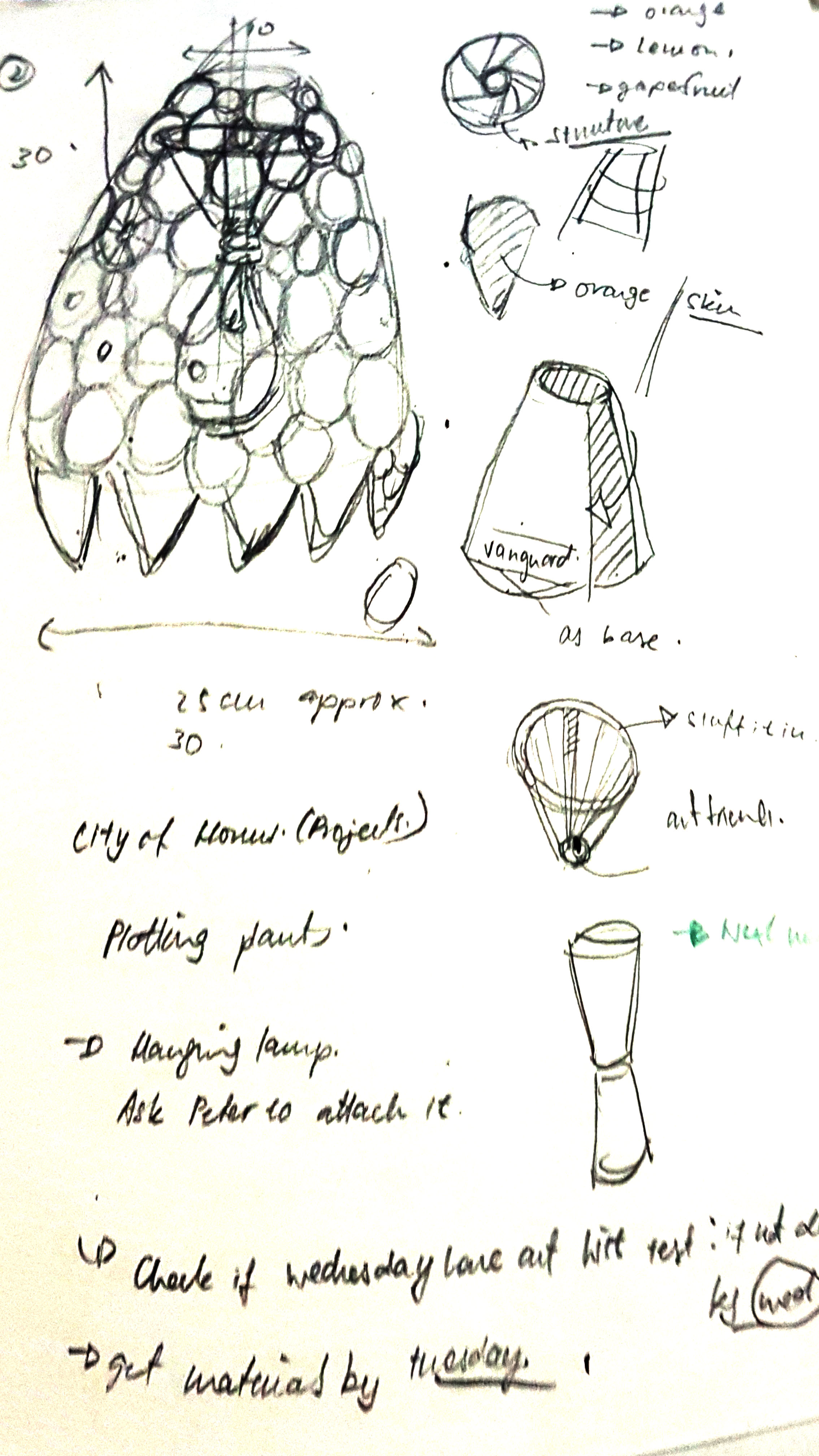
Sketches for our original product plans –
we initially wanted to go for a Russian Faberge-Egg shape sliced into half as a standing lampshade.
Though we eventually adapted the conical shape of the product of my SEM and made it more pointy.
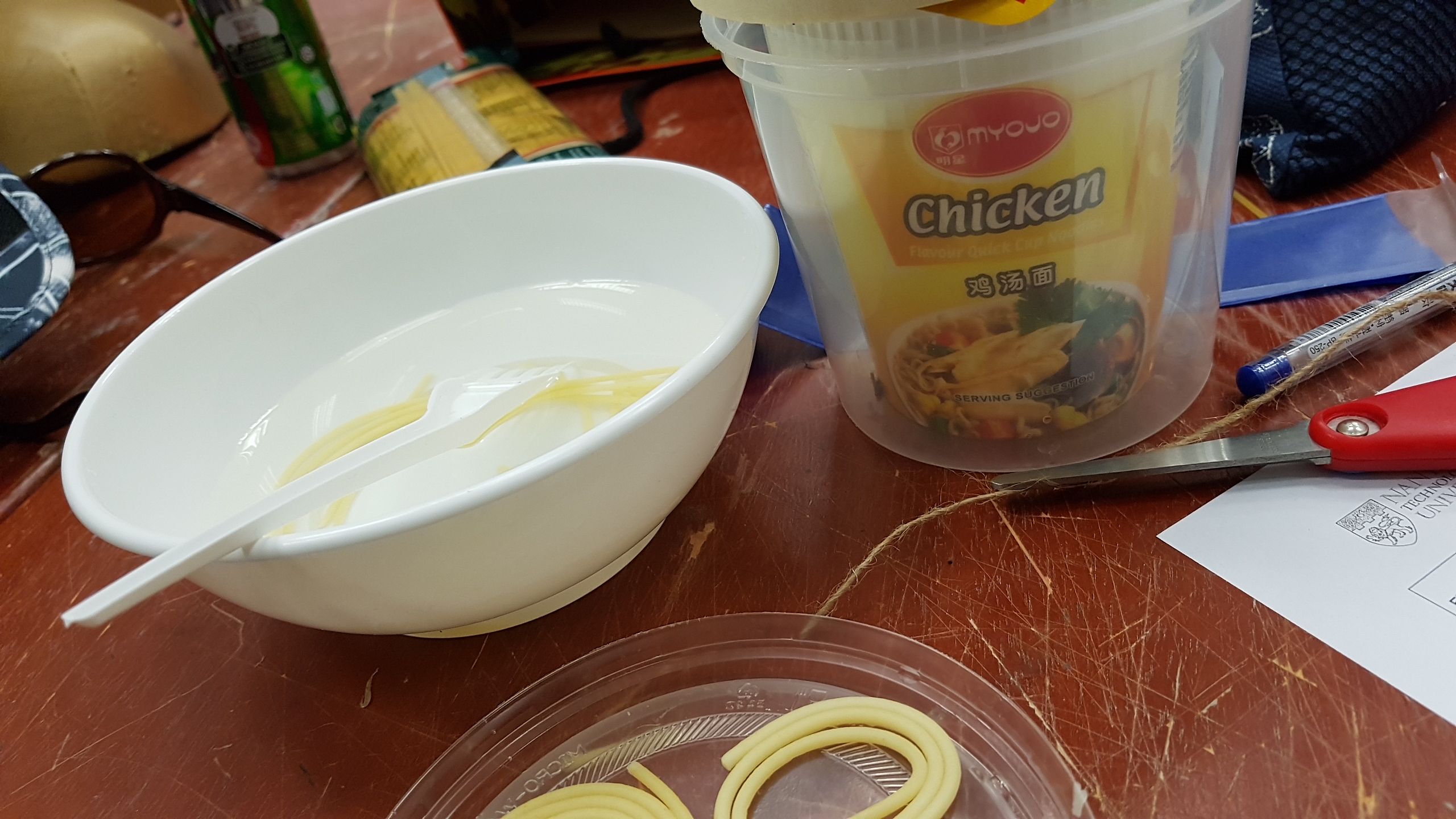
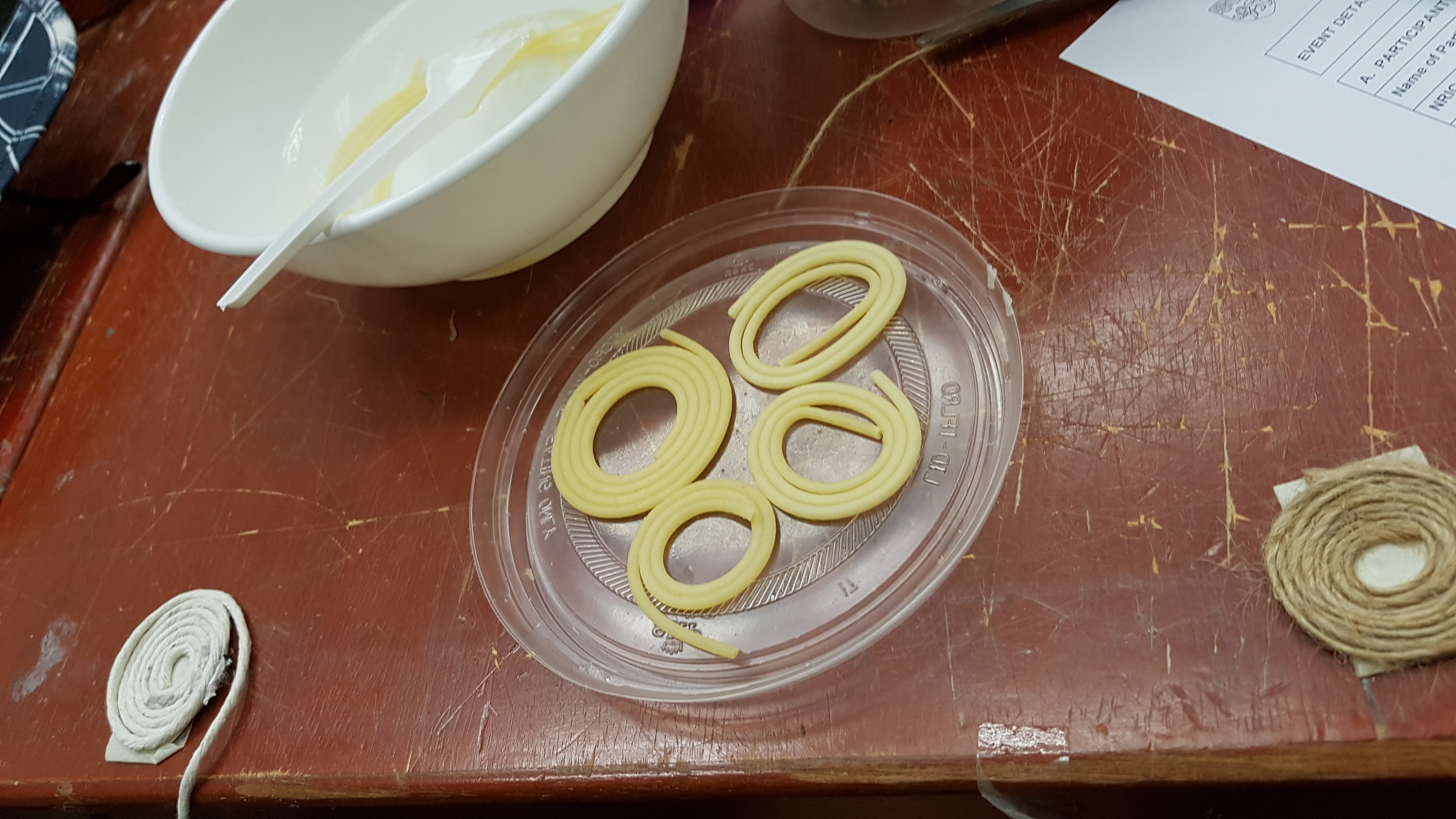
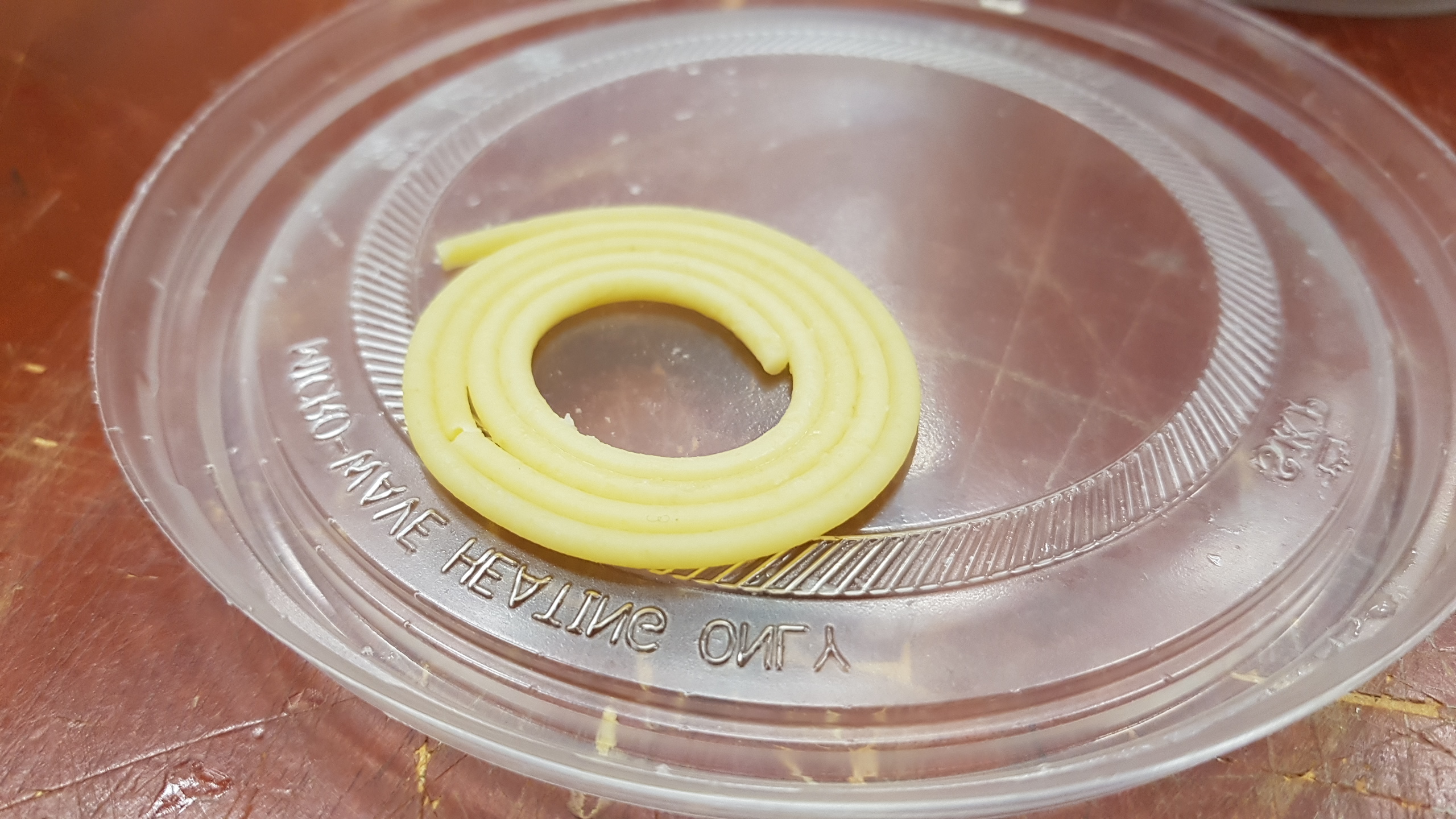
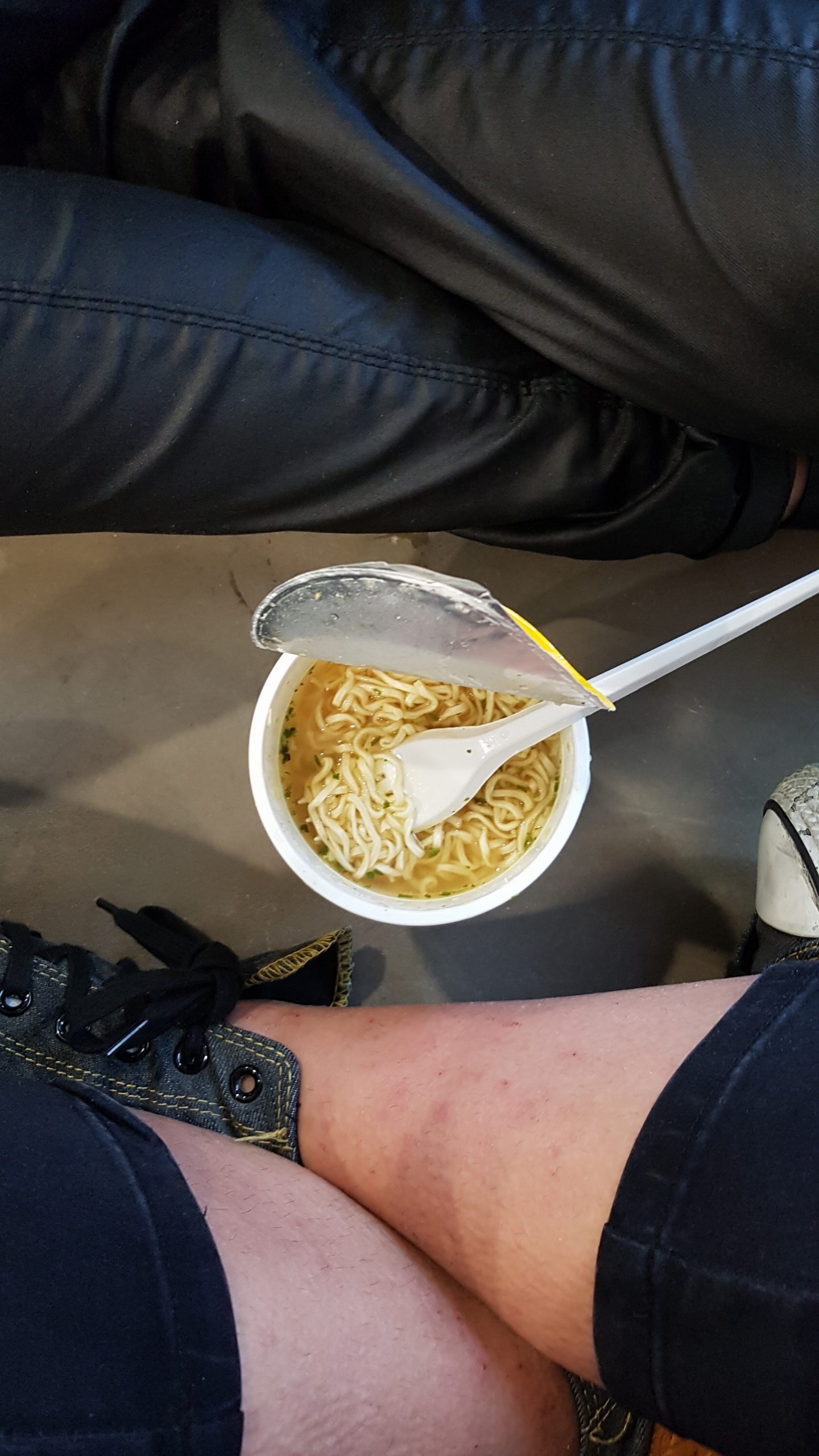
We tried to recreate the roundish-circular shape by attempting to mould cooked spaghetti (which we heated up in the cup noodles container; that I ate quickly) and resting it into the circular shape as it cooled. It didn’t work out as we expected as the spaghetti was too fragile and malleable after being cooked.
So we went back to the drawing board and stuck to our original aim of using fruits; namely:
Grapefruits, oranges and lemons for the citrus-ish colour scheme.
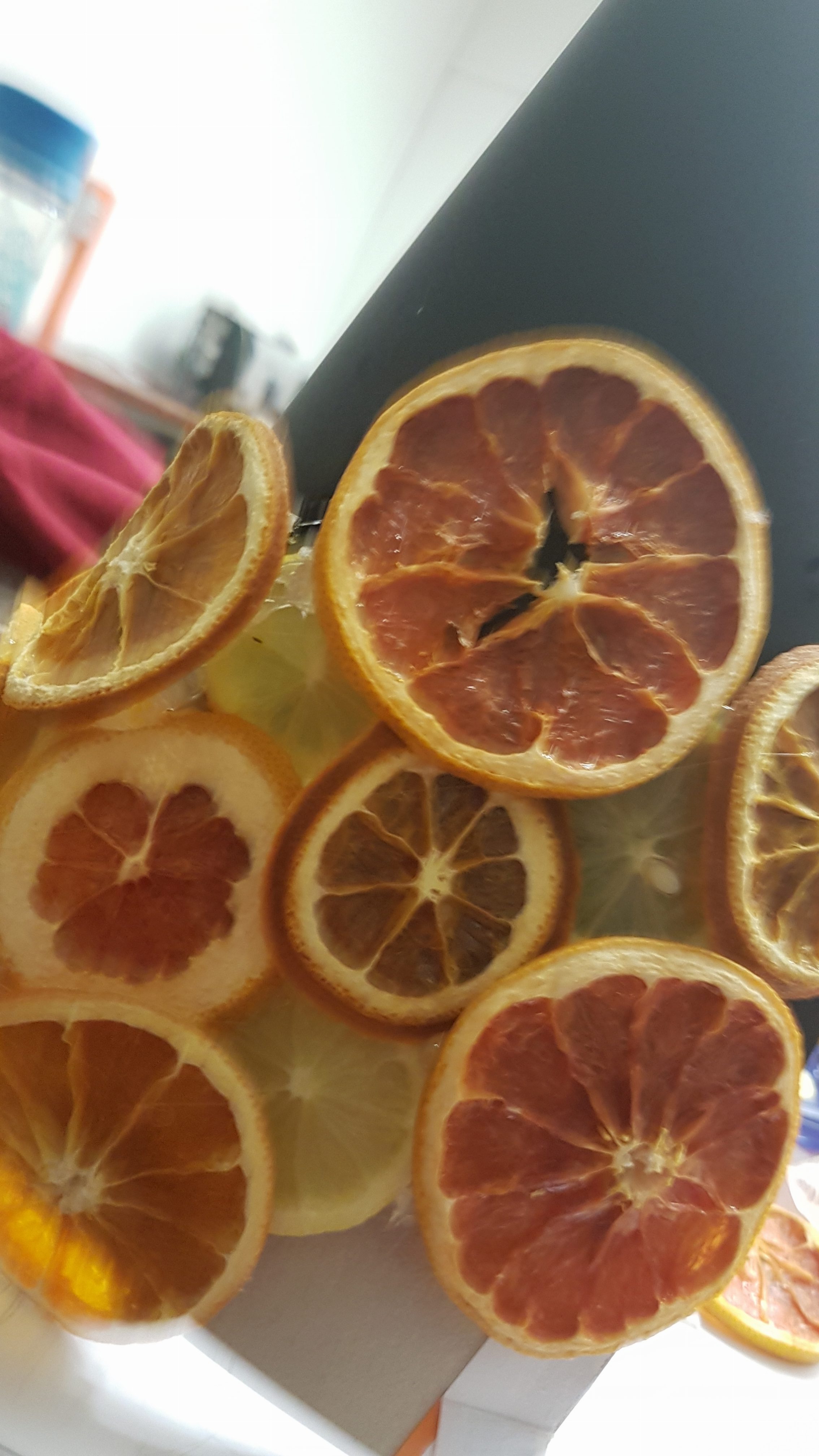
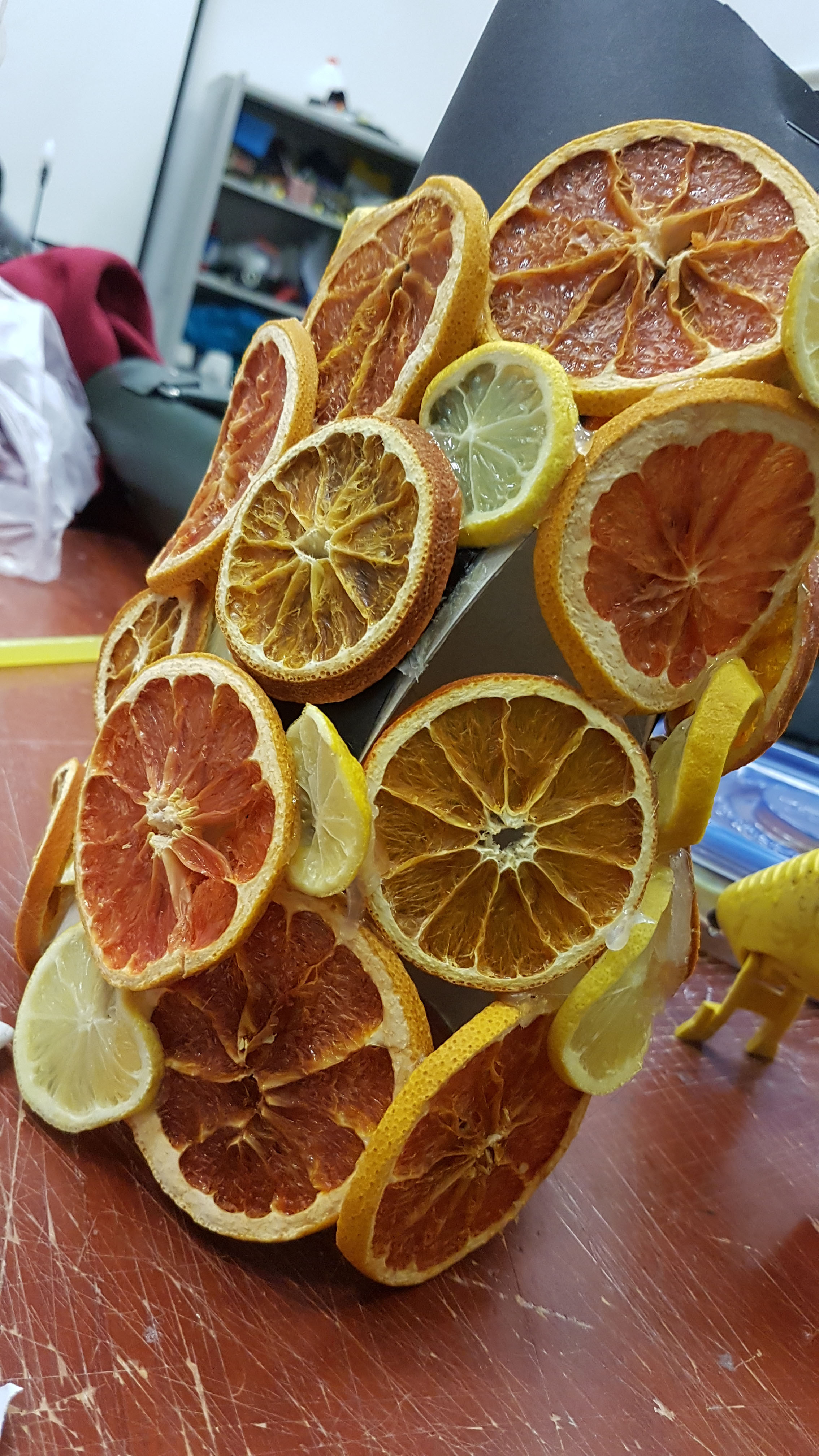
We stuck the fruits onto a hard, paper and cardboard-mix surface as a backing as we tried to place the fruits in a conical shape. We secured it initially with hot glue first, before slicing away the paper base after getting the required shape.
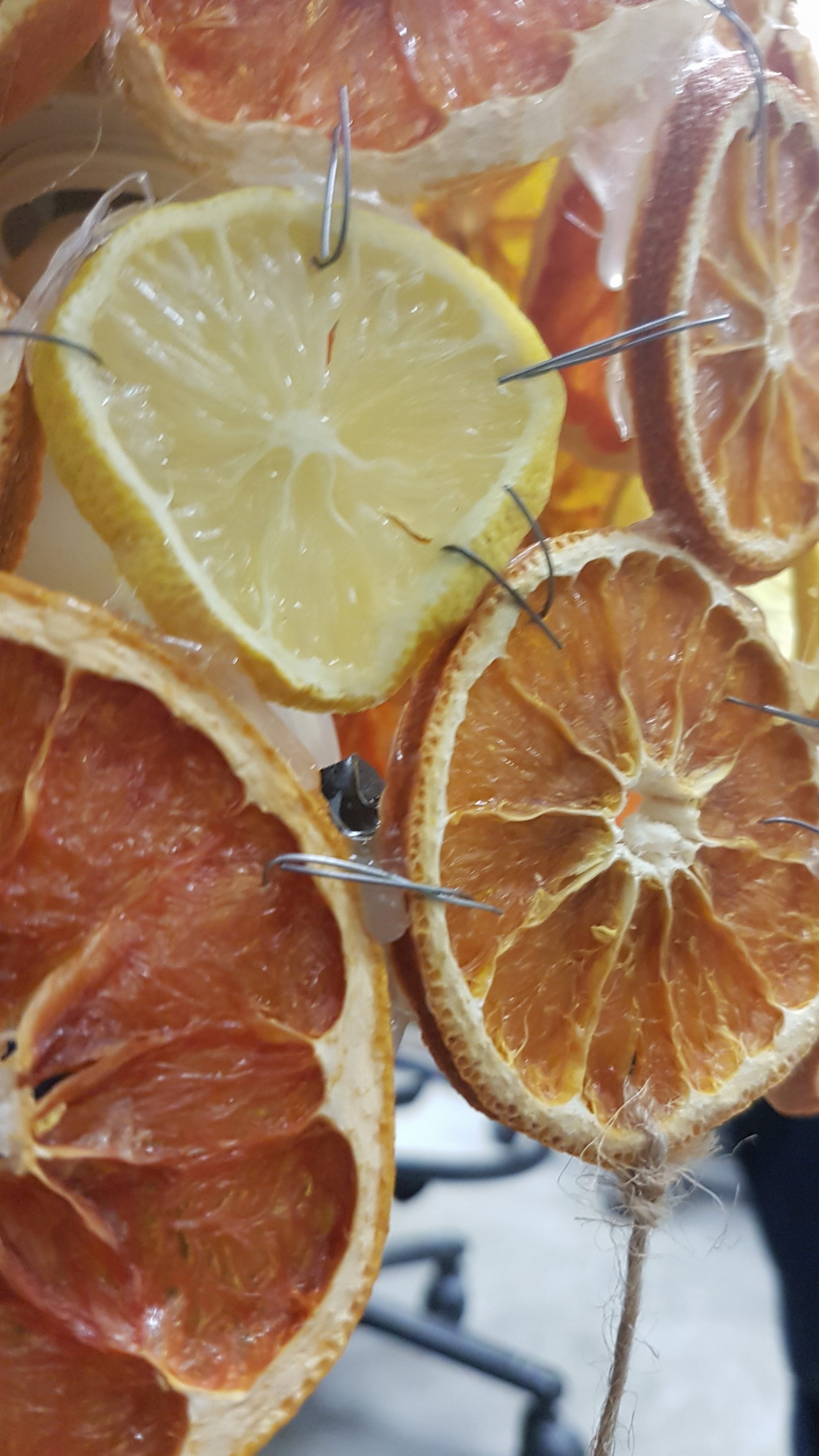
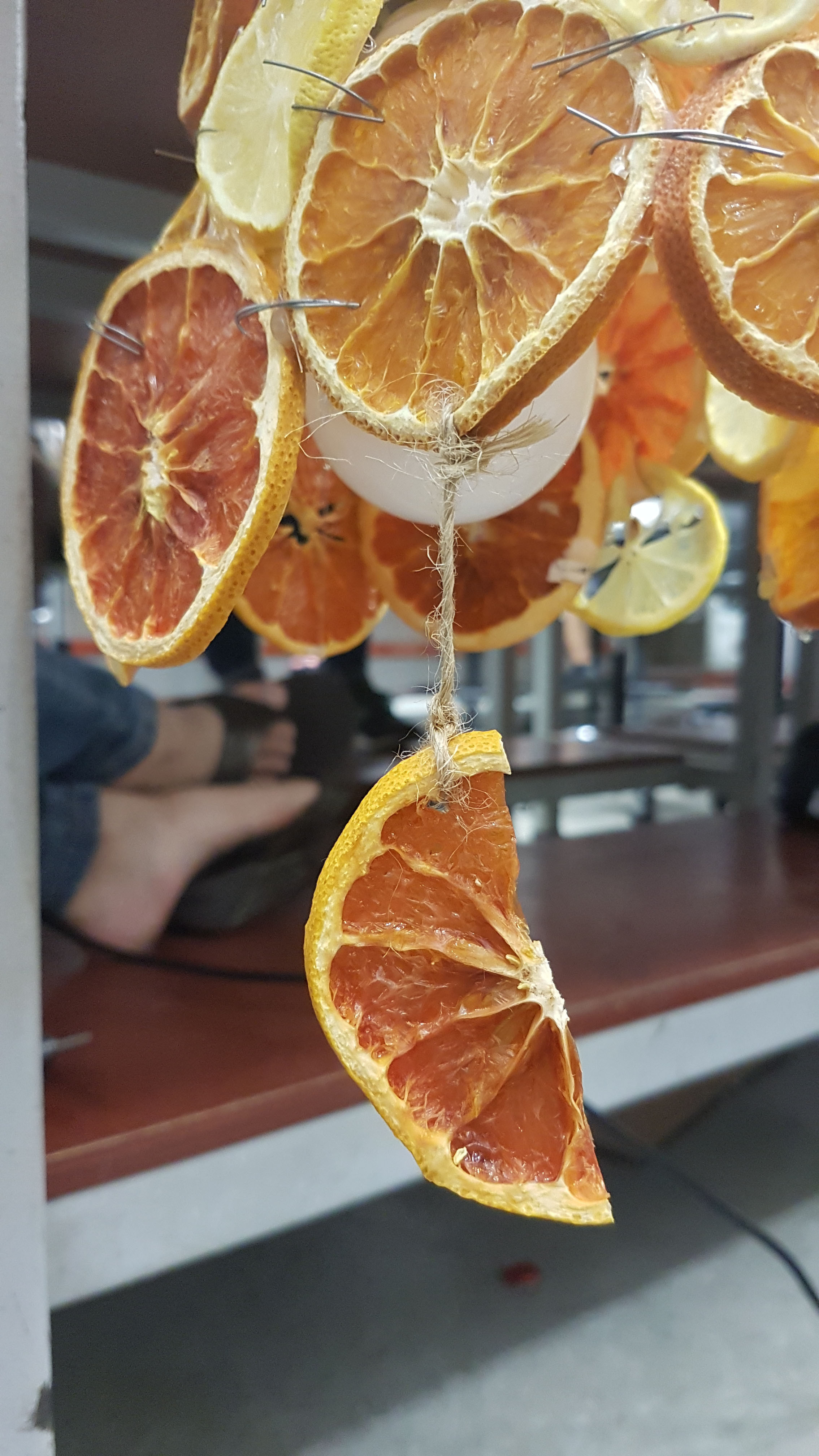
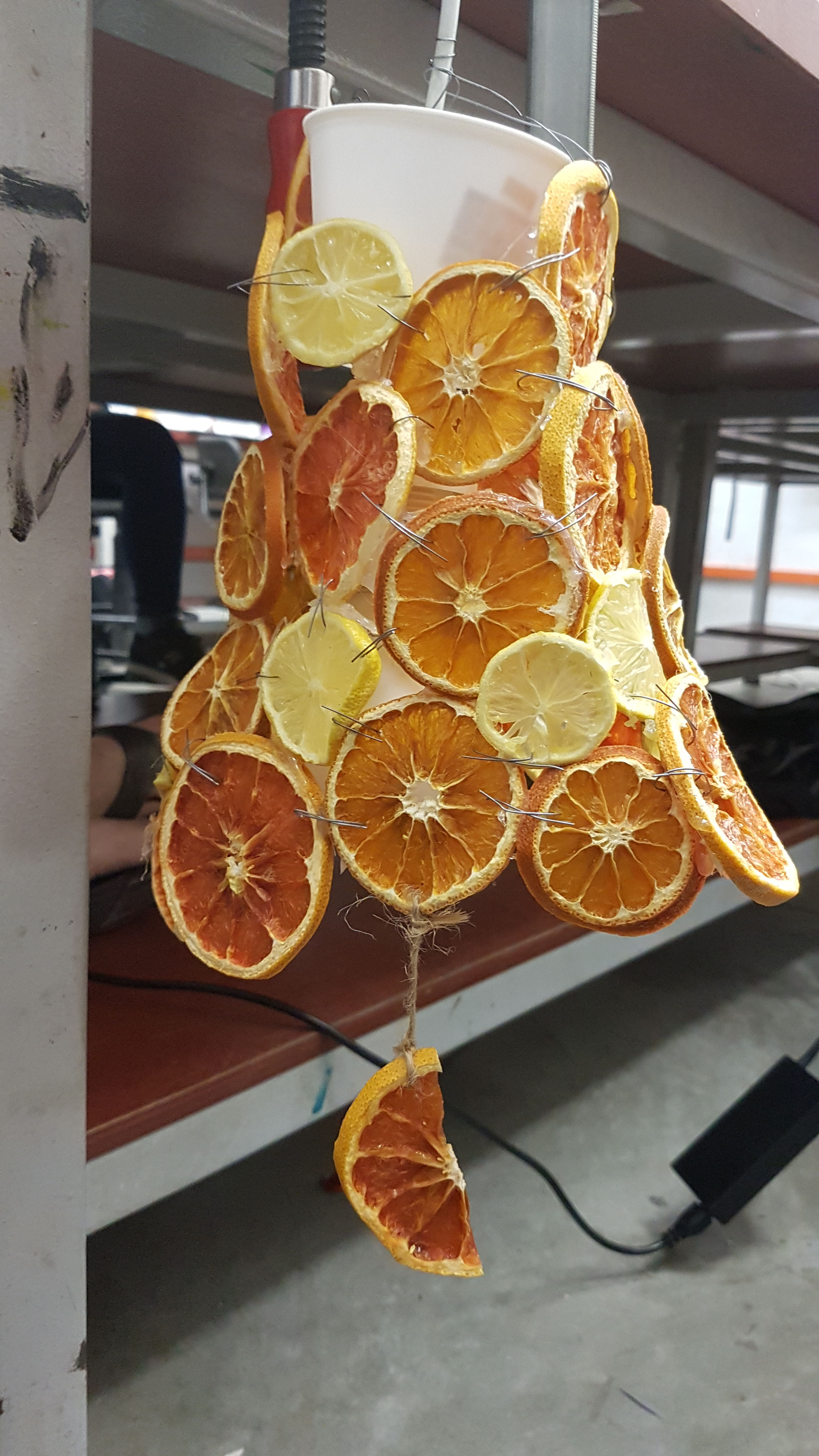
The glue got loose after detaching the fruits from the original base; which we sutured (yes, like doctors with metal wires) the fruits together in order to keep their shape. Afterwards, we attached the remaining bits with half pieces (we deliberated between the half-moon, face-down semi-circle and face-up semi-circle for the dangling ornaments, but decided that the half-moon was the least jarring and most matching.
One week later

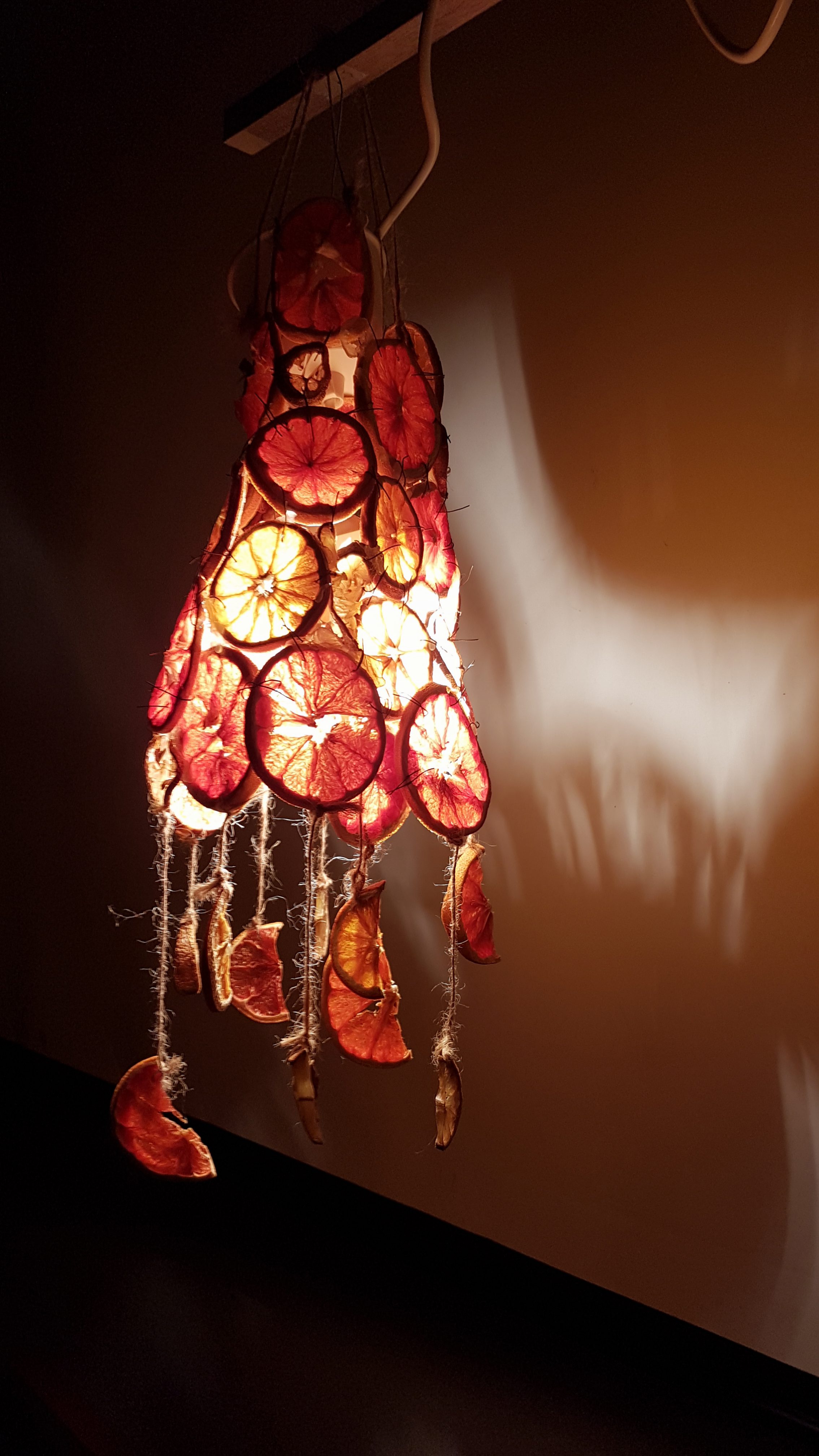
AND THEN THE FINAL PRODUCT. (BELOW)
Triggered : A hostage rescue
Incase the video isn’t showing up: https://vimeo.com/191452241
I had plenty of fun trying out and editing the action sequence; alas the amateurish attempt to capture the quickness of such a genre. Nevertheless, it was something refreshing that I have never experienced before, and would certainly endeavour to do should the chance arise again.
Action sequences required a lot of on-the-spot planning despite having a storyboard beforehand, and knowing the area intimately as well. Cuts and character flipping had to be carefully observed, as well as lighting within a dark room also had to be checked such that audiences are able to see the actors.
Lines:
1) What should I do?
2) Time’s ticking.
3) It stinks/ This stinks.
4) Maybe.
5) You can try.
6) What.
Title: Triggered
Credits: DOTS (OST –
[태양의 후예 Vol.1 ] Endless War – Various Artists
[태양의 후예 Vol.1 ] Time Is Running Out – Various Artists
[태양의 후예 Vol.2 ] Attention Mission Ver. – Various Artists
방탄소년단 (BTS) – 피 땀 눈물 (Blood Sweat & Tears) (Instrumental)
Director/Screenplay/Storyboard Artist: Calista Lee
Actors: Jaime (Hostage), Zerline (Kidnapper 1), Celine (Kidnapper 2), Jessabel (Cop)
ON AN ENDING NOTE:
Many thanks to the actors and musicians of the OSTs used in the film; without you the film would have been way less engaging.
