ZINE: Final Product
- Cover
- Page 2 and 3
- Page 4 and 5
- Page 6 and 7
- Back
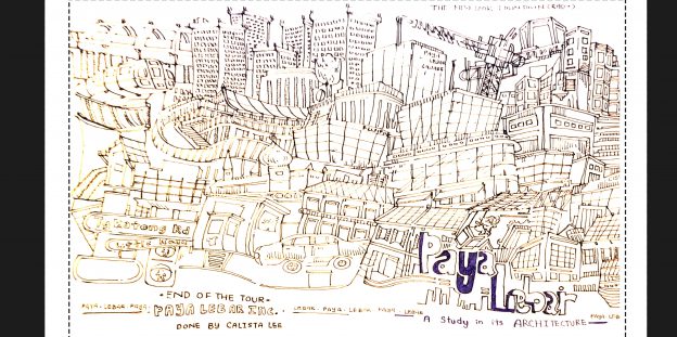
STYLE STUDY: Trying out different styles
After deciding on Architecture as a theme, I went searching on themes that I feel would best bring out what I love about the aspect. I eventually decided on the doodle-style; for its whimsical, playful yet rebel-like energy in them. The organisation yet messiness of it captures the essence of the place definitely.
Hence I sketched out the designs and layout; played with a few designs here and there with the theme in mind, used a tad of blue here and there for some variations in the designs. It saved indesign arranging-time for the layout since it was previously drawn and thought out in the design stage. It was a little confusing at the start, but helped with the usage of a trial prototype.
Scanned and cleaned up (Added 3 mm bleed-area with marking):
Ideation Process (Thoughts and Research)
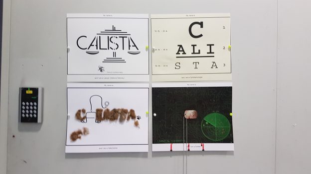
Task: Come up with 4 chosen professions, use fonts or materials to represent them in their finest (The work, the stereotypes, fonts associated with the profession)
Chosen Professions: Lawyer (Defence Attorney), Doctor (Ophthalmologist), Soldier (Land Intelligence) & Zoologist (Veterinarian)
1) LAWYER – Defence Attorney (First two Pictures above)
Thoughts: I have always wanted to stand in court, suavely defending your clients and working your way up to be the highest Legislature position in the country. When thinking about lawyers, I initially thought of lawyers being masters of deception; hence the gestalt elements in their design since they hide more than what you see at first glance. Courier New (Typewriter font) also reminded me of the court case files that are thought of when you think of lawyers as their association with font types.
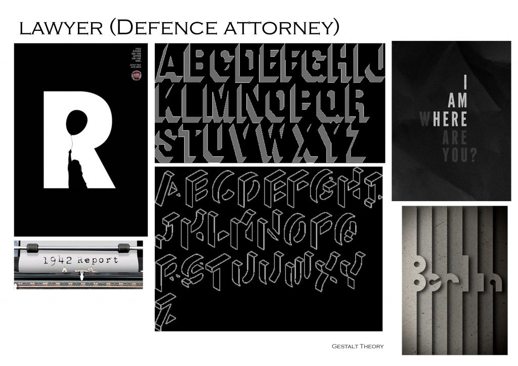
Eventually I went with the idea of Defence Attorneys being the “Scott-Free Jail” card (Monopoly) to their clients, hence I played with the stereotypical black and white stripes of the known prison uniform from the old west.
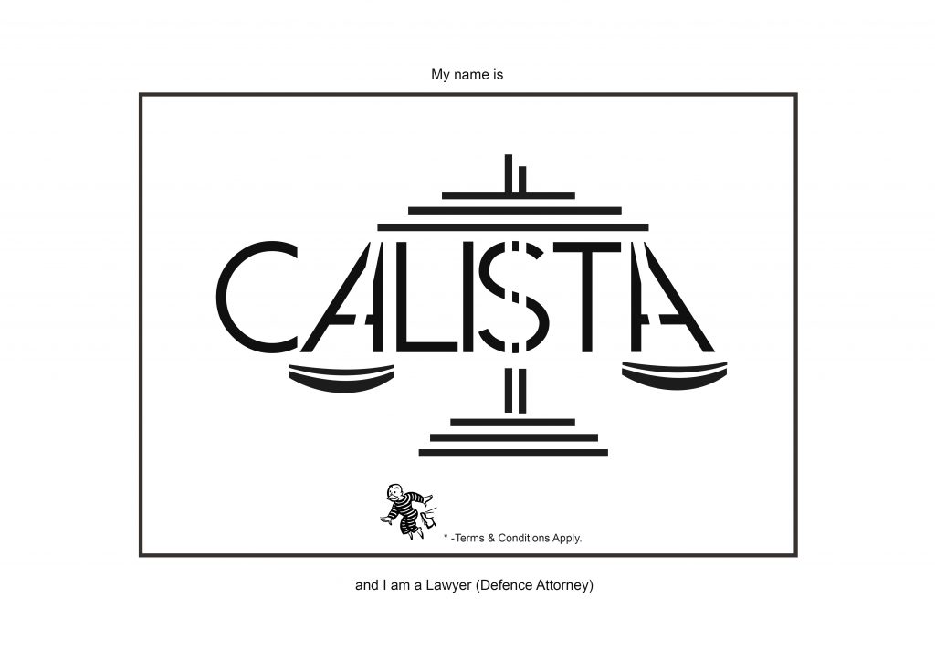 The hidden dollar sign in the letter “S” also symbolised how it is a monetary-driven profession as well, with it balancing the weigh to the law in defence attorneys. After all, it depends on the amount of cash one can fork out to matter bring out the best in a lawyer.
2) Doctor (Ophthalmologist)
A fancy-word for optician (or more medically-inclined if you prefer); it is one of the top-top earning fields in the doctoring world as of now. I figured I would try my hand at it since it is such a well-known profession in the developed world society now.
I thought of how Ophthalmologists provide vision back to their clients. Looking into the known icons of the profession, I looked at eye charts and some inspiration online. Initially, I wanted the worlds to be done in Braille to show that Ophthalmologists provide vision-aid back to their clients so they can see again: though it didn’t work out since it can suggest otherwise of a person seeking help only when he or she is beyond redemption.
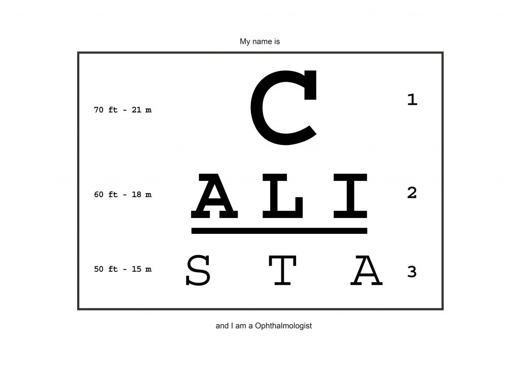
Hence, I stuck to the age-old representational way for Ophthalmologists: Eye Charts. It was interesting creating the arrangement of the chart though; it took quite a bit of kerning experimentation to get the right layout.
3) Soldier (Land Intelligence)
Had I have a stronger, fitter bill of health, this would have definitely been my career choice. The discipline and strong culture behind this job seems just right for me, with the right amount of espionage and work if you work at the intelligence-gathering department.
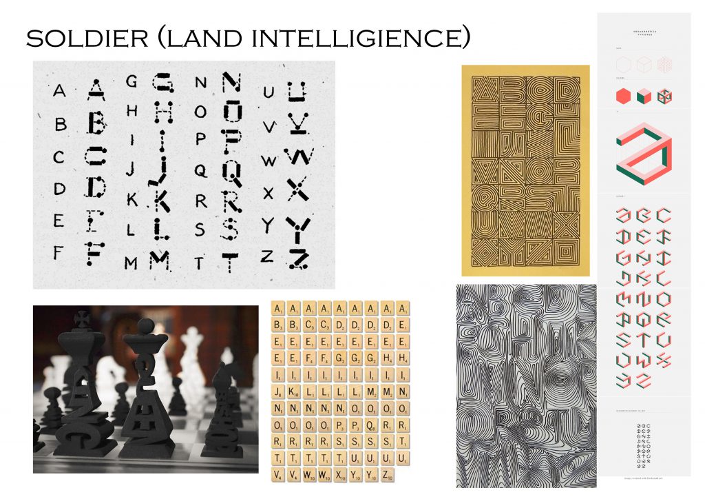 I looked into Morse code for this, since it is a well-know code. Since it island-intelligence, I also looked into the topological design aspect of making the map as part of the font, disguised yet readable if one were to look closer.
Yet, when I thought of soldier, the first thing that came to mind were dog tags. It seems unique of the culture. Hence, I figured, why not combine the icons together to form the best representation.
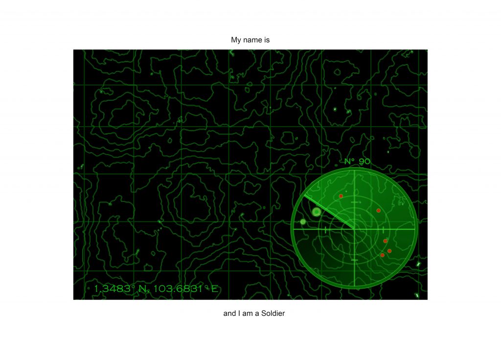
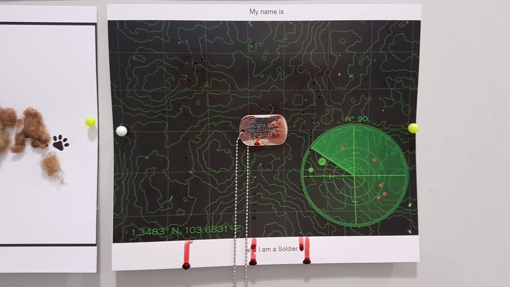 Added droplets of blood to well, show the sacrifice that the profession has on the field as well.
4) Zoologist (Vet.)
Animals are definitely a favourite of mine; considering how they are the more honest beings of us. The rawness of their nature made me fall in love with them, hence I wanted to try my hand at this profession.
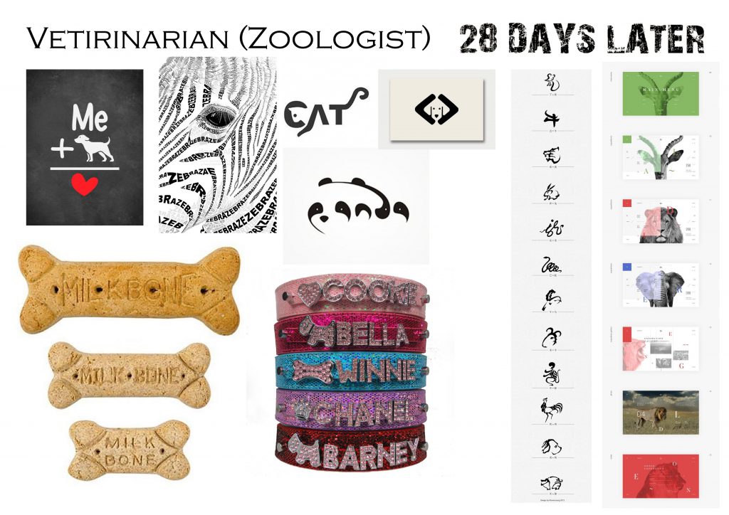
I looked into symbols and designs regarding animals, then figured I preferred the aspect of animals and design being combined into one and went researching along that field.
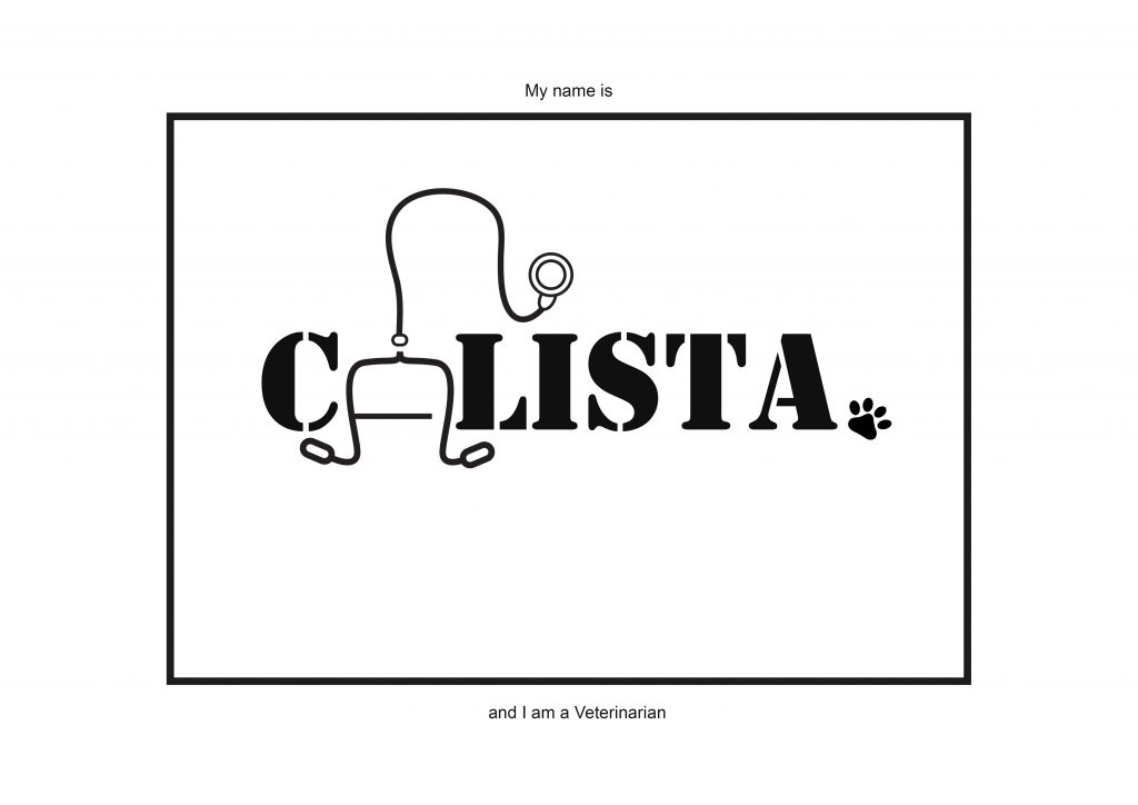
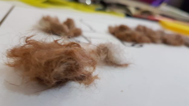
With the stencil font as the backing (since animal crates in Africa are stereo-typically used in that font, I figured it would be the best representation.) Then I figured and went ahead to add into the design with animal fur to show the realistic aspect of the work. The fur can be nice and smooth, yet clumpy and messy when added on just as the less glamorous aspect of the work. (Collected them from the groomer since the pet-clinic had a separate section at the groomers for their work. Had a larger concentration of animal fur as well.)
Digital Files to be printed:
Done by: Calista, Claudia and Kezia
Theme: World Creation (Reinventing the Old and New)
‘Paya Lebar’ – Swamp Wide in Malay. Previously in the early 1800s during the colonial time, there were plantations and small Malay settlements during the area.
The estates’s heyday is mostly during the 1950s to 1980s, with 1970s of the area being infamous for the hideout of Secret Societies; though there are close to little traces of this part of its history left. It is interesting looking at the differences and mix between the cultures of the Chinese and the Malay. The oldest shop I managed to locate was an old Bread-making shop that denied photos, but still accepted a few interviews. It was with mirth that the old shop owner complained that their work was taken over by bigger, industrial ‘Breadtalk’.
I started out at Geylang Serai, moved along and simply snapped photos to gain more insight into the area. To which there is previously a Chinese and Malay Kampung Settlement; took photos and some notes. The food is heavenly though, especially the kuey tutu and various Malay snacks. I wanted to venture further, but I was wandering close to the edge of Paya Lebar and reaching Geyland instead. I saw some dubious stuff in daylight, though the general sense of safety and ease is still there. Especially the massage pallor and entrances to the smaller streets, went back into the white collared world soon after a quick food tour.
There are forms of textures and and patterns of various forms I observed then, as well as the deeply embedded culture into the location. There is an exceeding amount of strong, unique factory architectures in the area. Since there are a mix of such a wide variety, I figured it would be nice to combine all these small nuances into a pattern unique to Paya Lebar; somewhat collage style.
Precisely due to the factories, wide, clear skies are exposed to the eye frequently whilst walking through the various main roads and smaller streets. It would nice to compile it into a tight photo-book that skies in Singapore can be equally pretty as well; as the other countries; perhaps to visit during the sunset to see if the evening colours can be captured as well.
Nevertheless, the presence of unique architecture and building cannot be ignored as part of the intricacies of this growing, industrial estate. By collapsing all these buildings together, I thought of how interesting it would be to predict the future landscapes with what we have; to create a completely unique landscape with the more peculiar features of the factories at the industrial estate.
Technique: (Refer to Slide 10)
Purpose: Kind of like a personal sketchbook of combined buildings
Combine the details and uniqueness of the Old and New buildings, to show the possibilities of combining a new form of building in the future and an unique brand of the architecture together of Paya Lebar, Singapore.
Some possible style references:
I will be looking into the creating a personalised unique style; from the references of the world creation. It would be mostly collage-style, and possibly recreated from my own drawings. Then, create a blend of futuristic and olden world.
Some artists to look into:
– Graham Holland
– Giacomo Costa
– Krista Svalbonas
– David Hockney
– Jospeh Binder