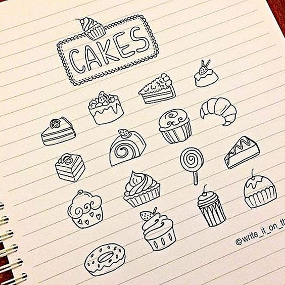
STYLE STUDY: Trying out different styles
-

- Layout – Cover
-
- Cover 2
-
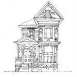
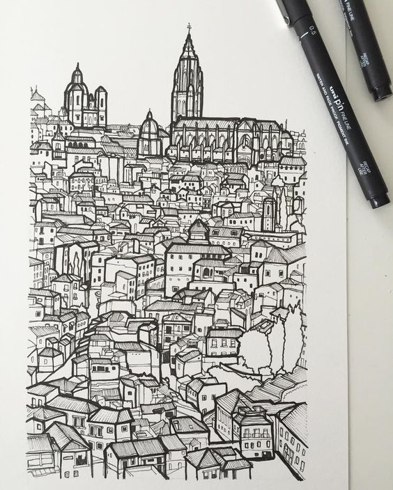
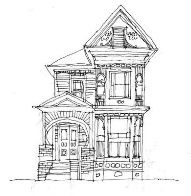
- Building Style
-

- Treatment
-

- Layouts
-

- Arrangement
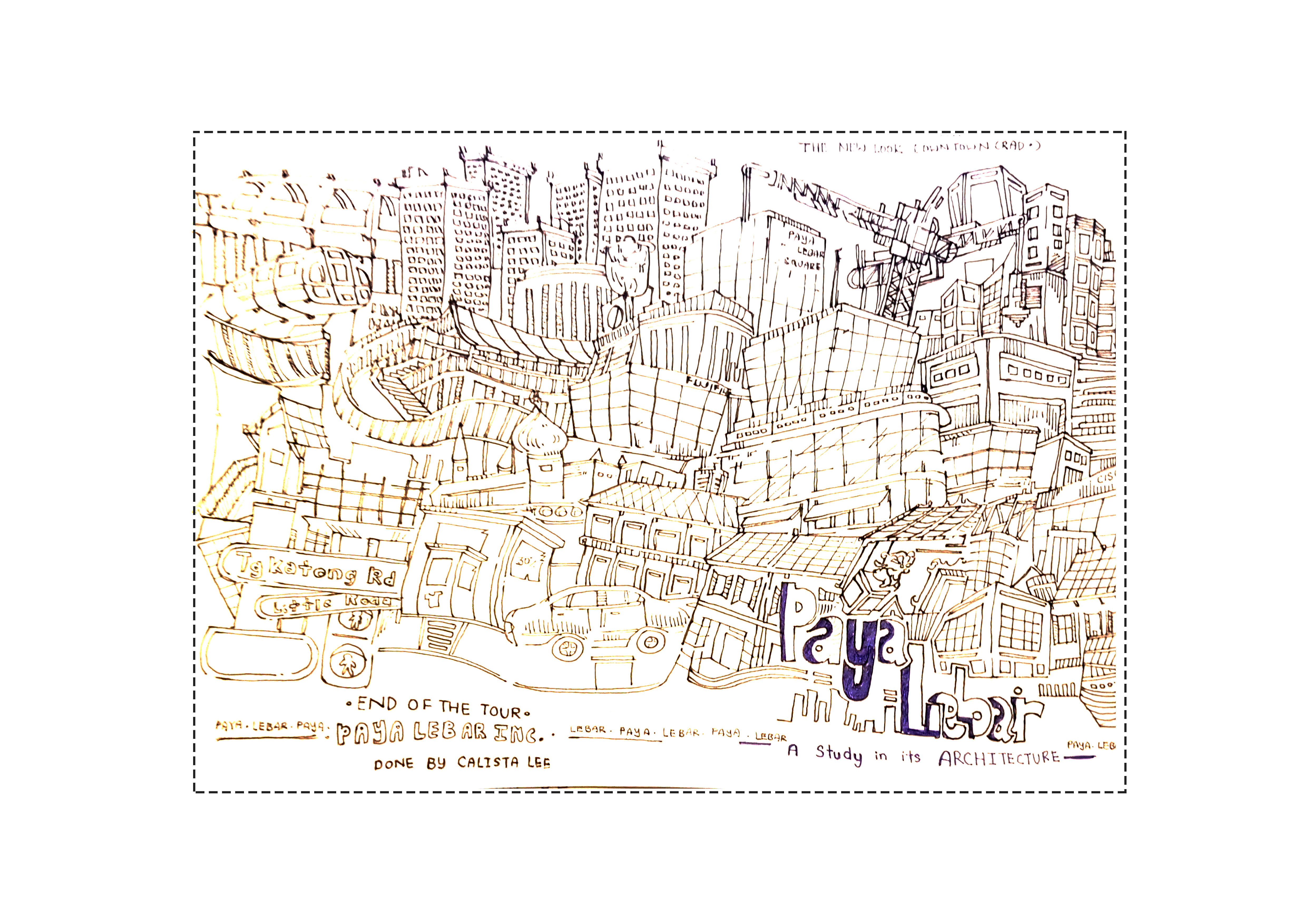
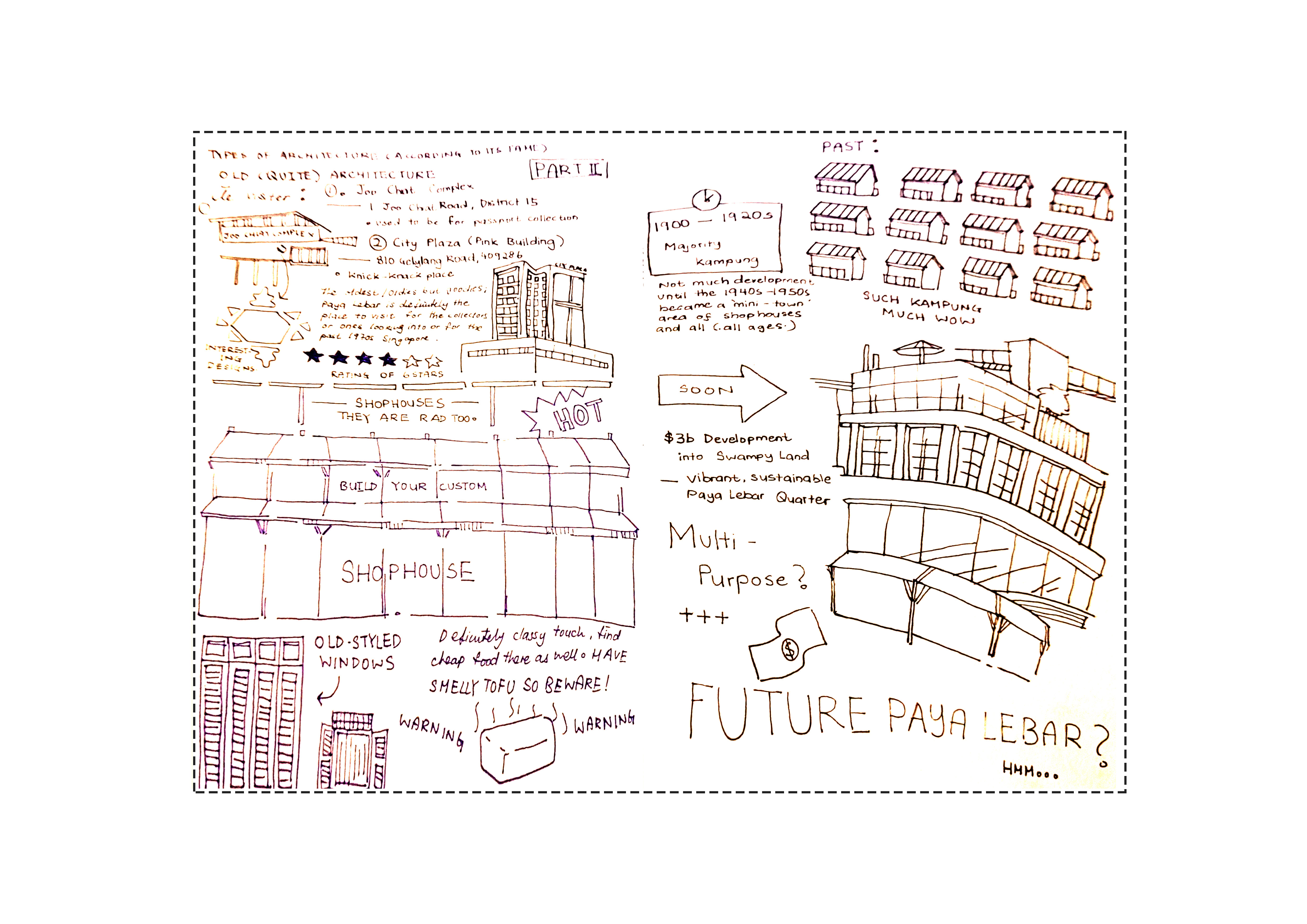
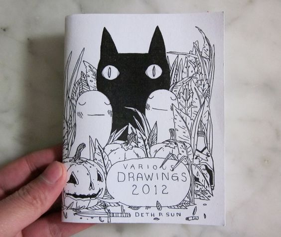
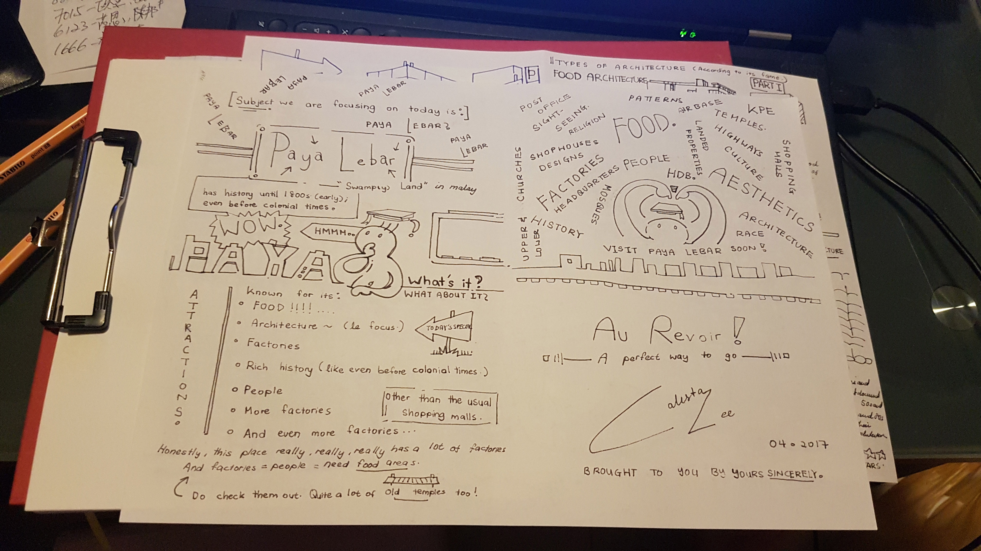
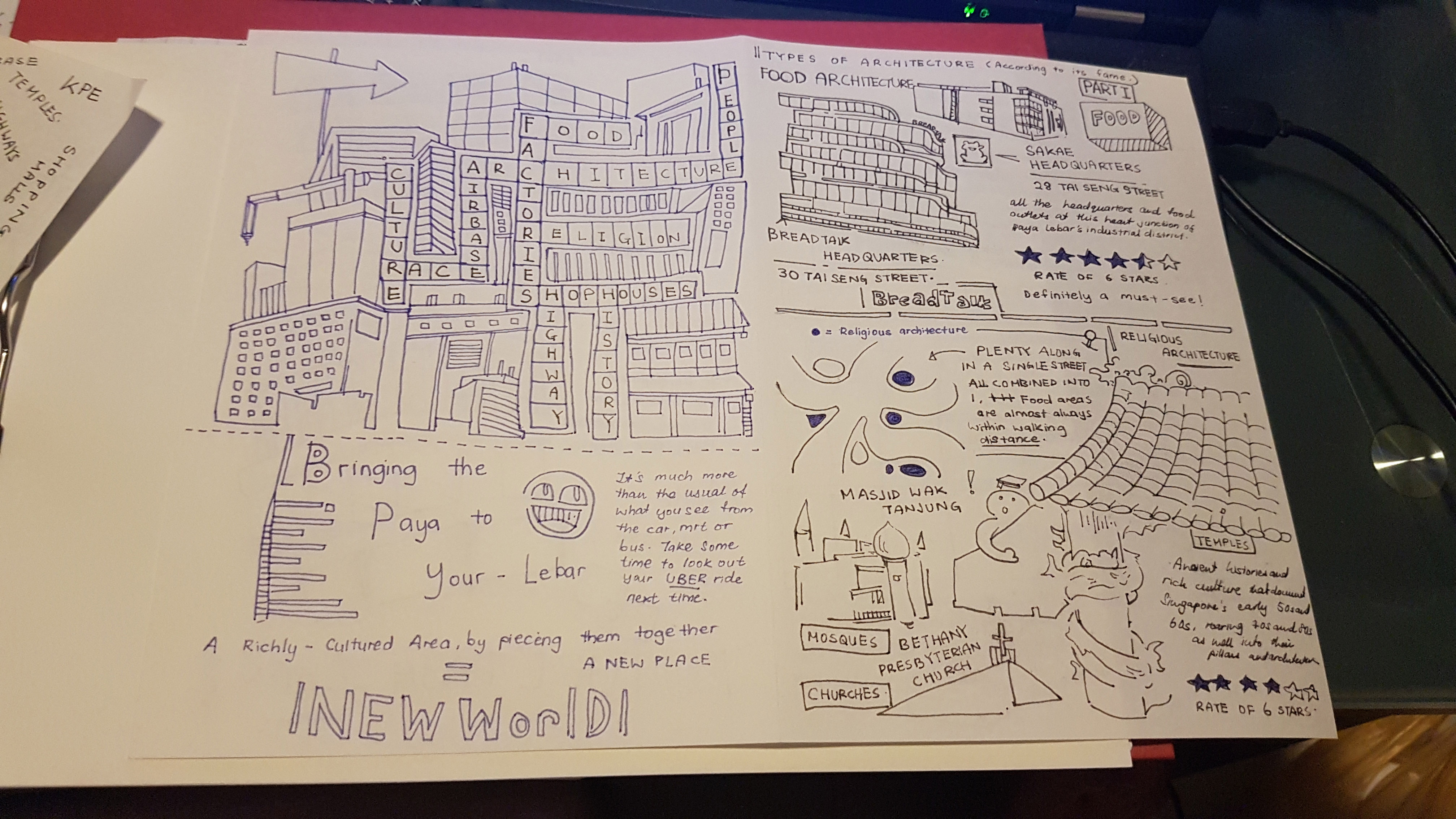
After deciding on Architecture as a theme, I went searching on themes that I feel would best bring out what I love about the aspect. I eventually decided on the doodle-style; for its whimsical, playful yet rebel-like energy in them. The organisation yet messiness of it captures the essence of the place definitely.
-
- Cover

-
- Page 2 (Left) and Page 7 (Right)
-
- Page 6 (Left) and Page 3 (Right)
-
- Page 4 (Left) and Page 5 (Right)
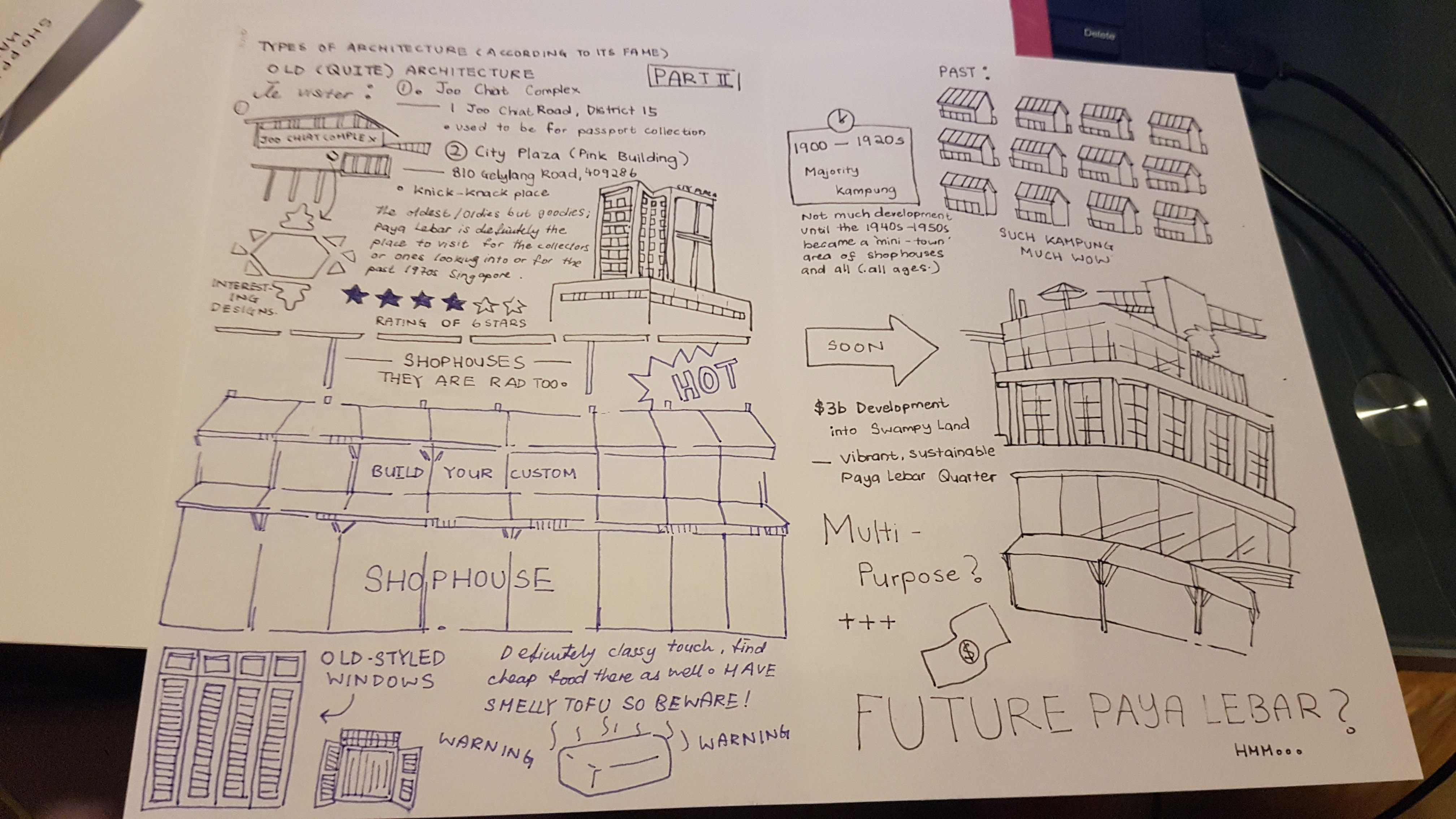
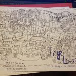
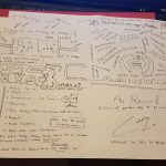
Hence I sketched out the designs and layout; played with a few designs here and there with the theme in mind, used a tad of blue here and there for some variations in the designs. It saved indesign arranging-time for the layout since it was previously drawn and thought out in the design stage. It was a little confusing at the start, but helped with the usage of a trial prototype.
Scanned and cleaned up (Added 3 mm bleed-area with marking):
-
- Front and Back Cover