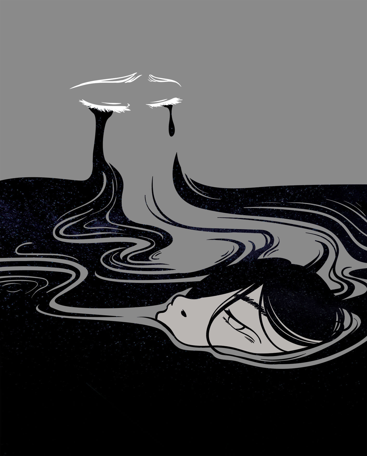

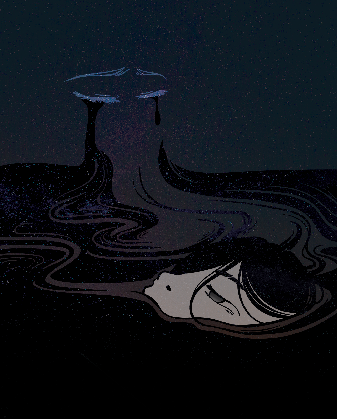
kind of found this effect (above) by accident while playing around with the layer modes and it was something i was looking for, so that the floating face stands out more. so i tweaked the effects a little to get to the final piece.
also i found the face too much of flat white so i coloured her eyes
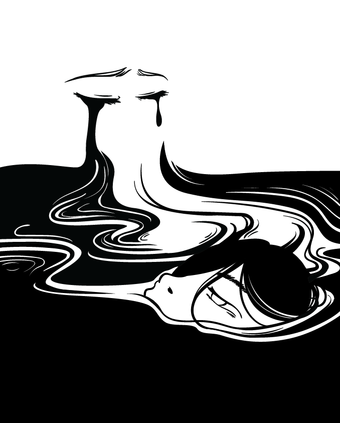
edit: okay SO after the critique session, i received feedback from Lisa and a few peers that the contrast between the black and white in the first outline-only composition works far better and conveys the message clearer as well.
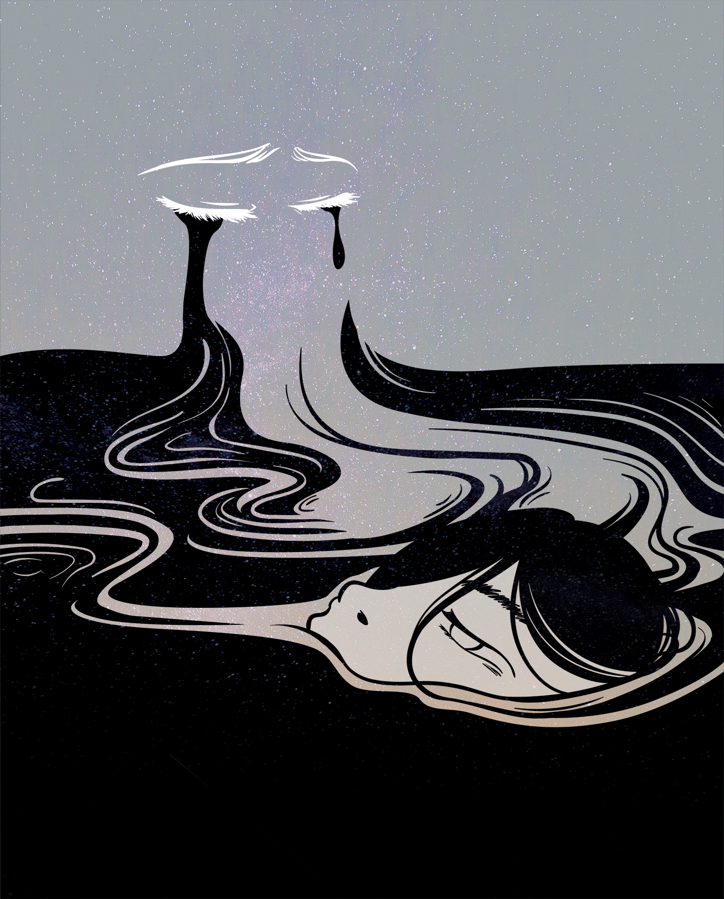
so i shall edit the final piece and update this post later!
lesson learned: stop adding too many things :’)