references
John Holcroft
conceptual and editorial illustrator


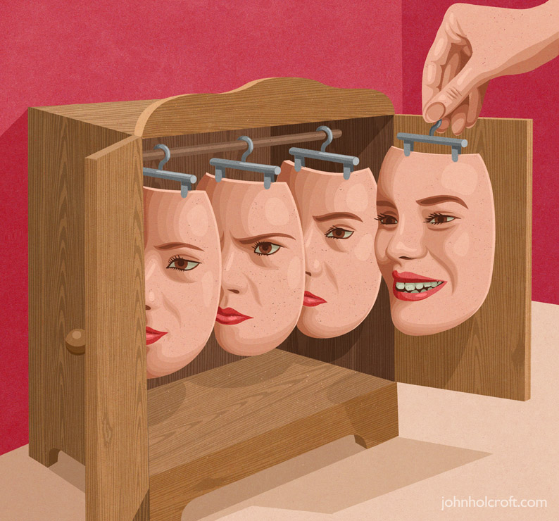
i love how Holcroft illustrates controversial concepts in an interesting manner, letting the audience view his take on certain ideas. for this assignment on editorial illustration, i would like to illustrate key points of the theme in the same manner as Holcroft, using unique analogies that quickly and effectively relate the message.
Yuko Shimizu
editorial illustrator
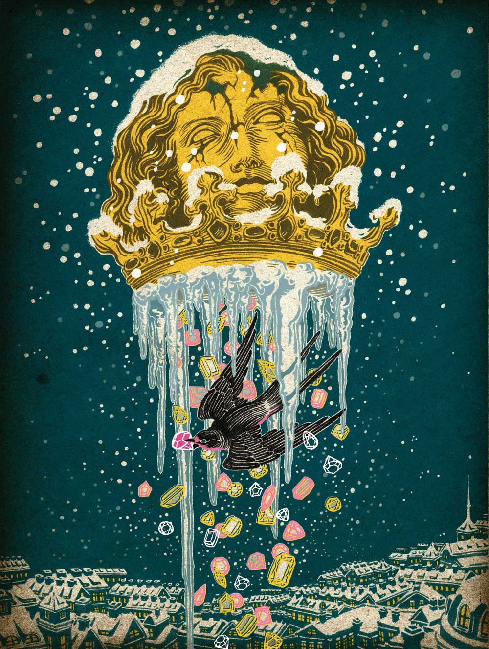
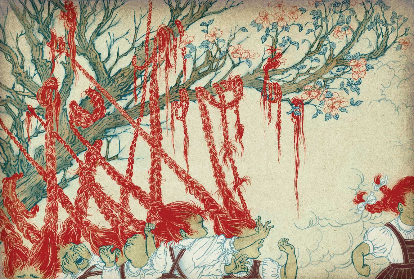
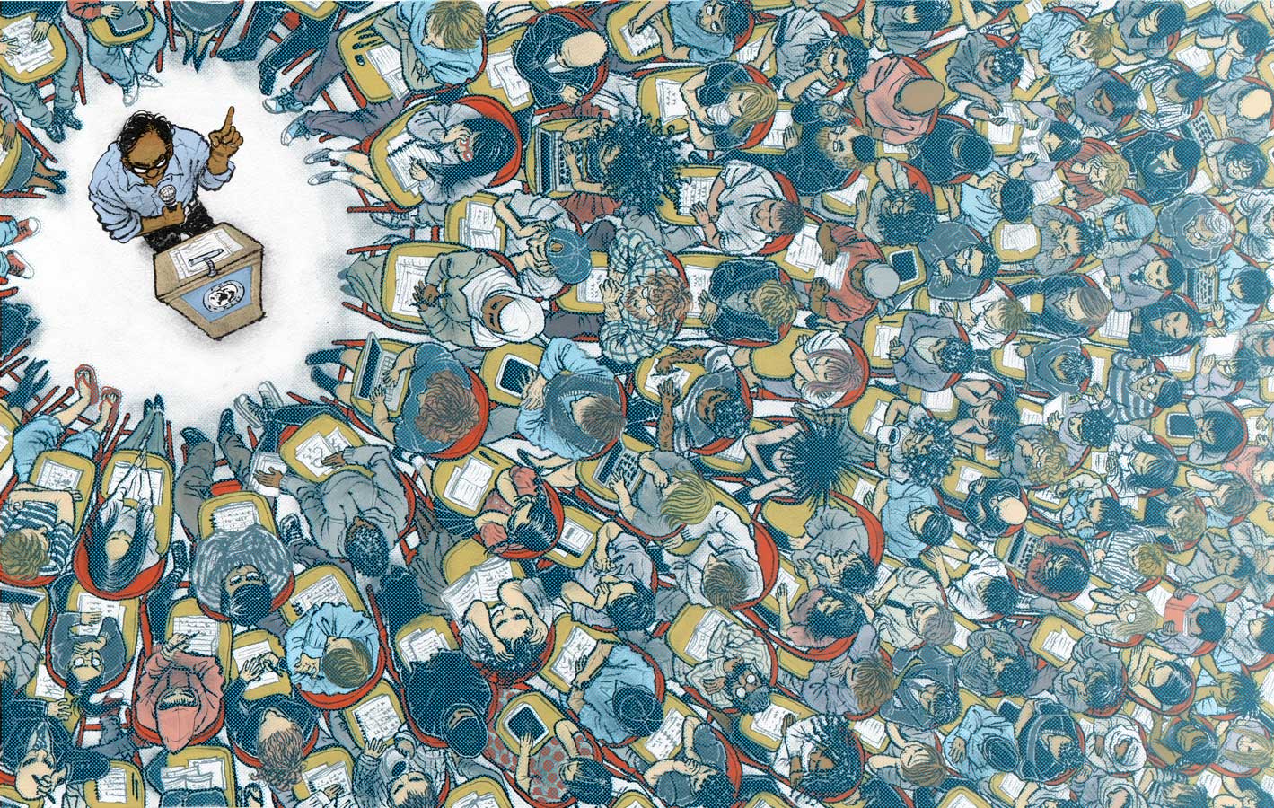
Shimizu’s works are beautifully illustrated, carefully inked, and finished with muted yet eye-catching colours. i like how her style is a fusion between american pop illustrations and japanese manga styles. being heavily influenced with japan’s manga illustration styles myself (and finding it a little hard to break out of the habit of drawing in that style), i find Shimizu’s style inspiring as she did not shy away from her roots nor ignore the style she often sees in her environment, and instead incorporated them both into her illustrations to make her own unique style.
(also her use of dynamic brush strokes is similar to what i am used to, so i would like to use her ink art as reference)
Akiya Kageichi
illustrator


words cannot even describe how much i find Kageichi’s style stunning and mesmerising. from the composition and the amount of details put into each piece, to the minimal colours and textures used. though some of his works look a little chaotic, a good few are framed beautifully and lets the viewers’ eyes move across the illustration.
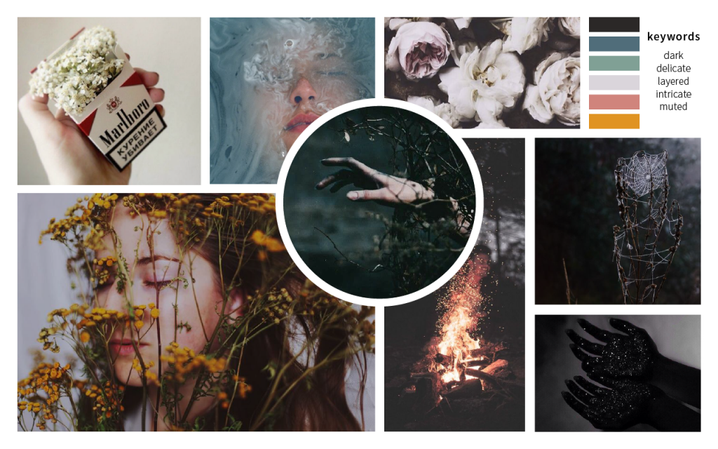
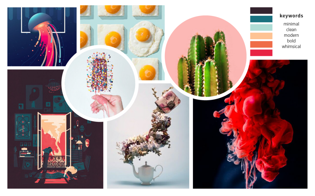
style-wise, i am still unsure which direction i want to take: either something minimal and effective like Holcroft’s illustrations, or detailed and impactful like Kageichi’s. (or perhaps even something in between like Shimizu’s artworks.) so i created two moodboards with different keywords, just to keep my options open.
moodboard 01
keywords: dark, delicate, layered, intricate, muted
moodboard 02
keywords: minimal, clean, modern, bold, whimsical
