target audience
basic demographic:
- 18 – 35 years old (students and/or working adults)
- well-informed or at least aware of current situation on environment; a bonus if environmentally conscious or cares for animal rights
- care to make a change for future generations??
- probably with higher-paying occupations
user persona 1: Nyle

Nyle is a 25-year-old travel agent, though he doesn’t like planning trips for himself and prefers to spontaneously find places to visit. he likes nature walks and long hikes with good company. recently, under his girlfriend’s influence, Nyle has made efforts to be more environmentally-conscious, starting small such as bringing his own tumbler and refusing plastic bags when not needed.
spontaneous // expressive // well-informed // open-minded // likes to engage in meaningful conversations and discussions
user persona 2: Marie

Marie is what you would call a typical 47-year-old ‘auntie’. she is a stay-at-home mother of two children and professional nagger. when something is broken, she doesn’t bother to fix them and would rather skip all the hassle by just getting a new one (courtesy of her husband’s income). she spends half of her time at home watching Taiwanese dramas.
stubborn // impatient // fixed mindset // wants to live a peaceful life // but makes sure everyone else doesn’t have a peaceful life by nagging at them
moodboard
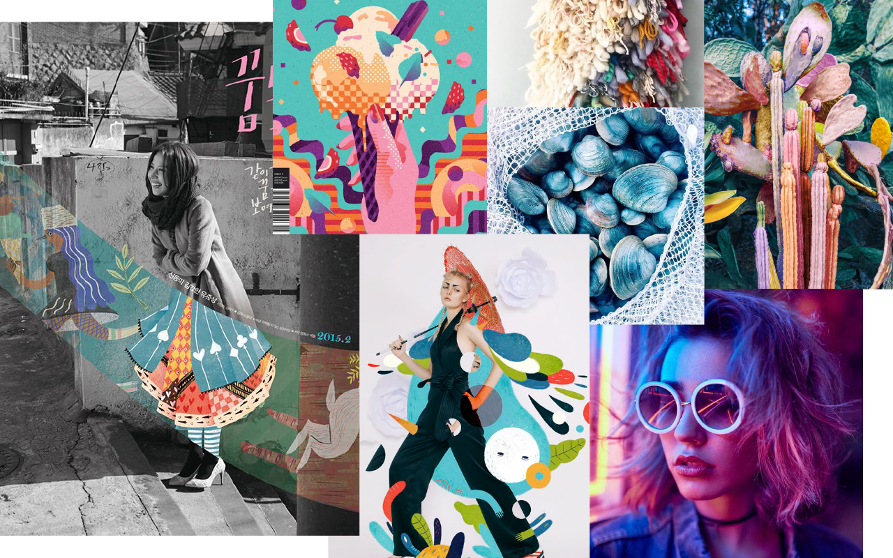

i had a few choices of colour palettes, but since the last two assignments i worked with muted and much darker tones, i think i’ll try to take the challenge of incorporating bright colours instead. also the brighter tones fit my concept and keywords better.
references
Juliette Oberndorfer

i love how the colours in which the artist uses in these illustrations doesn’t conform to the real world, making the composition seem more fantasy-like. the bright and saturated tones also adds to the fantasy effect, almost as if they came out of Harry Potter.
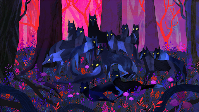
Mark Conlan

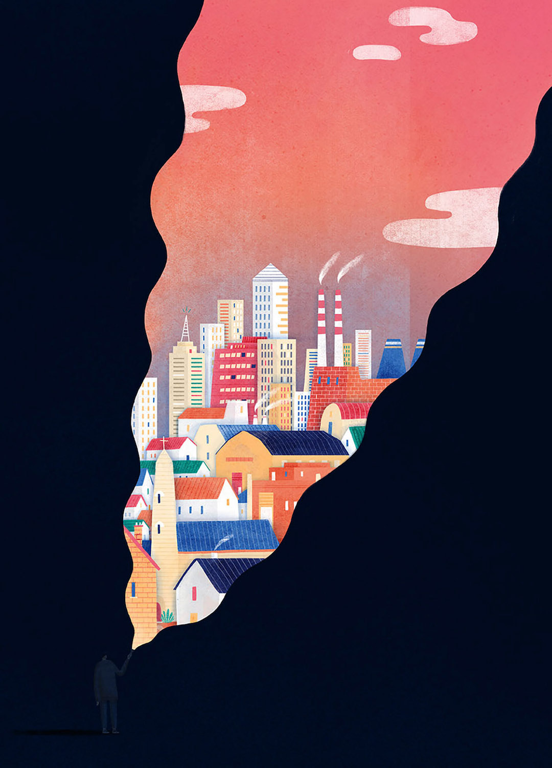
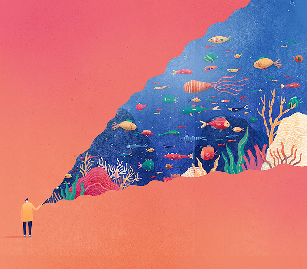
what draws my attention to Conlan’s works are the ‘strips’ of imagery that leads the viewers’ eyes across the composition. the juxtaposition of colours and contrast also gives them a dream-like effect.
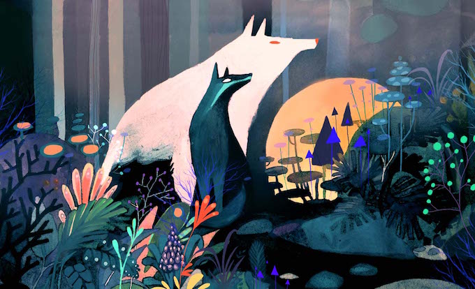
Lieke van der Vorst


this illustrator makes effective use of monochrome, sketchy drawings of animals with the combination of cleaner, brightly-coloured elements around the animals. the colours surrounding the monochrome subject of illustration makes the animals pop out even more.