feedback from last week:
two ways going about it;
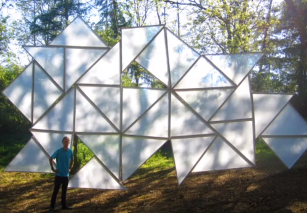
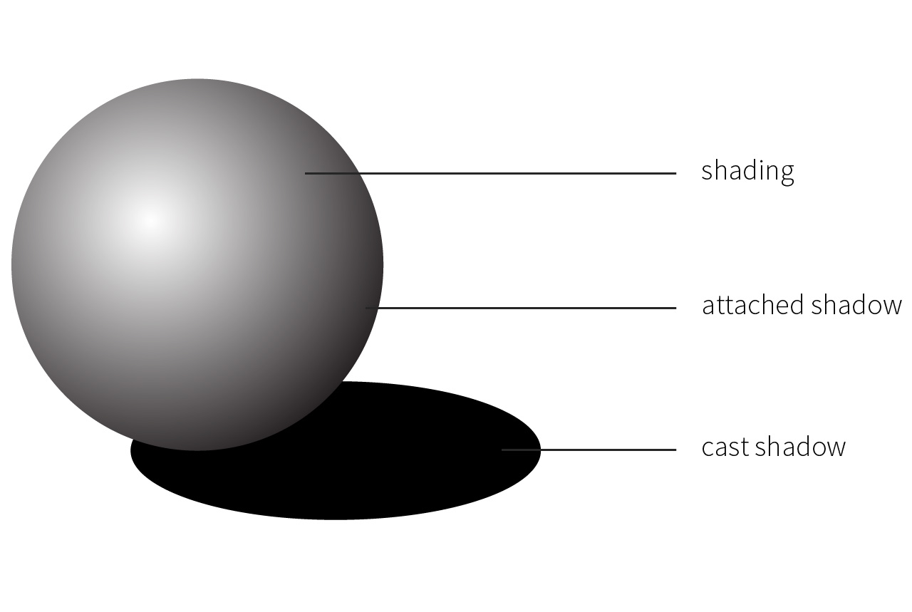
CASTING: creating an object/sculpture to cast shadows
FRAMING: using elements around us (nature and sunlight) and framing/emphasising their shadows
material consideration
polyester mesh; white translucent cloth; paper; frosted acrylic; polished aluminum
NB. we were thinking if there is any material that is photosensitive i.e. absorbs light in the day and emits fluorescent light at night — trapping the shadows
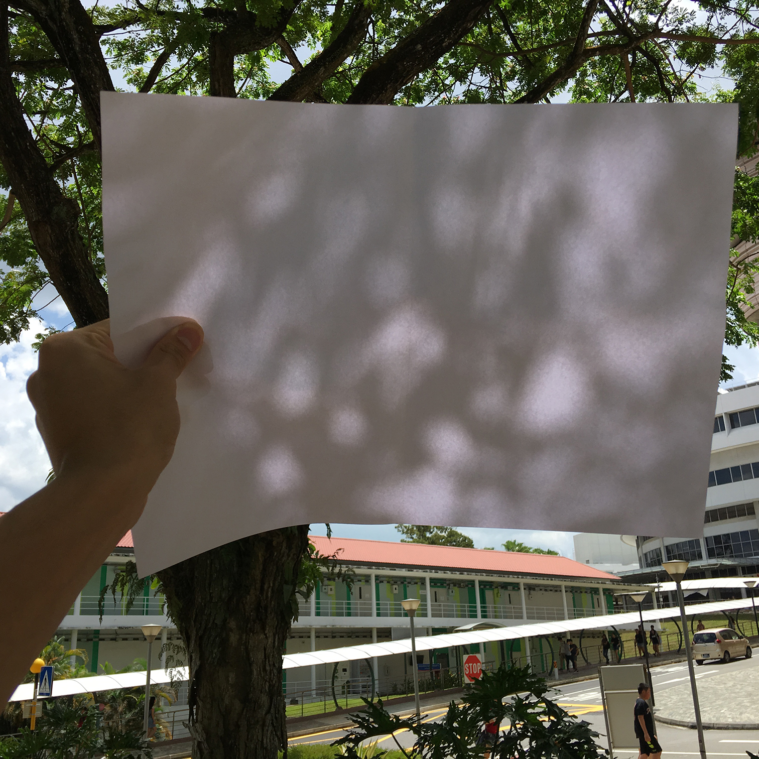
experimentation and observation
two ways of seeing how shadow interacts with the medium:
direct light
View post on imgur.com
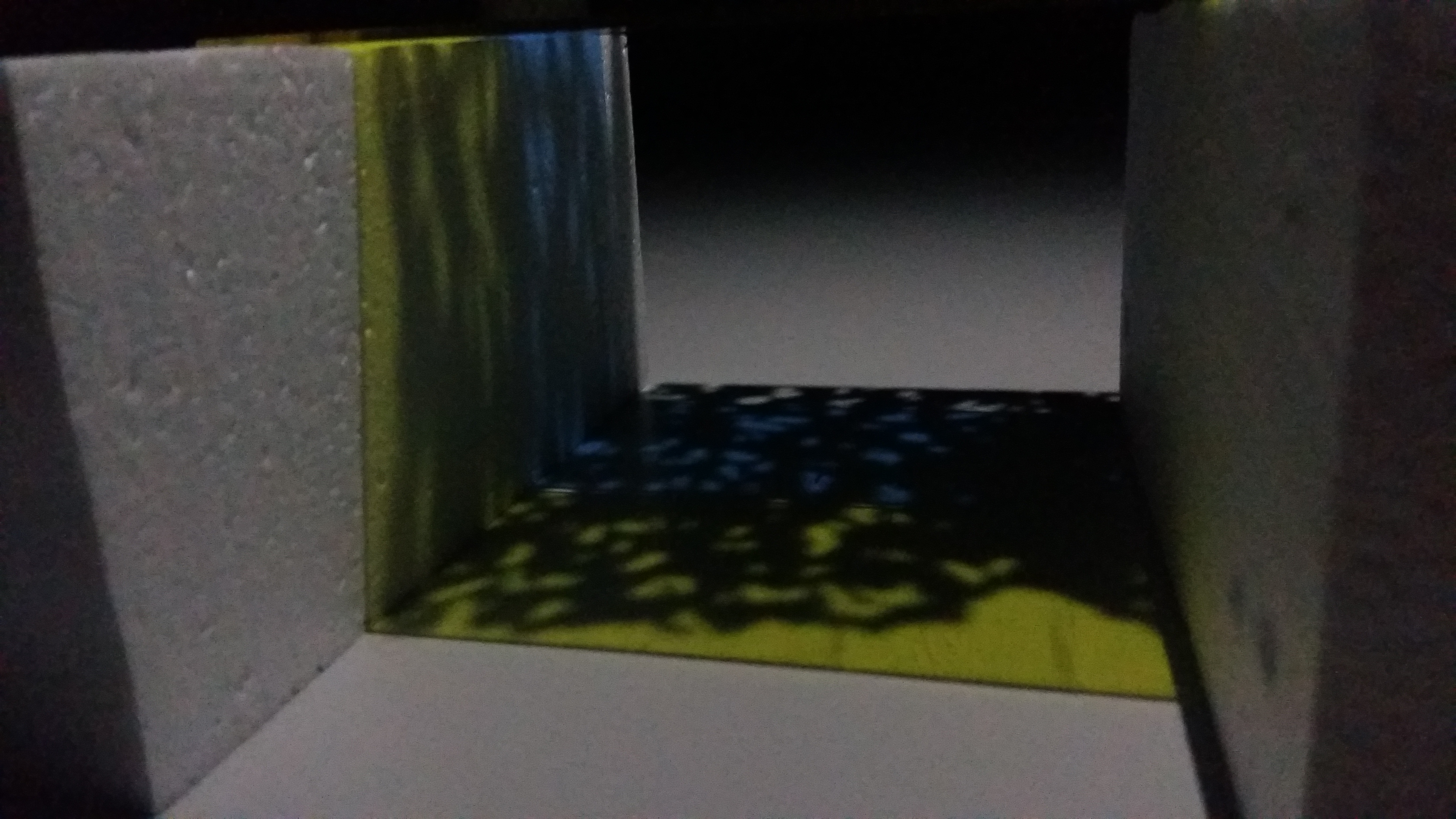
back light
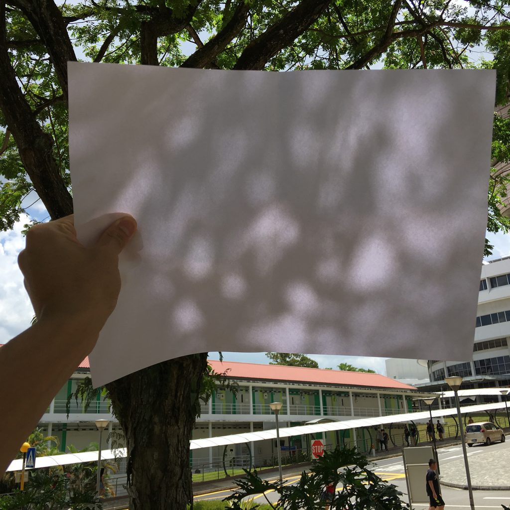
in back light, the effect between light and shadow is attenuated/toned down
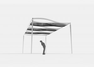
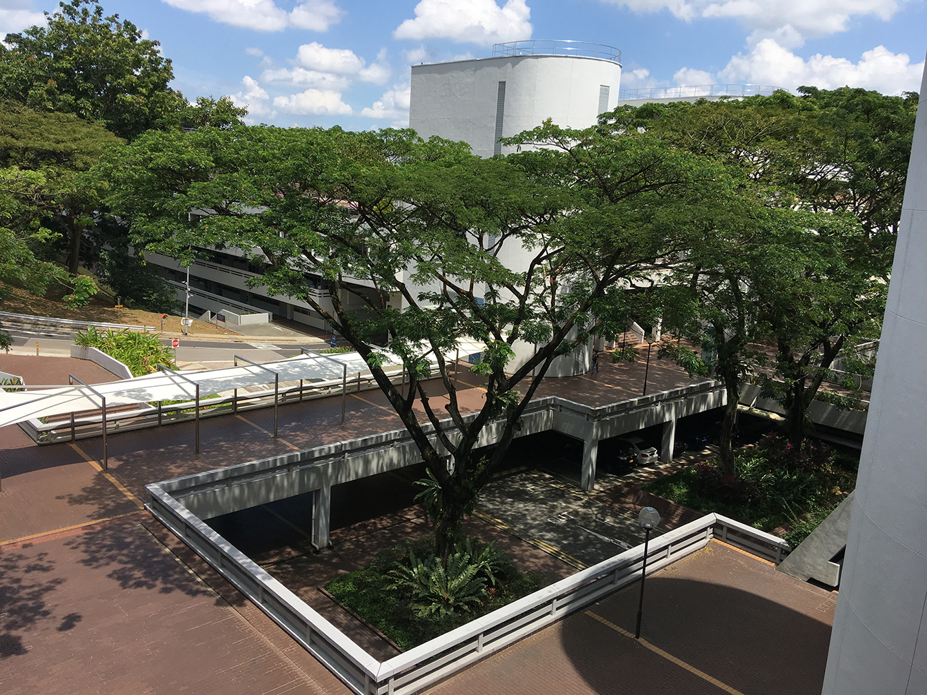
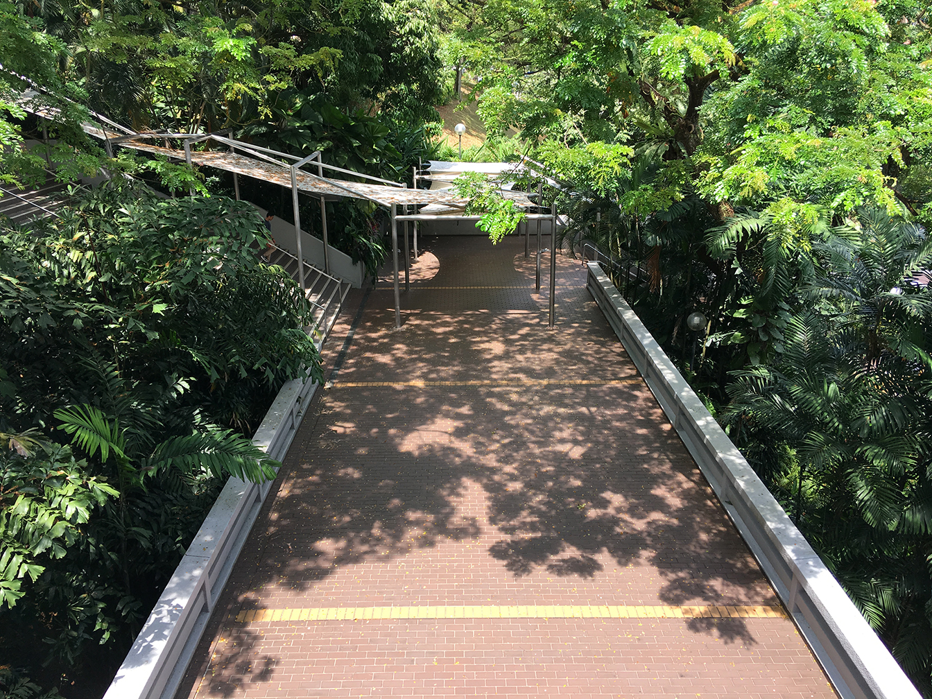
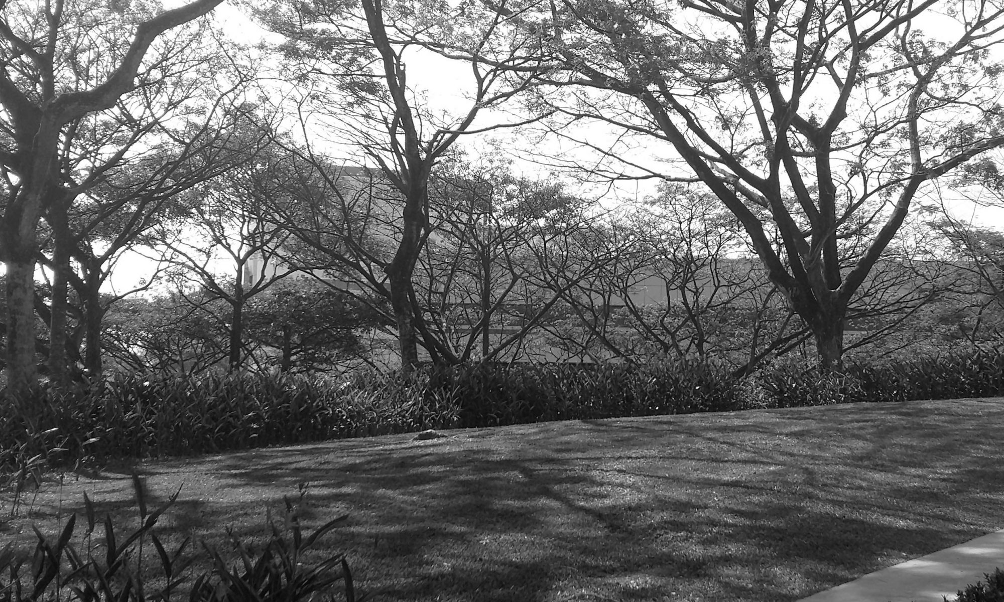
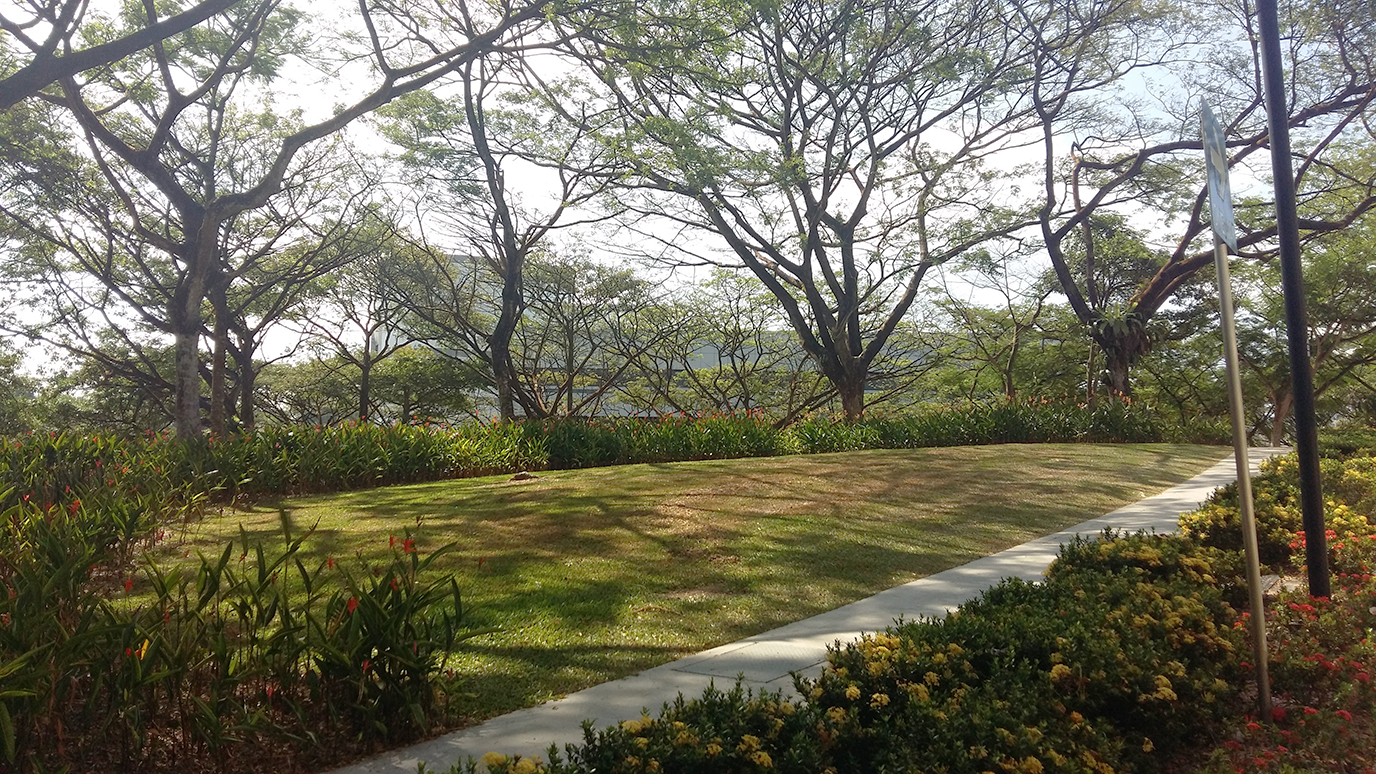
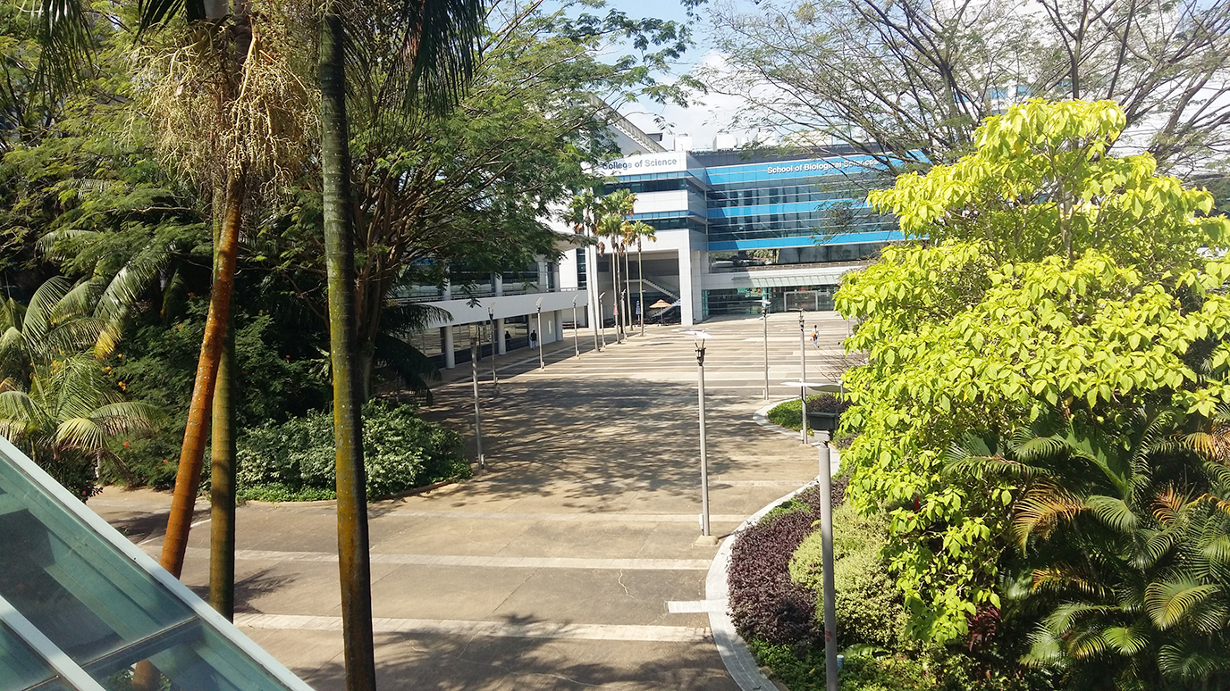
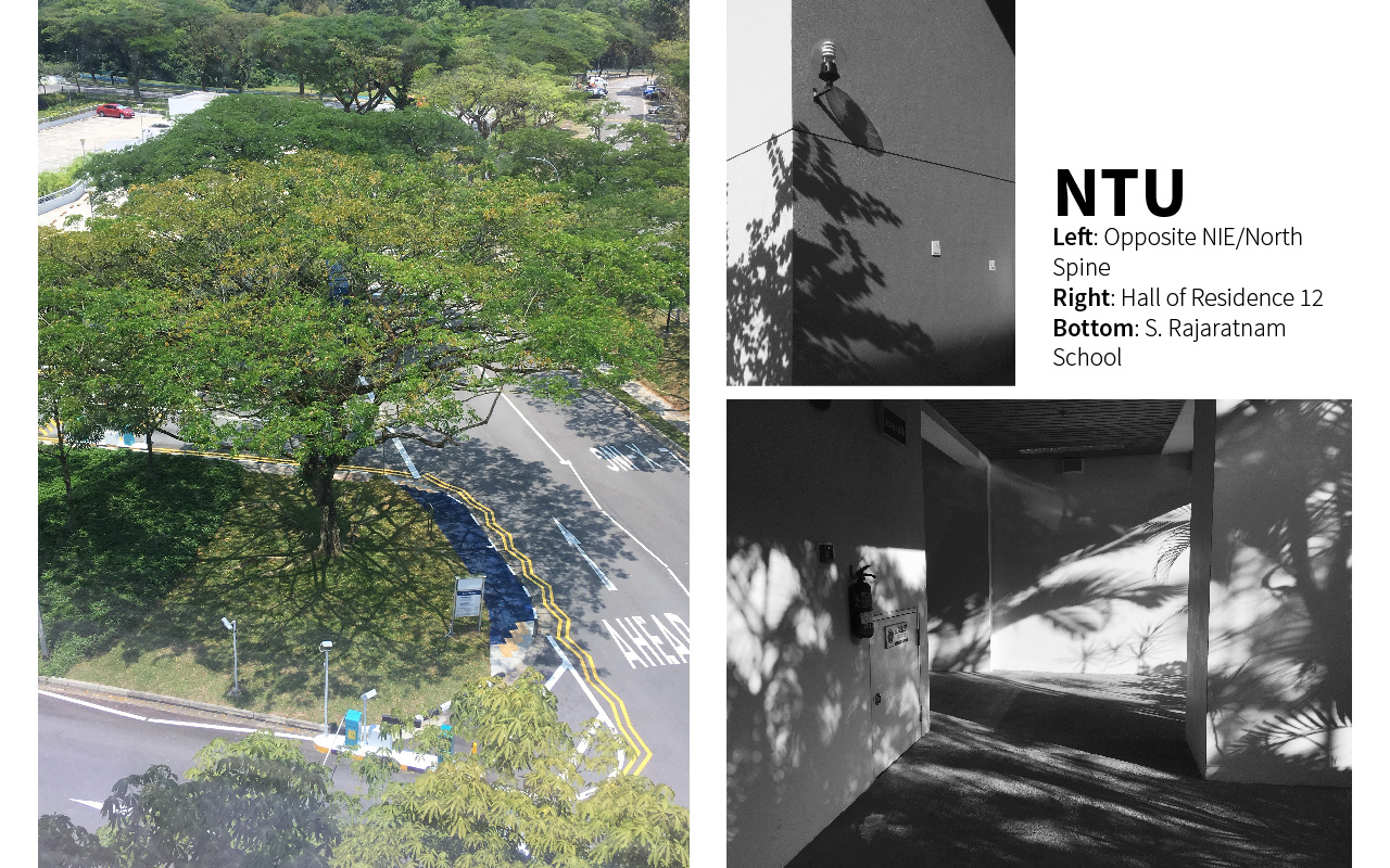
site consideration
1. stair linkway between North and South Spine
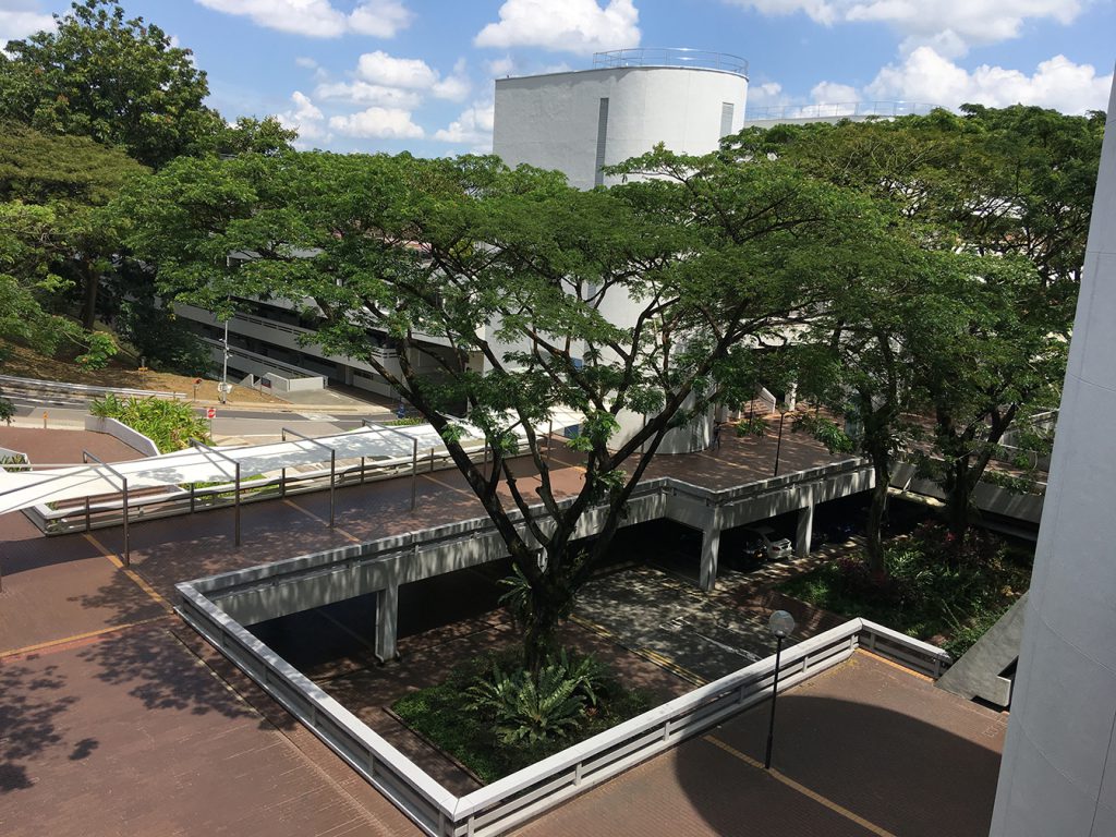

2. NIE entrance

3. entrance of the Quad

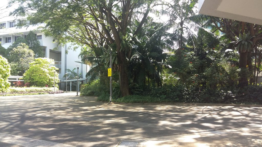
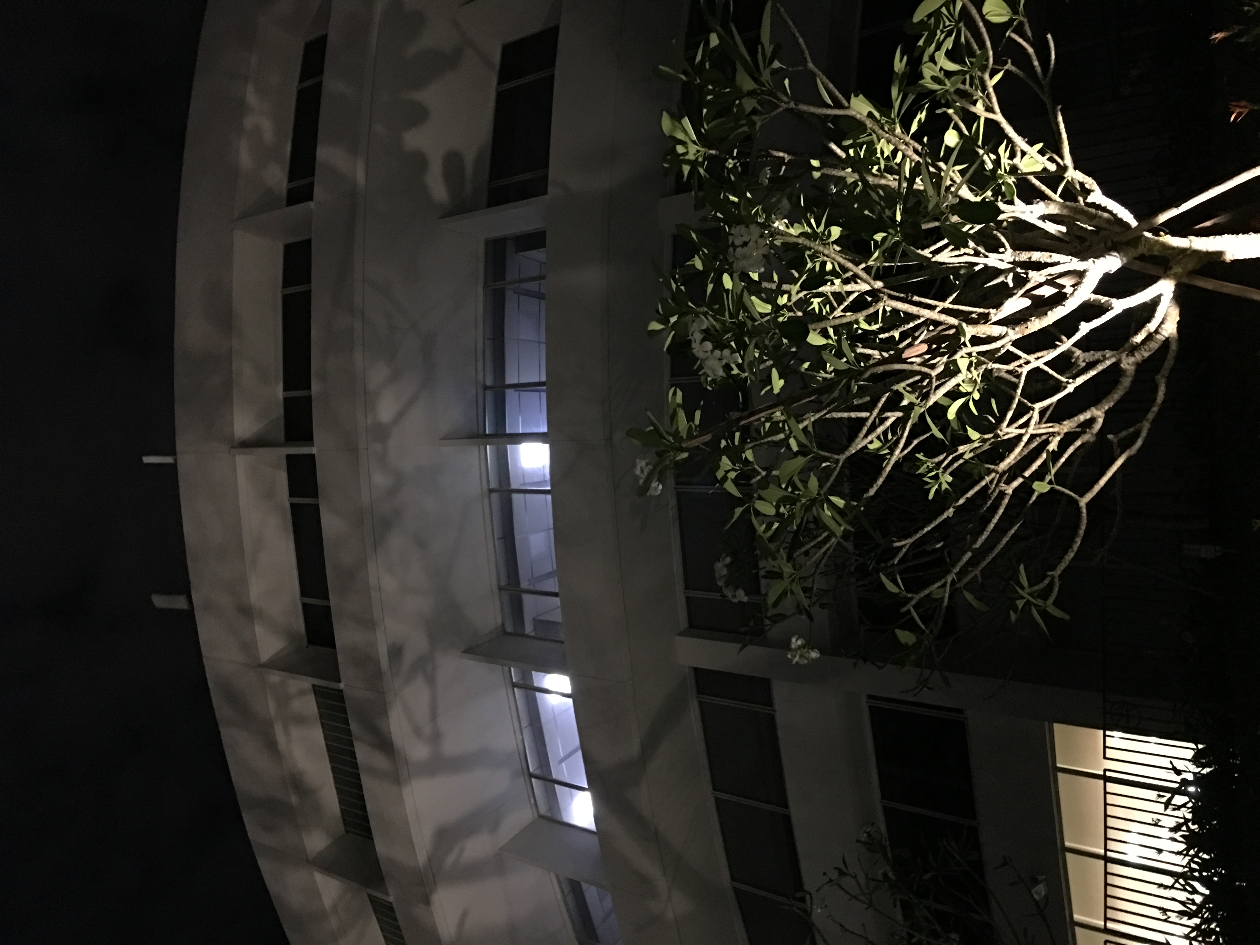
based on the feedback, we wanted to look into how we could frame existing elements. hence we looked for light/shadow-abundant areas. also taking into consideration the possibility of constructing an actual installation at the location
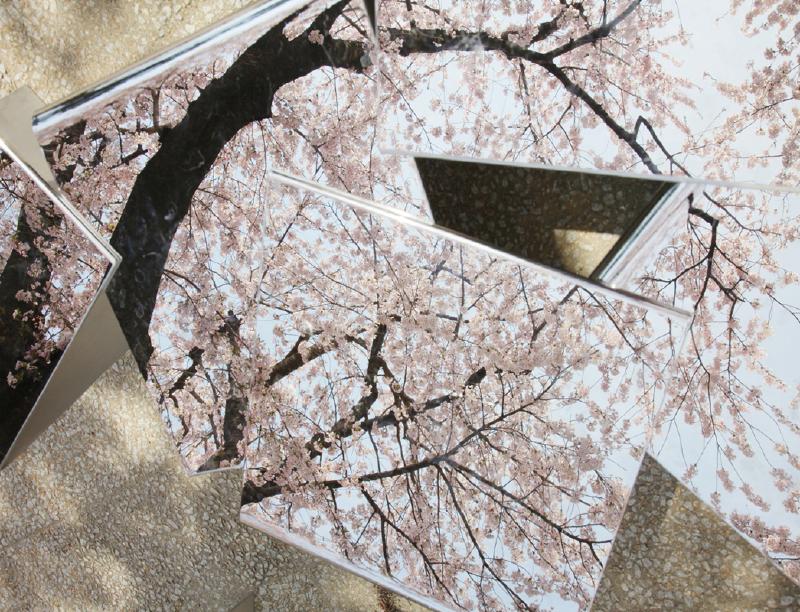
references
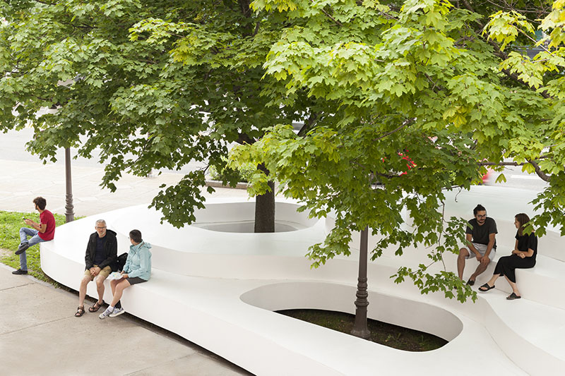
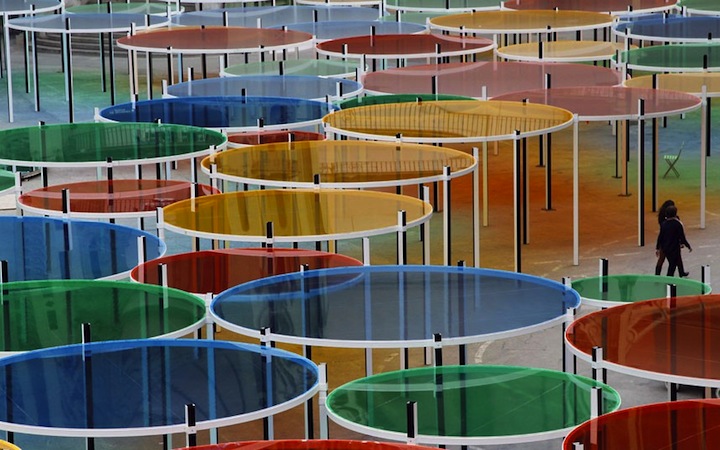
Le Banc de Nelge (the Bench of Snow), Atelier Pierre Thibault
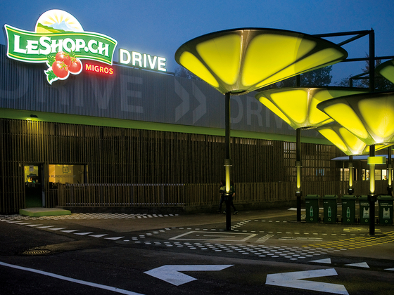
City of Hope Kaplan Family Pavilion, AHBE

Tree, Myoung Ho Lee


Wall in Blue Ash Tree, Letha Wilson

installation for Noisily Festival, Rupert Newman
temporary pavilion by students of Bezalel Academy of Art and Design

White Extension, Sasa Ciabatti, Bilyana Asenova and Archistart

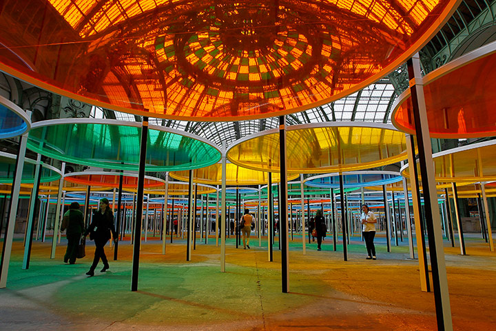
The Gates, Christo and Jean Claude

mass-void theory
form exploration
01
 version 1
follows contour and path of the shadow as it moves throughout the day
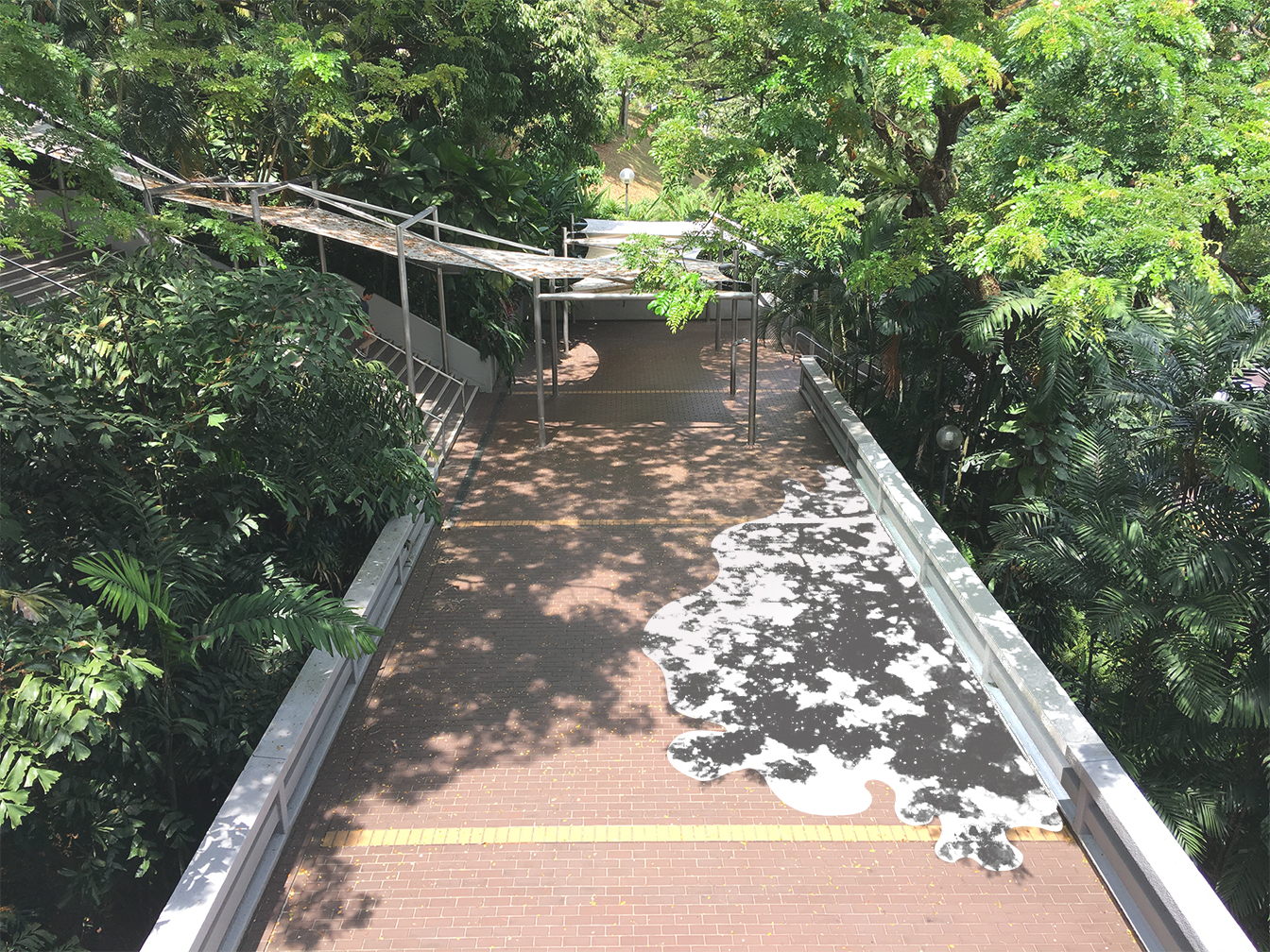
 version 2
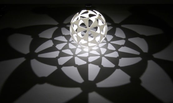
using a geometric shape such as a circle (as shown) or a rectangle, it contrasts with the organic forms of the cast shadow, allowing the white to be a ‘frame’ or ‘canvas’. the bench distorts the cast shadow and creates a new perspective to the flat white; it also defines a volume of the object whilst emphasising the effect.
 version 3
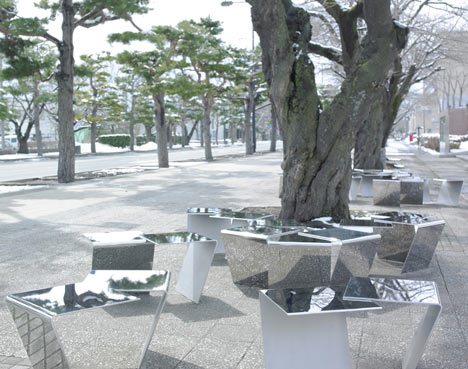
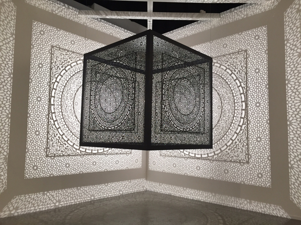
the use of reflective material reflects the cast shadow, duplicating and emphasising them; the top reflects the foliage above, offering a new perspective and prompting viewers to look up. viewers can differentiate between the colourful reflection and the monochrome shadow on the white background, emphasising the beautiful effect of the shadow.
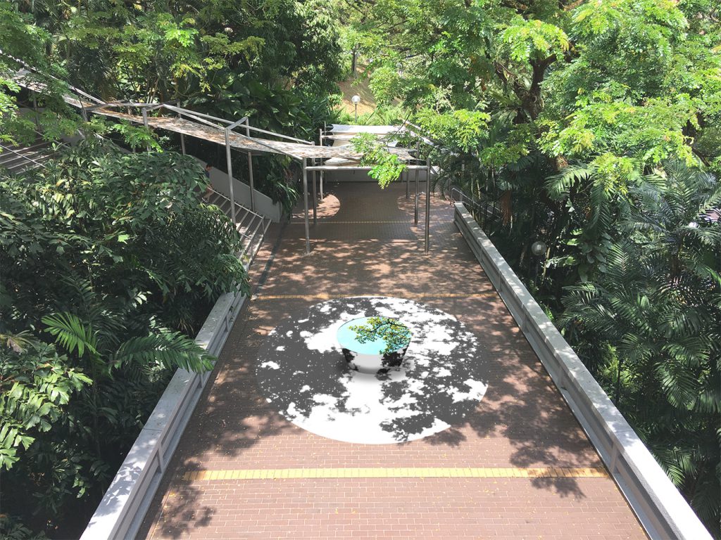
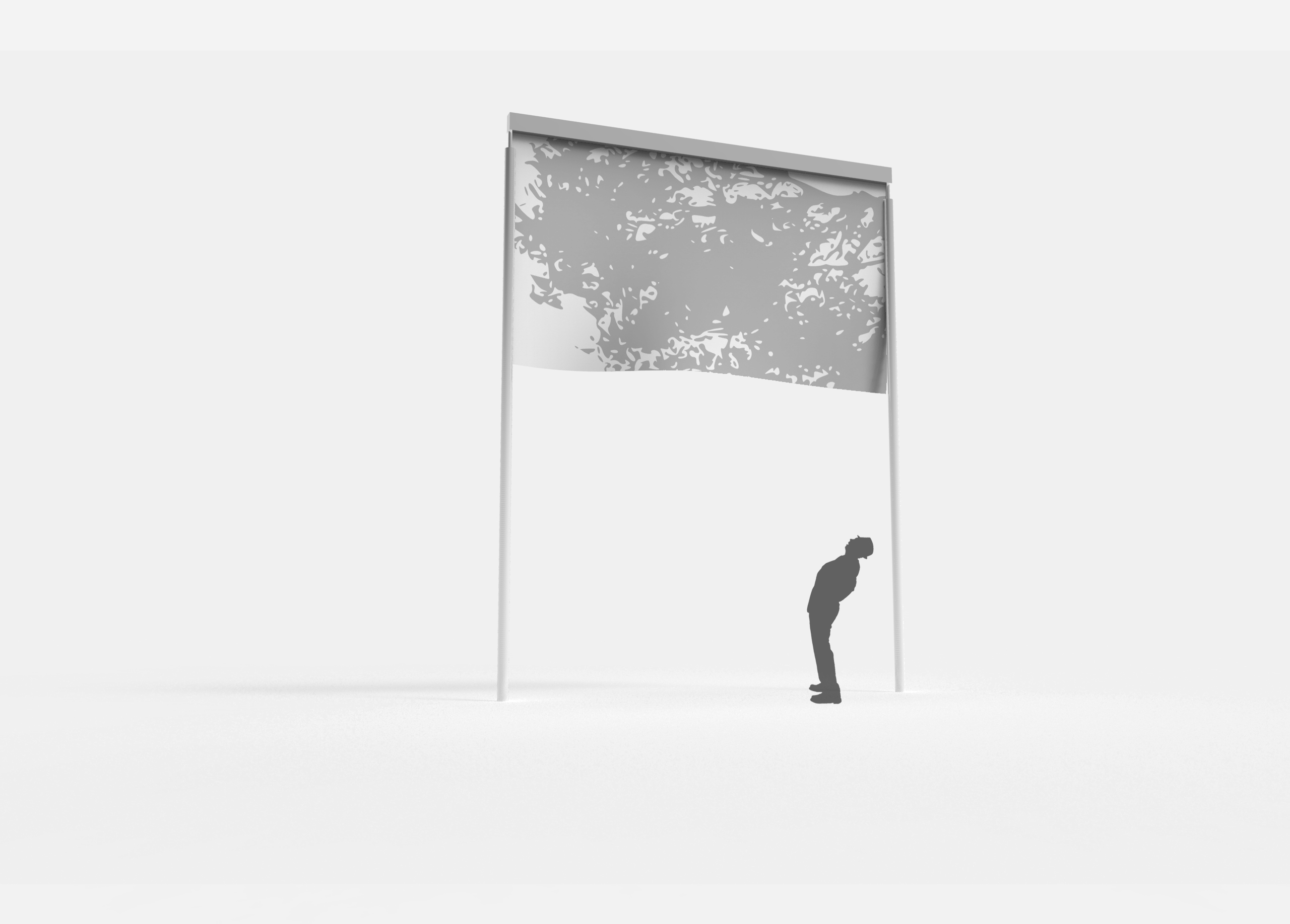
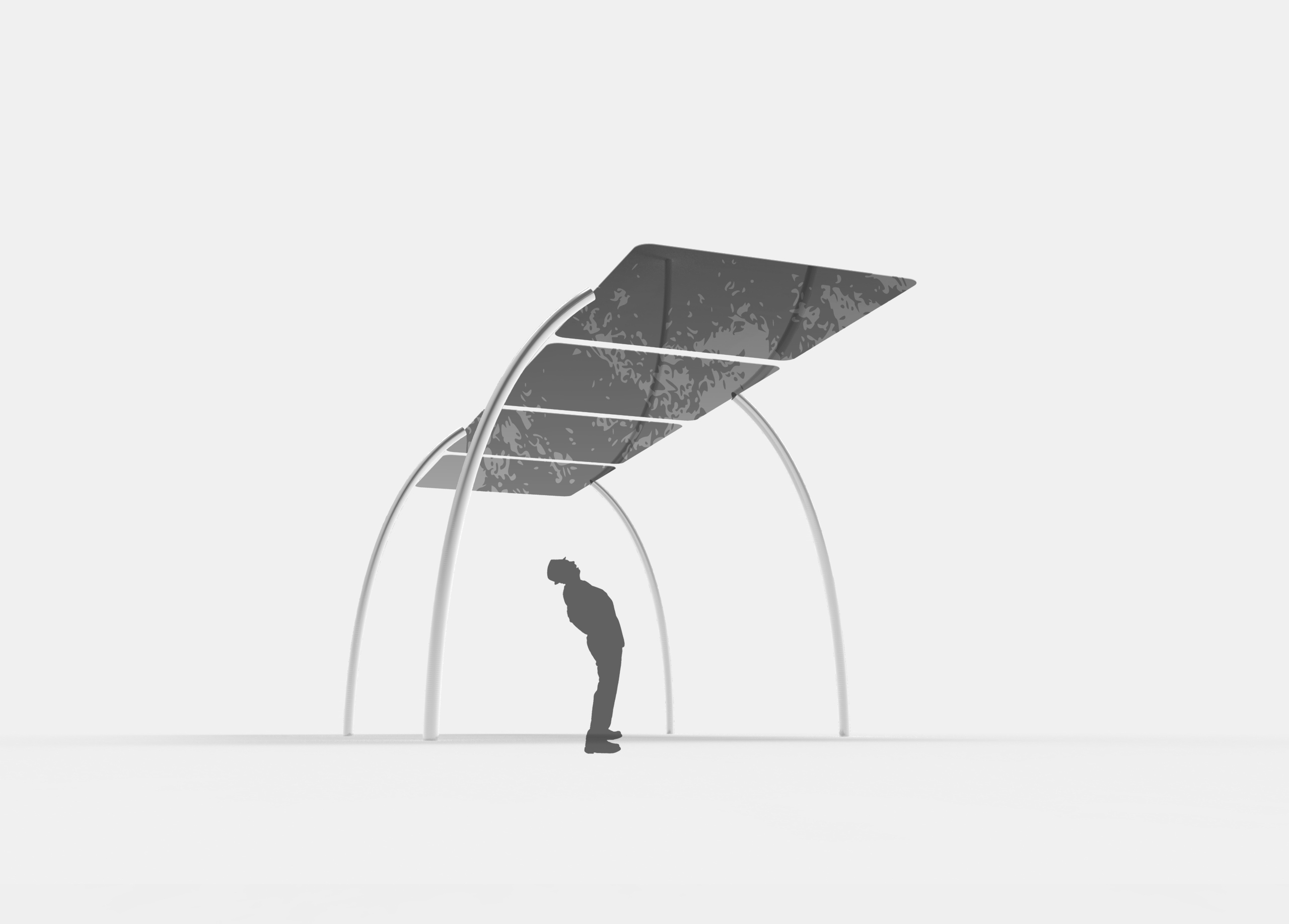
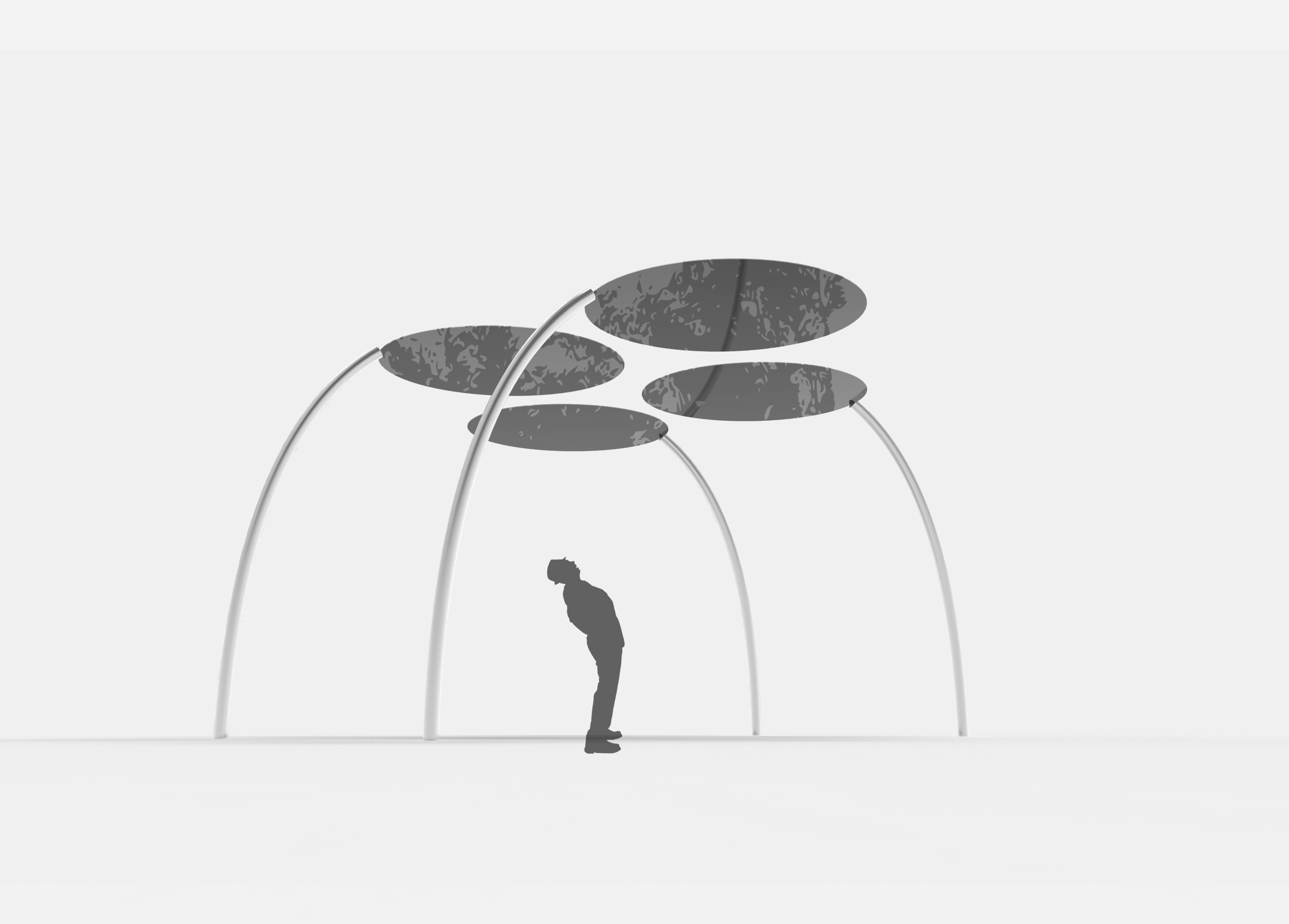
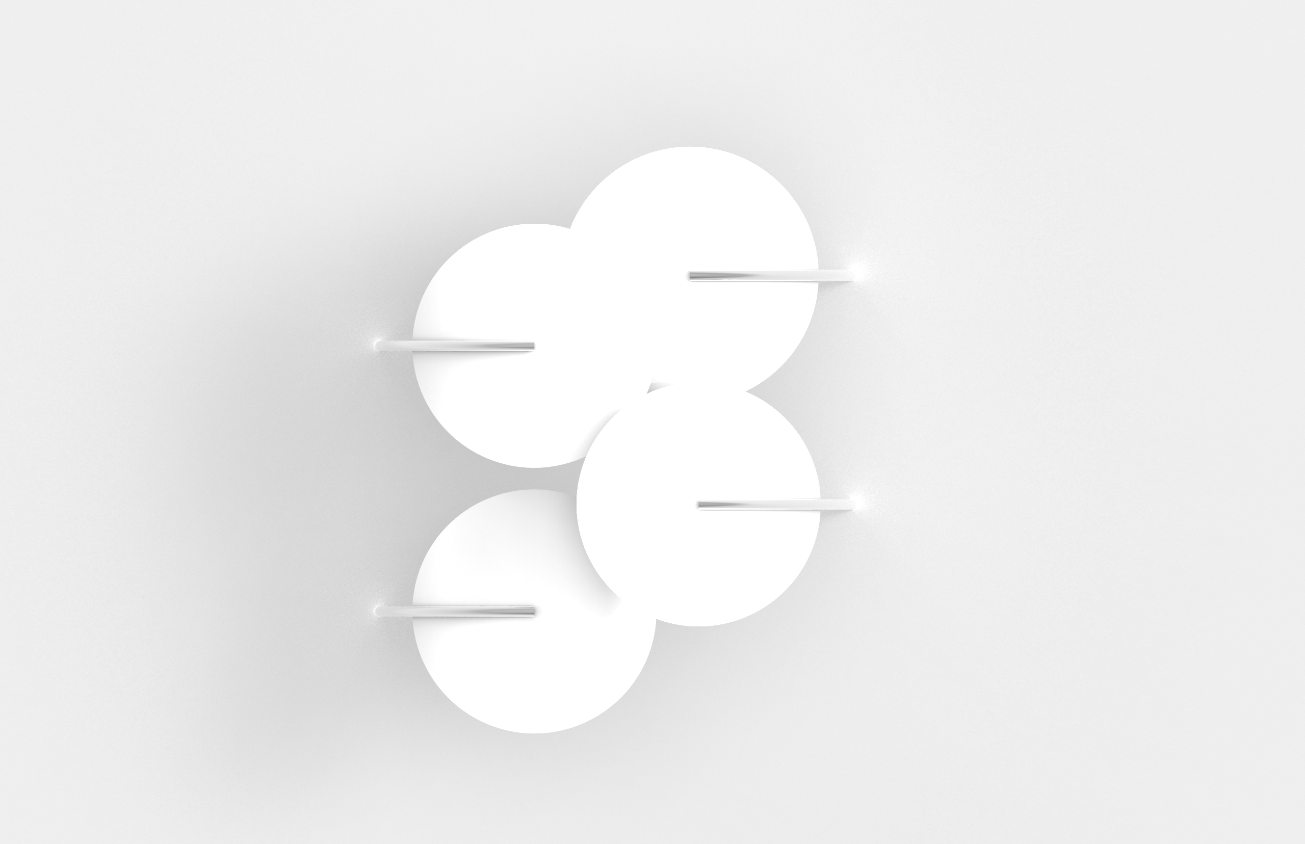
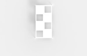
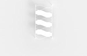
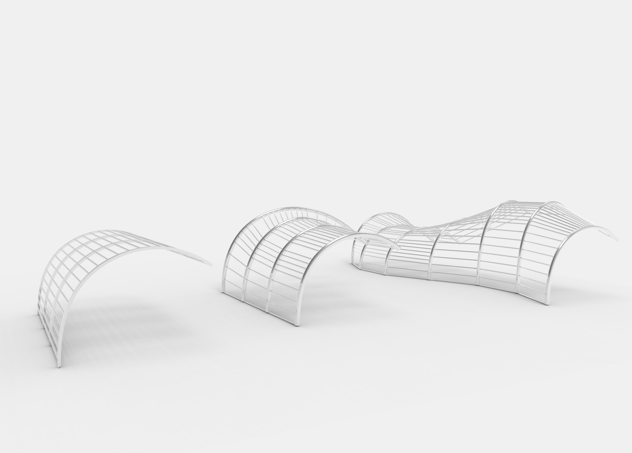
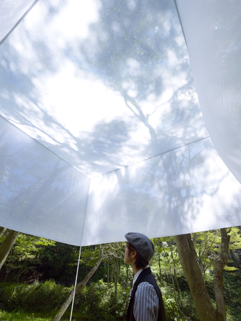
02
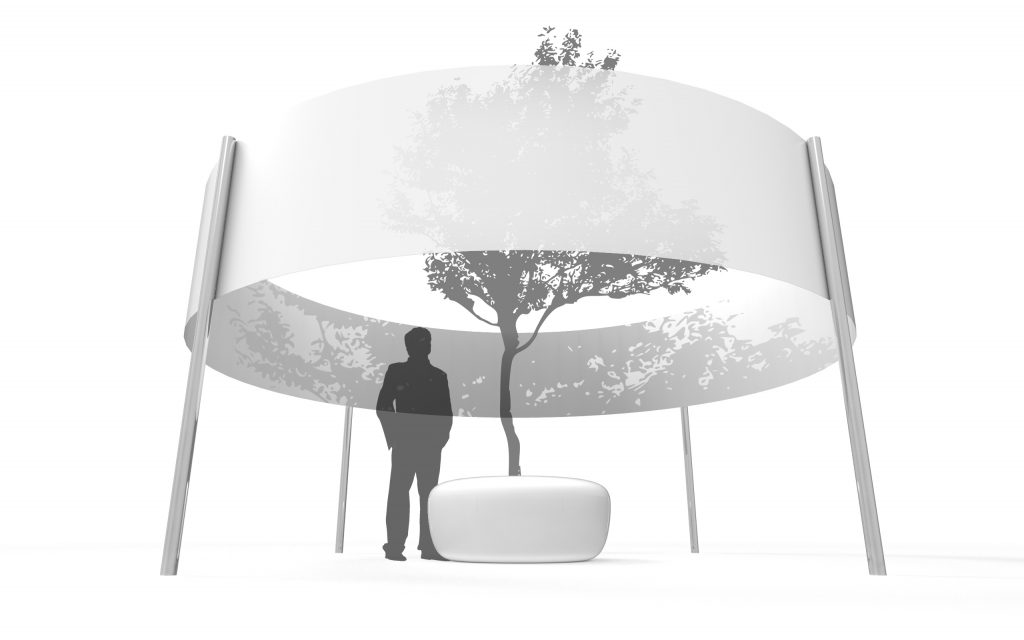

technically can be placed in any open space; not site-specific
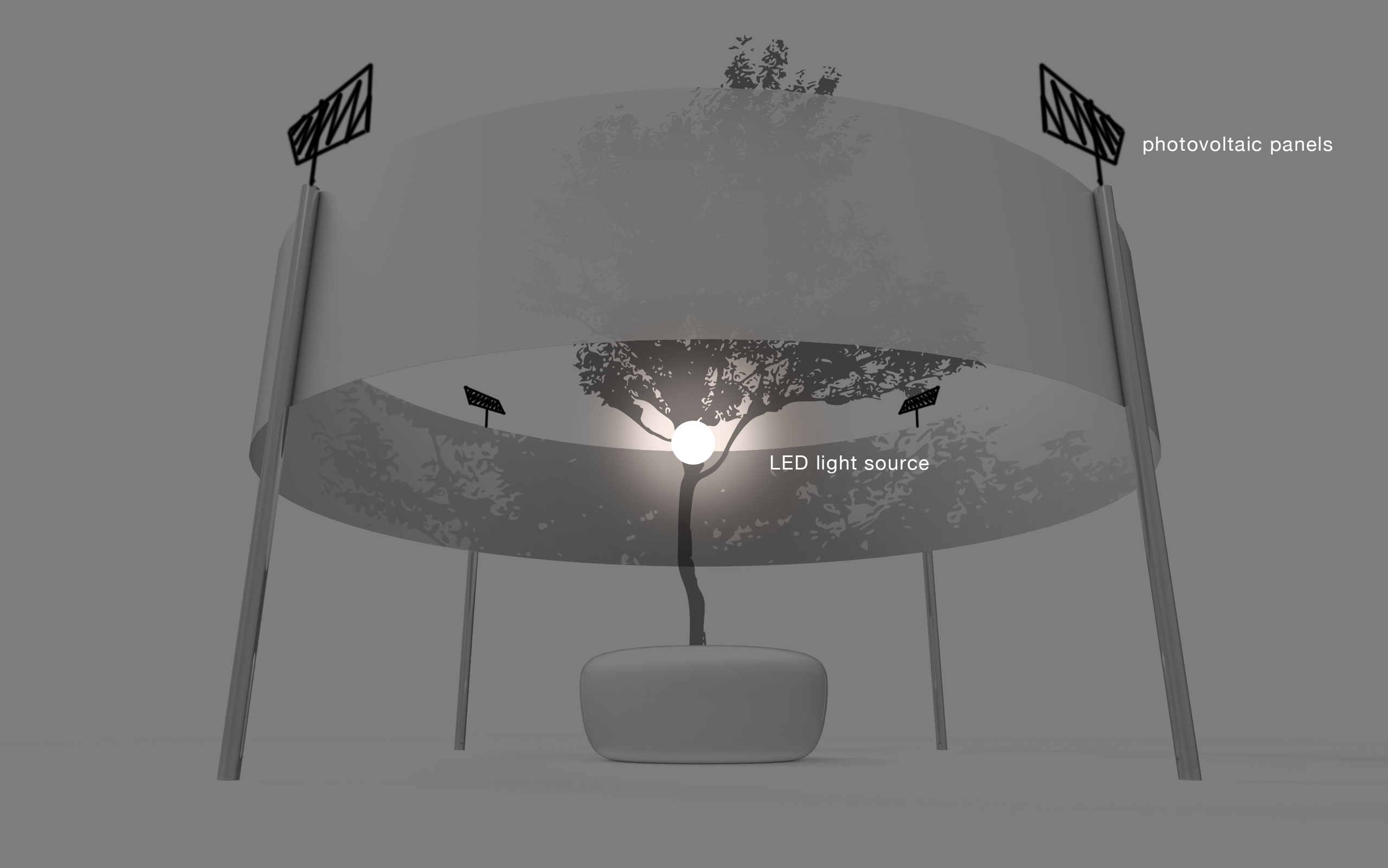
includes a small tree inside a pot/bench. throughout the day, shadow is cast onto the white circular screen (light material which will add movement when wind blows)
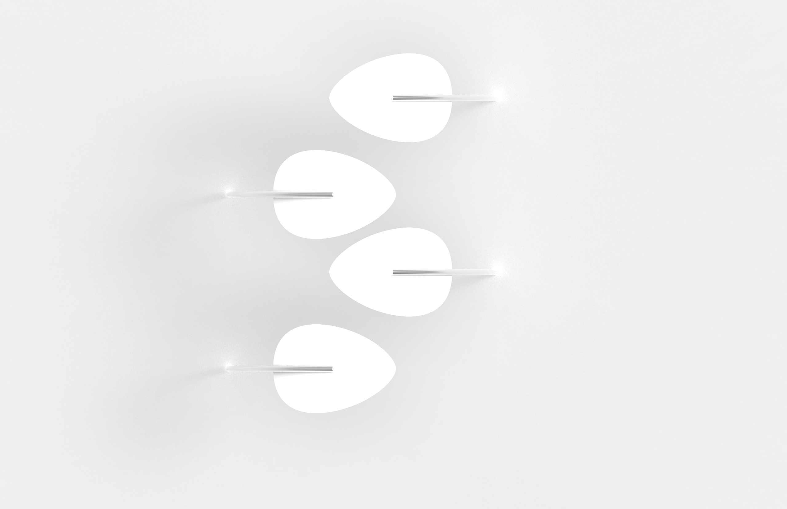
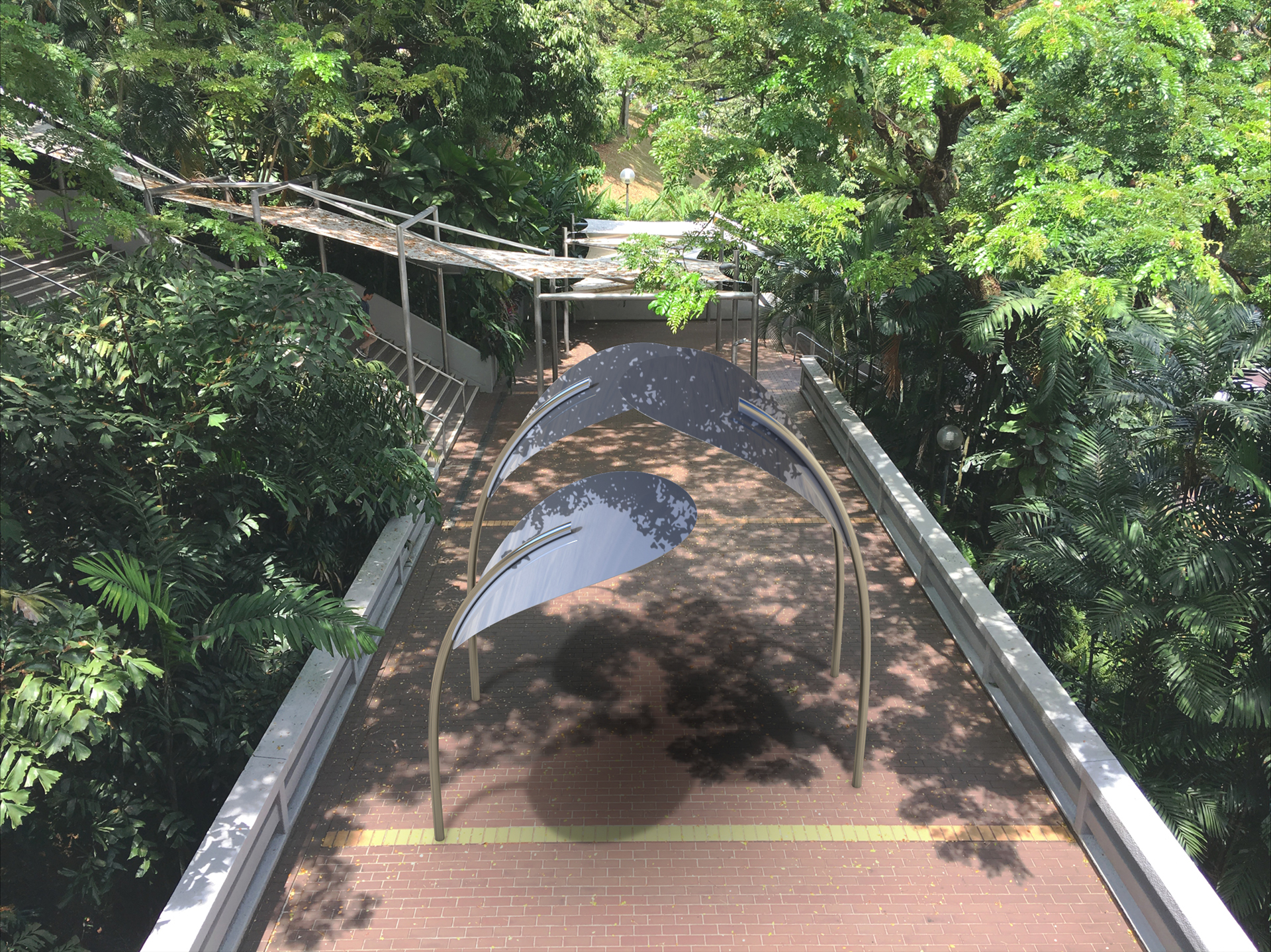
03
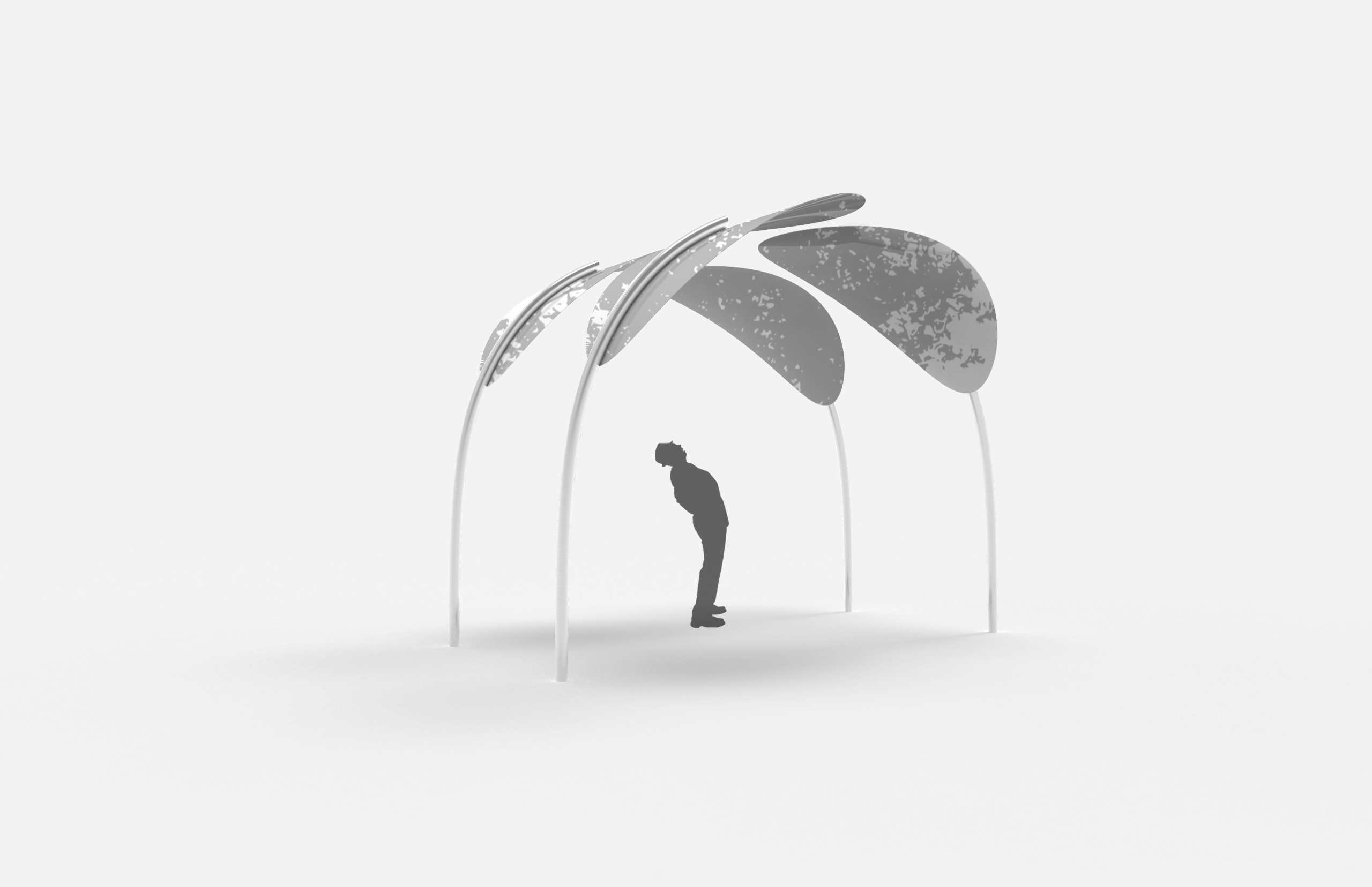
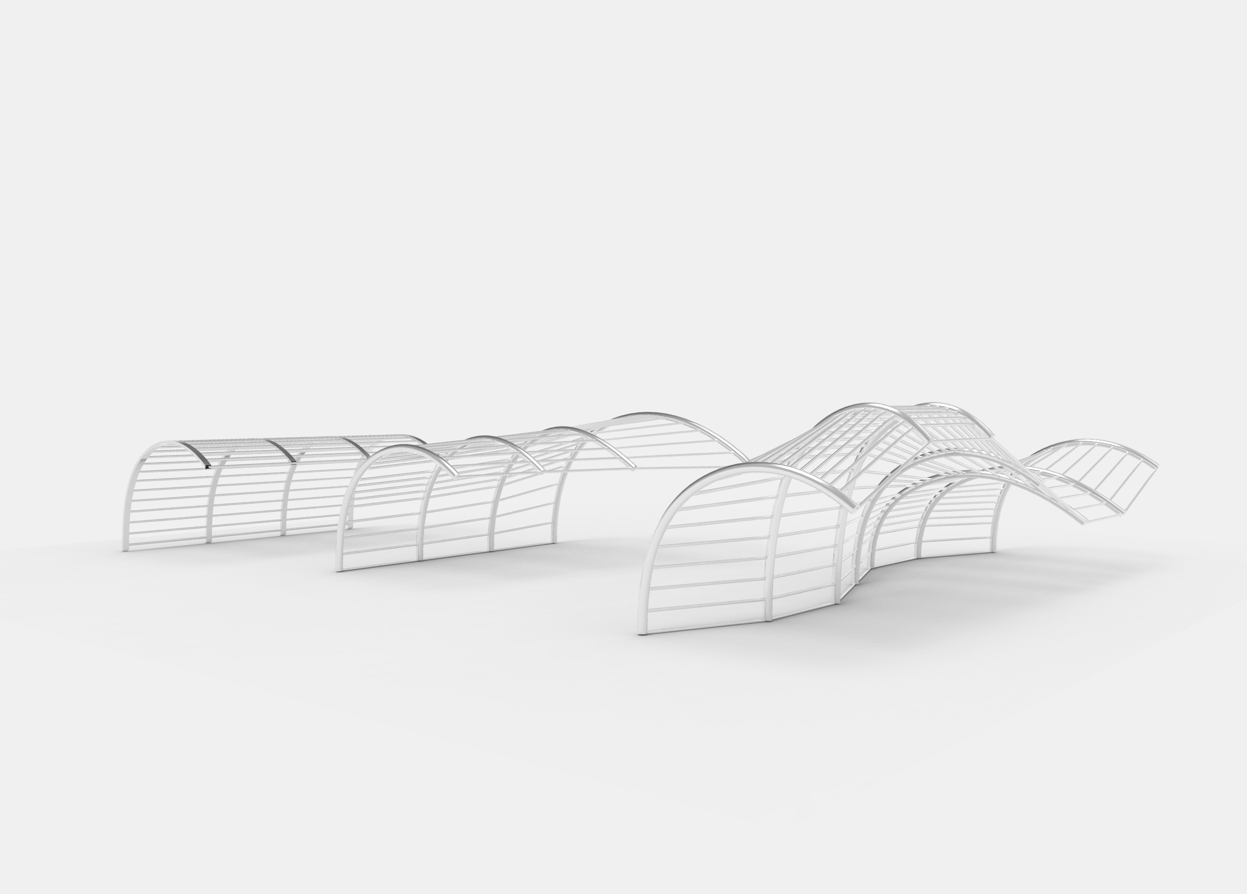
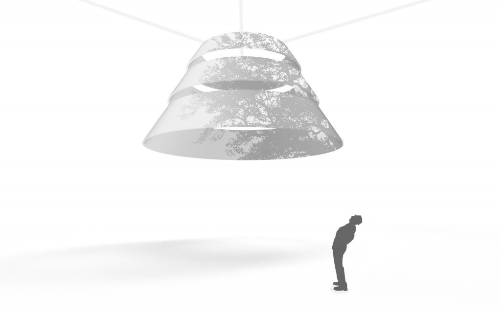 version 1
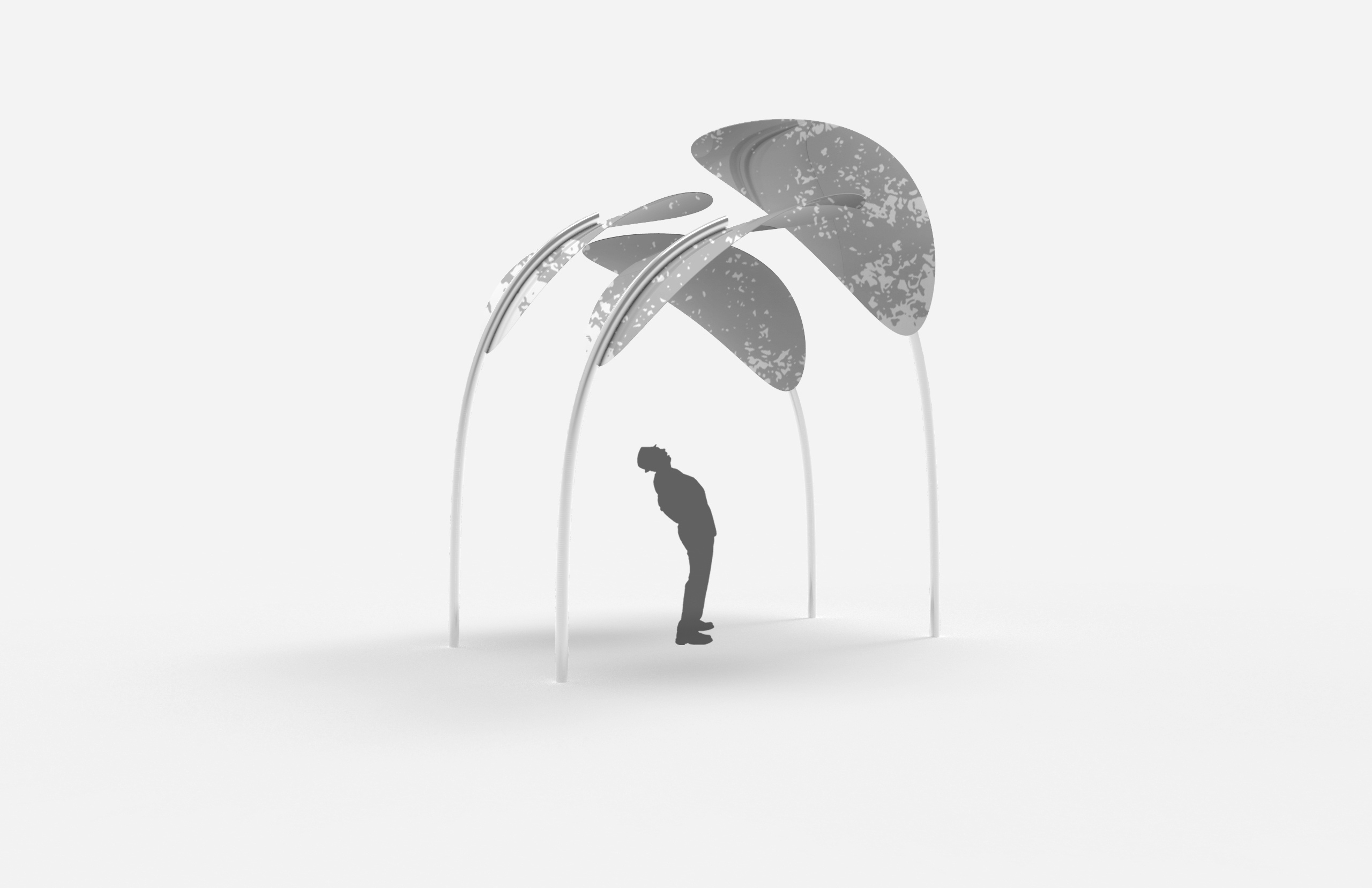
 version 2
floating sculpture that allows audience to view shadows of trees and objects in the environment cast onto the material. the shape invokes curiosity so people passing by are interested in approaching and viewing. the sculpture could be hanging down from branches of trees around the area or infrastructures
things to keep in mind:
how do you make users/audience notice the shadows? (importance of framing)
cannot be too simple, needs to have an intention, needs to stand out from the environment, should not blend in, should not be infrastructural


 version 1
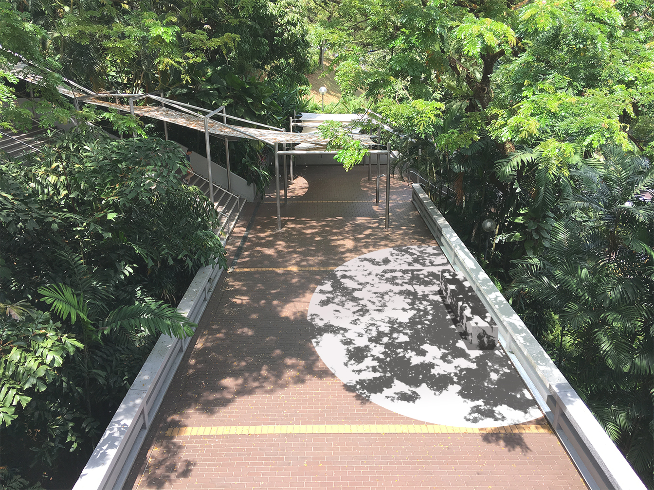 version 2
 version 3

 version 1
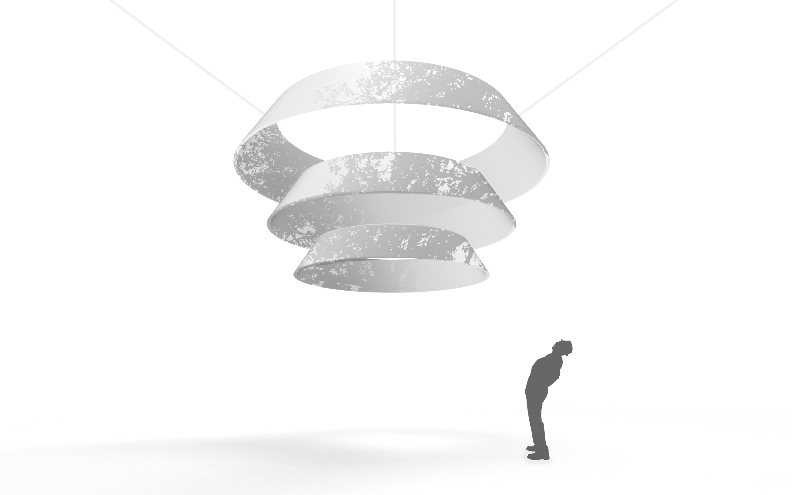 version 2
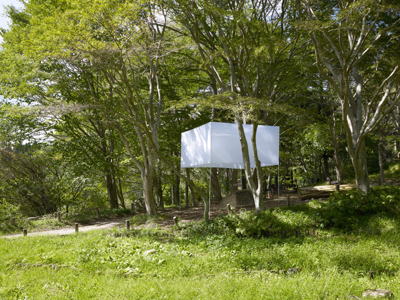

