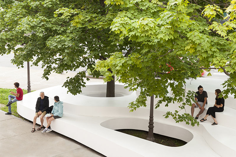
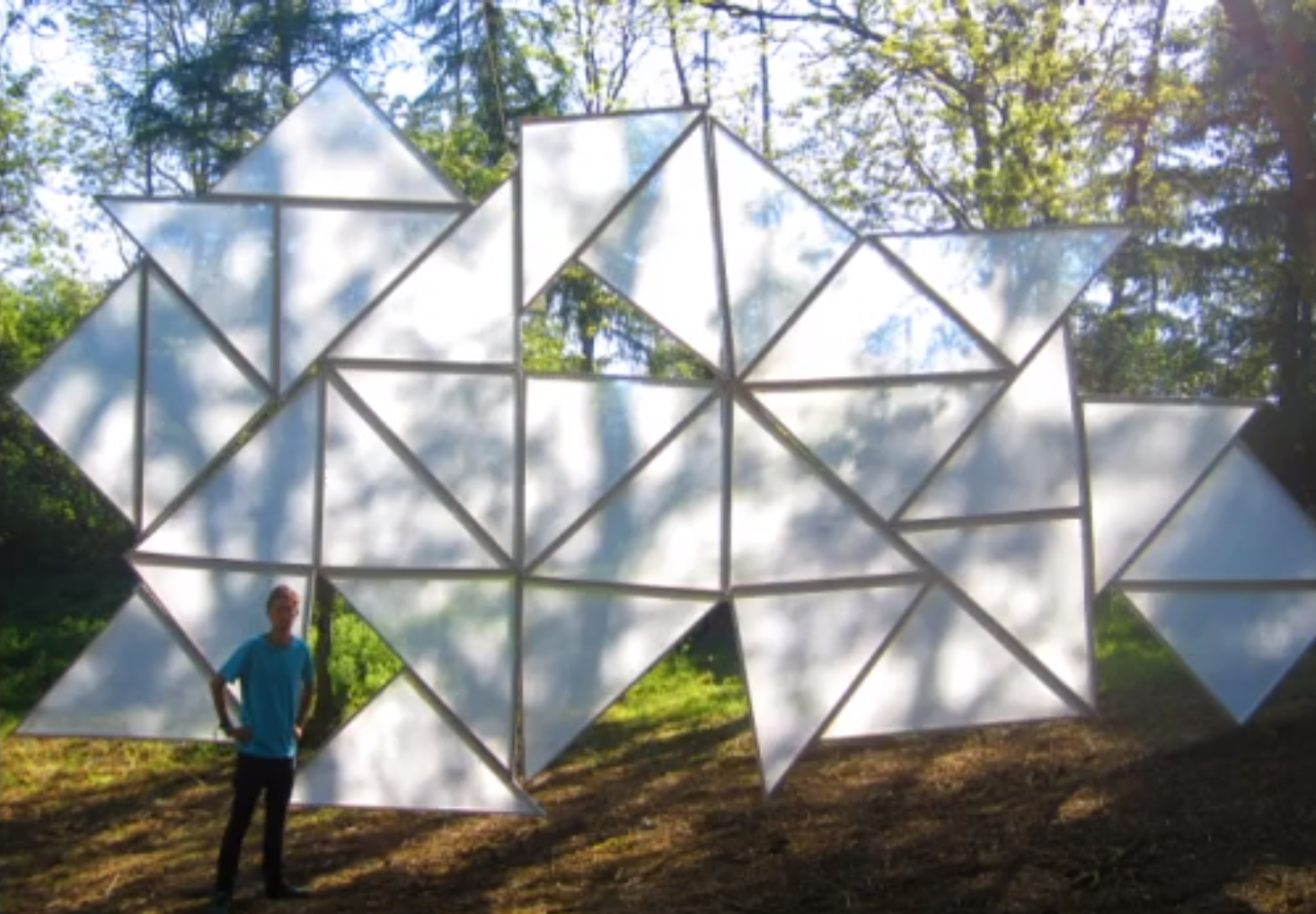
presentation here
poster draft 01
hello this is our first draft of our poster. any feedback would be appreciated!
note: realised i missed out 2D drawing/measurements, will add in later
another important note: TITLE IN PROGRESS. its almost 5 am jeremy is knocked out and i am incapable of naming things properly. will edit when both our brains work again.

wk12

feedback from last week:
- angles and proportions need to be justified and measured properly
- think more specifically about the choice of material
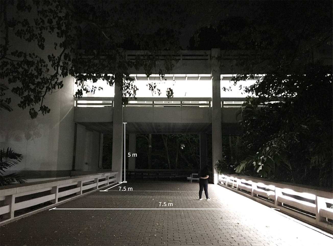
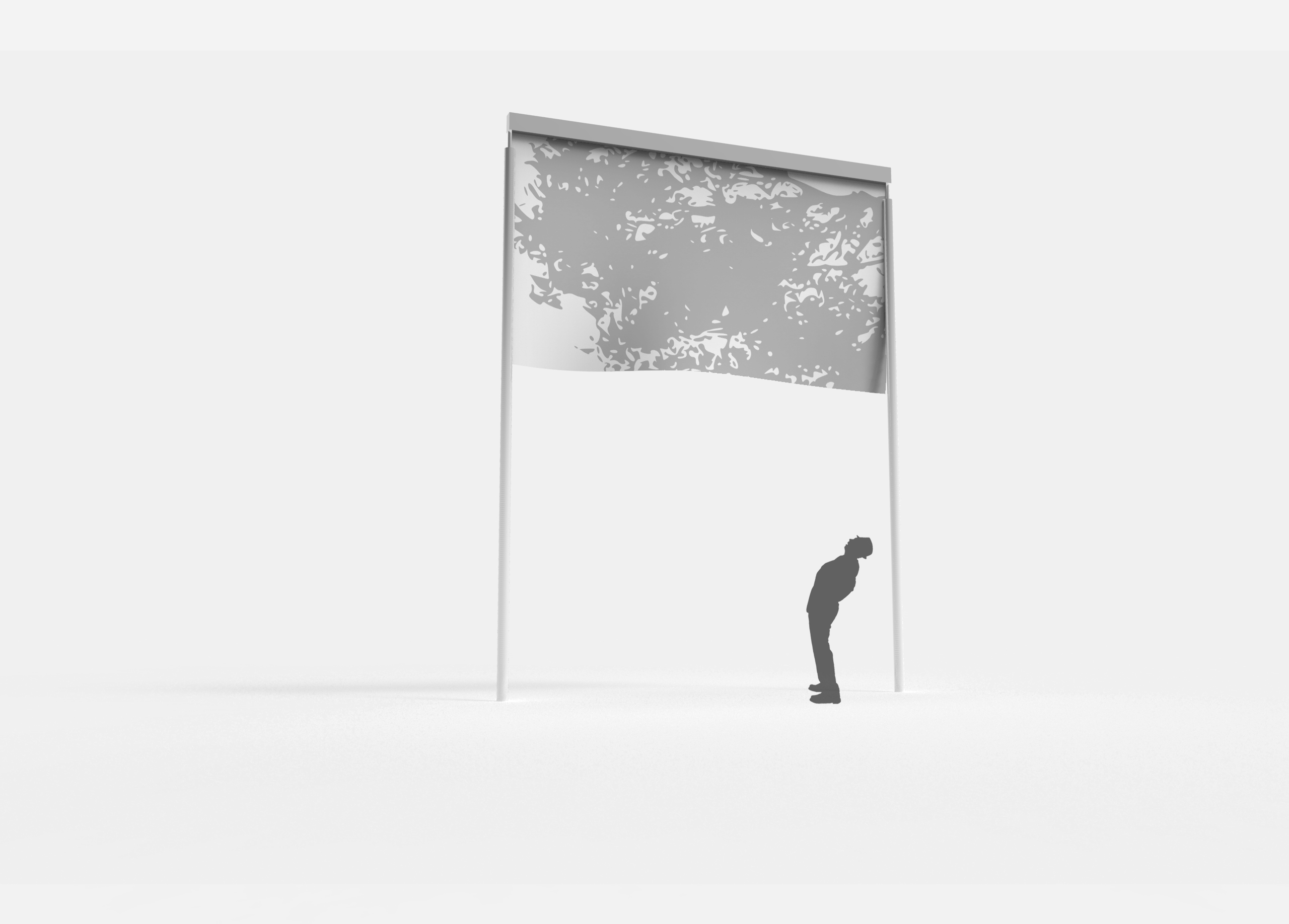
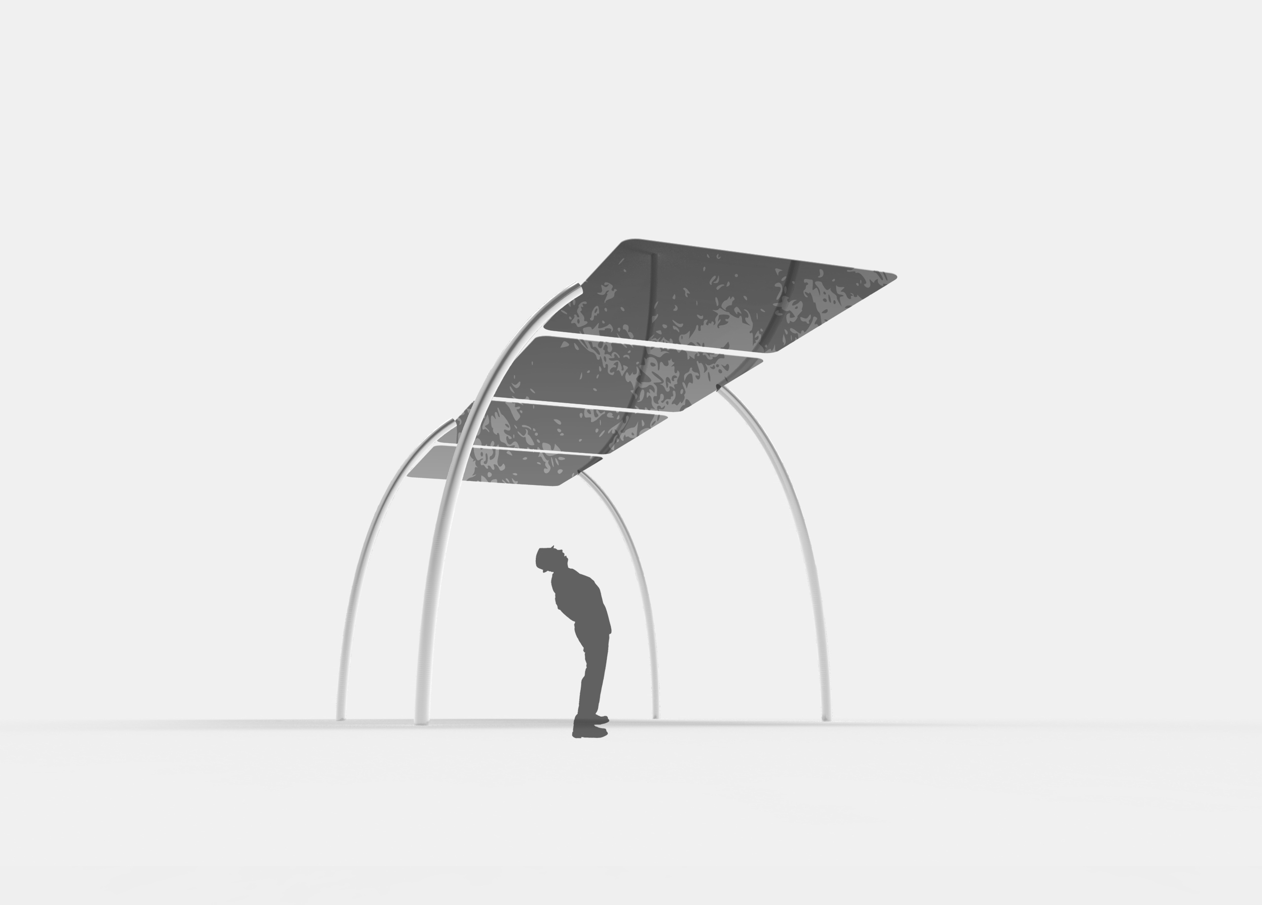
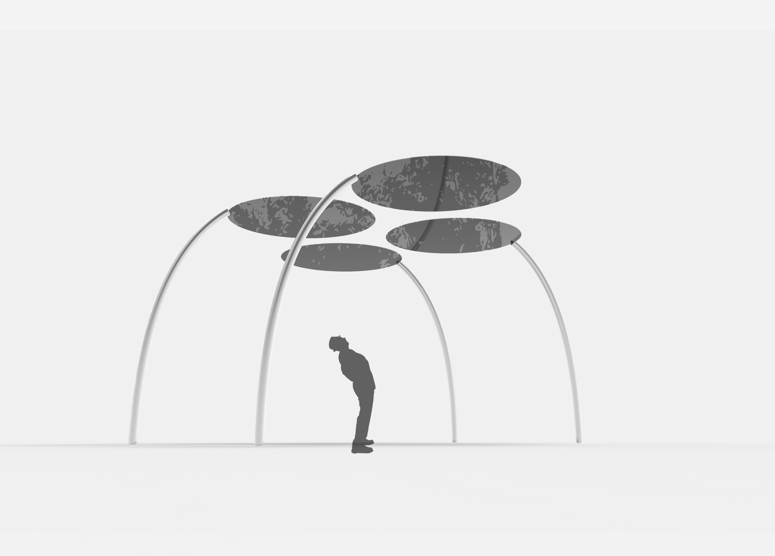
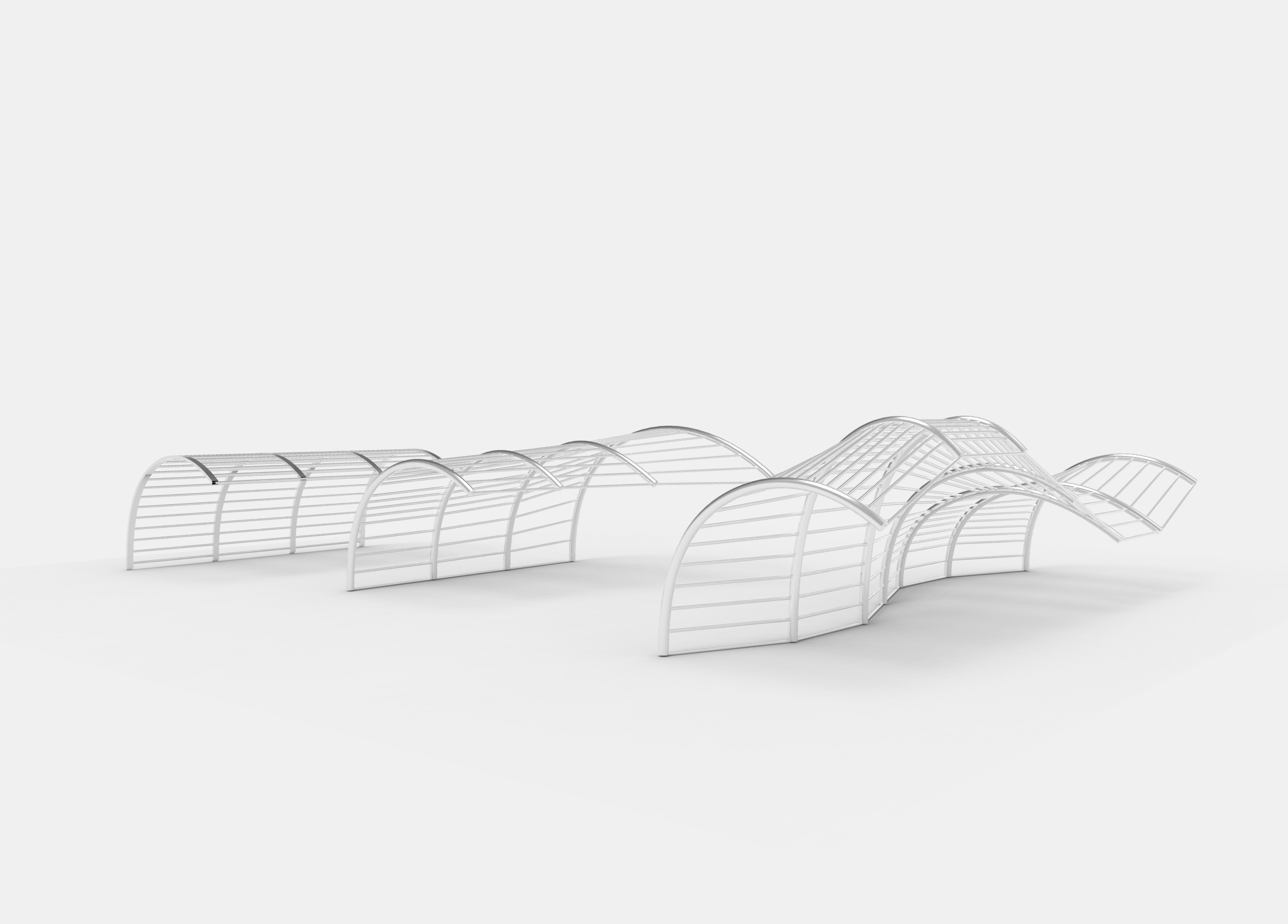
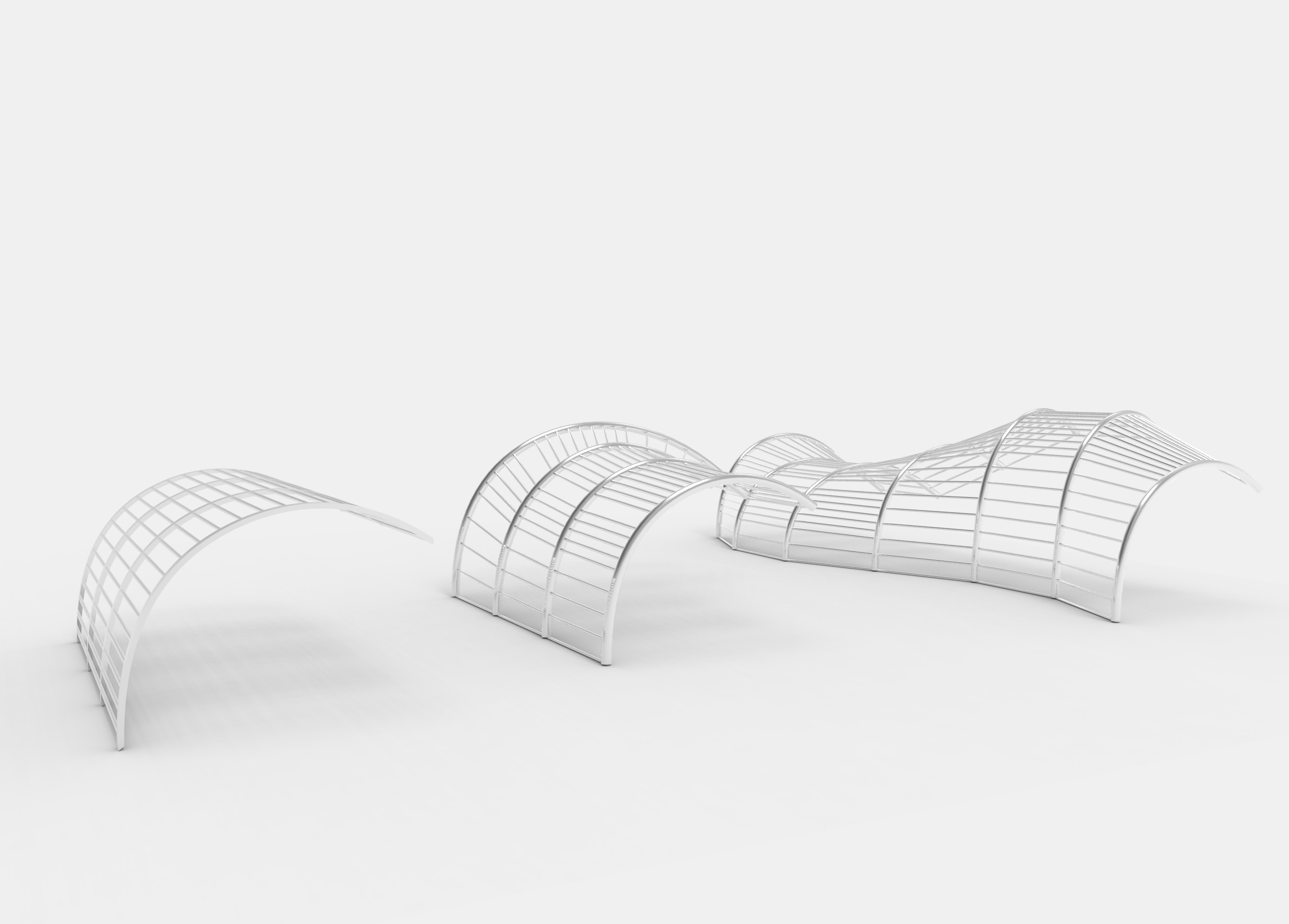
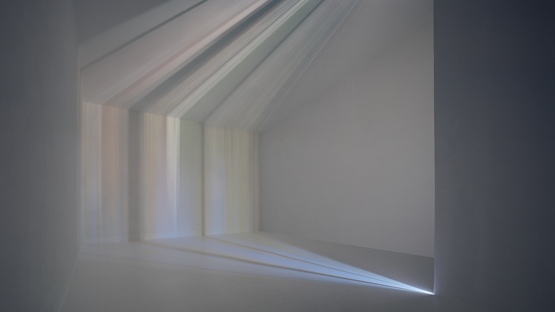
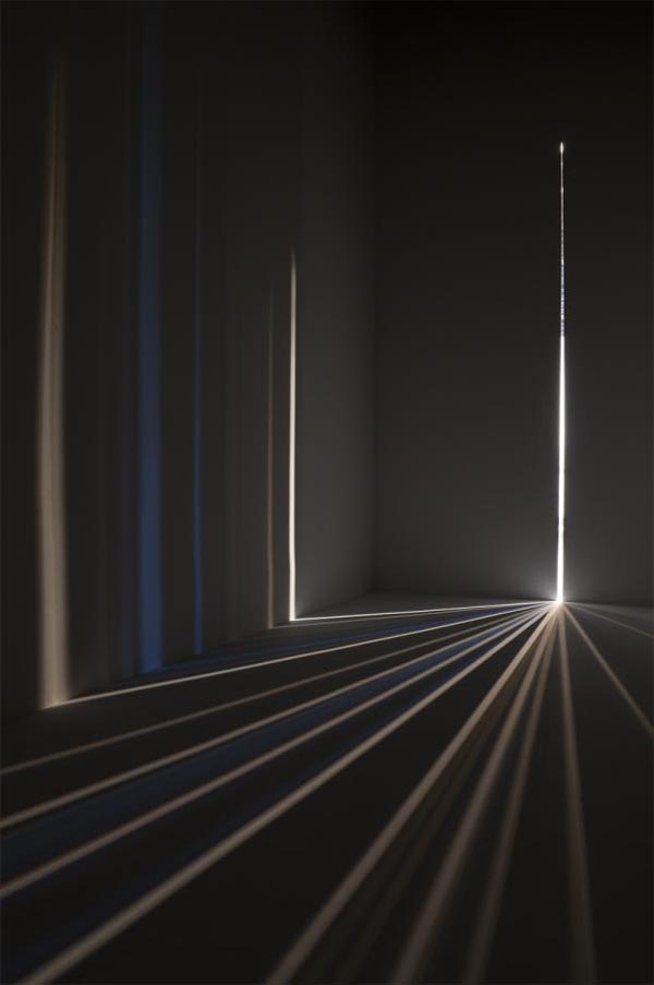
revised proposal
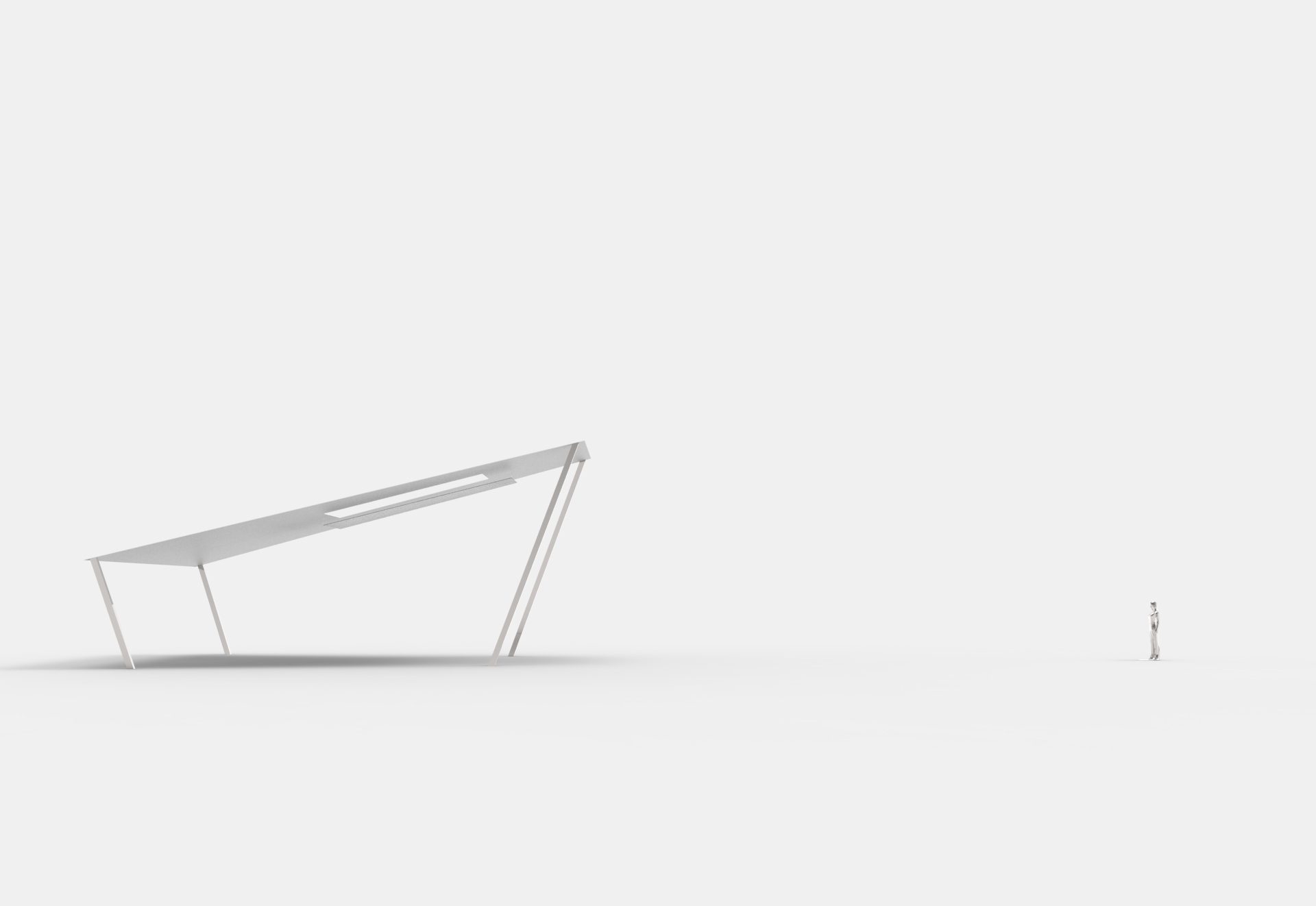
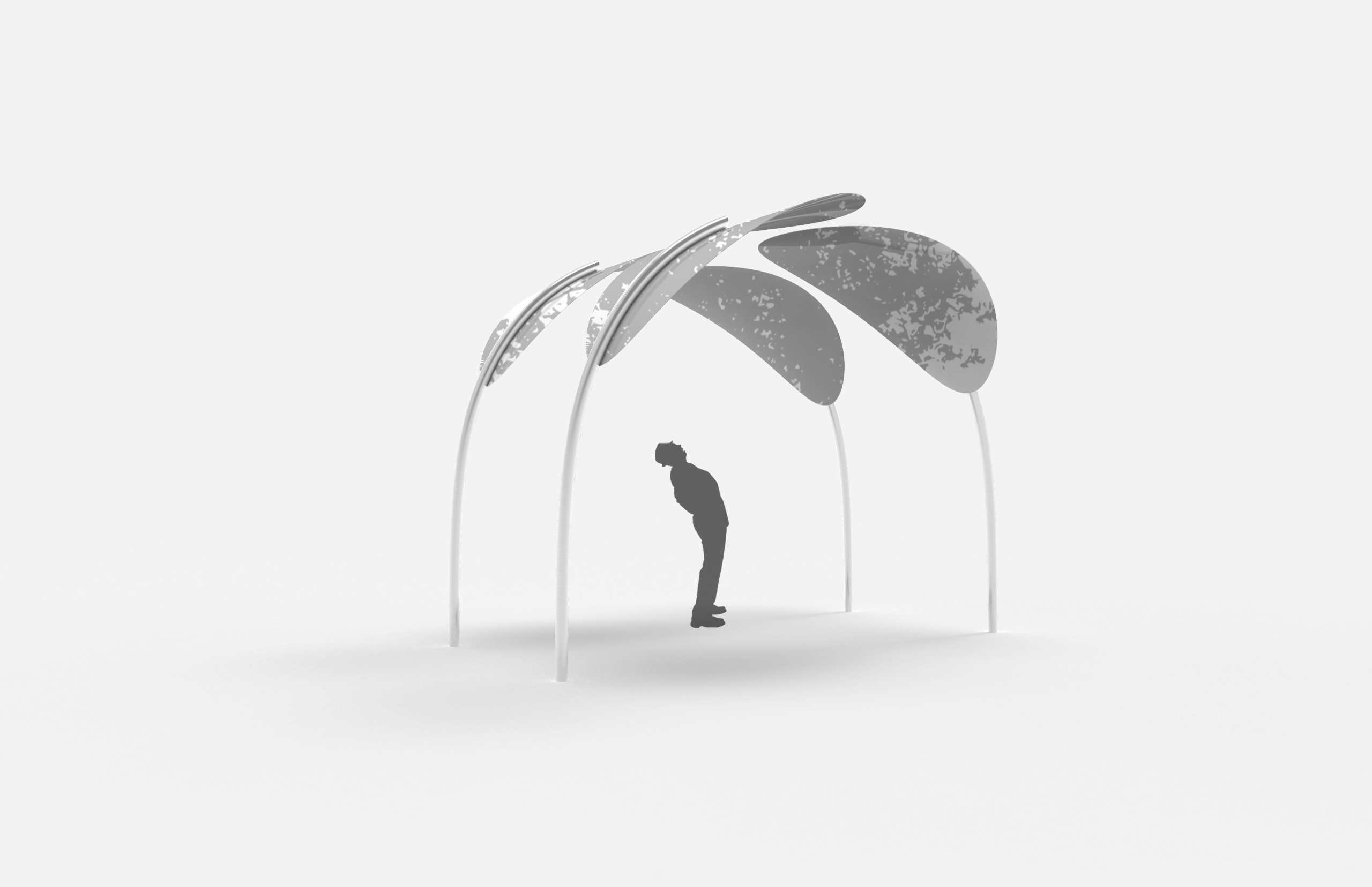
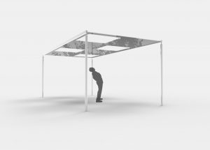
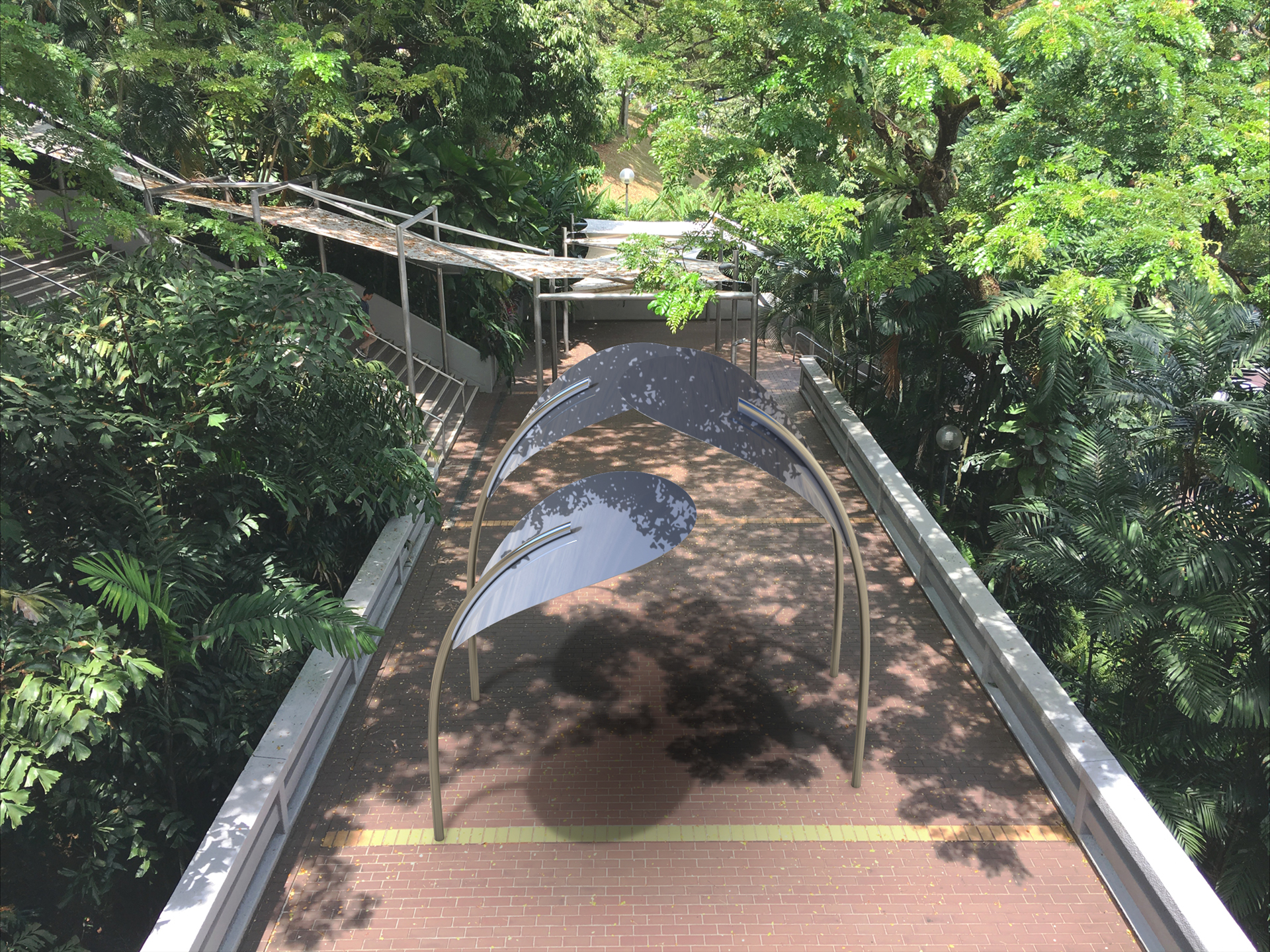
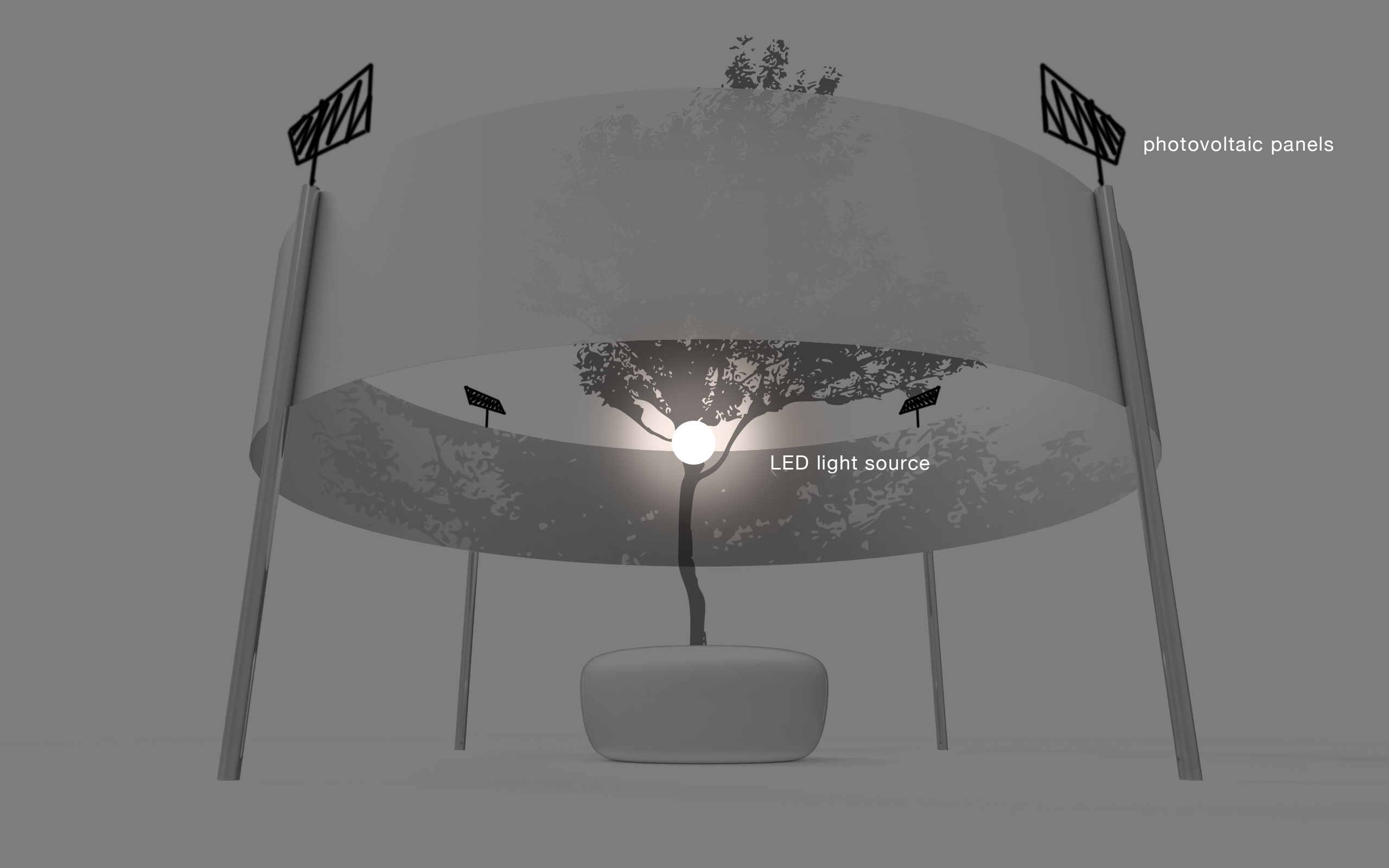
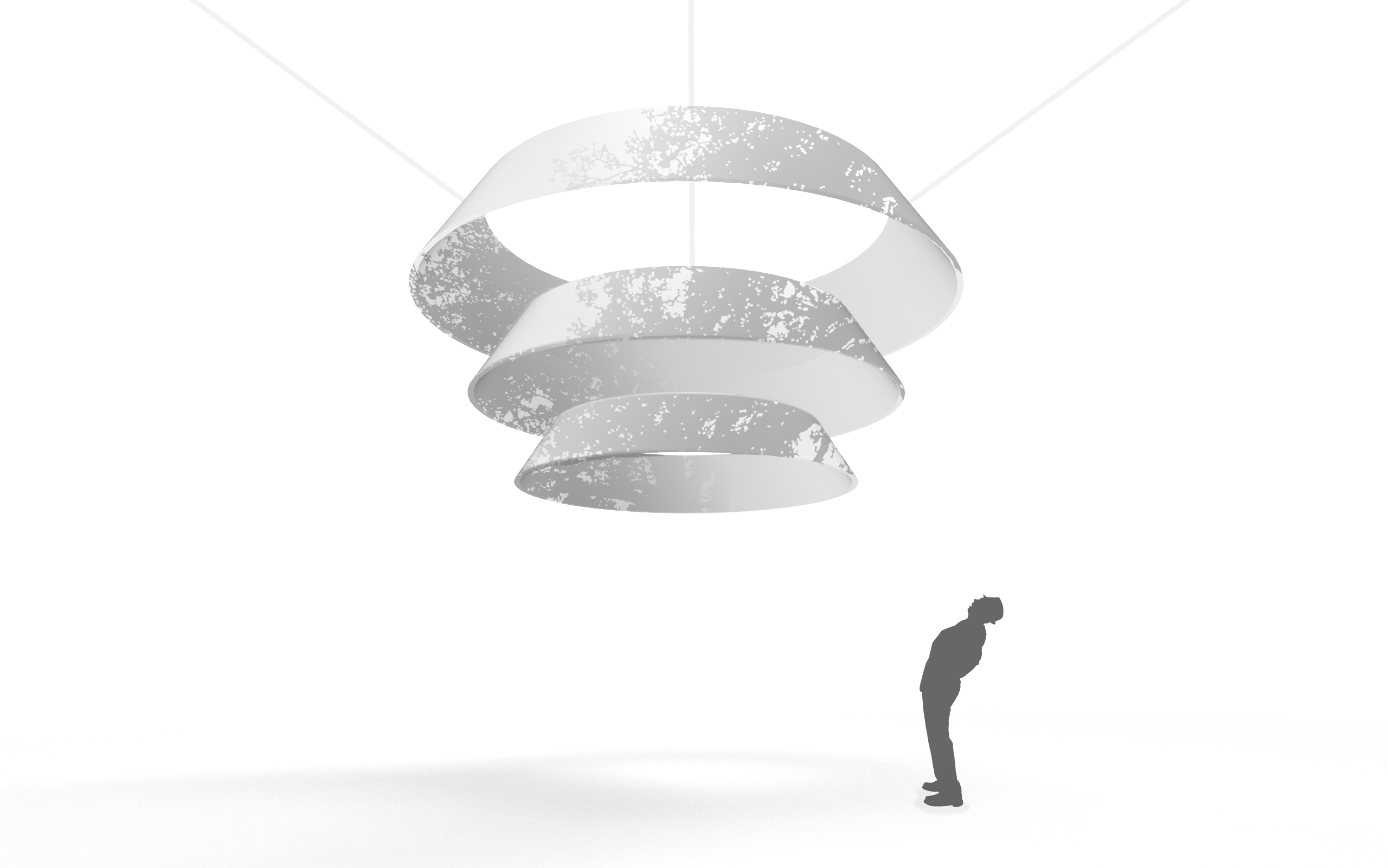
1

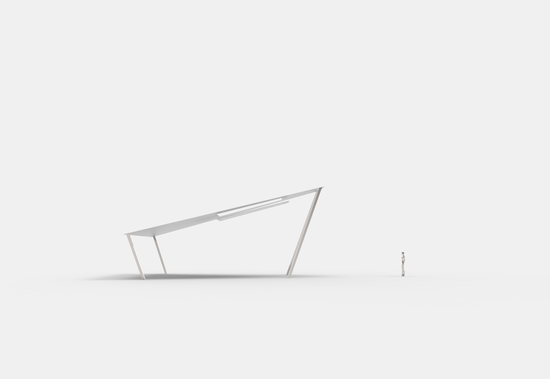

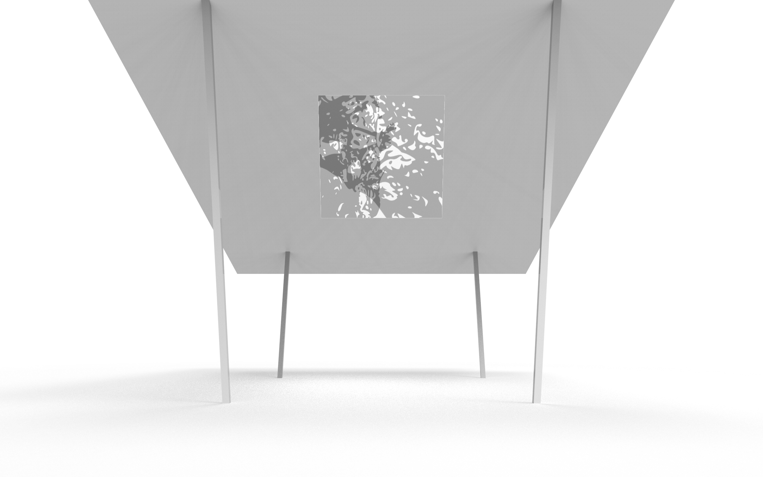
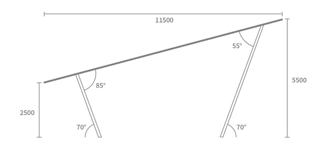
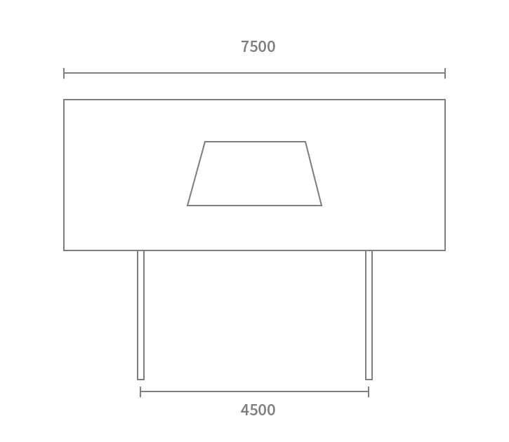
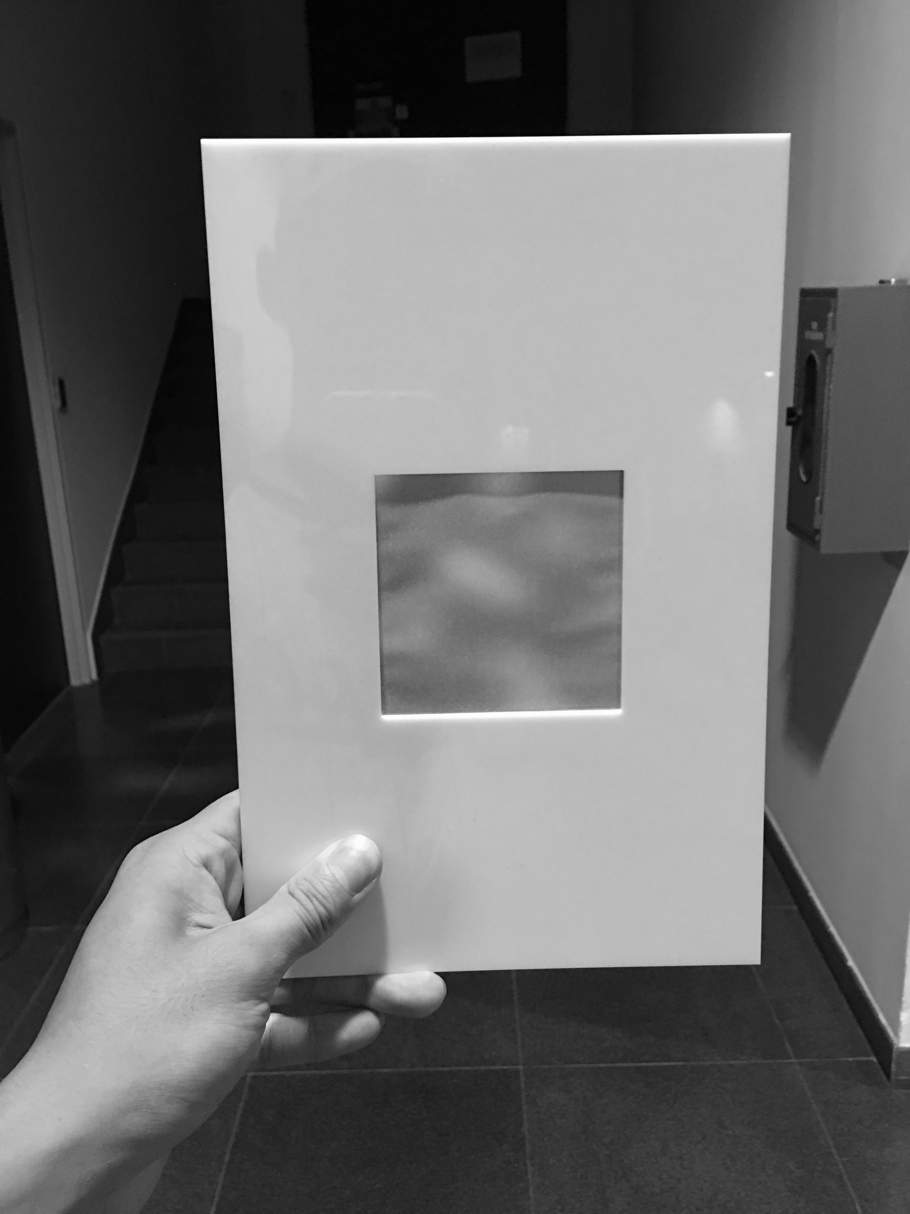
optimal viewing distance: 5 metres
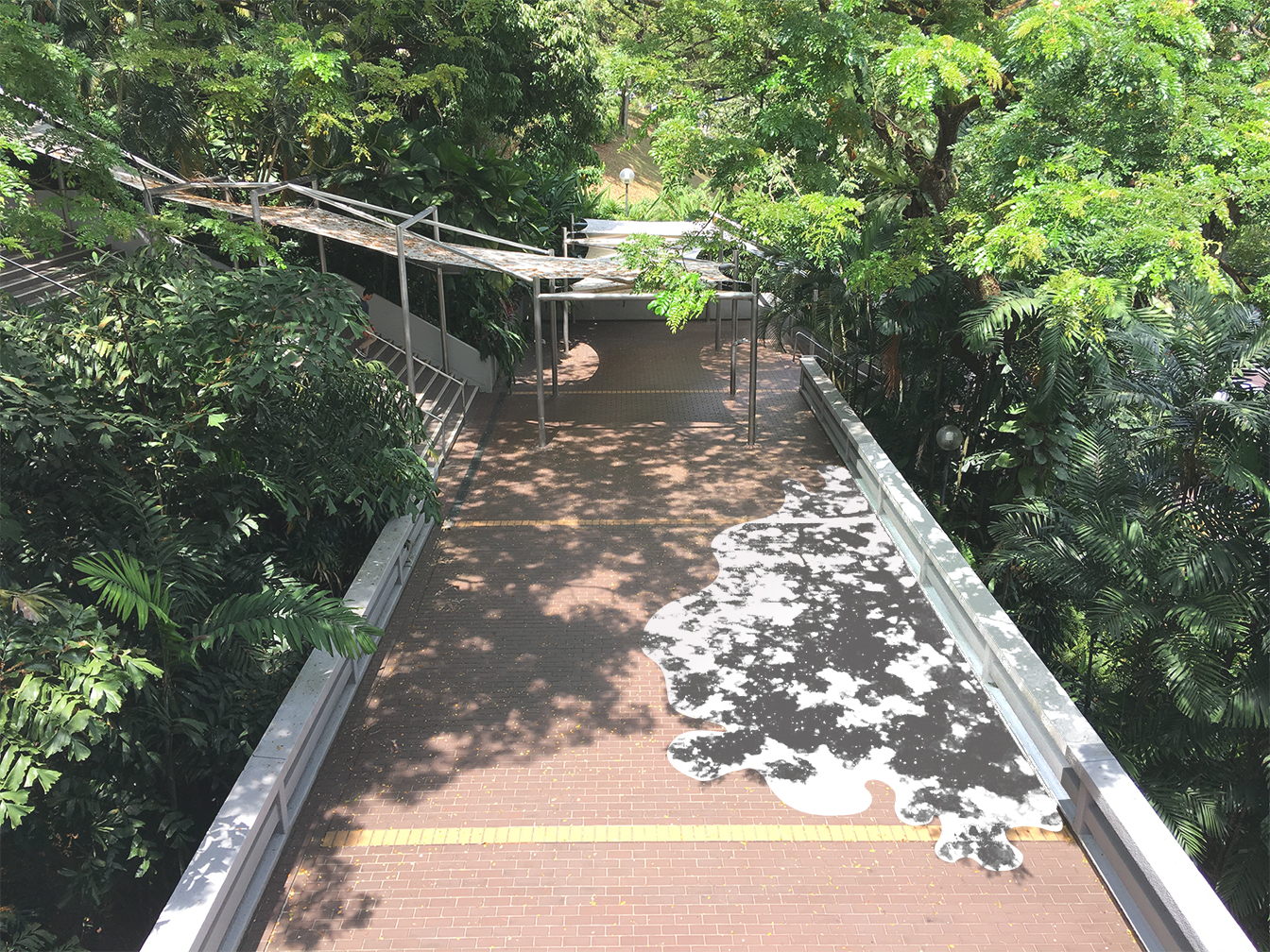
proposal 1 is true to size and accurately depicts the distorted perspective. we found the proportions to be too jarring, so we tried to minimise the angle in the next proposal.
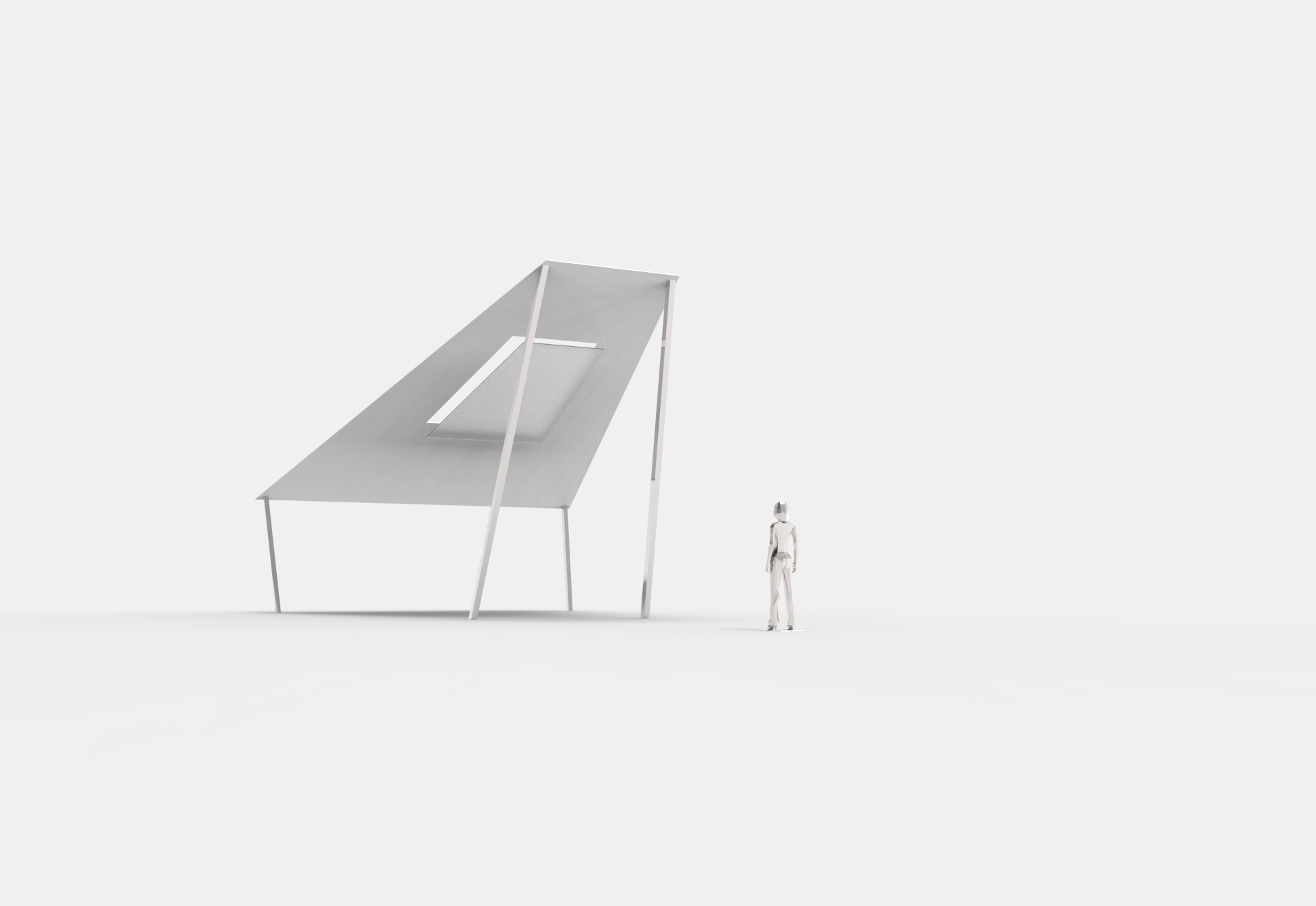
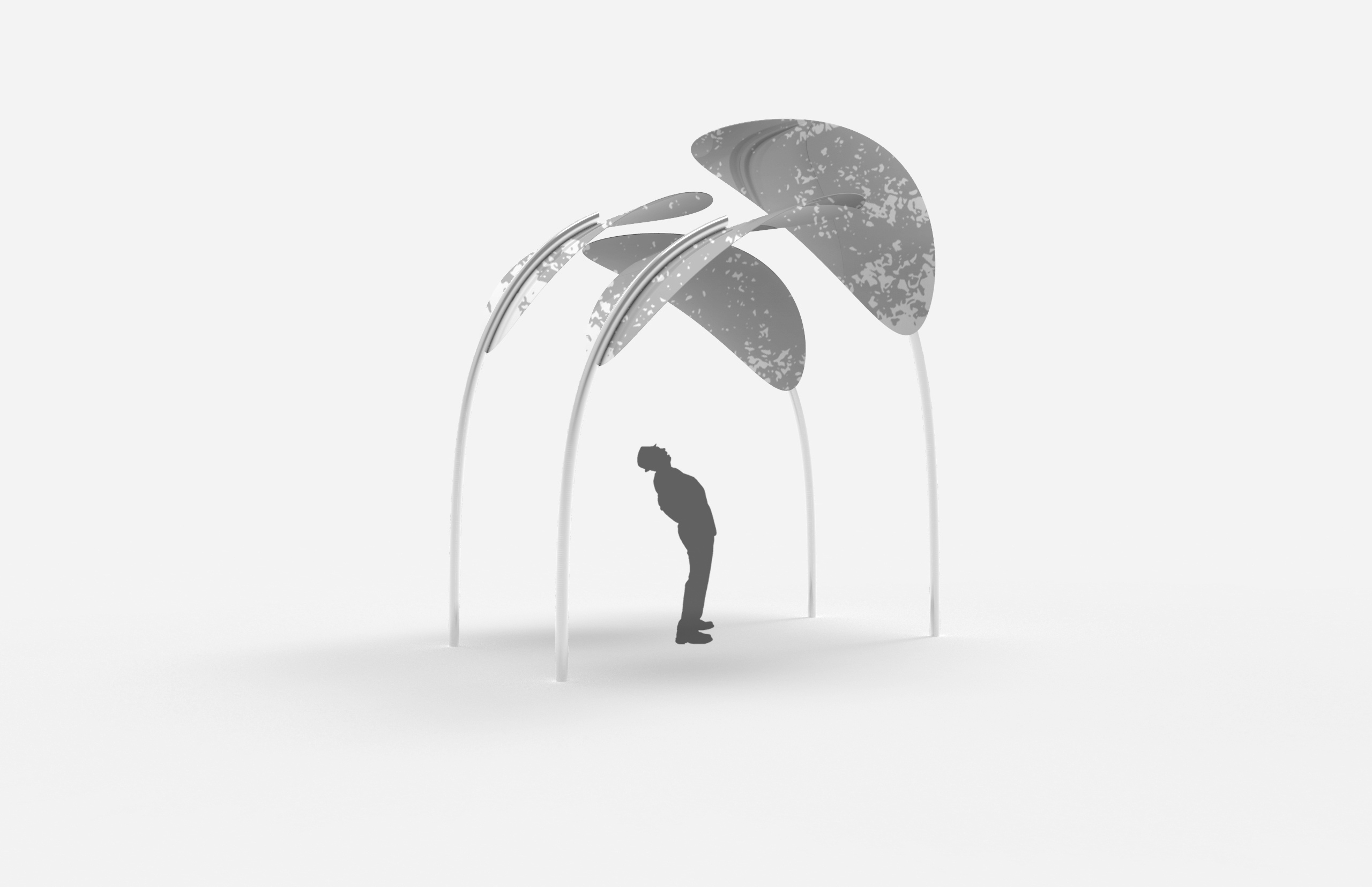
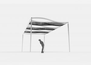
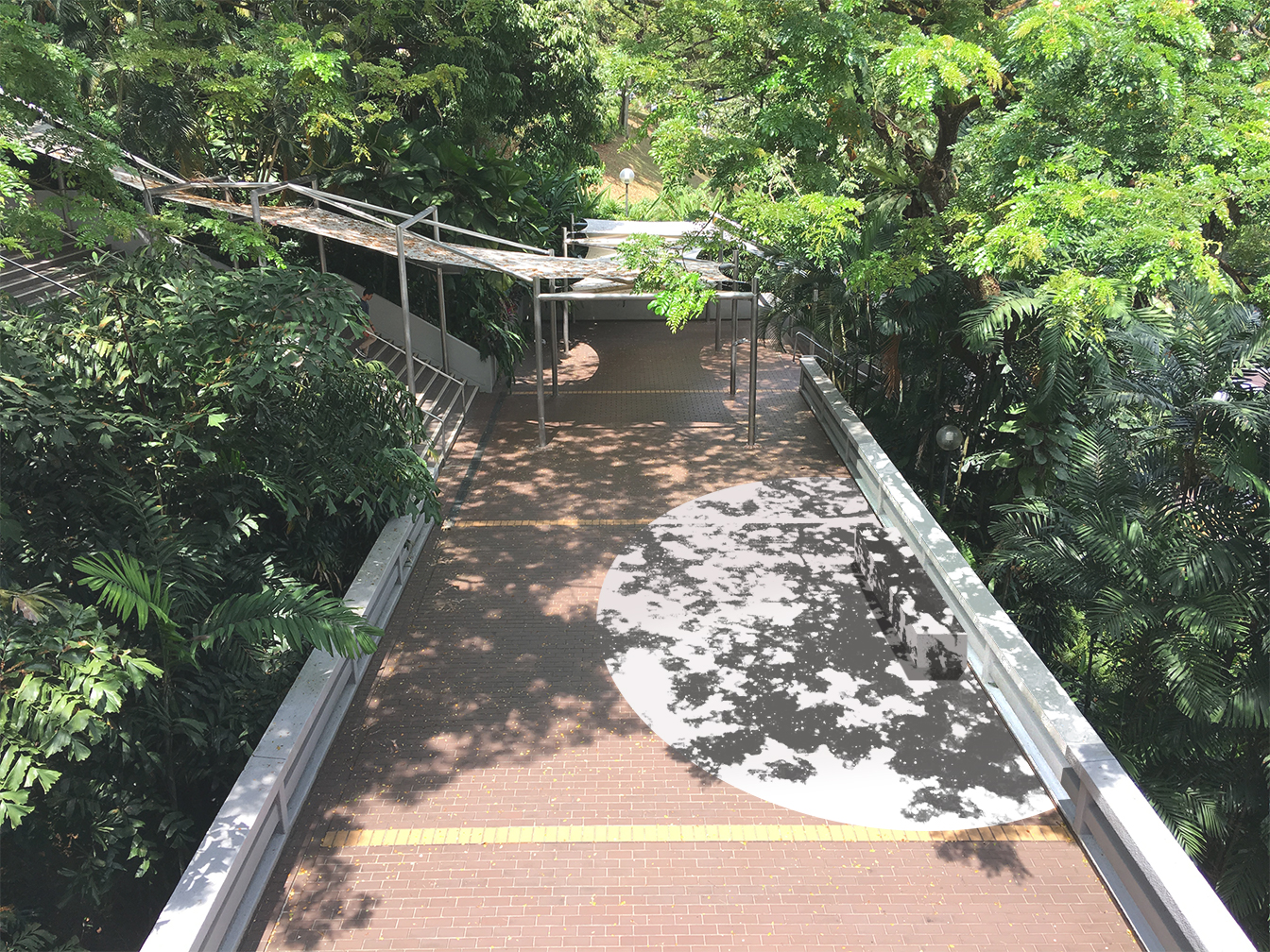
2


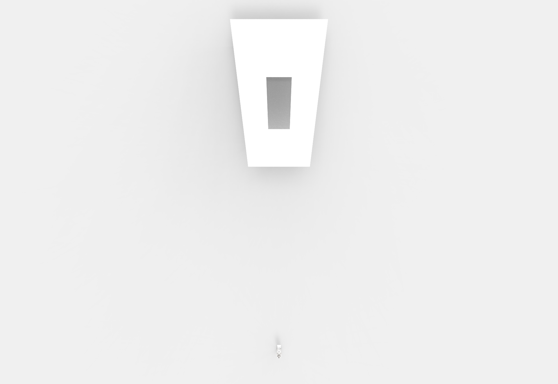
optimal viewing distance: 15 metres
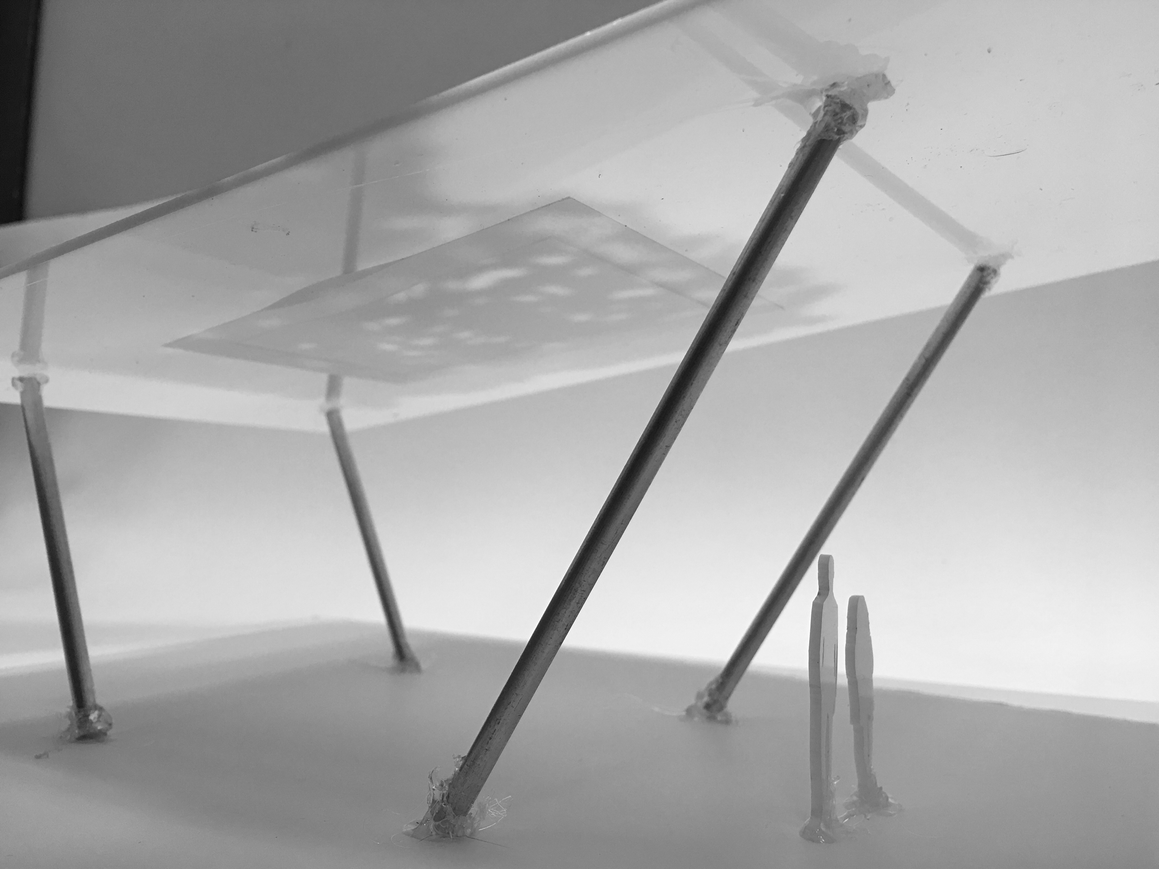
for both proposals, the metal structures are positioned and angled in such a way that when seen from the optimal position, they align with the edges of the canopy and the two poles behind are hidden by the front two.
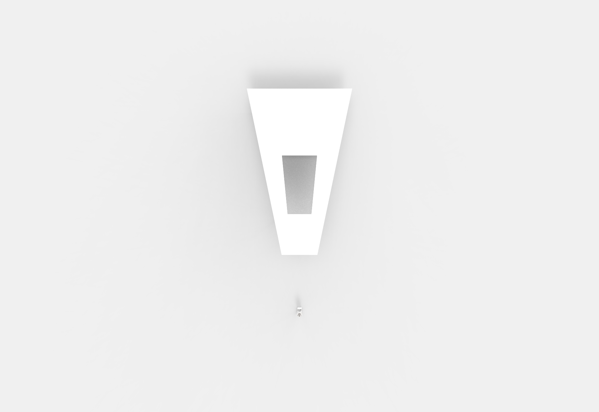
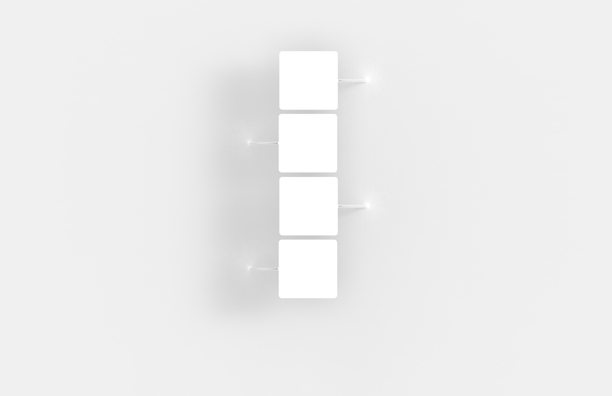
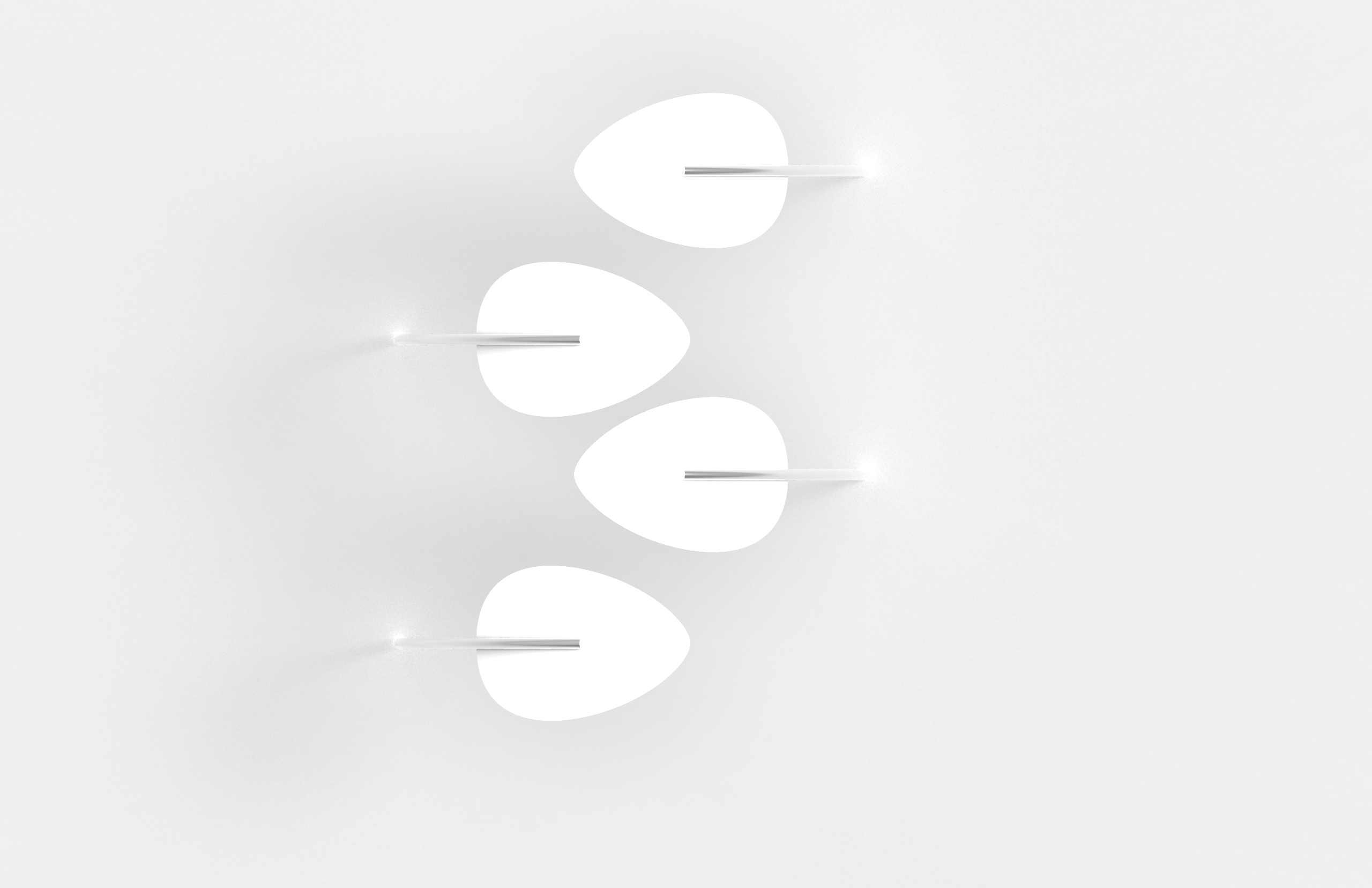
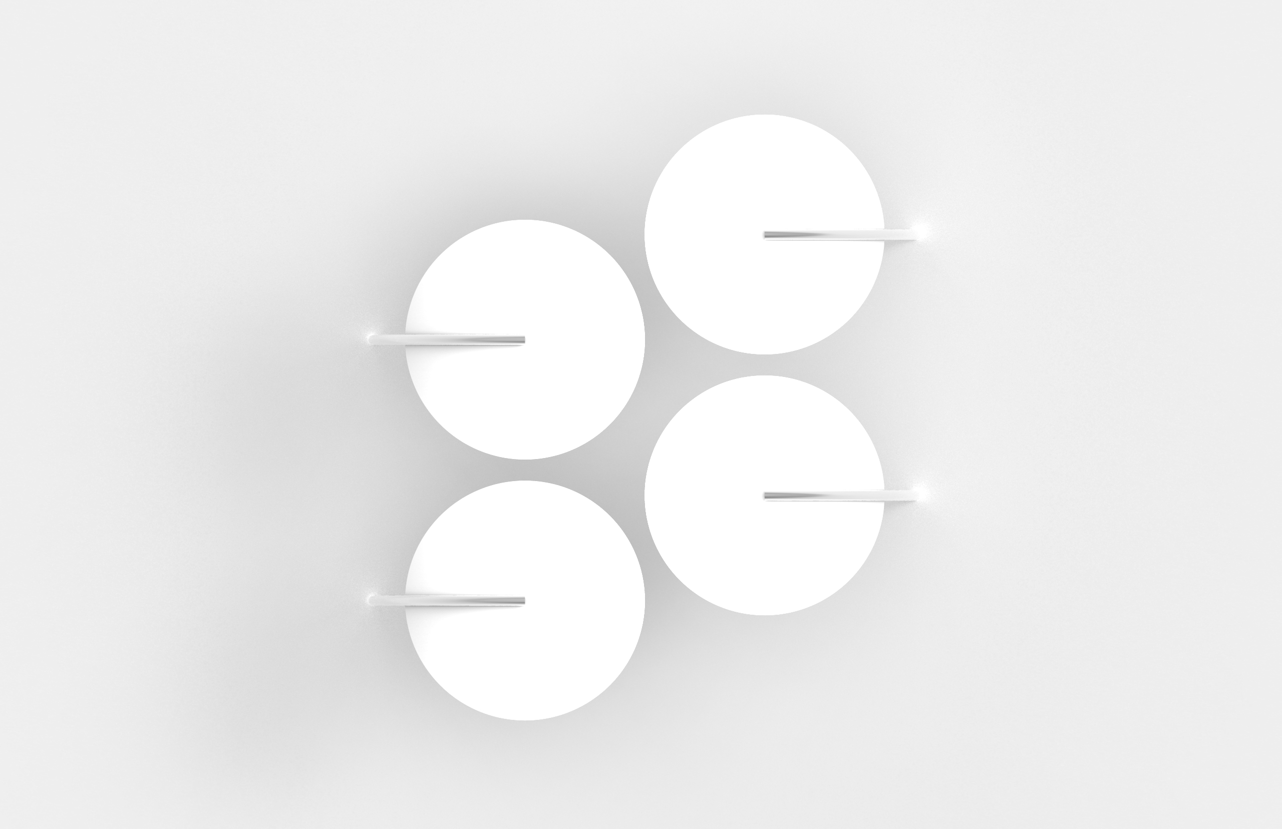
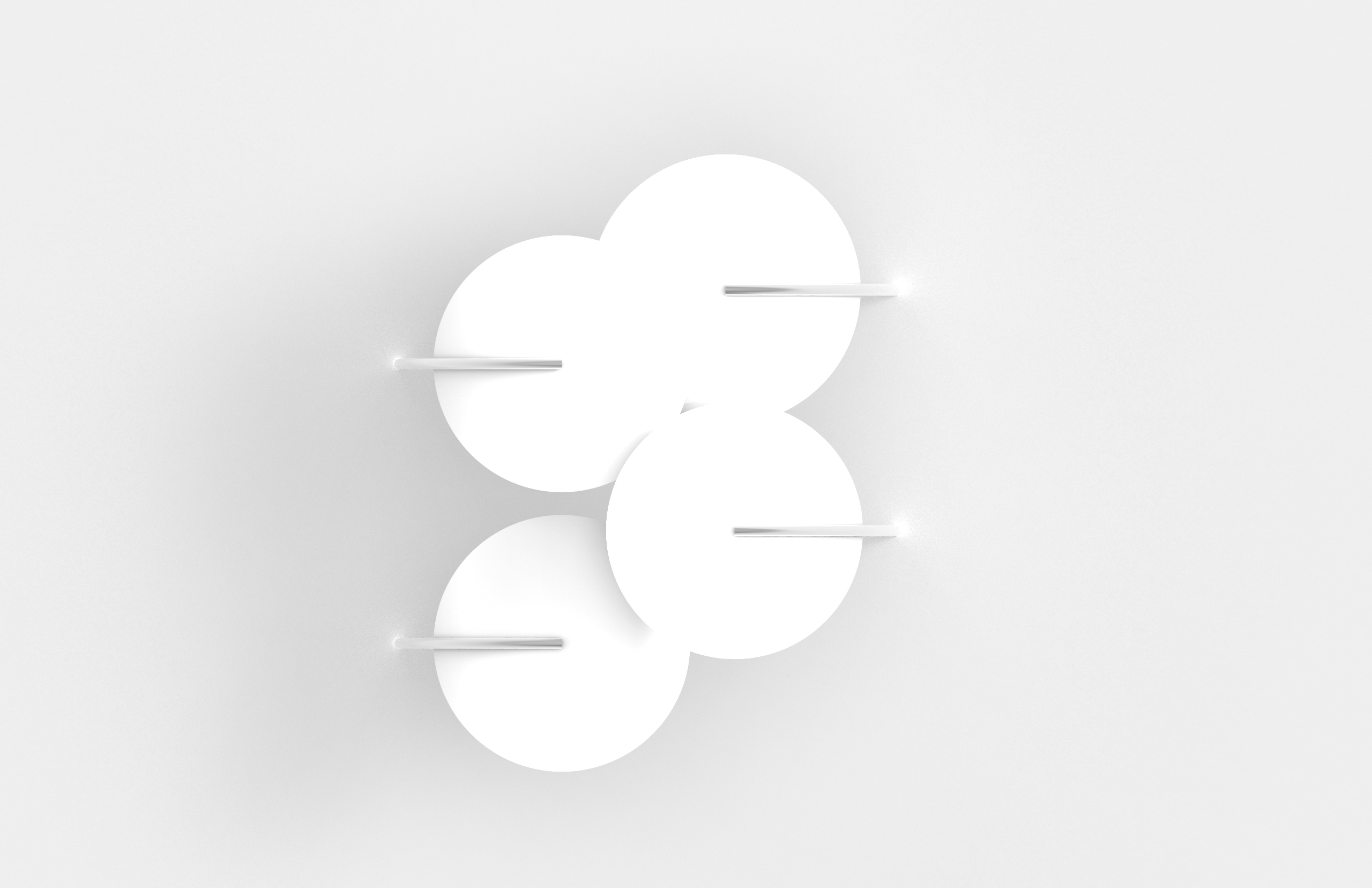
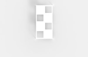
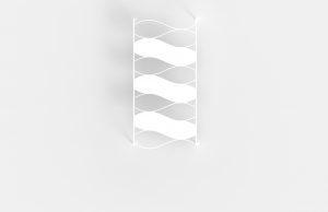
vinyl stickers/indicators
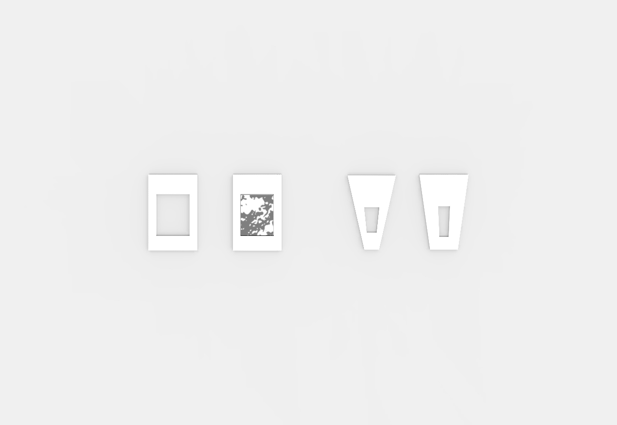
different variations of indicators for optimal viewing position. echoes the shape of the structure
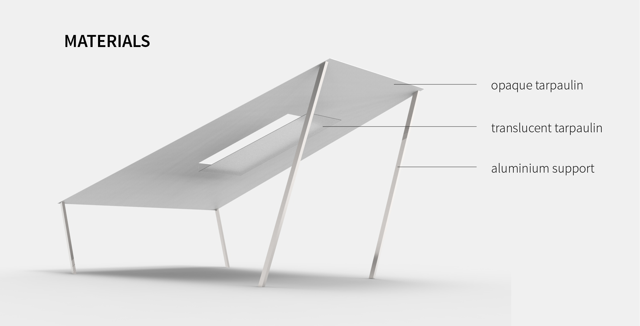
materials
wk11

feedback from last week:
- many of the structures proposed the previous weeks were too complex and dominates over the shadows i.e. viewers focus on the form rather than the shadows
- keep the structure of the installation simple
- use a combination of opaque and translucent material instead of only translucent to show more contrast
references
James Turrell


Felice Varini

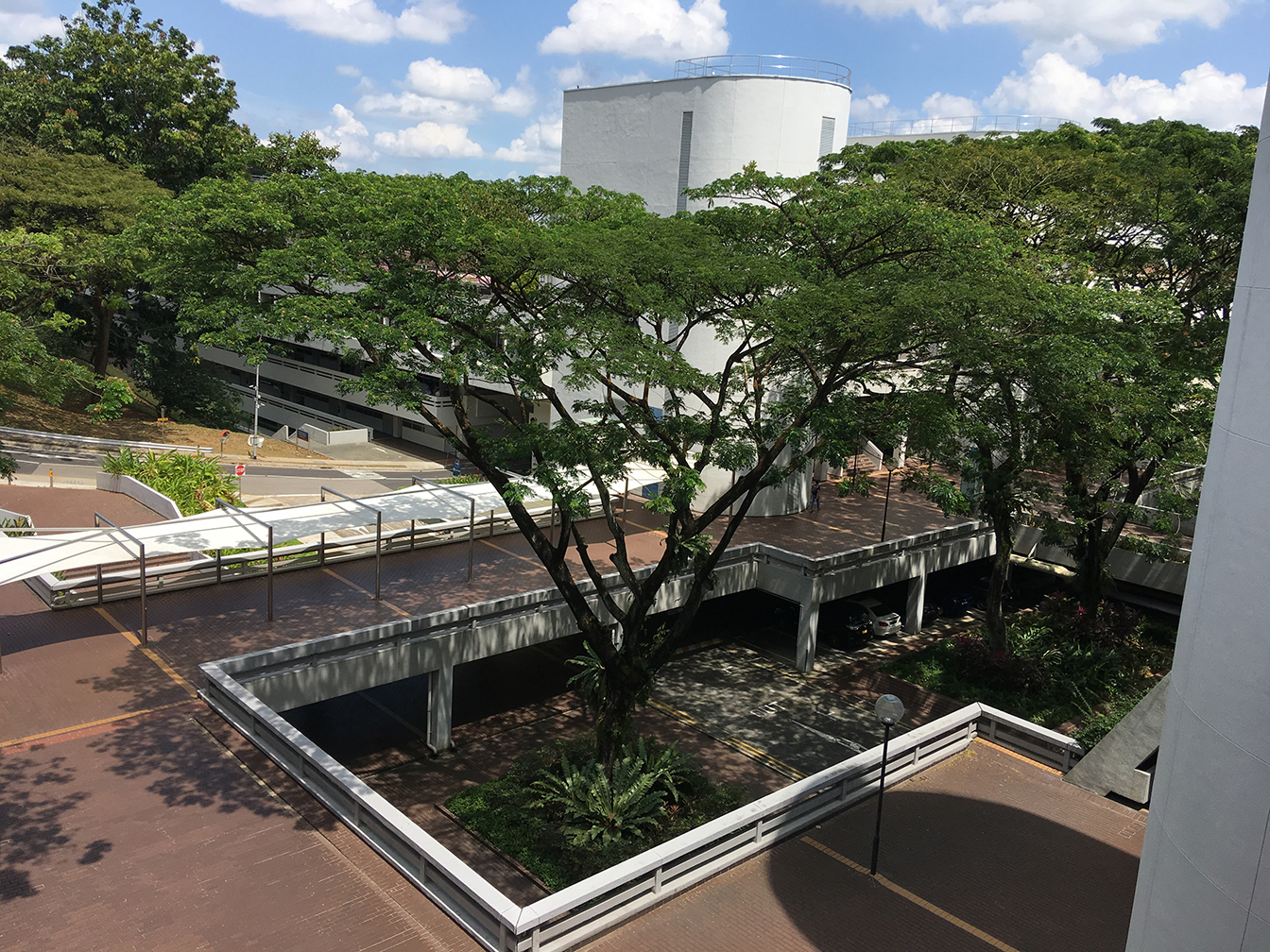
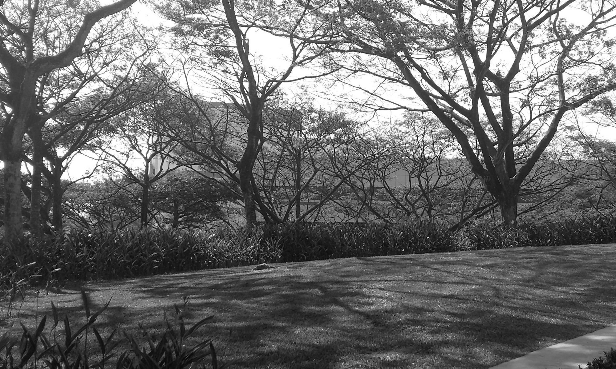
on-site measurements

existing canopy (with similar shadow effect)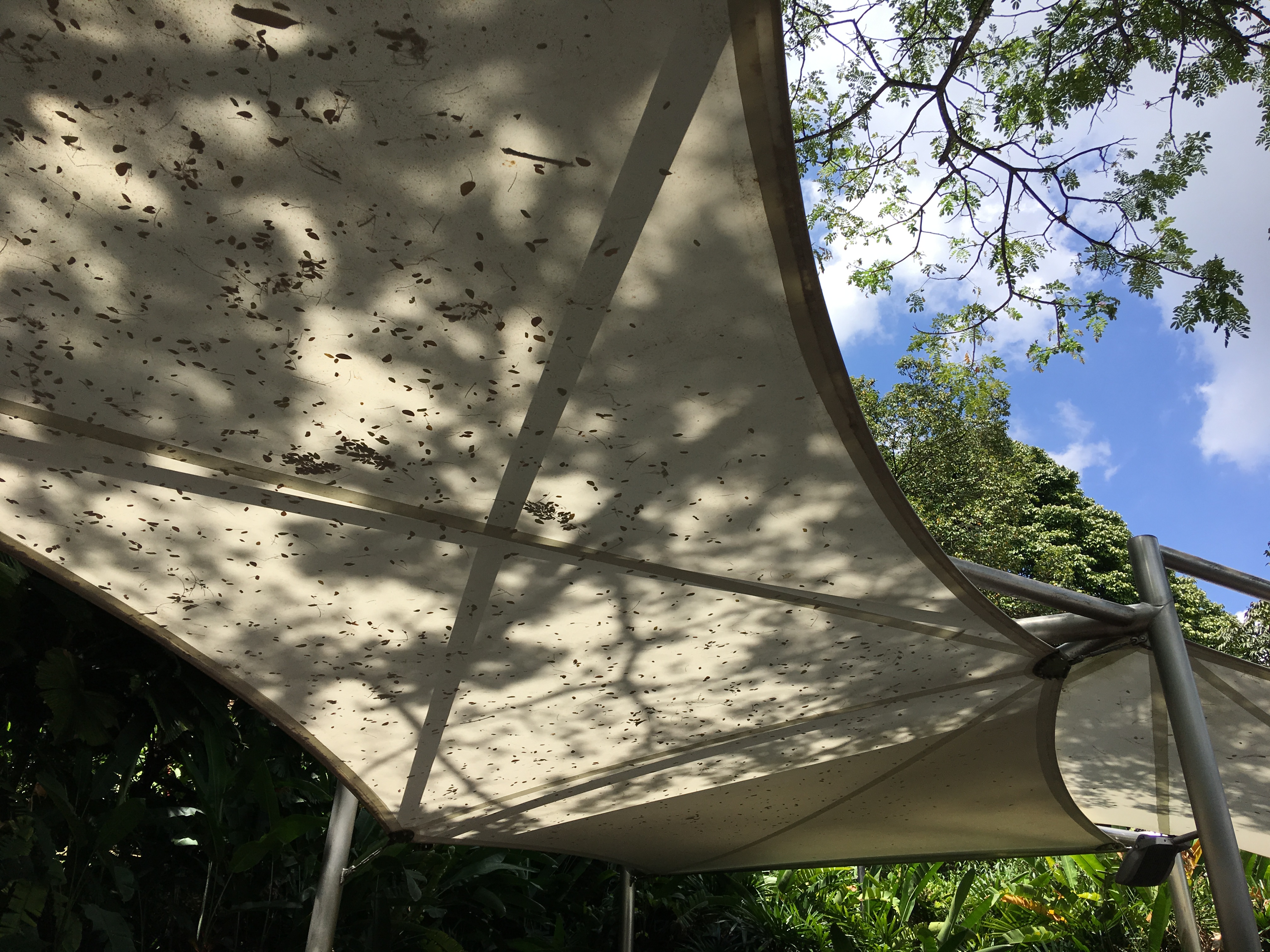
proposal
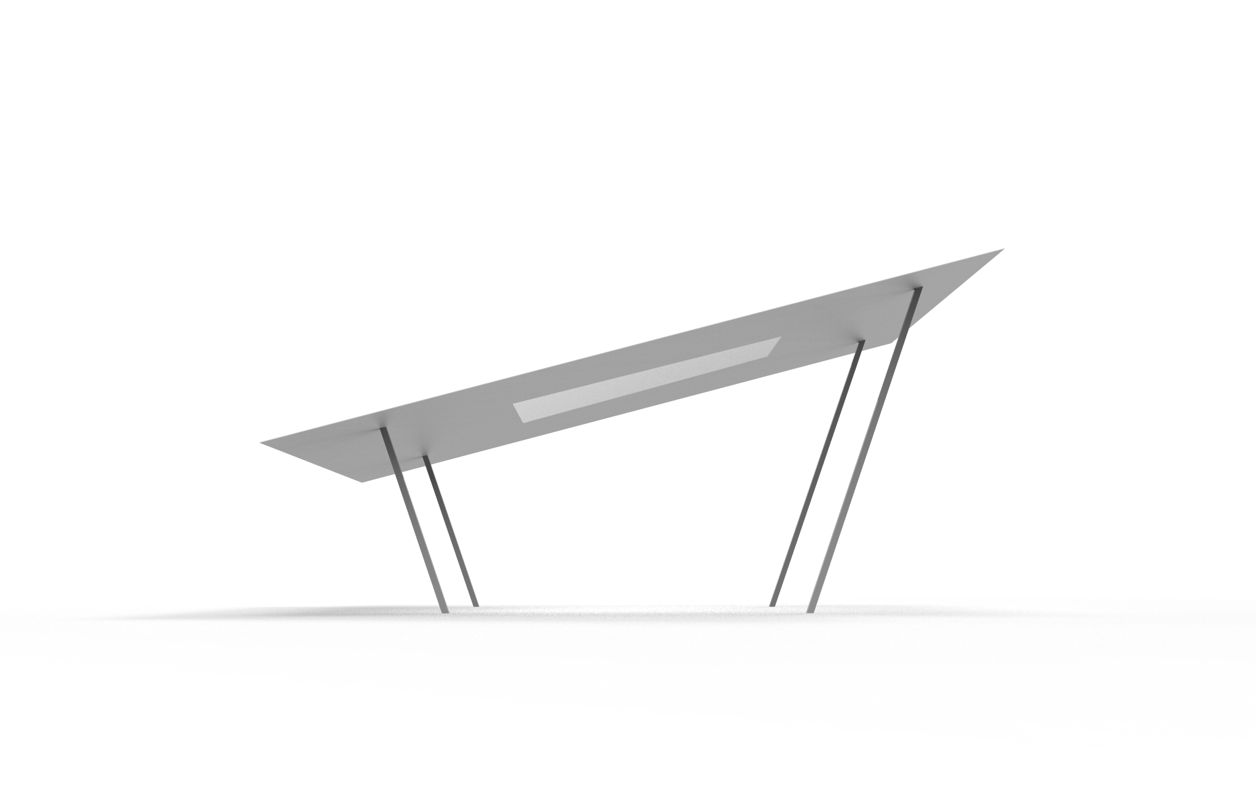
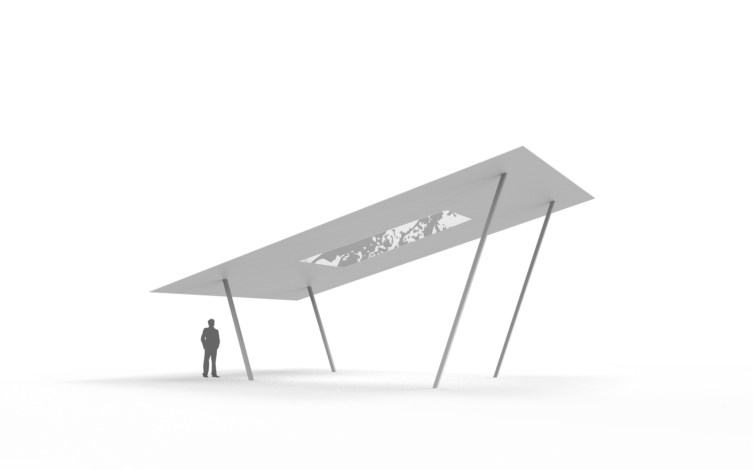
- by pushing the supporting structure towards the inside, it creates a cantilever effect and viewers are more inclined to look upwards
- the structures are angled so that the form does not blend in with the surrounding and overlooked, and does not look like the existing canopy
- the panel is angled slightly on one side for easier viewing
- the panel is inclined in this direction as it catches most of the sunlight, thus shows the most amount of shadows throughout the day
- the size of the panel is set such that it covers the whole width of the corridor so that no shadows of the foliage shows at the edges, while maximising the stretch of the site
- the shape of the translucent material in the middle plays an optical illusion such that it looks like a square from certain perspectives
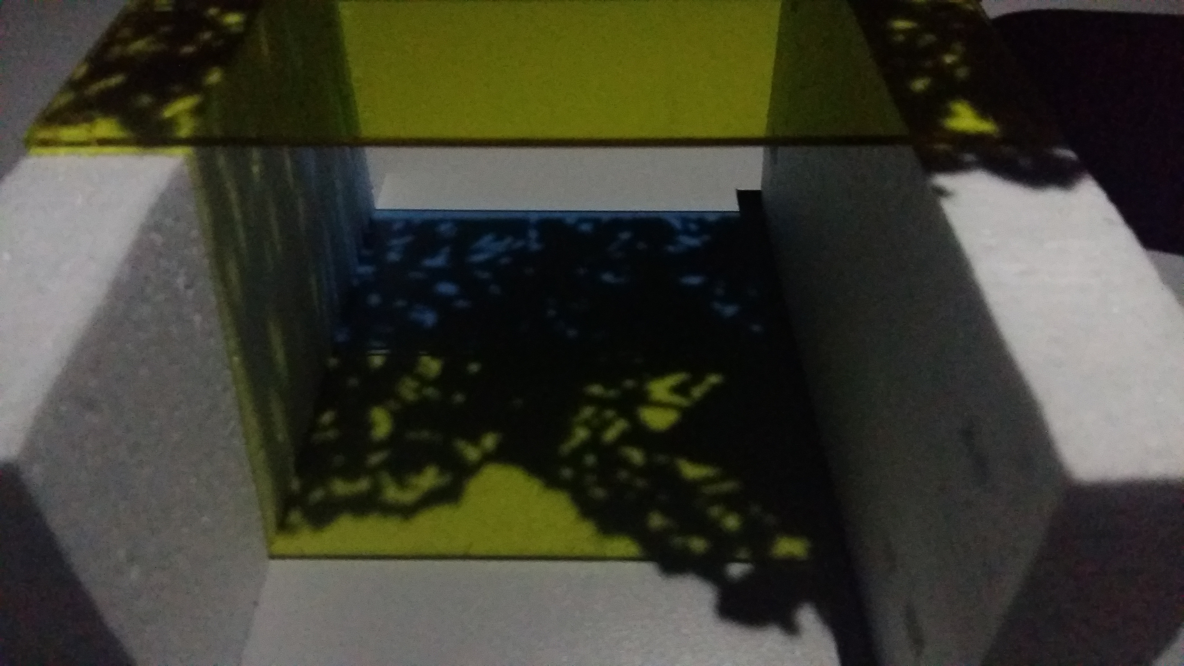
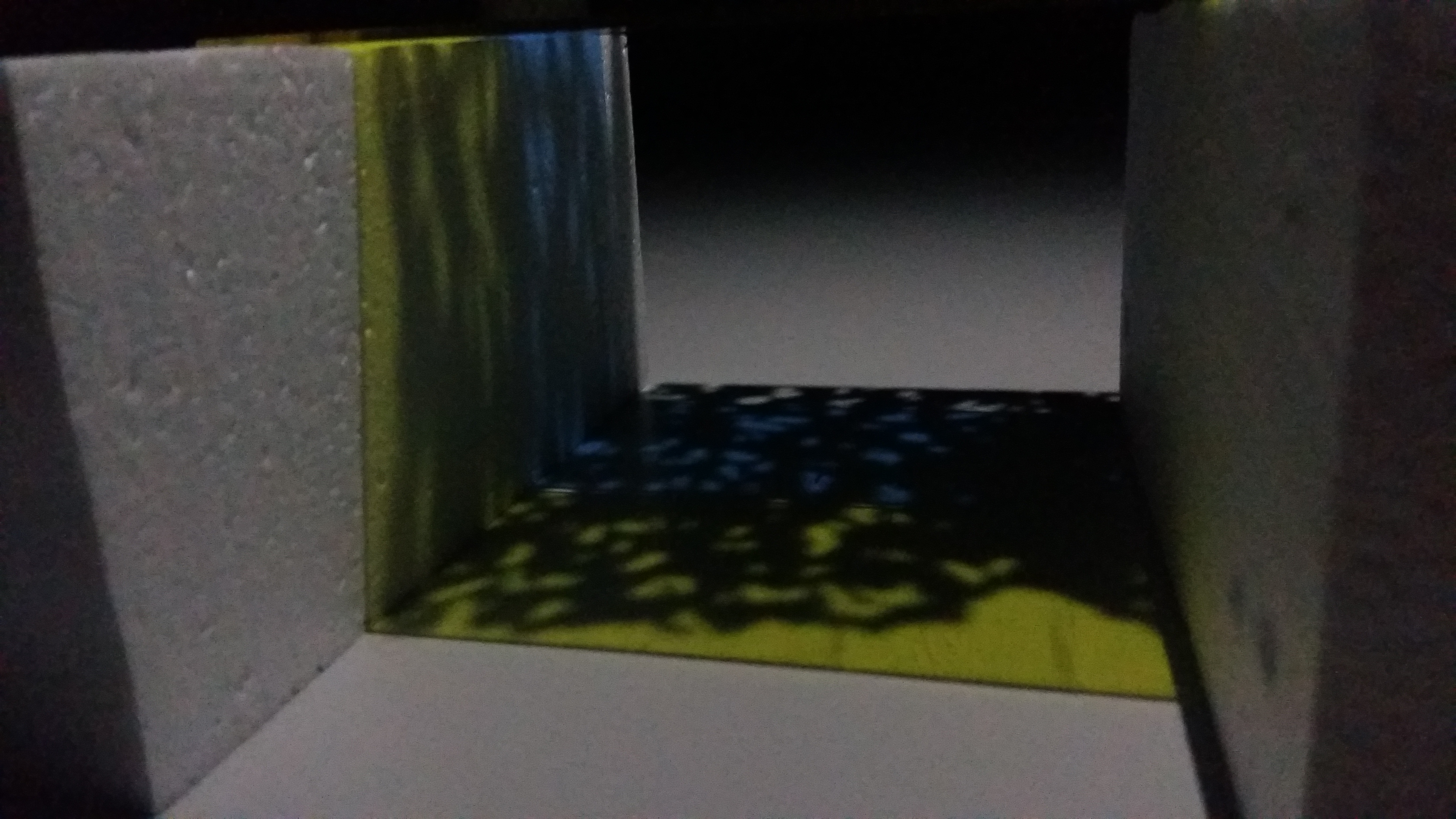
simulation

simulation of material and distance.
from top to bottom, the distance between the light source and the panel increases, the shadow cast gets more blurry and less distinct.
wk10
feedback from last week:
- the proposal last week was too much like a shelter; not intentional enough; people passing by will look at it as a ‘shelter’ and not a medium to frame the shadows
- suggestions: maybe add holes or use repetitive shapes, something that is more intentional and will let people think that it’s not just a shelter
- how do you utilise holes without them blocking the shadows?
- another suggestion: research more into interesting materials that possibly interacts with the light
references
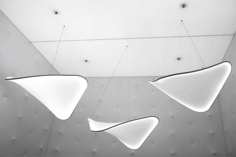
Rabbit and the Tortoise collection by Studio Juju

Manta by Ross Lovegrove
Fata Morgana by Teresita Fernandez

La Pineda by Javier Mariscal

Playground for Machida Kobato Kindergarten by Etre Design

material research
1 fluorescence
Fluorescence is the emission of light by a substance that has absorbed light or other electromagnetic radiation.

In most cases, the emitted light has a longer wavelength, and therefore lower energy, than the absorbed radiation. The most striking example of fluorescence occurs when the absorbed radiation is in the ultraviolet region of the spectrum, and thus invisible to the human eye, while the emitted light is in the visible region, which gives the fluorescent substance a distinct color that can only be seen when exposed to UV light.
Fluorescent materials cease to glow nearly immediately when the radiation source stops, unlike phosphorescent materials, which continue to emit light for some time after.
type: luminous
characteristic: lightly visible under sunlight, no effect in the dark or at night
2 phosphorescence
Phosphorescence is a process in which energy absorbed by a substance is released relatively slowly in the form of light.

/GettyImages-594838193-566744f95f9b583dc3ab08c3.jpg)
This is in some cases the mechanism used for “glow-in-the-dark” materials which are “charged” by exposure to light. Unlike the relatively swift reactions in fluorescence, such as those seen in a common fluorescent tube, phosphorescent materials “store” absorbed energy for a longer time.
type: luminous
characteristic: clear in the day, visible in the dark or at night
both fluorescent and phosphorescent effects can be achieved by luminous paint – easily found in Singapore paint shops, Art Friend, Spotlight, Lazada
3 photochromic
Photochromic materials are colorless in their inactivated state and become colored when exposed to an ultraviolet light source. They will respond to natural sunlight, and darkens as the light level increases.
Common applications of photochromic materials include sunglasses and spectacles.
type: darkening/colour-changing
characteristic: visible under sunlight, clear in the dark or at night
effect of photochromic ink
online products:
Solarmax Series ink (used in the video)
SFXC UV photochromic plastisol
4 coloured glass
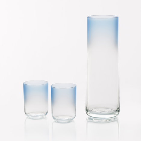
Colour Glass collection by Scholten & Baijings for Hay
coloured glass suppliers in Singapore:
https://www.carltonglass.com.sg/painted-glass
http://www.synergraphic.com.sg/synergraphic/public/productMain.jsp ???
form development


similar concept to last week’s, but the shape is curved upwards to make the form more intentional and deliberate, unlike conventional shades


irregular and organic forms intentionally designed so as to not resemble a conventional shade/canopy


- draped fabric to show interplay between positive and negative spaces
- also allows interaction with the wind as the fabric is hanging freely
- the shadows interact with the curved planes and are distorted to give a different perspective and dimension


reference photo for proposal above:


wk9: further form explorations
feedback from previous weeks:
- the circular screen installation proposed does not fit into the site proposed
- how do you expect people to use the installation?
- make a specific proposal of the installation
when developing forms and functions for the installation, we were stuck on the idea of having the passerby notice the shadows (forcing it on them). benefit of doubt that the users see what we intend to do. so we decided to leave it open-ended.
we clarified that there are two directions we could take to use the shadows in the environment:
1 define a space. because the environment chosen is a common area and is too noisy, the aim of the installation is to tone down and create a neutral space. some examples of forms the installation could take are canopy, architectural pieces, tunnel, partition.
2 define a three-dimensional object. by placing an object that is out of context and stands out from the environment, people are more inclined to look at them as individual objects rather than objects that blend in the background to only serve a purpose (e.g. shelter)
another point we clarified was also to use simplified forms, because the aim of the installation is to make use of the shadows surrounding the site, and a form that is too complex will simply overshadow and dominate the shadows. at the same time, it cannot be too simple; it needs to have a character and intentional so that it does not blend in to the background.
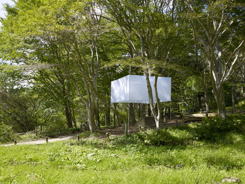
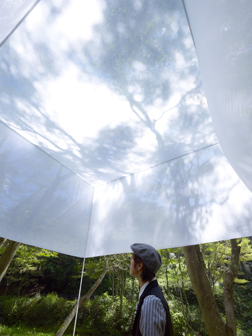
curating light through space and architectural structures
(above) 5-metre tall structure with hanging polyester mesh. interacts with the wind and serves as a big canva for the shadows to cast and interact on. the takeaway of this structure is that it is simple yet the size makes it eye-catching, and does not take away from the shadow.
references
shade structures by MDT-tex
Excentrique by Daniel Buren
Le Refuge by Marc Ange

Virgin Lounge Melbourne by Tonkin Zulaikha Greer Architects

proposals
1


in regards to the character and intention, the curved structure vs the rigid structure of the existing canopy suggest that there is an intentional design process. it does not look like an off the shelf structure, but a one-off, customised, curated and specific.
material: polyester mesh, stainless steel structure to foundation
height: 3-4 metres
can be duplicated/arrayed along the stretch of the walkway
possibility of using colours for material
2
reference:

different from the previous idea in which we are framing the shadows in the environment, the second idea is more curated towards creating shadows with the installation. the installation provides a structure for vines and climbing plants to grow on them, where the structure creates rigid shadows while the plants curate more organic shadows.
wk7: material exploration and form development
feedback from last week
- consider using textures or 3D forms so shadow is distorted and cast at different angles, playing around with the 3D volumes instead of a flat plane
- think about the fallen leaves and how to get rid of them; the leaves may make the installation blend in more with the environment and less noticeable to passerby
- reflective material – must be above waist level; cannot be seats
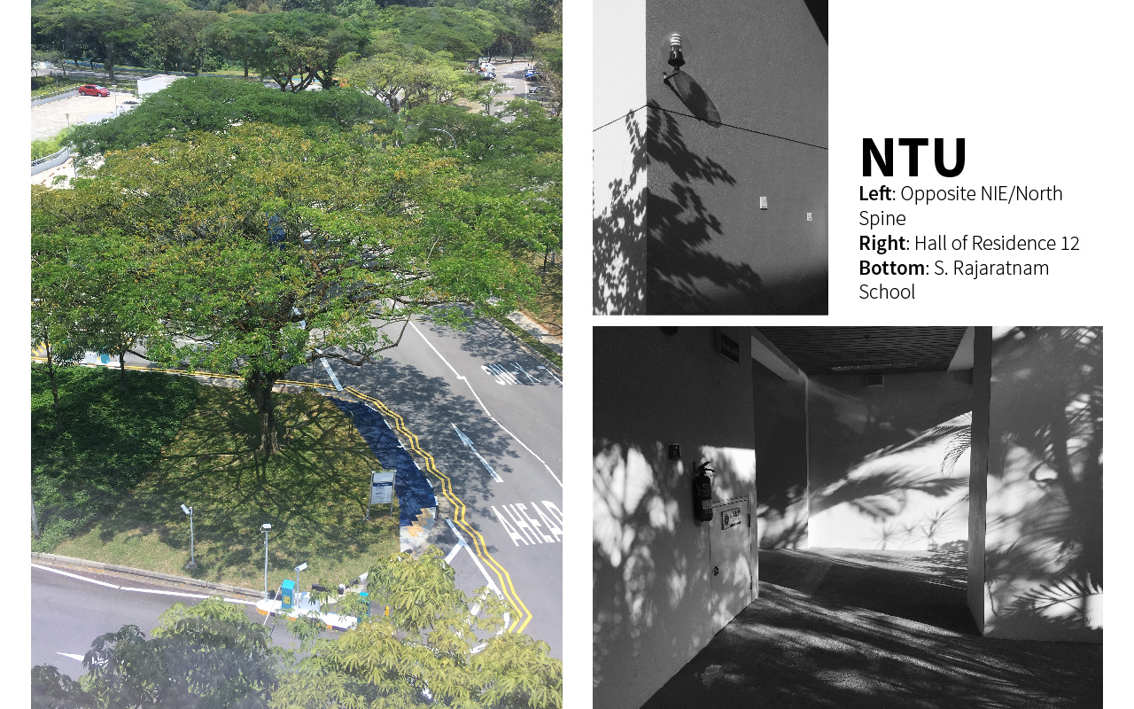
site observation
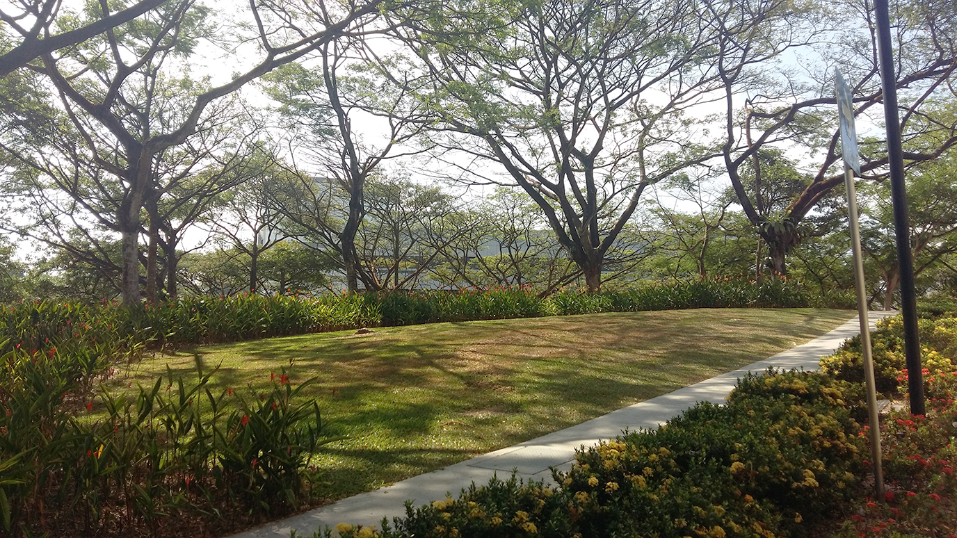
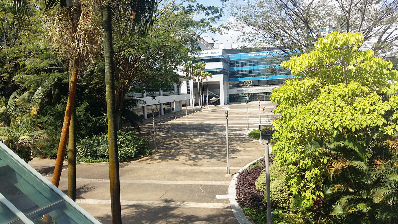
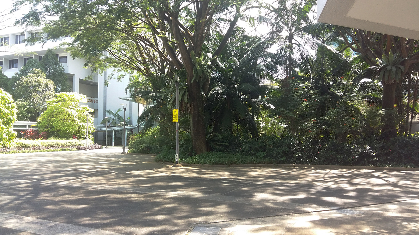
chosen site: stair linkway between North and South Spine
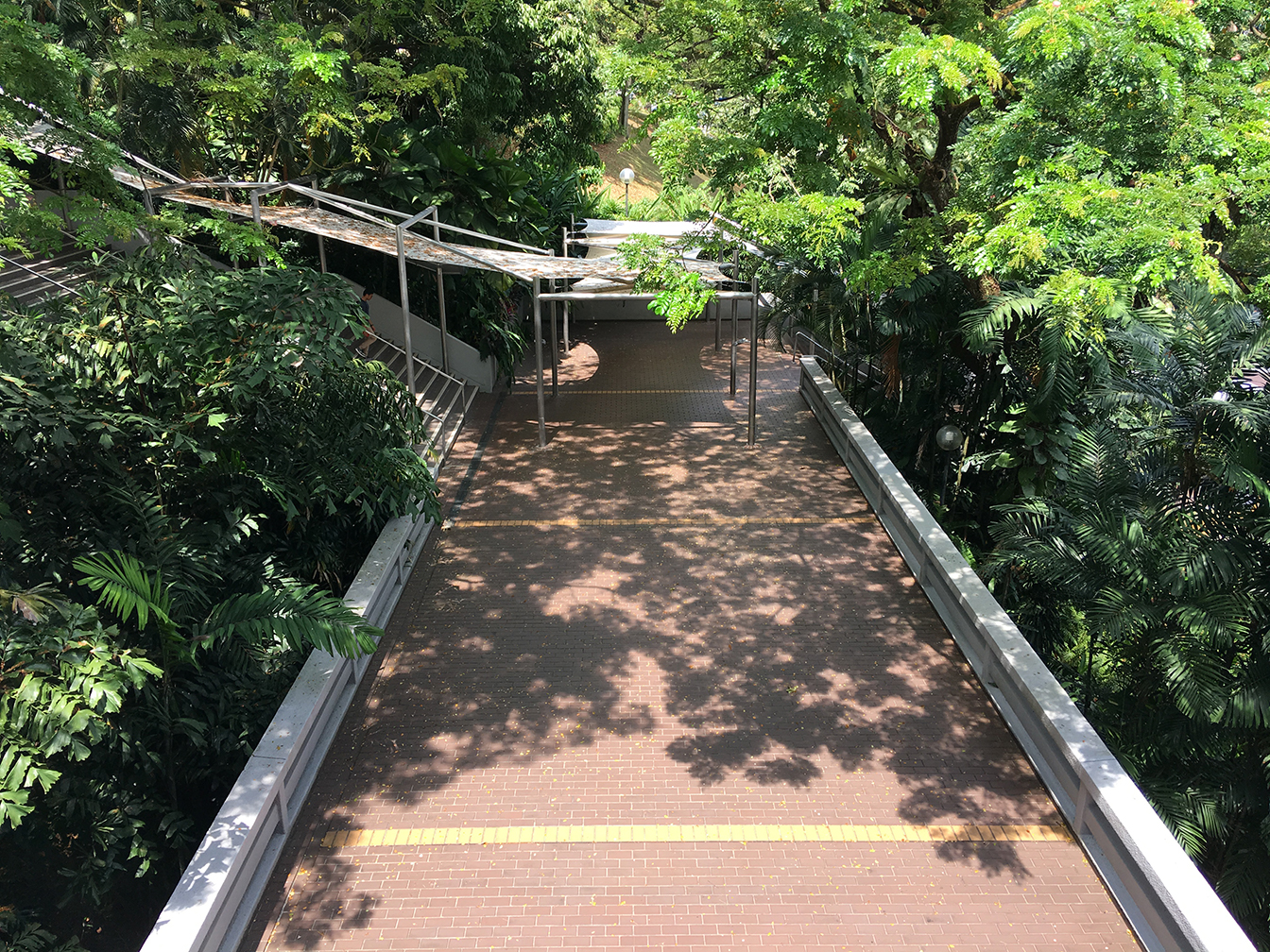
shadow time-lapse (11.30 – 15.30)


material exploration
in relation to last week’s first form exploration (mirrored seat), thus we tested out reflective materials and how they interact with the shadows


(left) brushed aluminum sheet
(right) polished aluminum sheet


(left) reflective paper sheet
(right) glossy plastic sheet
interesting distortion effect of reflection on glossy plastic sheet, which reminds us of the shadows on the ground
references
Tom Fruin

Catherine Losing

In Flakes by Mount Fuji Architects Studio
further exploration and development
1
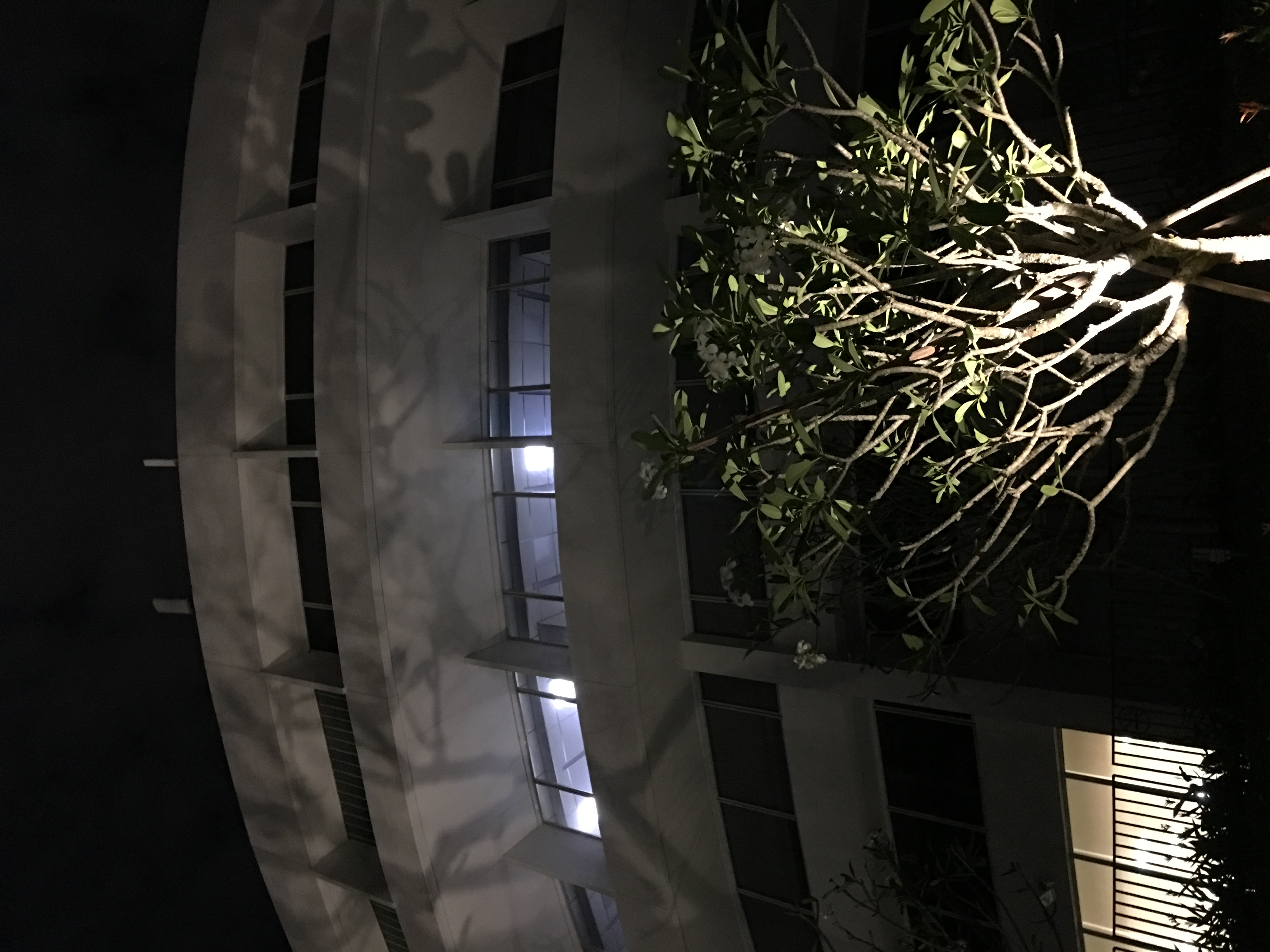
new light features from newly upgraded school infrastructure in North Spine
the shadow cast is an inspiration for our updated proposal found below, which is also relevant at night
an update from last week’s second form exploration with nighttime consideration of installation
2
emphasis on shadow
using coloured acrylic to cast colourful highlight, making the effect more noticeable
framing the shadow with the use of the coloured acrylic
next step
- further idea development
- constructing life-size mock-up to test effect
- potential consideration for wind interaction with installation
- EXPERIMENTATION!
wk6: site and form exploration
feedback from last week:
two ways going about it;
CASTING: creating an object/sculpture to cast shadows
FRAMING: using elements around us (nature and sunlight) and framing/emphasising their shadows
material consideration
polyester mesh; white translucent cloth; paper; frosted acrylic; polished aluminum
NB. we were thinking if there is any material that is photosensitive i.e. absorbs light in the day and emits fluorescent light at night — trapping the shadows
experimentation and observation
two ways of seeing how shadow interacts with the medium:
direct light
back light
in back light, the effect between light and shadow is attenuated/toned down
site consideration
1. stair linkway between North and South Spine
2. NIE entrance
3. entrance of the Quad
based on the feedback, we wanted to look into how we could frame existing elements. hence we looked for light/shadow-abundant areas. also taking into consideration the possibility of constructing an actual installation at the location
references
Le Banc de Nelge (the Bench of Snow), Atelier Pierre Thibault
City of Hope Kaplan Family Pavilion, AHBE

Tree, Myoung Ho Lee


Wall in Blue Ash Tree, Letha Wilson

installation for Noisily Festival, Rupert Newman
temporary pavilion by students of Bezalel Academy of Art and Design

White Extension, Sasa Ciabatti, Bilyana Asenova and Archistart

The Gates, Christo and Jean Claude

mass-void theory
form exploration
01
 version 1
follows contour and path of the shadow as it moves throughout the day
 version 2
using a geometric shape such as a circle (as shown) or a rectangle, it contrasts with the organic forms of the cast shadow, allowing the white to be a ‘frame’ or ‘canvas’. the bench distorts the cast shadow and creates a new perspective to the flat white; it also defines a volume of the object whilst emphasising the effect.
 version 3
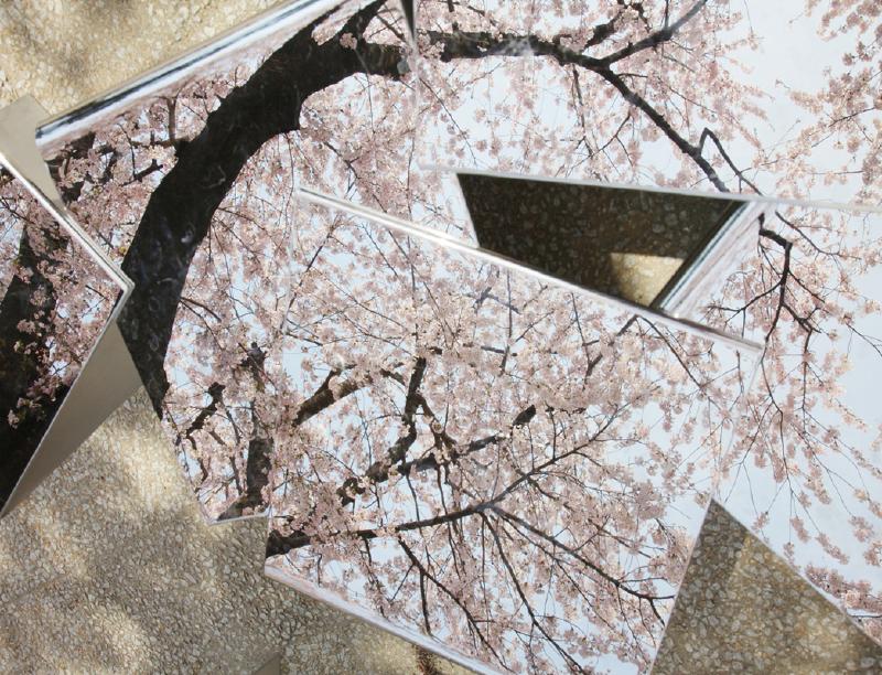
the use of reflective material reflects the cast shadow, duplicating and emphasising them; the top reflects the foliage above, offering a new perspective and prompting viewers to look up. viewers can differentiate between the colourful reflection and the monochrome shadow on the white background, emphasising the beautiful effect of the shadow.
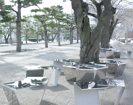
02


technically can be placed in any open space; not site-specific
includes a small tree inside a pot/bench. throughout the day, shadow is cast onto the white circular screen (light material which will add movement when wind blows)
03
 version 1
 version 2
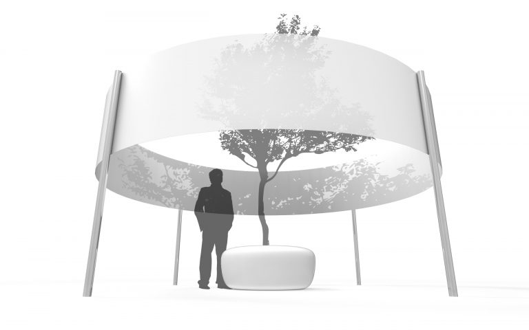
floating sculpture that allows audience to view shadows of trees and objects in the environment cast onto the material. the shape invokes curiosity so people passing by are interested in approaching and viewing. the sculpture could be hanging down from branches of trees around the area or infrastructures
things to keep in mind:
how do you make users/audience notice the shadows? (importance of framing)
cannot be too simple, needs to have an intention, needs to stand out from the environment, should not blend in, should not be infrastructural
wk5: defining spaces
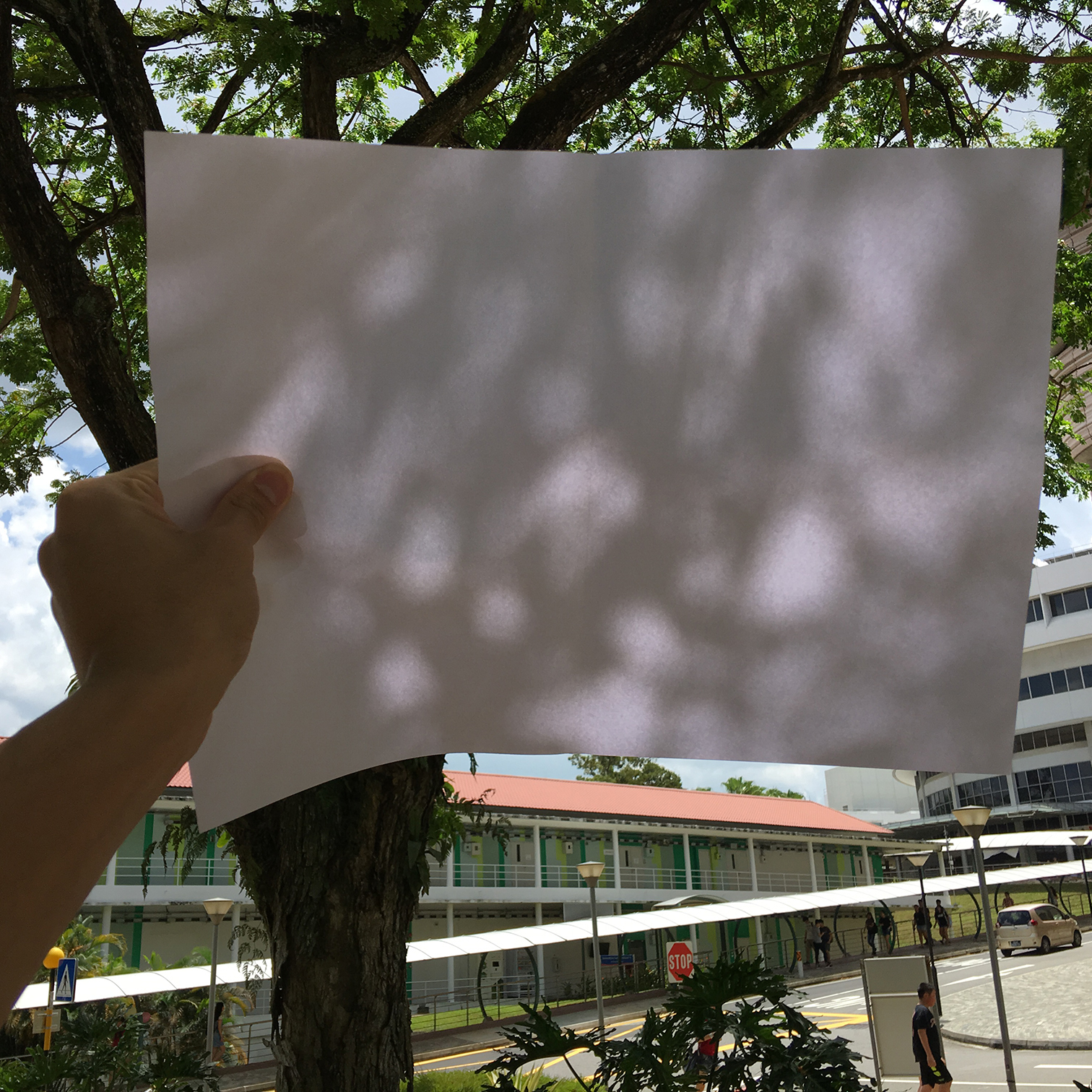
Continuing from our concept of observing the ordinary in NTU and the inspiration of the rays of light caused by the dense morning fog and the trees around the campus, we decided to forgo our original idea of using fog as a medium and focus on the use of light as a material instead.
Focus
Interplay between light and shadow to create spaces
Spaces around the campus are molded by the lush greenery prevalent in the campus area. Layers of foliage is an everyday occurrence in NTU—we see them everywhere—but even something that we see everywhere everyday can be beautiful.
Purpose
Emphasising beauty of the mundane
Initially inspired by the light broken down into rays of light by the foliage of the trees, we are looking into using the tree as a form exploration through natural stylisation. We found the rain tree in particular to be interesting. The rain tree can be found not only in NTU but island-wide, and is well-known for its wide canopy that serves as great shade. Another fun fact about the rain tree: the leaves of the rain tree close just before sunset and open again as the sun rises. This little feature could also be incorporated into our installation in creating movement and dynamism in the changing shadows.
References
Forest Shadow, Tomohiro Hata and Takashi Manda
“in the middle of the flood of color, what about we imagine a colorless space? only shadows of the trees exist in the world. music of birds what we didn’t take notice may come to ears of us who have enjoyed by our visions. various fragrance of nature may come to our nose. our skin may feel gentle breeze. on the contrary, because of such a vivid season, we propose a place where our senses slightly shift to other one in exception of our visions.”
Stereographic Projection, Henry Segerman and Saul Schleimer


https://www.theguardian.com/science/alexs-adventures-in-numberland/2014/oct/30/pumpkin-geometry-stunning-shadow-sculptures-that-illuminate-an-ancient-mathematical-technique
https://www.arch.nus.edu.sg/news/light.html#
Louis Kahn on The Power of Shadow
“As identified by Leonardo da Vinci, we often encounter three types of shadows: Attached shadow, shading and cast shadow. The attached shadow falls on the body itself – like a cantilever roof causing a shadow on the façade. The second type belongs to bright and dark contrasts, which are inherent to the form and depend only on the source of light, e.g. a ball shaped pavilion, which even under a cast sky shows a darker zone in the lower part. The third, cast shadow, could be the result of a high house generating shadow on the street due to the projection of the building outline.”
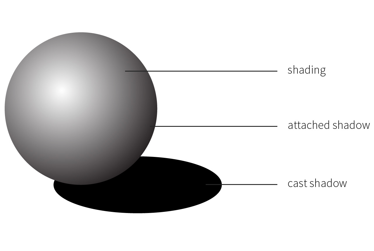
https://www.archdaily.com/362554/light-matters-louis-kahn-and-the-power-of-shadow
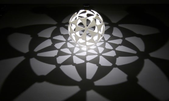
Sublime Light, Anila Quayyum Agha
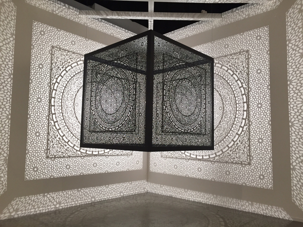
Photographic Exploration
wk3: references and development
Continuing off from the previous week’s inspiration of the morning sun rays, we developed our concept from there and narrowed down the purpose of our installation proposal.
Emphasise the unseen and let others
appreciate the mundane
As our inspiration was a repetitive occurrence that is something that can be seen everyday but is not usually noticed, we wanted to emphasise this event—the light and fog—to allow other people to view and appreciate it.
There are three elements to implement into the installation—the light, fog, and structure. Because we are attempting to mimic the light rays in the morning in NTU, we also decided to include movement into the structure of the sculptural installation to let the light rays change forms depending on the movement of the structure.
Artist References
Chris Fraser‘s light installations
“My light installations use the camera obscura as a point of departure. They are immersive optical environments, idealized spaces with discreet openings. In translating the outside world into moving fields of light and color, the projections make an argument for an unfixed notion of sight.”
Light Barrier (2014)
The light installation creates floating graphic objects which animate through space as they do through time. This system creates volumetric projections which can define 3 dimensional forms in space.
Feedback
Upon looking at Chris Fraser’s light installation, it seemed like something that people would not notice at first glance or would be too distracted to look at. Because the aim of our installation is to let people see the unnoticed, there would be no point in constructing an installation that would not be noticed in the end either. There has to be a particular context, mood and venue to set in place: how would people appreciate the piece? How do you make people transit from the realm of their phones to notice the installation?
Another feedback is to perhaps project fog and materialise images (almost like the second reference) and just let people walk through the mist.