introducing the models
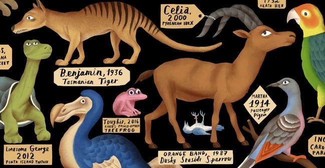
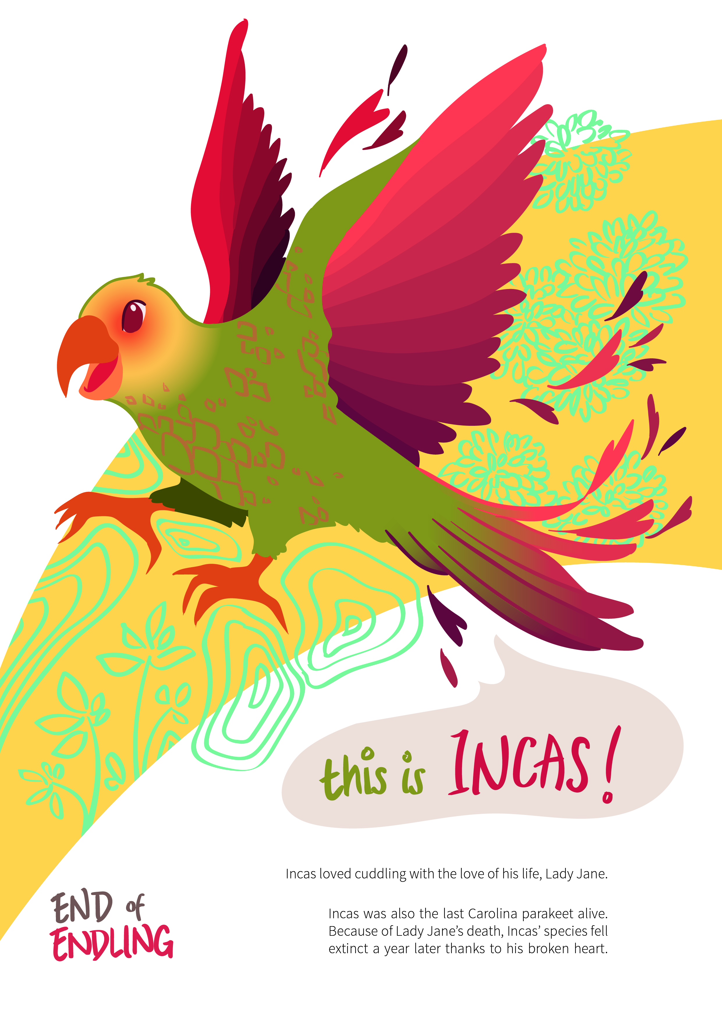
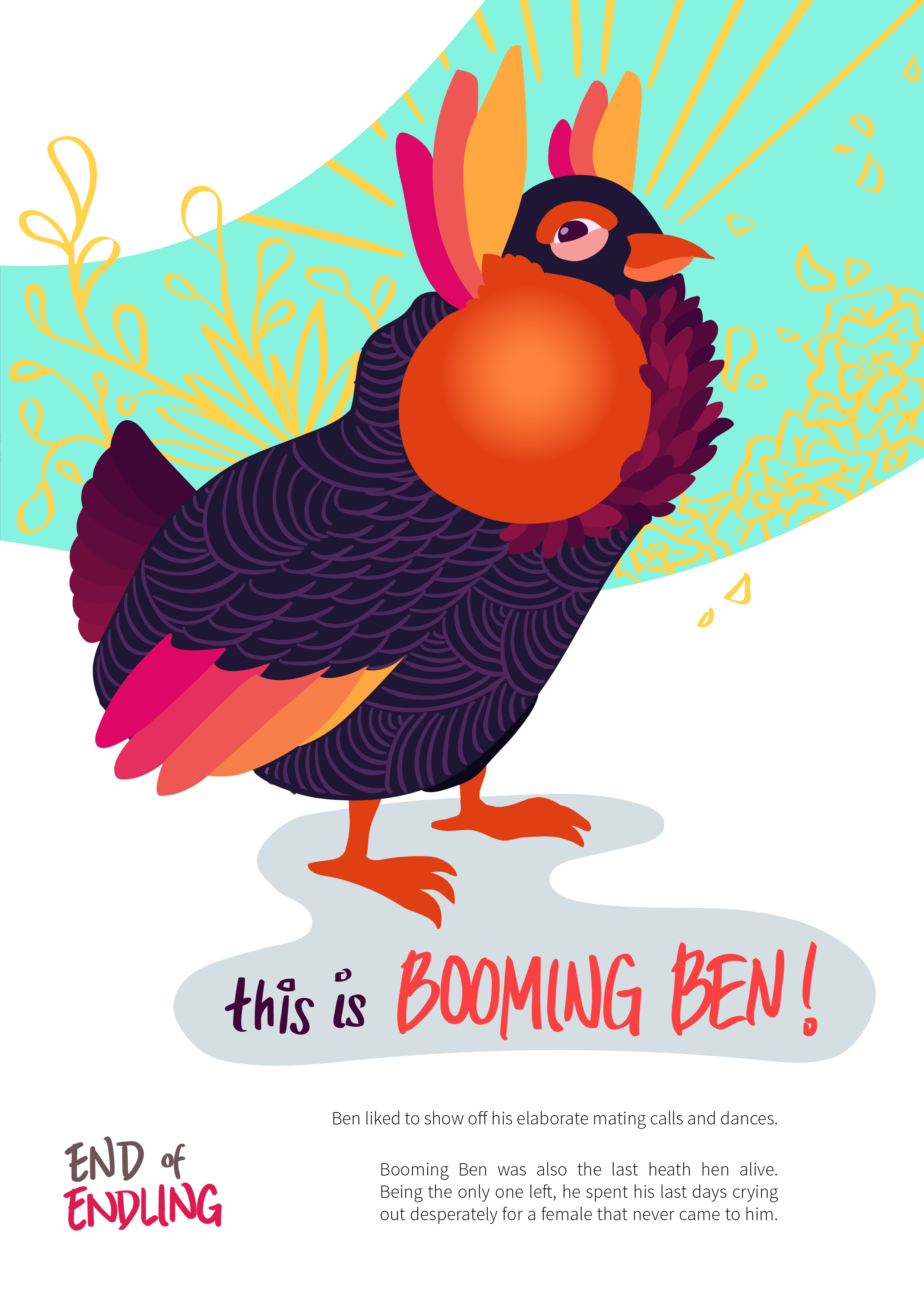
i’ve chosen three endlings as the models of my whole campaign:
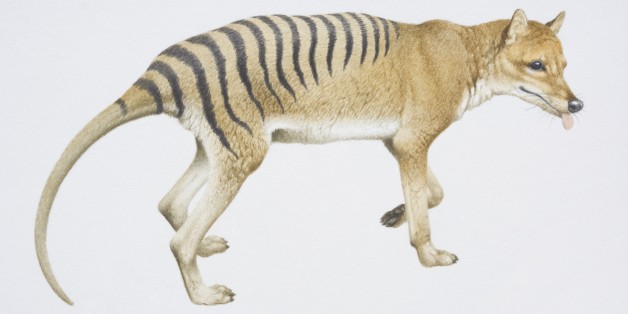

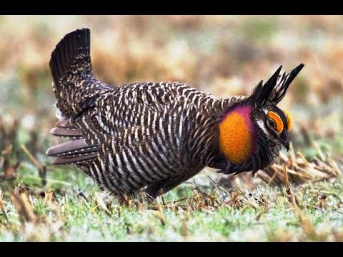
there were a few other choices, but i deliberately chose these three because they had names and tragic backstories. i want my target audience to feel guilty (haha) and empathise with these endlings. thus by connecting them with a name, it feels as though they were humans (just like my target audience) hence they empathise better—in contrast to just calling them with their general species names i.e. Tasmanian tiger, Carolina parakeet, heath hen.
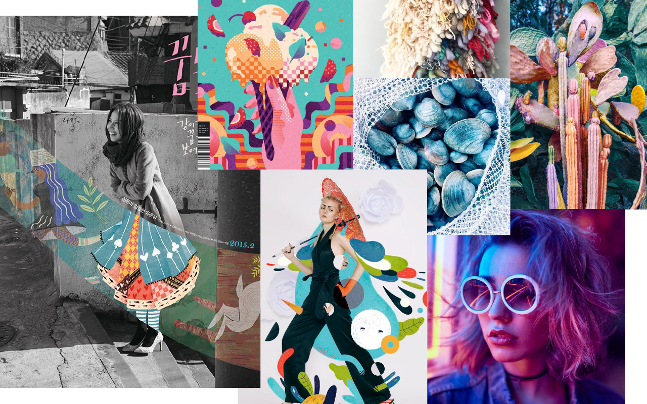
thumbnail sketches
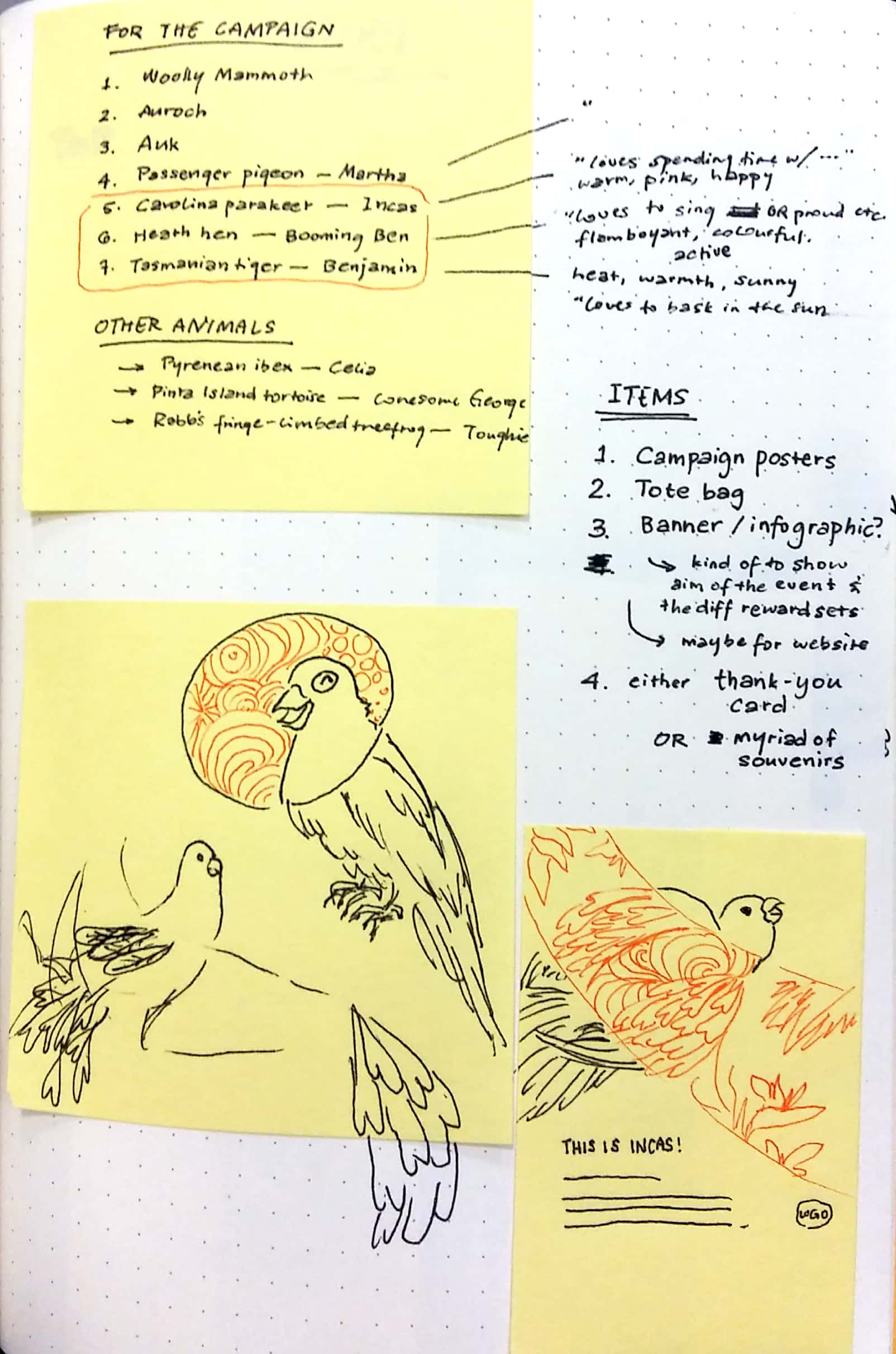
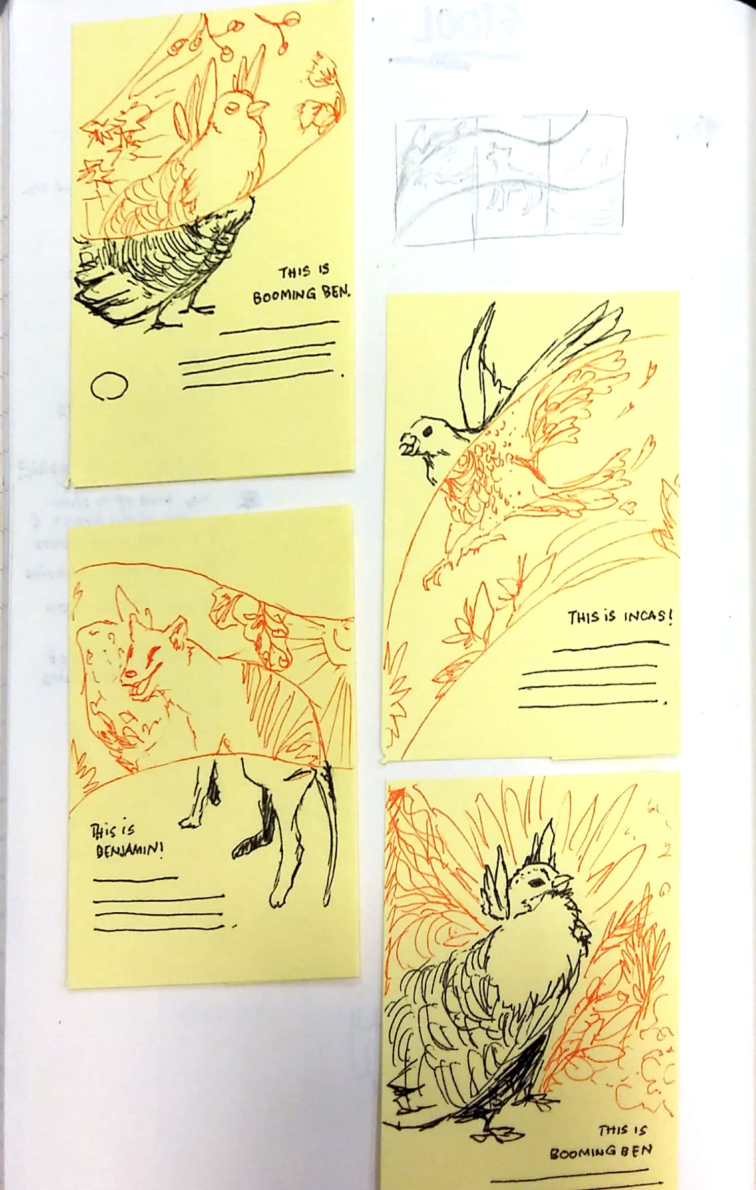
initially i wanted to play with the concept of juxtaposition between monochrome, hand-inked drawing and vibrant, digital art. so my thumbnail sketches (right image) consisted of compositions with a strip cutting in the middle of each page. the black represents the monochrome drawing while the orange represents the colourful rendition.
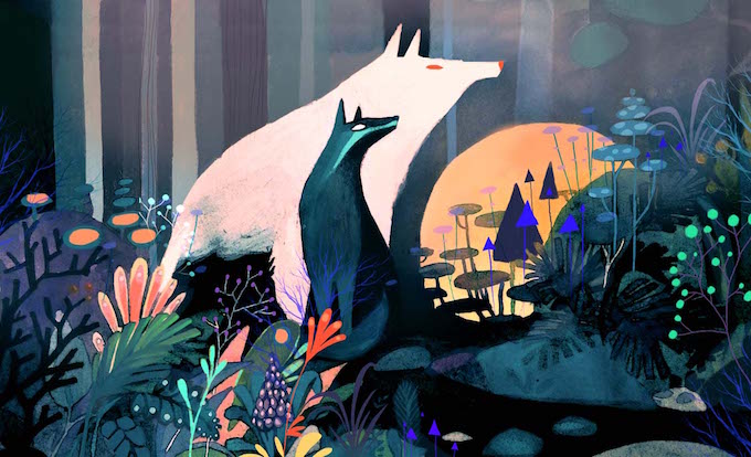
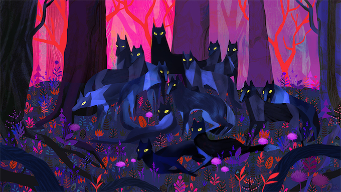
from these sketches, i moved to a more refined pencil composition of just the animals and rendered them digitally, keeping in mind that the colour palette i wanted was something more fantasy-like and out-of-this-world.
process to the final
trying out the juxtaposition
firstly i drew the monochrome parts of the endlings and scanned them
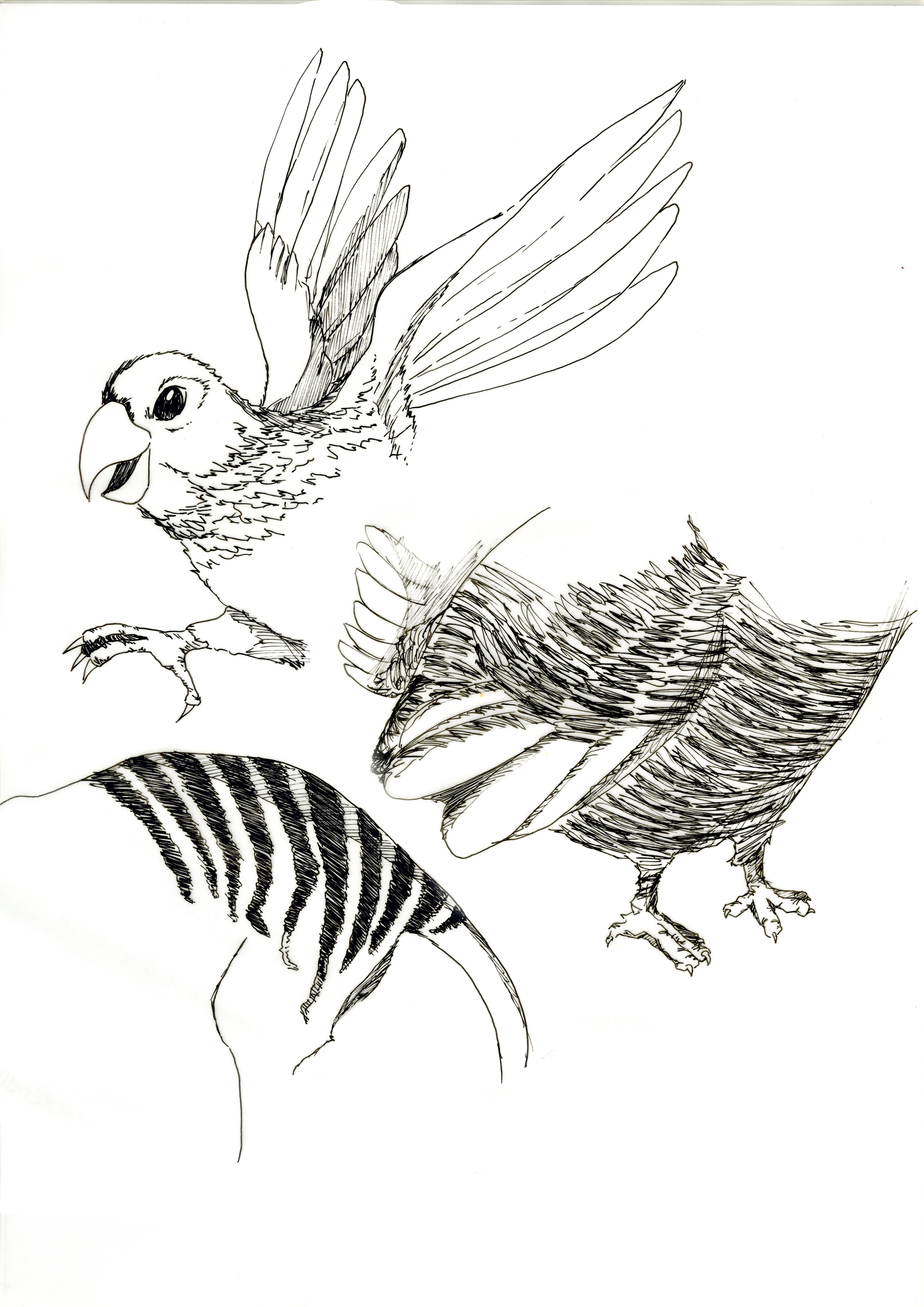
and then juxtaposed them to the coloured piece
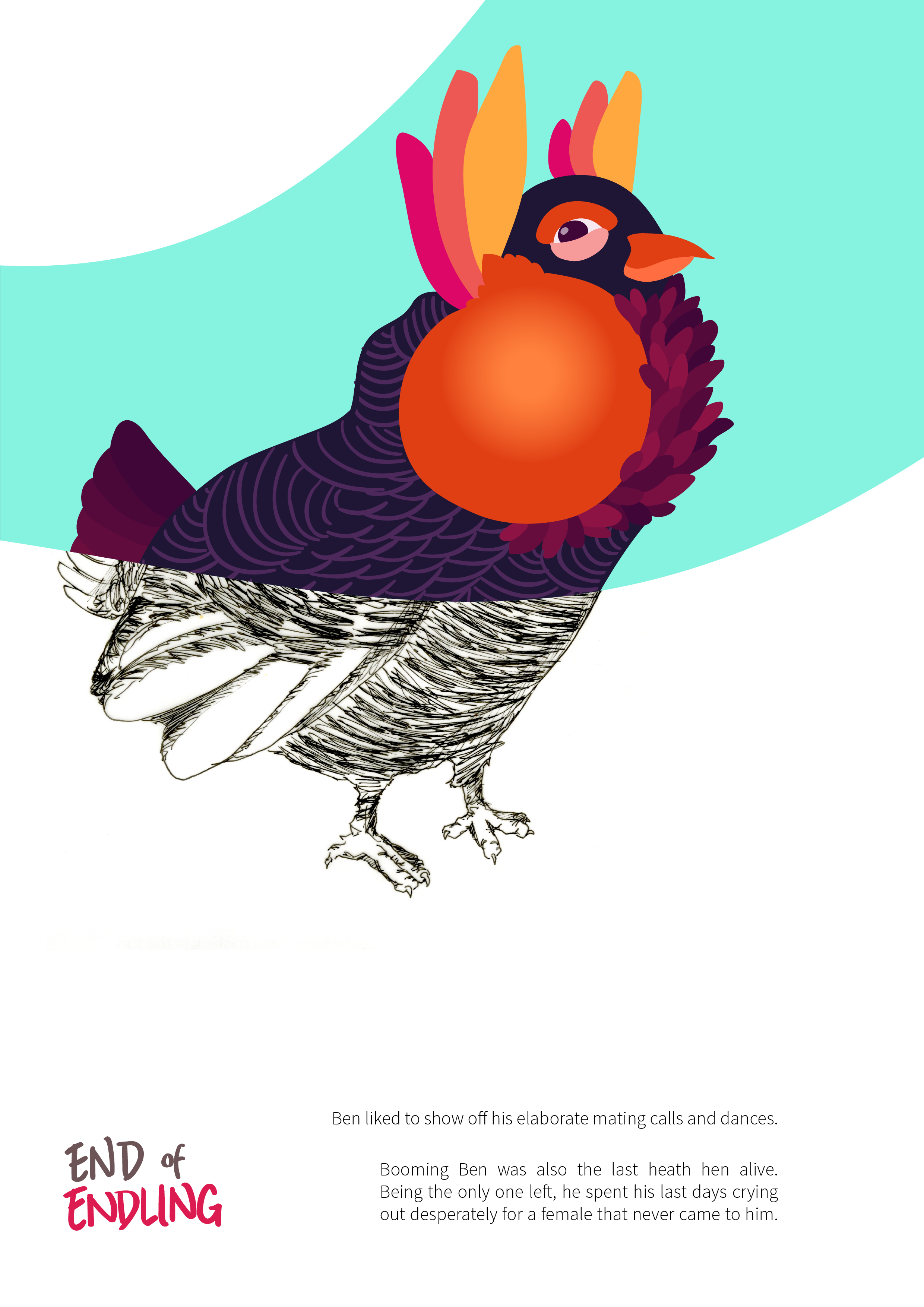
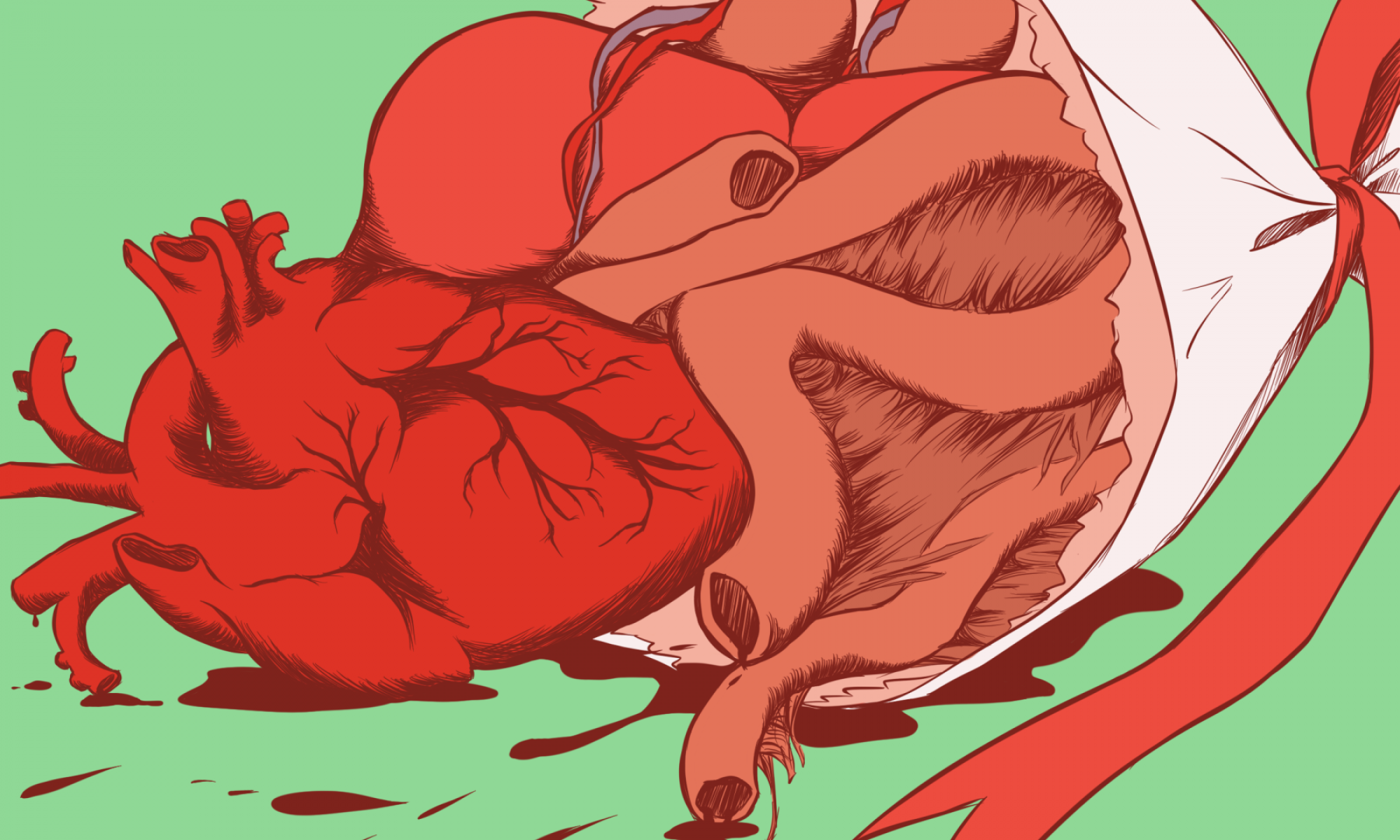
but the combination of the two looked terribly off 🙁 maybe it would have worked better with a photograph instead of inked drawing. i had to scratch my initial idea and go with a simpler concept instead: illustrating these endlings into fictitious-looking creatures by using vibrant colours and exaggerating certain body parts.
i don’t think i’ve ever illustrated anything with SO much colours in one composition before, so this was definitely an eye-opening experience for me. combining colours is HARD. i resisted the urge to keep a minimal colour palette and just threw in all the colours i could think of (while still considering the harmony of the combinations).
so without further ado, here are my final compositions before i edit them into the mockup layouts!
final pieces

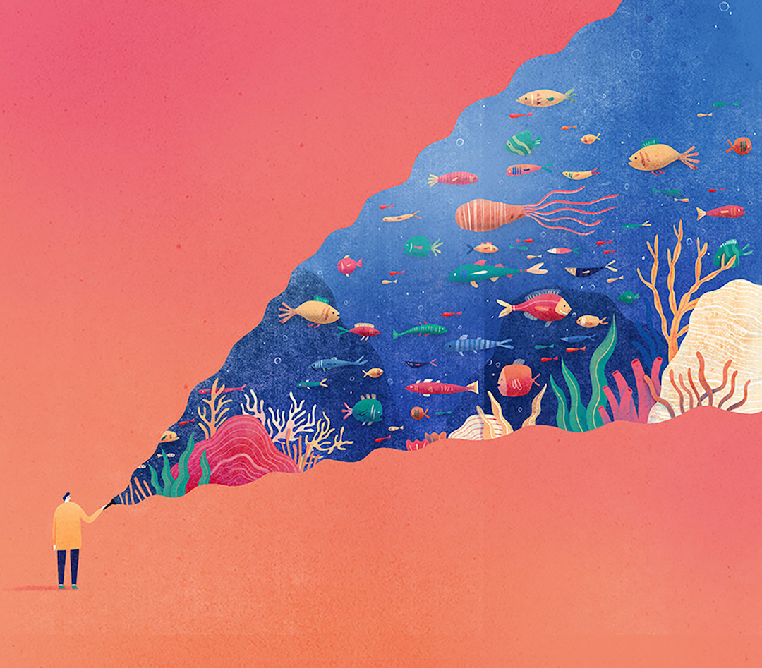
campaign poster
for the poster, the strips are made to flow smoothly when the posters are placed side by side in this order. i shall talk more about each piece in the next OSS post for the gallery!
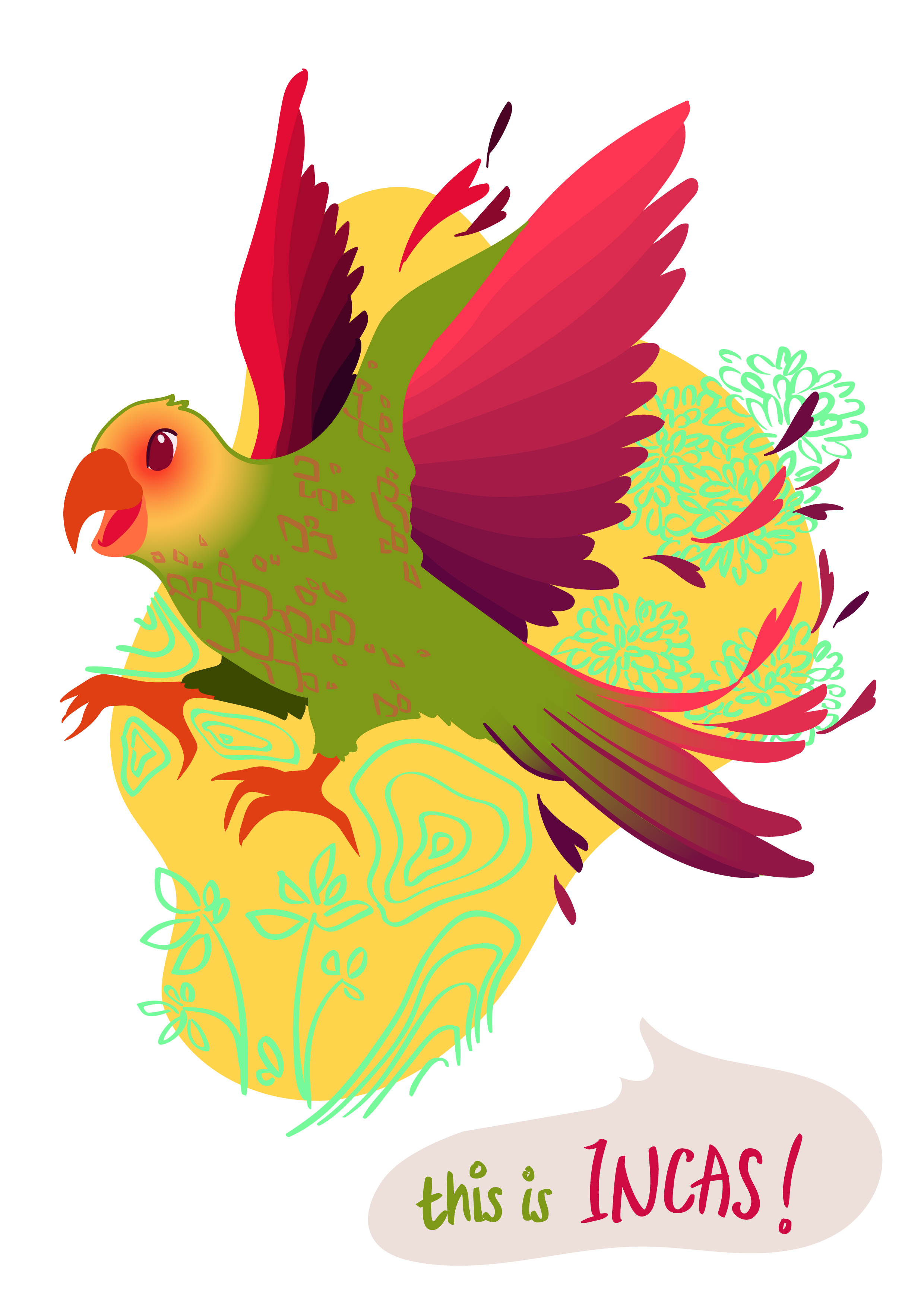
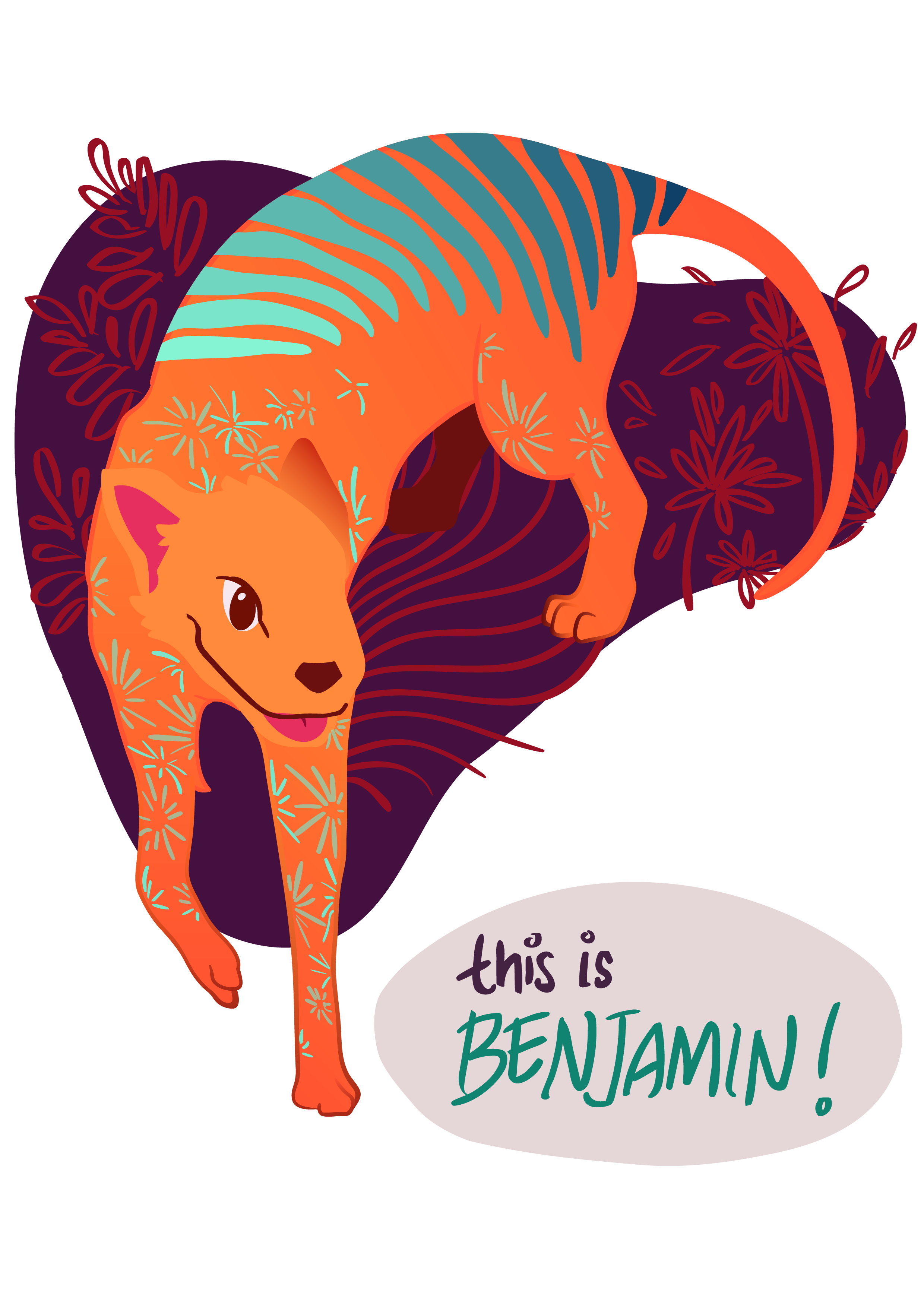

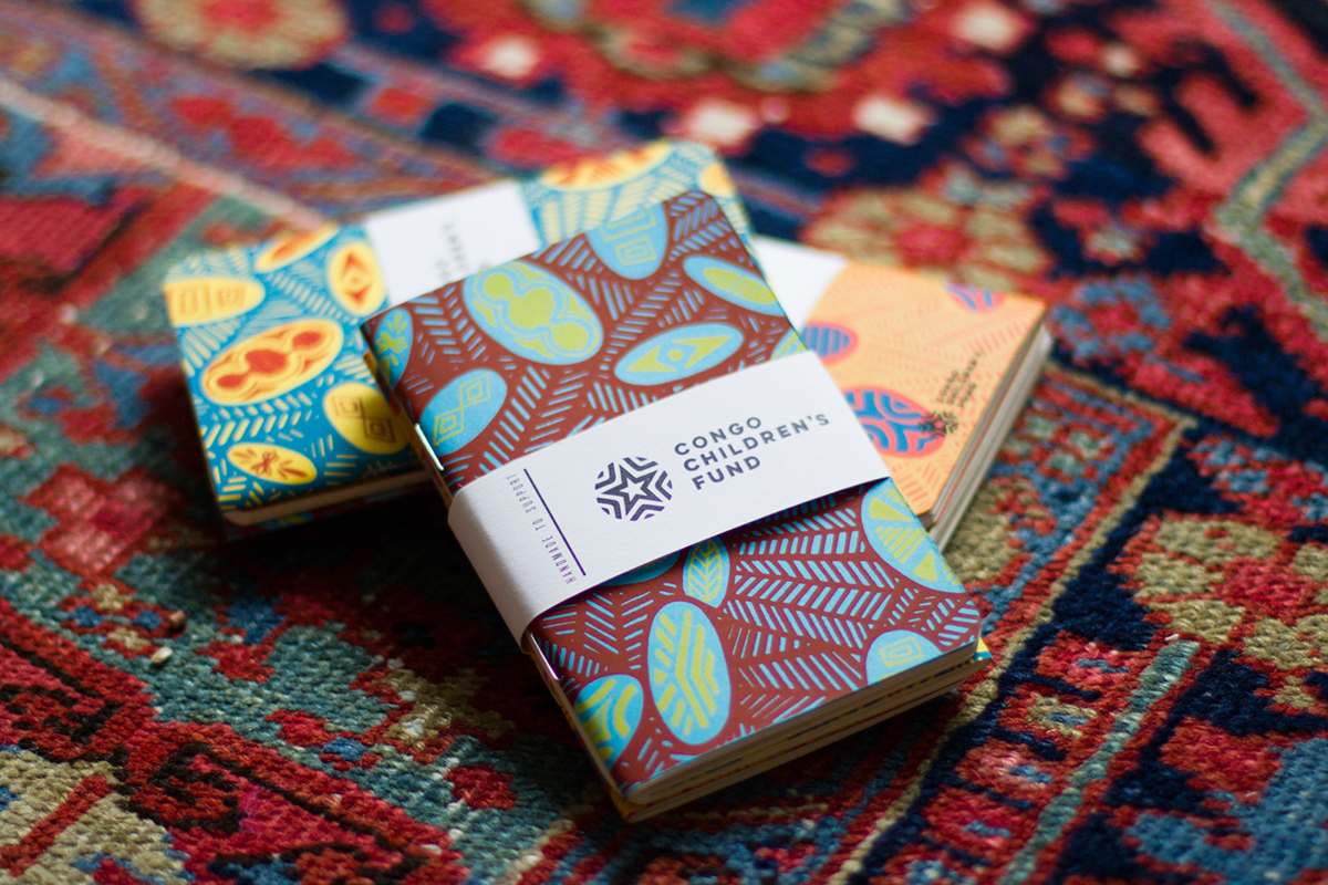
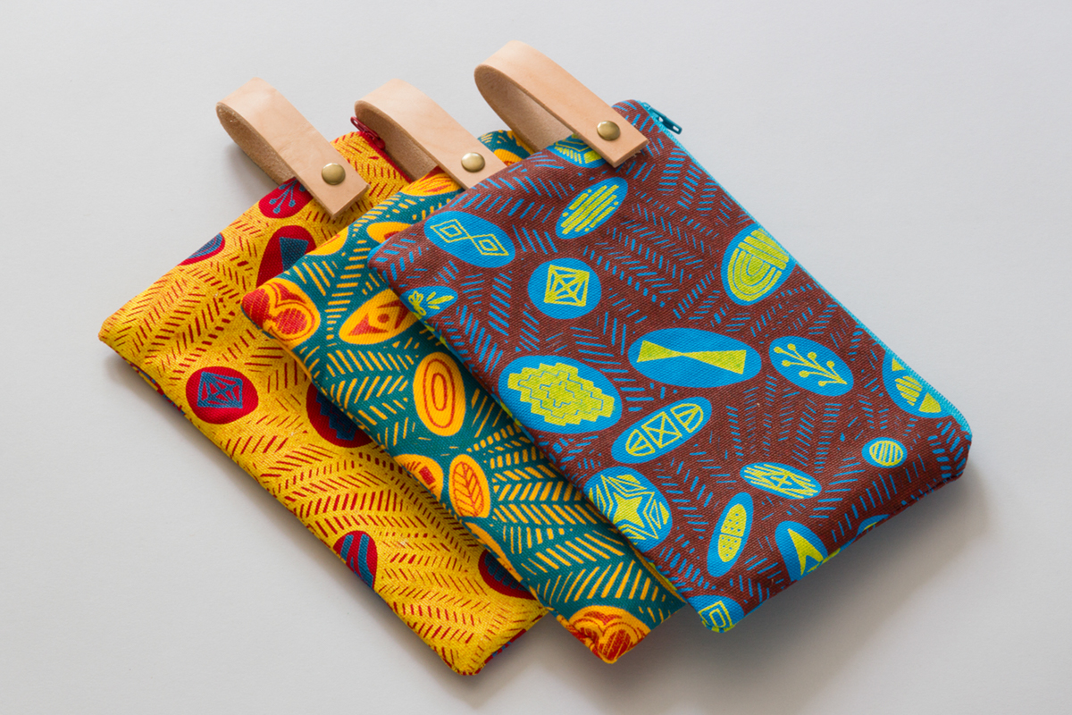
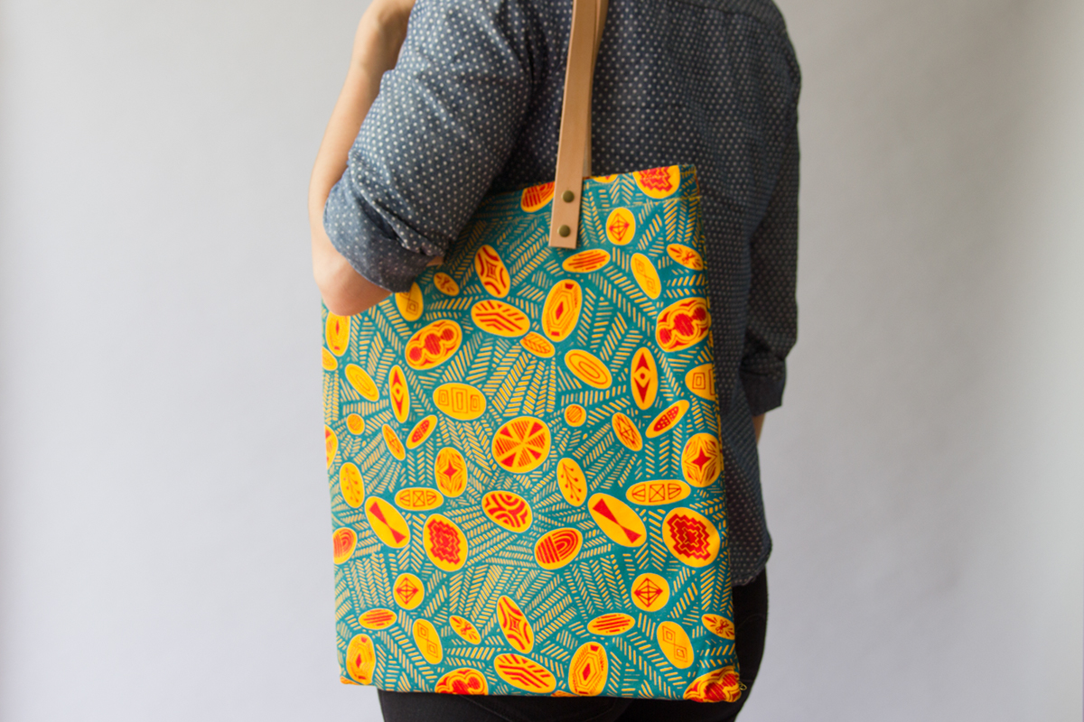
blob rendition
for this version, i changed the stripes at the back of the subjects into blobs. this is mostly used for the souvenirs to be sold at the fundraising event, so that the compositions can stand alone in most souvenirs without the awkward cut of the stripes like in the posters.