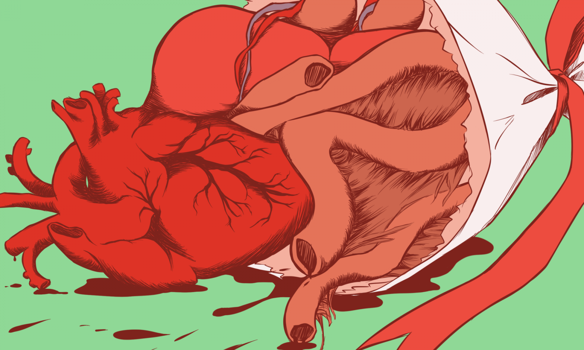
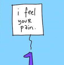
editorial illustration: research

Varoom

content includes comments and discussion on contemporary illustration from a global audience, as well as interviews with illustrators, image-makers, designers

[source: Association of Illustrators (AOI)]


editorial illustration

Across the spectrum of print and online publications, art directors rely on illustrators not only to create beautiful and attention-getting images, but also to help impart information and express complex ideas. Editorial illustrations bring stories to life and entice readers to engage with content.

— Jenny Carless (Adobe Create Magazine)

what is an editorial illustration?
an engaging visual representation of the accompanying article that clearly tells a story or convey a concept to the readers


two elements of editorial illustration:
concept and style

these two go hand in hand. a successful illustration can illuminate the essence of an idea effectively through the use of a fitting style to convey the mood; is it humourous? serious? thought-provoking?


empathy


definition

psychological identification with or vicarious experiencing of feelings, thoughts, or attitudes
[source: dictionary.com]

putting yourself in another’s shoes and/or experiencing from another’s point of view; not necessarily having experienced the feeling yourself
[source: self interpretation]


the three types of empathy

cognitive empathy “THINK IT”
understand what another is thinking or feeling

emotional empathy “FEEL IT”
put yourself in another’s shows and feel their emotion that may lead to pain and burnout

compassionate empathy “BE MOVED BY IT”
feel concern about another’s suffering, but from a distance and with the desire to help (positive feedback that relates to motivation and reward)


from personal experience

being quite an emotional sponge myself, i tend to absorb another’s emotions relatively easily – i would feel their suffering if they are in pain, their anger if someone irritates them, or even their excitement if they look forward to something. i do enjoy listening to their tales and rants. but sometimes… they get a little too overwhelming. most of the time? my positive energy gets sucked out and i end up feeling numb.

people say that empathy is an exceptional skill to have, not only personally, but also socially and career-wise. but for some (like myself) who do not know when to stop sharing the same thoughts and feelings as another, it can get very exhausting… especially when the other spouts nothing but negative remarks.

thus for this editorial illustration, i narrowed the theme down to

the trials and tribulations of having too much empathy

(to put it a little dramatically)


some negative impacts of empathy:

  1. feeling the pain and experiences of another; indirectly inflicting the pain and negativity on yourself
  2. always having to put up a positive front
  3. feeling burdened (especially when you don’t have anything substantial to make the other feel better); the idea of it weighing you down
  4. TIRING; burnout

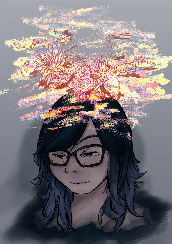
self portrait: final

Final piece


Alternate renditions

Fixed the lighting level on the face itself to be slightly brighter. Tried to cast an overhead light over the face but found it to be too dramatic (which opposed my initial intention) so I decided to just add reflections on the glasses to draw the audience’s eyes more towards the face and give the overall composition a better sense of harmony.

self portrait: working towards the final

a documentation of the process towards the final piece, and some feedback

Process
  1. Painting on Photoshop. One component I wanted to implement in the final piece is clean outlines. Initially, I used a Photoshop brush to outline the painting. However the line weight was not as varied as I would have liked them to be, and they looked a little too artificial. In the next rendition, I decided to use traditional methods to ink the drawing and transferred the outlines to Photoshop.
  2. Transferring traditional medium to digital. The messy scribbles on top was created using acrylic paint on canvas paper. I only realised a little too late that I only had acrylic tubes of the basic colours of red, yellow and blue to work with, so I had a lot of colour-tweaking to do on Photoshop. Nevertheless, I found the texture created to look better and more genuine than if I would have done the same thing with Photoshop brushes.

    what the colours actually looked like…
  3. Additional elements. Aside from the mess of rainbow puke, I also wanted to include the things I hold dear—Skink my pet lizard, Charles the succulent and Mei the tiny cactus—and some of my favourite things on the side. I attempted the same method of using traditional inking and digital colours for these elements, however they looked terribly out of place and the colours did not harmonise well with the overall composition.


(not so) Final Composition


feedback after critique
  1. The negative space in the middle of the jumbled mess is a little too jarring and could be reduce a tad bit. As how it is now, the eyes are attracted towards the negative space too much.
  2. As this is a portrait, it is still possible to emphasise more light on the face while still keeping the concept of using subdued colours to represent the calm and stoic atmosphere.
  3. One suggestion offered in relation to the second point is that the bright mess could cast light on the face instead—something just as subtle as a yellow light cast as a reflection on the glasses.


self portrait: conceptualisation and references

In-class exercise: Portrait

some takeaways:

Sketching a portrait was more intimate than I thought ; it was different from the usual live drawing sessions where I had to focus more on the model’s dynamic postures rather than their faces, and it definitely got a little awkward (perhaps because my ‘model’ was also drawing my face, so we were just… stealing glances at each other.)

Looking back at my illustration, I think I would have preferred to use a wider range of line weight as well as stylise certain facial features to make it look less realistic.


Assignment 1: Ideation and Initial Sketches


some things about myself I decided to focus on:

  • forgetful; just really terrible memory
  • the first one is due to my head being a jumbled mess
  • i always look calm; people say this often but sometimes i might just be internally dying
  • some things i hold dear: my succulent (Charles), my tiny cactus (Mei), my ex-pet (Skink)


Initial sketches; throwing random ideas out to portray both my forgetfulness and the juxtaposition between a calm exterior and messy interior. Eventually I went with the one on the most right, where it shows a messy scribble around my head to represent the many things I think about. I also decided to use subdued colours for my face, and bright, noisy colours for the scribbles to show the contrast between what is expressed on my face and what actually goes on in my mind.

Final composition; sketched a small thumbnail of my desired composition to visualise better. Decided to draw myself looking down instead of up; I found it to represent myself better because I tend to look at the ground (whether it be when I am walking or thinking).


Assignment 1: Reference Artists


Gabriel Picolo


Brilliant use of subdued colours with minimal bright accents; clean lines and smooth gradated colours


Carlos Villarreal Kwasek

Absolutely beautiful colour palette; subtle use of texture (not too overwhelming but still gives a nice effect)


Kathrin Honesta

This series in particular inspired me to use similar techniques for the colourful scribbles (will try to use acrylic paint instead)