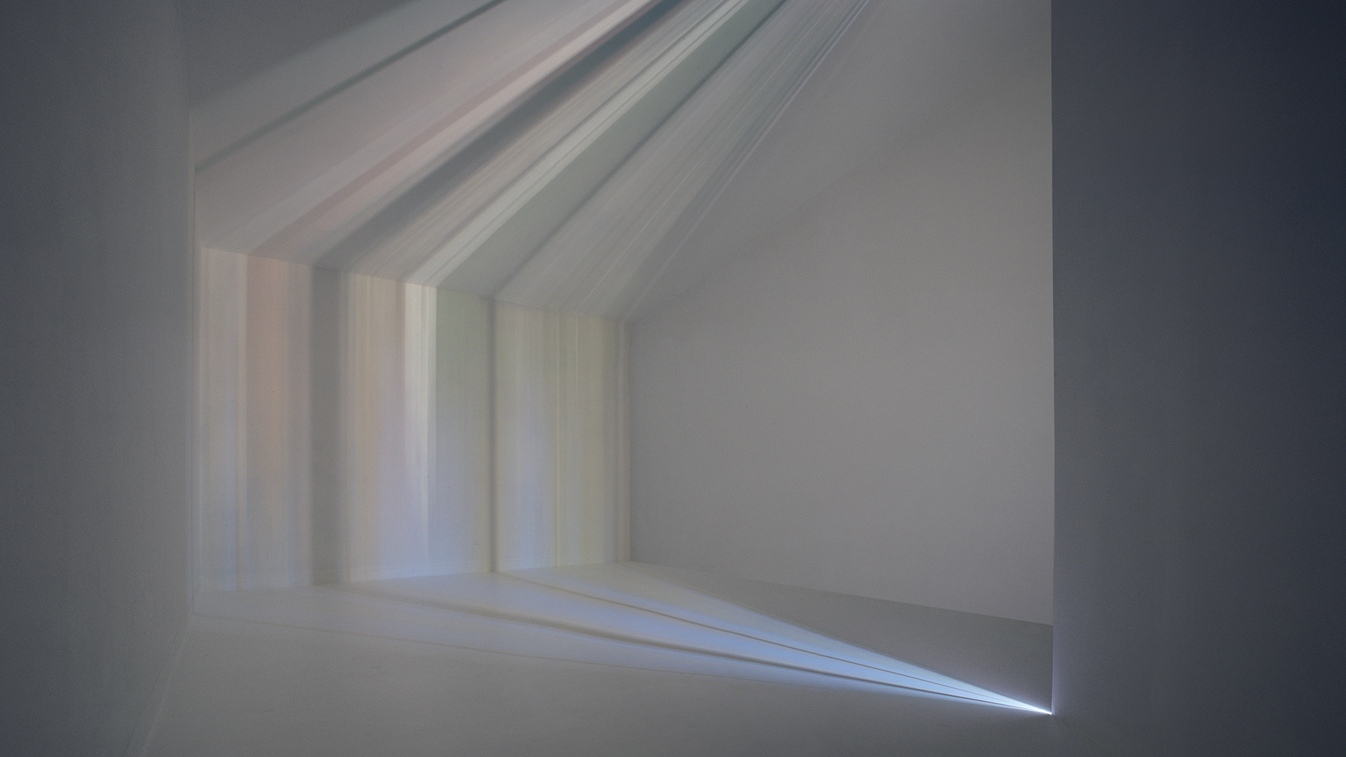
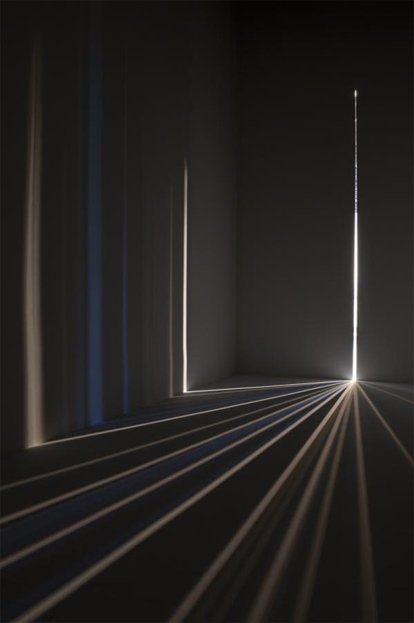
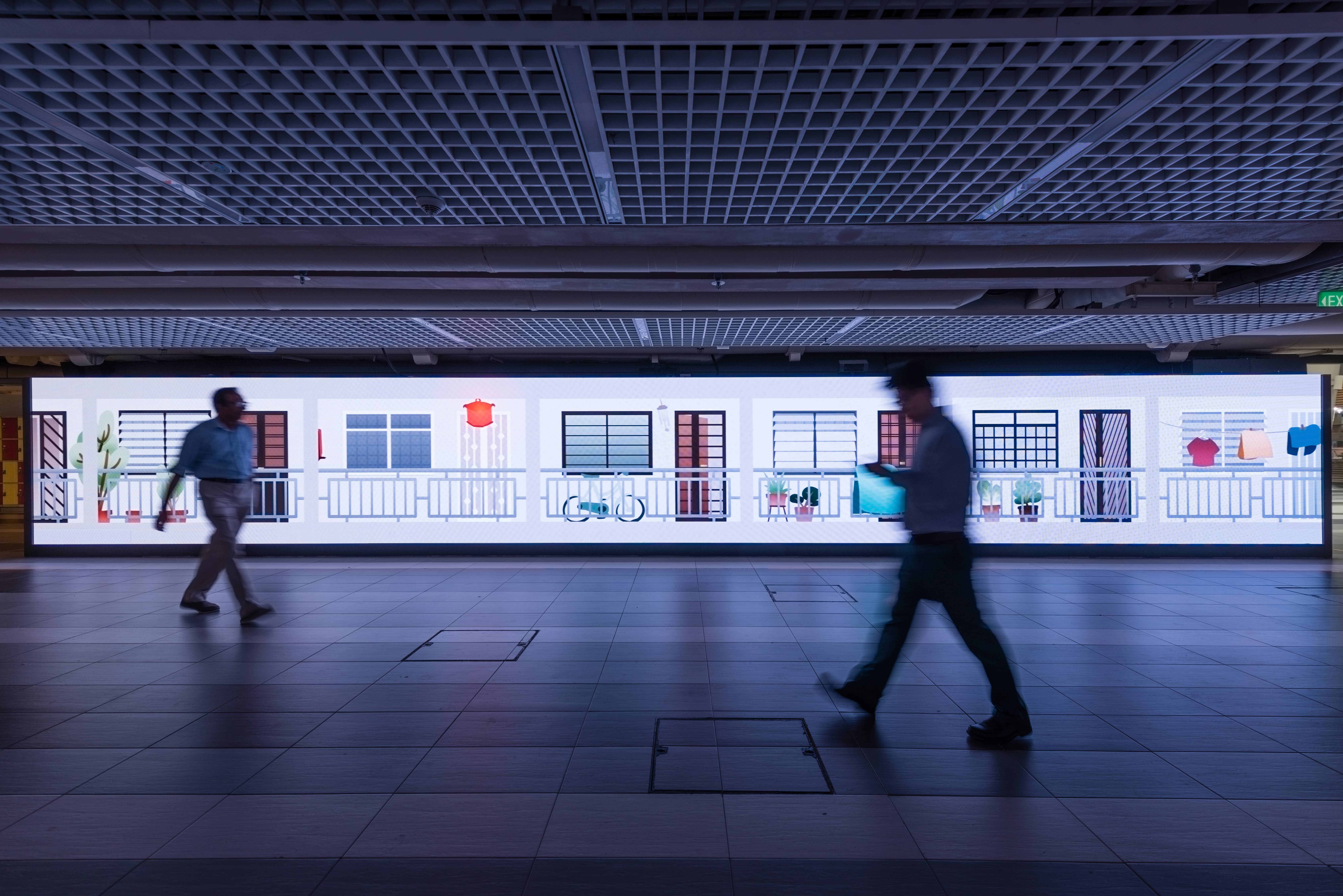
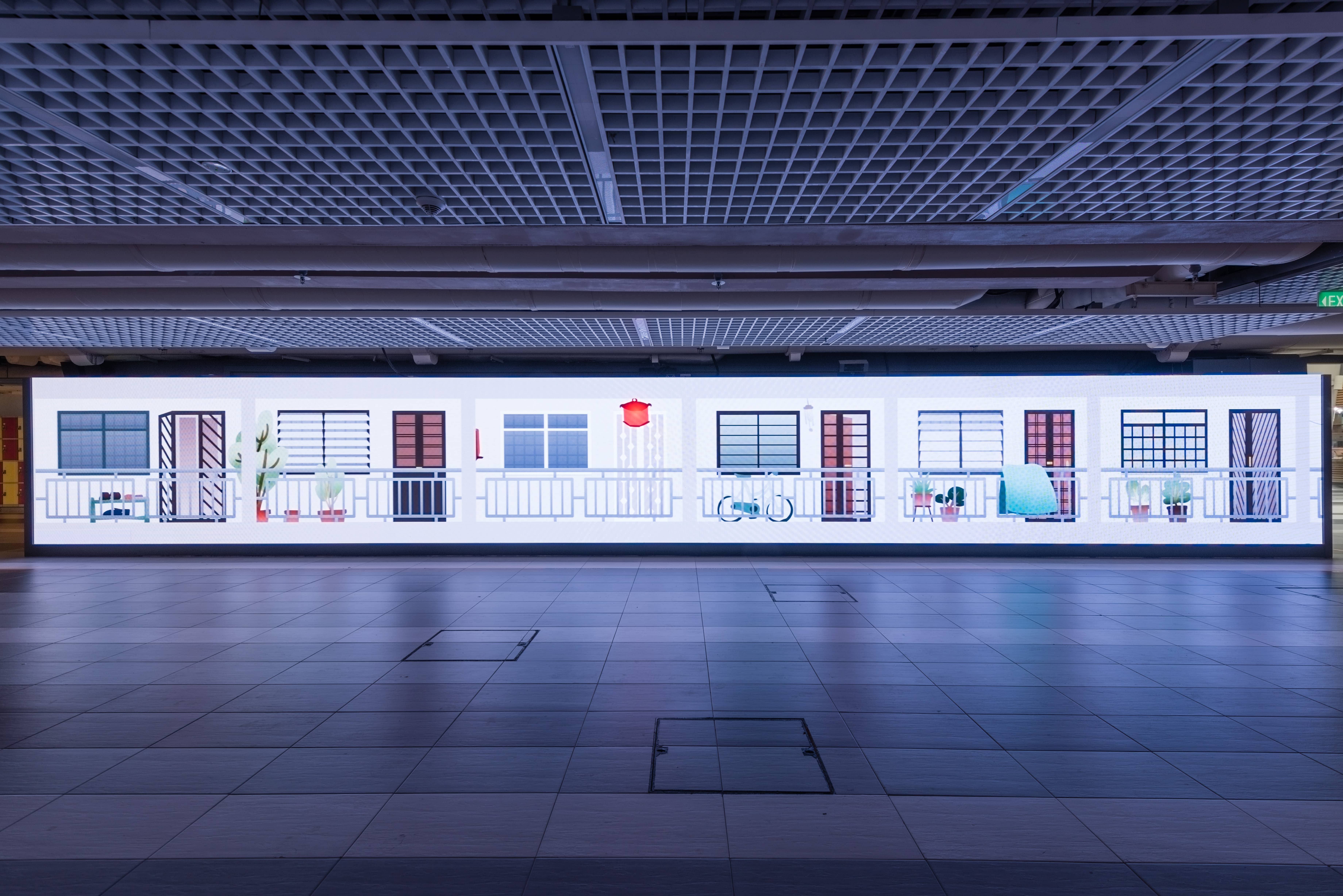
self portrait: final

Final piece


Alternate renditions

Fixed the lighting level on the face itself to be slightly brighter. Tried to cast an overhead light over the face but found it to be too dramatic (which opposed my initial intention) so I decided to just add reflections on the glasses to draw the audience’s eyes more towards the face and give the overall composition a better sense of harmony.

self portrait: working towards the final

a documentation of the process towards the final piece, and some feedback

Process
  1. Painting on Photoshop. One component I wanted to implement in the final piece is clean outlines. Initially, I used a Photoshop brush to outline the painting. However the line weight was not as varied as I would have liked them to be, and they looked a little too artificial. In the next rendition, I decided to use traditional methods to ink the drawing and transferred the outlines to Photoshop.
  2. Transferring traditional medium to digital. The messy scribbles on top was created using acrylic paint on canvas paper. I only realised a little too late that I only had acrylic tubes of the basic colours of red, yellow and blue to work with, so I had a lot of colour-tweaking to do on Photoshop. Nevertheless, I found the texture created to look better and more genuine than if I would have done the same thing with Photoshop brushes.

    what the colours actually looked like…
  3. Additional elements. Aside from the mess of rainbow puke, I also wanted to include the things I hold dear—Skink my pet lizard, Charles the succulent and Mei the tiny cactus—and some of my favourite things on the side. I attempted the same method of using traditional inking and digital colours for these elements, however they looked terribly out of place and the colours did not harmonise well with the overall composition.


(not so) Final Composition


feedback after critique
  1. The negative space in the middle of the jumbled mess is a little too jarring and could be reduce a tad bit. As how it is now, the eyes are attracted towards the negative space too much.
  2. As this is a portrait, it is still possible to emphasise more light on the face while still keeping the concept of using subdued colours to represent the calm and stoic atmosphere.
  3. One suggestion offered in relation to the second point is that the bright mess could cast light on the face instead—something just as subtle as a yellow light cast as a reflection on the glasses.


wk3: references and development

Continuing off from the previous week’s inspiration of the morning sun rays,  we developed our concept from there and narrowed down the purpose of our installation proposal.

Emphasise the unseen and let others
appreciate the mundane

As our inspiration was a repetitive occurrence that is something that can be seen everyday but is not usually noticed, we wanted to emphasise this event—the light and fog—to allow other people to view and appreciate it.

There are three elements to implement into the installation—the light, fog, and structure. Because we are attempting to mimic the light rays in the morning in NTU, we also decided to include movement into the structure of the sculptural installation to let the light rays change forms depending on the movement of the structure.


Artist References

Chris Fraser‘s light installations

“My light installations use the camera obscura as a point of departure. They are immersive optical environments, idealized spaces with discreet openings. In translating the outside world into moving fields of light and color, the projections make an argument for an unfixed notion of sight.”


Light Barrier (2014)

The light installation creates floating graphic objects which animate through space as they do through time. This system creates volumetric projections which can define 3 dimensional forms in space.


Feedback

Upon looking at Chris Fraser’s light installation, it seemed like something that people would not notice at first glance or would be too distracted to look at. Because the aim of our installation is to let people see the unnoticed, there would be no point in constructing an installation that would not be noticed in the end either. There has to be a particular context, mood and venue to set in place: how would people appreciate the piece? How do you make people transit from the realm of their phones to notice the installation?

Another feedback is to perhaps project fog and materialise images (almost like the second reference) and just let people walk through the mist.

self portrait: conceptualisation and references

In-class exercise: Portrait

some takeaways:

Sketching a portrait was more intimate than I thought ; it was different from the usual live drawing sessions where I had to focus more on the model’s dynamic postures rather than their faces, and it definitely got a little awkward (perhaps because my ‘model’ was also drawing my face, so we were just… stealing glances at each other.)

Looking back at my illustration, I think I would have preferred to use a wider range of line weight as well as stylise certain facial features to make it look less realistic.


Assignment 1: Ideation and Initial Sketches


some things about myself I decided to focus on:

  • forgetful; just really terrible memory
  • the first one is due to my head being a jumbled mess
  • i always look calm; people say this often but sometimes i might just be internally dying
  • some things i hold dear: my succulent (Charles), my tiny cactus (Mei), my ex-pet (Skink)


Initial sketches; throwing random ideas out to portray both my forgetfulness and the juxtaposition between a calm exterior and messy interior. Eventually I went with the one on the most right, where it shows a messy scribble around my head to represent the many things I think about. I also decided to use subdued colours for my face, and bright, noisy colours for the scribbles to show the contrast between what is expressed on my face and what actually goes on in my mind.

Final composition; sketched a small thumbnail of my desired composition to visualise better. Decided to draw myself looking down instead of up; I found it to represent myself better because I tend to look at the ground (whether it be when I am walking or thinking).


Assignment 1: Reference Artists


Gabriel Picolo


Brilliant use of subdued colours with minimal bright accents; clean lines and smooth gradated colours


Carlos Villarreal Kwasek

Absolutely beautiful colour palette; subtle use of texture (not too overwhelming but still gives a nice effect)


Kathrin Honesta

This series in particular inspired me to use similar techniques for the colourful scribbles (will try to use acrylic paint instead)

wk2: the infra-ordinary

Early mornings are one time of the day we are familiar with as students of ADM (not because we wake up early; rather, we find ourselves staying awake until ridiculous hours). As Jeremy and I live in halls on campus, we often walk back to our rooms at these hours.

One interesting point we noticed about NTU is that during the wee hours of the morning, the environment around the campus tends to be surrounded with a beautiful, mysterious morning fog. As the morning light shines through the foliage abundant around the area, and breaks through the mist, it creates an effect where the light rays become visible to our eyes. It is a normal, everyday occurrence, yet it is because it is happening everyday that we do not notice it.

How are we to speak of these ‘common things’, how to track them down rather, how to flush them out, wrest them from the dross in which they remain mired, how to give them a meaning, a tongue, to let them, finally, speak of what is, of what we are.

Inspired by Georges Perec‘s extract on The Infra-Ordinary, Jeremy and I decided to base our concept around this occurrence.


Obscurity

Obscurity, 2017
Graphic animation, 2 min 6 secs
3840 x 480 pixels
North Spine Plaza, Nanyang Technological University

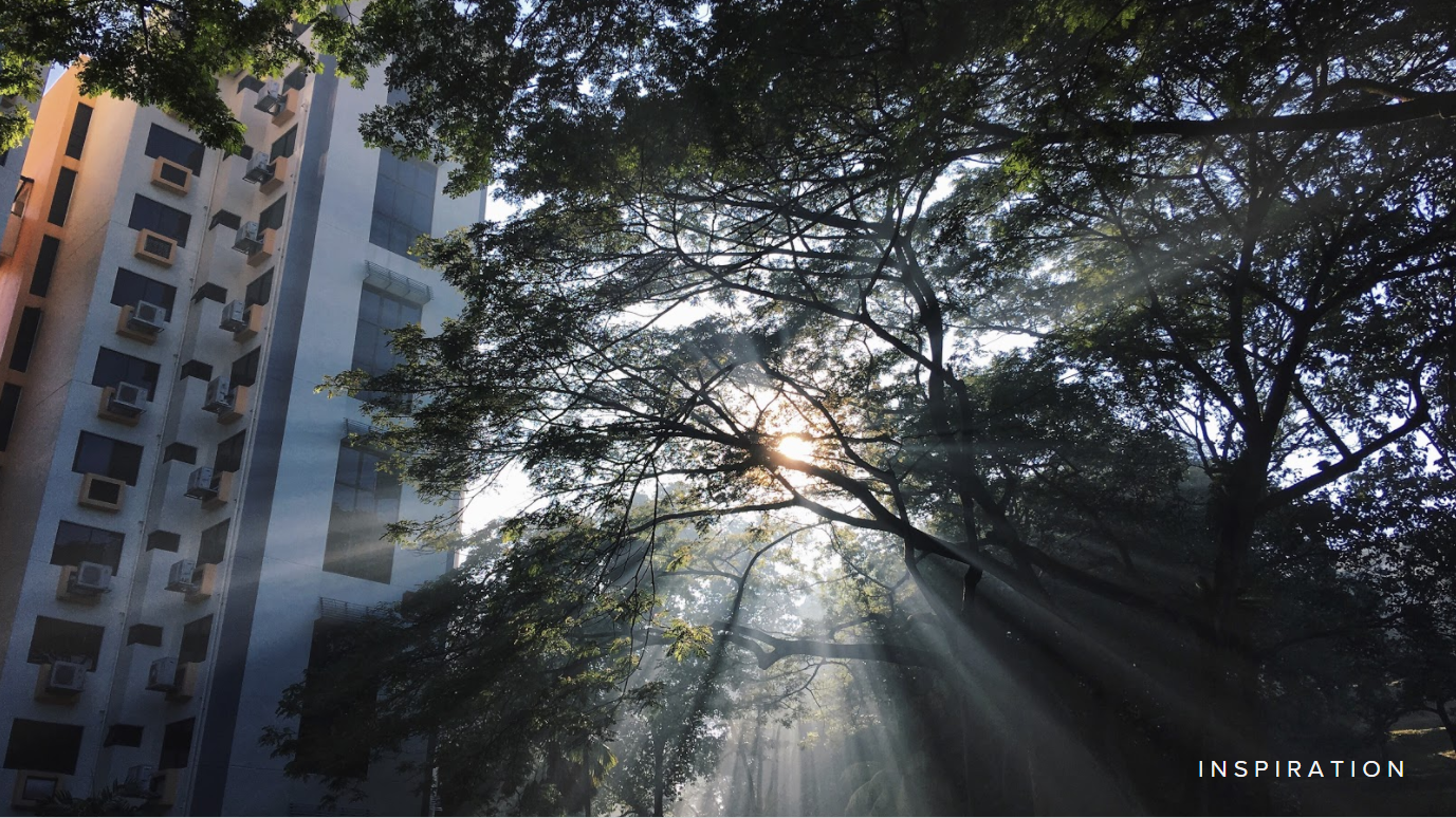
Inspired by my own experiences as a foreigner in the sunny island of Singapore, Obscurity explores the close coexistence of Singapore’s growing civilisation, and their diverse range of rich cultures. Even though Singapore is an expanse of rigid urban landscape, one may notice a temple nestled in between a few buildings could be viewed from the MRT windows. Or that despite the citizens living in similar, cold spaces of HDB blocks, one would notice unique habits spread around even in the hallway outside their living spaces. 

Little obscure things that can be easily overlooked, but significant nonetheless.

Music by: Podington Bear

Exhibition at Media Art Nexus Wall

Photo by: Solomon Quek Jia Liang

Reflection

As seen from the process posts linked in the next section, I was initially inspired by the story of the koi fish and the role they play in the Chinese culture. I attempted to learn a new programme: Cinema 4D. Unfortunately, I took the first 7 weeks trying to figure out how to use the programme itself, unable to move forward. If there was one thing I regretted, it was the fact that in the end, I finally decided to let it go. Seeing I was not going anywhere with Cinema 4D, I changed my methodology to something I was already familiar with. 

Even then I knew there was not enough time to create the background scenery and the animated koi fish in the 7 weeks I had left. I decided to forgo the koi fish and focus on the scenery instead. However I wanted to stick with my original concept: the coexistence between urbanisation and culture, thus the latter part of the idea was changed into these little inconspicuous cultural traditions in Singapore that people often overlook.

Honestly, thinking back on it, perhaps I should have focused on the animated koi fish instead, as it was the main feature of my inspiration. 

Future Developments

Obscurity, as it is now, is definitely lacking many things. One key development I would like to add onto the work now is the originally intended koi fish animation; just something as simple as sketchy line art that would complement the current graphics. There are also several other scenes I would like to try animating, such as nightlife with neon lights, as well as smoke fumes that represents growing industrialisation .

Conceptualisation


wk02: exploring beyond the seas

Hello Media Art Nexus

I decided to take this class despite having no background in animating or filming as I was inspired by some of my peers’ works last semester. I spent my first week researching on the different programs in which I could try to start learning—from After Effects to Processing—and I found it difficult to pick one because my knowledge in all the programs are at the same level: zero.

So I resolved to researching on the theme instead: Beyond the Seas.

Continue reading “wk02: exploring beyond the seas”