Project 2: Ego Final

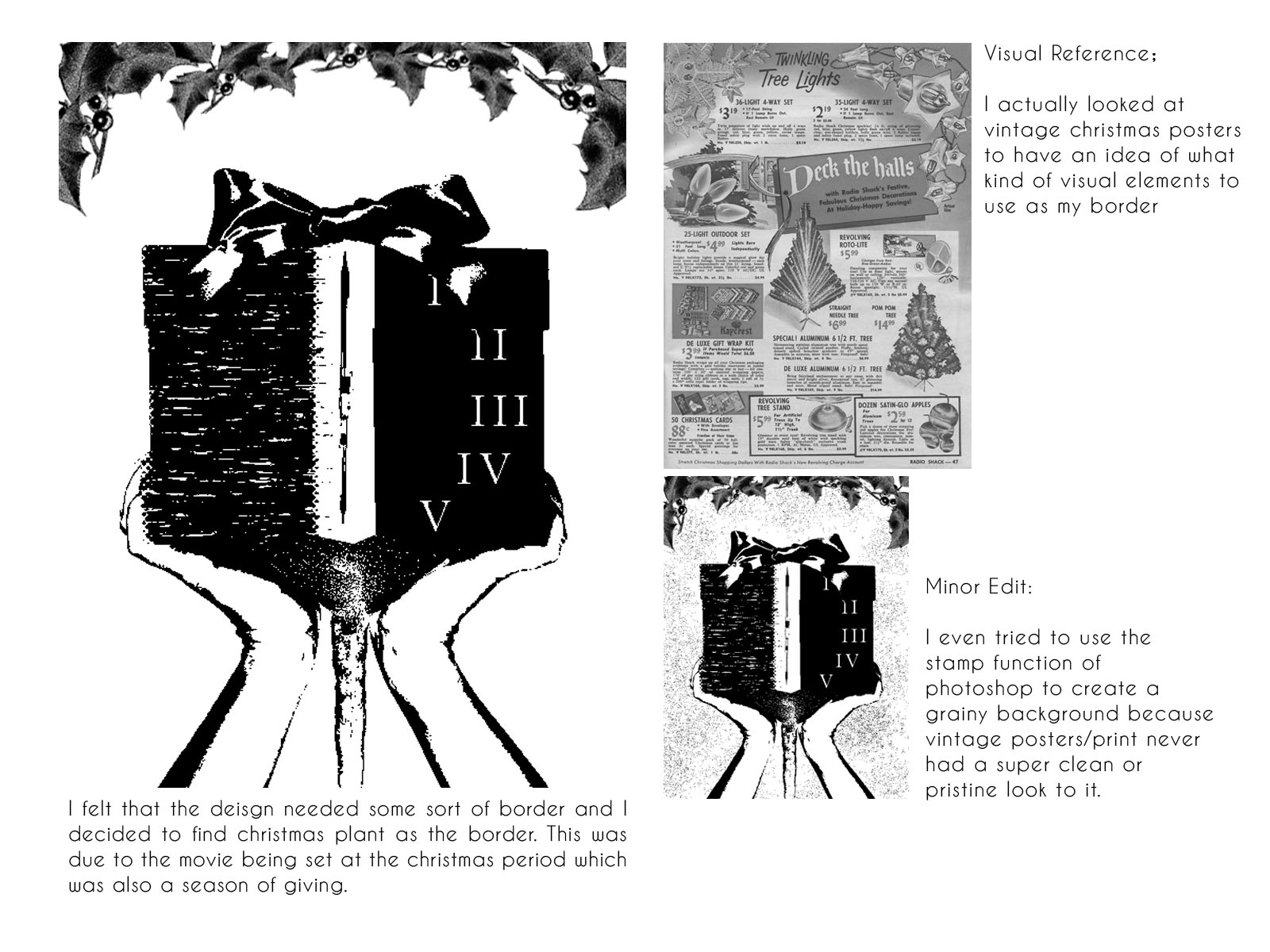
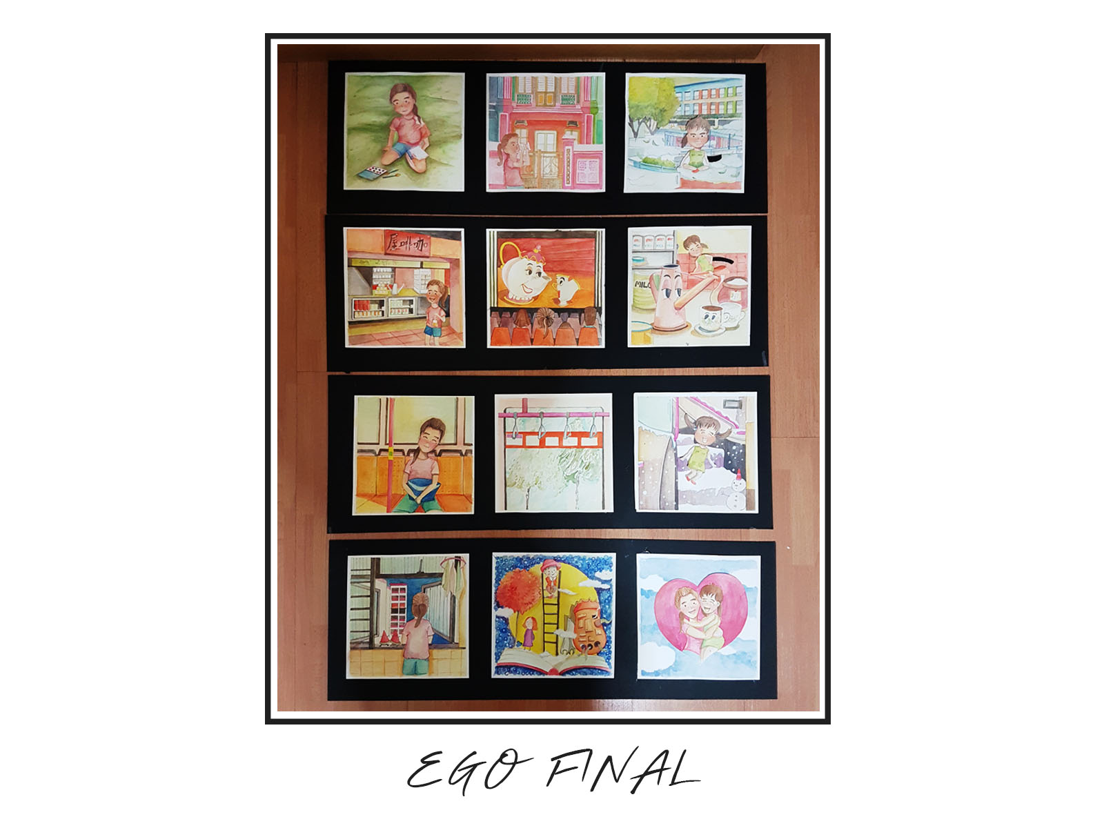
The overall concept of my ego is actually explaining (visually) how I re-imagine Singapore’s local landscape into something dreamlike and childlike. I hope I can divert the viewers’ attention to the seemingly insignificant fragments of our everyday Singaporean encounters through the frames of my imagined outcome.

All of my last frames has a same younger female character in it to highlight the child-like quality of the imagined outcome. This character is actually inspired by my younger self (such EGO) where I used to always tie 2 ponytails, had a very bad fringe cut (cos my grandma cut it) and had a very iconic looking kindergarten uniform (green checkered dress with 2 ribbons).  The female character is seen to be unrealistically situated in the composition to reinforce the surrealistic nature of the imagined outcome. 

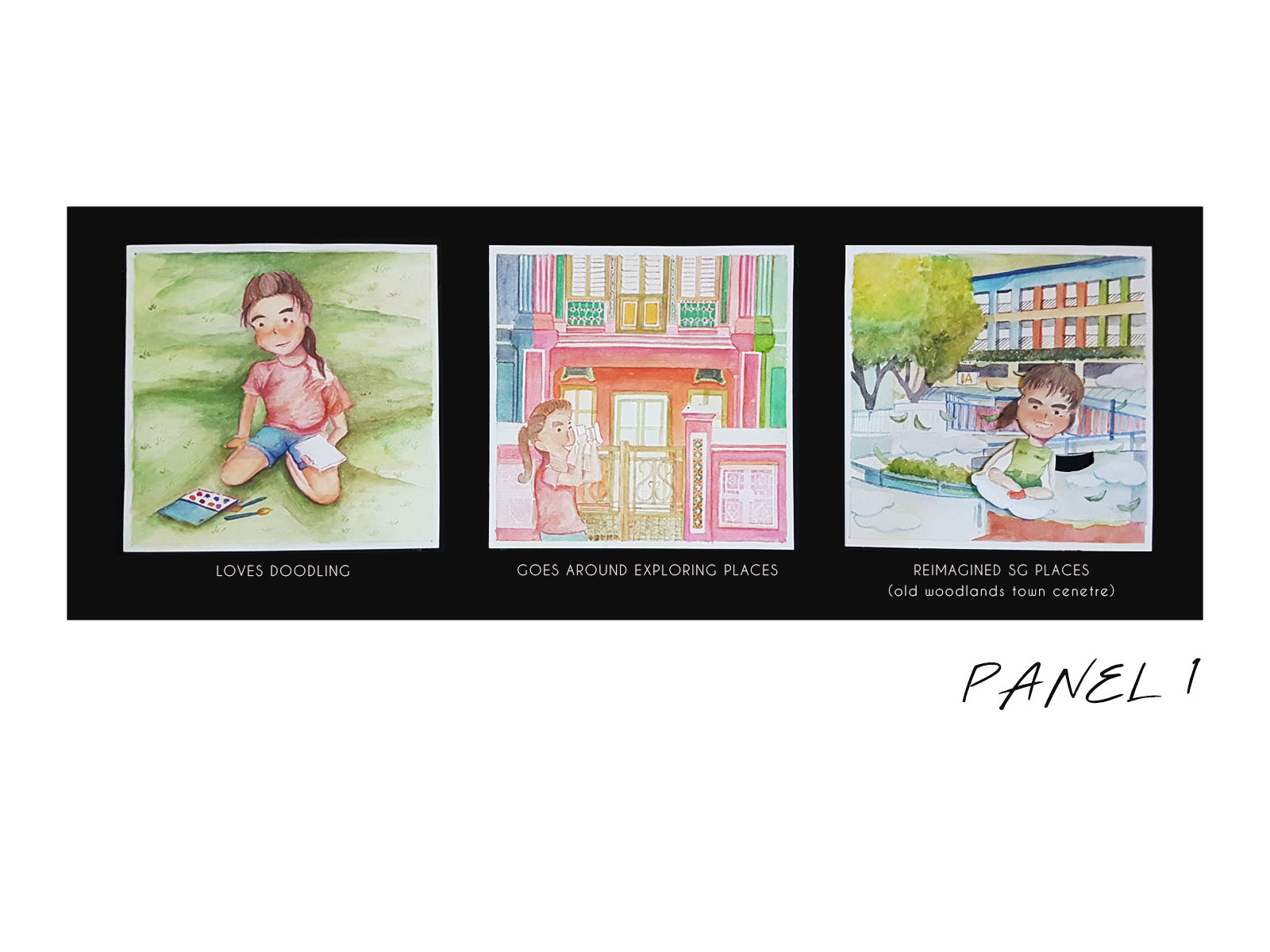
Since I really love to draw, I usually have to go out to find drawing content. This means bringing my camera out and going to more unconventional/ unexplored places in Singapore. My exploration, unlike many others, is for the sake of drawing more realistically grounded pieces. Hence, I will use the photos taken and  turn them into dream-like, surreal landscape. I chose to use the Old Woodlands Town Centre landscape as my final imagined outcome.

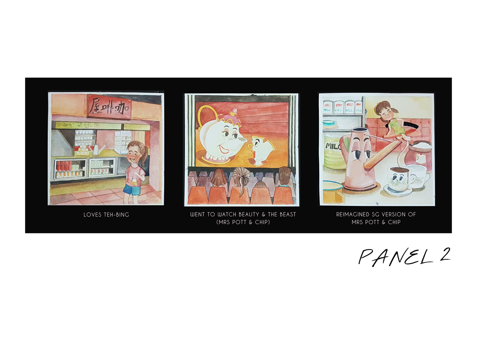
I really love to drink Teh-Bing, Teh-Bing with less sugar to be exact. Loving such a drink also means visiting coffeeshops very often. I always felt that that the coffee/tea making kitchen scene is very uniquely Singapore and decided to play with it after watching Beauty & the Beast. The movie had a talking tea pot and tea cup which then inspired me to bring it over to our local coffee making tools. The female character is seen sitting on a stirring spoon and flying around like how harry potter flies on his broom.

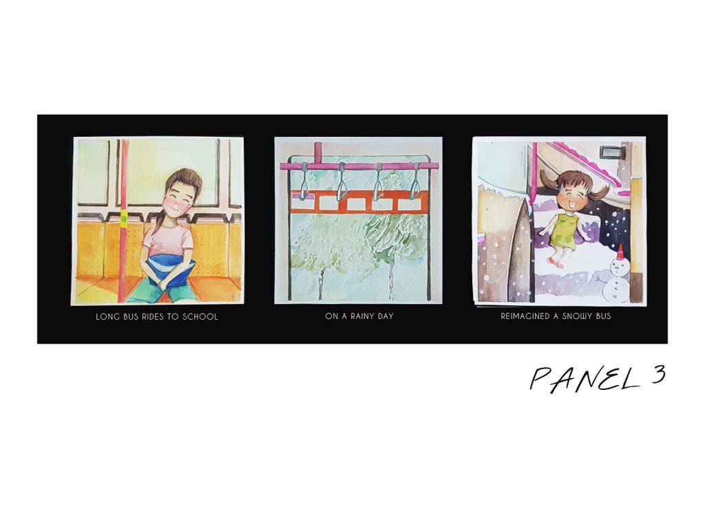
Since I don’t stay in hall, I have long bus rides to school and to home everyday. These bus rides are usually extended snooze time for me which explains the visuals on the first frame. However, taking a bus ride on a day with heavy downpour can be really really cold. It’s made worse when I don’t have a jacket with me. This inspired me to create a snowing bus and it was a scene set at the stairs going onto the upper deck of the bus. The female character is engineered to move as though she’s jumping from one step to another. 

The snowing bus is actually one of my favourite frames because it felt like I gave a new life to a seemingly insignificant part of the public bus. It is also this frame that will continue to spur me on to re-establish insignificant parts of our everyday lives into something special and dream-like. 
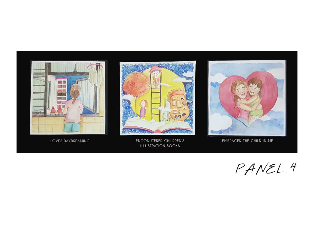
The last panel is one that explains and sums up the reason behind my inclination to illustrate images in a child-like manner. The first frame captures me at my favourite daydreaming spot at home which is in the kitchen. I often stand at the window to face the scenery outside to get a mental reboot before returning to work.

My daydreaming tendencies turned into something more than just a dream after I discovered the world of children’s illustration books. These books became a living proof of the potential direction of my artistic style and inclination. Artists like Ah Guo, Jimmy Liao & Shaun Tan became my main sources of inspiration to bravely venture into the world of illustration books.

Hence, the last frame has the older me hugging the younger me, showing how I have chosen to embrace and accept the child in me through my artistic pursuit.


P.S. I think photos of my drawings don’t portray the colours rendered at their best but oh wellz, the best is seen when it’s live.

2D Project: Ego Research & Process

I knew I wanted to use water colour right from the start, but to be honest, I only started using this medium earlier this year so  I am still pretty new to it. Mimi suggested Iraville as a visual reference and since I was familiar with her style too, I decided to go ahead with it.

These were some key takeaways that I took from Iraville:

  • Her use of warm, earthy hues. Almost every colour had a tinge of warmness to it
  • Her strong use of shadows adds depth the composition
  • Her method of painting human skin (I never painted skin with water colour before!!)

Iraville was a visual reference for my water colouring technique. On the other hand, I had another artist that was my content reference.

Ah Guo is a local water colourist that I chanced upon this year, and his manipulation of local landscapes to something dreamlike and surreal was the biggest source of inspiration for my body of works. His use of familiar landscapes motivated me to apply them in the frames for my imagined outcome.

Hence, combining Iraville’s water colouring technique together with the visual content of Ah Guo became the direction I was heading towards for my “Ego” project.

2D Project: Research on Movie Quotes

I started with a range of movie quotes to choose from, wondering which one was I able to visualise it in my head.  I personally have a habit of writing down impressionable movie quotes but I realised most of them were too abstract. They mostly consist of words that didn’t have a literal representation to it.

Hence,  I concluded that I needed to find quotes that had words which could be portrayed literally yet give me enough space/potential to add meaning to it.


2D Project: Process

QUOTE #1

I honestly quite liked this version of my design because the symmetry of this composition was really pleasing to the eye. However, the mountain against the black backdrop made them look similar to some sort of cosmic stones which wouldn’t have been the right association.  Furthermore, I realised that have grey tones wouldn’t be possible for silkscreen so I had to re-evaluate my designs to find one which would still create a successful threshold effect. 

FINAL DESIGN 

The above was my final outcome for the quote “The mountain always has the last word”. I decided to use the threshold version of the final composition since it was 1) what I used for my tote bag 2) it had a more imposing vibe since it was only black and white.

Using this composition made the addition of the human being redundant because they could not been seen. Furthermore, personifying the mountain as a monster-like creature was already enough to reflect the concept of nature triumphing (in a bad way) behind my quote.

QUOTE #2

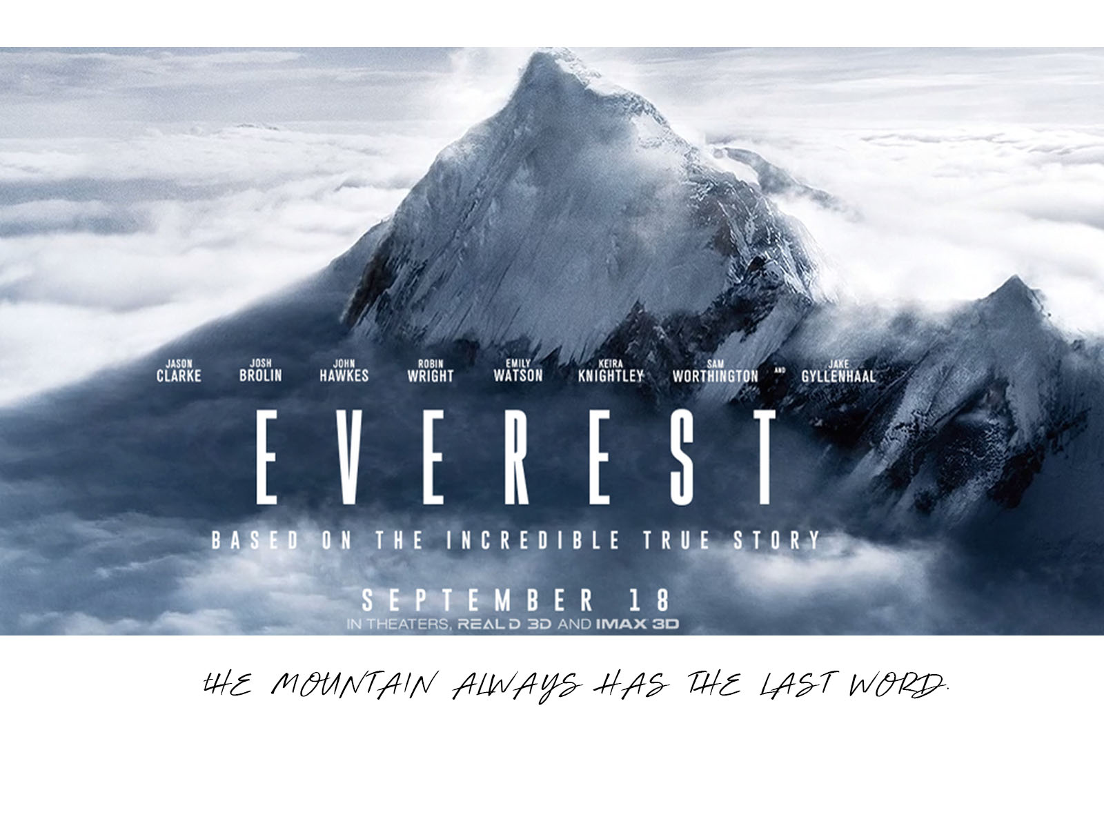
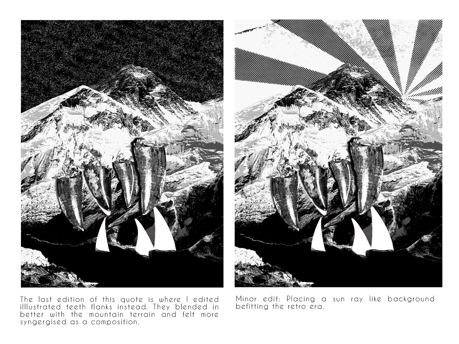
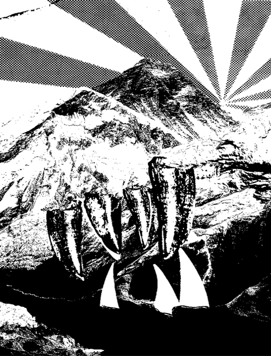
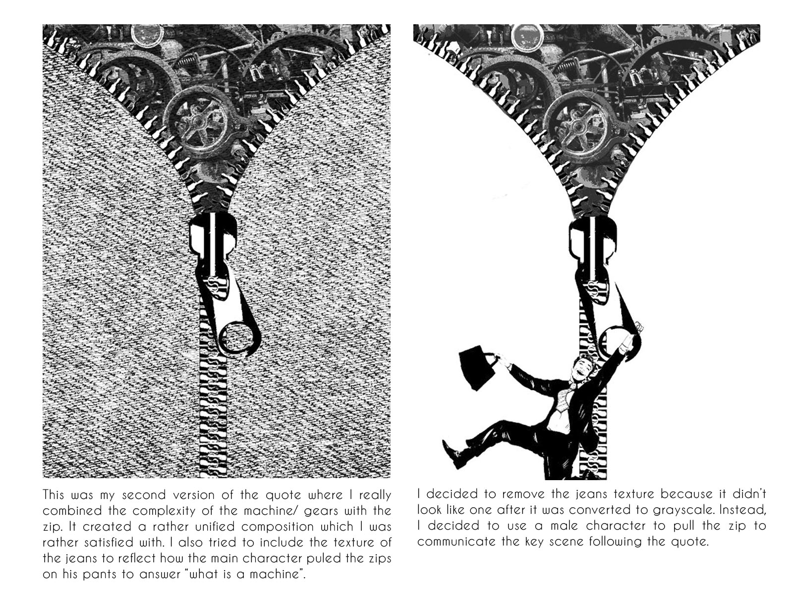
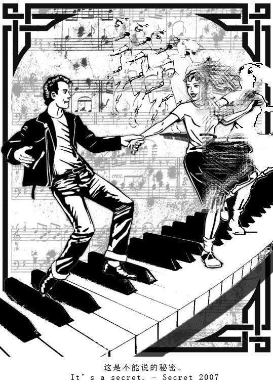
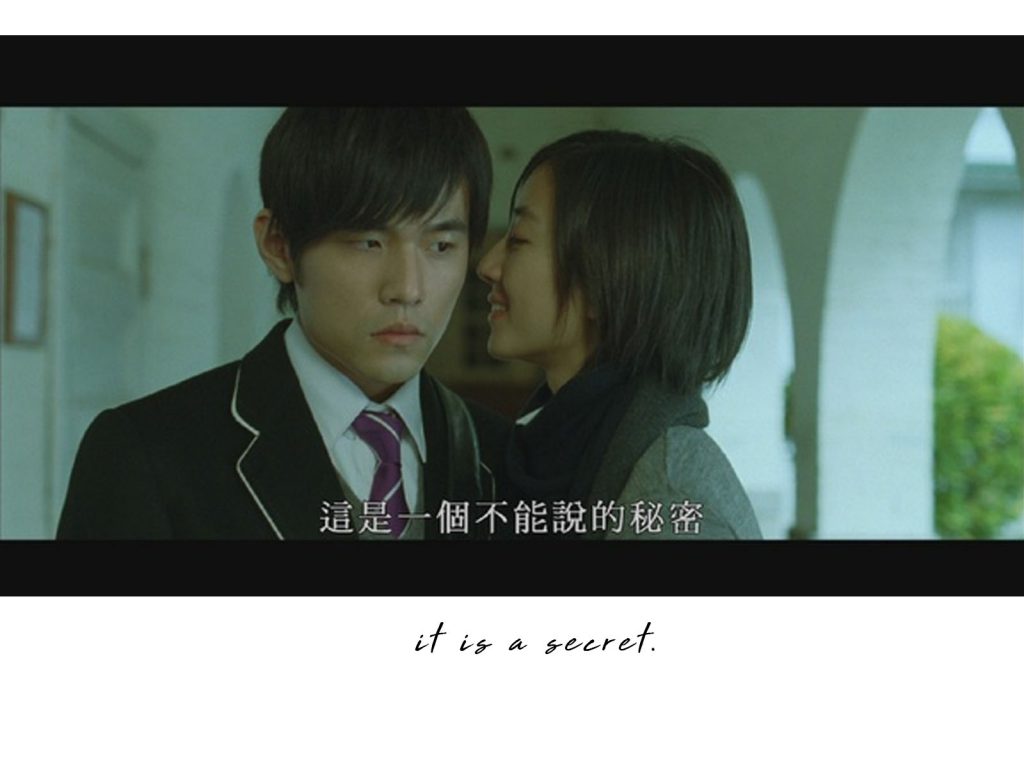
The scene where this quote took place is as follows:

Guy: What’s the tune that you just played?

Girl: That’s a secret

The tune was a secret and it’s actually called “Secret” because it is a tune that helped the girl travel through time. She traveled 20 years into the future and met the guy which she eventually fell in love with. Hence, the secret was more than just the piano tune but also how the girl is actually not real.

FINAL DESIGN

This was my final piece for the quote “It’s a secret”. One key change was the create multiple layers of the female character. They layers changed from clear facial features to faded off distortions to just a white fill layer and lastly to just an outline.  It’s as though the female character is gradually fading off to the background, reinforcing how her presence is not realistic at all.

Another very obvious visual addition was the Art Deco inspired frame which might not have been the best decision. However, the intention behind adding the frame actually sprang from my insecurity that the piece wasn’t retro/ vintage enough. Hence, I decided to link the Art Deco period to show that it was also the jazz age, hinting the strong musical presence in the movie.

QUOTE #3

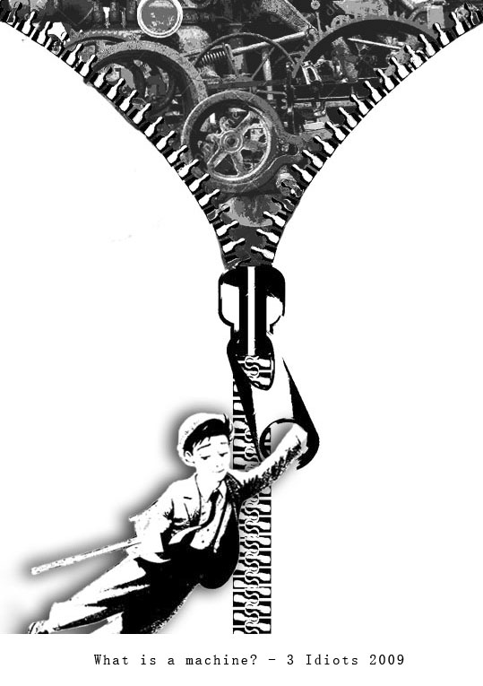
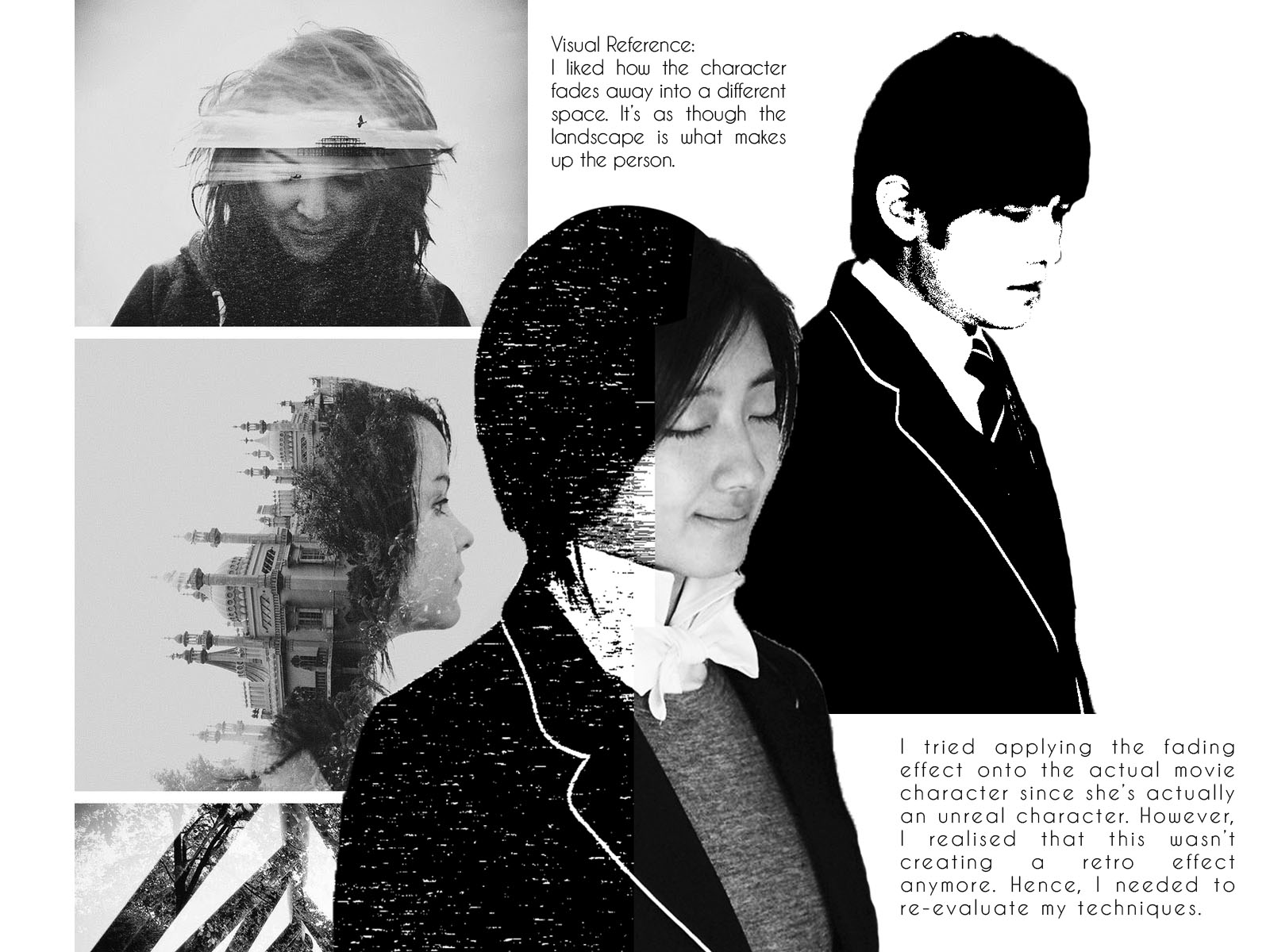
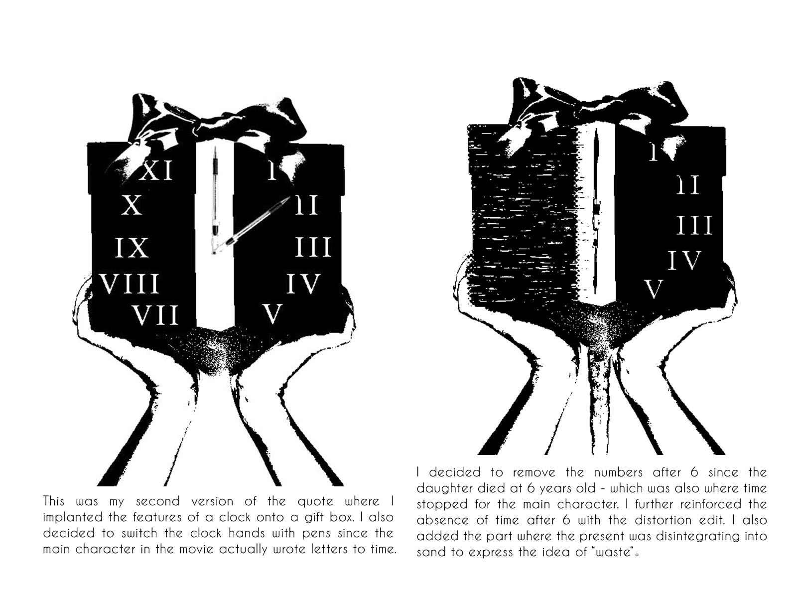
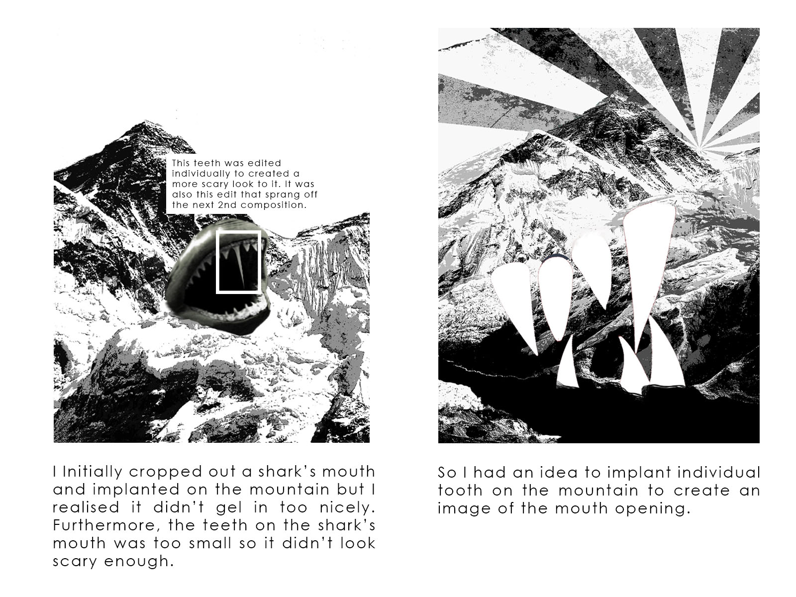
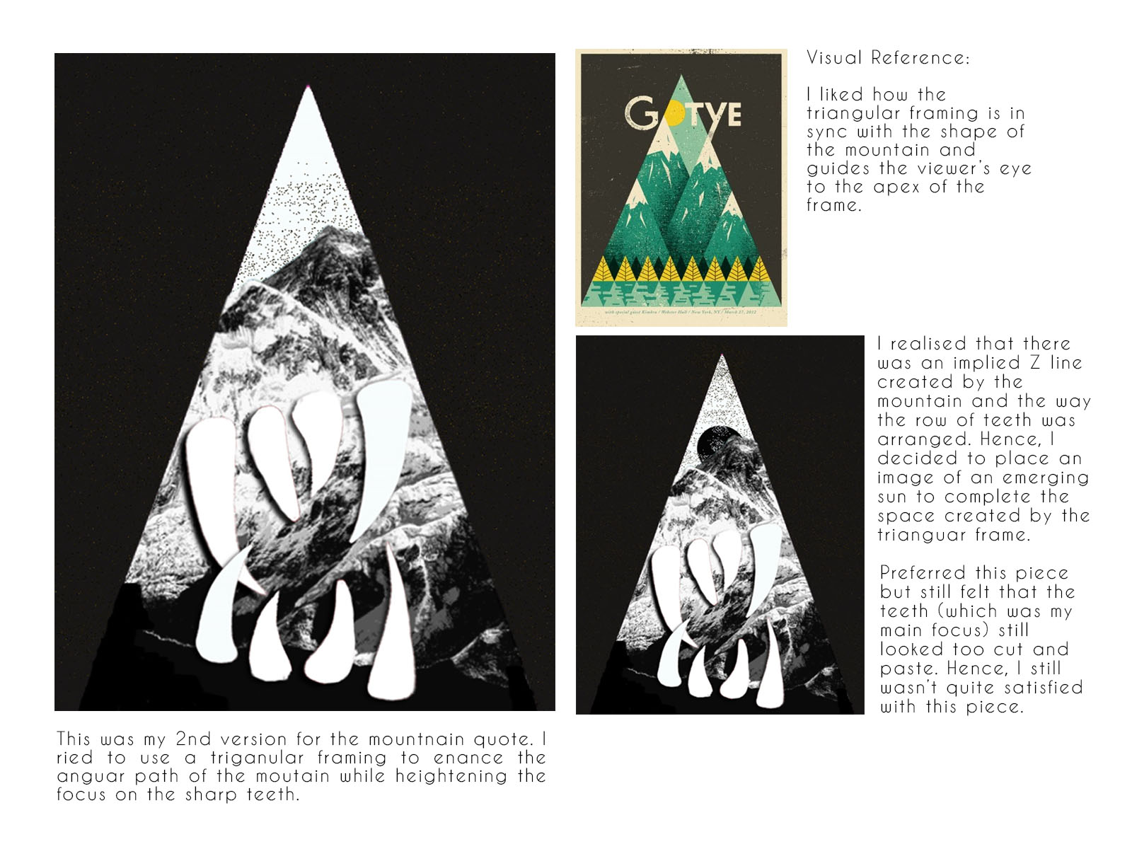
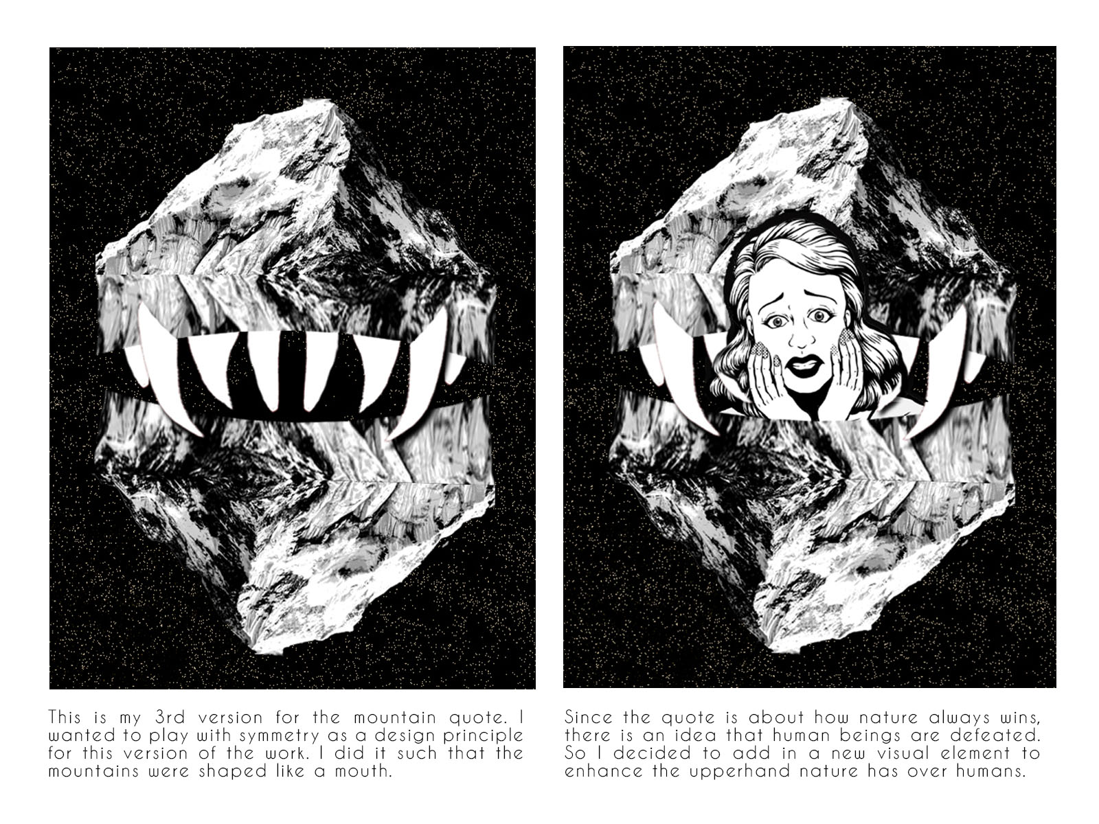
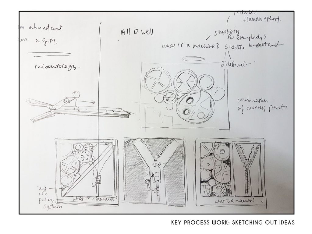
A very important and key process for this quote was actually physically sketching out different compositions on paper. I was never quite someone who dived straight into stringing different visual elements online so sketching out my thoughts was important.

Honestly, the sketching stage was already sufficient for me to decide what kind of composition would have worked and which wouldn’t. Some of the above thumbnails involved blatantly comparing the 2 responses to the chose quotes which I thought wasn’t sophisticated enough.

Hence, I decided to play with the thumbnail that had the zip take up most of the paper which led to the composition below.

FINAL DESIGN

This was the final design where I decided to do without the jeans texture and changed the male character. The previous male character was simply too jovial and was even in an working attire which wasn’t resonant to the context of the movie. Furthermore, I had to choose a male character which exude a vibe that belonged to the olden days.

I chanced upon this character which had an almost nonchalant expression which pretty much encapsulated the character in the movie. He exude a certain confidence and lack of care. It resonated with how the main character in the movie could not care less for strict book definitions.

I honestly loved this composition and would have liked to print this on my tote bag instead hahaha. It would have been a nice “optical illusion” to have an opening zip on the cover of the bag.

QUOTE #4

This movie was about how a father who lost his daughter due to an accident started writing letters to 3 abstractions – Time, Love & Death. So the quote “I am a gift and you are wasting it” is actually said by time.

FINAL DESIGN

This was my final design where I used the border to further contextualise the movie. The border is actually the border of the postage stamp which further reinforced the act of the main character writing letter to time.

Some comments was that the roman numerals on the gift box did not successfully portray an image of a clock. And I personally thought that there could be a smoother transition of the gift box disintegrating into sand (like an hourglass). This could probably be achieved with more exaggerated distortions on the left side of the gift box.


2D Project: Process Work for My Line is Emo

Most of my documentation have been done offline so my post here will just be a brief coverage of some key process works that I have taken while completing this project.

I remember my instinctive approach towards mark making was to create marks with natural objects – leaves, twigs, branches etc. The process actually left me with pretty nice stamp-like marks but they were obviously too representational. Hence, I needed to find a more abstract use of different mediums to convey my intended emotion.

With that, I kick started a brand new exploration with mediums that I had easy access too and had experience using it. However, I needed to consciously push boundaries and use them in unconventional manners.

One of the fun yet surprisingly tedious experiment was the acrylic flow technique. As my virgin try on such a technique and when acrylic paint is definitely more costly relative to other inks, I decided to play with it on a small canvas first.

Quite loved how it turned out as a first attempt due to the marbling effect that was created. Since my approach for the first round of experiments were to put an emotion to a visual effect, this was meant for satisfaction. But I guess it didn’t quite match the emotion since it turned out quite random.

To make my  acrylic flow more purposeful, I went ahead with my 2nd round of experiment (after consult). I did it on an A3 acrylic canvas and above are the crops that I made to choose my final strip. Instead of satisfaction, I decided to use this method to signify passion. Leveraging on the energy created by the acrylic flow, I thought it represented how my passion for art will bring me unexpected possibilities.

Another interesting experiment that I did was to paint Chinese ink on tissue paper. I tried different tones as the darkest tone could not highlight the creases on the tissue. Eventually,  I decided to apply a collage approach to achieve the visual  effect  to represent disappointment/sadness.

The last approach that left an impact on me is the burning effect. The varied effects that burning paper has provided really interest me. The variation comes from the type of paper used to what we use to burn, there’s really so much possibilities this approach has given me.

Burning paper to signify BURNT OUT

My first try was to burn with the fire lighter. Since it was my first time using this technique, I find that I have a lack of control over how much and where the fire was burning at. But I did learn about how the soot will look like on paper. I also discovered that using candle to burn created nicer and smoother visual effect. Hence, my final strip incorporated both burning techniques.

The burning, acrylic flow and tissue paper paint left the deepest impressions on me amongst all the other experiments that I did. I also felt that the acrylic flow and burning technique can be pushed further by mastering better control over a seemingly uncontrollable medium. But yes, this pretty much sums up the key creative processes that I enjoyed the most and will love to play with them even more.

2D Project: My line is EMO

The overarching theme for my set of emo lines is the emotional roller coaster ride that I face in my art making journey. It almost came as a surprise that my art making journey has provided me with such a wide spectrum of emotions as I delve deeper into this project. Feelings of satisfaction, disappointment, regret, calmness, a sense of burnt out and passion were ultimately chosen for my presentation.

Feelings of burnt out was literally captured with the burning of the paper strip. A huge hole was burnt focal point of the strip as I recalled saying “I’m about to explode!” as I was on a mad rush for my Alevel Submission. The strip encompassed 2 kinds of burnings – from the lighter and the candle, to represent the overlapping intensities of fatigue that I felt. What was possibly more interesting was how I used coffee powder as a mask for explosive marks. This created another layer to my piece, which was coffee as a “last resort” to fight on my fatigue to complete tasks at hand.

Following burn tout is a sense of satisfaction. I chose to portray my sense of satisfaction in a manner that was very light-hearted and full of movement. I understood satisfaction to have a very fleeting effect on me. Instead of hard strokes to portray an emotion that was very much tied to sense of fulfilment etc, I chose light wavy strokes instead. They project a light hearted, fleeting mood to it which very much linked to my idea of satisfaction. The way the wavy lines seem to continue out of the paper symbolises how these happiness is almost everlasting, and will always be a point of return when I face doubts in my creative journey.

Next, disappointment. If I ever faced huge disappointments, crying in my own personal space is my coping mechanism. Hence, I actually use tissue paper as my medium to paint on. I actually juxtaposed the randomness of lines created by the tissue’s creases with the jarring harsh lines of the geometric shapes. Using such harsh lines to compose this strip was to show how much I dislike being in a state of sadness and my strong desire to get out of this horrible emotional state.

Following that, is passion created by the acrylic flow technique. Such a technique embodies a sense of spontaneity, and produces lines that go in unexpected and uncontrollable directions. The medium itself also helps capture alot of energy and life in the flows created. This very much depicts my “passion” for the creative works. This interest of mine have very much continued and persevered in unexpected ways and has also gave me unforeseen opportunities that I have come to cherish dearly.

Regret comes next and seemed to be strip that caught quite a bit of attention. What makes it starkly different is that it’s white on white. A sense of regret is almost like an emotion that one can never truly reconcile with, hence, the use of modelling paste to create an uneven surface on top of the smooth paper. With the notion that I continue to live on with regrets, even using that as a motivation to do better, it occurred to me that there’s beauty in such a negatively conceived emotion. This made me draw inspirations from the wabi-sabi style where there is beauty in imperfection to finish up the strip. Painting streaks of pearl white which was shiny on the cracks created by the modelling paste, I seek to beautify and enhance what’s supposedly undesirable.

Lastly, I ended of with calmness. I often feel a sense of calmness envelop me when art making or even when in awe of paintings. This sense of connection is very much felt because there is a connection established. Whether is it in a physical form of connection where my brush touches the canvas and I can just paint for hours or when I stand still before a painting that has intrigued me, it is connection that brings peace and calmness. Hence, I drew 2 blobs that I had a point of merger like how I feel connected with the works around me. These 2 blobs are created with inspiration from geographical contour lines since connection is almost like 2 different worlds merged as one. They are drawn with a wrapping black background to signify the lack of presence/focus of my surroundings.

So I am done with explaining my thoughts behind these visual compositions! I must admit that my last strip is the most unresolved, hence, the hardest to put my ideas into words that actually corresponded with the visual outcome. Experimenting with super different techniques have been pretty interesting and it’s fascinating to see how the most abstract of ideas can develop further in the same direction. Goodbye, my line is emo, no more emo vibes in class!


Lavender Mist – Jackson Pollock

Jackson Pollock’s Lavender Mist is a painting created in the 1950s. He uses earthy colours  to create an abstract compositions of lines covering a large canvas. Fueled by spontaneous splash of paints on the canvas, a lot of movement is captured in Pollock’s work.  The synergy created with the overlapping lines and colours allows his work to evoke some sort of emotional response from the viewer.

Jackson Pollock, Lavender Mist