Category: AY1718 S1 FDN2D G8

foundation 2d project 2 // final

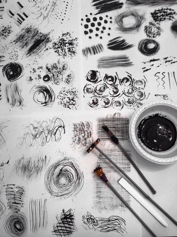
Before I start, I have to say this. Thank you Foundation 2D, for creating such a fun assignment. An assignment that I got to play around with after months of having not touched my tablet. It was tough getting back in touch with a digital medium, but it sure was therapeutic. It was like getting back onto a bicycle after years of not touching it, and wobbling about for several minutes (and in my context, it took at least a few days) before you finally got the hang of it again.

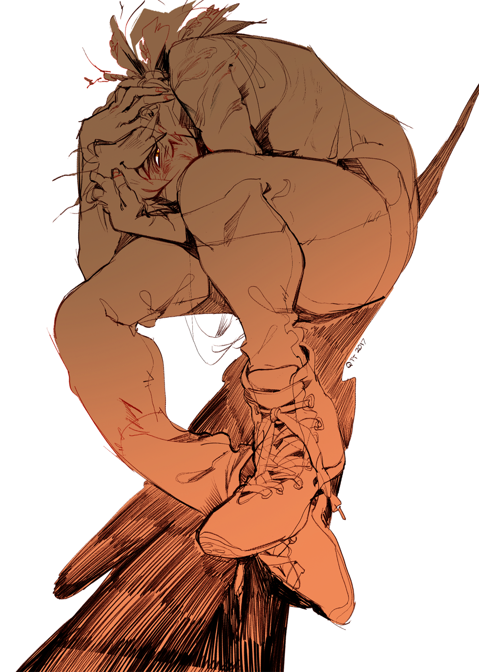
Well, here’s my final piece, anyway.


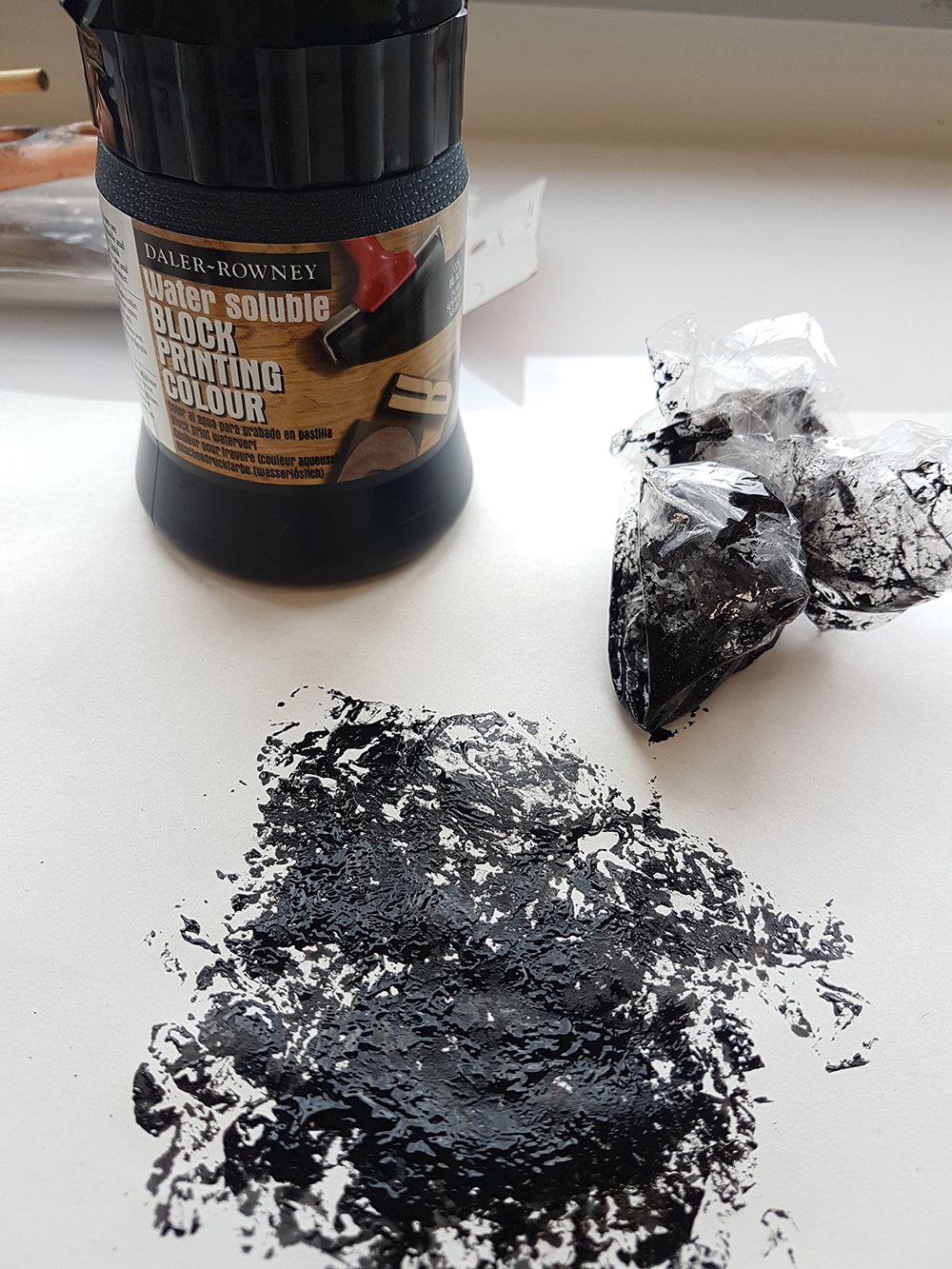
To be honest, I feel like I could have worked on it a lot more and played with colours more than I did. But I already had various colour palettes in mind that I also mixed around with by playing with the Hue and Colour Balance sliders on Photoshop. (Bless those sliders, I’ll give them my life.)

I’ll be honest. I never worked on OSS while doing this project. I had a few references that I spammed tabs on Google Chrome with — mostly colour references to the way people painted with, and then went ahead with consultations and drafting. So I’m basically going to stuff everything into one post this time, unlike my usual long separated posts for each category.

Maybe I’ll talk about my research, first. My three main inspirations are:

Tekkonkinreet

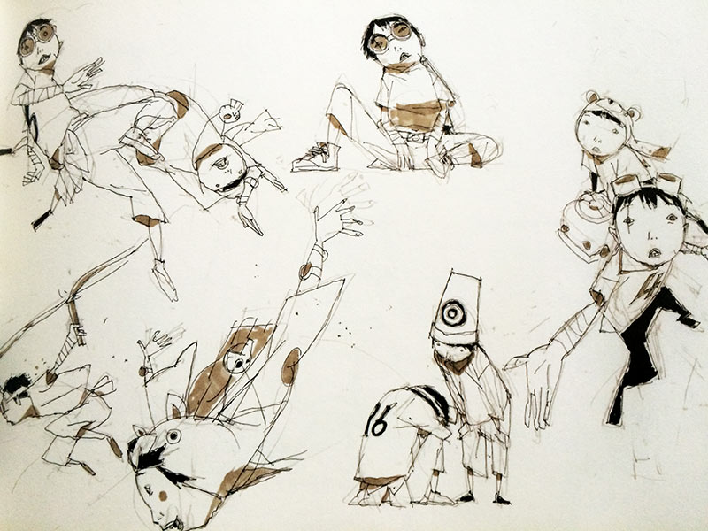
Retrieved from http://oomou.com/wp-content/uploads/2016/06/artbook-tekkon-kinkreet-6.jpg on 21 November 2017

I fell in love with the art of Tekkonkinreet back when I was in year 1 poly. They showed it to us in class for History of Animation, and it has been a big part of my art direction for awhile already. Although I still have not reached that level of confidence to play around with shapes that much, I have always admired the sketchy look that their art has. (Also, it’s a great movie. I even have the artbook.)

pupskin (tumblr)

Retrieved from http://pupskin.tumblr.com/post/165954839318/that-time-of-year-where-i-freak-out-about on 21 November 2017

Retrieved from http://pupskin.tumblr.com/post/166312942153/c-ya on 21 November 2017

Retrieved from http://pupskin.tumblr.com/post/166312942153/c-ya on 21 November 2017


I have a newfound love for colours done like how pupskin has done theirs. Dull on neon seems to be a thing they do which I don’t know why, attracts me a lot. It gives a slightly unsettled vibe to it, and is one of my colour references for my pieces, along with the messy work they produce that still give so much emotion and expression.

Skychair (tumblr)

Retrieved from http://qtt-art.tumblr.com/post/162861591759/something-i-drew-for-shunaos-gbf-art-book-a-while on 21 November 2017

Retrieved from http://qtt-art.tumblr.com/post/165228409149/made-of-gold-never-loved-her on 21 November 2017


Another one of my artist references for their Neat Line Work just look at that glorious glory beautiful wow amazing. I also referenced the piece on the left for my oriental looking pieces (temple).


Colours:

Along with hue and colour balance and my general preference for certain colours, I used a lot of this cool website https://coolors.co/ to find pretty palettes to play with. As you can tell, I avoided a lot of pastels, and for some odd reason, had a lot of yellow.

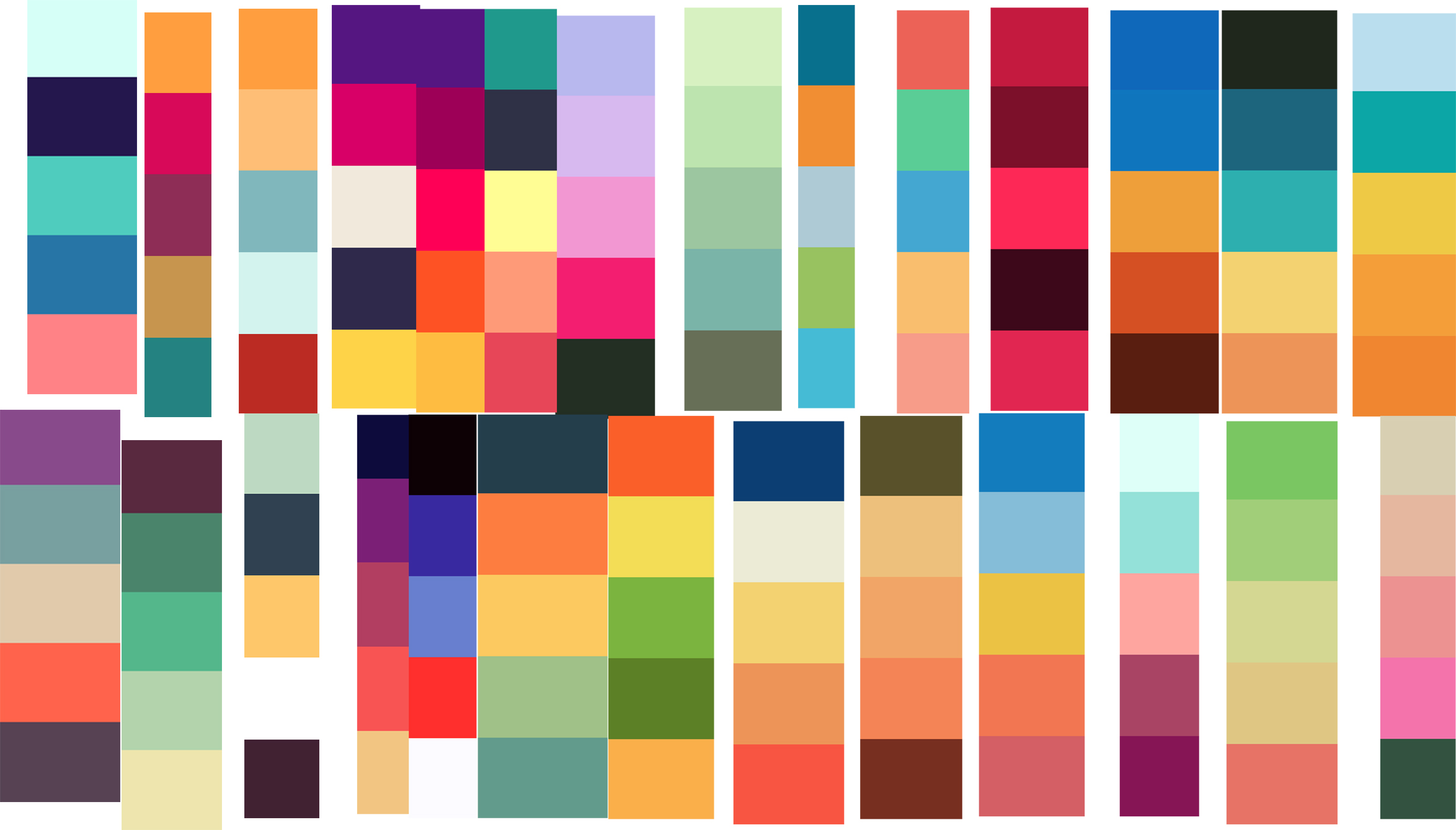
I used https://coolors.co/

The yellow obsession was probably an attempt to find a good yellow for my highlights that magically became an iconic part of me, besides my red glasses.


Well with my references done,

Here are the individual pieces:

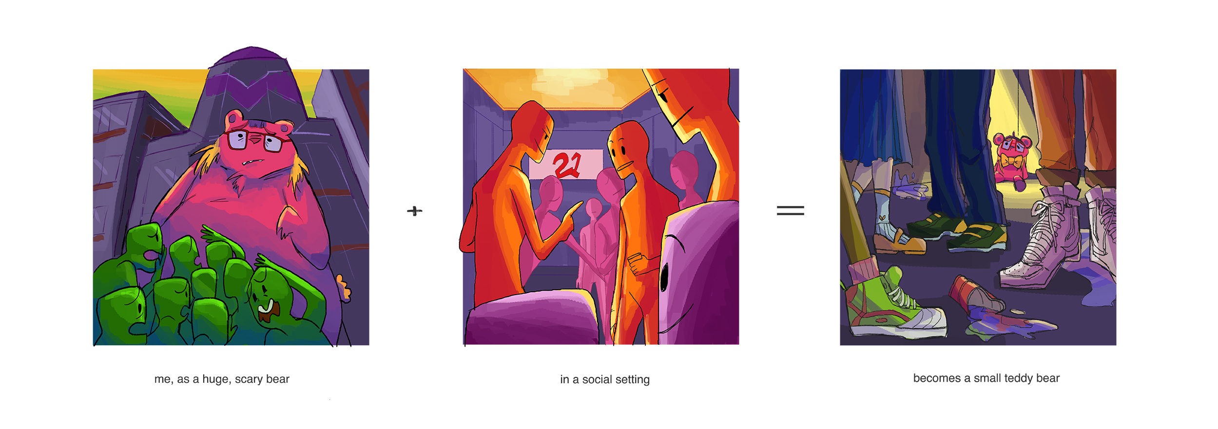
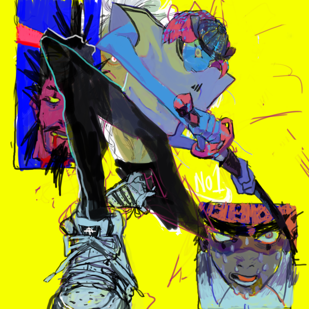
me, a huge scary bear +  in a social setting = becomes a small teddy bear

I wanted to basically talk about how my first impression would always be of a big scary person. Nobody ever dares talk to me, and when I ask friends they usually tell me I’m very unapproachable because of my height and general built (big). But once someone gets to know me, I’m usually just a meek person who is very huggable. Since I was primary school I was often called a teddy bear and till now it hasn’t stop, if I had to be honest. I don’t mind being a teddy bear. But once I’m placed in a social situation, where I have to be friends with people, I tend to shrink away really fast. So imagine a bear shrinking. That’s basically it. And I drew in a lower angle for the 3rd panel because it’s as if I’m reallyyyy small as compared to the first one where I’m reallyyyy big. And because I could play around with drawing shoes. That was fun.

Even though most of the scenes have a dark purple to them, I tried to keep an element bright, and the 2nd panel is seen as brightest with its illuminated human blobs. This is to show some sort of party element to it (social setting). The pinks that I used in the bear in the first panel were repeated in the 3rd panel, along with my glasses and my hair highlights to represent myself.

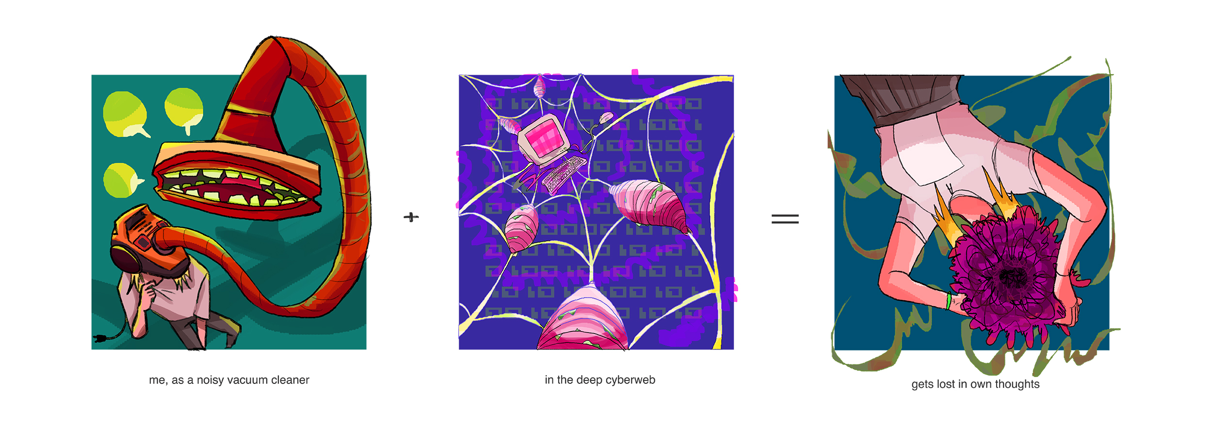
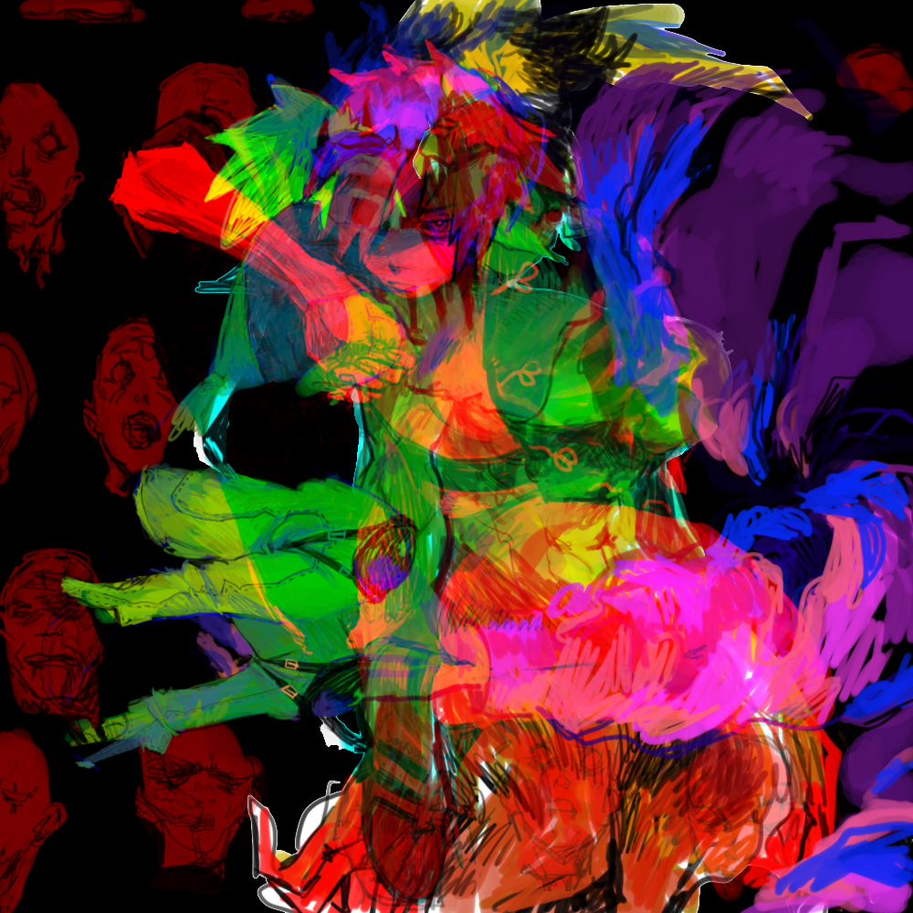
me, as a noisy vacuum cleaner + in the deep cyberweb = gets lost in own thoughts

I’m pretty talkative amongst my group of friends, and I also take in a lot of information from wherever I can. In a sense, I’m a naive individual, if you could still called a jaded, irony-loving person naive. When introduced to the darker side of the internet, I tend to go too deep, and find many weird theories about things, or weird thoughts about others. And that usually ends up with me too caught up in my own thoughts about things. I basically became a vacuum cleaner that sucked itself. What a sucker. HAH.

I went with greens and purples for this set, with a tinge of warm colours here and there as a contrast.

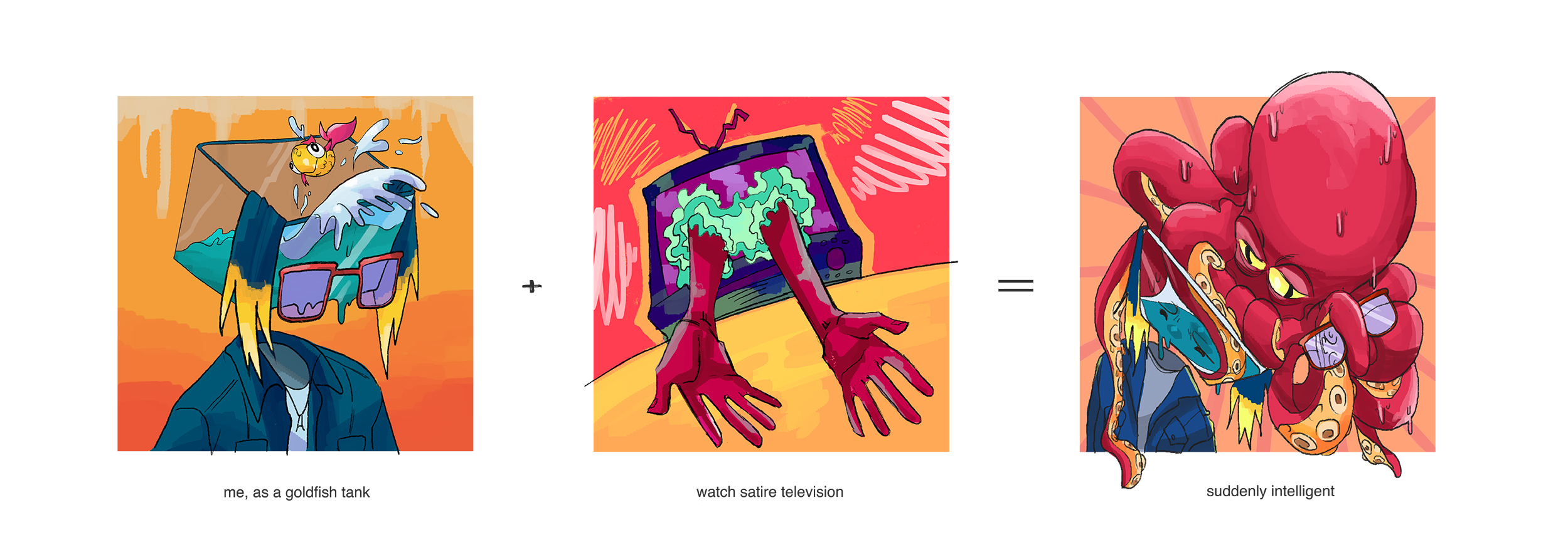
me, as a goldfish tank + watch satire television = suddenly intelligent

I have the worst attention span. I zone out all the time, and my brain is mostly empty if I don’t put in the effort to have something in there. How am I alive? I don’t know. I like my brain empty though. They always say goldfish have a 3 second attention span, and I placed one in a too-huge tank to basically represent me. Empty and dumb.

I have also been watching tonssss of shows that question society, and whenever I do that I tend to binge watch them. Like you know, watch 10 seasons of it within the past 3 weeks of school. And that keeps my brain going. It’s suddenly stuffed basically, and I now have this stupidly smart octopus in my teeny tank brain.

I went with lots of warm colours for this one to counter the water blues. My glasses and hair are still there. I gave the TV typical purple/green colours for a more ghastly villainous effect, and to show its psychedelic effects when you binge watch too much and lose track of reality.

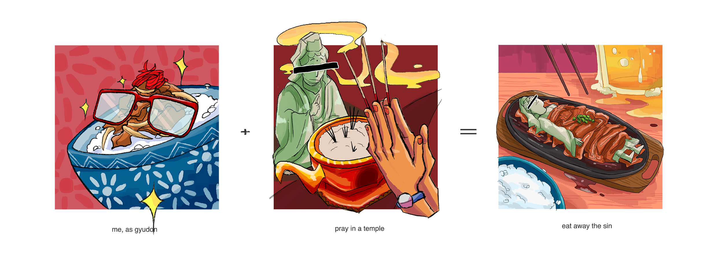
me, as gyudon (beef bowl) + pray in a temple = eat away the sin

First of all, as some sort of respect to the fact that I do pray to this god, I censored her face off. I think it’s kinda funny still. I’m probably a bad kid now going to hell. Sorry Guan Yin. ):

Ever since I was a kid I was told never to eat beef. It was part of my religious practice as a taoist who prayed to Guan Yin, and I never questioned it and was even afraid that eating it would result in me exploding. (Don’t ask me why, kid me was convinced.) I ate beef once because nobody told me lasagna was made of beef. I cried really hard.

But as I grew older I asked my parents why, and they eventually allowed me to for the convenience when eating with friends. (It used to be so strict that I couldn’t share barbeque pits that had beef on it. No contact with beef at all, nadah.) Eventually it came to a point when I was in Japan and we were having food at a gyudon restaurant. And that was my first time eating gyudon, AND I FELL IN LOVE. I have yet to shut up about beef bowls. Ask my friends.

So now I live my life in sin. HAHA. Joking. I still pray at temples, because I still didn’t mind being in a religion, but I had my secret love for gyudon for at least 2 years now. Yoshinoya doesn’t have the best but it’s good enough.

Here’s where the oriental bit of colour comes in. There are basically a lot of reds in setting and in meat and ginger. Tiny bits of cool colour (bowl, Guan Yin) help to balance it out. In this piece, I did not specifically put myself in the outcome of it, but I feel like it works, like as if I’m fake Guan Yin and I deserve to be eaten (lol.) But I kept with having more yellows throughout my four sets of three to imply my highlights.


Well that’s basically it. I loved every bit of this project, and I felt validated for using weird wiggly lines in my pieces by Shirley. I’m glad we had this to buck up our painting-y skills, really. I hope presentation day will be good to me, because it has been a tiring few weeks thinking that my art sucks.

foundation 2d project 2 // process + final

After doing parts of this project, I realised I really like it. A lot. I’m actually kind of sad that it is coming to an end in a few days. I enjoyed every part of making this assignment turn into a reality, and here it is! Based off the 4 quotes that I have chosen, a lot of my themes were very animal-driven, which I felt gave a very raw feeling, which was what I wanted. Said by the most irrational of teens, many of my quotes questioned the societal norm and related humans back to their nature of dealing with things —things like segregation, behavioural patterns, etc. I wanted my designs to be straight to the point, like how raw they all seemed.


J.D.: The only place different social types can genuinely get along with each other is in heaven.

(Heathers, 1988)

I started off with my initial idea of using animal heads on human bodies, but it honestly got too cluttered. There was no actual goal going on here, and I obviously did not pay any attention to design principles.

I decided to keep the shaking hands though, and tried to portray heaven with some Greek sculptures instead.

I tried to go with a diagonal, like a slash of nonconformity, and ironically used Narcissus and Aphrodite as my subjects to represent the various “social types”. Decided to keep the angel theme going as well by using a baby angel to portray heavenly innocence of sorts. However, there was too much going on in this composition as well, so I decided to take one of the sculptures out.

Final Design:

Decided to play around with the visual hierarchy by making Narcissus extremely big in comparison to what was supposedly heaven (the baby angel) The hands are used as a barrier, away from where heaven is. It basically shows how it is nearly impossible to allow all social types to be able to get along. I also tried to create a yingyang asymmetry, such that the shadows on Narcissus would contrast with the white background, whereas the light on his face would contrast with the black part of the background.


Heather Chandler: Well, fuck me gently with a chainsaw. Do I look like Mother Teresa?

(Heathers, 1988)

My initial concept was a snake cheerleader and chainsaws; with a coif around the snake’s head to let a person judge if it did look like Mother Teresa. I did keep the concept all the way through my various compositions, merely changing the types of pictures to make the design pop up more.

I made the chainsaw into some sort of ‘sun’, as if it were a holy light source to worship. It could also seem like a halo, this is up to your interpretation. I thought it would have been cool to add some illuminati symbols too, but I realised it was honestly a bit too much. So I took it out.

Many of my initial designs had more half-tone images, which ended up blending the image so much that nothing stood out. Changing the images used helped me to better contrast between black and white.

Final Design:

I changed the snake again when I realised the first one was too pixelated. I went with a stronger half-tone gradient background instead, and used ‘blood’ to help bring the focus to the snake. It also felt like a paradoxical contrast between violence with a chainsaw and the actual quote using the term ‘gently’. The snake cheerleader was also made bigger; Shirley told me to take the armpit away. HAHAHA.


Penny Pingleton:  I am now a checkerboard chick!
(Hairspray, 2007)
Honestly one of the cutest quotes ever. Penny is such a sweet girl, and I wanted to justify the quote in a more whimsical tone.
First of all: I got to, I HAD TO. Hands and chicks. Hens and cheeks. Hands and cheeks. Hens and chicks. Get it? GET IT!!!
Okay, it has a underlying message. I know we were just supposed to portray what the quote was, and it didn’t need any sort of backstory from the movie, but I thought it was a great idea to use it as some sort of meaning. Like, it could mean that the chicks were being set free. After being oppressed, or for the chicks being kept in a little box, for so long, they finally have the chance to roam around free and do whatever they wanted. Or it could be the hands of Mrs. Pingleton, dying to grab at Penny and send her back into a world of the Repressed.
The checkerboards are self explanatory. I twisted it so it looked like a dance floor too. And the background to give it a more poppy feel.
Final Design:
After consulting with Shirley, I looked around for woodcut chicks instead, so that they stood out more in the final picture. I made the whites of the checkerboard grey instead, so that the chicks were the main focus, along with the hands. The background became darker, and I was not too concern for the halftone of the background to appear on my final silkscreen printing; but if it did, It would be nice.
J.D.: Chaos is what killed the dinosaurs, darling.
(Heathers, 1988)
 To be honest, I wanted to use this quote just so I could play with a dinosaur fossil.
I used a explosion symbol to represent Chaos, and yes, of course, my beloved Dinosaur Skulls. Again, it turned out extremely cluttered the first time. I realised I kept trying to stuff too many elements into a singular piece of work, which often made no room for a nice composition.
Final Design:
Shirley helped make that cool background effect with half-tones, I don’t get it, how does she make it look so amazing,
I left the trail of blood at the bottom to represent the chaos and bloodshed.
I learnt that I needed to have a focal point to send my message across. In a sense, they always say that the audience is lazy, and you had to purposely give the audience a leading line for what they are supposed to look at.
So these are my four final designs! And ultimately, I ended up choosing:

TADAH.


On to the silkscreening process!

It was my first time trying silkscreen printing, and it was tHE MOST FUN I EVER HAD. I’m kinda sad that we can’t really do a lot of it past foundation year, but I’ll see how it goes in the future! (HINTS AT ADM)

I didn’t take many pictures because my hands kept getting dirty; everyone’s hands were dirty most of the time, so I couldn’t ask, but here’s what it looked like after the emulsion process!

It turned out so pretty I was really amazed. The grey areas managed to translate well, and there were still parts of the black background pattern that stayed.

Came time to test print it on paper, and I knew I had to use a lot of ink since there was a lot of black involved. I was afraid the pattern would disappear, but it turned out pretty okay.


The patterns all came out really well! I could see the half-tones and the values were similar to the original.

Here came the difficult part of printing it on the tote bag itself. I forgot I could actually iron the bag beforehand, and it came out a little different.

The background became even more fancy from my careless printing, and a lot of the half-tones in the hands disappeared. However, the checkerboard got a new, cool gradient, and the funky new background was not that bad. The chicks turned out good, and I was actually pretty satisfied with the end result. It didn’t look like the original though. I asked Shirley and she said it was fine, if I was fine with the end result; about how these sort of things made it art. BUT ANYWAY.

Lucky for me, I had an extra bag!!! WOAHHHHHHH. A drawstring bag!

This time I ironed it beforehand, and made sure the silkscreen was aligned well on the cloth.

I would like to thank my hands for being stable this time.

It looked EXACTLY like how I wanted it to turn out. All it took were some stable hands, your friend’s stable hands, and maybe an extra pair of hands, a lot of patience and screaming, to get it perfectly inked onto a bag!

The end results! Now I have two new bags to use, yay!!

foundation 2D project 2 // research

With Assignment 1 done, we have been immediately briefed for our next assignment: Forrest Gump!

So the first thing we had to do: find movie quotes.  And I had just the most perfect ideas in my head. I have recently been in love with musicals; and there have been a few really good ones that came from movies, or were made into movies. So I decided to find quotes from Heathers (1988) and Hairspray (2007).

One thing I like about these two movies are how they tackle various societal norms in the 1960s and 1980s. In Heathers, they made use of black comedy to talk about how suicide got overly popular in creating some sort of emotional sensation. Despite the movie representing something from the 1980s, I still felt like it was something relevant in today’s society, as if nothing has changed in the past 50 years.

Here are some of the quotes I have picked. In order to better understand the quote and how i interpret it, I will break the keywords down to aid my search for pictures.

And pardon the language used in some of my quotes. I like how direct it can get sometimes.

HEATHERS


https://media.giphy.com/media/ZZ8JgdJZadObS/giphy.gif Retrieved on 16 September 2017

J.D.: Chaos is what killed the dinosaurs, darling.
(Heathers, 1988)
This could be interpreted in many ways, and one would be to take it literally. But I’m going to try looking at it in a more figurative sense, and put what J.D. had said in context to understand the phrase better.
He mentions how he wanted to destroy society so that it can be built anew, into something where all different types of people could work together in harmony. He’s basically referencing this to how dinosaurs became extinct; which allowed for the Ice Age to have happened, followed by evolution to have eventually resulted in homosapiens existing.
Without the initial chaos, nothing would have changed. And he was willing to go as far as to cause an explosion in school for that to happen. He wanted society to ‘wake up’ from its chains of societal judgement. He states it matter-of-factly, as if it was only logical that killing everyone would result in change, just like how the dinosaurs died off.
Now looking into the various keywords!
Chaos
Chaos could mean the Big Bang. Chaos could also mean many people clashing into each other. Chaos in general, is a sense of disarray. But what J.D. wanted was an explosive sort of chaotic. He wanted things to end. So chaos could mean bombs.
Killed the Dinosaurs
So the dinosaurs are dead. I can try representing them with something not dinosaur-like, but I would prefer having dinosaurs in my print. So I picked some dinosaur fossils along with some dinosaur engravings to represent them.

https://68.media.tumblr.com/cb58af985002f797bb5ad58cbde310ad/tumblr_oqqd738j7z1uwkhb9o1_500.gif Retrieved on 16 September 2017

J.D.: The only place different social types can genuinely get along with each other is in heaven.

(Heathers, 1988)


A quote that resonates deeply in me; as someone who has difficulty blending well into places such as school. JD basically mentions that different people will never truly be friends with one another unless they were dead, and thus making any sort of interaction among various cliques impossible. As a loner in school, he lives with his own set of values, often stubborn and unwilling to change himself, and often blamed society for the problems that came his way. He had wanted to blow up the school in an attempt to prove a point to his concept of ‘society’, as if society had done him wrong by being the way it was.

In a way, I had thought that it did make sense; I didn’t agree with how most of society worked outwardly, where nobody truly understood one another. Someone would commit suicide, and everyone would make a pity post on facebook in some sort of attempt to prove that it wasn’t their fault, and that they ‘had been there when the victim had been alive’. He wanted to change that; he had wanted to get rid of a generation that thrived on being superficial beings.

So here are some of the keywords I picked out and explained further.

Different Social Types

I’d see this as different stereotypes in typical American high school fashion. There are the nerds, jocks, cheerleaders, band geeks, goths, etc. I’ll separate them into more iconic parts that represented these groups of students in school. I’ll also attempt giving an animal representation to each group. Of course, they are not accurate depictions of said groups; just how I’d like to see them in a 60’s context.

Nerds:

Commonly associated with glasses, books, sweater vests, brains and buttoned shirts with bowties. Otherwise, there were also gaming nerds, who were associated with laptops, game consoles and headphones, or generally introverted/lazy.  Possibly linked to dolphins, pigs, etc.

Jocks:

Commonly associated with varsity jackets, good bodies, sports, or could possibly be looked at as generally bigger dogs such as golden retrievers/German shepherds.

Cheerleaders/Popular girls:

Prim and proper. Commonly associated with makeup, slim figures, pompoms, and gossip in the girls toilet. Could be seen as either cats, or snakes.

Goths:

Commonly associated with skulls, drugs, cigarettes, metal accessories, etc. Could possibly be associated with animals such as vultures, reptiles, etc.

I will stick with these 4 main stereotypes for now!


Get Along

Getting along could mean a lot of things. But simply putting in this context, it would mean living together in harmony with everyone in a society.

It could be represented by hugs, handshakes, or hearts. Wow, so many Hs. Just like how there are three Heathers.

Typically, getting along can be represented by peace. Peace can be seen as doves, the peace symbol, Earth as a whole, nature, etc.


Heaven

Heaven is commonly represented with clouds, pearly gates, halos, angels, gods, and so on. To be honest, that’s just a very typical setting given with religious annotations and context given to it. Would there by any way to truly explain what Heaven is? Each religion had their own variation of this, so maybe I could try mixing this up a little?

Besides the idea of clouds and an eternity of good times, Heaven, in other religions, could be represented by a temporary place of sensual pleasures, before being reincarnated. It can also be explained as paradise, where there are gardens, and families reunite happily over lots of foods and drinks.


https://img.buzzfeed.com/buzzfeed-static/static/enhanced/webdr02/2013/1/17/13/anigif_enhanced-buzz-1784-1358445874-1.gif
Retrieved on 16 September 2017

Heather Chandler: Well, fuck me gently with a chainsaw. Do I look like Mother Teresa?

(Heathers, 1988)


An iconic phrase in the movie; that eventually got used in the musical as well. Heather Chandler looks in disbelief at Veronica Sawyer, as if she had just said gibberish. She then makes up an equally as crazy sentence, in a whole sense of sarcasm. And I live by sarcasm and irony; thus explaining why I want to use this quote. Bless Heather.

Heather, being the Most Popular Girl In School™, had her influences in all corners of the school. Her word was Final, and if she didn’t like what was going on, she could change it because everyone listened to her. She had her looks, and she had her charisma and she was only a junior in high school.

This gave her all the right to be a mega bitch, and she could do anything she wanted. She could curse all she wanted and she could grab any boy and have them smitten with her.

Mother Teresa

Aside from the obvious vulgarity and the even more painful description of being plunged deep with a chainsaw, she mentions sarcastically; the idea of her seeming in any way like Mother Teresa.

In a sense, Heather was like Mother Teresa. If anything, she had the charisma that was similar to that of Mother Teresa, how she’d be praised for things she has done, but also criticized by a minority for her various actions. But given her general lifestyle, it was probably better to say that she was an anti version of Mother Teresa.

Besides the usual holy things that could be associated to Mother Teresa, I could also make it seem a little more devil-like. Or just anything that went against how Mother Teresa would have been like, in all sense of Catholic Christianity. Of course, there should be limits to how I do this, because this is going to be on a tote bag. Can’t get too political here.

Chainsaw

Chainsaws have been linked to DC’s Harley Quinn and generally just manic pixie girls in skimpy cheerleading outfits for the longest period of time. It’s funny how it got referenced in such an old movie; as if it was also a thing in the past to have chainsaws on cute girls.

Along with all these obvious points, I also want to show how Heather Chandler was basically a snake in disguise, given her rude attitude towards Veronica whereas she remained disgustingly nice to most others. (Nothing against snakes, however. I love them.) Snakes were commonly represented as someone who was very cunning and two-faced, especially in many western cultures.

 HAIRSPRAY (2007)

https://68.media.tumblr.com/0c241c619240c9b89731042db984cc94/tumblr_nogjegrYd61r7pxxqo1_500.gif Retrieved on 16 September 2017

Penny Pingleton:  I am now a checkerboard chick!
(Hairspray, 2007)


 During a time when courting someone of a different colour was shunned upon, Penny Pingleton dared to announce that she was dating a black man on live television, and even  kissed him. Living in her house with an extremely overprotective mother, Penny was a sheltered girl who could never experience anything too ‘dangerous’ for her. In a you-only-live-once attempt, she yells excitedly that she was now an integrated girl who would date a non-white guy.
The phrase is literally talking about someone being black and white. And chick would basically be slang for a beautiful girl, like how people use the word lassie. 
I want to try something more literal with this one, and make a pun out of it. Because hens and chicks. Hands. And Cheeks. Haha. Ha.
But anyyy way. I look forward to playing around with the compositions! Hopefully I will come up with something that would look fabulous on a tote bag. 🙂

foundation 2D project 1 // final

So here are the final six emotions for project 1! I will put an interpretation of my own emotion, along with its original meaning.

uneasiness: fear

Interpretation:

A bubbling feeling of being unsure, anxiety, and all-out discomfort. There’s something out there ready to get you or pull you down, and as much as you try to fix whatever you can, you know it will still screw you up somehow.

a feeling of anxiety or discomfort.

Tool: milo can + ink

hopelessness: sadness

Interpretation:

It feels as if no matter whatever you did, no matter how much you tried, the effort would still come out as worthless. You end up giving up before you are even halfway there, and the results are as is.

a feeling or state of despair; lack of hope.

Tool: various attempts made previously (cut-up), collage

exasperation: anger

Interpretation:

A muddy sort of emotion, when you feel like a bundle of nervous anger. However, you cannot do anything. You cannot move, you cannot speak out. As people walk by and comment about it, you sit there in irate silence.

a feeling of intense irritation or annoyance.

Tool: sanitary pad + calligraphy ink

amazement: surprise

Interpretation:

Somewhat bewilderment, along with surprise. A constant state of stupefaction,  it feels like a whole lot to take in, and you just consume it slowly, let it digest.

a feeling of great surprise or wonder.

Tool: dirtied wet tissue + inked up piece of newsprint + leftover sanity pad

contentment: joy

Interpretation:

A calm, satisfied feeling. I wanted to portray the gentleness of contentment, how it pats you on the back like you did a good job. How it makes you feel full after an evening meal and you walk along the beach, a breeze goes by and it’s cooling and soft.

a state of happiness and satisfaction.

Tool: block ink + baby powder

infatuation: love

Interpretation:

A crush; a pure, quick crush. It comes by fast, and it plagues the mind of the beholder for weeks, months, or even years. It gives off the sense of youth, with its energetic behaviour. Infatuation is pure, but also mature. It starts out as lust masked as puppy love, and cut deeps into one’s heart.

an intense but short-lived passion or admiration for someone or something.

Tool: toothpaste + cut-out with razors

foundation 2D project 1 // process

Moving on to the actual process of making these marks!

I decided to go with the flow; I had all these mark-making tools and they all had potential in being whatever emotion it may be. Instead of forcing them to be one, I let my emotions do the work.

SO this is DAY 1!

Starting with: CLING WRAP

It’s nothing too fancy. Something you use to cover your leftovers up, or to wrap premature babies in. But cling wrap sure is versatile. You can stretch it, you can scrunch it up, or roll it into any shape you want. I first started by brushing on some Chinese Calligraphy ink onto the cling wrap and stamping it onto paper.

Cling wrap with ink, stamped

They turned out… pretty good. Funny little shapes that looked like watercolour brushes I can get on Photoshop. Each little attempt at blotting ink on the wrap gave a different result, given the clingy, crinkly material of the thin plastic. I further explored by scrunching up the cling wrap and dipping it into more calligraphy ink.

Scrunched up cling wrap

Lesser ink

Soaked in ink

I tried it with Block Printing ink too, hoping it would give a different effect. It did; it had a slightly thicker look to it, and seemed more textured in comparison.

Next up: METAL CHAIN


Bought from DAISO years ago, don’t know why I did it.

It had a unique square-like chain going on, and thought it would create some cool square-like patterns. I tried to spin it around after dipping it in ink, and it made a huge blotch on the paper.

Splotchy, blotchy. Nice silhouettes.

How about lighter touches? You know like… teasing touches. Although it’s a little hard to tease when it’s a metal chain. I tried though. It could also be jumpy; excited. It turned out decent, some of the square patterns showed up better in this version.

Jumping effect? Teasing effect? I don’t know.


I got thirsty. So I got a: MILO CAN

Four hour lessons are long and tedious sometimes. So I went to get something to drink to boost my morales. And hey, why not use what’s left as a mark-making tool? I’m so smart right.

Milo can, top surface.

I played around with the bottom of the can at first, but decidedly used the top part of the can instead. The little aluminium pop tab added a little more personality to the result whenever it caught a little more ink.

I also crushed the can using my fist and tried using the kinks created from the crush.

Spin, spin, spin.

Considering how hard the metal is, it created some pretty gentle marks.

Well, back to work then: BROKEN CD

I bent a CD in half and it snapped; showing off some interesting sharp edges (don’t worry, they are plastic). I dipped the broken part into ink and got to work.

Woah, edgy.

I gave some tiny strokes and proceeded to give it some sort of a… let’s call it a backwash. hah. SO SMART. WOW. But anyway. It created a sort of “regretful” look to it, which I kind of like. Might go with it.

I used the non-broken side of the CD too, to create some short wave-like effect.

shoom.

It looks like that one drawing with the jumping rabbits.

Something a little more wholesome, I feel. It has a clean look to it, like a line of action across a river.

Next up: WOOL

I got some wool from good friend by trading it for something I had. Thank you good friend. You are A Good Friend.

I tried to go for something that wasn’t just whipping a thread around. That’s kinda boring wasn’t it. So I did this:

Held both ends to whip it now. Wow, such is difference.

A mini vortex of emotions that got stuck in between two ends. Sounds like literature.

I knotted the wool string too, and tried stamping it around. It looked a little like light doggo footsteps. Happily trampling about.

Similar to the previous piece, but maybe we could mix both around?

I could probablyyy tear them and put them together. I will consider doing that.

Something a little more gooey?: LIPGLOSS

Self-explanatory. Lipgloss doesn’t have to belong on lips. [s]I didn’t like the colour it gave my lips so I’m using it now. Four dollars ain’t to waste now.[/s]

It gave a slight creamy look to it, although it did end up smearing slight pink across the paper. I probably have to redo it if I wanted to use it in my final version, and get rid of all that pink.

More beauty products: FACE CREAMS

 innisfree gives lots of free samples. This isn’t sponsored. I just threw in a bunch of things into a cult concoction of sorts with calligraphy ink. I’m sorry Mother, but art is more important than my face. To be fair they were free samples.

Clay mask by innisfree into black ink. There was also some sort of face cleansing gel added too.

Turned into some sort of globby thing which seemed… different…?

I tried it on paper with a brush, but it just looked stale. Like i just used a brush on block printing ink.

Okay so plan B. I’m going to THROW IT.

YEP. THAT’S MORE LIKE IT.

I love me some glob messes. The dried out version didn’t turn out as nice since the paper ended up absorbing the globbiness. But I still tried, and I really dig it.

I didn’t stop there. Oh yeah.

I have more.

SO

I retried some of the previously used methods, but this time on papers and such that’s a little closer to the desired size. I tried using acrylic paper too, with some of them, although the result did turn out pretty similar to what was achieved on newsprint.

Clingwrap, clingwrap, metal chain, retry

Cut out from previous experiments, wool string, milo can, CD.

More cutouts, more wool string, and milo can.

Yeah. Now on to the other new things I tried.

Going for something a little clean: TOOTHPASTE

To be really honest, it’s hard to record and be messy at the same time, so I don’t have that many gifs anymore whoops.

If something was off-white then I could… make it whiter right? Purity?

It smells really good.

Yay, cleanliness: GLADE

More nice-smelling things. I painted a strip of paper with ink, and proceeded to ruin it with a lot of Glade Air Freshener.

In an earlier version I messed up and used too much ink, so I tried strips of ink instead, to let that Breath of Fresh Air get to the ink better.

Well, I guess this is still clean?: SANITARY PAD

Pads are clean, but some cheaper pads have this sorta weird icky plastic hole-y pattern on them. And I wanted to make use of that, along with the fact that periods are the bane of every girl’s existence.

And using a pad for work felt different. Like I was trying to fight some social norm or something, while also feeling a little antsy over using something that could possibly be used to save someone’s poor ass on art. Credits to a friend for giving me her cheap pad.

I tried stamping it onto the newsprint, and it created a really hole-y effect as expected. But it wasn’t gross enough.

So I pasted the remains onto the newsprint itself.

I had some extra cotton from the insides, so I used one of the old Glade Attempts and hoped to salvage it somewhat.

Hopefully to give a sense of hope, I hope.

I had several Glade Attempts, and I left this one out to air with some glue on top of it, hoping it would collect dust.

The fact that my room had enough dust to collect was a bit concerning.

But Shirley said there wasn’t enough. I think the lack of values made it even worse, so I’m scrapping this one for now.

Negativity, Negative Space: BABY POWDER

Wanted to try playing around with something white instead. So I painted a piece of paper entirely black, and shook on some baby powder.

It had a similar vibe to the cotton one, but better? A smoother transition of sorts, gentler and more hopeful.

In some moment of boredom,

I played around a bit more with a random brush, slabbing on more ink onto a piece of paper. Like, a lot of ink.

It was a rubbery brush, not the usual hairy brushes we had. And I quite like how splobby it turned out.

And I had more random attempts at saving old pieces. so they became weird collages.

Cut up old pieces, stick them with glue.

Cut up pieces, stacked above each other

Torn, crumpled pieces, glued on.

Oh, I gotta explain this one.

Working with black ink and a lot of glue tends to get your hands real dirty. So I had to use a lot of wet tissue to wipe my hands in order to touch any other thing that wasn’t my work. So this was the end result; tons of crushed paper, tons of wet paper remains, and the leftovers from the sanitary pad sanity.

Finger tips dipped in ink, wiped onto paper.

Was thinking of having parts of this on the one with toothpaste, to show the idea of Infatuation.

All in all, I know I have a lot to work on. I concentrated too much on using different mediums, but I feel like I lost my idea of the emotions I had in mind. In class, I barely had anything to consult on, and it made me rethink many things. Also my lack of composition and all. I’ll try to experiment a little more before Tuesday’s submission, and hopefully my remaining six would make more sense.

foundation 2D project 1 // research

Creating a dot, line, shape with absolutely anything, and putting it on something be it paper, cloth, or your body; that’s the idea of mark-making.

There are various ways to achieve mark-making, and there are many techniques that gain different results, be it gestural and loose forms, or structured and disciplined lines. Artists can use thick and black lines or create grey and somewhat ambiguous blotches to show different sorts of emotion; there’s no limit to how one can deliver their emotions through ink and tool.

I looked up several artists and their methods of mark-making, and everyone had such different techniques and personalities that made their pieces so unique. One such example is Franz Kline, an American artist who had started out as a realist.

https://uploads5.wikiart.org/images/franz-kline/mahoning-1956.jpg!Large.jpg accessed on 21 August 2017

Franz Kline was known for his minimalistic black and white works, moving on from his realist style for a more abstract approach. His mark-making consisted of thick, bold strokes, often in an extremely dark and deep black ink. Many have said that his works were likened to Japanese calligraphy, with the lines differing in thickness but remained equally strong and controlled.

On the other hand, Cai Guo-Qiang made use of gunpowder explosives on top of paper to create his artworks.

Exploding House, Gunpowder on paper, 2006 http://db-artmag.com/cms/upload/57/onview/cai/20_guoqiang30_exp.jpg accessed on 21 August 2017

A Chinese artist based in New York, Cai Guo-Qiang wanted to express the idea of primordial chaos using natural forms of energy. Despite its destructive nature, his works tend to give a softer feel compared to Franz Kline’s harsher strokes; due to its lighter shades of brown from the gunpowder, and the dust fading away from the center of impact.

I have also looked up on various mark-making tools that others have used, and how they have affected the various marks made on paper.

https://i.pinimg.com/564x/05/79/fb/0579fbb4a31dd90ed1bf4139098975ac.jpg accessed on 21 August 2017

Stiffer materials (metal wires, sticks, etc.) tend to give solid tones of black, whereas organic materials (leaves, flowers, etc.) absorb the ink, and spreads said ink evenly across paper, creating a more diluted grey.

https://s-media-cache-ak0.pinimg.com/564x/37/8f/f8/378ff8bffaef15ff2d0cbfb0ebdeff91.jpg accessed on 21 August 2017

https://s-media-cache-ak0.pinimg.com/564x/68/7f/ea/687fea4903337ddaa16781dde3007800.jpg accessed on 21 August 2017

One good way to start is to play with texture and use all side of your mark-making tools. Feel free to get big splotches of ink onto paper, or small splatters created from the bristles of grass. Try to achieve unique shapes from the tools. Repetitive patterns can also be used, besides simple dots, lines and shape.

https://i.pinimg.com/564x/54/38/8a/54388a75324e7dddc644532d127492ae.jpg accessed on 21 August 2017

Some have even attempted using different mediums to experiment their tools on. Above, the artist has decided to use cloth as their base, creating a smudge-like effect that drips and stains. The use of white spots helps bring across negative space, which is something I wish to consider doing during my project.


Tools I Have Considered:

After much consideration, I have chosen a few things around the house to use as mark-making tools. Some with more organic forms, some more hard-edged, or some in between.

BUBBLE WRAP: A nostalgic piece from childhood. Everyone always has the urge to press on those bubbles, and it gives off a somewhat calming atmosphere when you are in your own world like that.

CDS/BROKEN CDS: CDs are rarely used nowadays; I asked my parents if they had any to spare, and they said I could take all the blank ones. They are cheap and we don’t have a CD burner. “Just take them lah!”

FACE GELS/BODY LOTIONS: Something to mix with ink to hopefully create a different consistency.

GLASS PEBBLES: They came from a part of my polytechnic days when each of our campmates would give it a well-wish and pass it on to you. They all have different shapes, although the texture is smooth.

METAL CHAIN: Given its interesting form, it is possible to create something unique out of its flexible shape and hard smooth surface.

FLUFFY FINGERLESS GLOVES: An essential for the easily-chilled. Curly fur bits can be used as a sponge, and further dabbed into a softer grey.

PAPER CLIPS: A simple daily object. Perhaps grabbing a bunch of them to use as a singular tool might create something interesting.

CLINGWRAP: Could be used in various ways; bunched up, rolled up, scrunched up like a tissue, etc.

WASHI-TAPE: I am considering using this to take ink away from certain parts.

TOILET/TISSUE PAPER: 2-ply, 3-ply, 4-ply. If I can find them.

BODY PARTS: Expression starts with the body. Why not use it.

There are many other sorts of mark-making tools out there that I might use in the future, but for now these are the few I will try experimenting on. 🙂


THEM EMOTIONS.

I had a few in mind, although I’m always open to the idea of being open-minded. See what we can get, right? But here are the few emotions I wanted to explore; and maybe I can get something out of it. Meanings are still somewhat vague; I know, I will work on it.


LOVE

Infatuation
an intense but short-lived passion or admiration for someone or something.

Basically speaking, it’s the short burst of lust that occupies the mind, which gets mistaken as a form of puppy love, ain’t it? Infatuation is a young emotion. A… somewhat pure, but yet mature emotion. It gives off the sense of youth, with its energetic behaviour.

Longing
a yearning desire.

Think of it this way: Long. It’s been a looooooong time. It’s like being stretched over a pot of boiling water, and your muscles are aching and you really want to snap. It hurts in a slow and seething sort of way, like your torso wants to give in from the tense feeling and you yearn it, yet can never get rid of the strings that hold you up above the pot.


JOY

Eagerness
enthusiasm to do or to have something; keenness.

You realise it’s dinner time soon after doing assignments for a whole day; maybe you want to reward yourself, and you suddenly get this burst of energy. Get it done and over with, and then food. Get it done and over with, and then food.

Relief
a feeling of reassurance and relaxation following release from anxiety or distress.

It’s basically holding a big ol’ dump for hours and finally letting it all go. I can’t explain this any better.


SURPRISE

Amazement
a feeling of great surprise or wonder.

Amazement could mean something respectful, or just all out awe. Like woah, this building is amazing. Or something like bewilderment that has the shock factor in it. But I’ll personally prefer amazement that goes like woah, COOL, I GUESS.

ANGER

Bitterness
anger and disappointment at being treated unfairly; resentment.

Like when your sibling gets something despite being younger. In other words, in teen lingo these days; salty.

Exasperation
a feeling of intense irritation or annoyance.

Ever get that feeling some point in your life when your parents don’t understand why you chose art for a living? Yeah, that. No matter how many words you try to use to explain why you wanted to survive on art, they will always remember to pick at you for it and you just sit there, kinda angry but somewhat speechless.

SADNESS

Anguish
be extremely distressed about something.

It’s like having a thing stuck in the back of your mind; like someone said: your hall has strangers coming in and out recently. Did you lock the door. Possibly, but you aren’t sure. Did your roommate lock the door. What if they didn’t. Oh god, they didn’t, didn’t they? Now your money is gone, your life is ruined, and that one piece of work you left on the floor could be in smithereens, your grades are now in the drain, and it’s because you weren’t sure if you locked the darn door.


Neglect
fail to care for properly.

I,

FEAR

Apprehension
anxiety or fear that something bad or unpleasant will happen.

Somewhat pacing, somewhat back of the mind thing again; but this time over the future. You could have done everything right but the possibility that you were born under the star of unlucky circumstances always haunts you. You pace every corner of the room because the ceiling fan could fall on you any time.