Moving on to the actual process of making these marks!
I decided to go with the flow; I had all these mark-making tools and they all had potential in being whatever emotion it may be. Instead of forcing them to be one, I let my emotions do the work.
SO this is DAY 1!
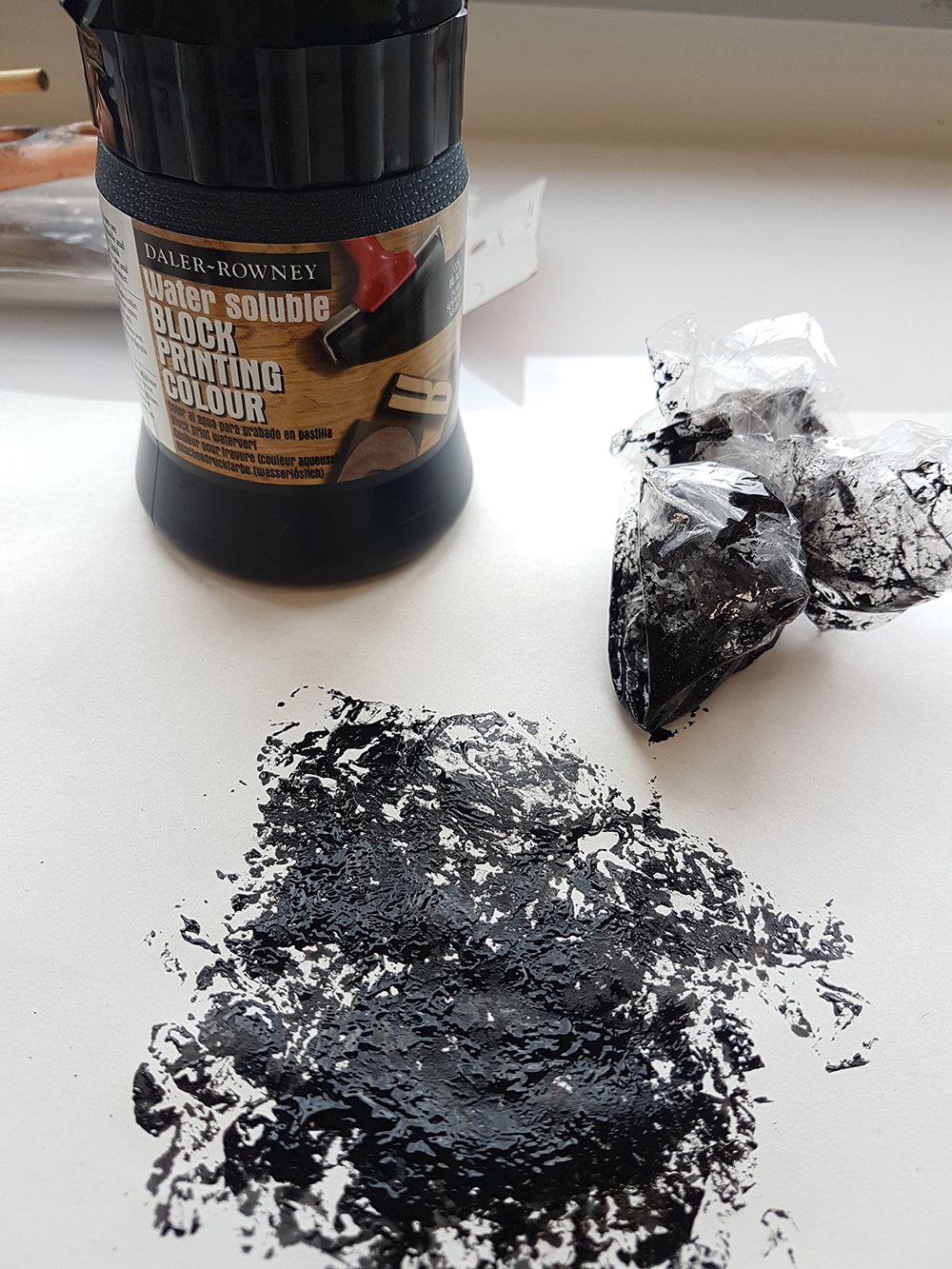
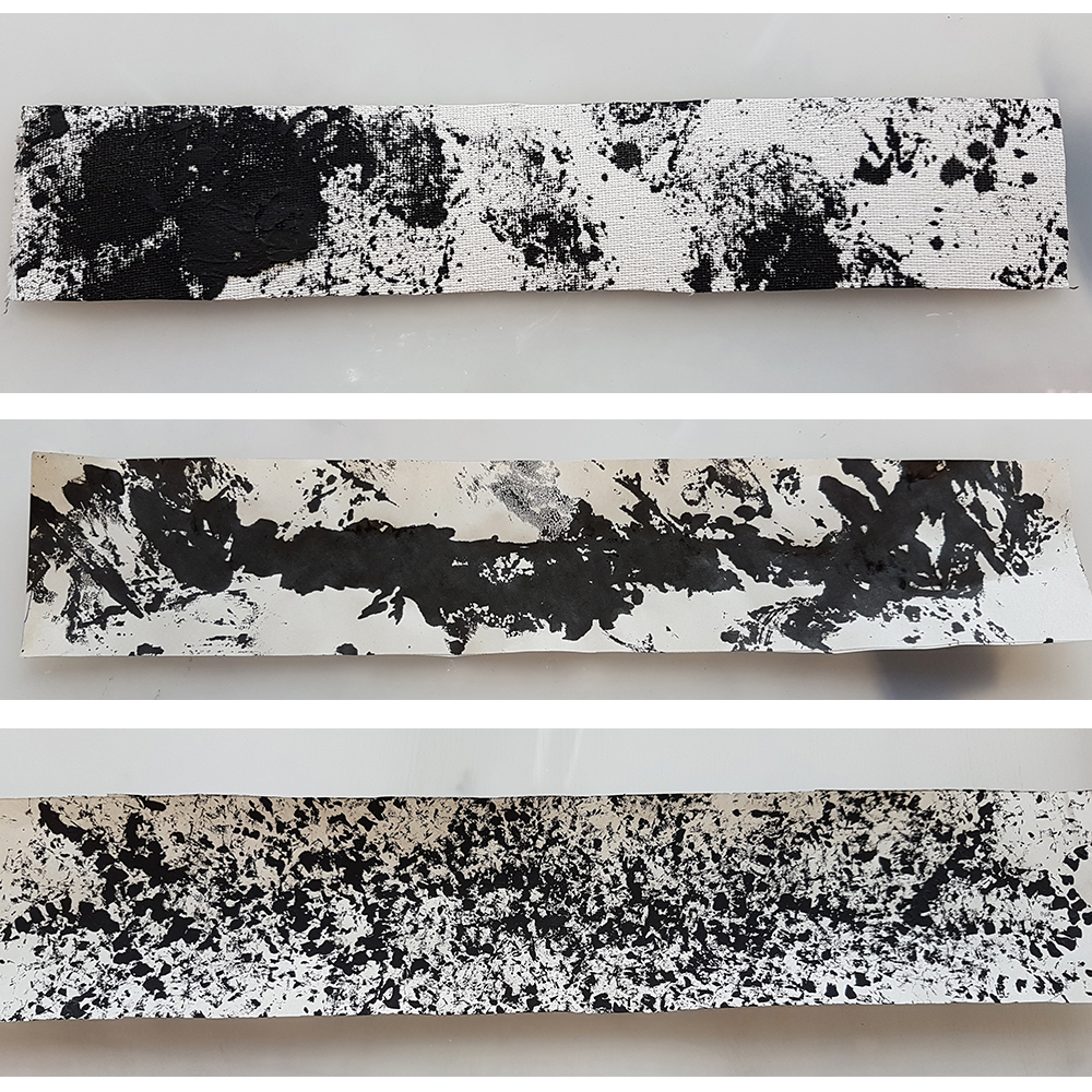
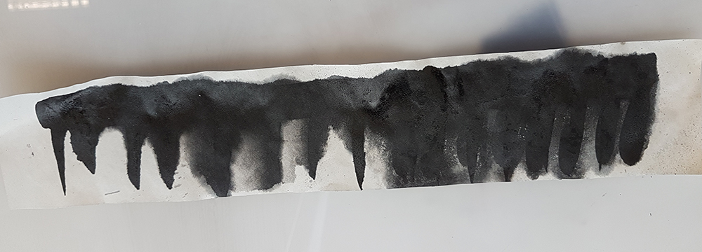
Starting with: CLING WRAP
It’s nothing too fancy. Something you use to cover your leftovers up, or to wrap premature babies in. But cling wrap sure is versatile. You can stretch it, you can scrunch it up, or roll it into any shape you want. I first started by brushing on some Chinese Calligraphy ink onto the cling wrap and stamping it onto paper.
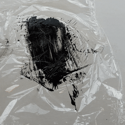
Cling wrap with ink, stamped
They turned out… pretty good. Funny little shapes that looked like watercolour brushes I can get on Photoshop. Each little attempt at blotting ink on the wrap gave a different result, given the clingy, crinkly material of the thin plastic. I further explored by scrunching up the cling wrap and dipping it into more calligraphy ink.
Scrunched up cling wrap

Lesser ink
Soaked in ink
I tried it with Block Printing ink too, hoping it would give a different effect. It did; it had a slightly thicker look to it, and seemed more textured in comparison.
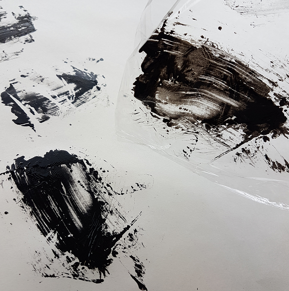
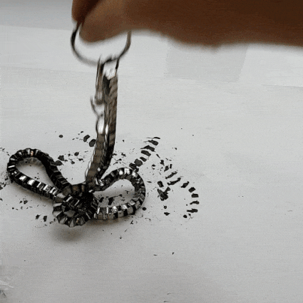
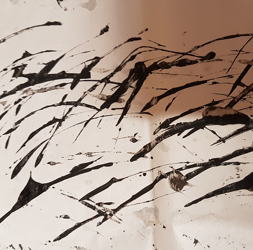
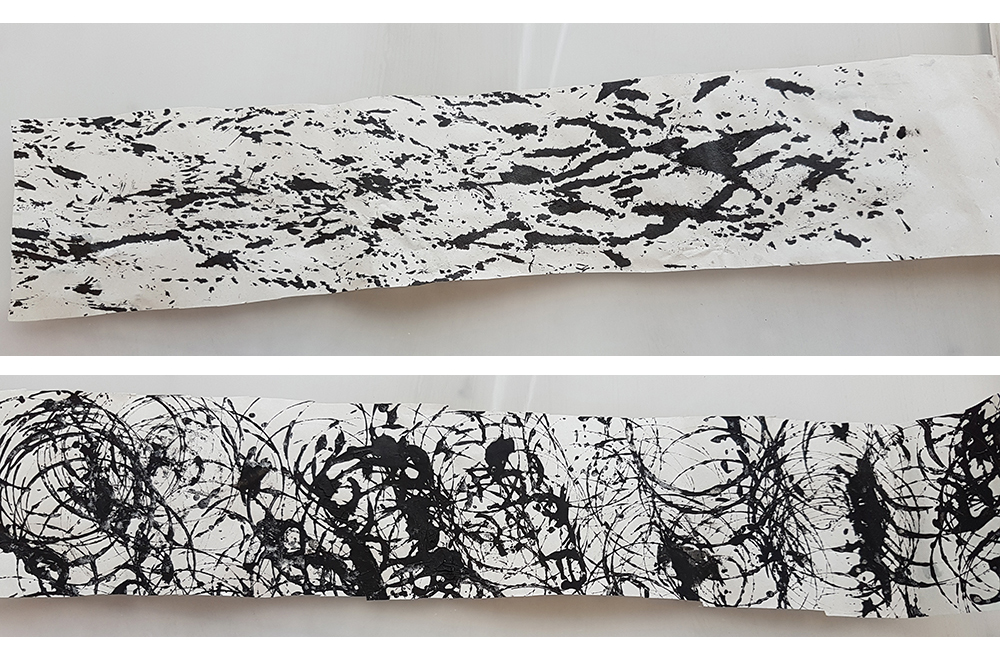
Next up: METAL CHAIN

Bought from DAISO years ago, don’t know why I did it.
It had a unique square-like chain going on, and thought it would create some cool square-like patterns. I tried to spin it around after dipping it in ink, and it made a huge blotch on the paper.
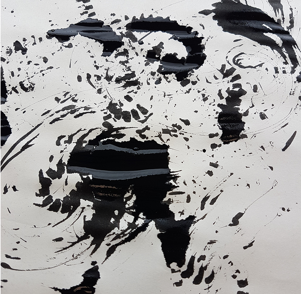
Splotchy, blotchy. Nice silhouettes.
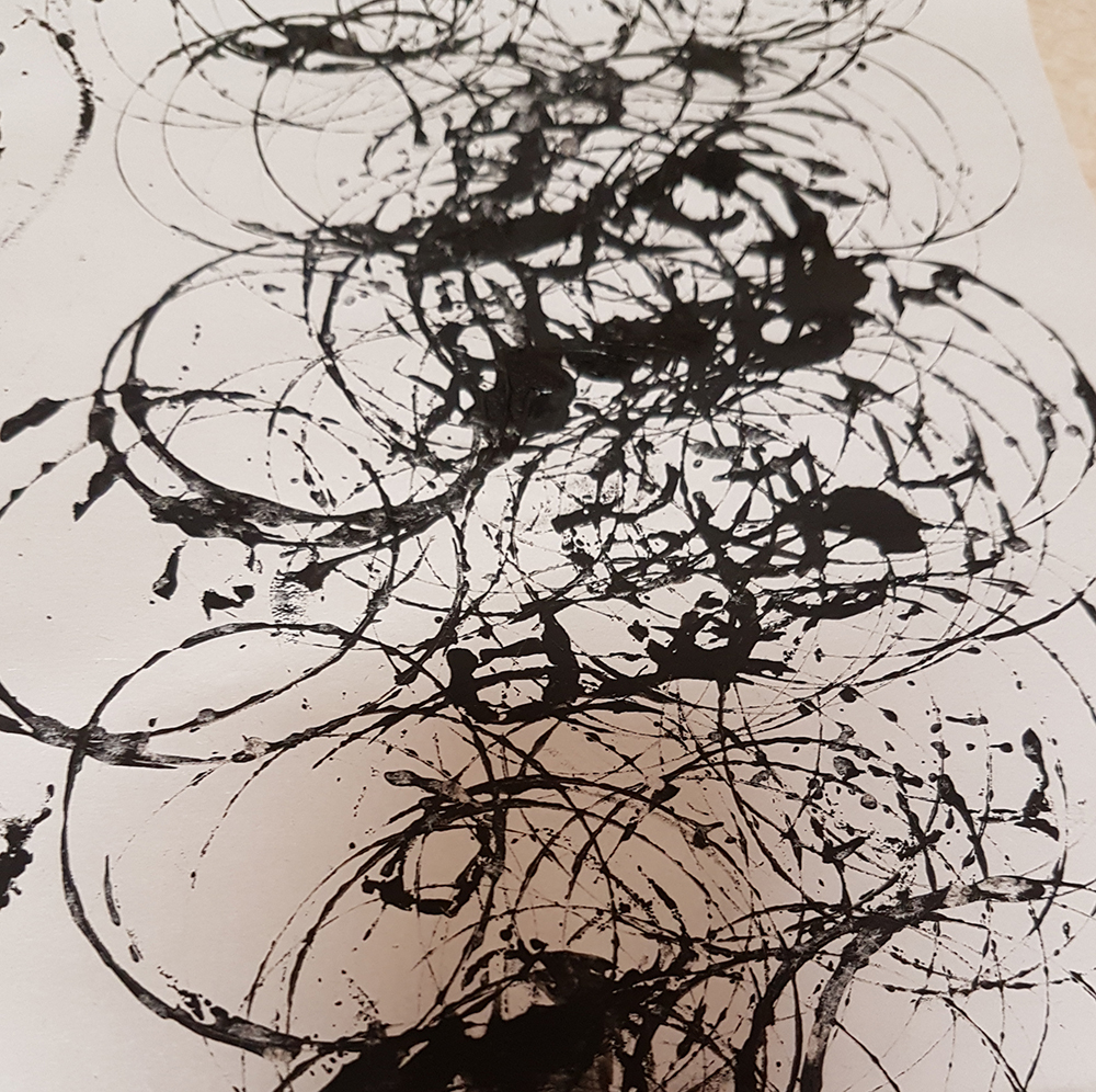
How about lighter touches? You know like… teasing touches. Although it’s a little hard to tease when it’s a metal chain. I tried though. It could also be jumpy; excited. It turned out decent, some of the square patterns showed up better in this version.
Jumping effect? Teasing effect? I don’t know.

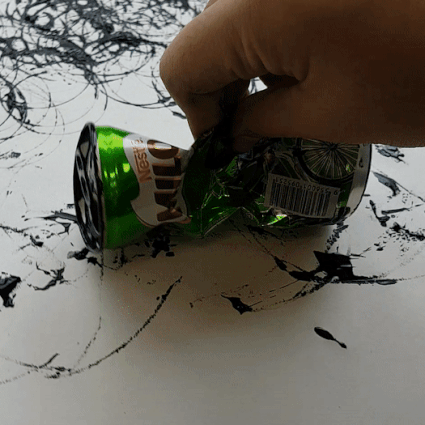
I got thirsty. So I got a: MILO CAN
Four hour lessons are long and tedious sometimes. So I went to get something to drink to boost my morales. And hey, why not use what’s left as a mark-making tool? I’m so smart right.

Milo can, top surface.
I played around with the bottom of the can at first, but decidedly used the top part of the can instead. The little aluminium pop tab added a little more personality to the result whenever it caught a little more ink.
I also crushed the can using my fist and tried using the kinks created from the crush.
Spin, spin, spin.
Considering how hard the metal is, it created some pretty gentle marks.
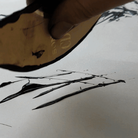
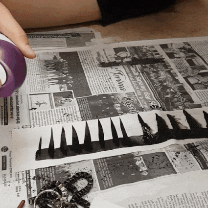
Well, back to work then: BROKEN CD
I bent a CD in half and it snapped; showing off some interesting sharp edges (don’t worry, they are plastic). I dipped the broken part into ink and got to work.

Woah, edgy.
I gave some tiny strokes and proceeded to give it some sort of a… let’s call it a backwash. hah. SO SMART. WOW. But anyway. It created a sort of “regretful” look to it, which I kind of like. Might go with it.
I used the non-broken side of the CD too, to create some short wave-like effect.
shoom.
It looks like that one drawing with the jumping rabbits.
Something a little more wholesome, I feel. It has a clean look to it, like a line of action across a river.
Next up: WOOL
I got some wool from good friend by trading it for something I had. Thank you good friend. You are A Good Friend.
I tried to go for something that wasn’t just whipping a thread around. That’s kinda boring wasn’t it. So I did this:
Held both ends to whip it now. Wow, such is difference.
A mini vortex of emotions that got stuck in between two ends. Sounds like literature.
I knotted the wool string too, and tried stamping it around. It looked a little like light doggo footsteps. Happily trampling about.

Similar to the previous piece, but maybe we could mix both around?
I could probablyyy tear them and put them together. I will consider doing that.
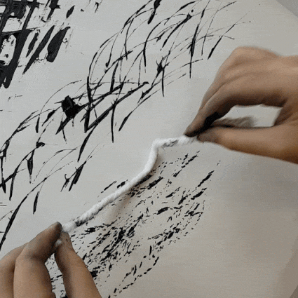
Something a little more gooey?: LIPGLOSS
Self-explanatory. Lipgloss doesn’t have to belong on lips. [s]I didn’t like the colour it gave my lips so I’m using it now. Four dollars ain’t to waste now.[/s]

It gave a slight creamy look to it, although it did end up smearing slight pink across the paper. I probably have to redo it if I wanted to use it in my final version, and get rid of all that pink.
More beauty products: FACE CREAMS
innisfree gives lots of free samples. This isn’t sponsored. I just threw in a bunch of things into a cult concoction of sorts with calligraphy ink. I’m sorry Mother, but art is more important than my face. To be fair they were free samples.
Clay mask by innisfree into black ink. There was also some sort of face cleansing gel added too.
Turned into some sort of globby thing which seemed… different…?
I tried it on paper with a brush, but it just looked stale. Like i just used a brush on block printing ink.

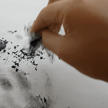
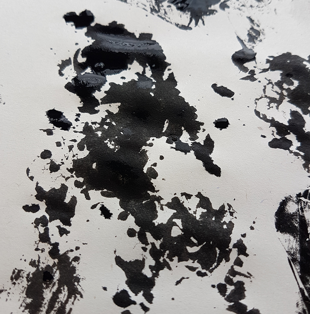
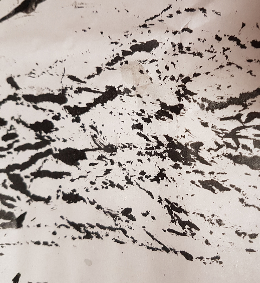
Okay so plan B. I’m going to THROW IT.
YEP. THAT’S MORE LIKE IT.
I love me some glob messes. The dried out version didn’t turn out as nice since the paper ended up absorbing the globbiness. But I still tried, and I really dig it.
I didn’t stop there. Oh yeah.
I have more.
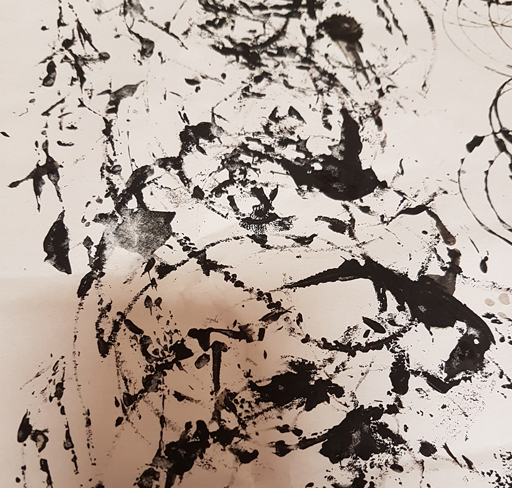
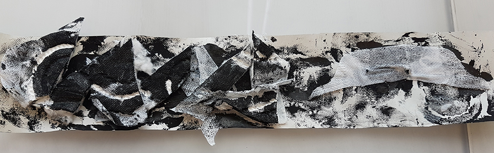
SO
I retried some of the previously used methods, but this time on papers and such that’s a little closer to the desired size. I tried using acrylic paper too, with some of them, although the result did turn out pretty similar to what was achieved on newsprint.
Clingwrap, clingwrap, metal chain, retry

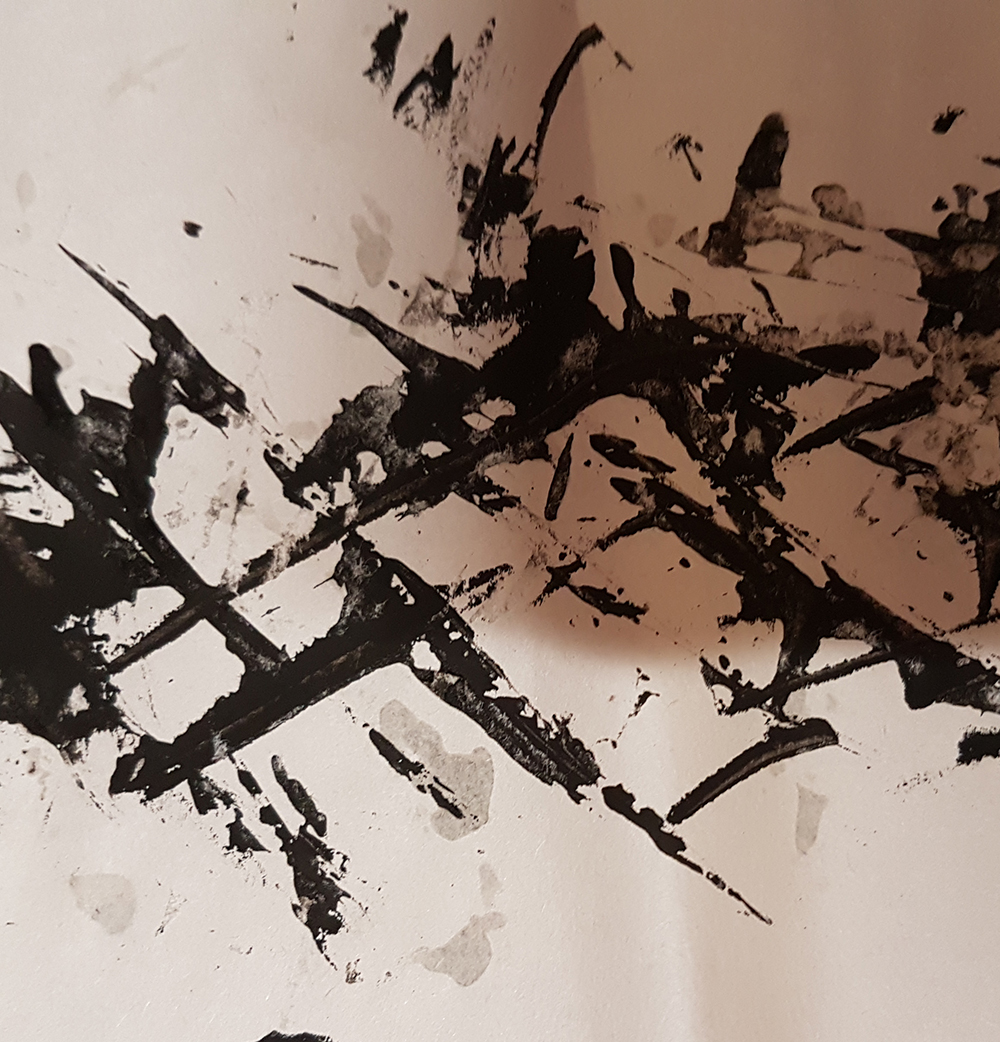
Cut out from previous experiments, wool string, milo can, CD.
More cutouts, more wool string, and milo can.
Yeah. Now on to the other new things I tried.
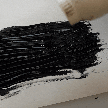
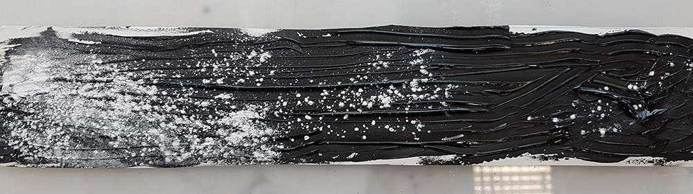
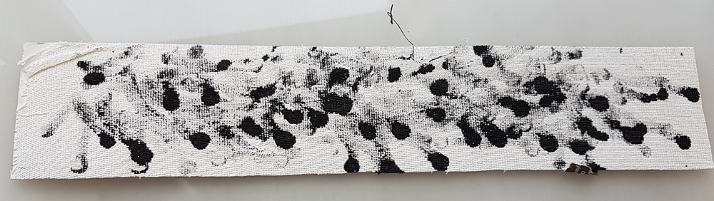
Going for something a little clean: TOOTHPASTE
To be really honest, it’s hard to record and be messy at the same time, so I don’t have that many gifs anymore whoops.
If something was off-white then I could… make it whiter right? Purity?
It smells really good.
Yay, cleanliness: GLADE
More nice-smelling things. I painted a strip of paper with ink, and proceeded to ruin it with a lot of Glade Air Freshener.
In an earlier version I messed up and used too much ink, so I tried strips of ink instead, to let that Breath of Fresh Air get to the ink better.
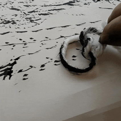
Well, I guess this is still clean?: SANITARY PAD
Pads are clean, but some cheaper pads have this sorta weird icky plastic hole-y pattern on them. And I wanted to make use of that, along with the fact that periods are the bane of every girl’s existence.
And using a pad for work felt different. Like I was trying to fight some social norm or something, while also feeling a little antsy over using something that could possibly be used to save someone’s poor ass on art. Credits to a friend for giving me her cheap pad.
I tried stamping it onto the newsprint, and it created a really hole-y effect as expected. But it wasn’t gross enough.
So I pasted the remains onto the newsprint itself.
I had some extra cotton from the insides, so I used one of the old Glade Attempts and hoped to salvage it somewhat.

Hopefully to give a sense of hope, I hope.
I had several Glade Attempts, and I left this one out to air with some glue on top of it, hoping it would collect dust.

The fact that my room had enough dust to collect was a bit concerning.
But Shirley said there wasn’t enough. I think the lack of values made it even worse, so I’m scrapping this one for now.
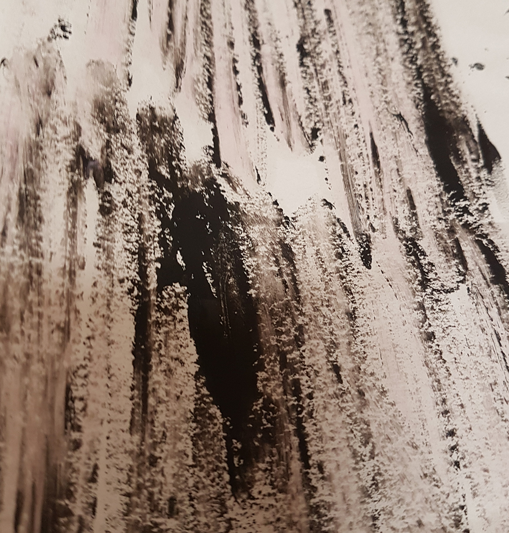
Negativity, Negative Space: BABY POWDER
Wanted to try playing around with something white instead. So I painted a piece of paper entirely black, and shook on some baby powder.
It had a similar vibe to the cotton one, but better? A smoother transition of sorts, gentler and more hopeful.
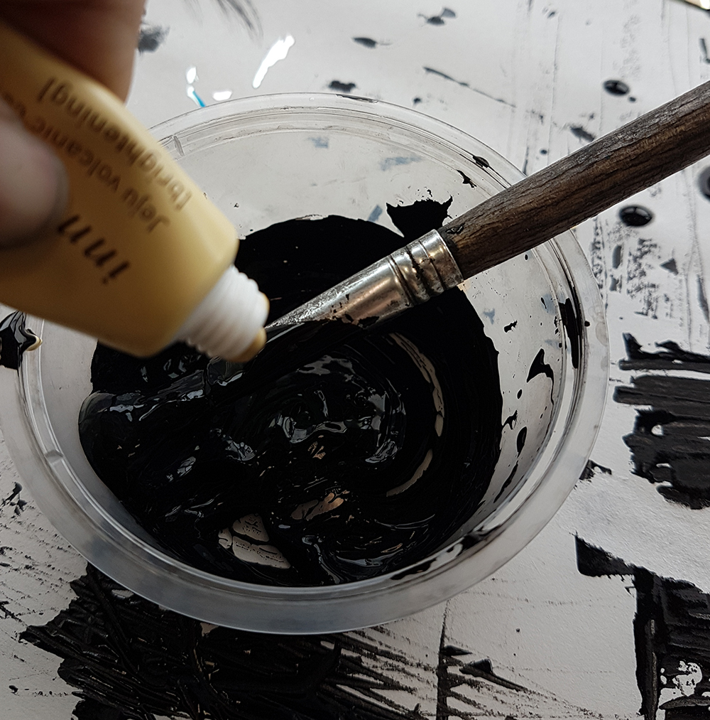
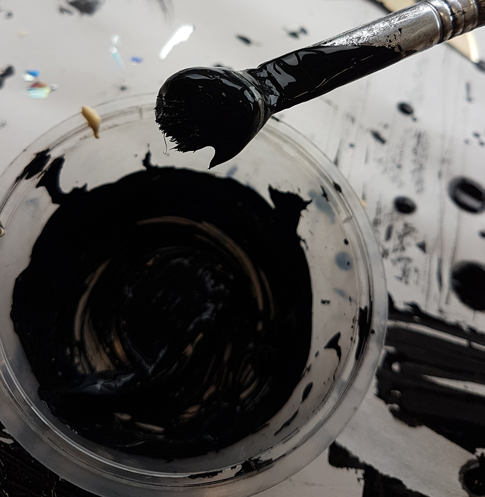
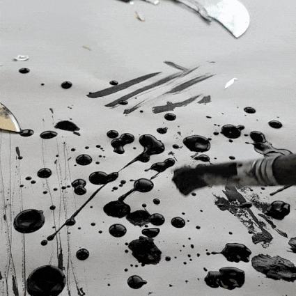
In some moment of boredom,
I played around a bit more with a random brush, slabbing on more ink onto a piece of paper. Like, a lot of ink.

It was a rubbery brush, not the usual hairy brushes we had. And I quite like how splobby it turned out.
And I had more random attempts at saving old pieces. so they became weird collages.

Cut up old pieces, stick them with glue.
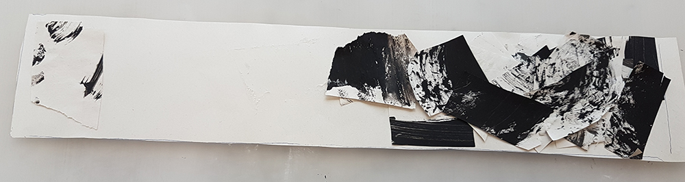
Cut up pieces, stacked above each other

Torn, crumpled pieces, glued on.

Oh, I gotta explain this one.
Working with black ink and a lot of glue tends to get your hands real dirty. So I had to use a lot of wet tissue to wipe my hands in order to touch any other thing that wasn’t my work. So this was the end result; tons of crushed paper, tons of wet paper remains, and the leftovers from the sanitary pad sanity.
Finger tips dipped in ink, wiped onto paper.
Was thinking of having parts of this on the one with toothpaste, to show the idea of Infatuation.
All in all, I know I have a lot to work on. I concentrated too much on using different mediums, but I feel like I lost my idea of the emotions I had in mind. In class, I barely had anything to consult on, and it made me rethink many things. Also my lack of composition and all. I’ll try to experiment a little more before Tuesday’s submission, and hopefully my remaining six would make more sense.
Recent Comments