After doing parts of this project, I realised I really like it. A lot. I’m actually kind of sad that it is coming to an end in a few days. I enjoyed every part of making this assignment turn into a reality, and here it is! Based off the 4 quotes that I have chosen, a lot of my themes were very animal-driven, which I felt gave a very raw feeling, which was what I wanted. Said by the most irrational of teens, many of my quotes questioned the societal norm and related humans back to their nature of dealing with things —things like segregation, behavioural patterns, etc. I wanted my designs to be straight to the point, like how raw they all seemed.
J.D.: The only place different social types can genuinely get along with each other is in heaven.
(Heathers, 1988)
I started off with my initial idea of using animal heads on human bodies, but it honestly got too cluttered. There was no actual goal going on here, and I obviously did not pay any attention to design principles.

I decided to keep the shaking hands though, and tried to portray heaven with some Greek sculptures instead.
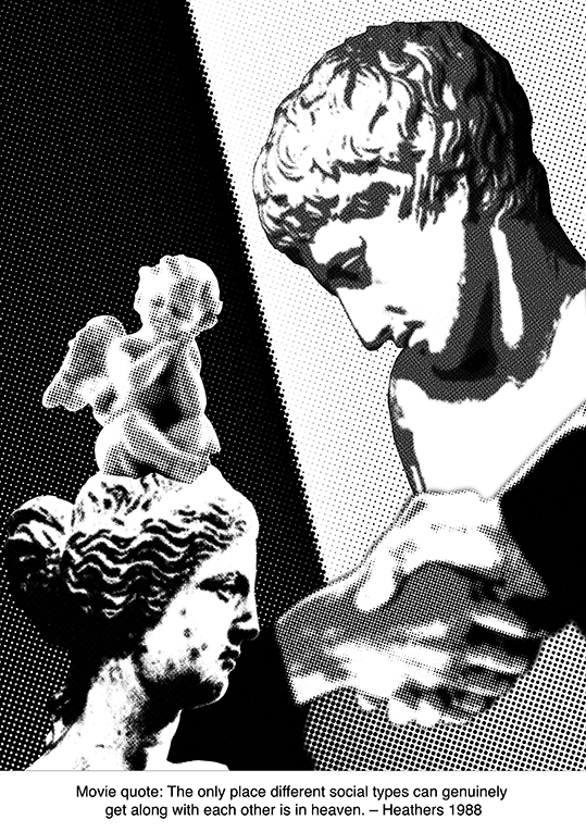
I tried to go with a diagonal, like a slash of nonconformity, and ironically used Narcissus and Aphrodite as my subjects to represent the various “social types”. Decided to keep the angel theme going as well by using a baby angel to portray heavenly innocence of sorts. However, there was too much going on in this composition as well, so I decided to take one of the sculptures out.
Final Design:
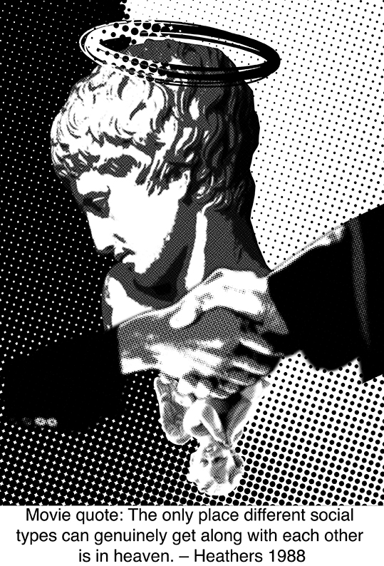
Decided to play around with the visual hierarchy by making Narcissus extremely big in comparison to what was supposedly heaven (the baby angel) The hands are used as a barrier, away from where heaven is. It basically shows how it is nearly impossible to allow all social types to be able to get along. I also tried to create a yingyang asymmetry, such that the shadows on Narcissus would contrast with the white background, whereas the light on his face would contrast with the black part of the background.
Heather Chandler: Well, fuck me gently with a chainsaw. Do I look like Mother Teresa?
(Heathers, 1988)
My initial concept was a snake cheerleader and chainsaws; with a coif around the snake’s head to let a person judge if it did look like Mother Teresa. I did keep the concept all the way through my various compositions, merely changing the types of pictures to make the design pop up more.
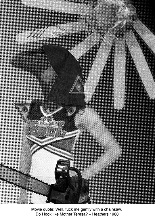
I made the chainsaw into some sort of ‘sun’, as if it were a holy light source to worship. It could also seem like a halo, this is up to your interpretation. I thought it would have been cool to add some illuminati symbols too, but I realised it was honestly a bit too much. So I took it out.
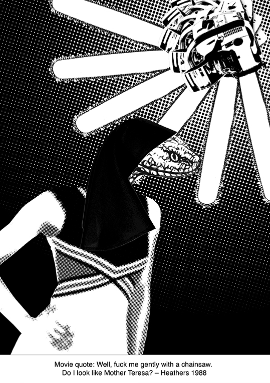
Many of my initial designs had more half-tone images, which ended up blending the image so much that nothing stood out. Changing the images used helped me to better contrast between black and white.
Final Design:
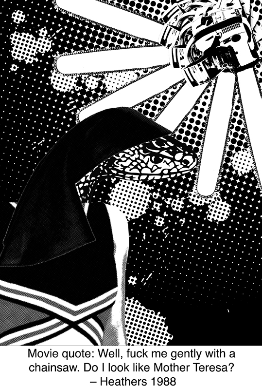
I changed the snake again when I realised the first one was too pixelated. I went with a stronger half-tone gradient background instead, and used ‘blood’ to help bring the focus to the snake. It also felt like a paradoxical contrast between violence with a chainsaw and the actual quote using the term ‘gently’. The snake cheerleader was also made bigger; Shirley told me to take the armpit away. HAHAHA.
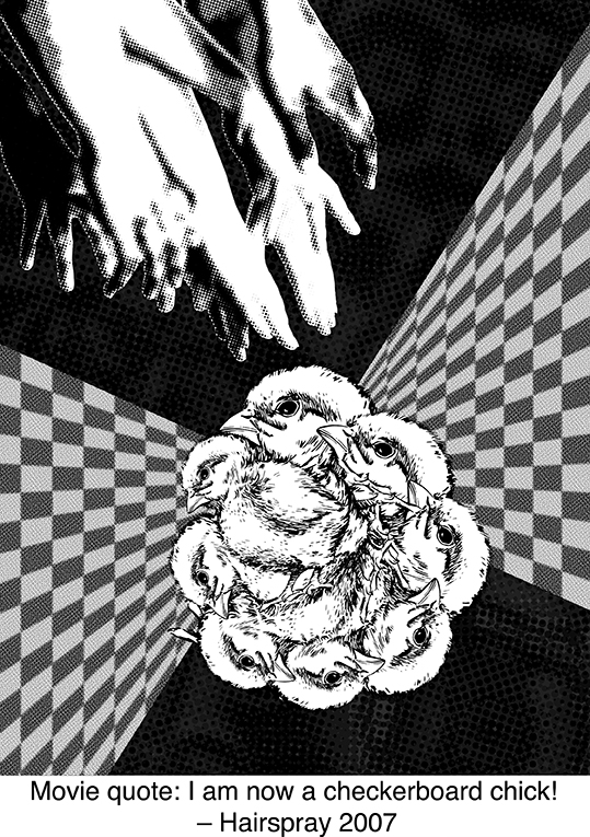
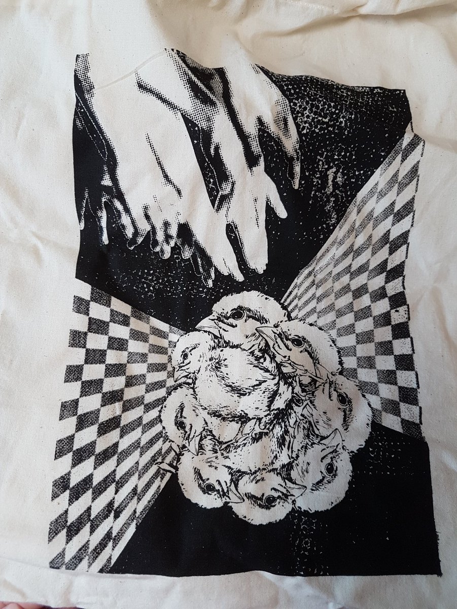
Penny Pingleton: I am now a checkerboard chick!(Hairspray, 2007)

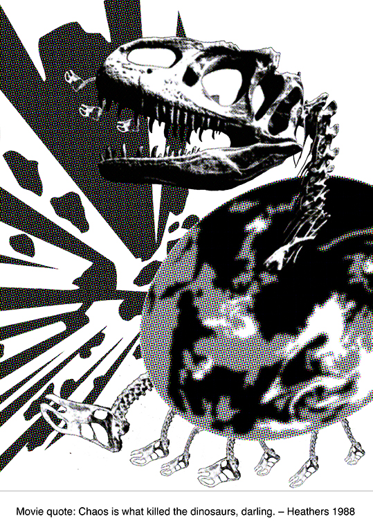
J.D.: Chaos is what killed the dinosaurs, darling.(Heathers, 1988)
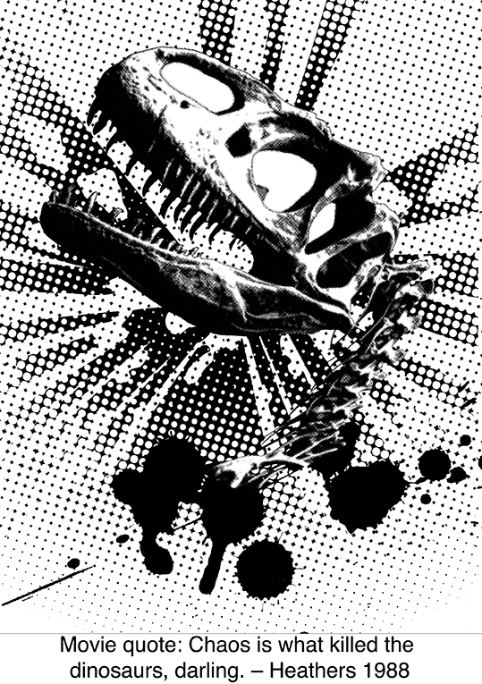
TADAH.
On to the silkscreening process!
It was my first time trying silkscreen printing, and it was tHE MOST FUN I EVER HAD. I’m kinda sad that we can’t really do a lot of it past foundation year, but I’ll see how it goes in the future! (HINTS AT ADM)
I didn’t take many pictures because my hands kept getting dirty; everyone’s hands were dirty most of the time, so I couldn’t ask, but here’s what it looked like after the emulsion process!
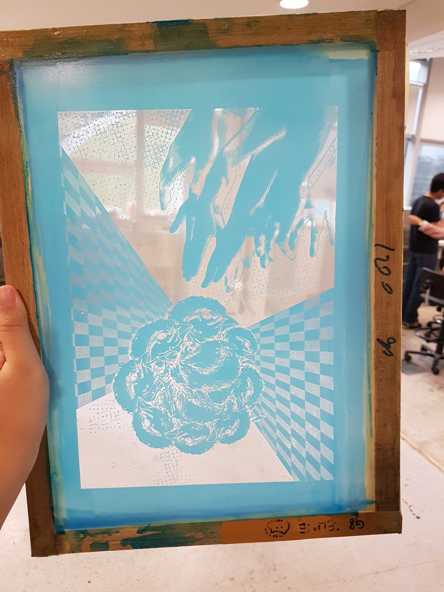
It turned out so pretty I was really amazed. The grey areas managed to translate well, and there were still parts of the black background pattern that stayed.
Came time to test print it on paper, and I knew I had to use a lot of ink since there was a lot of black involved. I was afraid the pattern would disappear, but it turned out pretty okay.
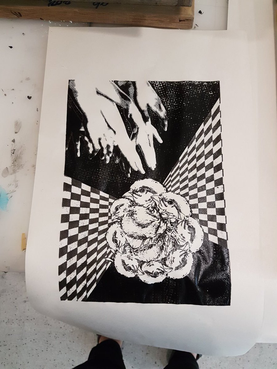
The patterns all came out really well! I could see the half-tones and the values were similar to the original.
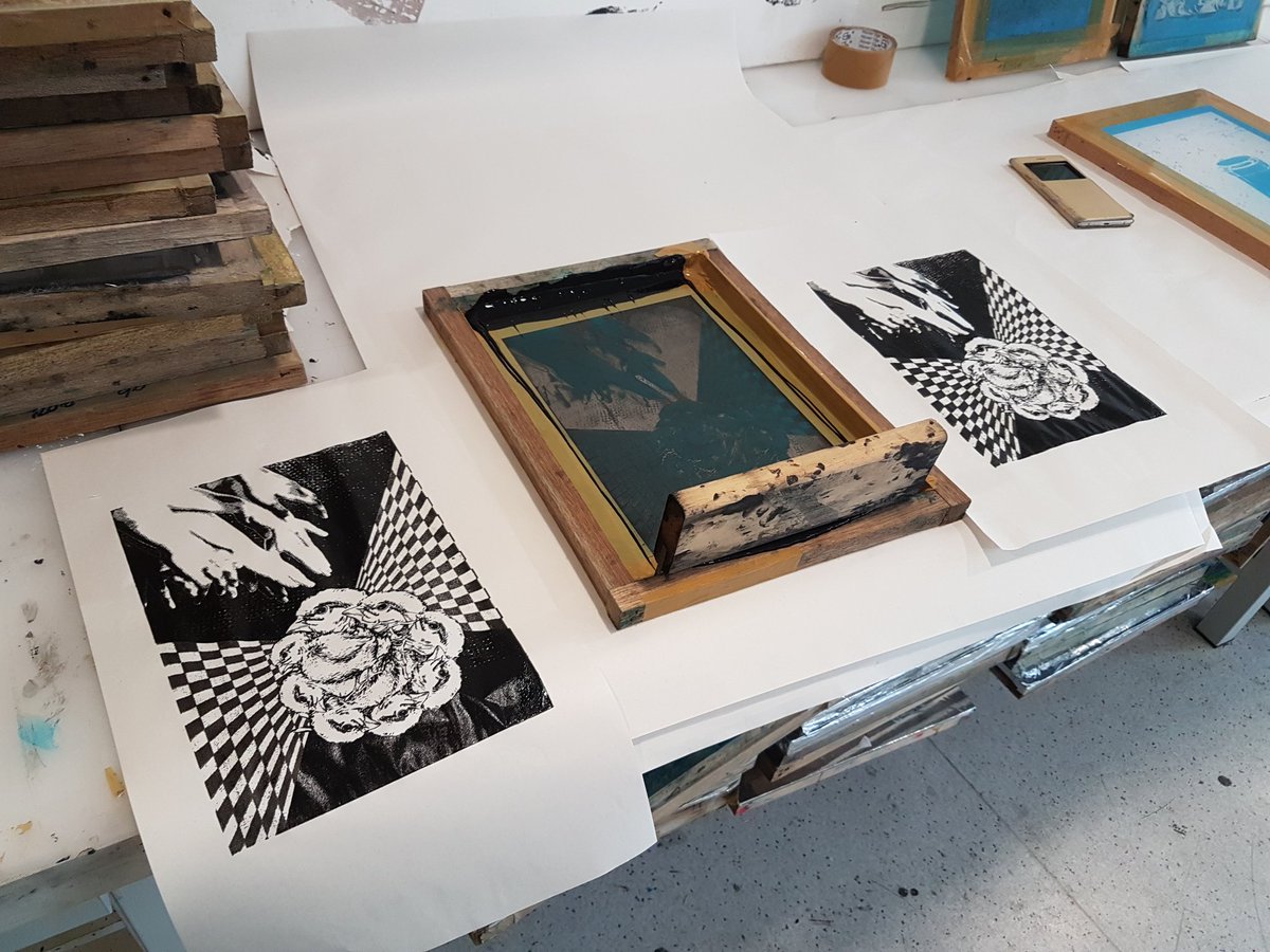
Here came the difficult part of printing it on the tote bag itself. I forgot I could actually iron the bag beforehand, and it came out a little different.

The background became even more fancy from my careless printing, and a lot of the half-tones in the hands disappeared. However, the checkerboard got a new, cool gradient, and the funky new background was not that bad. The chicks turned out good, and I was actually pretty satisfied with the end result. It didn’t look like the original though. I asked Shirley and she said it was fine, if I was fine with the end result; about how these sort of things made it art. BUT ANYWAY.
Lucky for me, I had an extra bag!!! WOAHHHHHHH. A drawstring bag!
This time I ironed it beforehand, and made sure the silkscreen was aligned well on the cloth.
I would like to thank my hands for being stable this time.
It looked EXACTLY like how I wanted it to turn out. All it took were some stable hands, your friend’s stable hands, and maybe an extra pair of hands, a lot of patience and screaming, to get it perfectly inked onto a bag!

The end results! Now I have two new bags to use, yay!!
Recent Comments