First of all, I’m glad to have this opportunity to be in Design Art. As someone who has had 0 experiences doing design, I cannot emphasise how lucky I am to be in the major I wish to delve into. I can only pick up a pencil/stylus and draw, so now is a good time to look into other ways of doing art, and to maybe put further meaning into my work.
I am unconfident. And it haunts me to this day, what with me not doing well in presentation and all. I can never be okay with what I create, and it stresses me out talking in front of a class. Reading about such a wonderful woman like Hannah Hoch was an experience, and although I can never be as amazing as such a big figure in Dadaism, I wish to have her in mind. I wish to have her works in mind — for how strong and stubborn she was in presenting society in the way she wanted to. Perhaps that will help me form words better like how she formed hers. It might not have the same impact but I wish to at least be able to say 5 sentences without sounding like I doubt myself.
On to the actual research!
Hannah Hoch
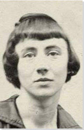
Retrieved from http://www.theartstory.org/images20/new_design/bio/bio_hoch_hannah.jpg on 24 January 2018
Hannah Hoch
A rare female figure back in the twentieth century’s art industry, specifically the Dada movement. She actively voiced her opinions on gender equality and often used photomontage in order to so. Picking photographic elements from popular culture and pasting it into her collages, she made many insightful connections that have people questioning how media and society portrayed gender. It gave photography and collage into a form of ‘higher’ art, fitting into the Dada movement in its development in communication design. Many other artists in Dada and in later generations started to adopt her style of collaging images.
Hannah Höch. German, 1889-1978
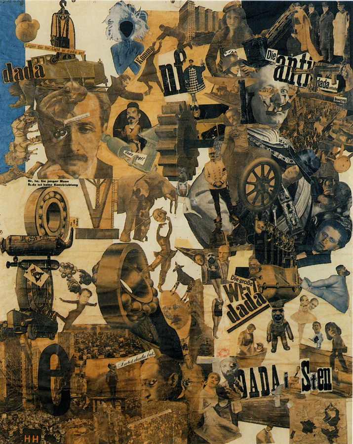
Cut with the Kitchen Knife through the Last Weimar Beer-Belly Cultural Epoch in Germany (Schnitt mit dem Küchenmesser durch die letzte Weimarer Bierbauchkulturepoche Deutschlands). 1919-1920
Photomontage and collage with watercolor, 44 7/8 x 35 7/16 (114 x 90 cm)
Staatliche Museen zu Berlin, Nationalgalerie
© 2006 Bildarchiv Preussischer Kulturbesitz, Berlin,
© 2006 Hannah Höch / Artists Rights Society (ARS), New York / VG Bild-Kunst, Bonn, photo: Jörg P. Anders, Berlin
One of Hannah Hoch’s most famous pieces, ‘Cut With The Kitchen Knife Through the Last Weimar Beer-Belly Cultural Epoch in Germany’ (1919-20), reflected on issues that occurred in German society after the first World War. Words such as ‘kitchen knife’ and ‘beer belly’ were used in regards to the social status of the male and female — where feminine qualities were not equal to that of masculine qualities. The piece is seen as mocking yet whimsical, what if its exaggeration of machinery exploding and theatrical way of body language, making fun of the political issues that are going on in Germany at that point in time. She also hints at the social issues that were happening, placing a small map of countries in Europe where women were allowed to vote. With her obvious interest in representing the female population, she plays into creating ridiculous caricature of men being stripped of their power, often playing with how the message could possibly be perceived in her pieces.
So what exactly is the Dada movement?
Like with Hannah Hoch’s many confusing pieces of work, many other Dada artists did not work on Dada art for the sake of art trends, but more on propaganda, using many borrowed elements to create its message.
Dada art had a lot of techniques borrowed from Futurists, an social movement that emphasized on speed, technology, youth and violence, involving many futuristic industrial elements. It made use of typography, photomontage, negative white space, layout, etc to create an interesting way of communication, and along with its rebellious nature, created a very strong design image.

Retrieved from https://upload.wikimedia.org/wikipedia/en/thumb/6/6e/Marcel_Duchamp_Mona_Lisa_LHOOQ.jpg/250px-Marcel_Duchamp_Mona_Lisa_LHOOQ.jpg on 24 January 2018
One example of such rebellious nature would be LHOOQ (1919) by Marcel Duchamp. Taking a cheap postcard of the Mona Lisa (1517) painting, he added facial hair and labelled it LHOOQ, which translated from french, stood for “She has a hot ass.” In all ways it was meant to offend, and showed a big lack of respect to traditional artforms. The Dada period challenged artistic values and creativity, and allowed people to question about what art truly was.
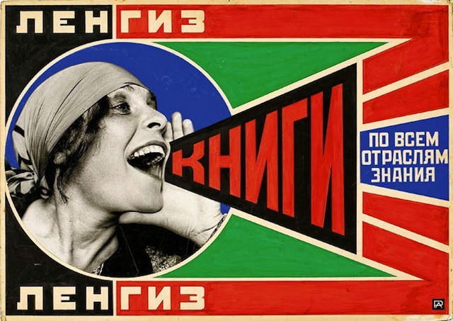
Russian Constructivism, and Graphic Design
They were all about the functionality of art, rather than art that was decorative and expressive that got hung on walls. There was high emphasis on the bourgeois culture, where people were more materialistic with what they liked.
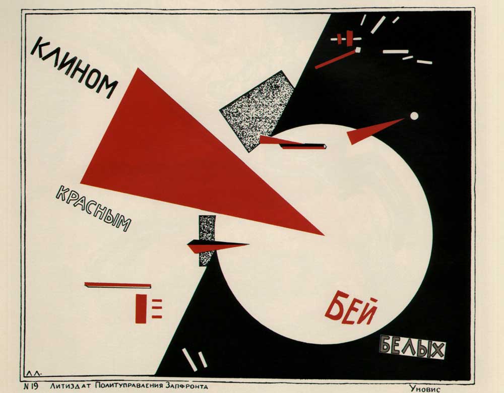
Retrieved from http://3v6x691yvn532gp2411ezrib-wpengine.netdna-ssl.com/wp-content/uploads/2017/09/F.jpg On 24 January 2018
Designs were mostly photomontages that were very ‘constructed’, and had very strong typography. Colours used were very minimal, often being red, yellow and black. There are a lot of diagonal and angled lines along with the occasional circles and images. Works from Russian Constructivism are often seen as very exciting. Similar to the Dada movement, there was wishes to change how society was seen, with their own personal philosophies on art.
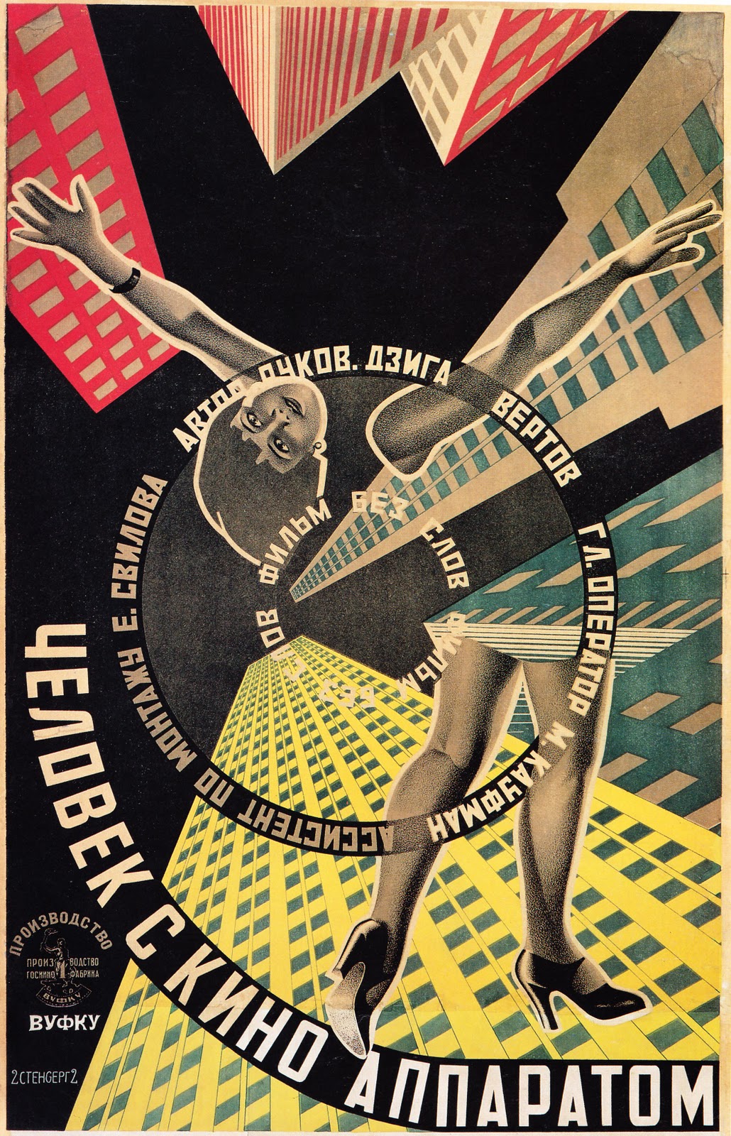
Retrieved from http://3v6x691yvn532gp2411ezrib-wpengine.netdna-ssl.com/wp-content/uploads/2017/09/O.man_with_movie_camera_poster_1.jpg on 24 January 2018
Retrieved from http://3v6x691yvn532gp2411ezrib-wpengine.netdna-ssl.com/wp-content/uploads/2017/09/O.man_with_movie_camera_poster_1.jpg On 24 January 2018
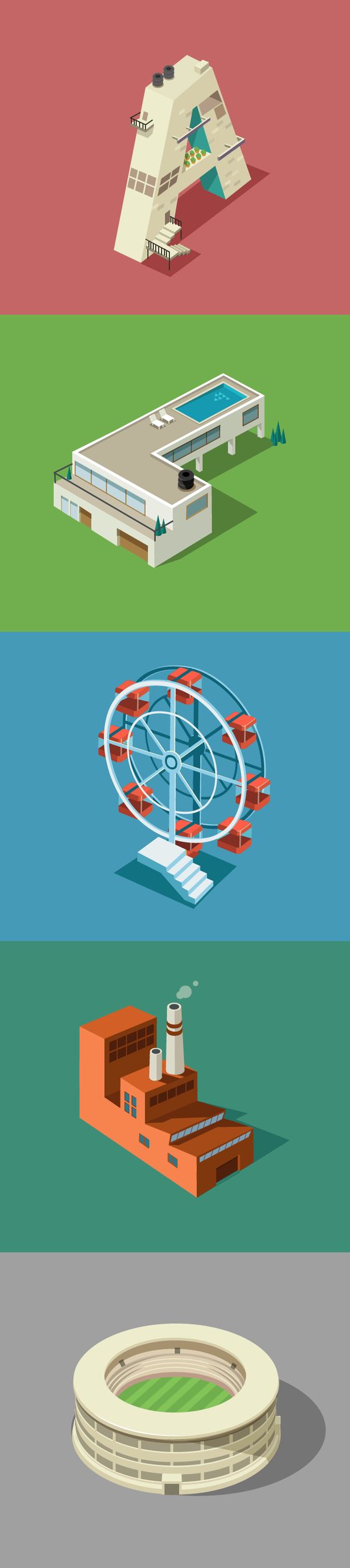
Research on unconventional tools
So first of all, I had to understand how to incorporate elements into fonts. Shirley mentioned how we had to deconstruct parts of our jobs, and use elements of these jobs to show our job.
Like for example –> mermaid –> fish scales + hair??
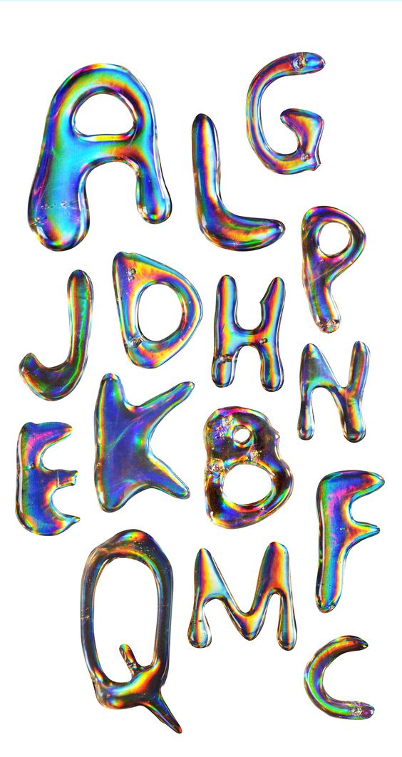
In the left example, the letters have taken the properties of a bubble, becoming bubbles themselves with their shiny, reflective surfaces. In a sense, the letters have embodied the bubbles.
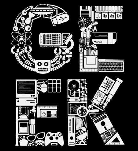
Likewise with the example on the right, the alphabet has become electronic components and consoles to represent geek-ish culture.
Retrieved from https://www.pinterest.com/pin/853572935598313225/ on 6 February 2018
Retrieved from https://www.pinterest.com/pin/853572935598312995/ on 24th January 2018
Other examples I looked at:

Retrieved from https://www.pinterest.com/pin/853572935598312994/ on 24 January 2018

Retrieved from https://www.pinterest.com/pin/389702173997655494/ on 6 February 2018
I really liked the one on the left because it basically represents a no-signal television, but there is no actual television. As for the right side, they are just numbers but they show the concept of “Mr. Laugh Comes Home In The Bad City Night”. Although I have no idea what that means, from the various numbers, it is seen that someone had a bad day outside and has come home for a good rest in bed. Wholesome.

Retrieved from https://www.pinterest.com/pin/853572935598302836/ on 24 January 2018
Similar to the geek culture one, this one is more on dubstep, and has several pieces of electronic music-related things in it. However, it is done physically and has wires sticking around, typically like how a dubstep musician’s environment would be like when they are working. It might be a little messy and have harder readability, but it probably held a sense of nostalgia for many other musicians.
Retrieved from https://www.pinterest.com/pin/853572935598405206/ on 24 January 2018
Retrieved from https://www.pinterest.com/pin/853572935598405180/ on 24 January 2018
Jobs
We were allowed to look into jobs that did not actually exist and that was a pretty fun concept to think about. Here are some of the jobs I wanted to try!
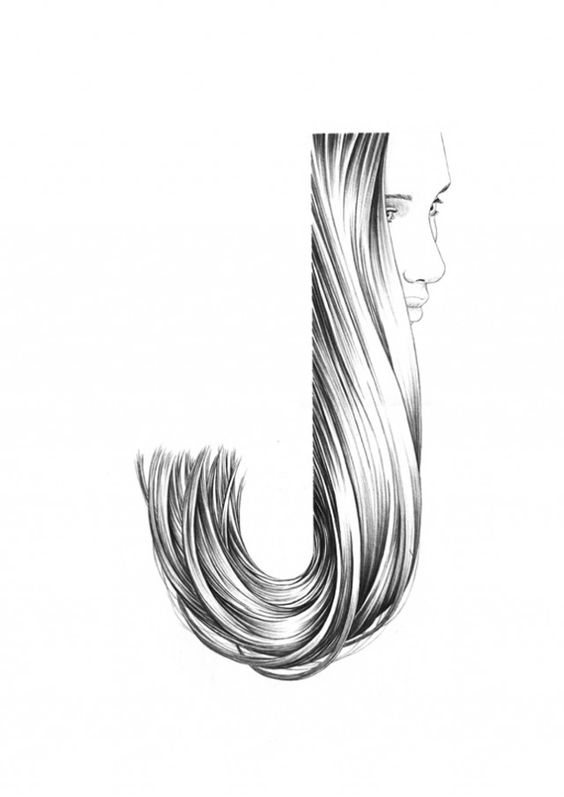
1. Hair farmer
Basically it is supposed to be a hair plantation. A place where hair grew so you can harvest and sell it to people who needed hair. So after consulting Shirley, she suggested that I put the ‘farm’ on a head, and made it such that the hair formed in the shape of my name. I decided to use my nickname ‘CEL’ for this one, probably in capital letters so they looked uniform, as if they were rows of hair. Shirley also suggested that I put a singular flower into the mix to show that it is as if I was planting actual plants. She also suggested that I put a pimple or two to show that it was on actual skin, which I thought was pretty funny.
I looked up how people usually did hair related typography:

Retrieved from https://www.pinterest.com/pin/853572935598404259/ on 24 January 2018

Retrieved from https://www.pinterest.com/pin/853572935598302806/ on 24 January 2018
Retrieved from https://www.pinterest.com/pin/853572935598404367/ on 24 January 2018
On a first note: I did not want to go around collecting hair, even though I was technically supposed to be a hair farmer. So recreating such a thing with actual hair was out of my comfort zone. I know art sometimes had to be about going out of the comfort zone, but that was way too much even for me.
Otherwise, I thought recreating how glossy hair would look on a head as a field of sorts, with strands occasionally sticking out like how the ‘e’ is would look nice. I will be trying to do so on illustrator and maybe editing it in photoshop.
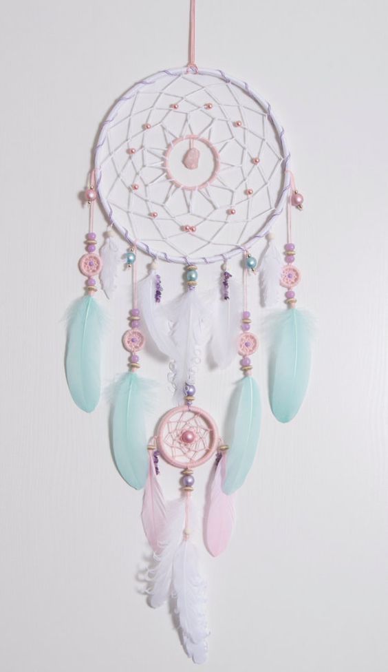
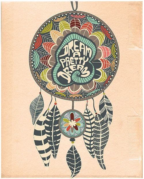
2. Dream collector
A dream collector was basically someone who took dreams for… perhaps energy-related purposes. When one thinks of dreams they would usually think of a dreamcatcher which is known to help rid one of bad dreams or used as protection.
I basically wanted to weave my initials “CL” into two dreamcatchers, while keeping a simple background in contrast with the complex weavings in a dreamcatcher. I found some examples of boho patterns and dreamcatchers as inspiration:
Retrieved from https://www.pinterest.com/pin/332633122462800532/ on 6 February 2018
Retrieved from https://www.pinterest.com/pin/37858453091186833/ on 6 February 2018

Retrieved from https://www.pinterest.com/pin/320318592218177592/ on 6 February 2018

Retrieved from https://www.pinterest.com/pin/178314466472776399/ on 6 February 2018
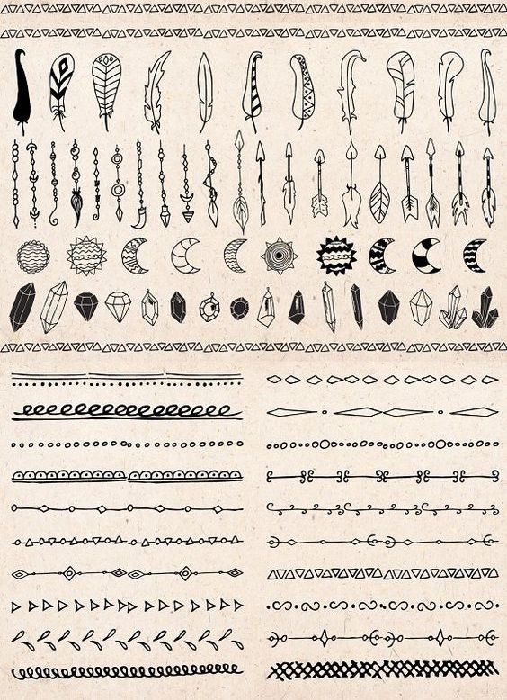
Retrieved from https://www.pinterest.com/pin/13721973847695687/ on 6 February 2018
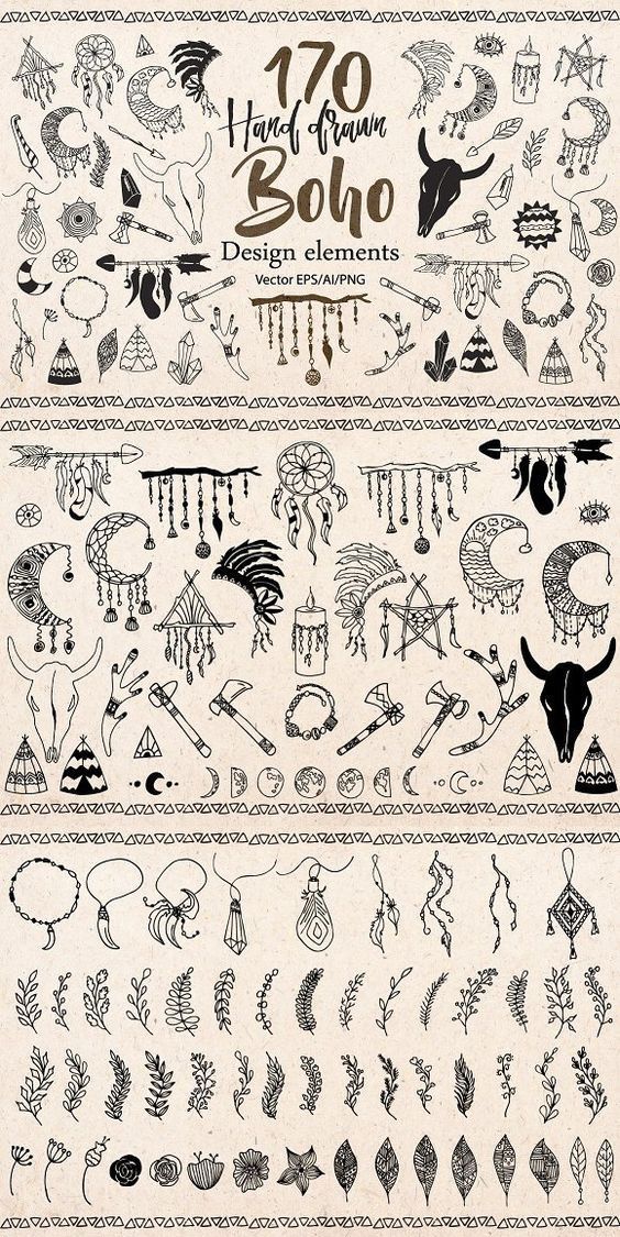
Retrieved from https://www.pinterest.com/pin/13721973847695687/ on 6 February 2018
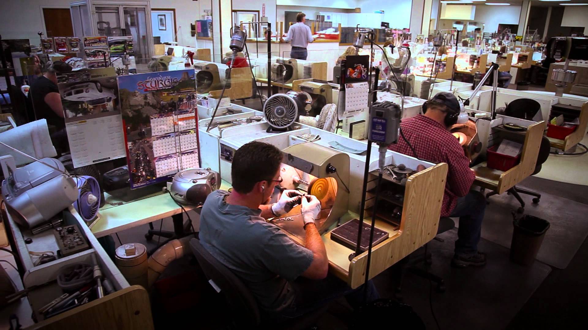
3. Emoji factory worker
It’s basically like a jewelry factory worker but with… emojis. I want them to be constructing emojis that are tiny and meant to fit into a phone for people to use when necessary. What I had in mind was basically this:
Retrieved from https://i.pinimg.com/originals/28/84/c1/2884c1726f367aa5bb228377cdfc90b8.jpg on 6 February 2018
Or something even more systematic like this:

Retrieved from https://www.dissentmagazine.org/wp-content/files_mf/1364821451shenzhenfactory.jpg on 6 February 2018
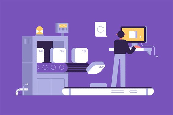
Illustrative conveyer belt reference. Retrieved from https://i.pinimg.com/564x/ff/7e/ff/ff7effa0051b02b3989dadc043d9567e.jpg on 6 February 2018
And because of its factory-esque theme, Shirley suggested I make my letters into a conveyer belt because conveyer belts were associated with big factories. With the emojis resting on the conveyer belts, I thought of how else to make use of the emojis.
emojis –> phones –> iphones –> speech bubbles?
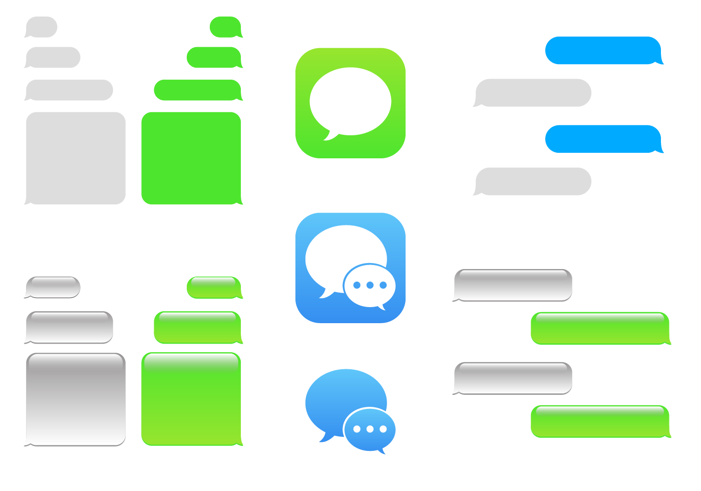
Retrieved from https://static.vecteezy.com/system/resources/previews/000/107/859/original/free-imessage-vector.png on 6 February 2018
I could try using the initials ‘CL’, making C a conveyer belt while it was being transferred to L, a speech bubble.
4. Neurologist
I always wanted to be a surgeon as a kid but then I realised I was scared of looking at the insides of a person. My other option was being a psychologist but I was not the most patient person on this world. I guess I’m stuck with art. But yay I shall relive that dream now. THROUGH ART!! hAH!
My original concept was to recreate letters using brain bits, like how brains basically look like a bunch of slimy tubes squished into a bean shape, and then double that and squish them again. But I was given the suggestion to basically make a typography style where each letter was a head on its own, while the head was only cut slightly, while the negative space of a letter would basically still be uncut head. I want to try creating a layer where skin has been cut, showing layers of bone, guts and skin, while the actual word would show brain. Wow, didn’t I say something about not liking to see insides?
I have the option of mixing realistic looking styles for the “gore” parts, while keeping the head shapes simple.
I mostly took my inspiration from these two pictures, and basically hope to mix both mediums together:
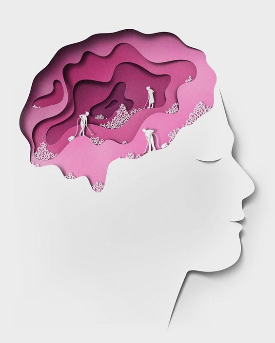
Retrieved from https://www.pinterest.com/pin/853572935598302879/ on 24 January 2018

Retrieved from https://www.pinterest.com/pin/853572935598312970/ on 24 January 2018
Recent Comments