The first assignment for Illustration for Designers was to create a stylized self portrait. I was kind of glad that it was stylized, as I was never really fond of my face. I remember creating a self portrait for class in foundation year and well, that did not go too well. I was relieved that realism was not something encouraged, because I, for the life of me, can’t seem to draw in a realistic way ever. Not to mention to pick out every single flaw on my face when doing realism? I’d rather fail my assignment, which I think I did.
However, as it was a stylized project, I thought I could skip out on drawing a face entirely. You know, because you never actually see your face ever. But I realise we had to actually have something representing us in the piece, preferably with a face. I couldn’t escape it, could I? I decided that my art had to reflect who I am as a person. While I did make an extensive list of things I liked, I felt vulnerable as a person, and as an artist, I wanted to make use of that. When I am nervous and shy outside, I tend to look at my phone a lot and immerse myself in the digital world to avoid talking to people, or to quickly pass time before I can leave. So likewise, I wanted to show that in my work, of being a closed-up individual who would rather drown herself in a screen than deal with the complexities of human nature. At least there is a face now, even if it’s distracted by a phone.
I had several other concepts as shown, one with a laptop head instead, because if I am not on my phone, I am probably on my laptop. It was kind of the idea of being a clam, with how clams could just shut themselves in. Yep, I am an introverted clam. Cliche. On the screen of the laptop sits my actual face, as I work on a computer for my studies.
Thumbnails
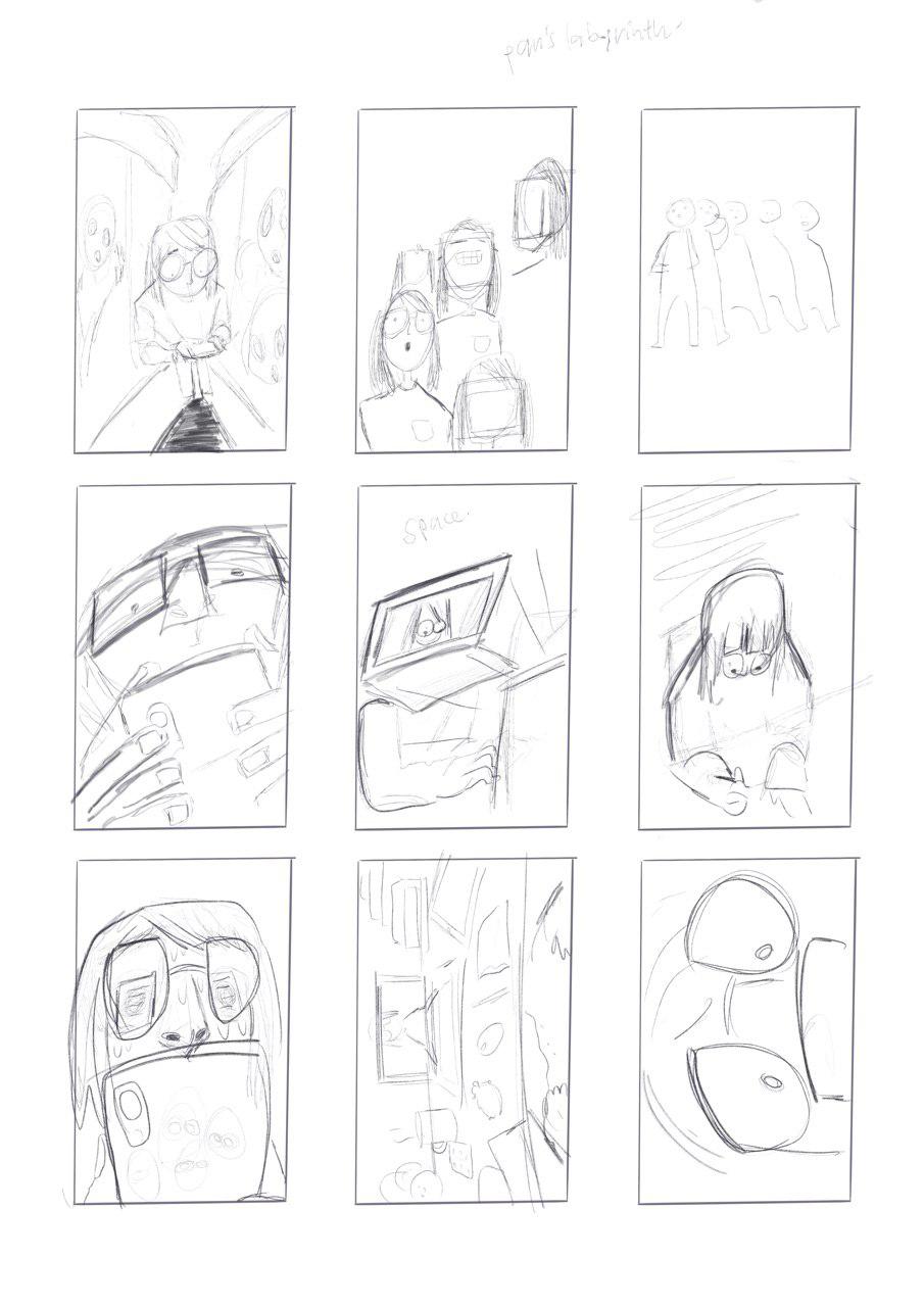
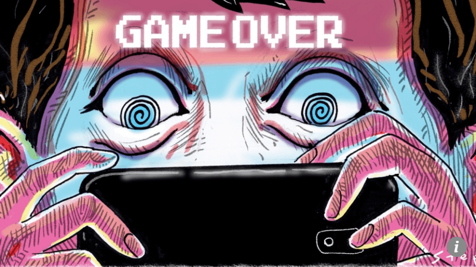
When I first started on the thumbnails, I thought it was rather necessary to give a sense of… Bust-ness. The idea of being able to see face and neck, and well, whatever else I can show that was similar to a statue bust. But upon showing Lisa my idea, she showed me an artwork by Craig Stephens in an article about phone addiction (ain’t that fitting). It shows a very closed up image of a person looking a their phone, with their eyes seemingly hypnotised.
Retrieved from https://www.scmp.com/comment/insight-opinion/article/2130139/switch-smartphones-save-children-tech-addiction
Many of my classmates said that the top left image seemed like it was something from a storyboard instead as well, rather than a self portrait. With that in mind, I made the other thumbnails closer in composition. I went with the middle-left thumbnail as my go-to draft, and started working on a bigger piece. I wanted to show off my nose I guess, because many have defined me as someone with a pretty non-button nose. I felt like it was just huge and a part of my face that was hard to miss.
I also added glasses, because I’m basically impaired without them, and also gave me a good reason to not draw my eyes (they are puny enough as is). I could also add a little bit of details of what was on my phone screen too.
Done on Procreate.
As I started drawing, I realise I did not know how much to show in the portrait, as well as how reflections worked against my glasses. I thought it would not be too hard to try snapping a few references, even if I had to deal with staring at my face. I used my iPad to take these pictures, so I could hold my phone up to my face as a gauge of how it would look from such a low angle.
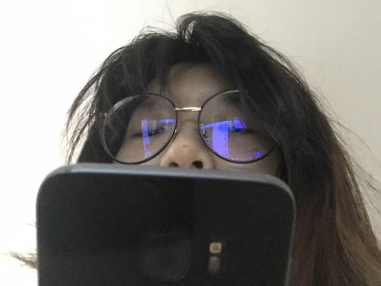
Pardon my face. And huge nostrils.
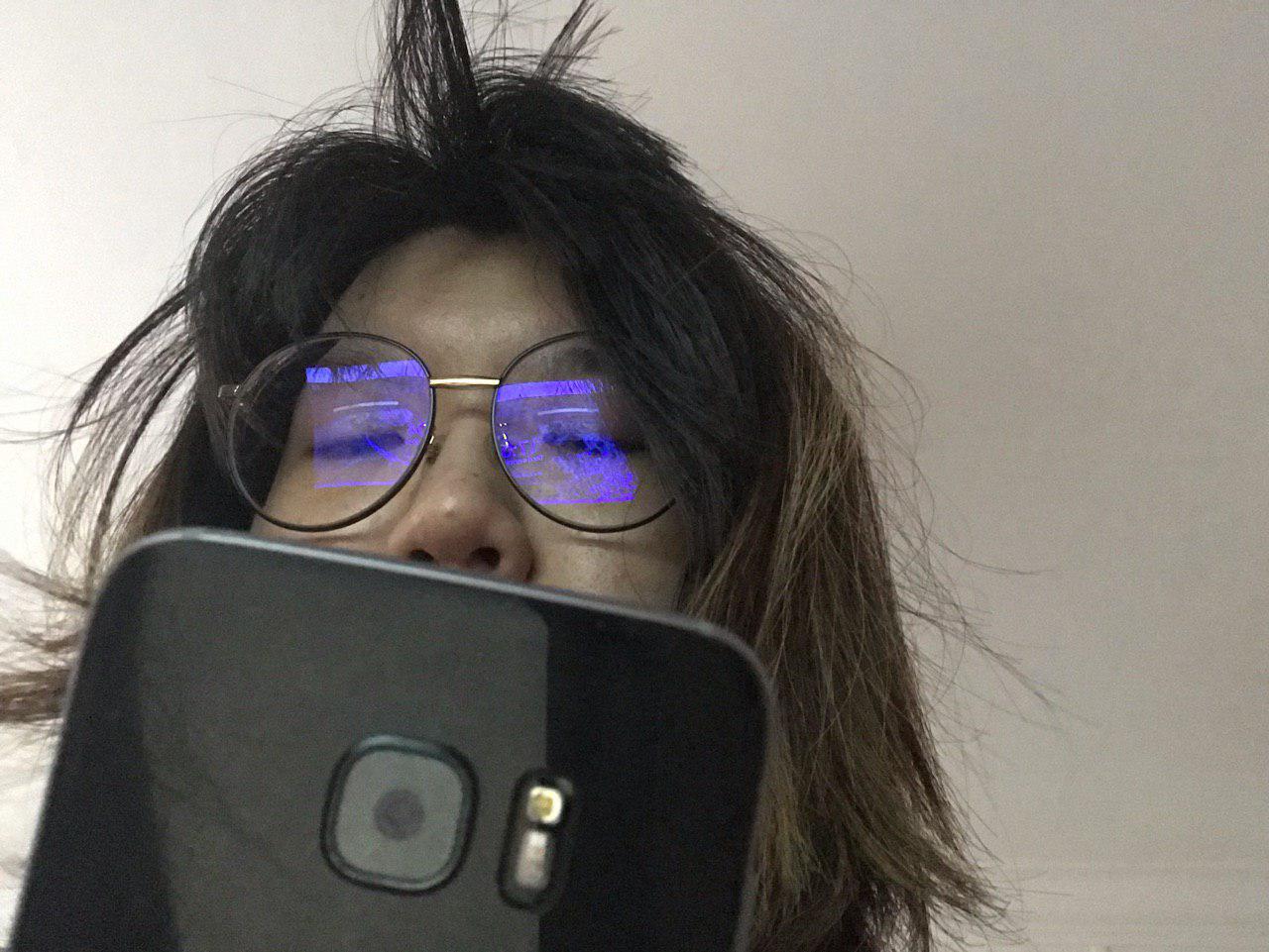
I did not like how the phone looked in the shots, because it was just kind of… there. So I decided to rotate my phone so my fingers were visible and one could tell that I was holding a phone.
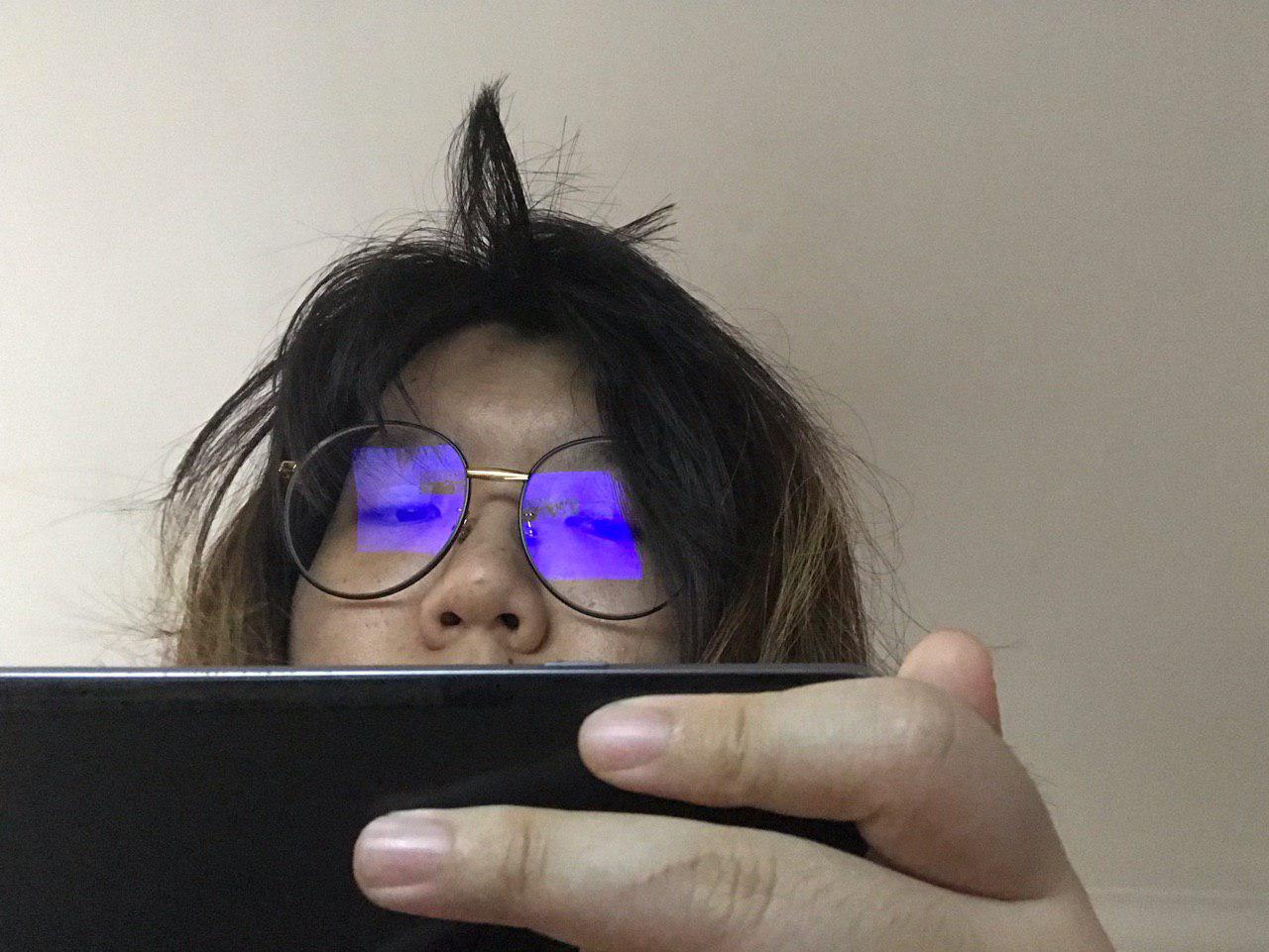
I was playing a game while trying to get this shot. Proof that my concept is Legit.
The references helped a lot with deciding how I looked. I could just take the important parts (phone, glasses, messy layered hair, big nose) and throw away the parts I was slightly more insecure about, right? (That’s Everything. I am insecure about Everything.) I started doing a rough sketch of how it would turn out. During consultation, I mentioned that the vibe I was going for was going to be more Gorillaz. My art as a teen was very inspired by Jamie Hewlett’s sketches and art of Gorillaz, and I wanted to try emulating that into my work again, through the strokes and colours for my self portrait.

Retrieved from https://www.edmtunes.com/2018/06/gorillaz-to-debut-new-album-the-now-now-via-live-stream-this-weekend/
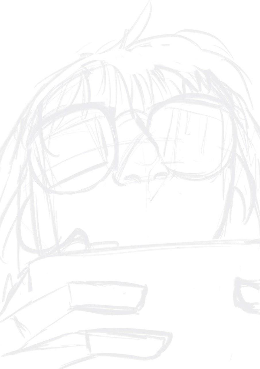
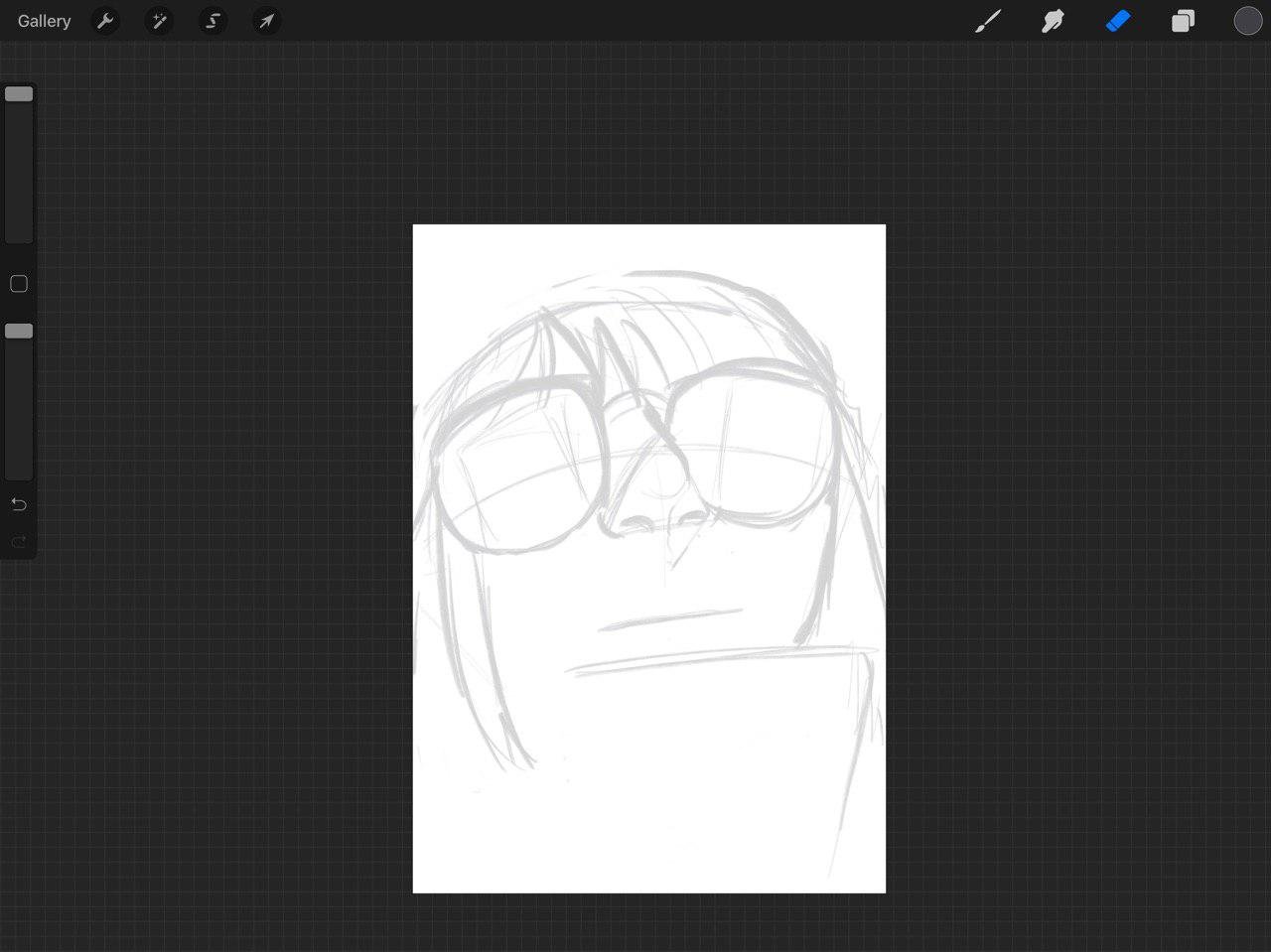
Initial Sketch
Once I was satisfied with the supposed anatomy, I did another sketch on top of the draft. May I also note that I have shaky hands which is why my art can never be straight and nice. But that is fine, someone once told me that it’s special to me.
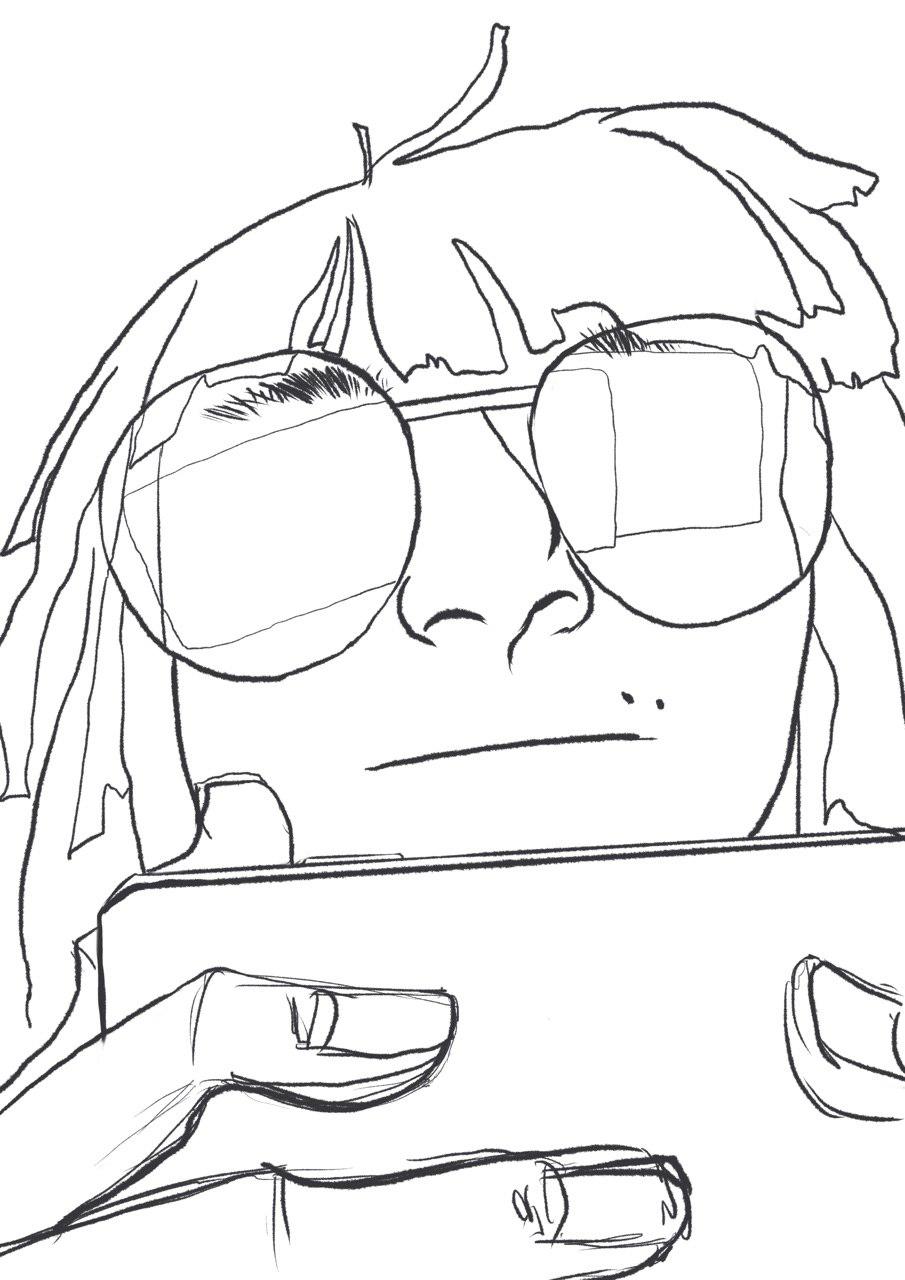
Refined Sketch
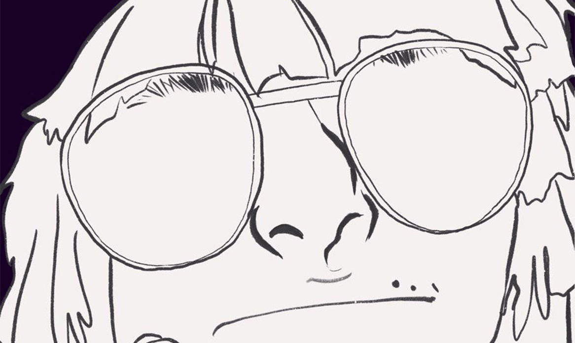
Once I was satisfied with the style, I lined over it again, with different line thickness, and added minor details. I wanted to give a sort of icky look to the entire thing, choosing to make my skin green (I know, similar to Murdoc from Gorillaz) and a colour that went well with icky (purple). I was contemplating between a complimentary palette, and this, but went with this for the more icky feeling. The green I used at first was more yellowish for a more sickly look. Why I chose to represent myself this way, was mostly because that was how I viewed myself, and to create a sort of cool, dark atmosphere, and warm colours did not do that trick.
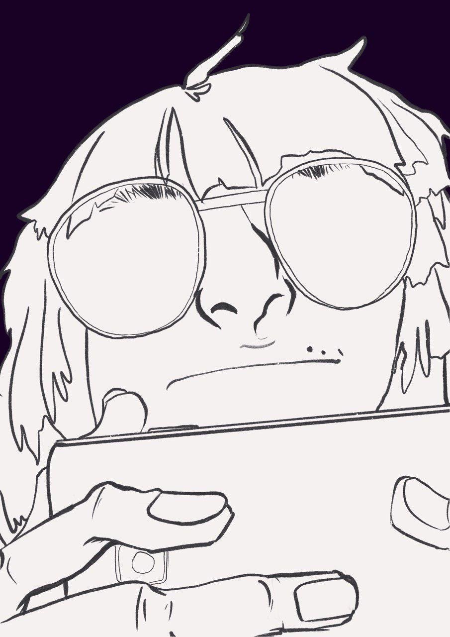
Finalised Linework

Base Colours
While rendering, I found it hard to stick to the two colours at first, as I was not too good at painting and colours in general. But this was the final result.
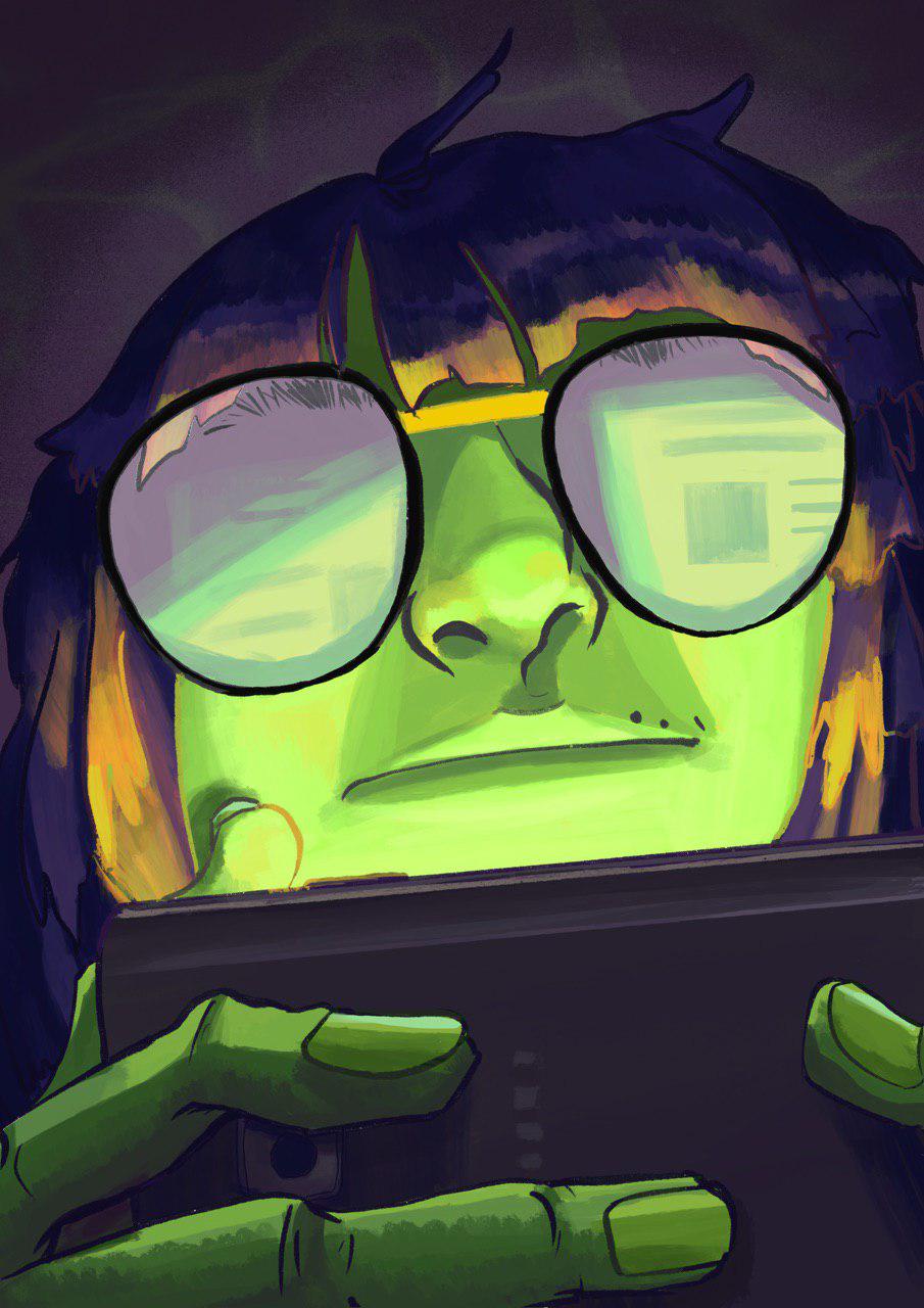
Version 1, final.
After consulting Lisa through email, I decided to turn up the shine contrast on my glasses, and made more detailed reflections. I tried blending back to the purples and greens I wanted to use as well, as the initial glow on the hair was way too bright and did not fit well with the whole piece.
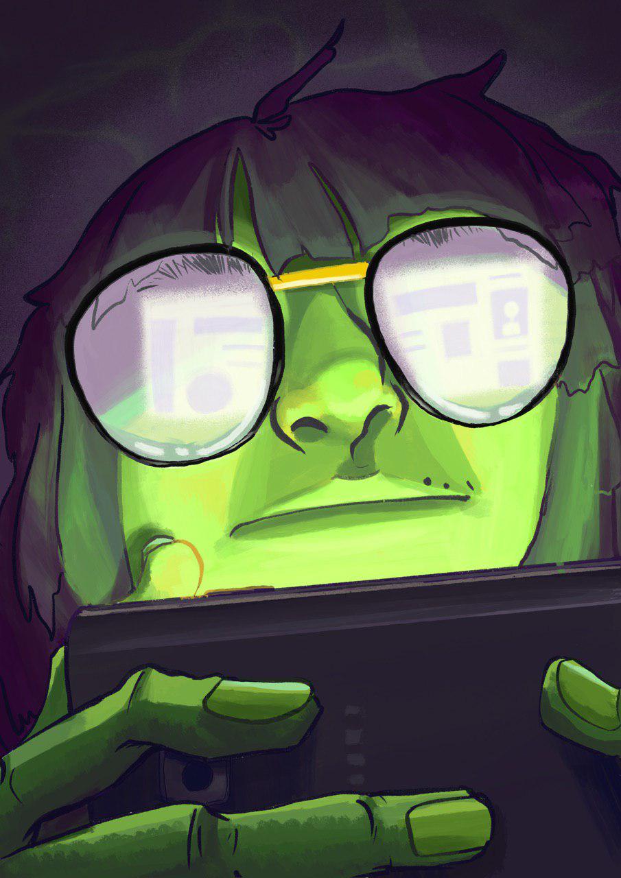
Version 2, final.
So this is my current progress. While I’m satisfied with my current result, I’m sure there would have been many more ways I could have done this better, or different. I’m new to the iPad even though I have had it for awhile now, and am glad I could use this opportunity in class to use it and test brushes out. I wish to do more conceptual paints on Procreate as I found it very fun to use, and I was very inspired by the many different stylized ways you could do portraits. I might want to work on some of the ideas I had planned out in my thumbnails in the future, and am satisfied to have been able to test/challenge myself even within this simple project.
Recent Comments