
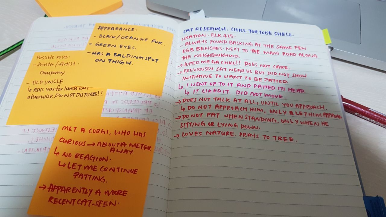
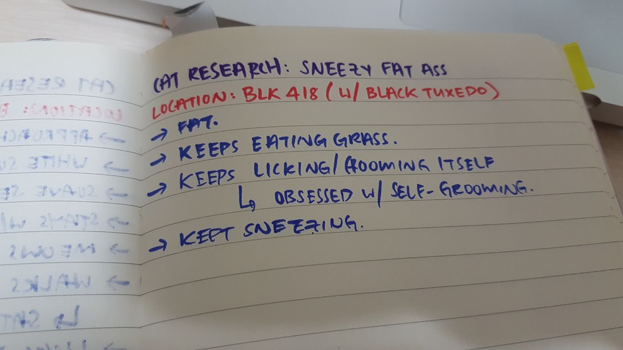
I started out looking through the millions of pictures I had of various cats I stalked, focusing on a few more eccentric kitties that caught my eye.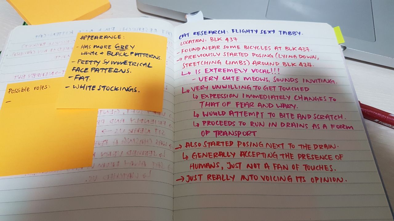


I also gave them names extremely stereotypical English names, thinking of possible news scandals that would normally catch the eye of people who read gossip magazines.

One of my bigger problems when starting this project was using photographs — I usually draw my projects from scratch. Having photos added into the composition was a limitation to me, especially with how cluttered the entire zine would look with the kind of aesthetic I wanted. I had to work around all the colours, and I realised that I couldn’t work directly on the images on InDesign (there was no editing function). I decided to work with an A3 canvas with bleed on Photoshop, and plan a base with it. I placed the .psd file in InDesign and used the Update Link option to constantly check if my edits would fit into the zine.
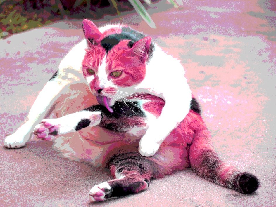
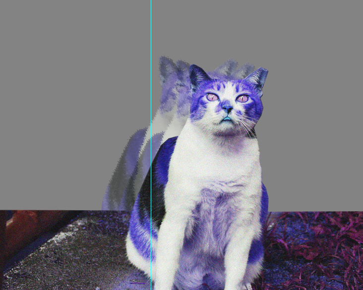
I also found it very hard to plan ahead for this project, and decided to just go ahead and grab some photos of the cats, plop them onto photoshop and start playing with the colours. Some of the effects I went with was relevant to our semester 1’s Forrest Gump project, where we played around with effects to change/filter the images.

OLYMPUS DIGITAL CAMERA
I decided to go with a more saturated effect with the colours, to give an obnoxiously loud and surreal feel to the cat images. The fact that I was personifying cats into a human gossip magazine was pretty weird already, so I wanted to make it feel a little trippy.
In my initial consultations I realised that visual hierarchy was very important in making this zine: it was important to lead the viewer’s eye to where you wanted them to look at first. Words also shouldn’t be too big, because the viewer would be overwhelmed by the text.
Boxes and texts did not have to fit the horizontal and vertical lines and could be diagonally placed, which gives it a bit of personality that someone might focus on. I slowly tried to work around creating a hierarchy with all these cats.
Without realising that my files were constantly overrid when I updated links, I did not take many work in progress pictures. But when I was done thinking up content for my various gossip stories, I had this:
I realised at this point that this way wayyyy too red. The colours I used were all warm, and when asking a friend for their opinion, they admitted that nothing really popped up since everything was just warm.
I went to print a black and white version for Week 12 consultation and forgot to take a picture so now its all messed up when I was moving stuff from hall to home WHOOPS.
I went to consult Shirley and she mentioned about how uppercase letters gave the viewers a harder time to read. She also told me to change my Monaco font. HAHA.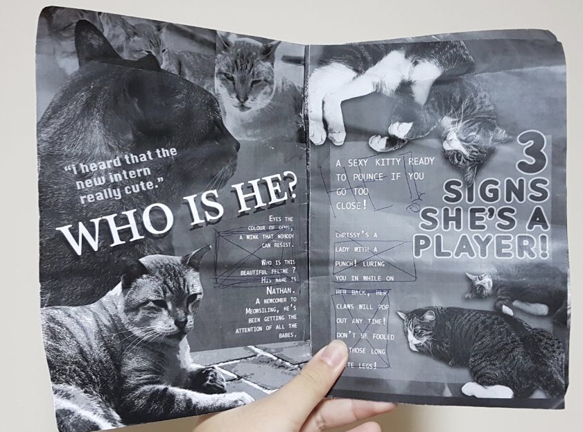

I’M SORRY IT’S SO UGLY HAHAHA I COULDN’T SAVE IT @ THE TIME.
Other things Shirley mention that I could ‘cross boundaries’ of pages, rather than stick to objects and text fitting into one page. She helped me make my text boundaries neater as well, and I changed the font to something else (Krungthep). I realised that InDesign automatically makes the fonts all uppercase. No wonder.
ALSO I printed it at the ADM library. But for some reason the images were not aligned, and when I was cutting them the back side would be affected. I also found out I’m not good with penknives. Nor rulers. Nice. NTS: print extra.
So came the point I had to figure out how to make my text pop out from my background. I decided that I wanted to keep my warm yellow texts and reddish themed cats, so I had to change the background instead to compliment the various objects.
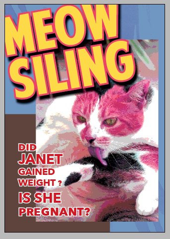
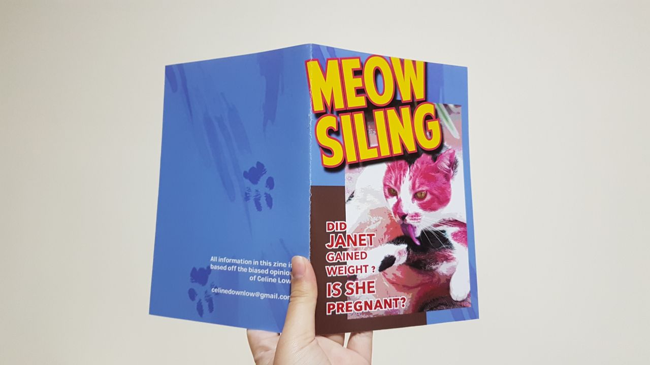
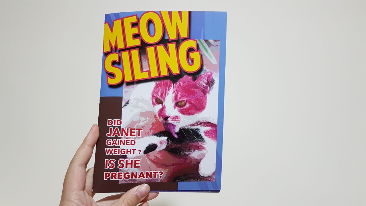
I decided to go with a light blue. It helped make the reds, pinks and yellows stand out better.
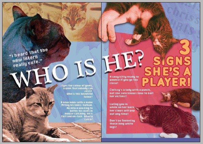
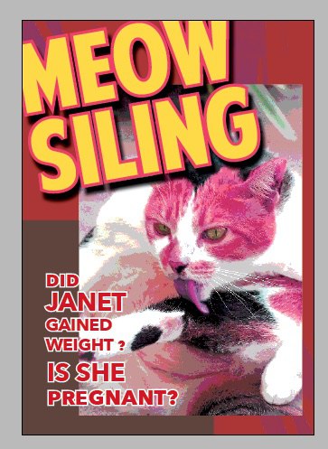
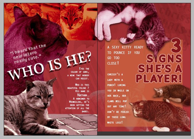
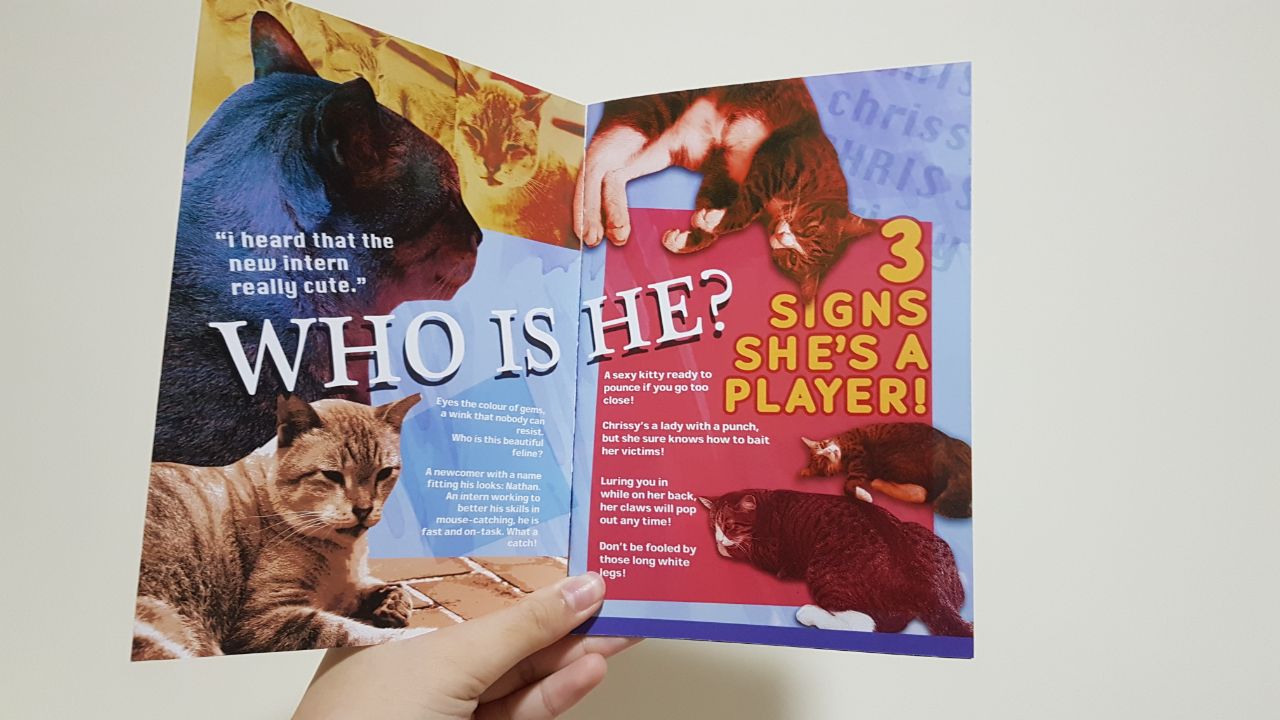
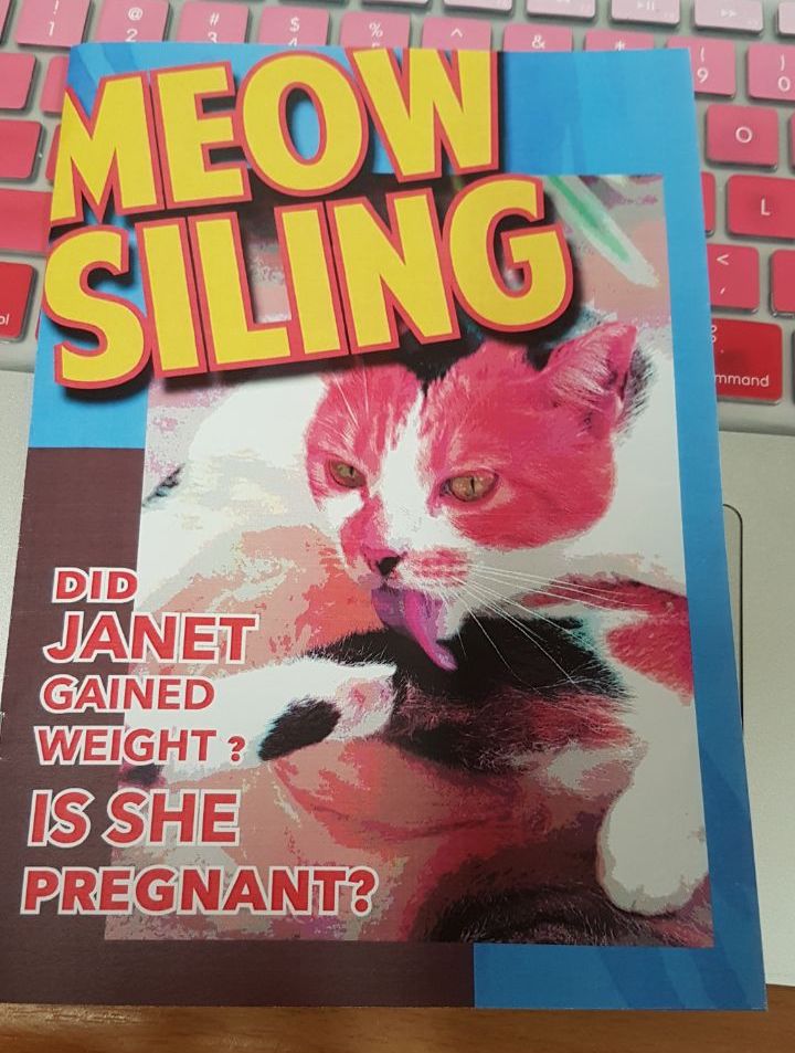
I kept with a muted yellow/orange on the right to show the serene, calm nature of that cat (Nathan), but followed Shirley’s advice to make the title bigger. It then lead to the next title, where the box is a super alarming red. I tried to go with a title that was very click-baity (I know, internet jargon, but that was the only word I know), like ‘3 hints that ____’ or ’25 ways he shows you love <3′.
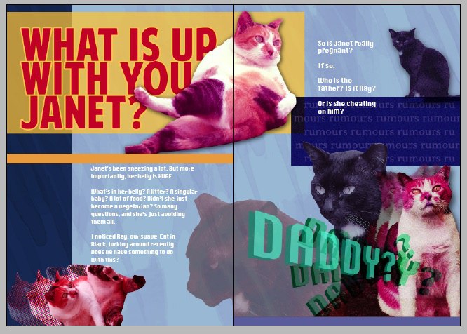
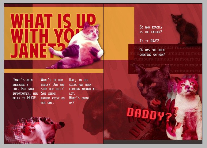
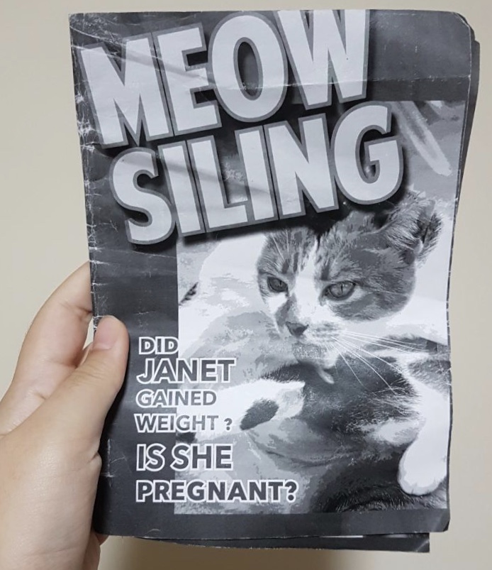
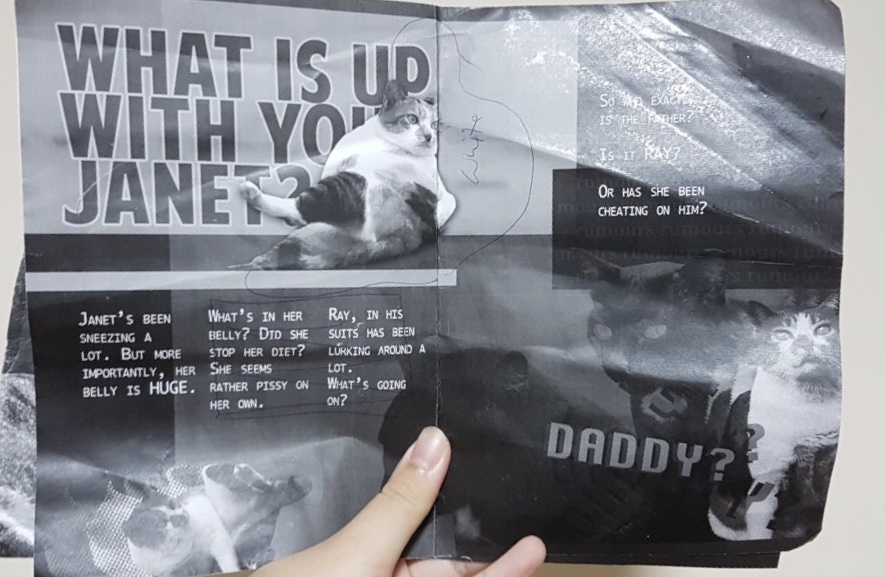
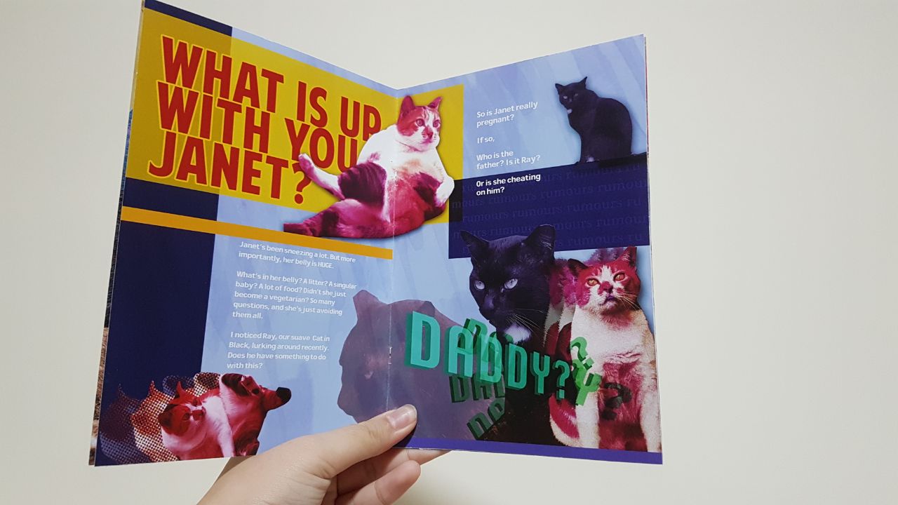
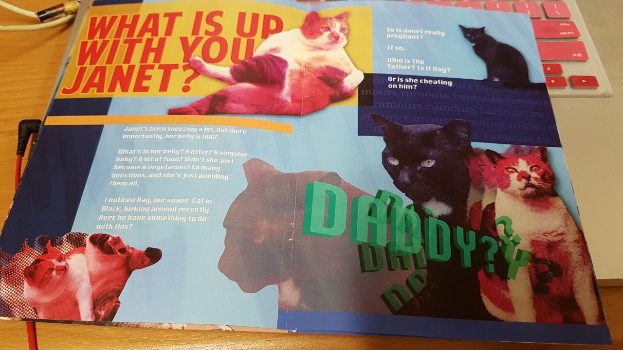
I made this the highlight page of the zine, to reflect my coverpage. Like a highlight story in a sense. I actually like how this page turned out, because there was a black cat and I really like black cats. He looks very suave. I called him Ray. There’s the huge blaring title of WHAT IS UP WITH YOU JANET???? With a big Janet picture (which Shirley told me to make bigger and have it cross to the other side of the page) and followed by a lead of darker images of the very Handsome cat. I also tried to create a little rumour box where I put the final text, ‘Or is she cheating on him?’ Which I think is a pretty cool effect, like it was a rumour just ~*passing by*~.

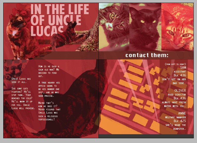
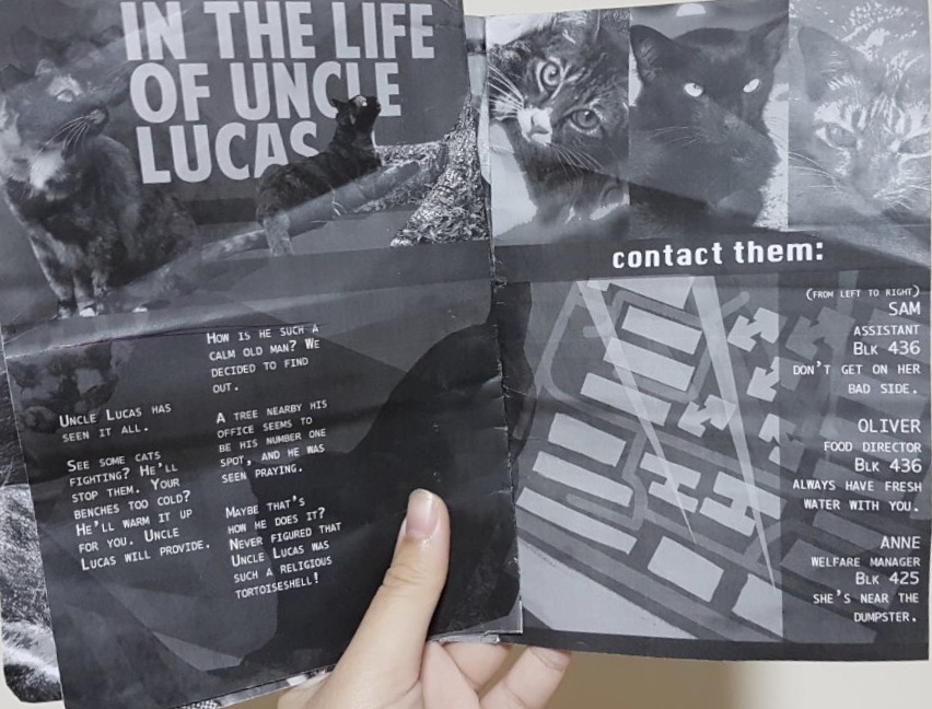
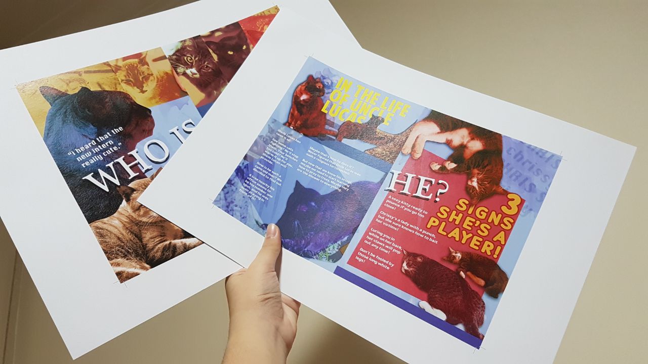
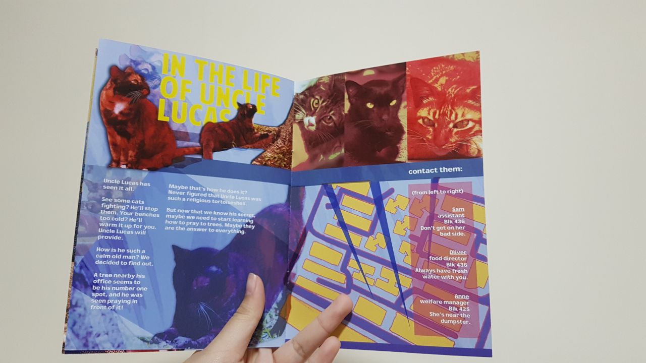
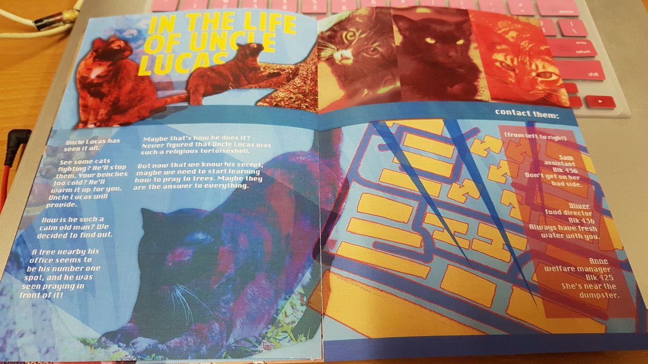
In this page I gave it a chiller sort of vibe, explaining the life of a cat I named Uncle Lucas, who prays under a tree. The colours flow in a less jarring way, and they blend together better rather than stand out like an obnoxiously sore thumb. (Not that I assume that the other pages were obnoxiously sore, just more… outstanding, I would say.) I also placed a mini map to find various important staff of this ‘company of cats’ that you can find. Because they do not technically have contacts, I just gave tips on where or how to approach them, because that was what happened when I first did.
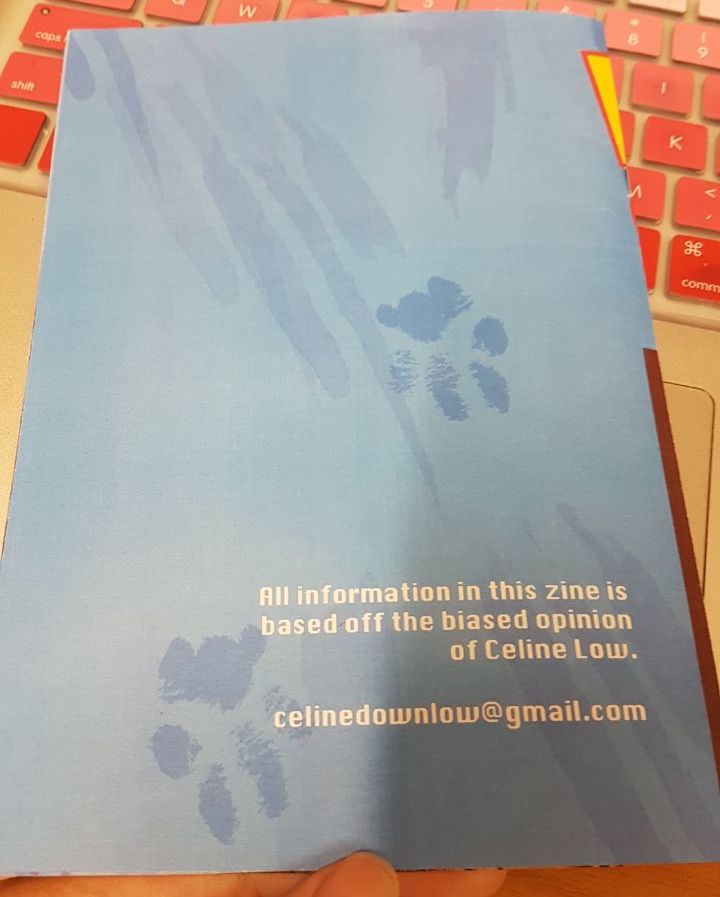
For a final touch, I added little pawprints, as if a cat decided to stand on my zine. I was actually tempted to go there and get them to autograph their pawprints. But I didn’t want to risk holding their paws to clean them and get scratched. Guess I’m pussy. /: This will have to do.
I went to print the zine and realised that the font was changed, although I was fine with what turned out, and because I have no money I’d rather not reprint since it wasn’t a major mistake.
I also have extremely clumsy hands and bad rep for cutting things so it took me 3 tries to get the zine to resemble a proper book.
Besides the wrong font (that still looks okay? I’m just really angry at myself) everything looks good and I am satisfied with how it turned out. To make myself happier I’ll probably go to the printers at North Spine to try again. I realise InDesign hates me with a passion but I’ll try to work with it in the future.
UPDATE: I tried North Spine and they only had normal A3 paper but I still tried anyway, and they have the same alignment issue (the dude told me to align my files according to their machines I’m like ??? okay sure).

The colour was also varyingly different, the sunshine plaza one looked way nicer. I think something I could have learnt from this was that I didn’t need a thick paper for this project (something I always usually did with my other projects), and I needed to always convert my fonts to objects (I learnt that I could do this from Tanya, who learnt it from Shirley, and I still don’t know how to do it but I learnt that you could do this).
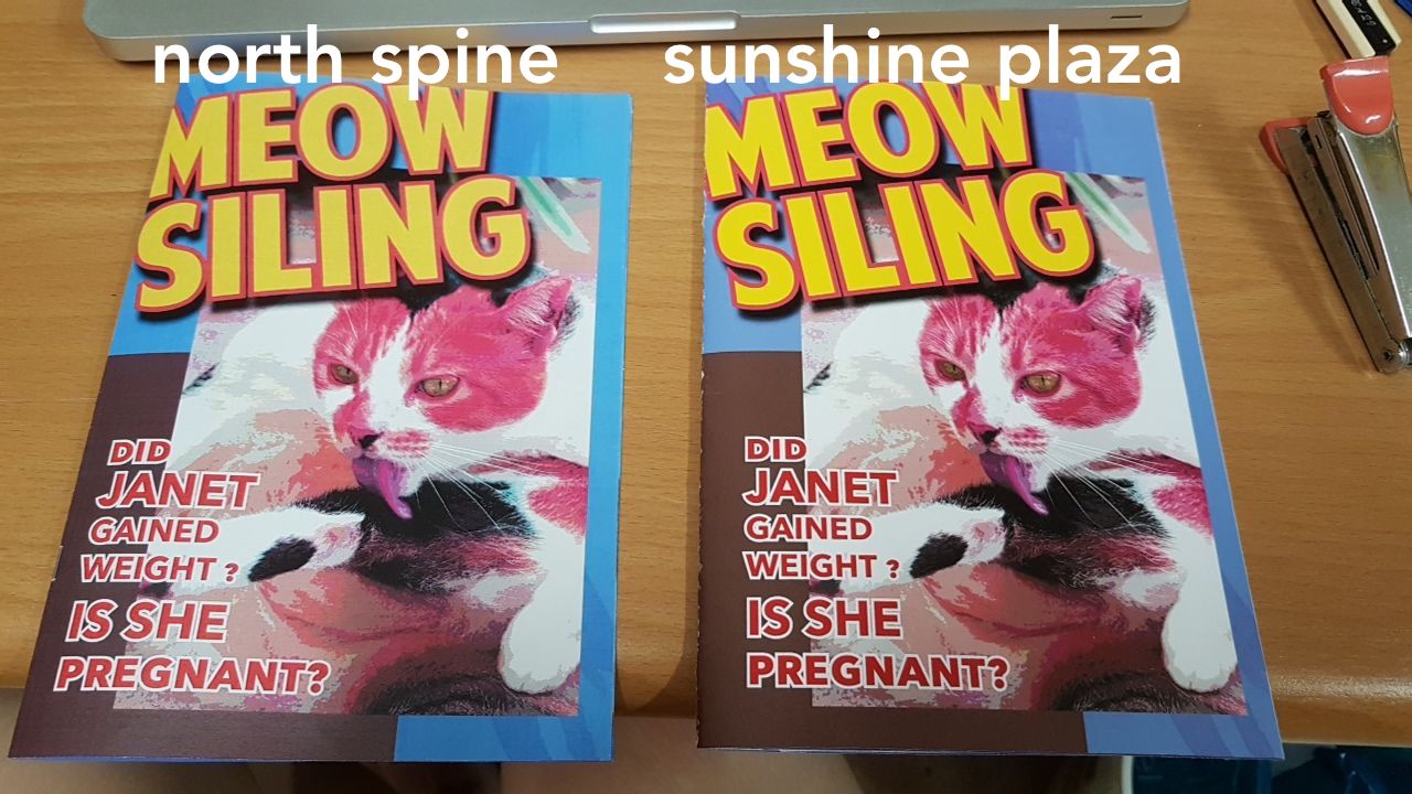
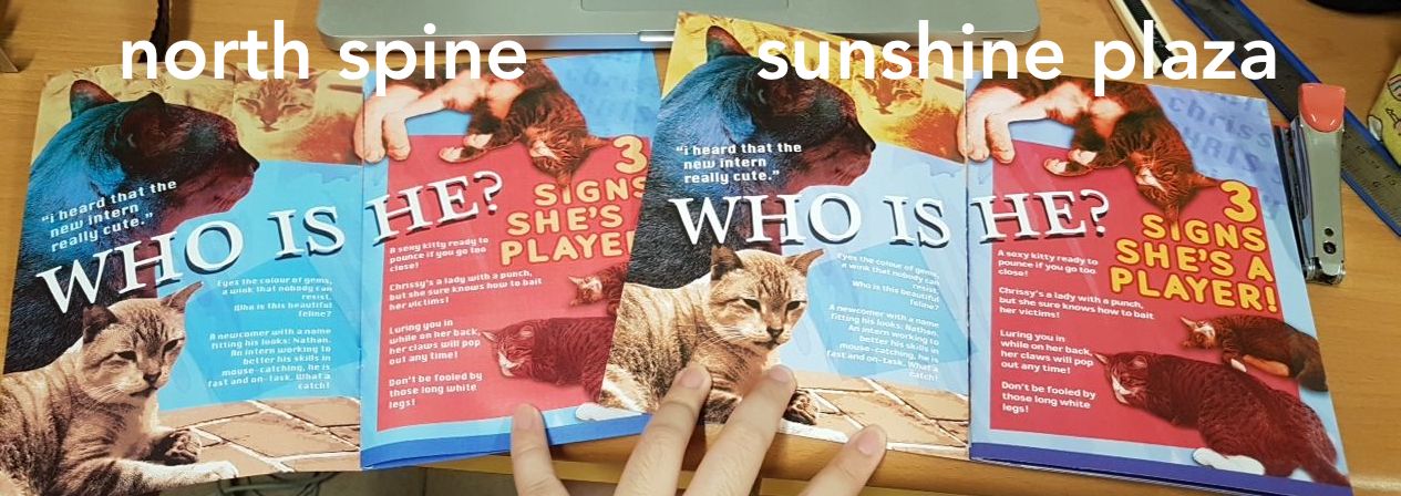
Notice the small text difference!!!
My takeaways for this entire project would be that wow I can make zines now. I wish to make a zine with my illustrations in the future, and this was a good first step for myself. Especially to learn how to make the file suitable for 2-saddle stitch. I also had a lot of fun stalking cats for hours. I’m going to give the zine to my friend’s grandma because she let me have dinner at her house every time I went there after cat-stalking, and she never knew there were that many cats in the area. Ahma don’t worry I found them all for you.
Recent Comments