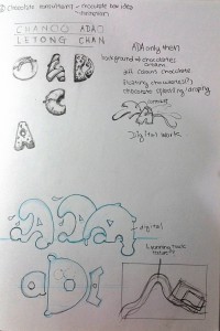
After the research, this post is about the progress in my project.
I am Ada and I am an animator
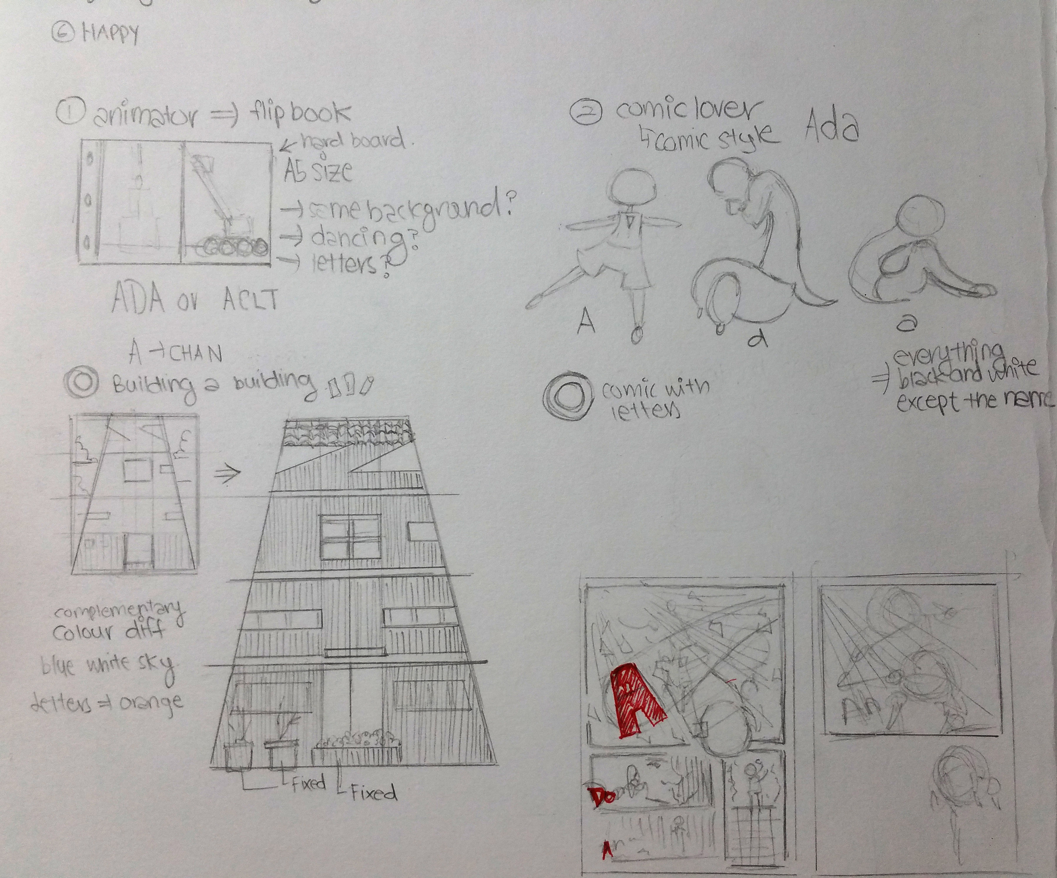
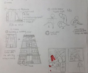
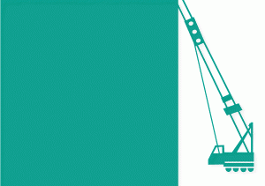
I wanted to do a flip book to introduce my name. I designed my name into a building, so that the alphabets in my name will be lowered down like those in construction site. Click on the image below for the GIF image to see a better explanation!!
 (Click on image)
After consultation, I removed the building elements since it maybe boring and slow. So, I try to create fun movements with the alphabets to show that I want to be a fun and entertaining animation. Click on the image below for the GIF image to see a better explanation!!
 (Click on image)
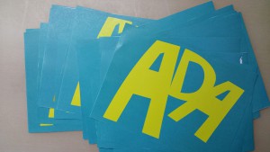
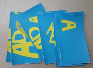
However, when I print out each page of the flip book, I find that it is too difficult to flip the pages on A5 and the papers runs too fast and its difficult to control.
 (A5 size)
 (Smaller than A5 size)
With time running out, I rejected this whole idea after all the efforts. ._.
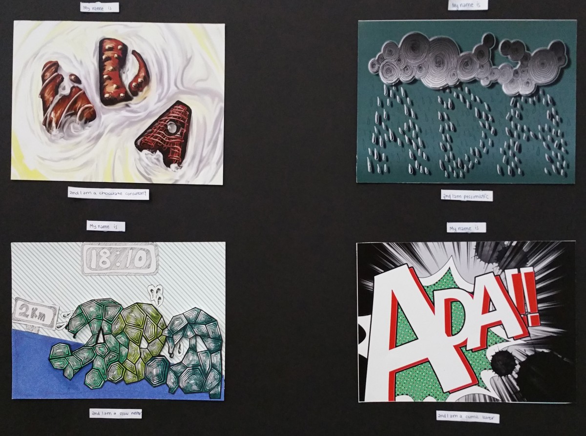
I am Ada and I am a comic lover (THE CHOSEN ONE)
At first I drew out a comic and try to incorporate my name into the comic. However after consultation, it was too visual to be a typography.
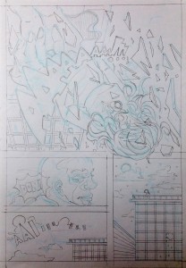
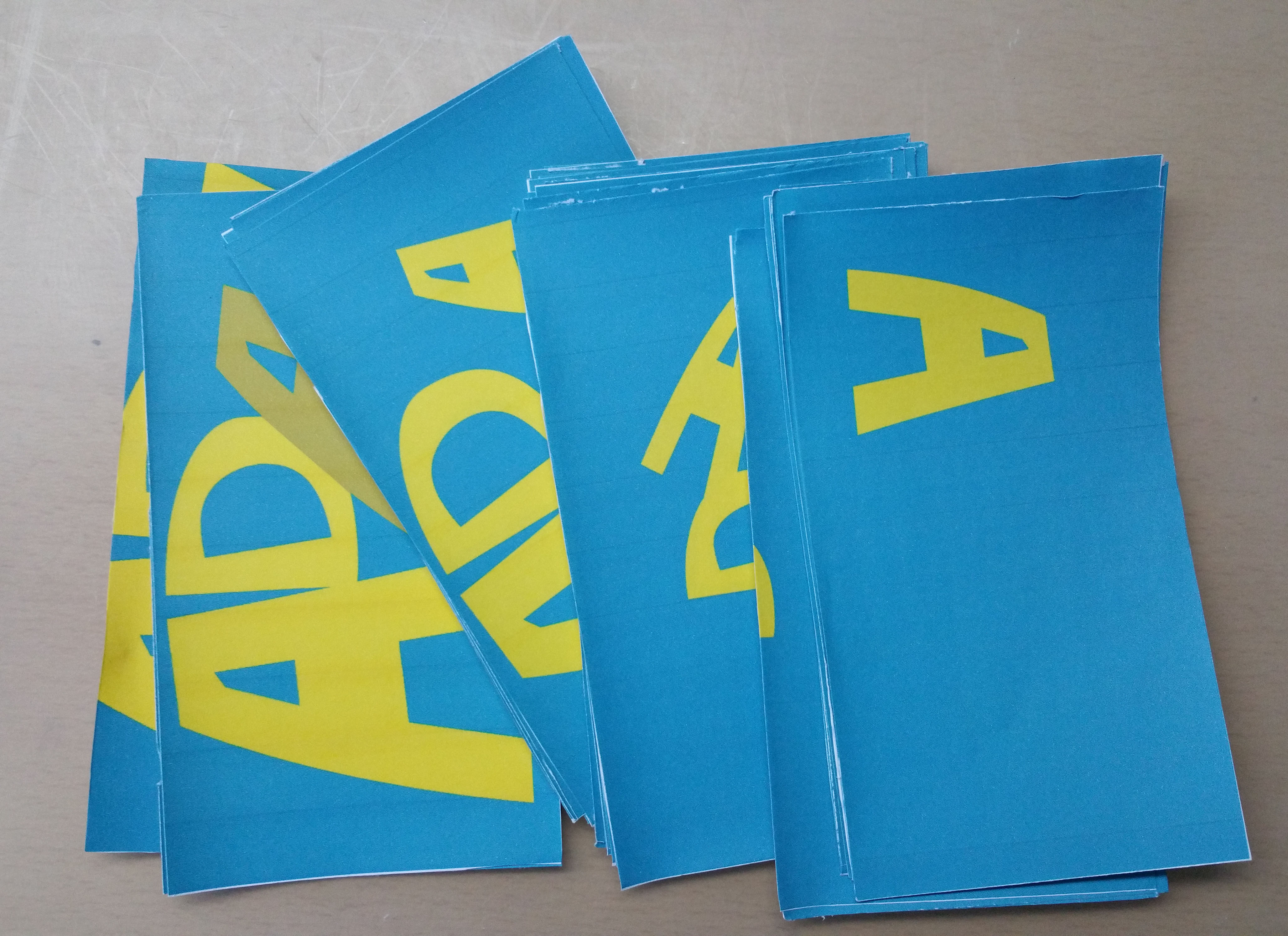
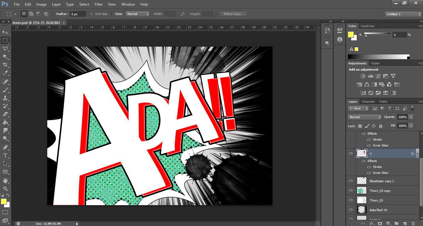
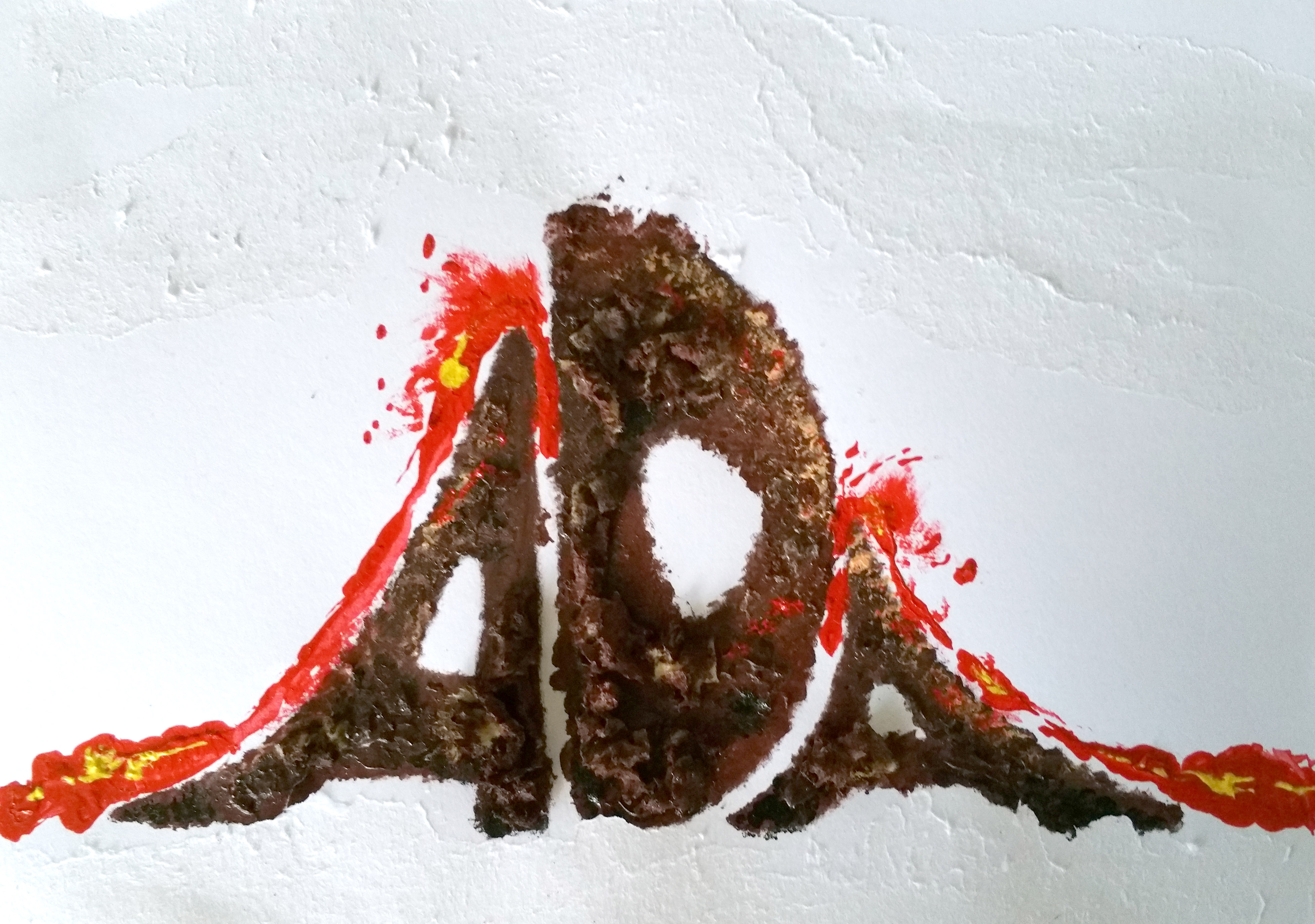
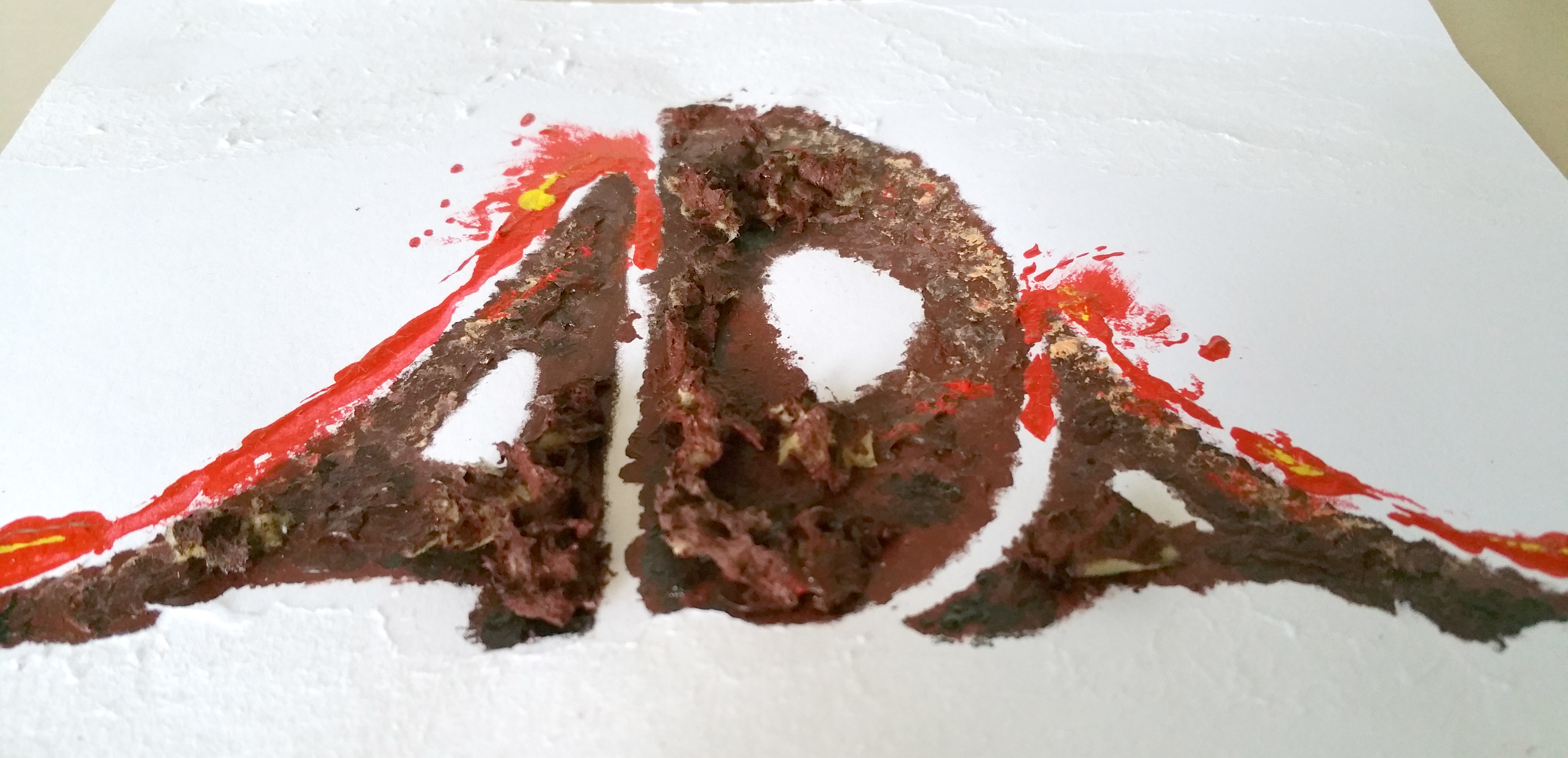
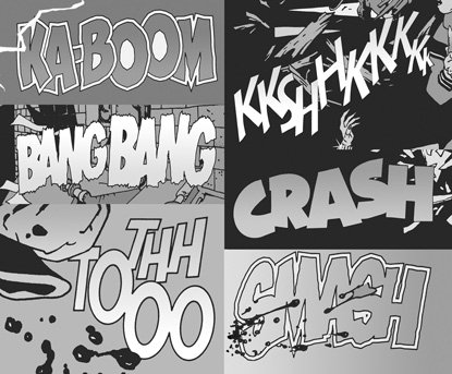
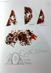
So I look at Google for the comic style typography. This is the easiest to create. I use the software Clip Studio Paint and their pre-installed comic elements into my work, such as the shout box, half tone and the blood stain. I arranged my name in Photoshop and export it to CSP.
I chose red on green so that my name would stand up from the complementary colours. I also chose black and white background because most of the comic that are read are from Japan and their comics are usually in black and white. Also, since I like to read action comics, I added blood stains and leading lines to create an action feel to it.

____________________________________________
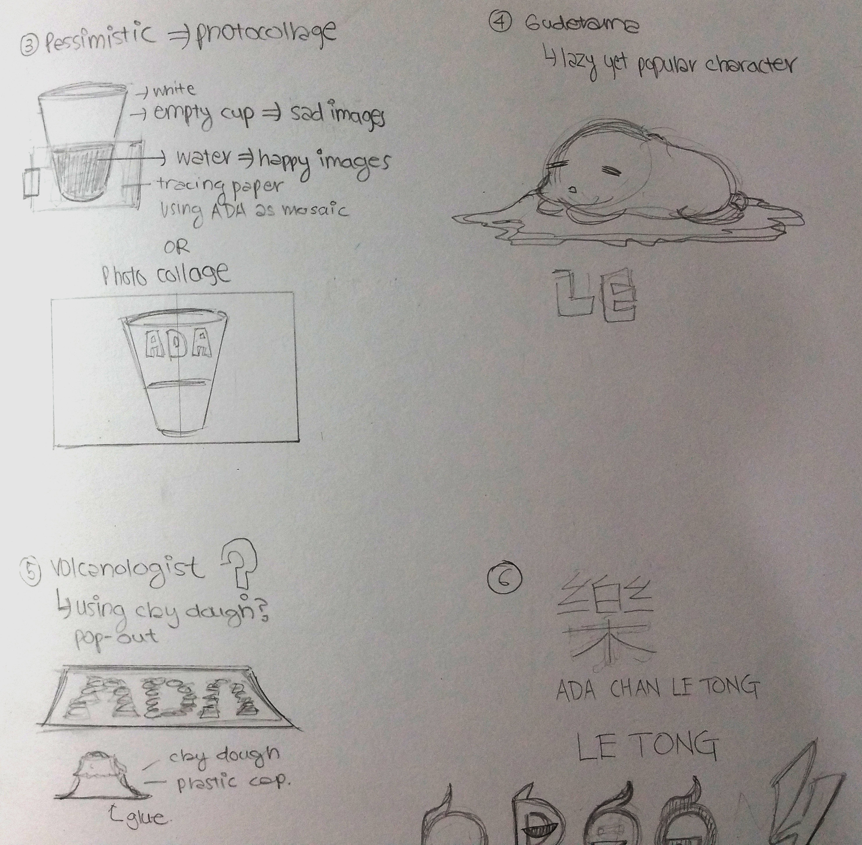
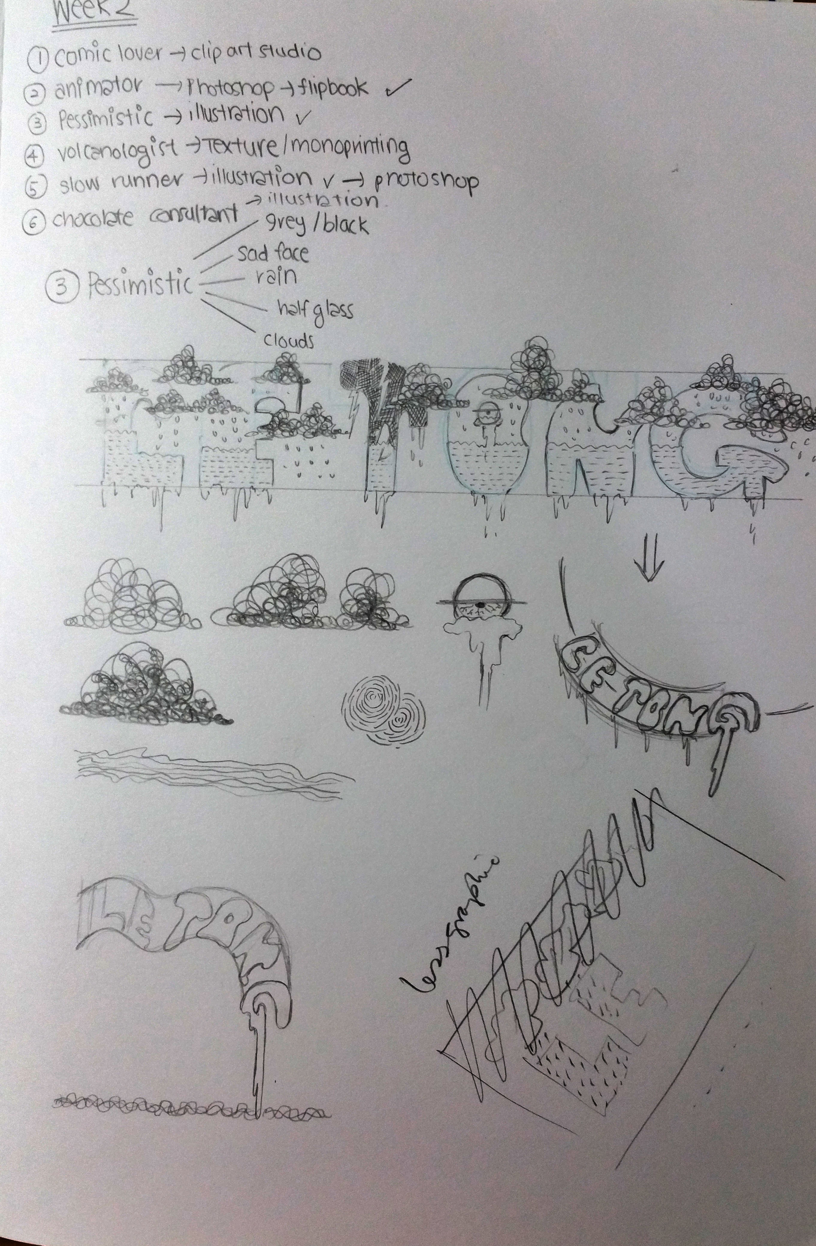
I am Ada and I am pessimistic (THE CHOSEN ONE)
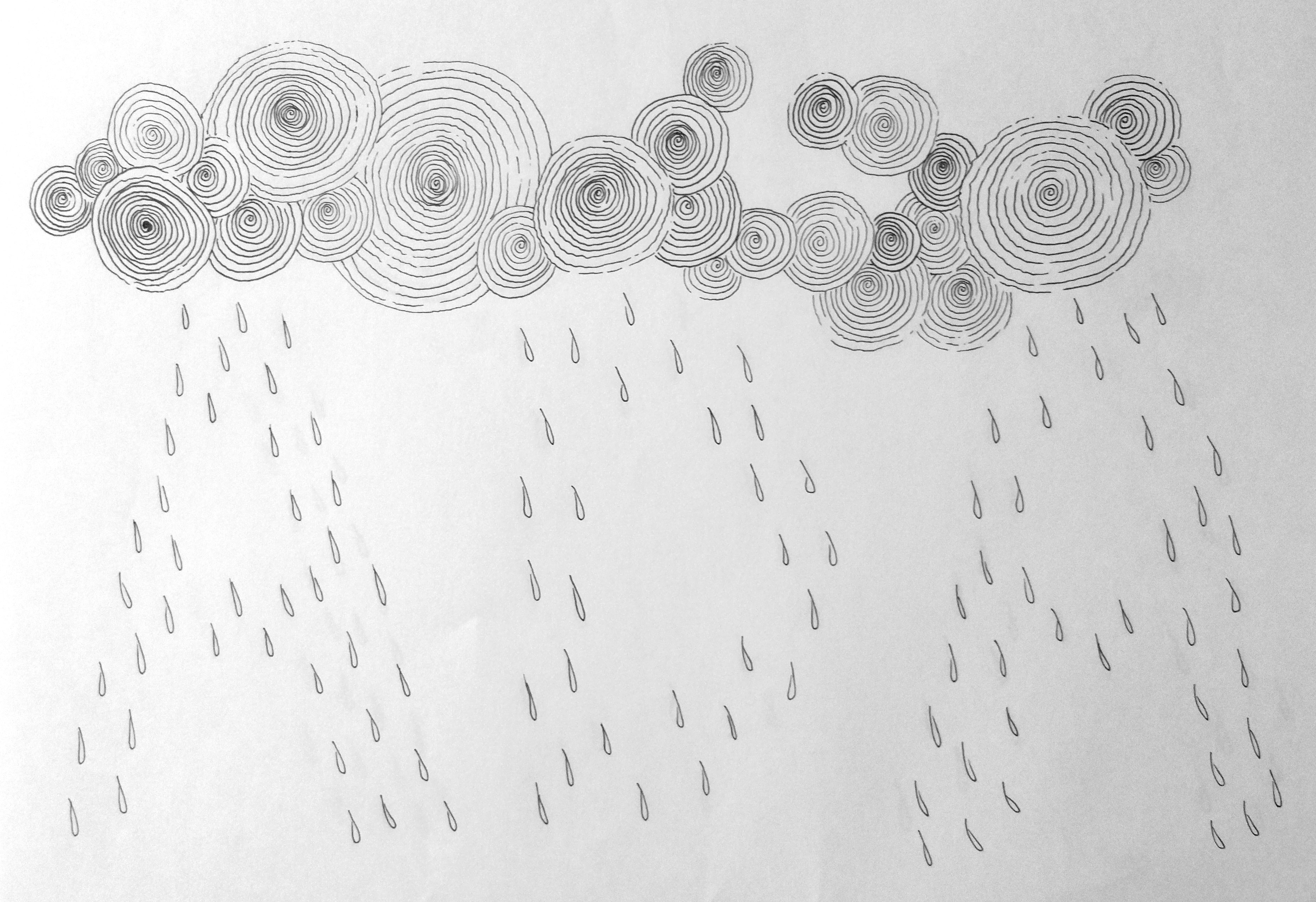
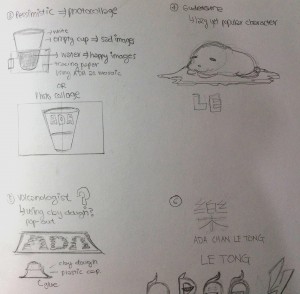
At first I wanted to do a photo collage to form a half filled cup with my name in it. However, it will look too confusing. So I googled pessimistic and I found that clouds and rain are most often associated to pessimistic. So, using my Chinese name Le Tong, I drew my name with clouds and rain as seen in the picture below.
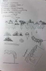
After consultation, Shirley commented that the typography has too many visual elements too. She suggested to use raindrops to form my name. Thus, I came out with the drawing below.

I chose spirals for my clouds as it gave off a sad and gloomy feeling to it.
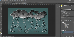
So I edited this drawing in Photoshop. I added gradient to my raindrops and clouds to give further gloominess into the work. I also chose dirty dark green so the the overall look will be sad. I added shadows at the back of my raindrops so that they would pop out from the green.
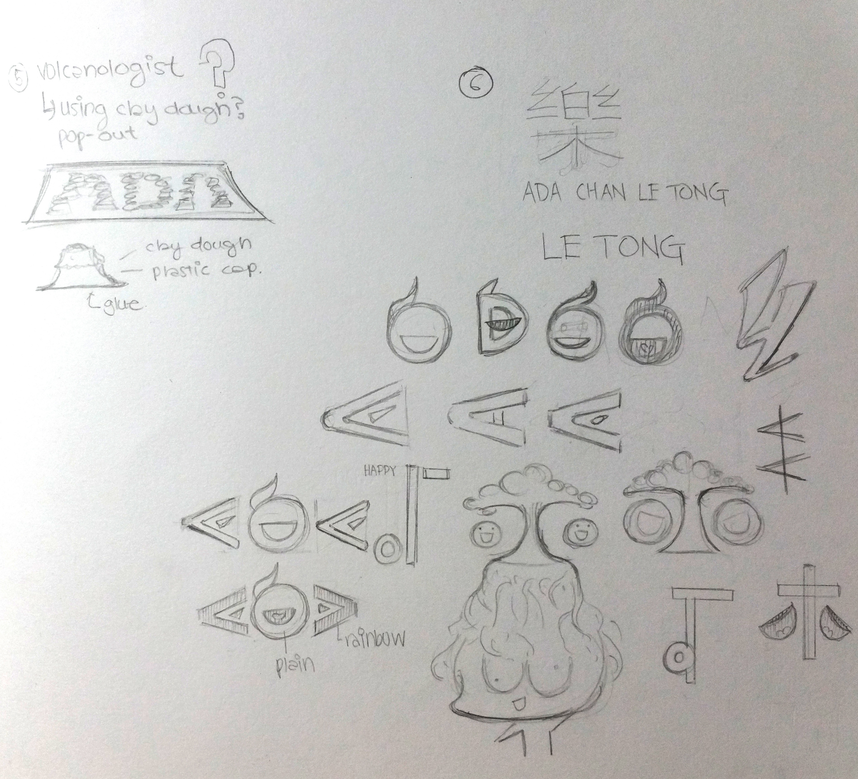
I am Ada and I am a volcanologist
One of my favorite subjects since secondary school is Geography, especially Physical Geography which is to study about the Earth, so I chose volcanologist, someone who study about volcano.
At first I wanted to do a 3D volcano with papers, glue and plastics. However, since I am not that good in craft work I changed my idea to use sponges to create the texture of volcano in my name.
I used different shades of acrylic brown for the volcano and red for the lava. After consultation, I changed the arrangement of the alphabets so that they are linked more closely together.


Sadly, after several attempts at home, I felt that the alphabets did not pop out and the whole work looked very messy. Hence, I rejected the idea. ._.
____________________________________________
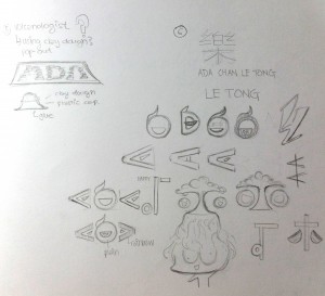
I am Ada and I am happy
I wanted to try to mix English alphabets with Chinese characters. The above picture shows some of the attempts. However I rejected the idea since it will contradict with my pessimistic work and my pessimistic idea is more developed.
____________________________________________
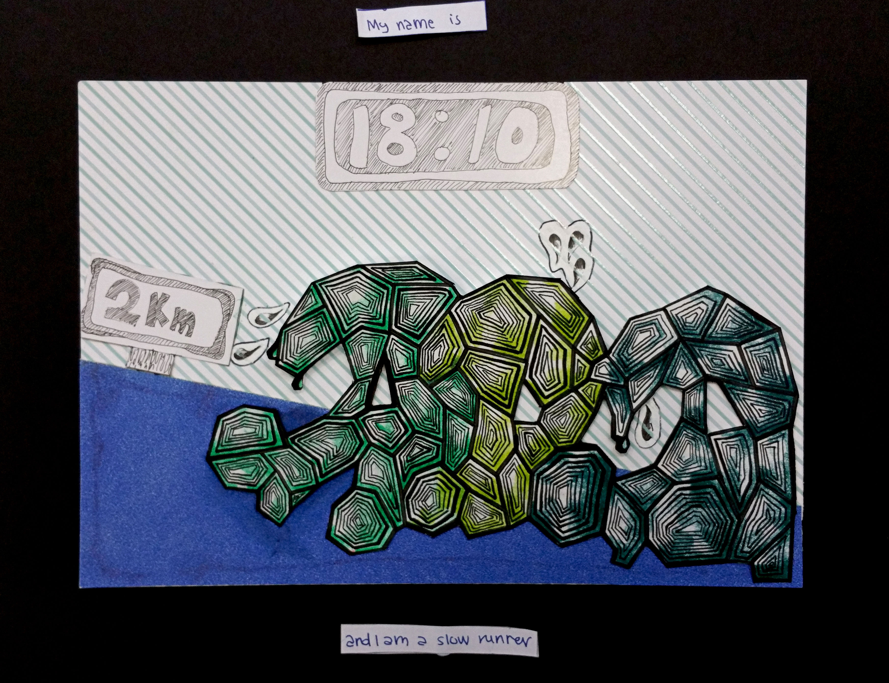
I am Ada and I am a slow runner (THE CHOSEN ONE)
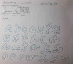
I drew out all the alphabets that seems to be running. I wanted to arrange those alphabets found in my name to be at the back of the race, while the rest of the letters will be at the back. However after consultation, the comments were there were too many letters in the typography.
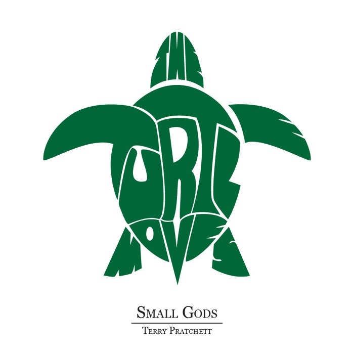
So I googled to find turtle are often associated to slow. Hence I try to use my name to form a turtle shape as seen in the picture below.
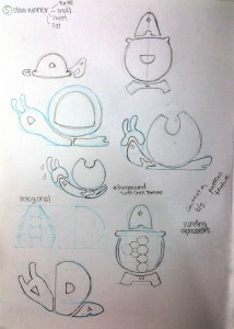
However, it is difficult to see my name, hence I used turtle texture instead.
I googled for suitable turtle texture and I found this.

Hence, I drew out my name with the above patterns. I also I added other elements such as the timing for my run. The details for this work will be written in my final post.
____________________________________________
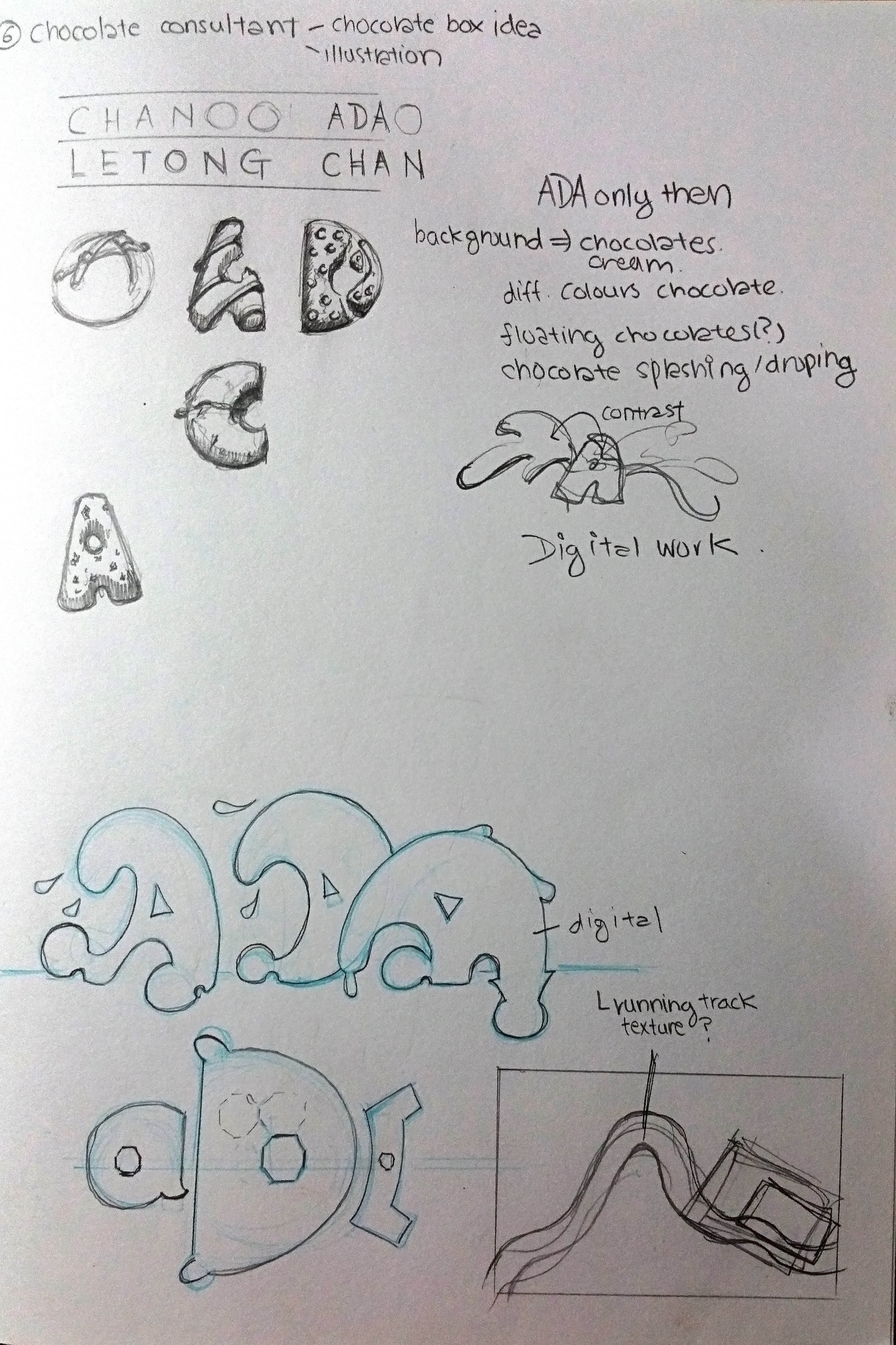
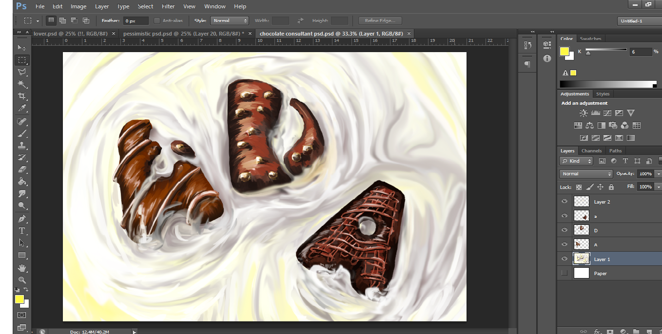
I am Ada and I am a chocolate consultant (THE CHOSEN ONE)
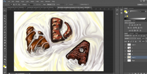
One of the best jobs in the world according to Google. I drew my name into chocolate like form. At first, I wanted to arrange my name into a chocolate box. After consultation, I decided to just place my chocolate name on white chocolate so my name will pop out and contrast with the background.
I use Photoshop and Clip Studio Paint for digital painting and editing of my work. I tired to make those chocolate look as realistic as possible.
I also tried to remove bits and parts of the chocolate in the letter A and D. According to the Gestalt closure theory, one would close up the gap to identify the alphabets.
Click on my next post for the final work in my project.
 Overall work
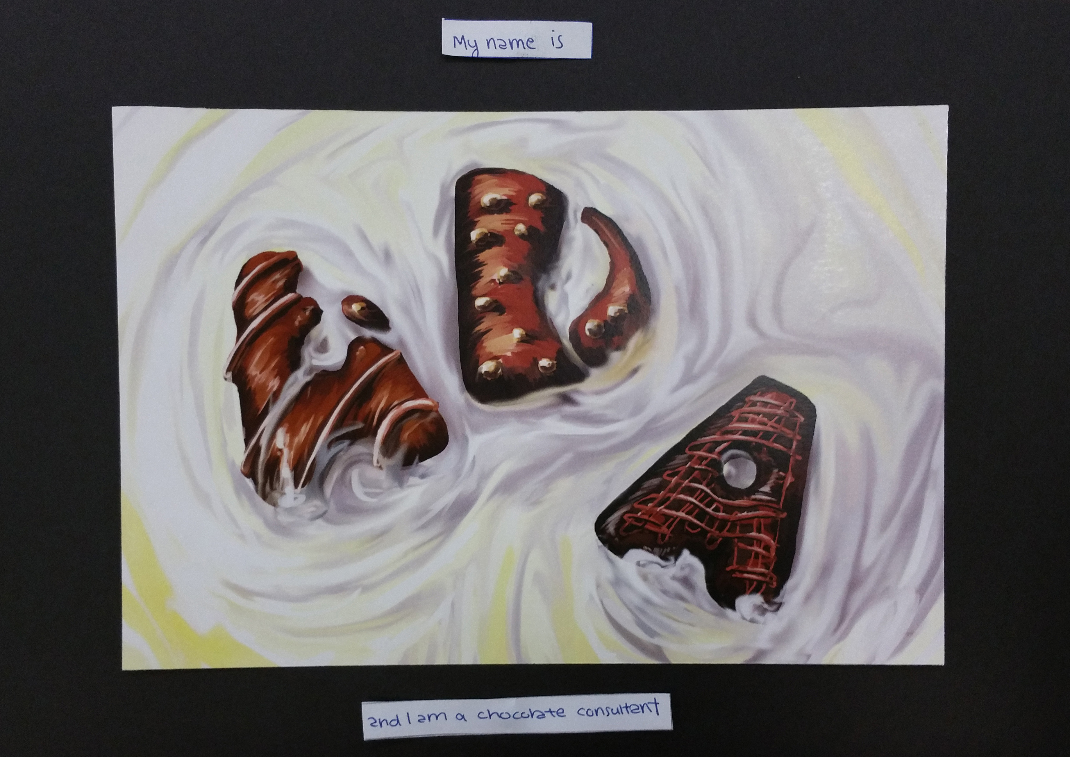
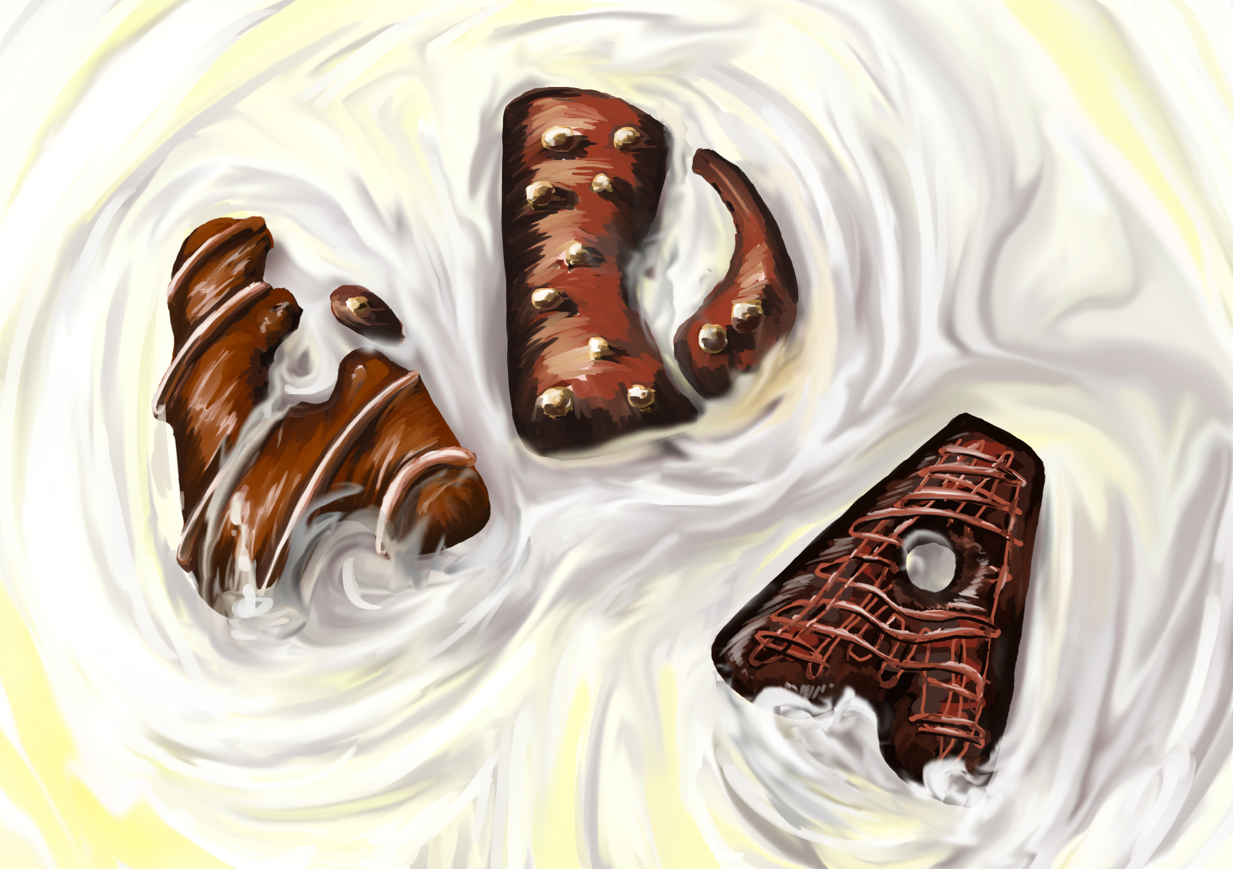 I tried to be as realistic as possible in my digital drawing. The dark chocolate contrasts with the white chocolate background. Gestalt Closure theory is applied here with the first letter A and D to make things interesting.
 The leading lines are are pointed towards the name. The name is also off balance from the image to create dynamic effect. Alphabets are overlap as often seen in comic book. The red on the name contrast with the green halftone background.
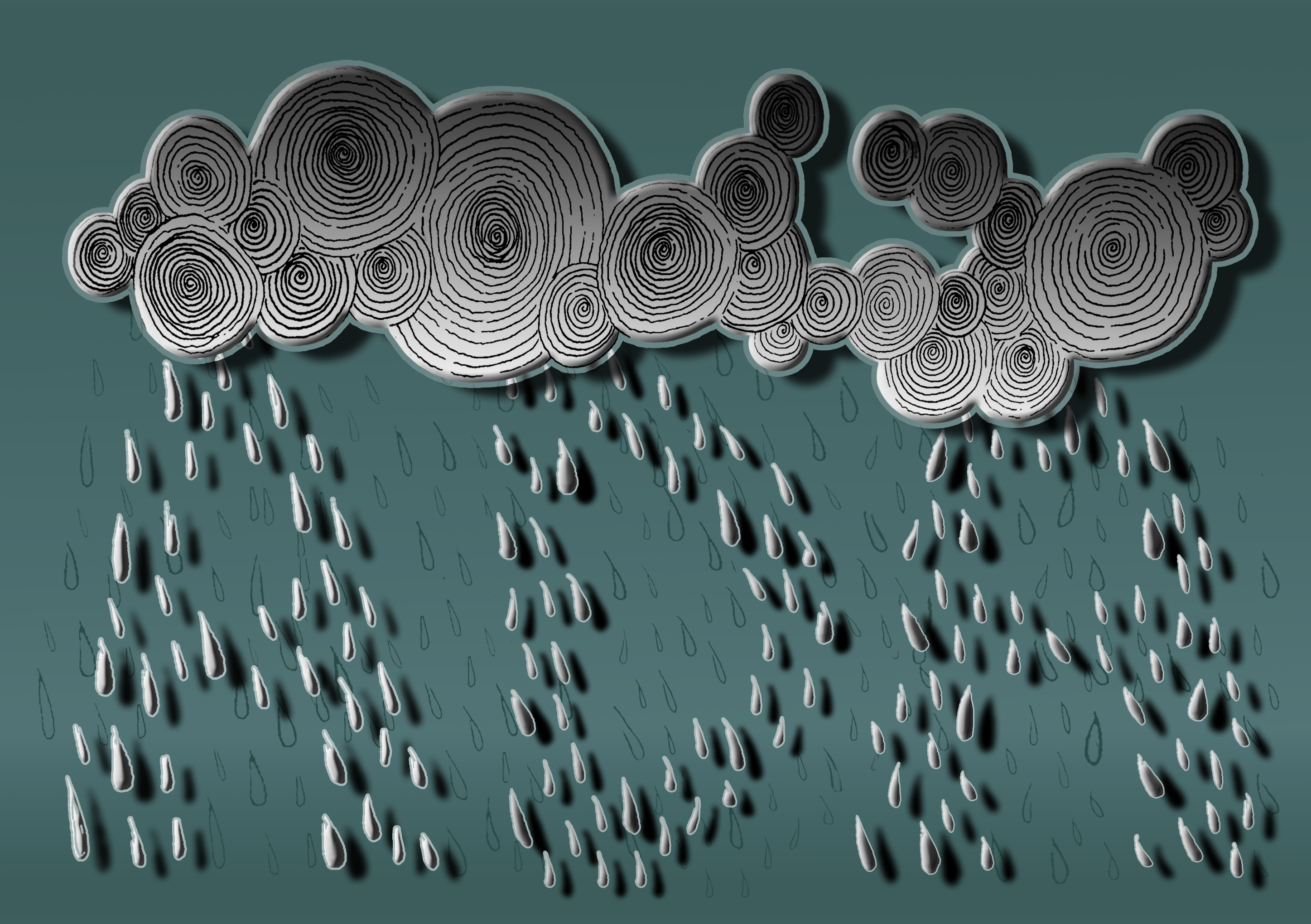 Gestalt Similarity theory is used here since similar raindrops shape are grouped together to form my name. The colours and gradient used give off a gloomy feeling. Original sketch of the raindrops are also added into the background to fill up the space. Shadows helps to make the name stands out.