Color scheme

Colour Scheme is the choice of colours used in design for a range of media. Colours that create an aesthetic feeling when used together will commonly accompany each other in color schemes.

List of colour schemes:

Monochromatic colours – All the colours of a single hue. Energy is more subtle due to the lack of contrast in hue. 

Complementary colours – Pairs of colours when combined together will cancel out each other. Creates high contrast on the design, captures attention. 

Split complementary colours – In addition to the base color, it uses the two “Analogous” colors adjacent to its complement. Also creates a high contrast, but not as strong as complementary colours. 

Achromatic colours – Any colour that lacks strong chromatic content is said to be unsaturated, achromatic, or near neutral. Easily modified beside saturated colours. 

Analogous colours – Group of colours that are adjacent to each other on the color wheel, with one being the dominant color, and two on either side complementing.

Triadic colours – Three colors equally spaced around the color wheel. Tend to be vibrant. Offer contrast along with colour harmony. Easiest to create a balance in colours. 

Tetradic colours –  Richest of all the schemes because it uses four colors arranged into two complementary color pairs. Difficult to balance, need one of the colours to be dominant. 


Research on Colours

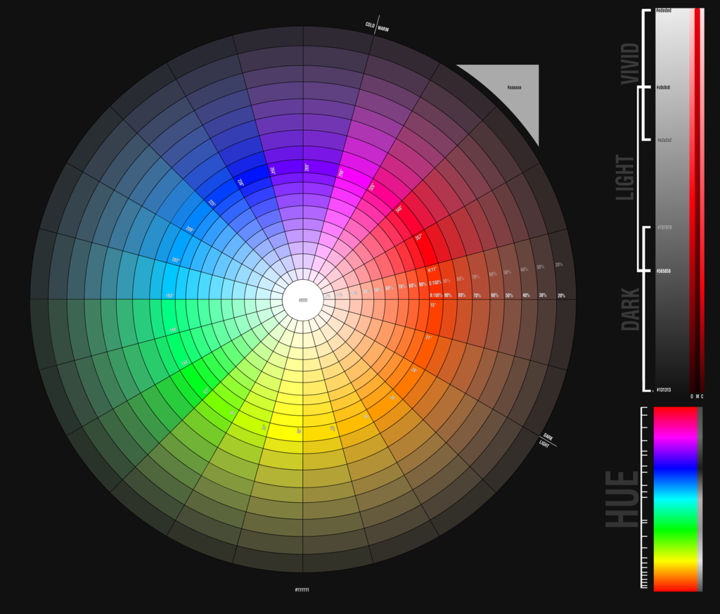
Real_Color_Wheel_475

I believe that there are infinite numbers of colours in the world, it will be impossible to name out every single colours that I know.

From a scientific perspective, there are different level of light-dark, level of red-green and level of yellow-blue to create different shades of colours. In addition, the surrounding conditions of also affect how we identify the colours. (Ref. http://www.rit-mcsl.org/fairchild/WhyIsColor/files/ExamplePage.pdf)

In computer display, it can only show 256 shades of red, blue and green each. Hence, the computer can display 256x256x256, roughly 16.7 millions different colours. (Ref. http://www.astropix.com/HTML/J_DIGIT/MON_RES.HTM)

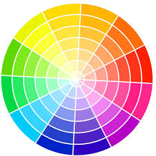
colour wheel


However, for my research, I will only be writing 11 different basic colours: Red, Orange, Yellow, Green, Blue, Purple, Pink, Brown, White, Grey and Black.

Red

red

Red is a warm colour with green as a complementary colour. It always appears striking and catches the viewers attention. Red often represents anger, agressive, strength, danger and stop. Red is often used to alert people of danger ahead. Red also represents good fortune for the Chinese.

Orange

orange

Orange is a warm colour with blue as a complementary colour. It often represents passion, sensuality and immaturity.

Yellow

yellow

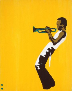
Yellow is a warm colour with purple as a complementary colour. It often depicts as something positive. Yellow represents passion, cheerful, optimism, happiness, friendly and confidence.

Green

green

Green is a cool colour with red as a complementary colour. It represents the nature and is pleasing to see as it does not strain the eyes. Green often means environment, refresh, relax, peace and negatively, jealousy.

Blue

blue

Blue is a cool colour with orange as a complementary colour. It is also another smoothing colour and blue objects often appear to be far and distance. Blue can represents the sky, water, calmness, cool, shy and negatively, cold and aloof.

Purple

purple

Purple is cool colour with yellow as a complementary colour. It is often shown as a spiritual colour. Purple represents wealth, luxury and introvert.

Pink

pink

Pink is a warm colour. It is often depicts as something cute and lovely. Pink can also represents love and kindness.

Brown

brown

Brown is the colour of the soil, hence it often gives people the feeling of reliable and support. However, negatievly, brown is also viewed as dirty and old.

White

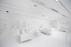
'Yayoi Kusama: Look Now, See Forever' Installation view

White complementary colour is black. It often communicates purity and peace. White can also represents cleanliness, clarity, elitism and coldness. It can also represents the season winter, hence snow and ice.

Grey

grey

Grey often represents something negative. It can mean sadness, depression, lack of confidence, neutral and lack of life.

Black

black

Black also often represents something negative. It often represent death, sadness, depression, coldness and mystery. However, positively, black could mean sophistication. Black is the easiest to match with other colours and acts as a barrier.


2D Project 2: Rhyme

The Chosen One:

old woman 2

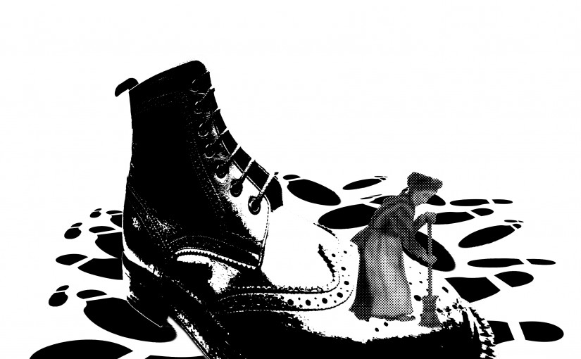
There was an old woman who lived in a shoe.

The old woman is placed at the Rule of Thirds to attract the viewers attention. The shoe is edited to show dynamic perspective and creates a leading line towards the old woman. The shadows and the highlights on the shoe also focus the old lady. The footprints below balance the image with the blank spaces above, hence the overall image is well-balanced.

Paint_diddle diddle 3

And the Dish ran away with the Spoon.

There is a high contrast between the background and the foreground to bring forward the main focus. The plate and the spoon are focused by placing at the Rule of Thirds. With a darker background and the shadows of the plate and spoon on the ground, it creates an atmosphere of mystery and adventure, like a couple running away from something.

Paint_diddle diddle 2

The cow jumped over the moon.

The cows are duplicated to create a flow over the image. It directs the viewers from the back of image to the front, hence the movement of how the cows jumped over the moon. The moon also covers one-third of the whole image to balance the overall image.

Paint_humpty dumpty 6

Couldn’t put Humpty together again.

The whole image is placed at the center. The king is found at the top to represent the hierarchy while the horses and men are at the bottom. The cracked eggshell is distorted to join with the egg below to show the connection between the eggshell and the egg.

The Others:

Paint_old woman 1

She had so many children, she didn’t know what to do;

The children are repeated many times in different sizes and orientations all over the image to represent the many children and the confusion caused for the old women. The old woman can be found at the Rule of Thirds and is being framed by the children, showing how she is surrounded by so many children.

Paint_humpty dumpty 1

Humpty Dumpty had a great fall.

The repeated eggshells create a comical effect of how Humpty Dumpty would “shout out” when it fell. The large eggshell also contrast with those smaller ones in terms of size.

humpty dumpty 4

Could not make Humpty Dumpty where he was before.

Th bandage is edited to have a sense of depth and height over the eggshell, showing how its trying to fix the Humpty Dumpty but is unable to do so. The shadow behind the eggshell also creates depth to the image.

humpty dumpty 5

Humpty Dumpty had a great fall.

Contrast is used here to focus on the Humpty Dumpty. The Humpty Dumptys and the eggshell are placed at a position to show a slow motion flow of the fall. The black background also acts as a wall and covered two-third of the overall image making it balances.

diddle diddle 1

The cat and the fiddle,

The fiddle is the focus of the whole image, hence it is darker and placed at the center of the image. While the cats are arranged from tall to short to create dynamic lines. The overall image is relatively symmetrical to create a balance and harmony to the image.

Principle of Design

Elements of design:

  • Point
  • Line
  • Shape
  • Volume
  • Direction
  • Size
  • Texture
  • Colour

Principles of design:

  • Unity

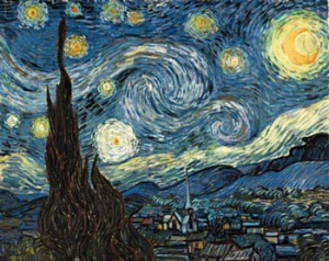
The relationship among the elements of a visual that helps all the elements function together. It gives a sense of oneness to a visual image. The words and the images work together to create meaning.

vincent-van-gogh_starry-nig

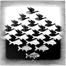
  • Harmony

All parts of the visual image relate to and complement each other. Can be achieved through repetition and rhythm.

images

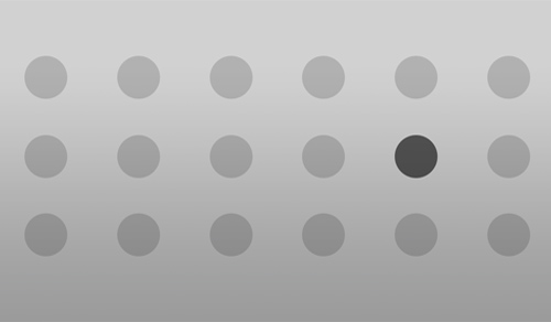
  • Contrast

Arrangement of opposite elements in a piece so as to create visual interest, excitement and drama.

9107341_orig

  • Repetition

Combination of elements or shapes repeated in a recurring and regular arrangement.

Rhythm is a combination of elements repeated, but with variations.

download

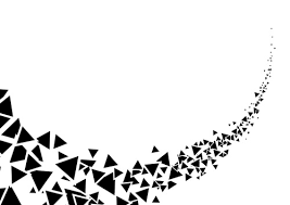
  • Movement

The path the viewer’s eye takes through the artwork, often to a focal area. It can be directed along lines, edges, shapes and colour. Objects seem to be moving in a visual image.

download

  • Balance

The distribution of the visual weight of objects, colours, texture, and space. If the design was a scale, these elements should be balanced to make a design feel stable.

images (1)

  • Emphasis

An area or object within the artwork that draws attention and becomes a focal point. Minimizing or toning down other composition elements in order to bring attention to the focal point.

principles-of-design-emphasis

2D Project 1: A Line is a dot that went for a walk

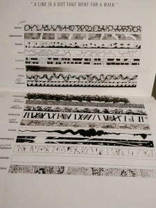
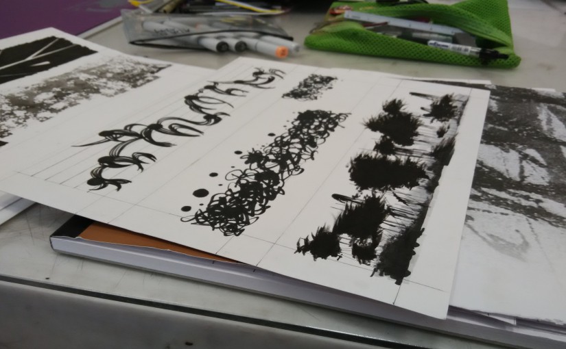
18 words, 18 designs, each represents the feelings I have for that particular word.
15-09-07-16-52-15-224_photo15-09-07-16-51-39-180_photo

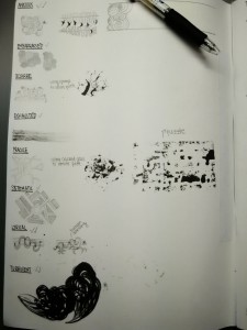
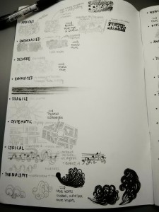
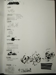
The above picture shows the process of my designs for the first 8 words.

Anxious – For my first design, I drew circles with spirals facing at different directions. Those circles represents people eyes that are looking at me which caused me to feel nervous. Furthermore, the spirals represents the dizziness and sickness I would feel when being the center of attention. For my second design, I drew butterflies inside the curved lines. This represents the saying “butterflies in stomach”. However, I chose design 1 for my final work since design 2 maybe too abstract.

Embarrassed – I drew crosses all over the paper. With those crosses, I form various empty circles in my final work. The blushes-like crosses represent the feeling of hiding. There is also law of closure shown in my design. The circles are like holes that expose oneself, causing one to hide back into the crosses.

Bizarre – For my Design 1, I drew alien-like creature to represent something weird. However, I thought it was too simple. So for Design 2, I dipped sponge into ink, hoping to create many different holes, to represent a condition “Trypophobia”, the fear of holes. However, the effect created by sponge was not obvious. Therefore, I use my design for “Indecisive” as my final work for “Bizarre” since the designs do remind me of weird patterns and scenes in “Alice in Wonderland”, the feeling of being in another dimension.

Exhausted – I used charcoal to drew straight line across the paper at different strength. Then I smudged and erased the charcoal the the end. At the start, the texture of the charcoal is vivid, however towards the end, the charcoal fades away, representing the tired feeling of not wanting to continue ones work.

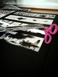
Fragile – For my first design, I drew lines of glass crack to represent fragile. I also tried painting ink over puzzle pieces and print it on paper to show that puzzles are also easily destroyed. However, since the print from the puzzle was not that obvious, I chose Design 1. For my final work, instead of drawing lines, I cut out tapes to create glass shatter, painted over the tapes and then removed the tapes.

Systematic – I am inspired by city map when designing this. Thus, I drew city map for my work since city planning is systematic. The design is harmony in whole despite the different shapes used.

Lyrical – I drew 5 lines over the paper to represent the music scores and black circles to represent notes. There are curves connecting the circles. Each circle has 4 curves stretching out which represent someone dancing. With music and dance, it gives the feeling of something beautiful. It gives movement to the design.

Turbulent – At the start, I drew small repeated waves pattern. However, it does not represent turbulent well. Thus, with the concept of waves, I drew bigger waves among smaller waves to create the contrast in sizes to show the turbulence in the design.
15-09-07-16-52-22-570_photo15-09-07-16-51-58-049_photo

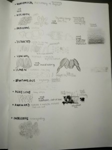
The picture above shows rest of the words.

Nonsensical – I used markers to draw random curves and dots across the page to show the chaos. In my final work, I left a gap between the design to shows that being nonsensical, one does not need any reason. I also inverted the design at the end to show that the design is not restrictive.

Psychotic – There are various designs for this word. I tried drawing repeated eyes or smiles to show the psychotic feeling. However, I chose to use tissue paper dipped in ink to create a messy lines of different thickness. It represents a unstable mental state, messy and unable to think clearly.

Ambiguous – I used smoke-like patterns to represent being blur and unclear. I tried drawing smoke but I felt it was not blurry enough. Thus, I used penknife to create smoke-like markings on the paper and shade over those markings. Hence, the smoke pattern would be blurred to create the ambiguous feeling.

Distracted – The straight lines and the waves at the back are contrasting each other in terms of shapes. Hence, both of them are distracting to the viewer to see two totally unrelated shapes.

Sensual – I drew muscle-like shapes to represent physical contact and intimacy. I also shaded the work to create a 3 dimensional effect to further pull the viewer closer to the work.

Sloven – I drew straight line with ink blots in between to show carelessness of oneself not being able to draw even a simple line.

Spontaneous – I drew explosion for spontaneous to represent something to be sudden and unexpected. The start of the explosion is located at the golden ratio to create a space and movement for the explosion.

Aggressive – For Design 1, I drew triangles and shape edges to represent aggressive. However, it was not aggressive enough, hence in my Design 2, I added blood splatters to represent violence and gore.

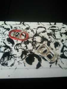
Awkward – I used pull top can tabs to create prints on the paper. I also used a flower to create a print. The flower will be the awkward element since it is the only organic object among the inorganic object prints.

Indecisive- At first, I used all my rejected designs above and mix them together to create patterns for indecisive, since there are a lot of things going on in a indecisive person mind.  However, the design also better represents bizarre. Hence, I created repeated patterns using question marks. A indecisive person will have many questions. The questions marks are at different orientation and sizes to show confusion. Furthermore, upon closer look, one can see a white and black question mark within a box, hence creating an interesting pattern.

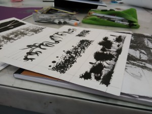
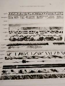
Pictures below are more progress of my work.
15-09-06-23-31-28-091_photo15-09-06-23-28-32-416_photo

15-09-05-13-51-12-810_photo15-09-05-13-08-38-556_photo

2015-09-01-09-42-50_photo