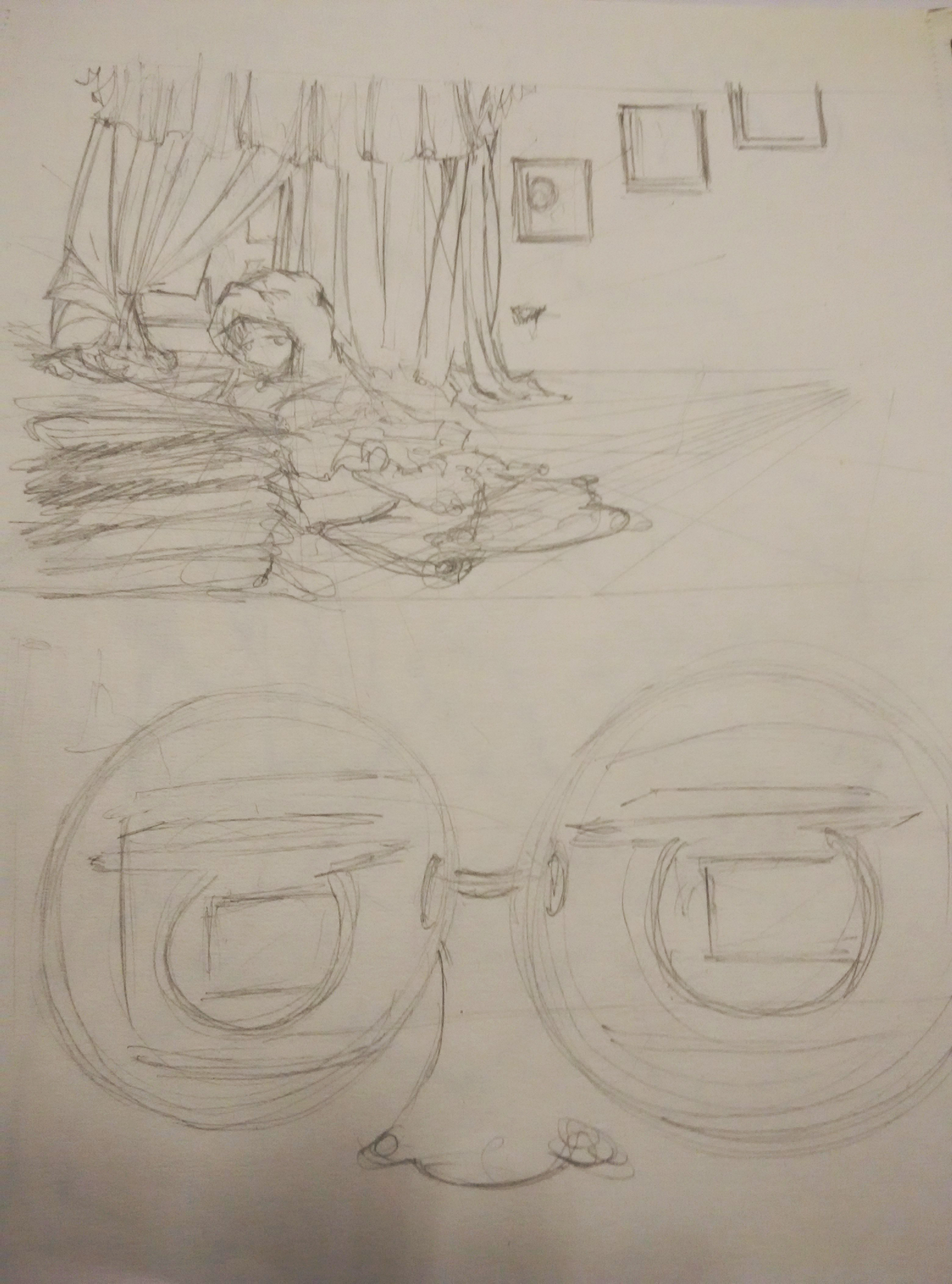
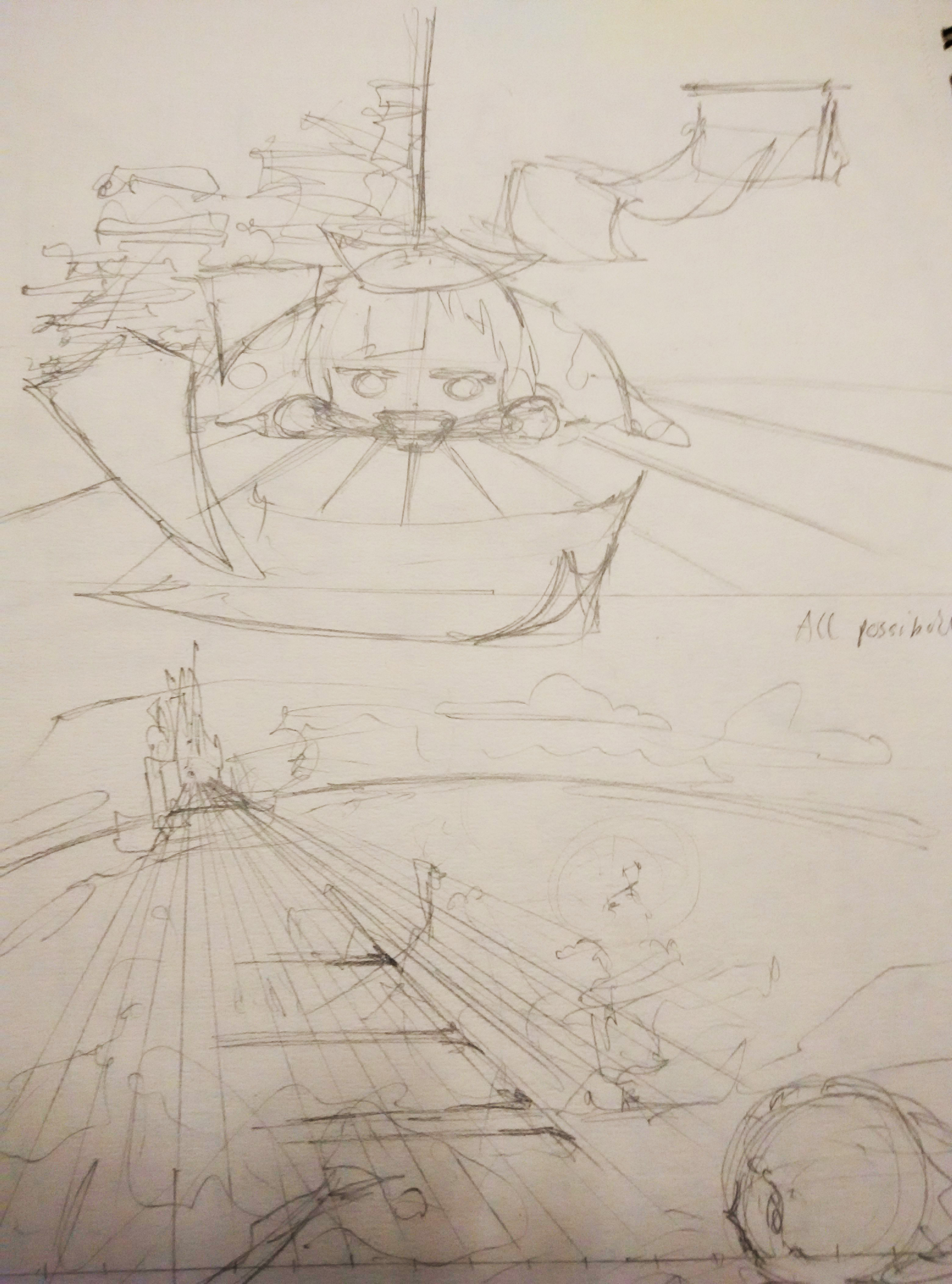
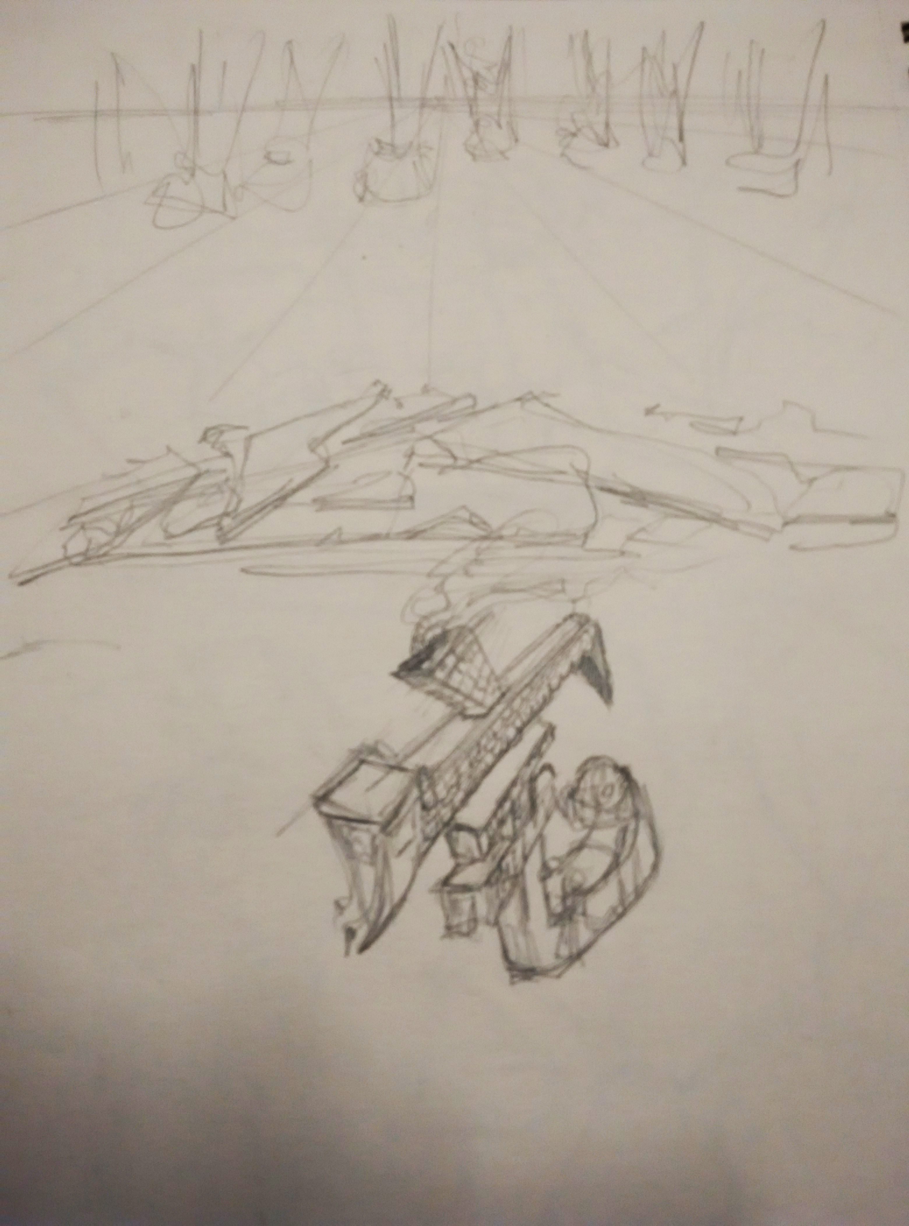
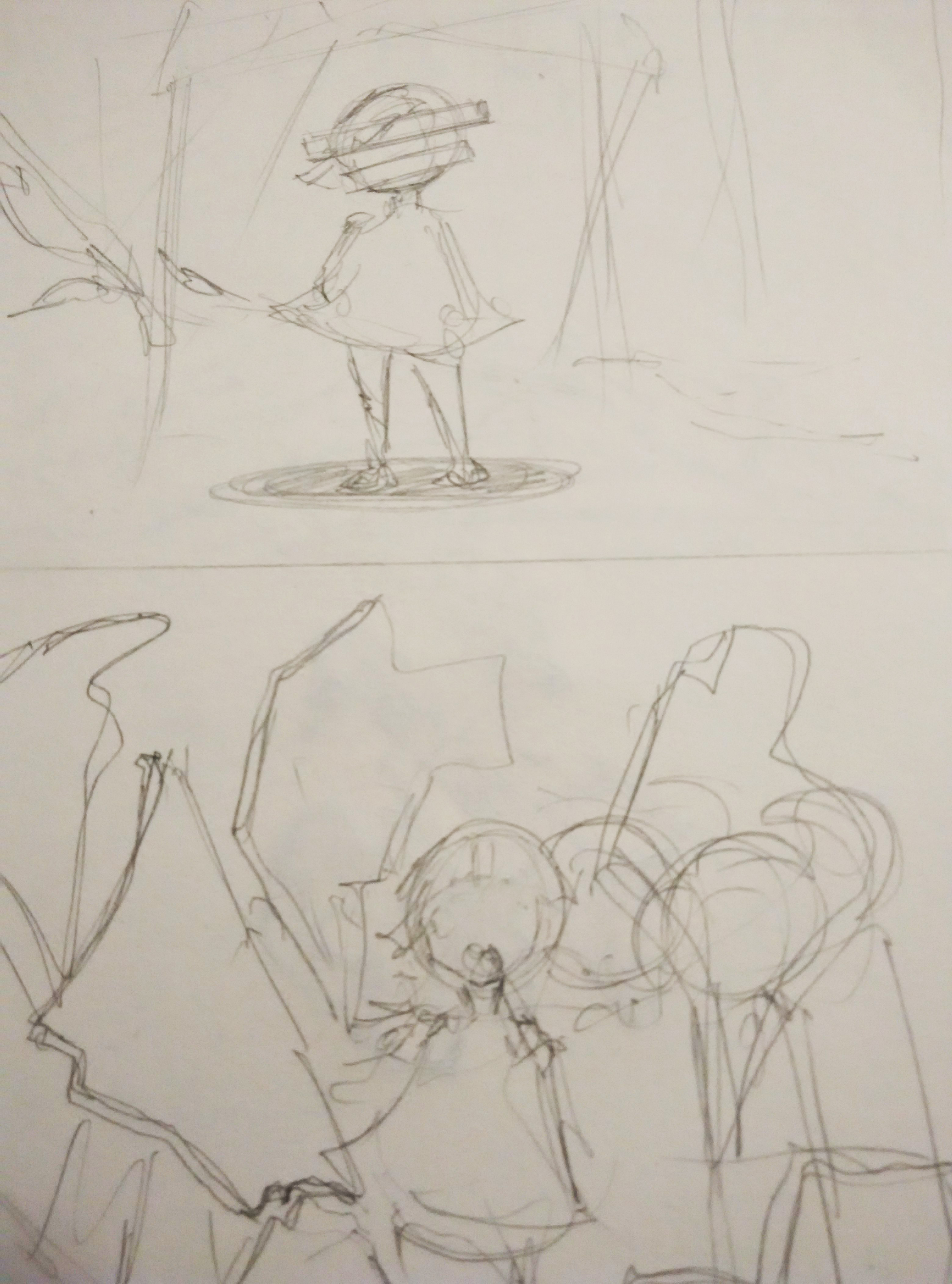
Hui shan and I have come out with the storyboard for our stop motion film. This is the rough idea.


Yes, there will be changes later on.
人间蒸发 (´・ω・`)
Hui shan and I have come out with the storyboard for our stop motion film. This is the rough idea.
Yes, there will be changes later on.
点虫虫 (Point the insect)
点虫虫,虫虫飞,飞到荔枝基,荔枝熟,摘满屋,屋满红,陪住个细蚊公
Rough translation: Point to the insect x2. (The insect) flies to lychee trees, the lychees ripen. Lots of lychees are picked that it fills up the room, with a little boy
The Game

(Click on image for gif)
Narrative
Overall idea: Comparison between the rhyme and the growth of a child &
the idea that this rhyme is passed on for generations.
Stop motion animation film


 (Click on image for gif)

(Click on image for gif)
Yes, my style of drawing. Anyone wants to collaborate? 😀
I don’t mind working on other projects with animation stop-motion.
Idea 1: Childhood rhyme
I want to make experimental music video on one of the Cantonese childhood rhyme that I have heard since young.
The name of the rhyme is called 點蟲蟲, which means point the worm.
Rhyme: 點蟲蟲, 蟲蟲飛。飛去邊﹖飛去荔枝畿。荔枝熟, 摘滿一包袱。
Rough english translation: Point the worm, the worm flies. The worm files to lichee site. Lichee ripen, (I/we) filled the bag with Lichee.
There is also a game which uses this rhyme to train children on their reflexes. The game is the adult would put an index finger on the child palm and sing out 點蟲蟲. The child is then expected to quickly grab the finger after the adult finished the rhyme, and the adult would try to avoid being caught by the child.
I want to incorporate the idea of this game and some of the images related to the song into the music video.
I am thinking of using a mixture of filming and stop motion animation in this film.
Idea 2: Bras Basah Complex

I want to film a experimental documentary video on the Bras Basah Complex. The Bras Basah Complex is built in 1980s. It is a famous place for students for books and art materials.
Inspired by the “5 minutes Museum” by Paul Bursh, I want to use similar style of filming (stop-motion) on Bras Basah Complex, to capture the objects like books and people of that place.
Idea 3: Being Unique

Inspired by the short animation video “Eggplant” by Yangzi She (https://vimeo.com/145897706), I want to create a narrative story about being oneself.
I will be using colors to represents people different personalities. There will also be a main character that is trying to be unique but is discriminated by others along the way which he/she will try to resolve. As for the detailed storyline, i haven’t thought in-depth into it yet.
I am interested in using stop-motion animation on this film.
Thats’s all.
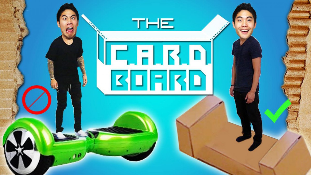
https://www.youtube.com/watch?v=Yt3VB-7juiY
Inspiring video:
The CARDBOARD! by nigahiga
A commercial advertisement like video with a funny approach to it.
Amazing use of stop motion at the end of the video which inspired me.
Some of the sketches that I did for the progress of the project.
My initial ideas were mainly using human characters to represent me. However, after consultation, I felt that I need find other objects/things to represent me.
Most of the ideas still remain the same except for some which I changed the subject representing me from a human character to animals.
At first, I wanted to do digital illustrations. However, due to the lack of time and experience, I found out that I may not achieve what I want by the deadline. The drawing below is a digital illustration which I did halfway for my first equation.
Hence, I changed my medium to mainly watercolors and color pencils instead.
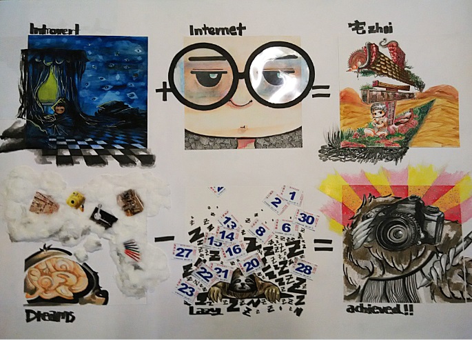
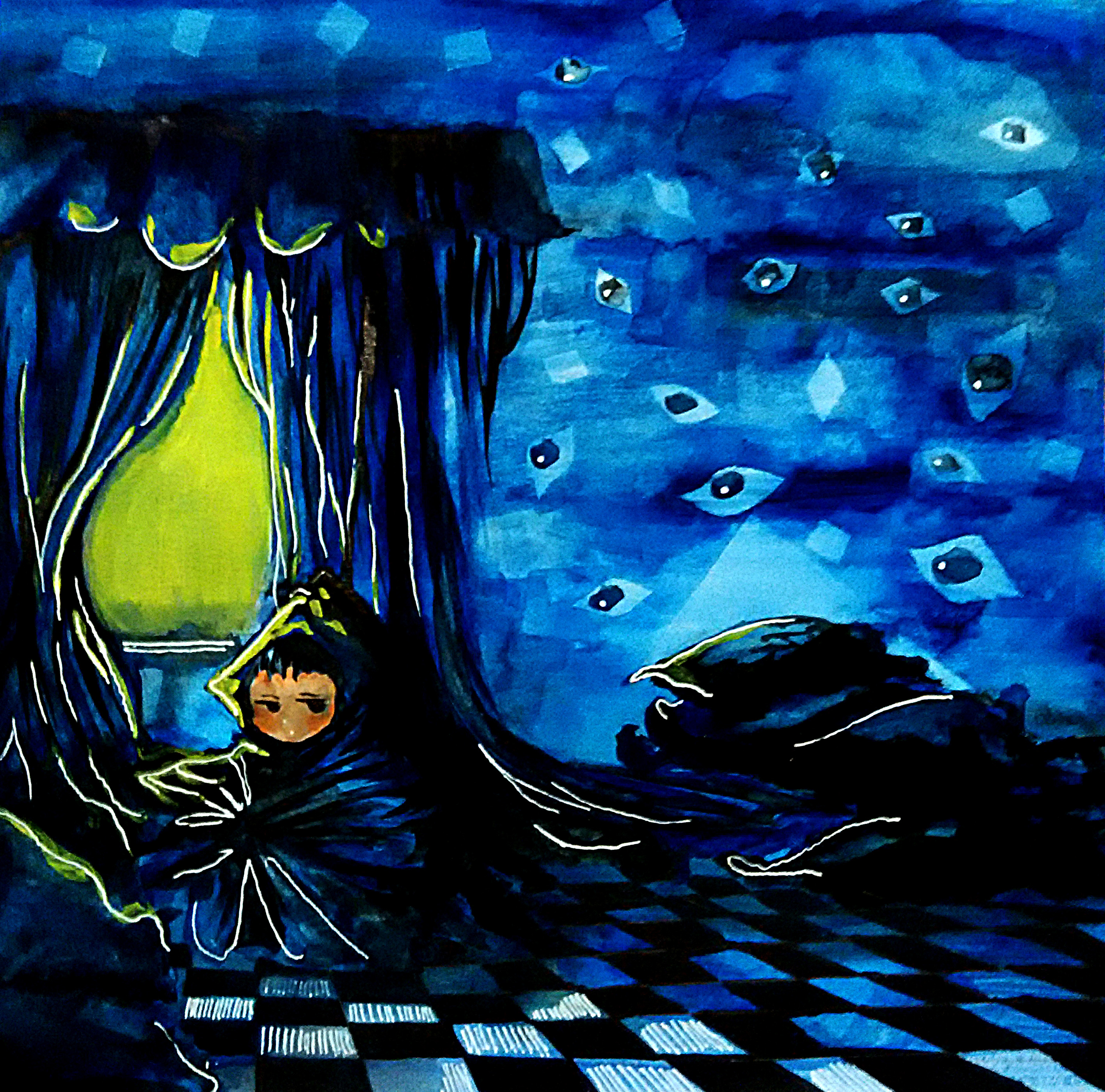
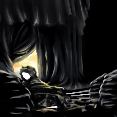
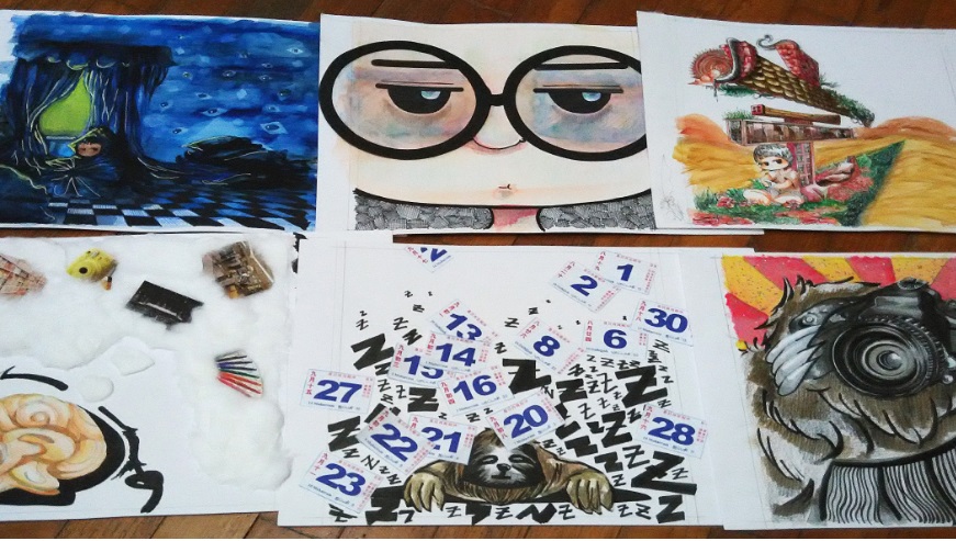
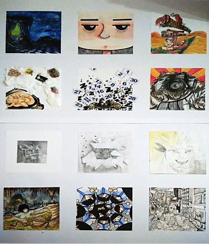
This represents the introvert side of me and sometime I like to be alone in my room. The character representing me is placed at the 1/3 of the drawing and tiles on the floor form perspective lines toward my character. The character is covered in cloth to show that I’m trying to escape from the outside world. While the social world outside is represented by the bright yellow window, a contrasting color to the dark blue room. The room is dark blue and black in color to show the loneliness and sadness in me. Despite the bright yellow color trying to shine through the room, the room still remain dark, showing how I’m unaffected and away from the world outside. There are eyes on the wall represents those views from the outside.
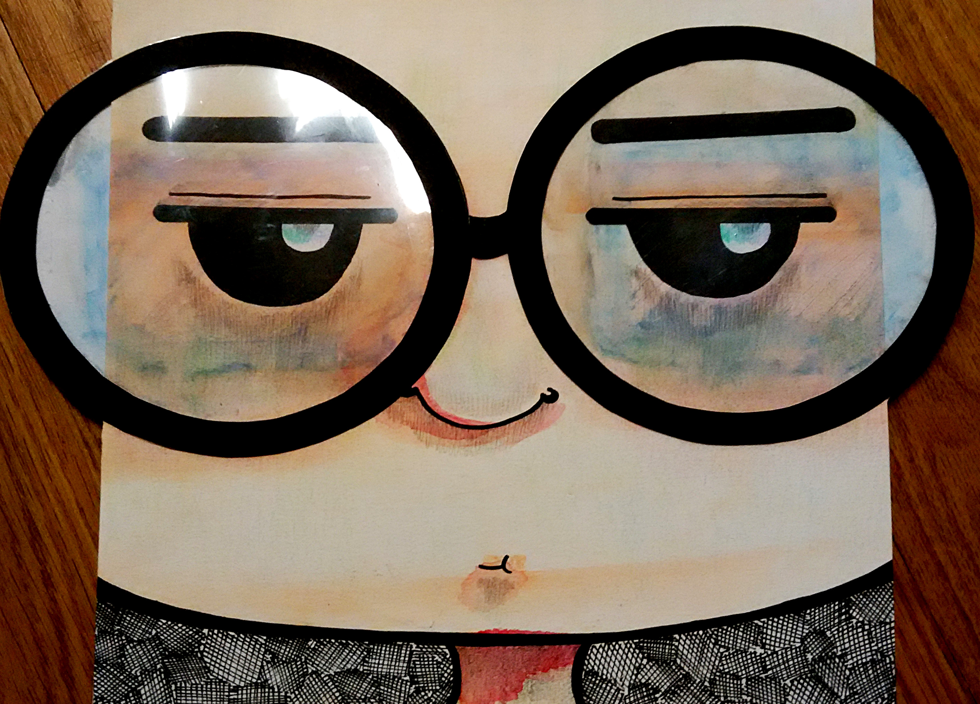
This represents my addiction to the internet. I tend to face my phone or laptop for a long time. I wanted to draw a face of me looking at the internet. The focus of the drawing would be the spectacles which has the reflection of the computer screen, hence the colors on it. I used plastic cover and black papers to create the spectacles, and I used markers to smudge the inks over the plastic cover.
Alone + Internet may sound like bad things for most people, however it is a oasis to me. In the background, I used brown to represent the desert. While my character is seated on a patch of grass and flowers to represent the oasis. I chose red and green because red means energy and green would contrast against the brown background. The house that my character is sitting under is in fact a Chinese word, 宅 (zhai). 宅 means house in Chinese. In modern meaning, it often use to describe people that love to stay at home. My character is holding a phone, hence relating back to my addiction to internet. There are also books in the house, showing my interests in reading books. However, I’m only interested in reading Chinese novels, thus I used a Chinese word instead to represent me in this drawing.
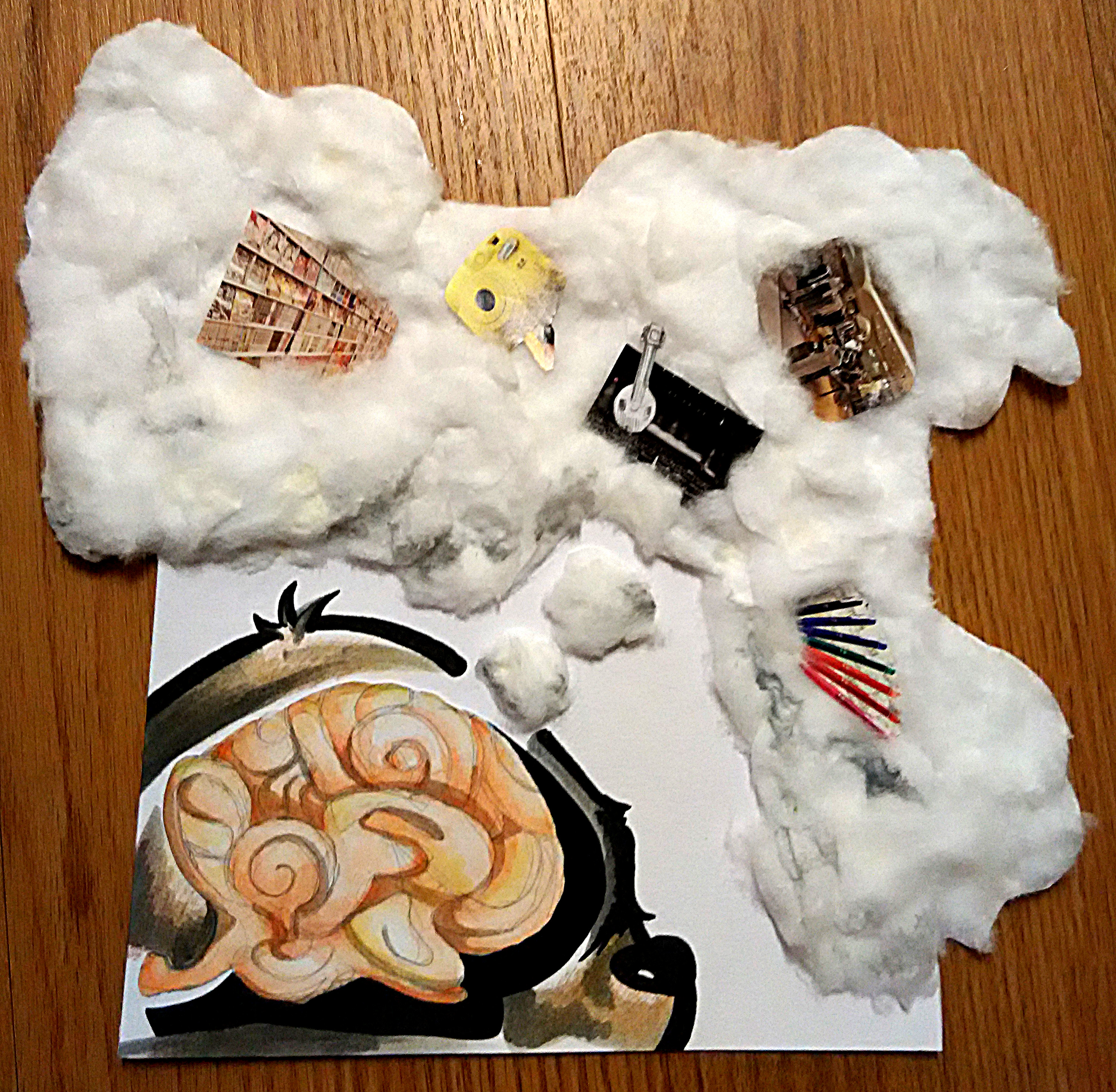
This picture shows that I have a lot of dreams. The “dream cloud” is done using cotton wool to create a fluffy texture of the cloud. There are many images on the cloud, each representing my different dreams. There is a picture of a shelves of books to show my dreams to publish my own book. A camera to show my hope to improve my photography skill. A performing theater and my instrument to show that I hope to perform solo in a concert. Dresses to show my desire to slim down so that I can fit into dresses that I like. Lastly, drawing materials to represents my desire to improve my drawing skills. The dream cloud extended out of the box hence showing that my dreams does not stop there and that I have even greater dreams.
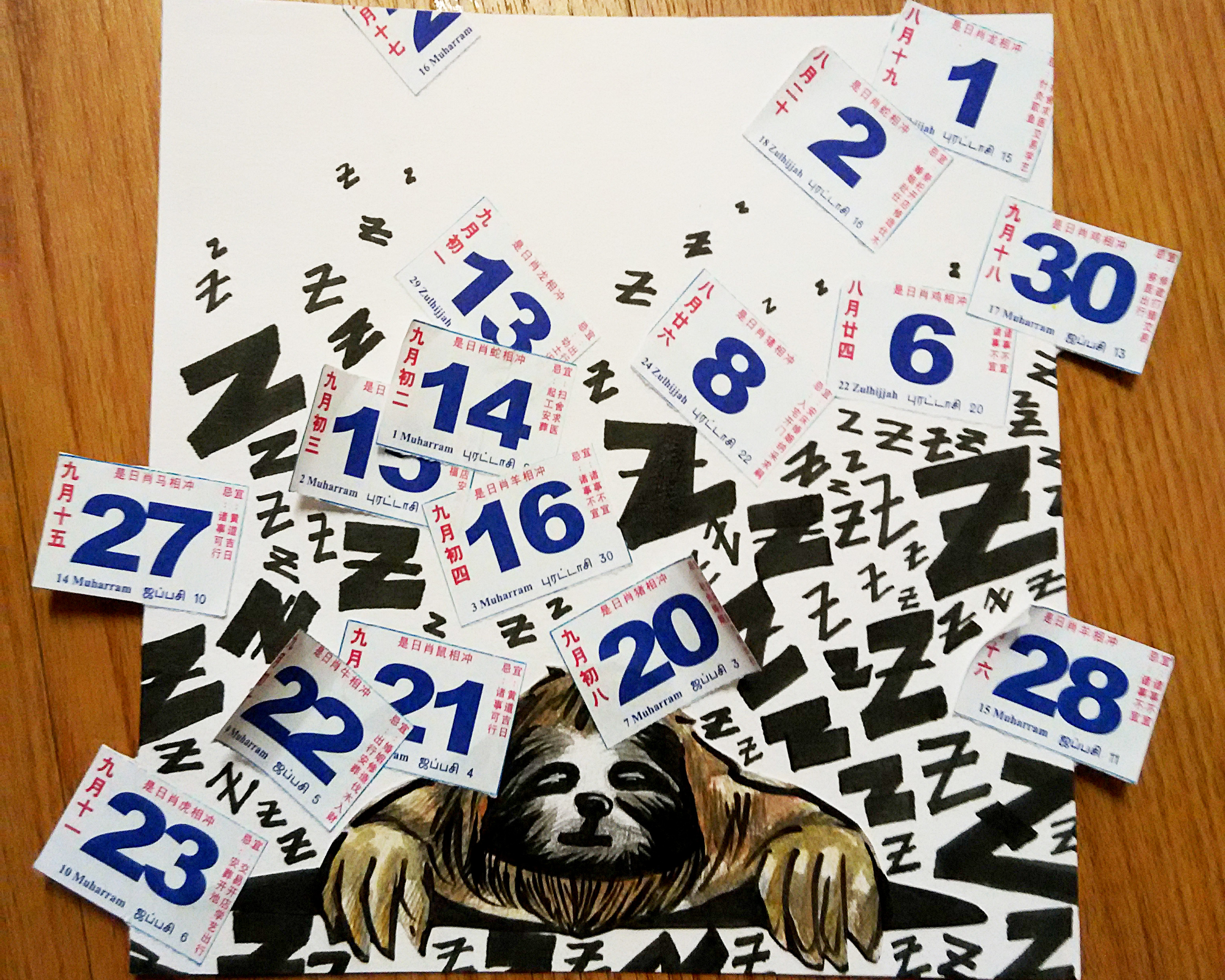
Despite having dreams, I am very lazy. I drew a sloth to represent my laziness. A sloth tends to sleep a lot and so do I. I used cut out calendar dates and arranged them to show a movement of how the days just flew passed me without noticing. Due to my laziness, I’m unable to attain my dreams. “Z”s just represent the time I have wasted from sleeping.
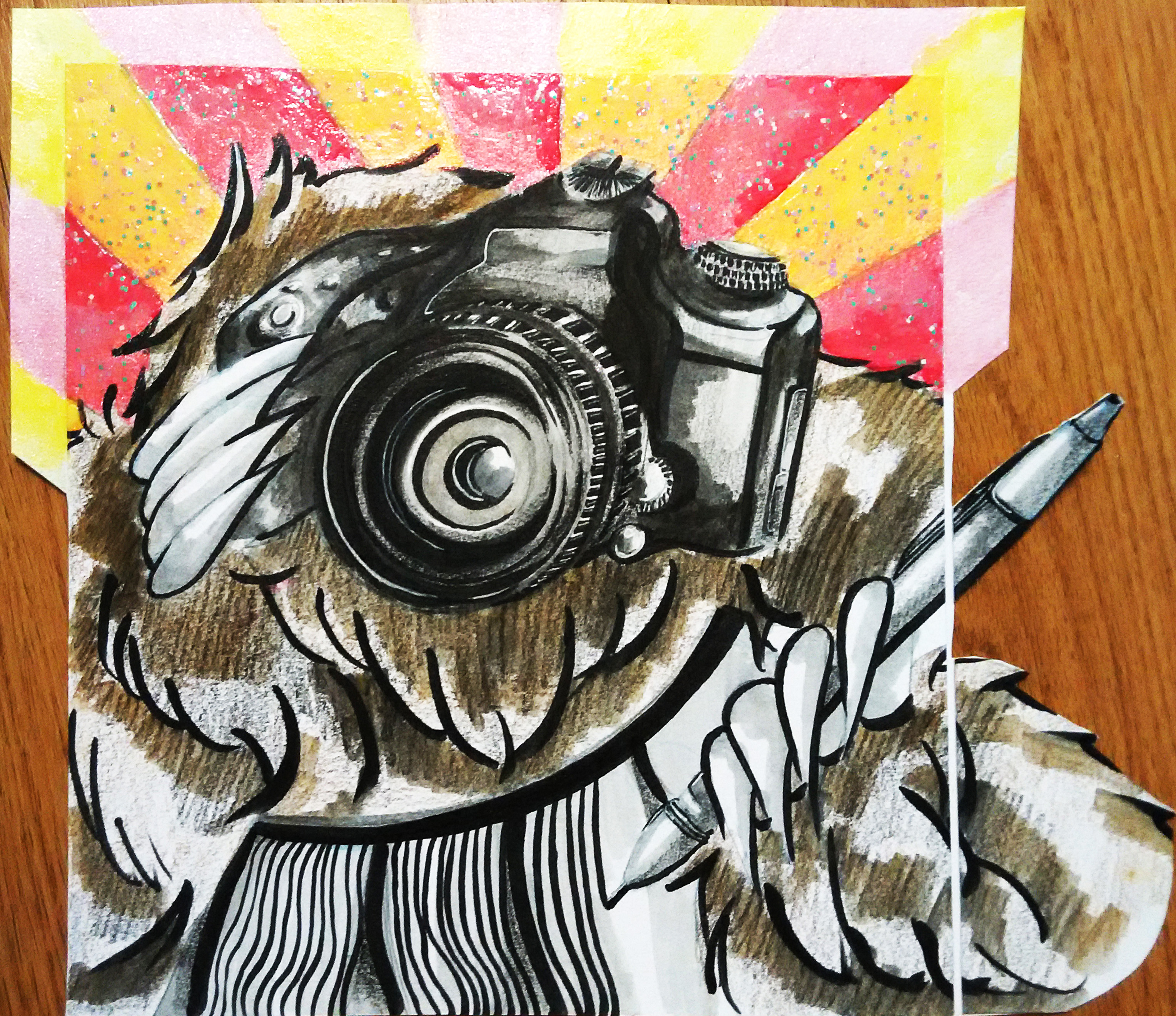
Without my laziness, I will be able achieve my dream. I dream a sloth holding a camera and a pen to show that it is diligently practicing its photography skill and drawing to be a better photographer or illustrator. There are rays coming out from the sloth’s back. I chose yellow and red as they signify something happiness, achievements and successes. I used nail paint to paint the rays to give it a shiny effect and glitters.
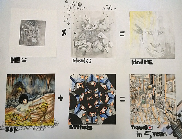
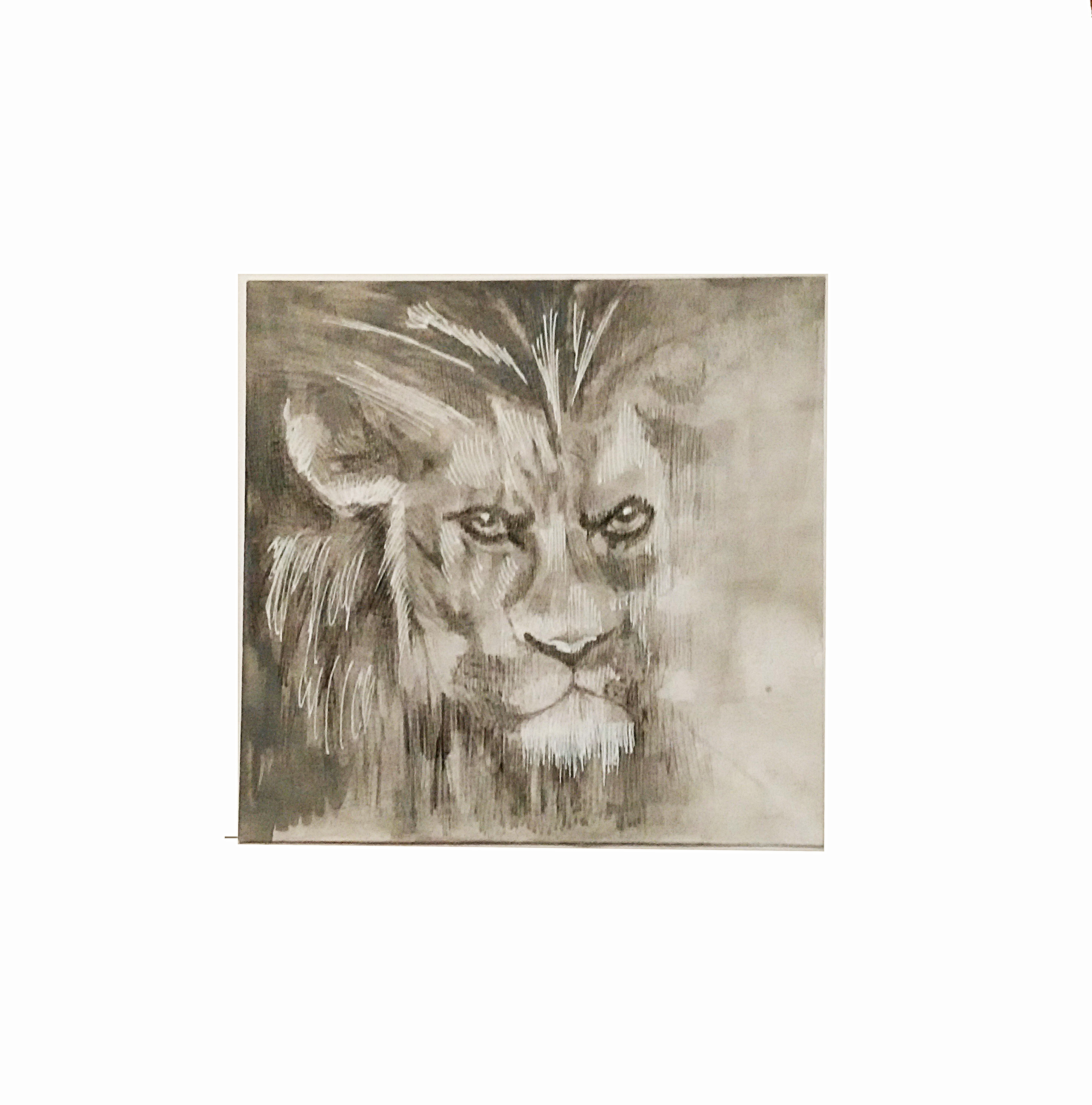
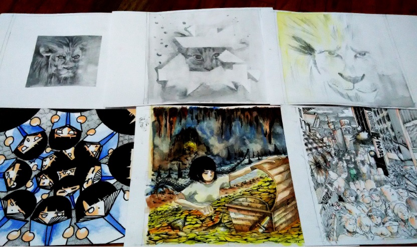
The lion represents the current me. My friends in secondary school called me “lion” due to the hair I had. Lion may sounds majestic, however, I felt that lion is an animal that people would be afraid of and do not dare to approach. This is also how I felt about myself. Hence, the drawing of the lion is grey to show the unhappiness and the lion is confine within such a small box to represent its lack of interactions.
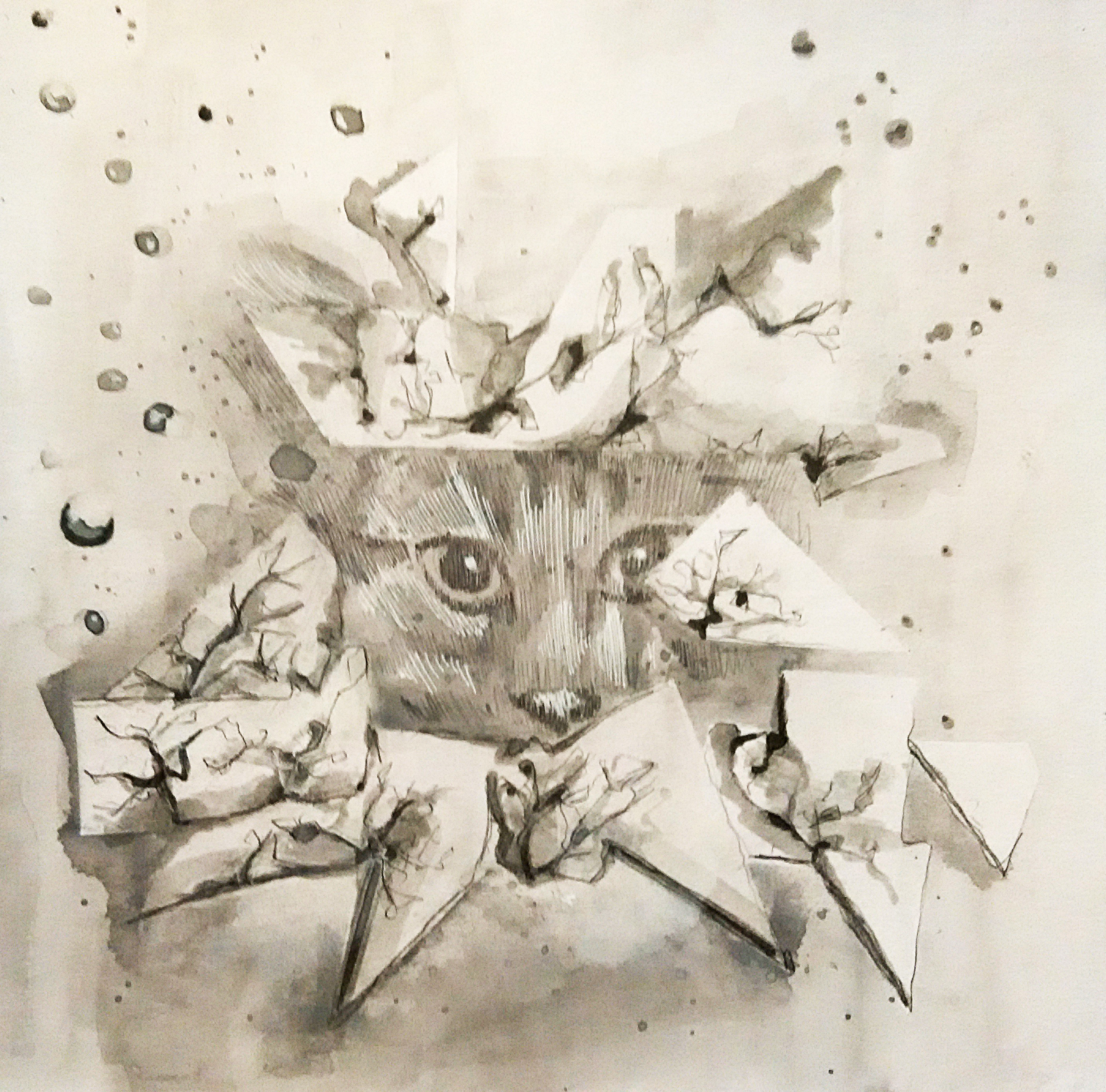
The cat represents something that I wish to strive for, which is being more sociable. I felt that most people are cats lovers and would be approach cats. Hence, I drew a cat breaking out of the box, which is the box that previously confine the lion above. The color still remain grey as this is only a dream and it still not yet achieved.
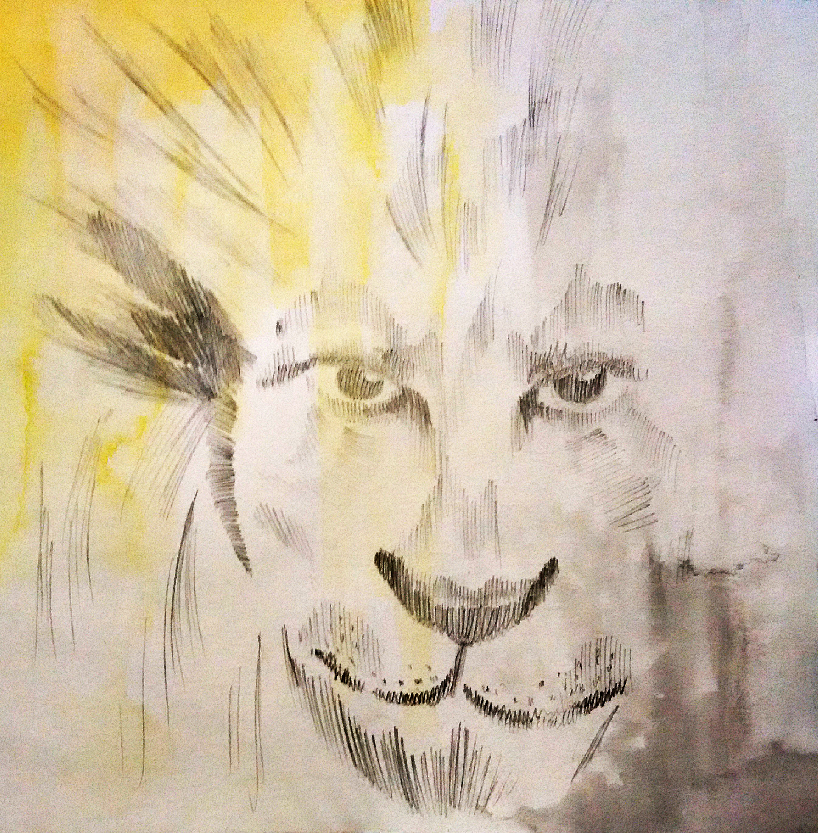
A lion x friendly cat = friendly lion. This will be an ideal me. I will still be a lion since it is what representing me. However, I will be a more approachable person. Since it is a ideal me, I added yellow to represents happiness, thus there is a transition from the grey to yellow.
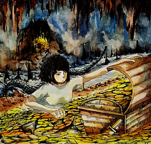
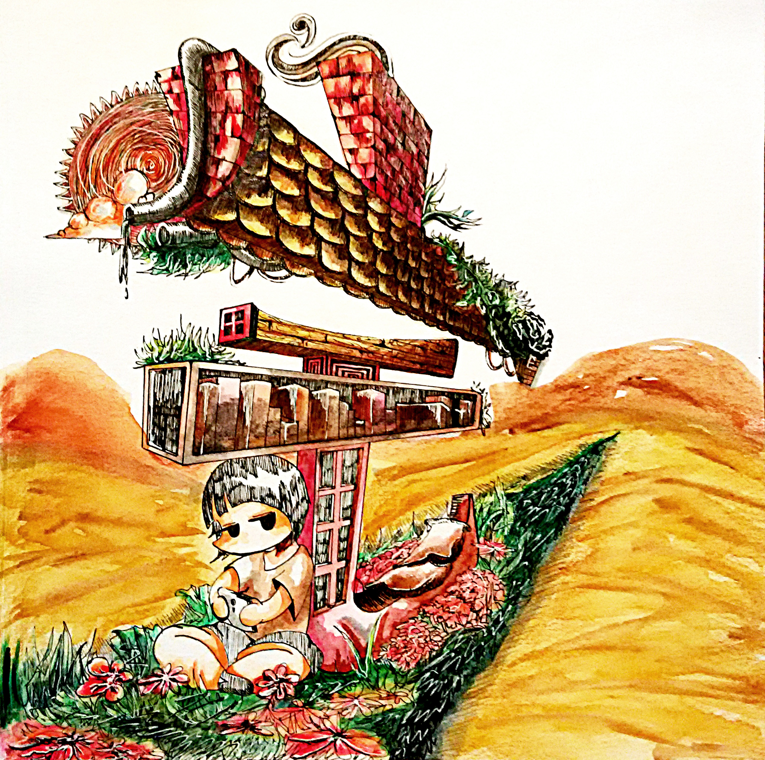
This drawing represents the journey to earn money. Since I hope to further study/ work in Japan 5 years later, I would need to earn some money first. The money is represents as a treasure box filled with golden coins. On the other hand, the background is dull blue in color to represents the tough journey that I need to go through in order to get the money. Hence, there are sharp rocks and a creature drawn at the back.
Beside money, I would need to study too. I drew repeated characters which are arranged in a manner as shown in the picture to represents that I always need to study to improve myself in order to attain my dream. I felt that studying is important and one should not stop studying/gain of knowledge. In order to travel in Japan, I would need to learn the Japanese language, hence there are small Japanese characters written on some of the books. The color scheme for this drawing is blue and black as study maybe boring and tiring, hence I used dull and cool color.
This is what I hope I will be in 5 years. I hope to further study/work in Japan since I love the Japanese culture in general. The drawing is just some architectures and things that represent Japan. The left side of the drawing represents the ancient Japanese architecture, and the right side of the drawing represents the modern Japan. The whole drawing is in bright orange as I felt orange is the color of success and even brighter future. However, the character representing me is in green color so as to simply differentiate me in the drawing since green is almost a complementary color of orange. My character is also placed at the 1/3 of the drawing to attract attention.
Overall, I would say that I enjoyed doing Project 3 since I’m able to draw for all of my equations and I simply enjoy drawing.
(。◕ ∀ ◕。)
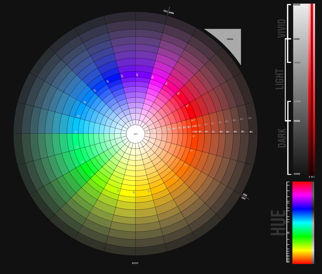
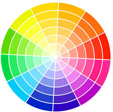
Colour Scheme is the choice of colours used in design for a range of media. Colours that create an aesthetic feeling when used together will commonly accompany each other in color schemes.
List of colour schemes:
Monochromatic colours – All the colours of a single hue. Energy is more subtle due to the lack of contrast in hue.

Complementary colours – Pairs of colours when combined together will cancel out each other. Creates high contrast on the design, captures attention.

Split complementary colours – In addition to the base color, it uses the two “Analogous” colors adjacent to its complement. Also creates a high contrast, but not as strong as complementary colours.
Achromatic colours – Any colour that lacks strong chromatic content is said to be unsaturated, achromatic, or near neutral. Easily modified beside saturated colours.

Analogous colours – Group of colours that are adjacent to each other on the color wheel, with one being the dominant color, and two on either side complementing.

Triadic colours – Three colors equally spaced around the color wheel. Tend to be vibrant. Offer contrast along with colour harmony. Easiest to create a balance in colours.
Tetradic colours – Richest of all the schemes because it uses four colors arranged into two complementary color pairs. Difficult to balance, need one of the colours to be dominant.


I believe that there are infinite numbers of colours in the world, it will be impossible to name out every single colours that I know.
From a scientific perspective, there are different level of light-dark, level of red-green and level of yellow-blue to create different shades of colours. In addition, the surrounding conditions of also affect how we identify the colours. (Ref. http://www.rit-mcsl.org/fairchild/WhyIsColor/files/ExamplePage.pdf)
In computer display, it can only show 256 shades of red, blue and green each. Hence, the computer can display 256x256x256, roughly 16.7 millions different colours. (Ref. http://www.astropix.com/HTML/J_DIGIT/MON_RES.HTM)
However, for my research, I will only be writing 11 different basic colours: Red, Orange, Yellow, Green, Blue, Purple, Pink, Brown, White, Grey and Black.
Red

Red is a warm colour with green as a complementary colour. It always appears striking and catches the viewers attention. Red often represents anger, agressive, strength, danger and stop. Red is often used to alert people of danger ahead. Red also represents good fortune for the Chinese.
Orange

Orange is a warm colour with blue as a complementary colour. It often represents passion, sensuality and immaturity.
Yellow

Yellow is a warm colour with purple as a complementary colour. It often depicts as something positive. Yellow represents passion, cheerful, optimism, happiness, friendly and confidence.
Green

Green is a cool colour with red as a complementary colour. It represents the nature and is pleasing to see as it does not strain the eyes. Green often means environment, refresh, relax, peace and negatively, jealousy.
Blue

Blue is a cool colour with orange as a complementary colour. It is also another smoothing colour and blue objects often appear to be far and distance. Blue can represents the sky, water, calmness, cool, shy and negatively, cold and aloof.
Purple

Purple is cool colour with yellow as a complementary colour. It is often shown as a spiritual colour. Purple represents wealth, luxury and introvert.
Pink

Pink is a warm colour. It is often depicts as something cute and lovely. Pink can also represents love and kindness.
Brown

Brown is the colour of the soil, hence it often gives people the feeling of reliable and support. However, negatievly, brown is also viewed as dirty and old.
White

White complementary colour is black. It often communicates purity and peace. White can also represents cleanliness, clarity, elitism and coldness. It can also represents the season winter, hence snow and ice.
Grey

Grey often represents something negative. It can mean sadness, depression, lack of confidence, neutral and lack of life.
Black

Black also often represents something negative. It often represent death, sadness, depression, coldness and mystery. However, positively, black could mean sophistication. Black is the easiest to match with other colours and acts as a barrier.
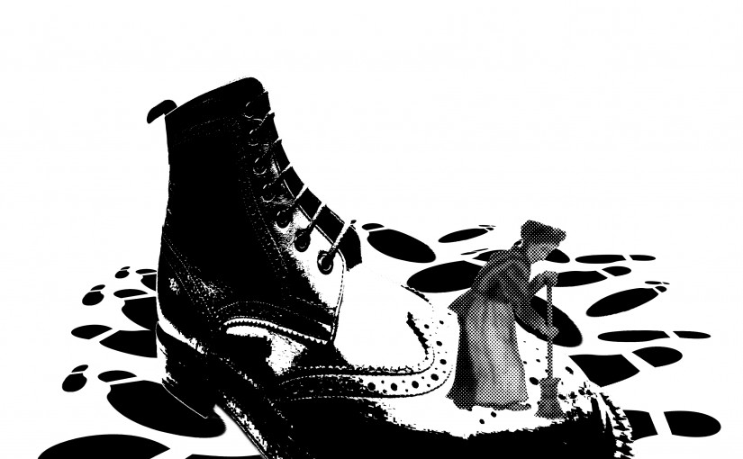
The Chosen One:

There was an old woman who lived in a shoe.
The old woman is placed at the Rule of Thirds to attract the viewers attention. The shoe is edited to show dynamic perspective and creates a leading line towards the old woman. The shadows and the highlights on the shoe also focus the old lady. The footprints below balance the image with the blank spaces above, hence the overall image is well-balanced.

And the Dish ran away with the Spoon.
There is a high contrast between the background and the foreground to bring forward the main focus. The plate and the spoon are focused by placing at the Rule of Thirds. With a darker background and the shadows of the plate and spoon on the ground, it creates an atmosphere of mystery and adventure, like a couple running away from something.

The cow jumped over the moon.
The cows are duplicated to create a flow over the image. It directs the viewers from the back of image to the front, hence the movement of how the cows jumped over the moon. The moon also covers one-third of the whole image to balance the overall image.

Couldn’t put Humpty together again.
The whole image is placed at the center. The king is found at the top to represent the hierarchy while the horses and men are at the bottom. The cracked eggshell is distorted to join with the egg below to show the connection between the eggshell and the egg.
The Others:

She had so many children, she didn’t know what to do;
The children are repeated many times in different sizes and orientations all over the image to represent the many children and the confusion caused for the old women. The old woman can be found at the Rule of Thirds and is being framed by the children, showing how she is surrounded by so many children.

Humpty Dumpty had a great fall.
The repeated eggshells create a comical effect of how Humpty Dumpty would “shout out” when it fell. The large eggshell also contrast with those smaller ones in terms of size.

Could not make Humpty Dumpty where he was before.
Th bandage is edited to have a sense of depth and height over the eggshell, showing how its trying to fix the Humpty Dumpty but is unable to do so. The shadow behind the eggshell also creates depth to the image.

Humpty Dumpty had a great fall.
Contrast is used here to focus on the Humpty Dumpty. The Humpty Dumptys and the eggshell are placed at a position to show a slow motion flow of the fall. The black background also acts as a wall and covered two-third of the overall image making it balances.

The cat and the fiddle,
The fiddle is the focus of the whole image, hence it is darker and placed at the center of the image. While the cats are arranged from tall to short to create dynamic lines. The overall image is relatively symmetrical to create a balance and harmony to the image.
Elements of design:
Principles of design:
The relationship among the elements of a visual that helps all the elements function together. It gives a sense of oneness to a visual image. The words and the images work together to create meaning.
All parts of the visual image relate to and complement each other. Can be achieved through repetition and rhythm.
Arrangement of opposite elements in a piece so as to create visual interest, excitement and drama.
Combination of elements or shapes repeated in a recurring and regular arrangement.
Rhythm is a combination of elements repeated, but with variations.

The path the viewer’s eye takes through the artwork, often to a focal area. It can be directed along lines, edges, shapes and colour. Objects seem to be moving in a visual image.
The distribution of the visual weight of objects, colours, texture, and space. If the design was a scale, these elements should be balanced to make a design feel stable.
An area or object within the artwork that draws attention and becomes a focal point. Minimizing or toning down other composition elements in order to bring attention to the focal point.

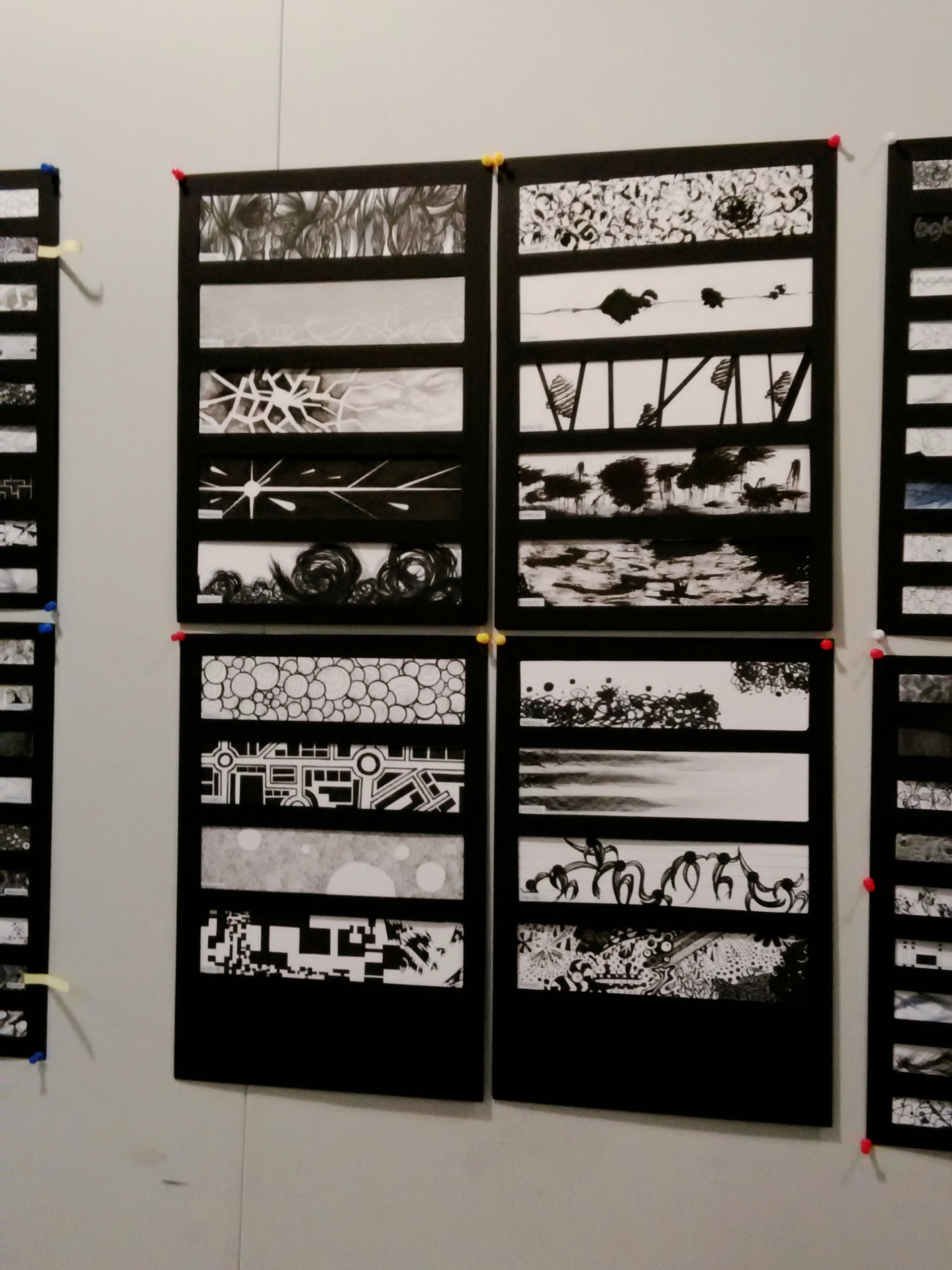
From top to bottom: Awkward, Sloven, Distracted, Aggressive, Psychotic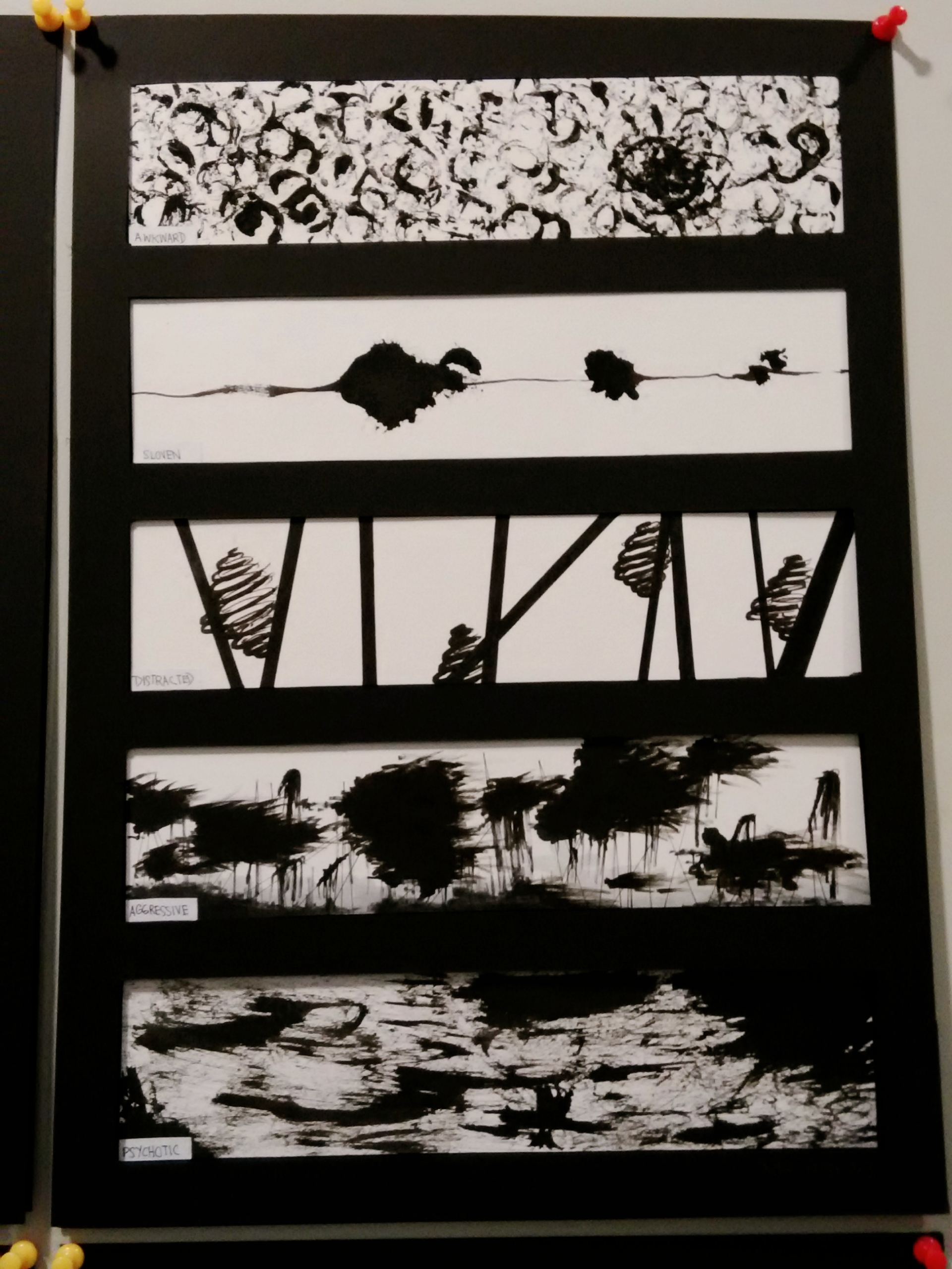
From top to bottom: Sensual, Ambiguous, Fragile, Spontaneous, Turbulent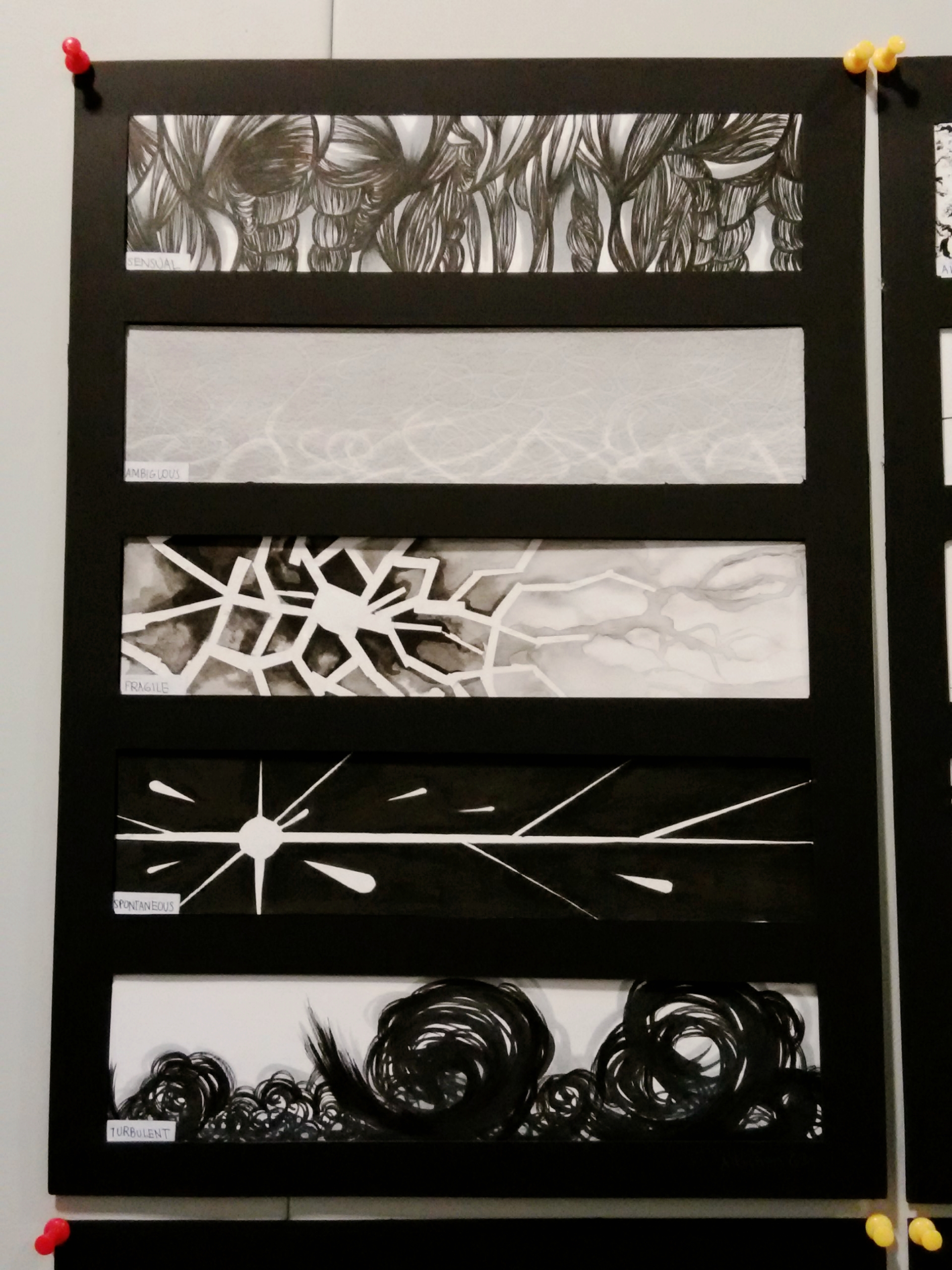
From top to bottom: Nonsensical, Exhausted, Lyrical, Bizarre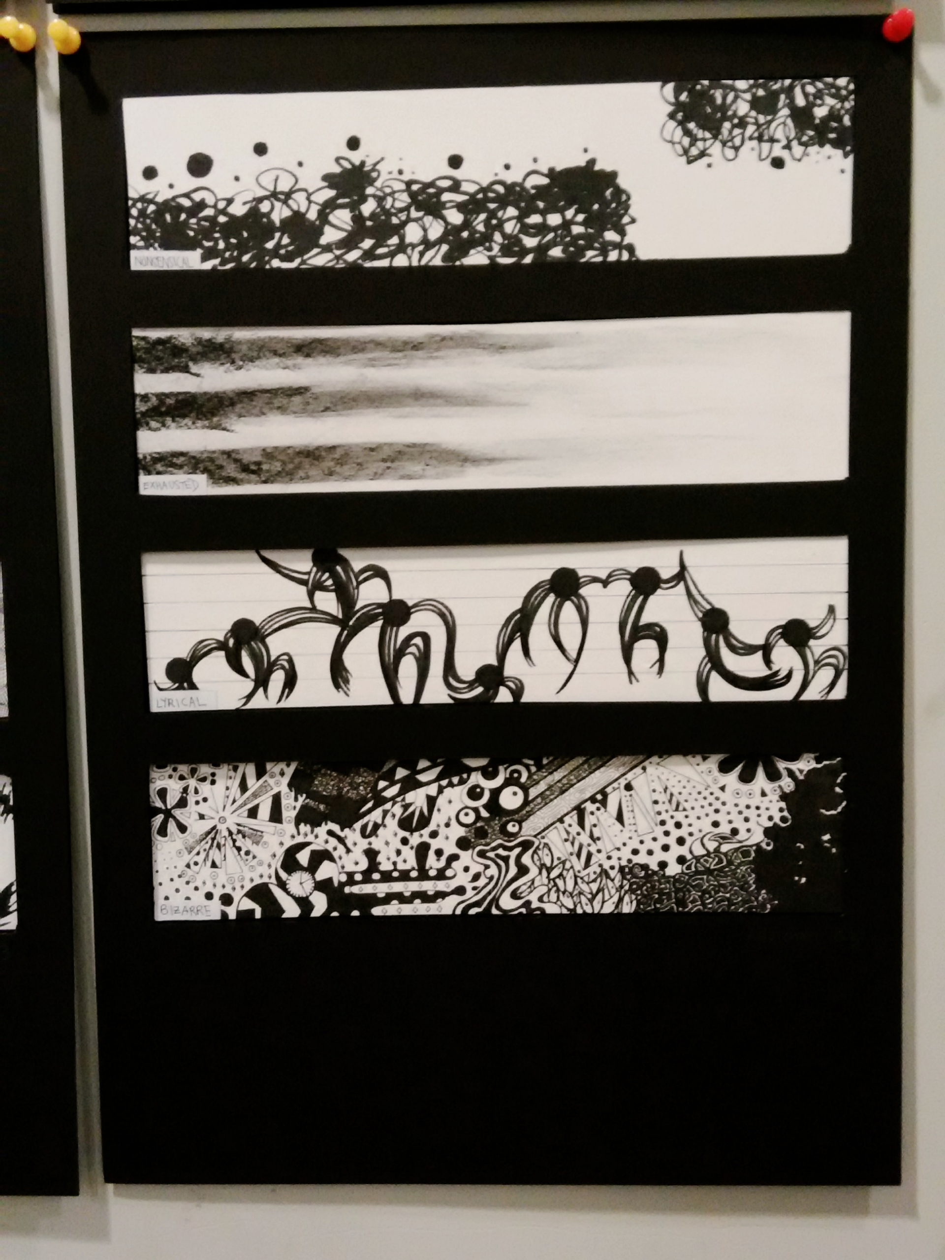
From top to bottom: Anxious, Systematic, Embarrassment, Indecisive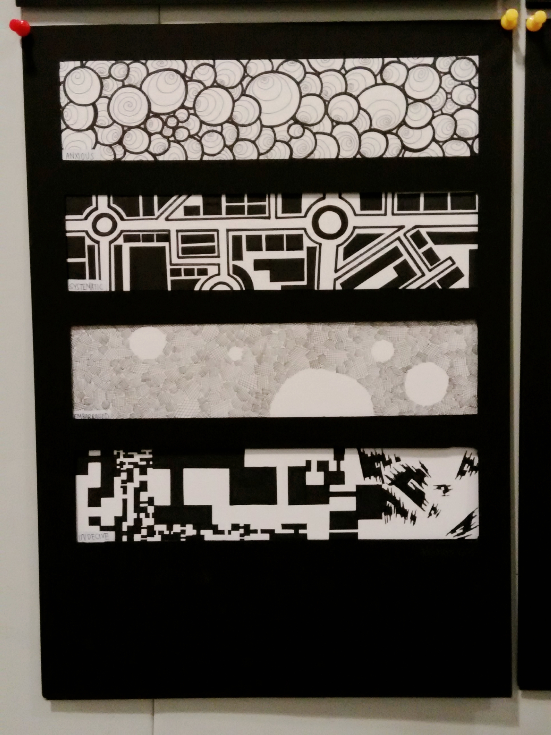
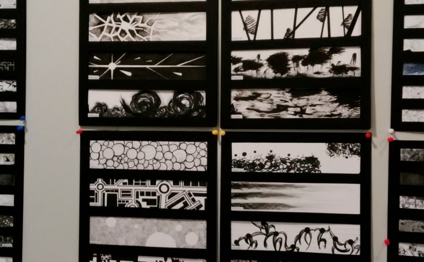
Overall work:
The explanation each design can be found in journal/research folder.