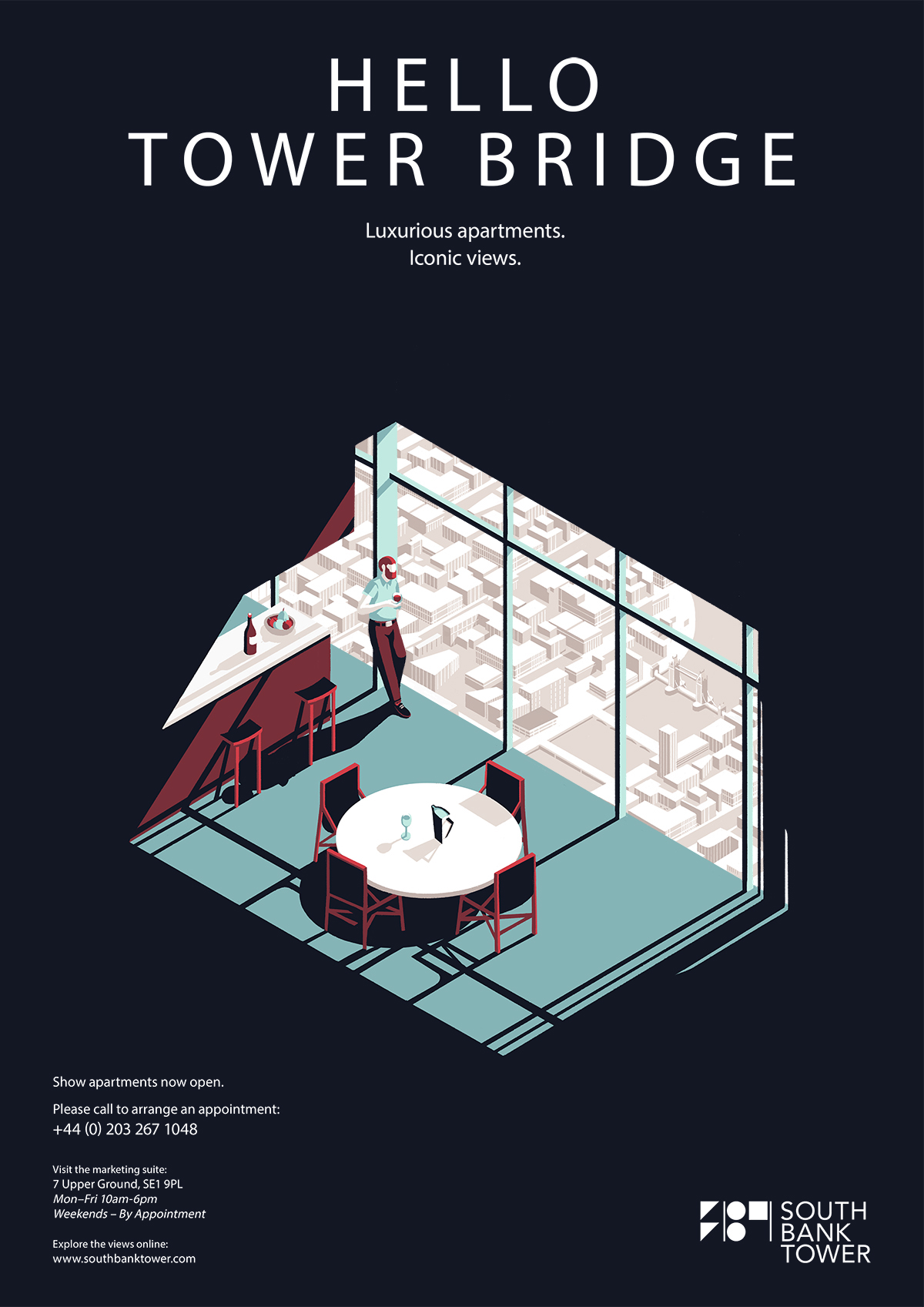
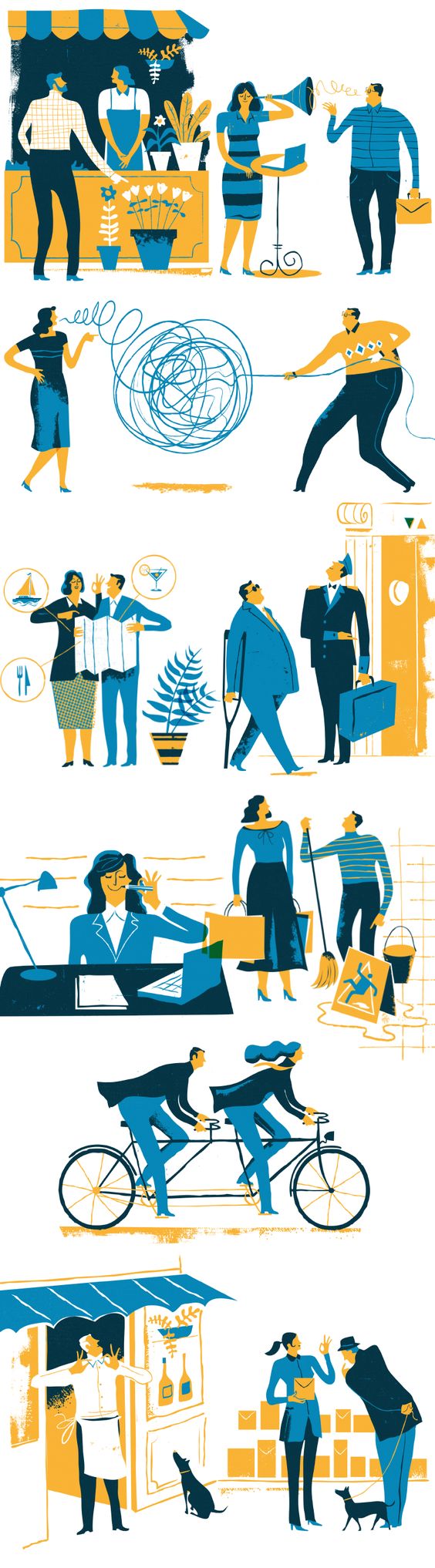
Category: AY1617 S1 FDN2D1 G3
2: Quotes

1: Emo
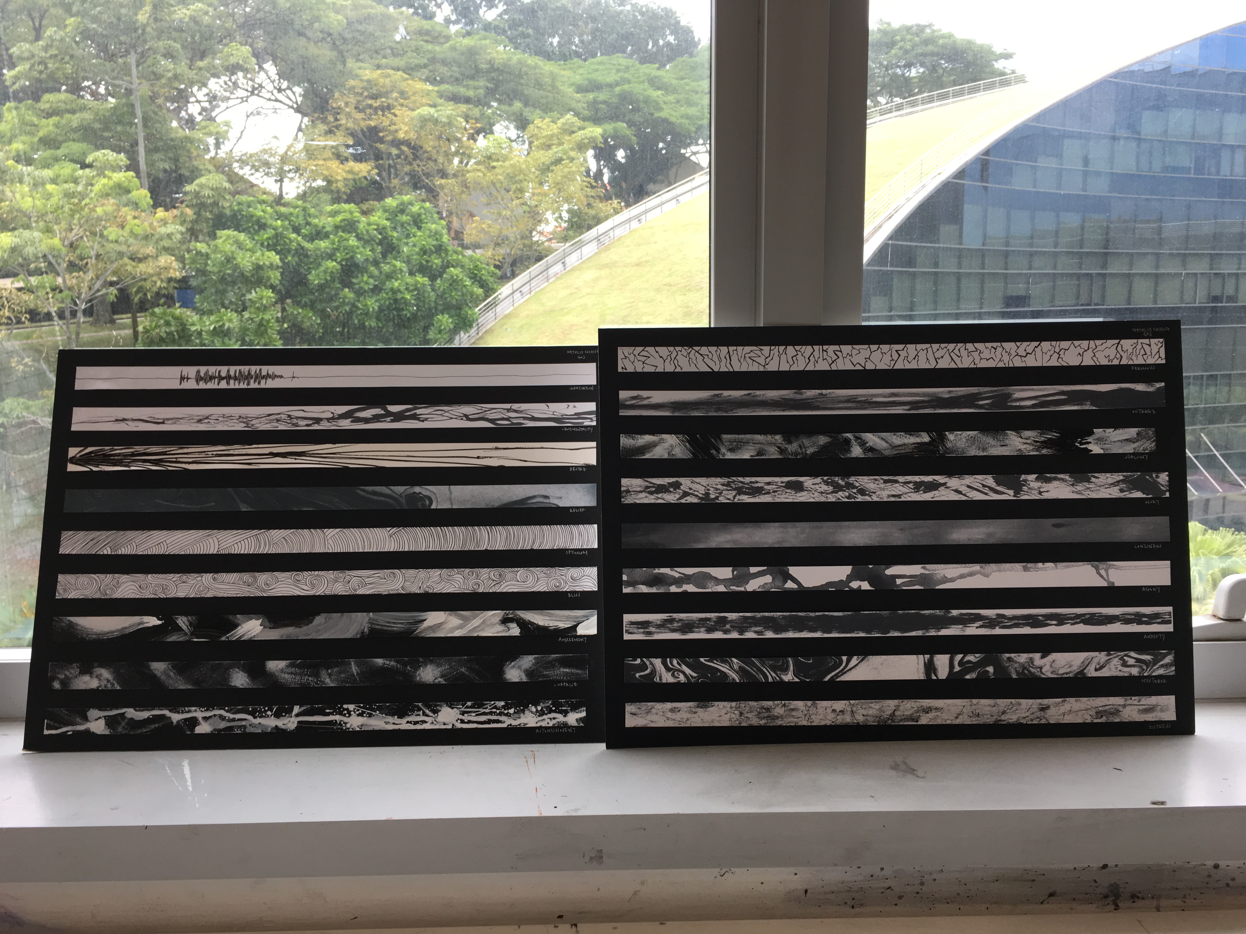
ego – execution
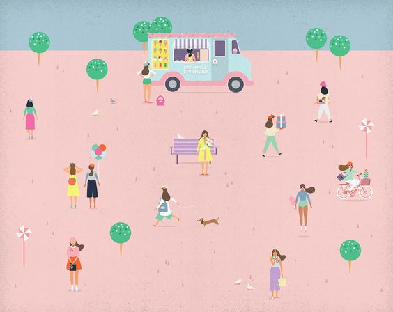
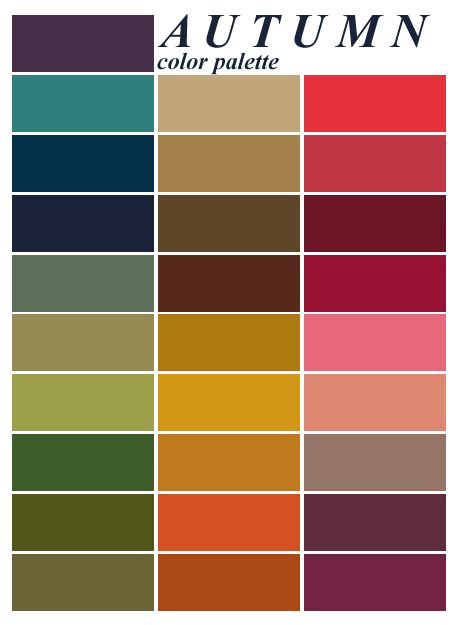
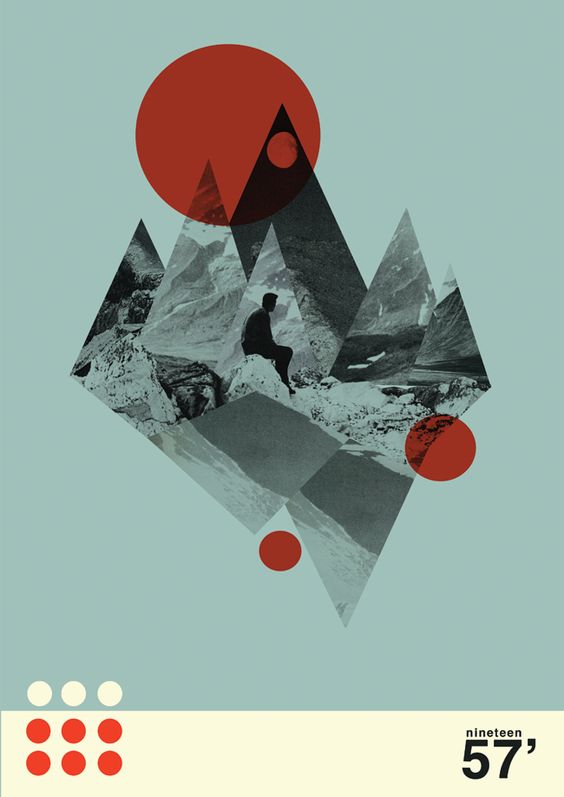
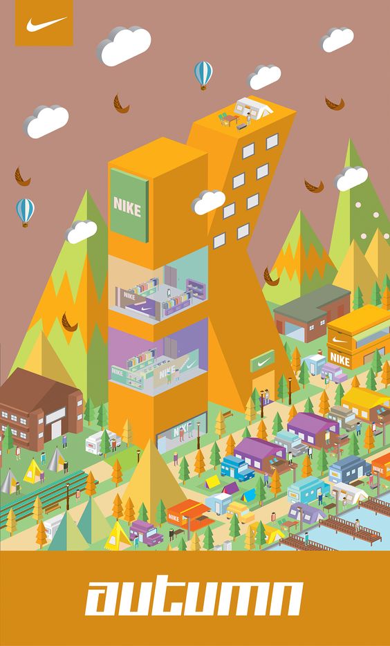
my concept is time based on the 4 seasons. its a series of development of myself through situations in the idea of time passing.
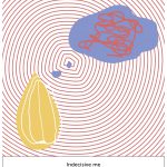
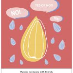
in spring, i start off as a seed. as spring is a season of personal growth, i put myself as a person that grows through making decisions. as im an indecisive person, i require friends to make decisions for me. from that, i can fully breathe and have a clear mind.
spring –
triadic harmony, monochromatic harmony
the colours for spring is quite pastel like, pretty and colourful. because my colour scheme is triadic, i had to keep it low tone so it won’t be too jarring.
i took this opportunity to apply some knowledge on colour emotions, previously studied from my study on colour emotions for my presentation.
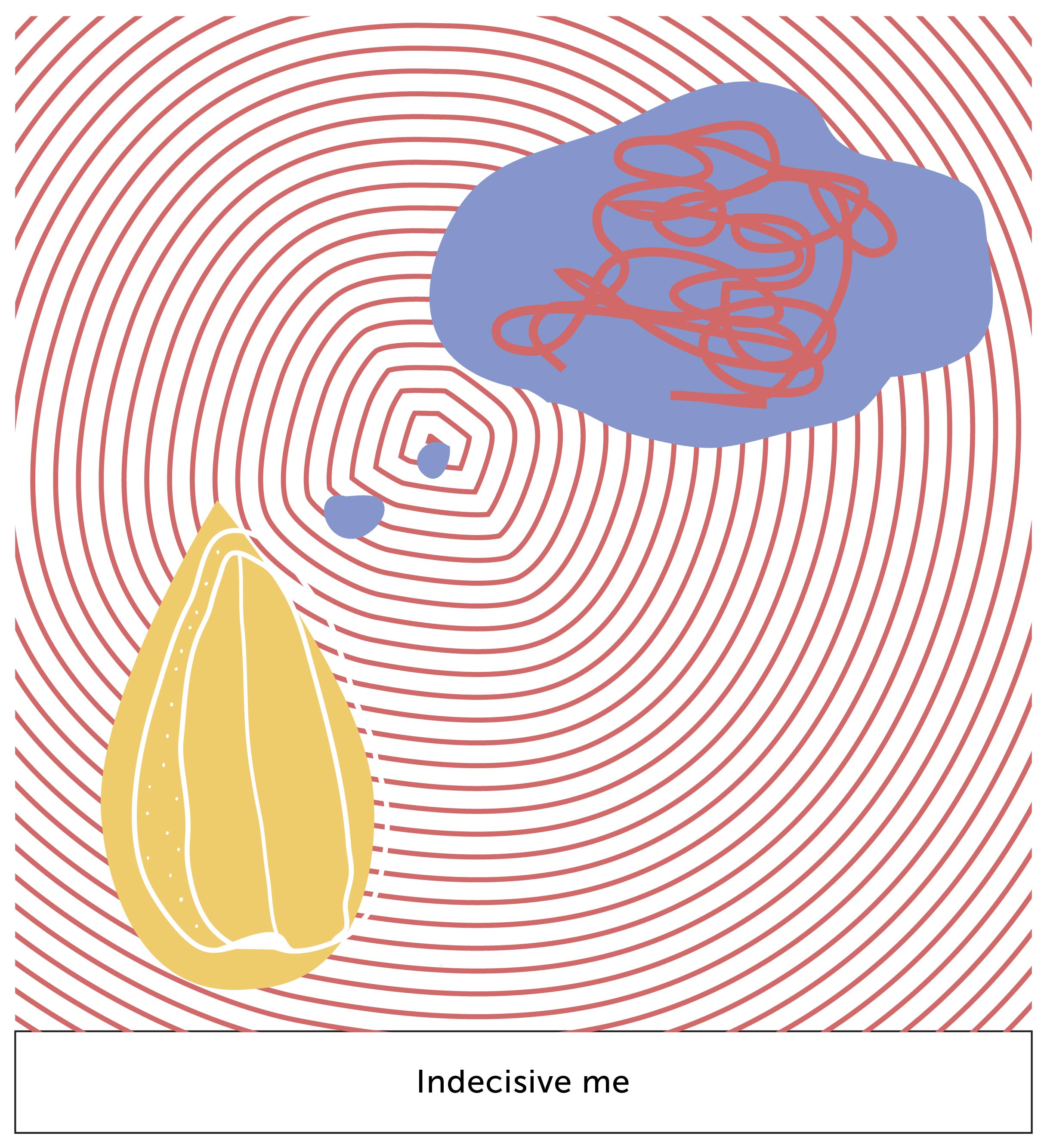
this box depict me as a decision maker. the pattern of circles represent my choices; often overwhelming i cant make up my mind. the scribbles in the dream bubble represent me overcomplicating my options although they are as simple as ABC.
+
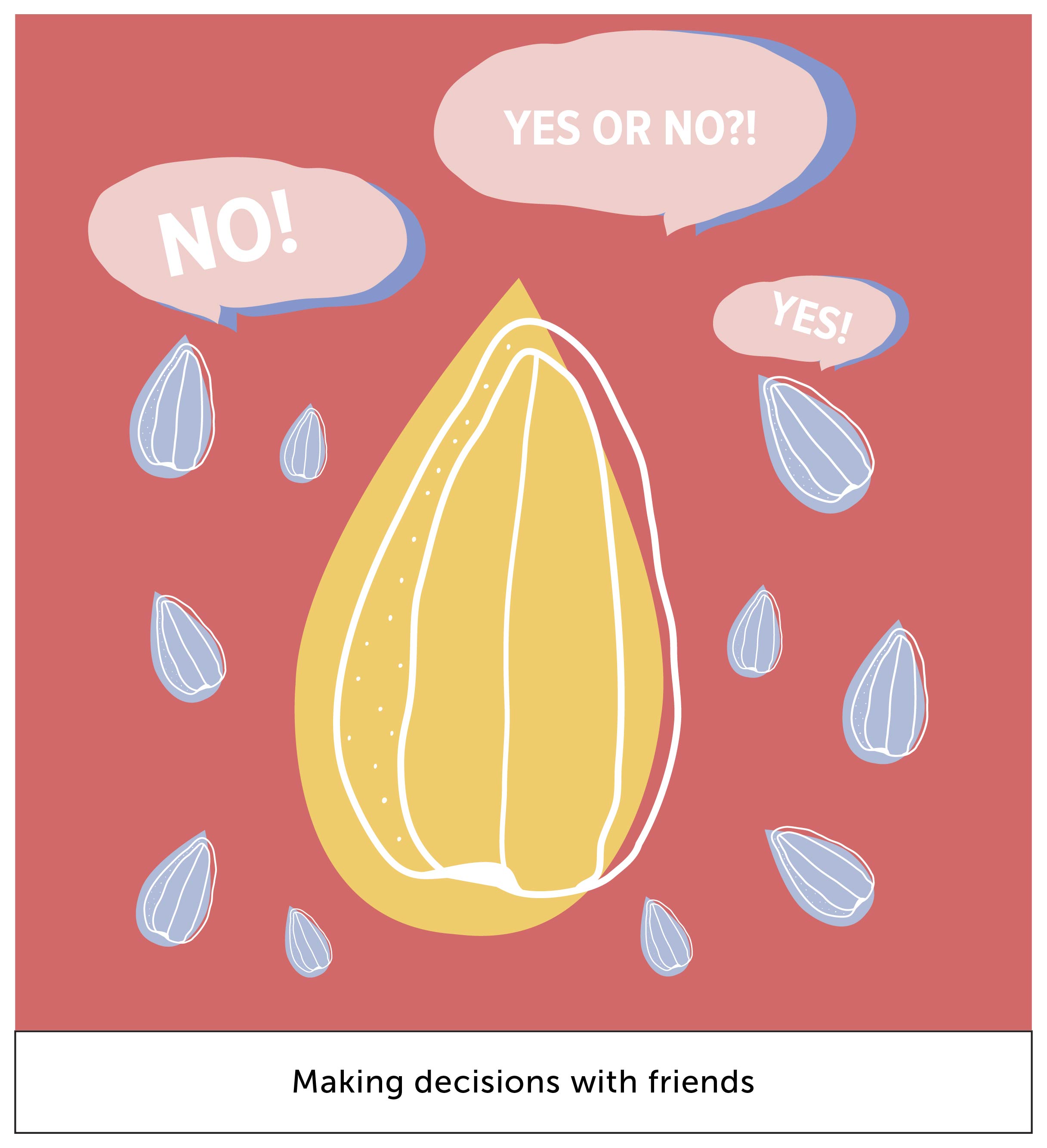
the little blue seeds represent my friends. often, i require people to make decisions for me. hence, we see here the little seeds answering my question.
the colour red represents anger. red is also a colour for something to stand out. hence i used red mostly in this situation because it’s a heated situation of debating, thus i feel its a great colour out of the other 2 to represent what im trying to communicate.
i used blue instead of using a darker shade of red as the shadow for the speech bubble in my 2nd box because it gives it a subtle pop of visual interest.
=
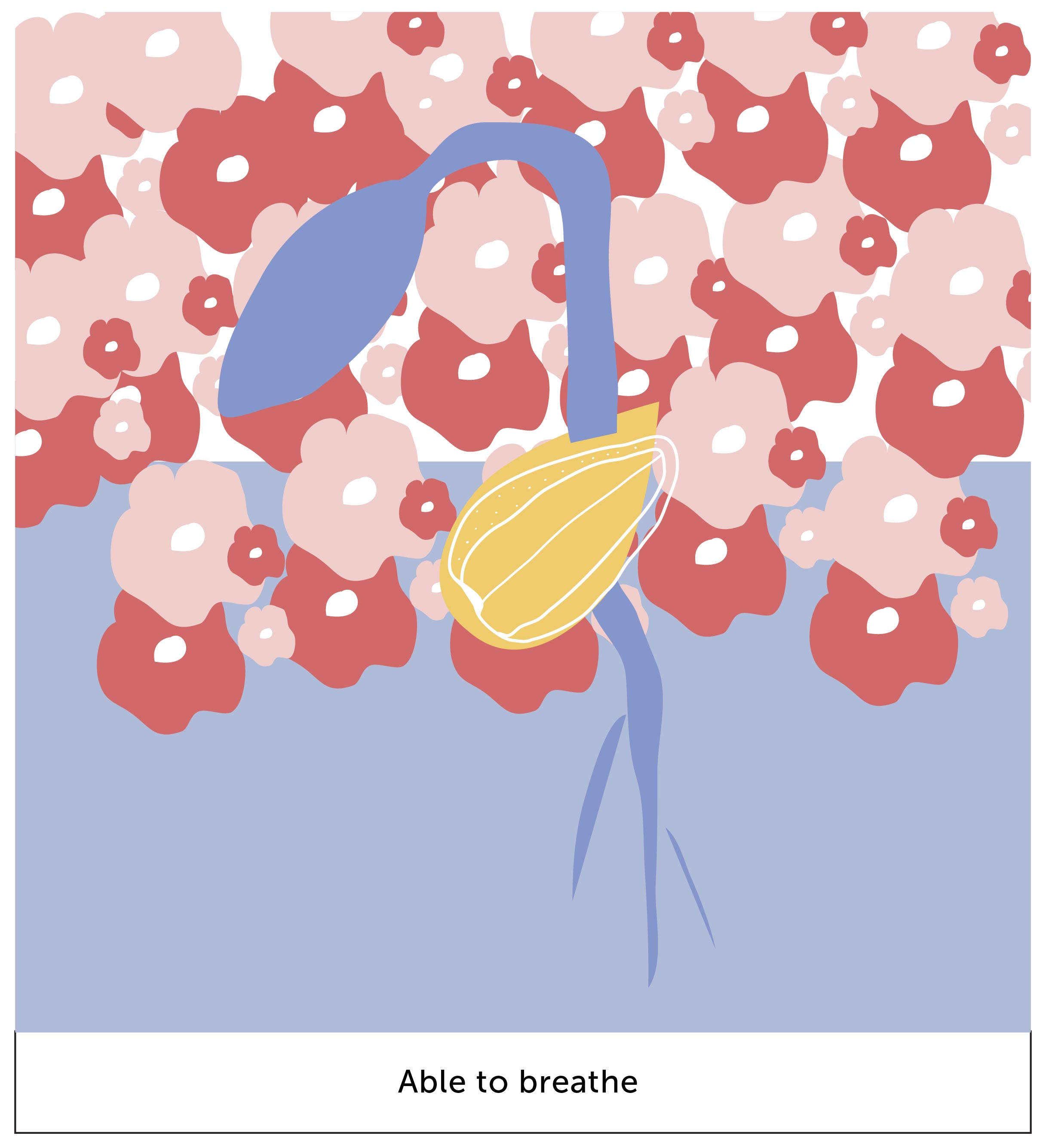
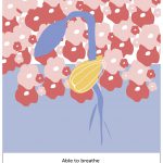
in this box, we see a germinating seed. the background is half applied to represent that i can finally breathe. the flowers represent the beautiful aspect of spring; in this context they symbolize a depiction of a clear mind through the flowers.
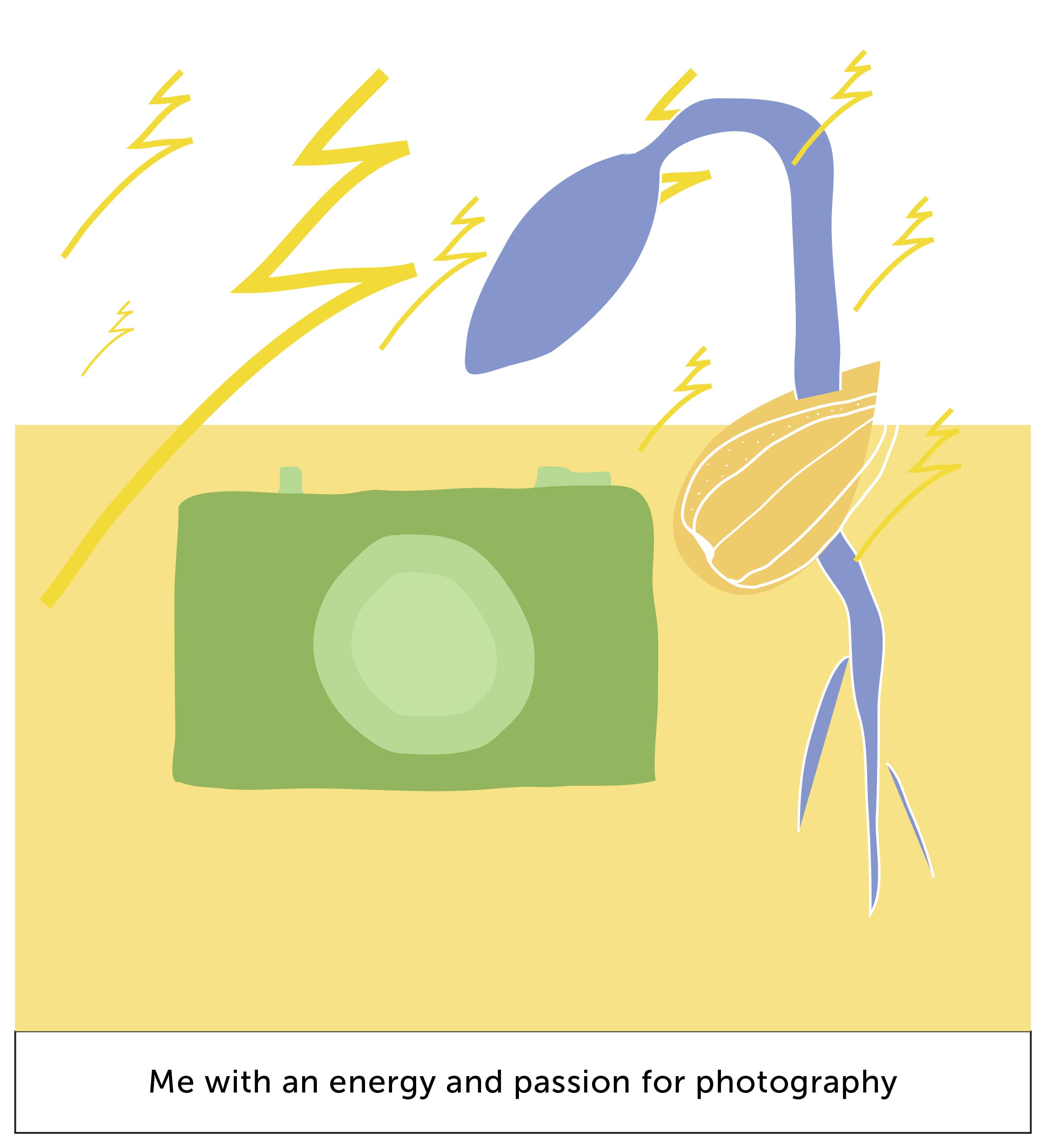
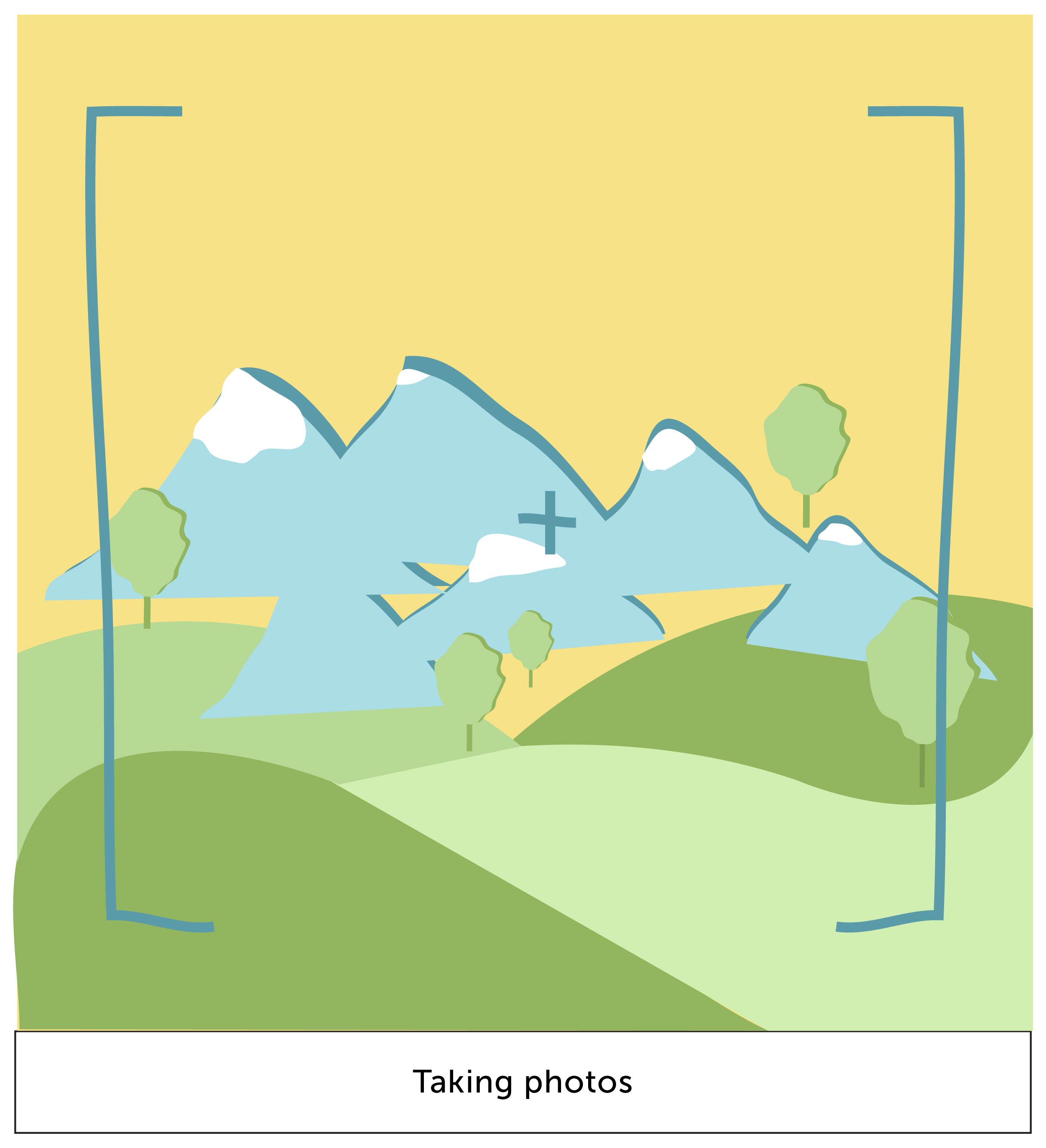
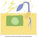
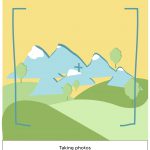
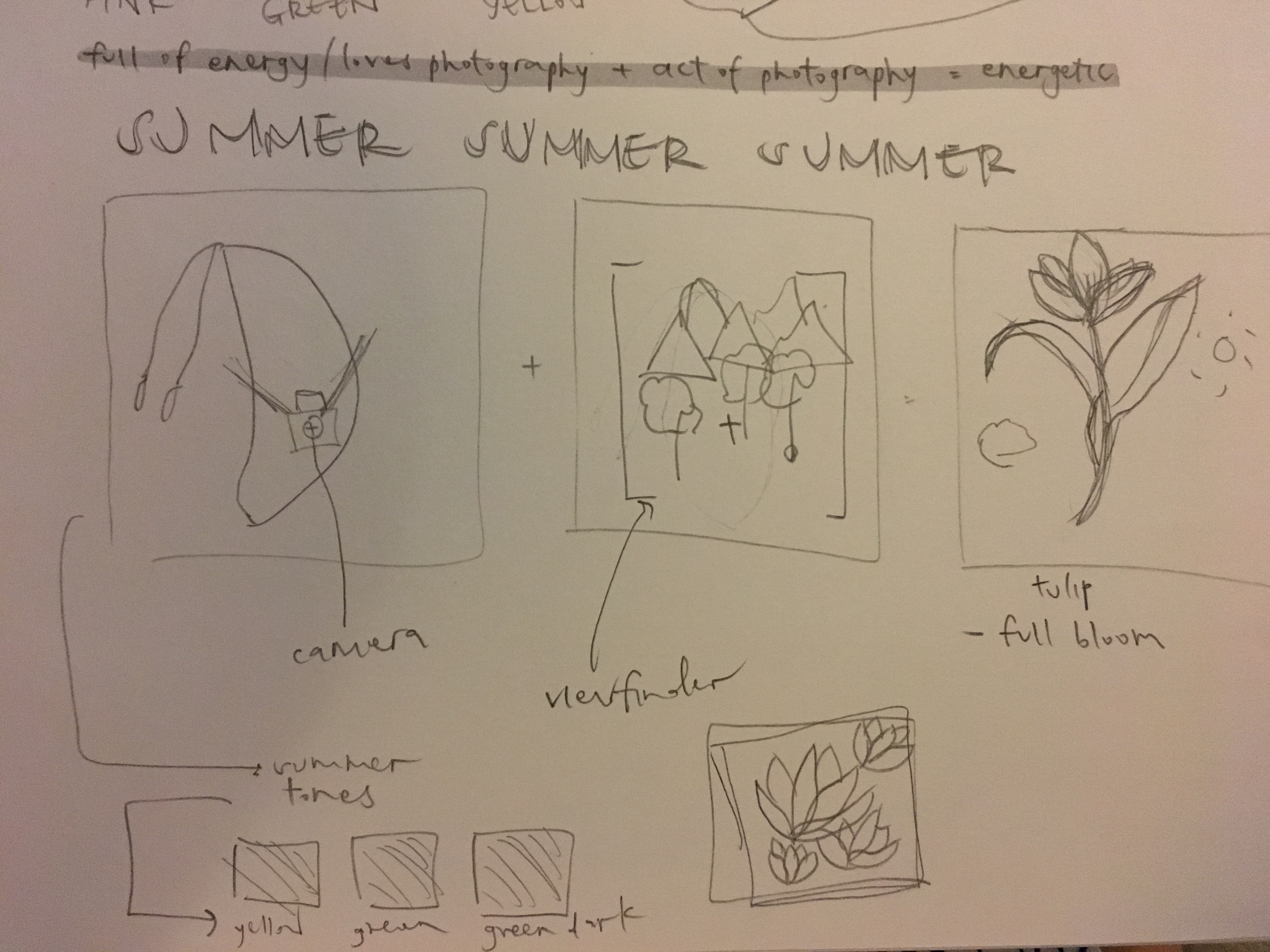
in summer, its a season of energy and vitality. i feel energized whenever i have my camera with me. the colour scheme rotates around mainly with yellow because it being the recognized colour for summer. also yellow is a symbol for happiness, which is what summer is about.
summer –
analogous harmony, monochromatic harmony
the symbols of lightning represent the energy whenever i have my camera with me. also, building up with the last box from spring, the germinating seed gives it a pop of emphasis with a yellow background because they’re complementary colours.
+
this box represent the act of photography-ing. the mountains and trees represent scenic views, which is what i enjoy taking most. the colours used here are kept to their original natural colours.
=
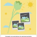
a flower has bloomed here! it represents me as a person who has grown, full of energy, because of the amount of new photos taken that i can use for my portfolio.
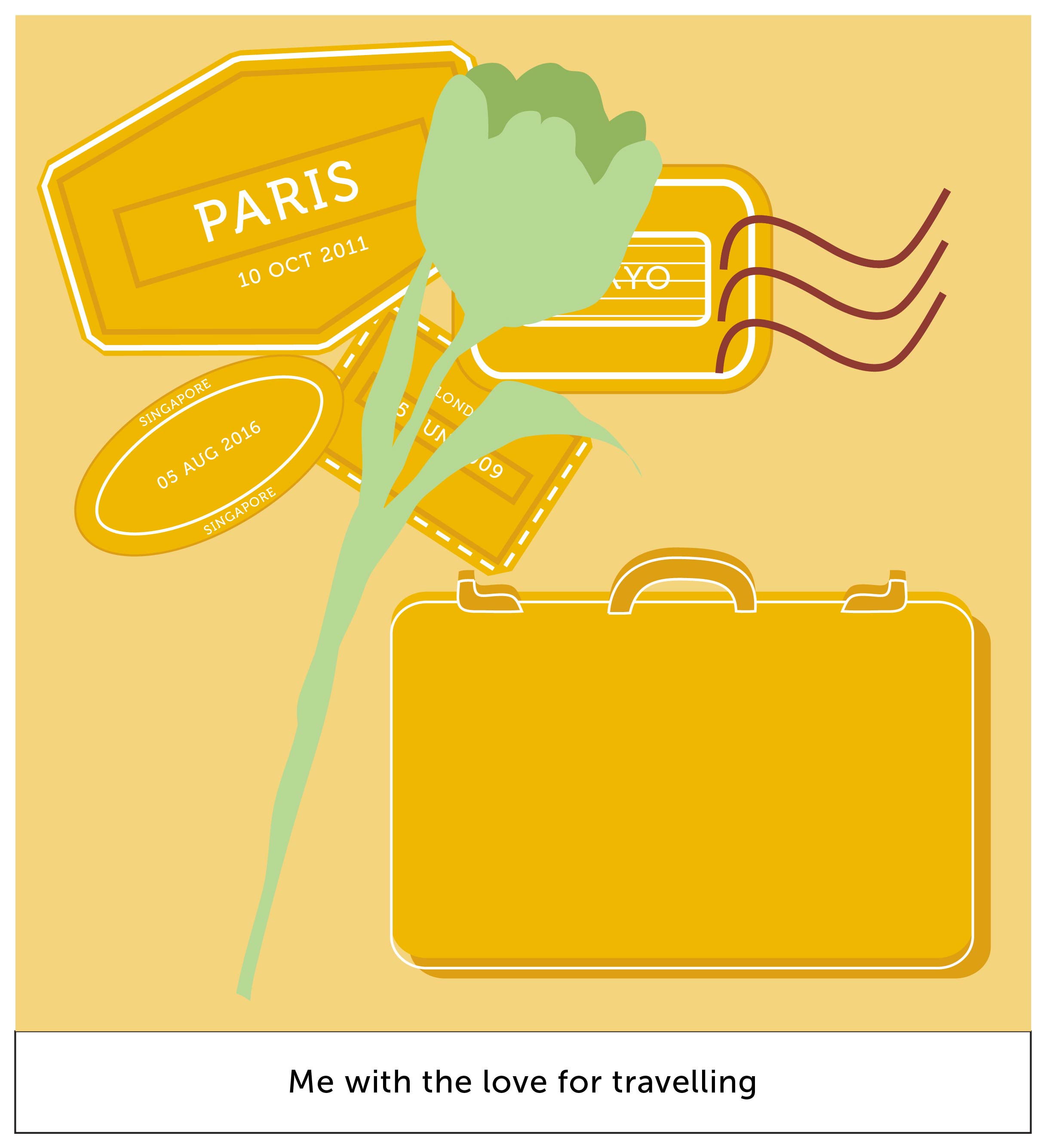
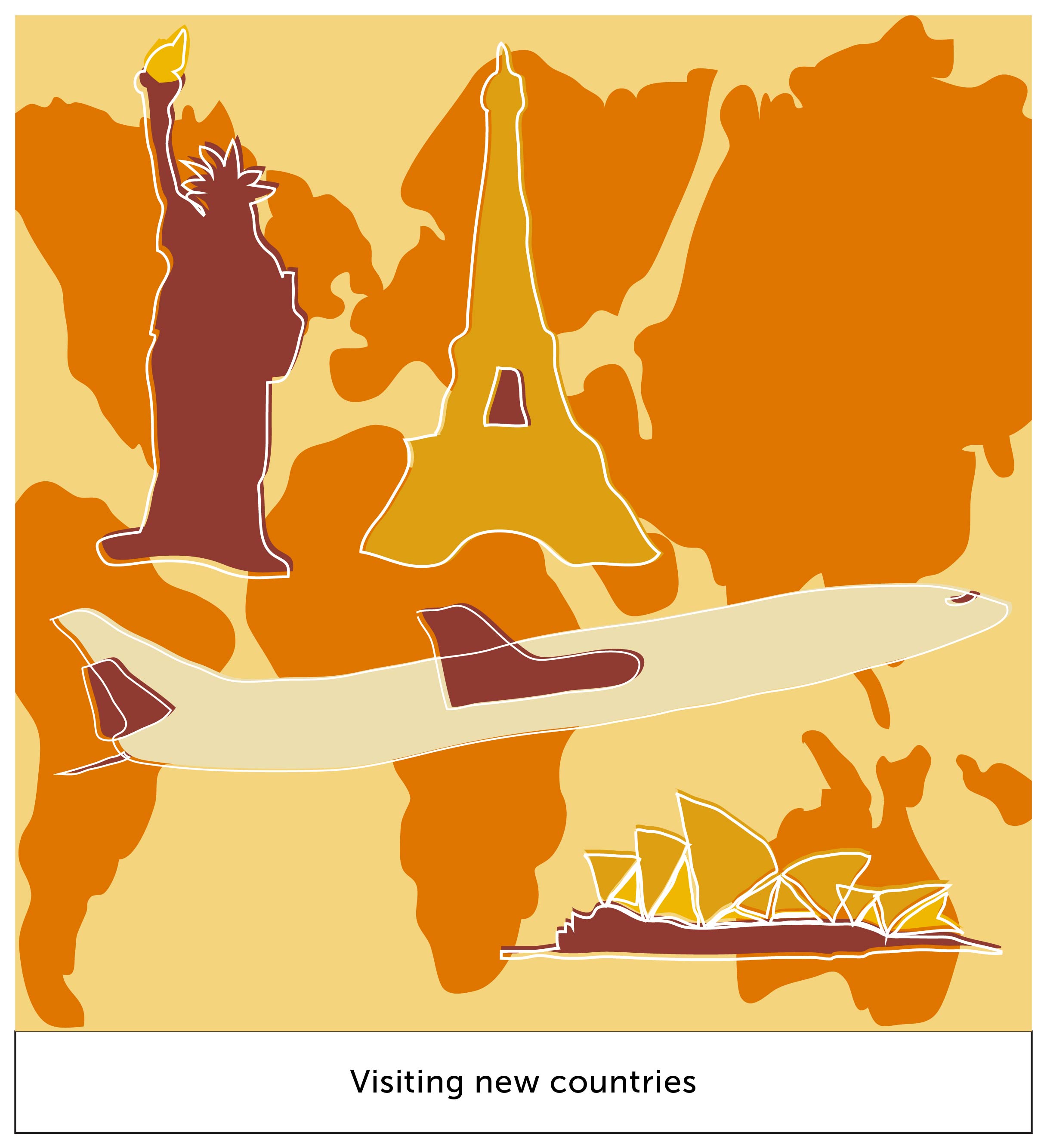
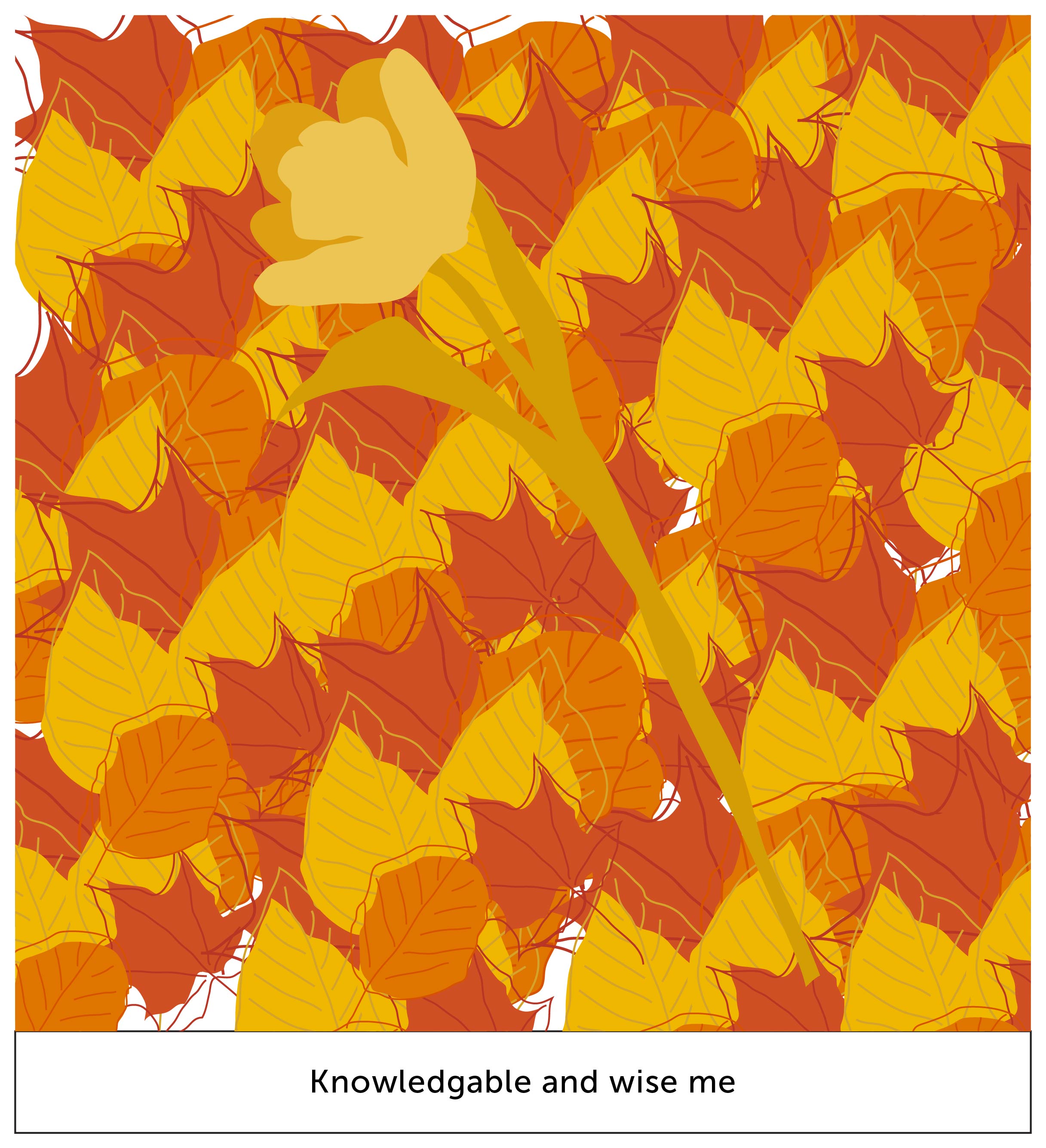
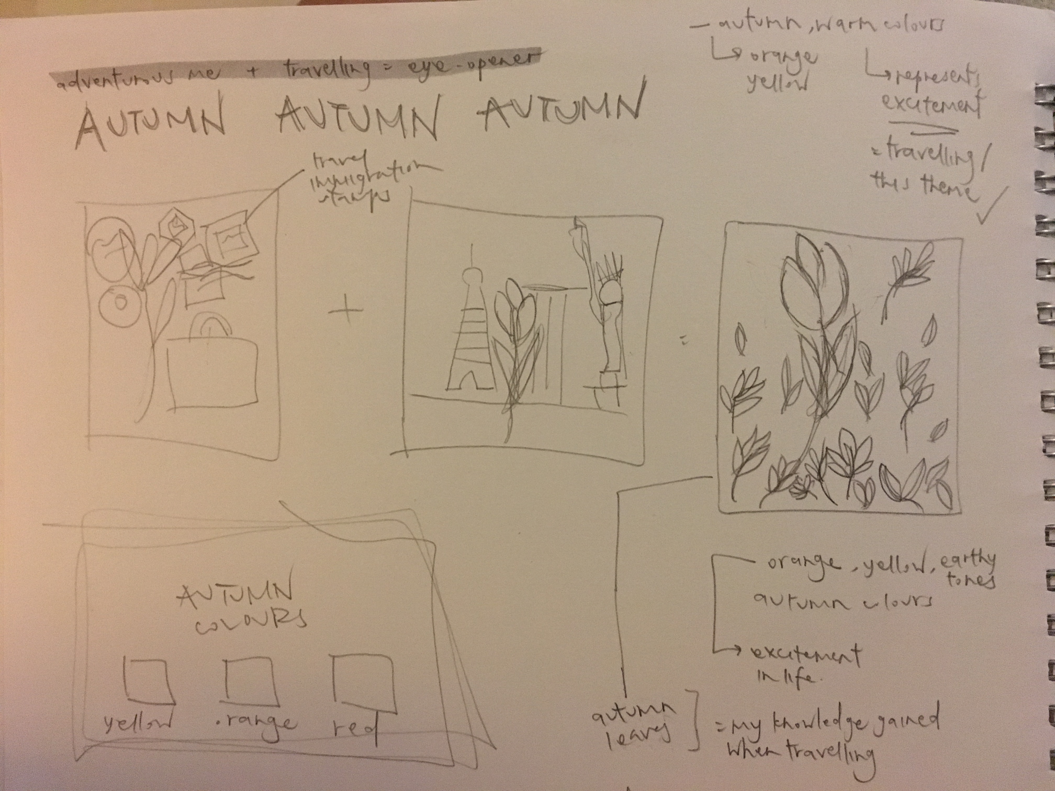
autumn represents middle age, knowledge and wisdom. hence i feel that a good way to represent this is when i travel. i gain knowledge from learning about the city’s culture, talking to people, eating local food, etc.
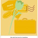
autumn –
analogous harmony warm, monochromatic harmony
as described, i do love to travel. the stamps at the background represent the collection of stamps. as orange is a colour that symbolizes “energy” and “excitement”, i feel that this colour scheme is appropriate for my context of travelling.
+
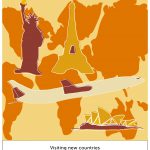
this box represents my setting of travelling. different world icons are illustrated and are set on their appropriate continents.
the darker shade of orange as used for the continents gives it a level of depth to the composition. it brings out the monument icons.
=
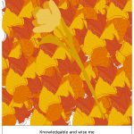
me, the flower, has bloomed even larger! it depicts the amount of knowledge i absorbed, causing it to grow larger as a person.
the foliage represents my amount of knowledge collected. the colour of the leaves harmonizes one another, giving it a pleasant visual interest.
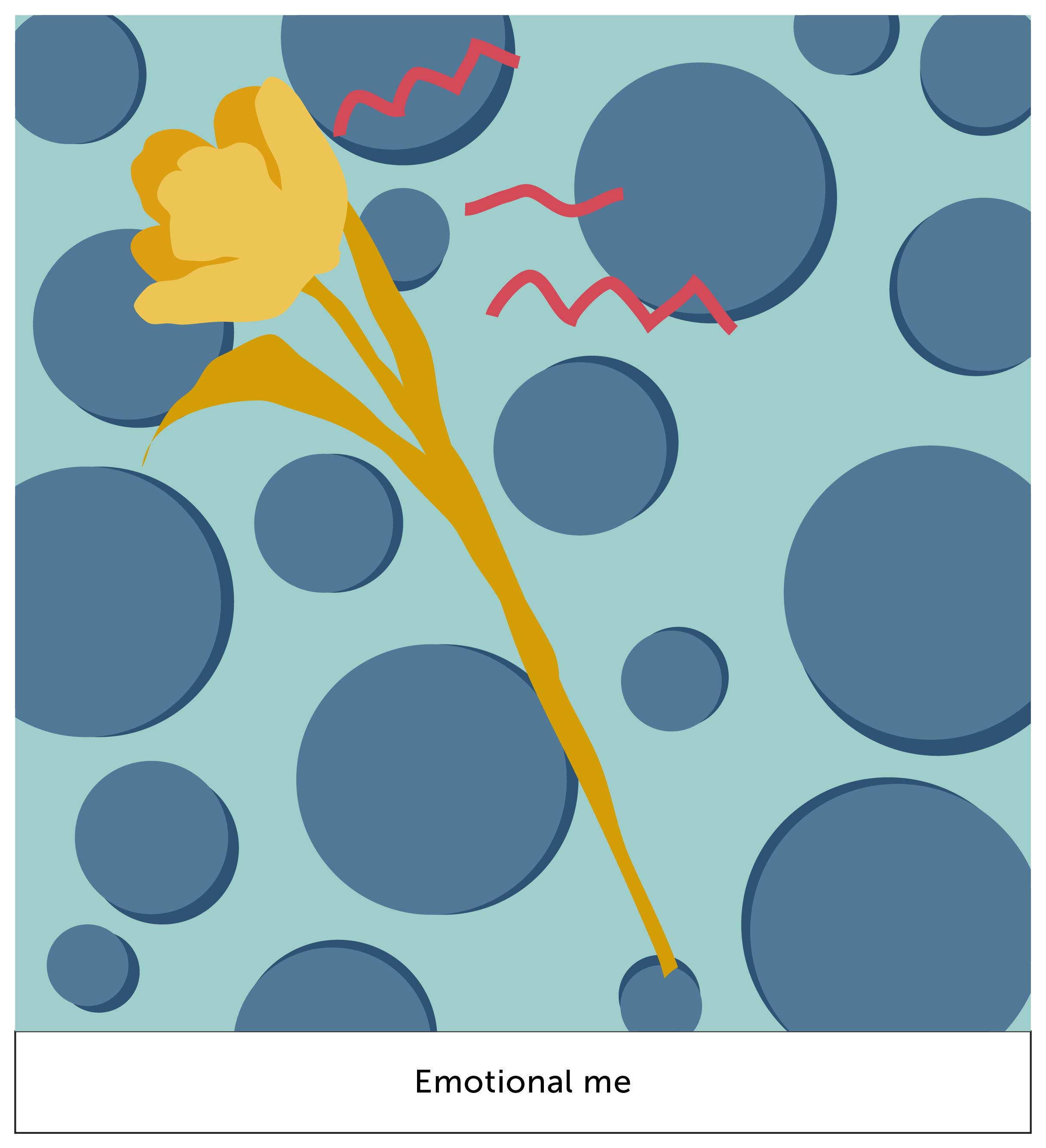
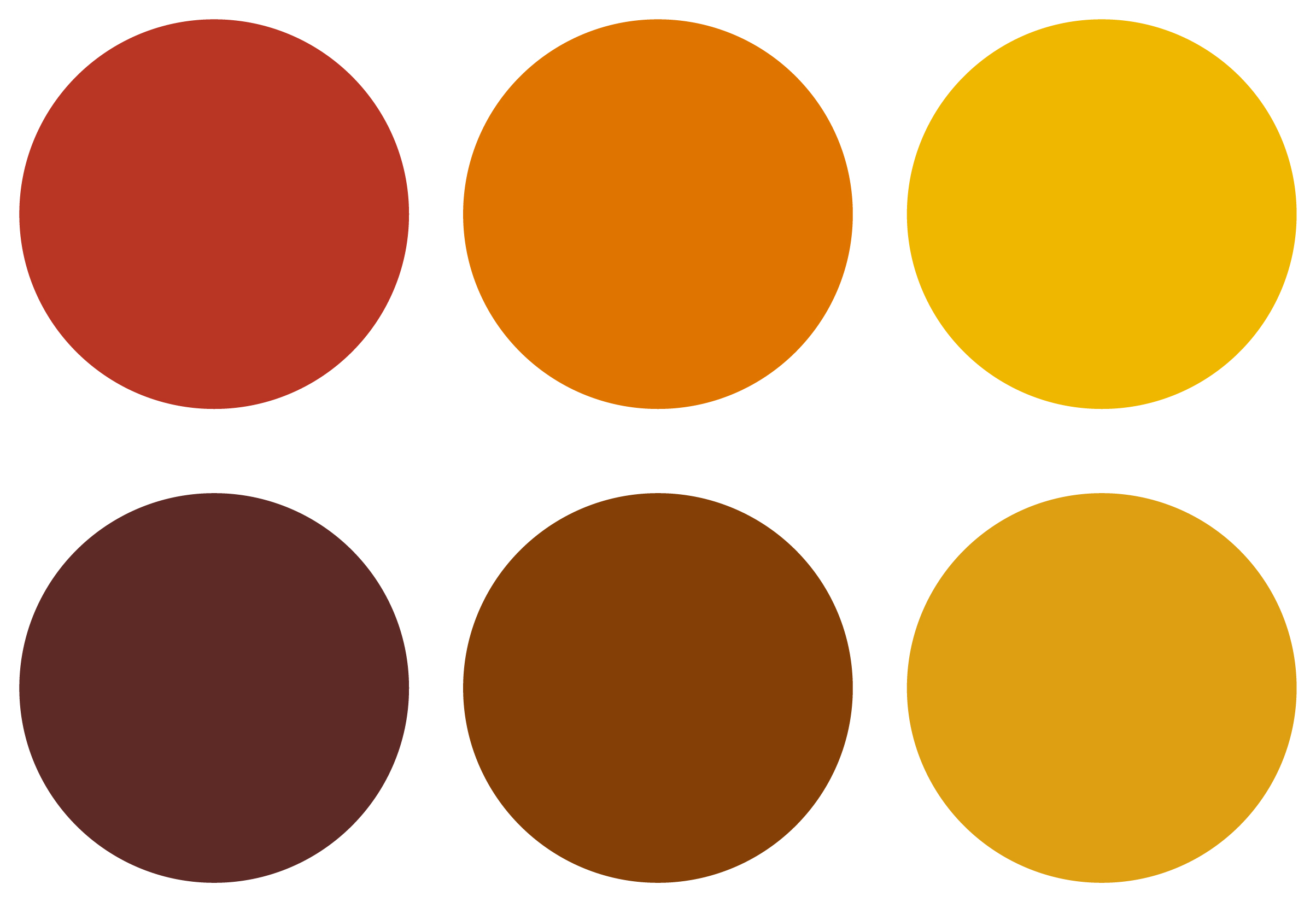
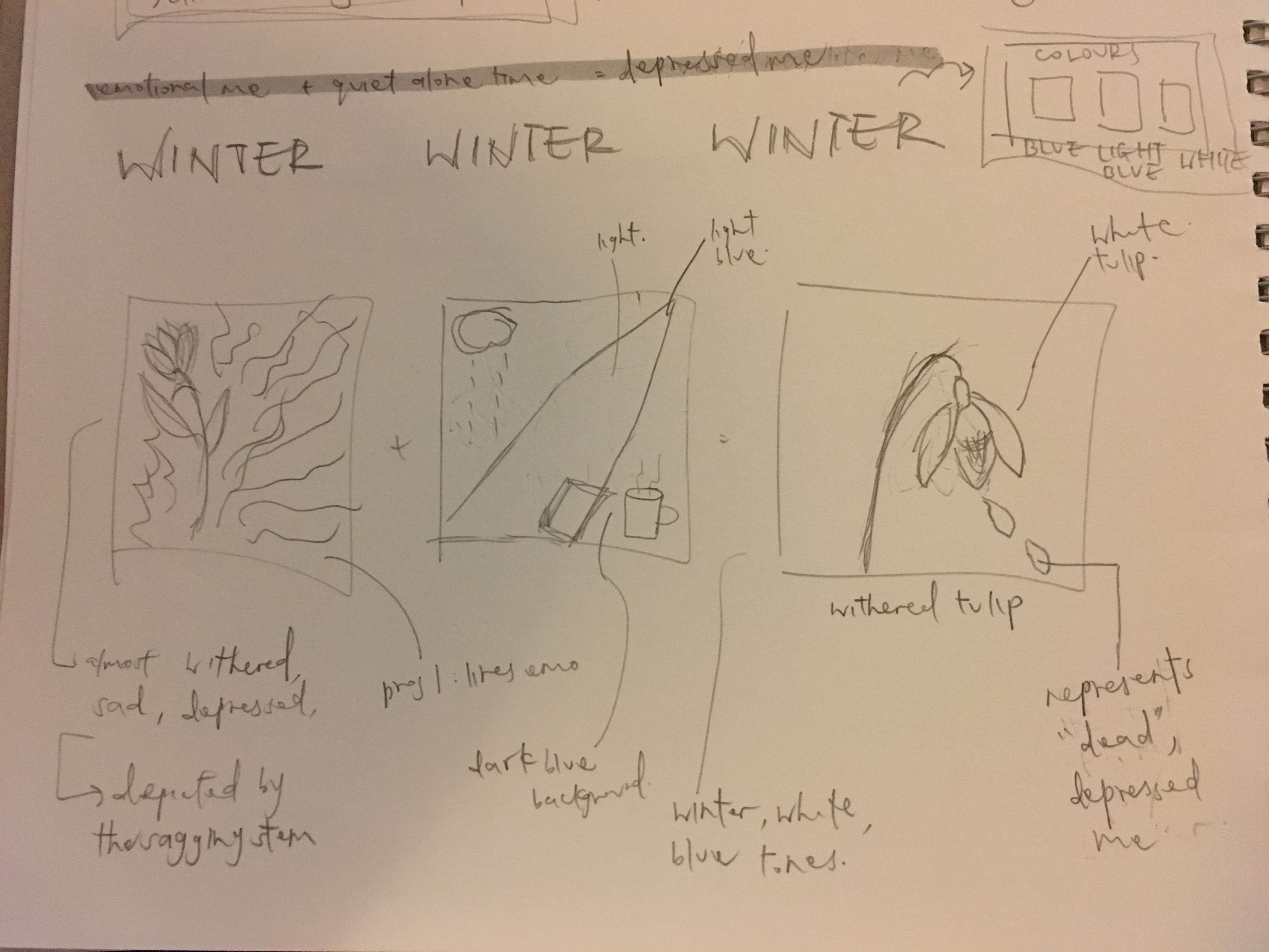
winter represents death; the end of a cycle. in literature, it can also symbolize sadness, which is what i did in this last equation. the colour scheme for winter is the most perfect for my context as well. the colour blue represents sadness, calmness, stillness.
winter –
analogous harmony cool, monochromes harmony
since orange and blue are split complementary colours, my flower definitely stood out.
the red strands represent my emotions (hur hur, project 1); frustrated, emotional; emotional pain. the circles being blue, they complement my emotions too, and also since circles are organic shapes.
+
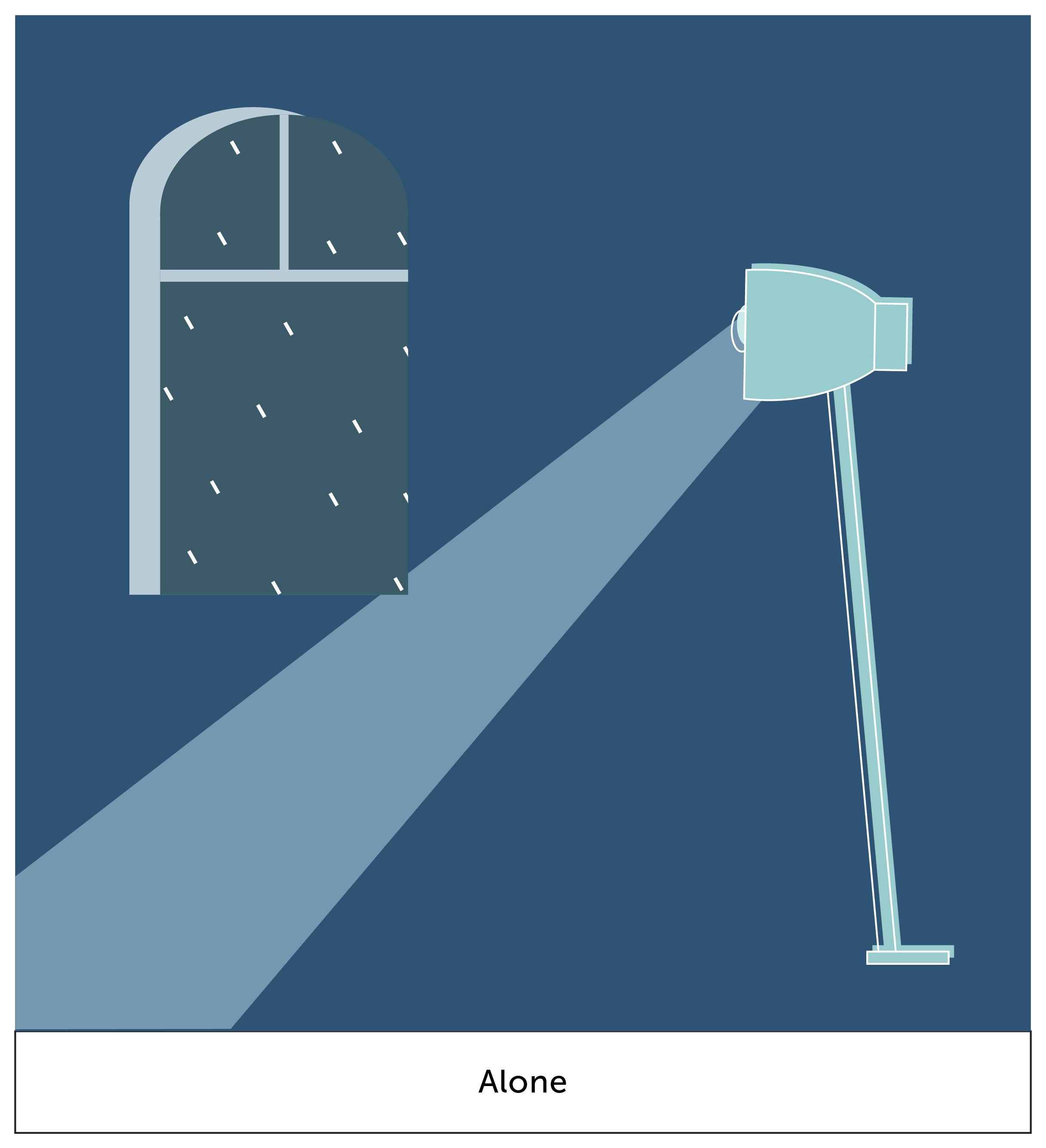
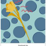
i wanted to create a setting of quiet and stillness. from the window at the back, you can see raindrops. this creates a mood to the setting. the lighted ray shines at a corner of nothing-ness, which is what i create to depict a scene of emptiness. i do like how the dark blue is able to create a mood of stillness.
=
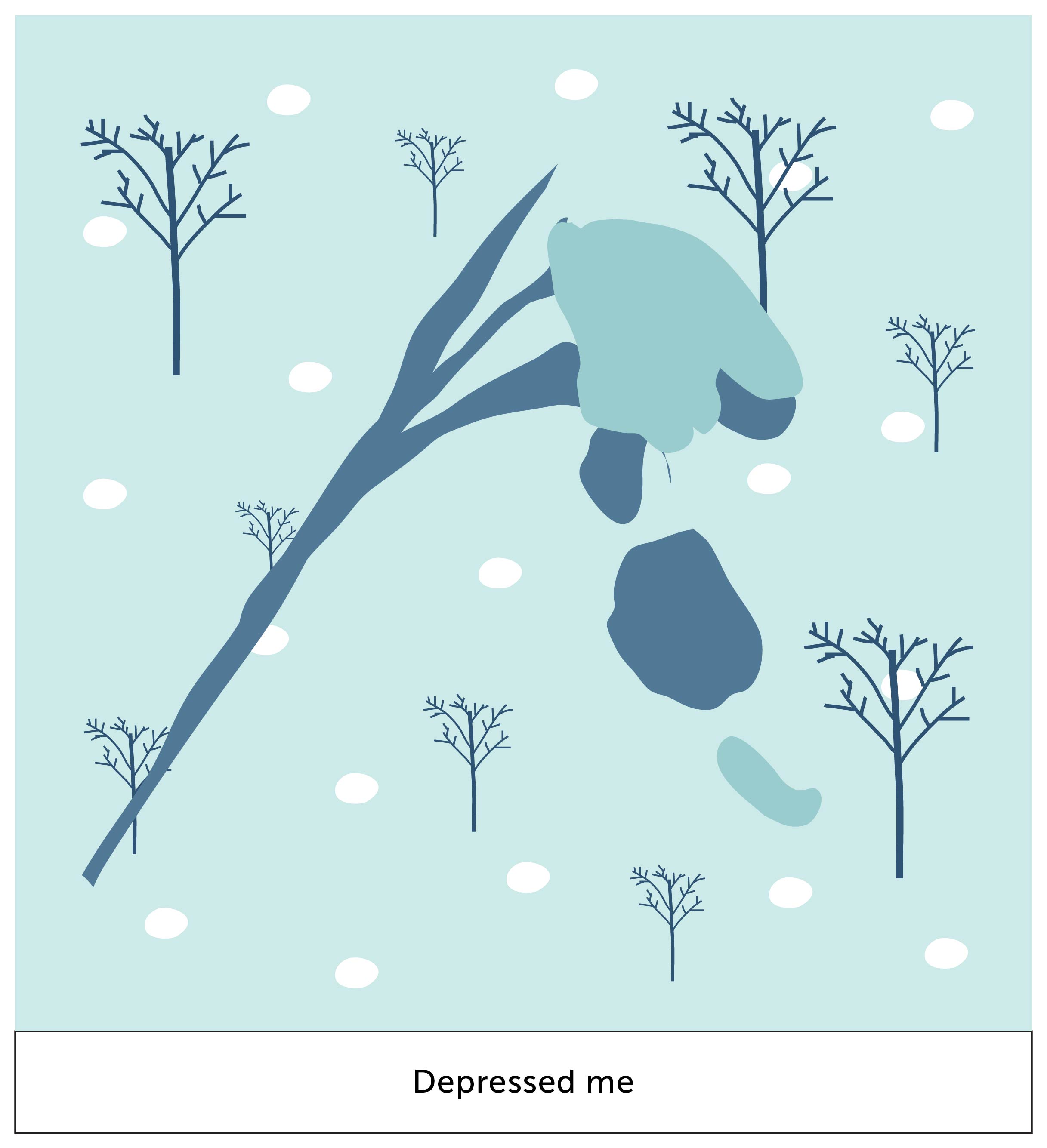
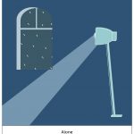
in my final box, i finally caved in to nature’s work. the “depressed me” is withered, and this is shown by petals falling. the blues definitely create a somber aesthetic look to it. also the emphasis is still kept despite the contrast of white (snow) in the background.
aaaand thats it for this project! it started off difficult for me but i enjoyed the execution part. i enjoy illustrating and im glad i managed to do it for this project. i’m looking forward to improving my skills and to create great work just like from my artist research.
time to get a wacom because i cannot tell you how painful and limiting it was to illustrate with a mouse and touchpad.
ego – WIP

so in this project, i started off with deciphering who i am as a person.
NATALIE CHENG –
introvert
enjoys quiet time alone
emotional
bubbly
outgoing
enjoys travelling
amateur photographer
there were lots of pre-planning and research that i had to do before starting on the execution of the project.
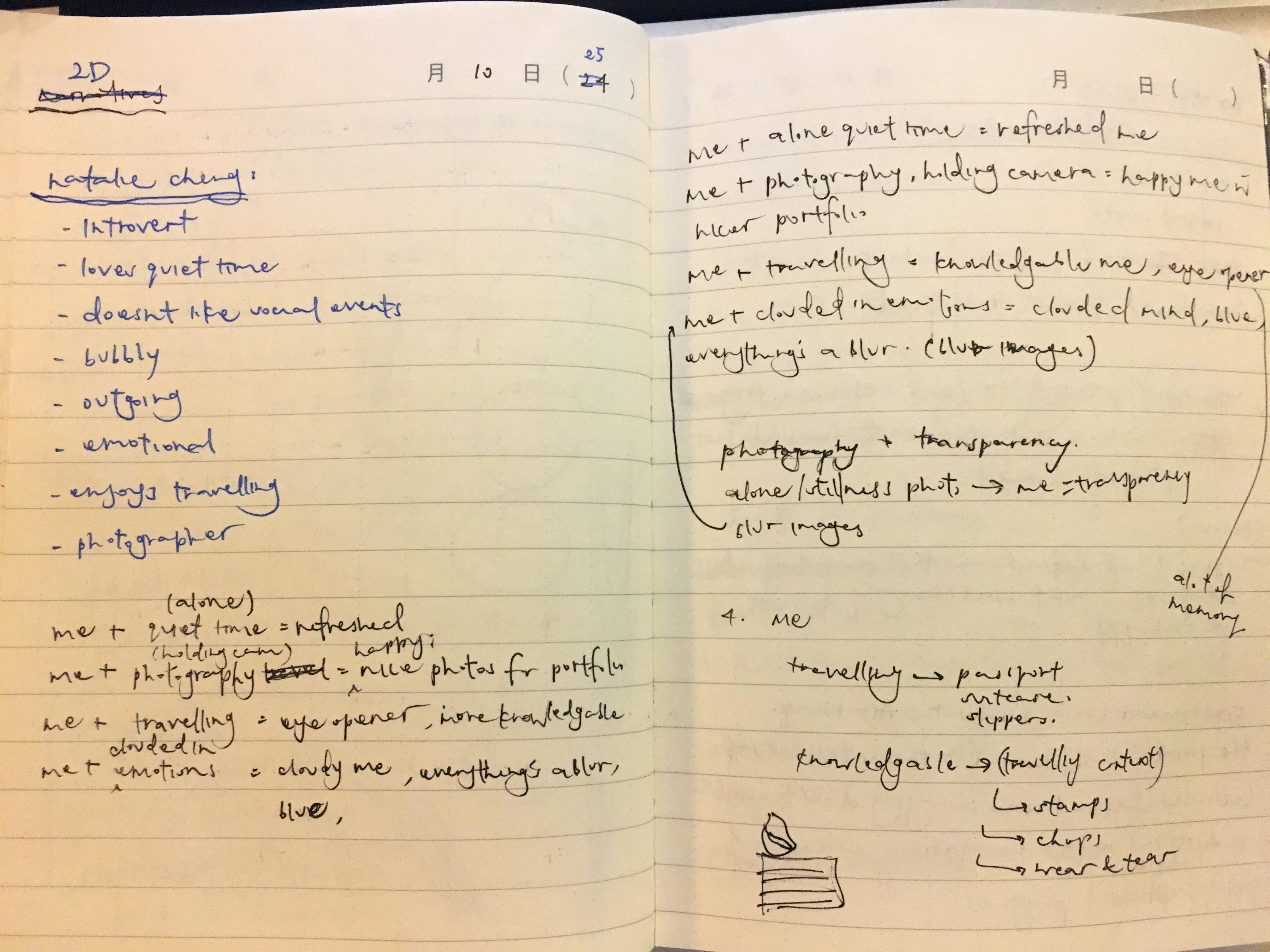
from those traits that i discovered about myself, i came out with some rough initial equations during the earlier start of the project –
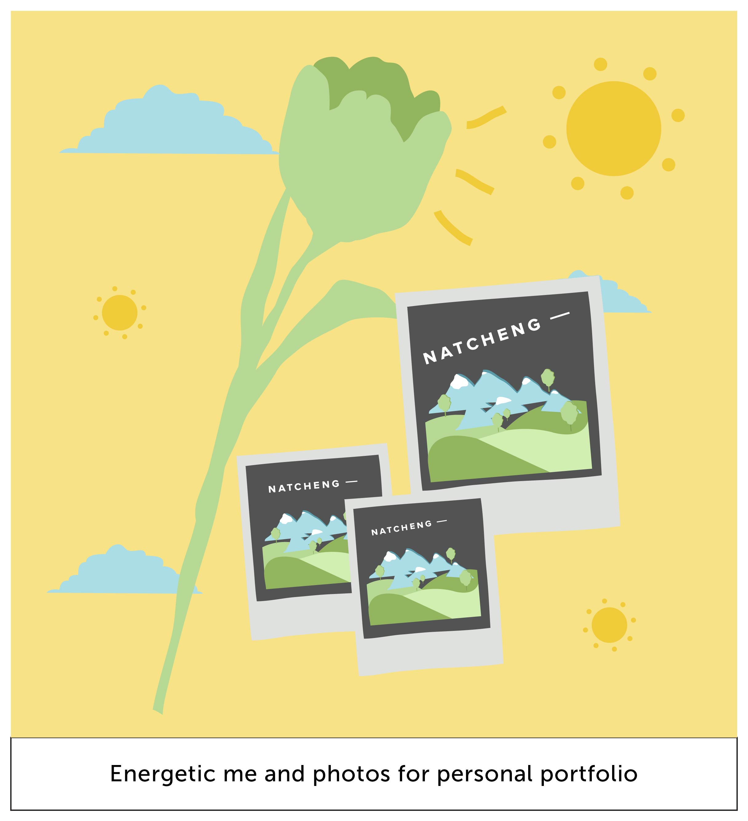
me + quiet alone time = refreshed
me + photography = a happy me (and because i have new content for my portfolio)
me + travelling = eye-opened, knowledgeable me
me + clouded in emotions = cloudy / blurry / blue me
then the tough part arrives…
i wanted to break away from the normality and direct way of approaching this project. instead of being something that i like, or being “my favourite animal / food”, i wanted to approach “me” in an abstract, conceptualized and have in a deeper meaning to it.
….. but i couldn’t think of any.
this project started to get really difficult and brain sucking. it was tough to think of something that symbolizes me yet tell a story about my personality.
so i thought, i thought, and i thought hard.
i started to list out the things that i like.
NATALIE CHENG ENJOYS –
food
flowers
photography
styling
cooking
travelling
so from these points, the most apt subject that i could work with that also holds a symbolism to things would be flowers!
also, since this is a colour project, i could definitely play on the colours of flowers to tell my story.
hence, i came out with this concept of me being the different type of flowers in different settings that holds a symbol of importance as well.
me = flower.
white chrysanthemum + funeral = me crying, drowning in sadness
sunflower + graduation = me happy, joyous
red rose + date = me feeling infatuated, in love
pale muted colored lilies + wedding = a bloom of new life
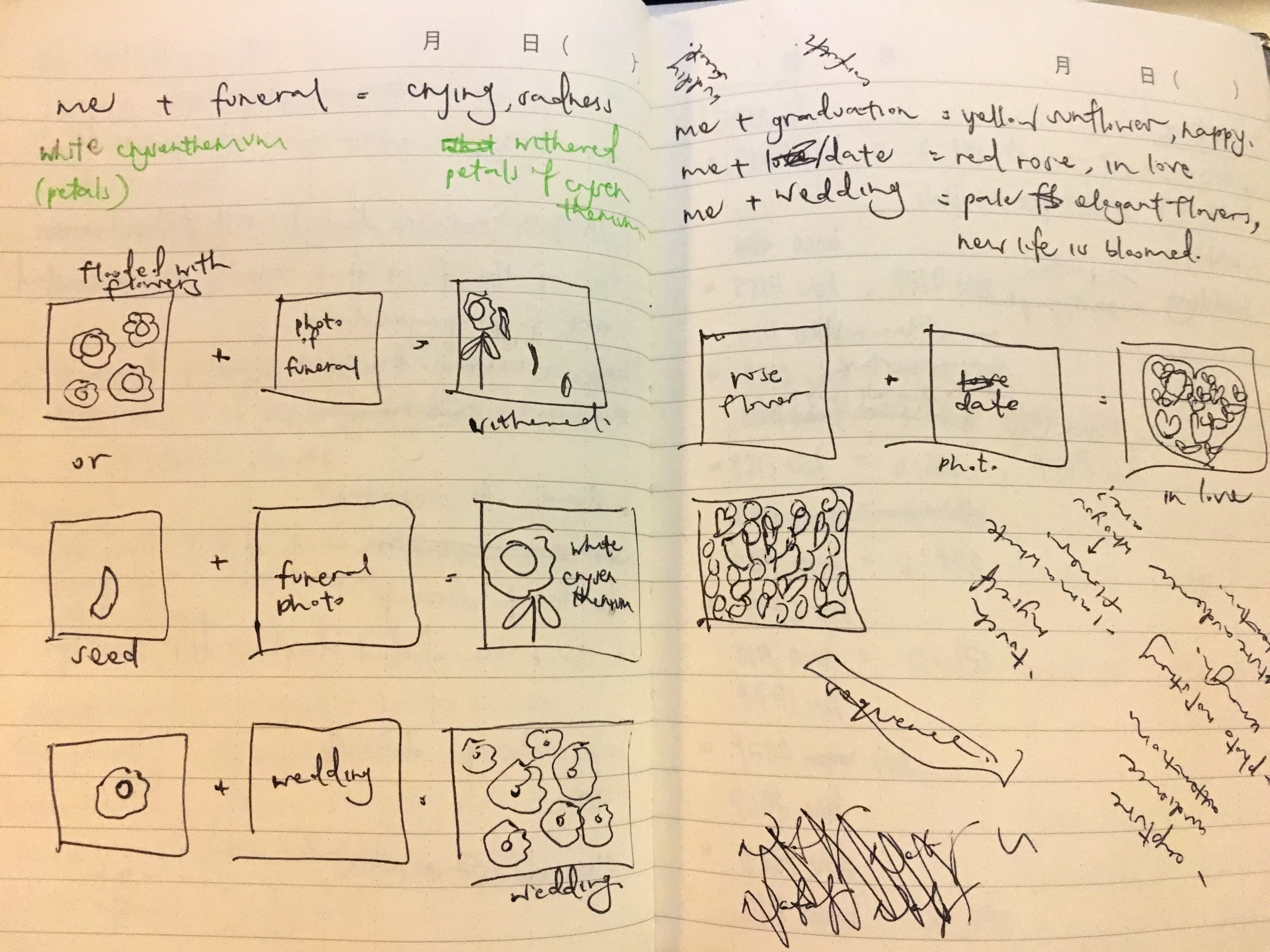
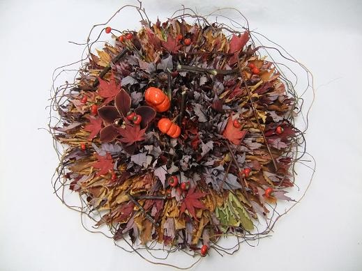
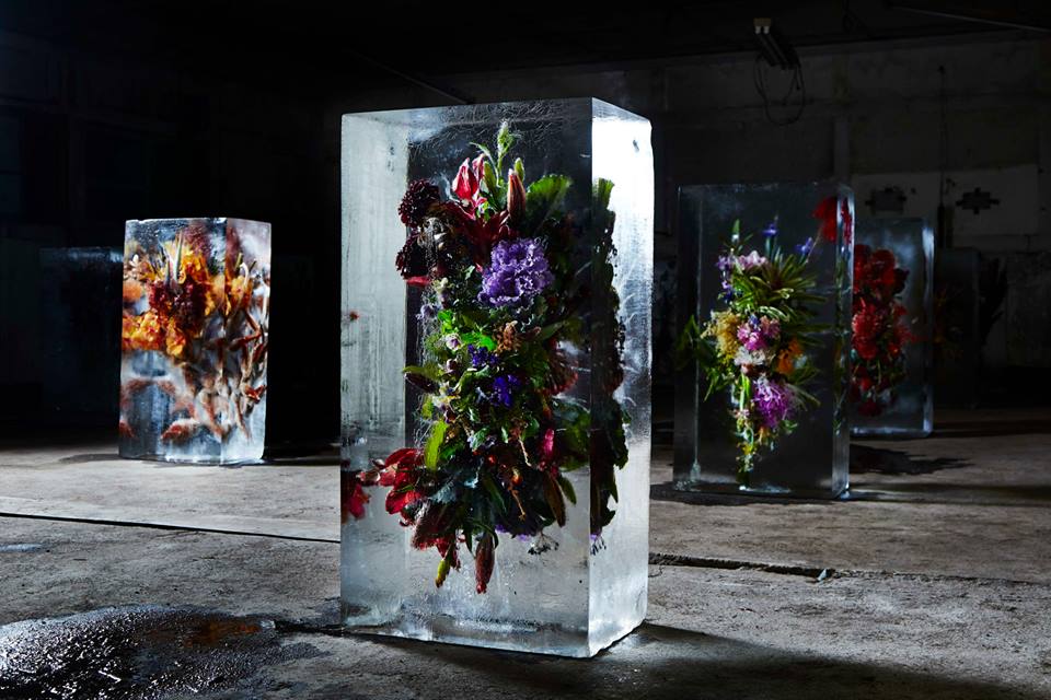
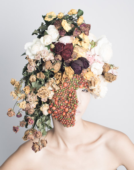
i was inspired by one of my reseached artists, Pam (refer to previous post) on her usage of illustrations + photography for her paintings.
i was also inspired by mostly exhibition works like these
since this project is super open to mediums, i thought of using real flower petals to represent “me” as a flower. i also wanted to use photography in my setting, and a mixed of both for my final outcome.
however, shirley said that it is a bad idea because the flower petals will rot and it won’t be a pleasant sight after 🙁 she also mentioned that taking photos of the settings will be a challenge (eg, funeral), how will i able to capture it in the right manner to suit what i want to communicate. she also told me to think about my concept harder and bring it higher because it currently doesn’t represent me.
ARGH. i wanted to rip my hair apart for the next few days because IT IS SO TOUGH TO CRACK THE BRIEF IN MY OWN SUBJECTED MANNER.
(but never give up)
so, its another round of research and thinking.
i am going to keep my flower concept because it is okay. but how am i going to improve it to keep it relatable to me? okay, i remembered that my original initial equations are good. so i will combine them both together.
the tough thing now is to relate flowers as a symbol and back at me.
there are 4 seasons – spring, summer, autumn and winter. i thought of a really good idea to use this concept of time to represent me as a person whom grows overtime as time passes.
SO. i did a research on what each season symbolizes.
SPRING
The cycle of life is beginning.
Youth & childhood.
New life emerges from plants. Rain nourishes new life.
Buds, flowers, birds, butterflies, sunshine…all good.
Think: A fresh start. A new beginning. Rebirth.
Another transitional season, spring is a time of phenomenal renewal. The earth reawakens from her slumber, and explodes with new life. In our own lives, Spring can be symbolic of starting new projects, sewing new seeds and coming forth with new ideas. This is also a time to contemplate health and physical well-being too. Be refreshed and prepare for your soulful debut!
SUMMER
Life is in full swing.
Young adulthood
Energy & vitality is abundant.
In a word – ‘PARTY!’ And our host is the sun whose presence is fierce and utterly forthright on the scene. Days are longer and the rays of the sun dissolve all shadows in our lives. No hiding, no secrets, no darkness. Summer is a time of light, joviality, expression and wholehearted action. To be sure, this season is symbolic of the vitality inherent within every heart.


AUTUMN
Life is reaped and winding down.
Middle age.
A time to count one’s blessings.
It’s a season of transition, it embodies a culmination – it’s Nature’s ‘last hoorah!’ before retiring into winter’s slumbering mood. This is a hustle-bustle-boogie down month as preparations are made. Autumn is symbolic of the activity inspired by the fire-glo radiance of the changing foliage we see this time of year. This is a time of taking stock of all the bounty and provision we’ve been afforded. A time for itemizing our blessings and recounting our joys.
WINTER
Life is dormant or dead.
Old age & death
It’s a season governed by the recluse, the hermit. Activity gives way to dormancy. Life is still, indwelling and silent. This is a time of introversion, contemplation and going within. Symbolic winter invites us to quiet the mind, still the soul, and crystallize our inner workings. This is a time to ice skate through winter whites as a means of gaining purity and clarification.
research info extracted from
http://lzmarieauthor.com/seasons-in-literature/
http://www.whats-your-sign.com/symbolic-meaning-of-seasons.html
then i realize that my original equations are able to tie to the 4 seasons!
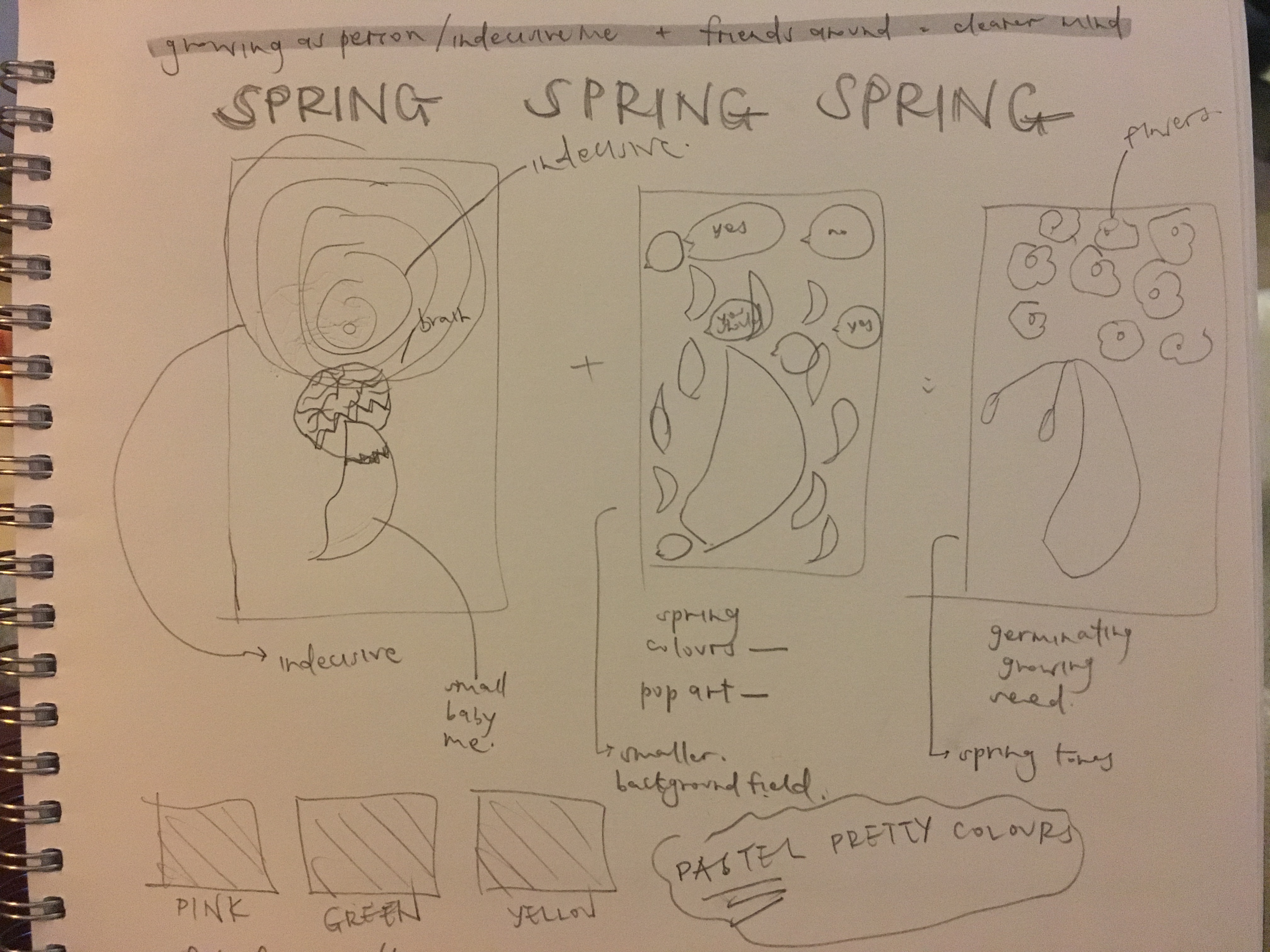
spring = a new life
indecisive me + friends making decisions for me = able to think clearer and breathe
this symbolizes me as a person whom make decisions that enable me to grow as a person.
summer = energy and vitality
me who has the passion for photography + photography-ing = a very energetic and happy me.
i get super energized when i take photos because it develops my skills and passions and i enjoy what im doing. also i get new photos for my portfolio!
autumn = middle age, which can represent knowledge, wisdom.
me who loves to travel + traveling = knowledgable, eye-opened me
i definitely learn heaps while traveling. the people, culture, the city. it definitely makes me grow as a peson and widens my horizon of knowledge.
winter = death
emotional me + alone time = depressed me
i realized that i need people when im having one of those days. however if im left alone when im feeling super emotional, i’ll feel really crappy.
AND MY CONCEPT WAS APPROVED.
so i emailed shirley with some quick initial sketches and these were her comments.
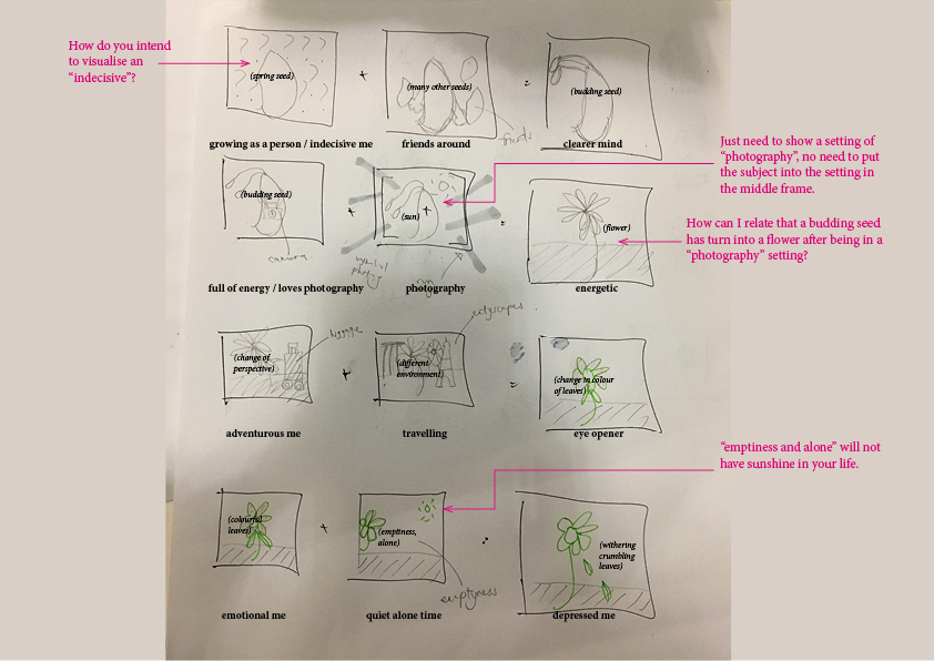
i took some time after to work on them.
here are some of my final sketches.
also i took some time to work on the colour palette.
i researched on the colour palette for the different seasons as well.

okay that’s it for my research phase!
the next post will be on my execution process.
ego – artists research
here are some works by various artists that inspired me throughout this project —
Illustrators
Jeremy Booth
i especially like his illustrations and his use of triadic colours to create depths and shadows in his work.
Davide Bonazzi
the style of illustration is similar to Jeremy. this is something that i hope to explore in this project. also his use of just the 3 primary colours – red, blue and yellow, in different shades is so simple yet i must say complex during his creative process. to create something minimal yet complex is really tough.
(also this series of his Day Trippers is sooooo cute!)
Tom Haugomat
i stumbled this series of illustrated posters while scrolling through Behance.
i absolutely love it. there’s definitely an interest in me on flat design. but what i adore most from these is that the use of colours to create depth and the 3D-ness in them. especially using darker tones to cast shadows in the design.
Mixed Media
Robert Mars
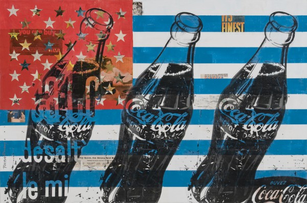
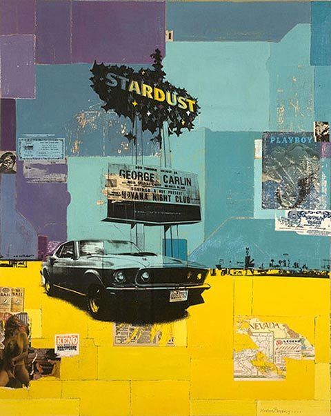
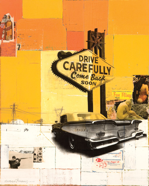
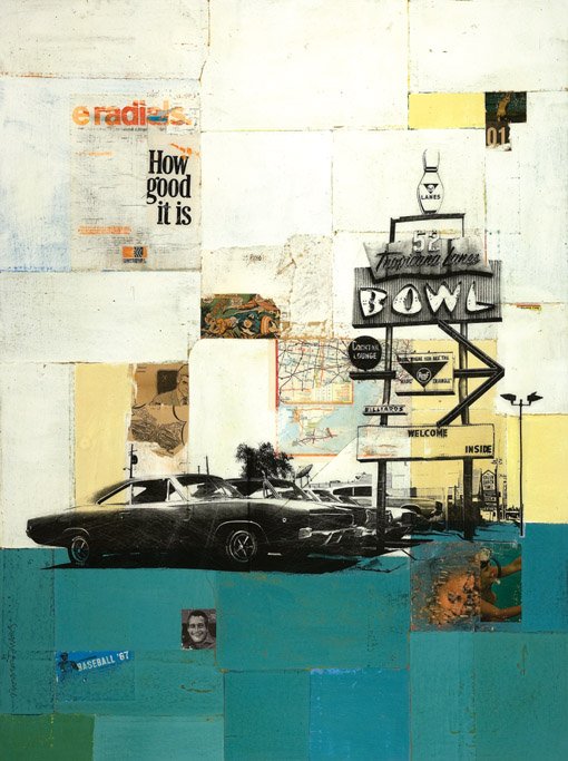
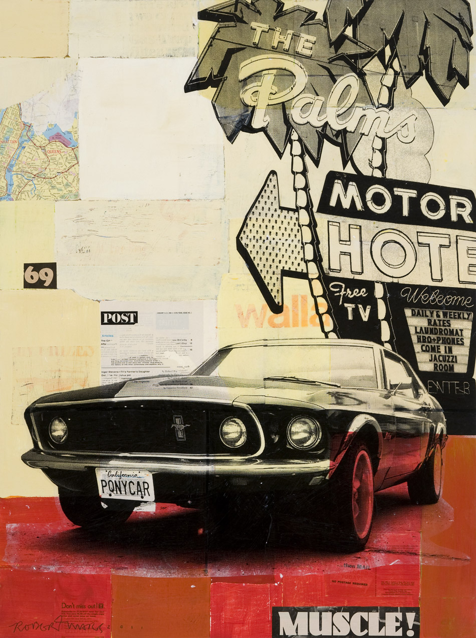
his use of triadic colours to create pop art, which he is known for. and really interesting way of using mixed media.
Pam Lostracco
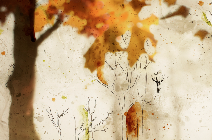
this artist used photography and illustrations on his painting. i was super intrigued when i stumbled upon this. i think its a really clever subtle and delicate way of creating art from photography.
Artists
Marcel Dazama and Raymond Pettibon
Edward Hopper
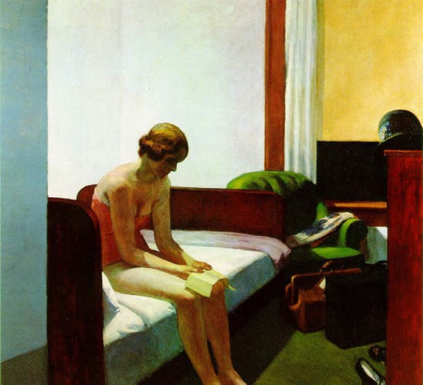

classic, and always a favourite.
Photographers
Francois Beaurain
definitely seeing them being feasible in a flat design illustration.
Samuel Burgess-Johnson
loving the use of split complementary to create visual contrasts in colour.
Other inspirations –
colour theory
Interaction of Colour/Josef Albers: App Trailer
“Colour is the first step in making great art.”
FINALLY. We get to touch on colours for this project. I love colours and I cant agree more with the quote above (im not saying that we can’t make great art in b&w too).
Beautiful beautiful colours. In this project, we are asked to study and use the different colour harmonies in our design.
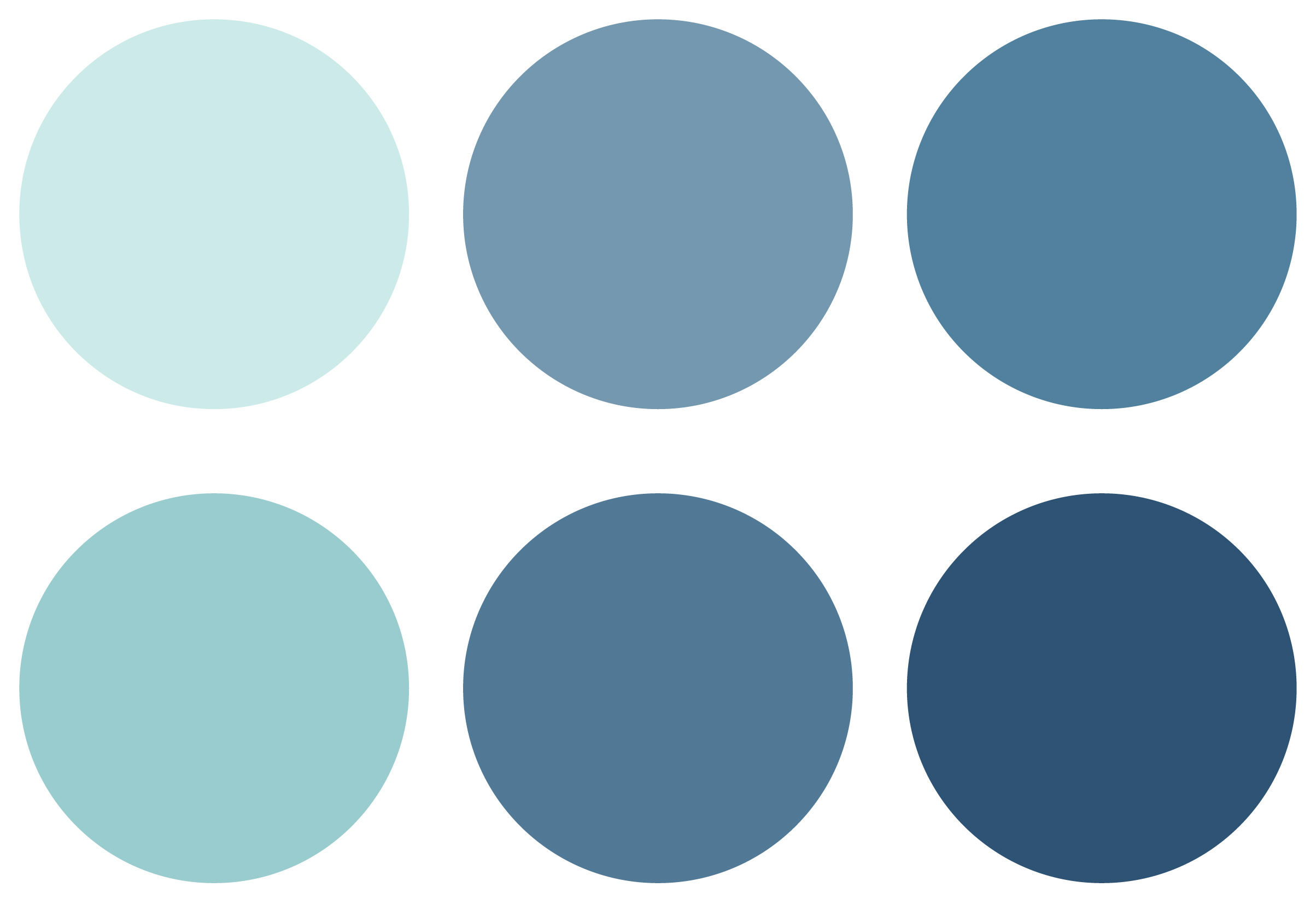
Monochromes Harmony
Analogous Harmony
Analogous Harmony Warm and Cool
Complementary Hues
Split Complementary


these are some examples from Josef Albers Interaction of Colours book. SO BEAUTIFUL.
Monochromes Harmony
Colours in a monochromes harmony palette basically means colours that share a single hue, but vary in brightness and saturation.
For example –

This is a palette of a monochromatic palette of the colour red. “Same same but different”.
Analogous Harmony
Analogous colour schemes are colours that are next to each other on the color wheel.
For example in this colour wheel –

these are some examples of analogous colours.
colours that are next each other on the colour wheel.

They usually match well and create serene and comfortable designs.
Analogous color schemes are often found in nature (eg, autumn) and are harmonious and pleasing to the eye.
It is best if there is enough contrast when choosing an analogous color scheme.
Choose one color to dominate, a second to support. The third color is used (along with black, white or gray) as an accent.
Analogous Harmony Warm and Cool

Analogous Harmony Warm is generally colours that are next to each other but of a warm colour scheme (orange, yellow, red, light green).

Analogous Harmony Cool is the same but of a cool colour scheme (dark green, blue, purple).

Complementary Hues
Colors that are opposite each other on the color wheel.
The high contrast of complementary colors creates a vibrant look especially when used at full saturation. This color scheme must be managed well so it is not jarring.
Complementary color schemes are tricky to use in large doses, but work well when you want something to stand out.
Complementary colors are really bad for text.
Some examples of complementary hues –

Split Complementary
The split-complementary color scheme is a variation of the complementary color scheme. In addition to the base color, it uses the two colors adjacent to its complement.
This color scheme has the same strong visual contrast as the complementary color scheme, but has less tension.
Some examples of split complementary colours –

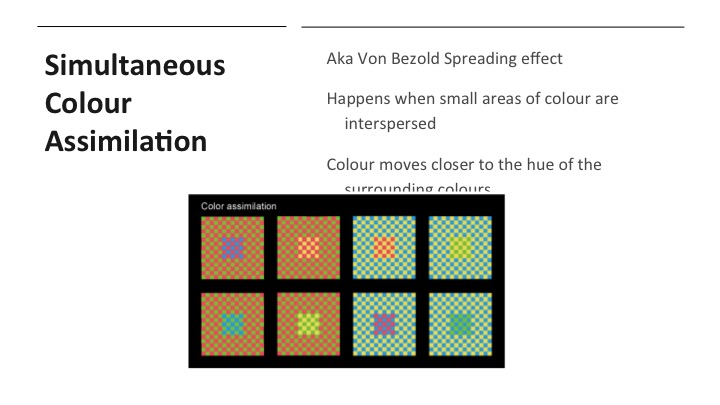
This colour study has been a PURPLE-SEFUL (geddit geddit?) one.
Looking forward to applying them to my future designs!
G8 Presentation


movie quotes pt. 2
my 2nd quote –
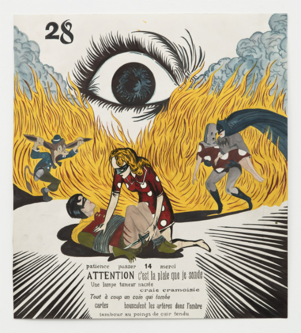
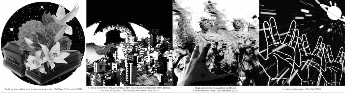
“If I like a moment, for me, personally, I don’t like to have the distraction of the camera. I just want to stay in it.” from the movie The Secret Life of Walter Mitty. from this, i created this visual:
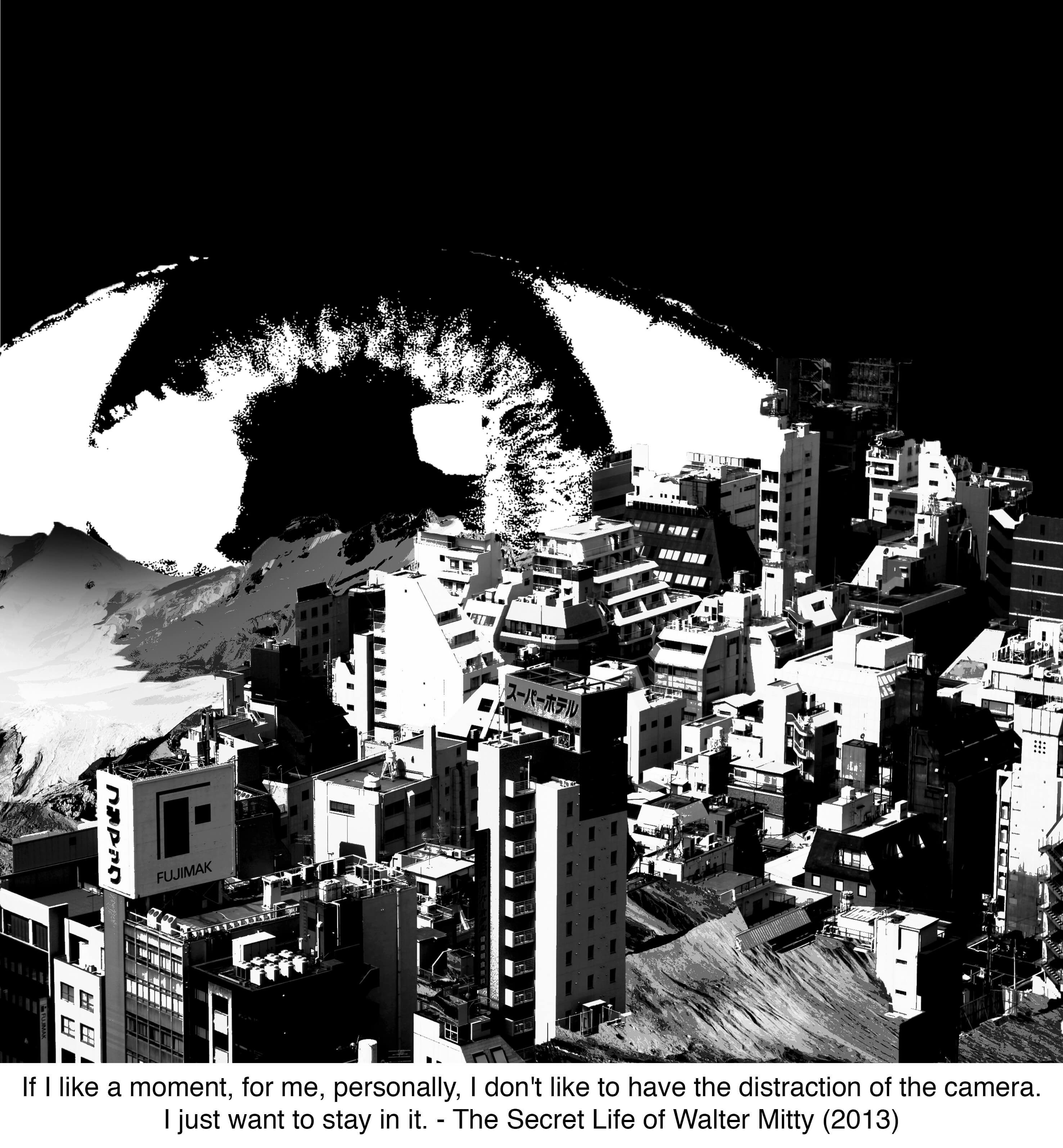
my original idea was use the viewfinder of a camera as the foreground and the buildings and mountains as the opposite but i realized it was contradicting my quote. so i thought, how would someone “be in the moment”? i didnt want to make it as literal by including a person in my visual hence i thought of the idea of an eye where its the basic form of “looking at something”.
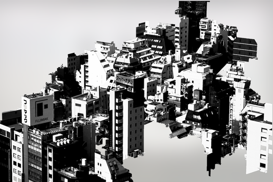
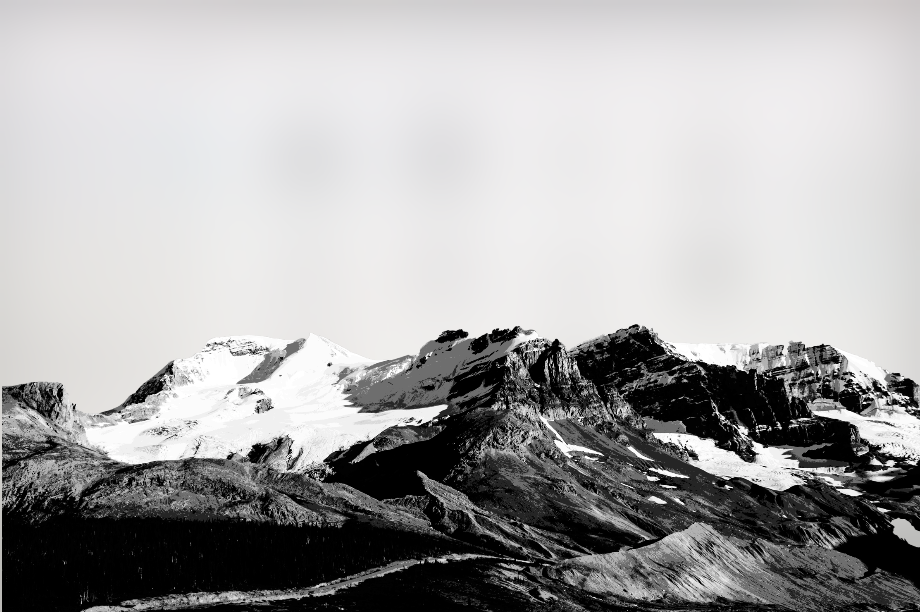
i enjoy scenic views hence i used images of scenes like buildings and mountains to represent “the moment”. since the movie is filled with beautiful scenic moments too, i believe its a good representation of that.
the buildings arent fully masked so add an layer of depth and dimension to the visual, and not fully cover the mountain background as well.
quote #3-
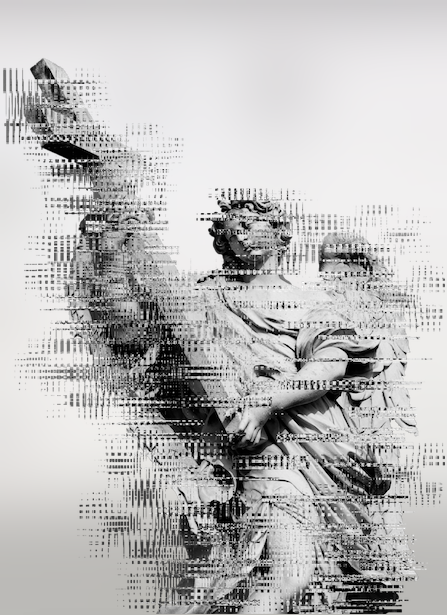
“I had a dream my life would be so different from this hell im living” – Les Misérables
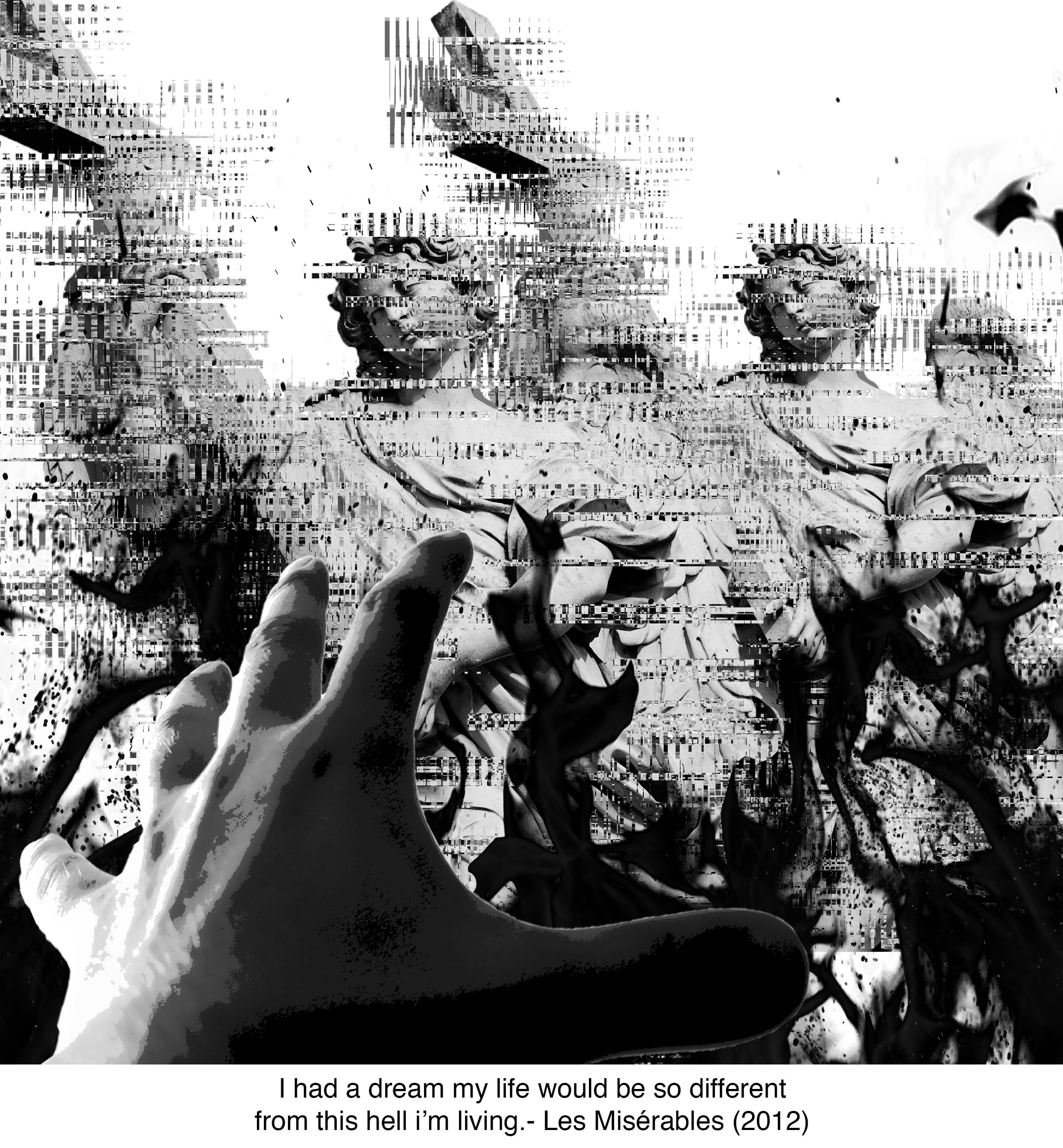
the hand represents her reaching out for the heaven that she dreamed of, but they are crumbling infront of her eyes. “heaven” is represented with the roman angels holding a cross, but in order to fit the narrative of bring destroyed by the flame, i thought of the idea of glitch! i experimented with the glitch technique on photoshop where i selected multiples of rectangles and played around with the ‘distort’ and ‘wave’ functions. the glitch better suits the moment of something being “destroyed”.
the glitch function was really fun to play with, and im glad i managed to learn new techniques from this assignment.
previously i did some brain storming on ideas on how i could represent hell.
- explosions, smoke
- fire
- blood

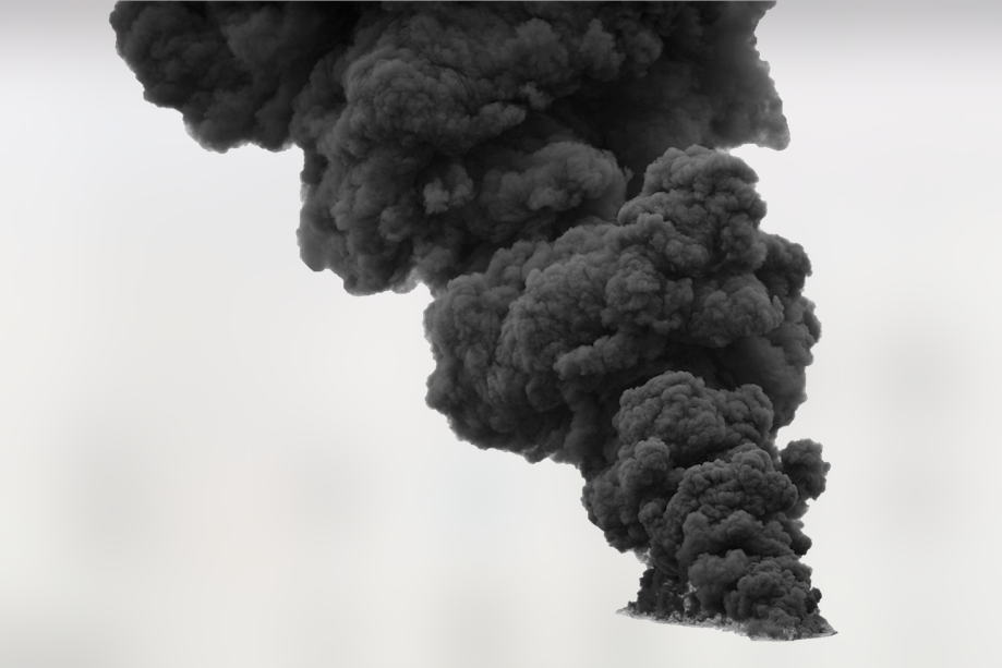
these were some smoke elements that thought i could include in my designs.
i decided to combine the elements to see how they would turn out.
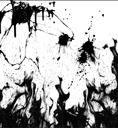
i liked how they looked so i thought it could be an texture background!
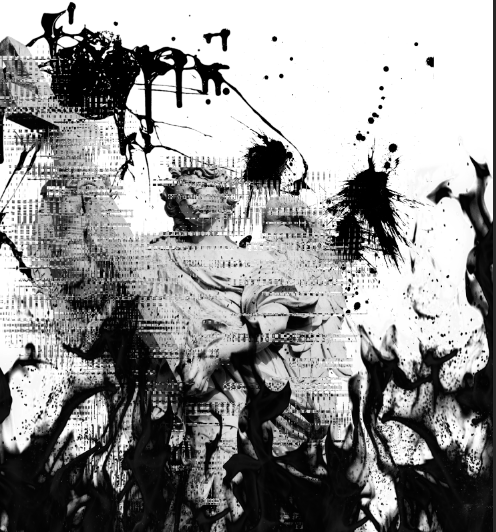
however it got a little too visually overwhelming when i add the roman angels to the composition that it takes away the focus of them.
in the end i decided to settle on something less painful to look at to the eye and went ahead with my final one. although there isnt any much texture to the background, i feel that its much pleasant to look at because the background doesnt take away much attention away from the main focus of the hand.
quote #3 –
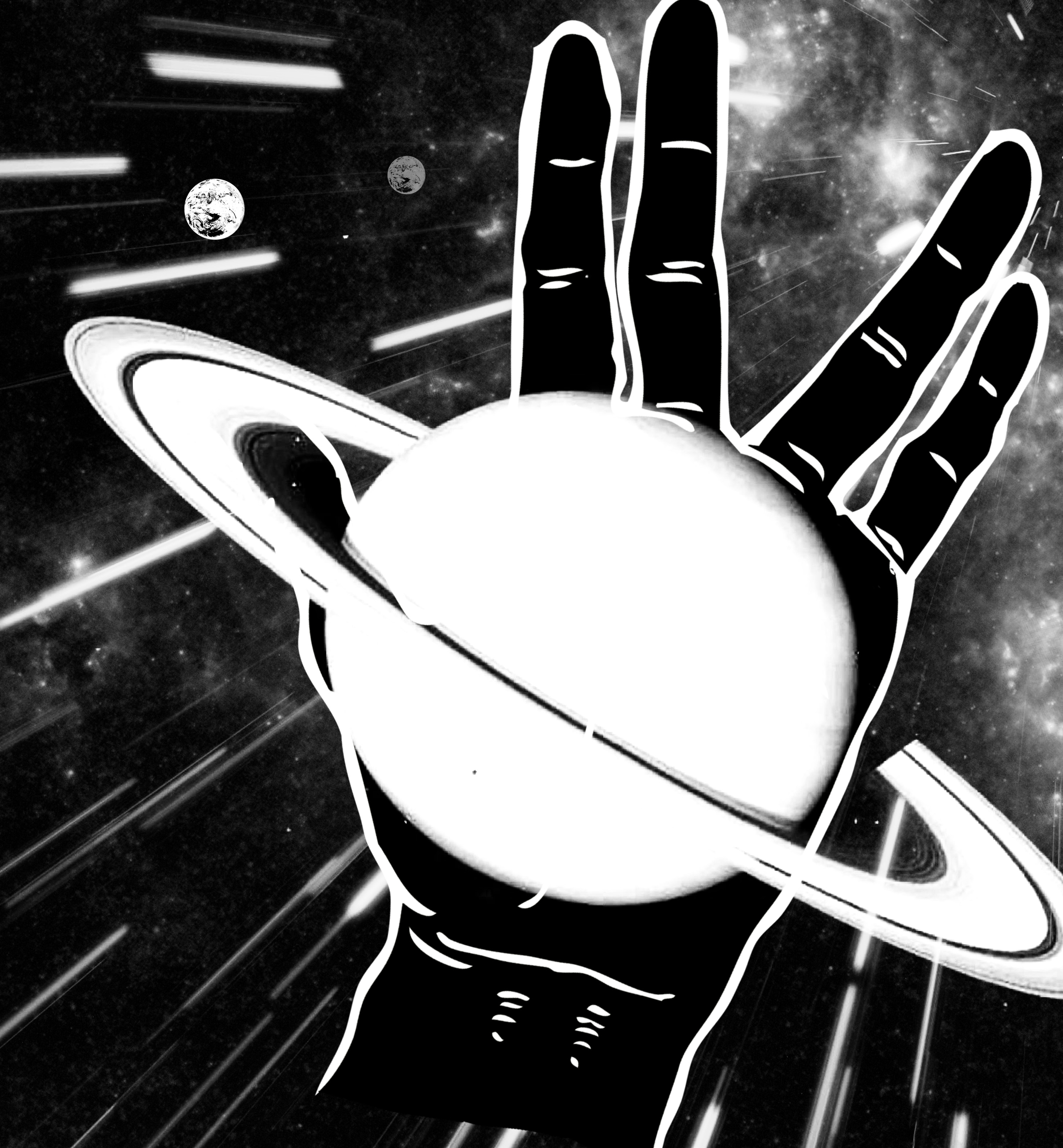
“live long and prosper” – star trek
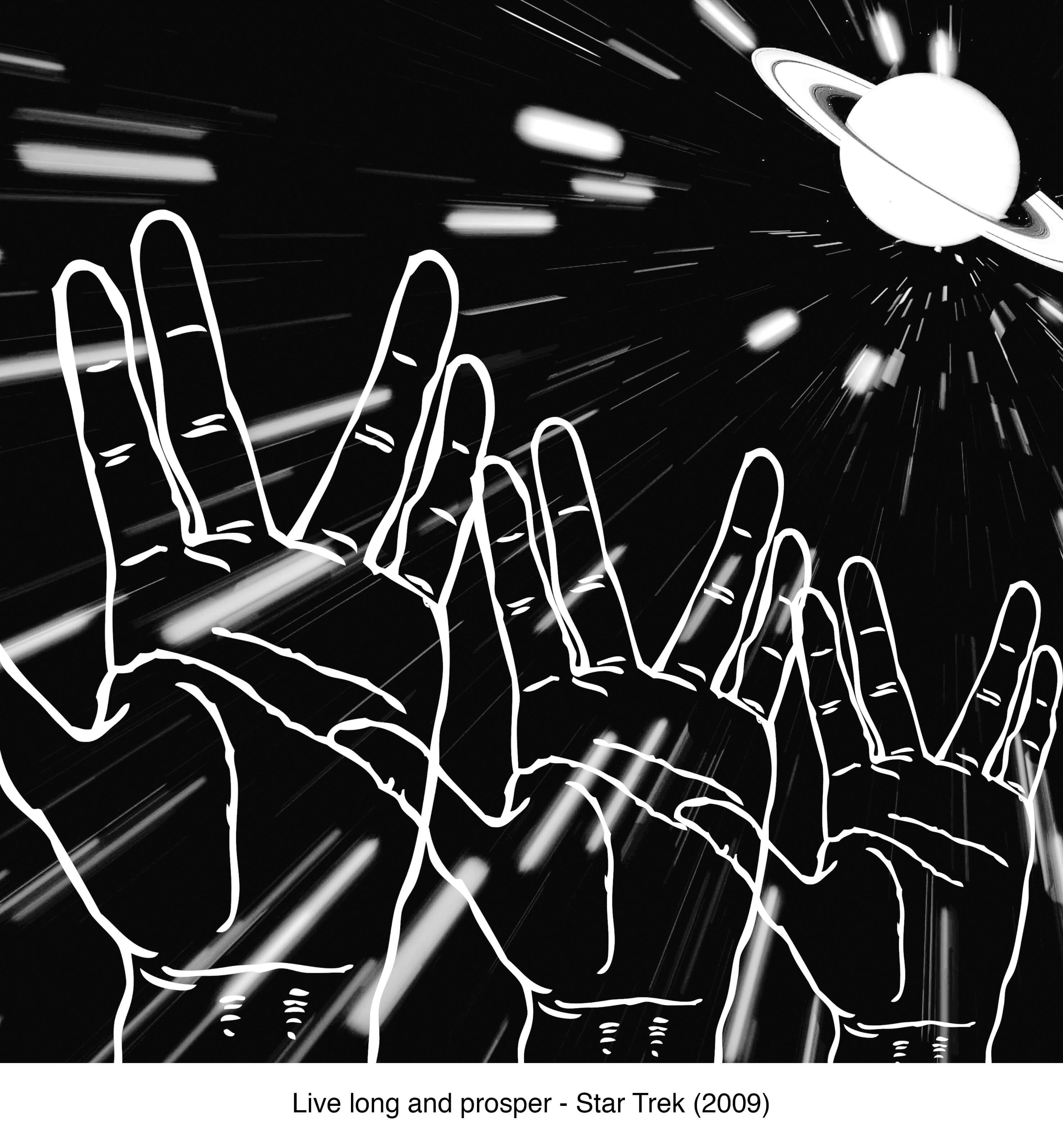
most of us definitely have heard of this quote. in fact there already is a visual to represent it and that is the hand gesture. this quote was the most challenging one because there werent much imagery to represent the quote apart from the hand gesture. so, with just the hand, the challenge was how i should make the visual creative and relative to star trek.
this was one idea that i tried to work with – not showing the hand too literally. the idea behind the planet on the palm of the hand was to represent the moment and life they have in space (star trek). but i dropped this image because there isn’t any focus and everything was just too over the place for me. hence i decided to go with the previous compositions.
this was another composition which i did which i had difficulties in deciding which looks visually better.
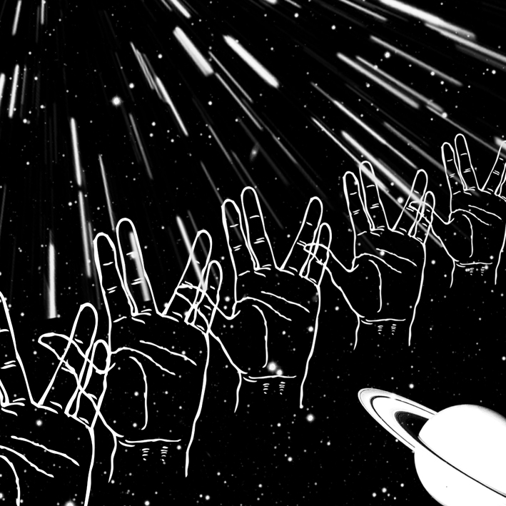
shirley said that this wasnt as interesting because there isnt a distinct focus. hence i went ahead with the other.
in my selected final one, i decided to use the texture of stars in movement for my background. this is mostly seen when they go in warp speed. the planet is placed in a one-third position because its one of the better places that is comfortable to look at. also, instead of just one hand, i added 3 of the hands so to make the composition more interesting and engaging.
this project has been quite a fun one! i really enjoyed it because not only do you get to experiment with different effects on photoshop, but it also trains your eye in looking at visuals, and how different compositions can be created interestingly. i see the importance of compositional studies because it trains your eye in differentiating the hierarchy between different elements. it also allows you to go wild with ideas, but at the same time settle down with something relevant to the main meaning. this is extremely useful for future projects i.e graphic visuals (branding, poster, campaign) for clients. we can be as creative as we want but have to settle down on what is on topic.
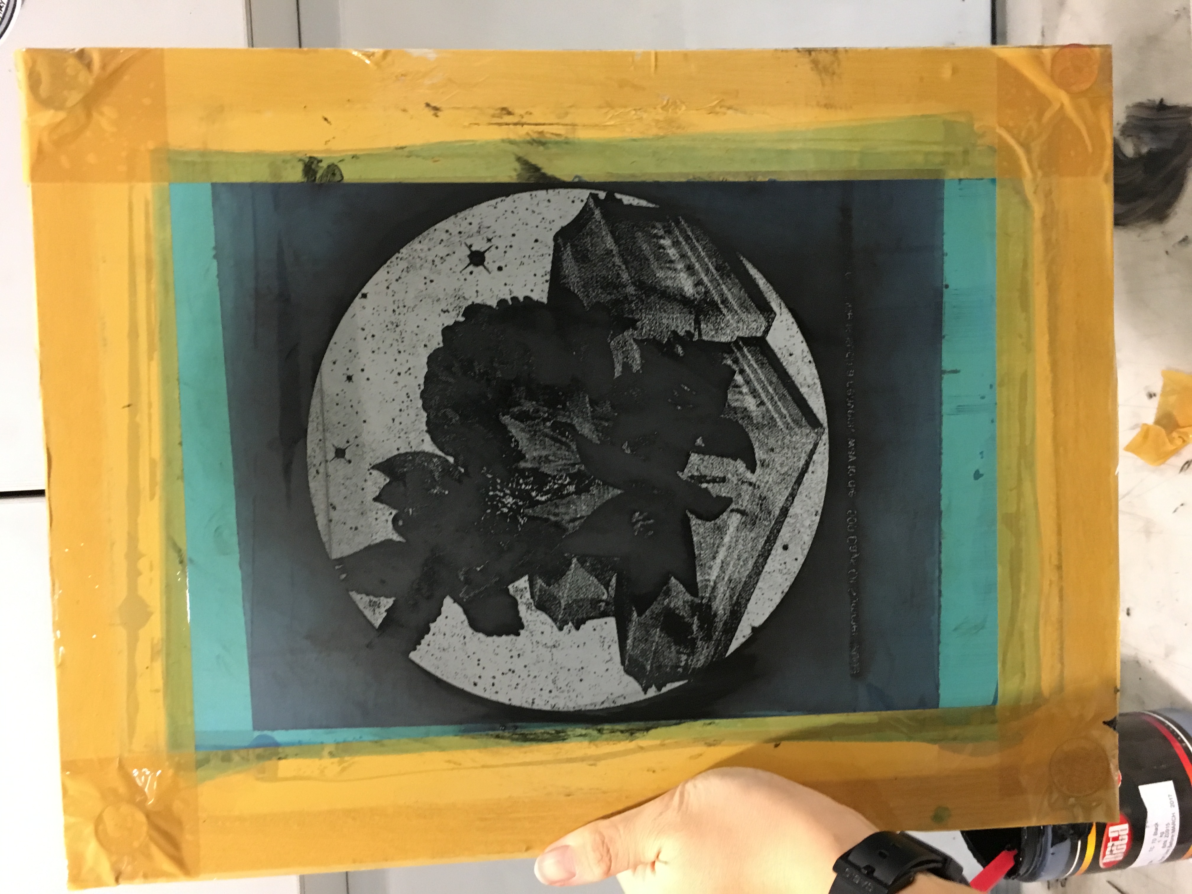
forrest gump – the real deal: silkscreen
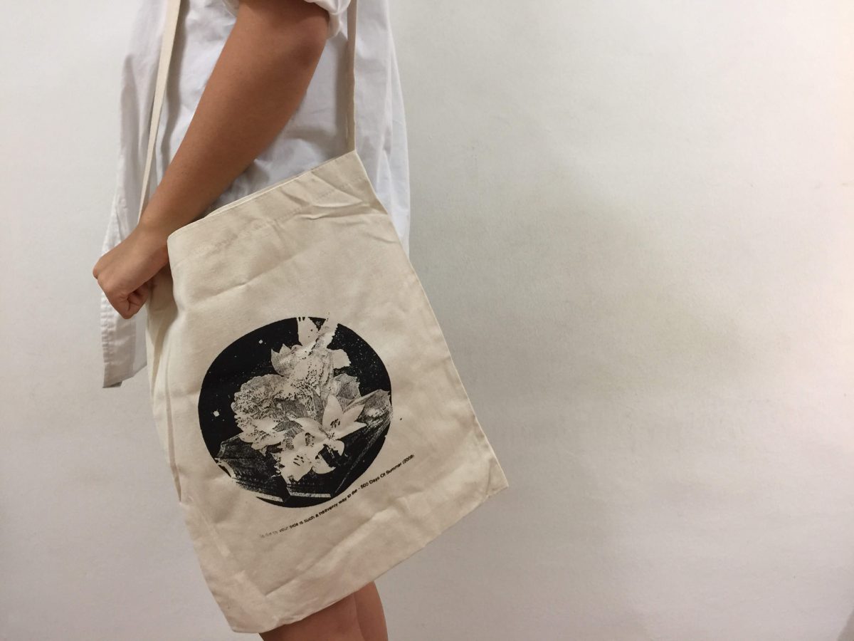
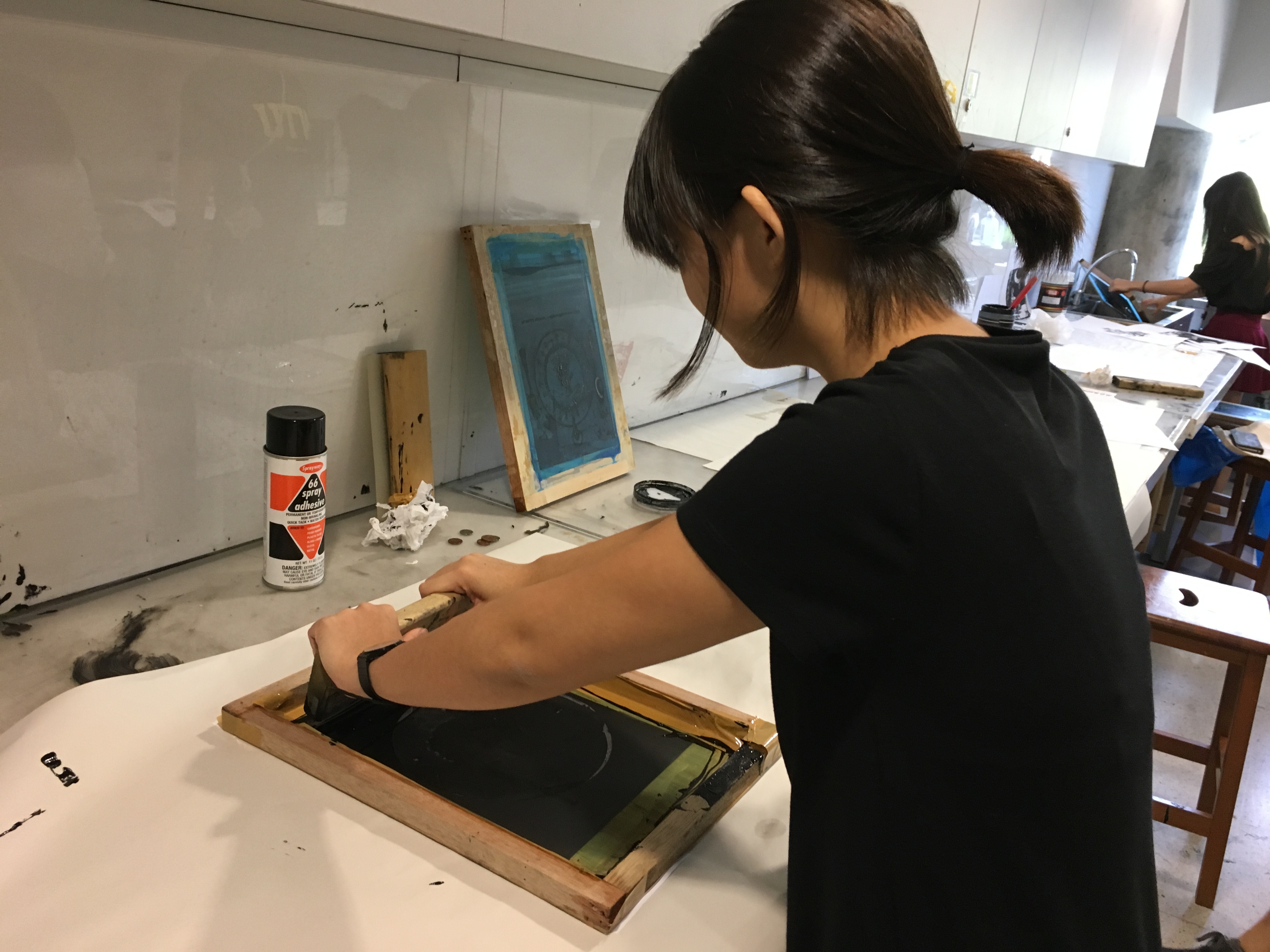
today was quite an exciting yet nerve wrecking day for us. exciting because we finally had a chance at silkscreen, nerve wrecking because we only have one totebag so we cant mess it up.
being the kiasu me, i took about 20+ tries silkscreening my print on paper before doing it on the real deal- THE totebag.
it was quite a stressful process for me because the results were literally based on your luck. my print has lots of fine details, so screening it with lots of ink will ruin the outcome and details. and when i tried with with lesser ink, some part will not be screened and thats another fail.
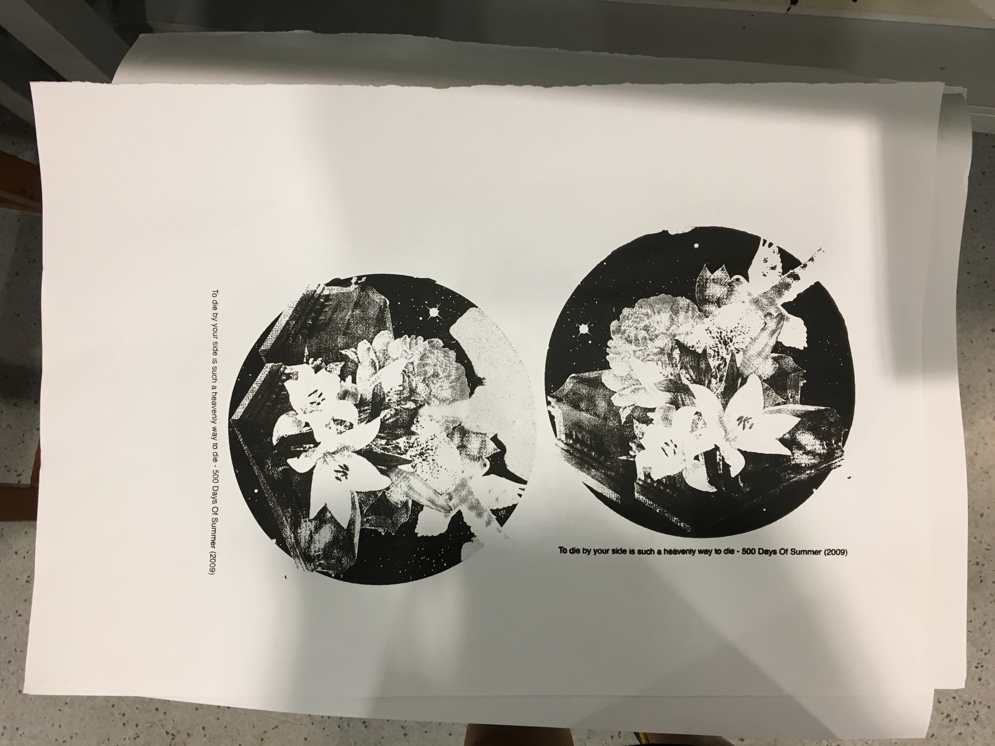
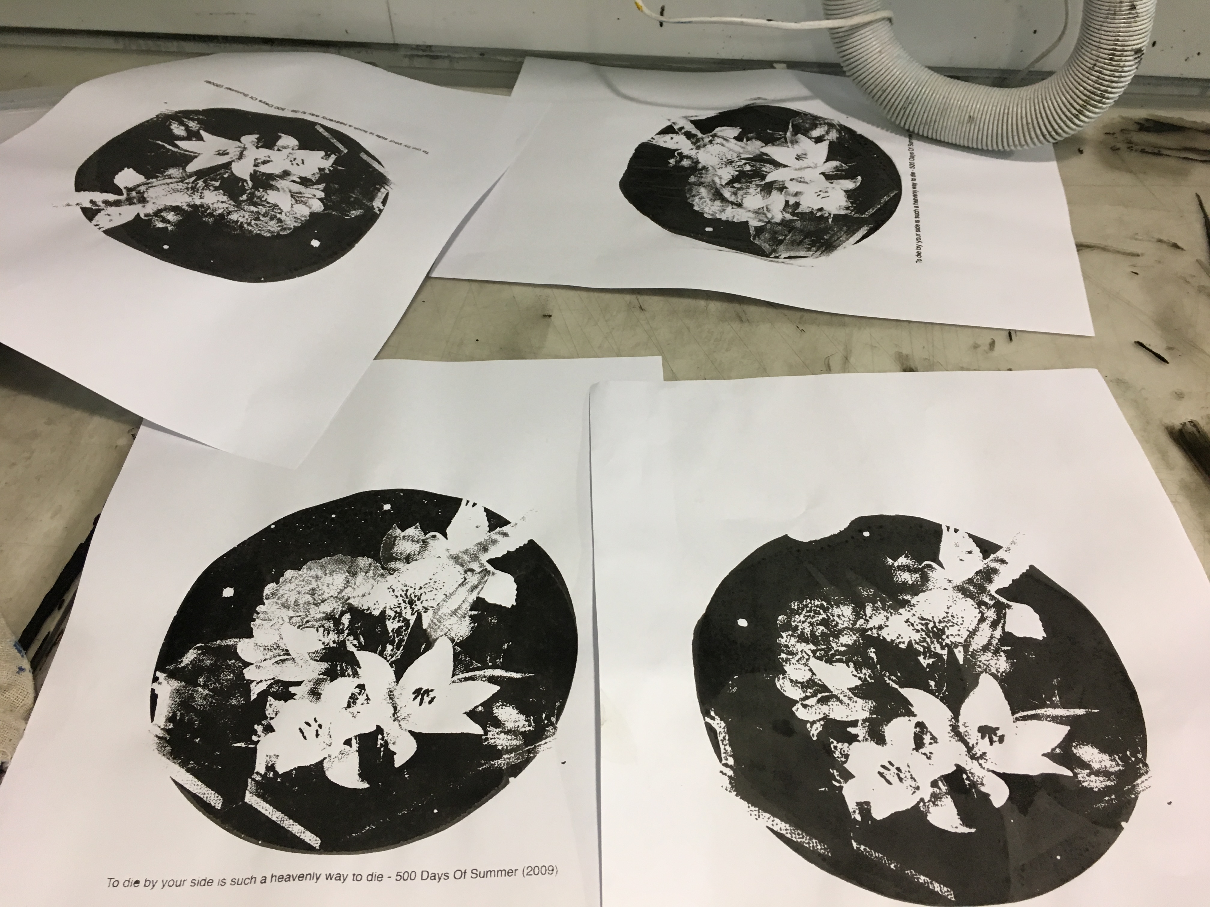
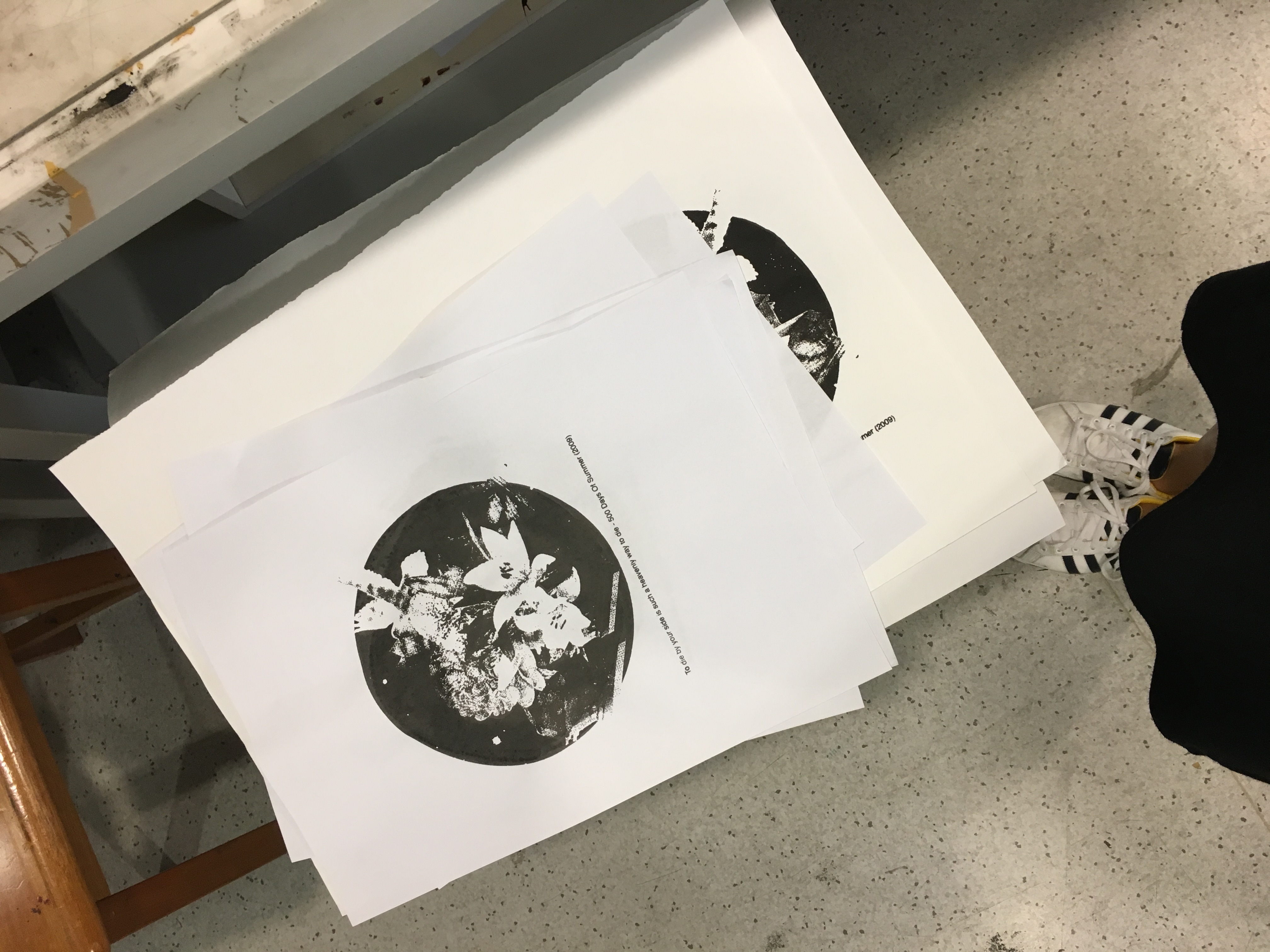
the kiasu me with 20+ pieces of prints.
throughout the whole process i was really afraid the details wont show because they are really fine, but to my surprise, it turned out really well on fabric! i conclude that you need more ink when printing on fabric because of its material.
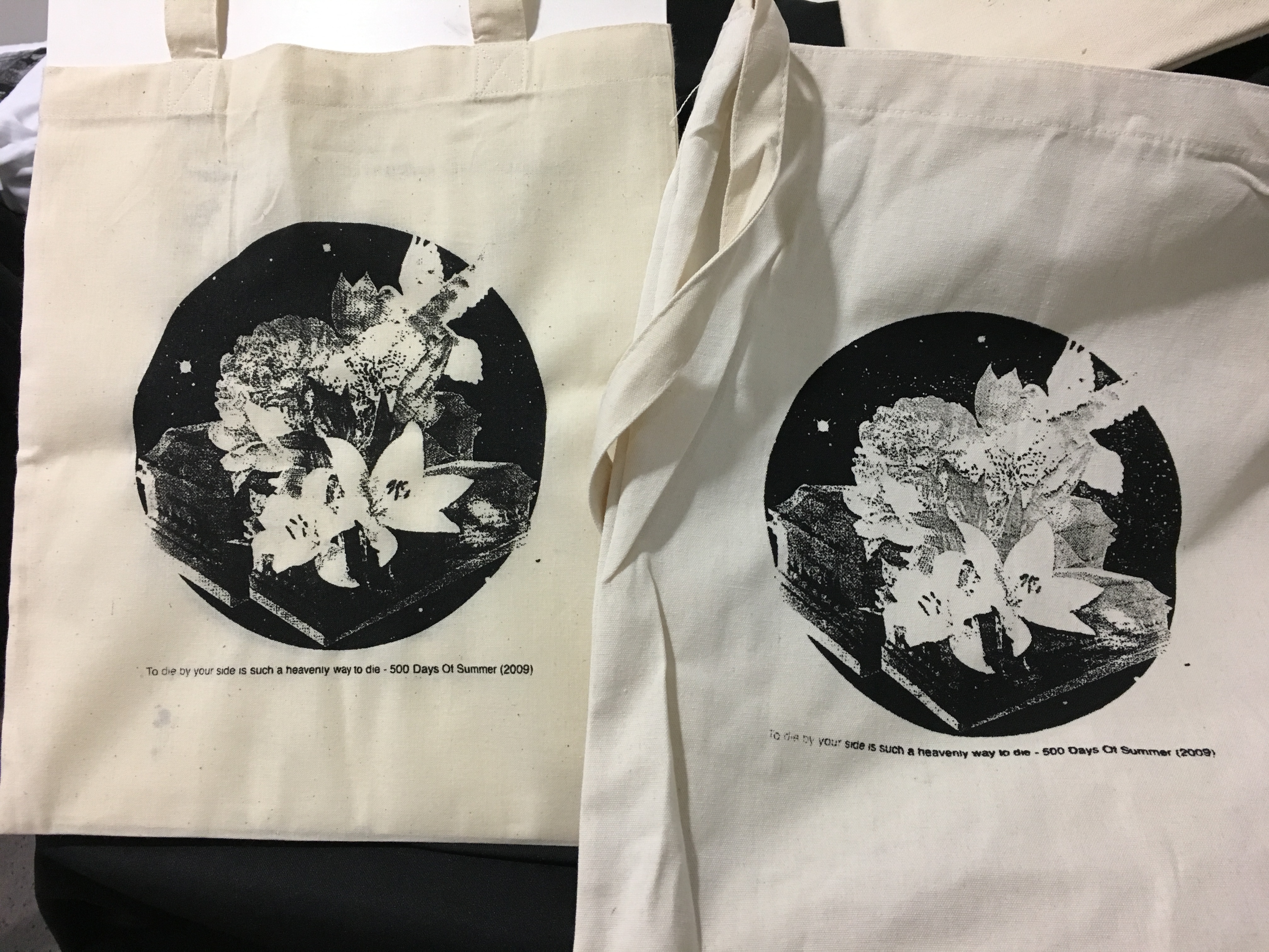
yay! glad they turned out well and the process went smoothly. so happy to see clear details!