


Category: Foundation 2D 2 – G8
2DII – Zine Process + Final
i had a few inspirations in mind for my zine. i wanted to design my zine learning towards the experimental side, rather than a straight forward photo + interview one.
here are a few inspirations i had in mind –


taking these inspirations into consideration, i came up a few layouts variations –

i consulted mimi and she told me to try out with the real content out because i didnt have anything out yet so it was hard to comment on.
and so i came up with my first layout mock up –
however, mimi wasnt a fan of my layout because she mentioned that my images weren’t deserving the little attention as how they should be as they were well taken. she also didnt like the unnecessary geometric patterns and elements that i was adding into my zine as they have no purpose.
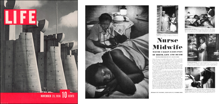
mimi gave me a few helpful and insightful tips that i should work on. she told me to focus on the people, and my zine should be one that people would want to keep looking at the images. my zine should be humanistic, and story orientated. she told me to look at magazines such as TIME.
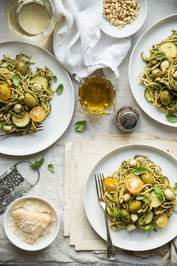
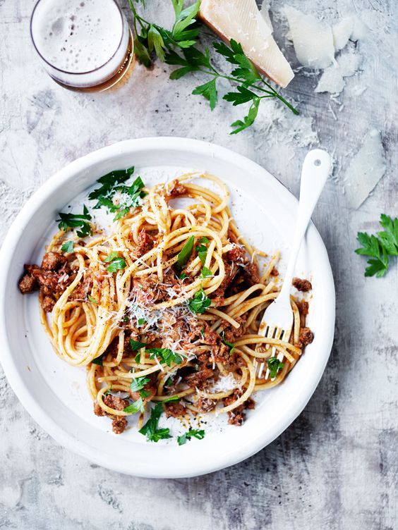
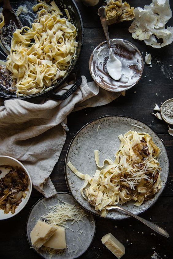
i researched on those magazines and here are some insightful


i understood what she was referring to and i realized i was lacking in some portraiture, so i went back to beauty world for another time to take their portraits.
unfortunately Lilian from Sew Easi wasnt comfortable to have her picture taken, so i could only use the previous photo i had of her back to substitute as her portraiture 🙁
getting a layout was actually quite difficult mainly because of the lack of pages!! as i had 3 craftsmen to showcase, it meant that i only have 1 spread for 1 craftsman. the tough part was squeezing the images into one spread, and have a write up with it too. i had struggles on the arrangement because i didnt want to make my zine as just a photo journal, but more of it being content related.
i wanted to have a full page of their portraiture, however that leaves me just 1 page of images + text. that. was. a. challenge.
i didnt know where to place my write up because there was just too much going on one one page. i wanted to experiment with the overlaying of write up on my images to make it look “experimental”, but that’s not a way to do graphic design because aesthetics shouldn’t be the main reason to design. design must make sense, then comes aesthetics.
after much painful processes of rearranging in the middle of nights, i finally settled on a layout –
however there are some elements that i felt should be worked on –
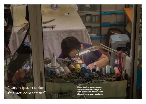
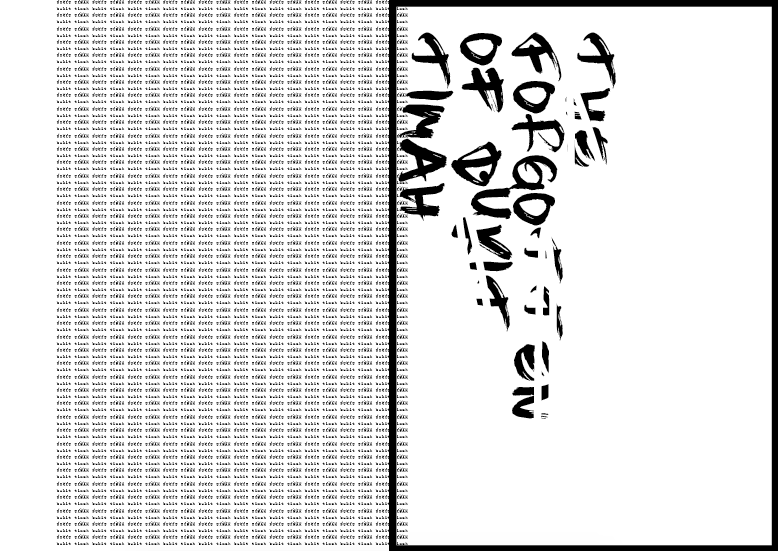
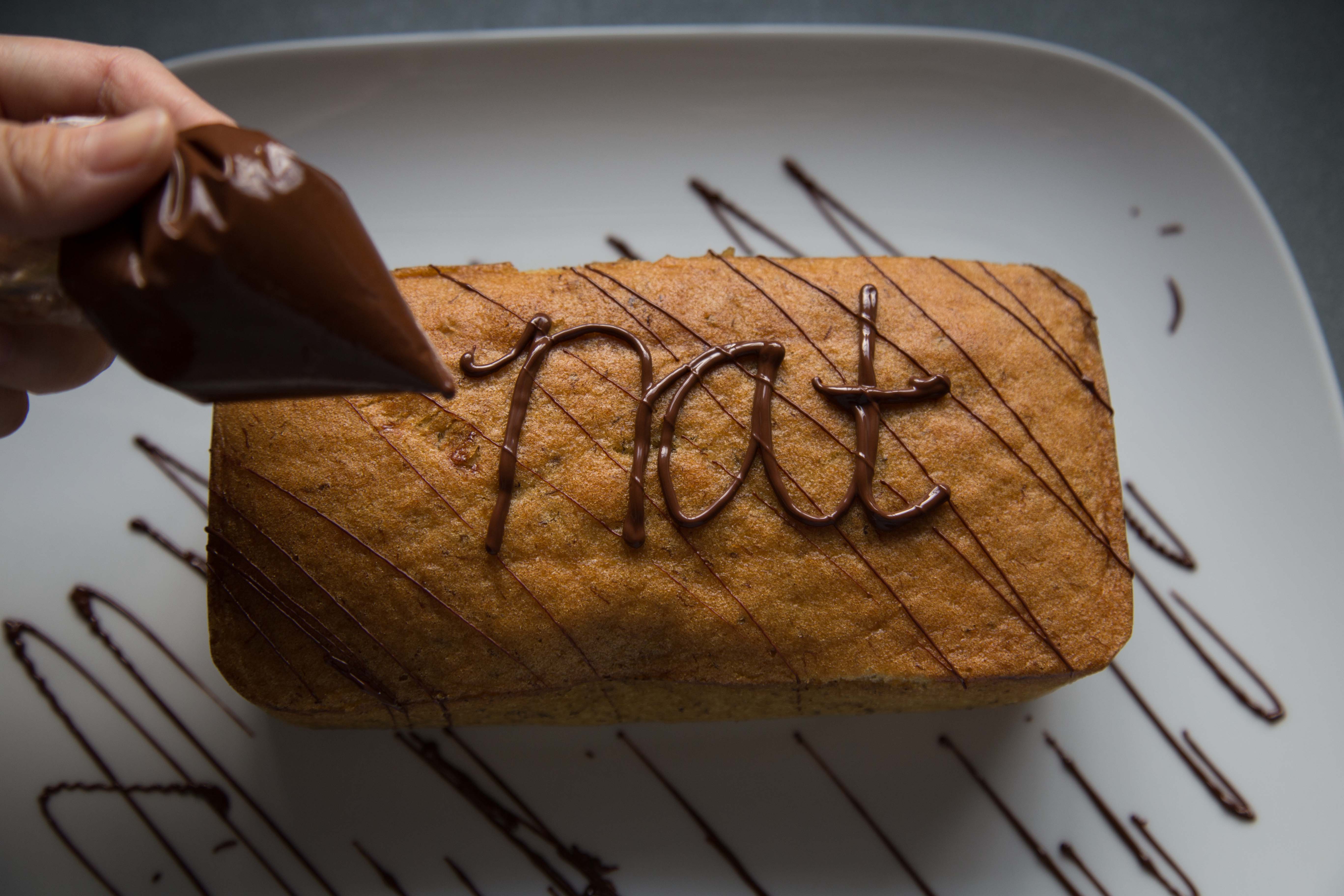
- the placement of the quote on the first page. it was hard to read because of the colour of the text and background, and the arrangement of it was wrong. it didnt make sense. my eye doesnt lead me to the quote.
- the title of the place. “lucky star hair dressing saloon” was at the wrong place because it makes people have the impression that the write up starts from the right column, but it is not.
i tweaked them again and here is my final layout! –
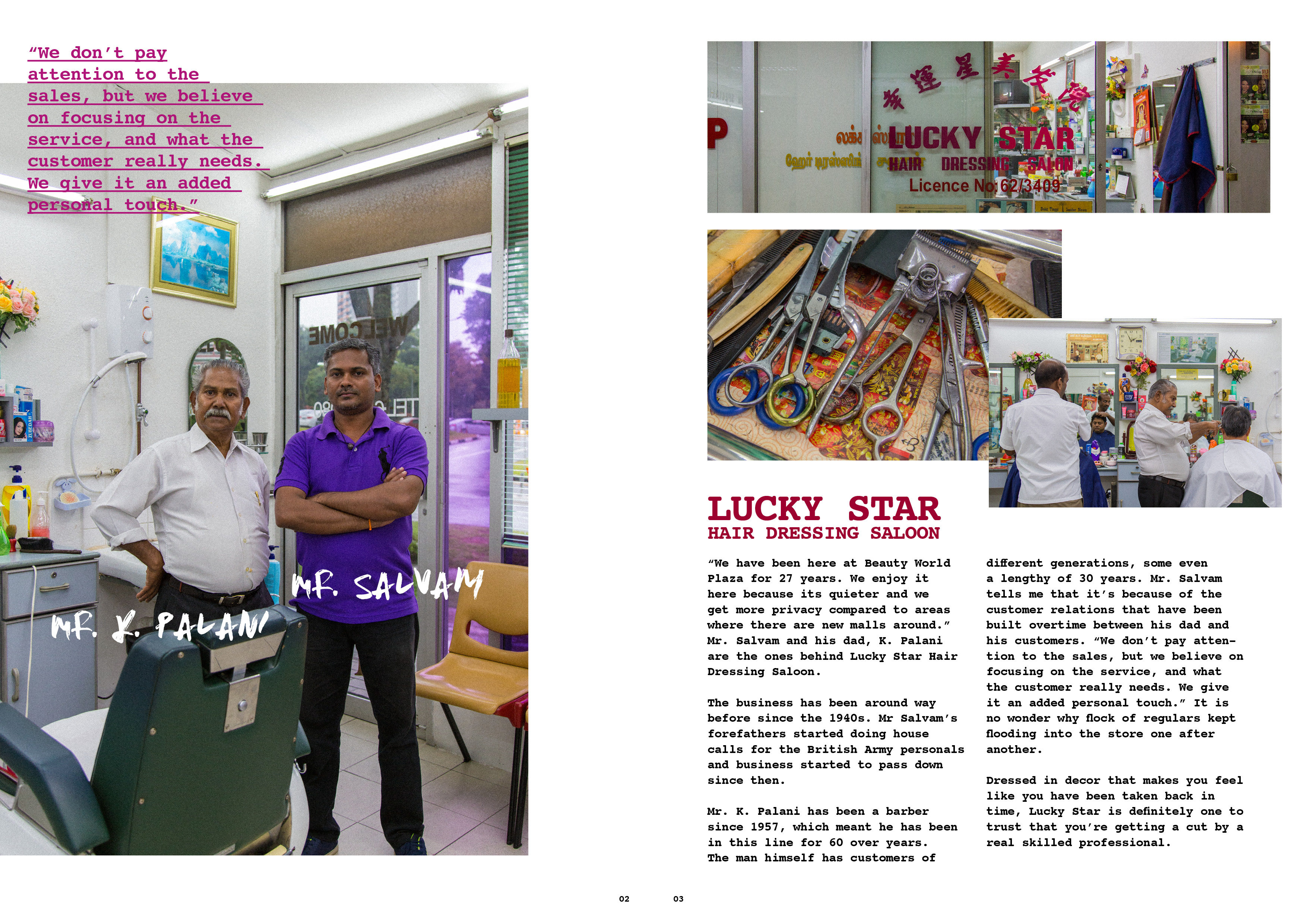

i preferred the way it looks now because the images dont look too stagnant and systematic. they are overlaid and i feel that way they look more organic, but also pleasant to the eyes.
aaaand thats a wrap for 2D! i really had fun the projects for this semester because they were more visual communication related. i really enjoyed the process of doing site research because it opened my eyes and created a whole new perspective of bukit timah as a whole. i am also thankful that because of this project, i managed to find out about these artisans, and their stories be it their life, their business, or their philosophy on things in general. i am also glad i had the opportunity to land myself photography project as well because it has always been my passion to document and photograph artisans and their craft.
designing publications has been my favourite because i find the excitement in the challenge on how placements of elements could affect the readability and the feeling. this project has definitely provided me the experience and trained me well.
and im really glad that mimi brings her professional industry background into class, as telling us how the graphic / advertising industry works in class. i believe that is important and essential for us, especially for budding designers.
thank you mimi for your guidance for this sem! i have definitely learned quite a bit!
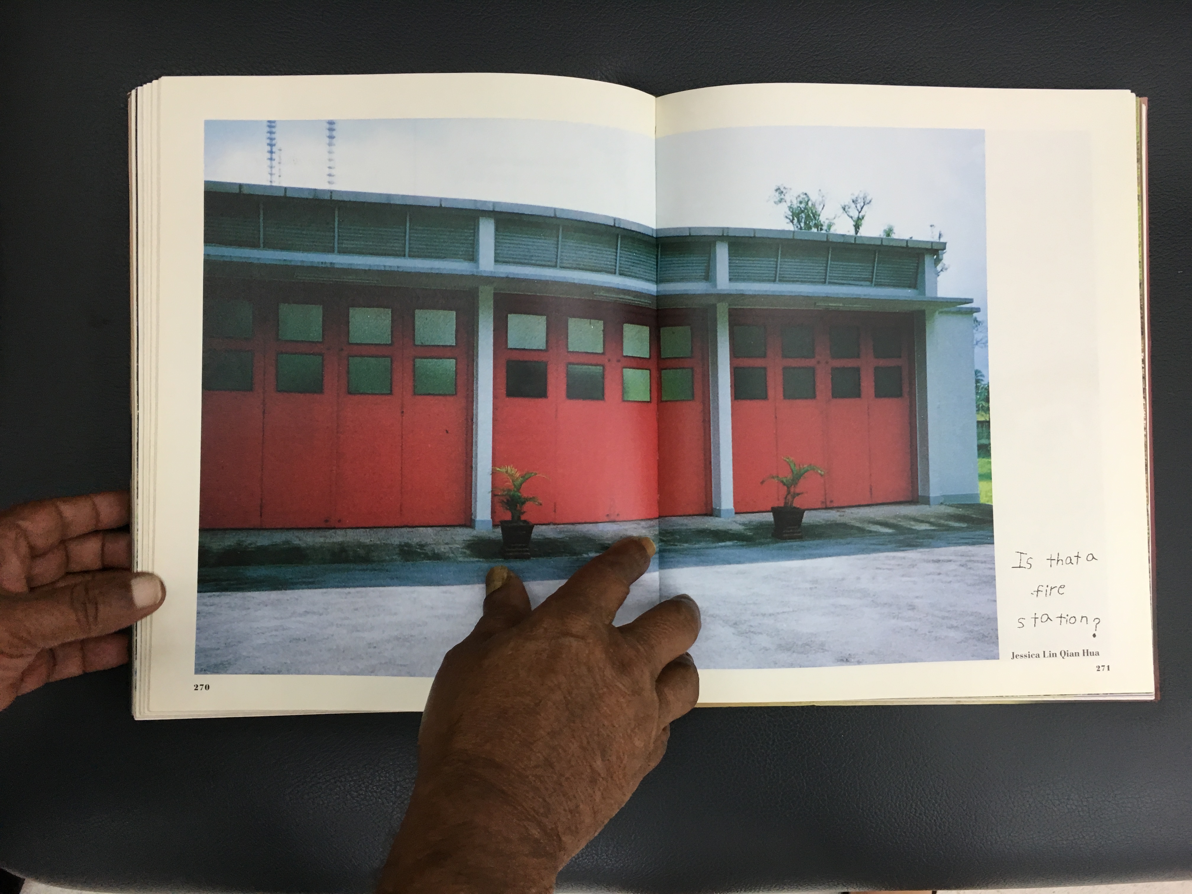
before i end off, here are images that didnt make it into the zine. enjoy!
2DII – Zine Process #1
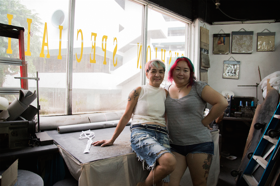
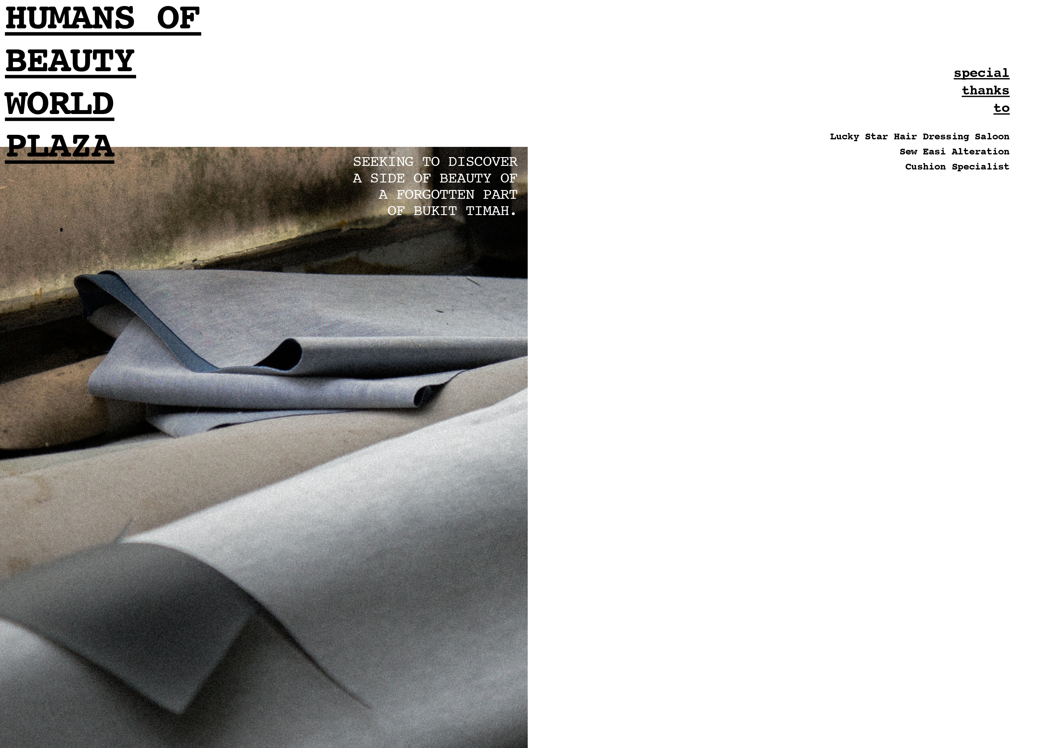
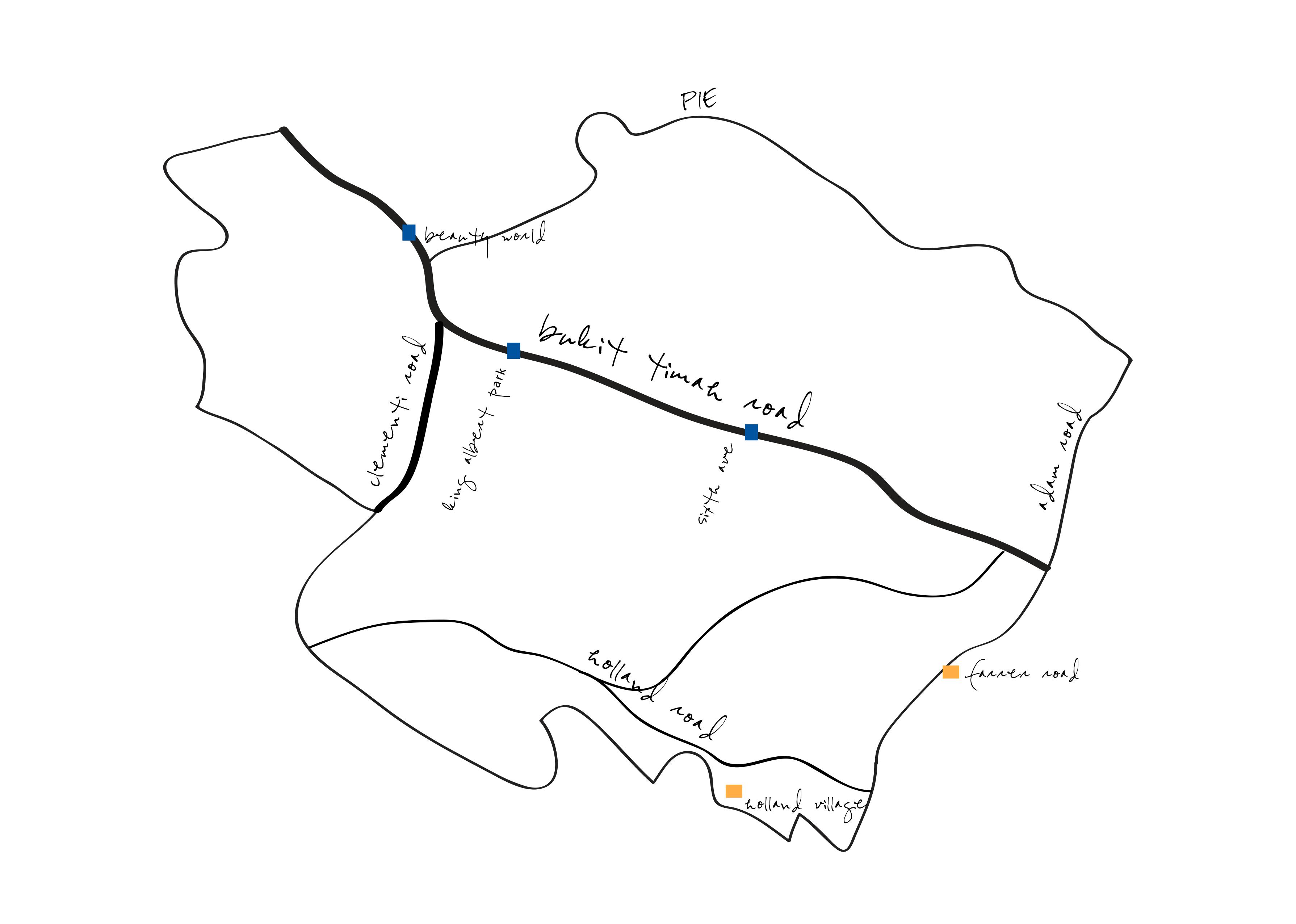
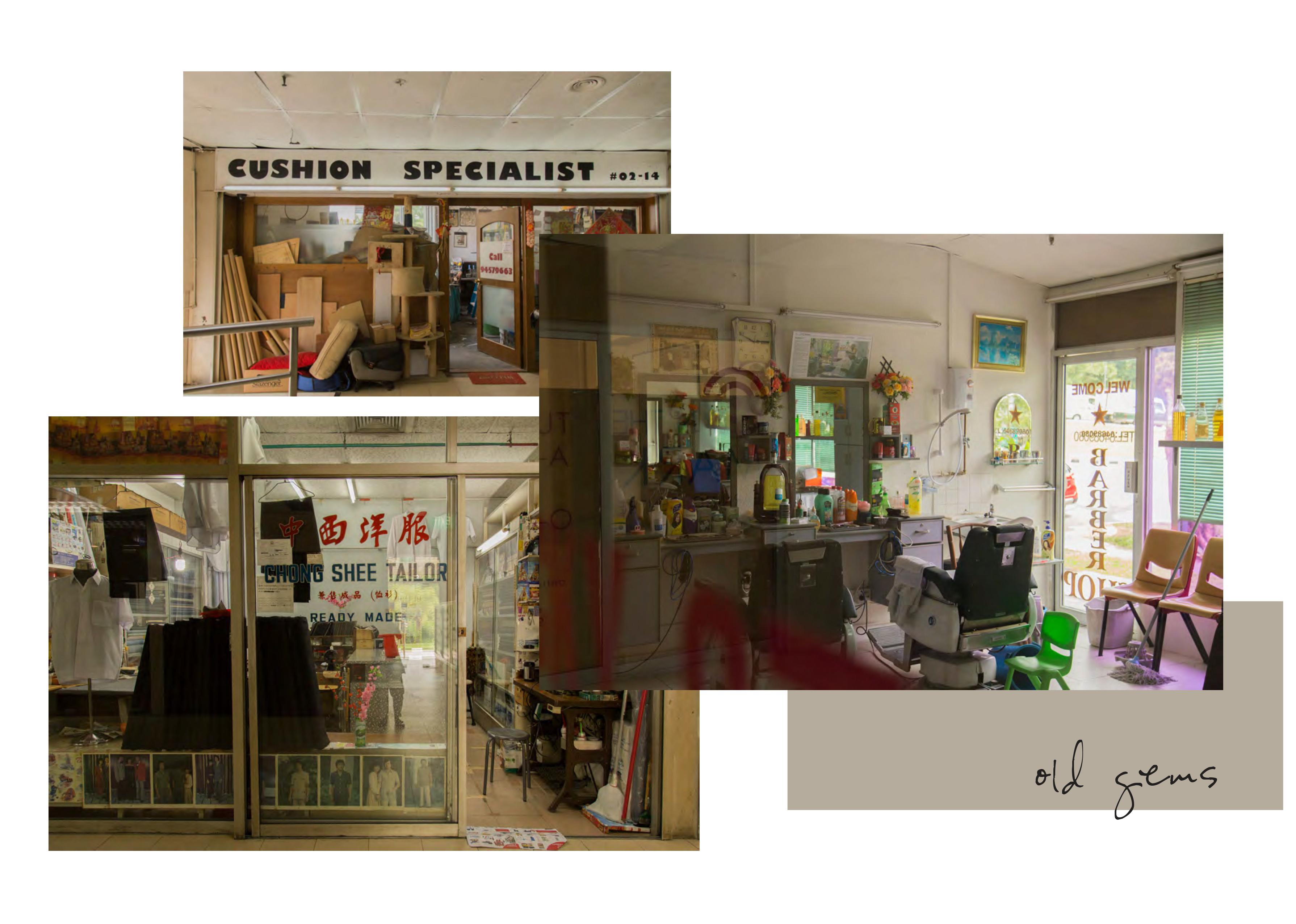
my zine concept is going to be documentating the forgotten of beauty world. i narrowed down to 3 store owners that caught my attention the most during my first recee – Cushion Specialist, Sew Easi Alteration and Lucky Star Hair Dressing Saloon.
prior to the visit i made, i crafted a few initial questions to ask them. they were mainly questions on their thoughts of bukit timah and their thoughts when people associate it as an atas area, but forgetting this part of bukit timah.
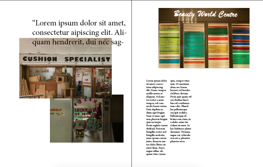
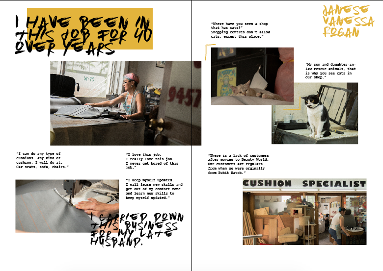
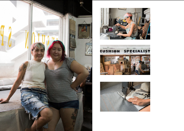
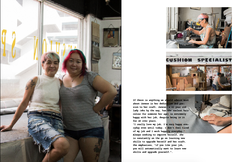
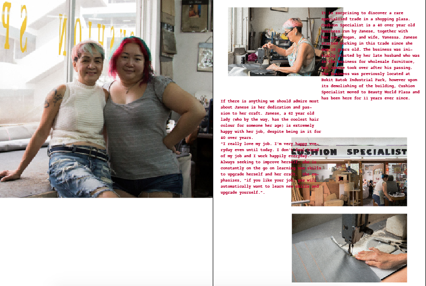
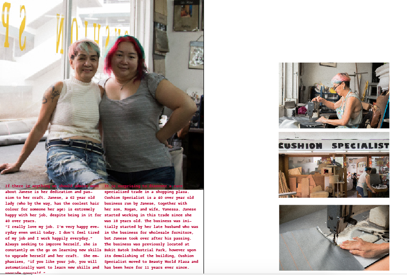
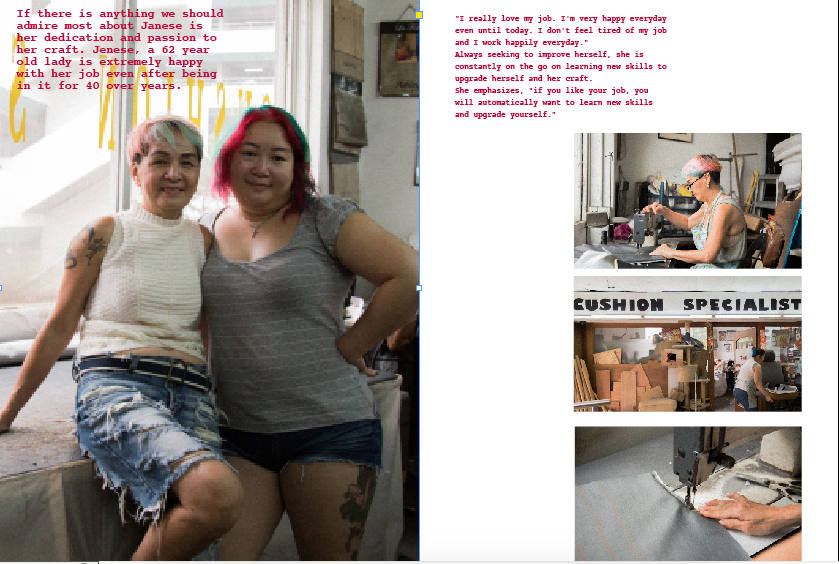
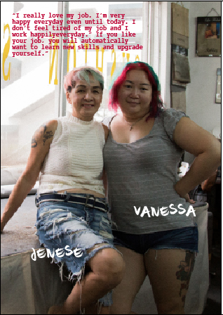
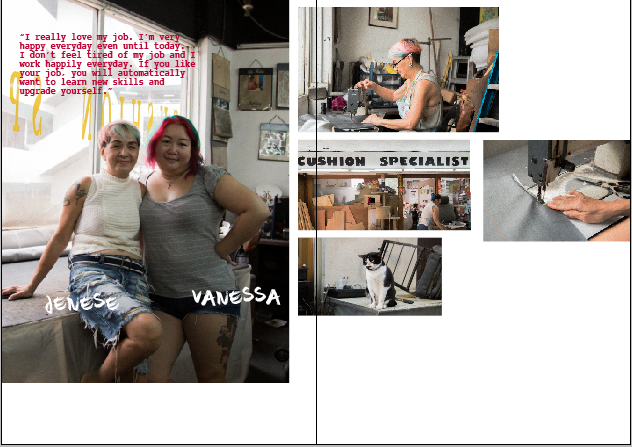
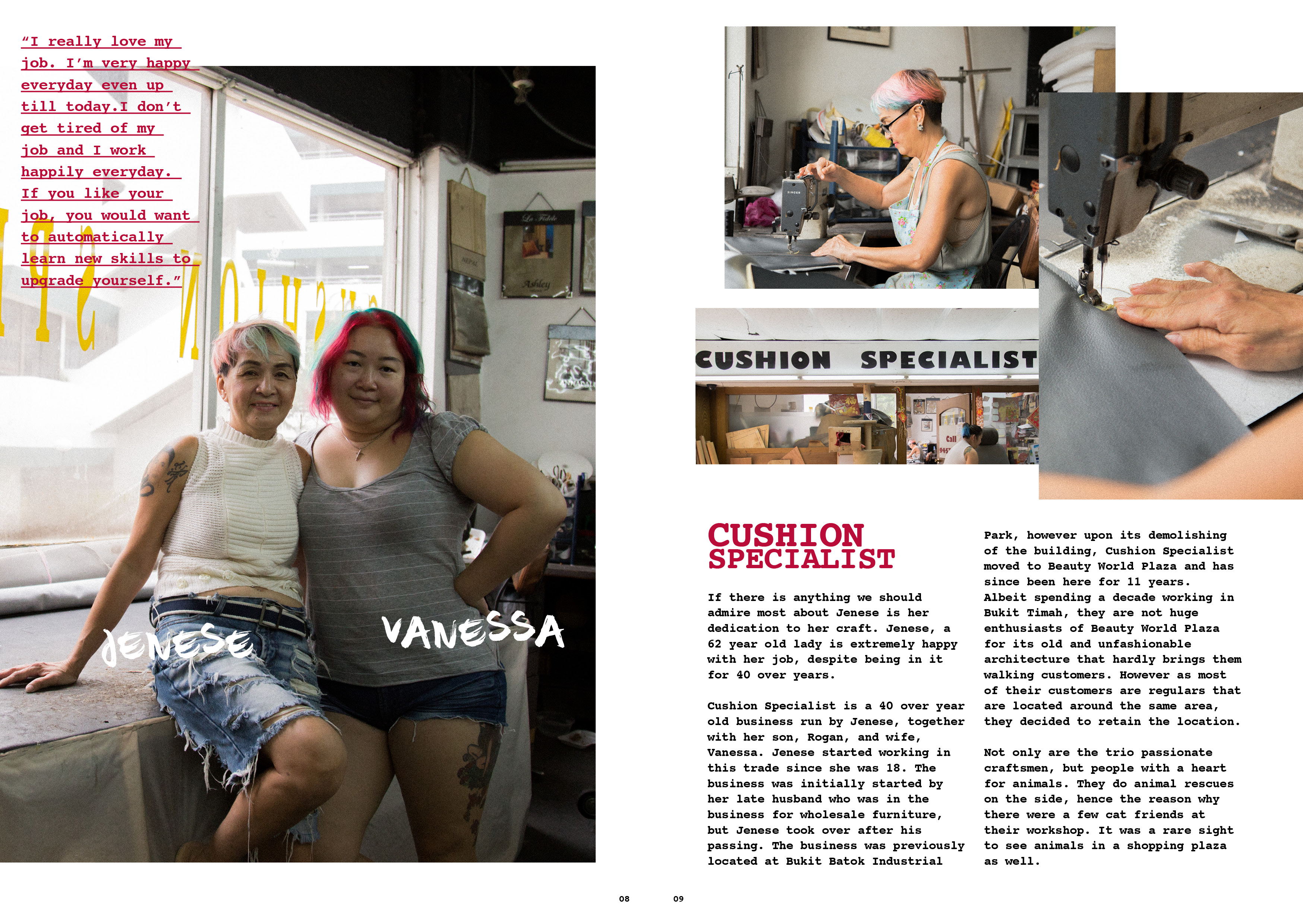
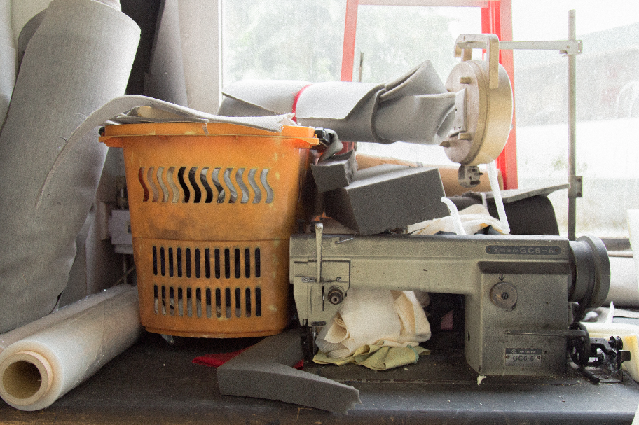
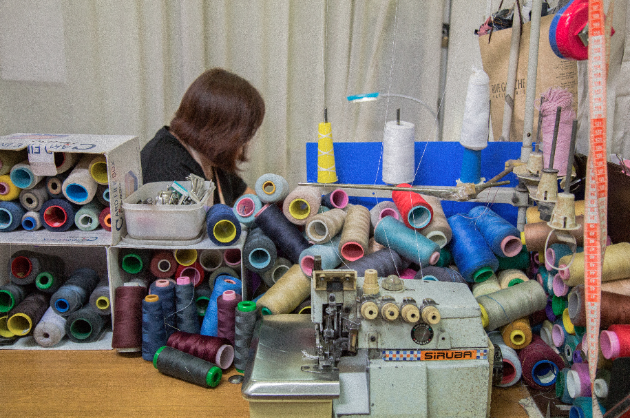
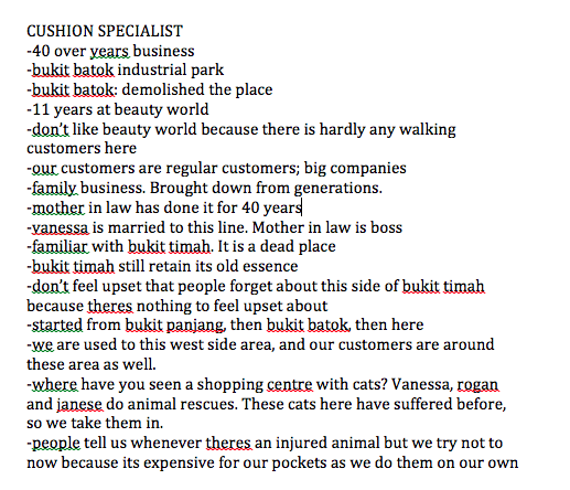
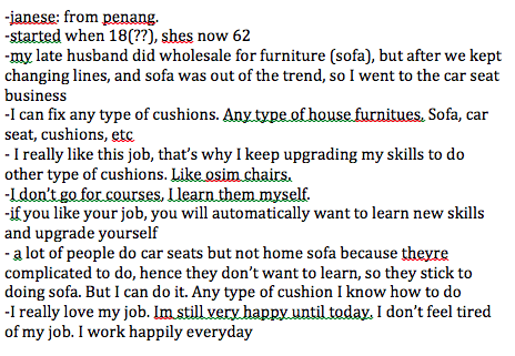
Cushion Specialist
jenese, vanessa and rogan were really friendly people to talk to. jenese is a 60 year old lady who runs the business together with her son and daughter in law. it was a business started by her late husband but took over upon his passing. throughout the whole conversation, it was really heartwarming to hear her speak continuously and so passionately about her job.
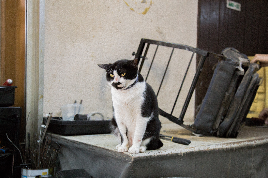
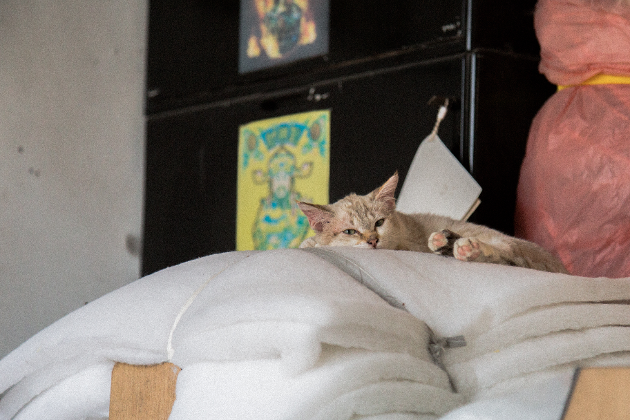
vanessa told me that they do animal rescues on the side, and it was the reason why they have 4 cats in their workshop (and 10 more at home). it was really really nice to meet and know there are kind hearted people like them that exist.
images below are insights that i got from the interview.
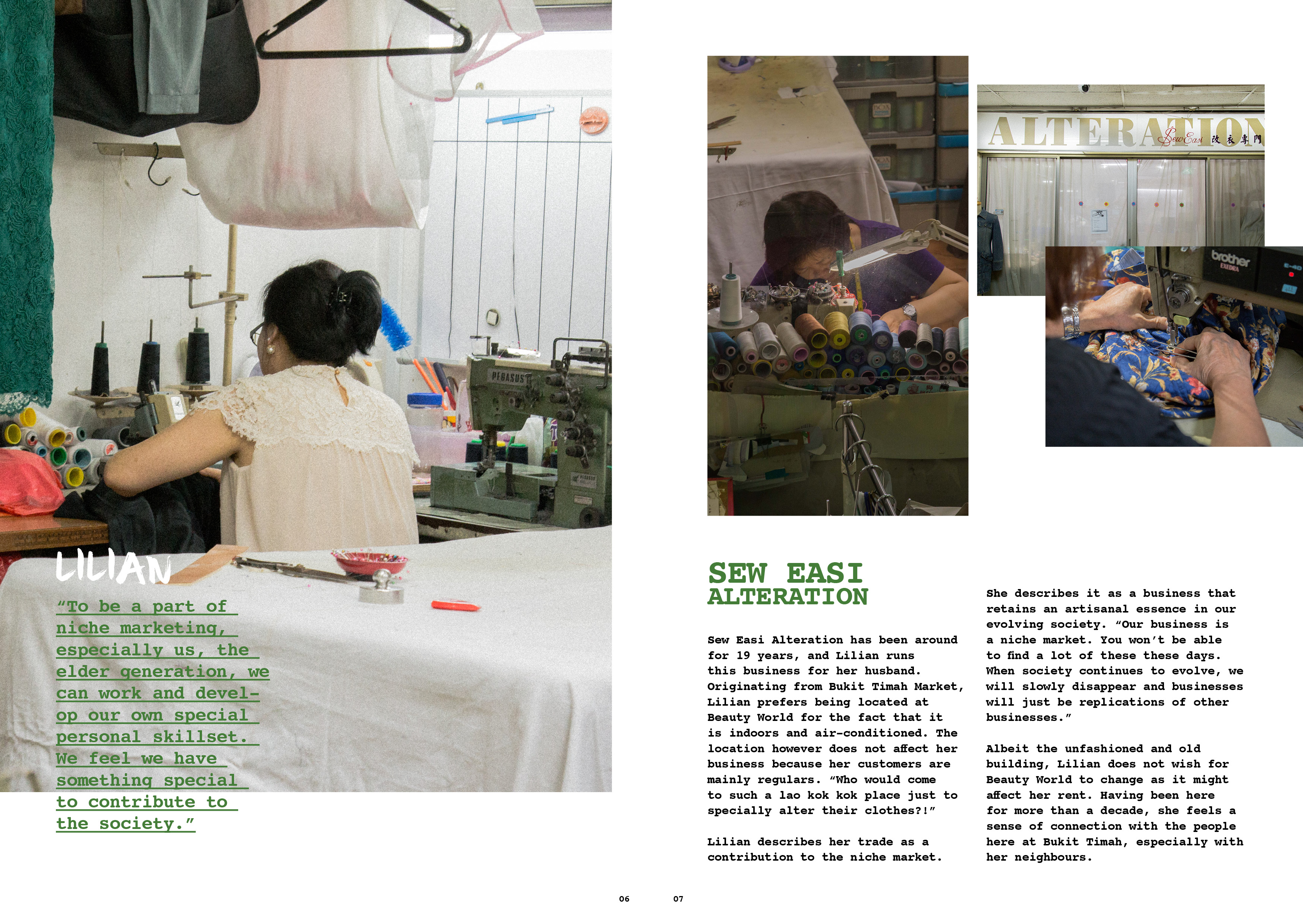
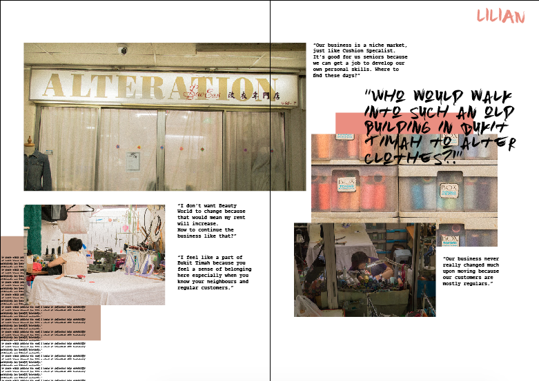
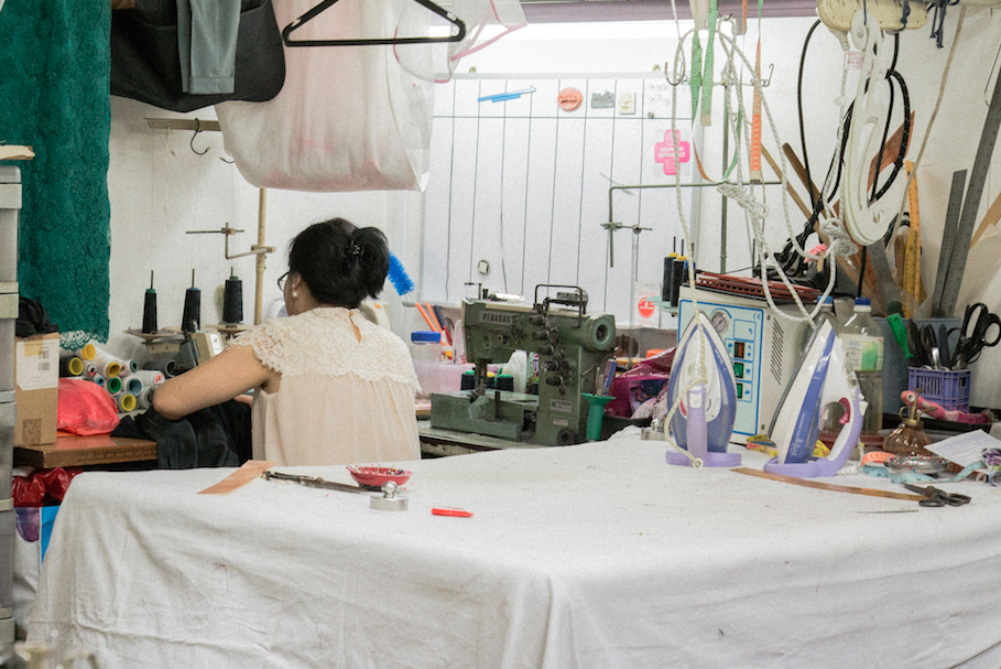
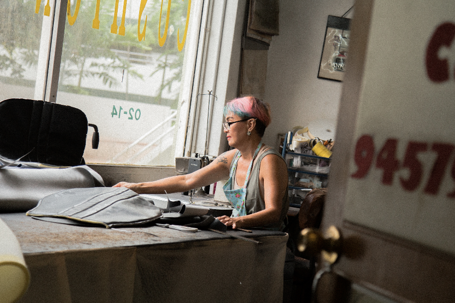
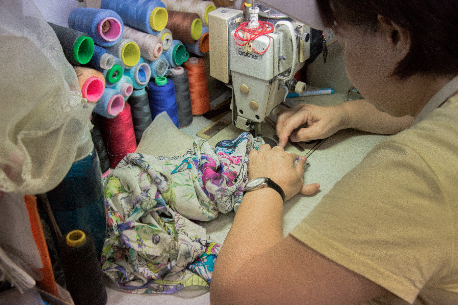
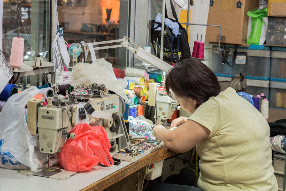
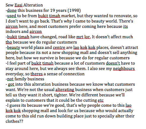
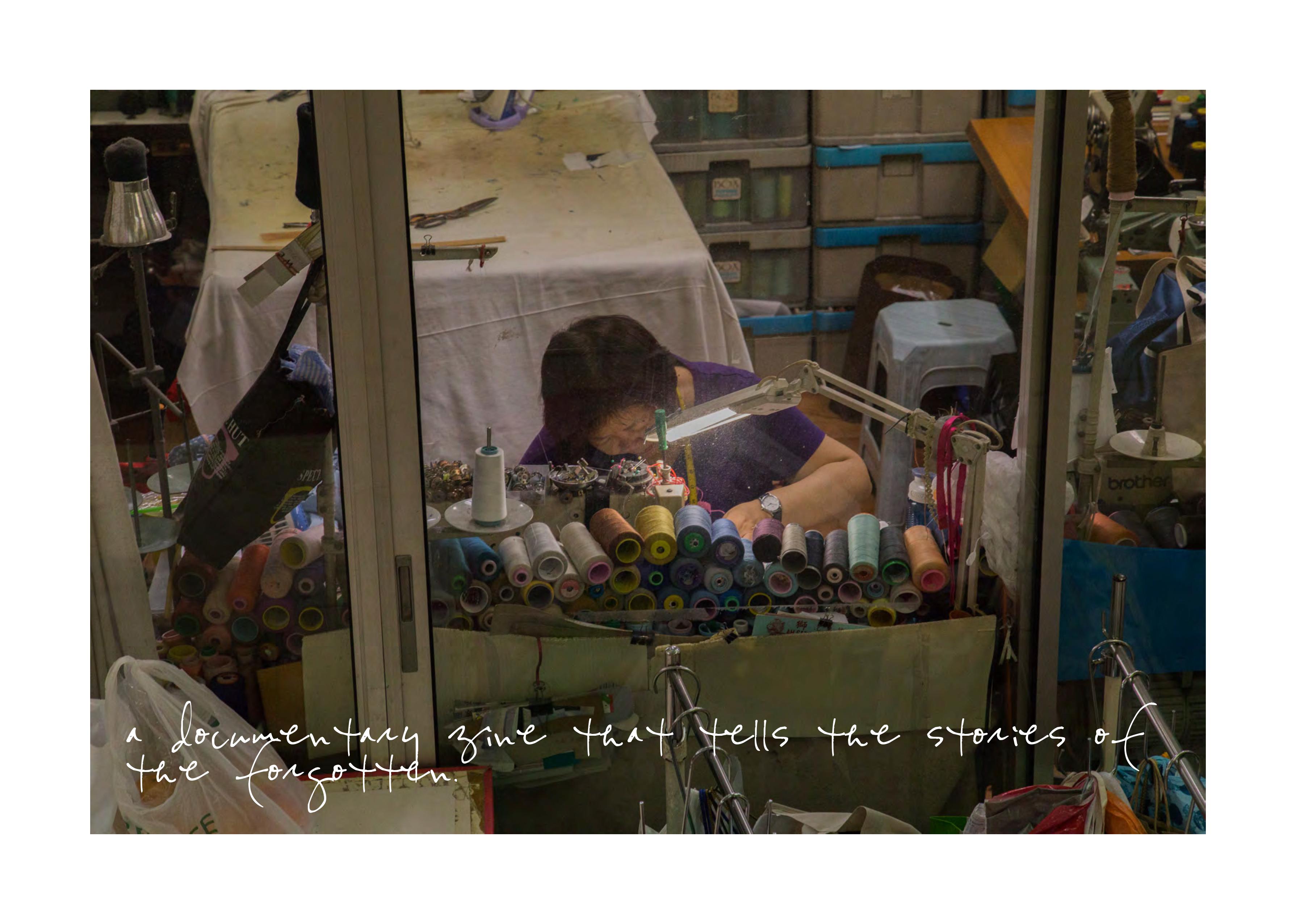
Sew Easi Alteration
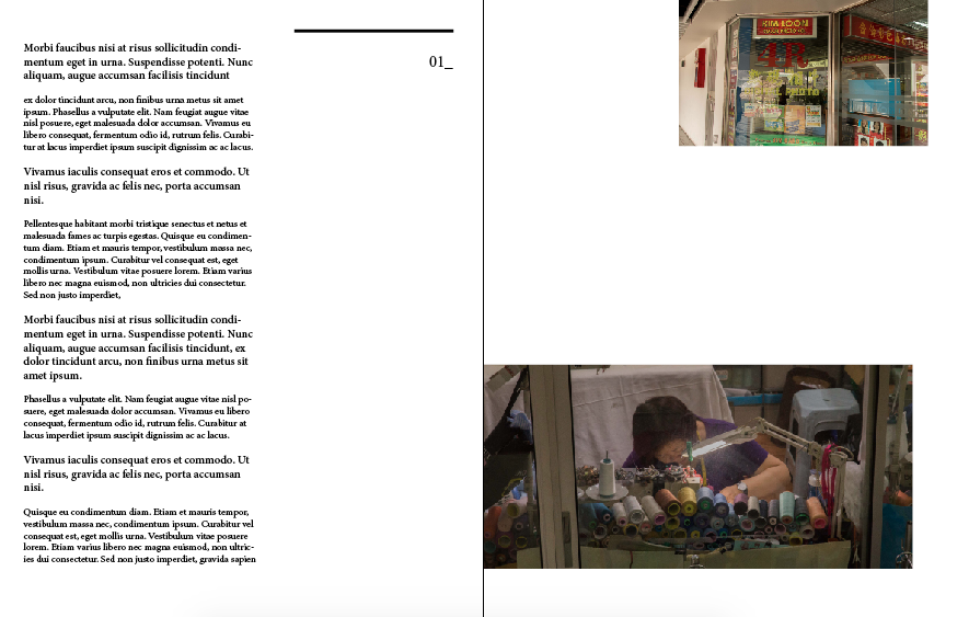
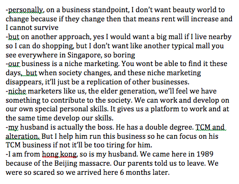
lilian came to singapore from hong kong in 1989 due to the Tiananmen massacre in china. she runs the business for her husband because he holds a double degree – TCM and Alteration (she runs it because her husband cannot cope with 2 jobs). i was glad that i found out she came from hong kong because i was able to communicate with her in cantonese (that made the converastion more comfortable for her and casual). however she was really uncomfortable to be infront of the camera, so i could not get any photos of her face and her colleagues.
images below are insights that i got from the interview.
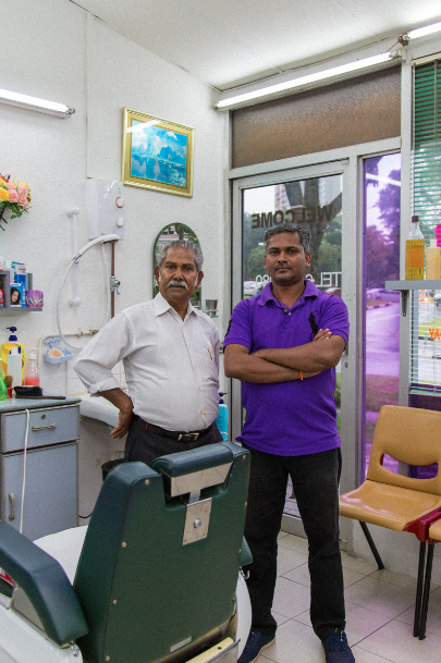
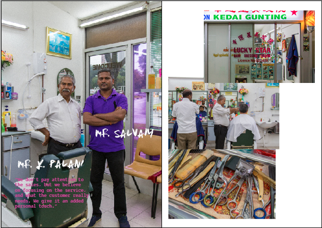
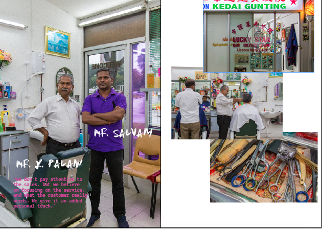
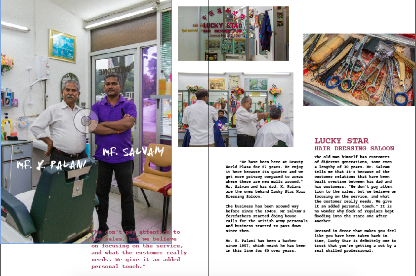
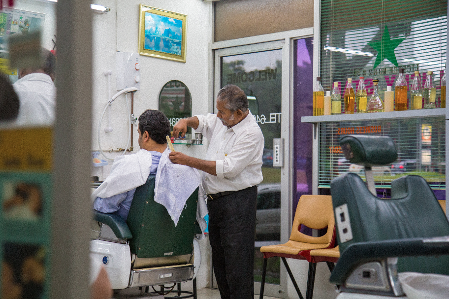
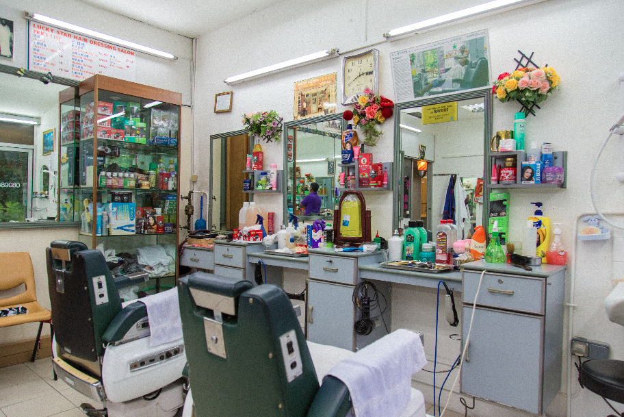
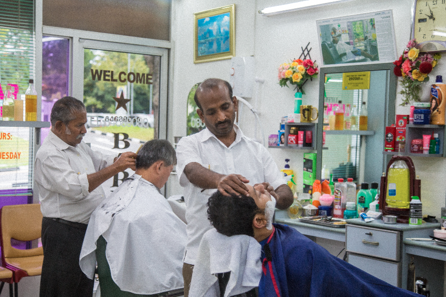
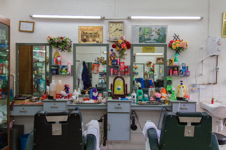
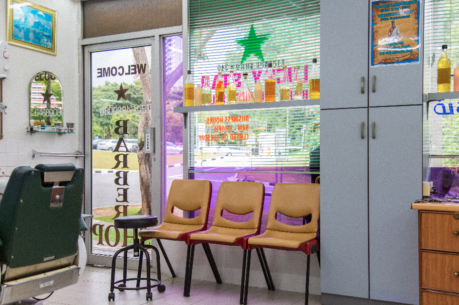
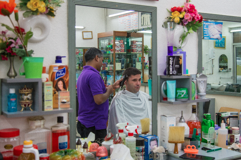
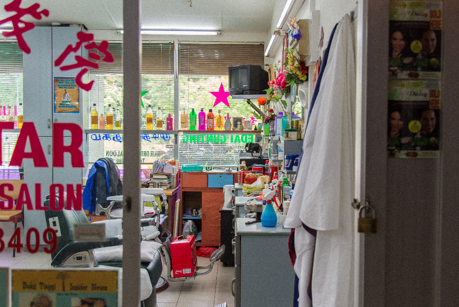
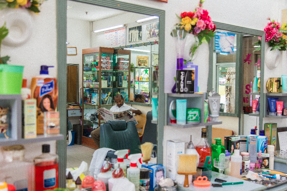
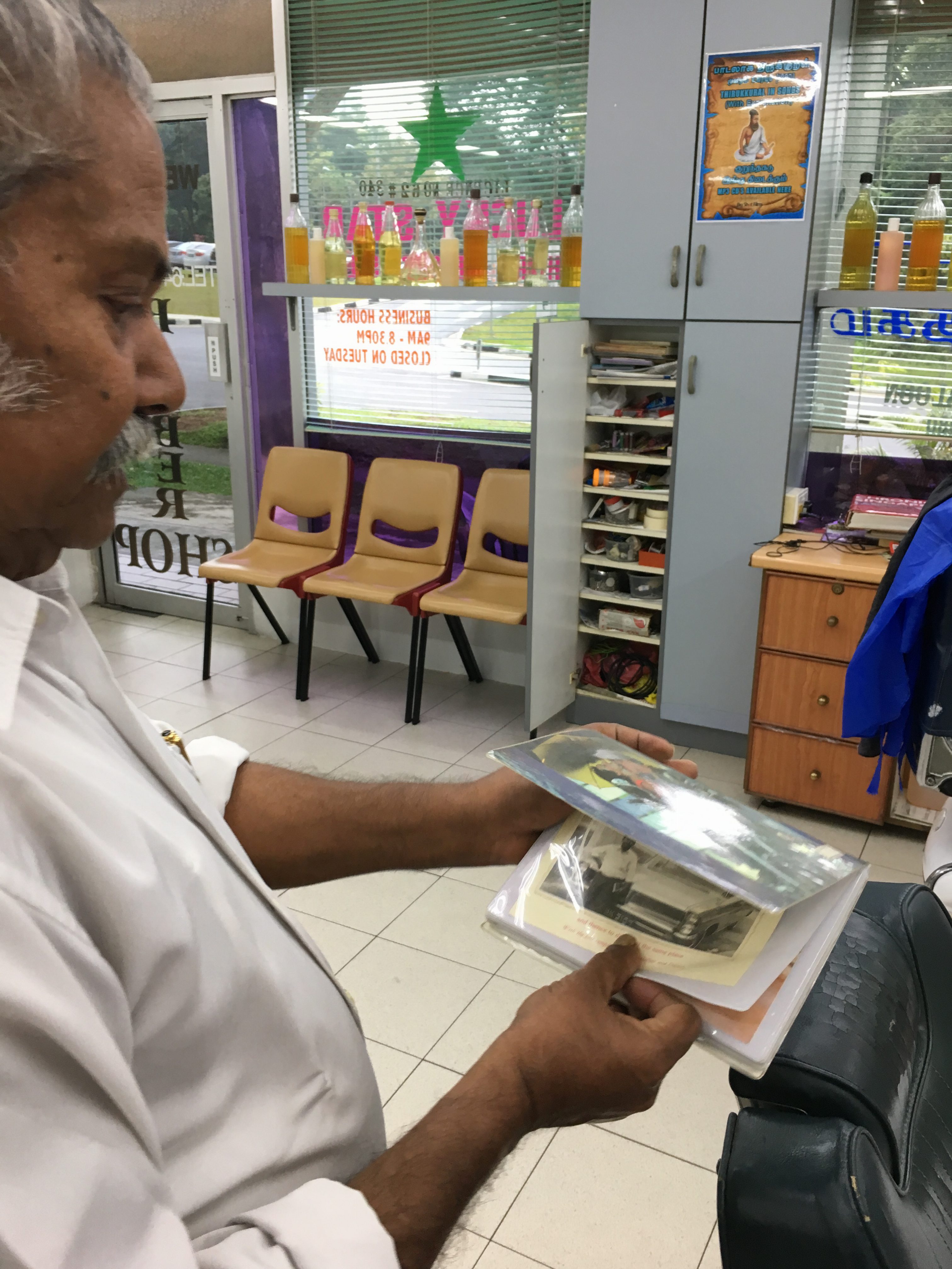
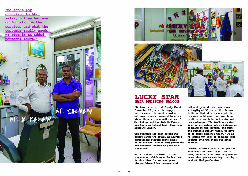
Lucky Star Hair Dressing Saloon
this place was a challenge for me to get an interview with them. they were closed the previous 2 times i went to beauty world plaza for recee. during the 2nd time, i asked vanessa (from cushion specialist) if they’re always closed. turns out they are closed on every tuesday. the third time i went on a thursday to specially interview them, i waited for 2 hours because they were busy. afterwards, the old man (Mr K Palani) told me to come back tomorrow morning (around 10am) because he cant speak english but his son will be there tomorrow to hold the interview. i agreed and came back the next day. on friday, i came in 10am and Mr Palani told me that his son wont be here until 2pm. (i was really discouraged at that point of time because i have been wasting too much time). luckily i came back at 2pm and his son arrived and agreed to do the interview with me.
they were really nice people to talk to, especially Mr Palani (we commuicated through simple english) and i could feel his pride in his craft. i learnt that their business has been around for 60+ years. during the 2 days ive been there, customers kept coming in and they were extremely busy. turns out they’re really famous. Mr Palani was so passionate about telling me how long his customers have been going to him. he told me some of his customers have been with him for 30 years, and now hes starting to cut for theit grandchildren. he also told me how the relationship between him and his customers is more than just a business interaction, but a bond. i could feel his sadness when he told me some of his customers have passed on, and some are sick.
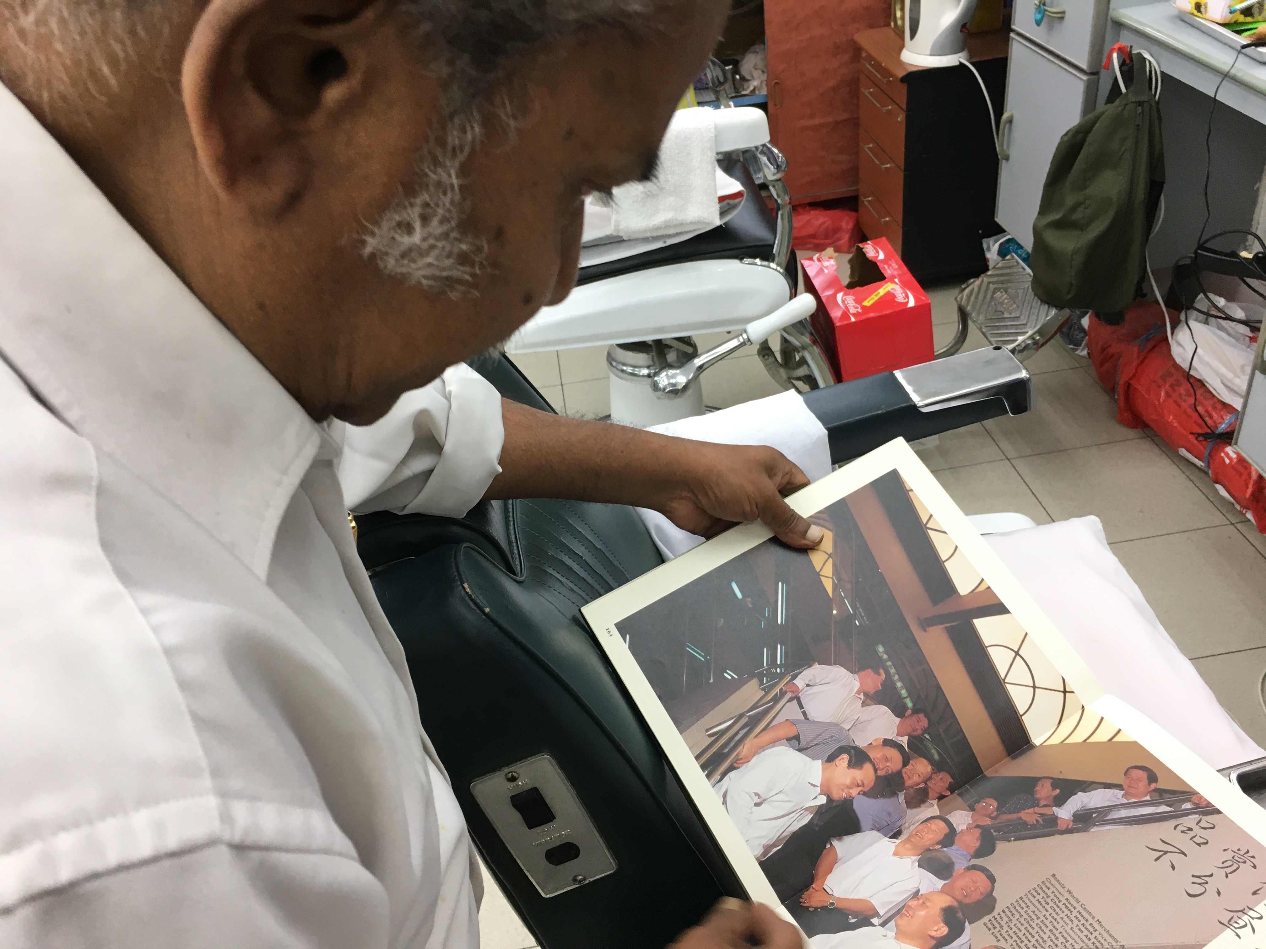
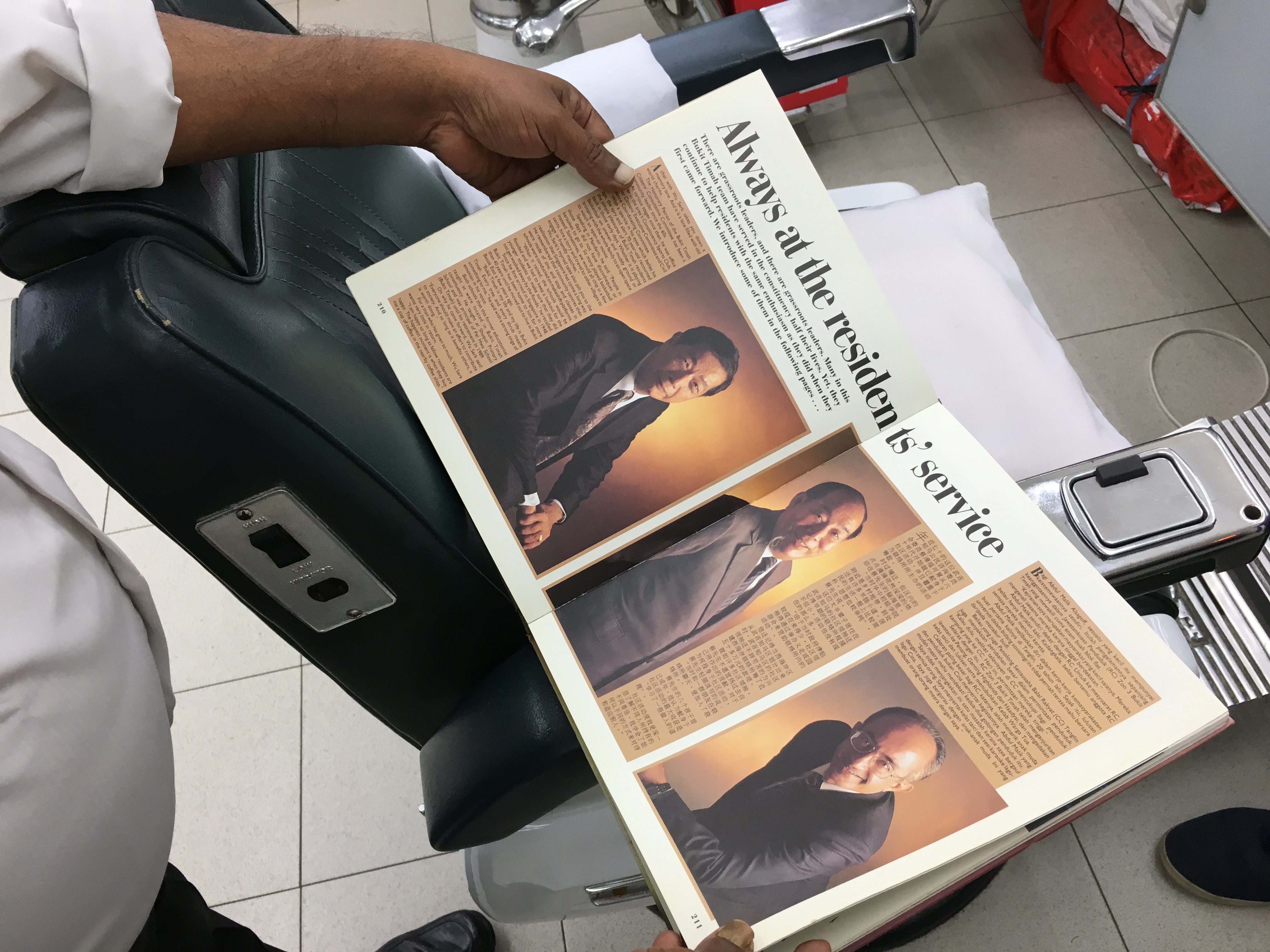
Mr Salvam and Palani showed me a book on the old bukit timah they were given from PAP when i told them my proj. (talk about the real originals of bukit timah!)
here’s a video on them in action! (pay attention to Mr K Palani’s hand movements and the sound of his scissors. definitely an old professional indeed.)
images below are insights that i got from the interview.
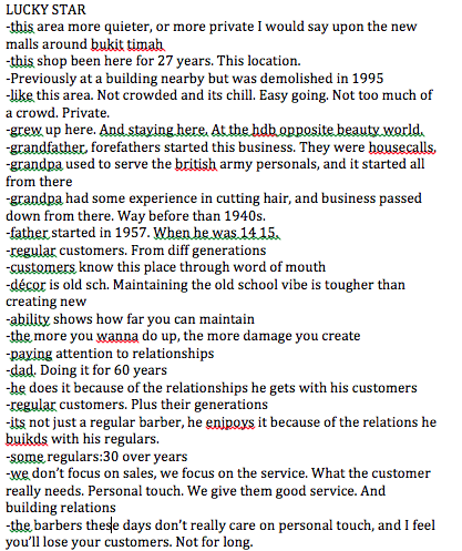
i really enjoyed the interview process. it broadened my perspectives on knowing the stories behind these craftsmen – they’re really passionate in what they do, and they put their customers’ needs more than their attempt on making their money. this is probably because they’ve been doing it for many years, and making money from their regulars is the last thing that they want. their customers also add on to the fact why they are unwilling to move. (reasons include their customers are familiar with their location, or because their customers live around the area and its accessible for them).
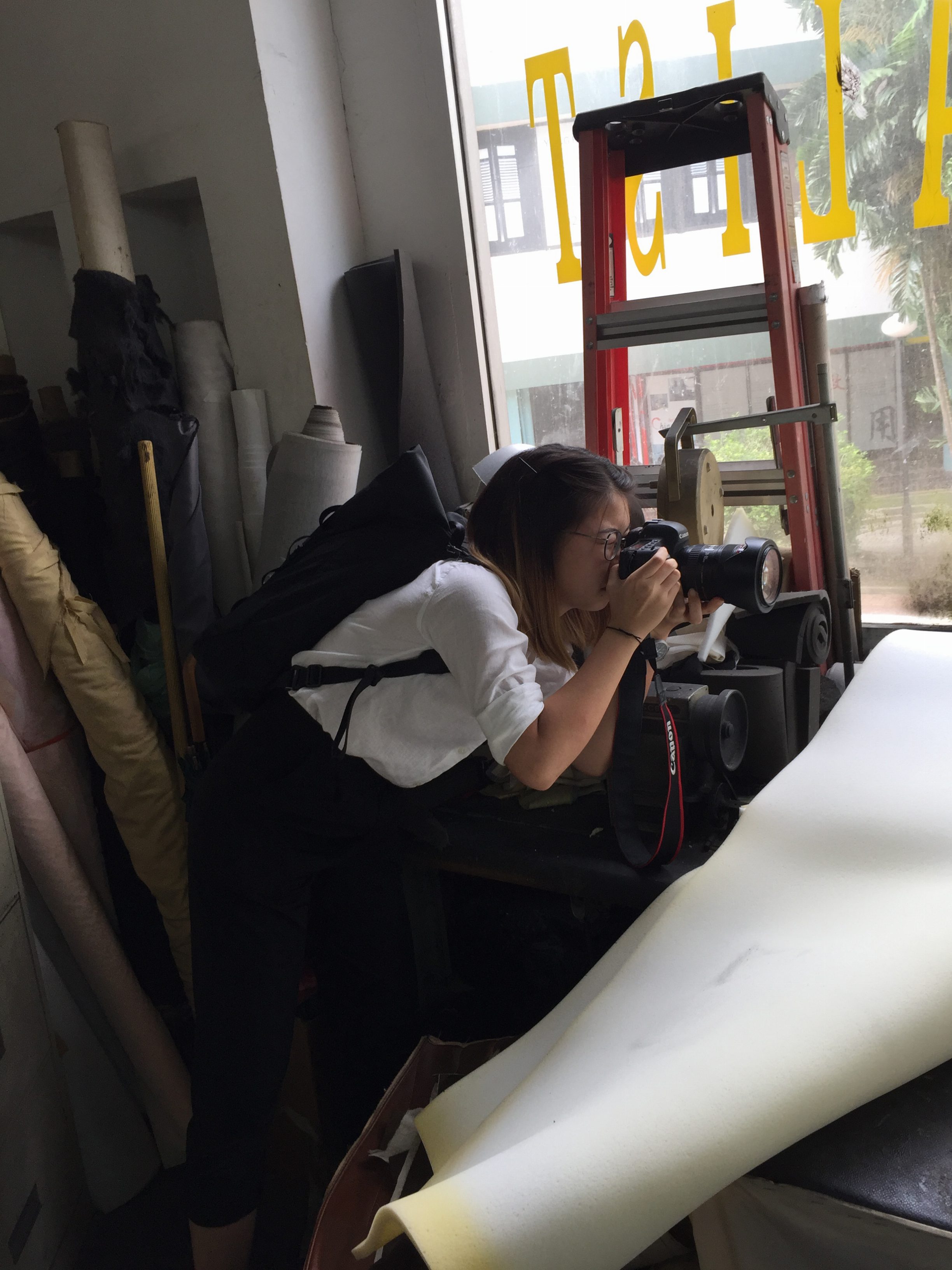
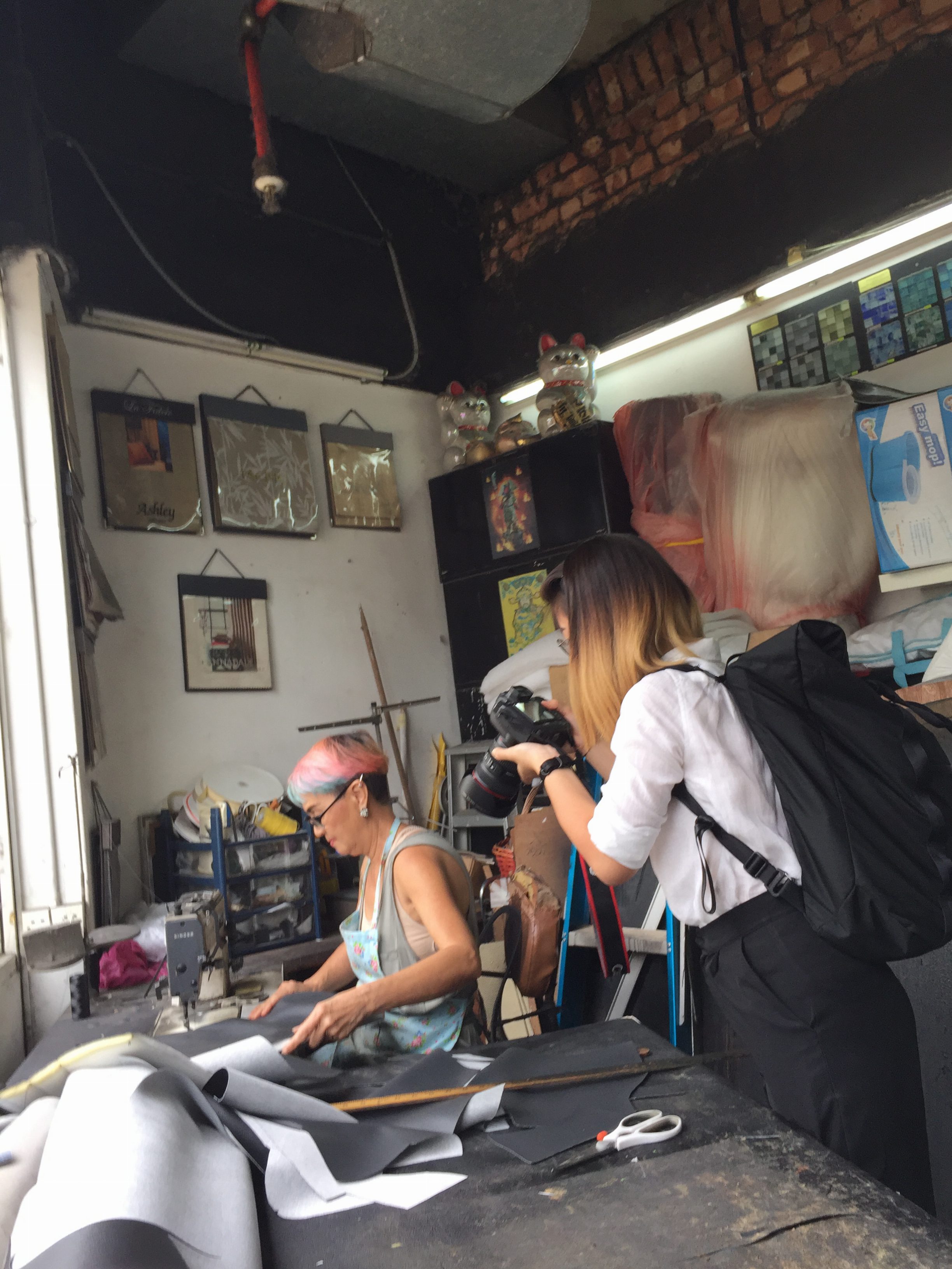
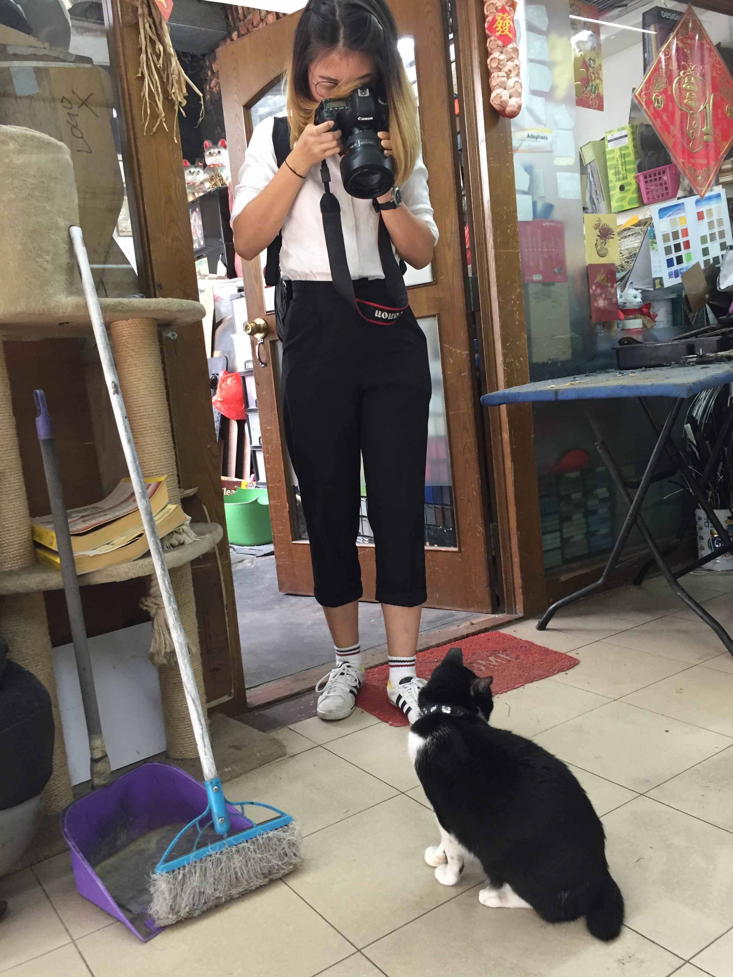
some behind the scenes images
2DII – Experimental Bookbinding
here’s the link to our presentation! –
Experimental Bookbinding2D Slides
2DII – Zine Recee Presentation Slides

2DII – Zine Recee
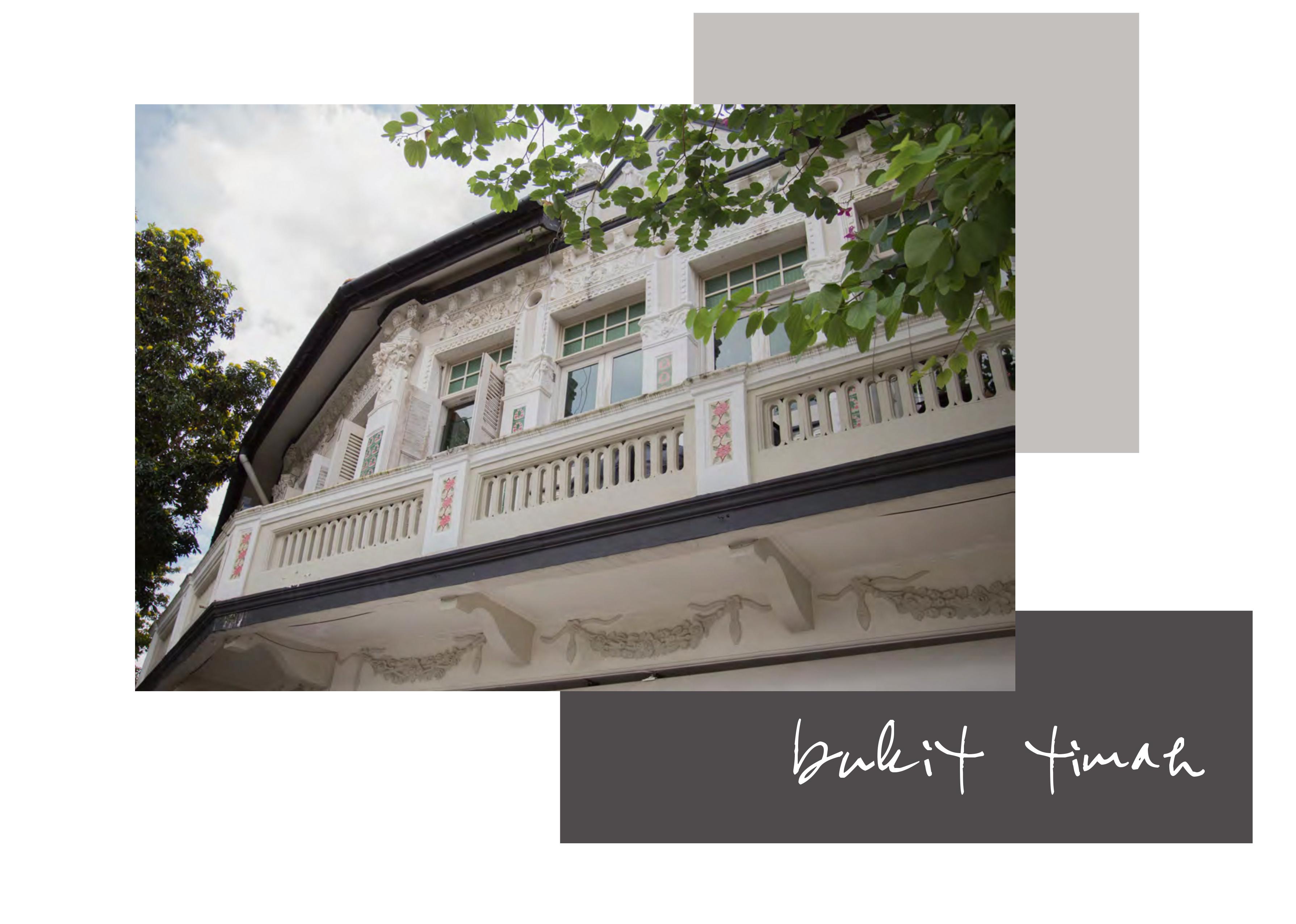
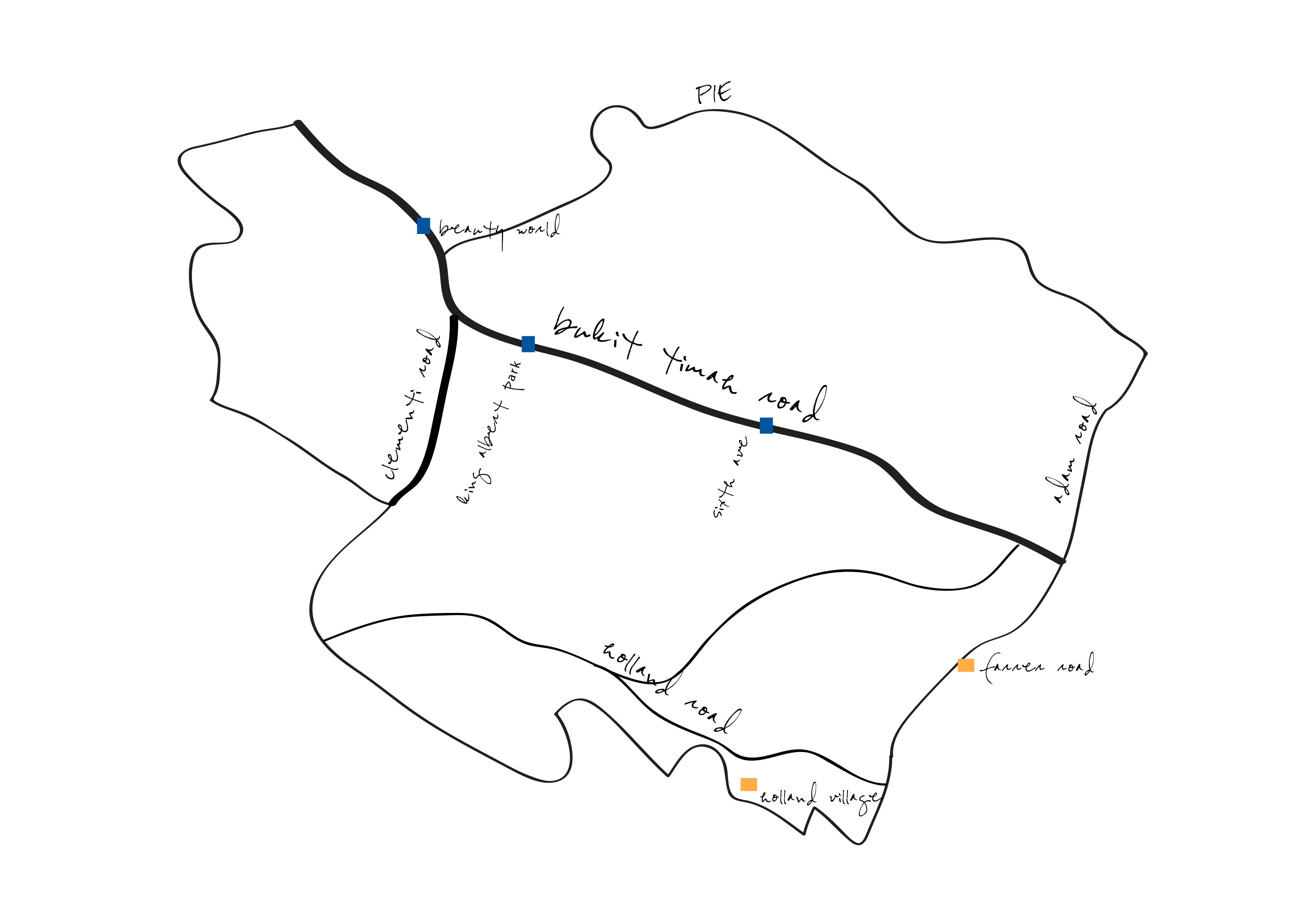
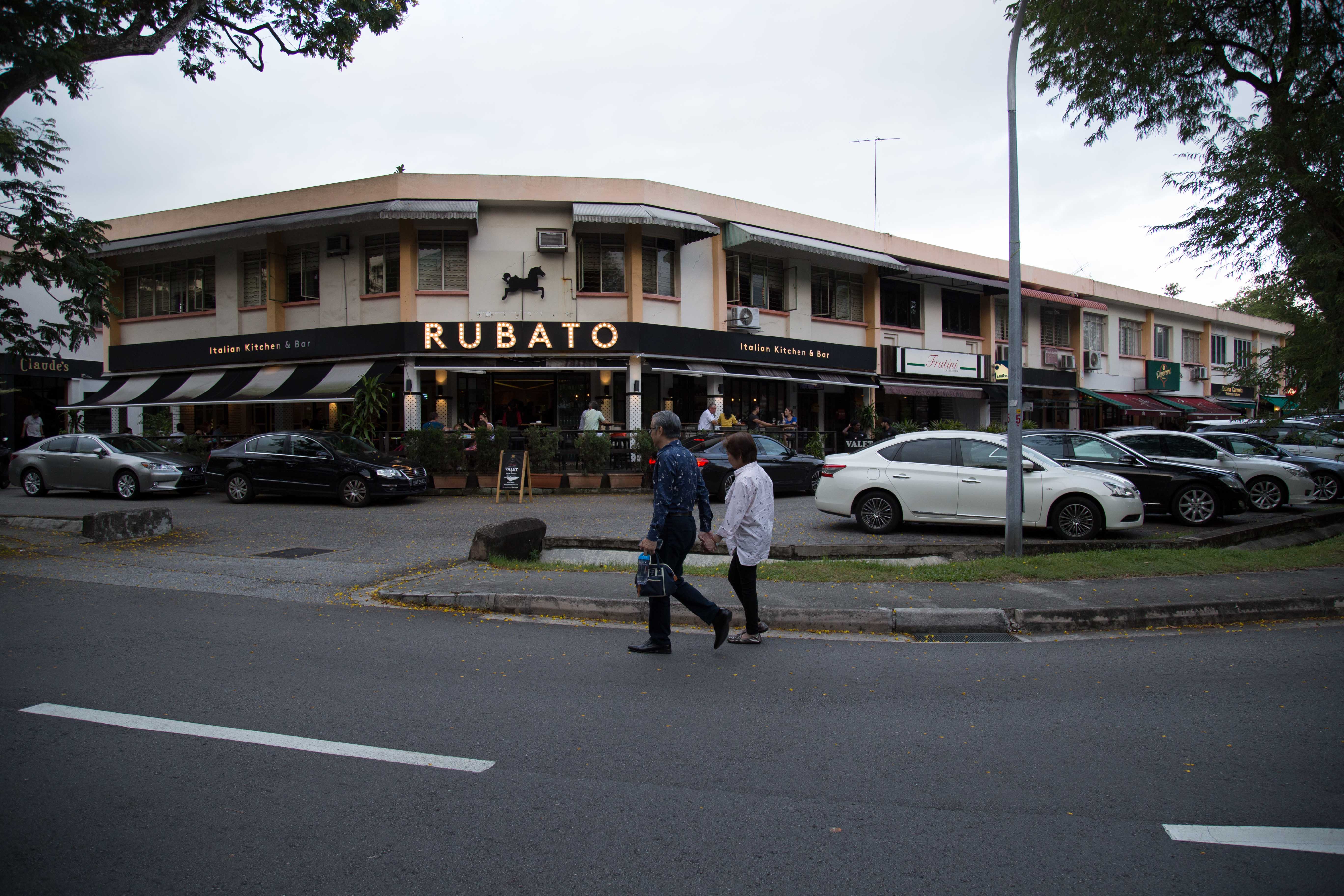
BUKIT TIMAH
an afternoon of recee-ing at bukit timah was enjoyable because –
1. i was alone exploring.
1b. exploring is my favourite past time. i enjoy dicovering new things and people watch.
2. i had the opportunity to take pictures / do photography.
2b. photography is my second nature / job.
3. bukit timah isn’t my hood and it’s a chill area and that made my experience even more enjoyable (+ point!).
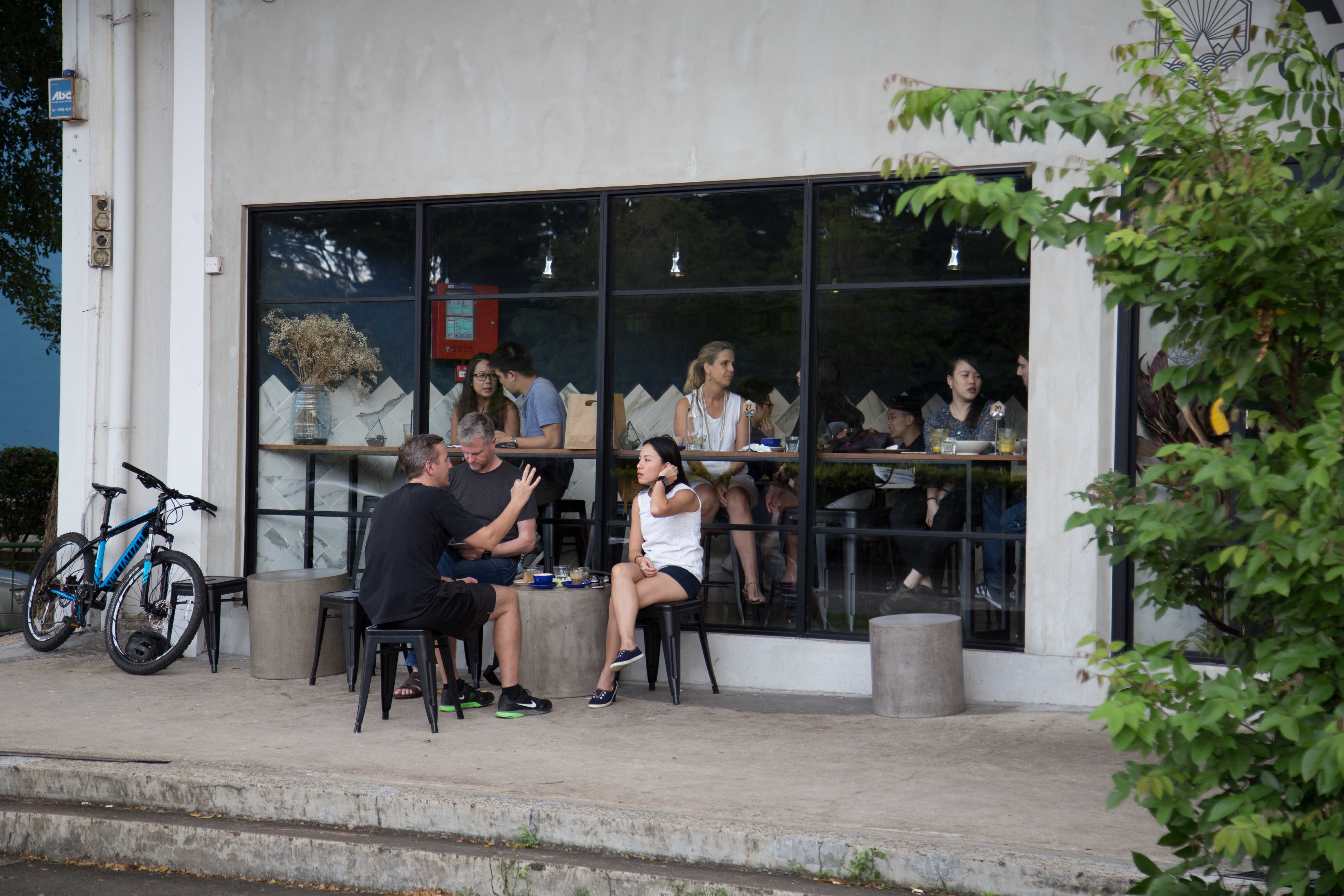
i started the day of recee-ing with gorgeous weather. it was a sunday afternoon, the sun was covered by the clouds and it was windy. i alighted at botanical gardens and started my recee there.
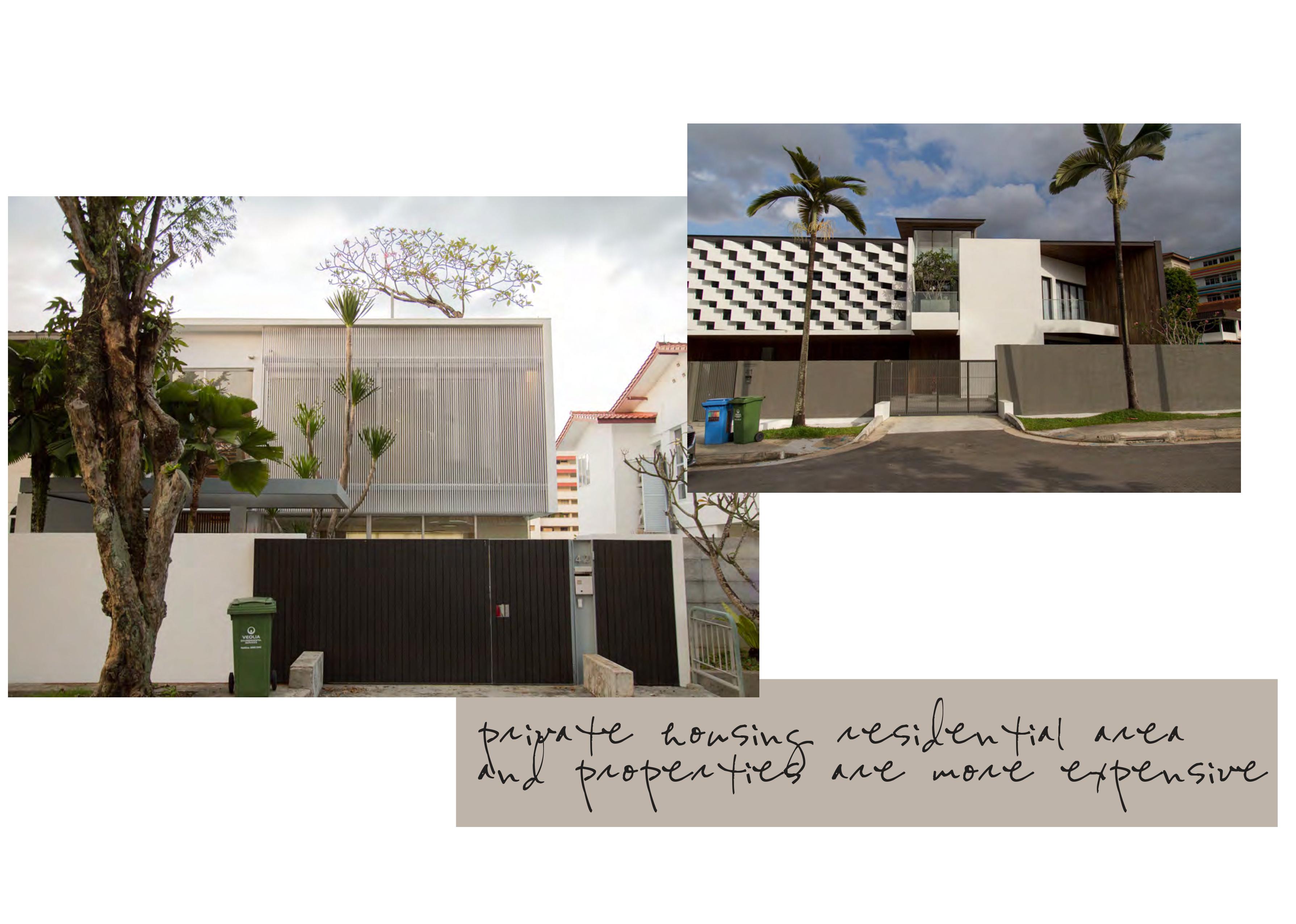
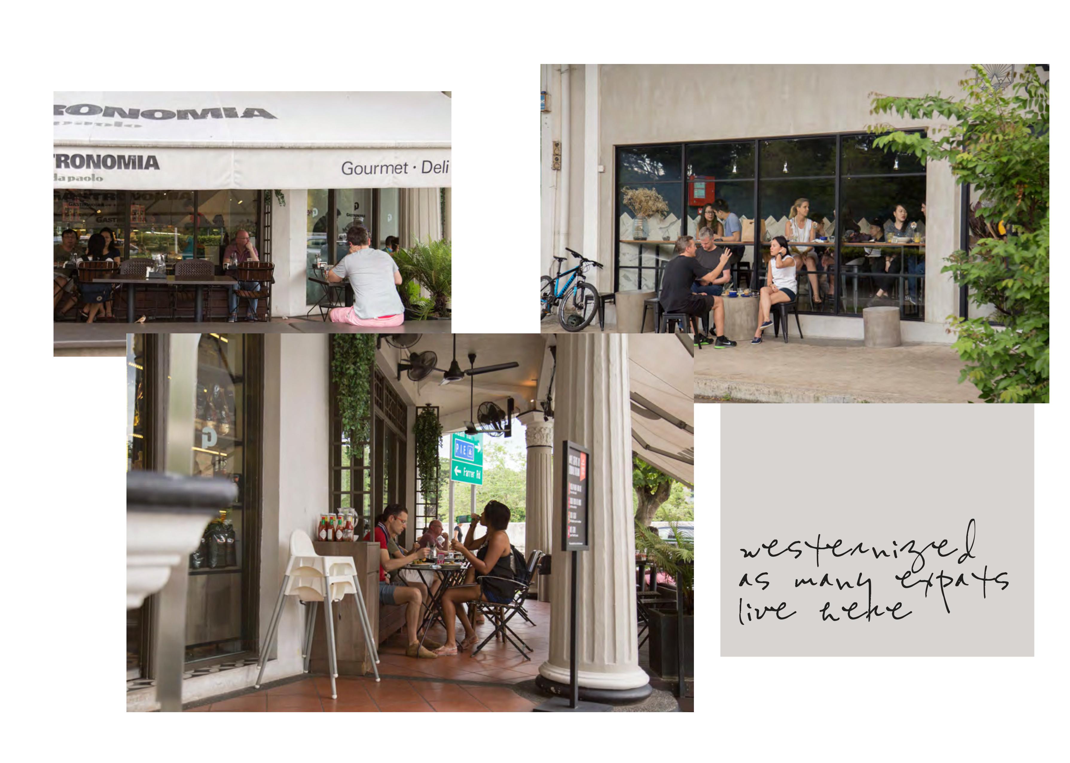
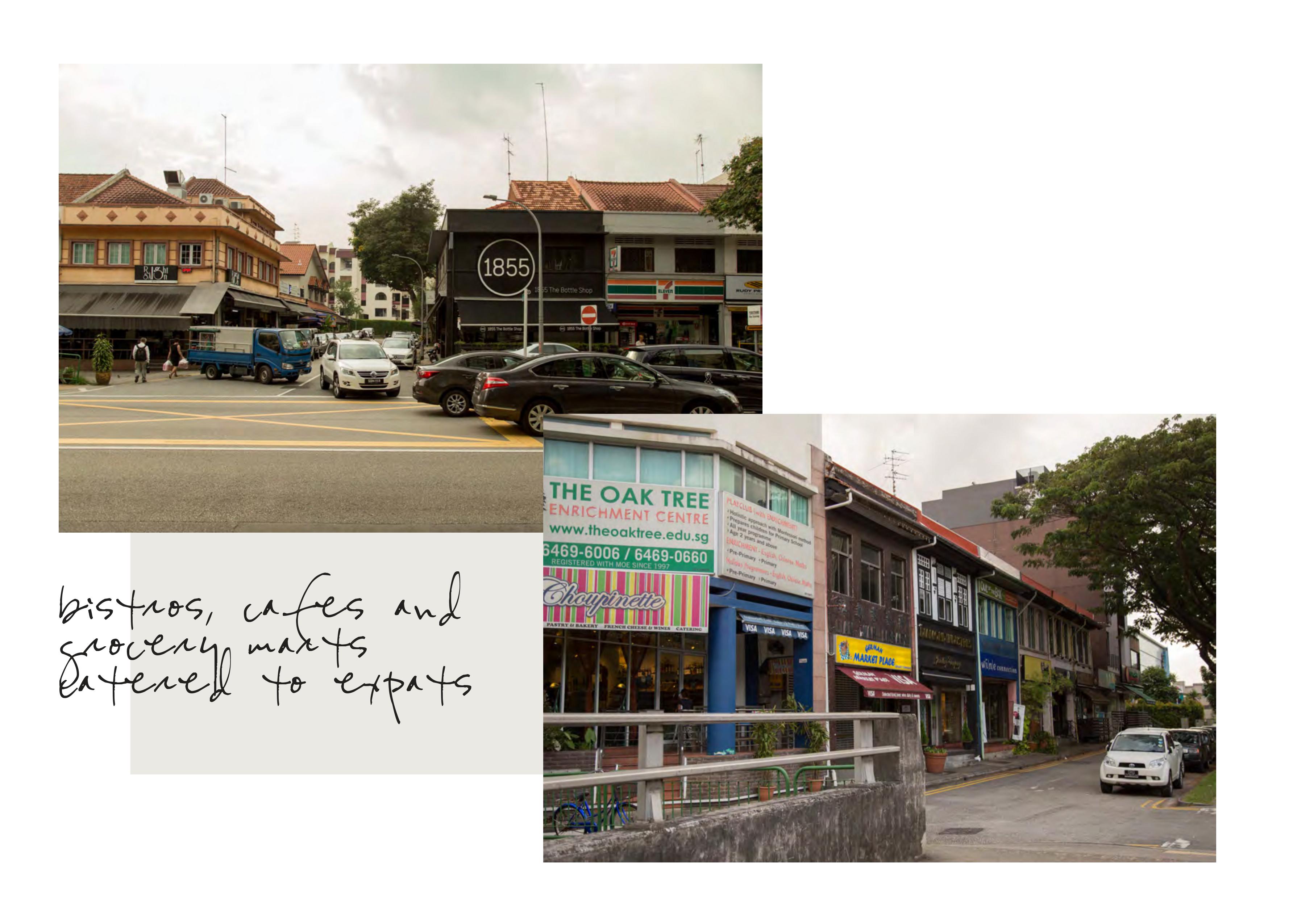
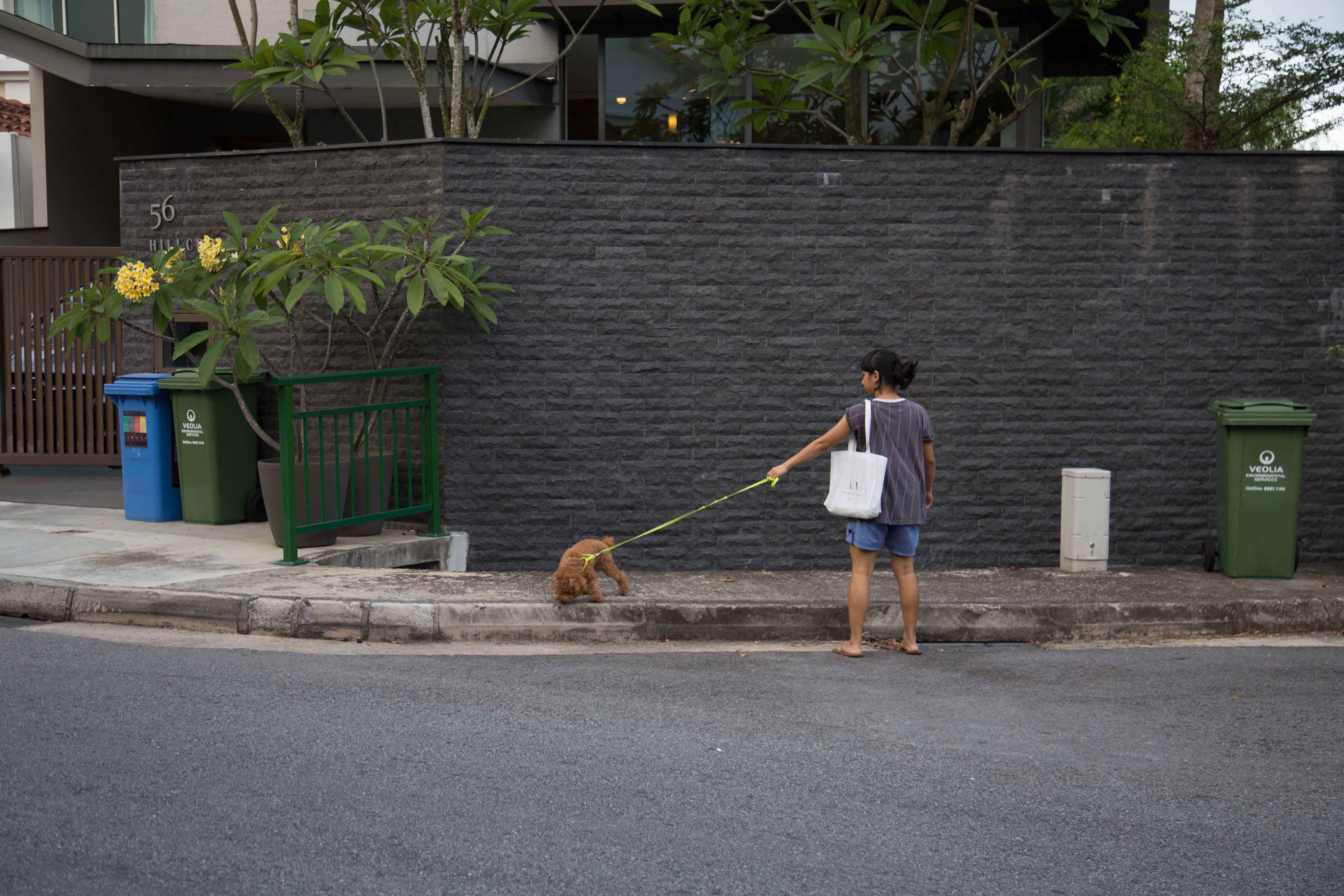
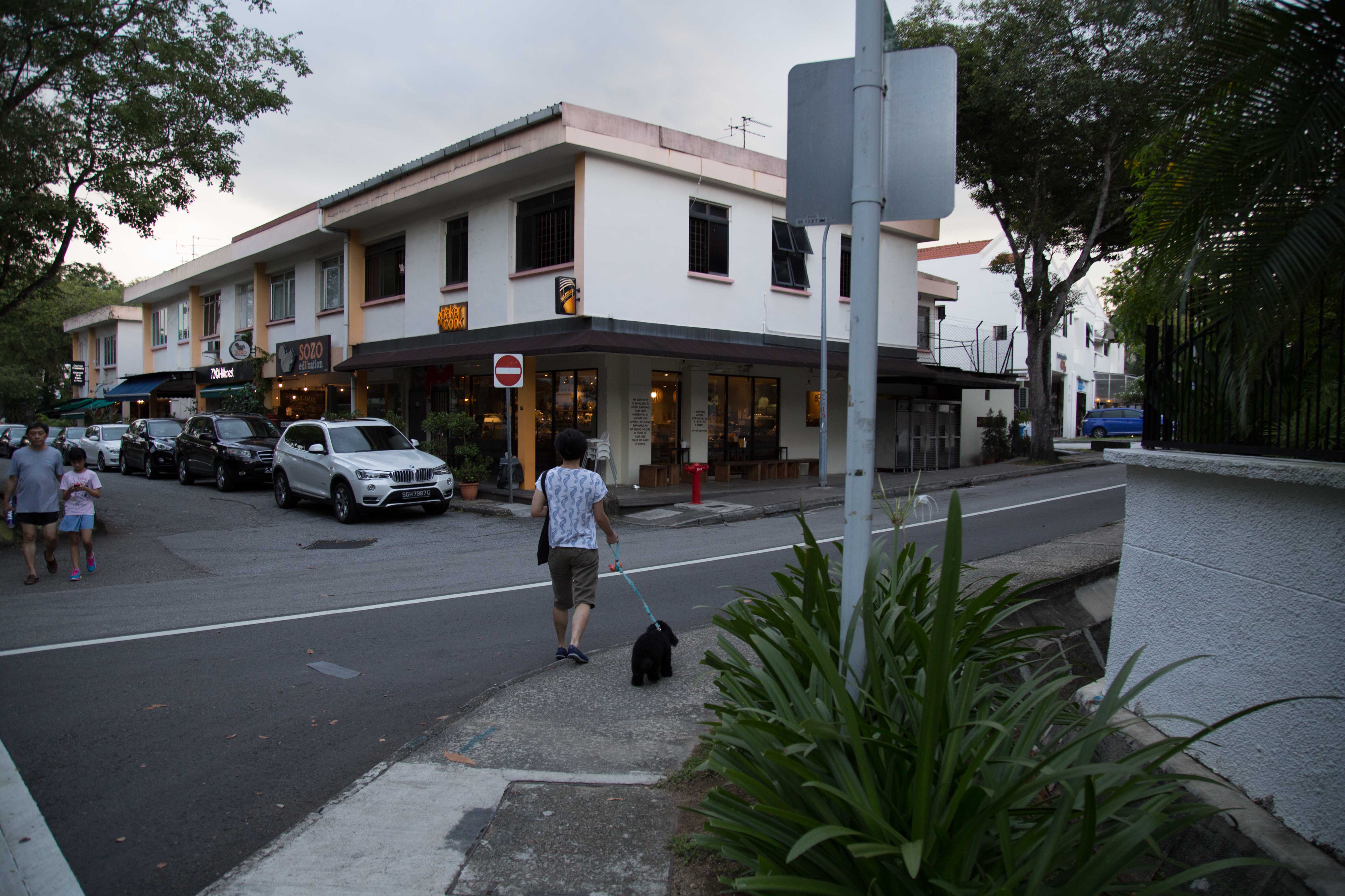
bukit timah is basically a residential area, but for the rich. there are no HDBs, only condos (quite a few actually), and mainly landed property. there are quite a few small malls (do not be confused with neighbourhood malls) to cater the people who live nearby. you’d see supermarkets, laundry mats, small bakeries, cafes, bike shops, wine shops, small restaurants, etc. houses are expensive but gorgeous. its a mixture of old houses and newly designed built $$$ ones. it
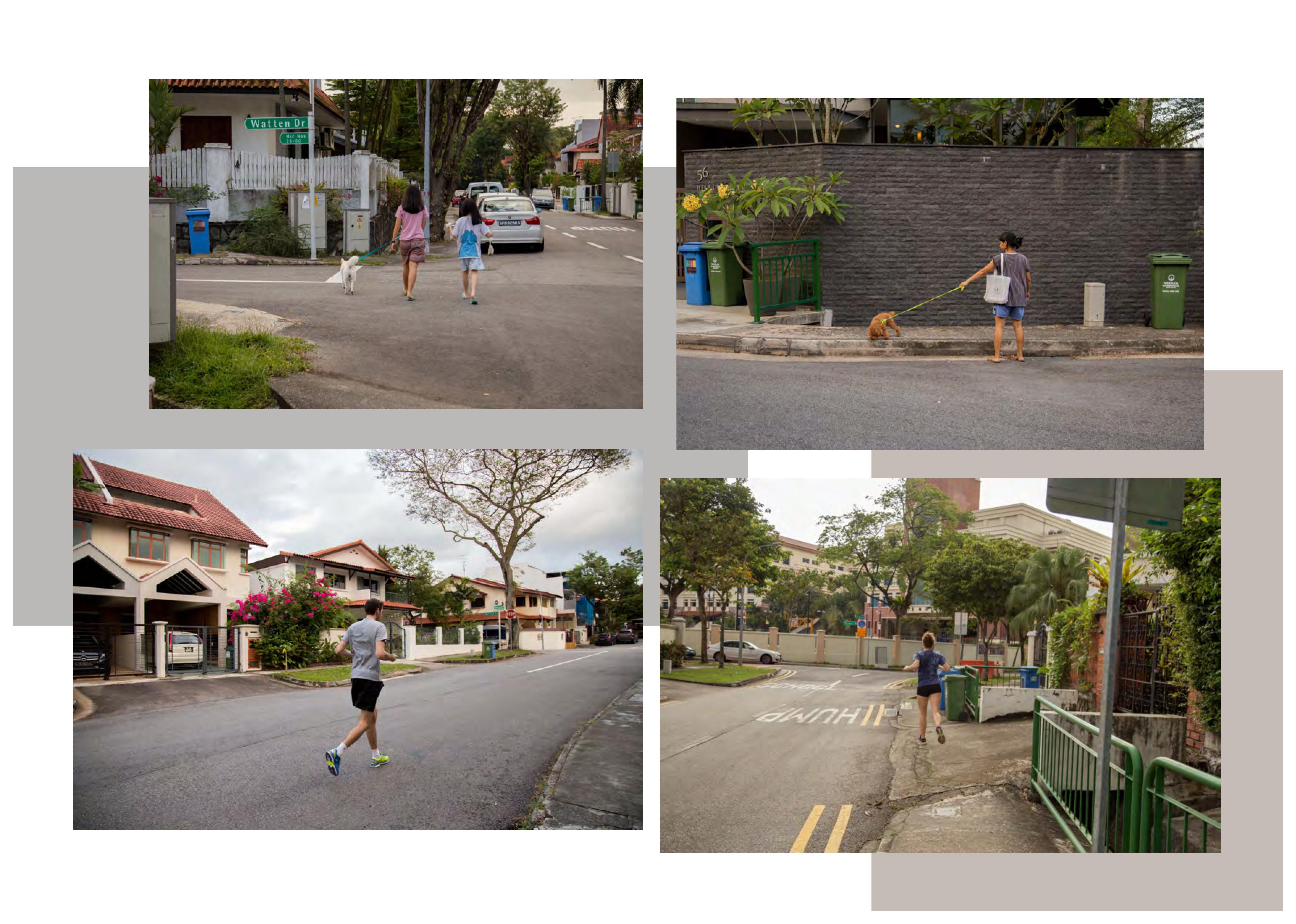
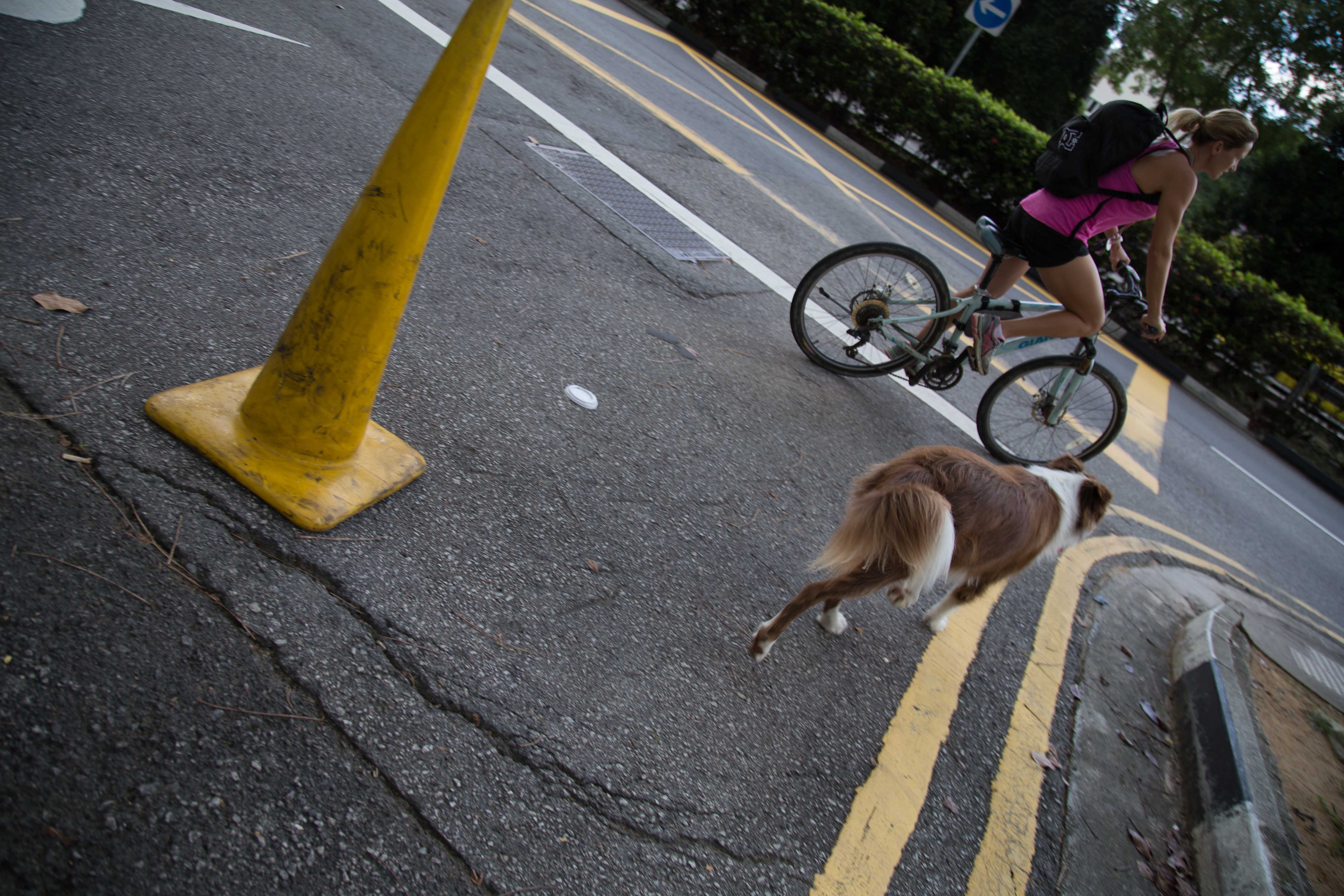
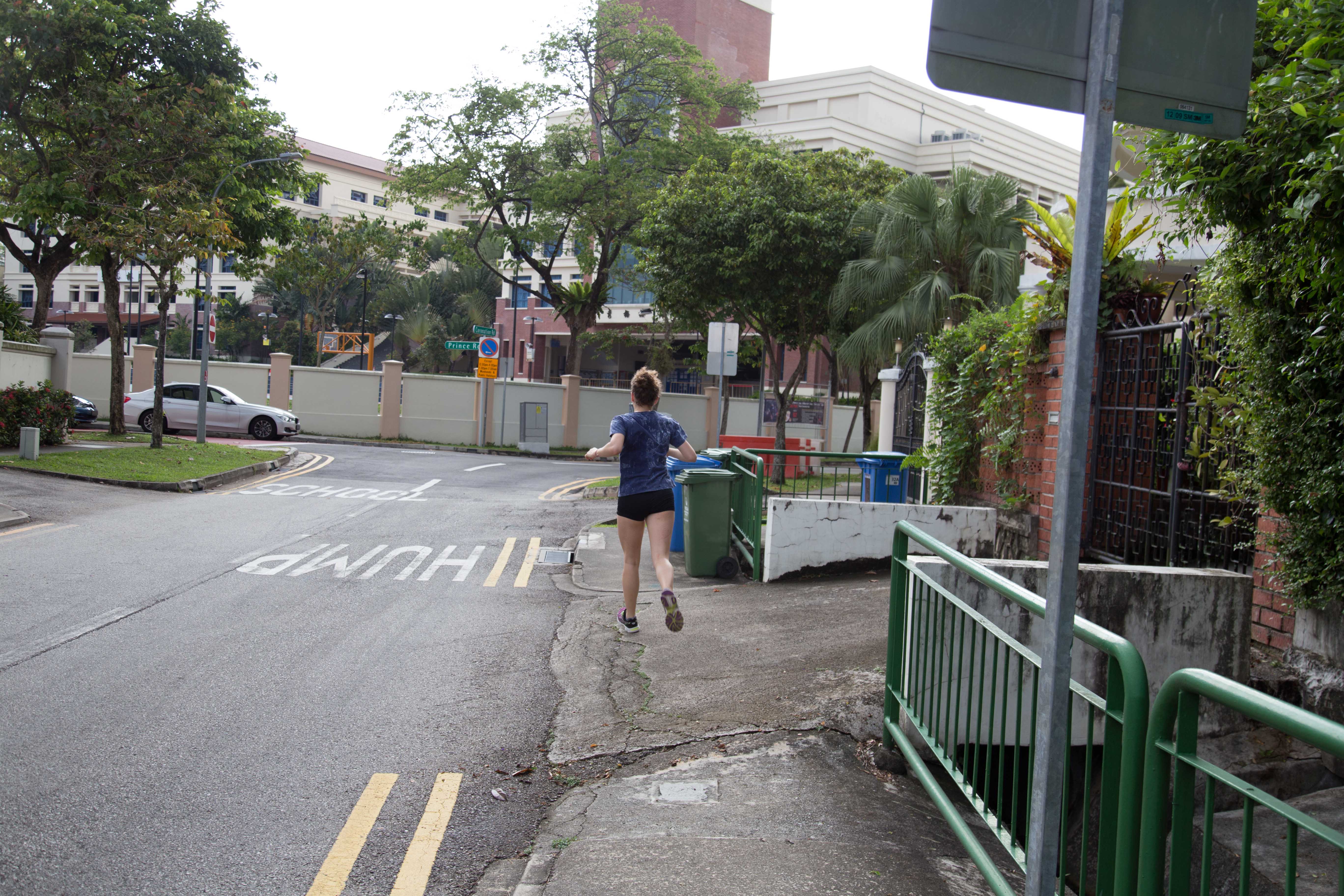
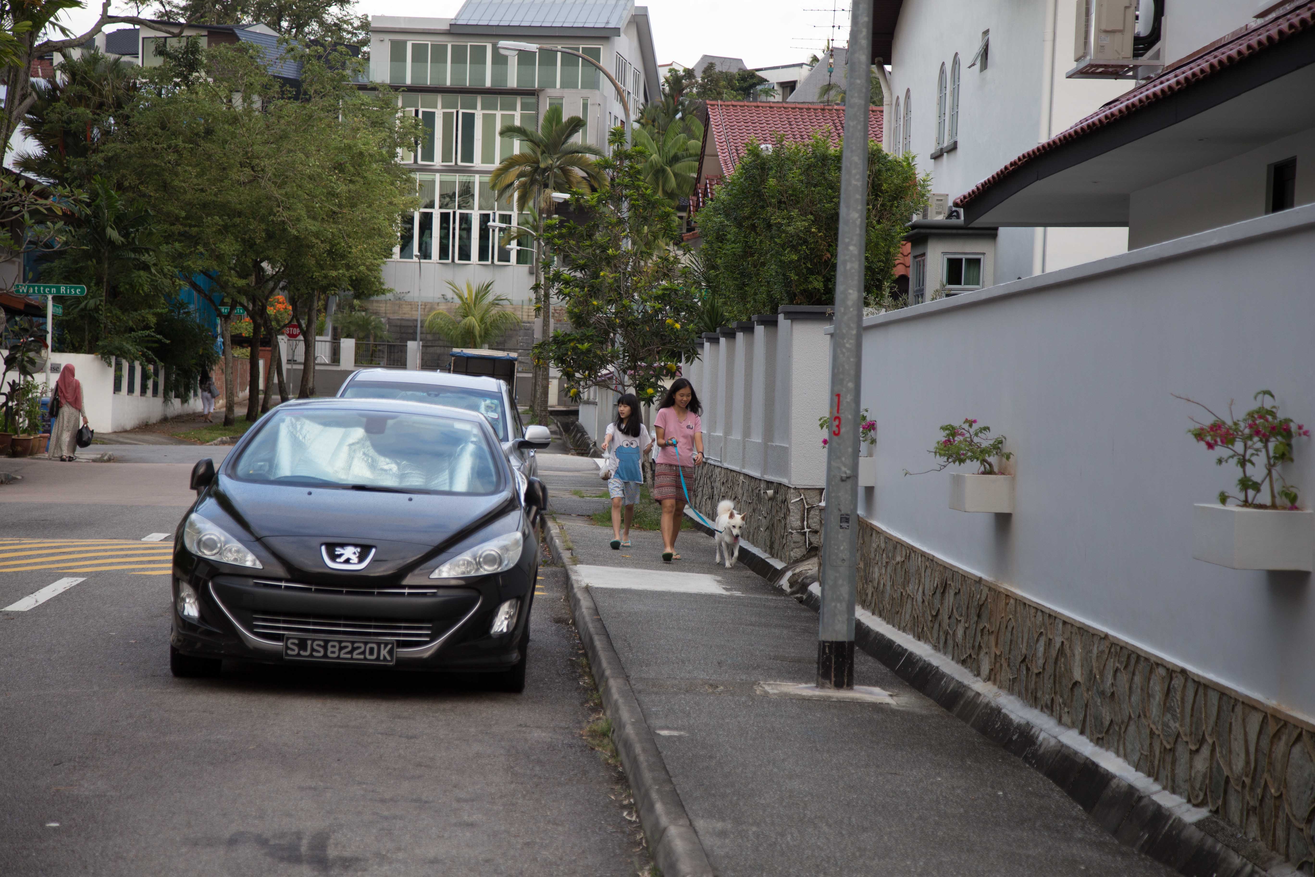
it wasnt too quiet when i was there because it was a sunday afternoon. there were quite a number of people running around the hood, walking their dogs, doing grocery runs.
i started my route at botanical gardens and walked towards cluny court.
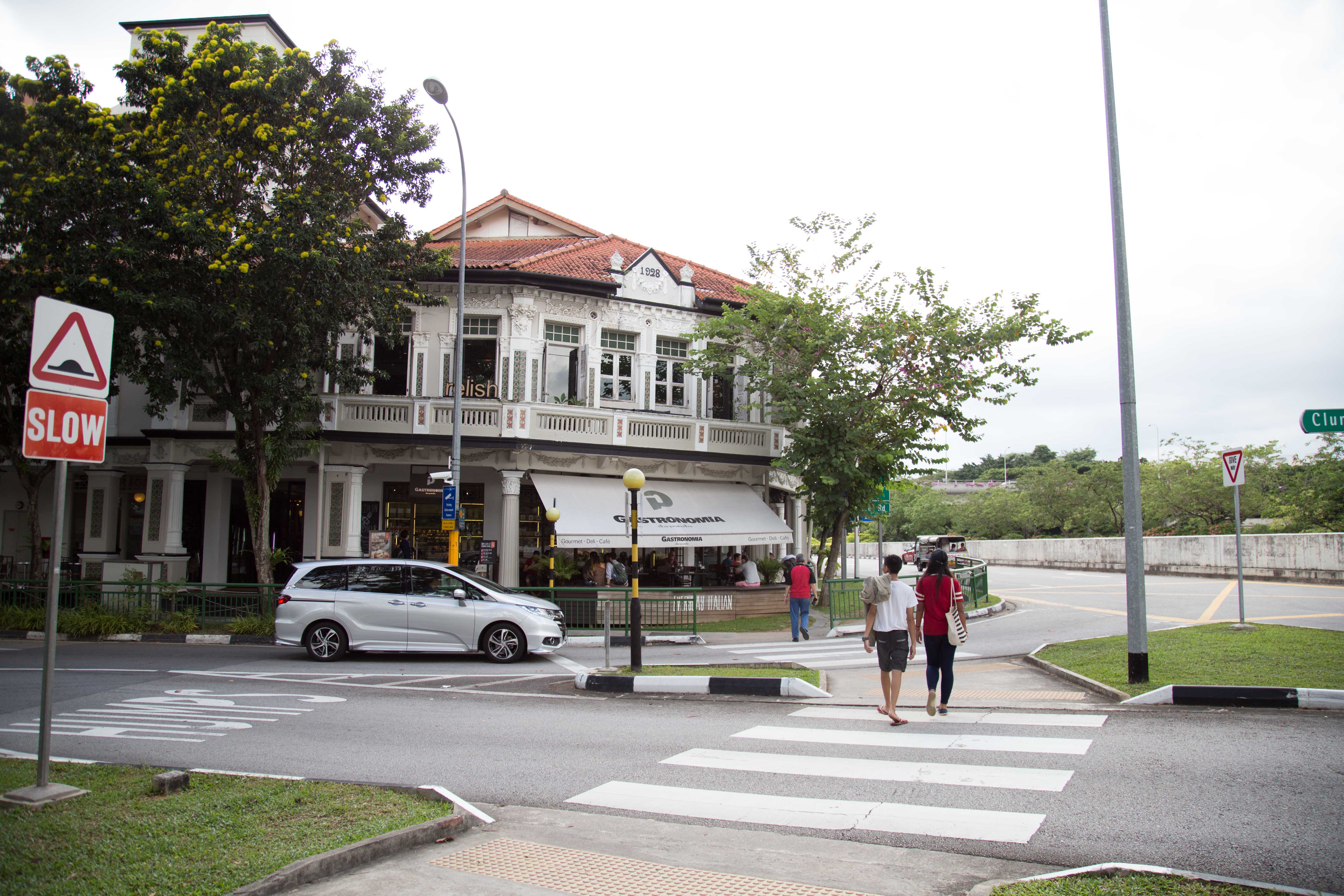
lots of shops and bistros at cluny court. theres a cold storage here as well.
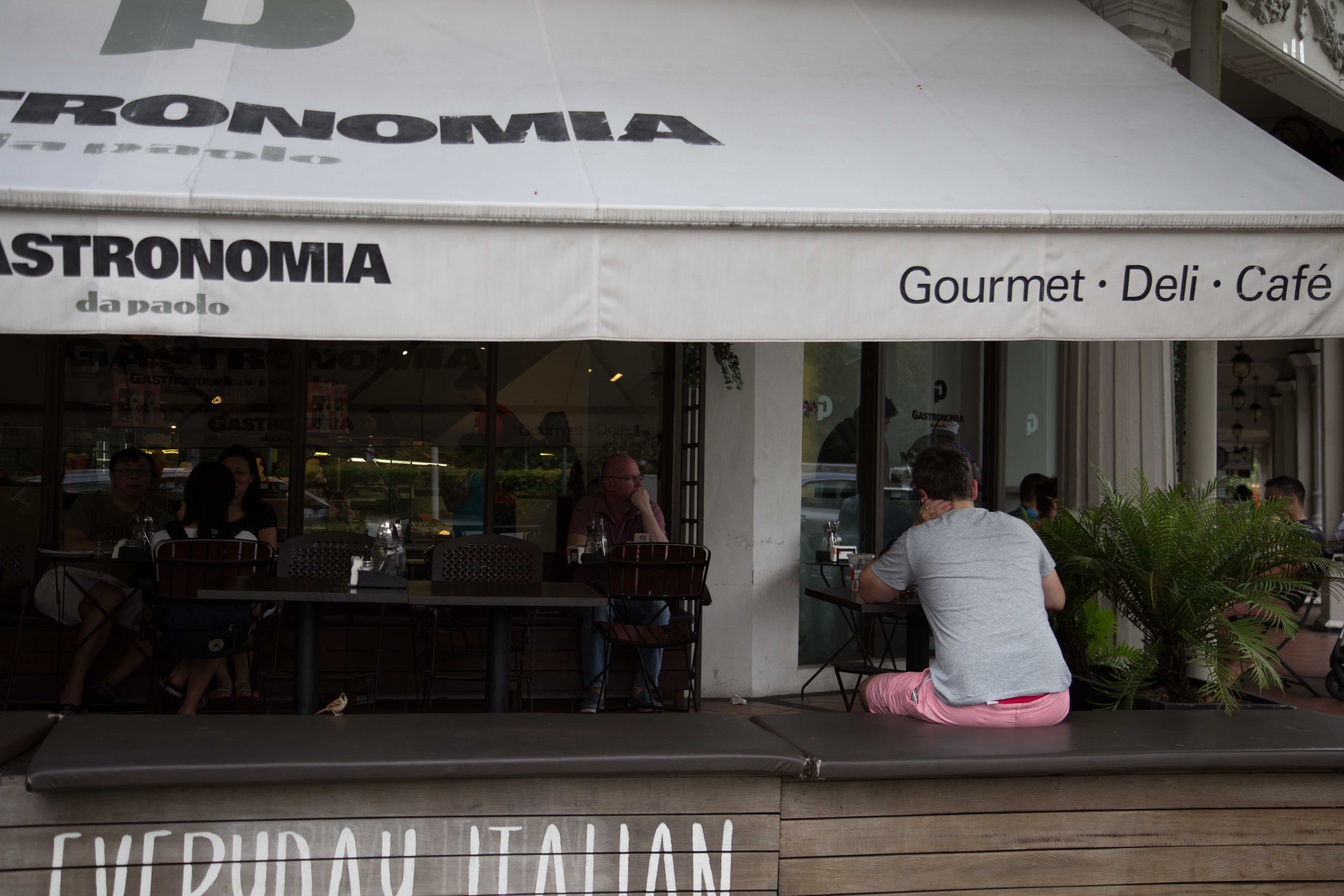
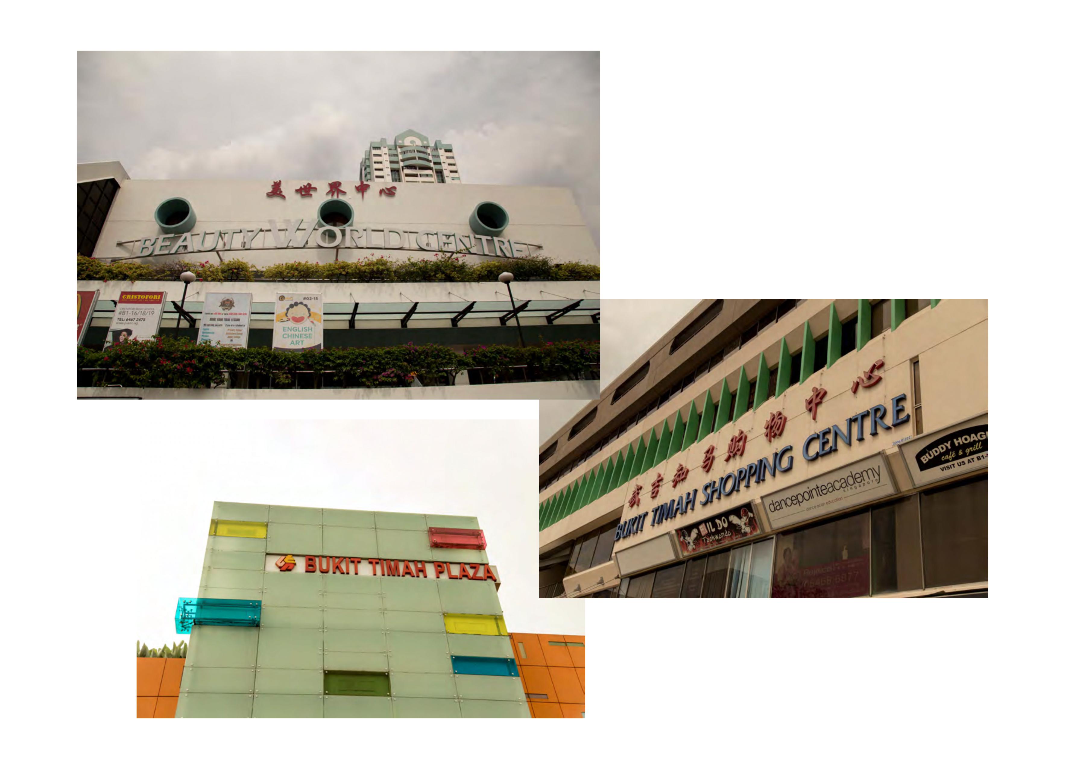
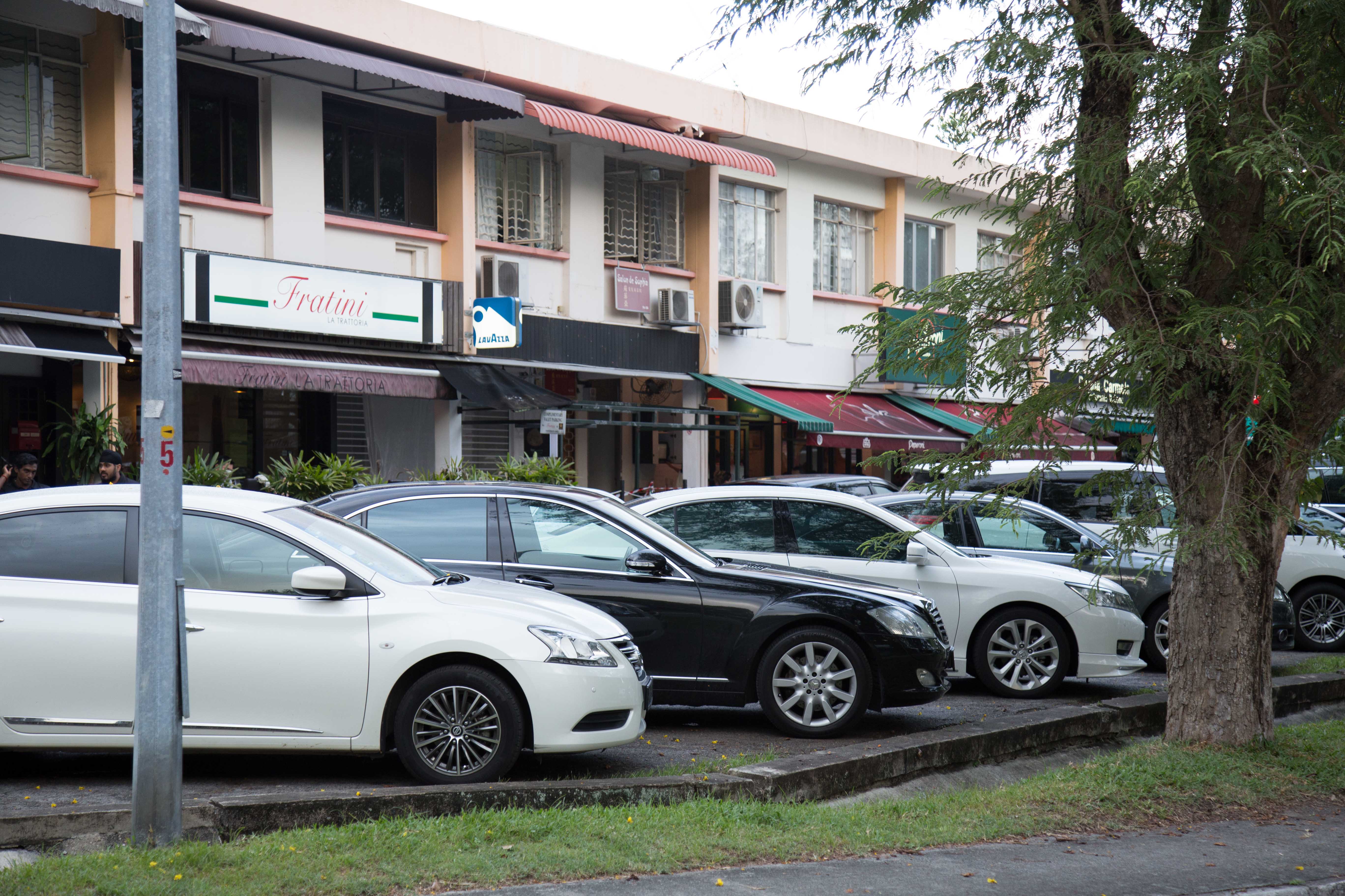
the next few malls include serene centre, crown centre and coronation plaza. they’re the small malls i was referring to.
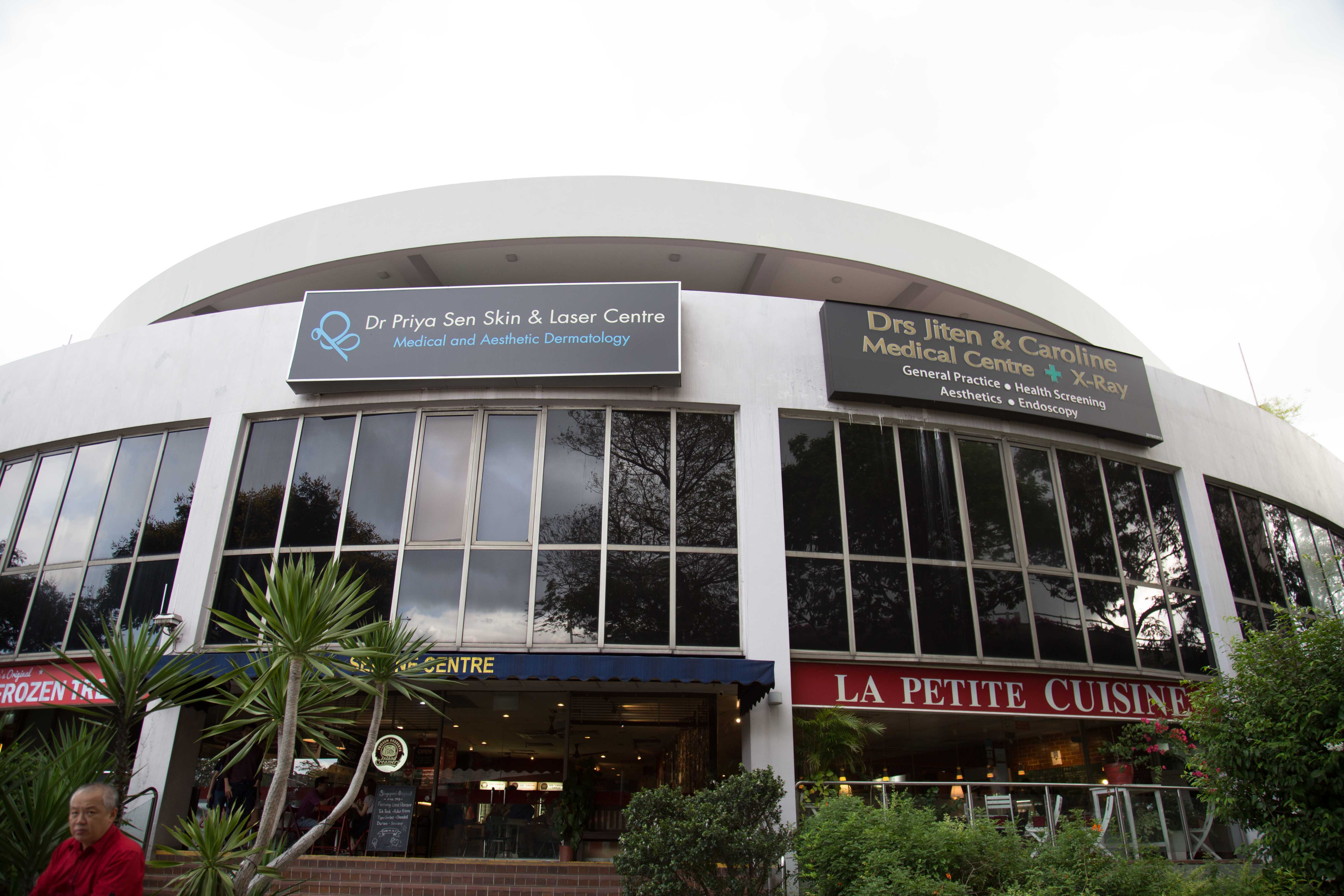
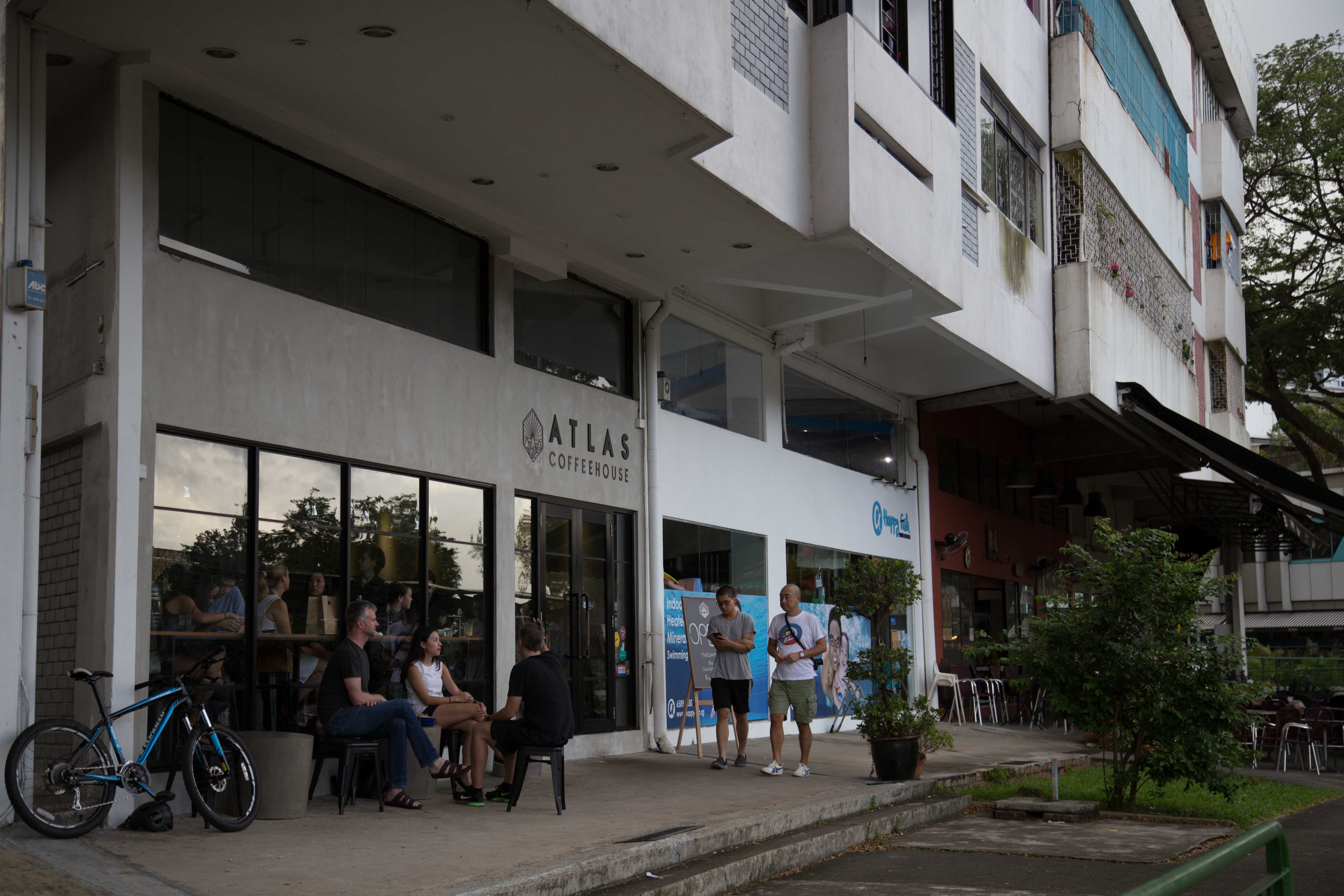
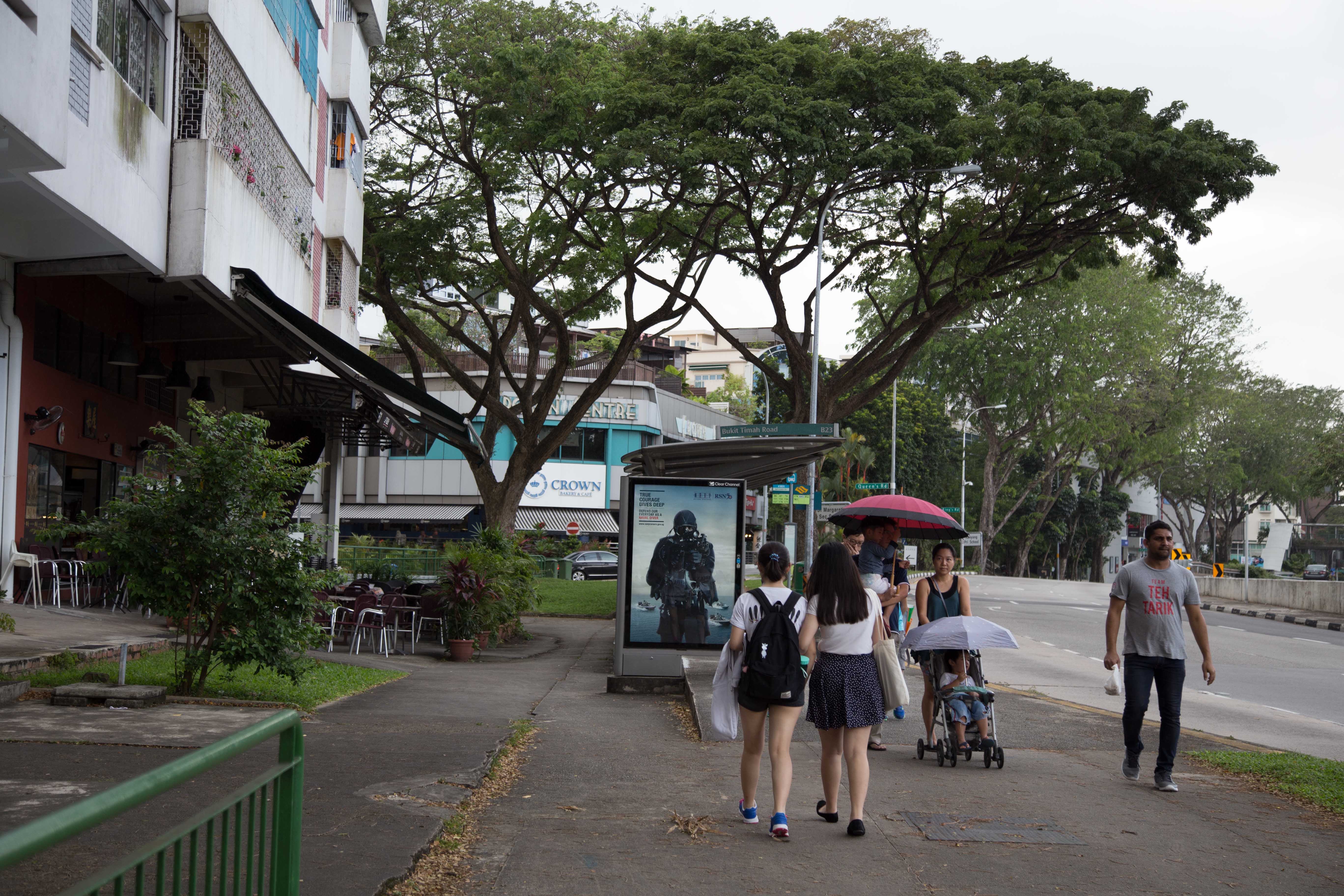
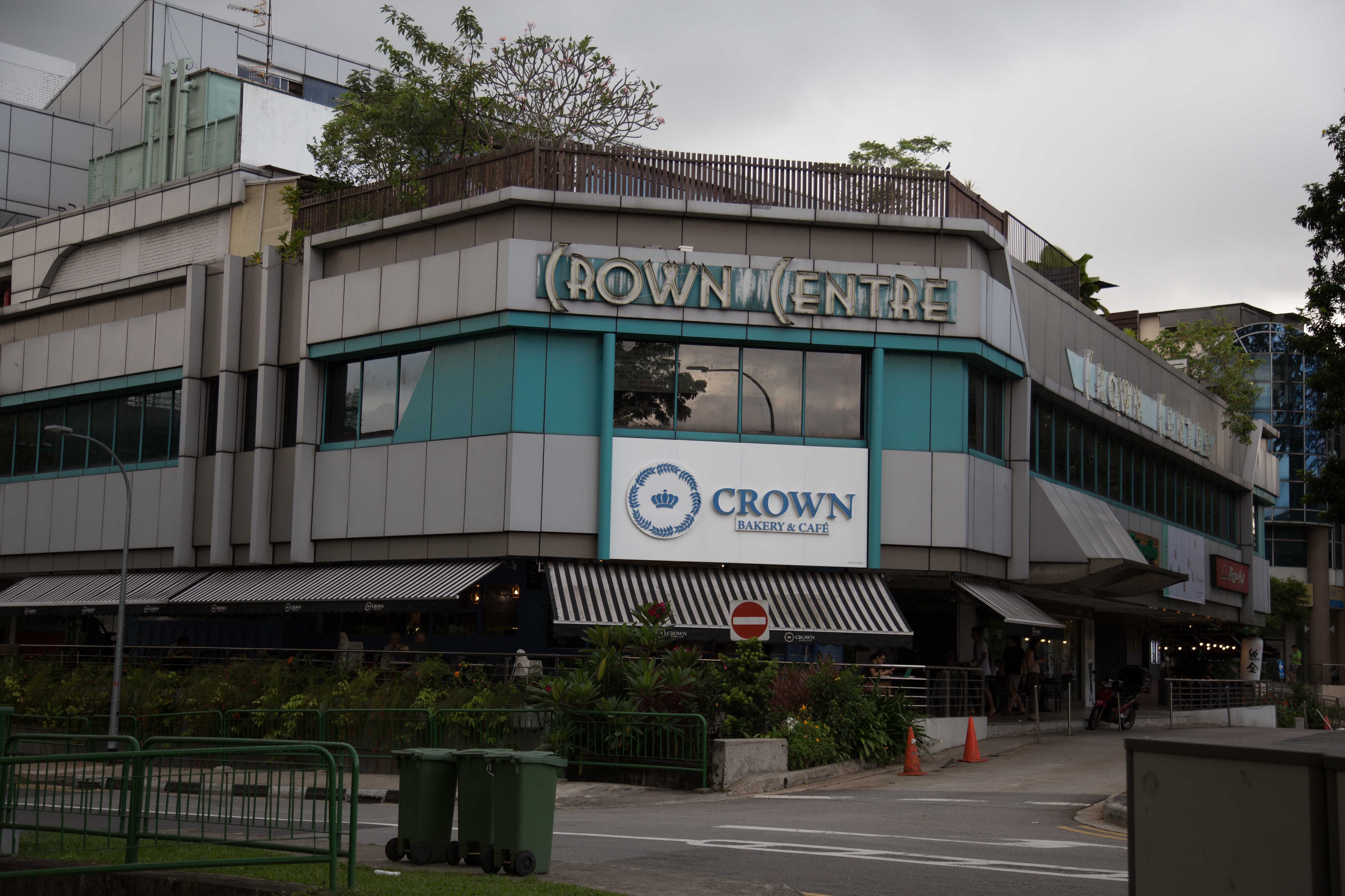
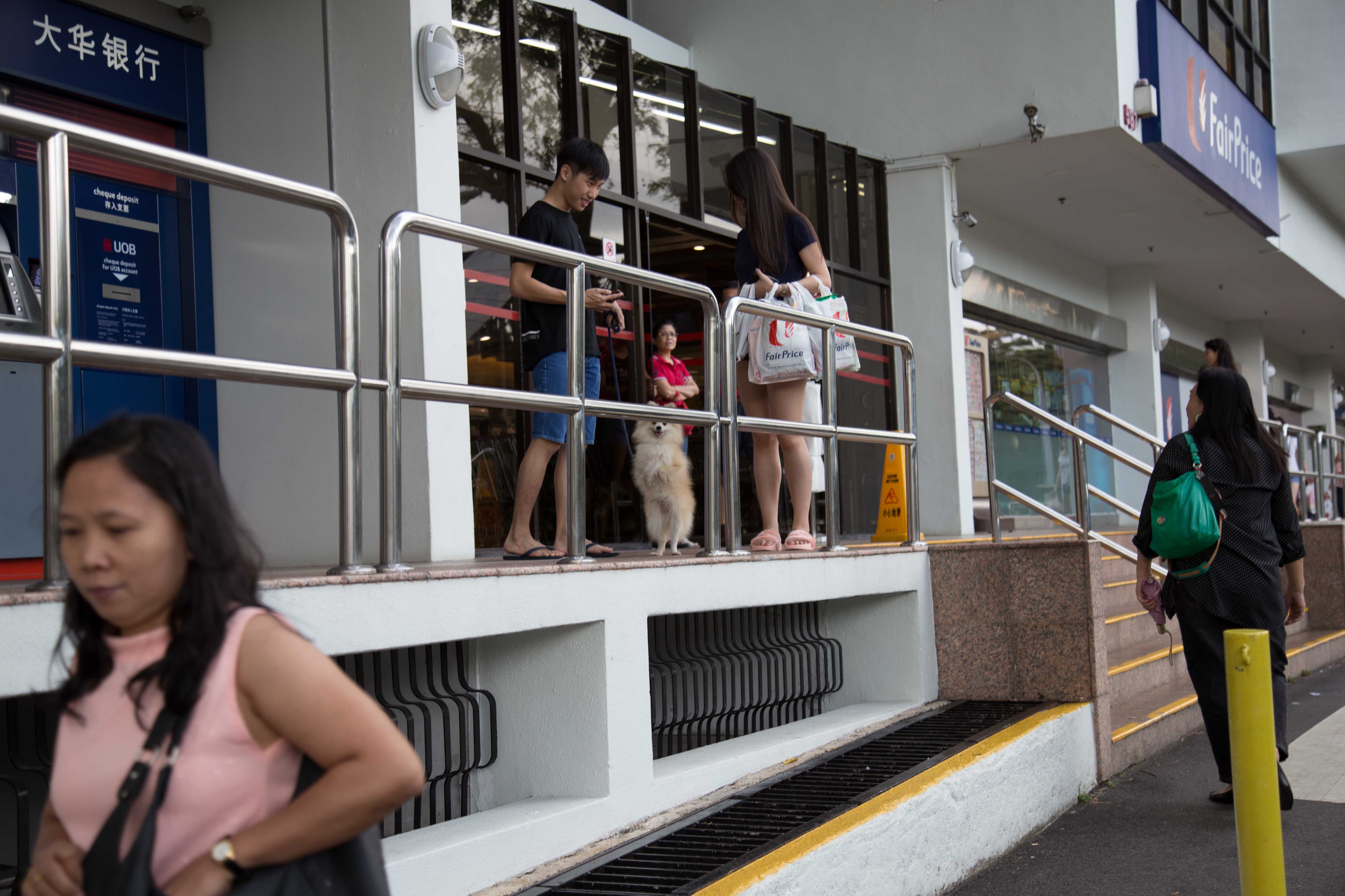
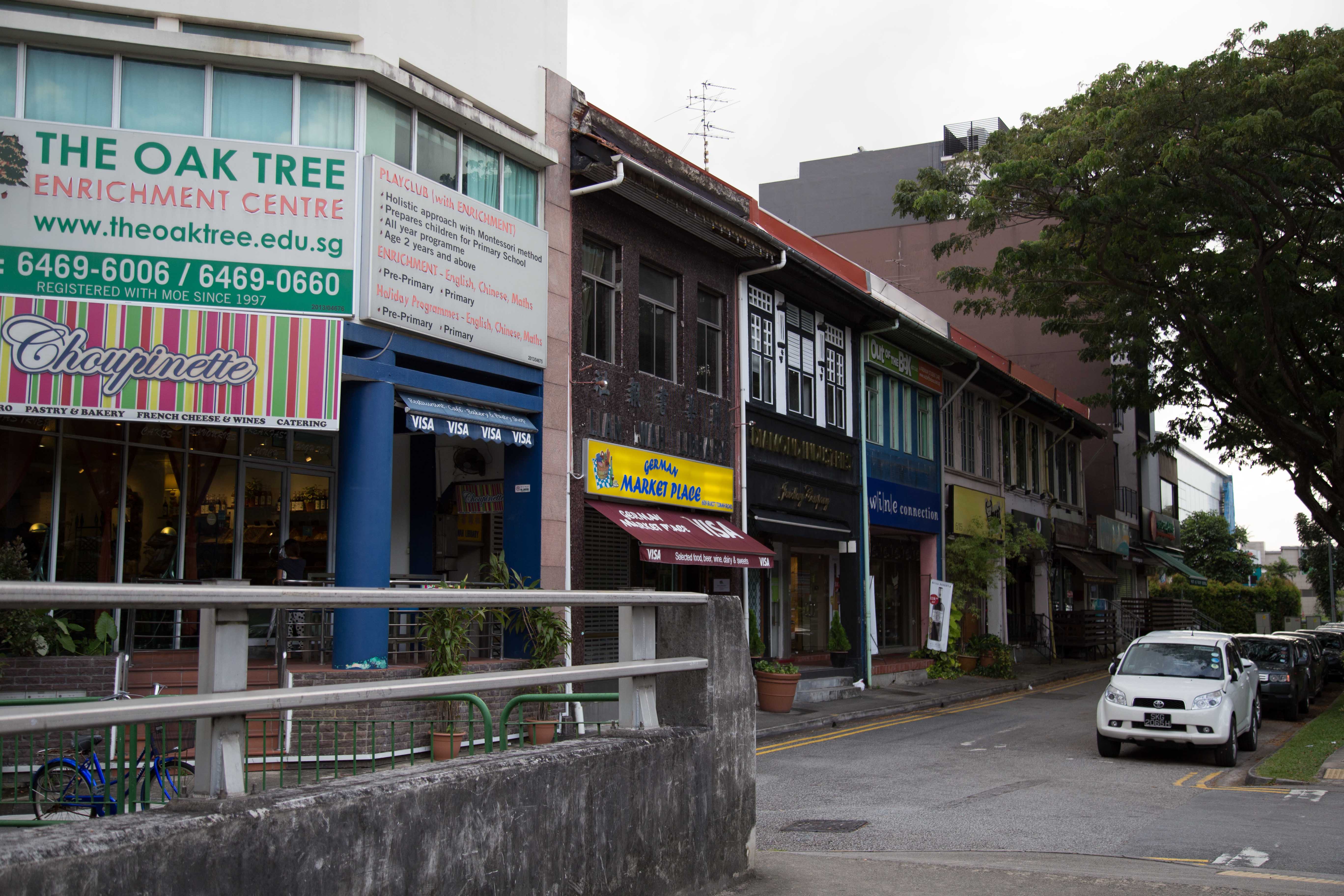
you’d pretty much most of the things you need nearby. eg, clinics, cafes, bike shops, banks, etc.
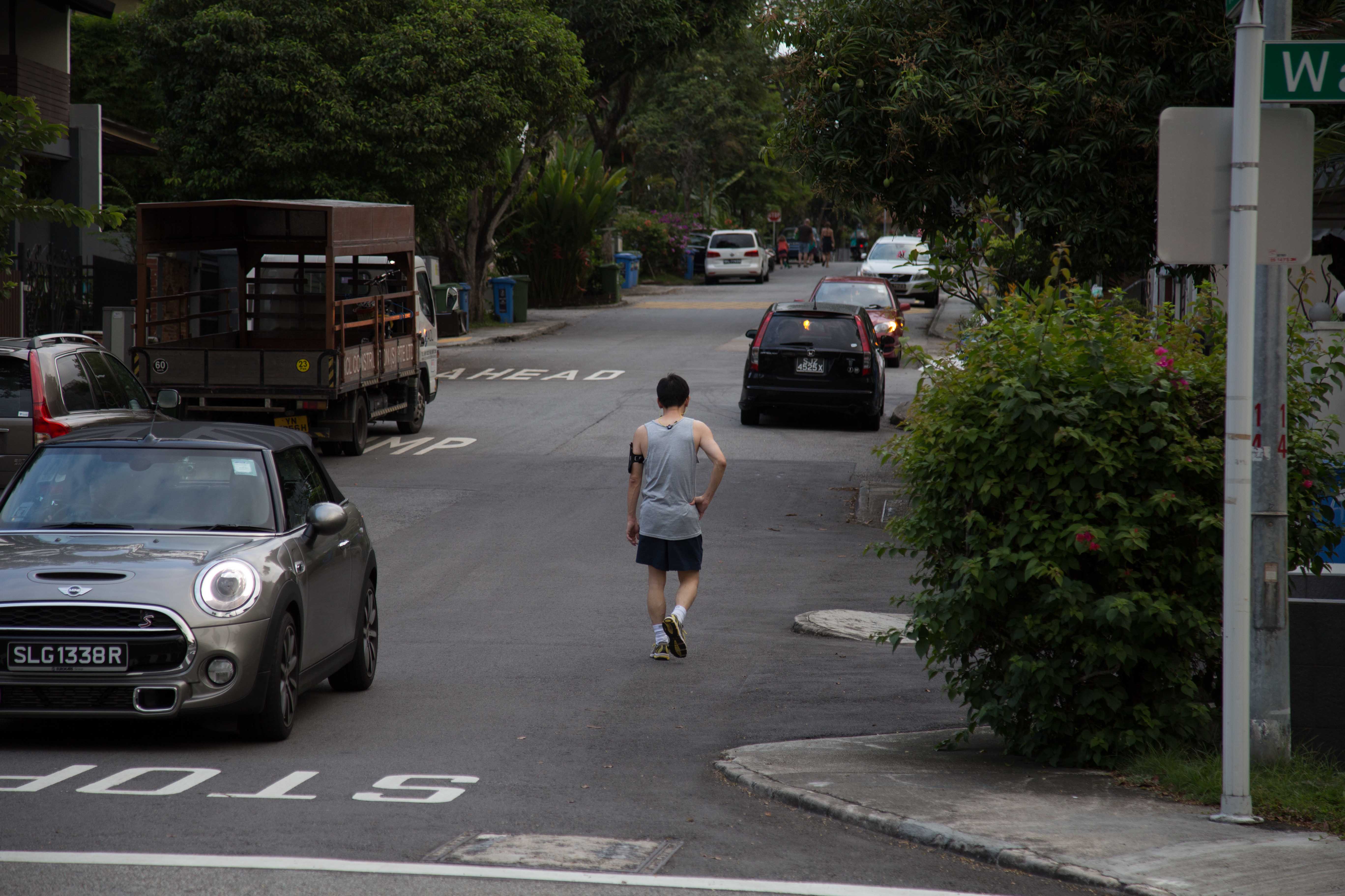
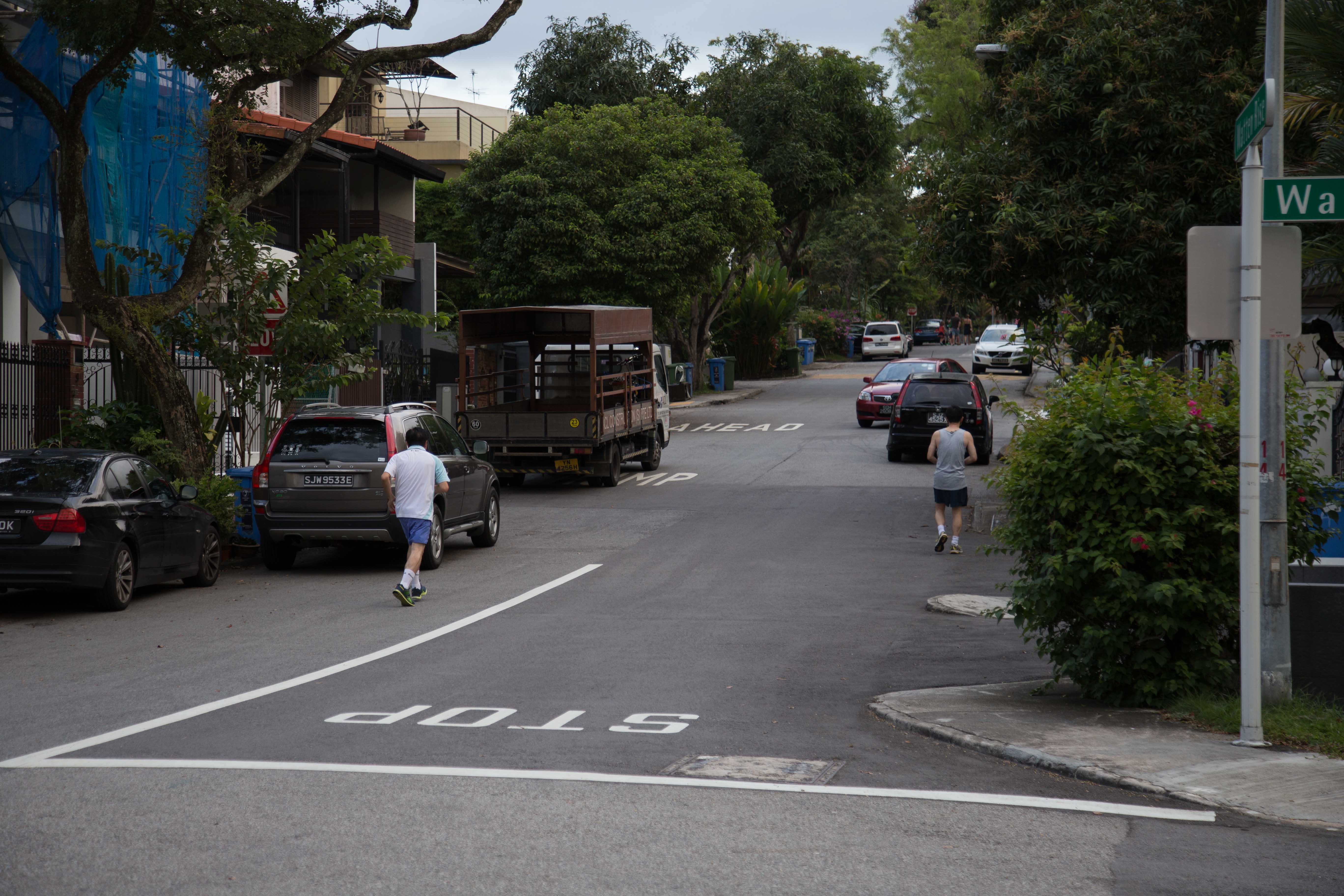
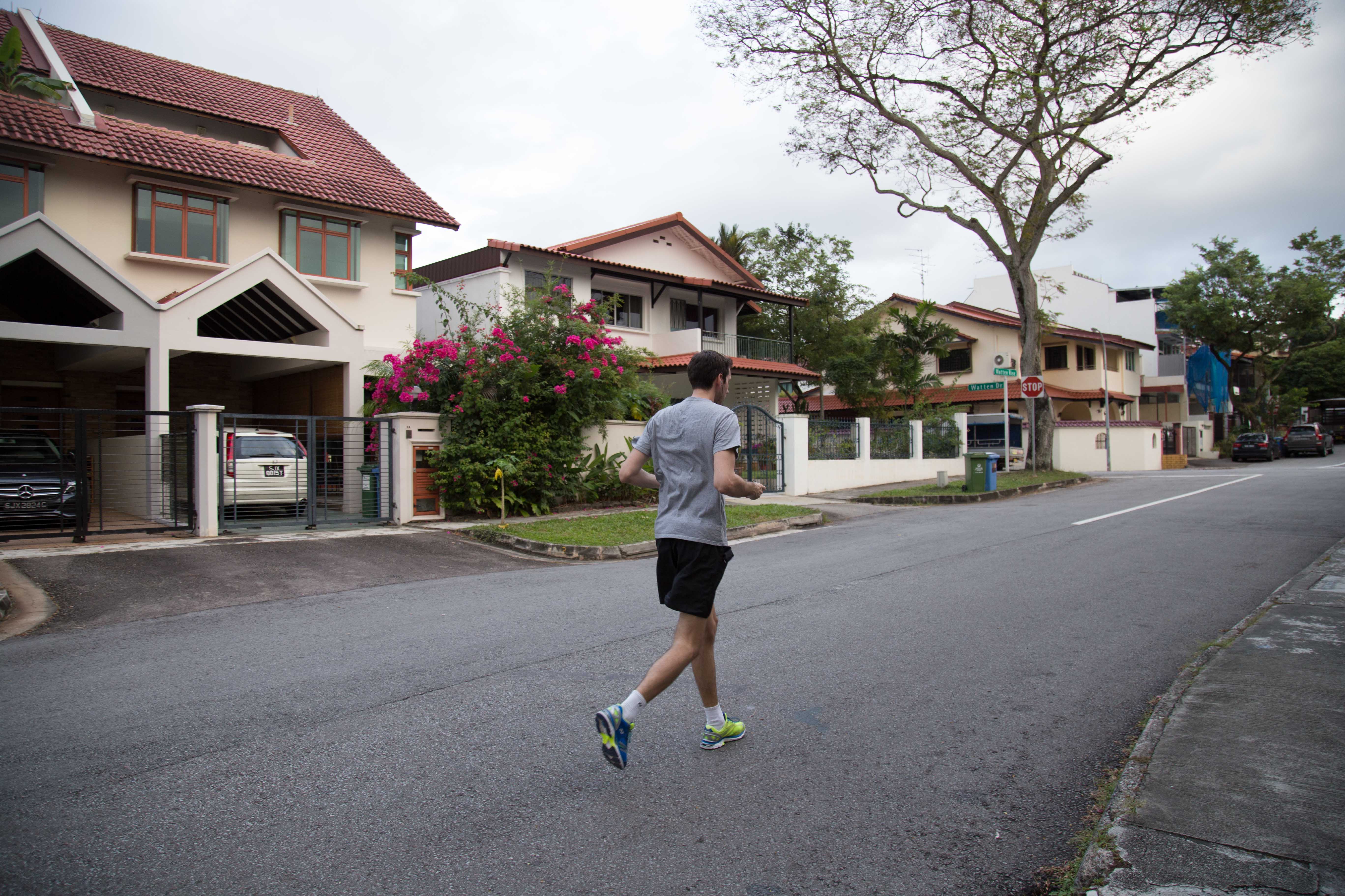
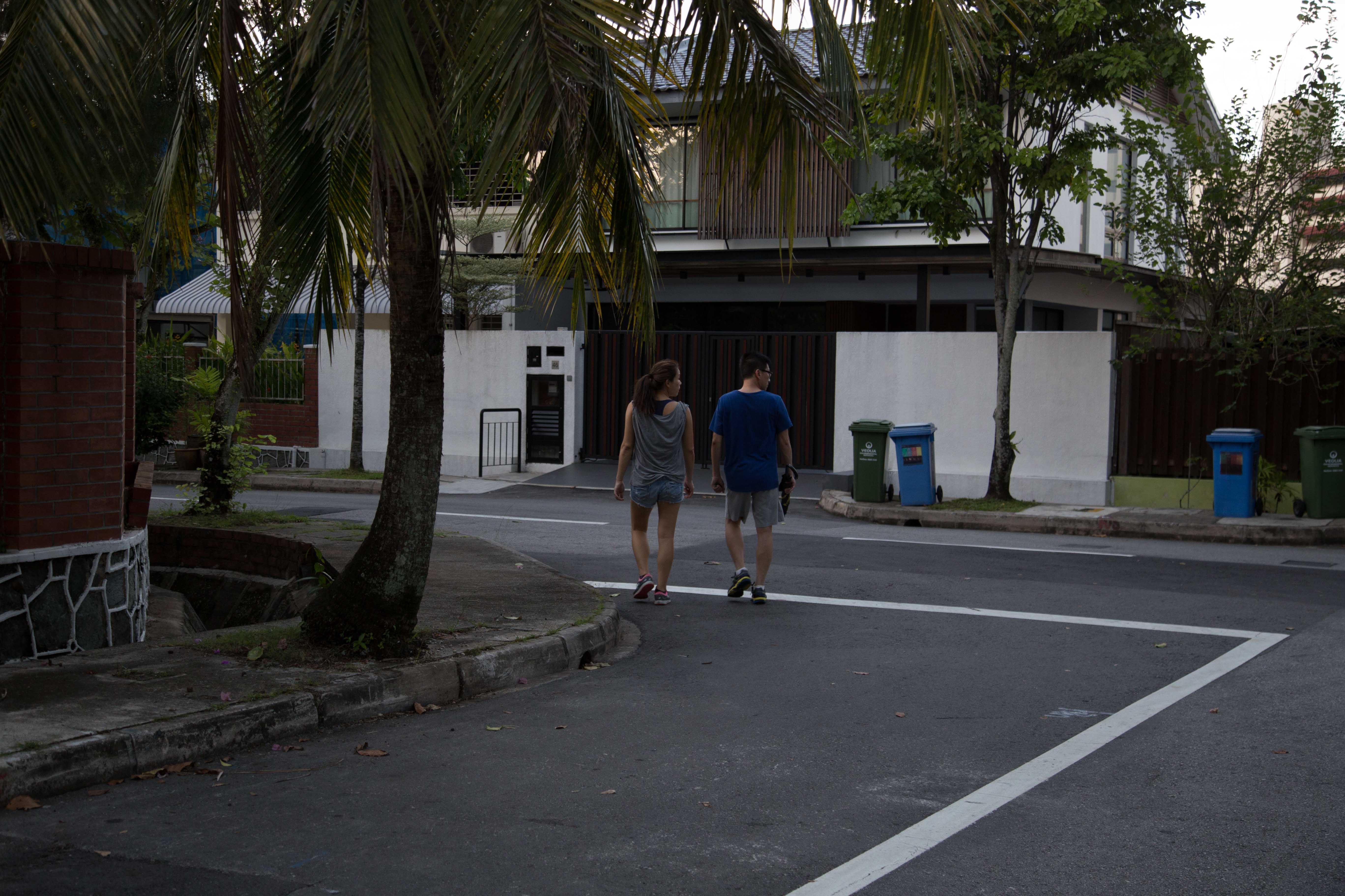
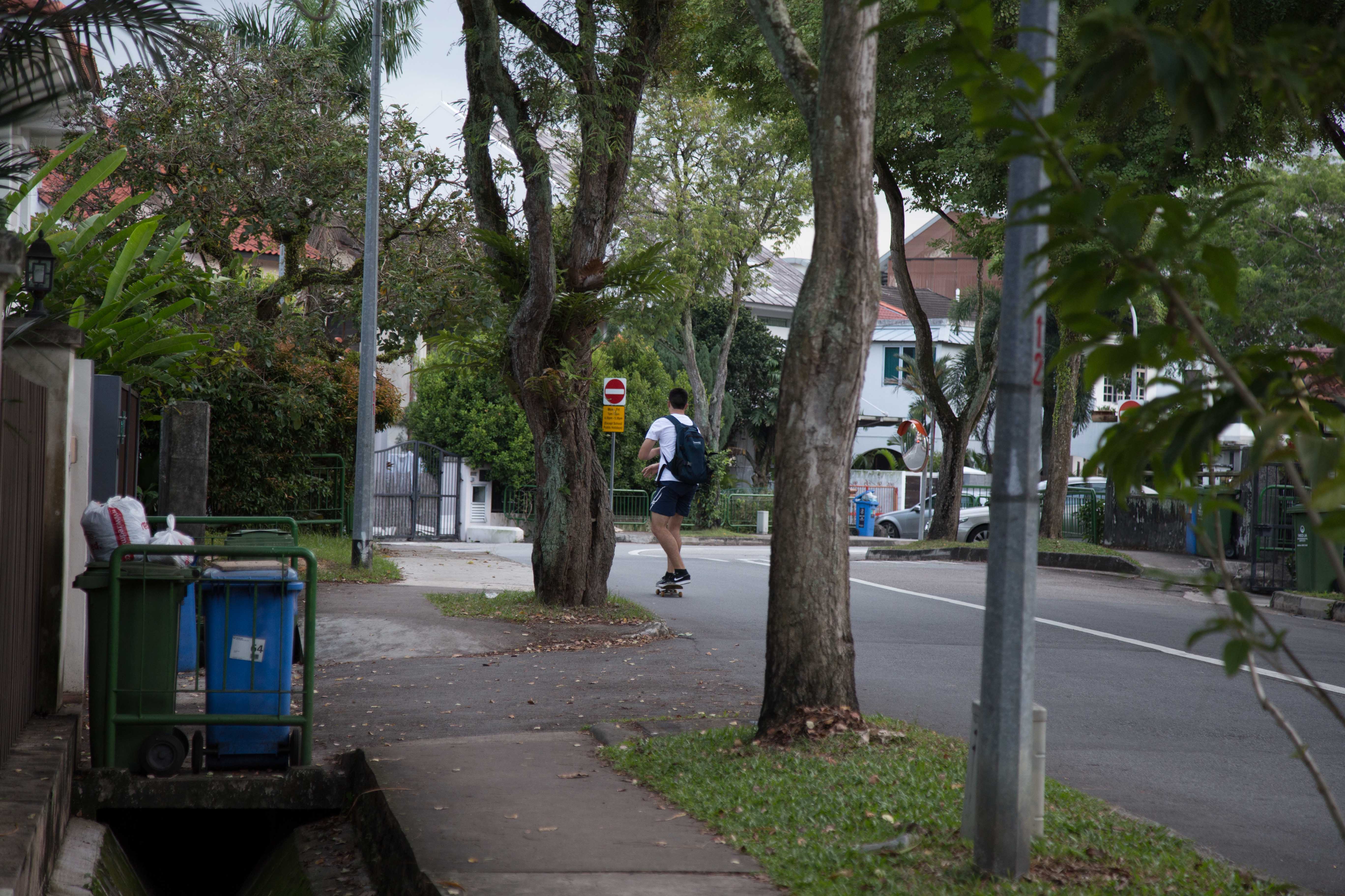
i walked to Tan Kah Kee and started my residential recee there.
my route for my residential recee started at Coronation Road > Duchess Road. then i crossed the road and covered Watten Estate > Greenwood Avenue.
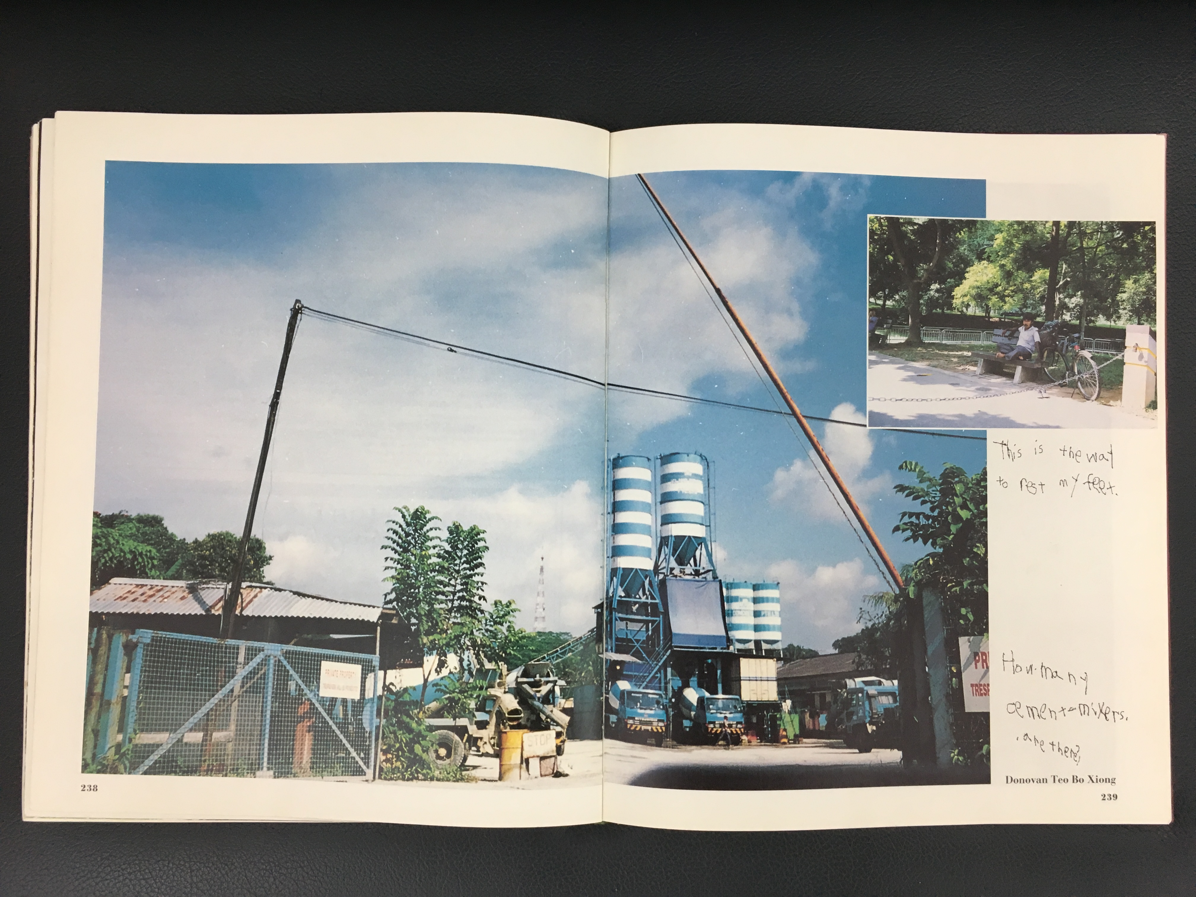
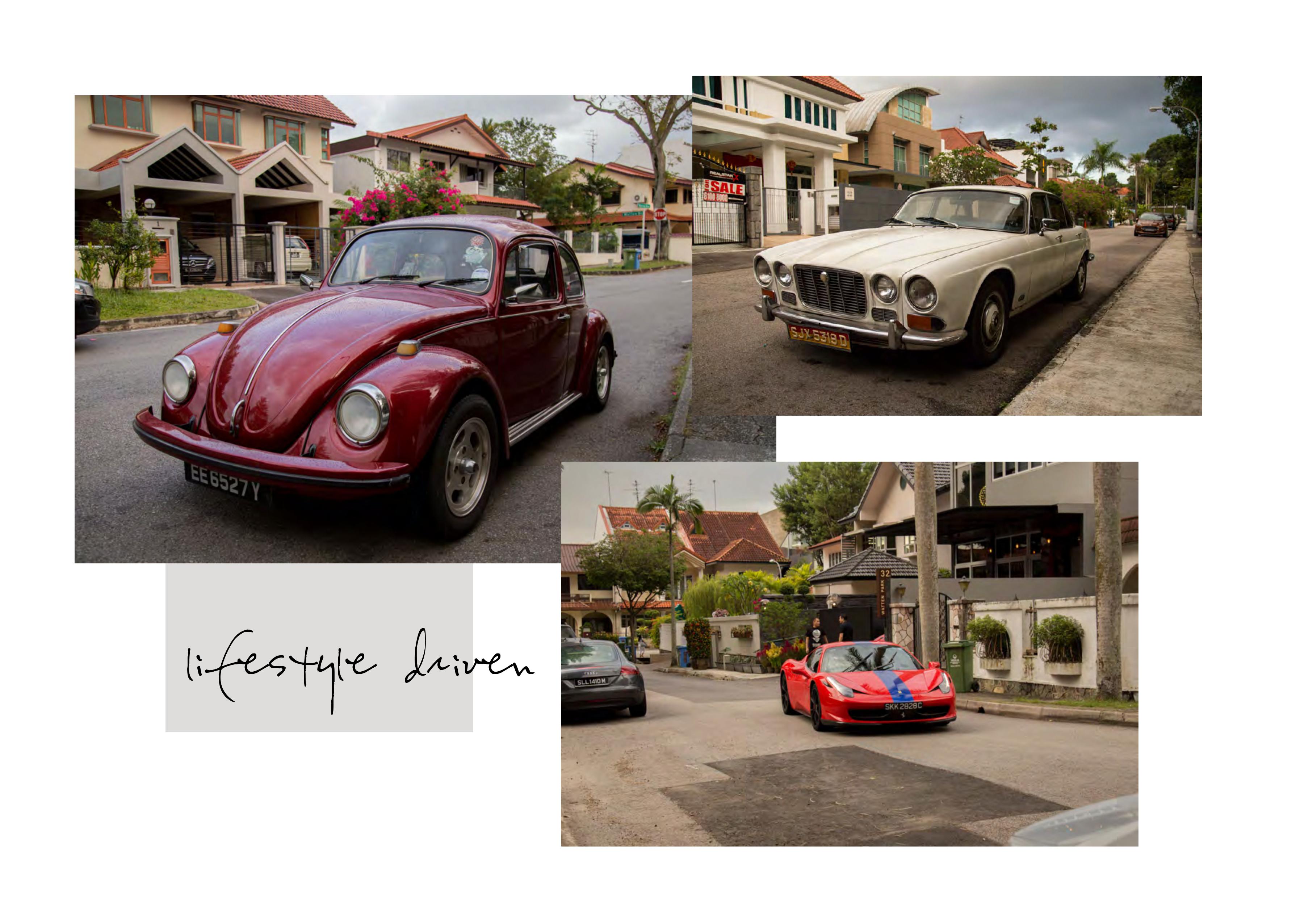
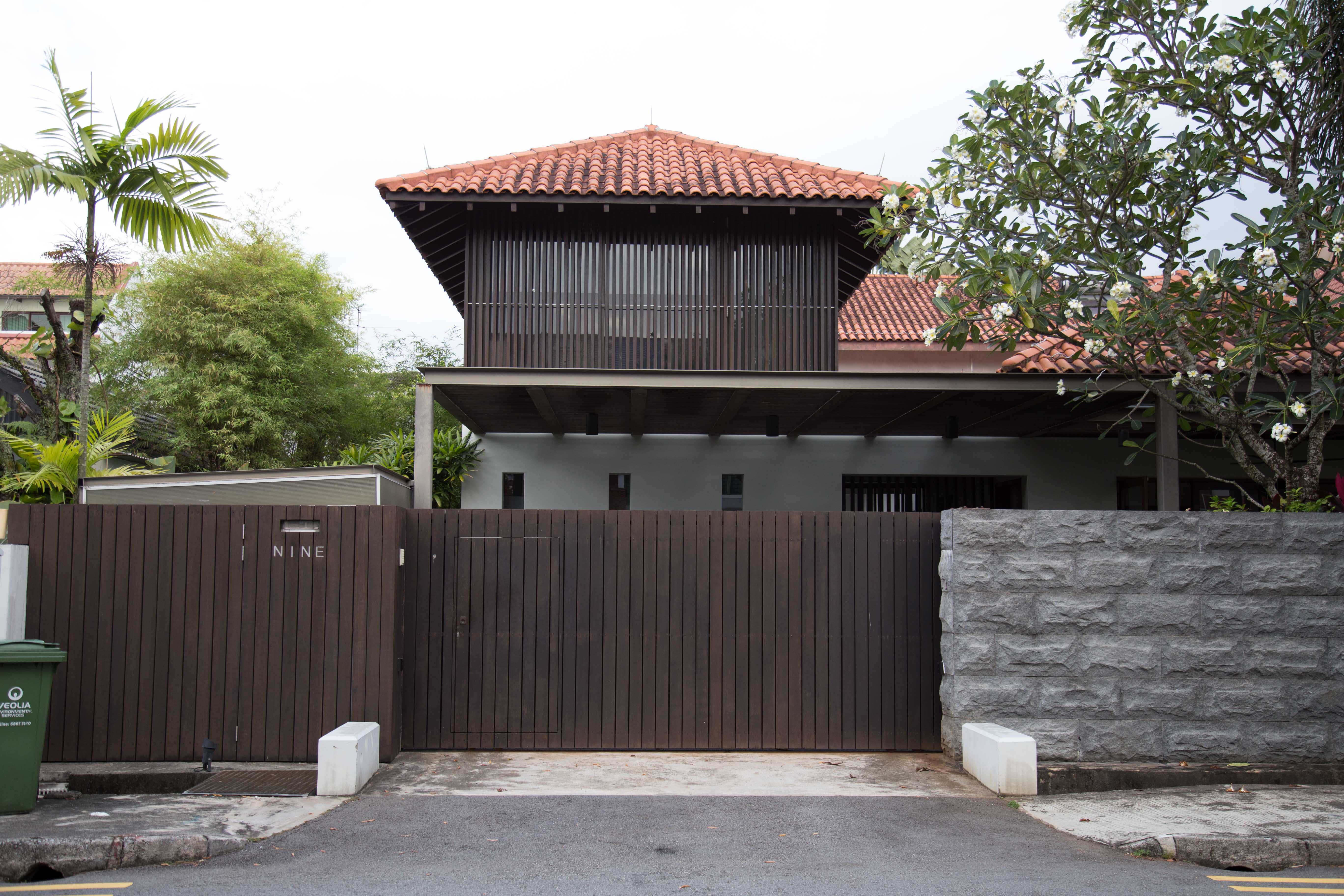
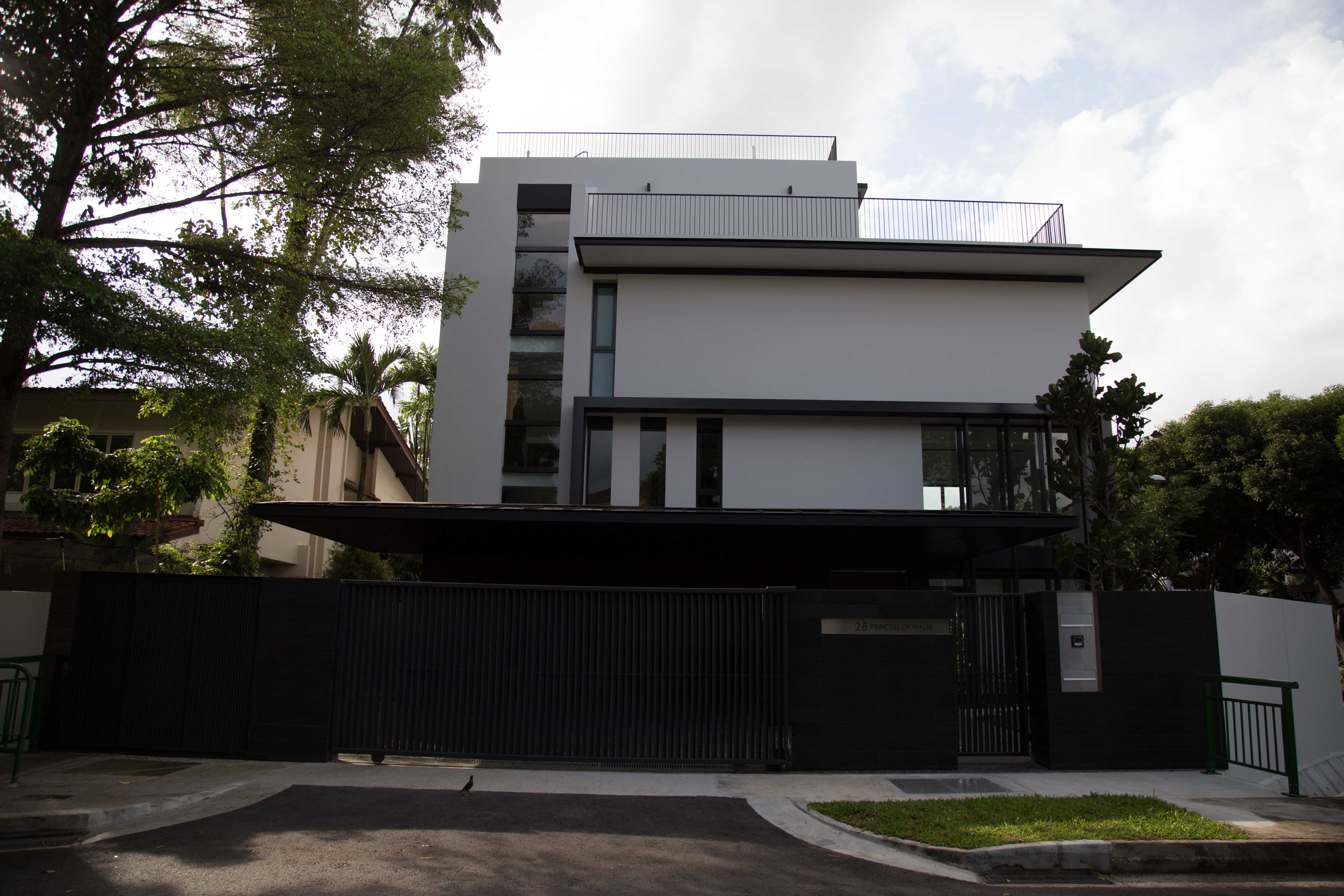
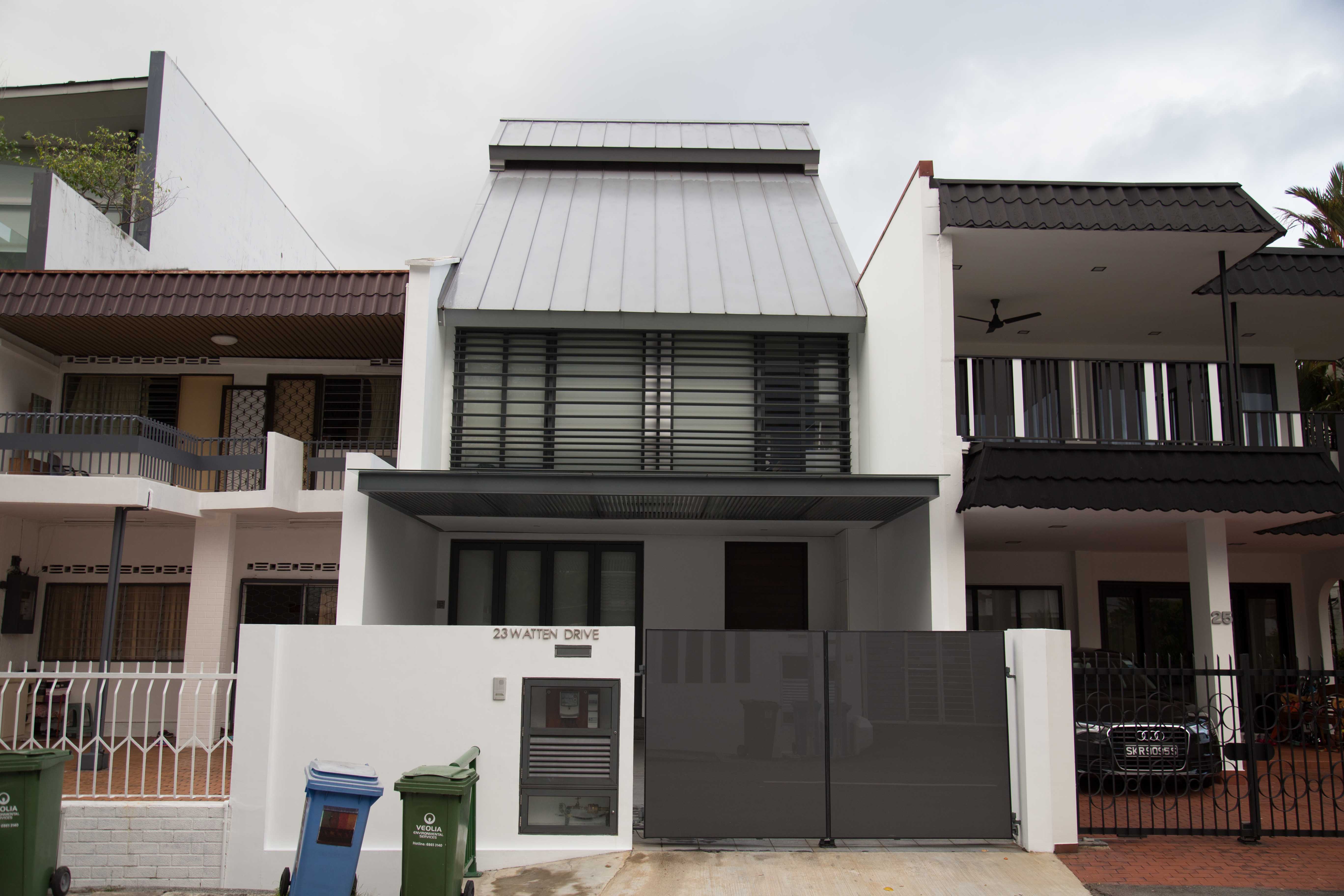
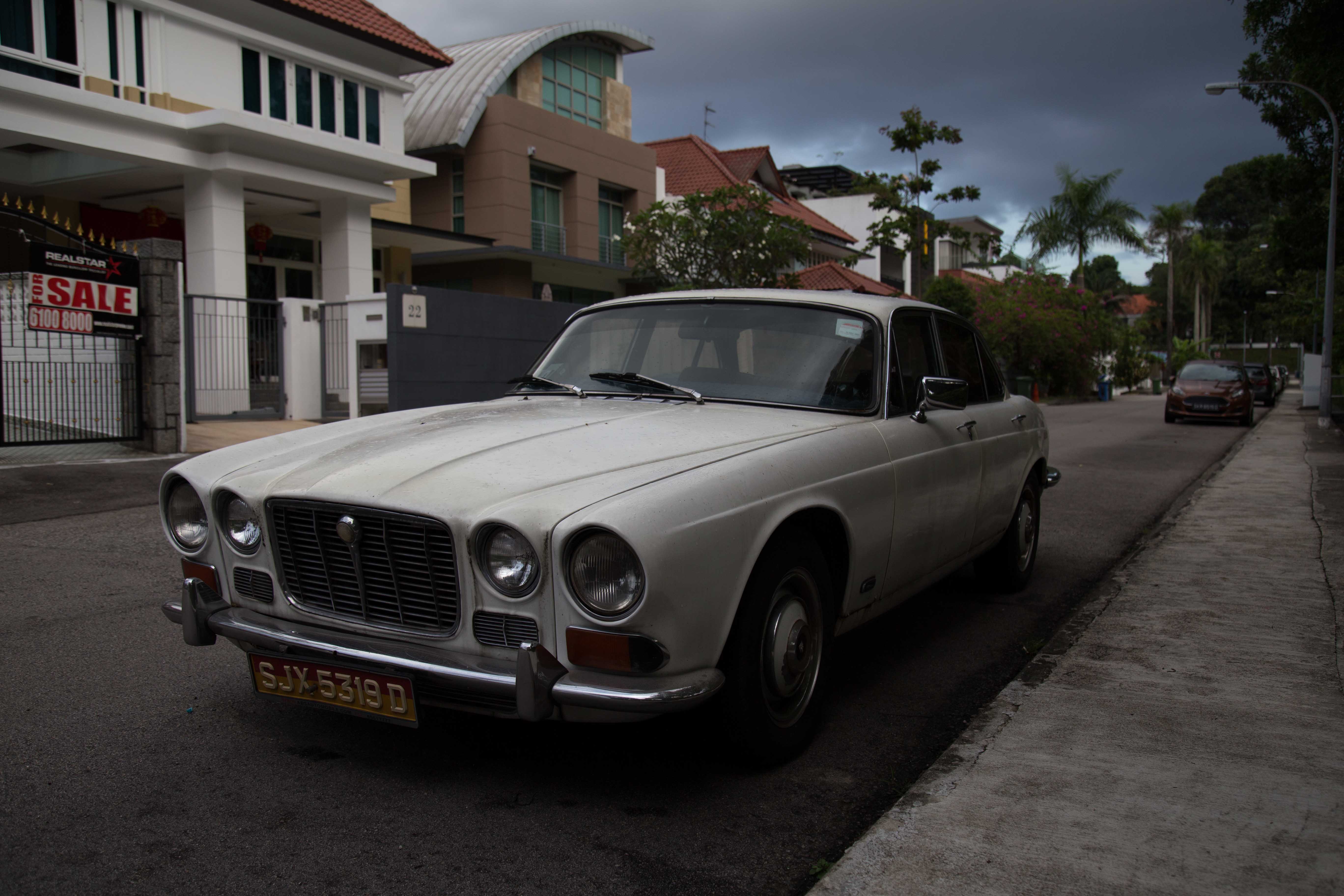
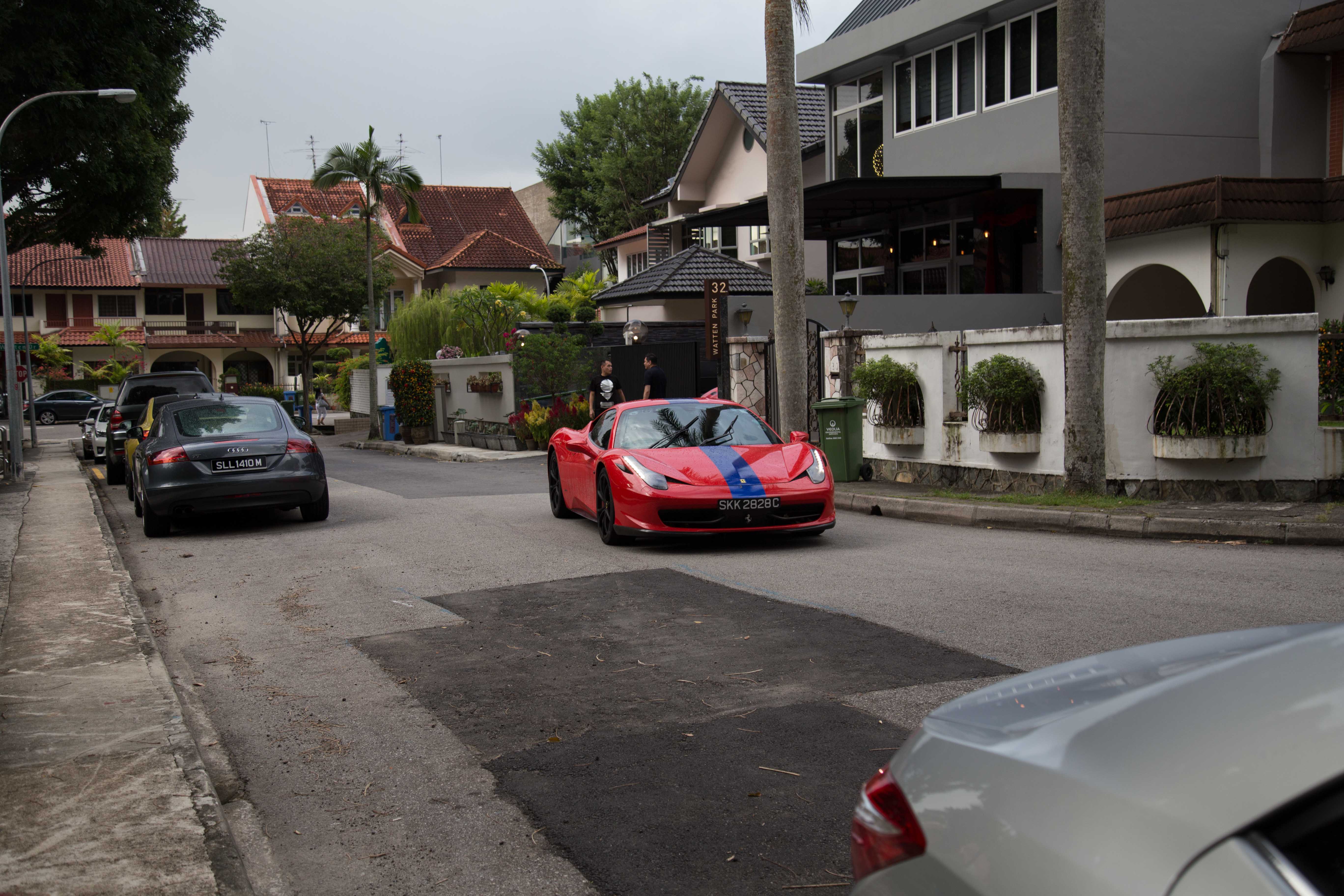
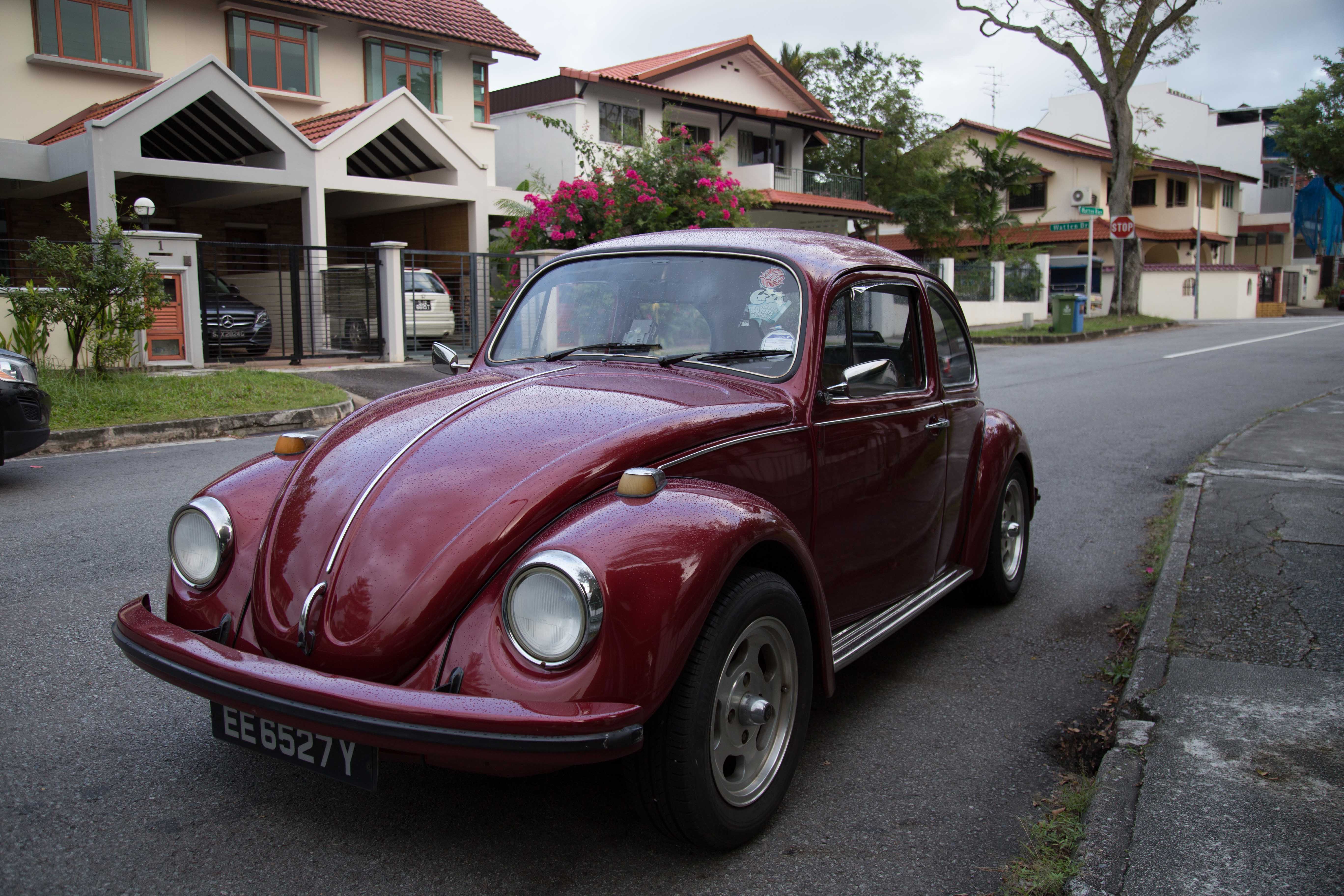
because its a residential area, i captured photos of the houses, and the life in the hood. the houses i captured are mainly the really nice and expensive ones, but i didnt forget the old ones too.
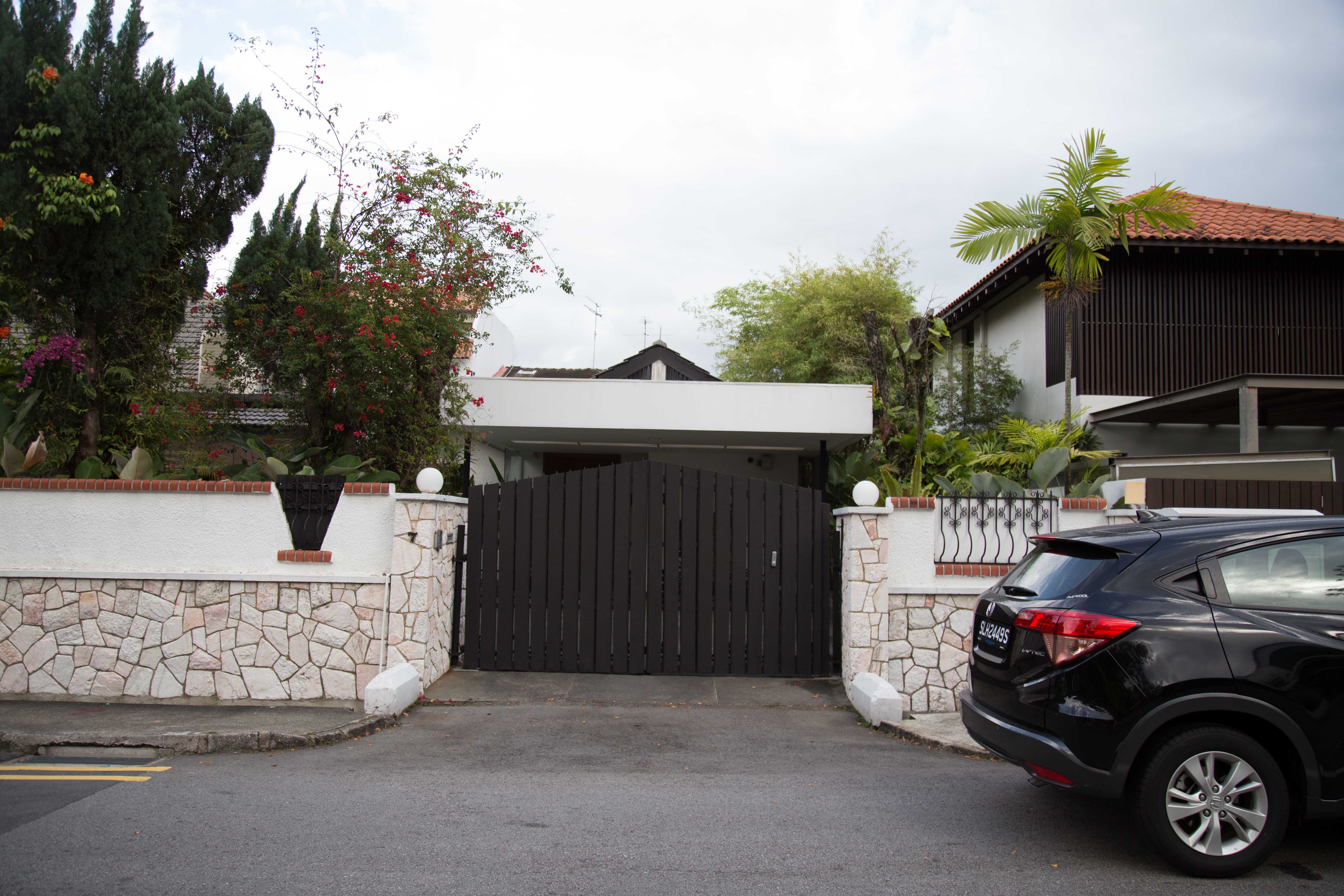
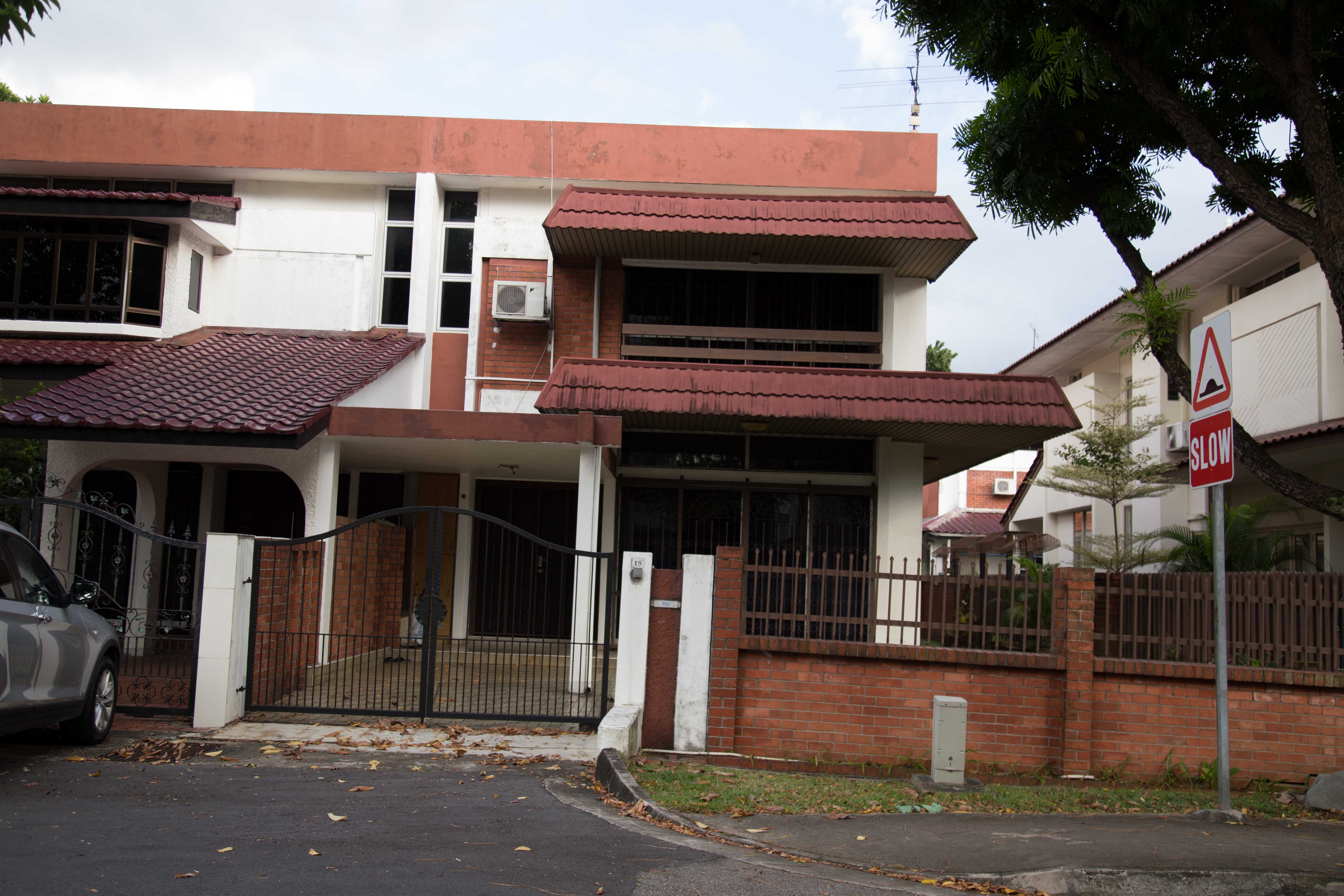
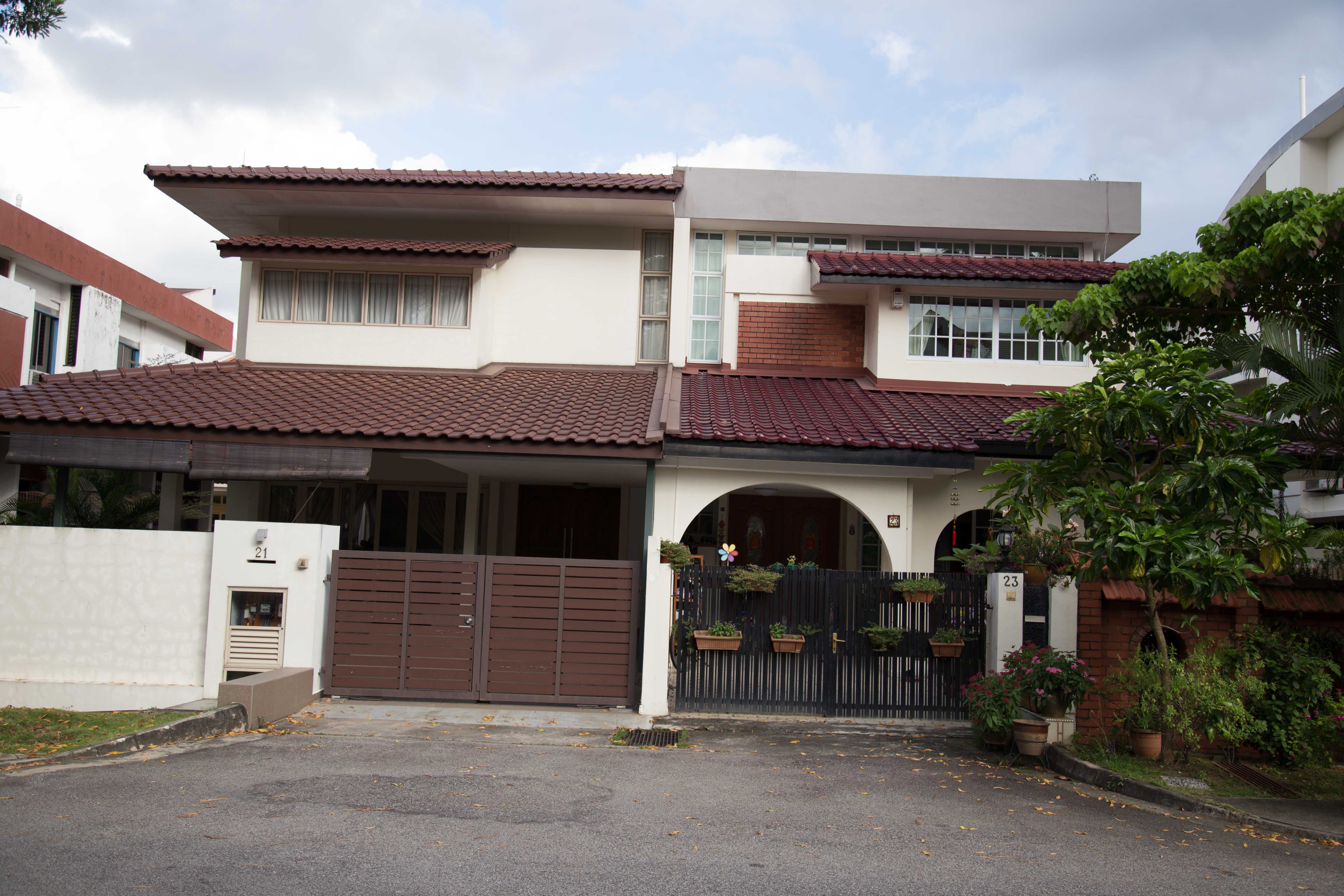
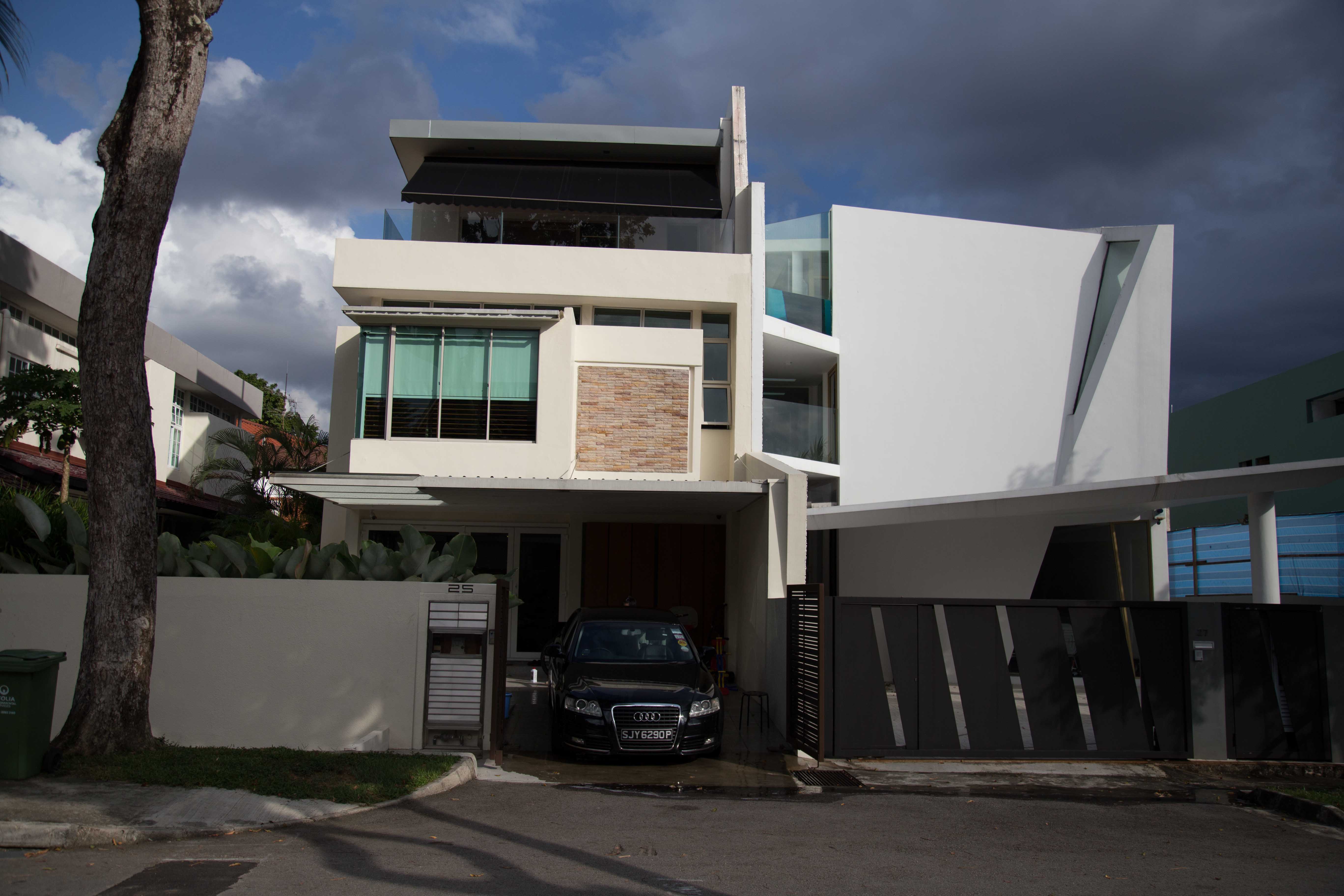
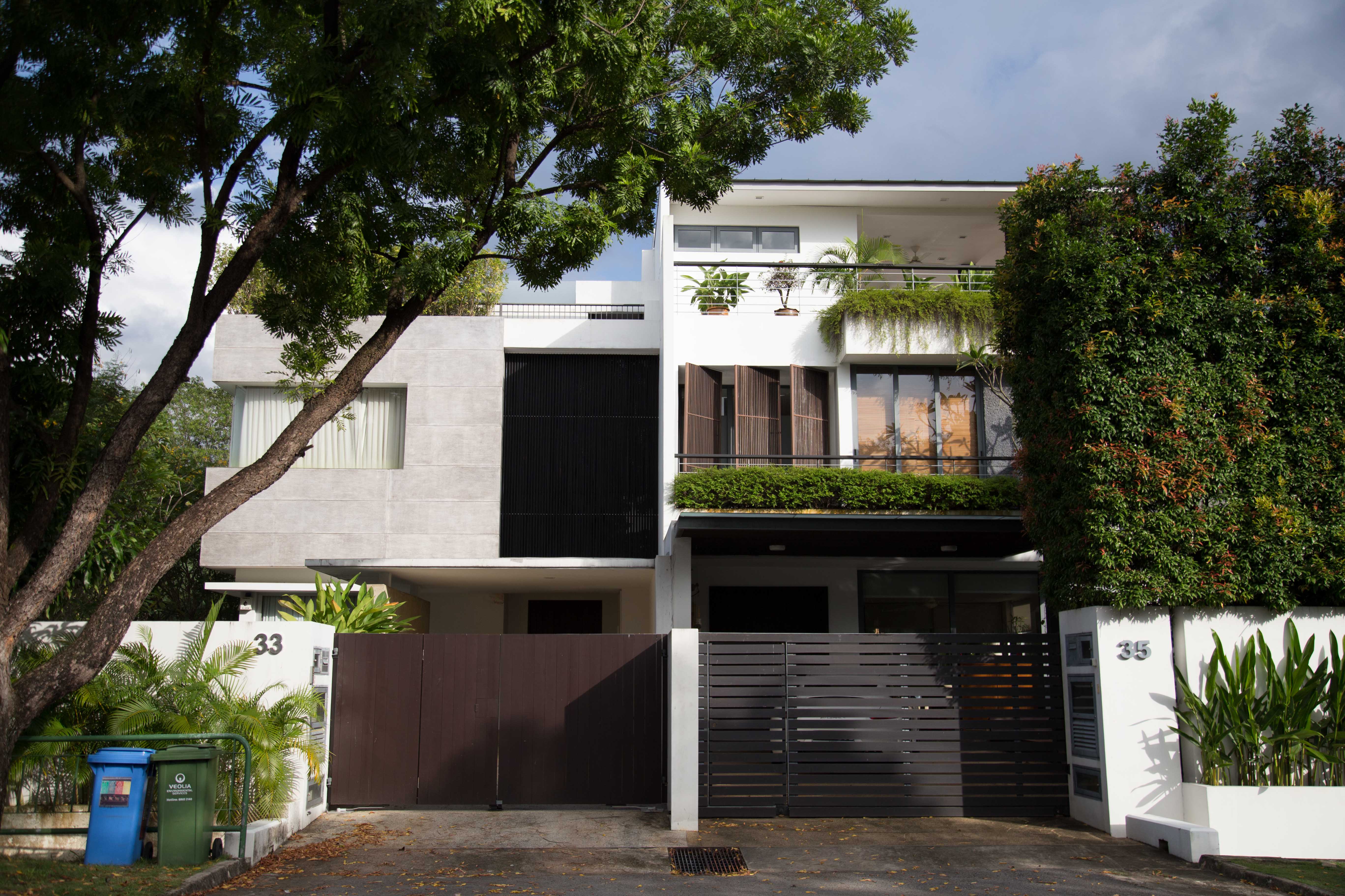

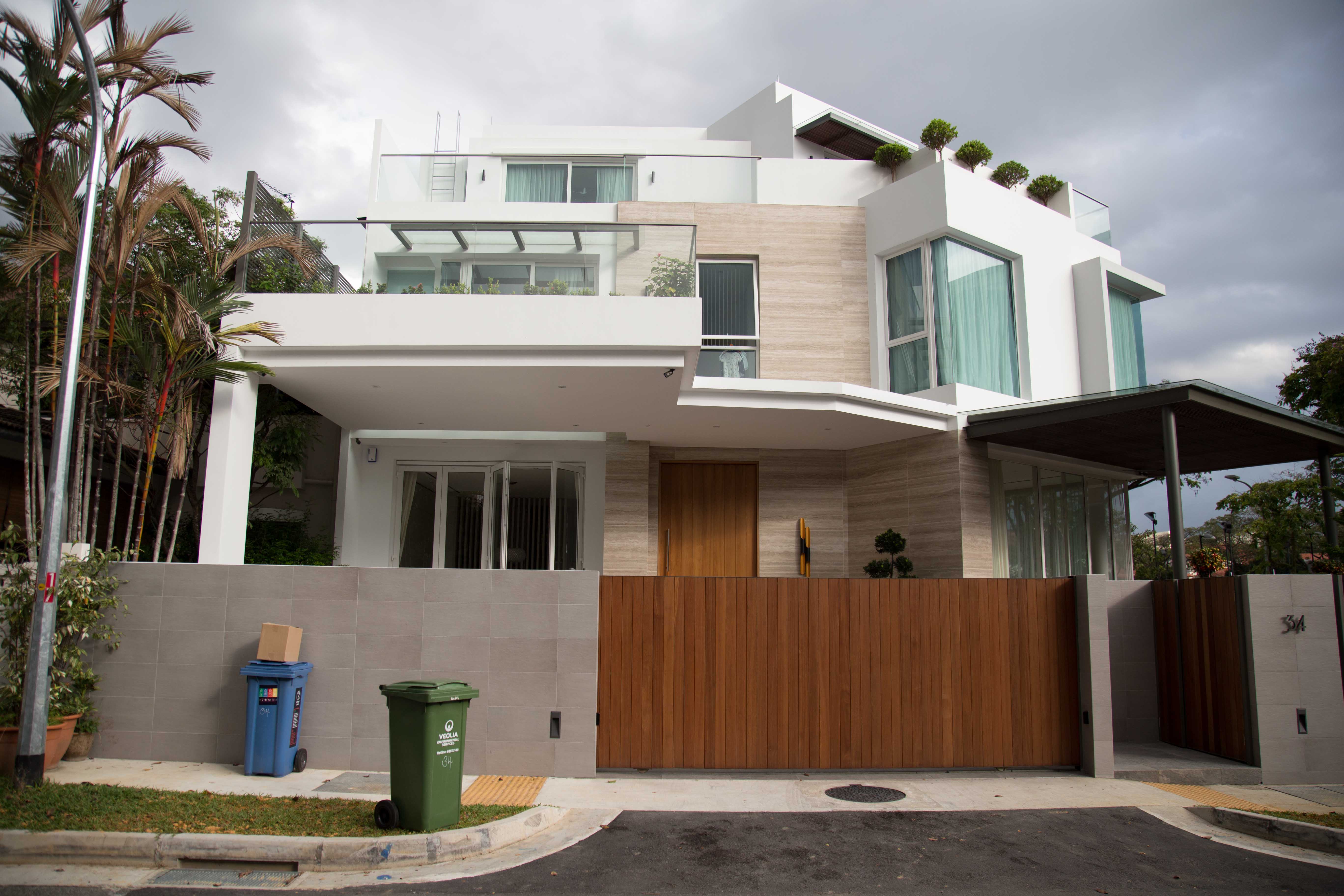
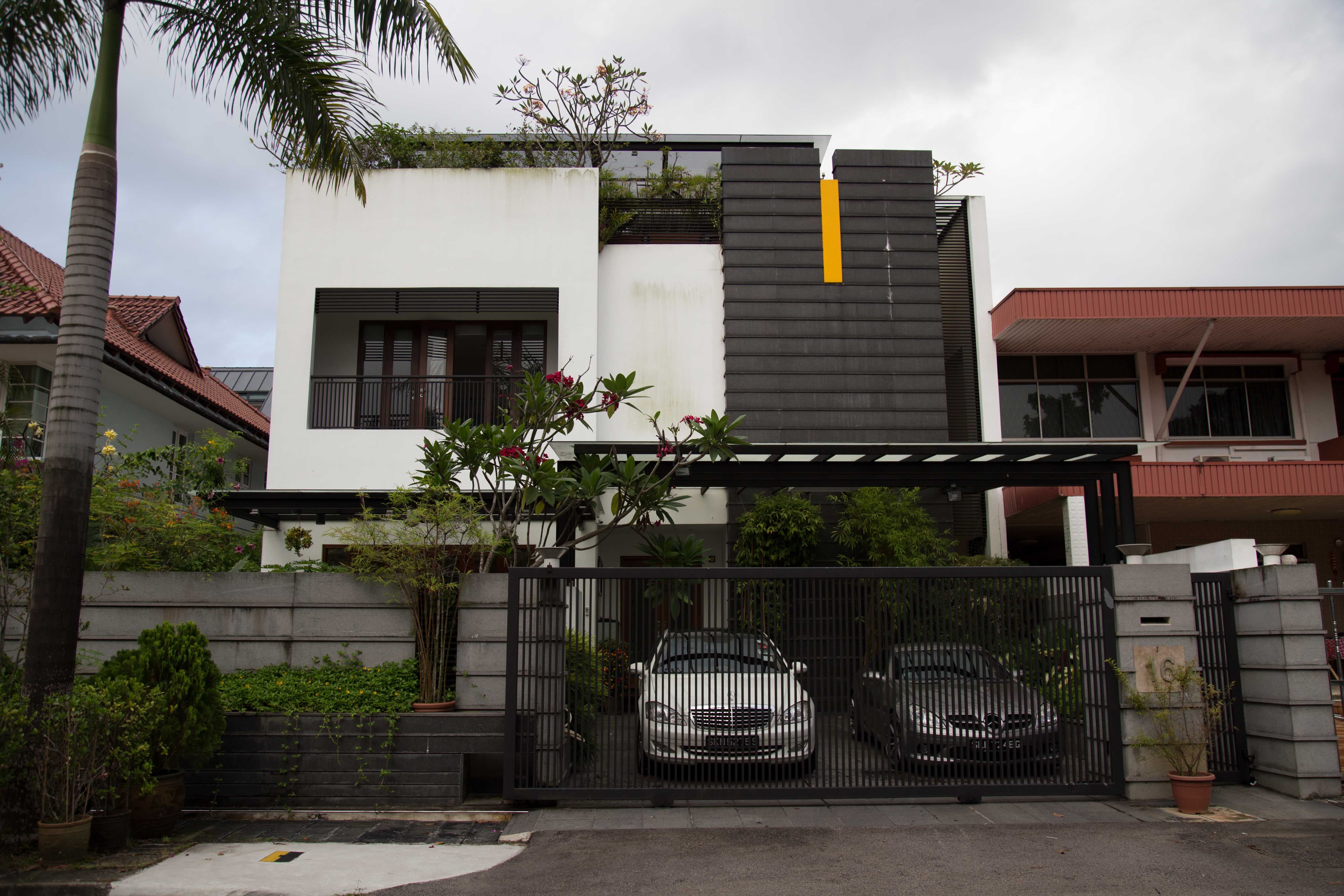
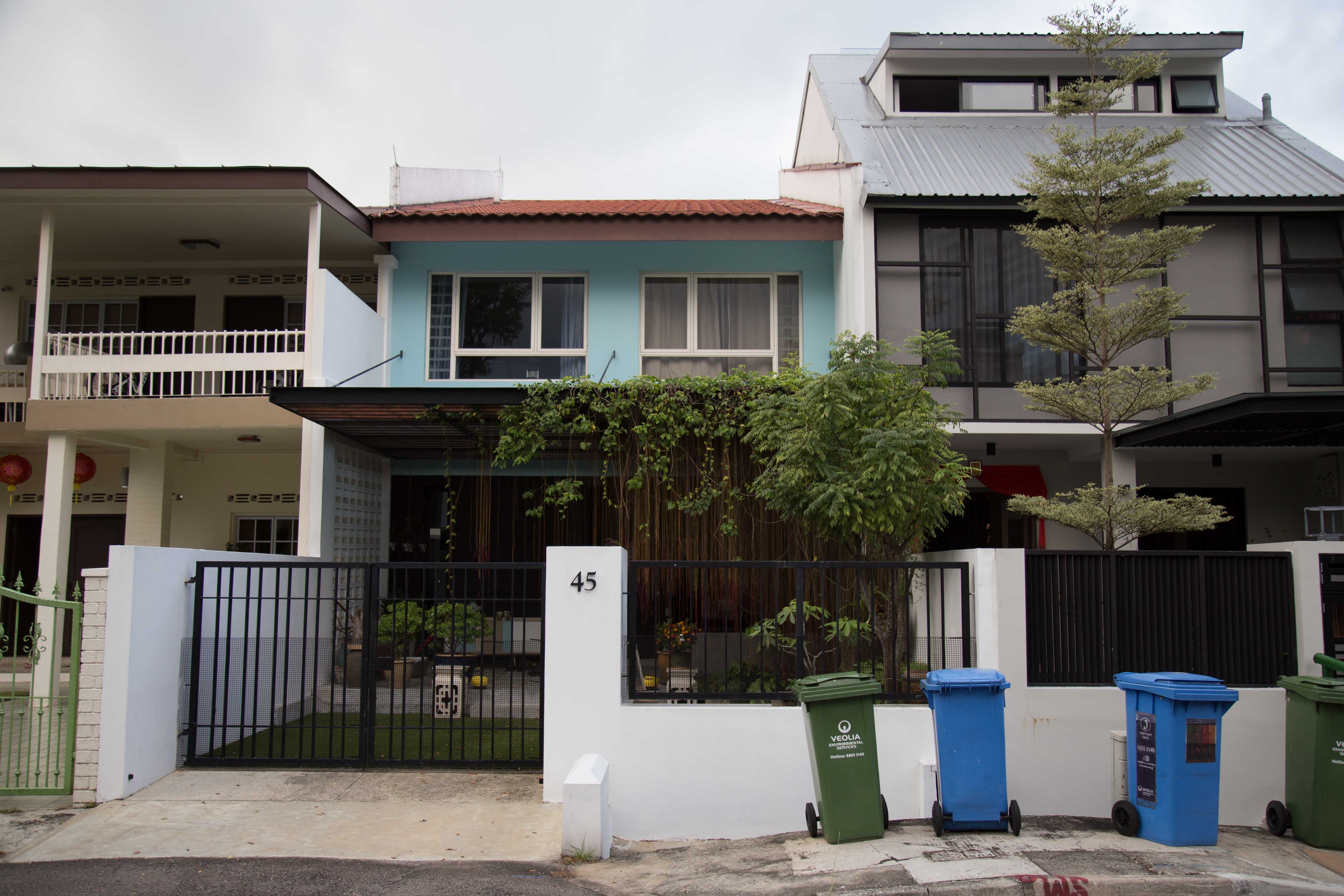
apart from the beautiful houses, a few things i captured as well – the life, and cars. i saw a number of them doing their afternoon run and walking their dog. expensive cars caught my attention too.
cars –
a few raw ideas for the zine currently:
- the architecture of the houses? (old vs new)
- the life in bukit timah? (running, animals (dogs, cats, idk what else), walking dogs, people biking, people dining, …)
- different types of gates? (the different patterns, geometry, old vs new)
- cars?
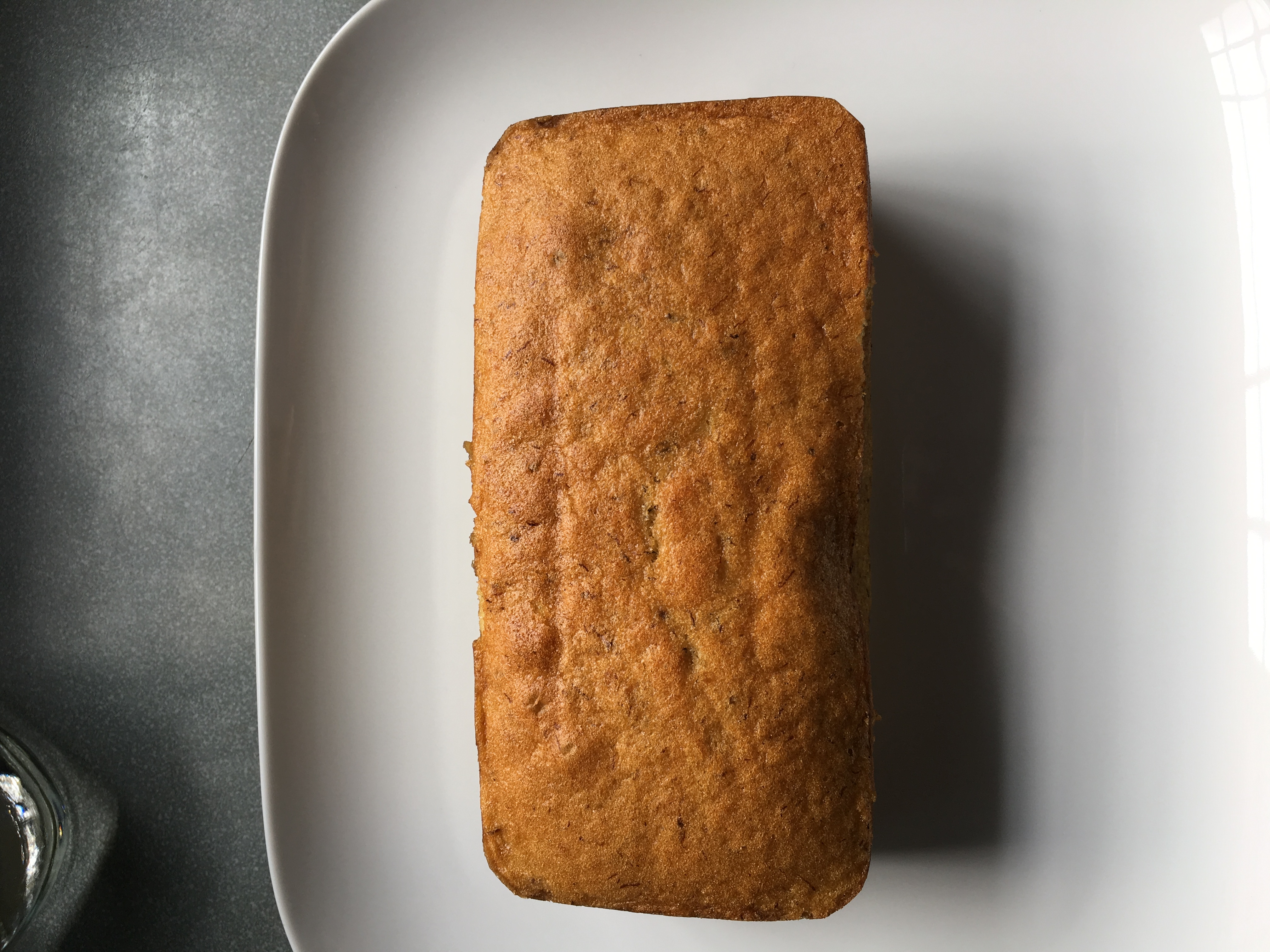
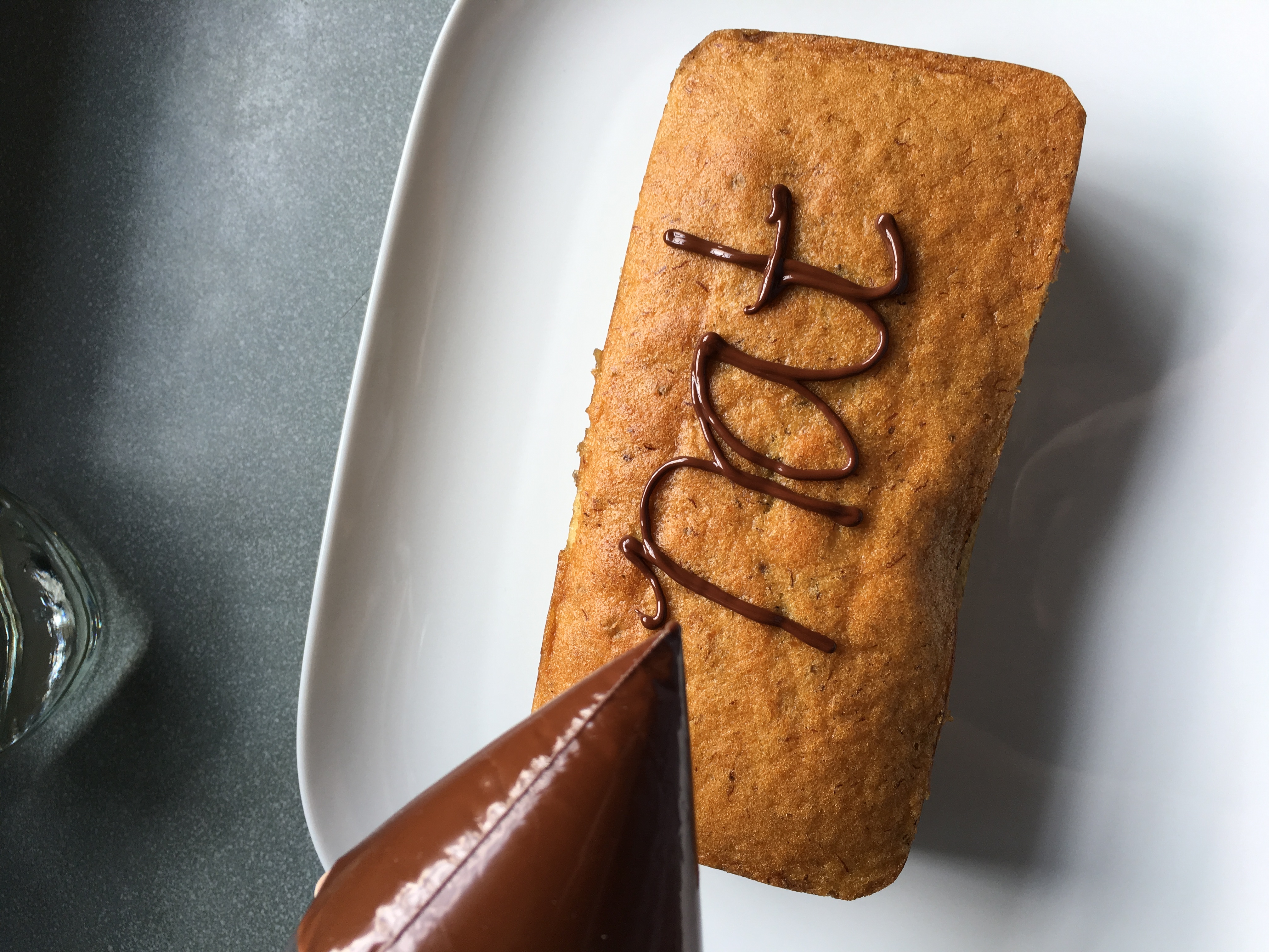
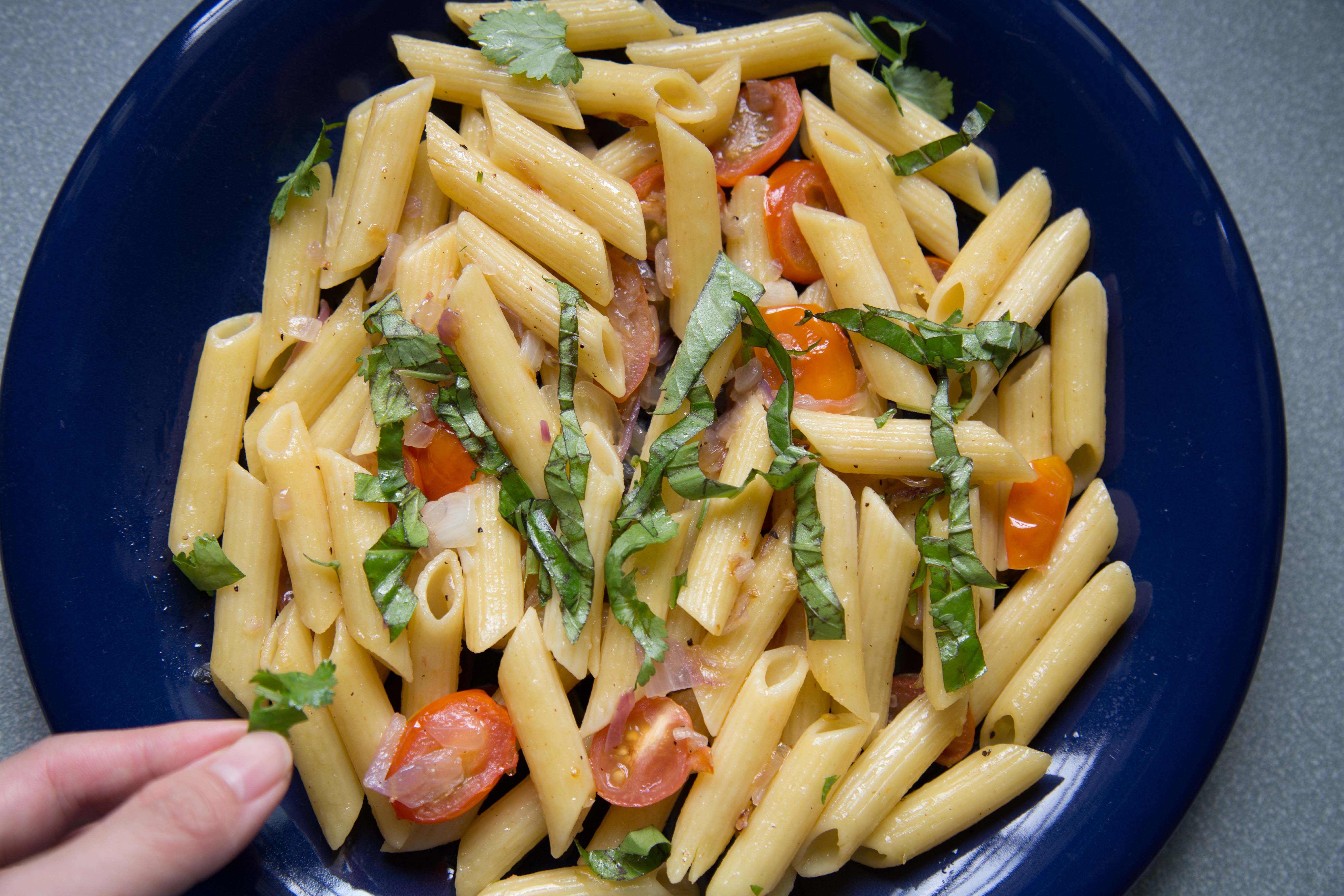
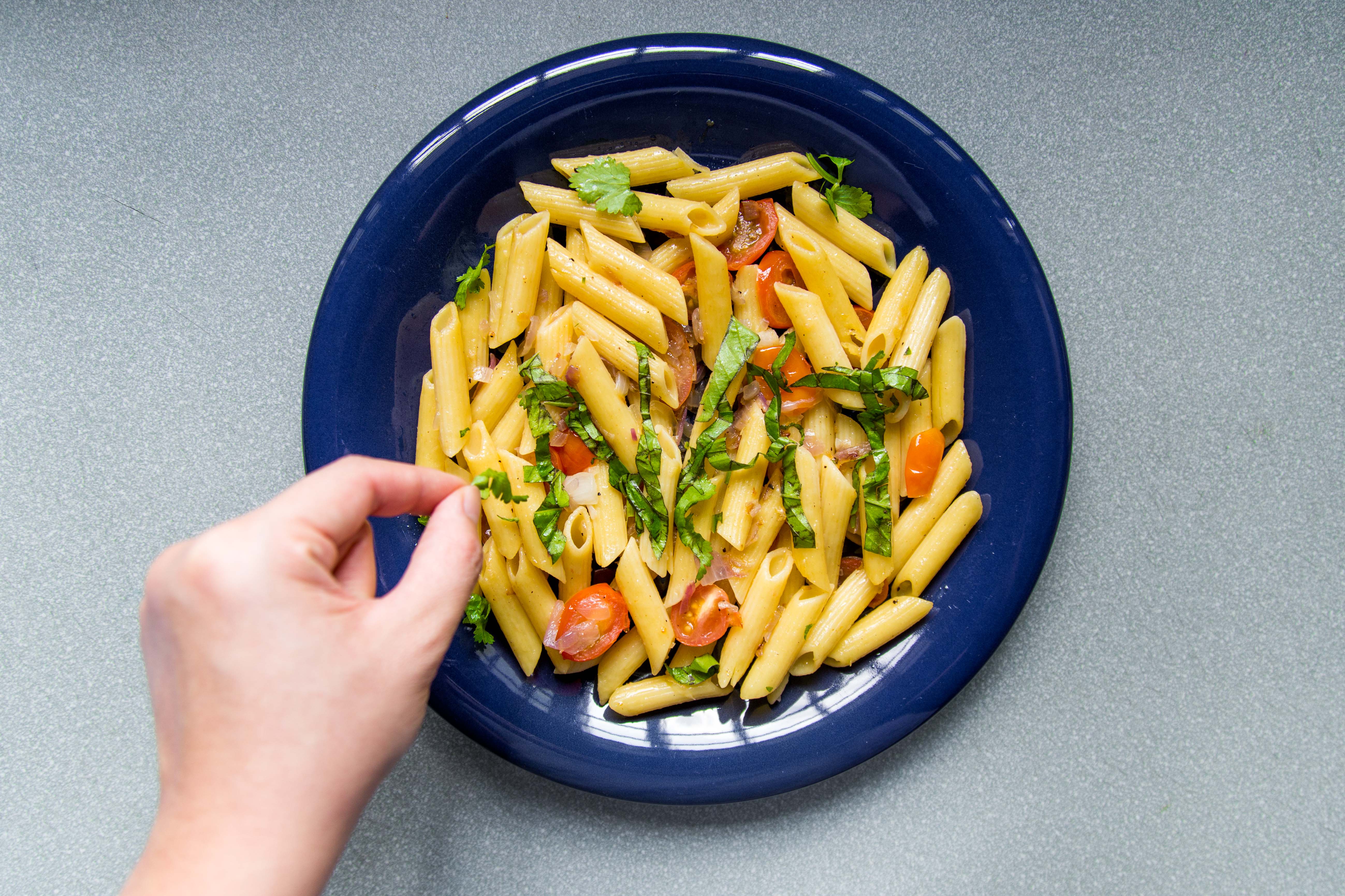
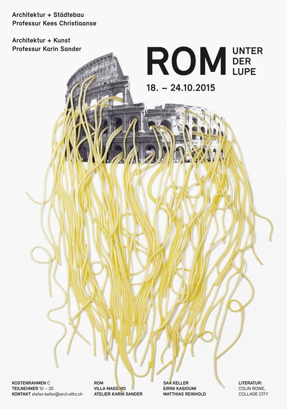
2DII – Que Sera Sera Final
taking in comments from Mimi from last consultation, i decided to do food styling with photography for my final pieces.
the art direction with my final approach is a clean, not overdone, simple straight to the point styling.
before doing it, i had to study more on the kitchen environment of chefs, and their choice of utensils.
1. Pasta Chef
i looked at some images on pinterest to look at food styling but i felt that they were very rustic image driven, which is not the direction im heading for.
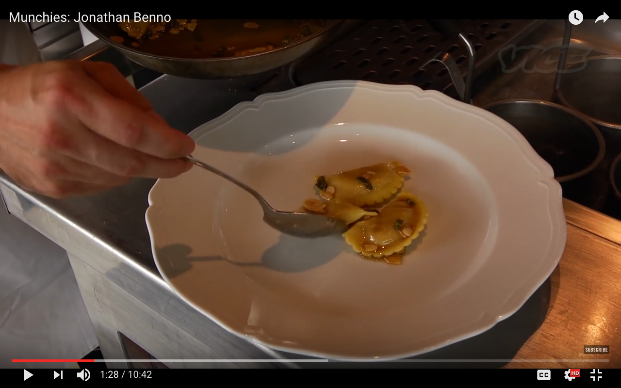
instead of looking at stylized visuals of food styling on pinterest, i looked beyond them by studying videos of chefs cooking pasta to see what type of utensils they use for their cooking.
i started seeing crockery such as tongs, spoons, the pan used for cooking the pasta, a white plate.
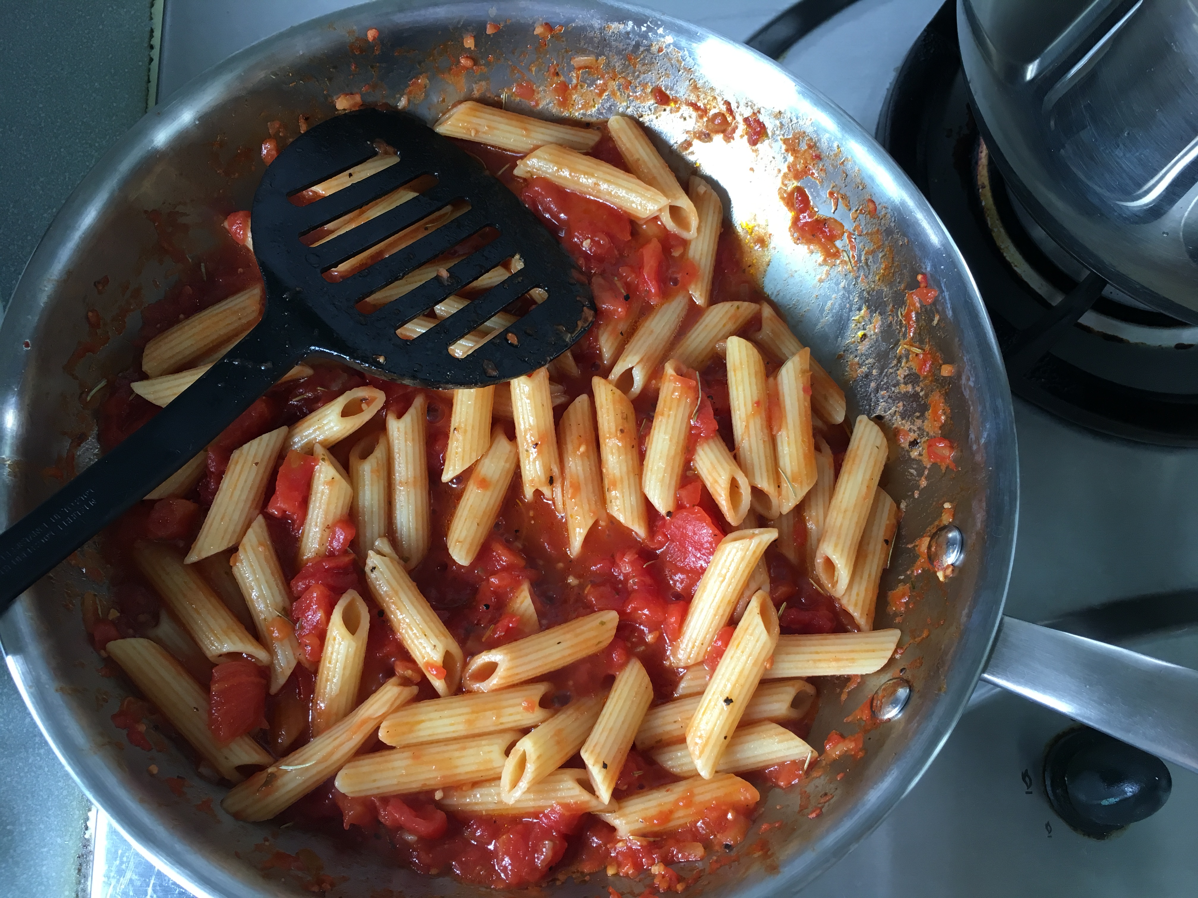
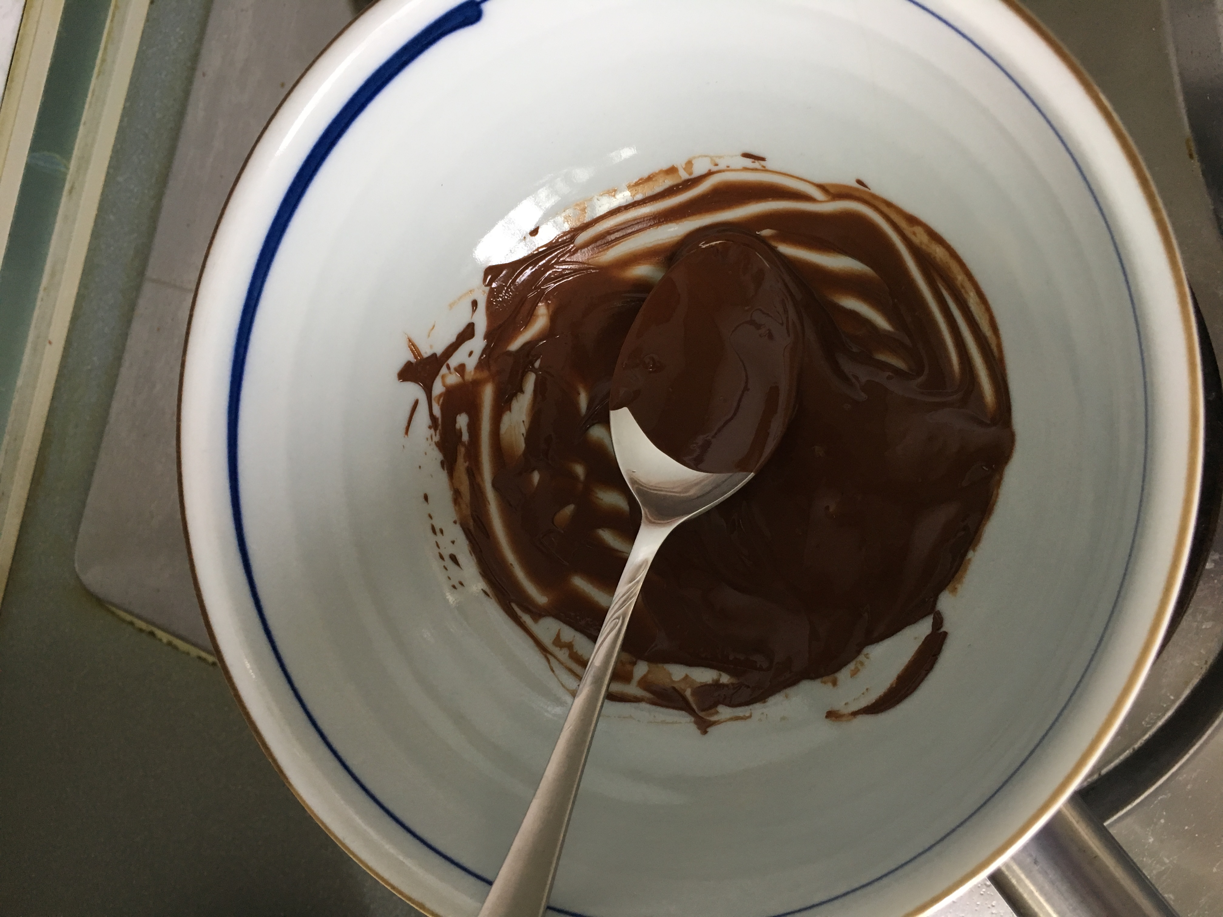
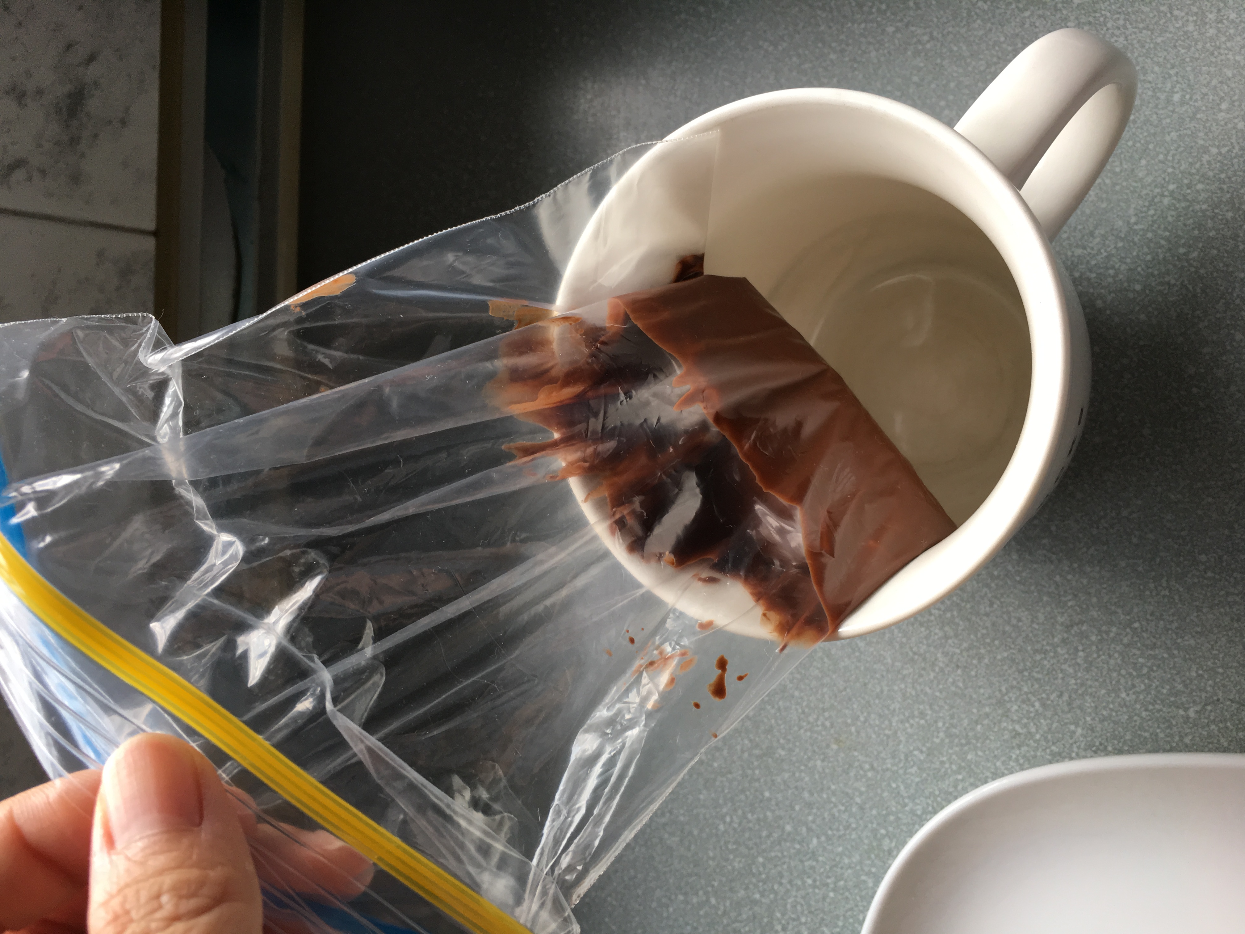
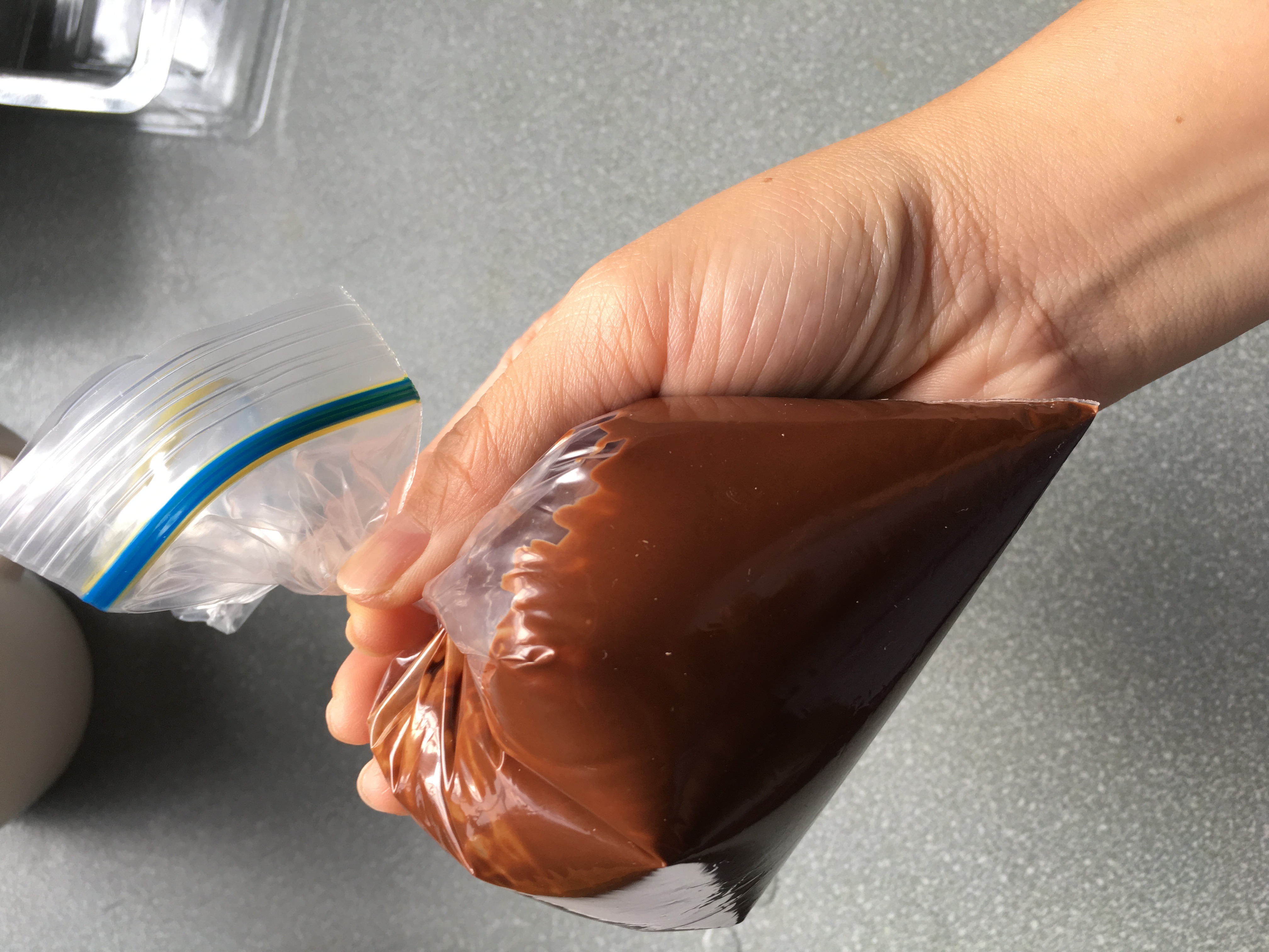
some of my process photos of executing my final work –
final outcome –
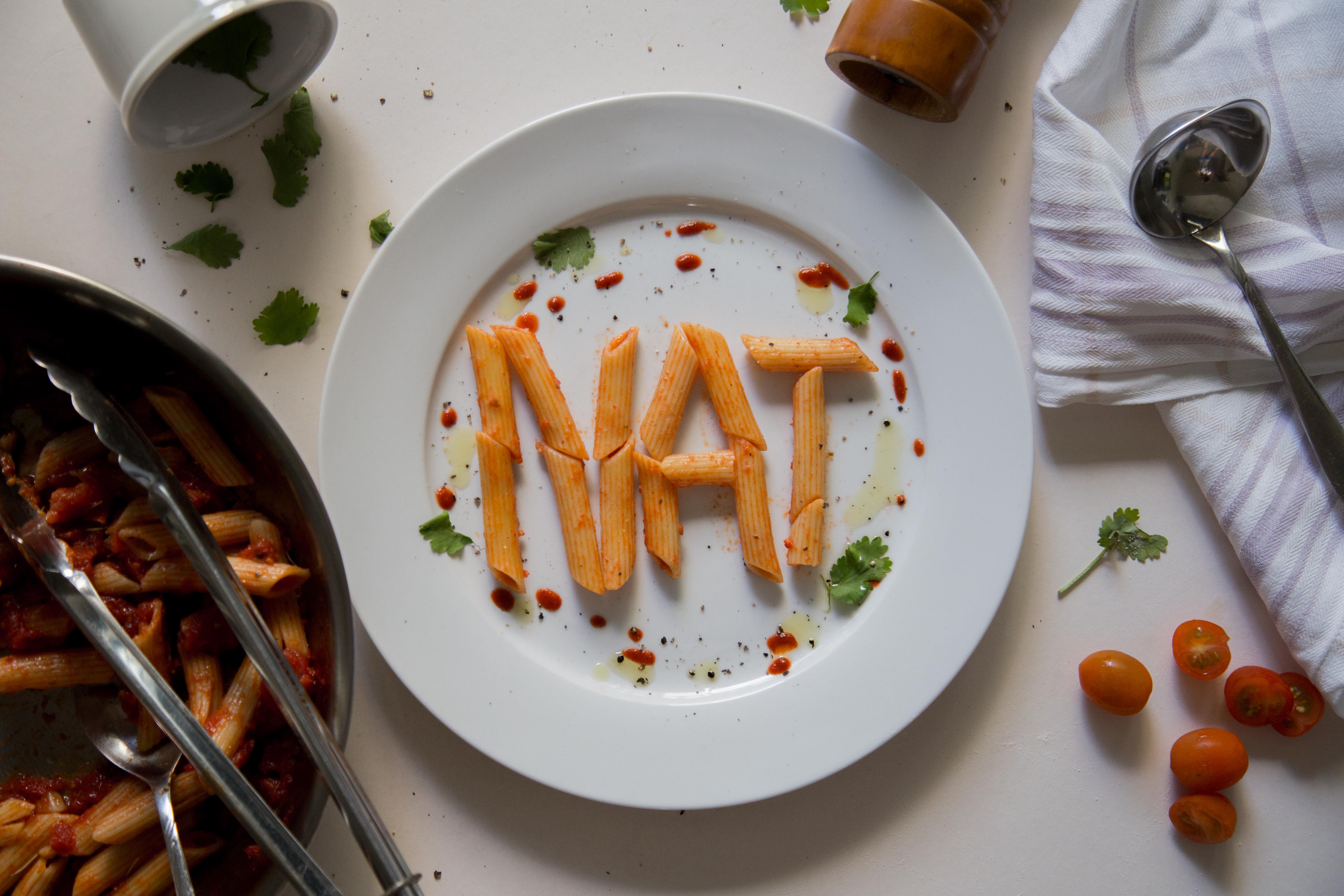
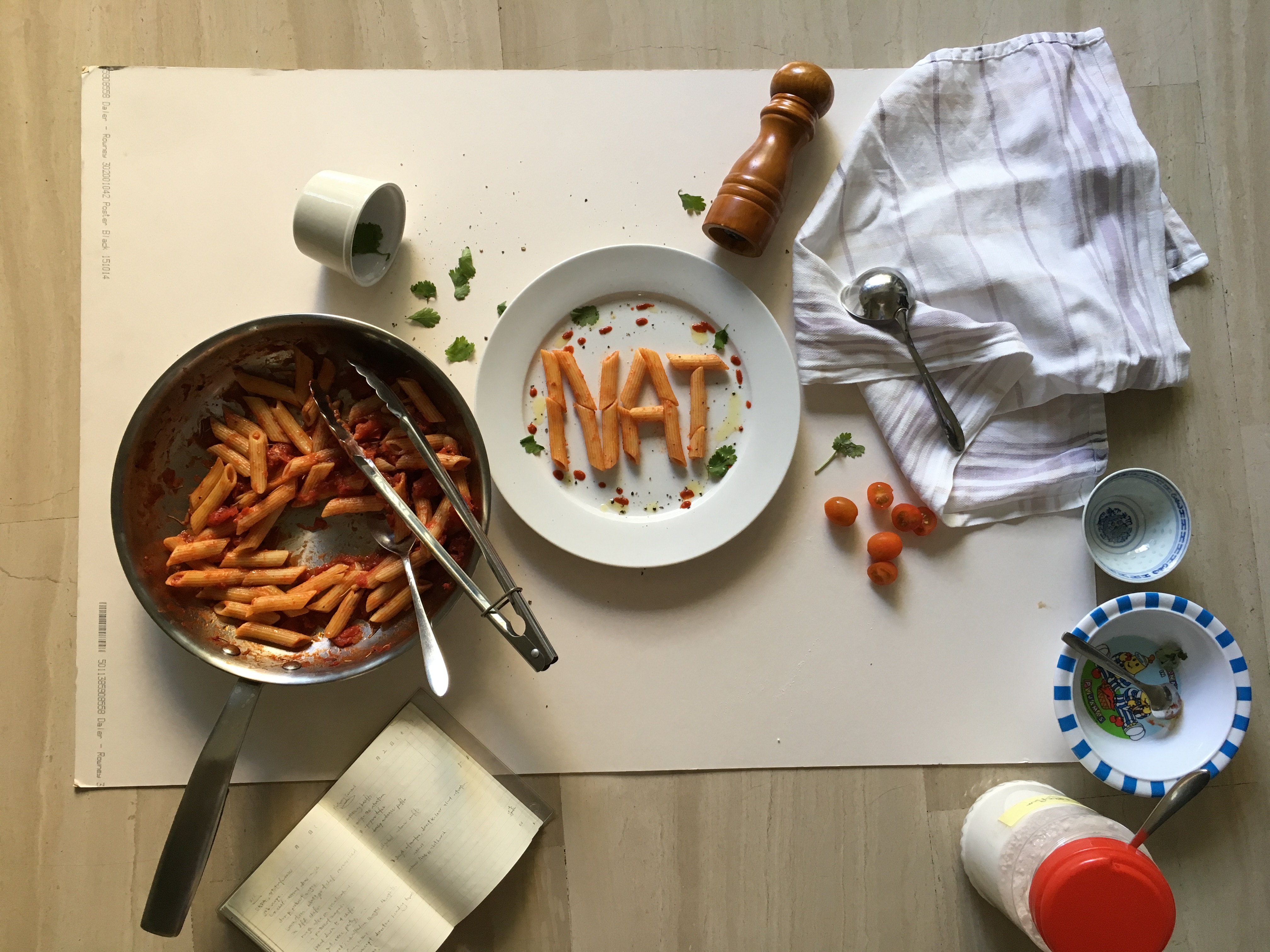
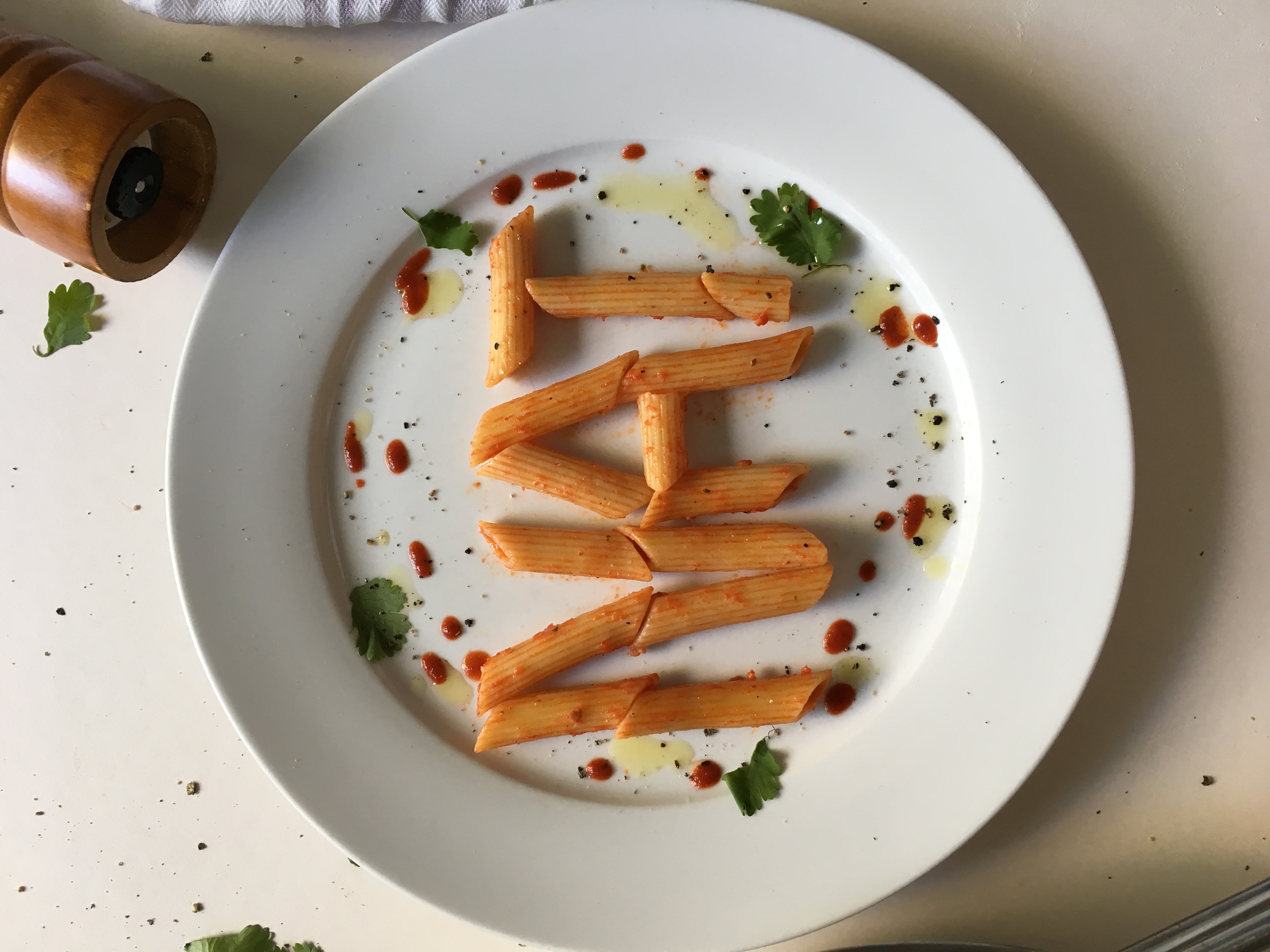
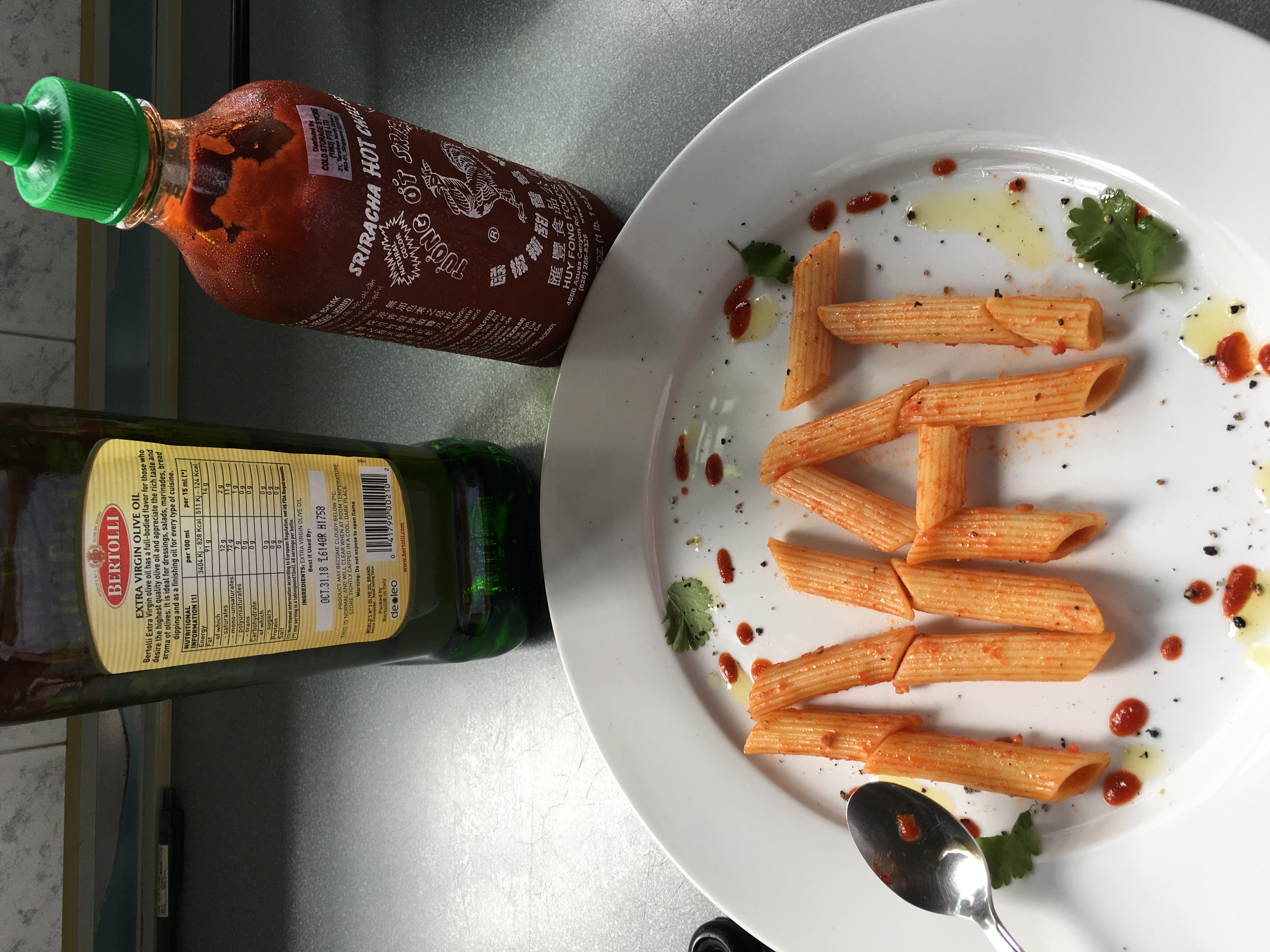
i used penne this time because it was way easier to control than spaghetti. i stylized the plate with tomato sauce (in reality its actually chilli sauce in a squeezable bottle), black pepper and corriander to give it not only a pop of colour, but also because they are relevant to the dish. the pan, tongs and spoon are placed halfway at the corner of the image so to not steal emphasis of the image. the cloth is placed because chefs usually clean the edge of the plate with it. i decided to place the ladle on the cloth because when i tried placing it on the bottom right during the styling process, it looked odd as there were too many silver cutleries on the bottom of the image, making it look heavy and uneven.
2. Pastry Chef
for pastry chef, it was slightly easier because there were a standard few crockeries that are mainly used. before researching i knew some elements that i could already play with – flour, eggs, whisk. 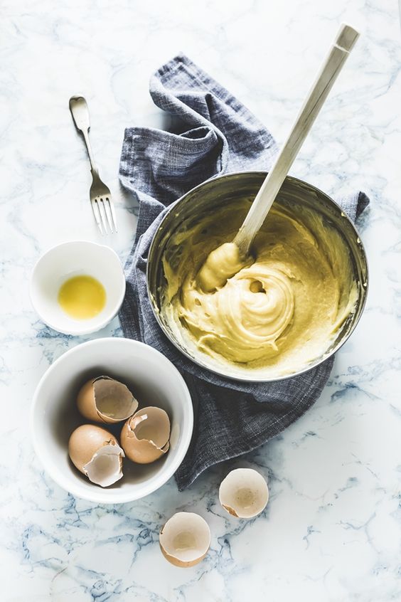
process photos-
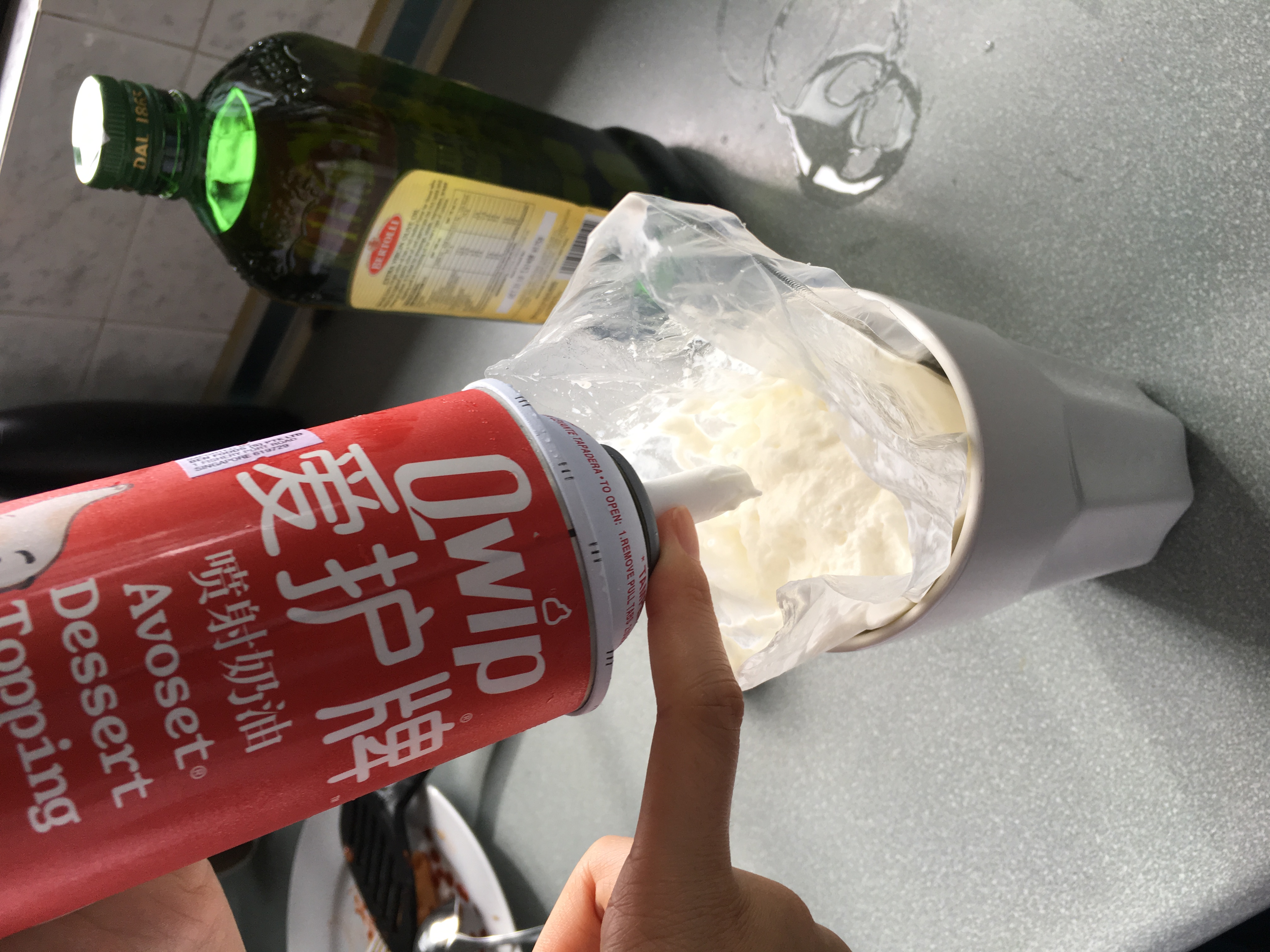
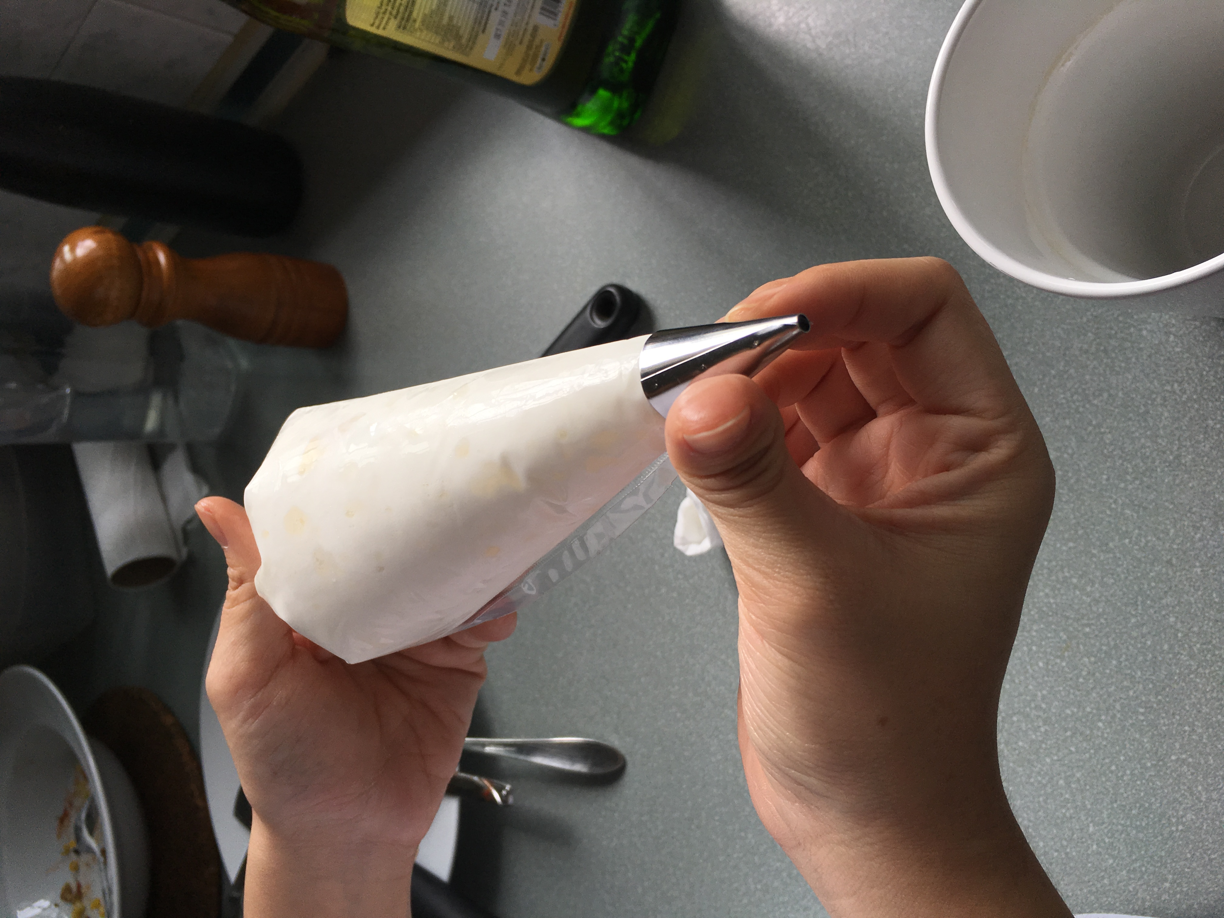
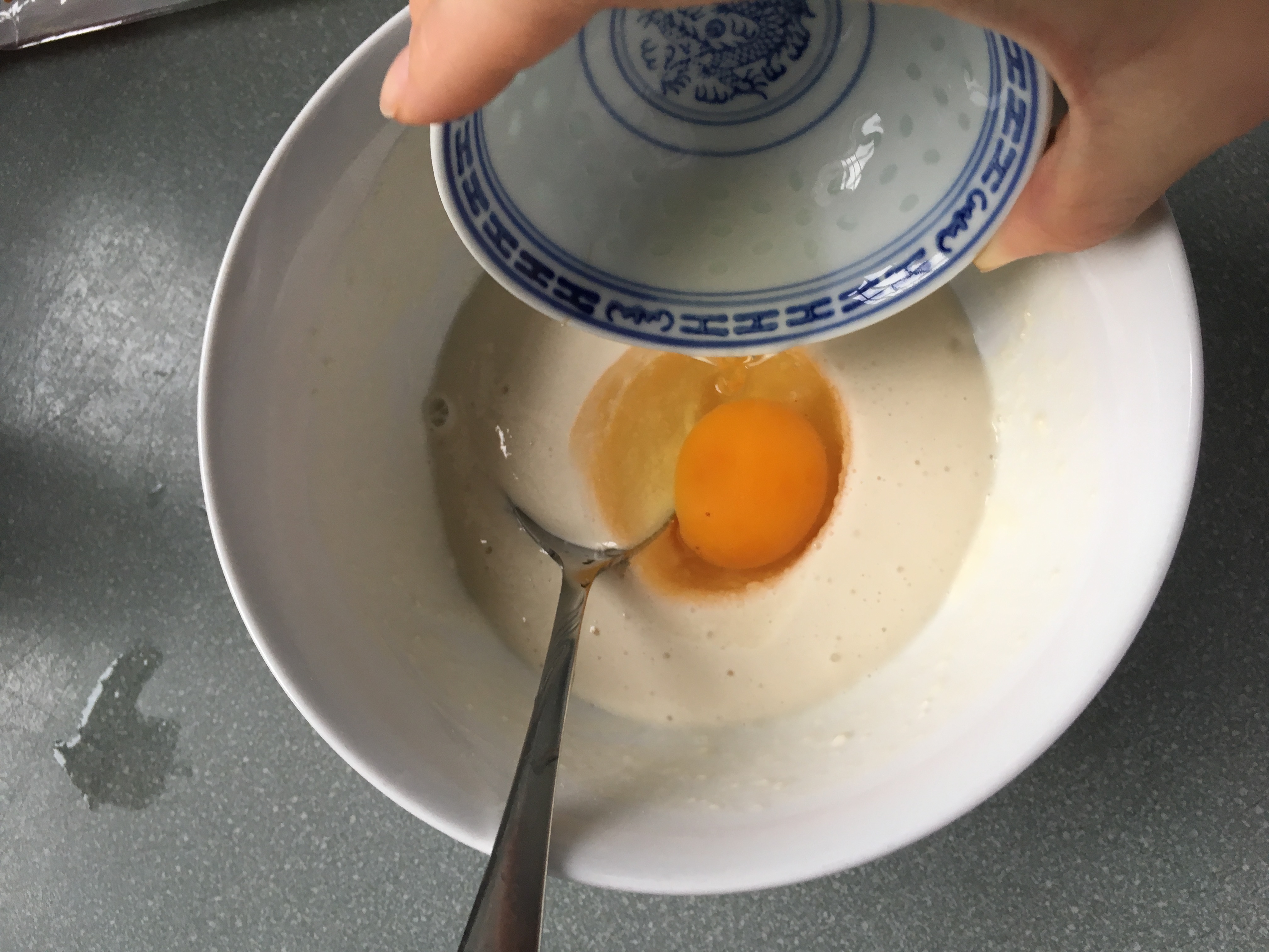
final-
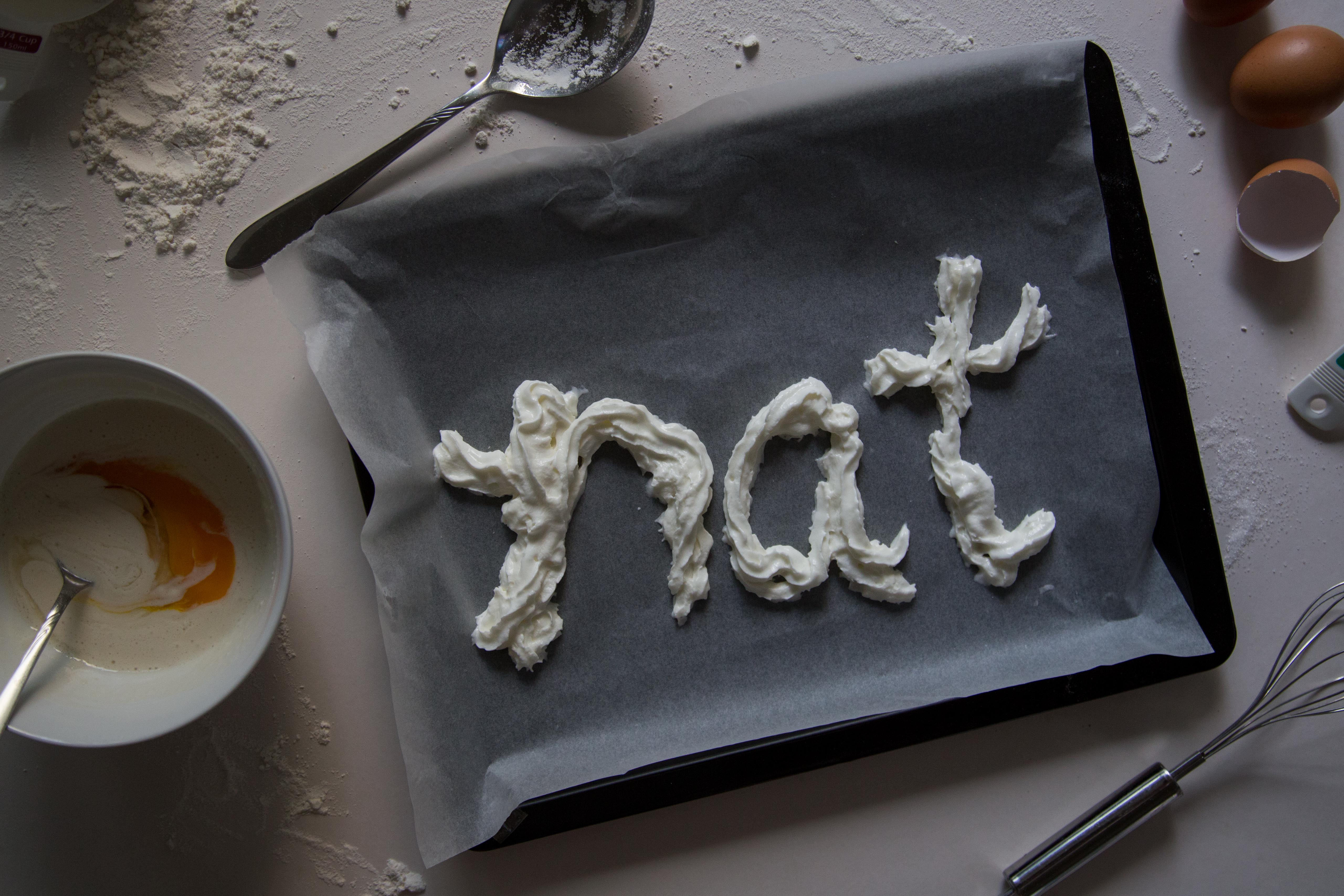
my name is created using whipped cream. the whole situation of the image shows the process of a life of a pastry chef. the supporting elements- whisk, bowl of batter, baking paper and tray, cracked eggs, flour and spoons. i scattered flour on the surface to create a more natural visual look of the image.
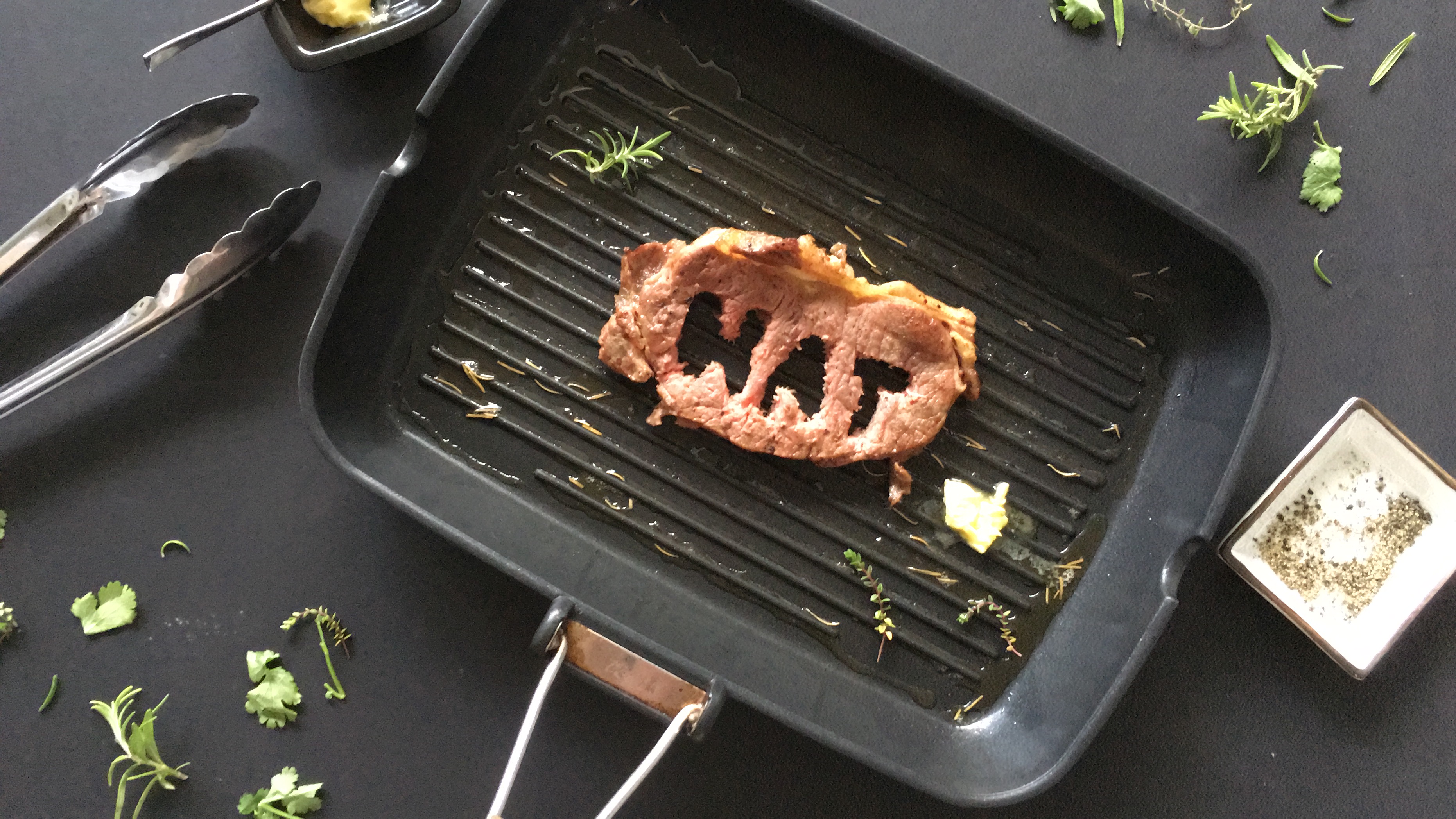
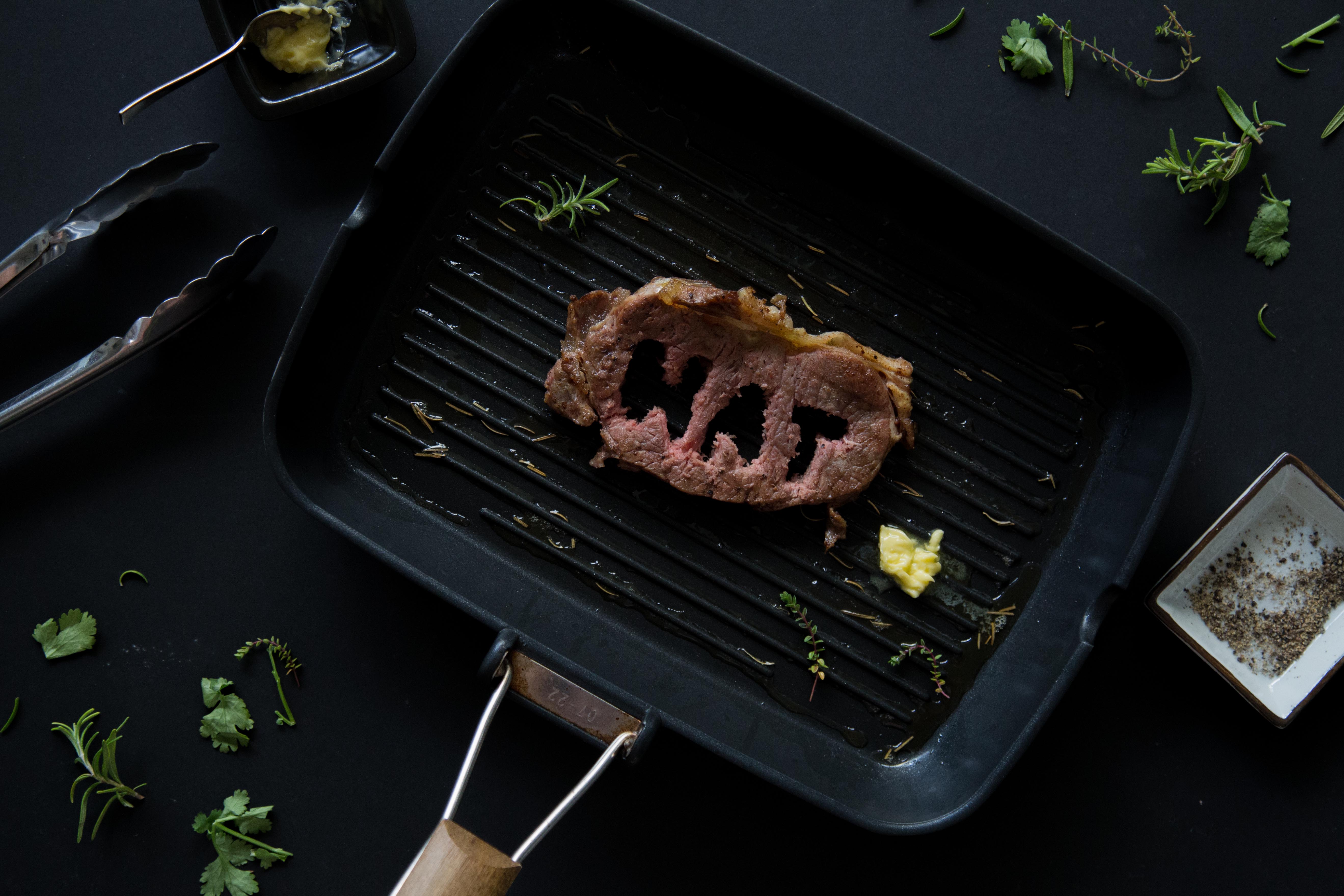
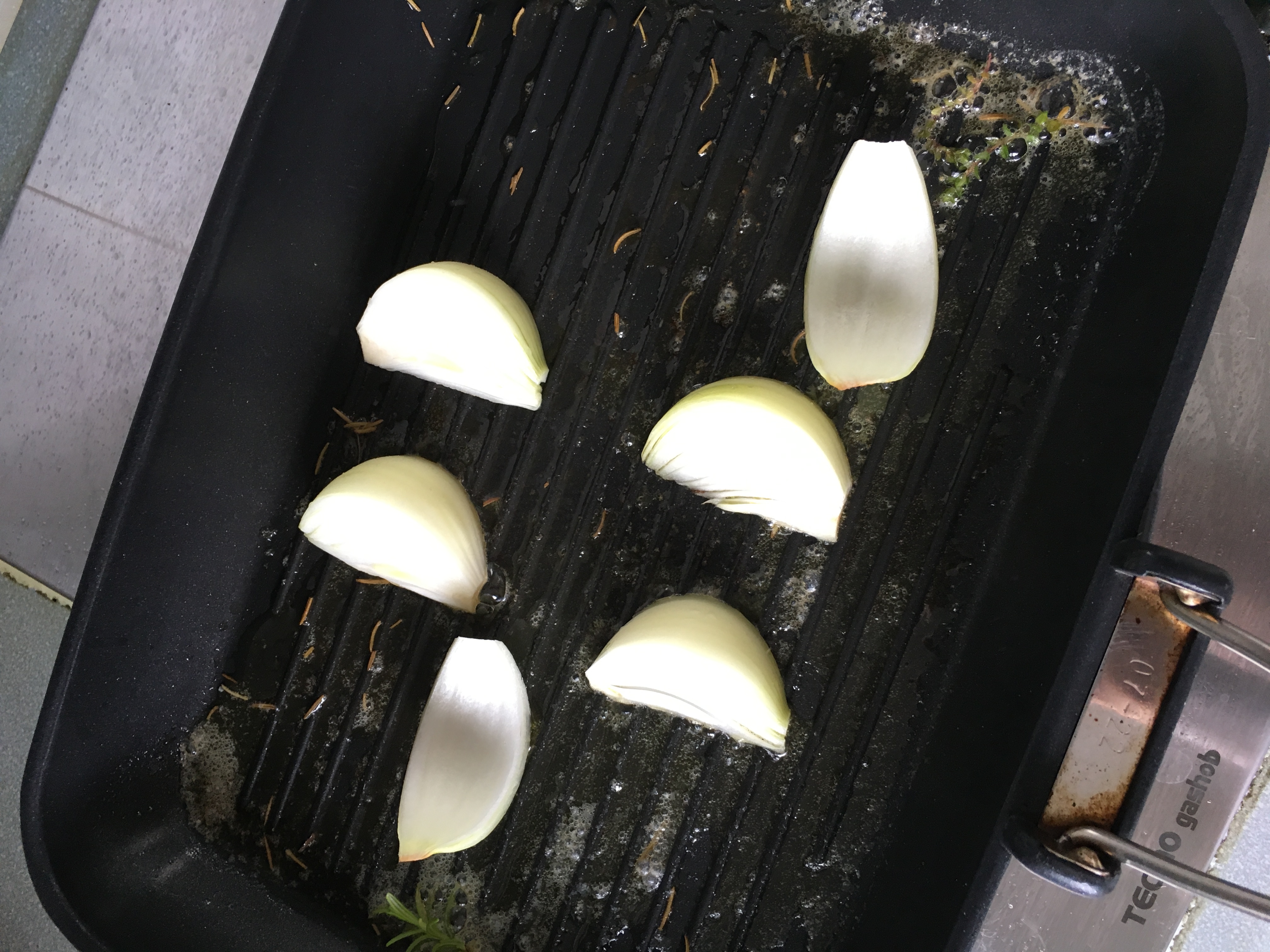
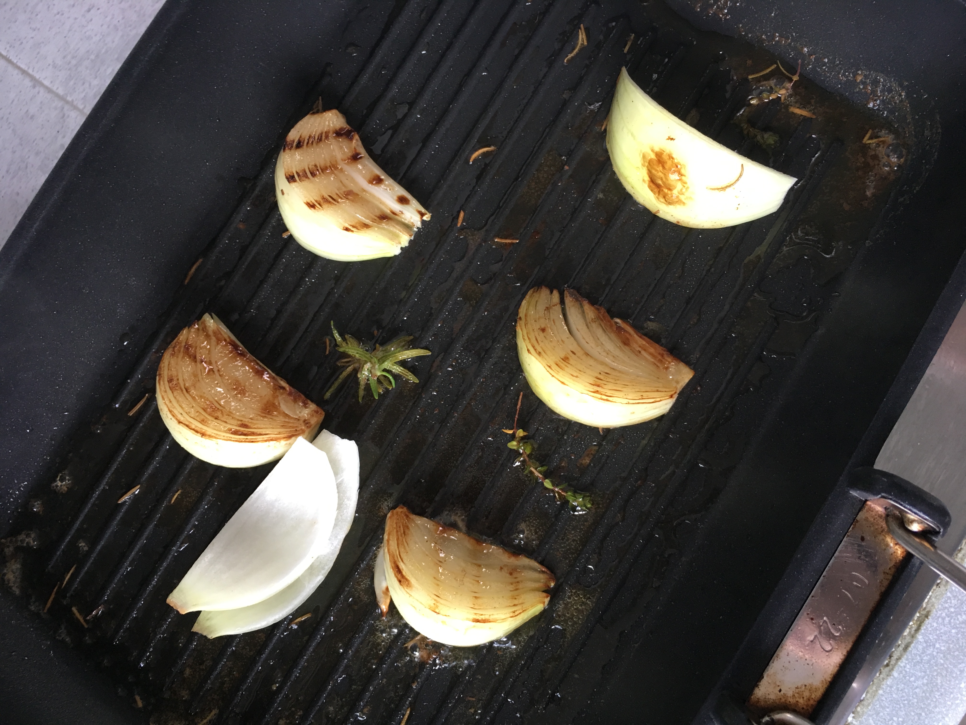
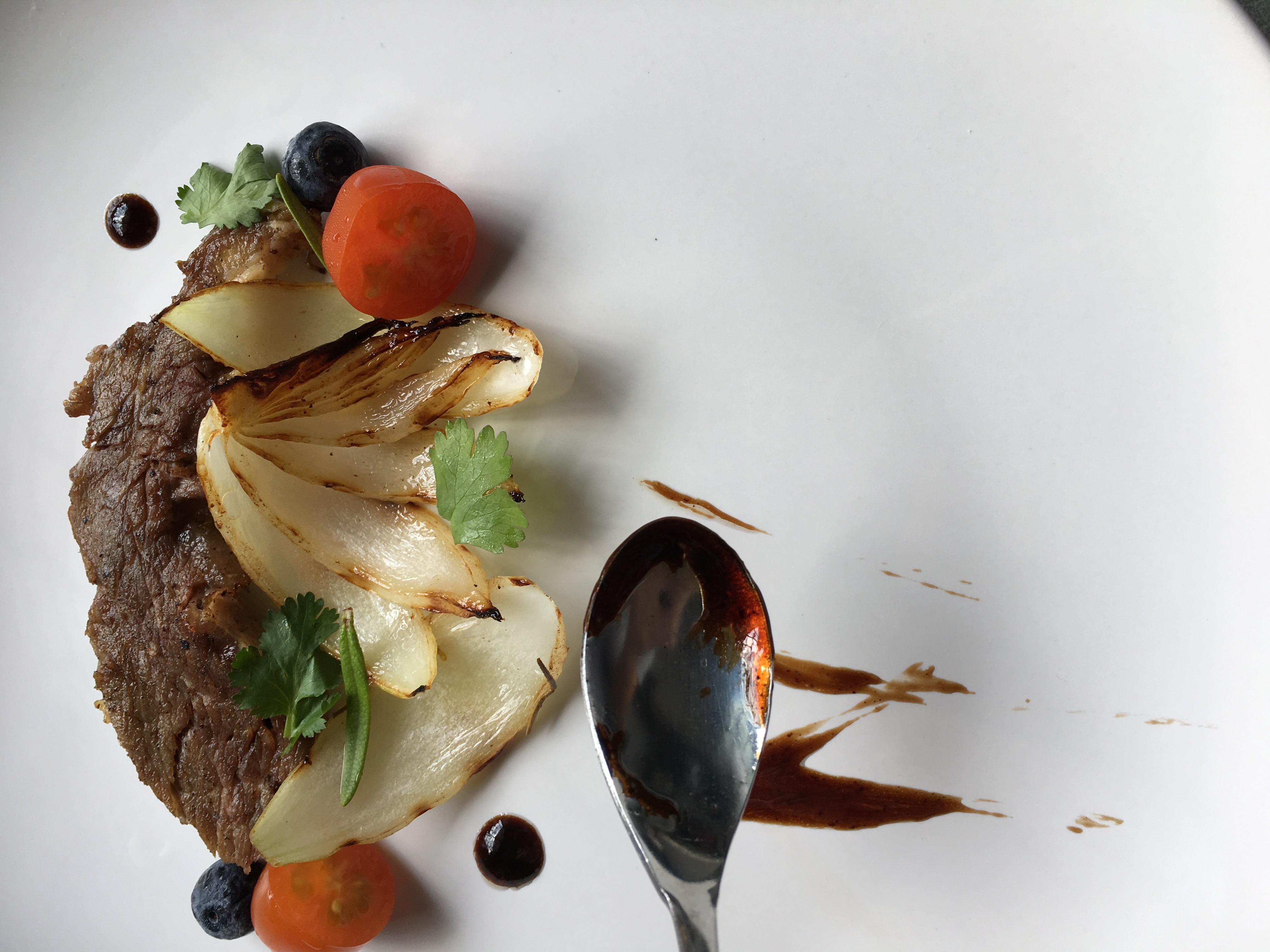
3. Grill Chef
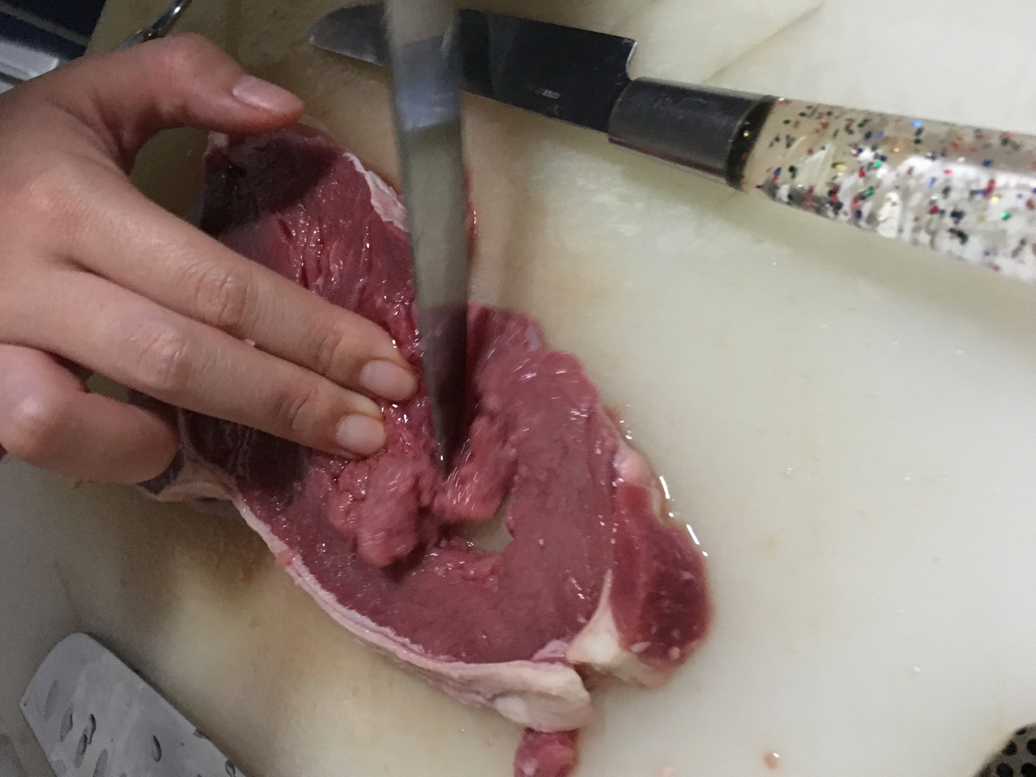
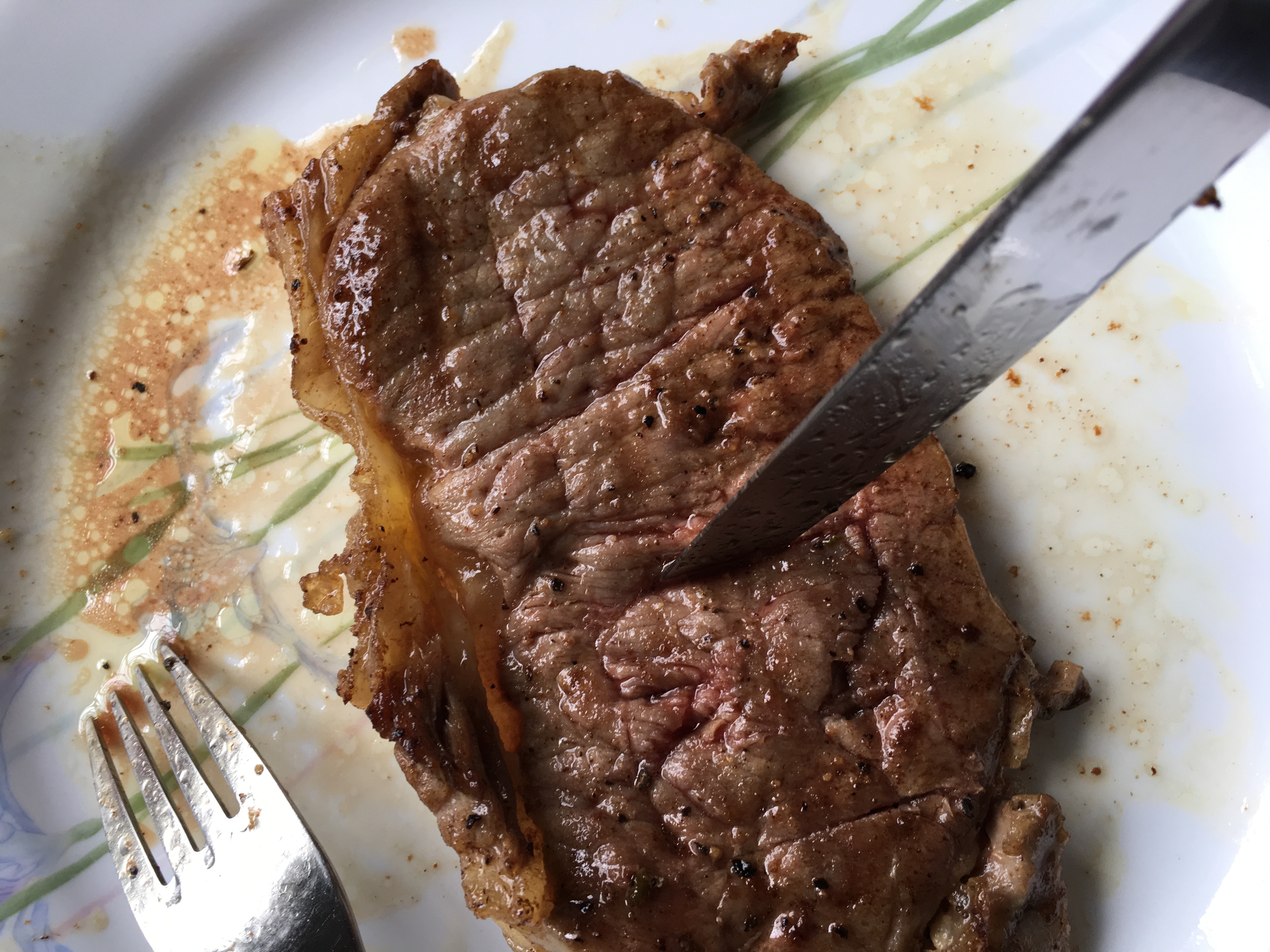
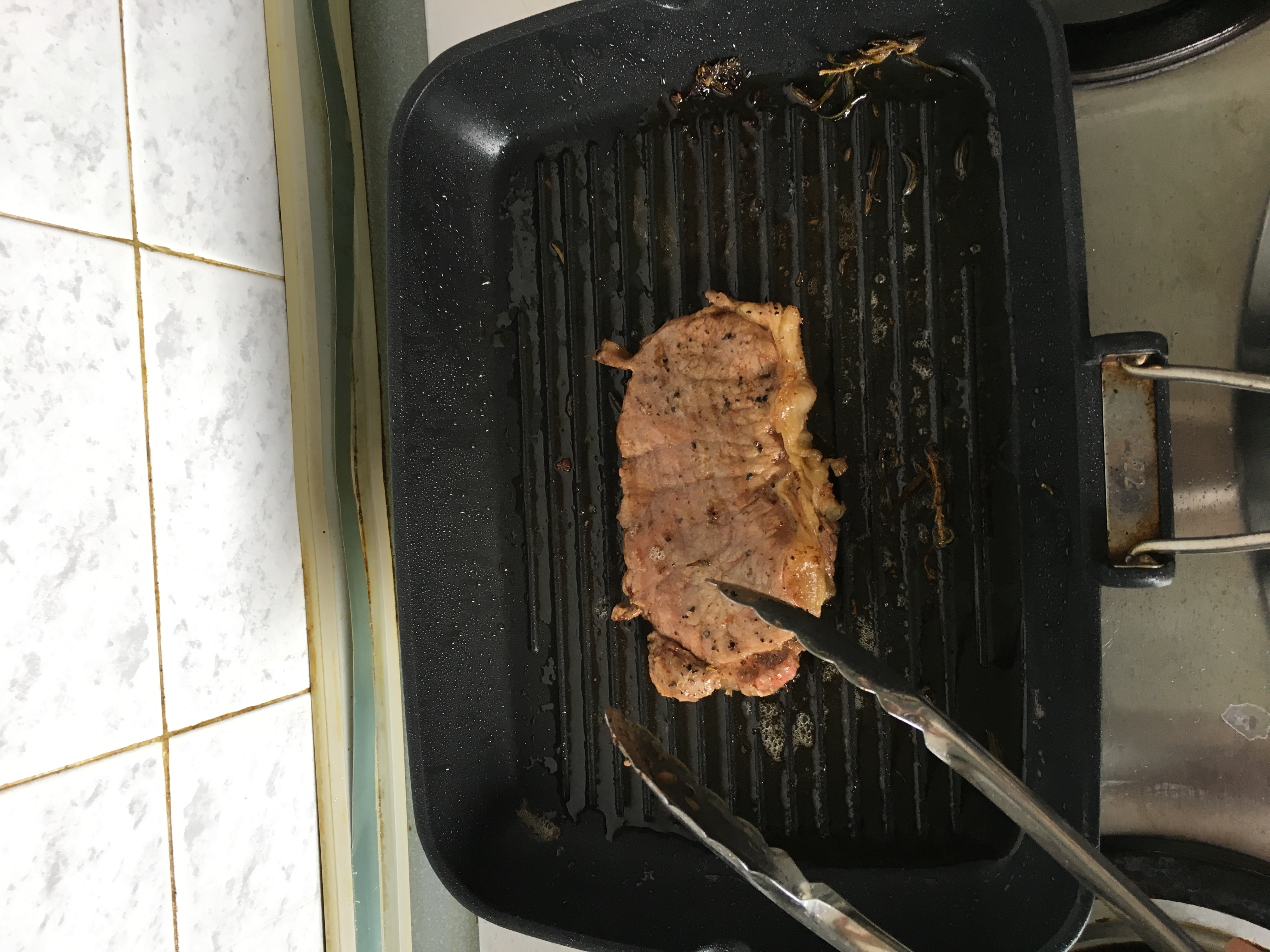
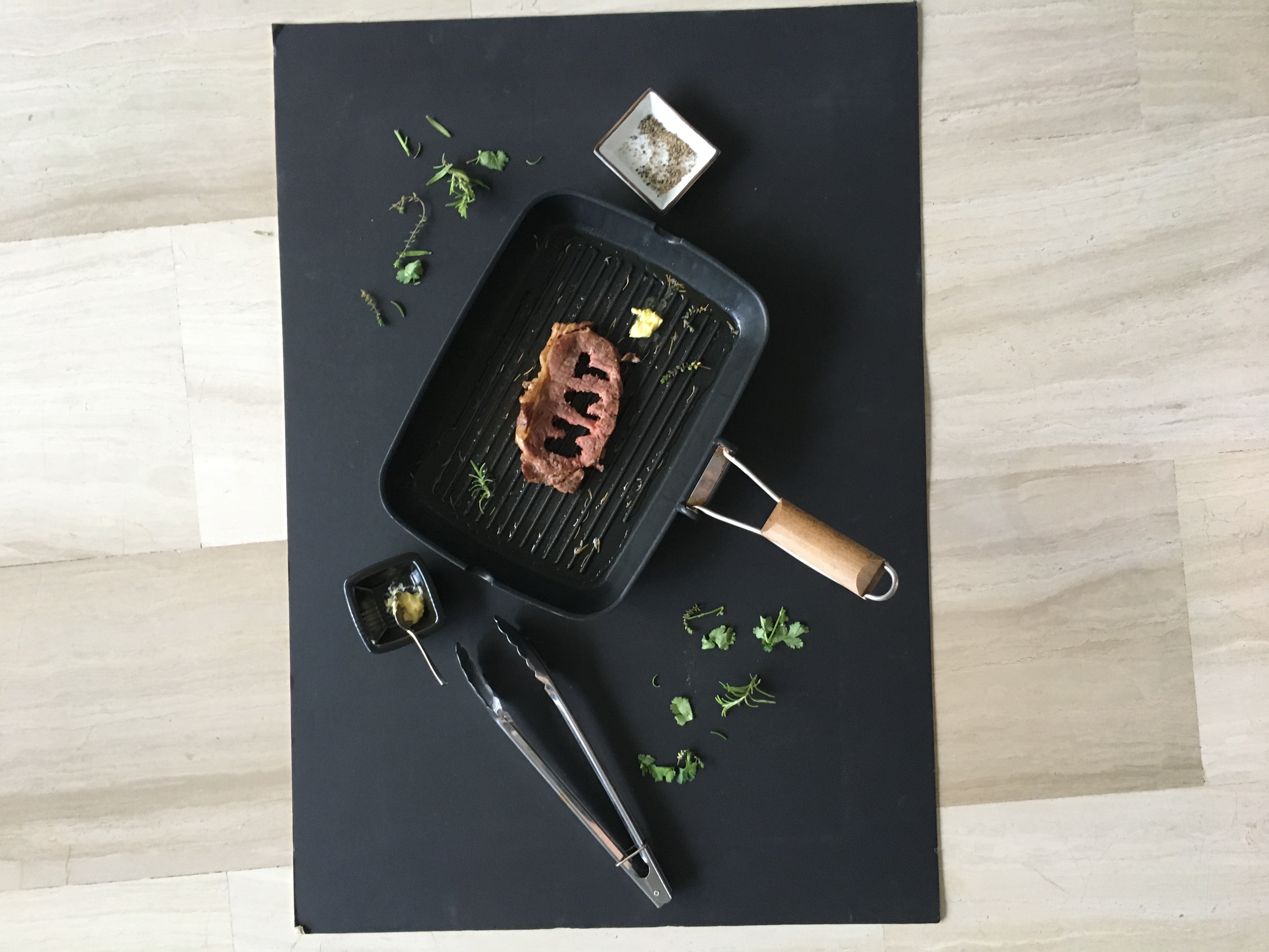
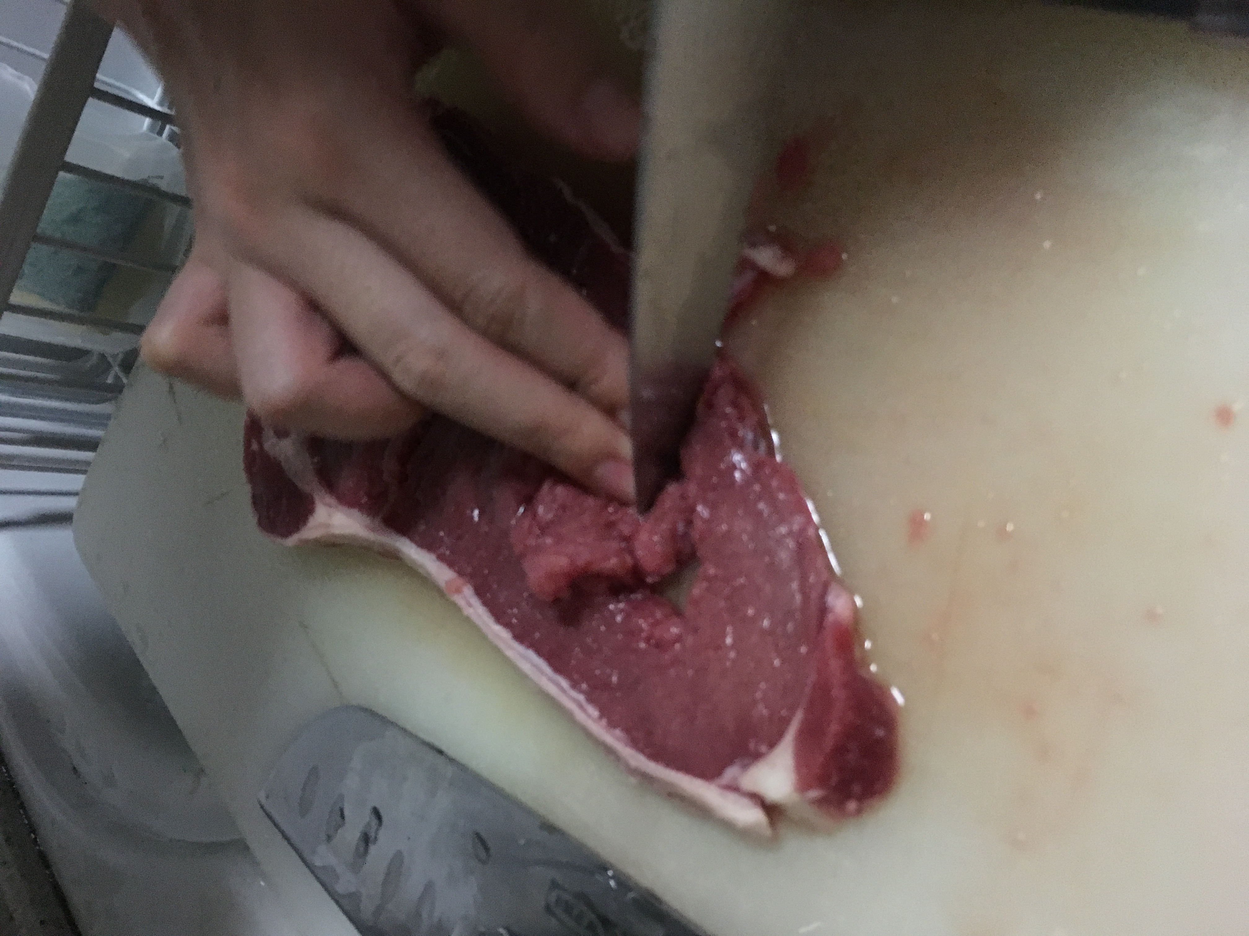
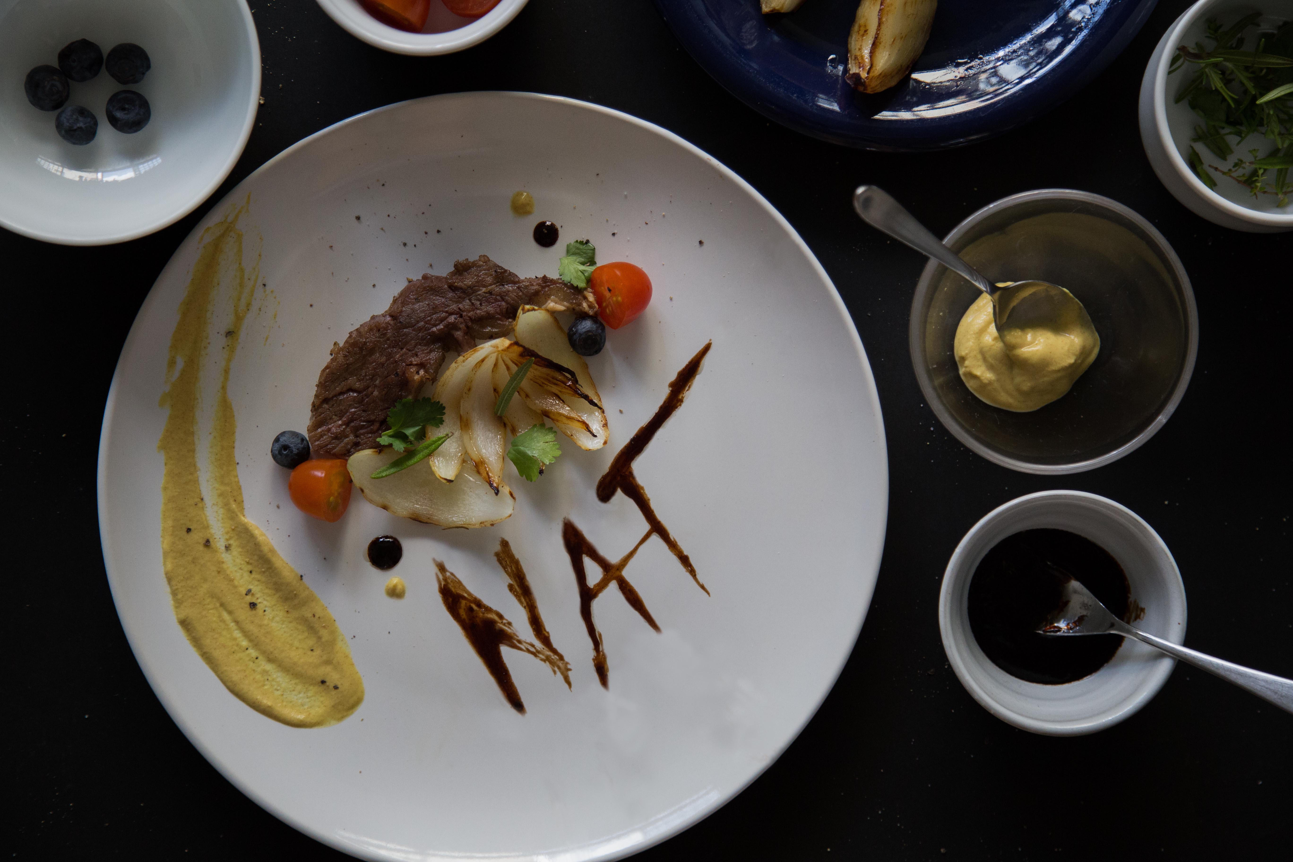
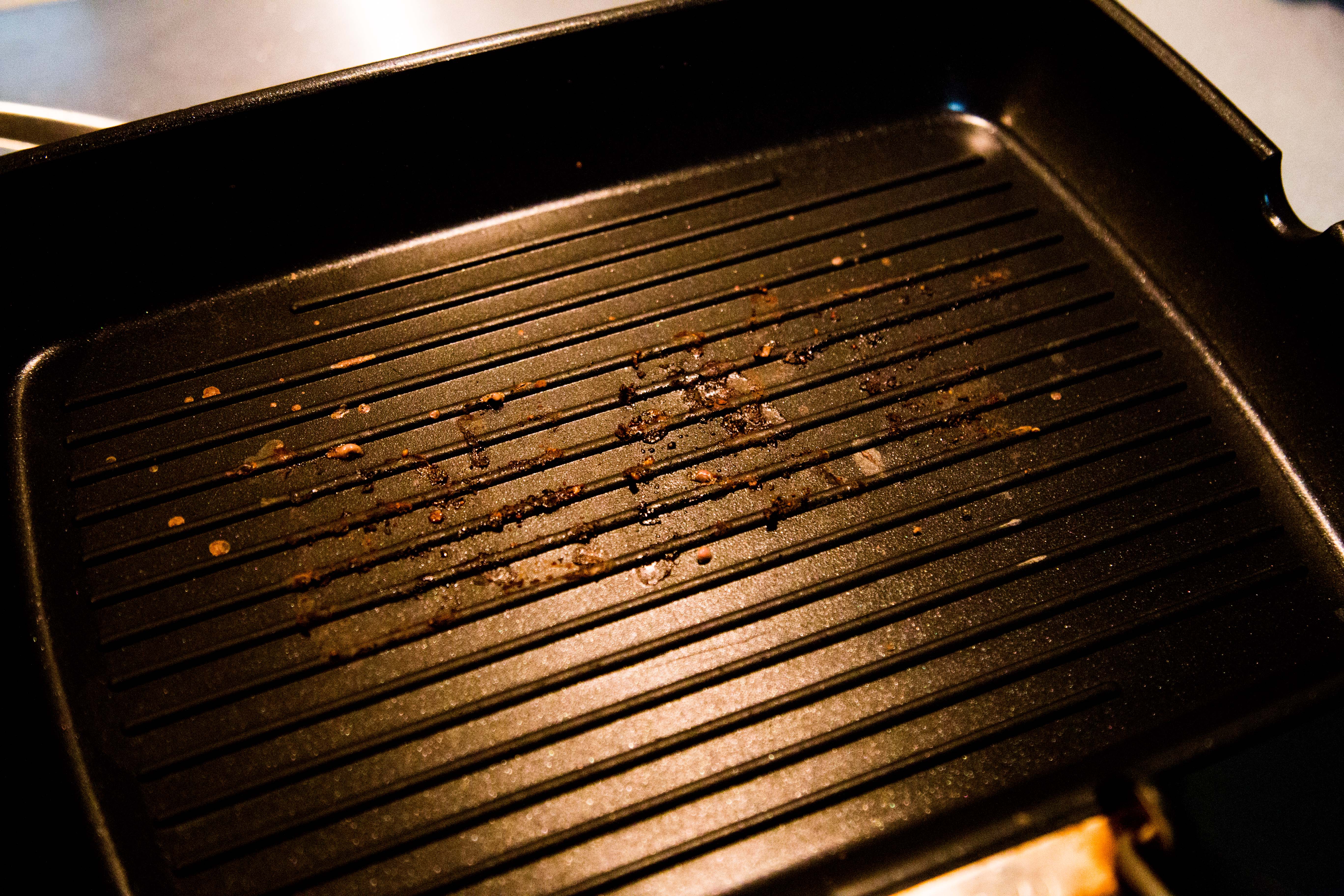
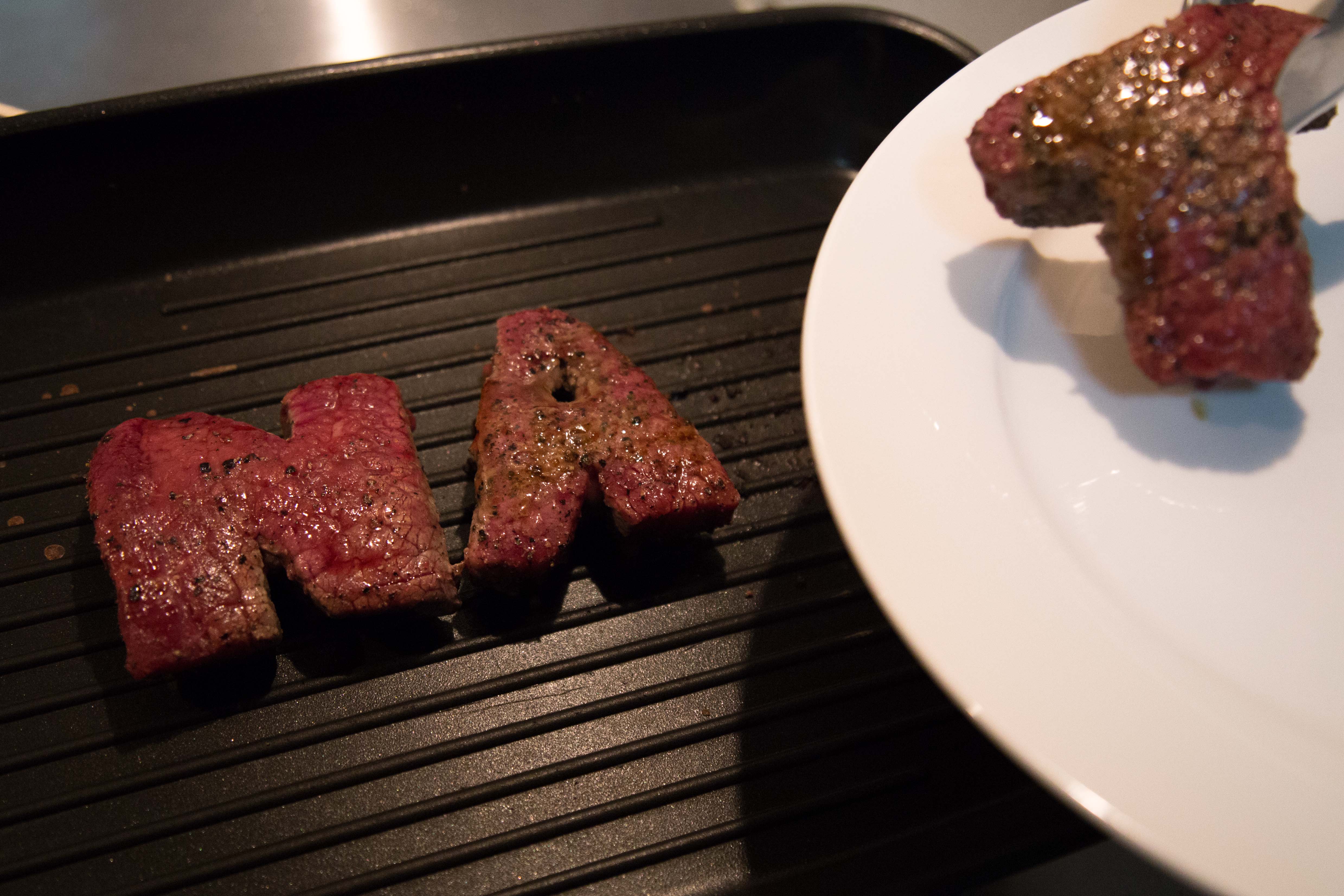
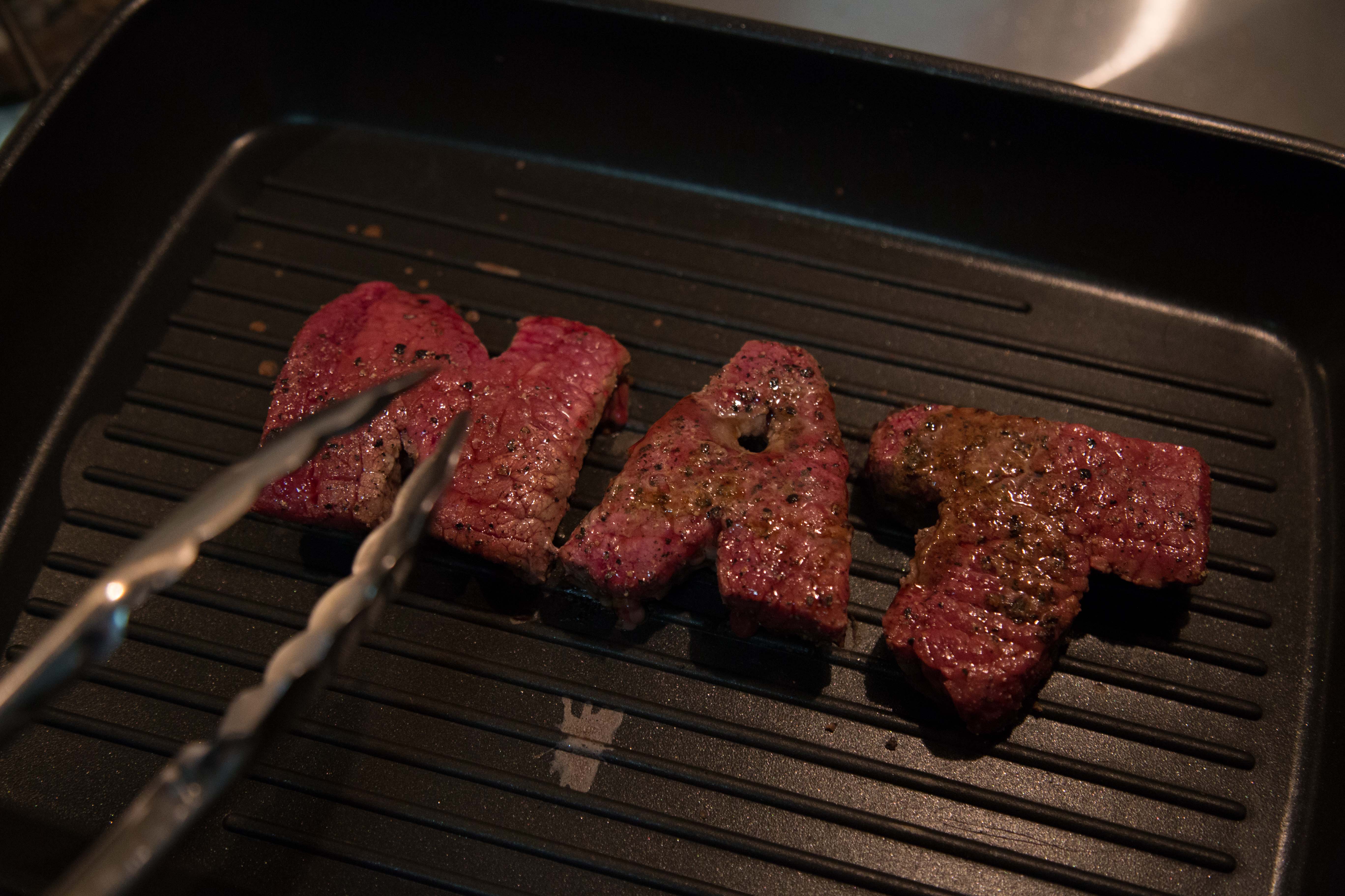
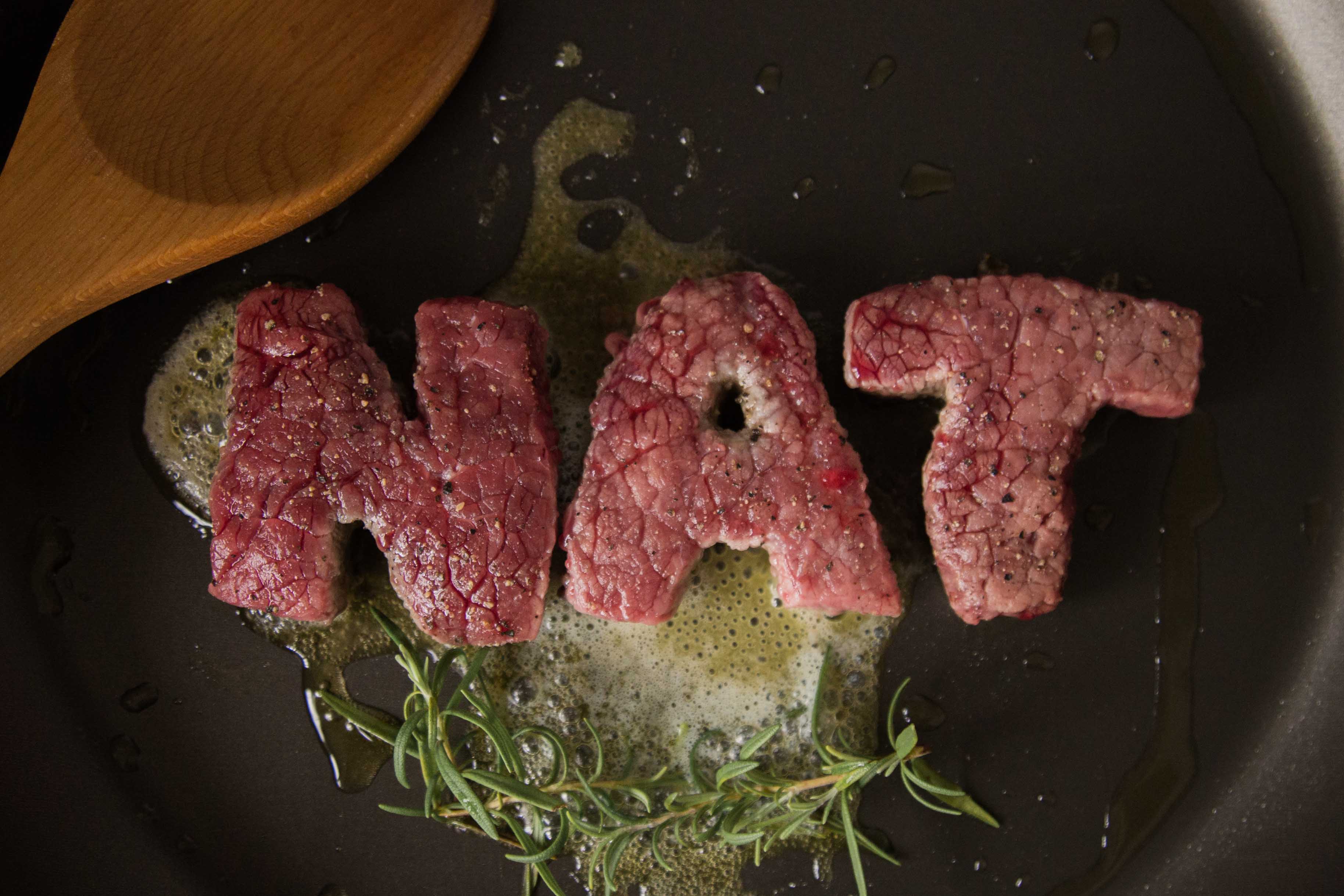
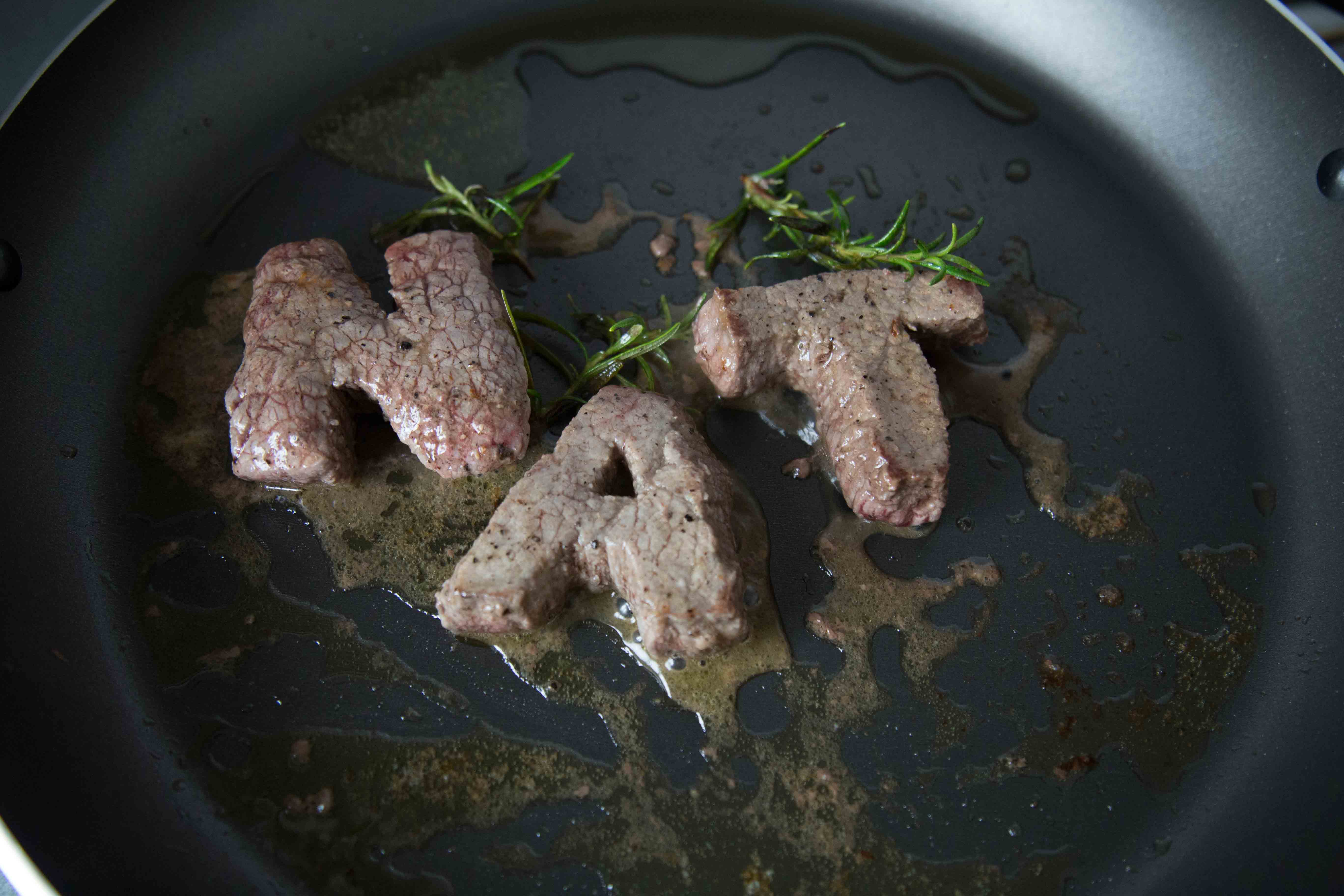
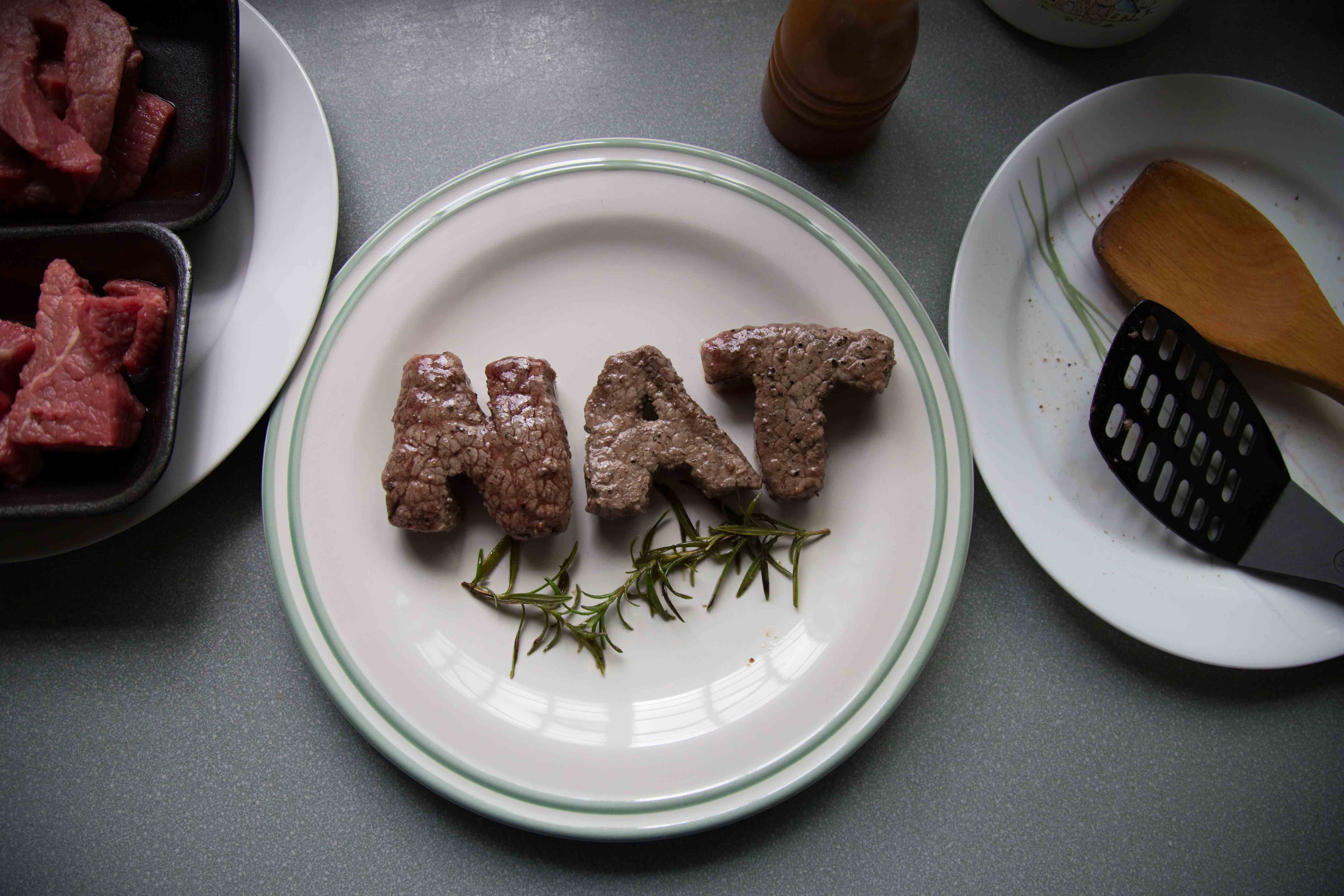
in my previous 2 attempts (see previous 2 posts), they were names cut out from pieces of steak. as Mimi mentioned it was too direct, and creating grill marks on the grill is not possible, i decided to go towards a different approach this time by cutting my name on the piece of steak after cooking it. prior to this, i tried cutting my name when its raw, but it was impossible because of the tendons on the meat that made it impossible to cut through. i used a black background for this because i felt that it gives a better contrast with the green herbs. it also allows the steak to pop better, and i felt that it fits the mood of a grill chef – ‘dirty’; ‘unclean’ so to speak.
process photos –
i studied on how chefs cook their steak and the proper way of doing it is to baste it with melted butter with herbs, hence the herbs and butter on the grill pan. the types of saucers used for the butter and salt & pepper is for contrasting purposes. i felt that yellow butter on a black saucer would fit better, and salt&pepper would fit better on a white one.
final –
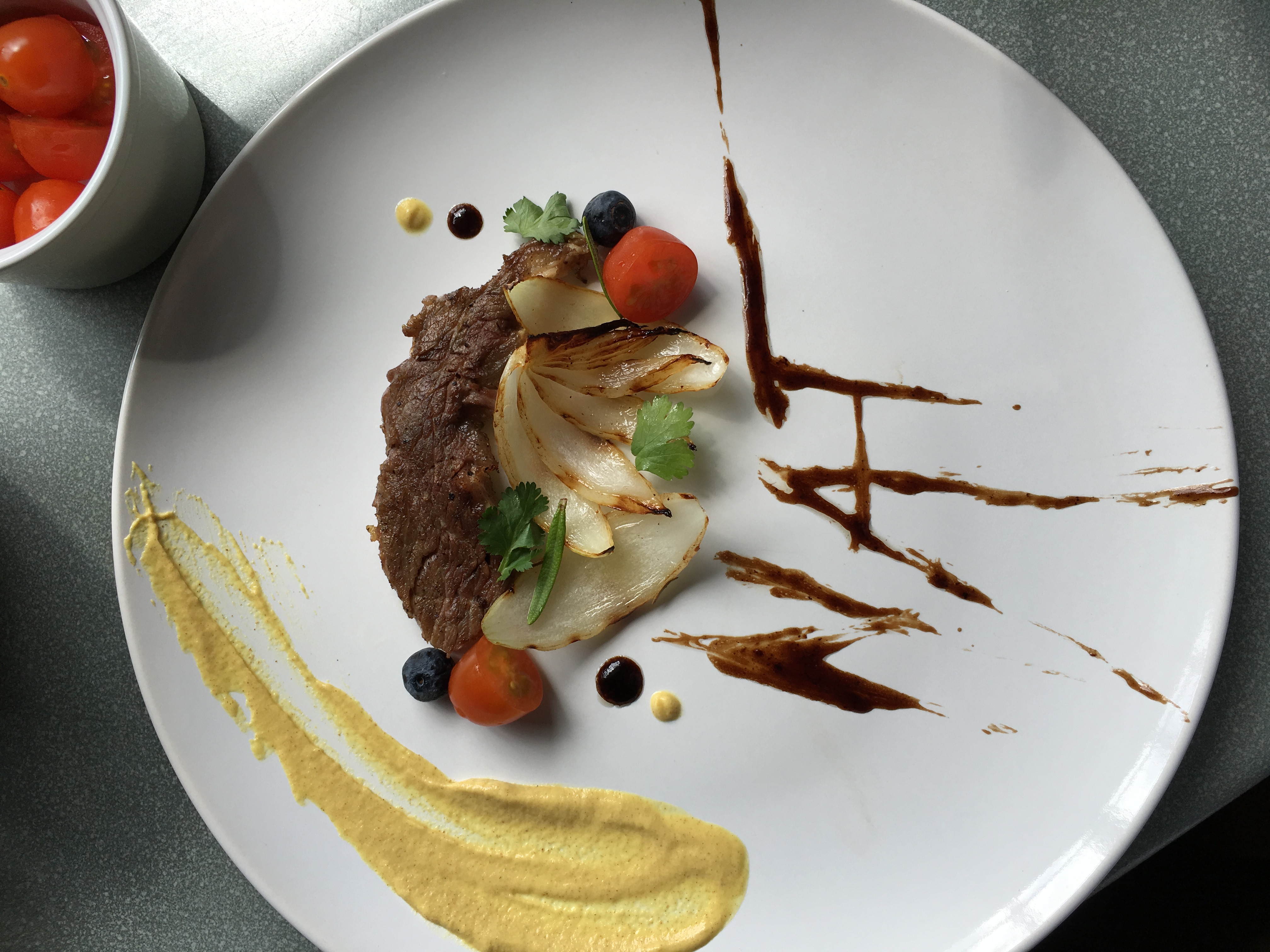
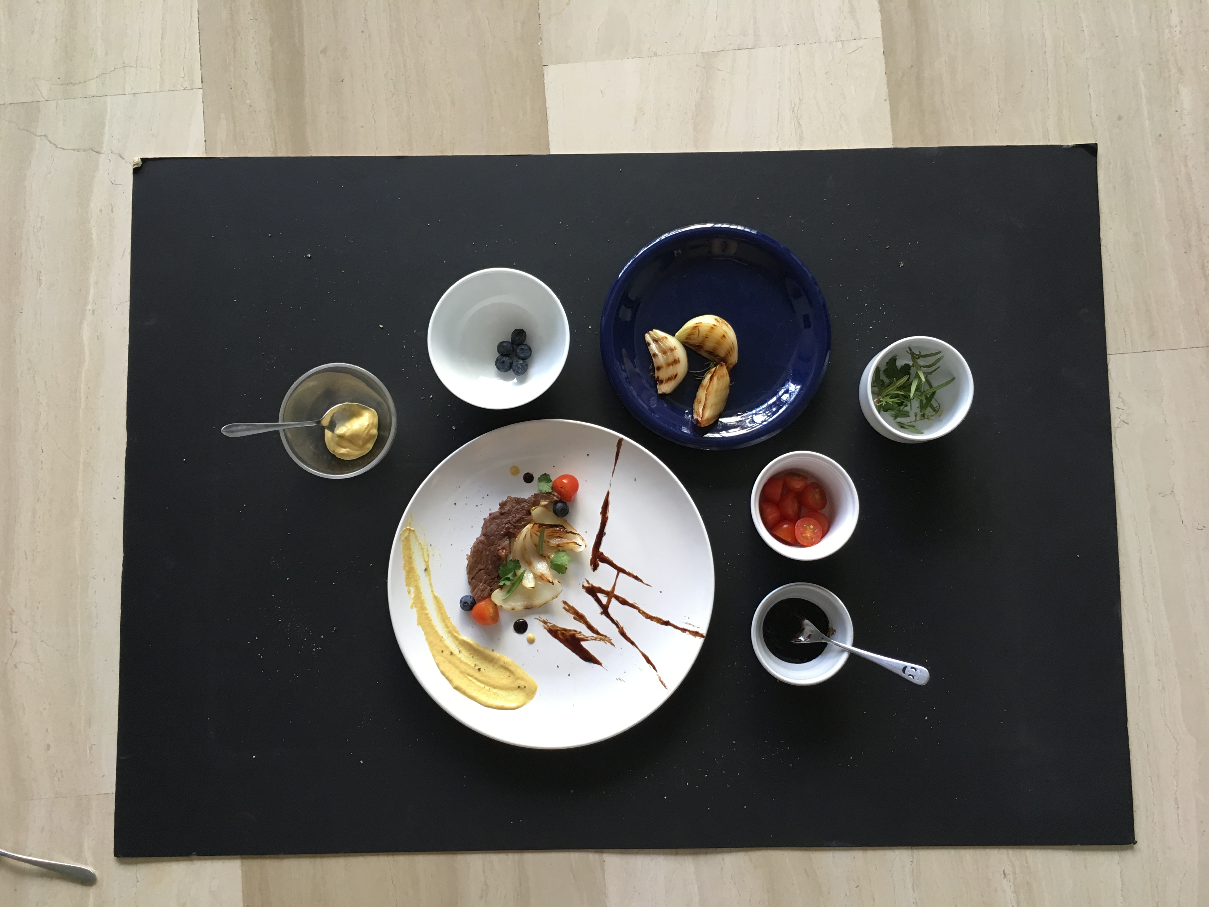
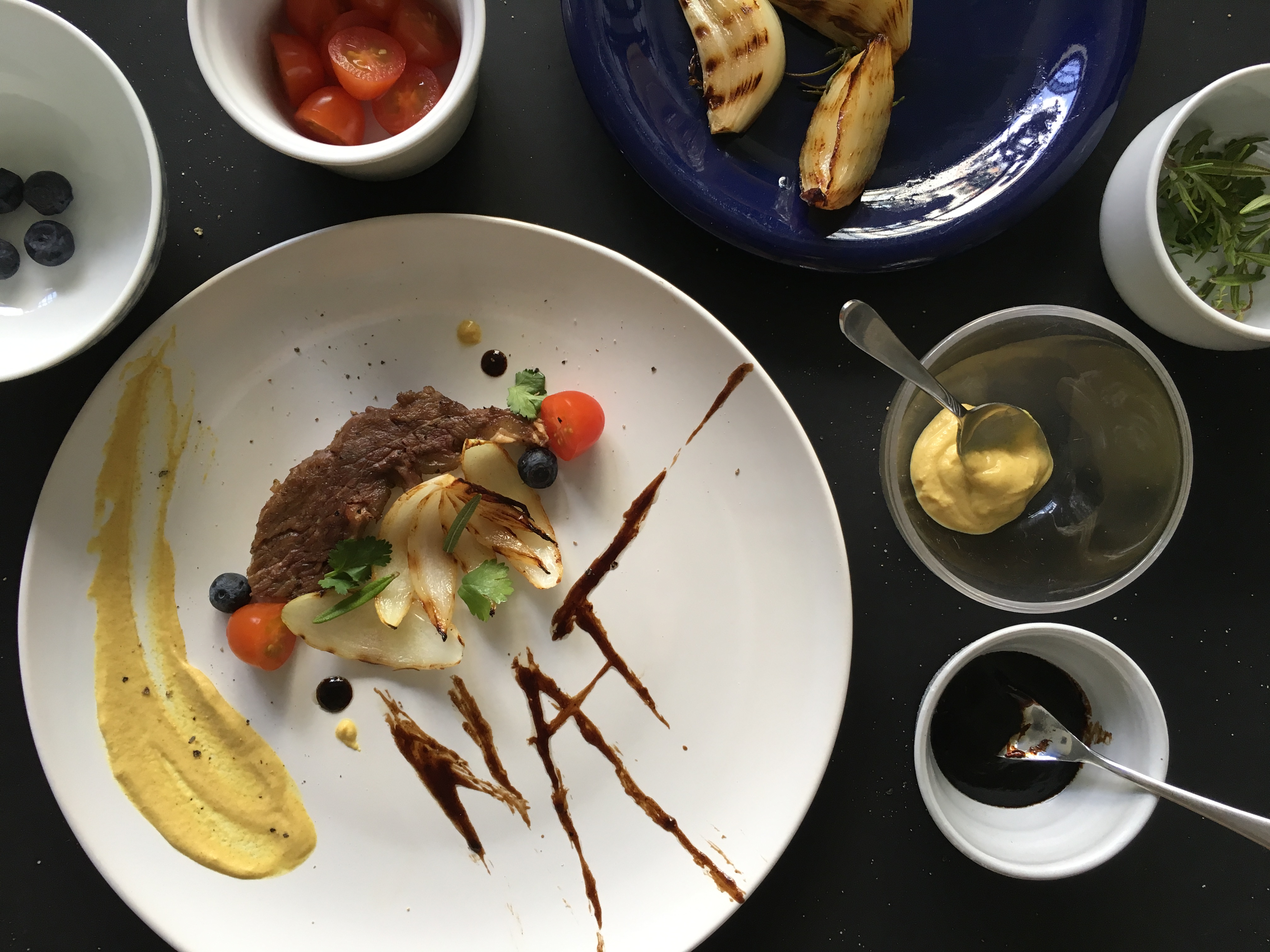
4. Executive Chef
executive chefs are the ones who plate the food before serving. this was a fun one for me to do actually because i had the chance to plate food and make them look pretty for the first time. but before doing it i have 0 knowledge on it so i watched some videos on how to do it.
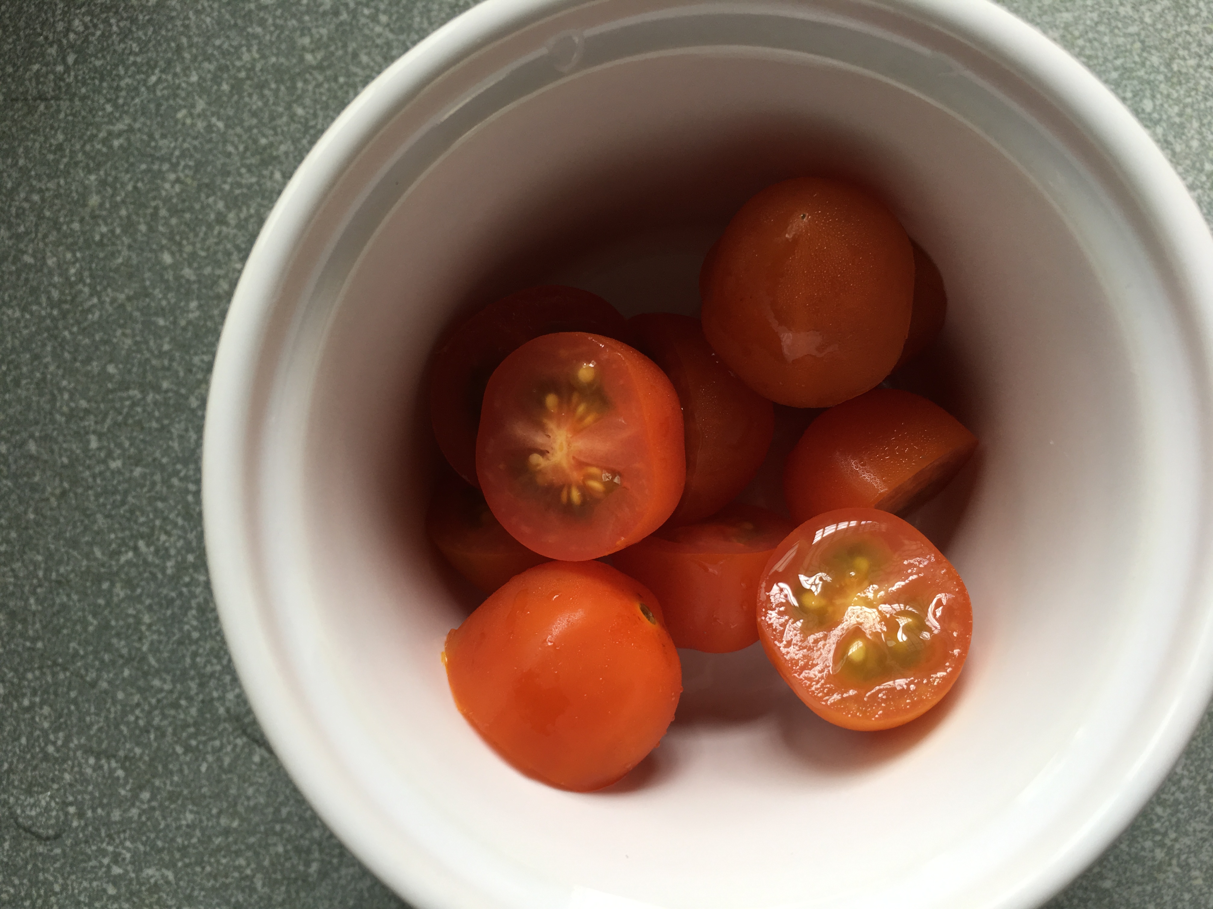
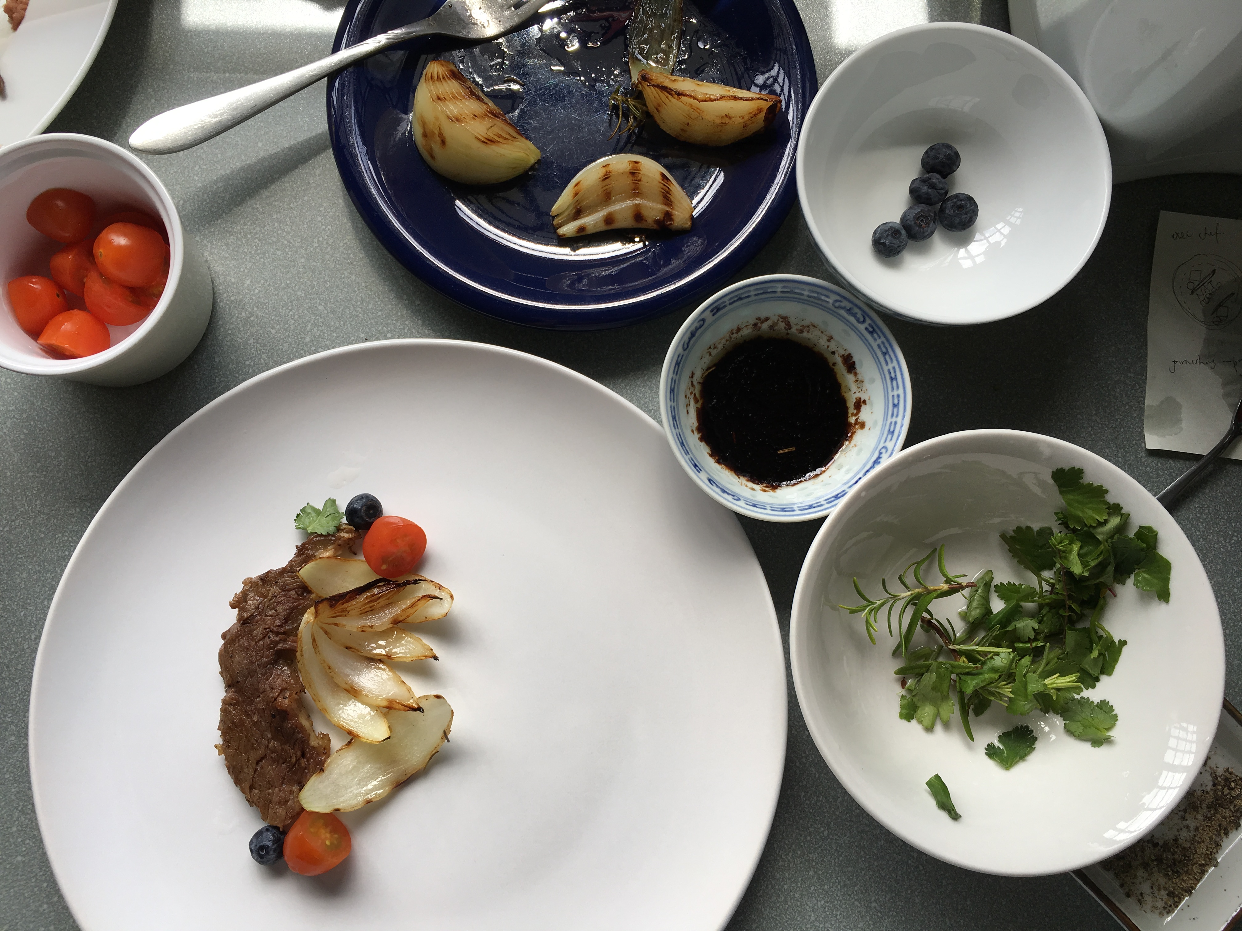
i used a piece of meat from the steak i cooked for the grill chef because dont waste food!! i decided to rummage through my fridge and found half a un used onion, some cherry tomatoes and blueberries. and there, a dish is created.
process photos –
final-
the tomatoes, blueberries and mustard gave the entire dish a pop of colour, which is what i wanted. the herbs are used for garnishing. the char on the onions gave another level of colour and depth to it. the plate is surrounded with the sauces and garnishing because i realized that chef needs their elements close to them. i also realized that the elements are given in an entire serving. i came up with the idea of using the sauce to form my name because sauces are always used during plating, and i felt that it was the most interesting and relevant to the entire job scope of an executive chef.
some research ive done –
““Aside from taste, we eat food visually. The first thing I think about is coloring: You want to have a nice balance of color on the plate. For example, we serve a skate wing at Hinoki & the Bird that is served with bright orange sambal sauce on top and plated on top of a banana leaf. The skate wing doesn’t need a banana leaf on the bottom, but it’s nice to have a contrast of color—chili sauce is orange and green sets it off. It brings the plate to life.”—Kuniko Yagi, chef, Hinoki & the Bird, Los Angeles”
&
https://www.fastcodesign.com/3050217/how-to-plate-food-like-a-3-star-michelin-chef
the plate is surrounded with the sauces and garnishing because i realized that chef needs their elements close to them. i also realized that the elements are given in an entire serving. i came up with the idea of using the sauce to form my name because sauces are always used during plating, and i felt that it was the most interesting and relevant to the entire job scope of an executive chef.
i plated my food on the side of the plate because its creates a good composition and visual pleasantness. i also used a white plate to create a fine dining look.
–
to conclude this project, i felt that this was the most fun as i get to work with new mediums. ive learnt how to art direct a food shoot, and also get to experiement with food + learn food styling. i’ve also learnt that “its all about the idea, followed by a well executed job.” – Mimi
2DII – Que Sera Sera Process #2
after the last consultation with Mimi, i had lots of comments to take in to rethink about my idea.
this round of trials, i had an idea of incorporating the element of my hand into the images, to show the current action of making.
1. Pasta Chef
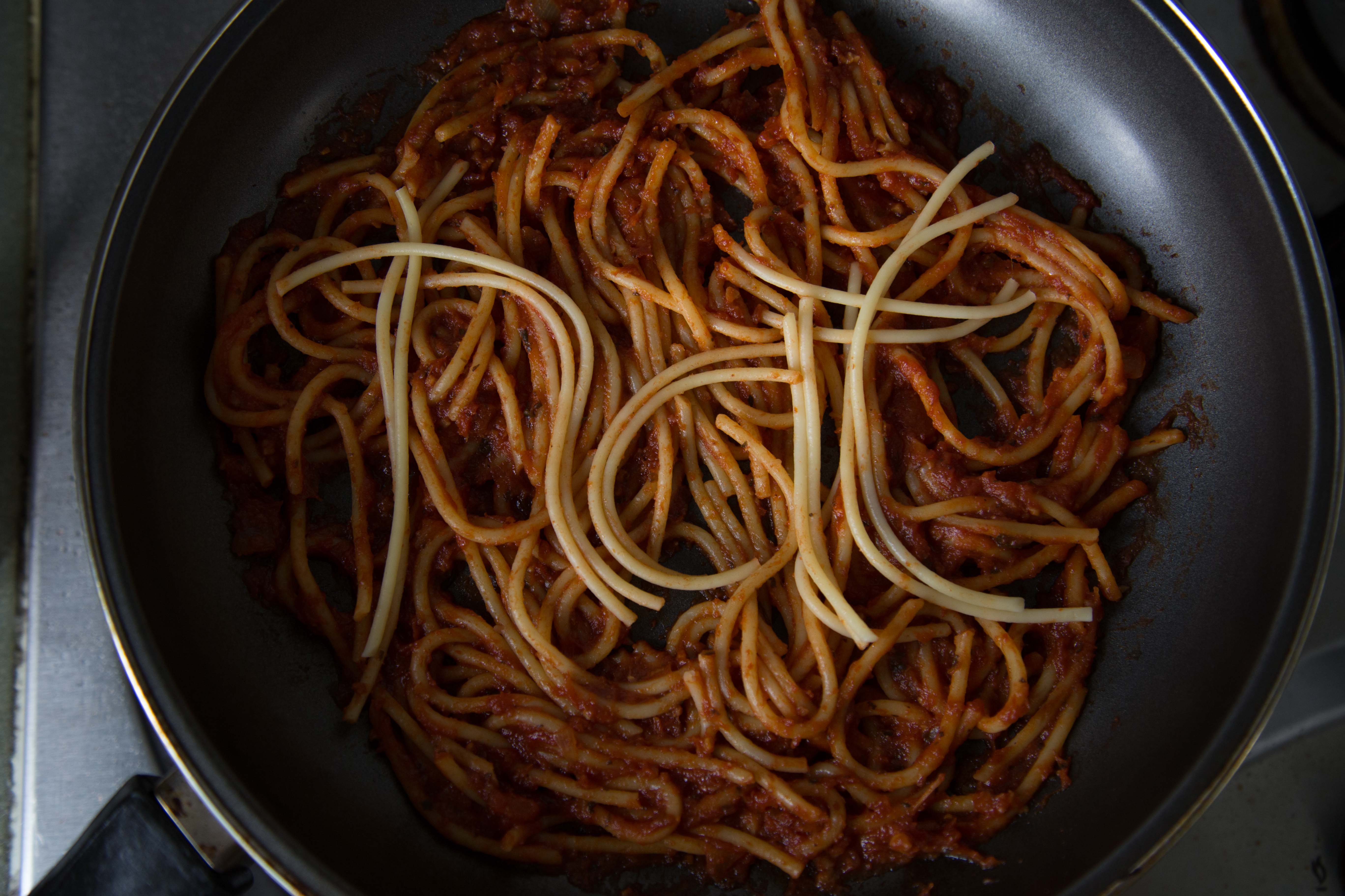
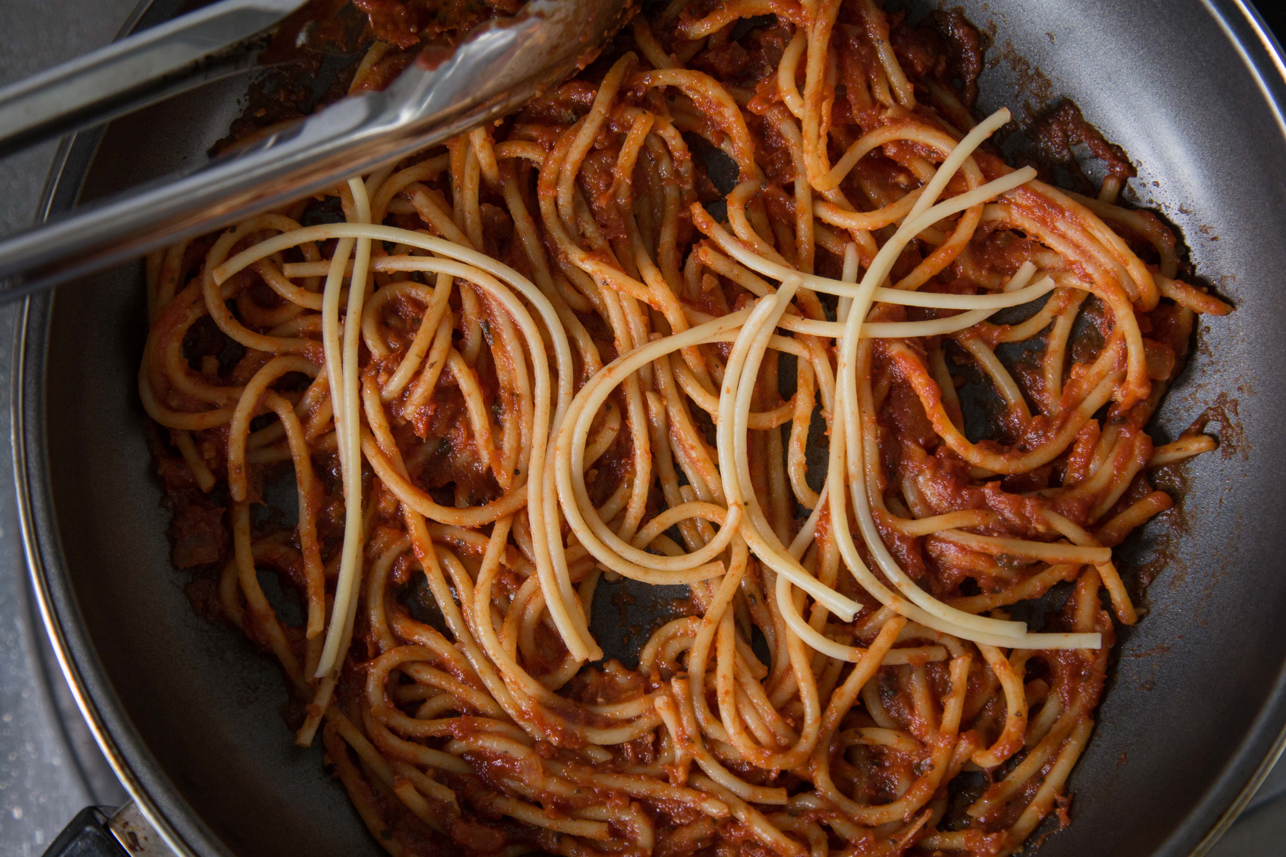
taking in advice from my classmates on using tomato sauce, and creating my name to standout, i created this.
i felt that using the spaghetti to form my name in the right context (in this case in a pan of spaghetti) would create the ‘ah hah’ moment that Mimi referred to. unfortunately Mimi said it didnt look appealing, and at the same time nothing to shout about.
2. Pastry Chef
okay i have to be honest that this didnt turn out as what i expected. the typography turned out quite ugly, and the execution isnt good. Mimi agreed with me and i had to rethink again.
some process images on how i created my failed outcome.
3. Executive Chef
the executive chef is the one who garnishes and plate up before allowing the waiters to serve the food. i chopped up some basil leaves and parsely to have my name formed. Mimi said that my name looks a little thin and there isnt a need for the hand.
4. Grill Chef
in the previous consultation, i thought Mimi meant that i should create my name using the burnt char marks left on the grill pan. but no, thats not what she meant. anyway, i tried having the burnt marks on the pan but it didnt turn out obvious enough.
i didnt want to waste the cuts of meat again so i tried to see if putting them on the pan, with the tongs would be better.
at that point i was really lost. i didnt know how to proceed further. Mimi told me that my work has to be believable, they have to look like its done my a proper chef and in the context of a real kitchen in an expensive restaurant. my execution has to be good, and it has to look like it comes from a page of epicure magazine. it could be food styling, or it could be really good DI of food typography. all in all, the art direction has to be thought out, and my photography has to be good. the choice of utensils has to be well thought out as well as they are the details that speak that they’re in a context of a restaurant.
2DII – Que Sera Sera Process
prior to this, i had a few different ideas on my job scope. some examples such as florist, photographer, barista, etc.
i did some research on some examples i could find on the internet and had some ideas.
florist –

photographer –

i had an idea of using the edges of signboards to form my name using photos i recently shot of during my trip to Hong Kong during the Chinese New Year.
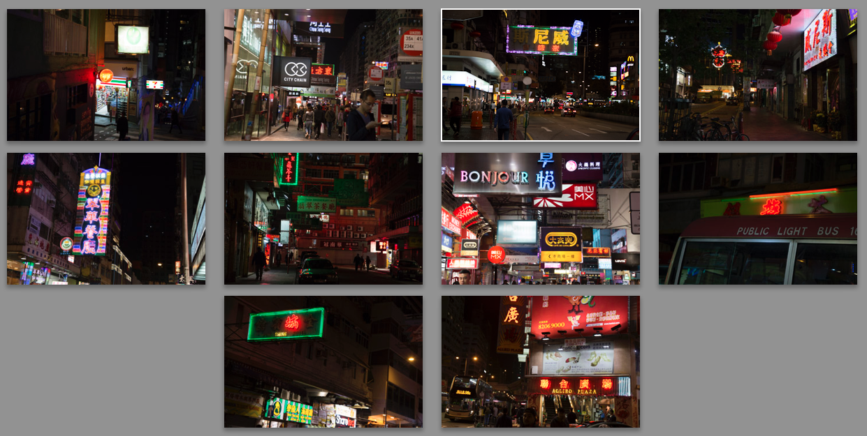
i wasnt really clear on how to proceed, but it was just an idea. i asked my friends about it and they mentioned that its gonna be tough because of the angles of my signboards, and also it doesnt really protray me as a photographer, but more of a neon light artist.
after a few days of conceptual thinking, i had an idea to focus on one type of job then branch it out. finally, i decided to focus on a being a chef, but branching it out to 4 other different types.
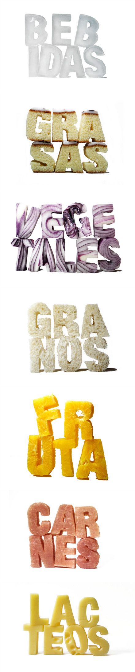
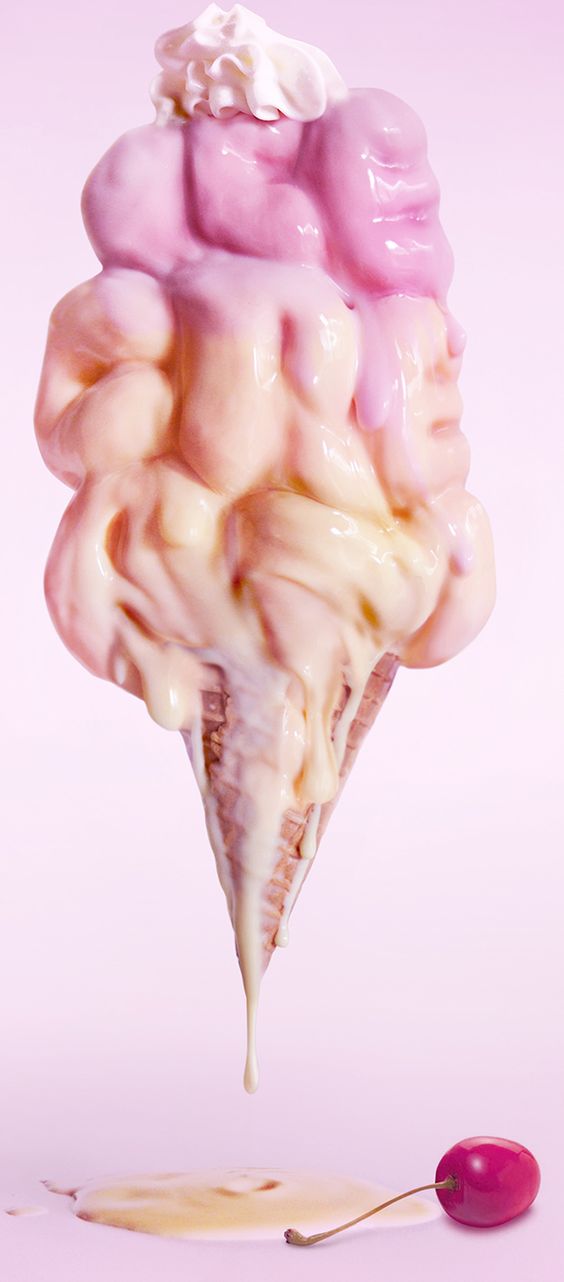
i did some visual research on pinterest –
there were a few chefs i had in mind:
sushi chef, steak chef, sous chef, pastry chef, executive chef (the one who plates the food), pasta chef, vegetable chef.
i settled on pastry, pasta, executive chef, grill chef.
i felt that my knowledge on the types of chef werent strong, so i decided to do a research on the different types of chef. these are some examples of what i found.
from this, i decided to focus on Grill Chef, Pasta Chef, Pastry Chef, and Executive Chef.
i did some studies on pinterest hopefully to get some inspiration from existing works.
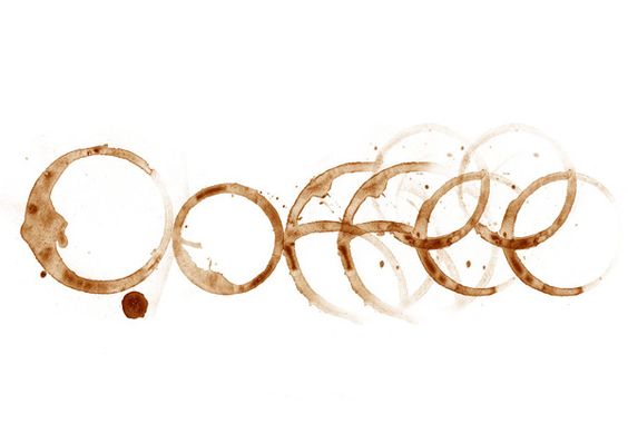
i appreciate the cleverness in the play of words with the visuals. unfortunately this project is based on our names, so creating a clever play on the words is out of scope.
i did some initial tryouts –
1. Pasta Chef
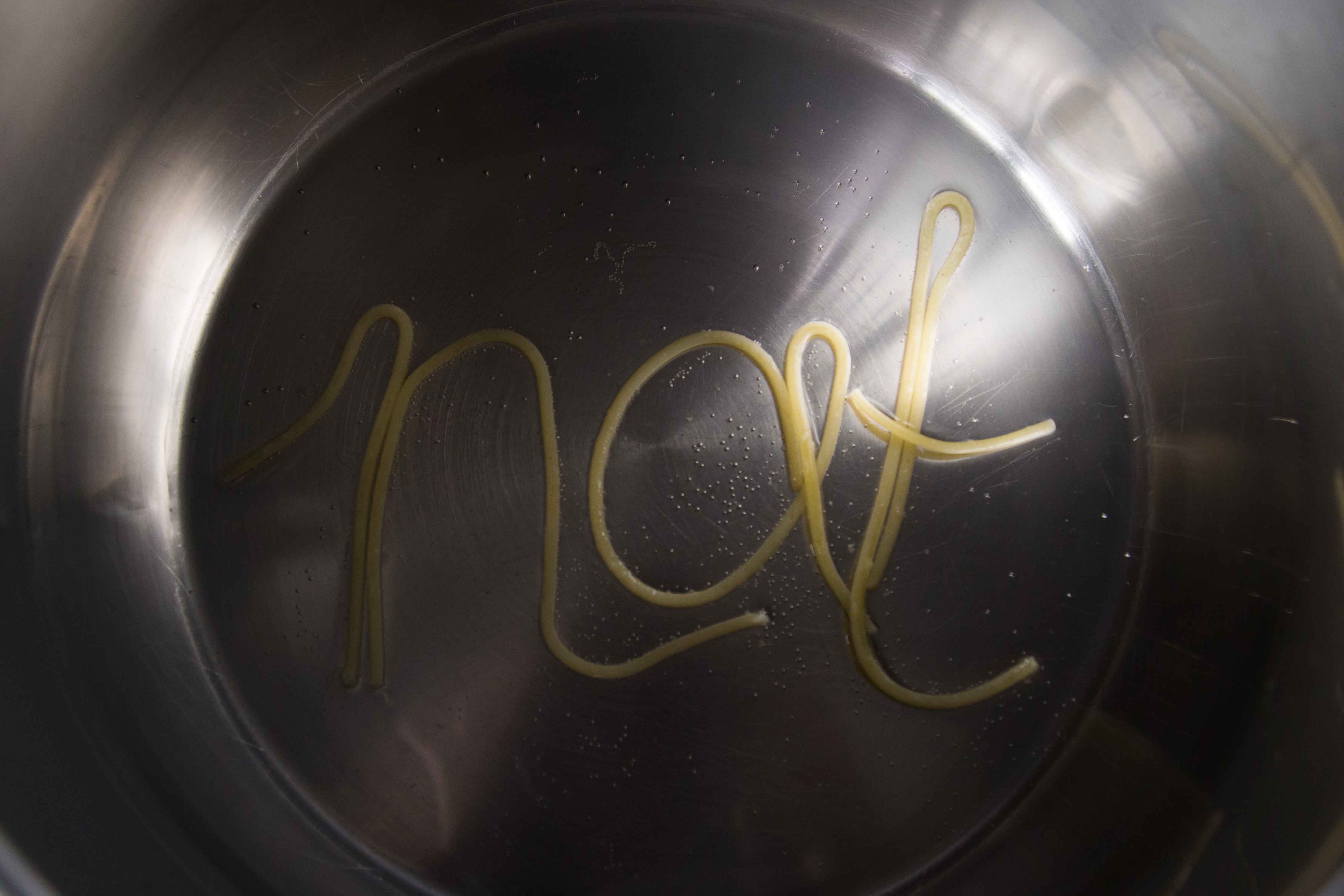
this is an initial idea of a pasta chef. i had an idea of having pasta in a pot of boiling water as the concept, but Mimi advised me to have it more complex and not too direct. she also advised to use different types of pasta because spaghetti is a difficult medium to control.
my classmates gave me some advice that i could experiment with other types of noodles like ramen or penne. they also said that i could use tomato sauce as a background to make the image pop (yellow on red).
i had an idea on playing with the alphabets found in alphabet soup. 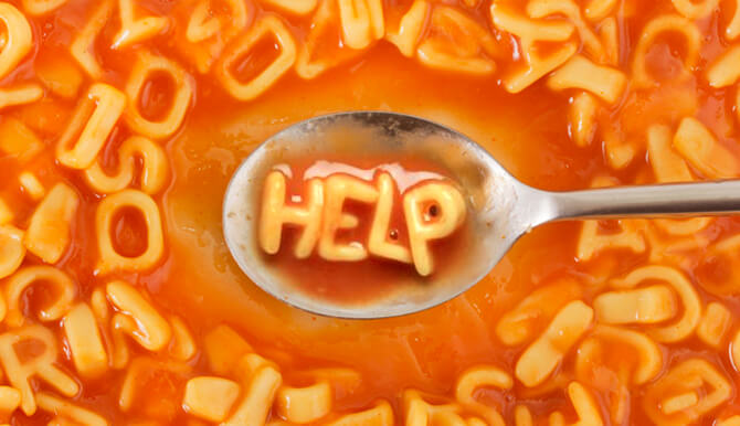
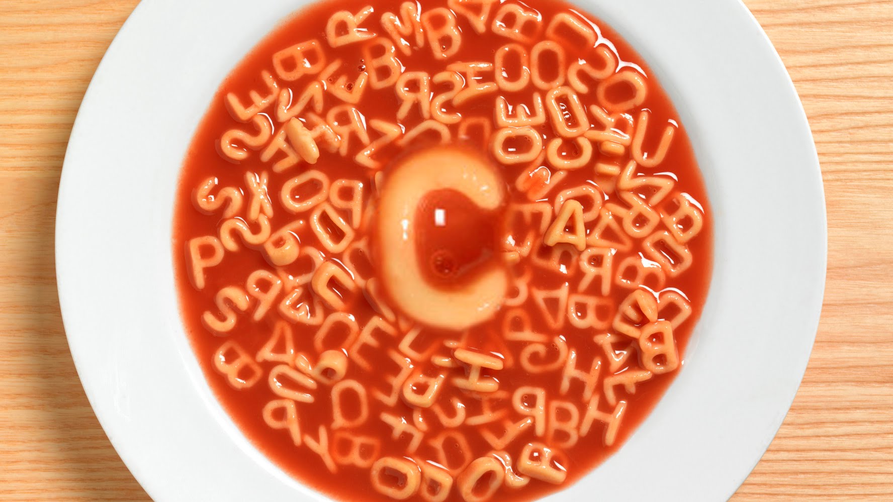
i could try and elevate this simple concept into something more visually appealing.
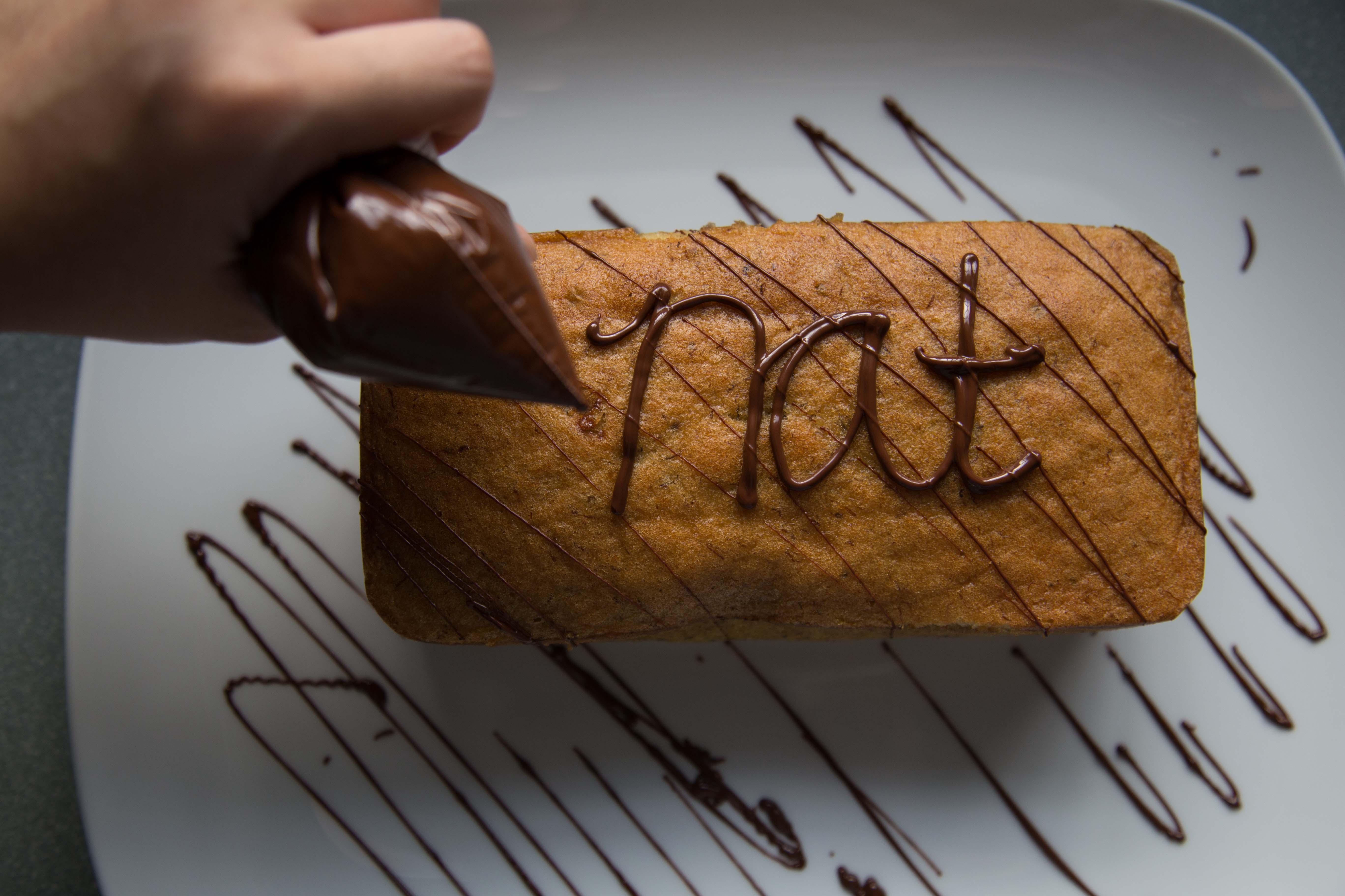
2. Pastry Chef
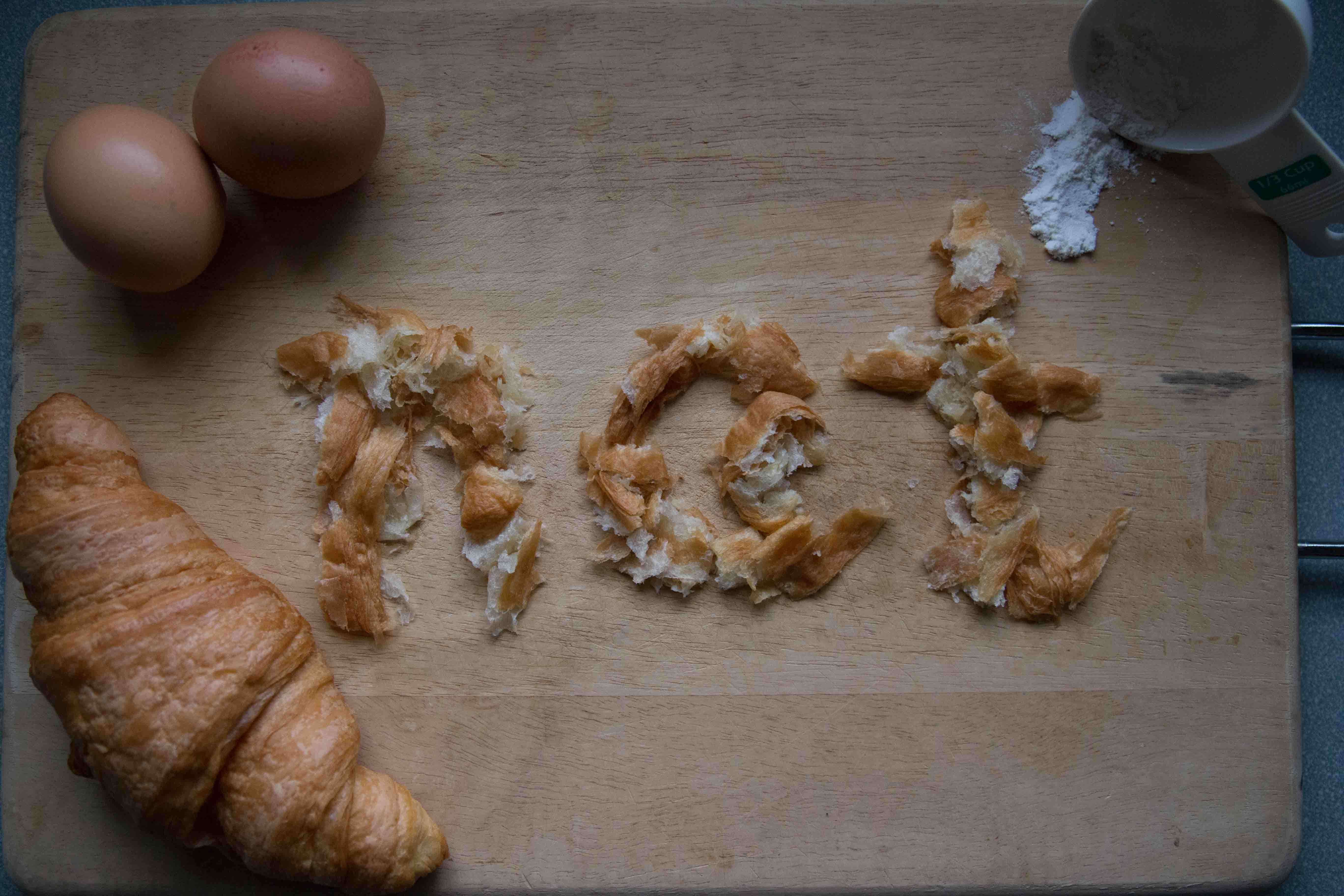
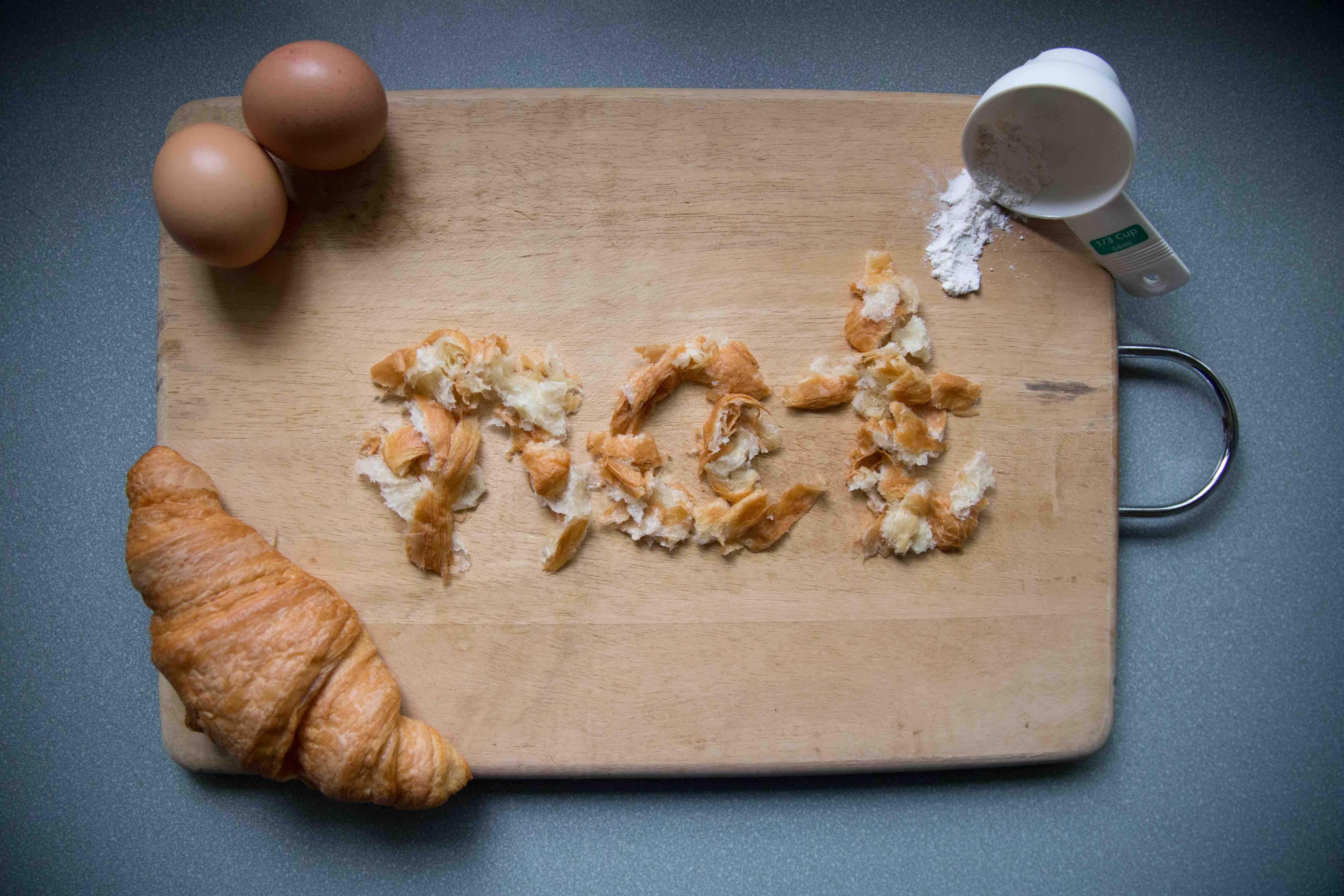
this is my initial version of a pastry chef. i really liked how it came out but Mimi said that it only looks pretty; there is no deeper concept behind it. she also pointed out that tearing up a croissant to form my name doesnt prove my role as a pastry chef because (which pastry chef tears up their work?), which i agreed with her.
3. Grill Chef
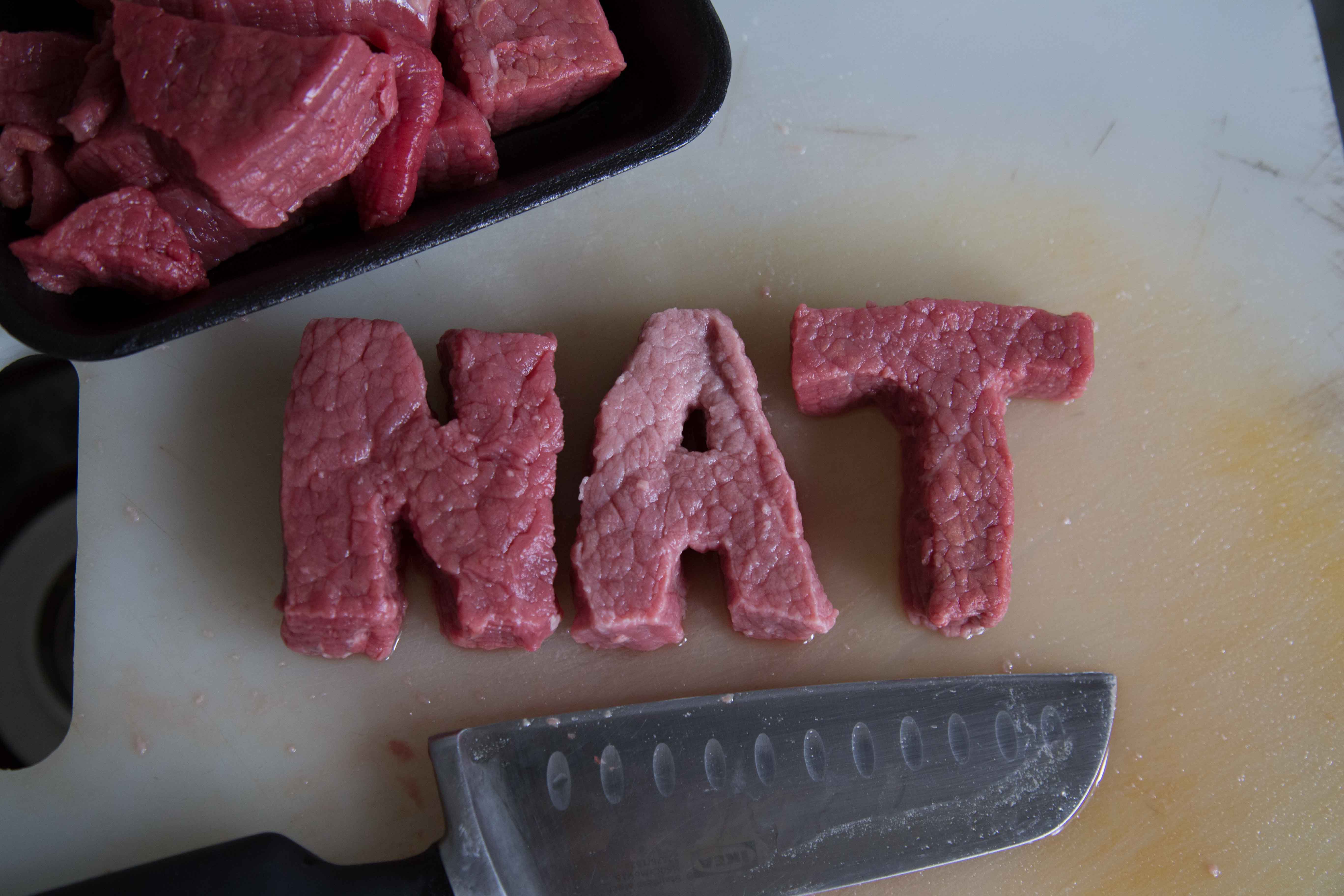
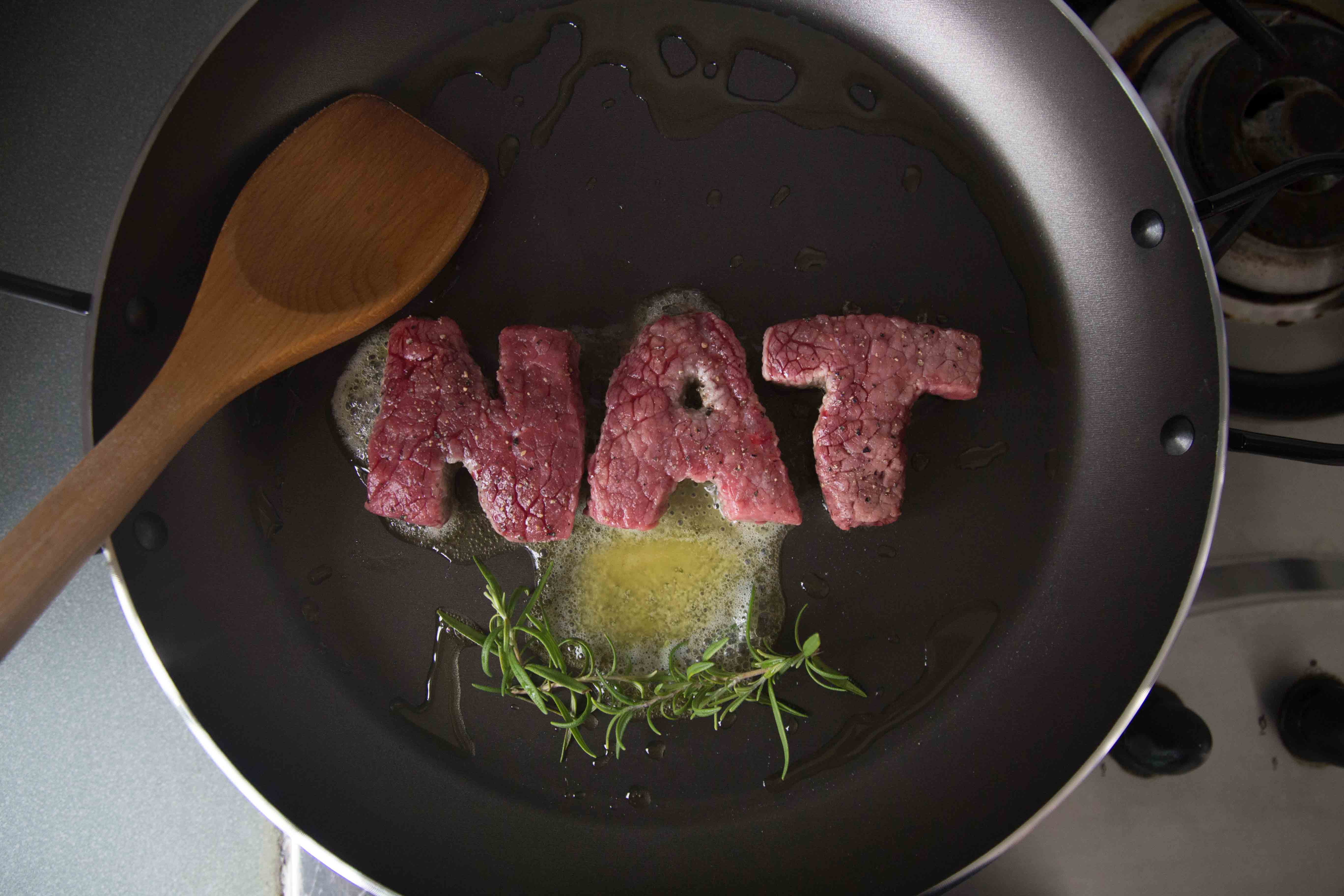
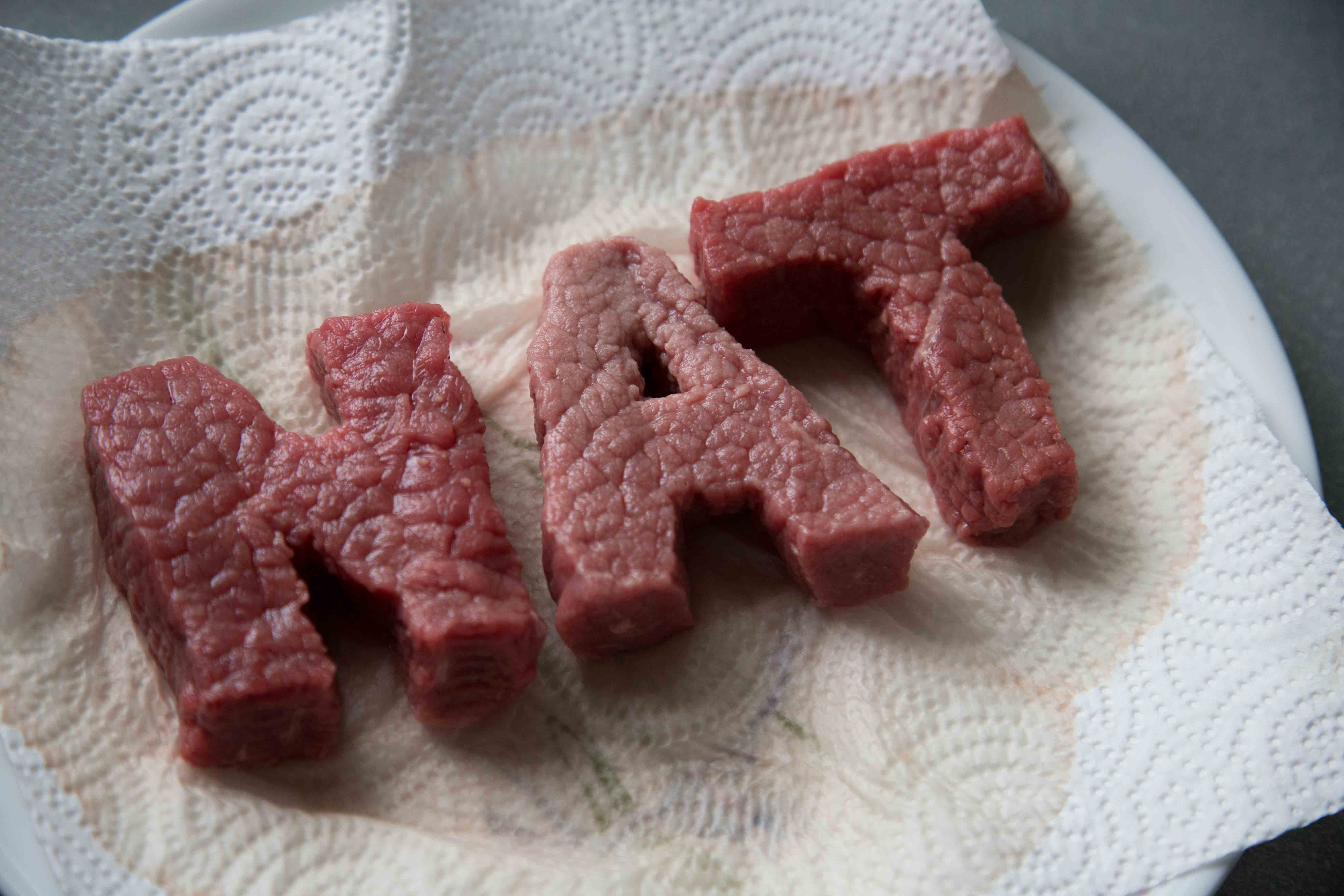

similar to the previous 3, Mimi said that my outcomes didnt really have any conceptual depth to them. she suggested that i use the grill marks to create my name because all im doing now is approaching the execution too directly, and thats too simple.
generally, Mimi told me to think of my concept in a depeer context, and create that ‘ah-hah’ moment.