


Category: Final Project
2DII – Zine Process + Final
i had a few inspirations in mind for my zine. i wanted to design my zine learning towards the experimental side, rather than a straight forward photo + interview one.
here are a few inspirations i had in mind –


taking these inspirations into consideration, i came up a few layouts variations –

i consulted mimi and she told me to try out with the real content out because i didnt have anything out yet so it was hard to comment on.
and so i came up with my first layout mock up –
however, mimi wasnt a fan of my layout because she mentioned that my images weren’t deserving the little attention as how they should be as they were well taken. she also didnt like the unnecessary geometric patterns and elements that i was adding into my zine as they have no purpose.
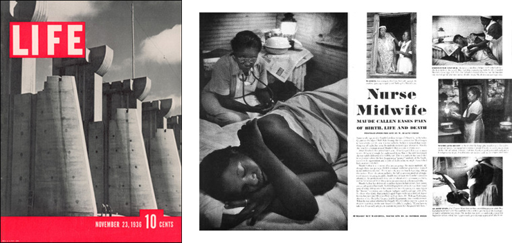
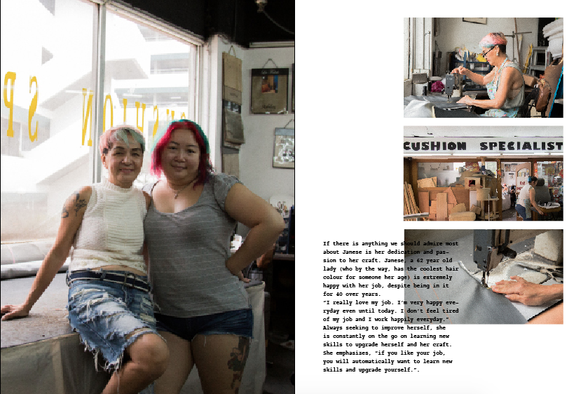
mimi gave me a few helpful and insightful tips that i should work on. she told me to focus on the people, and my zine should be one that people would want to keep looking at the images. my zine should be humanistic, and story orientated. she told me to look at magazines such as TIME.
i researched on those magazines and here are some insightful


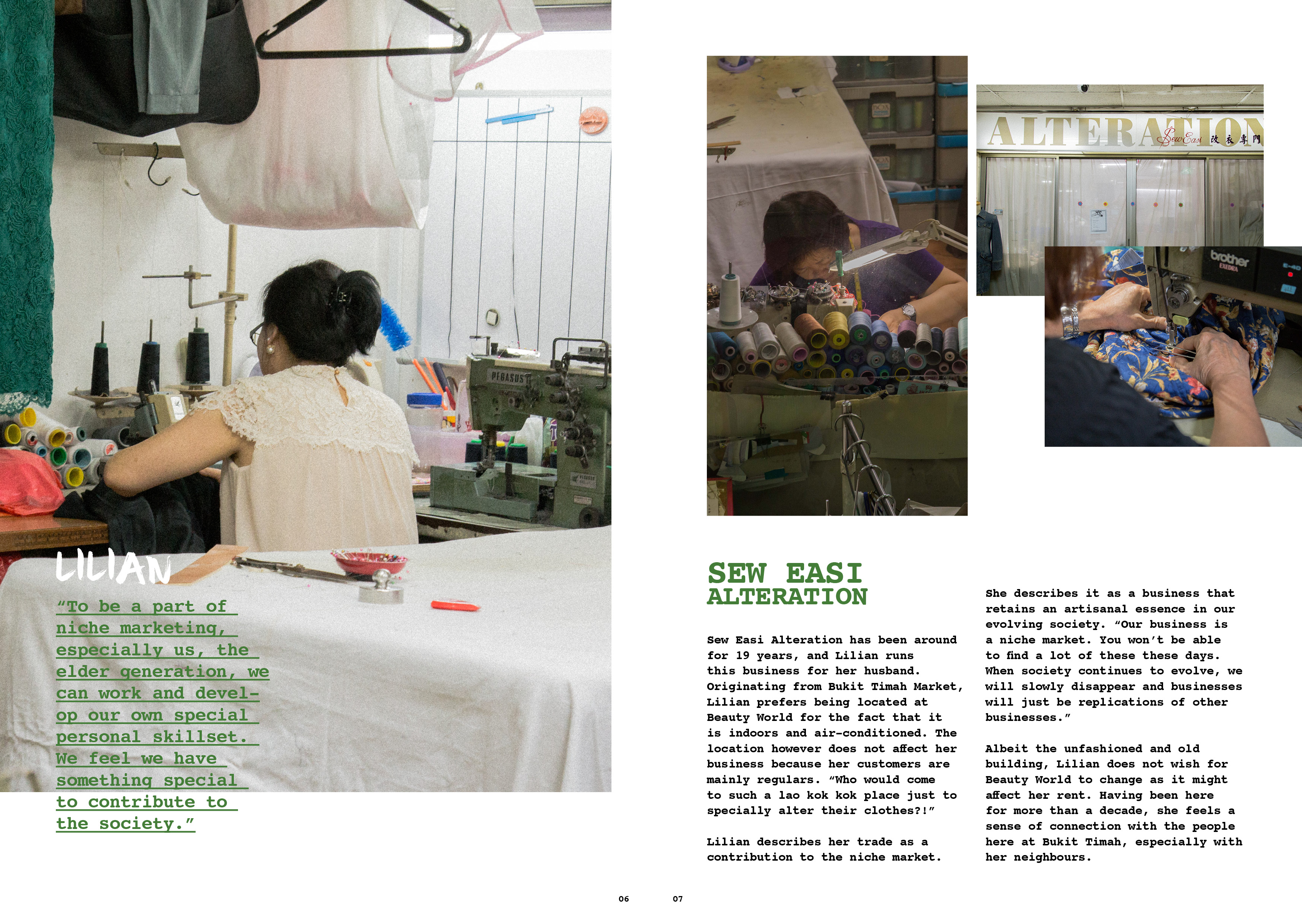
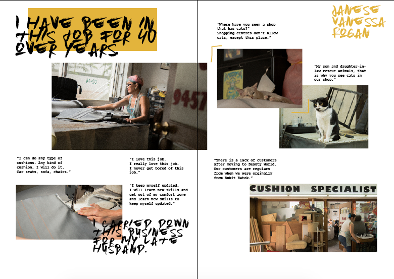
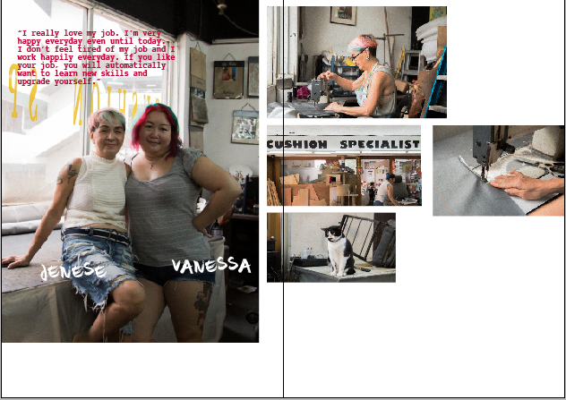
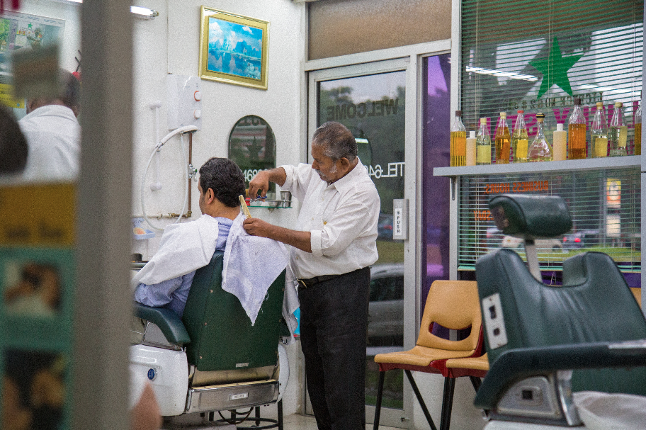
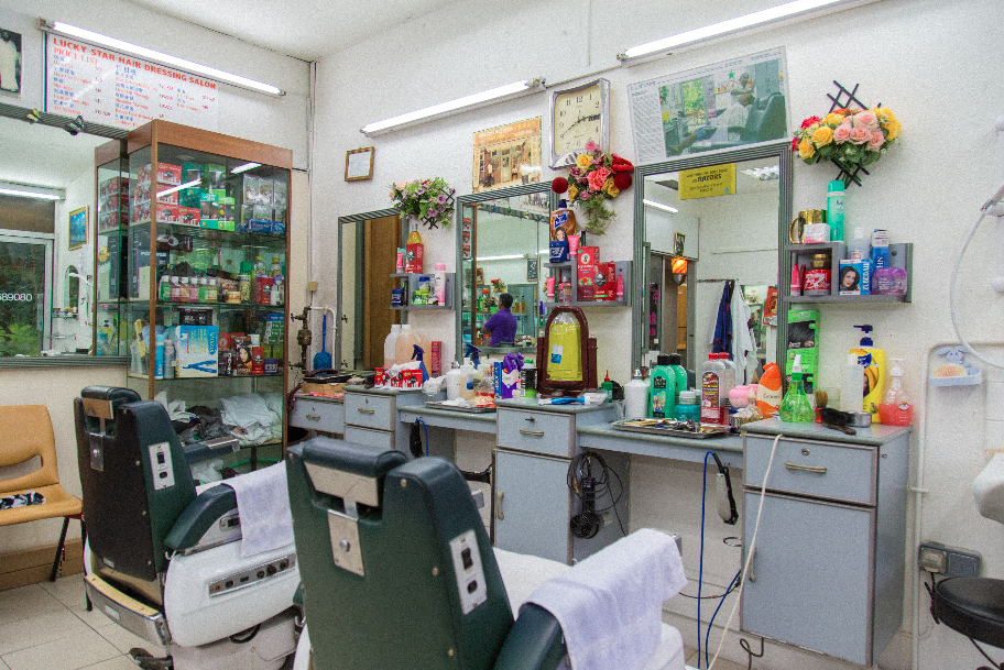
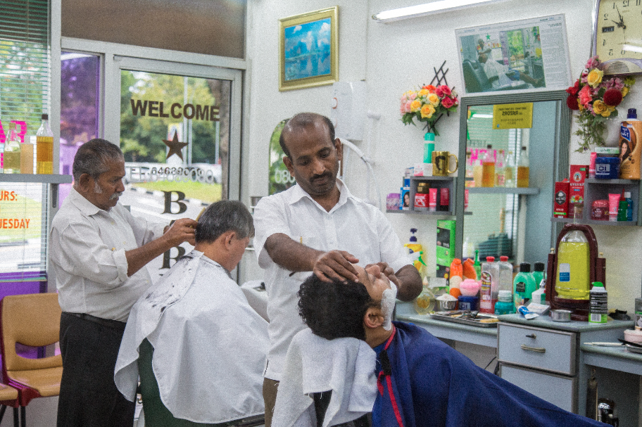
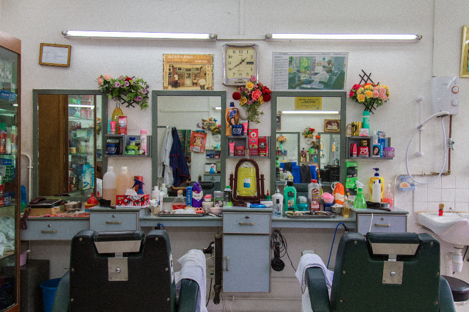
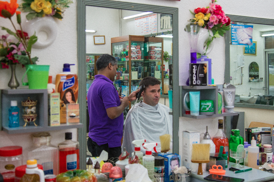
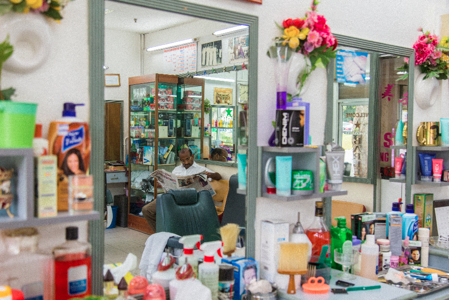
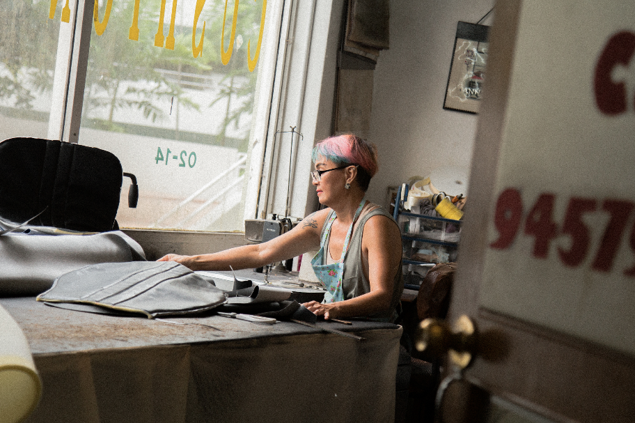
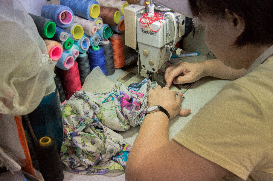
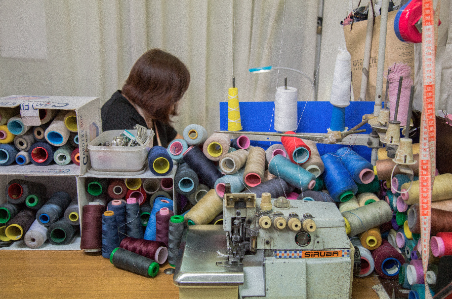
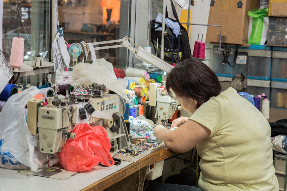
i understood what she was referring to and i realized i was lacking in some portraiture, so i went back to beauty world for another time to take their portraits.
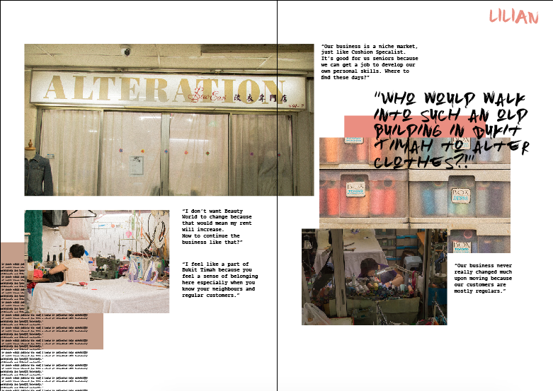
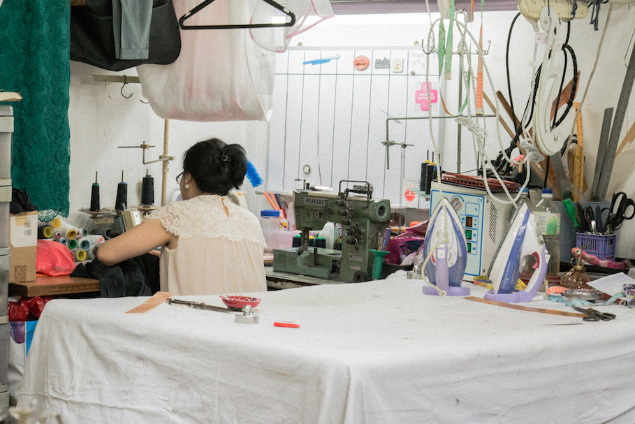
unfortunately Lilian from Sew Easi wasnt comfortable to have her picture taken, so i could only use the previous photo i had of her back to substitute as her portraiture 🙁
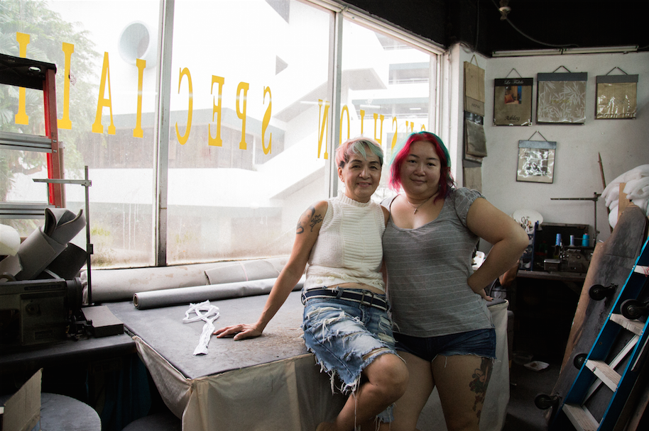
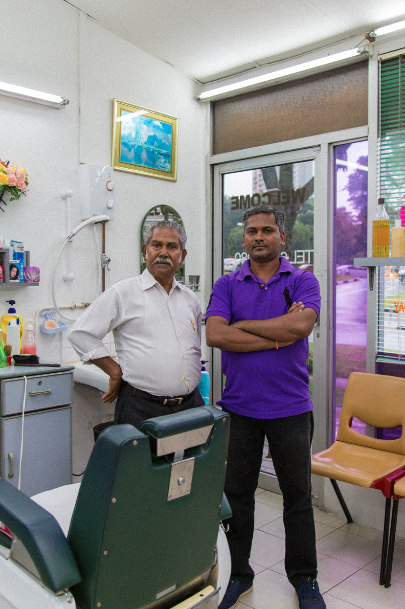
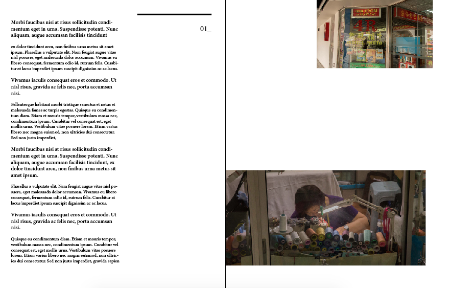
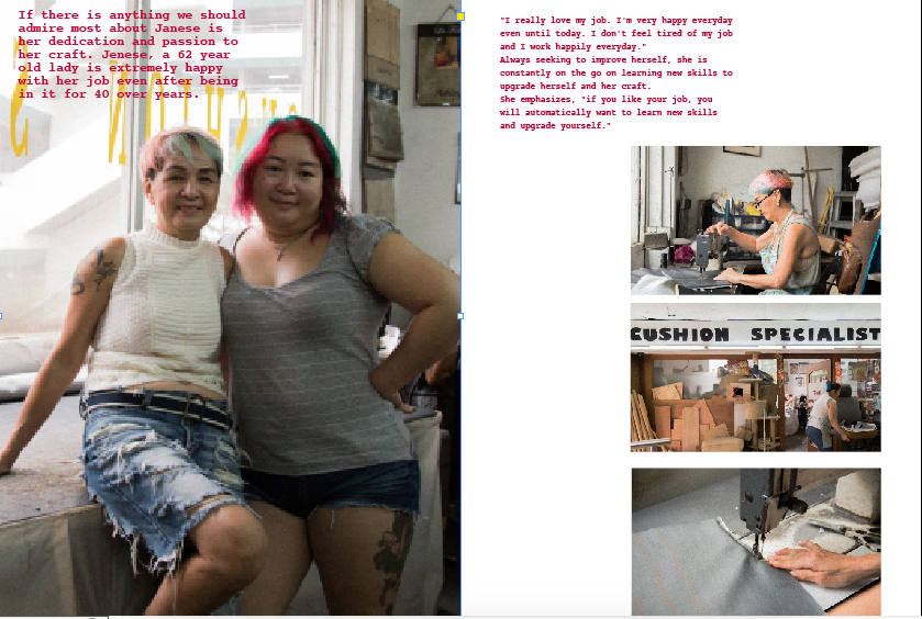
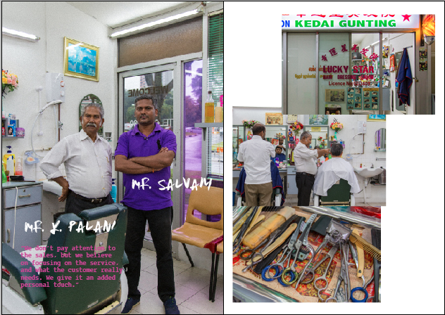
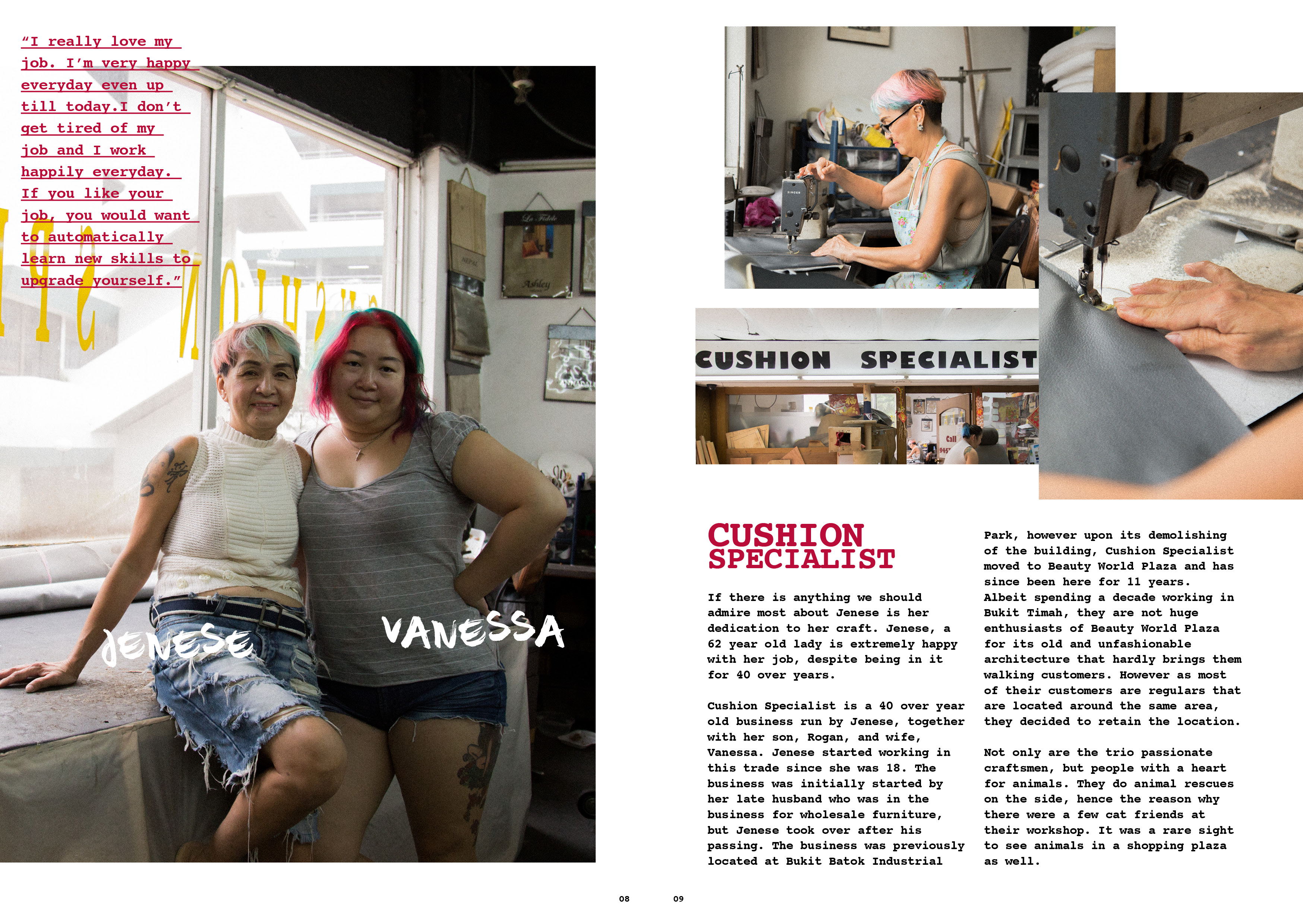
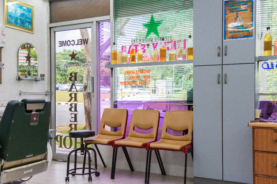
getting a layout was actually quite difficult mainly because of the lack of pages!! as i had 3 craftsmen to showcase, it meant that i only have 1 spread for 1 craftsman. the tough part was squeezing the images into one spread, and have a write up with it too. i had struggles on the arrangement because i didnt want to make my zine as just a photo journal, but more of it being content related.
i wanted to have a full page of their portraiture, however that leaves me just 1 page of images + text. that. was. a. challenge.
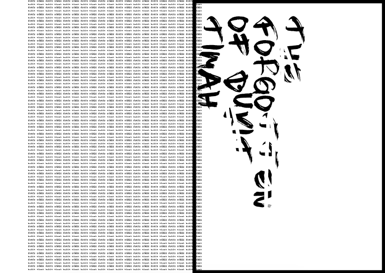
i didnt know where to place my write up because there was just too much going on one one page. i wanted to experiment with the overlaying of write up on my images to make it look “experimental”, but that’s not a way to do graphic design because aesthetics shouldn’t be the main reason to design. design must make sense, then comes aesthetics.
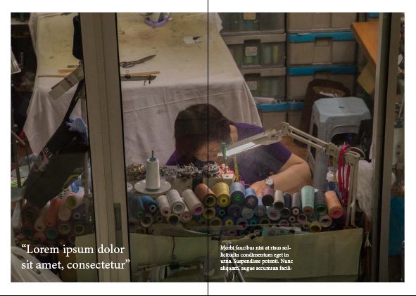
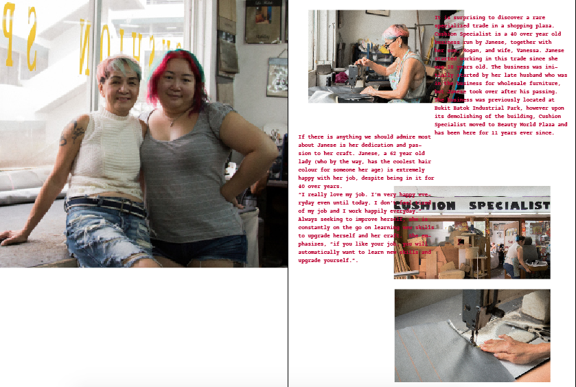
after much painful processes of rearranging in the middle of nights, i finally settled on a layout –
however there are some elements that i felt should be worked on –
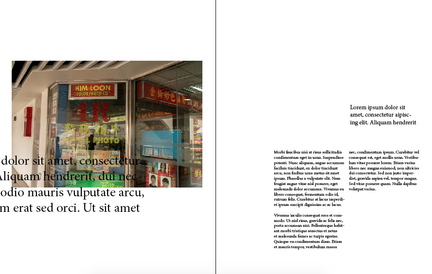
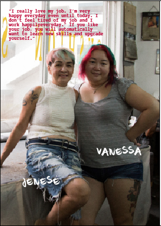
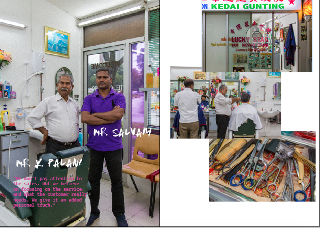
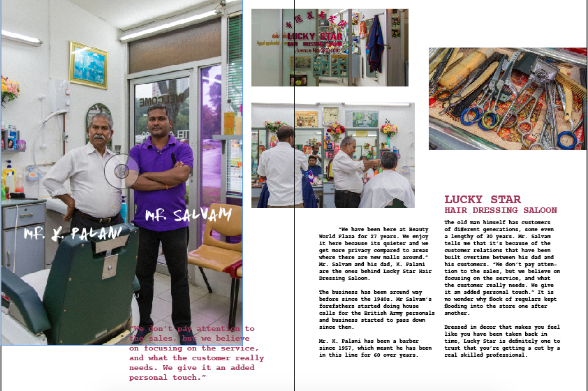
- the placement of the quote on the first page. it was hard to read because of the colour of the text and background, and the arrangement of it was wrong. it didnt make sense. my eye doesnt lead me to the quote.
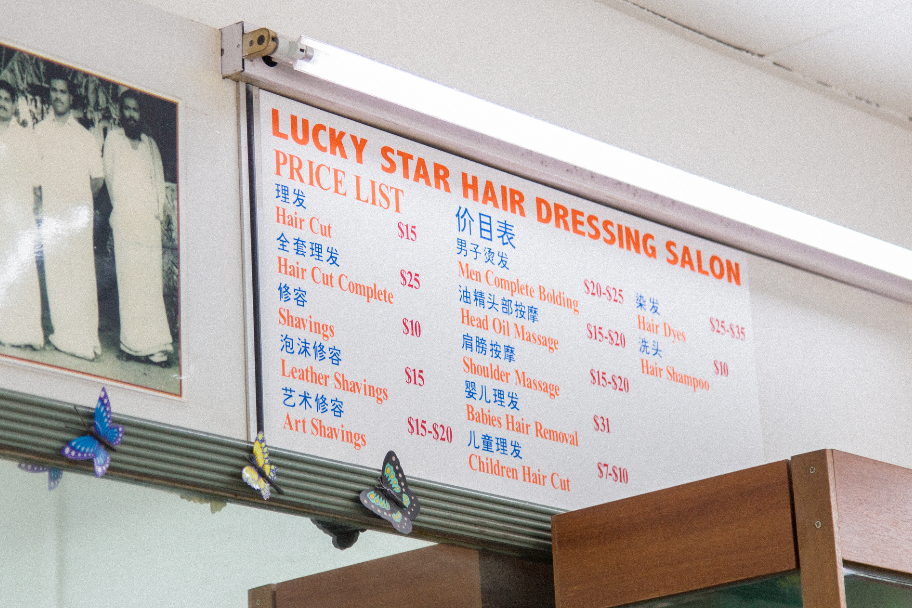
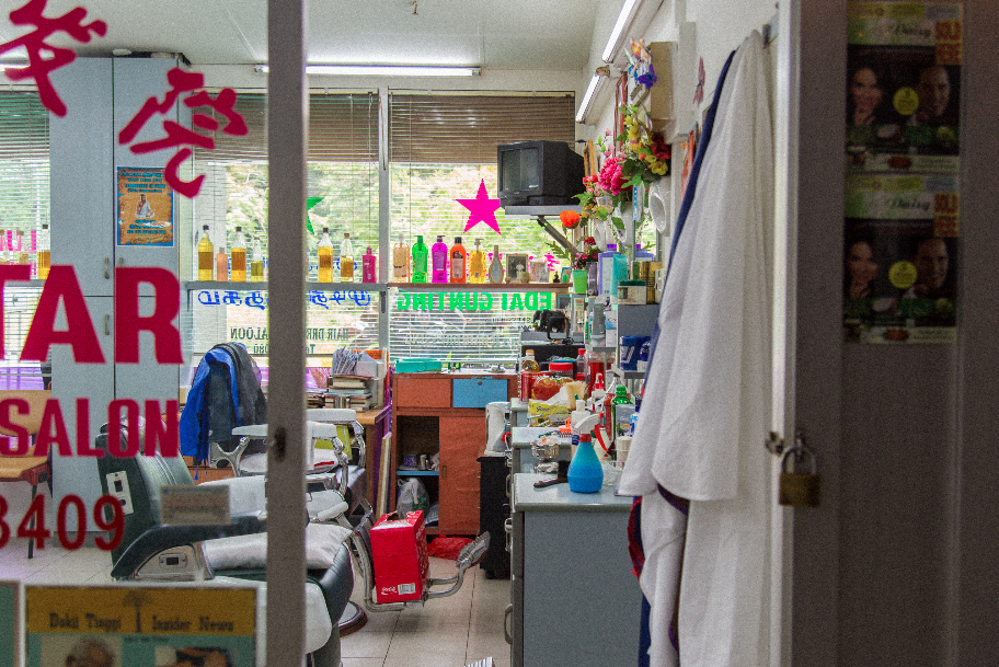
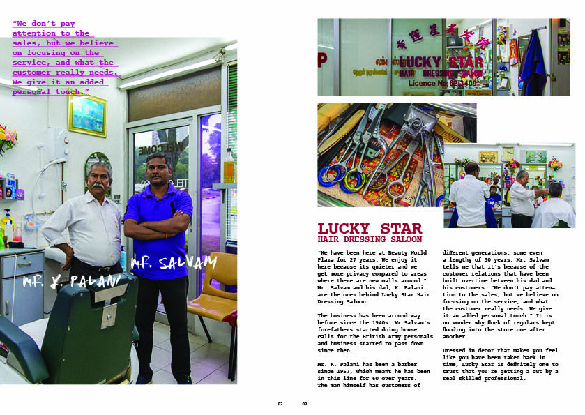
- the title of the place. “lucky star hair dressing saloon” was at the wrong place because it makes people have the impression that the write up starts from the right column, but it is not.
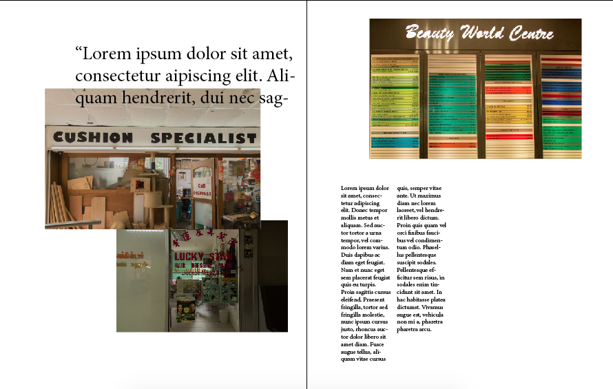
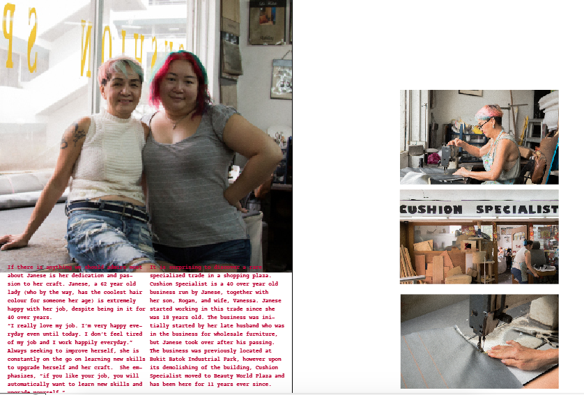
i tweaked them again and here is my final layout! –
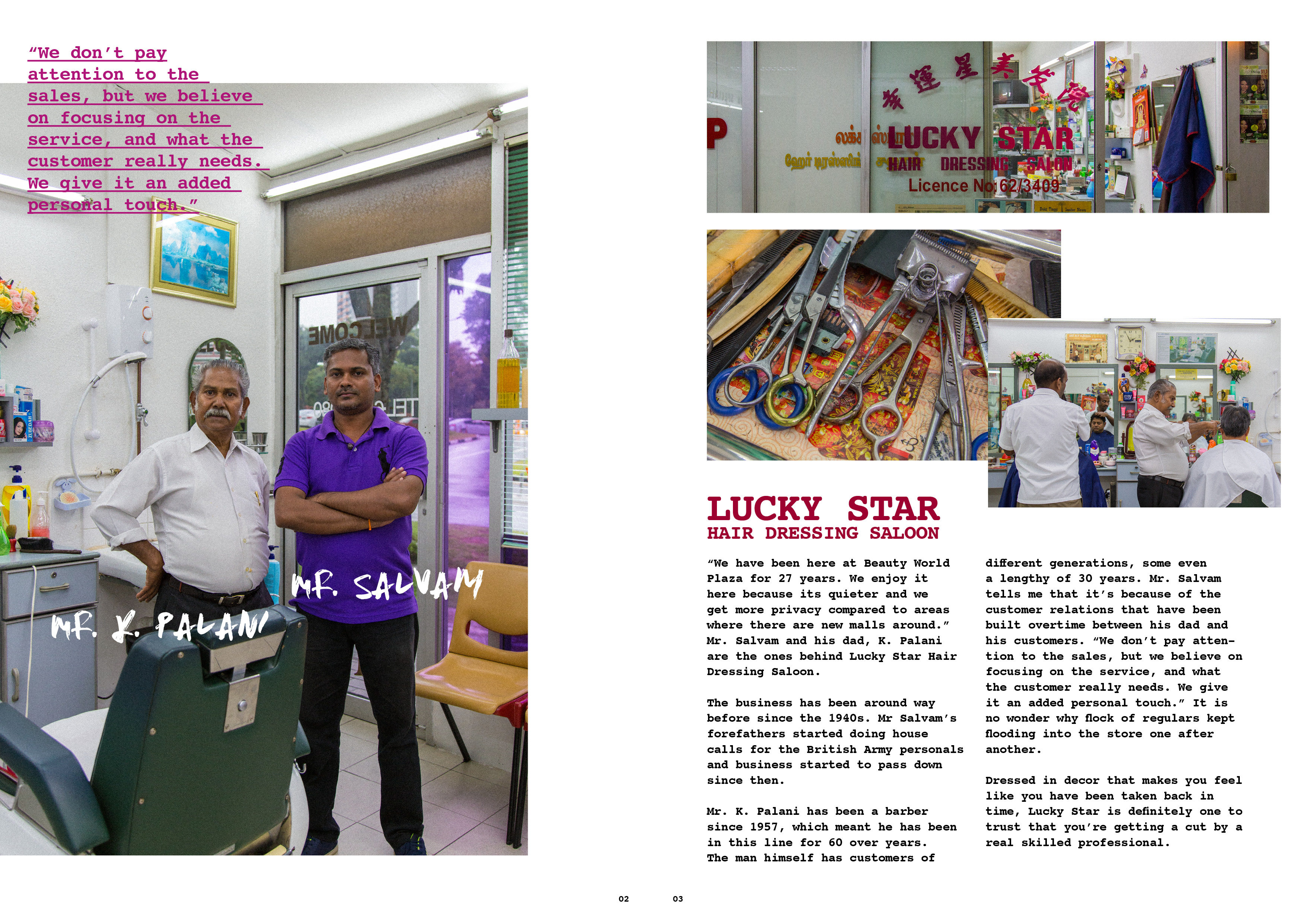

i preferred the way it looks now because the images dont look too stagnant and systematic. they are overlaid and i feel that way they look more organic, but also pleasant to the eyes.
aaaand thats a wrap for 2D! i really had fun the projects for this semester because they were more visual communication related. i really enjoyed the process of doing site research because it opened my eyes and created a whole new perspective of bukit timah as a whole. i am also thankful that because of this project, i managed to find out about these artisans, and their stories be it their life, their business, or their philosophy on things in general. i am also glad i had the opportunity to land myself photography project as well because it has always been my passion to document and photograph artisans and their craft.
designing publications has been my favourite because i find the excitement in the challenge on how placements of elements could affect the readability and the feeling. this project has definitely provided me the experience and trained me well.
and im really glad that mimi brings her professional industry background into class, as telling us how the graphic / advertising industry works in class. i believe that is important and essential for us, especially for budding designers.
thank you mimi for your guidance for this sem! i have definitely learned quite a bit!
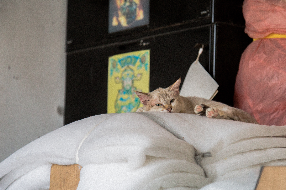
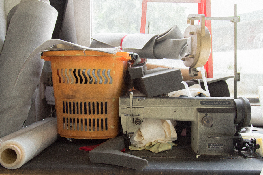
before i end off, here are images that didnt make it into the zine. enjoy!
2DII – Que Sera Sera Final
taking in comments from Mimi from last consultation, i decided to do food styling with photography for my final pieces.
the art direction with my final approach is a clean, not overdone, simple straight to the point styling.
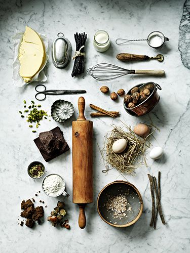
before doing it, i had to study more on the kitchen environment of chefs, and their choice of utensils.
1. Pasta Chef
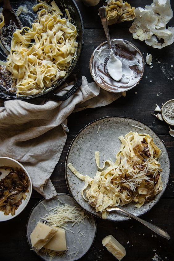
i looked at some images on pinterest to look at food styling but i felt that they were very rustic image driven, which is not the direction im heading for.
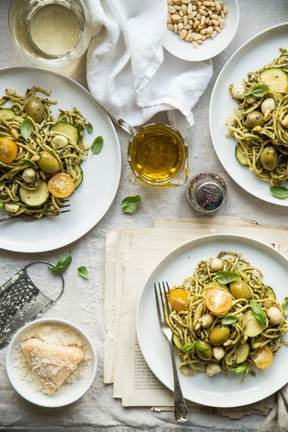
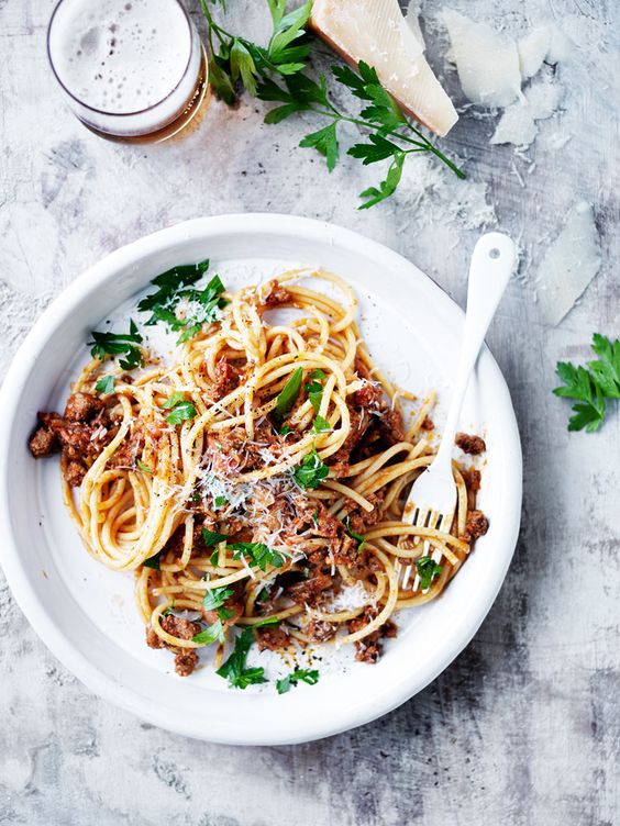
instead of looking at stylized visuals of food styling on pinterest, i looked beyond them by studying videos of chefs cooking pasta to see what type of utensils they use for their cooking.
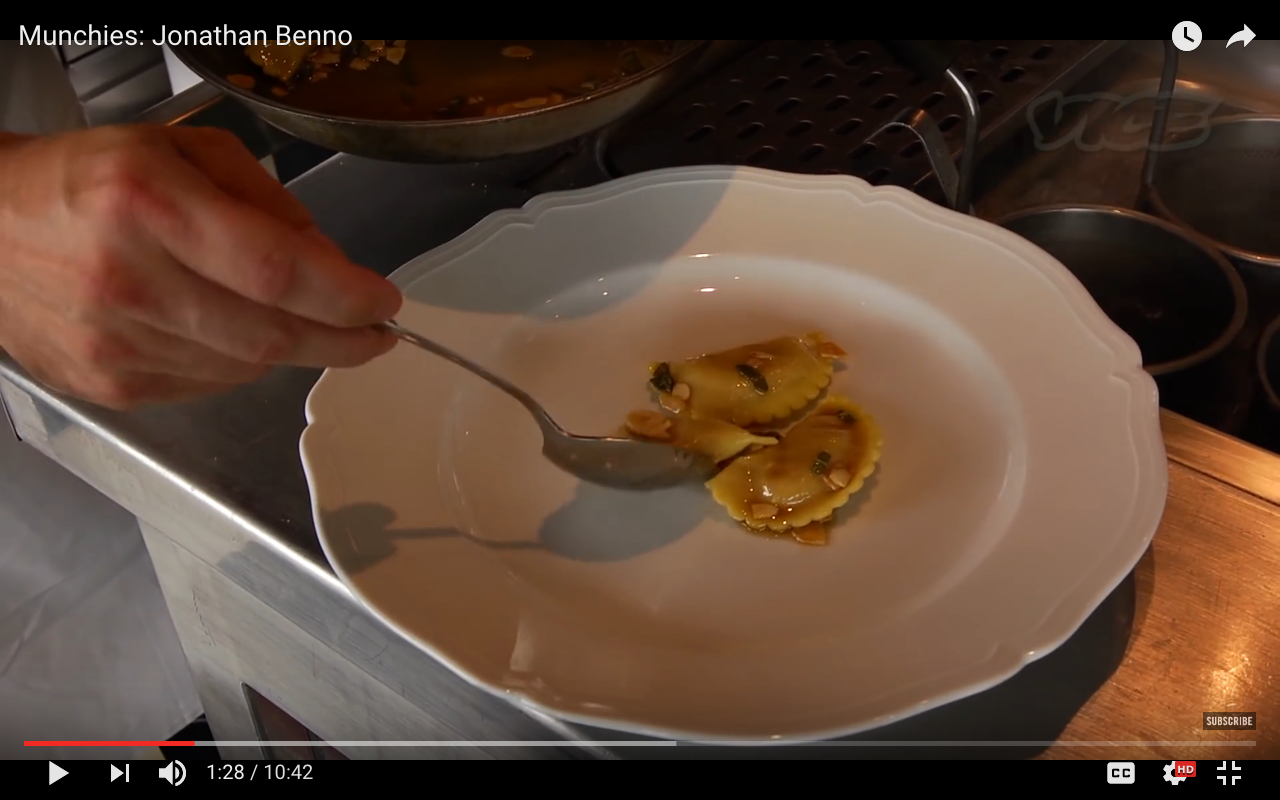
i started seeing crockery such as tongs, spoons, the pan used for cooking the pasta, a white plate.
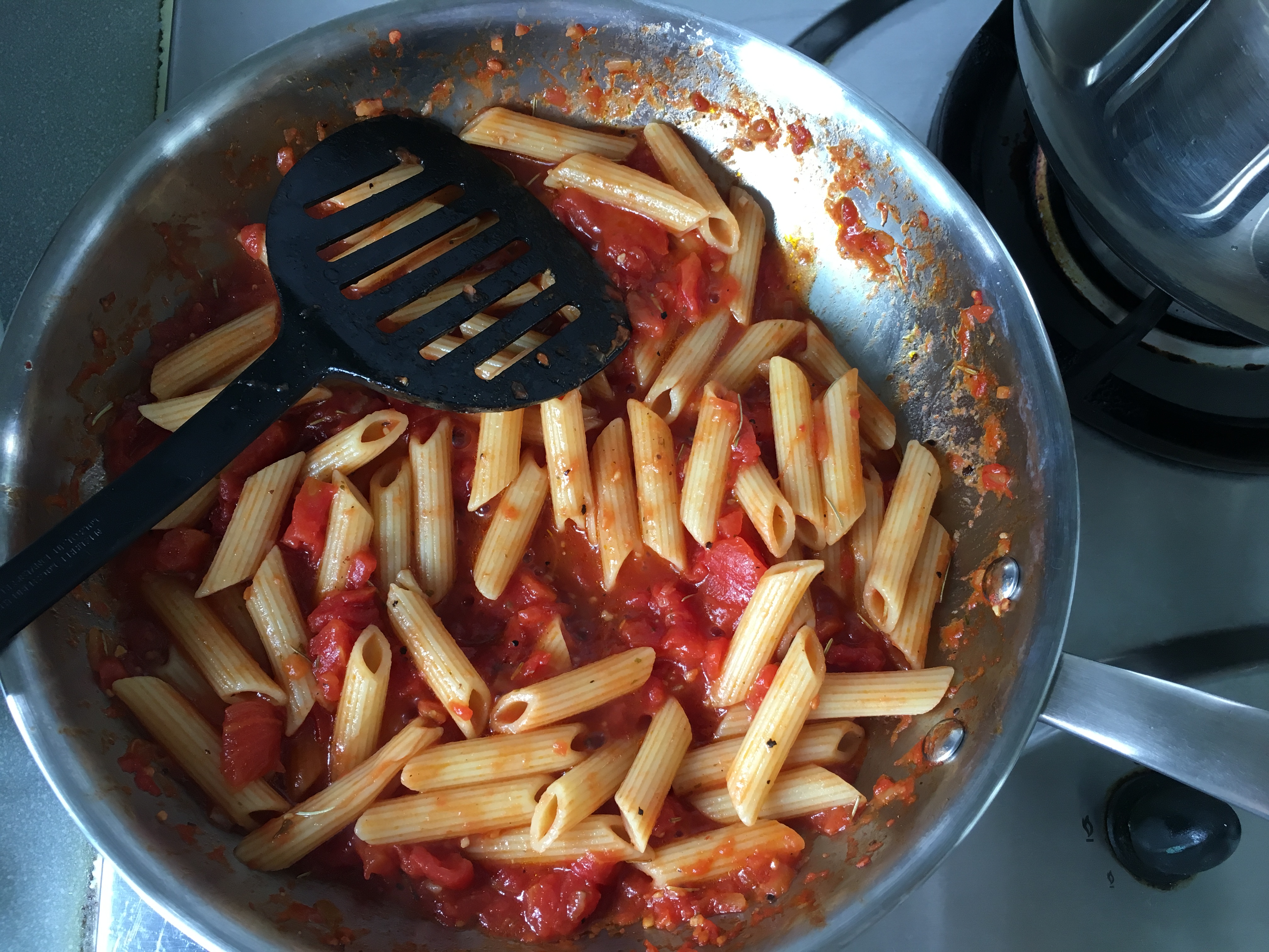
some of my process photos of executing my final work –
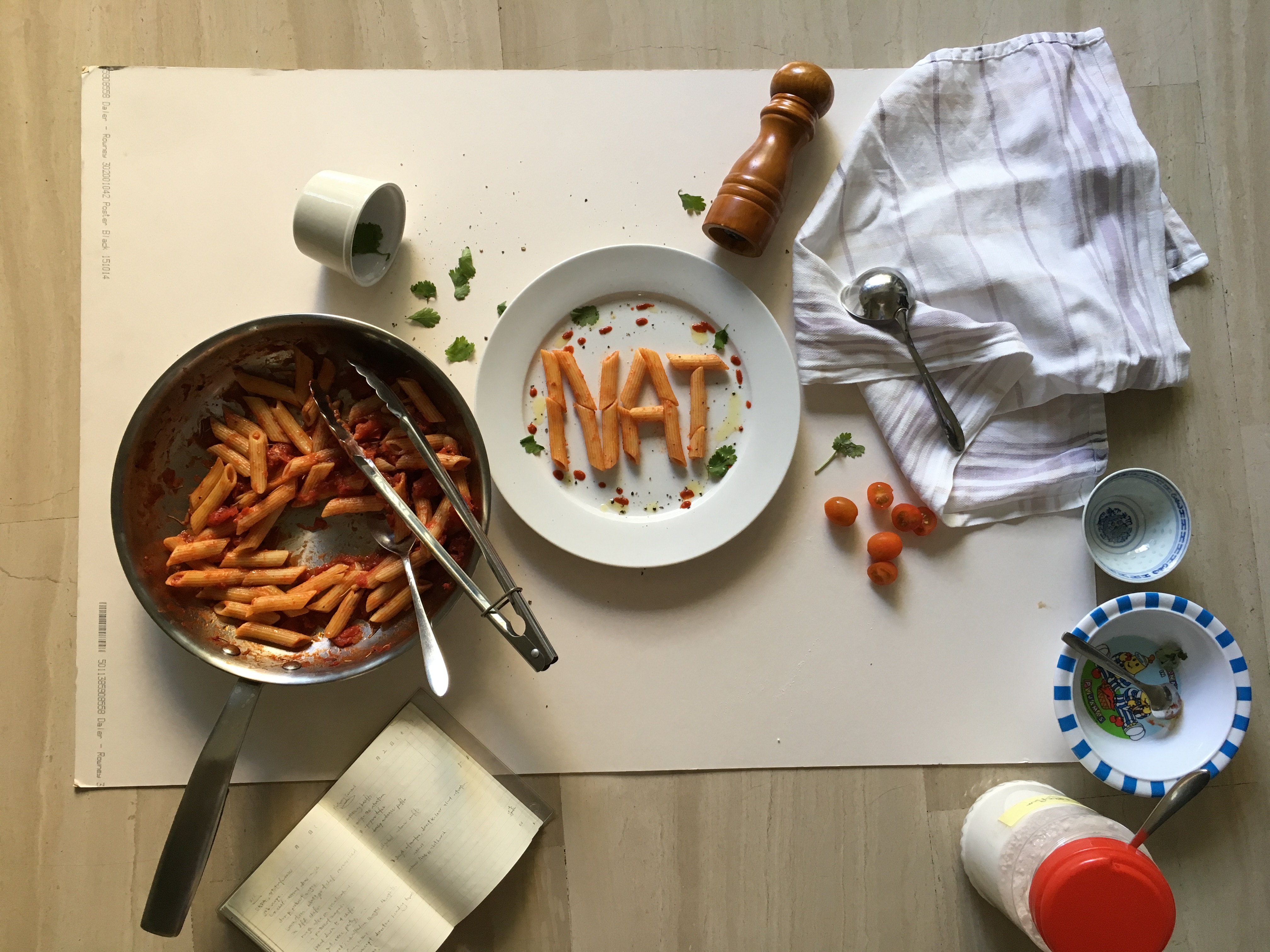
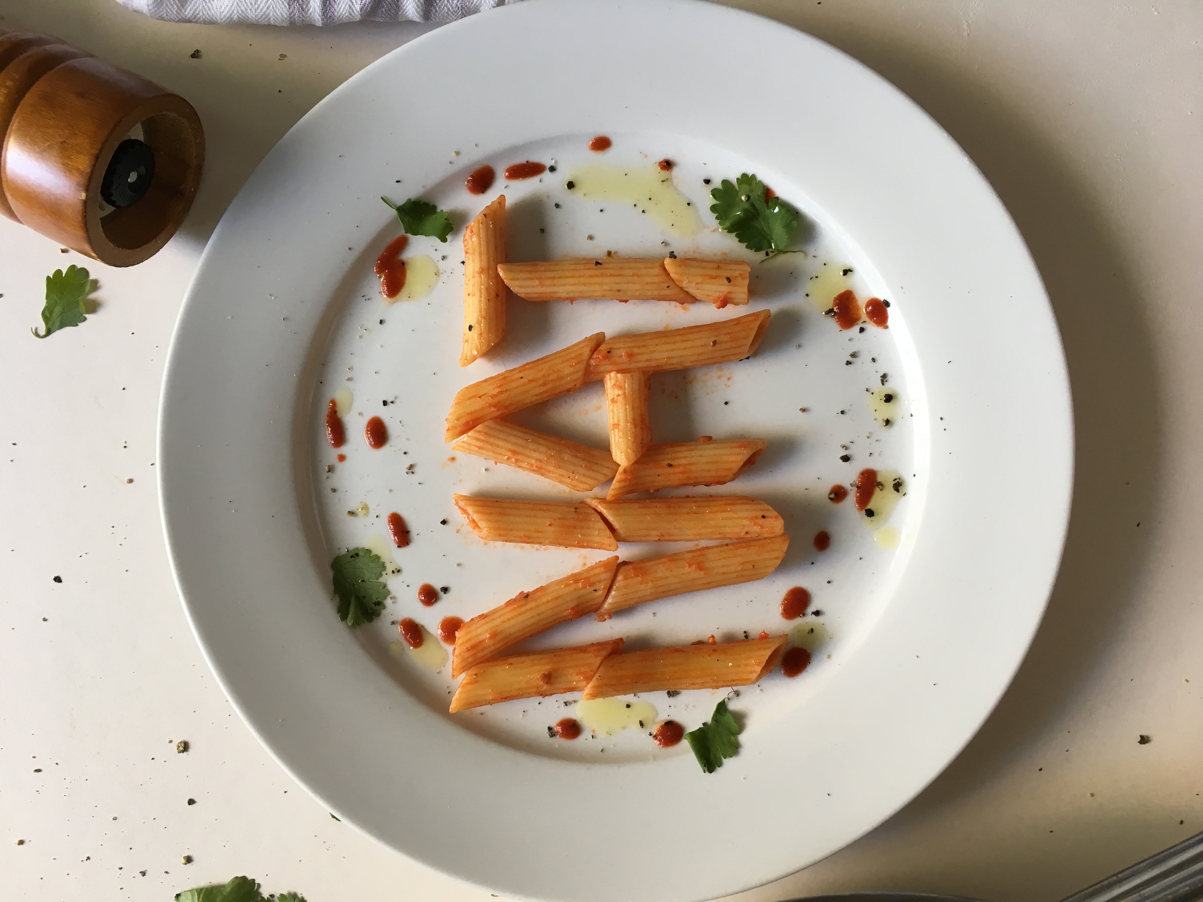
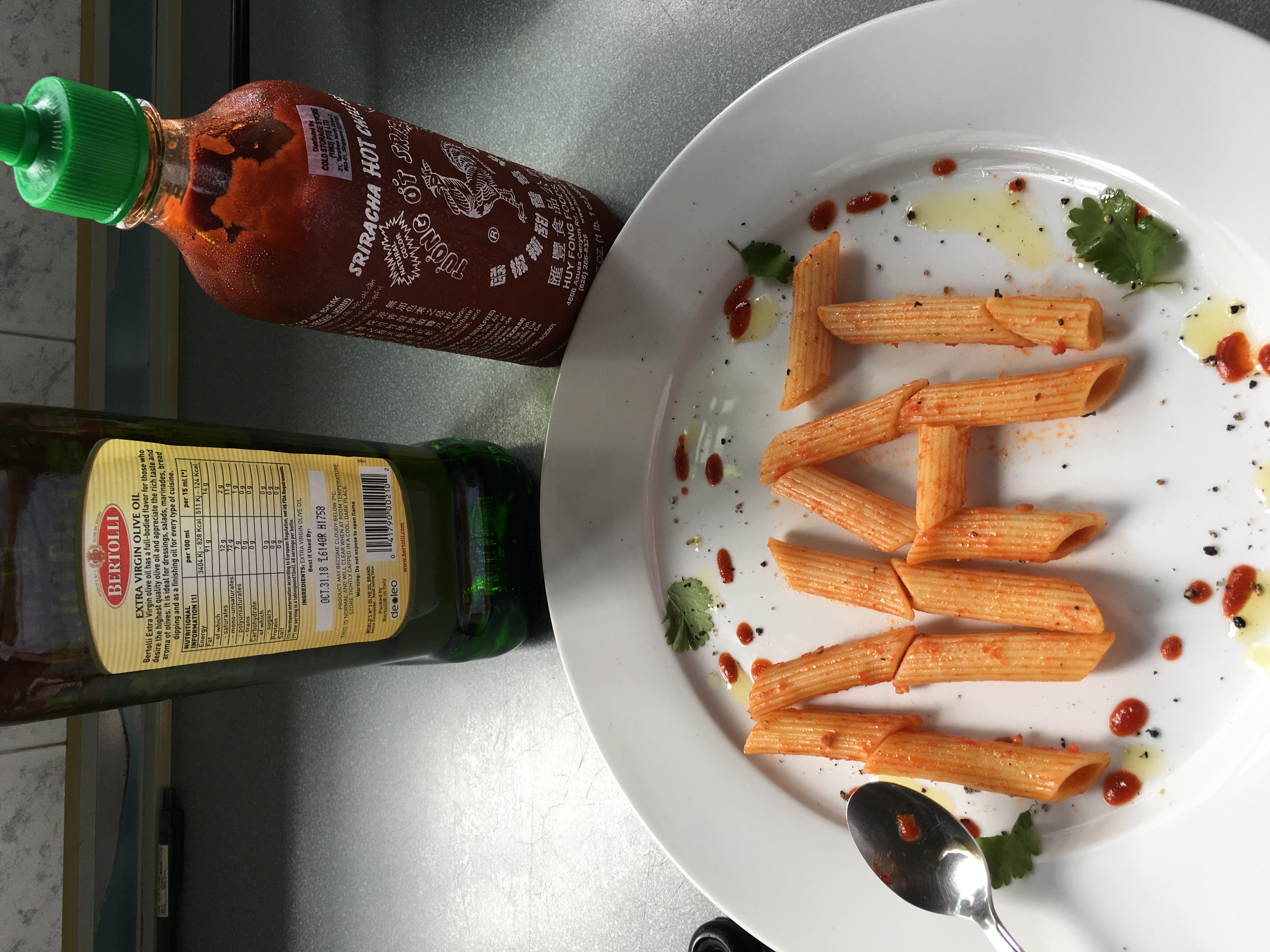
final outcome –
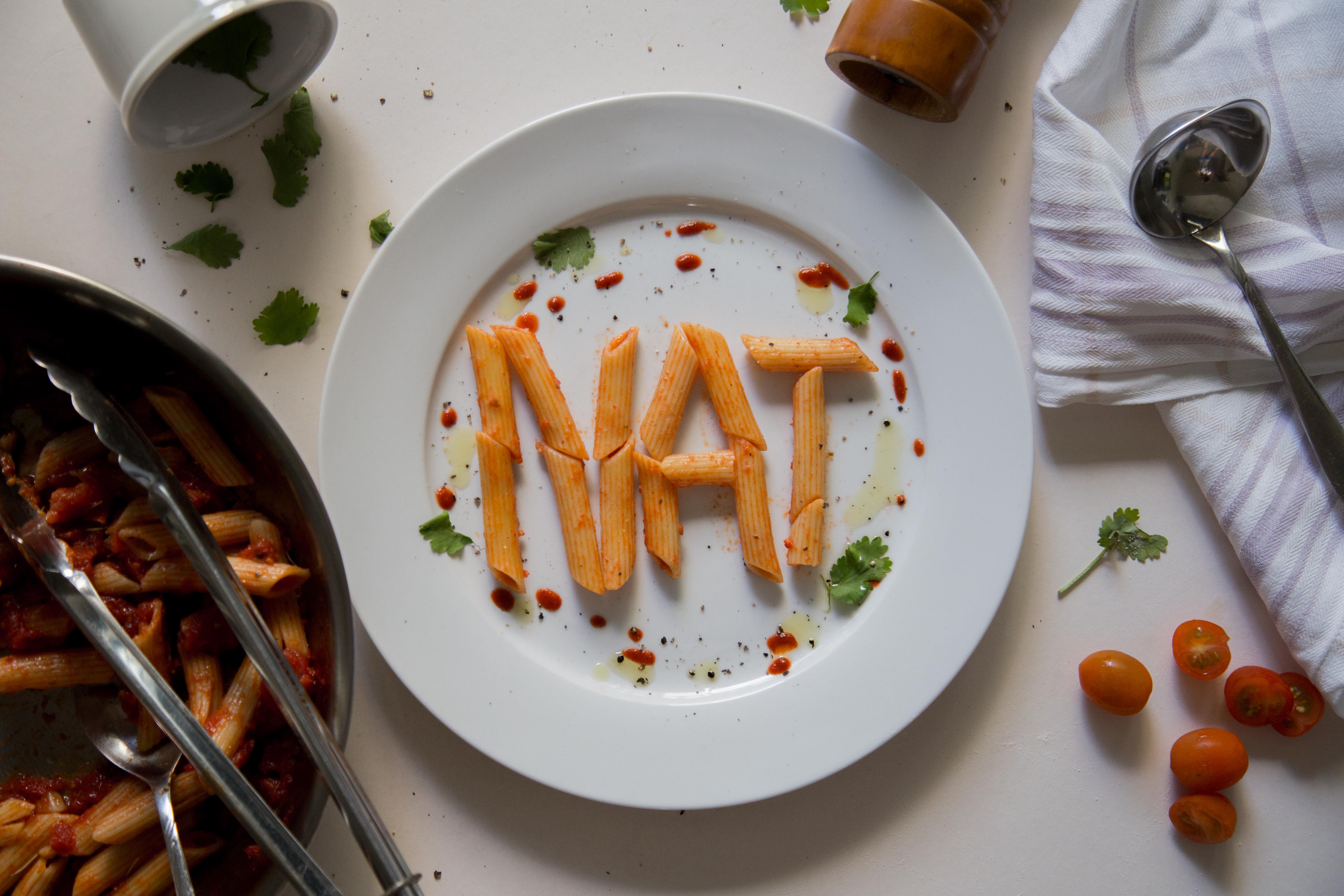
i used penne this time because it was way easier to control than spaghetti. i stylized the plate with tomato sauce (in reality its actually chilli sauce in a squeezable bottle), black pepper and corriander to give it not only a pop of colour, but also because they are relevant to the dish. the pan, tongs and spoon are placed halfway at the corner of the image so to not steal emphasis of the image. the cloth is placed because chefs usually clean the edge of the plate with it. i decided to place the ladle on the cloth because when i tried placing it on the bottom right during the styling process, it looked odd as there were too many silver cutleries on the bottom of the image, making it look heavy and uneven.
2. Pastry Chef
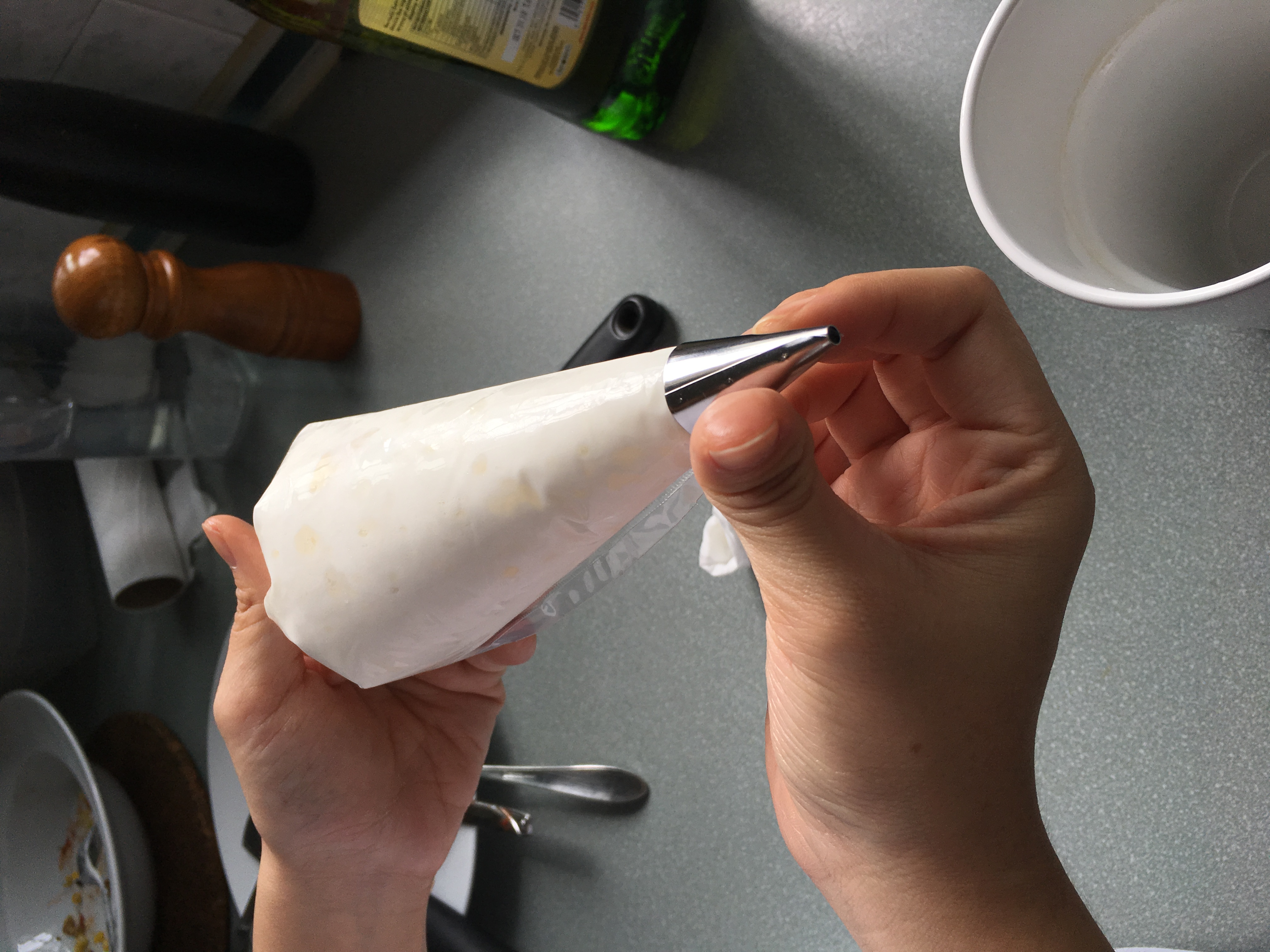
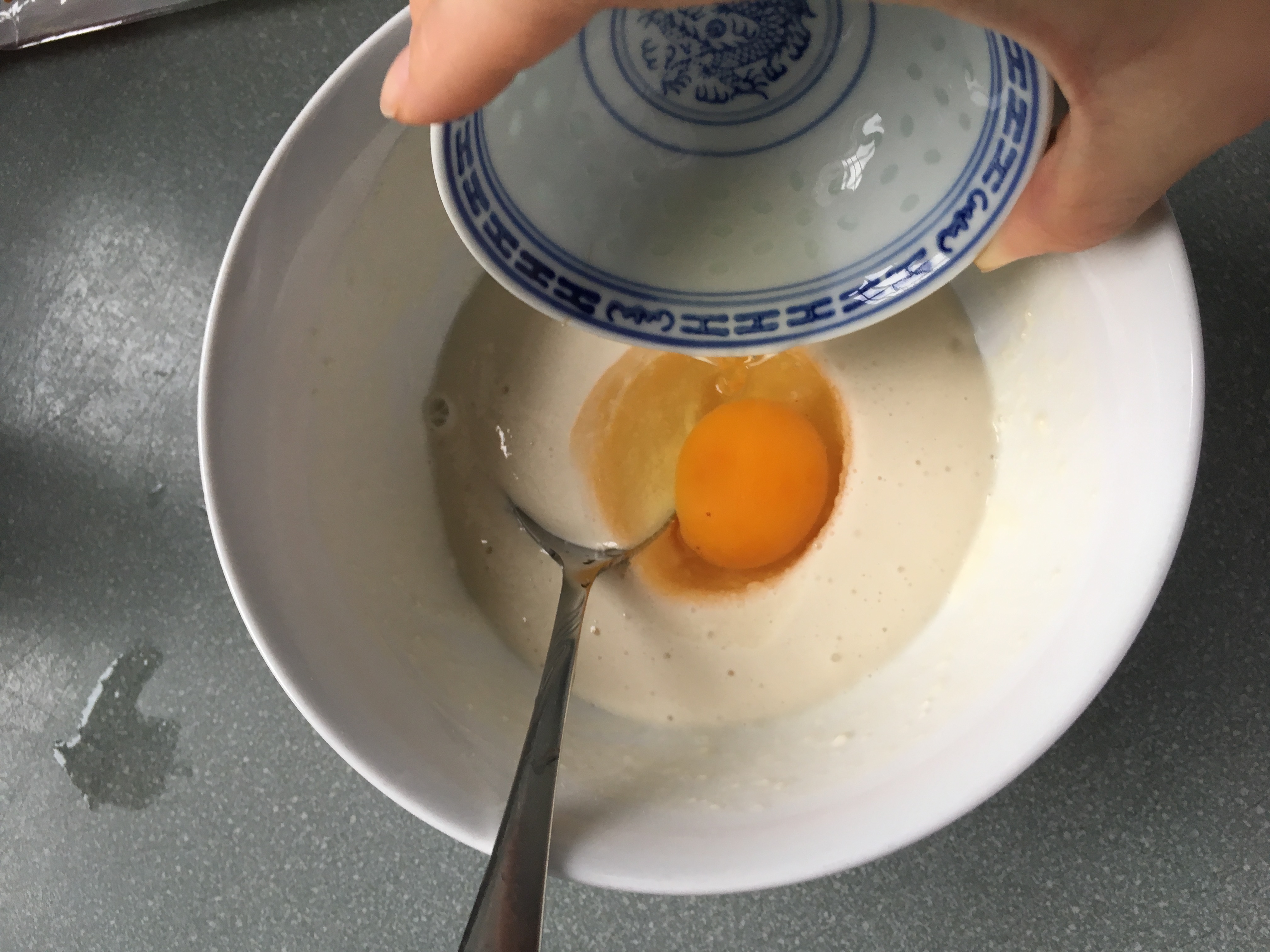
for pastry chef, it was slightly easier because there were a standard few crockeries that are mainly used. before researching i knew some elements that i could already play with – flour, eggs, whisk. 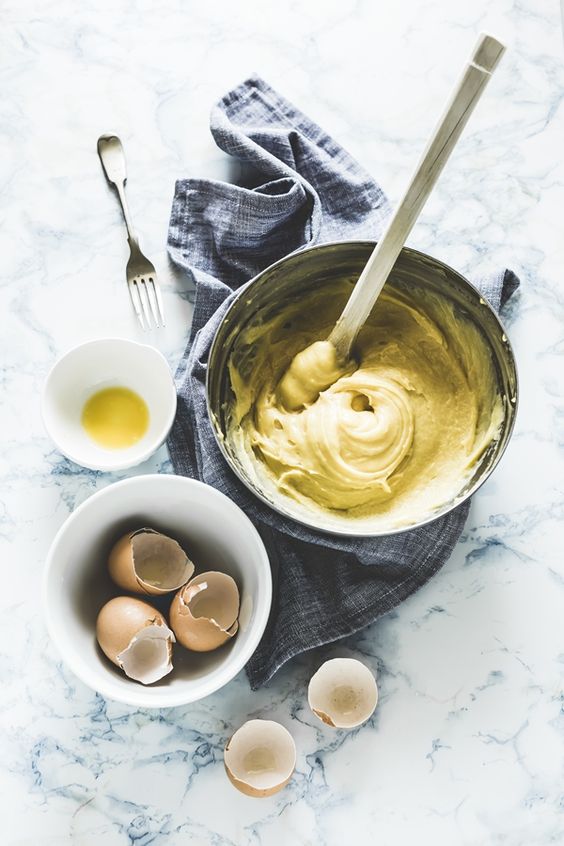
process photos-
final-
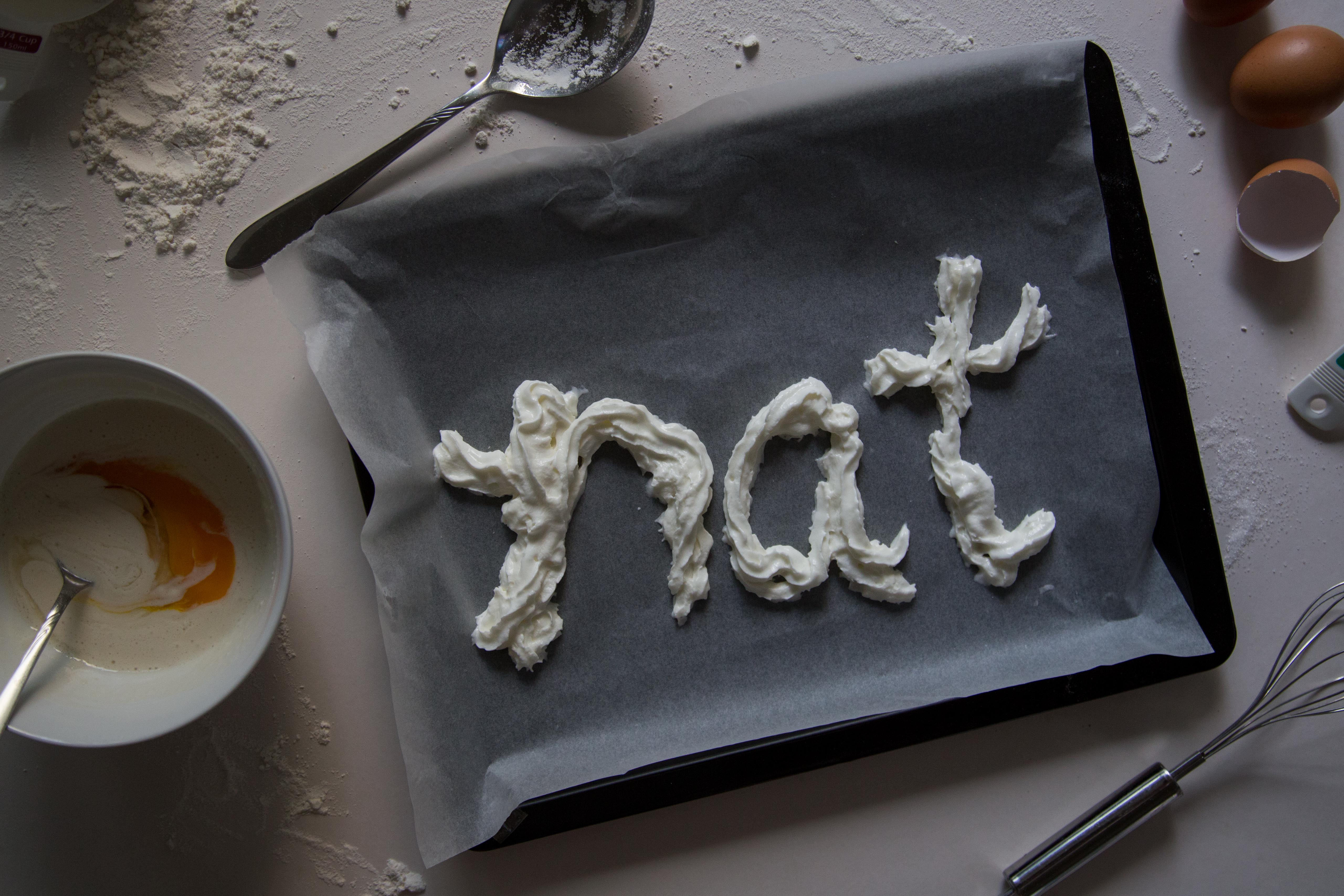
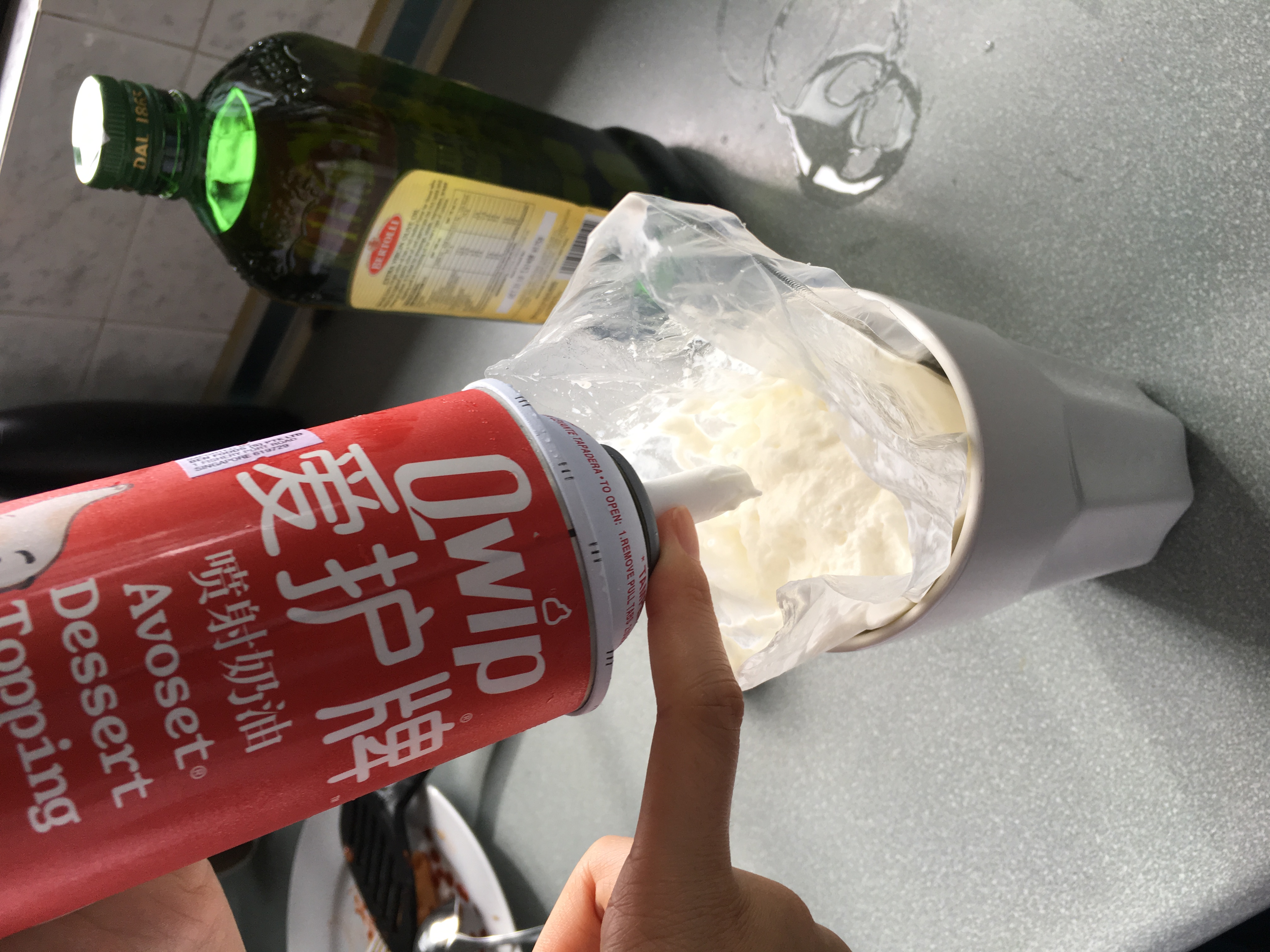
my name is created using whipped cream. the whole situation of the image shows the process of a life of a pastry chef. the supporting elements- whisk, bowl of batter, baking paper and tray, cracked eggs, flour and spoons. i scattered flour on the surface to create a more natural visual look of the image.
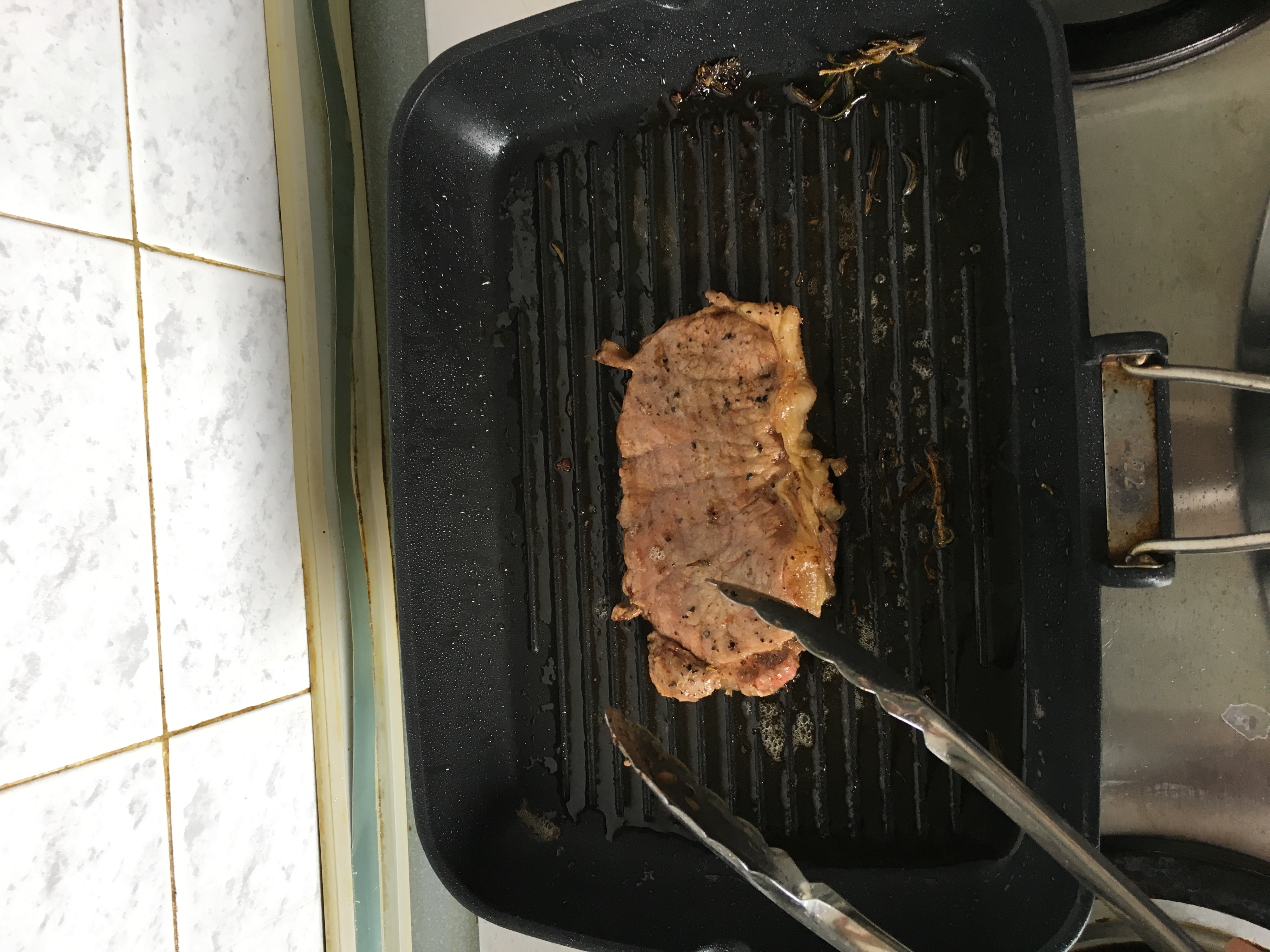
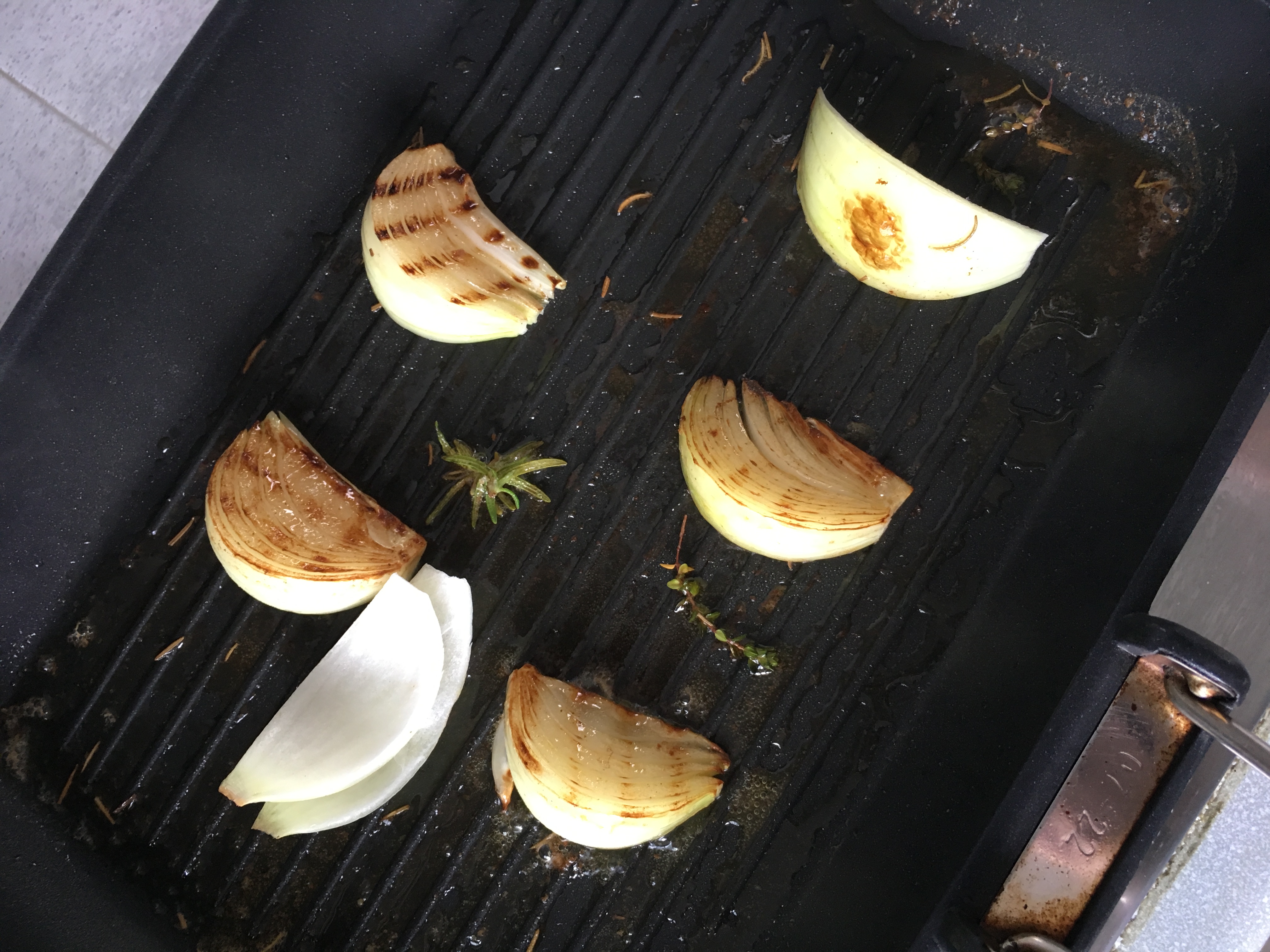
3. Grill Chef
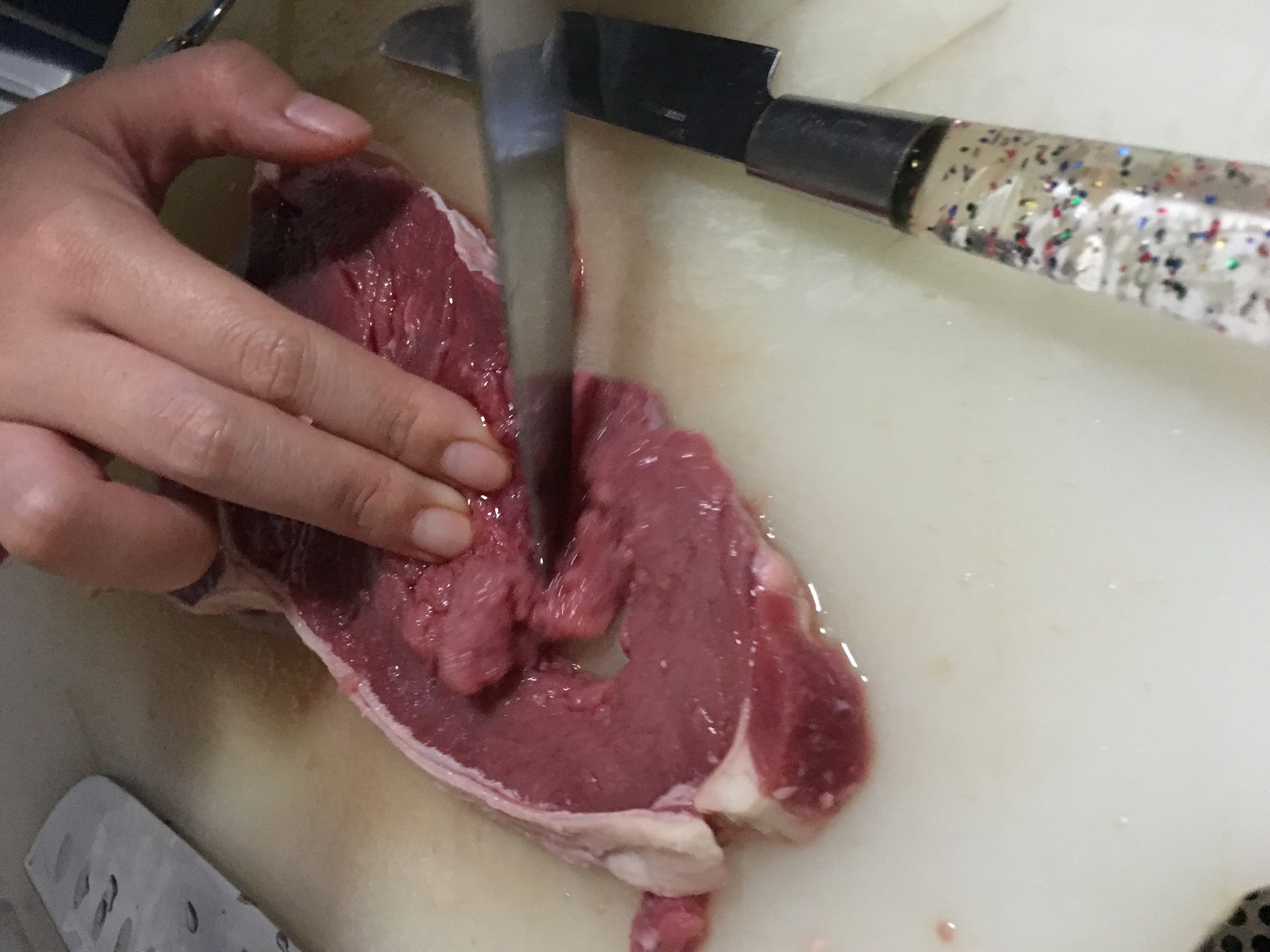
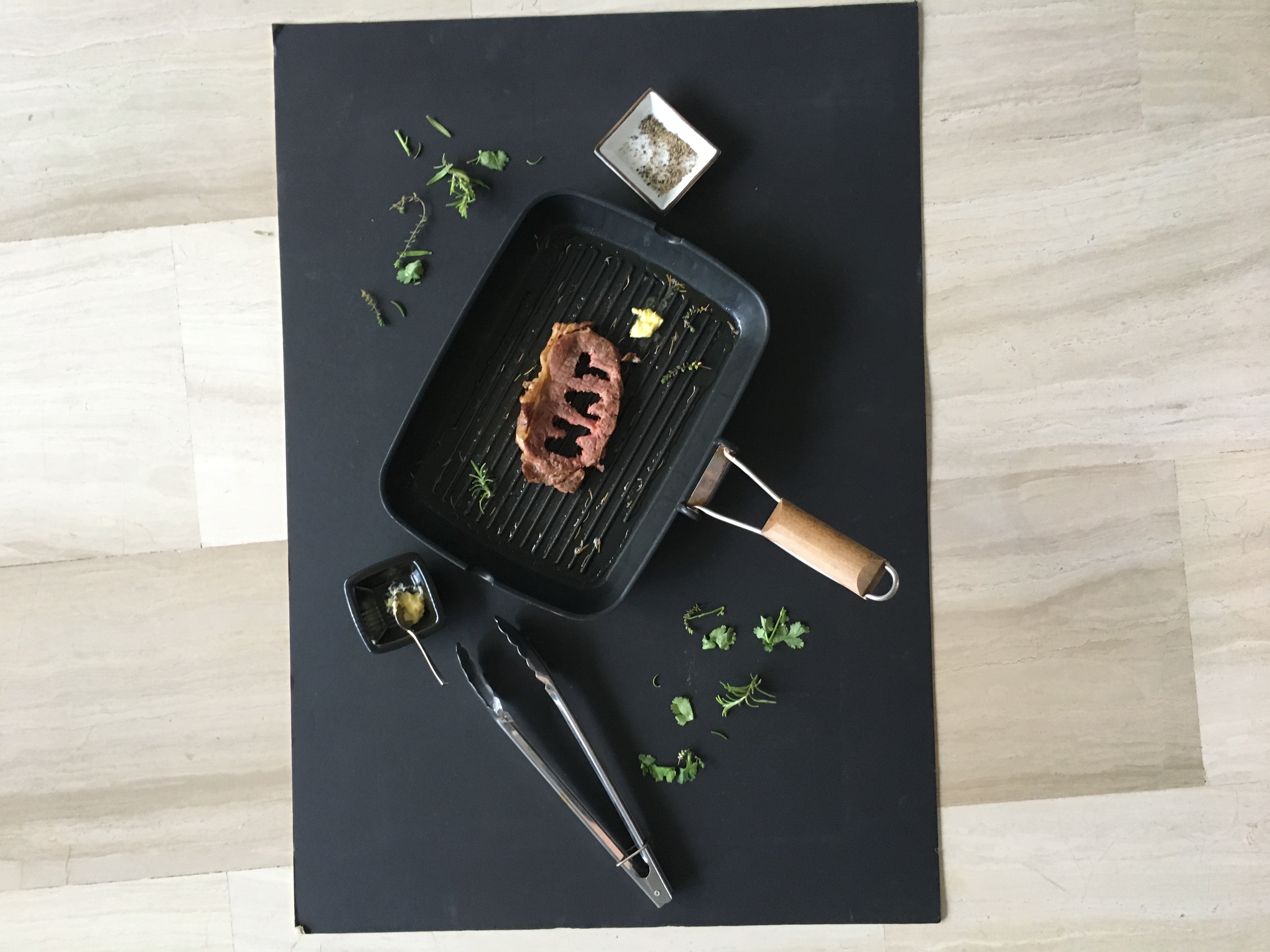
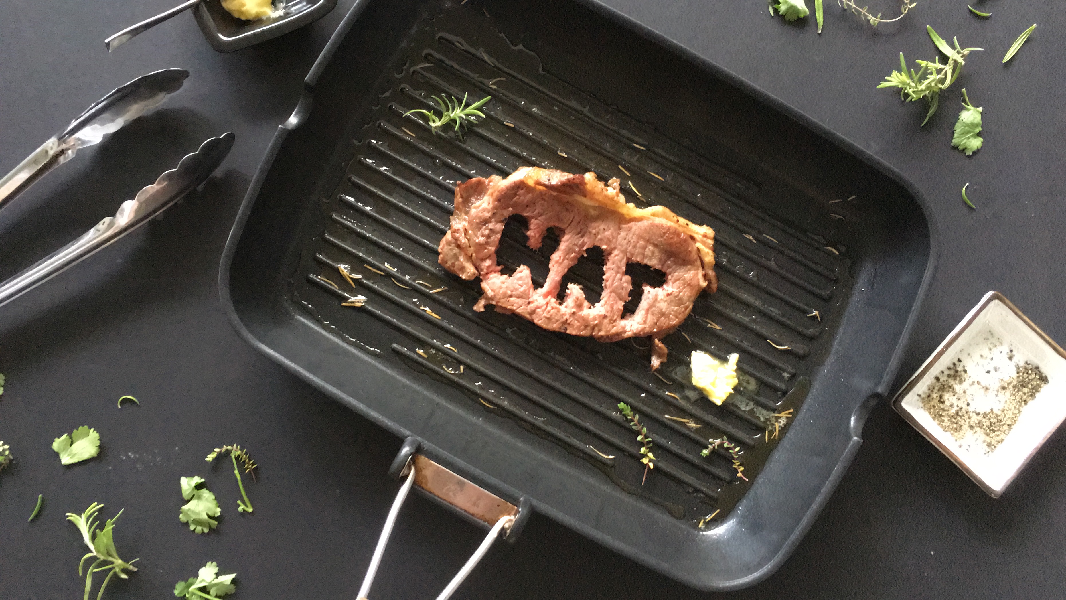
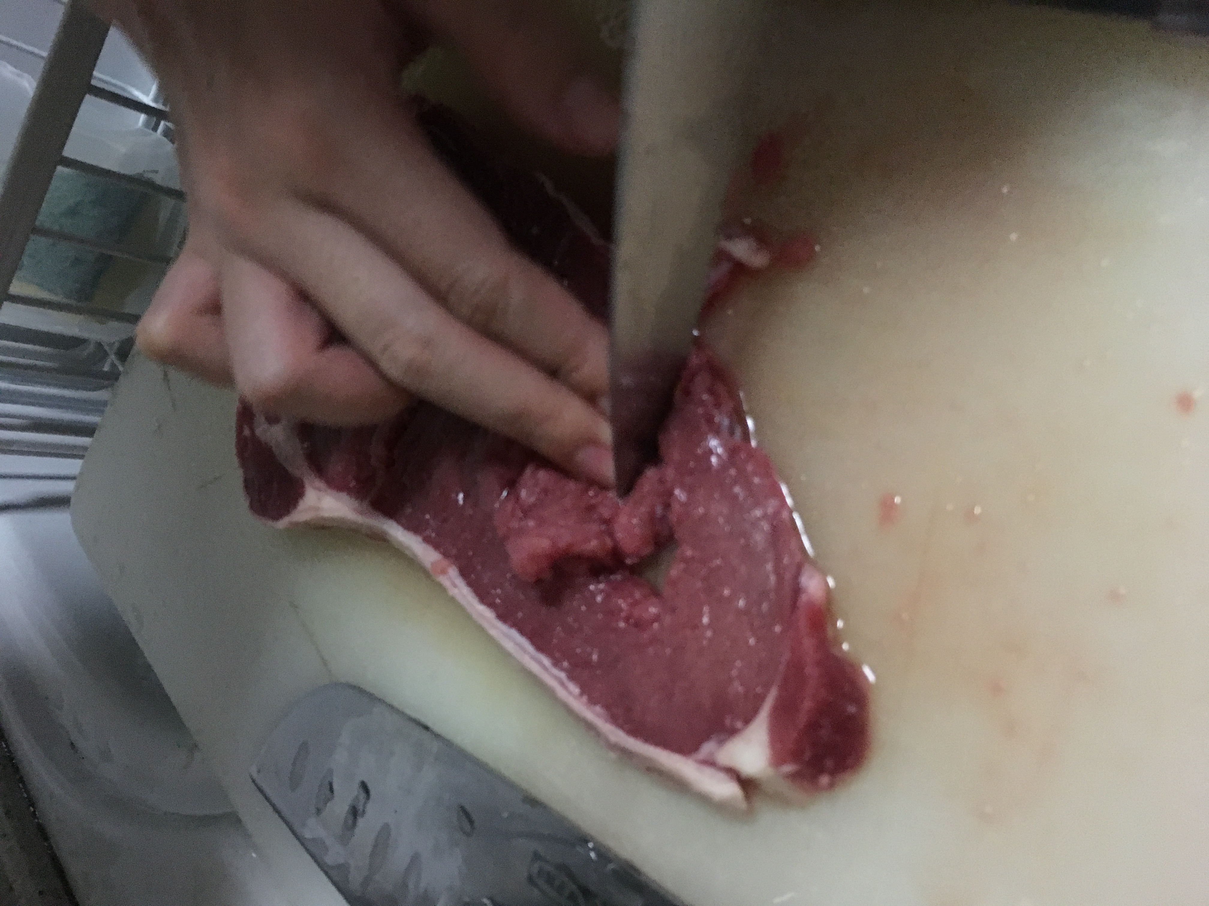
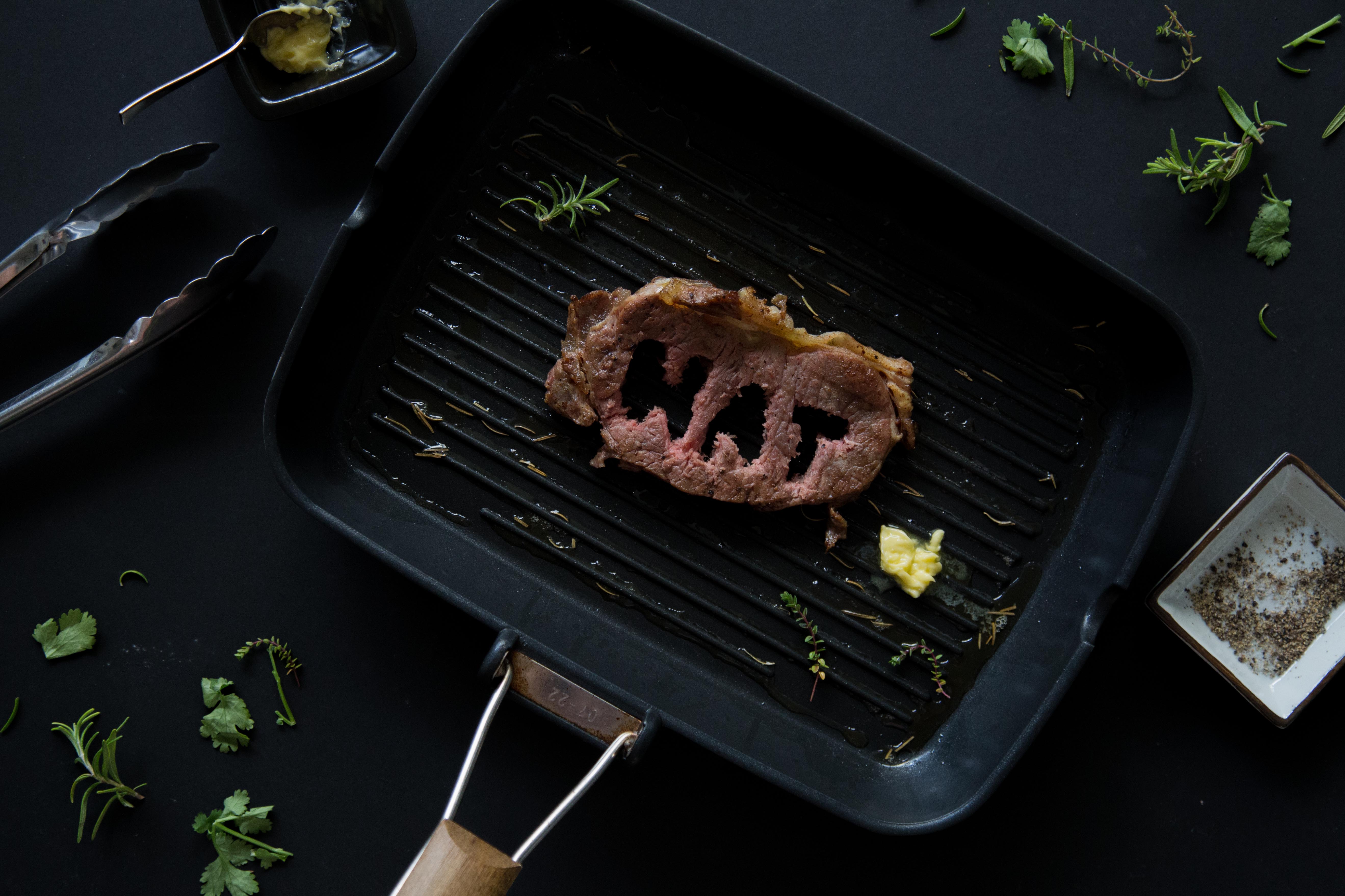
in my previous 2 attempts (see previous 2 posts), they were names cut out from pieces of steak. as Mimi mentioned it was too direct, and creating grill marks on the grill is not possible, i decided to go towards a different approach this time by cutting my name on the piece of steak after cooking it. prior to this, i tried cutting my name when its raw, but it was impossible because of the tendons on the meat that made it impossible to cut through. i used a black background for this because i felt that it gives a better contrast with the green herbs. it also allows the steak to pop better, and i felt that it fits the mood of a grill chef – ‘dirty’; ‘unclean’ so to speak.
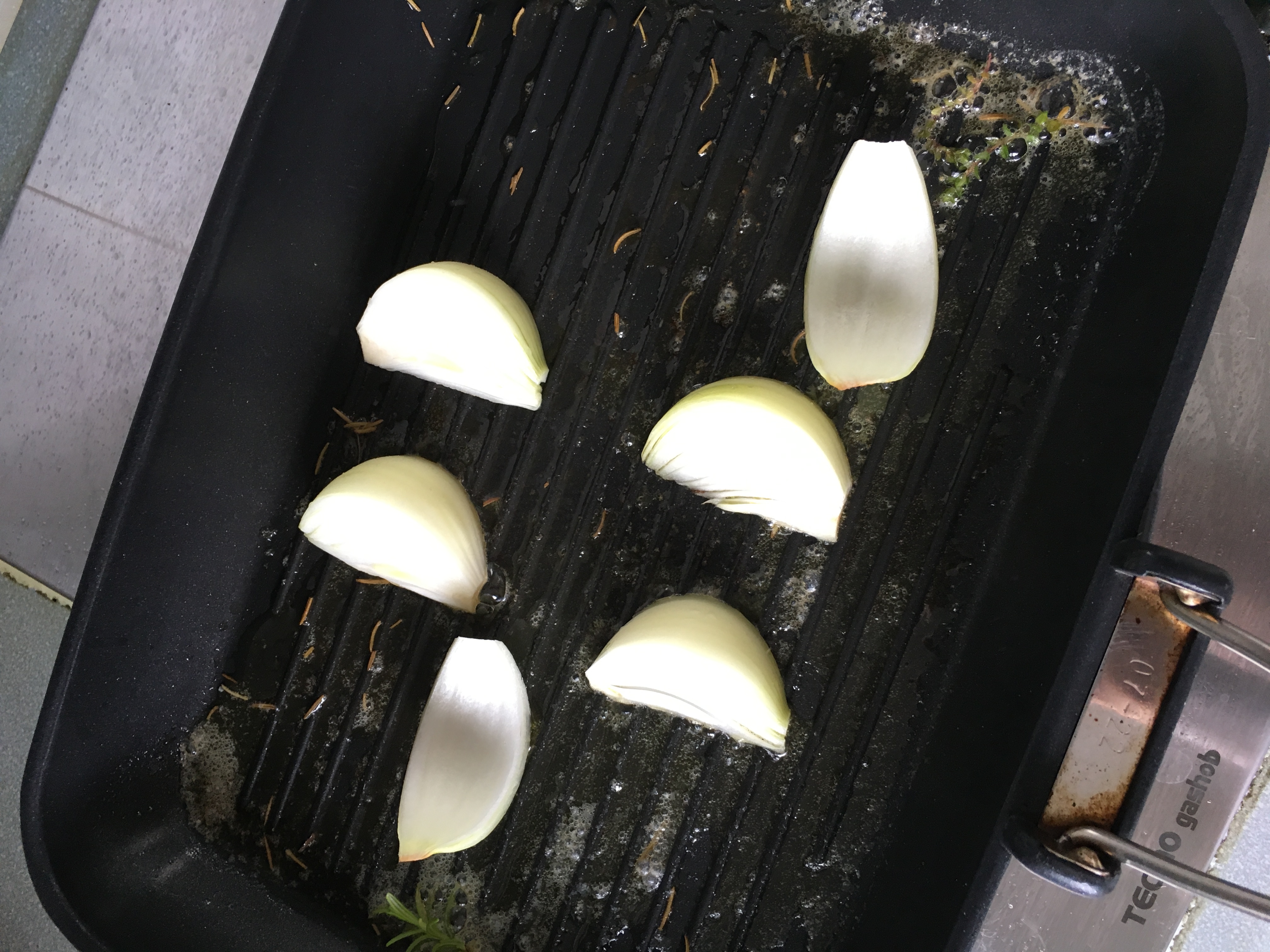
process photos –
i studied on how chefs cook their steak and the proper way of doing it is to baste it with melted butter with herbs, hence the herbs and butter on the grill pan. the types of saucers used for the butter and salt & pepper is for contrasting purposes. i felt that yellow butter on a black saucer would fit better, and salt&pepper would fit better on a white one.
final –
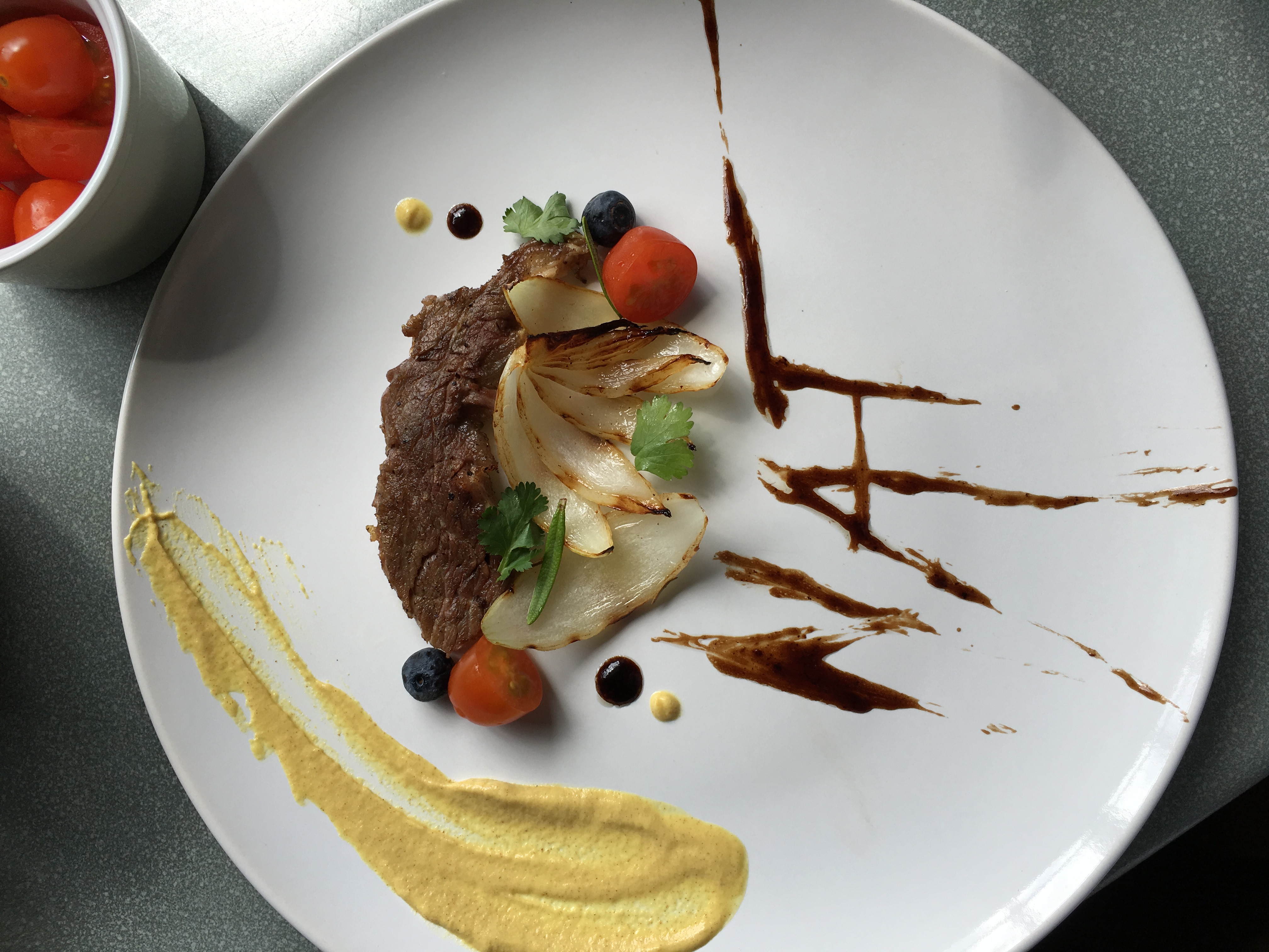
4. Executive Chef
executive chefs are the ones who plate the food before serving. this was a fun one for me to do actually because i had the chance to plate food and make them look pretty for the first time. but before doing it i have 0 knowledge on it so i watched some videos on how to do it.
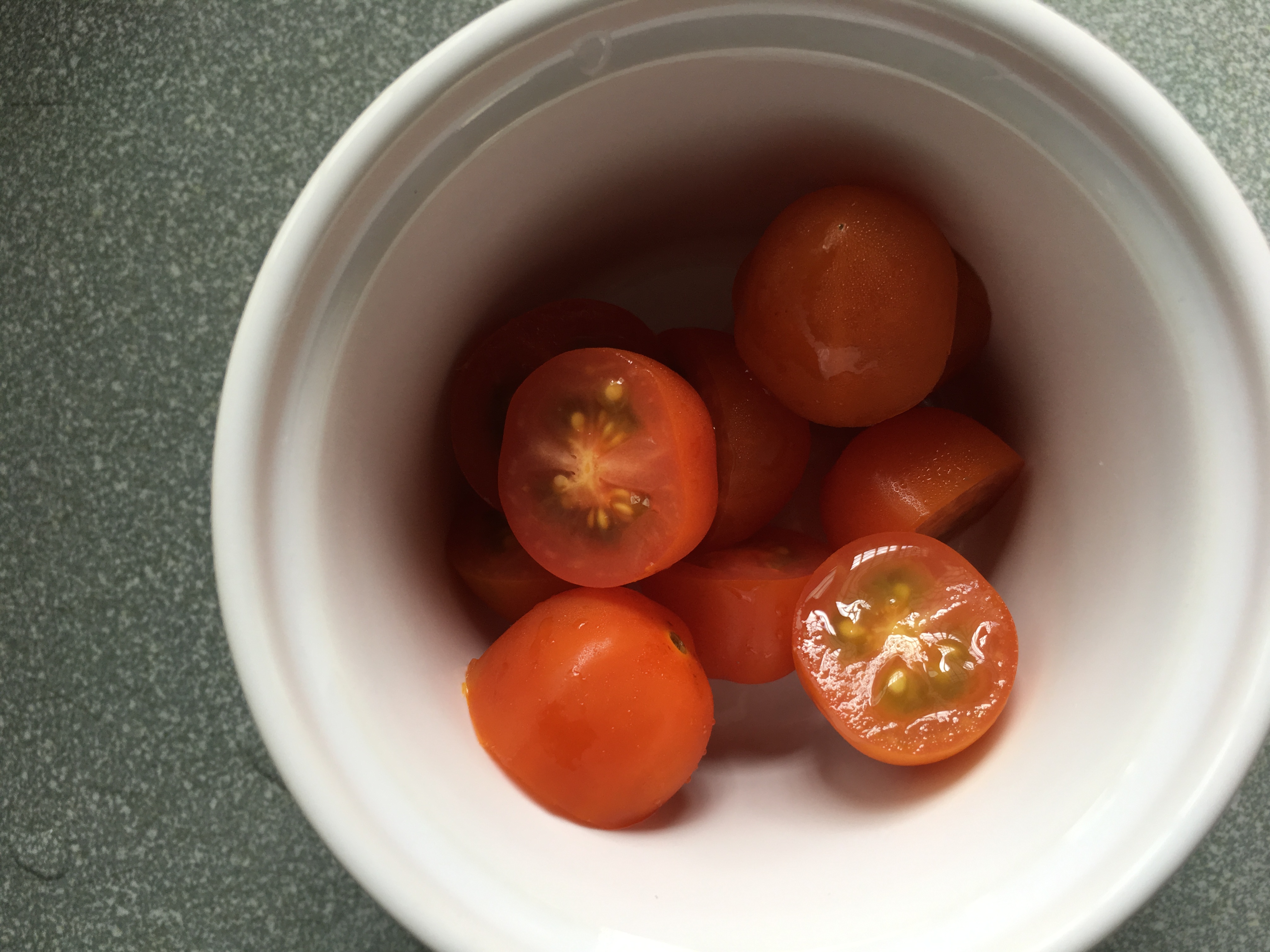
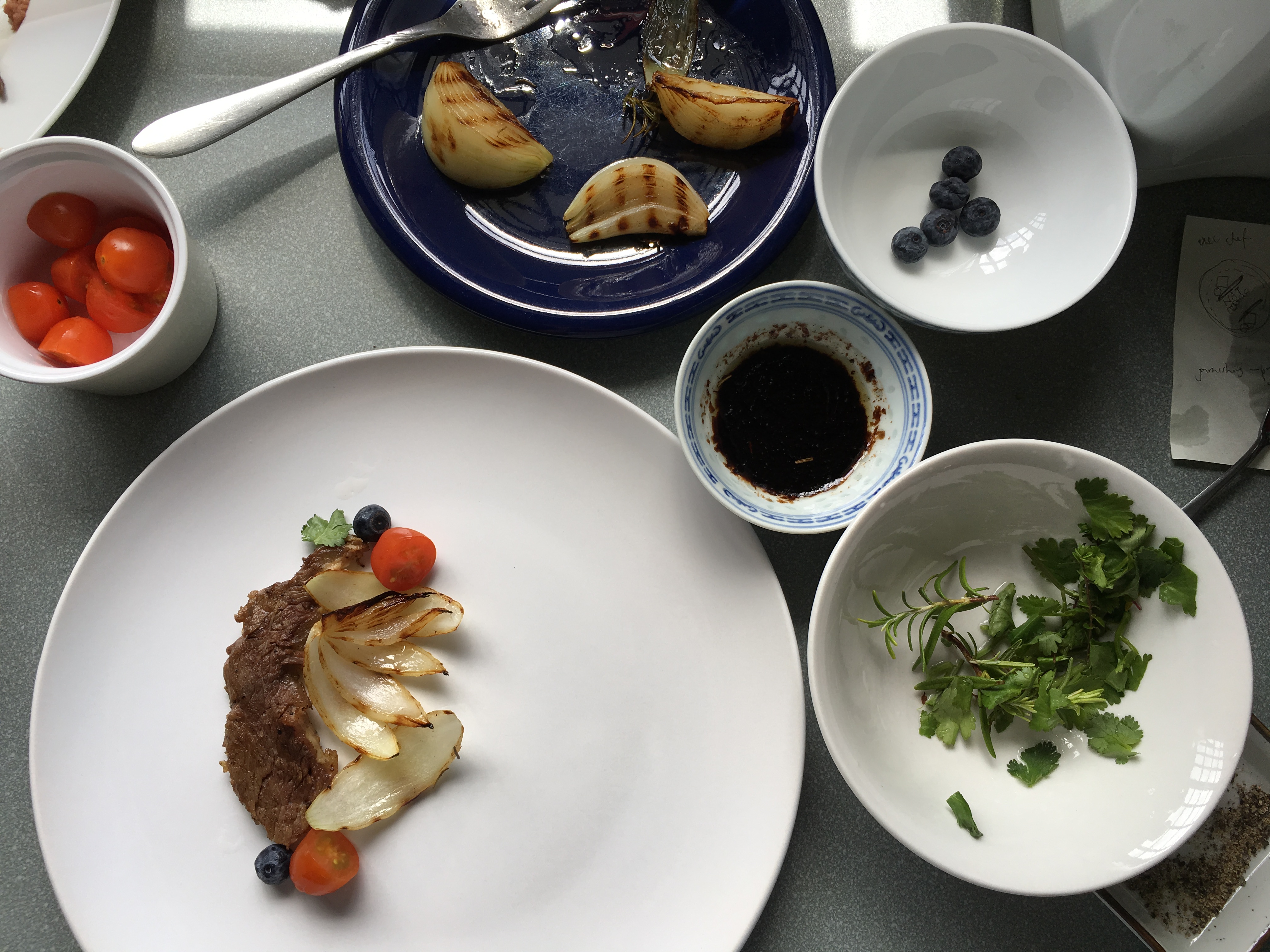
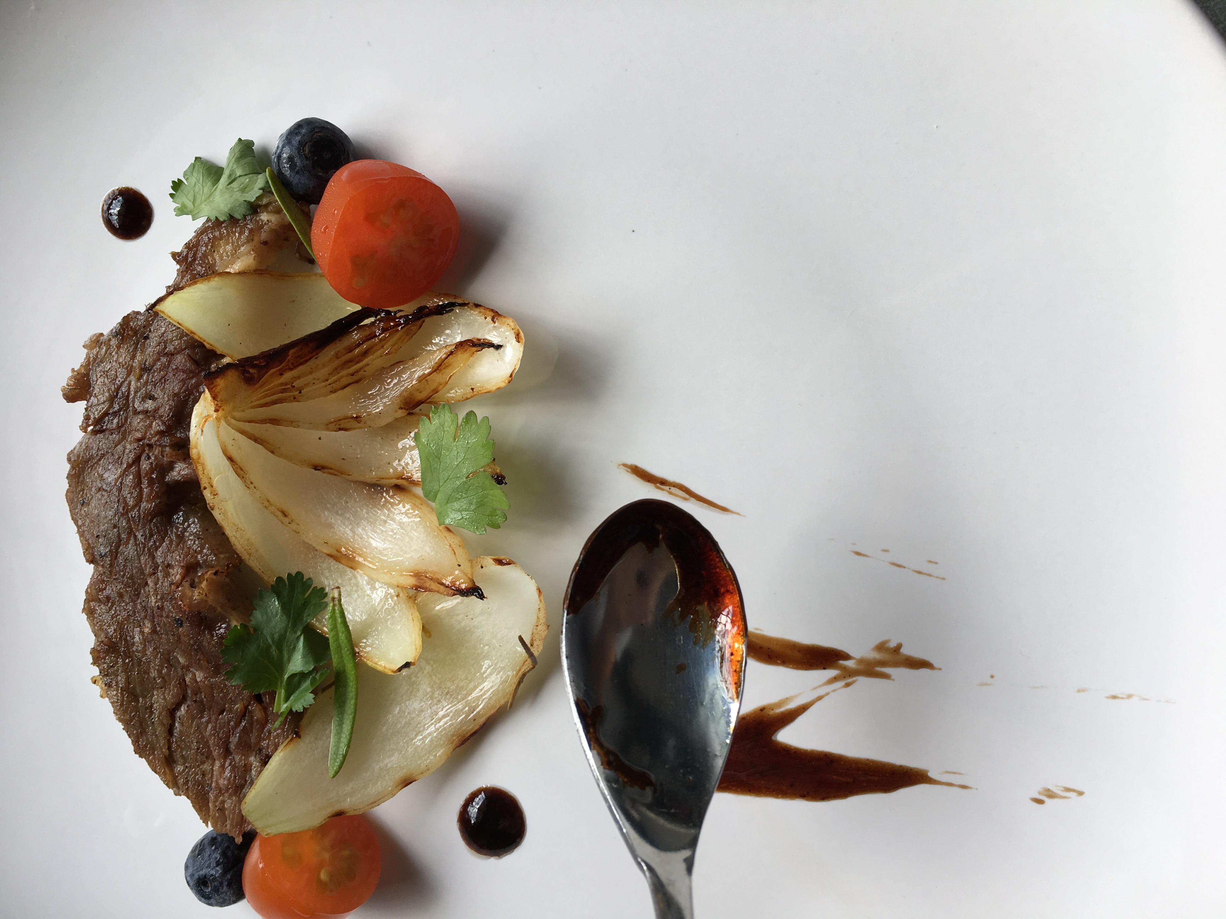
i used a piece of meat from the steak i cooked for the grill chef because dont waste food!! i decided to rummage through my fridge and found half a un used onion, some cherry tomatoes and blueberries. and there, a dish is created.
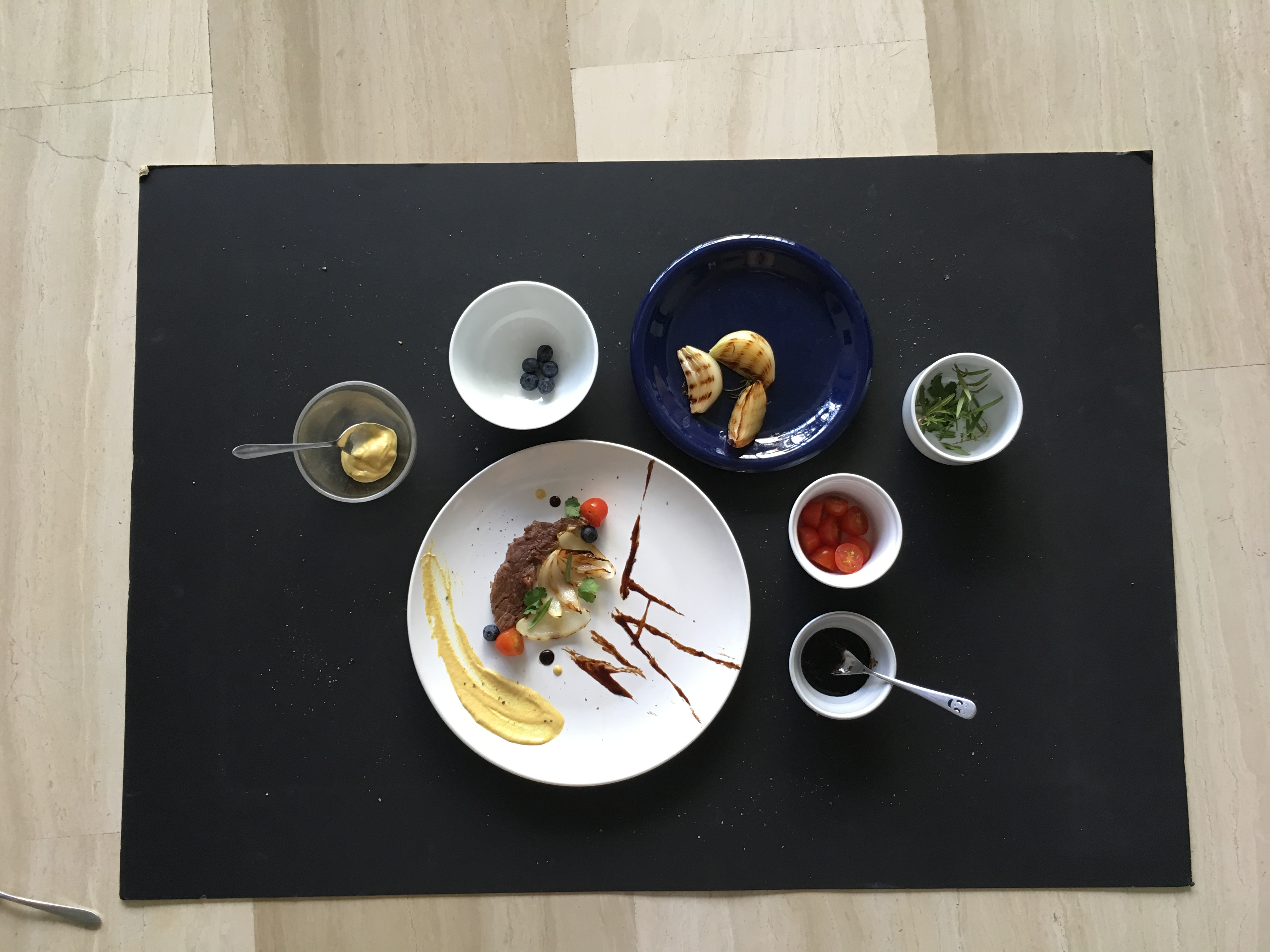
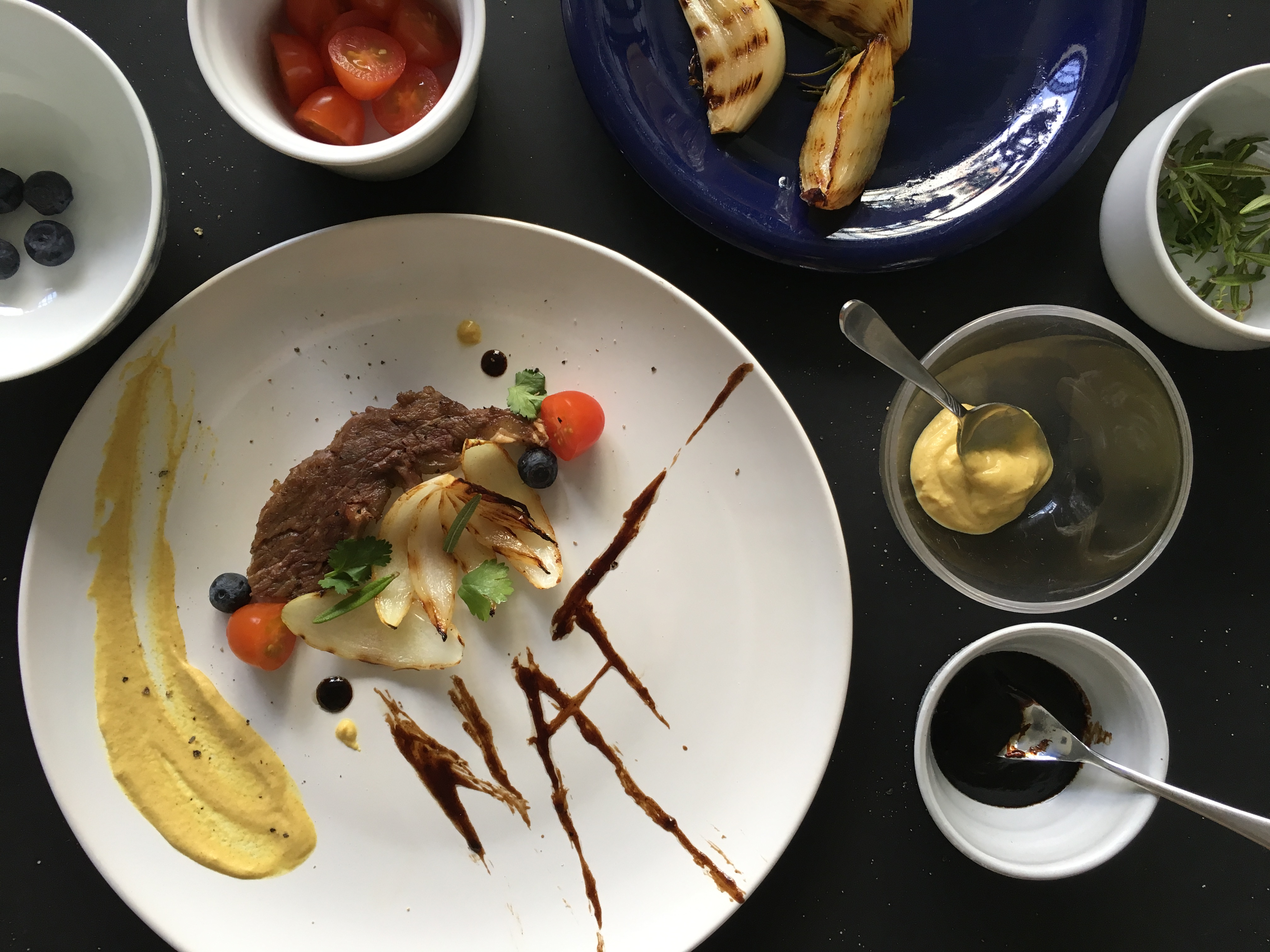
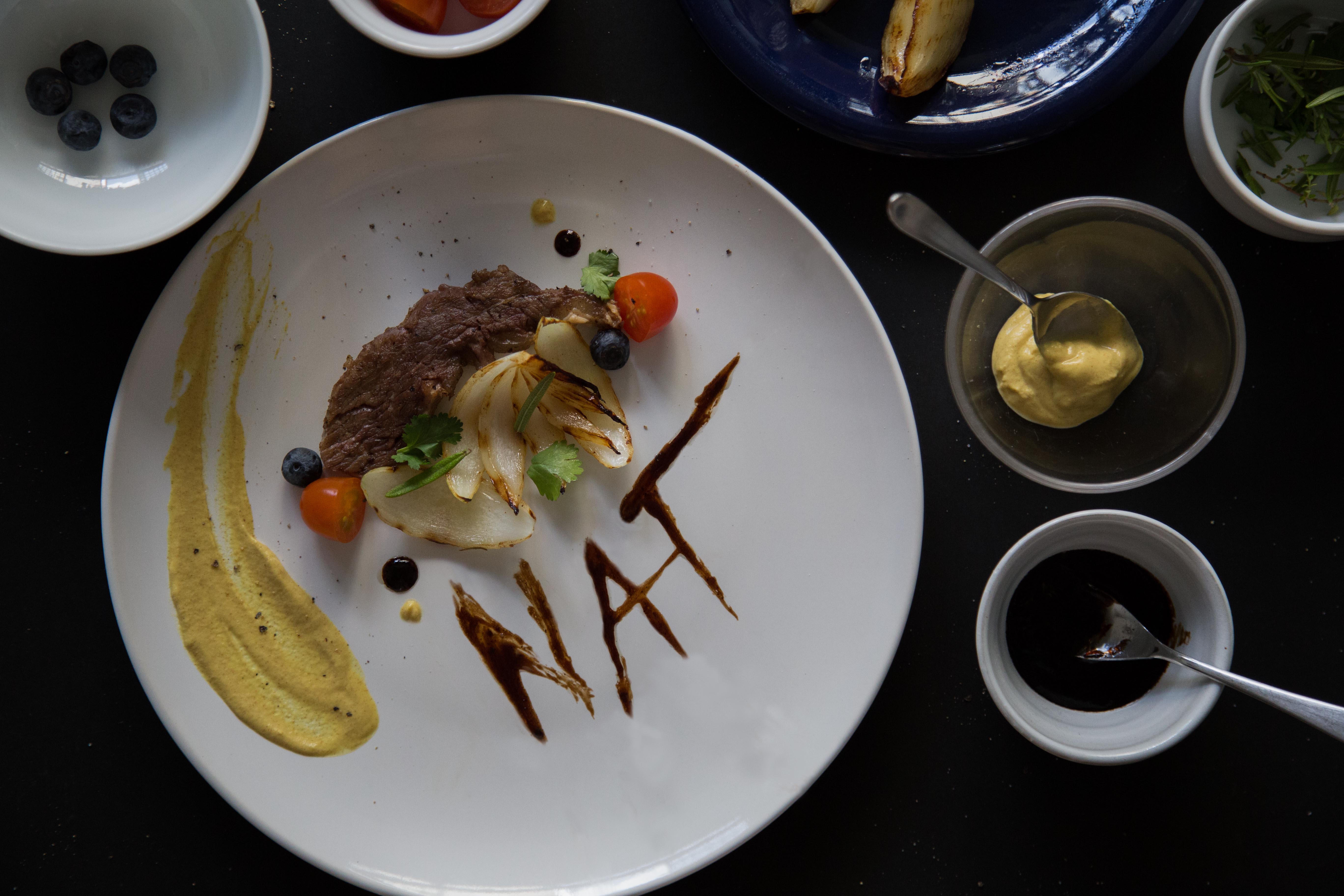
process photos –
final-
the tomatoes, blueberries and mustard gave the entire dish a pop of colour, which is what i wanted. the herbs are used for garnishing. the char on the onions gave another level of colour and depth to it. the plate is surrounded with the sauces and garnishing because i realized that chef needs their elements close to them. i also realized that the elements are given in an entire serving. i came up with the idea of using the sauce to form my name because sauces are always used during plating, and i felt that it was the most interesting and relevant to the entire job scope of an executive chef.
some research ive done –
““Aside from taste, we eat food visually. The first thing I think about is coloring: You want to have a nice balance of color on the plate. For example, we serve a skate wing at Hinoki & the Bird that is served with bright orange sambal sauce on top and plated on top of a banana leaf. The skate wing doesn’t need a banana leaf on the bottom, but it’s nice to have a contrast of color—chili sauce is orange and green sets it off. It brings the plate to life.”—Kuniko Yagi, chef, Hinoki & the Bird, Los Angeles”
&
https://www.fastcodesign.com/3050217/how-to-plate-food-like-a-3-star-michelin-chef
the plate is surrounded with the sauces and garnishing because i realized that chef needs their elements close to them. i also realized that the elements are given in an entire serving. i came up with the idea of using the sauce to form my name because sauces are always used during plating, and i felt that it was the most interesting and relevant to the entire job scope of an executive chef.
i plated my food on the side of the plate because its creates a good composition and visual pleasantness. i also used a white plate to create a fine dining look.
–
to conclude this project, i felt that this was the most fun as i get to work with new mediums. ive learnt how to art direct a food shoot, and also get to experiement with food + learn food styling. i’ve also learnt that “its all about the idea, followed by a well executed job.” – Mimi