my 2nd quote –
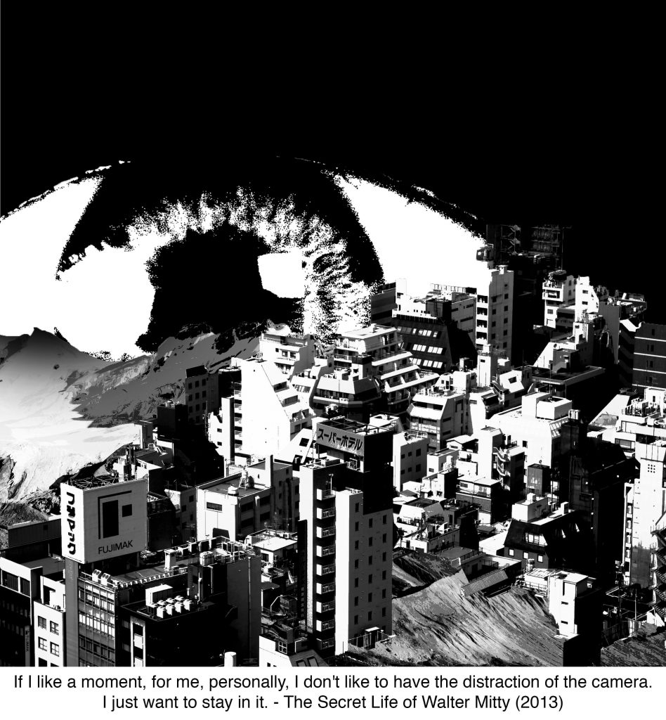
“If I like a moment, for me, personally, I don’t like to have the distraction of the camera. I just want to stay in it.” from the movie The Secret Life of Walter Mitty. from this, i created this visual:
my original idea was use the viewfinder of a camera as the foreground and the buildings and mountains as the opposite but i realized it was contradicting my quote. so i thought, how would someone “be in the moment”? i didnt want to make it as literal by including a person in my visual hence i thought of the idea of an eye where its the basic form of “looking at something”.
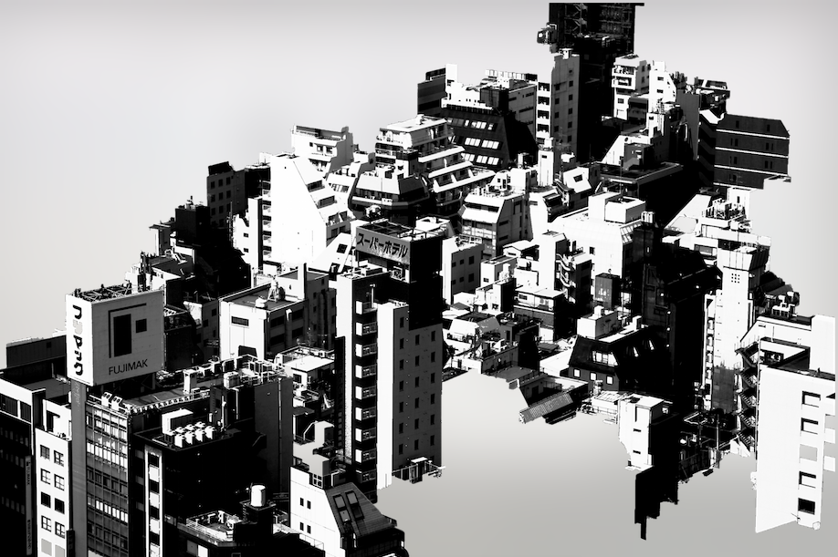
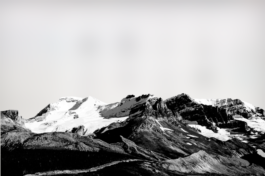
i enjoy scenic views hence i used images of scenes like buildings and mountains to represent “the moment”. since the movie is filled with beautiful scenic moments too, i believe its a good representation of that.
the buildings arent fully masked so add an layer of depth and dimension to the visual, and not fully cover the mountain background as well.
quote #3-
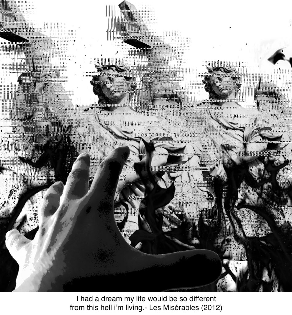
“I had a dream my life would be so different from this hell im living” – Les Misérables
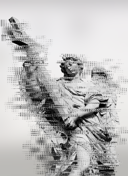
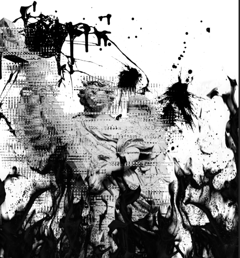
the hand represents her reaching out for the heaven that she dreamed of, but they are crumbling infront of her eyes. “heaven” is represented with the roman angels holding a cross, but in order to fit the narrative of bring destroyed by the flame, i thought of the idea of glitch! i experimented with the glitch technique on photoshop where i selected multiples of rectangles and played around with the ‘distort’ and ‘wave’ functions. the glitch better suits the moment of something being “destroyed”.
the glitch function was really fun to play with, and im glad i managed to learn new techniques from this assignment.
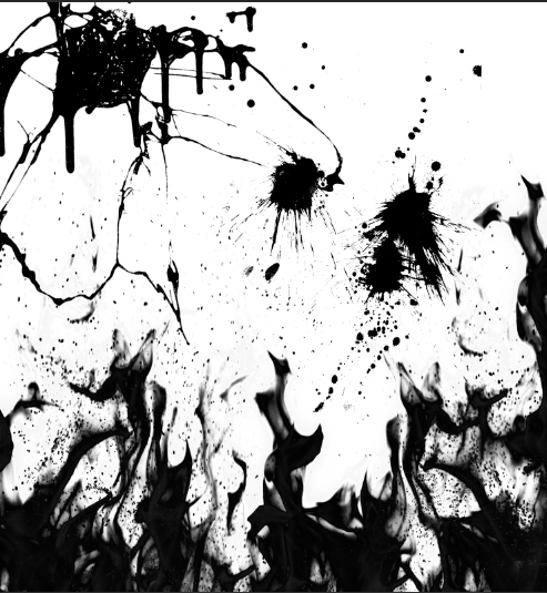
previously i did some brain storming on ideas on how i could represent hell.
- explosions, smoke
- fire
- blood
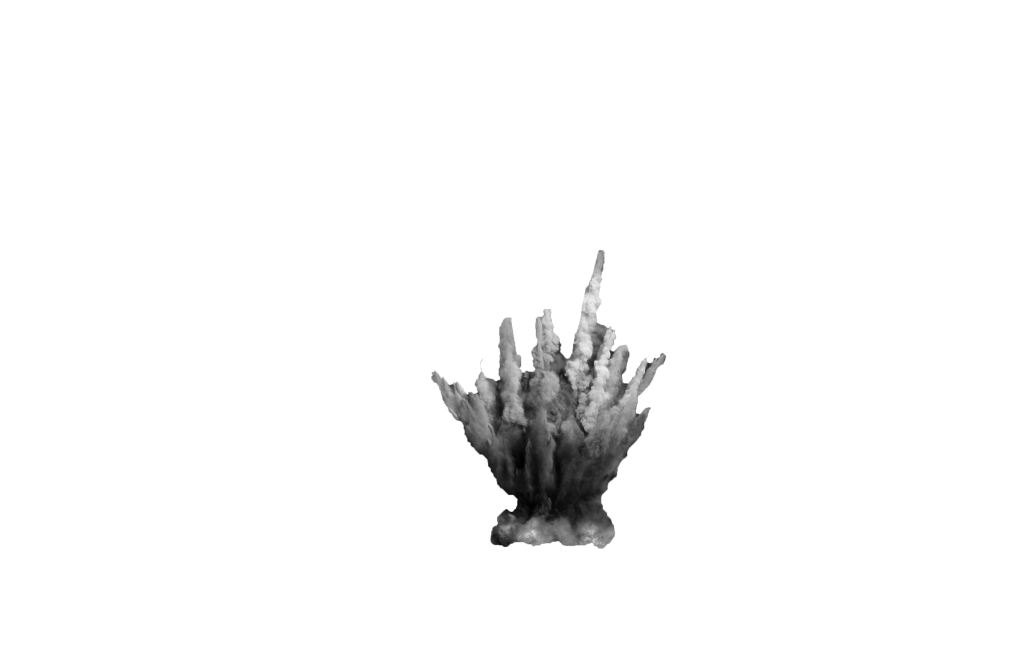
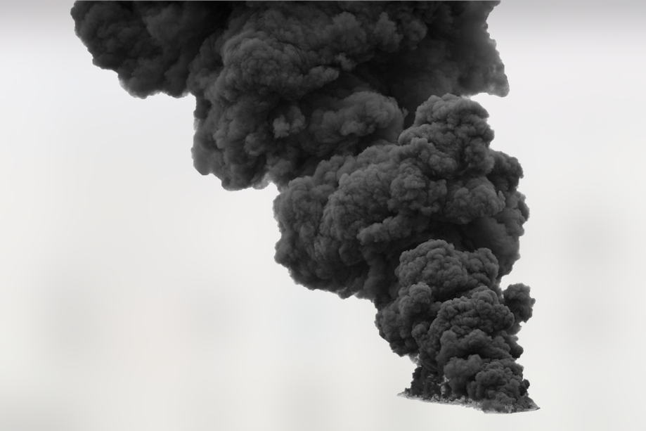
these were some smoke elements that thought i could include in my designs.
i decided to combine the elements to see how they would turn out.
i liked how they looked so i thought it could be an texture background!
however it got a little too visually overwhelming when i add the roman angels to the composition that it takes away the focus of them.
in the end i decided to settle on something less painful to look at to the eye and went ahead with my final one. although there isnt any much texture to the background, i feel that its much pleasant to look at because the background doesnt take away much attention away from the main focus of the hand.
quote #3 –
“live long and prosper” – star trek
most of us definitely have heard of this quote. in fact there already is a visual to represent it and that is the hand gesture. this quote was the most challenging one because there werent much imagery to represent the quote apart from the hand gesture. so, with just the hand, the challenge was how i should make the visual creative and relative to star trek.
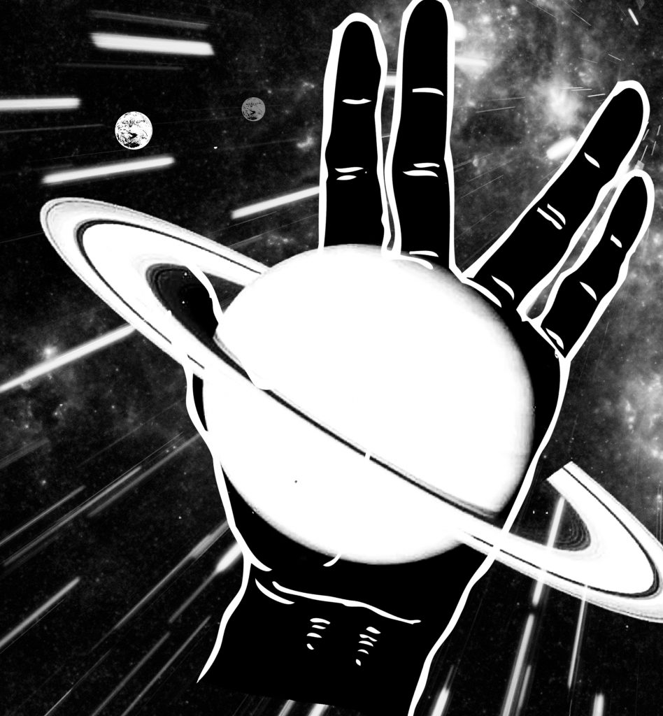
this was one idea that i tried to work with – not showing the hand too literally. the idea behind the planet on the palm of the hand was to represent the moment and life they have in space (star trek). but i dropped this image because there isn’t any focus and everything was just too over the place for me. hence i decided to go with the previous compositions.
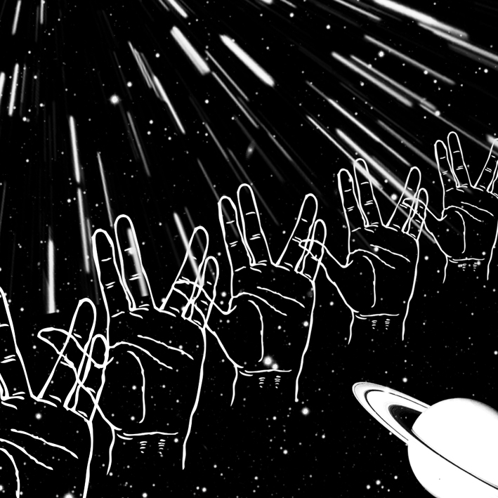
this was another composition which i did which i had difficulties in deciding which looks visually better.
shirley said that this wasnt as interesting because there isnt a distinct focus. hence i went ahead with the other.
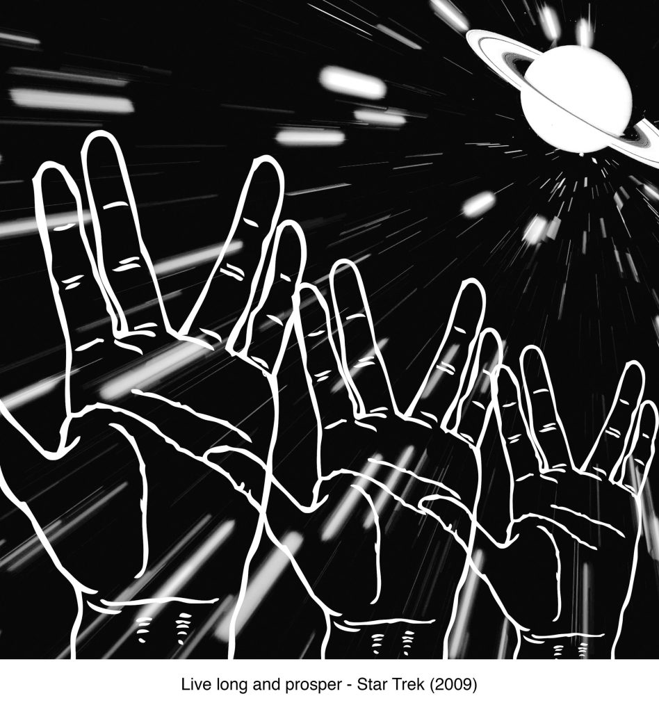
in my selected final one, i decided to use the texture of stars in movement for my background. this is mostly seen when they go in warp speed. the planet is placed in a one-third position because its one of the better places that is comfortable to look at. also, instead of just one hand, i added 3 of the hands so to make the composition more interesting and engaging.
this project has been quite a fun one! i really enjoyed it because not only do you get to experiment with different effects on photoshop, but it also trains your eye in looking at visuals, and how different compositions can be created interestingly. i see the importance of compositional studies because it trains your eye in differentiating the hierarchy between different elements. it also allows you to go wild with ideas, but at the same time settle down with something relevant to the main meaning. this is extremely useful for future projects i.e graphic visuals (branding, poster, campaign) for clients. we can be as creative as we want but have to settle down on what is on topic.

