Monochrome Composition


Colour of Light
This project allowed me to explore different kinds of light in my environment. unfortunately, my tripod broke over the weekends so I had to find other ways such as supporting the Hasselblad on containers or tables but this still resulted in some shaking due to unforeseen circumstances.
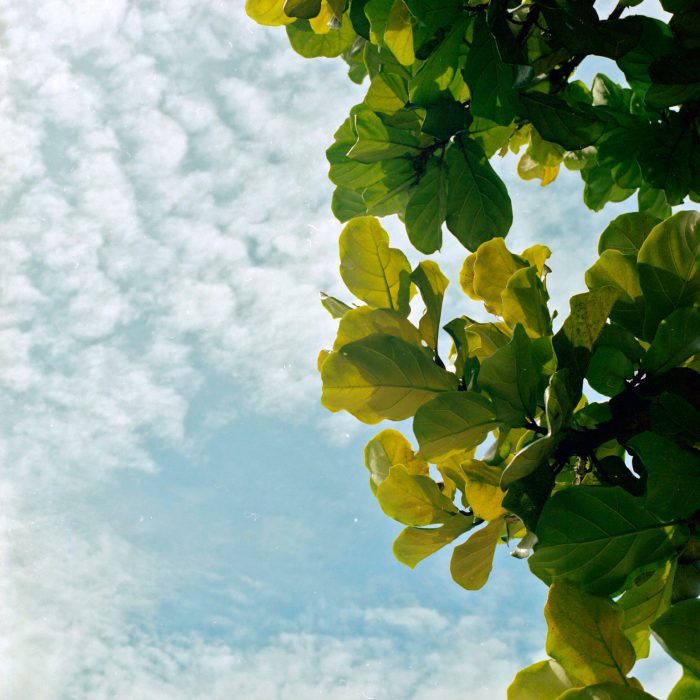
Morning sunlight

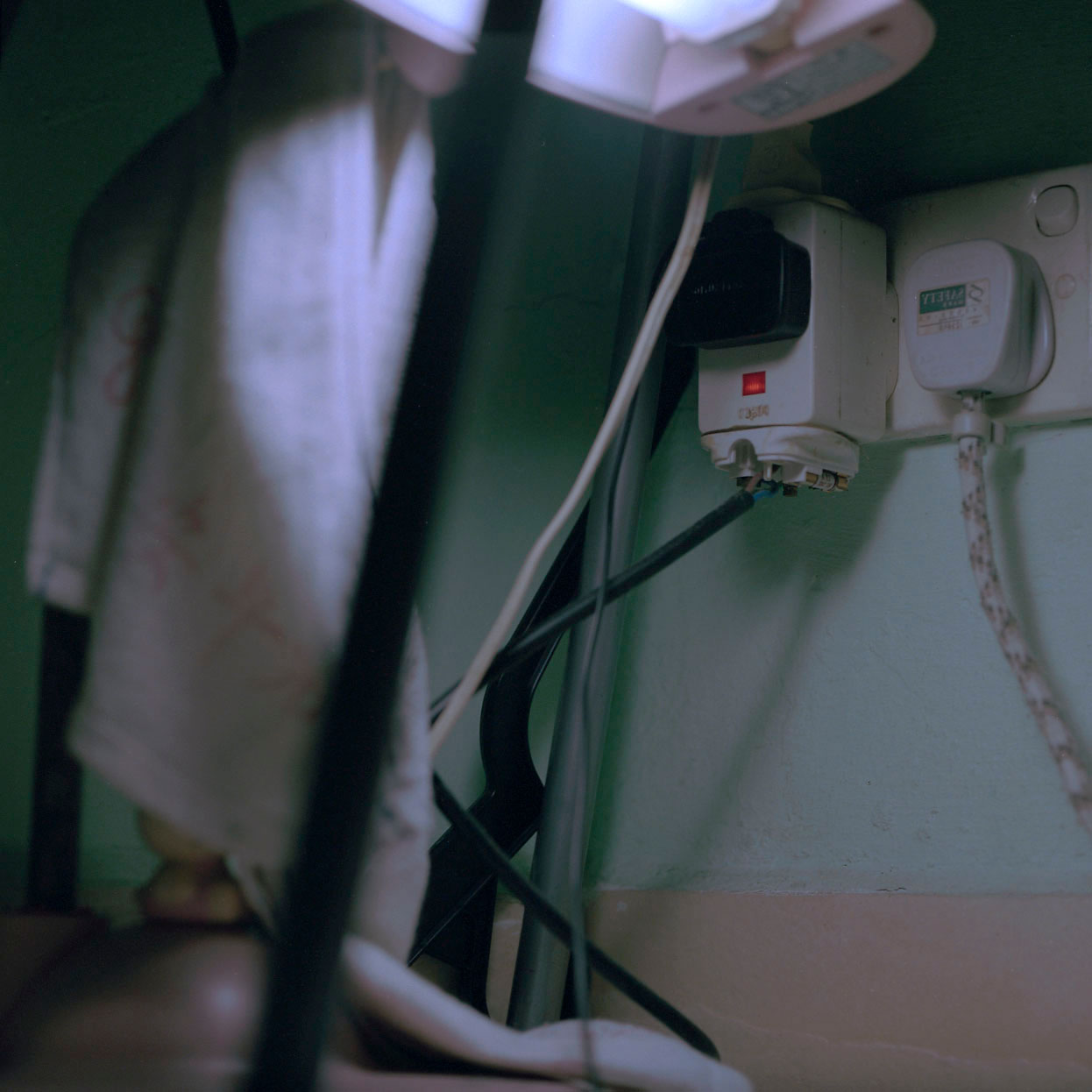
Evening sunlight in my house  Exposing to the inside of fridge at night, might have underexposed too much.
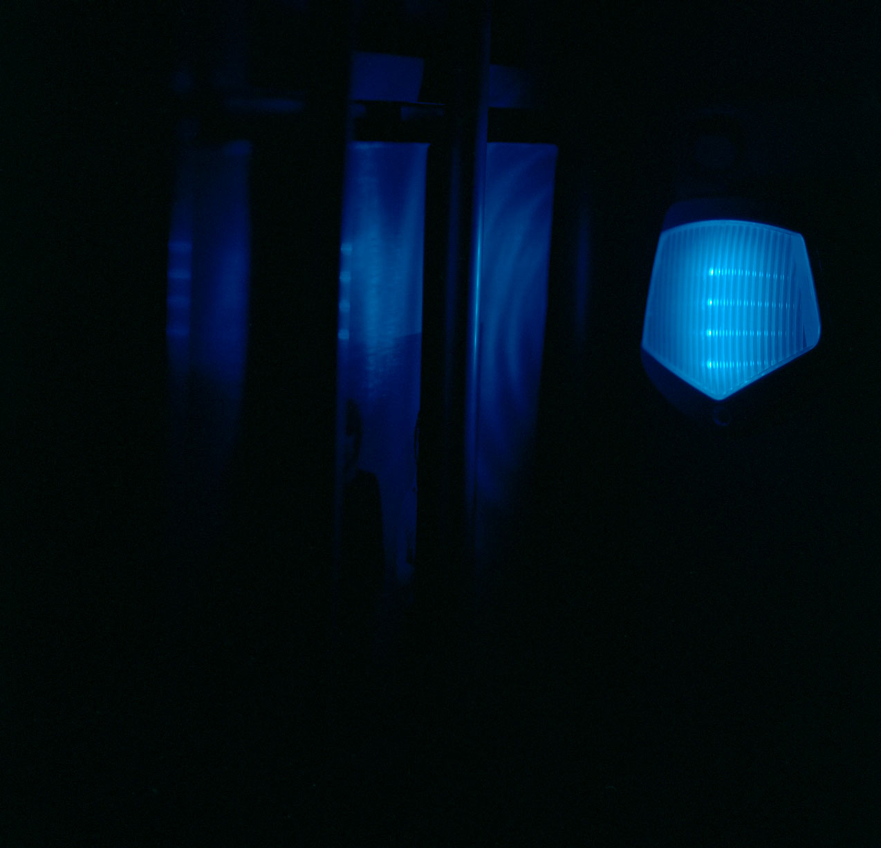
 The flame from the stove in which the camera may not have been able to focus on as it was flickering, resulting in this weird blue thing that resembles the Northern Lights??
Light from the TV and the toilet
 Light from a small blue nightlight
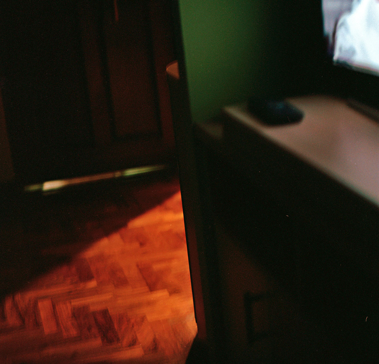
Warm and cool light from the combination of strong sunlight in the room on the left and sunlight from much further away casting faint shadows of the stairs on the right.
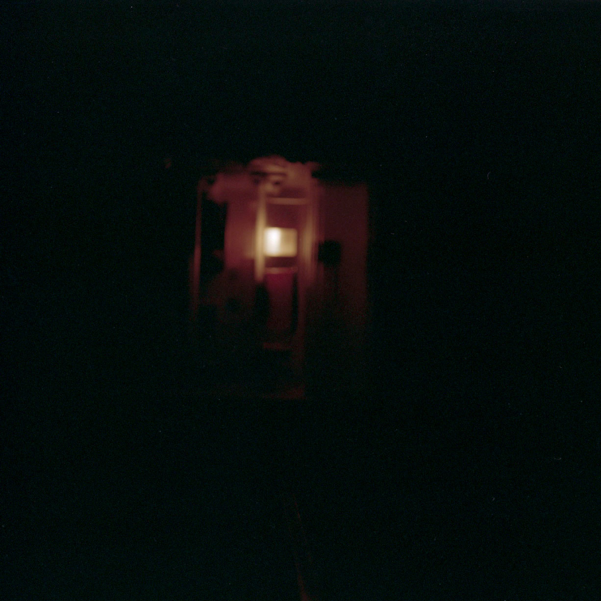
Exposing to the fridge light in the dark from afar. I had to turn on the lights initially to focus if not I see the image in the viewfinder. However, upon switching of the lights, the focus might have went off, resulting in a blurry image.

Neon lights
 Artifical white lights
Ecopark adventures
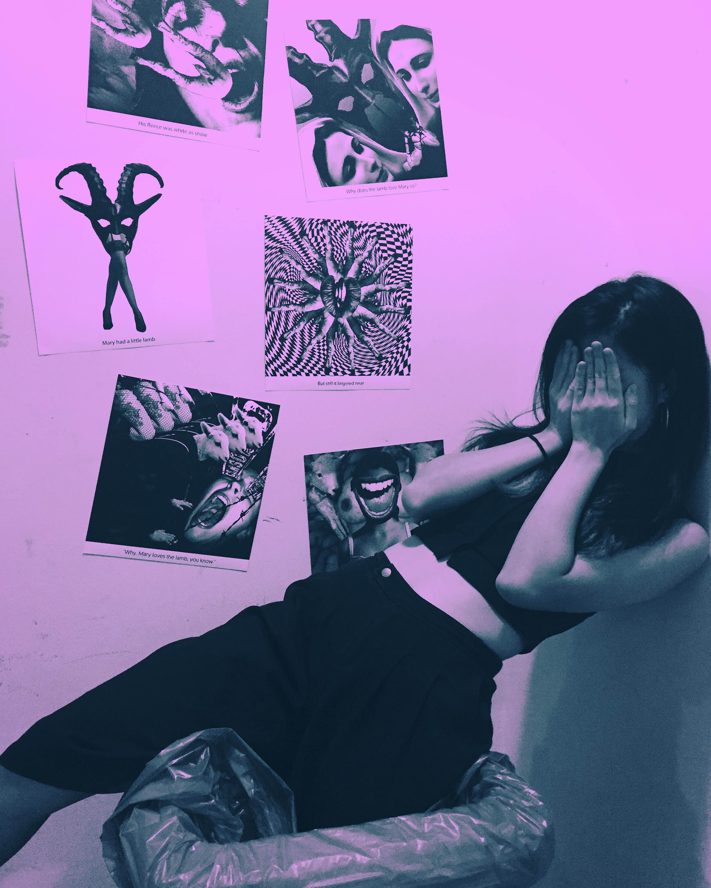
Assignment 1: Deja Vu (Process)

A Review of “So Young” by Vicki Zhao

“Come on, its only History of Ancient Chinese Architecture! I grew up with ancient architecture next door!”
‘Helvetica’ Presentation Reflection
This research assignment encouraged us to dig deeper into typefaces, and why and how they were created. We are exposed to so many typefaces daily, and we usually don’t stop to think about how they came to exist. It was interesting to learn how the conceptualisation and development of a typeface – in our case Helvetica – was so closely interlinked with the social and visual culture of the period from which it originated. It’s never occurred to us that typefaces can accurately capture the zeitgeist of the era in which it was created, especially such a seemingly modern and minimalist typeface like Helvetica.
Project Hyperessay #02
When I saw how real virtual reality can be, and that we can replace human vision with virtual vision, this can be the ultimate platform.
– Brendan Iribe
Project Update 04

Project Update 03
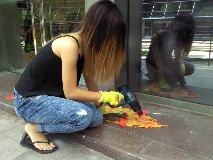
I finally managed to obtain the pictures of me making my costume so I will feature them in this post alongside some of the images from our rehearsal and my thoughts on it.