I have to admit the past 2 weeks I didn’t really have much of a concrete idea of what to do…all I did was go to the library, borrowed books on 80s graphic design, concert flyer designs, old chinese label designs, cut-and-paste graphics…basically types of designs I was interested in but still I wasn’t really sure how to put them together…(will do a separate research post on those books)
and then the night before last week’s lesson, I still had no idea what to do and with limited time on my hands, I grabbed some materials and arrange them to create this…
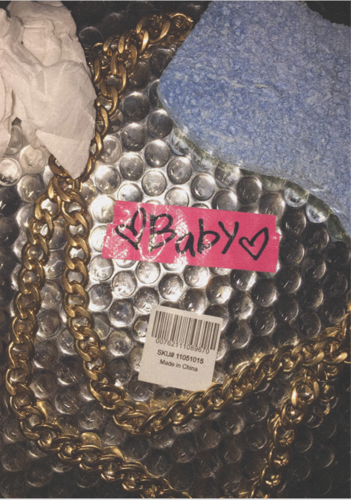
Not the most appealing but I sense some idea behind this…I went with the intention of playing with contrasting materials and meaning when added together. I also like making things look tacky so there’s the “Baby” and fake gold chain. It represents a collection of materials associated with a type of girl…one that scrubs floors, where dirt and trash is part of her everyday life (she doesn’t have to necessarily be a cleaner or dishwasher but just someone who doesn’t have a very glamorous job) but at the same time craves glamour and a dreamy love life. Not sure if it shows but I thought it would be interesting to explore duality in female subjects where both glam and trash meet which brings me to my next idea…
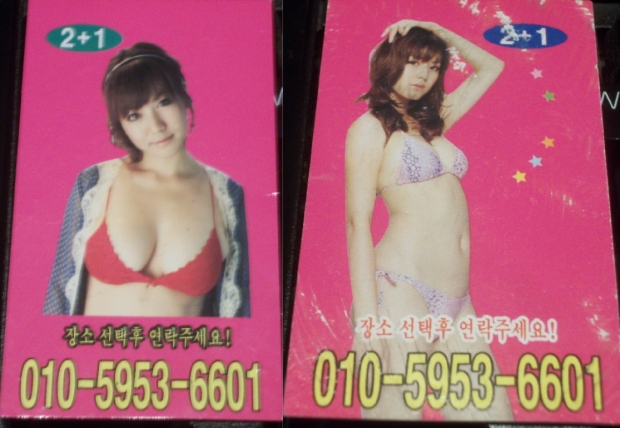
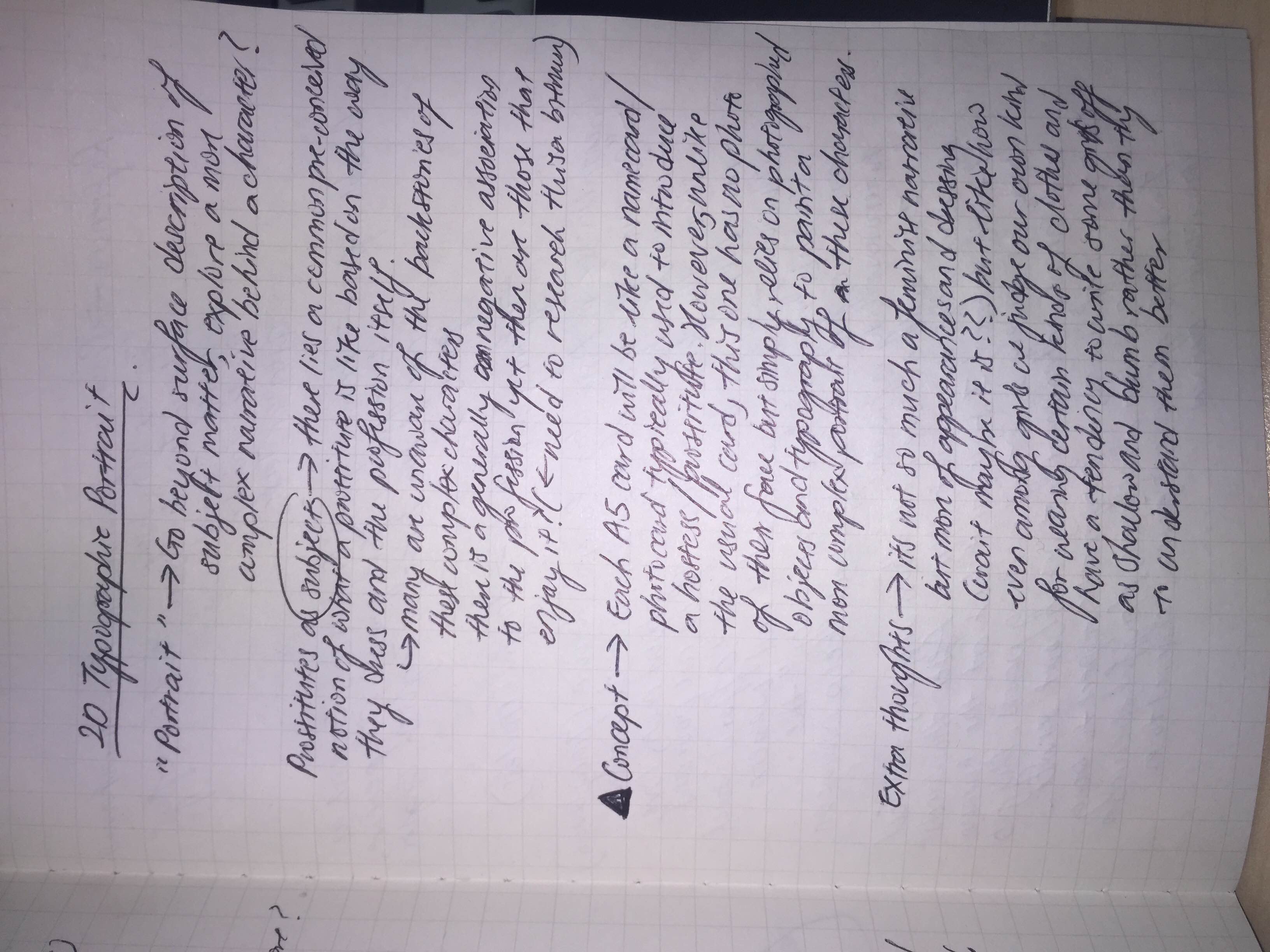
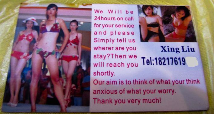
I shall do typographic portraits on prostitutes/hostesses/strippers! Each A5 card will be like a name card of each of the different females so in the sense I will be presenting it in a mock hostess club setting. Usually name cards introducing the females will be like those in the above photo where a photograph of the female and a number to dial is presented but for this project, I will be using typographic design elements to represent them instead. This will allow me to present a more complex identity behind these females instead of just surface level representations. Still, I would like to keep the concept of a name card so I will need to think of how to incorporate name card elements in along with the designs.
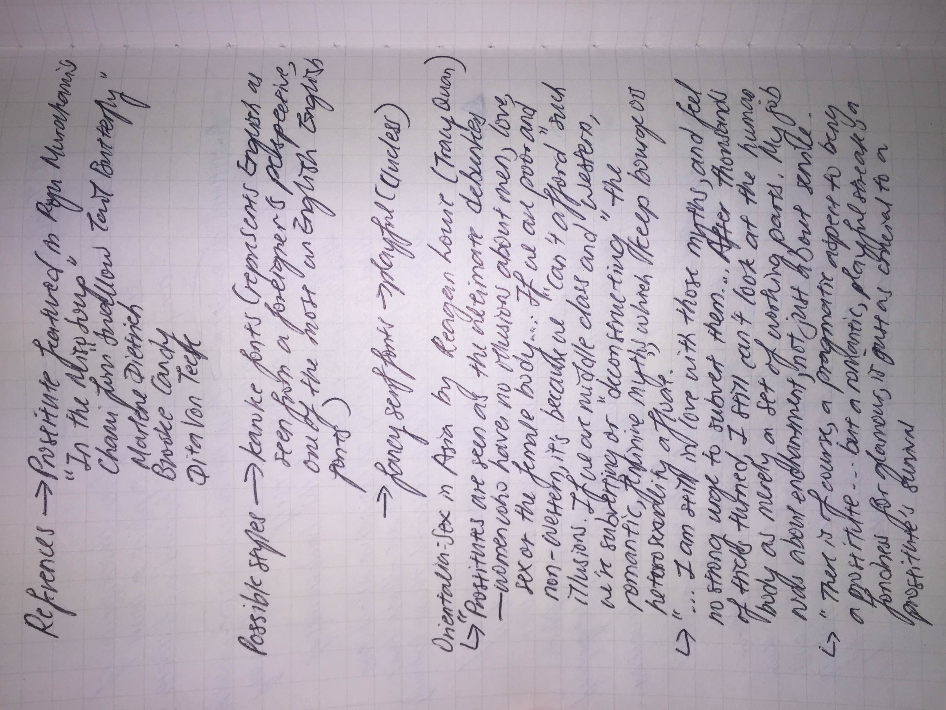

I took reference from Orientalia: Sex in Asia by Photographer Reagan Louie for some ideas to construct the different narratives for each female.
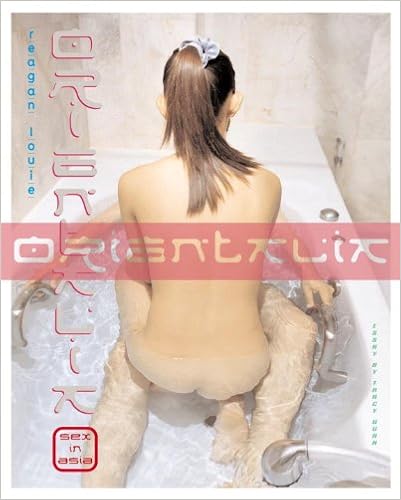
Contrary to most books about females in the sex industry, her book’s emphasis is not on the graphic lurid images of females in various poses but features their life outside of prostitution as well, show that they are just like us, some being daughters and mothers as well. I think exploring the different identities of prostitutes/strippers/hostesses is interesting due to their prevalence in almost any country. Yet, they cannot be simply be generalised under one identity given their different backgrounds and reasons for entering the industry (be it for pragmatism or simply pleasure). This gives me the opportunity to mix design elements from both east and west, classy and kitschy, formal and messy.
Another idea that I am keen to explore through this project would be how some kinds of fonts can represent the English language as seen from a foreigner’s perspective. Some obvious ones would be having narrow Arial font with a much wider than usual kerning like the above or having really light serif fonts with a lower value of kerning. I see this as a way to touch on the topic of exoticism present in the sex industry as well.
Some further reading for myself hoho:
The Tart Cards of Tel Aviv
https://medium.com/@sarahsouli/the-tart-cards-of-tel-aviv-547f5a564ace#.1nuk8u4i6
understanding the motivations, behaviours and aspirations of your targeted group is great starting point..all the key-words, characteristics, create an exciting storyboard and set the mood, mental construction for project!