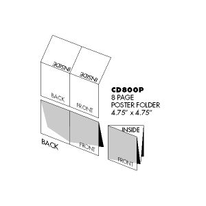
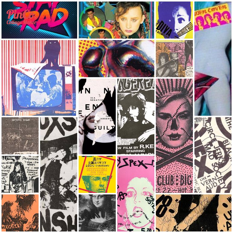
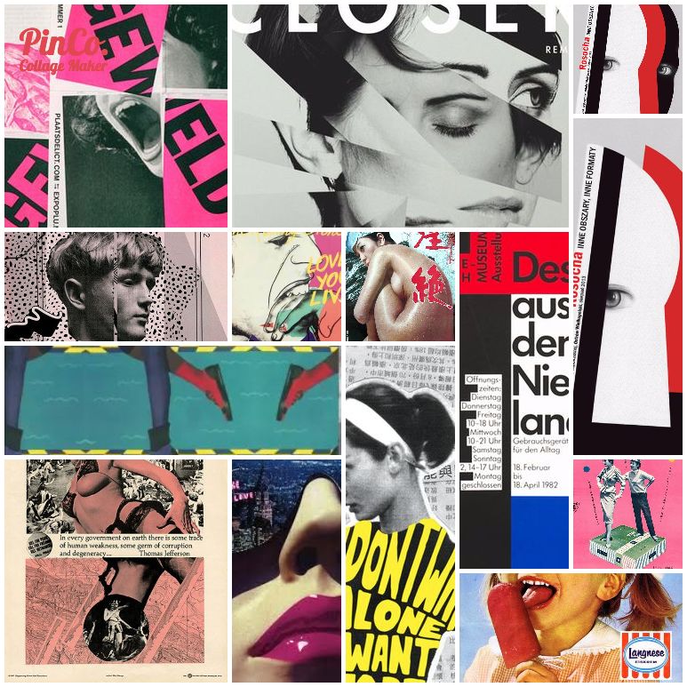
Heavily relied on Pinterest to organise my references for each series since I plan to have a different style for each one in relation to the meaning of each square (album cover). Yes, I plan to have my squares be the CD album covers and actually put them in CDs complete with inside and the back printed…so yes extra work indeed…will elaborate on why the CD concept in later posts.
My first Pinterest
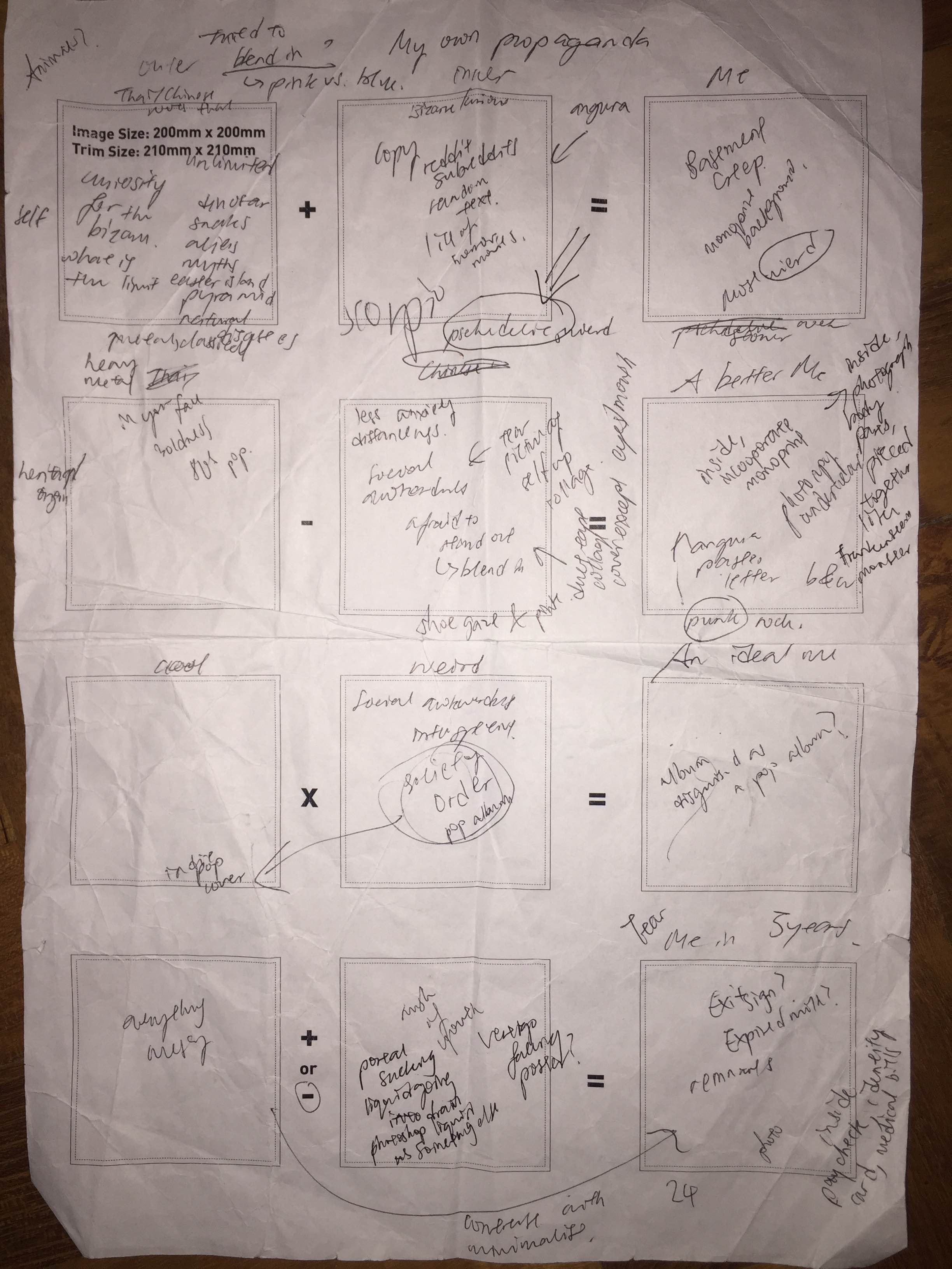
Rough plans on template
Ego: Me
Link to Pinterest board: Ego: Me
For the first series about “Me”, the ‘equation’ goes as follows (the equation thing seems kind of silly when you think about it)
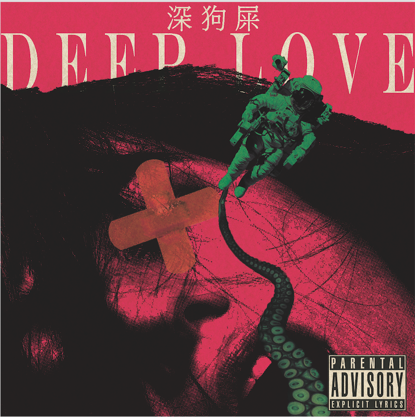
Fascination with the Bizarre + Love for the unusual = Basement Creep
The equation can be further simplified into traits which are “Fascination” and “Love”, two main things that drive me and I just heavily identify with the stereotypical Basement Creep so why not. I mean fascination and love when taken to the extreme kind of sums up a Basement Creep.
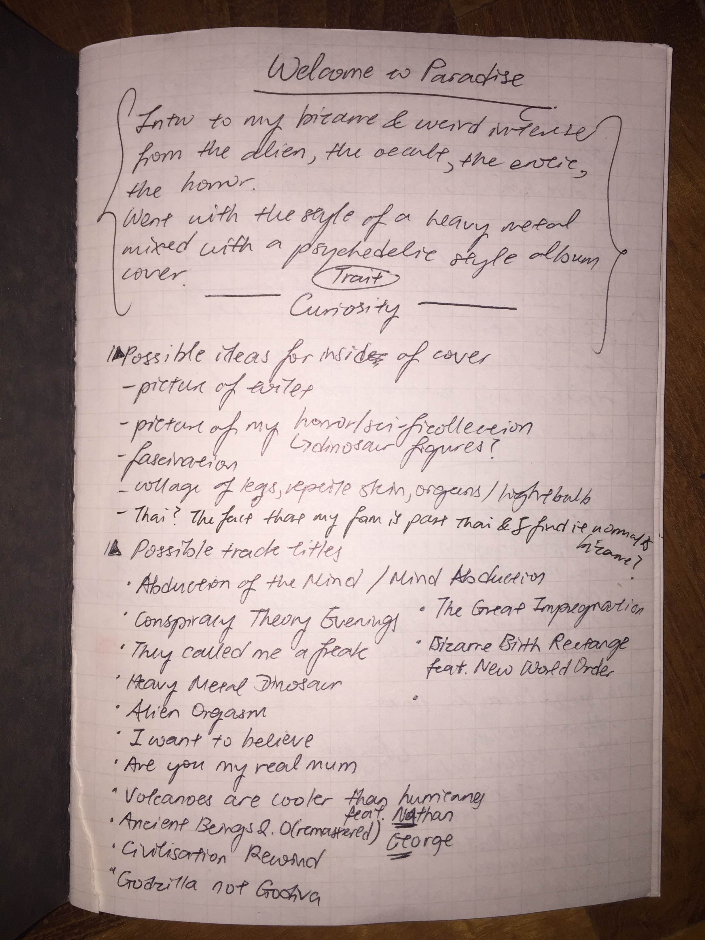
I initially wanted to have all my squares to be in the style of Japanese Angura Posters (underground avant-garde theatre posters from 1960-70s) such as those by Tadanori Yokoo and Shuji Teriyama and 80s pop album covers (I find the design elements really strong during that era for album covers).
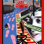


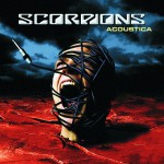
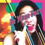
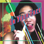
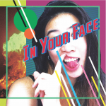
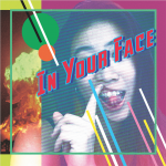
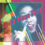
However, as I started to explore and play around with images, I found it hard to stick to one style strictly so I decided to have a different style for each one. For “Fascination with the bizarre”, I wanted to try the style of heavy metal albums mashed up with all the weird horror, erotic, sci-fi stuff that I was fascinated by. Heavy metal is quite broad so yeah I was thinking of combining a few looks like the horror of Misfits with the bizarreness of Scorpions.

However, my tendency to make things as messy as possible got the better of me until I lost sight of how it was suppose to be like a heavy metal album cover so it did not end up as dark as it was suppose to be and lacked certain elements and frames that were intrinsic to the “heavy metal” style. It ended up looking like some pop punk cover on drugs with just a slight tinge of “heavy metal”…so much for trying…
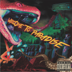

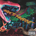
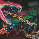
I tried a few effects such as with texture and without texture overlaid. To ensure the elments blended well together instead of looking too photoshopped, I felt that texture was necessary to make sure they all seem like they were all the same plane. However, took much texture tended to darken the entire image and make the font look dull so I had to play with the order of the texture and font and the opacity of the texture as well. 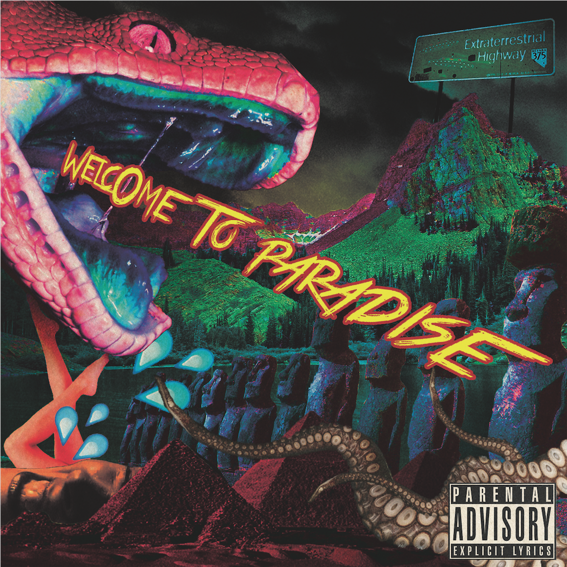
The images inside range from a snake, Egypt’s pyramids, tentacles, Easter Island statues, valley, women’s face in pain, legs, water spash emoji which takes on a different meaning given the context when placed near legs if you get what I mean hmmm…There’s quite a lot going on so I was pretty unsure if the colours work but Prof Ina assured me and said it did so I hope its ok. It seems well to me hmm..
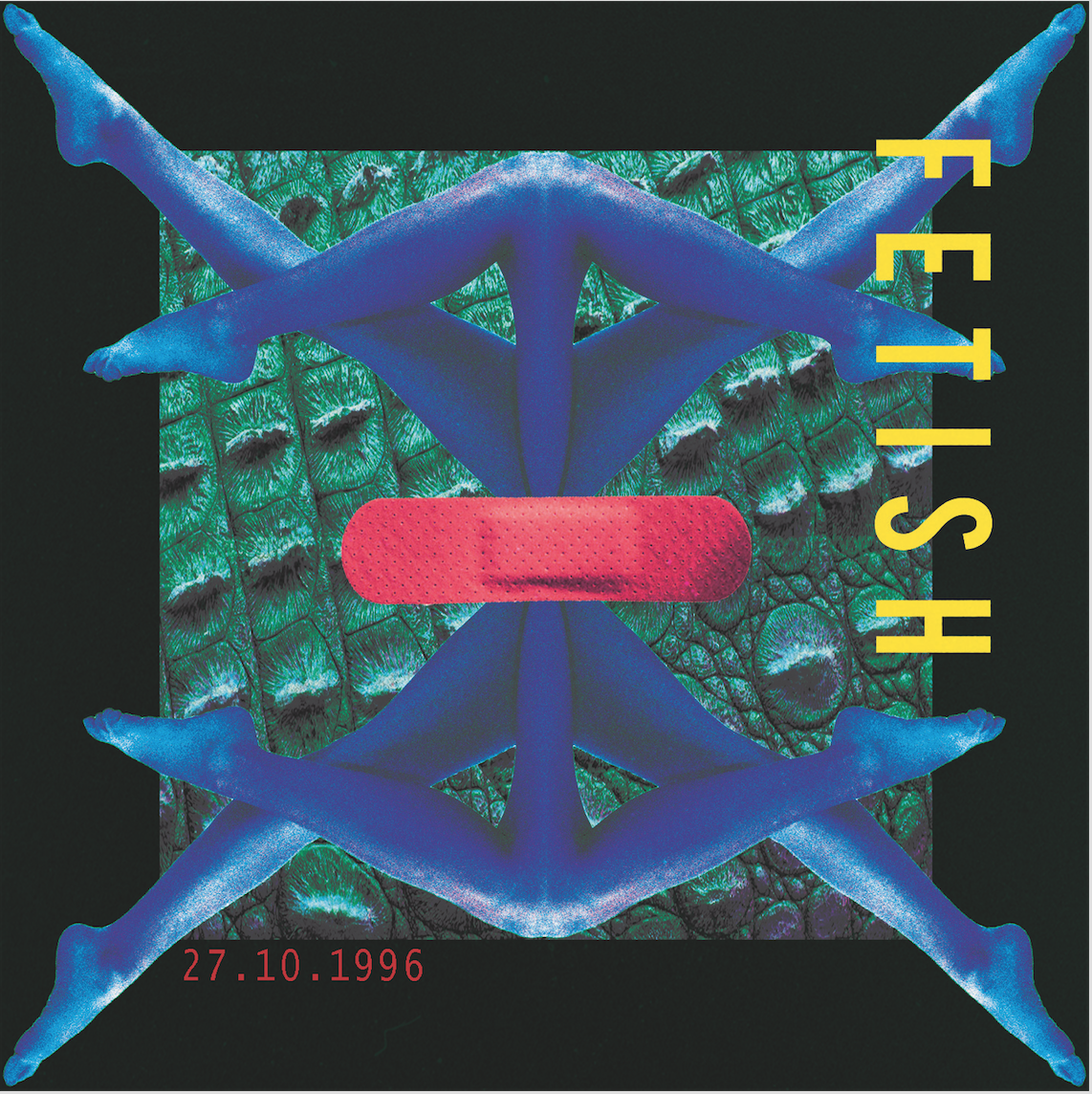
As for the inside cover (and this is where the extra not required for the assignment but I’m still doing it cause I want to part comes in), I started out playing with some nice legs I found. I really like the collage of body parts in this book called Fotoshock (will add in image when I get back to hall) so I tried to do something similar. I duplicated it and arranged it symmetrically to create the impression of some other being.
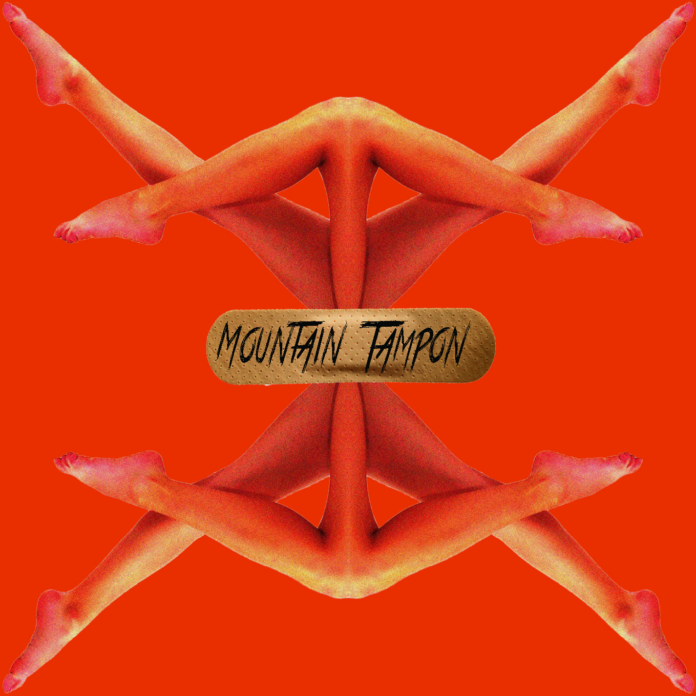
The initial design was to make it look as human as possible and include some fleshy tones to make it look really raw. However, it ended up looking quite plain with just the plaster and legs so I felt the need to add more elements. (Oh yeah, Mountain Tampon doesn’t mean anything, it was just random words I ask Nat to give me…some dada going on)

I looked through my book on old movie posters and came across one with this interesting palette of blue and a pink that looked quite bizarre.
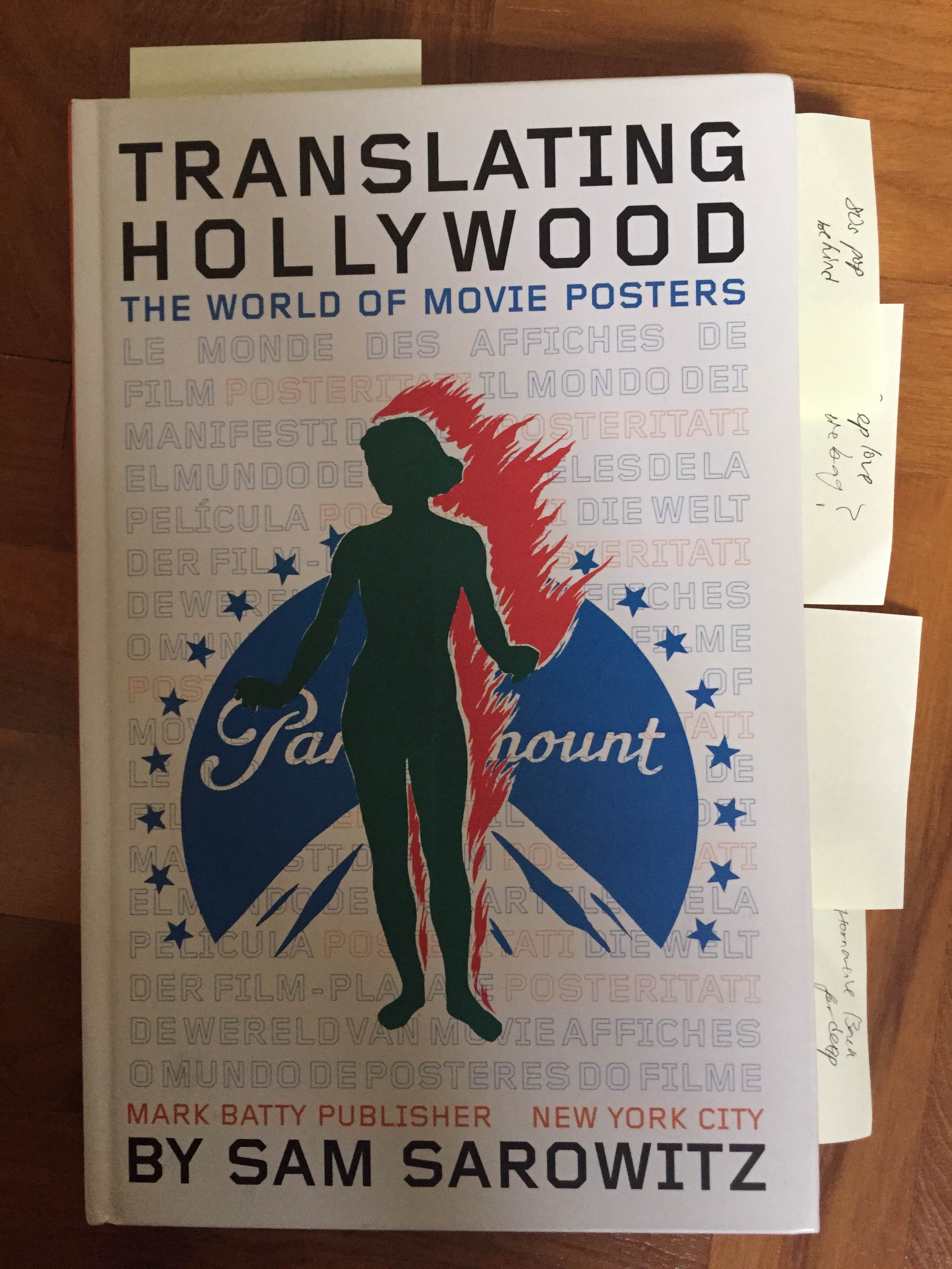
I referred to this book for colour schemes.
I decided to try it out on the legs and added in the crocodile skin texture since the idea of female legs and rough crocodile skin suddenly came into my mind. I wanted to add lightbulbs too but decided enough was enough. I guess for the layout I was inspired by recent designs on Japanese magazine covers but really I usually just go with instinct so I’m not exactly sure what I come up with.
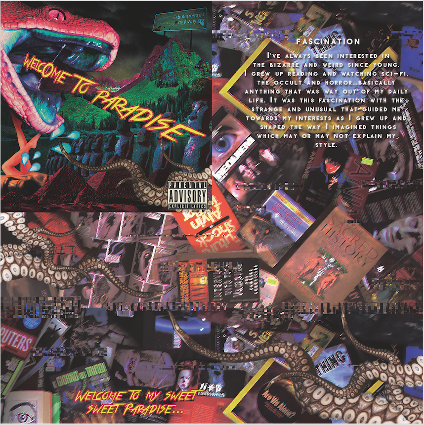
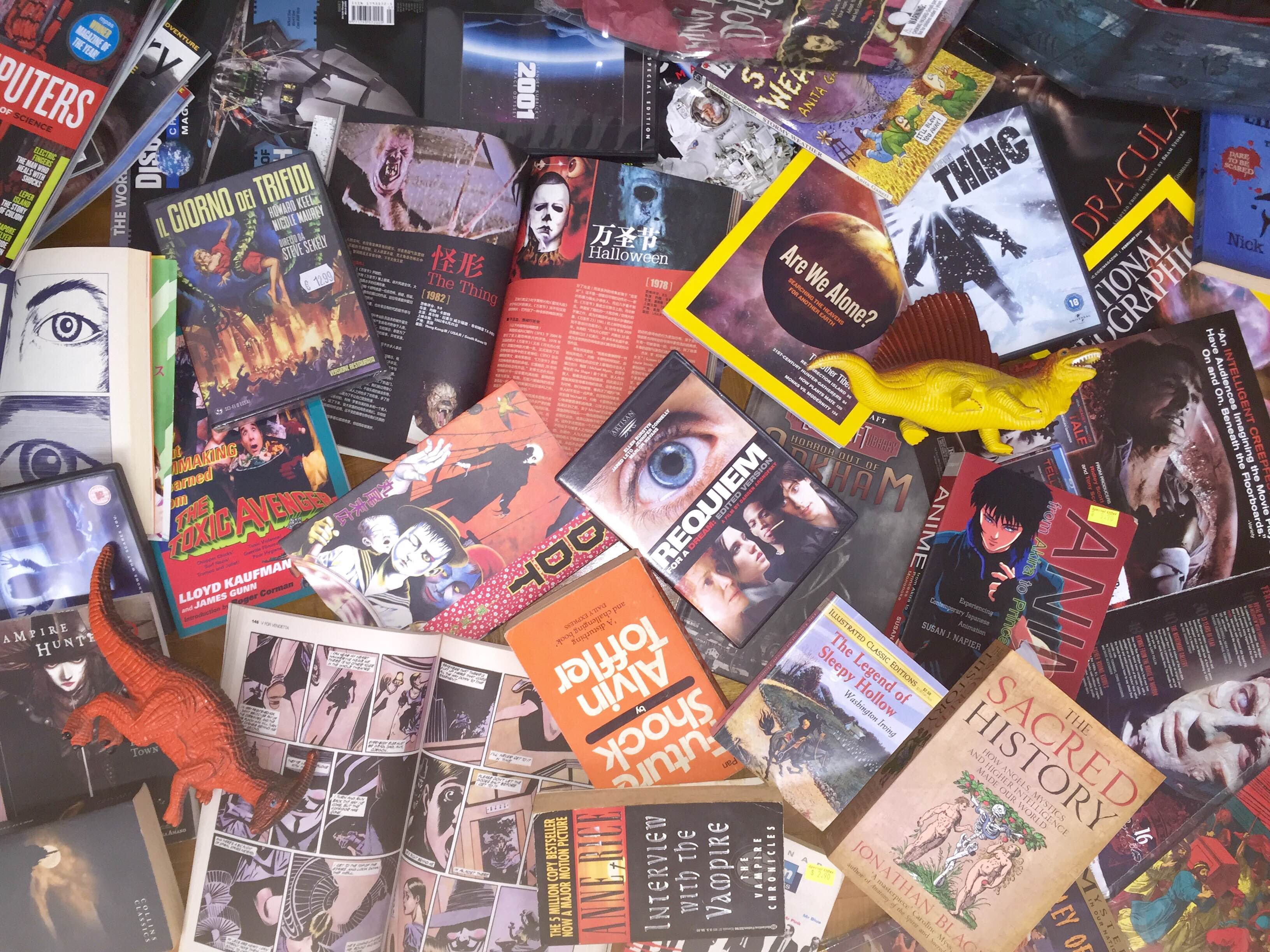
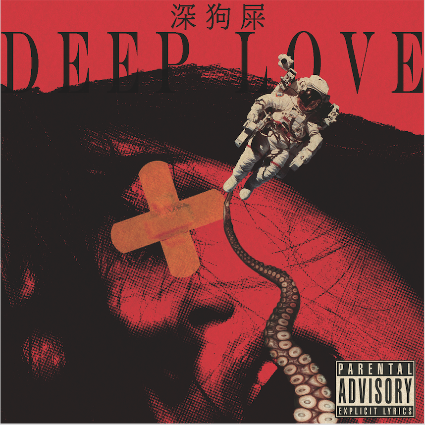
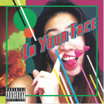
and here’s the front cover that will be folded and inserted into the CD! I gathered all my weird books, DVDs, Dolls and stuff, took a pic and edited it with some glitch.
 Here’s the original images before I edited them
 I proceeded to play with the cyan and magenta levels to get a more blue-ish red tint to contrast against the yellow font.
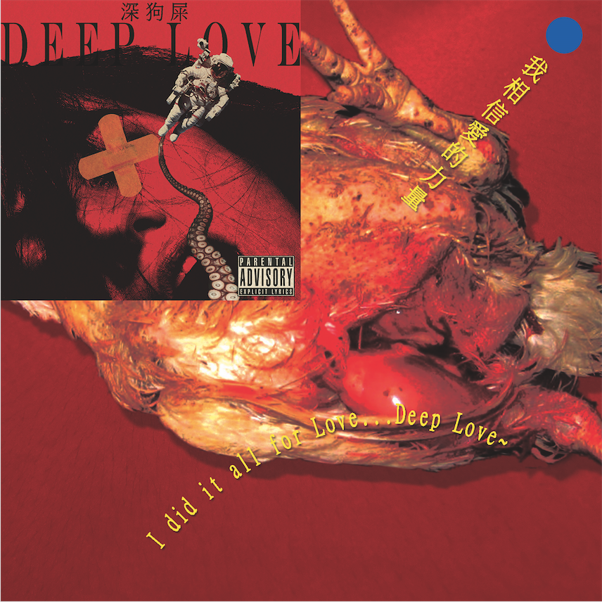
 I did the same for the back with the tracklist. I kind of like how the edited image looks like here. and yeah the tracklist…hehe…
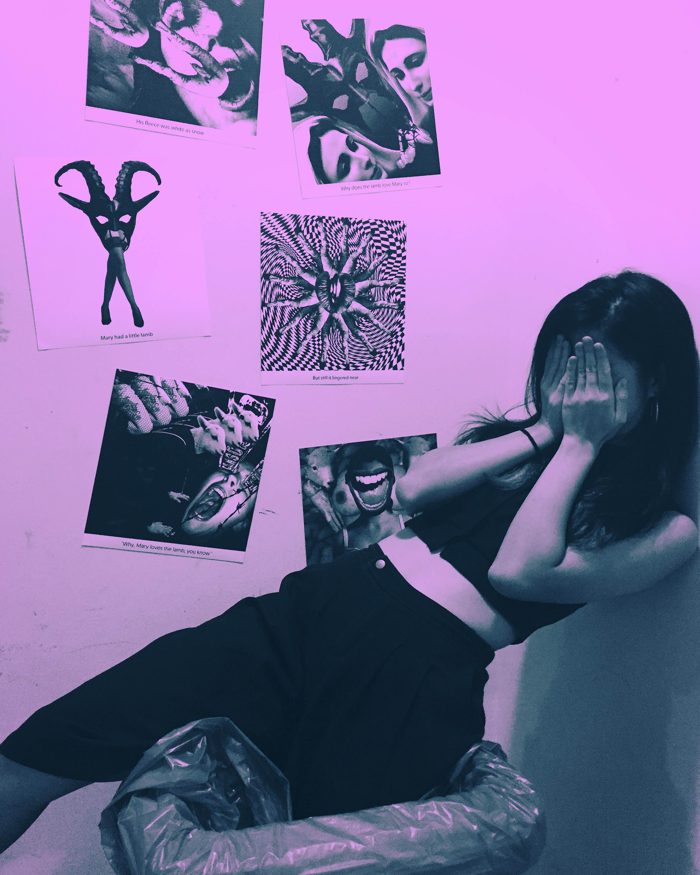
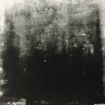
As for “Love for the unusual”, I looked back at my previous Rhymes assignment and decided to work with one of my favourite halftone images.

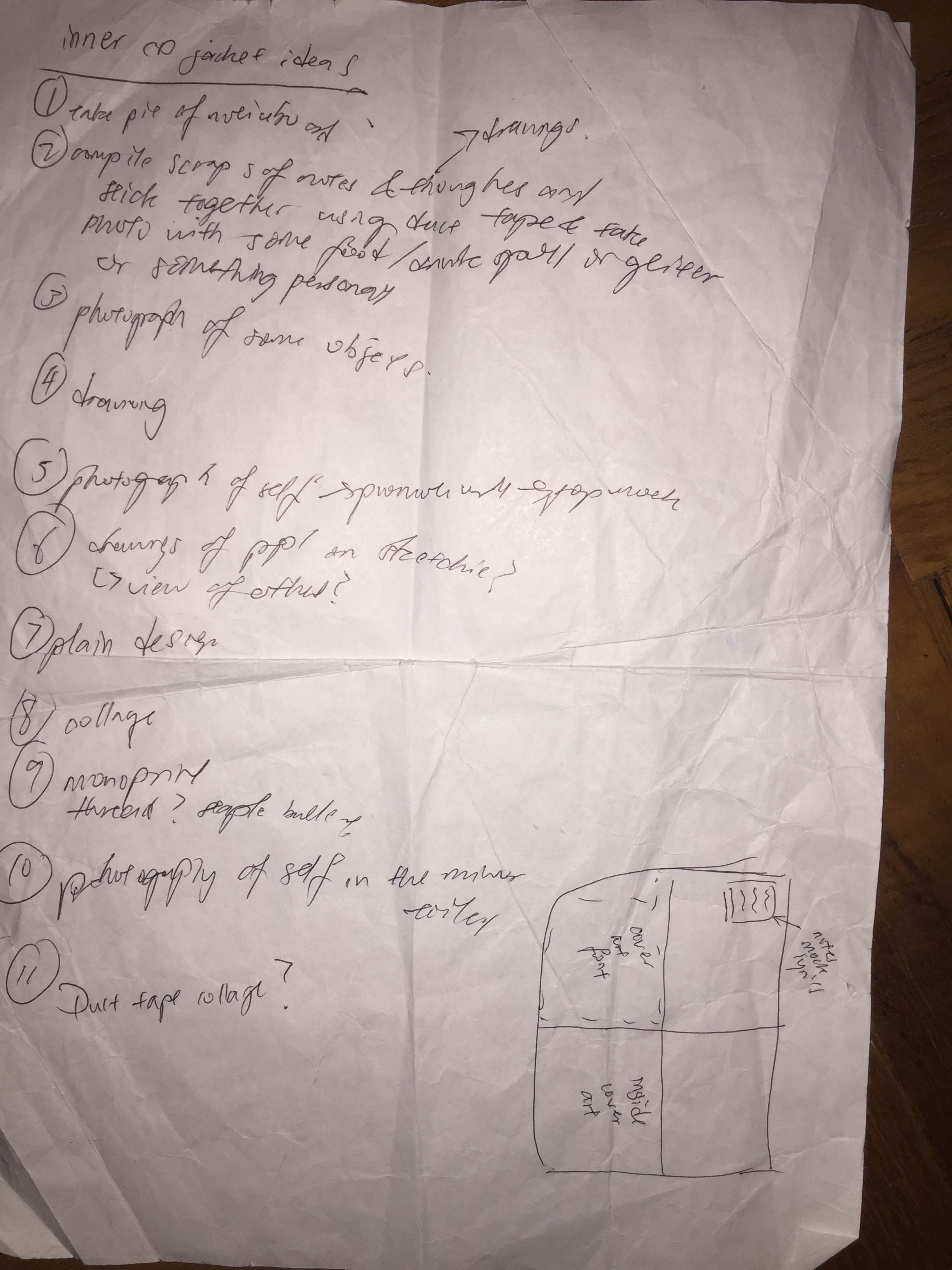
Here’s my rough journal plan once again…
 Below is the original image
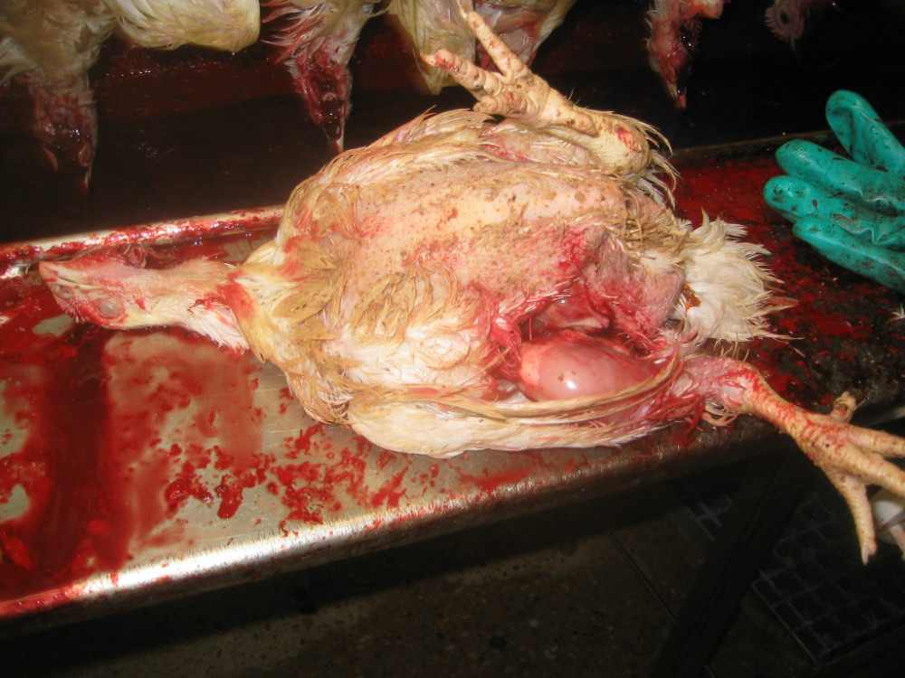
The Front cover that will be folded. I wanted to work with images that conveyed a really raw feel so I found this slaughtered chicken and edited it to make it look really saturated and intense. I deliberately tried to connect the body of the chicken with the points where the female’s head ends in the front cover to connect them…not sure if it works.
As for the inside, I wanted to include an alternate version of the front cover. These two are some of the possible ideas.
 An alternate title I had in mind was Explore Me which Prof Ina said worked too but I decided on Deep love in the end.
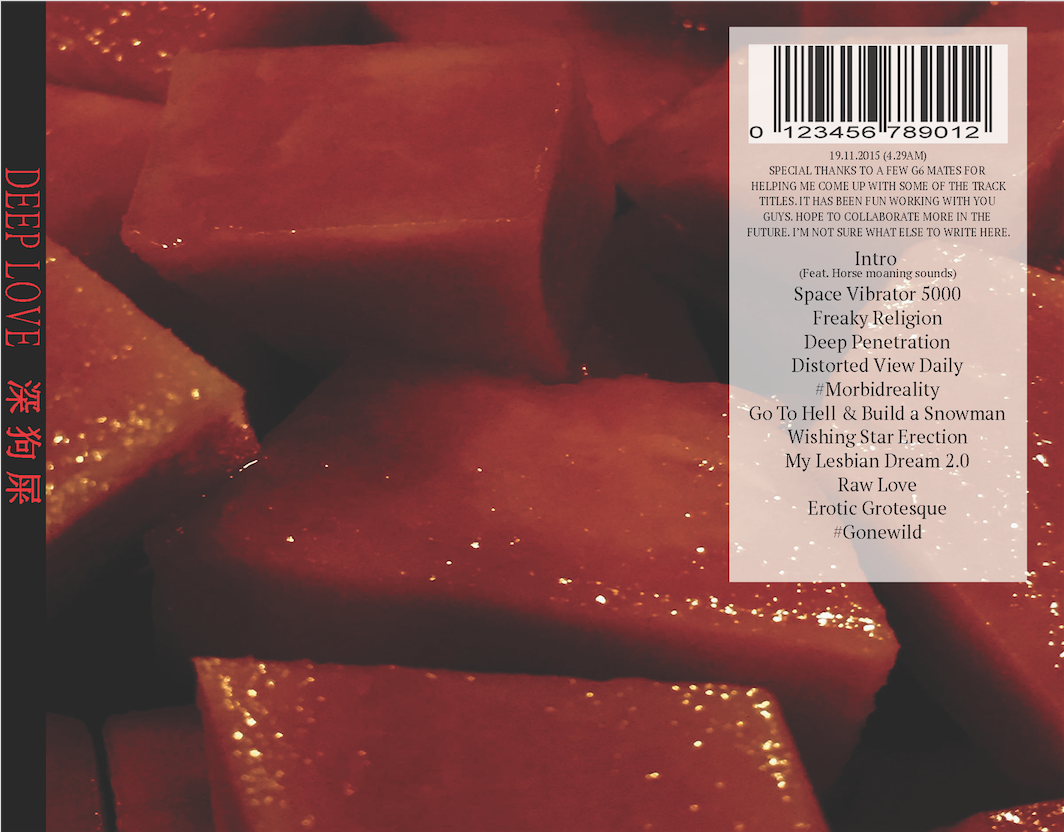
As for the back cover, I used this image of cut papayas I took a few months back. I edited it to look really saturated to convey the raw feel and make it seem almost like blood and flesh. Anyway, the back cover will not follow the square format since its another extra thing I will be printing to add on to the CD concept (the things I do to myself sigh)
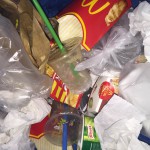
Next up, what does Fascination and Love lead to?? Me as a Basement creep and we all know what basement creeps are usually seen as so I went to collect some trash (mainly food and tissues), dump it all in a bin, took a shot and edited it to make it look as raw as possible.

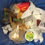
Original image before editing, chose this after a few attempts.
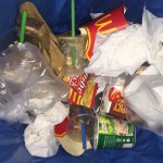

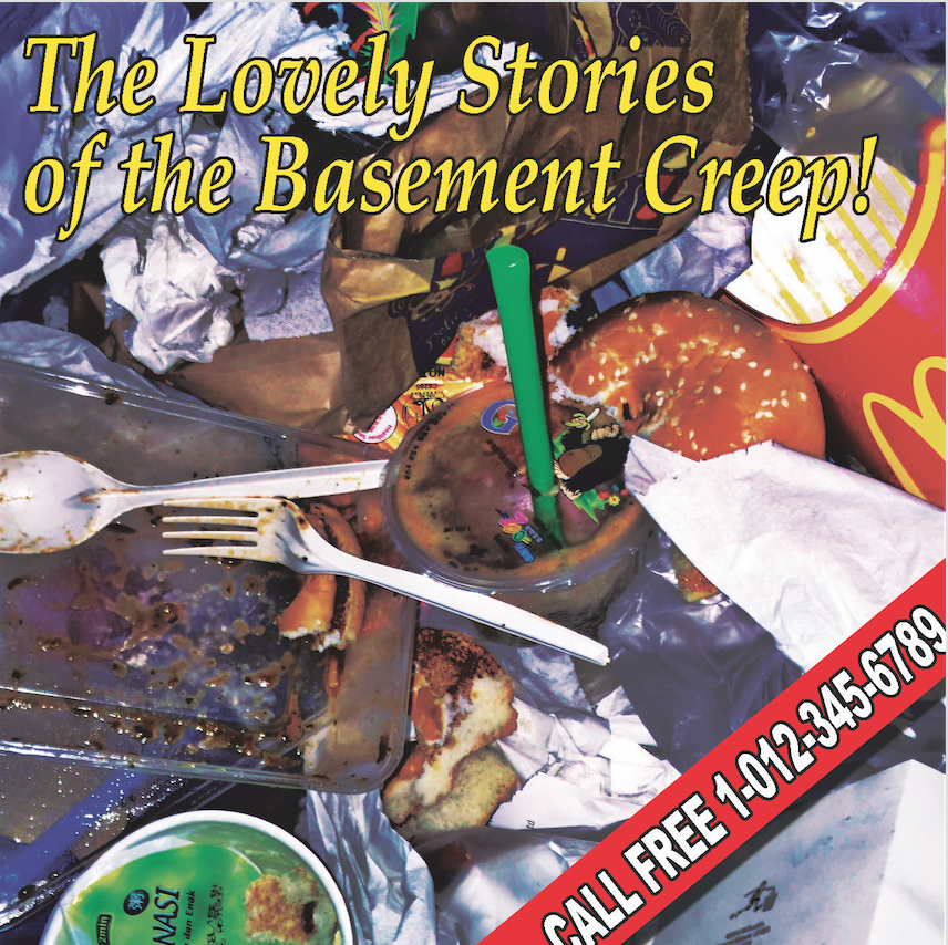
I tried to make it look like bad pizza advertisement or some menu from a cheap Italian restaurant.
*googles bad advertisement design*
Ego: A Better Me
 Link to Pinterest Board: Ego: A Better Me
Direct (True to self) – Need to conform (blend in) = Raw Self
For the album on being True to self, I plan to based it on some 80s pop album cover since they had really bold designs and at the same time most of them had a collage effect. I also like listening to 80s pop whenever I felt high and it just gave me a lot of confidence to be myself.

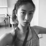
I started out with this strange selfie of mine (I’m still quite disturbed as to why I did that but oh well it looks fun enough for an 80s pop cover), then I cut it out and added in the basic elements. To ensure everything blended well with each other, I used some slight motion blur and added noise so that the elements seem as if they were all of similar resolution. The rest is just experimenting with the exposure, order of layers so see which fit best, with and without the green frame. I added in the hearts emoji for added cheesiness and to contrast with the straight edges and lines.


For the album on the need to conform and social insecurities, I wanted to create one that contrasts with the “true to self” album, which means to be very reserved rather than bold and much more organised. I was thinking of Shoegaze albums as that’s what I tend to listen to when I feel down and not completely there.


I started out with this selfie and to show how awkward I was, I decided to crop out half my face and use one of my monoprints from the first assignment. I like how this monoprint had this gradient effect which gives this uncertain feeling as well. The main challenge with this composition was how to blend the roman pillar in with the rest of the images. I played with the cyan, magenta, yellow levels to achieve the chromatic effect and used motion blur to create the blurry effect which goes with the idea of not being entirely there. The roman pillar represents order and is placed in this very strange composition to show my incompatibility with order yet desire to be part of it at the same time.

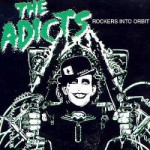
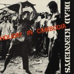
As for the album about the raw honest self, I intend to go for a punk album inspired look since punk was about the bare necessities and being able to create music based on knowing a few chords and without the glitz and glamour of 70s glam rock or even 80s pop. Punk bands have a very raw sound and direct lyrics that just get to you immediately so i thought it would be fitting this album. Took inspiration from some of my favourite bands like The Dead Kennedys, The Adicts…

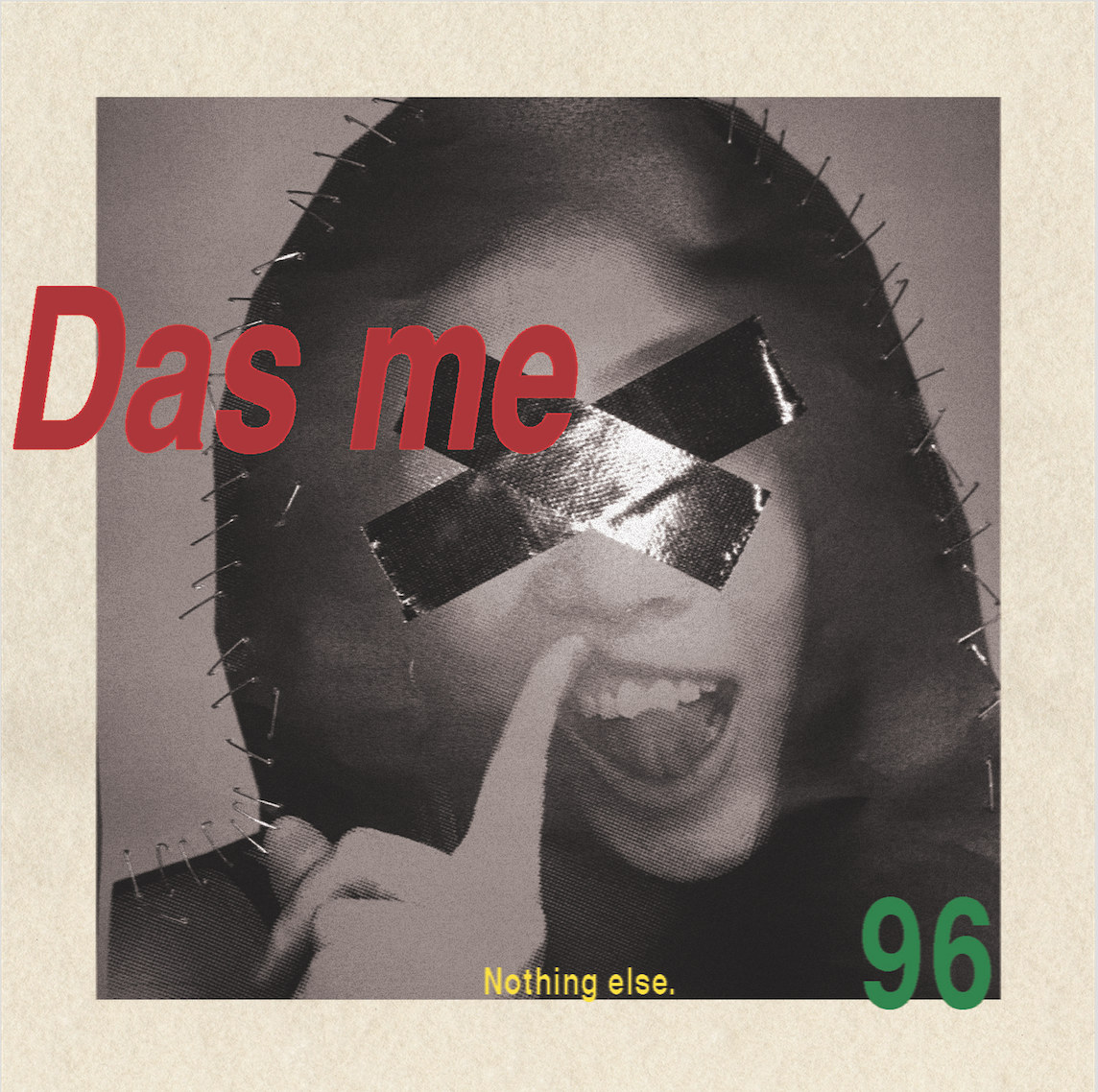
I edited this photo of myself, printed it out, used staple bullets and duct tape to evoke the stereotypical punk look…but then again punk can be shown in many ways so I decided to opt for some other look instead of the conventional one.

I used the same picture but decided to not rely on pink but just the placement of fonts. I was partially inspired by German magazine designs so I went with standard Helvetica and deliberately put the Das me out of frame in a really awkward position. I also made it as simple as possible and added “nothing else”. and that was my interpretation of a somewhat punk look.
Ego: An Ideal Me
 Link to Pinterest Board: Ego: An Ideal Me
Cool x Weird = Cool Freak
For the cool album, I looked at indie pop album covers since they were what’s trending at the moment.
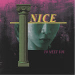
For the ideal me, I initially wanted to do a combination of cool and weird but as I thought about it further I realised it would be quite impossible to truly create such a combination since one would definitely overpower the other and the whole thing may just look quite pretentious. I mean I actually thought of doing a weird album disguised as a pop album but that idea has been done before quite a few times such that it now sounds quite pretentious?? (The 1975’s Love Me is one recent example) I decided to just portray that feeling of being incomplete instead.

I started out with that same selfie (I feel really uncomfortable taking any more for this project so yeah same one), halftone the image and played with the hues, tore it apart, put it back together again using duct tape in a messy fashion before editing the whole thing on photoshop again. I deliberately made the word incomplete out of frame cause incomplete (LOL okay) and pinched the eye to foreshadow the melting in the following series.
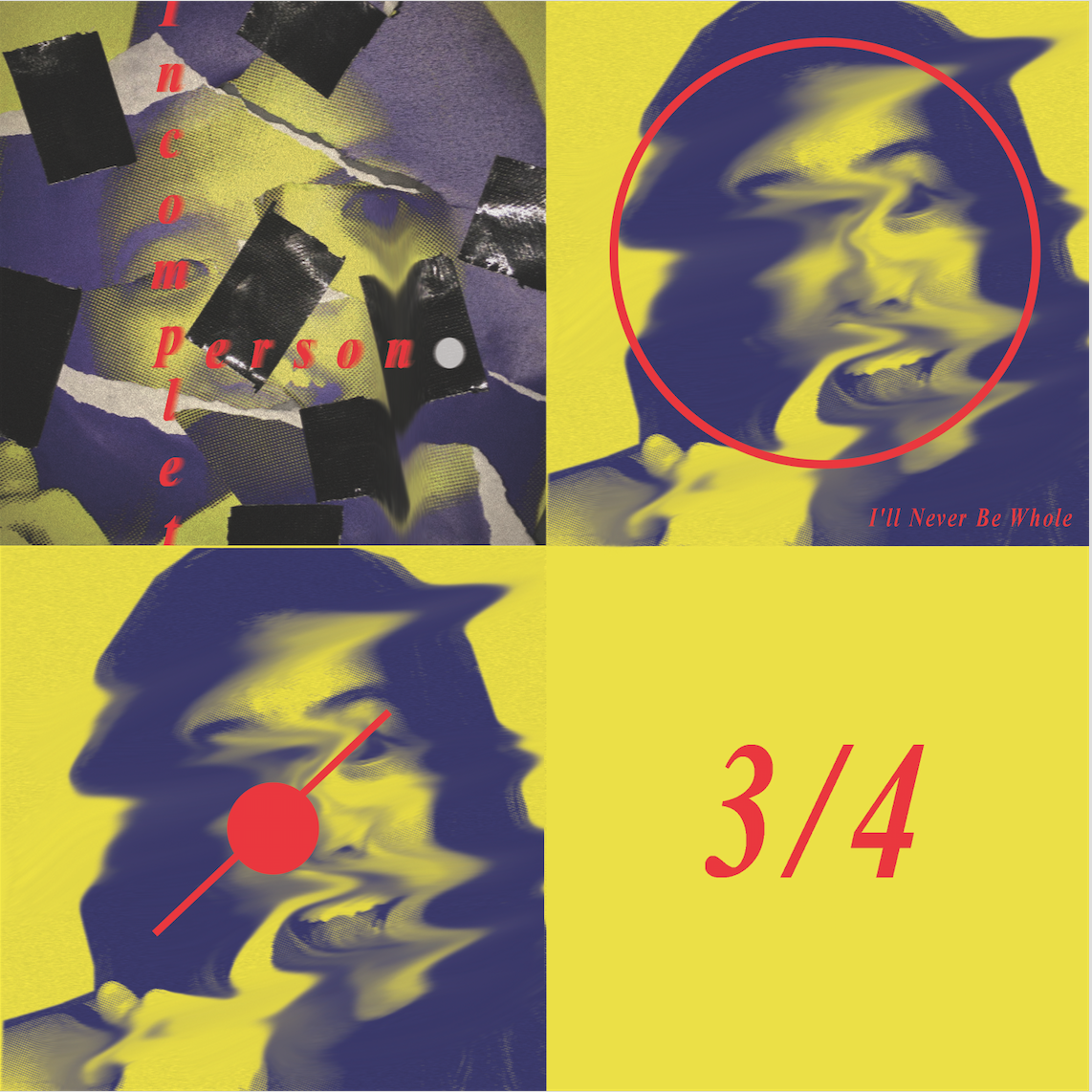
For the inside cover, the melting is now more full blown and I played with the contrast between the complete circle and my melting face to show how I’ll never fit in the “circle” which I see as complete and the complete human being. I went with 3/4 cause of the division of squares and adding in a fraction makes it all look quite mathematical and almost mechanic and cold as I see myself melt away slowly.
Ego: Me in 5 Years
 Link to Pinterest Board: Ego: Me in 5 Years
Everything that I am – Rush of Youth = Emptiness (blank slate)
more like fear of what I might become in 5 years…
However, when I re-looked at the other squares I realised that doing an album based on everything that I am will probably end up looking like a repeat of the first series so I changed it to
Minimalist + Rush of youth = Emptiness (blank slate)
For the minimalist, I did a rather sarcastic take on it since I was not very fond of the style. I understand it has its own beauty but when the style becomes ubiquitous such that it loses its original shine…it starts to become kind of irritating and even ridiculous..
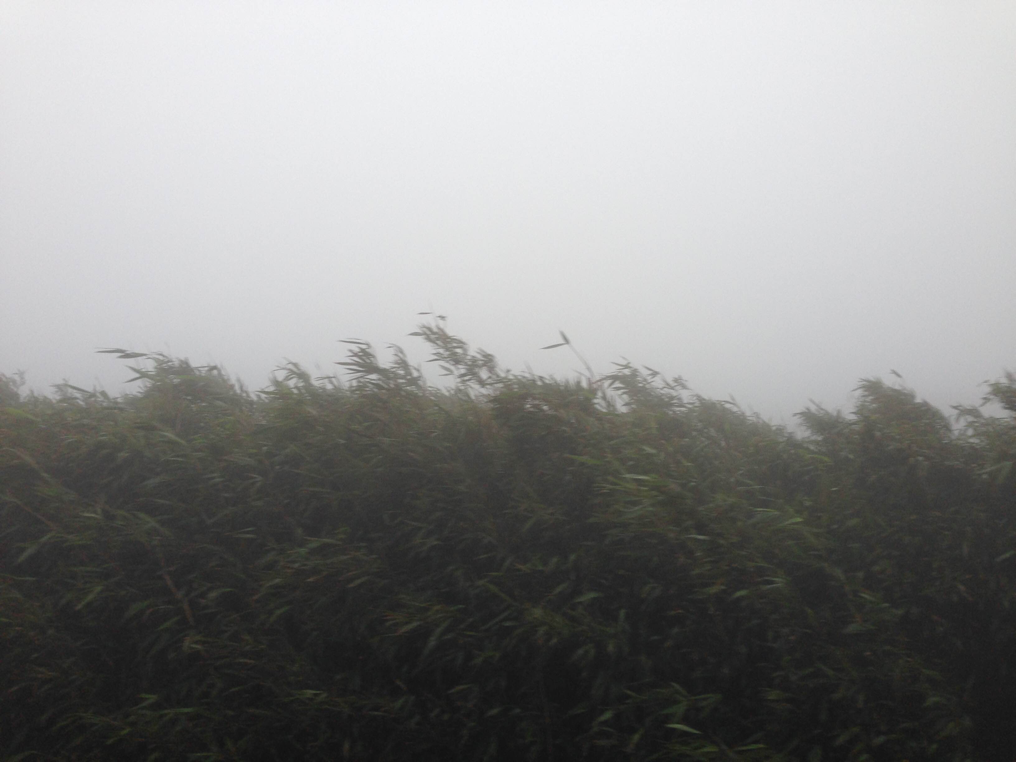
This is the original image of some bushes/trees/ferns I captured on some foggy mountain…seems like something suitable for a minimalist indie album cover so…
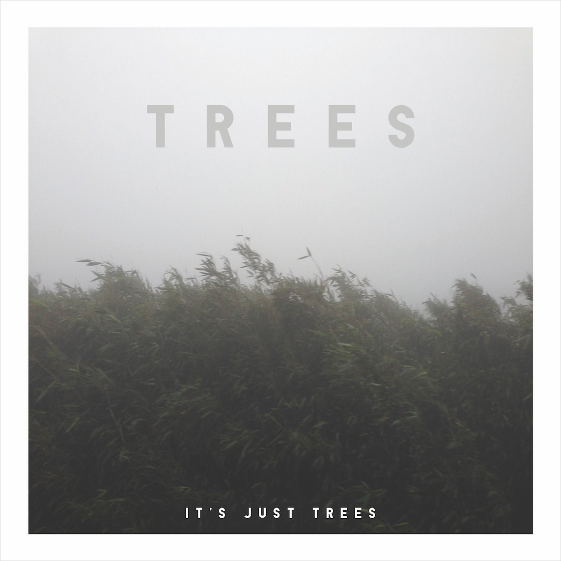
Strange enough, photos like these get lots of likes on Instagram yet if you think about it…it’s just bushes or trees…seriously…and think about how much effort went into making this design…I honestly don’t mind revealing that I put in little effort for this square since its part of the overall concept so even such designs are still important.
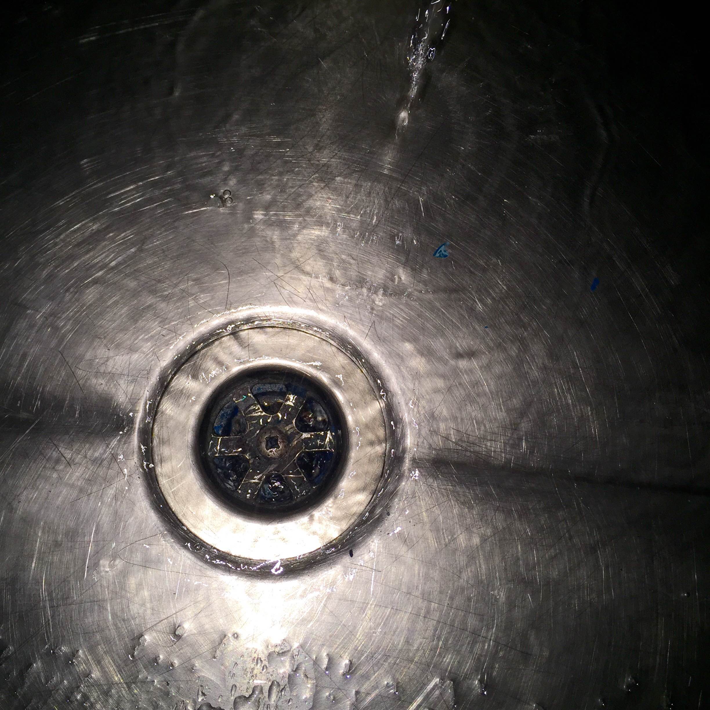
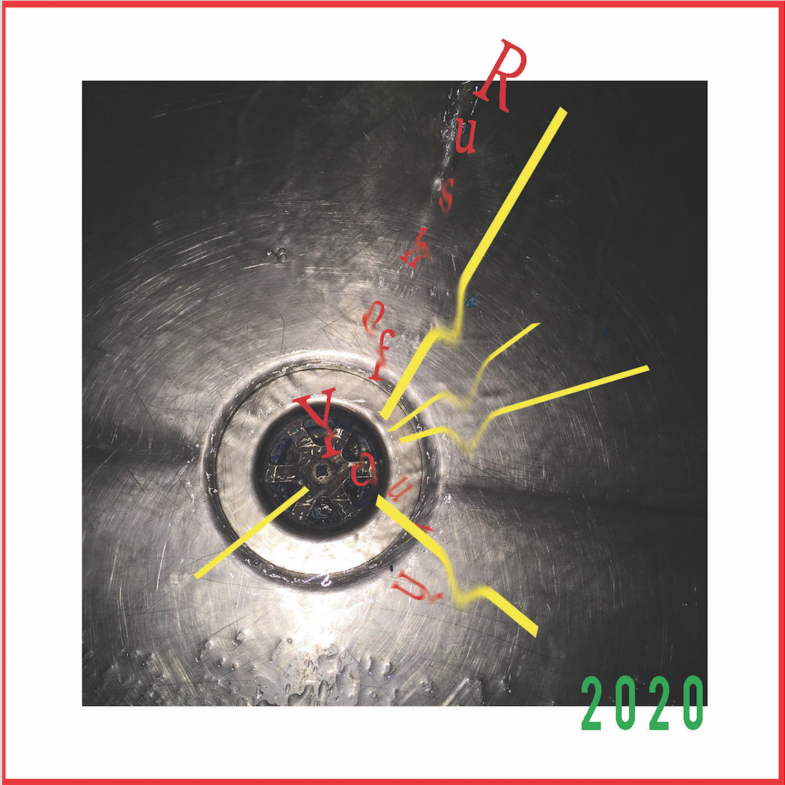
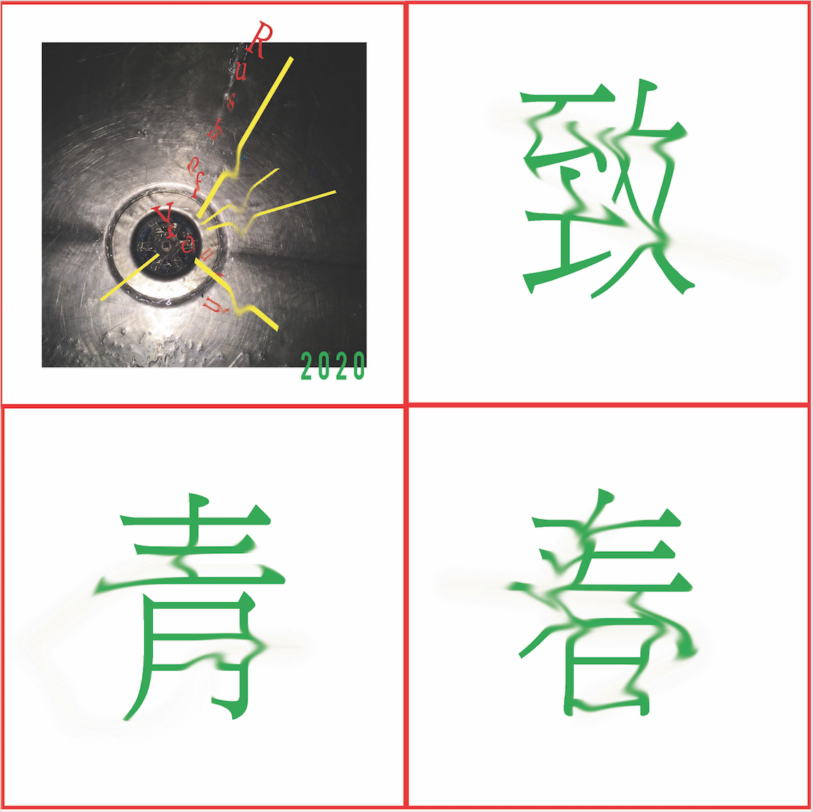
For Rush of Youth, I had the idea of wanting to show something being drained away or sucked away yet at the same time keep a very minimalist design to show the gradual loss of style as I progress (fear in 5 years). I started with this photograph I took of a sink in the 2D monoprint room.

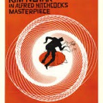

As for the design, I wanted to try added lines in a circular motion after looking at the effect it created in the Peeping Tom poster. I also thought of going for the circular motion effect as seen in Saul Bass’s famous Vertigo poster and one of Hannah Hoch’s collage where the text goes in a circular motion along with the character to reinforce the falling effect. The lines of building contrast nicely with the circular motion and add to the effect of vertigo so i wanted to try something similar.
As for the inside, I was inspired by Faye Wong’s song so I added in the words 致青春 and used the pinch tool to drag it out and make it look like its melting away.
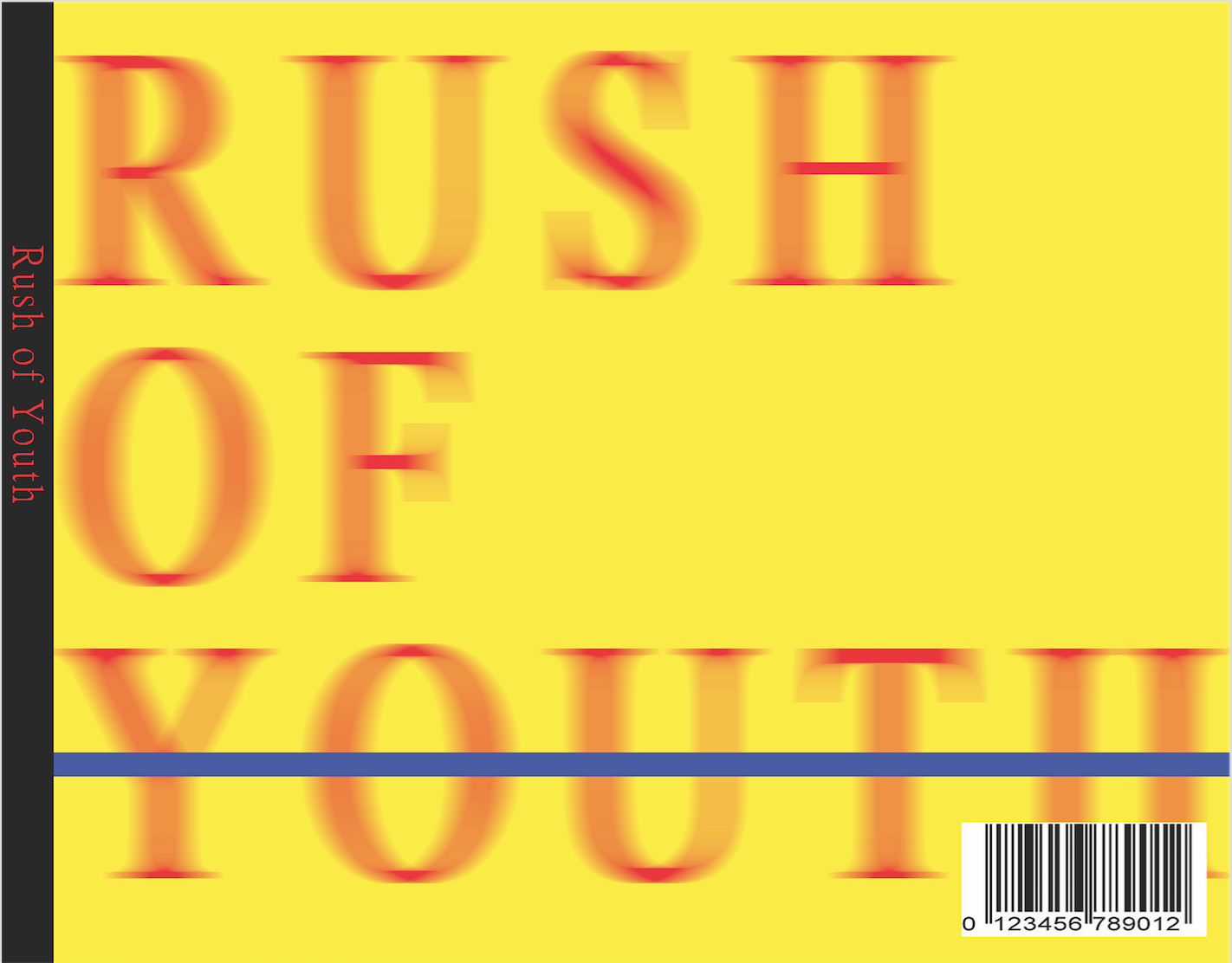 For the back cover, I played with the motion blur took again to convey the effect of rush while the sudden blue line strikes the words youth out to create a jarring effect, a harsh reminder of youth being erased.
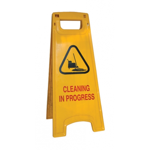
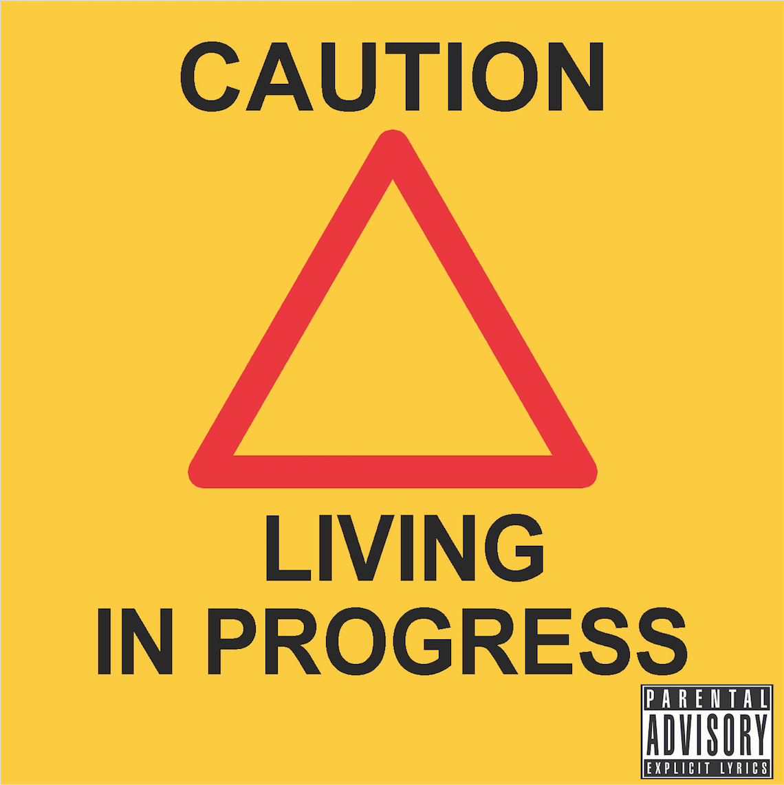
For the last one as I reach the final state of emptiness in 5 years as I fear, I based it on the design of the standard cleaning signboards.
I thought of adjusting the hues at first but decided not to in the end, since the idea here was to have as little artistic touch and creativity as possible so I just ripped the design and made it my own. The process showing just how drained of creativity I fear I might become. Moreover, I felt the usage of the cleaning board design should relate directly back to the cleaning board due to my cleaner past rather than to manipulating it “artistically” and having too much focus on its design. Basically, the subject matters more than the design for this last piece.