Artist research: Craig Atkinson

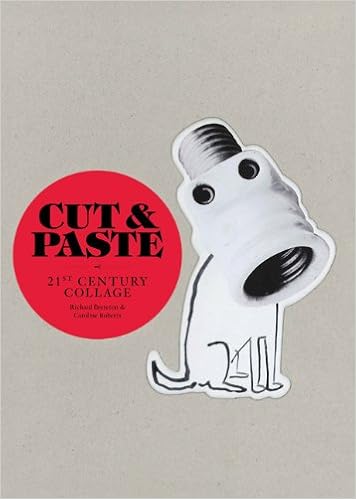
So as previously mentioned, I went to the library to read up on a few graphic design books 2 weeks ago and I chanced upon one called Cut & Paste: 21st Century Collage by Richard Brereton and Caroline Roberts.

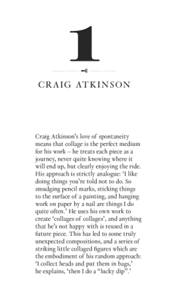
One artist from the book stood out to me in particular and that was Craig Atkinson.


Cut & Paste: 21st Century Collage (Retrieved from: http://www.amazon.com/Cut-Paste-21st-Century-Richard-Brereton/dp/1856697177 on 1 February 2016)

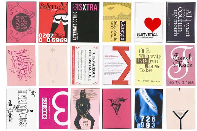
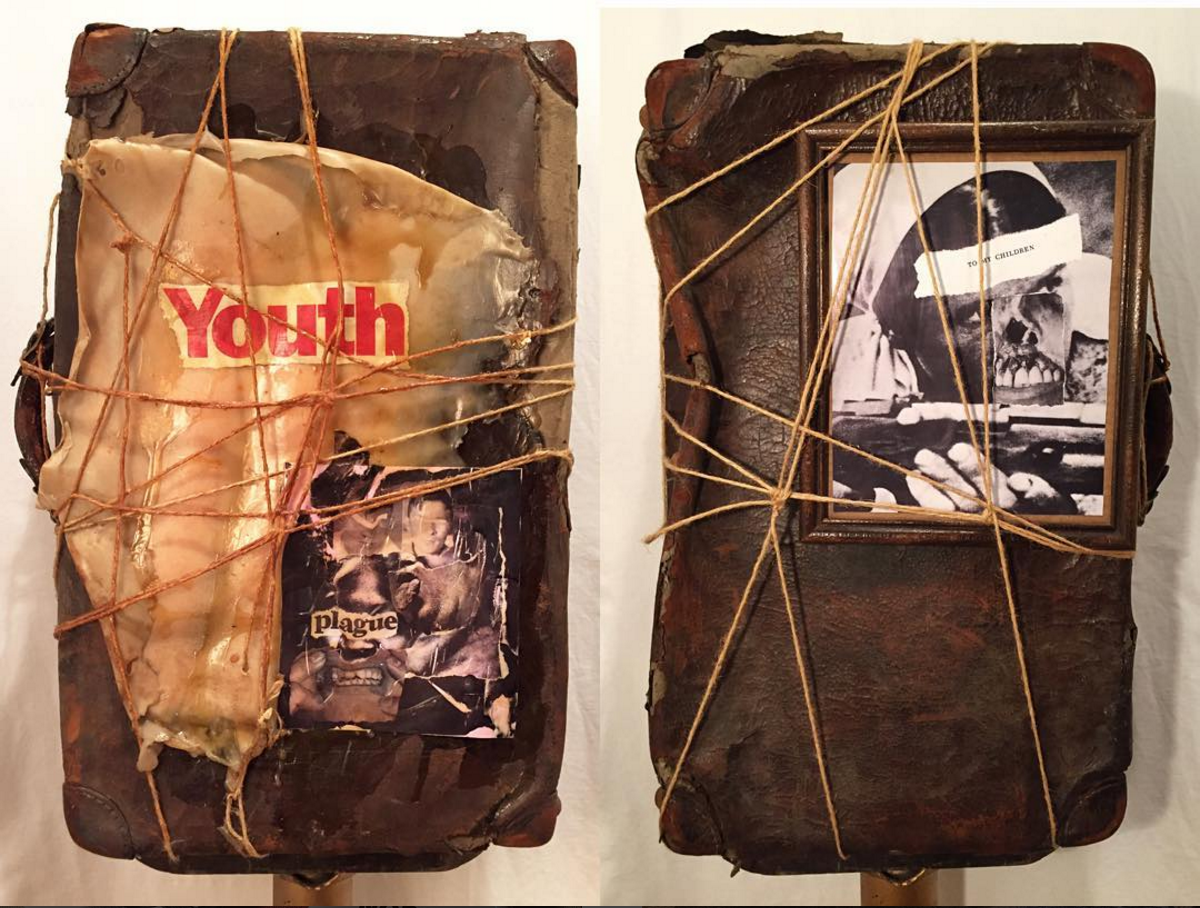
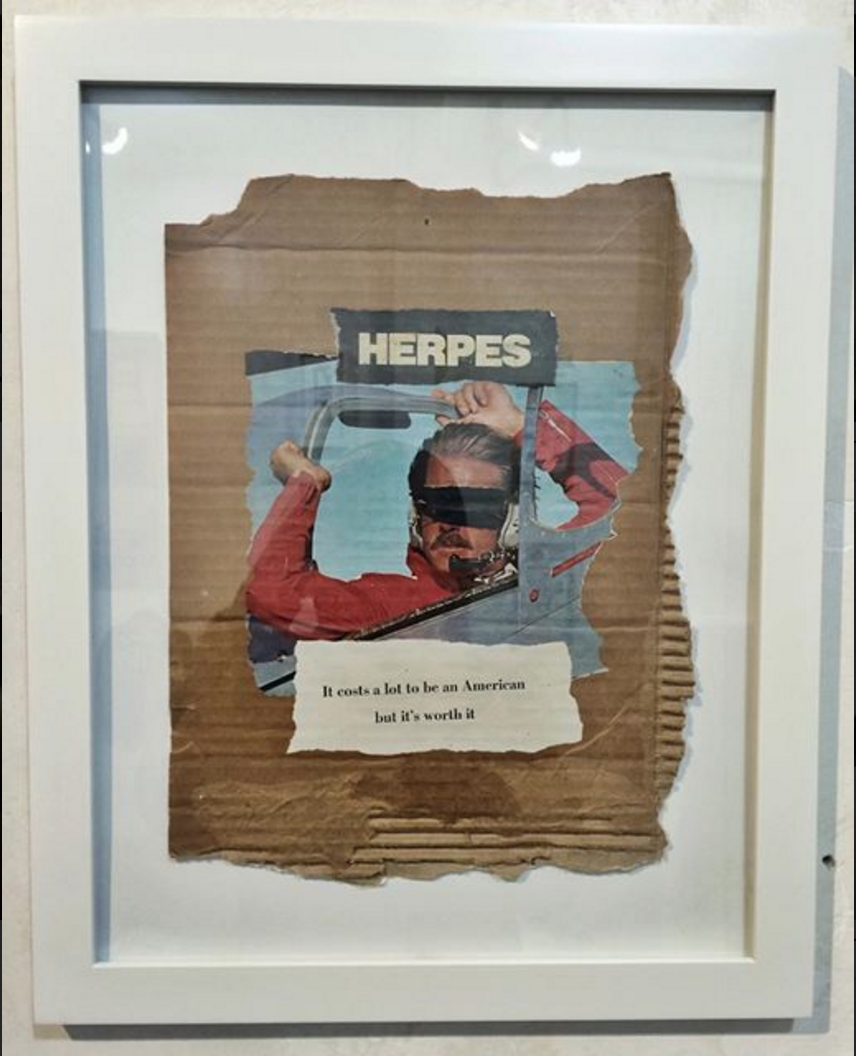
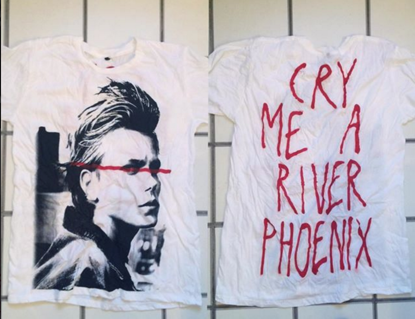
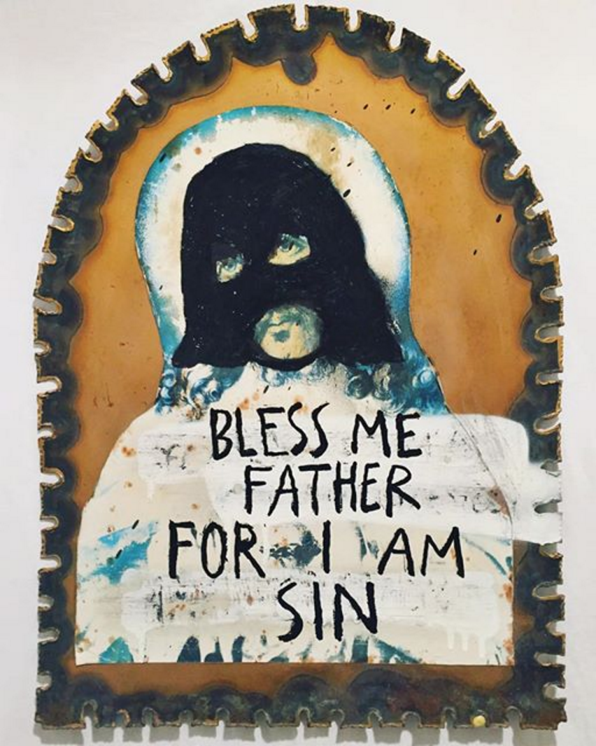
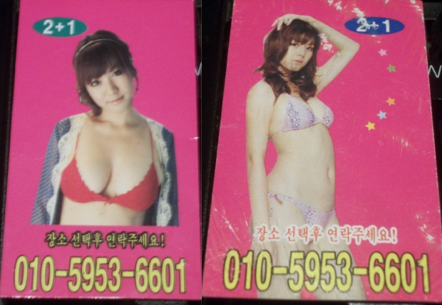
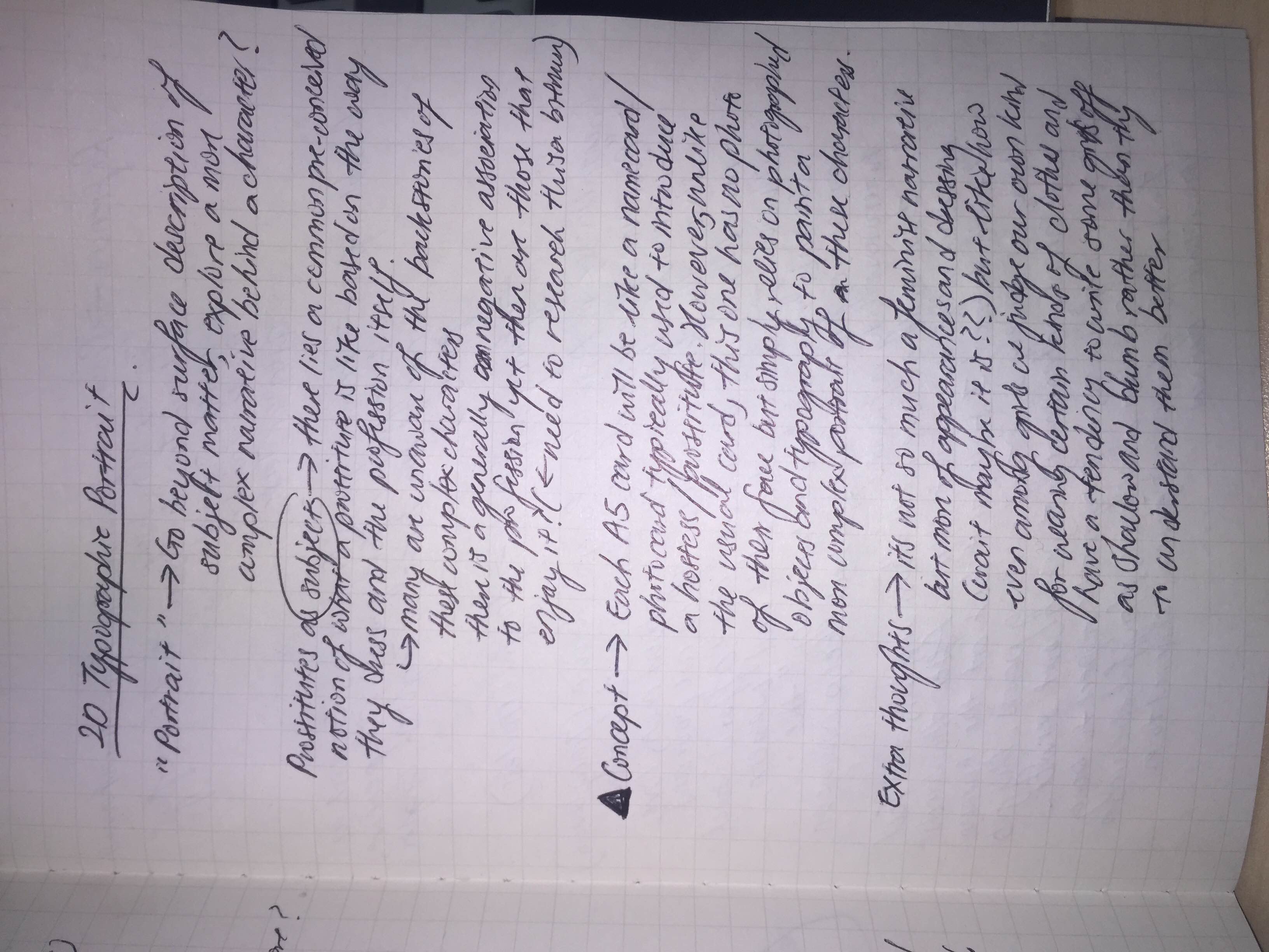
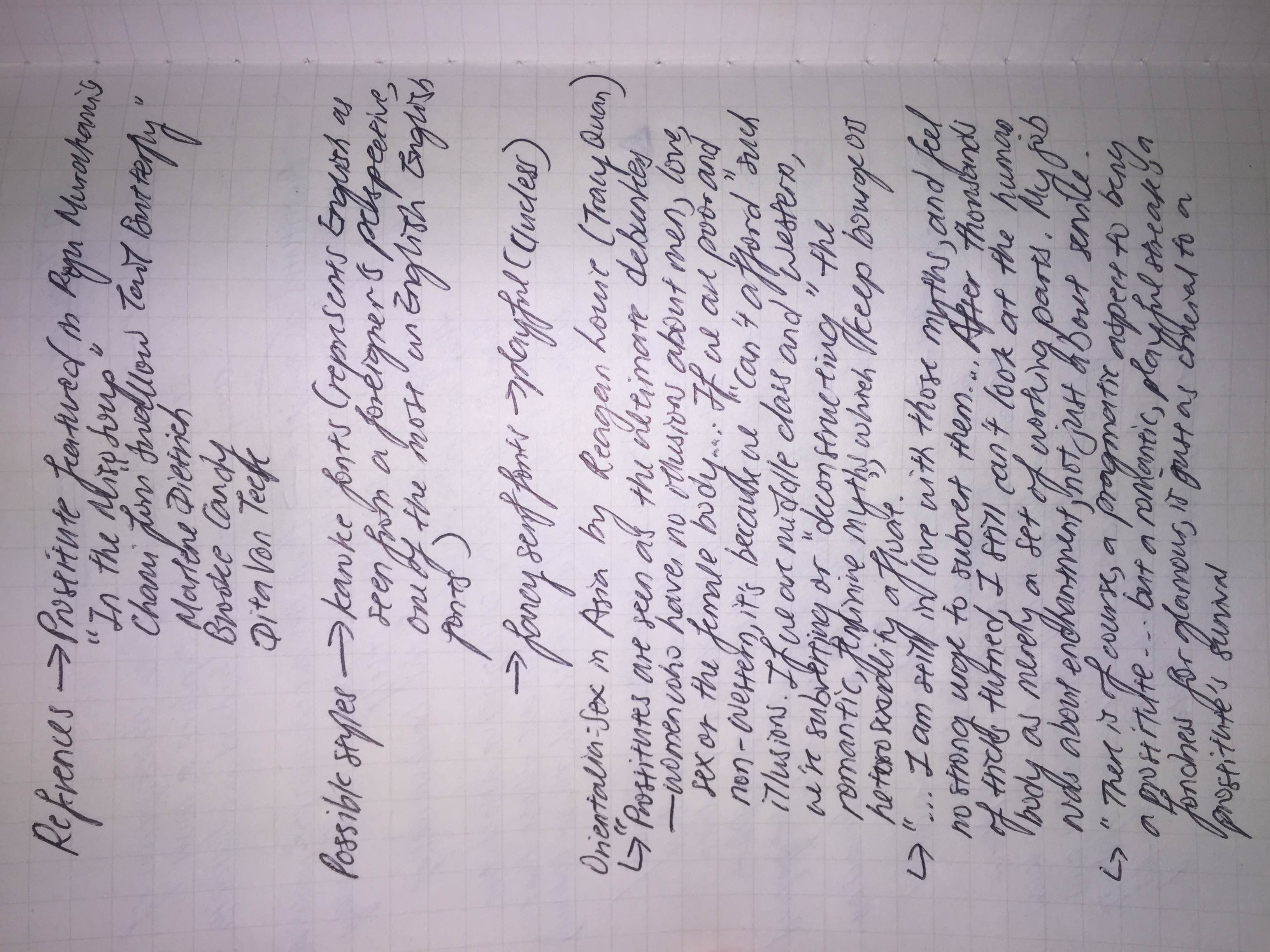
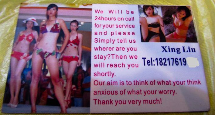
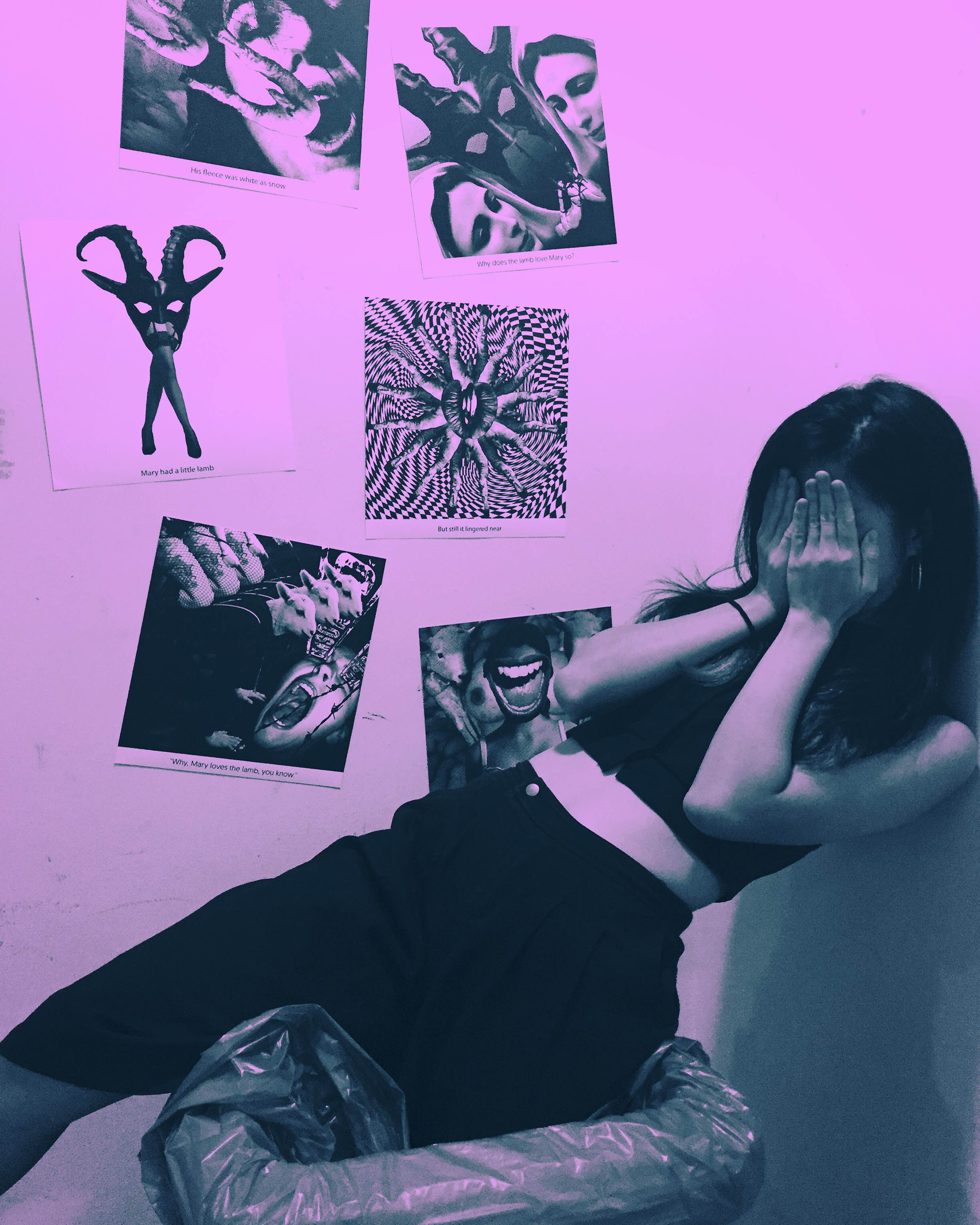
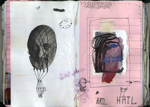
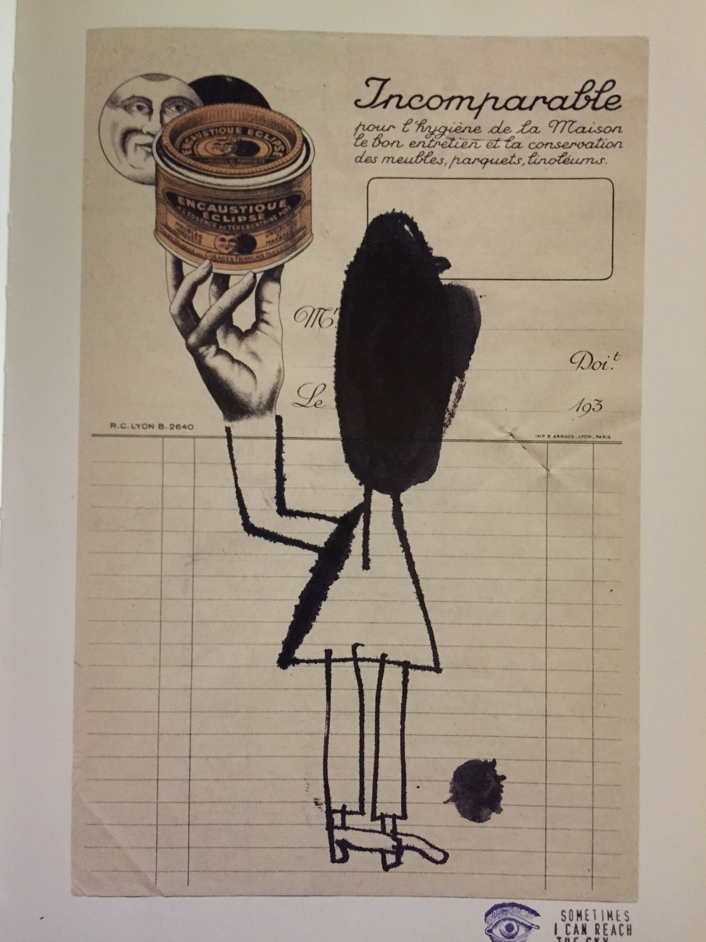
Similar to Concannon’s work, I love the raw and immediate effect of Atkinson’s collages. The slightest details such as the tearing, crumpled marks and almost kiddy-ish lines are really appealing especially when juxtaposed against a background of a photograph or a found object. It contains a sense of fun, the kind when you doodle on a newspaper or your air ticket. It feels very honest and spontaneity parallels those of old school tart cards (they were usually handmade to save cost) and concert flyers. I intend to carry this spontaneity into the tart cards I will be making rather than make it a clean cut typographic tart card like those in the London 2009 competition as I believe while I am constructing a narrative using typography, I should not forget the subject I am working with and the overall look should reflect the background of a prostitute at the end. Then again, I may choose not to have this look for all as some prostitutes do come from well-off families so a more formal look may suit those cards better. (okay I feel like I’m just rambling here…it’s late I should sleep…)

I intend to work with materials that can be found with prostitutes or are easily associated to them and their backstories.

I understand this isn’t a very complete research so I will update this post further when time permits.

Research into Tart Cards

It appears that there is a proper name for cards advertising prostitutes and in the UK, the term would be tart cards. (Before that I was just googling “photo cards” “name cards”…amateur pfft wished I had researched a bit more into this hours ago) Tart cards were often found in London’s telephone booths in the past and now with the internet and they are less used and instead regarded as a kind of accidental art with a cult following. While reading the article on tart cards in Tel Aviv, I came across this tart card design competition held in London in 2009. This is really a great reference point on how to incorporate typography and suggestiveness into the tart cards I will be creating for this project. However, I will need to work on how to add an additional meaning to the tart cards beyond the suggestiveness to construct a more wholesome narrative going beyond their sexual profession. I will most likely be going for something similar to James Concannon’s image + text style and Craig Atkinson’s cut-and-paste spontaneous stye so the final product is not pure clean typography but a combination of messy collage and typography.

A tart card competition at the St. Bride Library in London in 2009. They explain: We would like you to design a tart card either for a typeface or a letter of the alphabet. If you are unfamiliar with these things, tart cards are the means by which London prostitutes advertise their services. Step in to any Central London call box and you can contemplate up to eighty cards inviting you to be tied, teased, spanked or massaged either in luxury apartments, fully-equipped chambers or the privacy of your own hotel room. So pervasive are these things, and so curious is their typography, images and copy writing they are now regarded as bona fide items of accidental art and have something of a cult following. Once on the periphery of design, the cards have influenced the work of many mainstream artists including Royal Academician Tom Philips and Sex Pistols designers, Ray and Nils Stevenson. Perhaps they can inspire you too?  (Retrieved from http://luc.devroye.org/fonts-50682.html on 1 Februrary 2016)

Old school tart cards have also been linked to the punk aesthetic which just makes me more excited to work on this project.

& it would be great if I could get my hands on this book…


Artist Research: James Concannon

I am so excited to type this post cause just yesterday I discovered an artist named James Concannon while scrolling through Instagram and he could quite possibly be my favourite artist of all time.

I love everything about this guy…the fact he uses garbage, trash to make art and the way he assembles them in that particular DIY punk style without having to resort to glitter tactics to make them look good. It feels soooo immediate and raw (like body fluids pls) and the final image created is always so strong and visually appealing (at least to me).

I love how he just tears photographs, cardboard and puts them together in such a raw fashion. (I think I’m starting to use this word a lot…) and the how he uses DUCT TAPE OMG YOU HAVE NO IDEA HOW HAPPY THIS MAKES ME FEEL…I LOVE USING DUCT TAPE!!

Screen Shot 2016-01-31 at 8.32.00 PM

Most of his works are critiques of America and he makes many references to pop culture. While this does not make him a particularly unique artist, considering how so many artists love criticising the american society, its his manner of presentation that keeps me interested in his work. It is clear that his style is probably derived from the punk movement of the 70s but his choice of materials allows him to stand out from being simply associated with the general punk aesthetic. Typographic elements also become a very important feature in most of his work, adding a new meaning on top of the imagery created by the materials alone.

Screen Shot 2016-01-31 at 8.31.38 PM Screen Shot 2016-01-31 at 8.30.51 PM

Screen Shot 2016-01-31 at 8.40.57 PM Screen Shot 2016-01-31 at 8.40.31 PM Screen Shot 2016-01-31 at 8.39.36 PM Screen Shot 2016-01-31 at 8.38.40 PM


New Hostess Club Opening Soon~

I have to admit the past 2 weeks I didn’t really have much of a concrete idea of what to do…all I did was go to the library, borrowed books on 80s graphic design, concert flyer designs, old chinese label designs, cut-and-paste graphics…basically types of designs I was interested in but still I wasn’t really sure how to put them together…(will do a separate research post on those books)

and then the night before last week’s lesson, I still had no idea what to do and with limited time on my hands, I grabbed some materials and arrange them to create this…

Screen Shot 2016-01-31 at 7.16.15 PM

Not the most appealing but I sense some idea behind this…I went with the intention of playing with contrasting materials and meaning when added together. I also like making things look tacky so there’s the “Baby” and fake gold chain. It represents a collection of materials associated with a type of girl…one that scrubs floors, where dirt and trash is part of her everyday life (she doesn’t have to necessarily be a cleaner or dishwasher but just someone who doesn’t have a very glamorous job) but at the same time craves glamour and a dreamy love life. Not sure if it shows but I thought it would be interesting to explore duality in female subjects where both glam and trash meet which brings me to my next idea…

I shall do typographic portraits on prostitutes/hostesses/strippers! Each A5 card will be like a name card of each of the different females so in the sense I will be presenting it in a mock hostess club setting. Usually name cards introducing the females will be like those in the above photo where a photograph of the female and a number to dial is presented but for this project, I will be using typographic design elements to represent them instead. This will allow me to present a more complex identity behind these females instead of just surface level representations. Still, I would like to keep the concept of a name card so I will need to think of how to incorporate name card elements in along with the designs.

IMG_9416IMG_9417IMG_9418

I took reference from Orientalia: Sex in Asia by Photographer Reagan Louie for some ideas to construct the different narratives for each female.

Contrary to most books about females in the sex industry, her book’s emphasis is not on the graphic lurid images of females in various poses but features their life outside of prostitution as well, show that they are just like us, some being daughters and mothers as well. I think exploring the different identities of prostitutes/strippers/hostesses is interesting due to their prevalence in almost any country. Yet, they cannot be simply be generalised under one identity given their different backgrounds and reasons for entering the industry (be it for pragmatism or simply pleasure). This gives me the opportunity to mix design elements from both east and west, classy and kitschy, formal and messy.

Another idea that I am keen to explore through this project would be how some kinds of fonts can represent the English language as seen from a foreigner’s perspective. Some obvious ones would be having narrow Arial font with a much wider than usual kerning like the above or having really light serif fonts with a lower value of kerning. I see this as a way to touch on the topic of exoticism present in the sex industry as well.

Some further reading for myself hoho:

The Tart Cards of Tel Aviv

https://medium.com/@sarahsouli/the-tart-cards-of-tel-aviv-547f5a564ace#.1nuk8u4i6