
“Come on, its only History of Ancient Chinese Architecture! I grew up with ancient architecture next door!”
There are 7 posts filed in My Work (this is page 1 of 1).
“Come on, its only History of Ancient Chinese Architecture! I grew up with ancient architecture next door!”
This research assignment encouraged us to dig deeper into typefaces, and why and how they were created. We are exposed to so many typefaces daily, and we usually don’t stop to think about how they came to exist. It was interesting to learn how the conceptualisation and development of a typeface – in our case Helvetica – was so closely interlinked with the social and visual culture of the period from which it originated. It’s never occurred to us that typefaces can accurately capture the zeitgeist of the era in which it was created, especially such a seemingly modern and minimalist typeface like Helvetica.
Sem 2 AKA Return of the TRA$Hbin
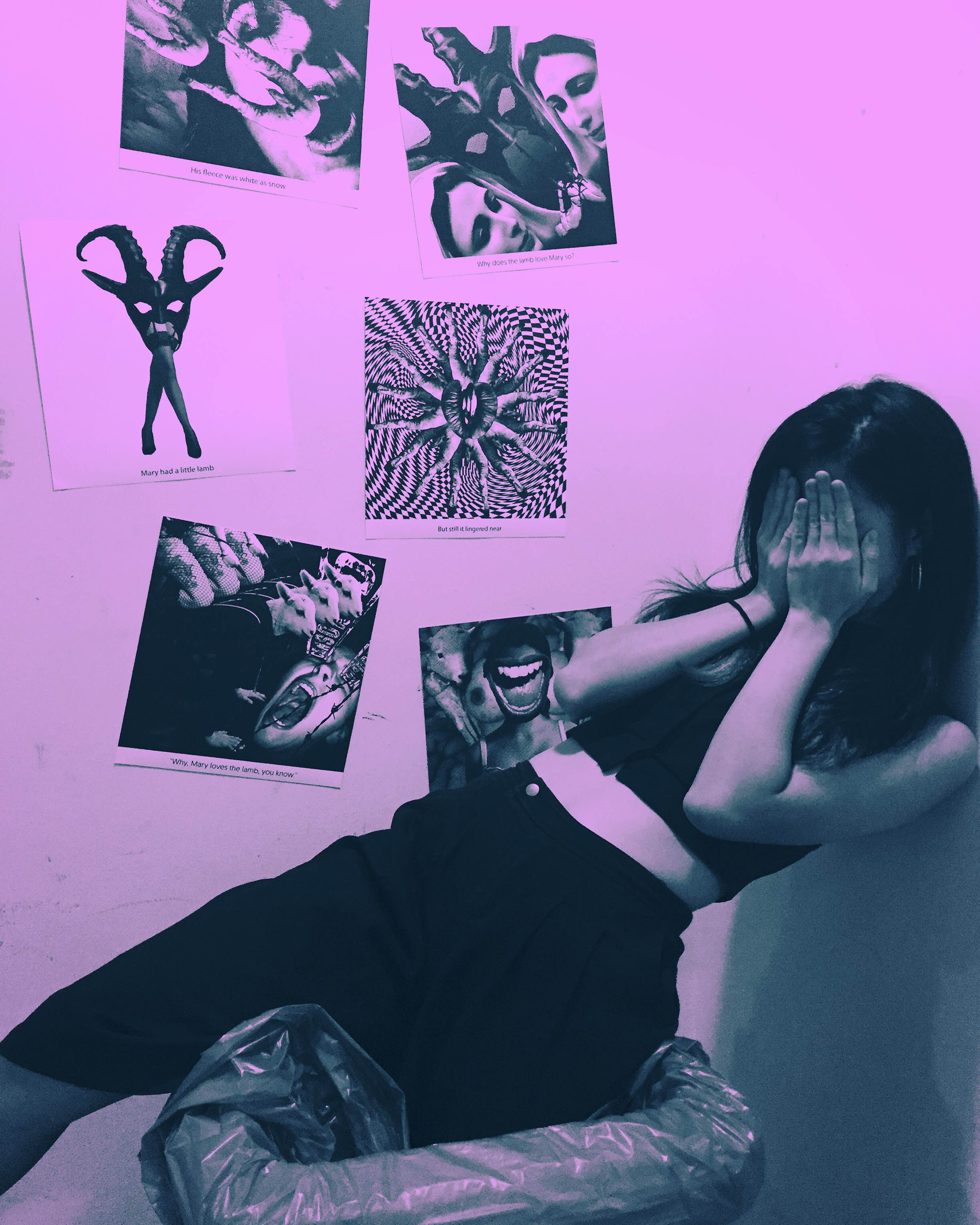
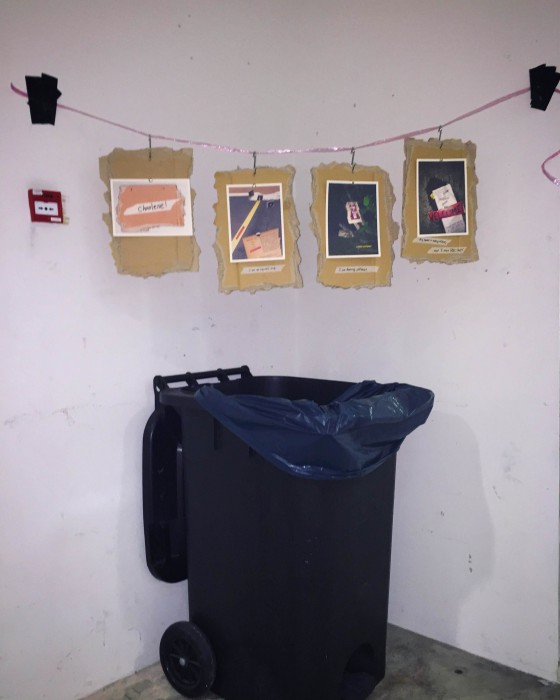
My final series may be the most confusing thing cause a sudden change in ideas resulted in me dropping quite a few supposed “finals” and creating new “finals” on the spot. Anyway, I guess its for the better that I dropped the prostitute series since it fits better with the next assignment (hell, it’s actually made for the next assignment!). So the concept I had for this series ended up being about a typographic portrait series of how I felt now (aka while doing the project) and I wanted it to be really raw looking and spontaneous so the set-up looked like I just hanged them up like I was hanging laundry (complete with raffia string and metal hooks) but for added trashiness, over a the garbage bin! Okay, on a more serious note, it was for added context too since I wanted it to look like it could belong anywhere you find on the streets like even when you take out trash you will see it. I like direct expression so I admit it was cheap, no frills, no fakery, and it was done quickly. At the same time, I want it to look like anyone can do it (find a random piece of cardboard or rough paper lying around and just write out what they feel) but its a matter of whether you choose to or not so its sort of like encouraging people to express themselves directly too?? I knew that corner had bad lighting since the light there died but I guess it was even better, it’s not gonna be glamorous so nahhh I don’t need the lighting. I just felt since I was expressing how I honestly felt in that short moment, the set-up had to reflect that too.
WARNING LONG POST CAUSE I NEED TO EXPLAIN MYSELF
So as previously mentioned, I went to the library to read up on a few graphic design books 2 weeks ago and I chanced upon one called Cut & Paste: 21st Century Collage by Richard Brereton and Caroline Roberts.
One artist from the book stood out to me in particular and that was Craig Atkinson.
Cut & Paste: 21st Century Collage (Retrieved from: http://www.amazon.com/Cut-Paste-21st-Century-Richard-Brereton/dp/1856697177 on 1 February 2016)
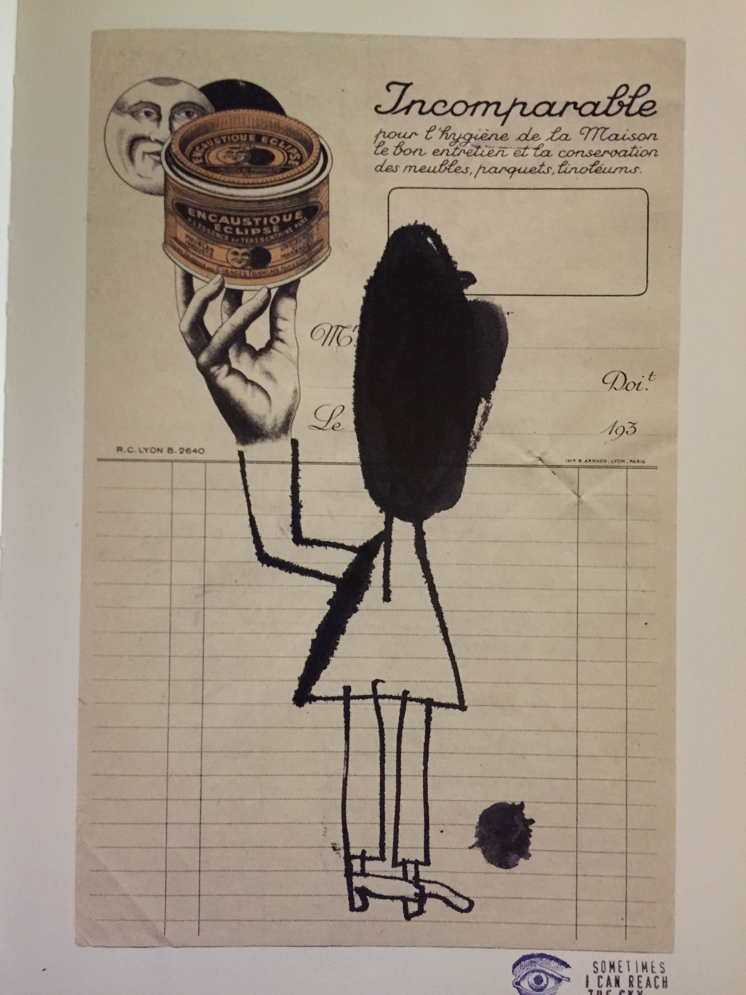
Similar to Concannon’s work, I love the raw and immediate effect of Atkinson’s collages. The slightest details such as the tearing, crumpled marks and almost kiddy-ish lines are really appealing especially when juxtaposed against a background of a photograph or a found object. It contains a sense of fun, the kind when you doodle on a newspaper or your air ticket. It feels very honest and spontaneity parallels those of old school tart cards (they were usually handmade to save cost) and concert flyers. I intend to carry this spontaneity into the tart cards I will be making rather than make it a clean cut typographic tart card like those in the London 2009 competition as I believe while I am constructing a narrative using typography, I should not forget the subject I am working with and the overall look should reflect the background of a prostitute at the end. Then again, I may choose not to have this look for all as some prostitutes do come from well-off families so a more formal look may suit those cards better. (okay I feel like I’m just rambling here…it’s late I should sleep…)

I intend to work with materials that can be found with prostitutes or are easily associated to them and their backstories.

I understand this isn’t a very complete research so I will update this post further when time permits.
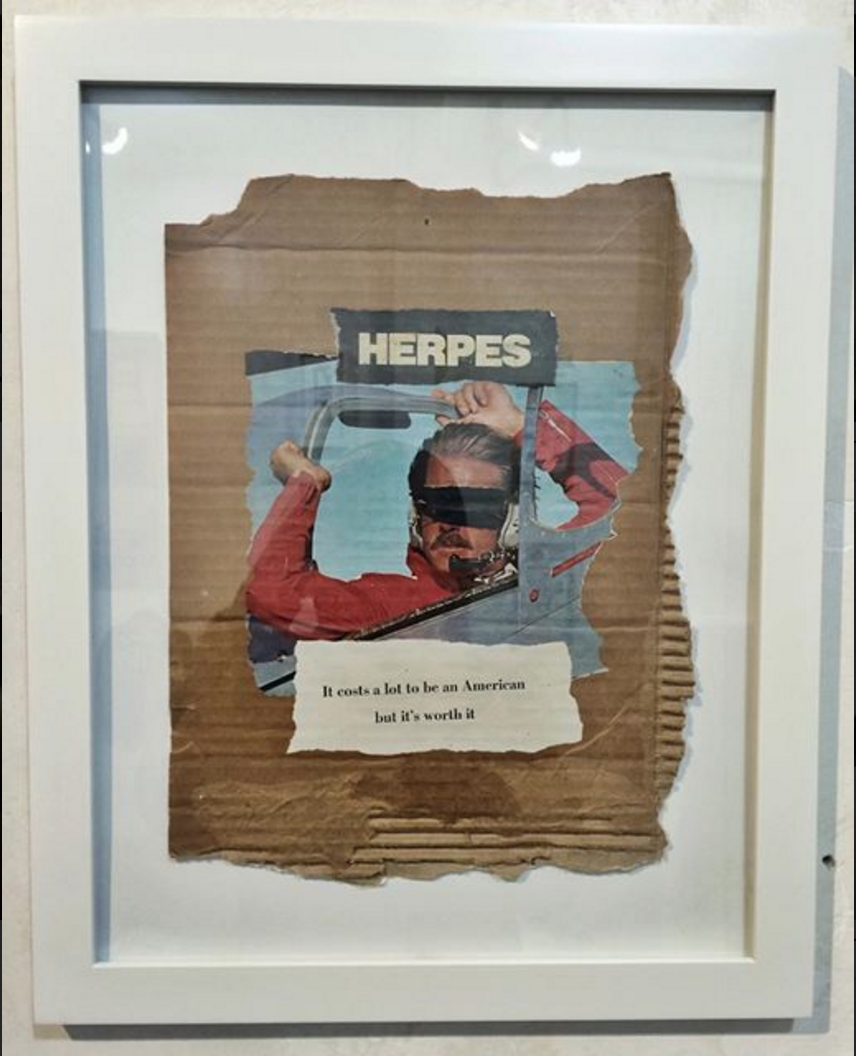
I am so excited to type this post cause just yesterday I discovered an artist named James Concannon while scrolling through Instagram and he could quite possibly be my favourite artist of all time.
I love everything about this guy…the fact he uses garbage, trash to make art and the way he assembles them in that particular DIY punk style without having to resort to glitter tactics to make them look good. It feels soooo immediate and raw (like body fluids pls) and the final image created is always so strong and visually appealing (at least to me).

I love how he just tears photographs, cardboard and puts them together in such a raw fashion. (I think I’m starting to use this word a lot…) and the how he uses DUCT TAPE OMG YOU HAVE NO IDEA HOW HAPPY THIS MAKES ME FEEL…I LOVE USING DUCT TAPE!!

Most of his works are critiques of America and he makes many references to pop culture. While this does not make him a particularly unique artist, considering how so many artists love criticising the american society, its his manner of presentation that keeps me interested in his work. It is clear that his style is probably derived from the punk movement of the 70s but his choice of materials allows him to stand out from being simply associated with the general punk aesthetic. Typographic elements also become a very important feature in most of his work, adding a new meaning on top of the imagery created by the materials alone.


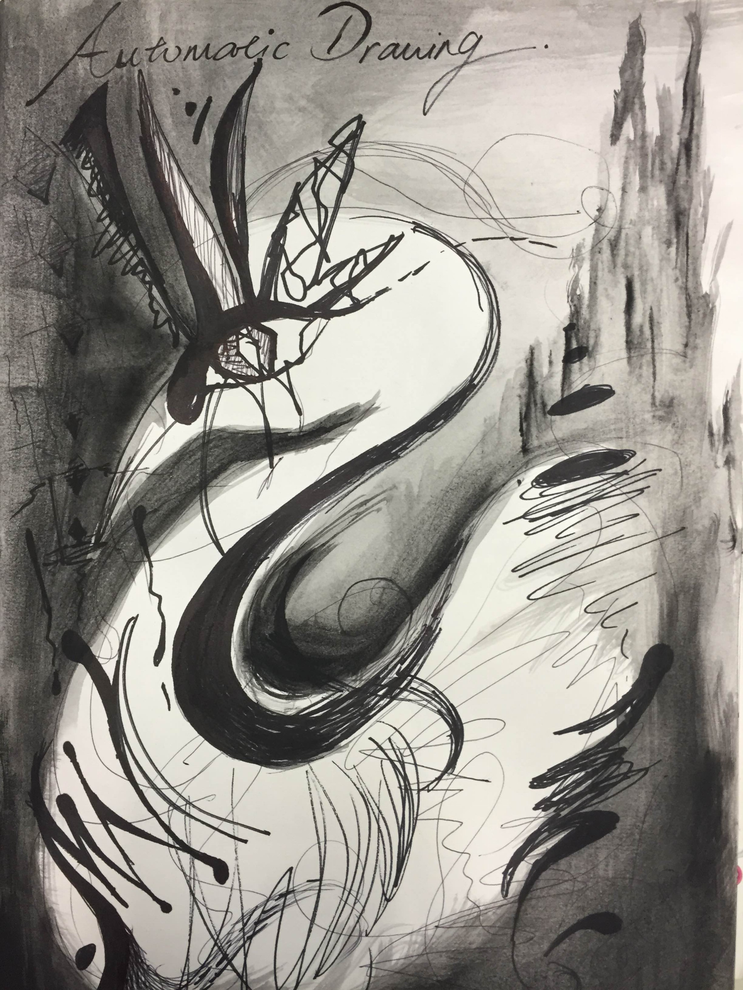

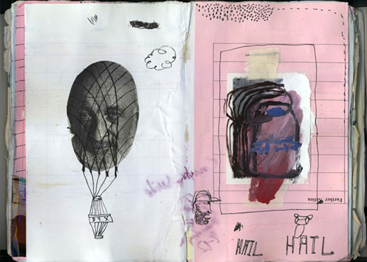
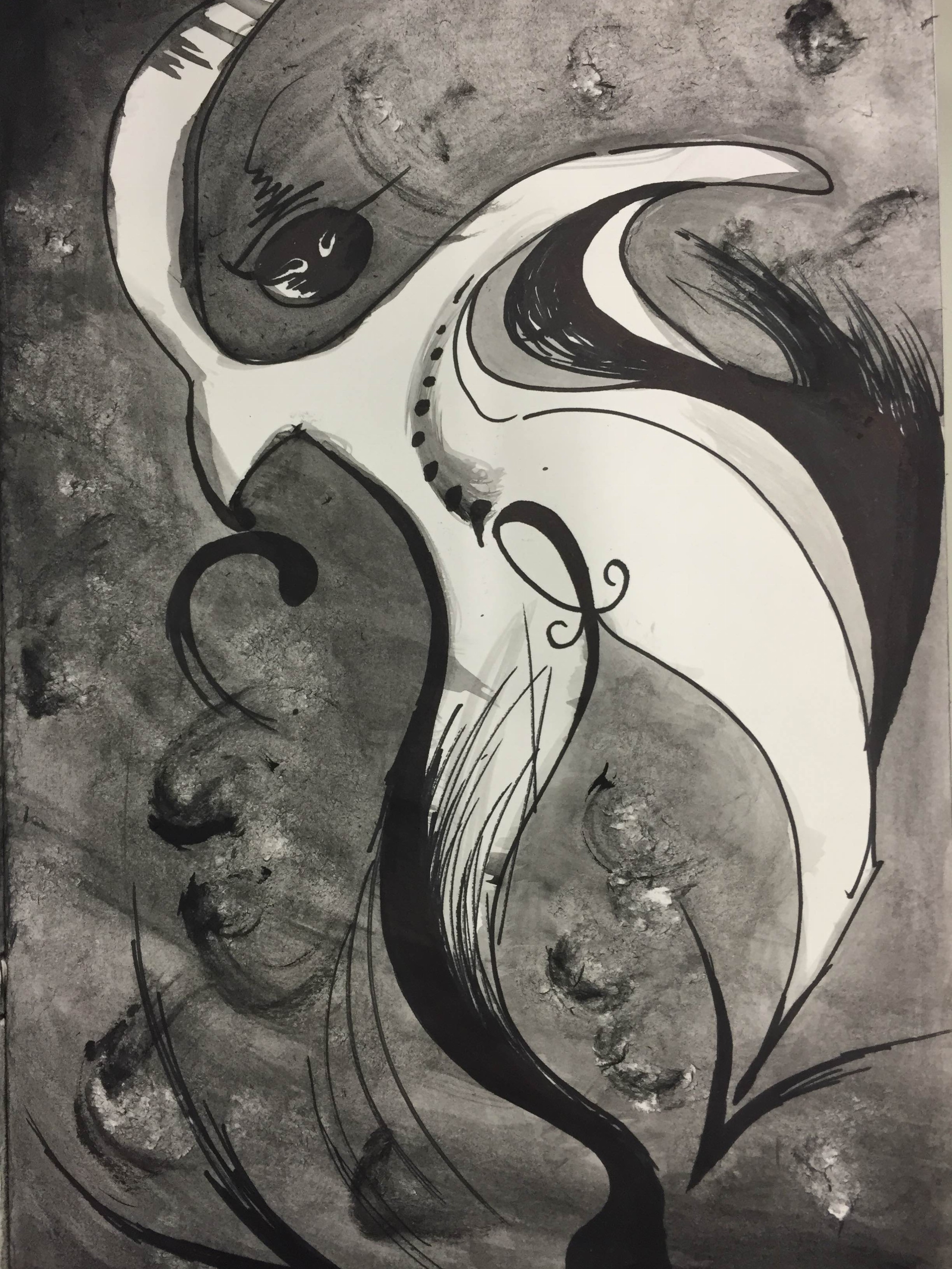
One of the first techniques I explored was automatic drawing. I researched on how artists went about this technique and Andre Mason stood out to me as he was one of the pioneers of automatic drawing. As it was not possible for me to force myself into “a reduced state of consciousness” under time constraints, I listened to different kinds of music to get myself in different moods and tried my own automatic drawings. Before doing so, I also referred to examples of automatic drawing from Masson to get a sense of the different lines I could try when doing my drawings. Above is a drawing I did when I listened to music with an ethereal feel.


Similarly, I did this drawing while listening to rather upbeat and magical music.
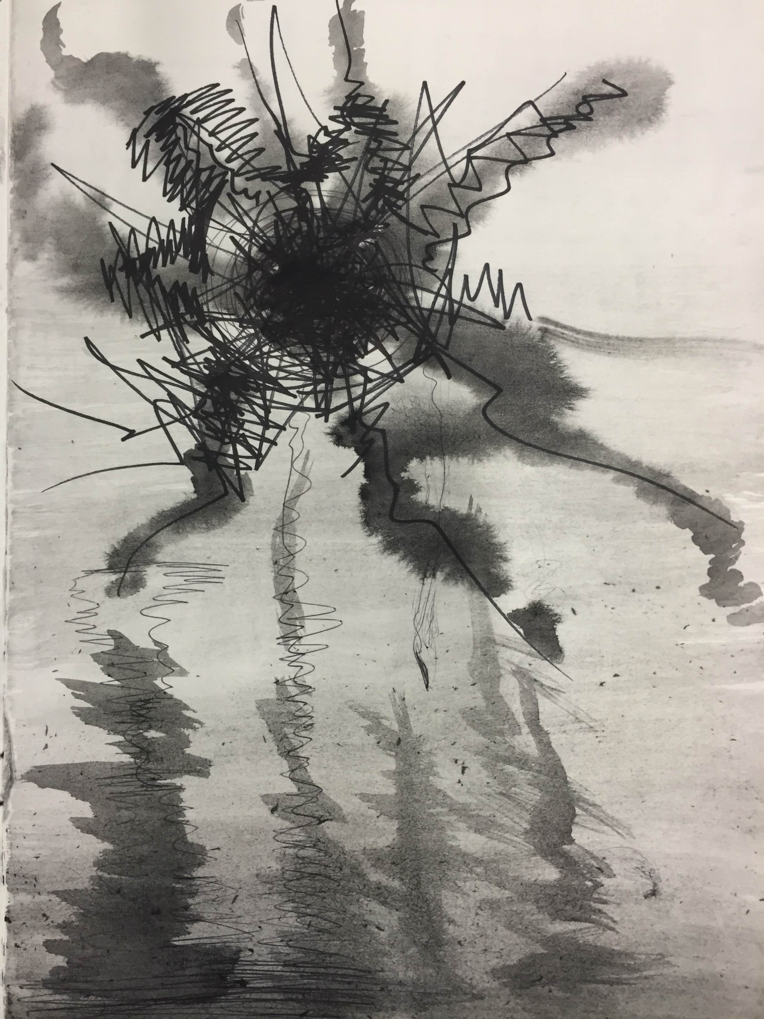
I did this while listening to something heavier and with sharper beats,

I did this while listening to something fast and sharp.
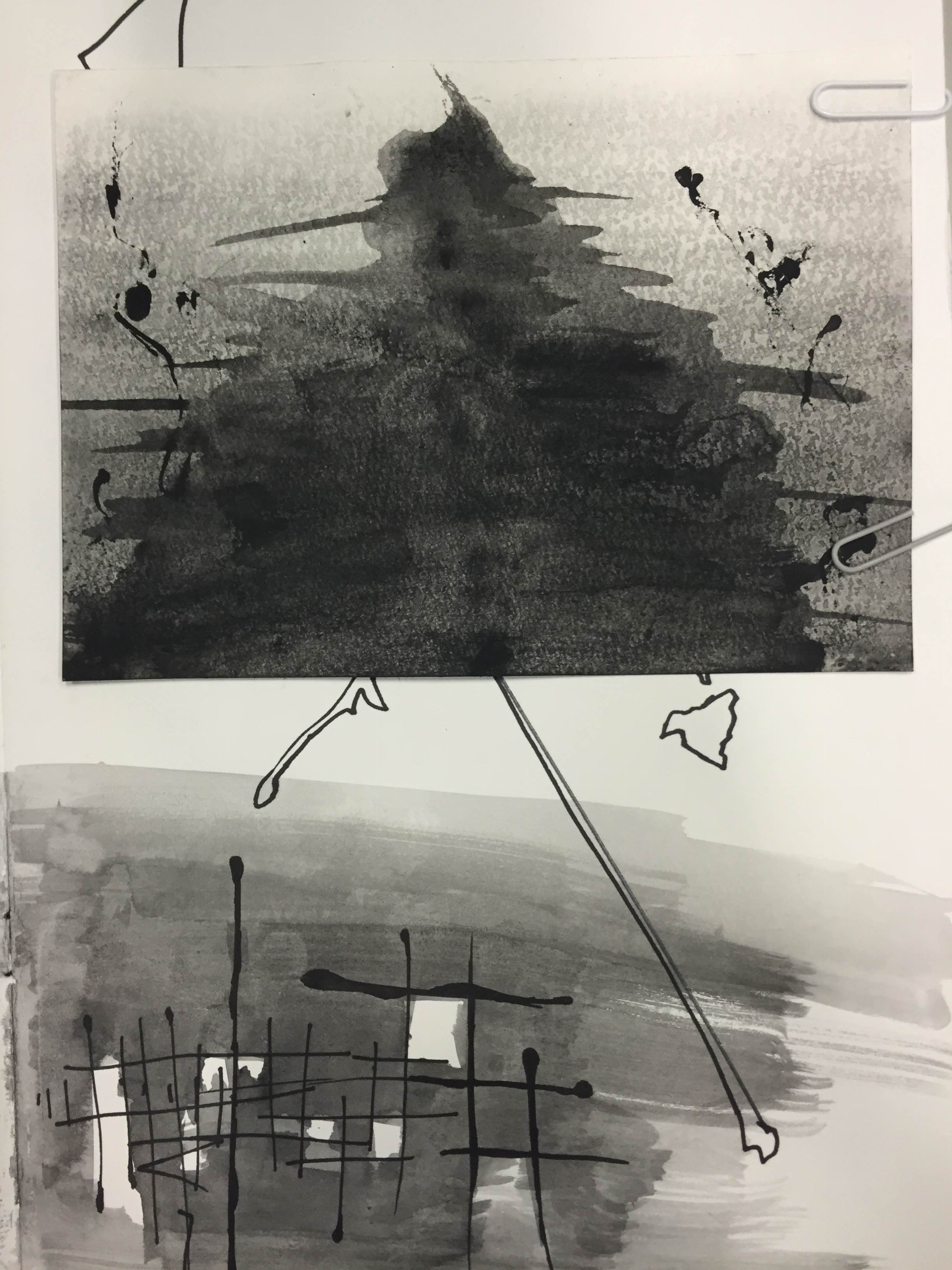
I did this while listening to something that made me focused. I felt like this could be used for systematic.

As I experimented with different media, I applied the technique of automatic drawing to create abstract patterns. Above, I mixed paint and glue to get a glossy effect that would make the paint slightly translucent and have a “bubble” effect. With the idea of spontaneous in mind, I quickly painted balls in a playful manner to show the feeling of them rapidly shooting out.
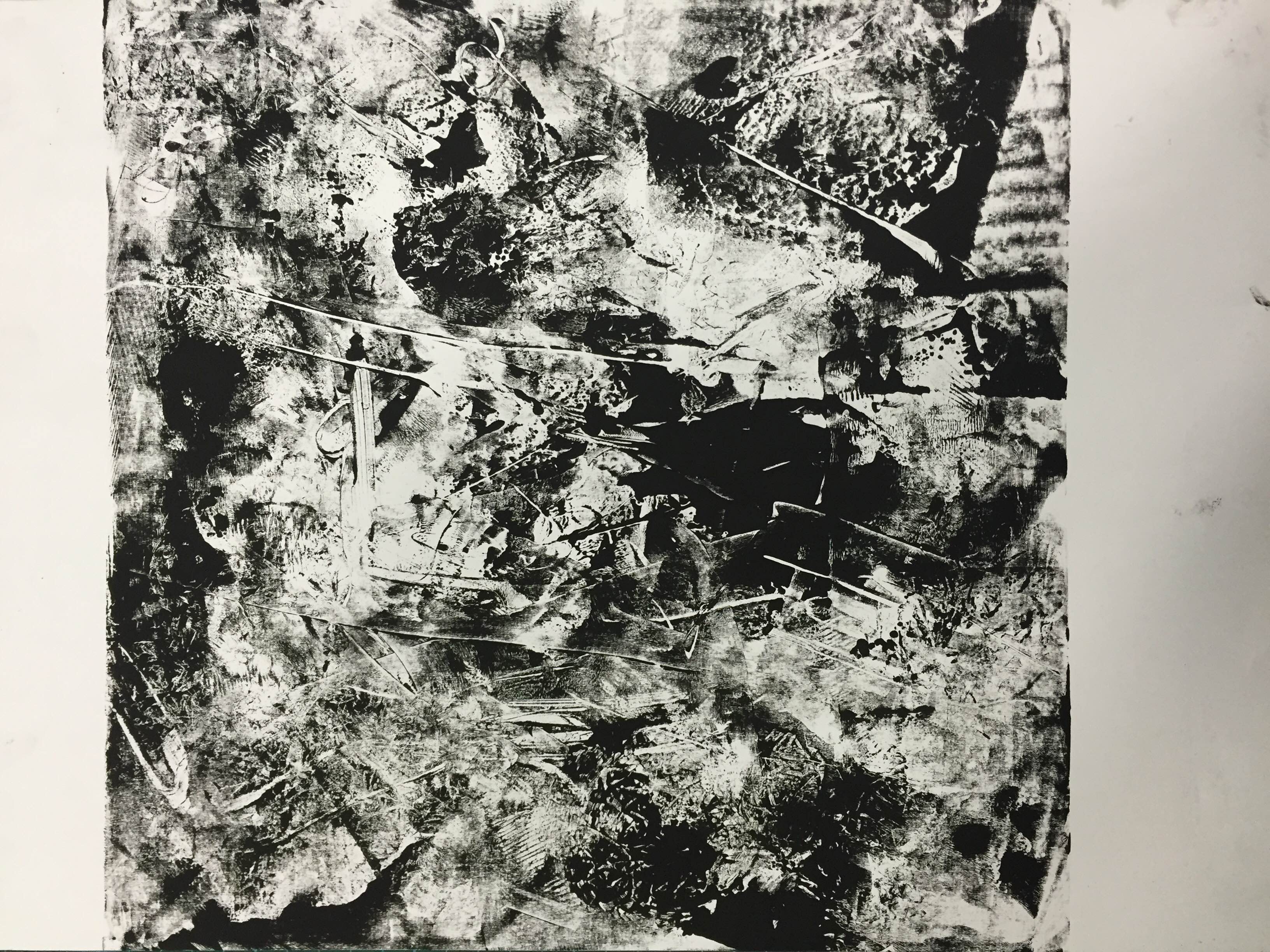
 I also used water colour and applied the automatic drawing technique to create an image straight out of my mind. I created this flowy and strange looking ink blot pattern. I thought it looked quite sinister with the way the ink creeps out like tentacles from the sides. The blurry effect created by using a wet on wet technique makes it look very vague at the same time, adding to the sinister effect.
Welcome to Open Source Studio. This is your first post. Edit or delete it, then start blogging!