So as previously mentioned, I went to the library to read up on a few graphic design books 2 weeks ago and I chanced upon one called Cut & Paste: 21st Century Collageby Richard Brereton and Caroline Roberts.
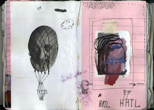
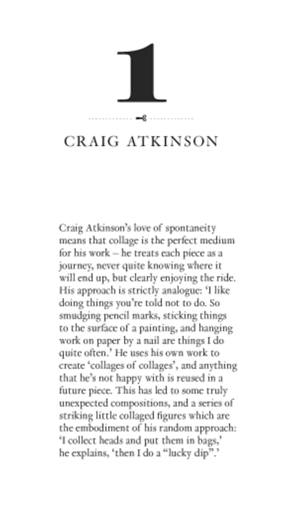
One artist from the book stood out to me in particular and that was Craig Atkinson.
Cut & Paste: 21st Century Collage (Retrieved from: http://www.amazon.com/Cut-Paste-21st-Century-Richard-Brereton/dp/1856697177 on 1 February 2016)
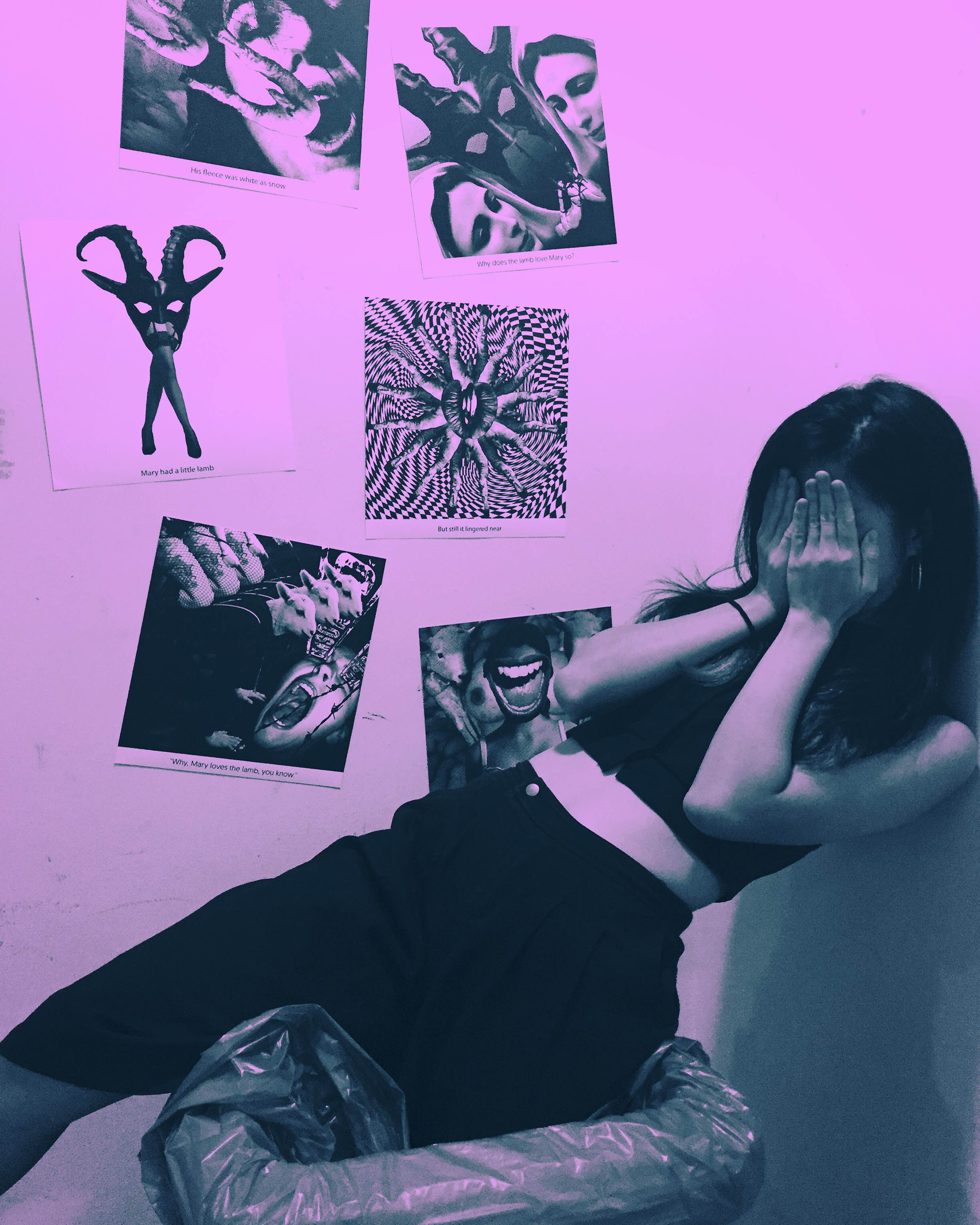
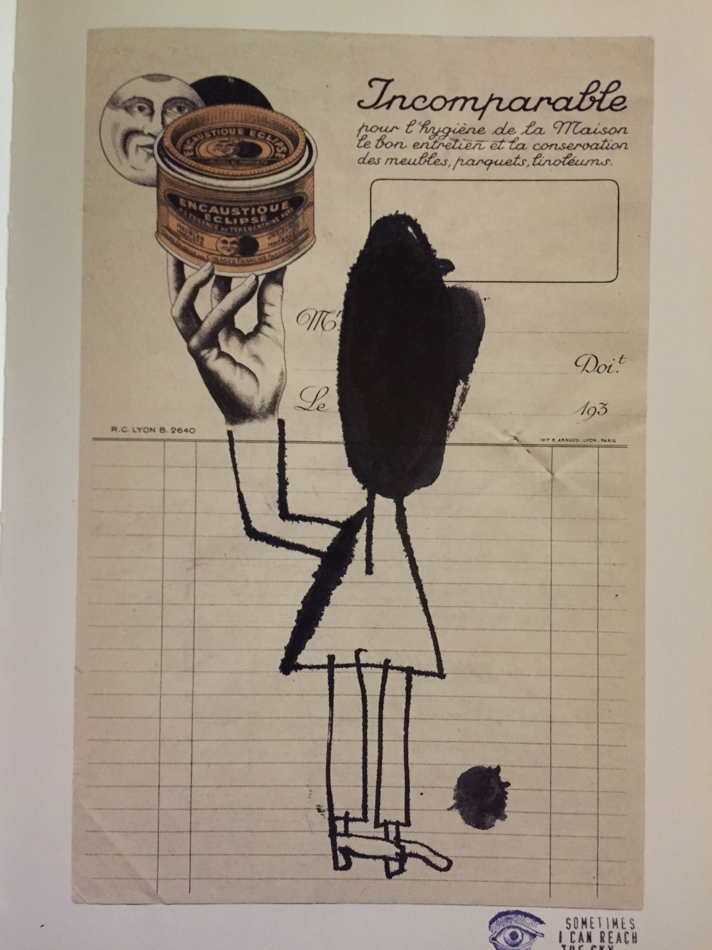
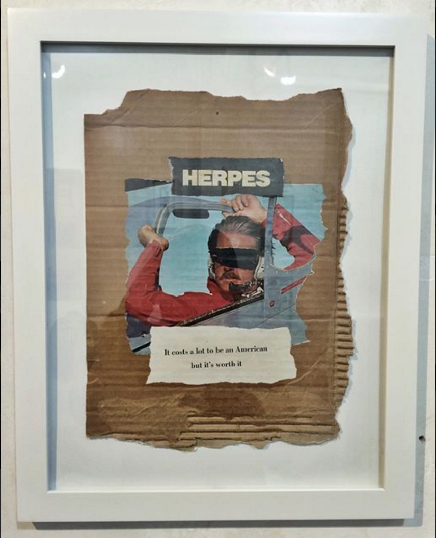
Similar to Concannon’s work, I love the raw and immediate effect of Atkinson’s collages. The slightest details such as the tearing, crumpled marks and almost kiddy-ish lines are really appealing especially when juxtaposed against a background of a photograph or a found object. It contains a sense of fun, the kind when you doodle on a newspaper or your air ticket. It feels very honest and spontaneity parallels those of old school tart cards (they were usually handmade to save cost) and concert flyers. I intend to carry this spontaneity into the tart cards I will be making rather than make it a clean cut typographic tart card like those in the London 2009 competition as I believe while I am constructing a narrative using typography, I should not forget the subject I am working with and the overall look should reflect the background of a prostitute at the end. Then again, I may choose not to have this look for all as some prostitutes do come from well-off families so a more formal look may suit those cards better. (okay I feel like I’m just rambling here…it’s late I should sleep…)
I intend to work with materials that can be found with prostitutes or are easily associated to them and their backstories.
I understand this isn’t a very complete research so I will update this post further when time permits.
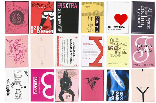
It appears that there is a proper name for cards advertising prostitutes and in the UK, the term would be tart cards. (Before that I was just googling “photo cards” “name cards”…amateur pfft wished I had researched a bit more into this hours ago) Tart cards were often found in London’s telephone booths in the past and now with the internet and they are less used and instead regarded as a kind of accidental art with a cult following. While reading the article on tart cards in Tel Aviv, I came across this tart card design competition held in London in 2009. This is really a great reference point on how to incorporate typography and suggestiveness into the tart cards I will be creating for this project. However, I will need to work on how to add an additional meaning to the tart cards beyond the suggestiveness to construct a more wholesome narrative going beyond their sexual profession. I will most likely be going for something similar to James Concannon’simage + text style and Craig Atkinson’s cut-and-paste spontaneous stye so the final product is not pure clean typography but a combination of messy collage and typography.
A tart card competition at the St. Bride Library in London in 2009. They explain: We would like you to design a tart card either for a typeface or a letter of the alphabet. If you are unfamiliar with these things, tart cards are the means by which London prostitutes advertise their services. Step in to any Central London call box and you can contemplate up to eighty cards inviting you to be tied, teased, spanked or massaged either in luxury apartments, fully-equipped chambers or the privacy of your own hotel room. So pervasive are these things, and so curious is their typography, images and copy writing they are now regarded as bona fide items of accidental art and have something of a cult following. Once on the periphery of design, the cards have influenced the work of many mainstream artists including Royal Academician Tom Philips and Sex Pistols designers, Ray and Nils Stevenson. Perhaps they can inspire you too? (Retrieved from http://luc.devroye.org/fonts-50682.html on 1 Februrary 2016)
Old school tart cards have also been linked to the punk aesthetic which just makes me more excited to work on this project.
& it would be great if I could get my hands on this book…
I am so excited to type this post cause just yesterday I discovered an artist named James Concannon while scrolling through Instagram and he could quite possibly be my favourite artist of all time.
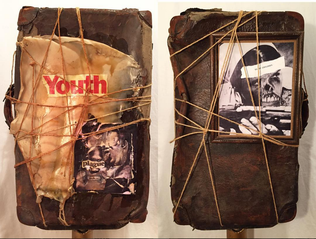
I love everything about this guy…the fact he uses garbage, trash to make art and the way he assembles them in that particular DIY punk style without having to resort to glitter tactics to make them look good. It feels soooo immediate and raw (like body fluids pls) and the final image created is always so strong and visually appealing (at least to me).
I love how he just tears photographs, cardboard and puts them together in such a raw fashion. (I think I’m starting to use this word a lot…) and the how he uses DUCT TAPE OMG YOU HAVE NO IDEA HOW HAPPY THIS MAKES ME FEEL…I LOVE USING DUCT TAPE!!
Most of his works are critiques of America and he makes many references to pop culture. While this does not make him a particularly unique artist, considering how so many artists love criticising the american society, its his manner of presentation that keeps me interested in his work. It is clear that his style is probably derived from the punk movement of the 70s but his choice of materials allows him to stand out from being simply associated with the general punk aesthetic. Typographic elements also become a very important feature in most of his work, adding a new meaning on top of the imagery created by the materials alone.
I have to admit the past 2 weeks I didn’t really have much of a concrete idea of what to do…all I did was go to the library, borrowed books on 80s graphic design, concert flyer designs, old chinese label designs, cut-and-paste graphics…basically types of designs I was interested in but still I wasn’t really sure how to put them together…(will do a separate research post on those books)
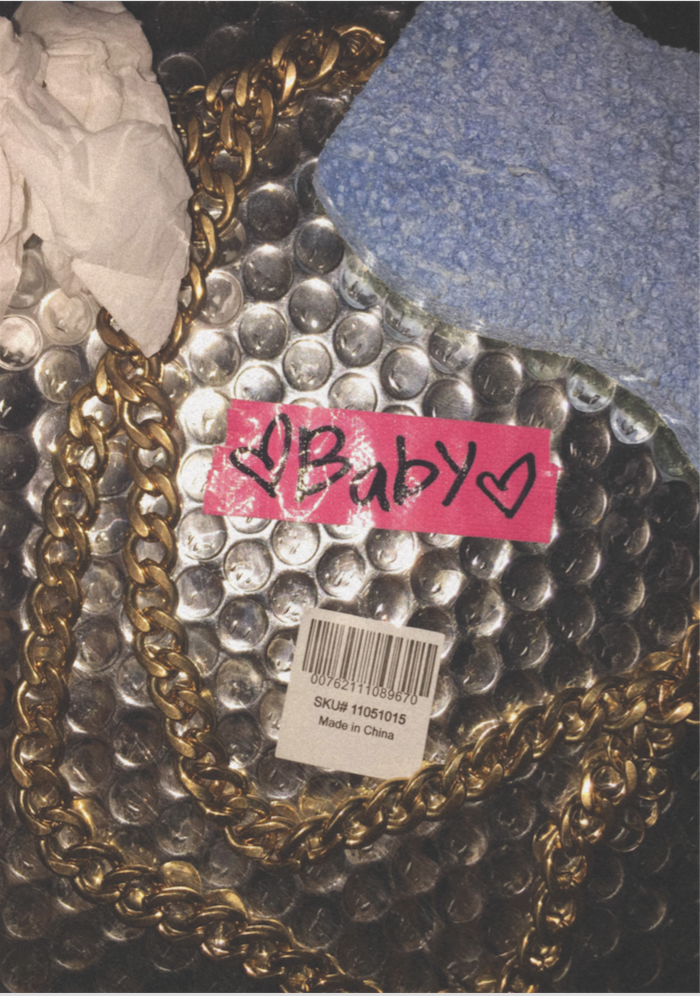
and then the night before last week’s lesson, I still had no idea what to do and with limited time on my hands, I grabbed some materials and arrange them to create this…
Not the most appealing but I sense some idea behind this…I went with the intention of playing with contrasting materials and meaning when added together. I also like making things look tacky so there’s the “Baby” and fake gold chain. It represents a collection of materials associated with a type of girl…one that scrubs floors, where dirt and trash is part of her everyday life (she doesn’t have to necessarily be a cleaner or dishwasher but just someone who doesn’t have a very glamorous job) but at the same time craves glamour and a dreamy love life. Not sure if it shows but I thought it would be interesting to explore duality in female subjects where both glam and trash meet which brings me to my next idea…
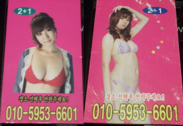
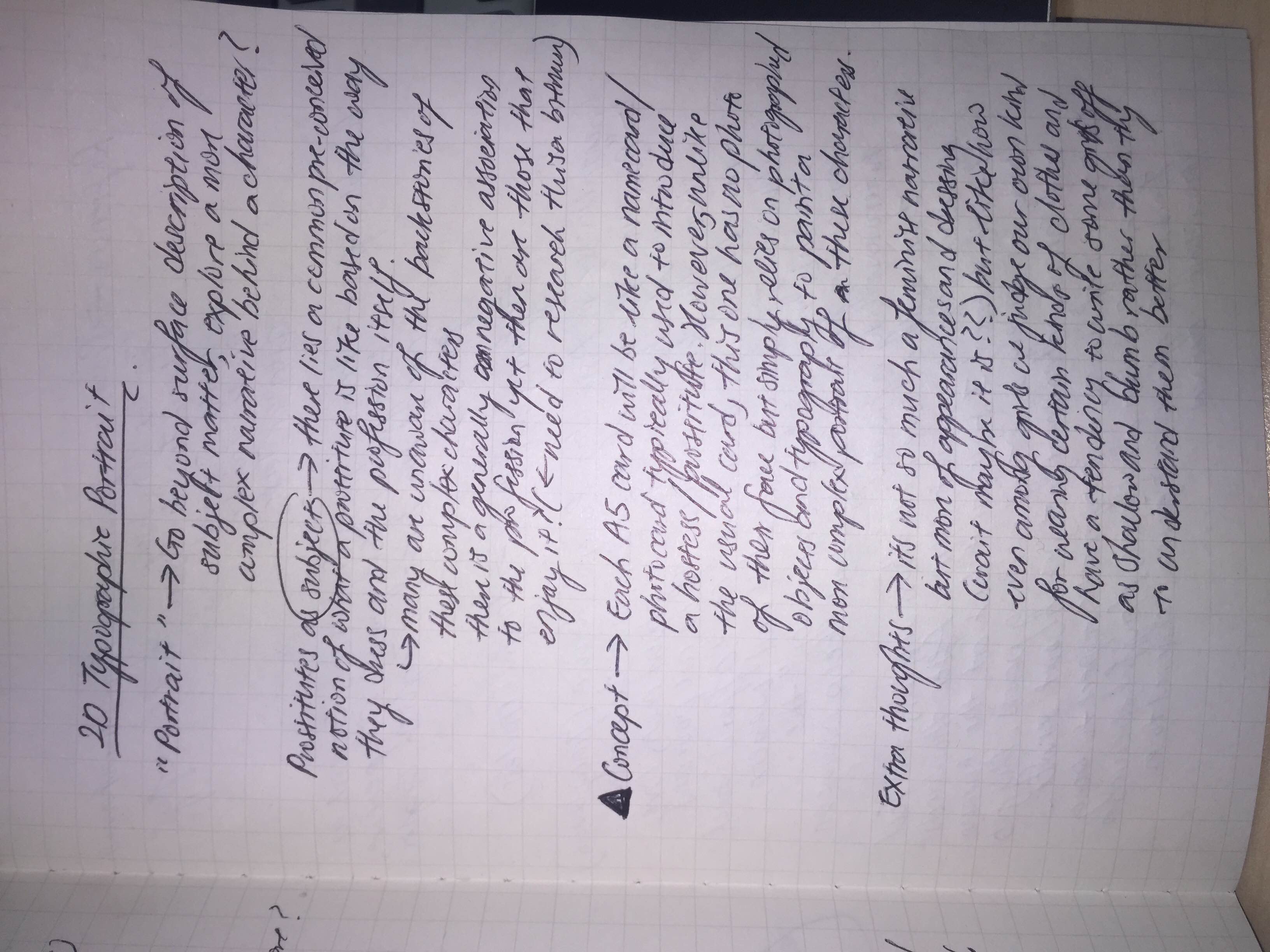
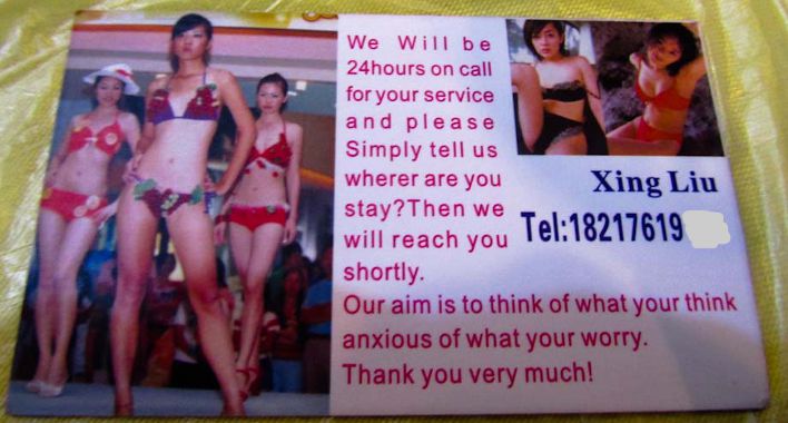
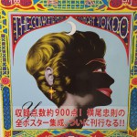
I shall do typographic portraits on prostitutes/hostesses/strippers! Each A5 card will be like a name card of each of the different females so in the sense I will be presenting it in a mock hostess club setting. Usually name cards introducing the females will be like those in the above photo where a photograph of the female and a number to dial is presented but for this project, I will be using typographic design elements to represent them instead. This will allow me to present a more complex identity behind these females instead of just surface level representations. Still, I would like to keep the concept of a name card so I will need to think of how to incorporate name card elements in along with the designs.
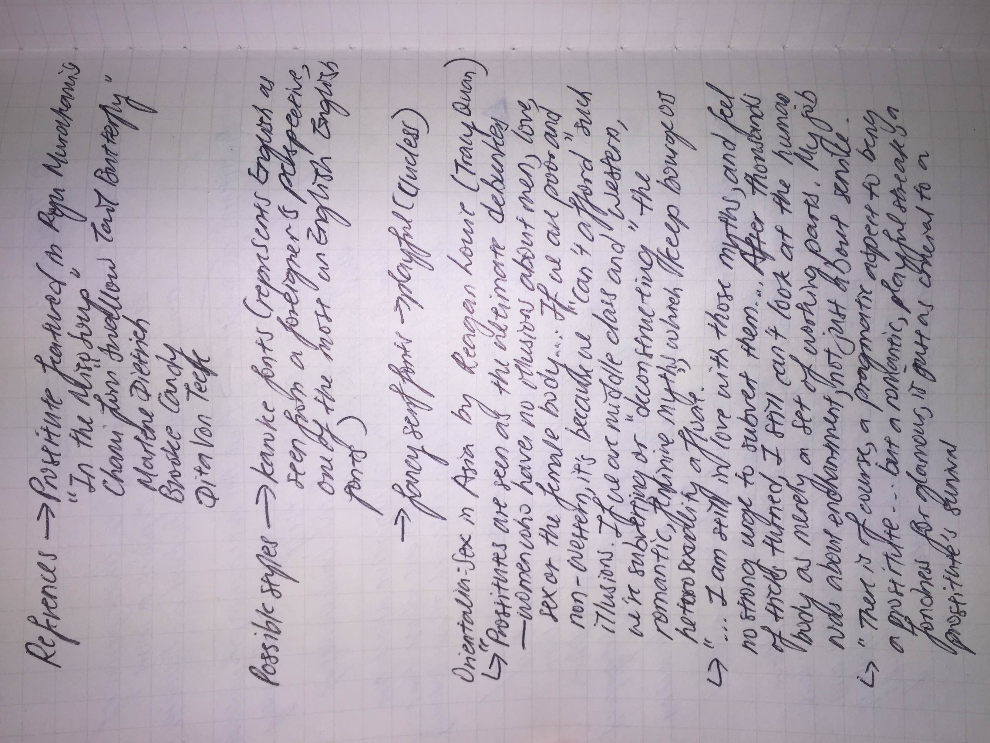
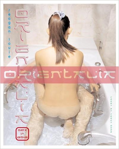
I took reference from Orientalia: Sex in Asia by Photographer Reagan Louie for some ideas to construct the different narratives for each female.
Contrary to most books about females in the sex industry, her book’s emphasis is not on the graphic lurid images of females in various poses but features their life outside of prostitution as well, show that they are just like us, some being daughters and mothers as well. I think exploring the different identities of prostitutes/strippers/hostesses is interesting due to their prevalence in almost any country. Yet, they cannot be simply be generalised under one identity given their different backgrounds and reasons for entering the industry (be it for pragmatism or simply pleasure). This gives me the opportunity to mix design elements from both east and west, classy and kitschy, formal and messy.
Another idea that I am keen to explore through this project would be how some kinds of fonts can represent the English language as seen from a foreigner’s perspective. Some obvious ones would be having narrow Arial font with a much wider than usual kerning like the above or having really light serif fonts with a lower value of kerning. I see this as a way to touch on the topic of exoticism present in the sex industry as well.
The virtual embrace was definitely unlike a physical one since it did not involve any sort of physical contact but more of positioning our hands in the right place. This itself required a unique sort of mutual collaboration that created a new sensation when making contact with someone. The process also becomes more dragged out due to the need to match the scaling and positioning, thus a longer contact is established in the virtual world even without a physical touch interestingly enough.
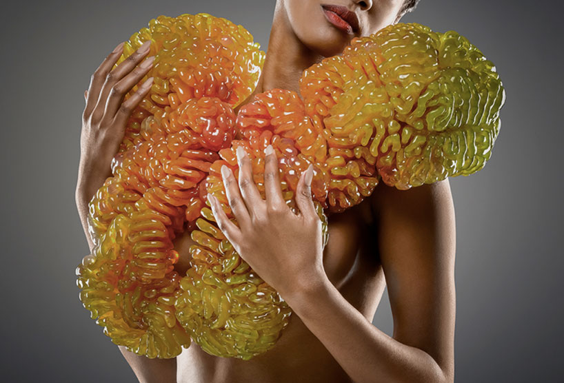
Neri Oxman and a group from the MIT mediated matter group recently collaborated with Christoph Bader and Dominik Kolb on a project known as ‘Wanderers: Wearables for Interplanetary Pilgrims’. With the intention of sustaining life through voyages beyond our planet, the wearables are created to hold life sustaining elements contained within 3D printed vascular structures with internal cavities. It makes use of a technology that produces digitally manufactured wearables with multi-material 3D printing machinery.
3D printed vascular structures with internal cavities
According to the mediated matter group, they’ve found a way to embed ‘living matter in the form of engineered bacteria within the 3D structures in order to augment the environment. living matter within these structures will ultimately transform oxygen for breathing, photons for seeing, biomass for eating, biofuels for moving and calcium for building.’
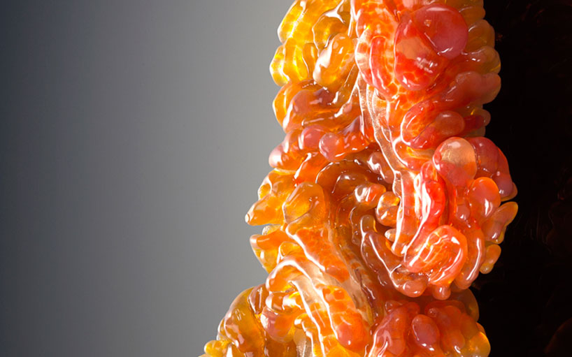
The internal cavities are infused with synthetically engineered microorganisms to make the hostile habitable and the deadly alive. Inspired by natural growth behaviour, starting as seeds, the biomimicry process of the technology simulates growth by continuously expanding and adapting its shape to the environment. The wearable is capable of generating the basic elements needed for survival through elements that photosynthesise, bio-mineralise to strengthen human bone or contain florescence to provide light in dark places.
Skip to 1:04 to watch how the growth process works
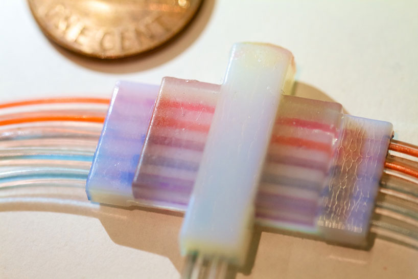
multi-material fluidic valve 3D printed using the connex 500 stratasys 3D printer
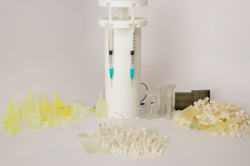
3D printed fluidics and a syringe pump. mediated matter
I found this wearable to be very fascinating due to its potential for the future, in fact, it already sounds almost straight out of science fiction itself. Yet, I do have my doubts when it comes to the idea of holding all these bacteria that can be potentially deadly, on my body. If one of the cavities breaks, it could threaten my life rather than prolong it. The form of the wearable does not seem very pragmatic either for travel so I do hope the design can be improved in this aspect.
The wearables were produced on an ‘objet500 connex3 color multi-material 3D production system’
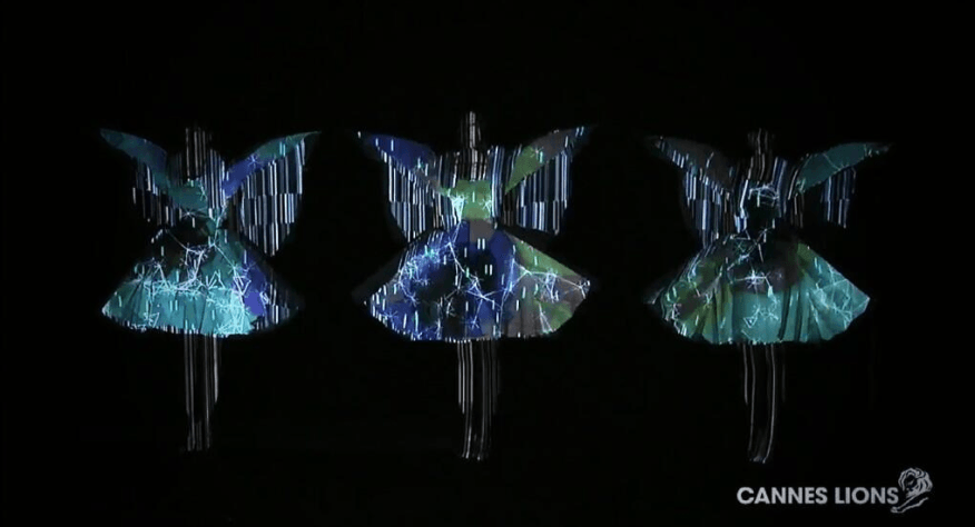
Japanese techno-pop unit Perfume’sinteractivedress worn during their “Spending All My Time” performance at Cannes in 2013 was a result of their collaboration with Japan’s techno-artist Daito Manabe. Manabe is a programmer whose work fuses advanced technology and artistic creativity. The concept behind many of Perfume’s performances involve mimicking androids, thus the digital patterns projected on the dress complement their performance.
Motion capturing technology on Perfume’s dresses
For this particular performance, Perfume used twitter to connect with its fans and then through open source technology, fans were able to download 3D data of the females and simple drawing programmes to create their own unique graphics.
Fans submit different graphics to be projected onto the dresses
They were invited to submit their own digital graphics which were then projected onto the dresses in sync with the rhythm of the music through motion capturing and project mapping technology, creating a fine example where technology invites the audience to be part of the performance.
Behind the scenes
“During the performance, a dynamic projection mapping system cast visuals onto the semi-translucent screens in front of the singers; motion capture allowed the position of the projections to be calibrated automatically moment by moment. The cameras filming the performance were also watched by a motion capture system, each outfitted with a marker allowing the system to track the camera’s position and orientation in space. This, Manabe says, was key for morphing seamlessly between perspectives, an effect conjured by Rhizomatiks computer vision wizard Yuya Hanai. The final video moves seamlessly between the live footage and the 3D model captured ahead of time.” – WIRED
Project mapping revealed at the exhibit “Rhizomatiks Inspired by Perfume”
Personally, aside from the fact that the performance was amazing and seemed so ahead of its time, I find this integration of technology and performance very fascinating. By blending advanced technology with pop music performances, technology does not feel out of place but rather complements and adds value to the experience to create one their is multi-sensory and highly engaging. The combination of both art and technology is full of potential and I look forward to more of such.
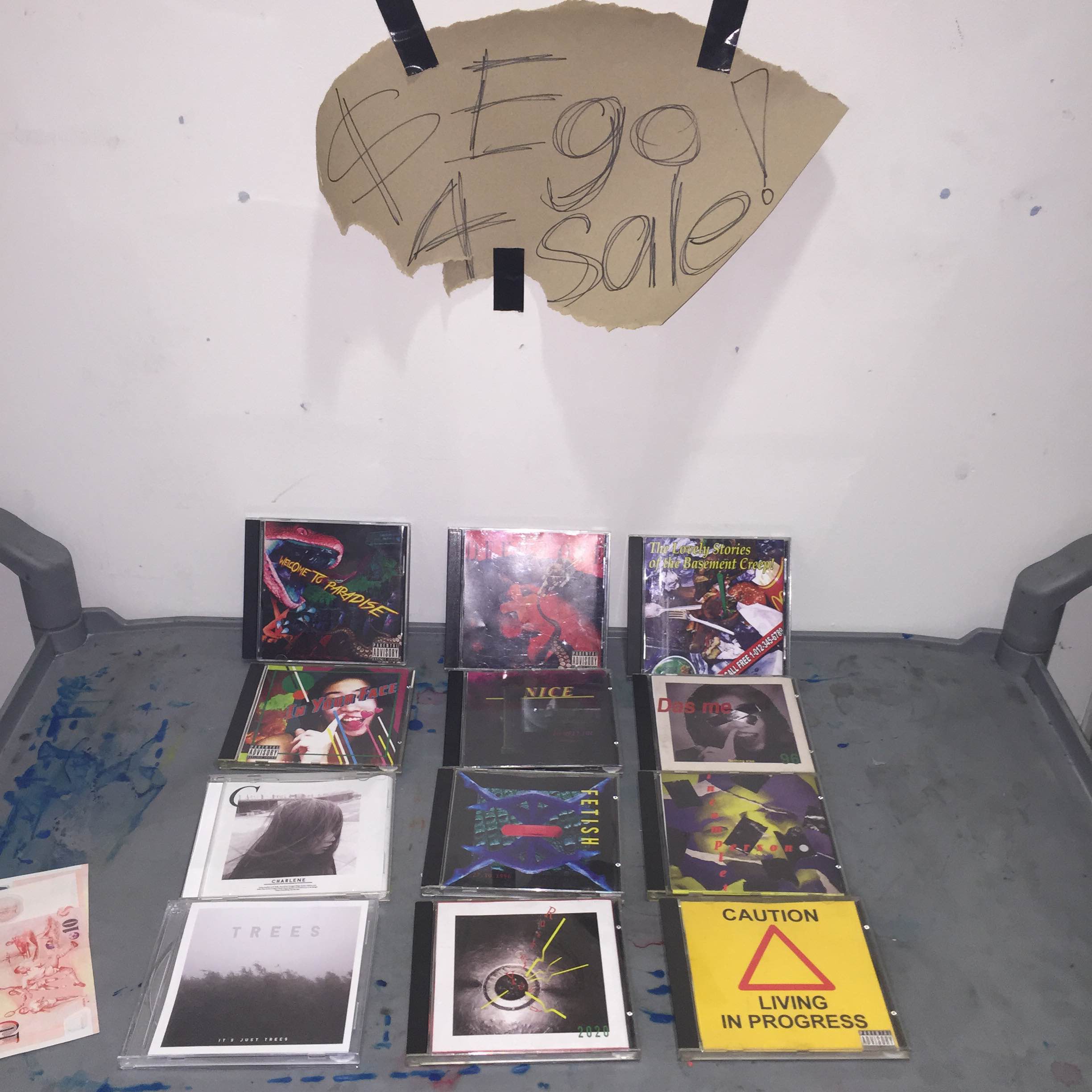
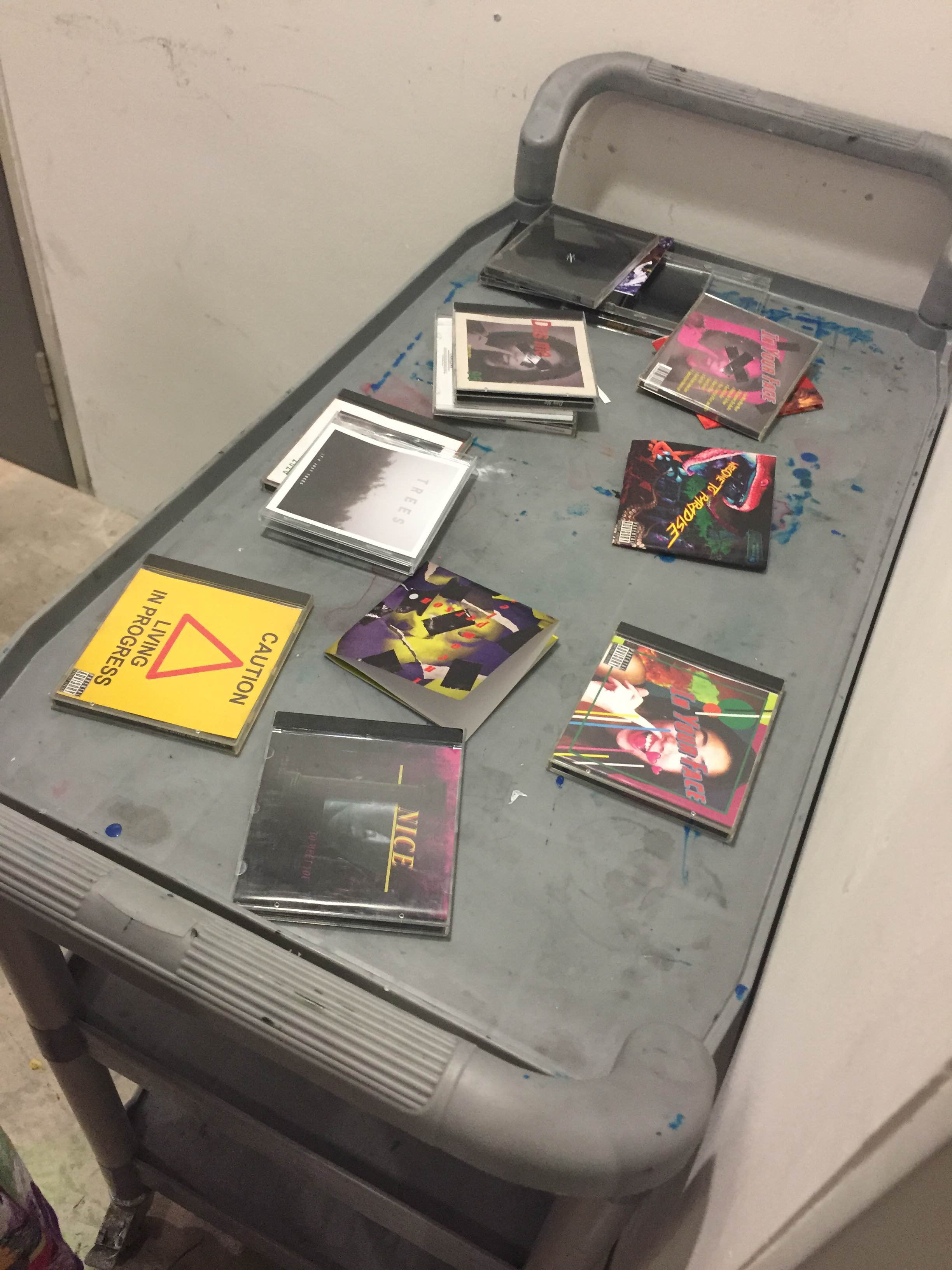
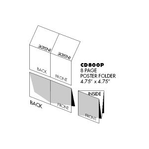
I have to say, this last assignment on Ego was probably the most fulfilling assignment this Semester. I was blessed with a great Prof Ina who allowed me to have it my way with this assignment so instead of following the usual 210mm x 210mm squares and equations format, I could design CD covers. & here’s a video I filmed of the whole process of opening these CDs and unfolding the covers. The sound of CDs being opened is quite nice..
As a collector of CDs since young, I just felt that a project about Ego had to be in this format. After all, with the rise of digital music downloads, CD sales have dropped and no one really collects CDs anymore. People are now into the large Vinyl format and less people seem to even know about this (soon-to-be) ancient relic known as the Compact Disc.
I believe in collecting the physical thing cause without it, it just feels like whatever music that I like does not actually exist, like my interest in these things is just a mere passing thing, there’s no show of evidence..and most of all I really treasured the art found in this CD jewel cases.
As a young child who went to Sembawang and Gramophone often, the idea that inside these CDs laid a piece of art that I could unfold really excited me since some of them contained personal messages written by the artist or just extra photographs that are not featured on the front cover. At the same time, I’m not against Vinyl, in fact I collect Vinyl too but only for albums from the 80s and older, while majority of the music that I listen to from 2000s onwards I felt should be collected in the form of CDs since it best represents that era and with my childhood mostly in the CD era, I felt this project should be in CDs rather than Vinyl. This part of Elly Jackson’s interview from the group La Roux sums up the above sentiment.
“I’m still coming to terms with music not being physical. It doesn’t really matter how much I own in my phone or on my iPod or in my computer, I don’t feel like I own it. Even if I’ve bought it, I don’t feel like I own it. It just feels like a list. I don’t like the idea that when I have children, I can’t go, ‘Here’s my record collection’. What am I supposed to do? Go, ‘Here’s my f**king password’? It’s a bit boring, isn’t it? – Elly Jackson from La Roux
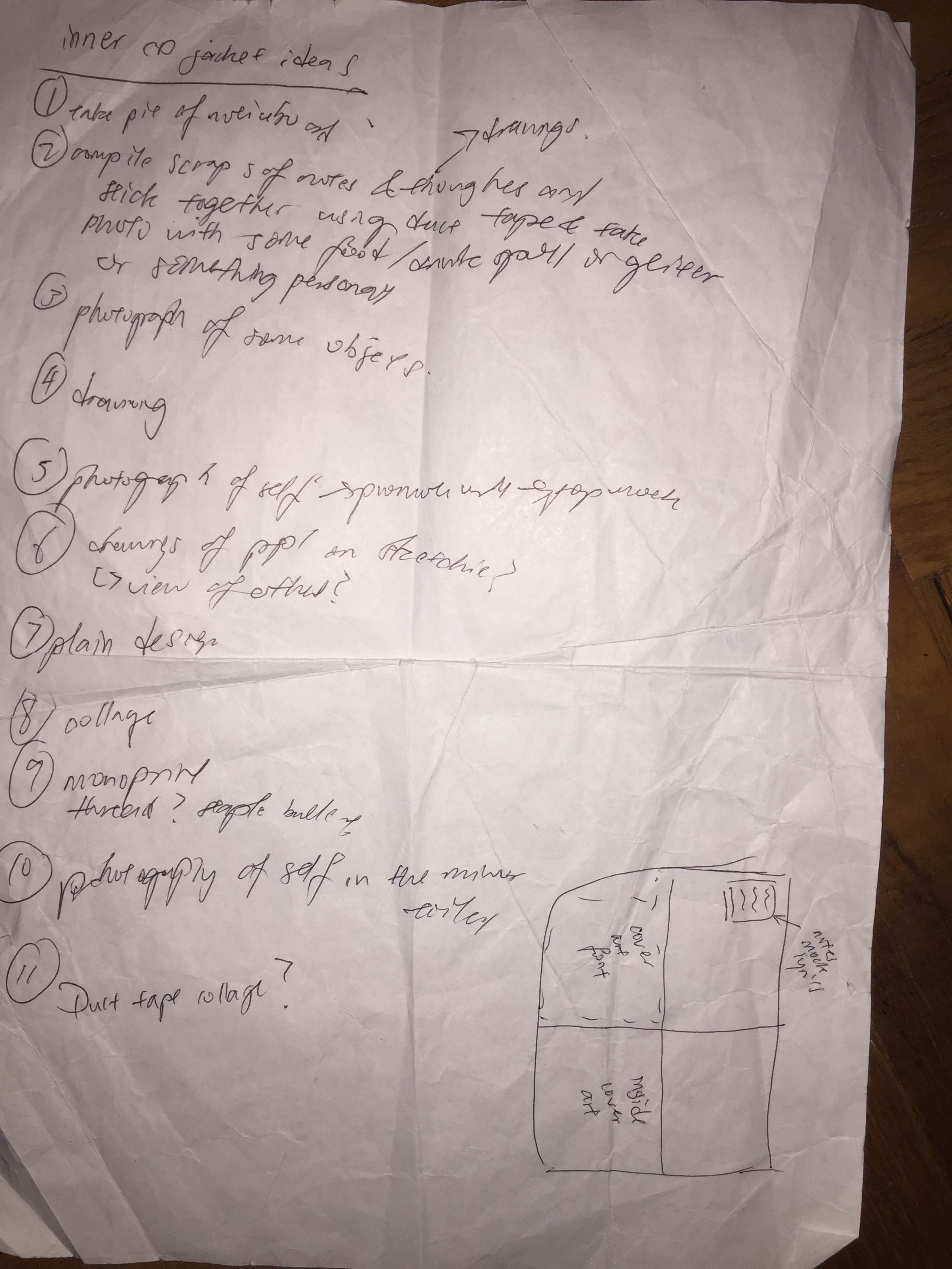
With that whole CD explanation out of the way, its time to move on to the individual album art I did for each “square”. As you read on, you will realise there’s a lot of things here that I did not mention during presentation cause I felt saying every single detail out kind of spoils the presentation itself and is just kind of obnoxious to a viewer who just wants to appreciate the work as it is.
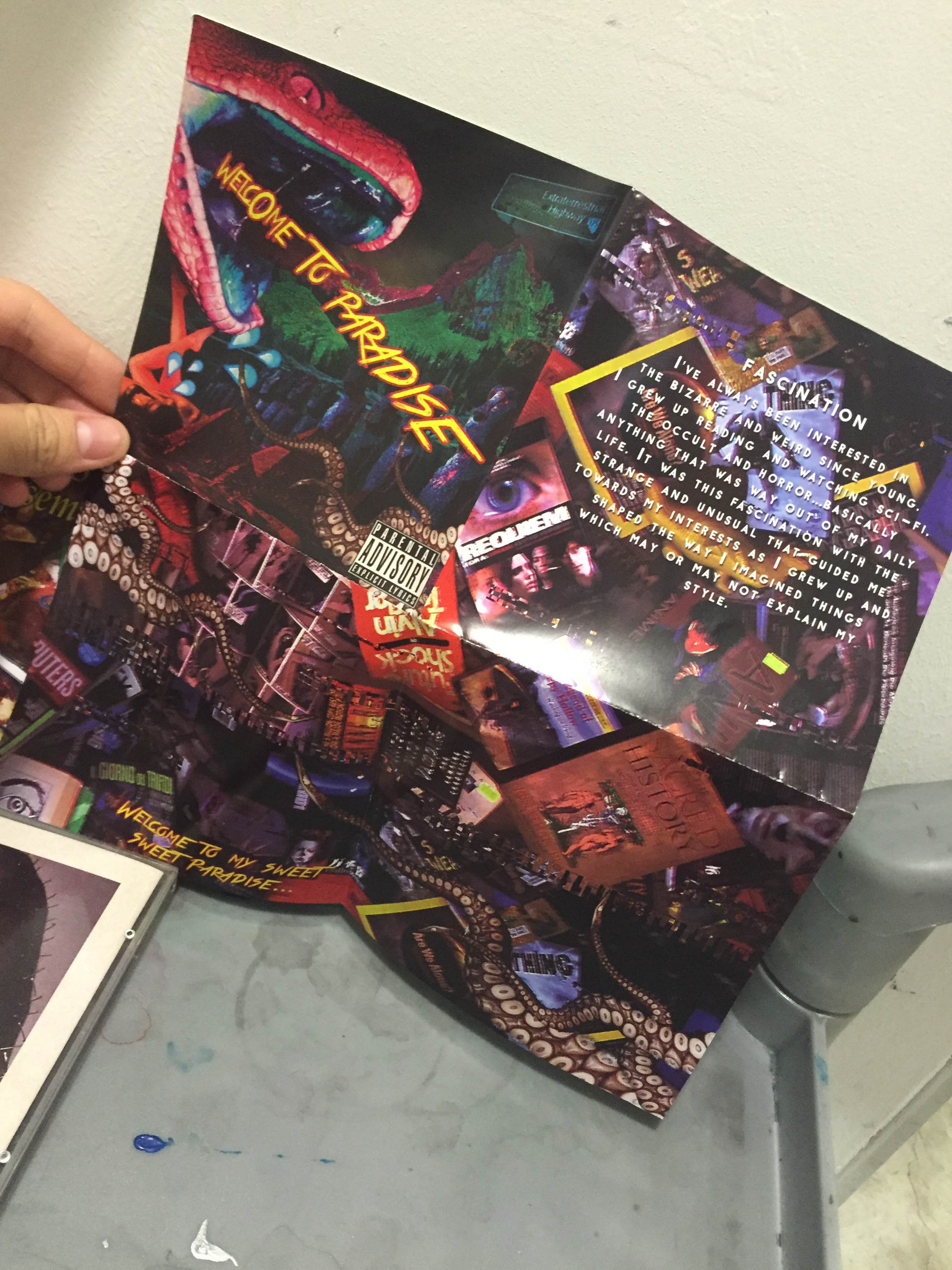
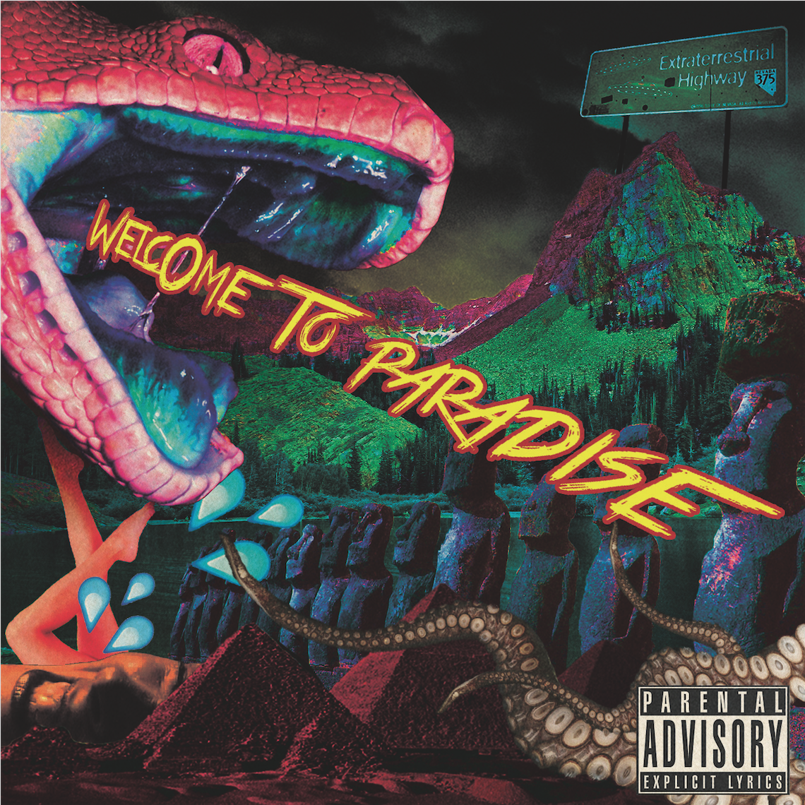
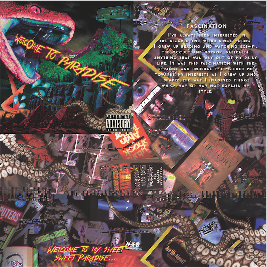
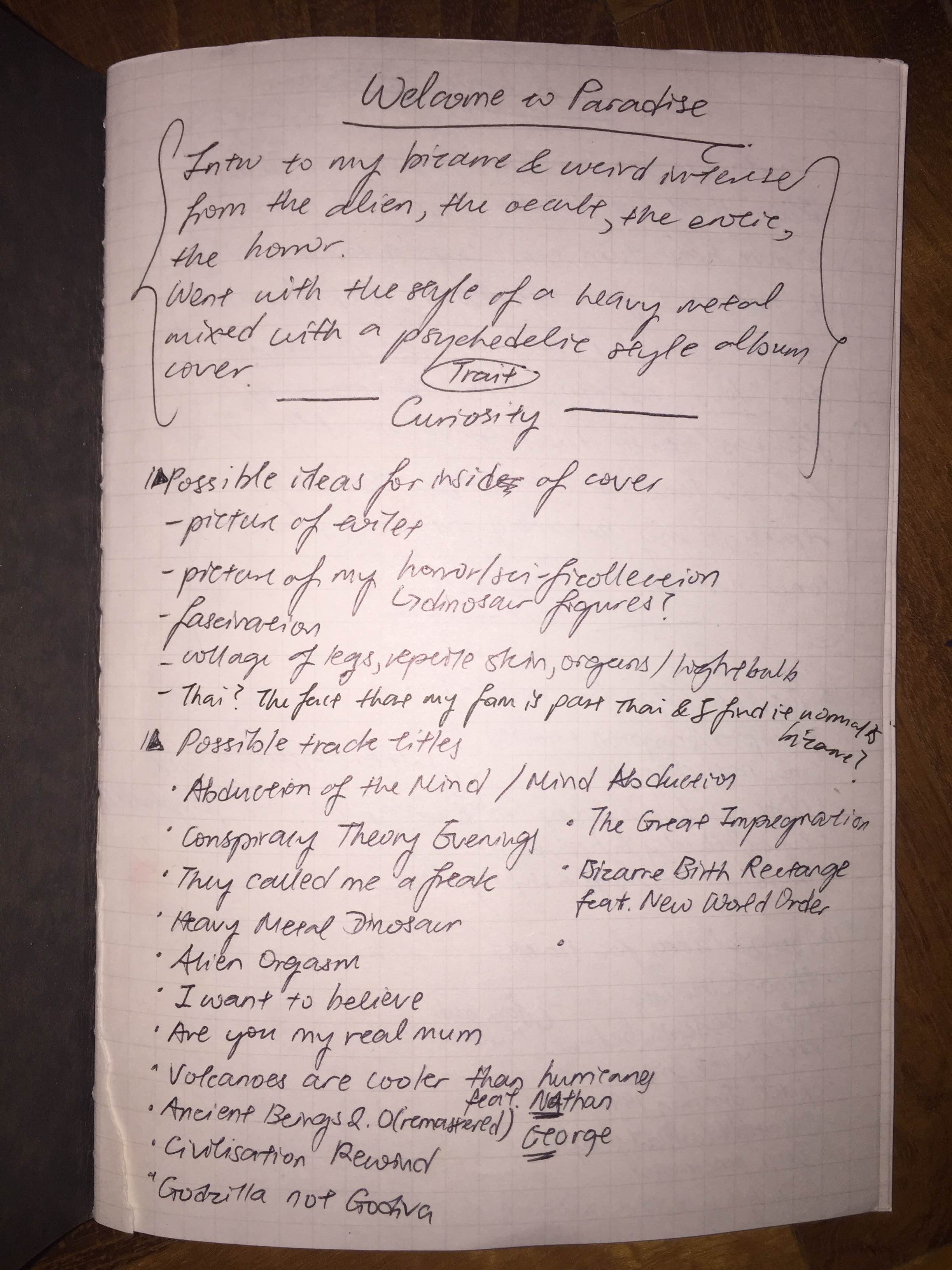
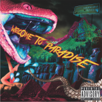
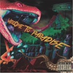
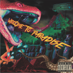
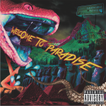
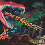
Fascination
This album is based on the trait of being fascinated by the strange and the unusual. I initially wanted to base each album on a certain genre of music but due to time constraints I did not manage to follow the concept up for all. However, for this album it was suppose to be like a heavy metal album but somehow it ended up looking more like a pop punk meets metal so not really quite there album. Nevertheless, I was quite satisfied with the result. I have been into sci-fi, horror and all the weird occult stuff since young, borrowing books on aliens, watching all sorts of documentaries on Nat Geo and Discovery Channel and googling all sorts of things I was curious about. Thus, my version of Paradise would be an amalgamation of all these things that fascinate me. I love how messy it looks cause it just makes the whole cover look really intense which exactly the kind of person I am (maybe its a Scorpio thing? haha). As for the inside album art, its a photograph of my collection of things as I grew up with (sci-fi books, horror magazines/ DVDs, weird graphic novels, living dead dolls, science magazines…) which I thought was a nice way for viewers to understand me better. Like I previously mentioned how I like it when artists include extra bits of personal info in their inside covers, I wanted to do something similar here. As for the track list, to be honest, it was not completely random…I actually did some planning with it so there is a reason behind each one. For example, 03 “Conspiracy Theory Evenings”, is somewhat a thing I enjoy doing. On peaceful afternoons/ evenings, I love to watch a conspiracy documentary or a shock documentary of some sort (yes I am that person who googles top 10 disturbing documentaries). 08. “Bizarre Birth Rectangle” is just a parody of New Order’s hit single “Bizarre Love Triangle” so I added in a “(Feat. New World Order)” to play on their name as well. 09. “Are You Really My Mum” is something that I actually asked my mum when I was quite young. I had been watching some show about how someone’s mum was not actually their mum and the foolish yet inquisitive side of me as a child just had to ask my mum the question. Her reaction was not the most pleasant of course.
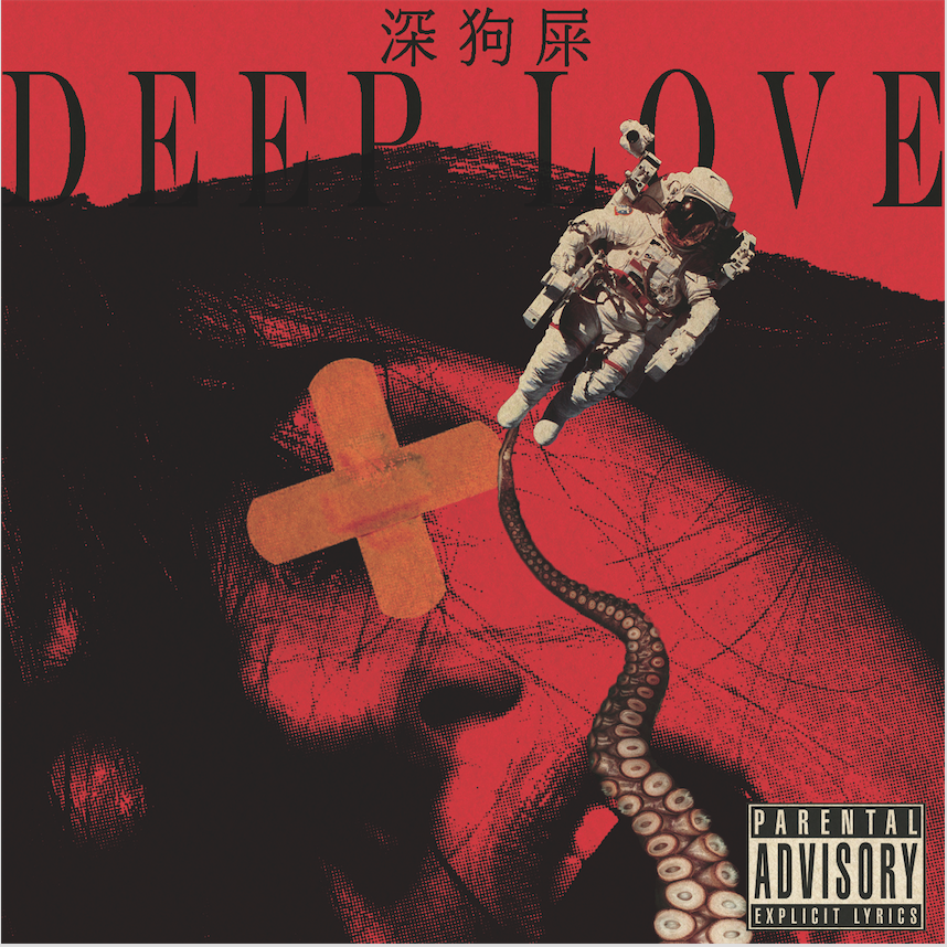
Love
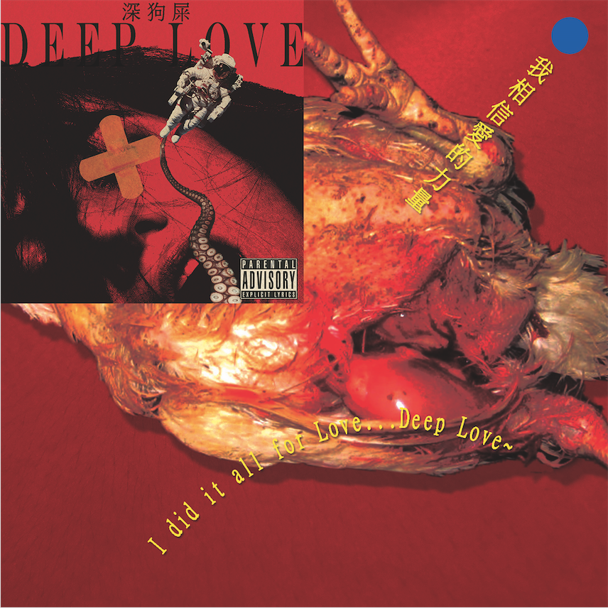
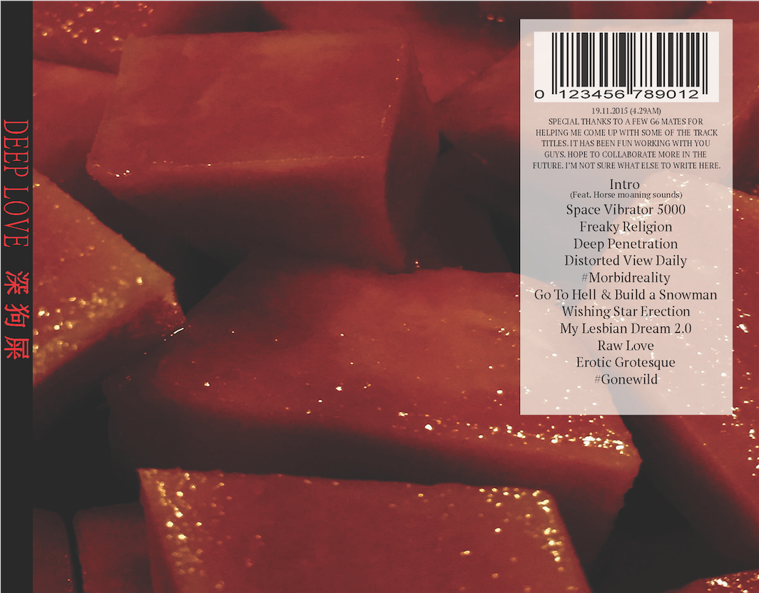
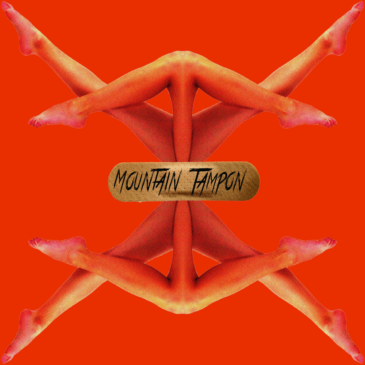
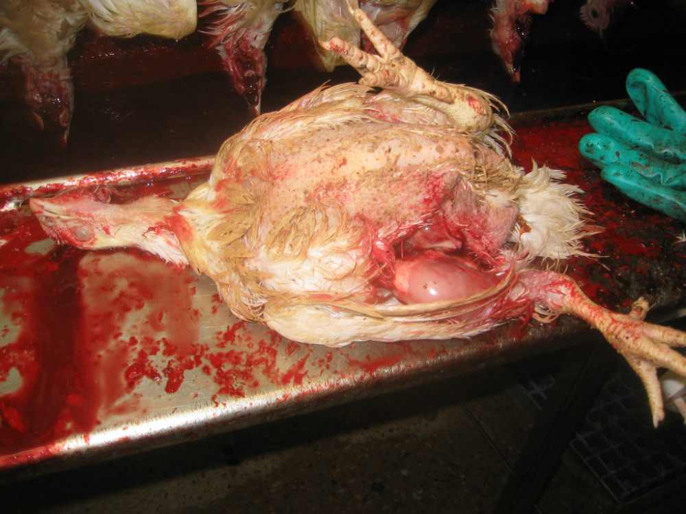
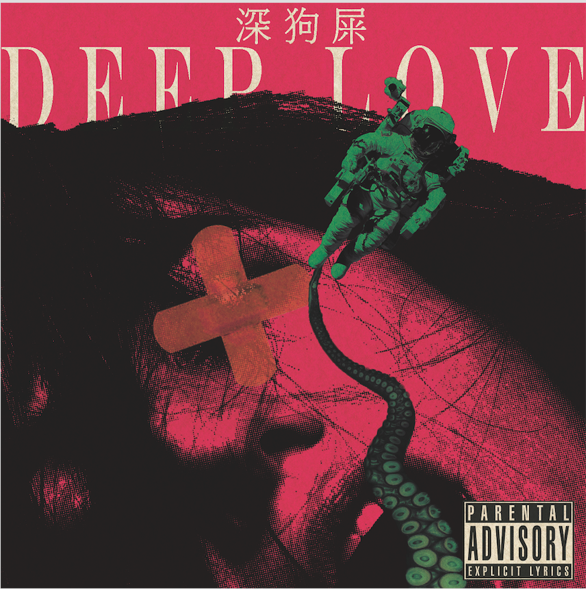
As for “Deep Love”, the trait covered here is literally Love but in really broad terms. Not just romance but love for things. I believe Fascination and Love are the two main traits that drive me as a person. As I grew up, I discovered that I was not just simply fascinated with all the weird stuff but I really loved them. It was quite hard to accept at first since it meant that I was rotten as hell but I gradually grew to accept this side of me. As a young child who constantly compared herself to other girls in school, for a long time, I felt the need to be THAT girl AKA the IT girl as some would put it. Basically, well-liked, sociable, pretty, popular blablabla kind of girl. This meant that I should be into a certain set of things and stay away from some things, thus I always kept my love for the weird a secret. However, as I grew up I realised I just could not stay that way, if I was already rotten in my core, I cannot possibly force myself to be some clean-cut person. That’s also when I realise that if I want to accept myself, I should hang out with people who would accept me too, rather than force myself to be some social butterfly and be someone else. tldr; went through some self-evaluation and accepted my own rotten self. Oh yeah, I believe my interests are considered rotten not my personality hah. Anyway, for the look, I re-used the nice halftone image I did of this women’s orgasm face, along with the long astronaut exploring while being connected to a tentacle. It represents my curiosity to dive DEEP into the bizarre realm that’s far from reality and the lone astronaut represents me as a loner and introvert who’s so into my own world. I added the plaster since plasters bring up the idea of injuries and there’s just something very human about plasters so I added it in. & call me crazy but when I was young I had this dream of wanting to paste plasters all over someone’s nude body. For the inside cover, I edited this image of a slaughtered chicken to make it look really saturated, gross and most of all raw. Aside from the fact that it added on to the raw visual look I wanted to capture for this album, I felt that for one of love oneself, you need to accept every single thing about yourself even if it was not pleasant and in fact downright gross. If you like eating fresh steamed chicken, you better accept how the slaughtered chicken looked before it ended up on your plate. (I realised this analogy can be applied to women too..hmm) I placed it such that it conveniently connects with the women’s face and looks slightly ambiguous at the same time. The blue circle was inspired by a certain kind of packaging where neon orange or green circle are pasted on to mean something (I forgot but its definitely an asian thing). The back cover was a photograph of cut papayas I took a few months back which I then edited to make it look really raw and have that “blood and flesh” feel. Once again, I can explain the tracks. “Distorted View Daily” is one of my favourite podcasts that I discovered recently that embraces everything rotten and perverse. If you’re familiar with Reddit, then you’ll probably know that “#morbidreality” and “#gonewild” are actual subreddits. I really like exploring “#morbidreality” during my free time. “Wishing Star Erection” was something I misheard when someone n G6 said something and “My Lesbian Dream 2.0” was also contributed by someone in G6 (I kind of forgot who so if its you, do reply in the comments!)
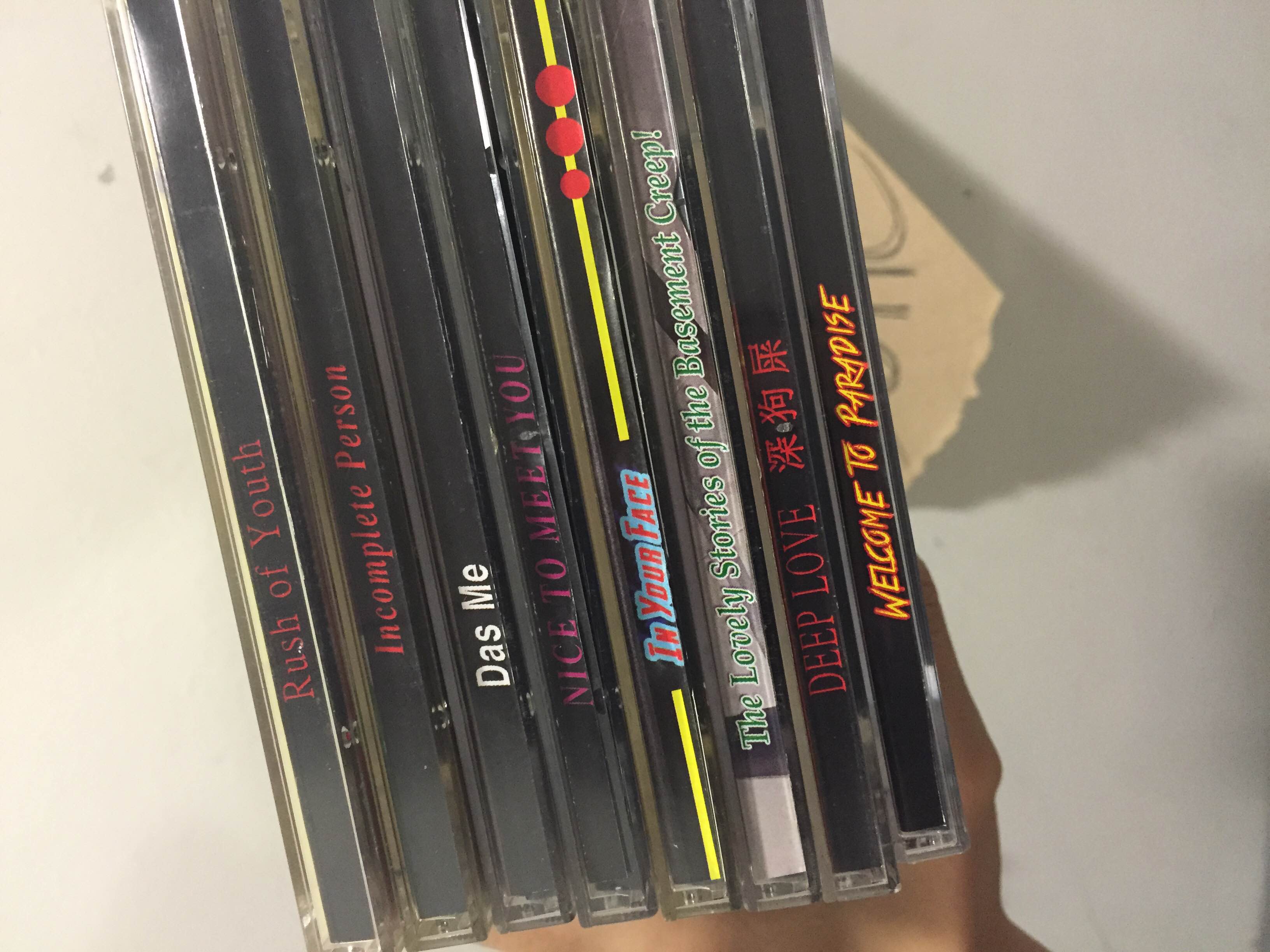
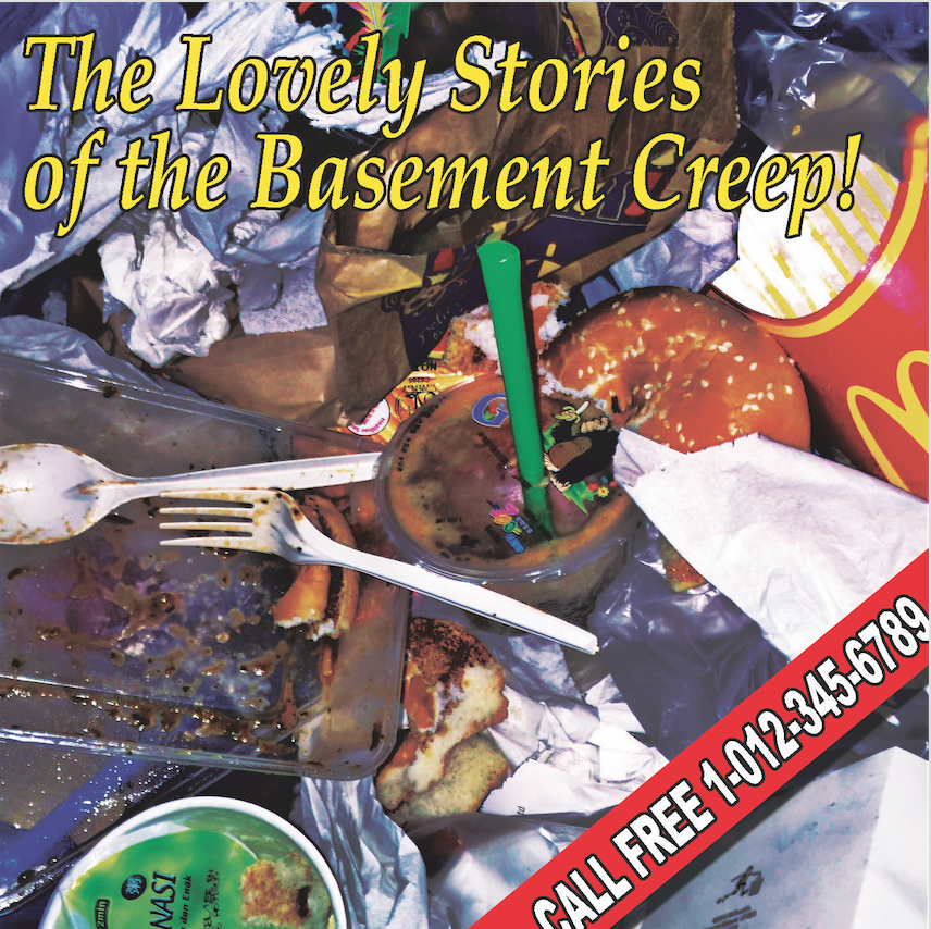
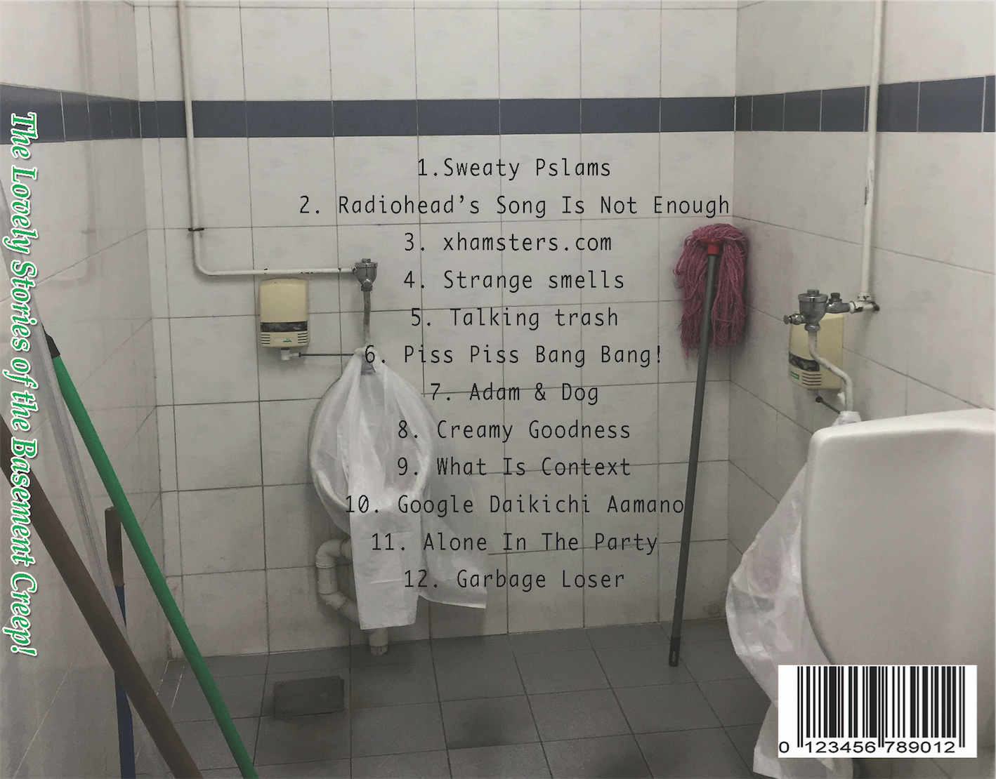
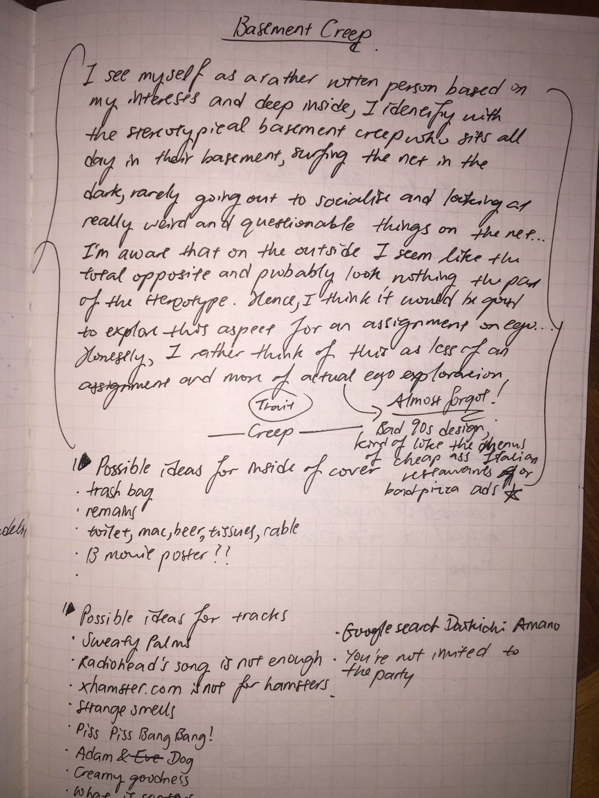
So take lots of Fascination and Love for weird rotten stuff and what do you get? A Basement Creep! For this album, I decided to just show what represents a basement creep which is the trash of food from long periods of staying in the basement. I somehow identify with the stereotypical basement creep since I like spending lots of time alone on my own surfing really weird stuff on the net at night…hah pathetic…Anyway, collecting and arranging the trash to make it look as gross as possible was…fun. Since there’s nothing glorious about basement creeps, I decided to model it after a bad 90s advertisement/ cheap Italian restaurant menu/ bad pizza ad complete with a fake number. However, at the same time I’ve learn to accept myself for who I am and be proud of it so the title says “The Lovely Stories of the Basement Creep”. For the back, I wanted to keep up the cheap trashy look so I just took a picture of the Hall 2 toilet and used karaoke translation fonts for the title. Once again, I did plan the titles but I’ll only explain one of them that is 10.”Google Daikichi Amano” who is one of my favourite artists and those who know me will probably understand. I think it fits pretty well with this album so he’s in. I understand that there is a tendency to romanticise one’s self “Ego: Me” so I thought quite hard for this series, trying to be honest with myself as possible. While I would have loved to explore more glorious aspects of me like my inquisitiveness, my strong intuition or my thinking ability, I decided to just get straight to what I feel I really am especially late at night so here you go, I’m a basement creep at heart.
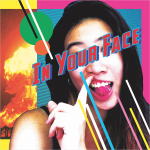
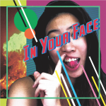
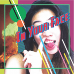
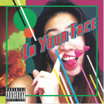
In Your Face
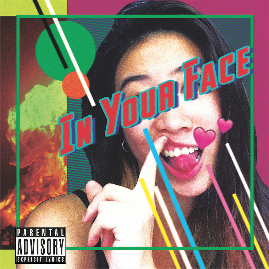
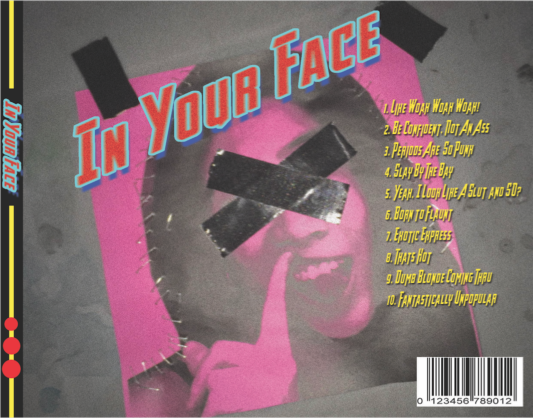
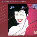
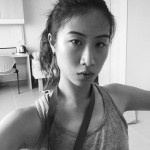
For the ideal me, I thought of being more direct and bold. I’ve been told by people that I have great ideas but I just did not dare to put them down. Also, I always felt I have been very controlled when it comes to my art for the past few years due to fear of being judged but as you can see recently, I seem to have gotten over that or maybe not completely yet. To capture this boldness, I modelled this album after 80s pop album covers. I’m not sure if it shows but I was most inspired by Duran Duran albums in the 80s so I used the lines in that manner. The selfie was taken when I was pretty high and feeling fun so I felt it should be included. At the same time, I felt it should have a modern touch so I added it in the double hearts emoji which makes it look cheesier too. The explosion at the back also adds to the whole look too. I didn’t realise it till now but with my face doing that action beside it, it seems almost like a slight smile by me created an explosion and I seem to not care at all. For the inside cover, I tried to make it more like a pop album cover, complete with text and pictures of myself and yes, sanitory pad (that’s not mine but it could have been) cause we should be proud of periods and not shy away from it. I also played with the idea of swiping on social media apps and went for “Swipe off” to remind myself to not care too much about some people on social media. I realise I care a little too much about people I barely know so yeah, swipe off! I used a lot of pink here which is not my favourite colour but I always felt pink was a really bold colour and a colour that had a lot of attitude. For the back cover, I took the same selfie, edited it, printed it and paste it on some dirty ground using my favourite tool duct tape! Basically, I just felt that I should continue to stand tall and proud no matter what people treat you as. I mean that selfie almost feels like I literally give no F***s (sorry for the profanity but I felt that the phrase had to be said)
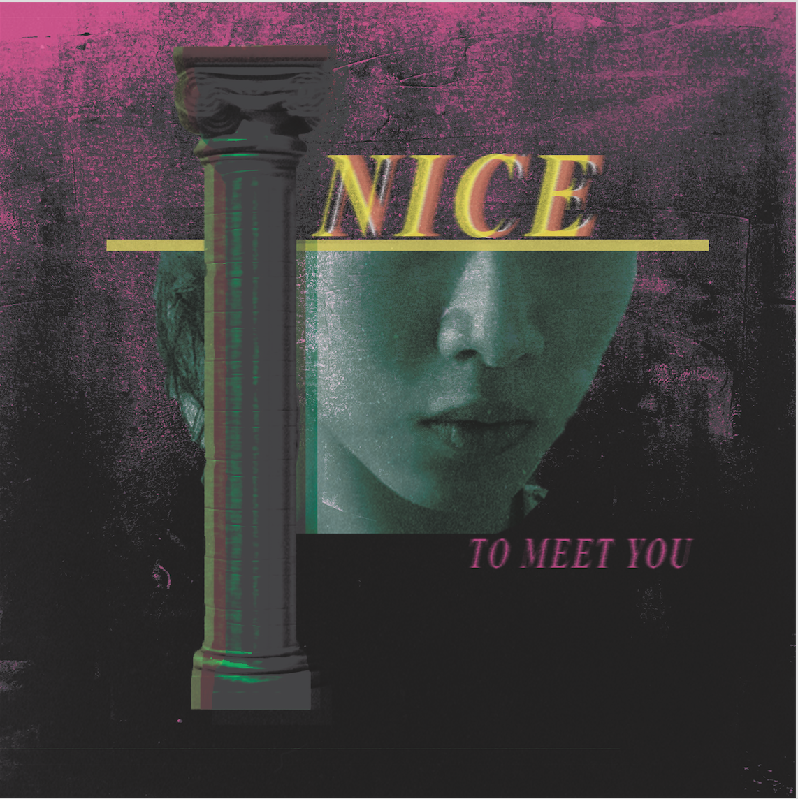
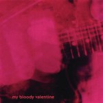
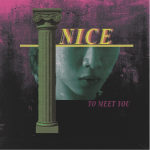
Socially awkward & insecure
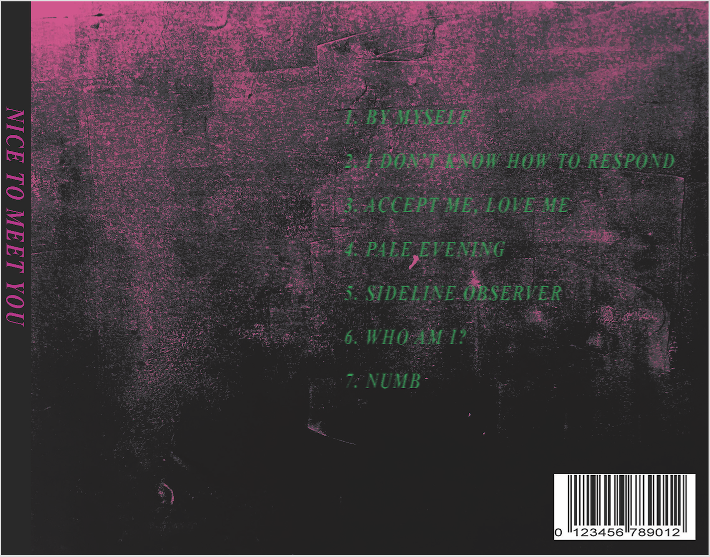
I hope to be less socially awkward and insecure. I know on the outside I don’t seem like it at all, in fact, people have told me that I seem confident surprisingly but I guess cause I hide it well enough. I decided to model this album after Shoegaze album covers like My Bloody Valentine cause its the music I listen to when I feel like I’m breaking up and not really there. The look I wanted to capture for this album was the feeling of not being completely there, ambiguous and almost fading away. While the title says “Nice to mee you”, it doesn’t feel welcoming. I like the combination of this pink and green which makes it looks slightly mysterious at the same time. I did not manage to print the inside back cover but I’ll post it here just to show that for a long time, I struggled with the idea of trying to literally stay within the boundaries yet be myself at the same time. Red and green together just looks really jarring which is pretty much how I feel about this struggle.
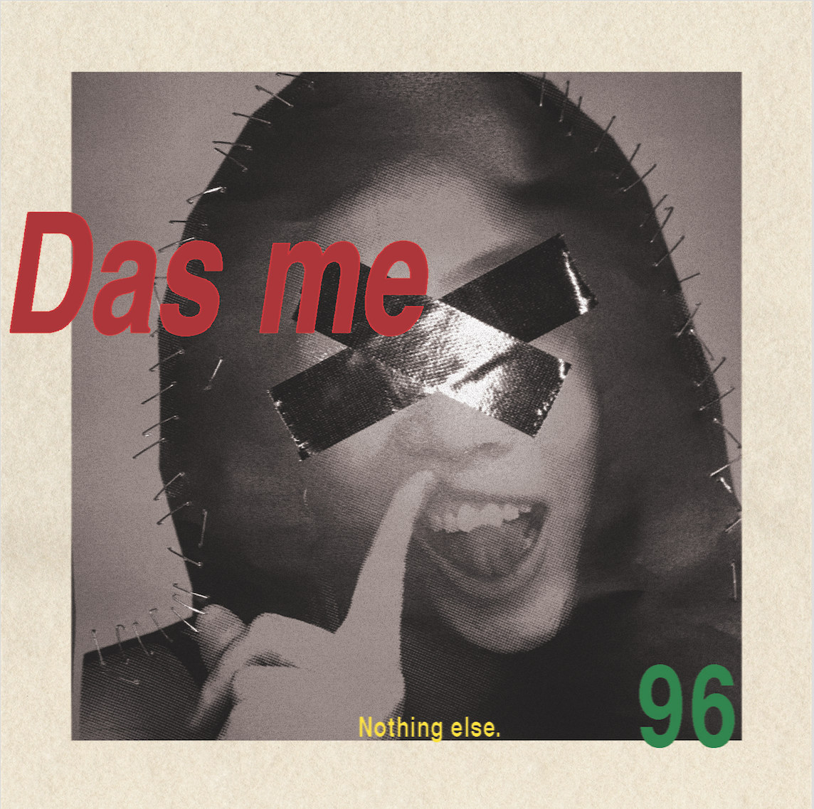
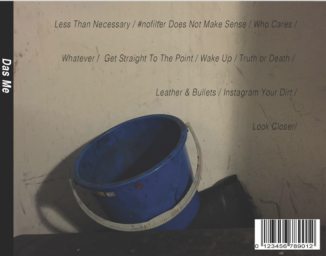
Truth
More boldness, less shyness and I hope to achieve I more honest self. I went with the title “Das Me” as I was inspired by the song of the same title by Brooke Candy. It just sounds so different when you say it out loud compared to “That’s me” and the song is just really relevant for the concept of this album. I went for a much more plain look for this album and only added details that were necessary like my birth year and literally “nothing else”. I also added photos of plain things without any filter whatsoever to reinforce that concept. Like how pop album rely on lots of extra graphics and promotional material, this album goes is the very anti-thesis of that. A better me means not relying on anything else to be myself. For the look, I guess I was influenced by old German designs rather than a certain genre. I just like how simple yet strong the design looks, not sure if mine reflects the same feeling though…
Cool
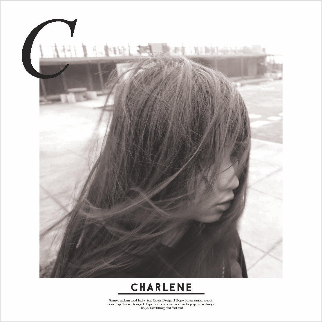
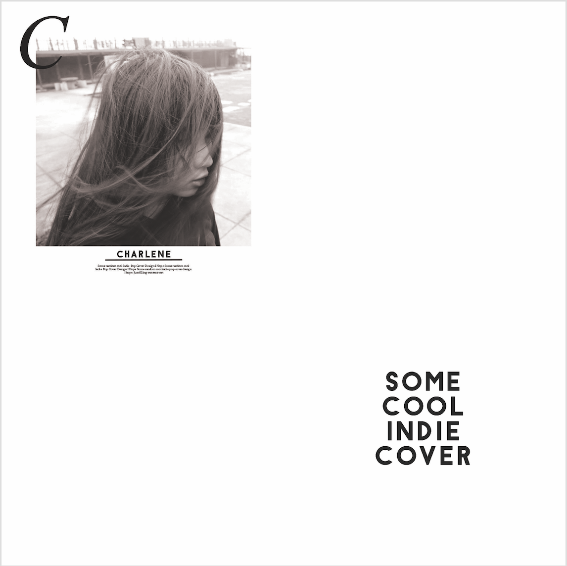
For one part of the Ideal me, since young I wanted to be a cool kid, like really one of those “popz” people…I guess even now…so for this album, I modelled it after an Indie pop album, especially those that feature a solo artist. It’s pretty much what’s cool these days I suppose (unless I’m outdated). However, at the same time, I’m kind of aware of how being that kind of “cool” is kind of ridiculous to me since it’s just being into a certain set of things and portraying a side that’s not really me so yeah, hence the “some cool indie cover”. It’s like imagine if my instagram was replaced with the whole white minimalist layout and only features photos of me facing sideways and clean workspaces instead of my real interests. That kind of scares me..but still I wanted to fit in with the cool kids so this represents that aspect.
Weird
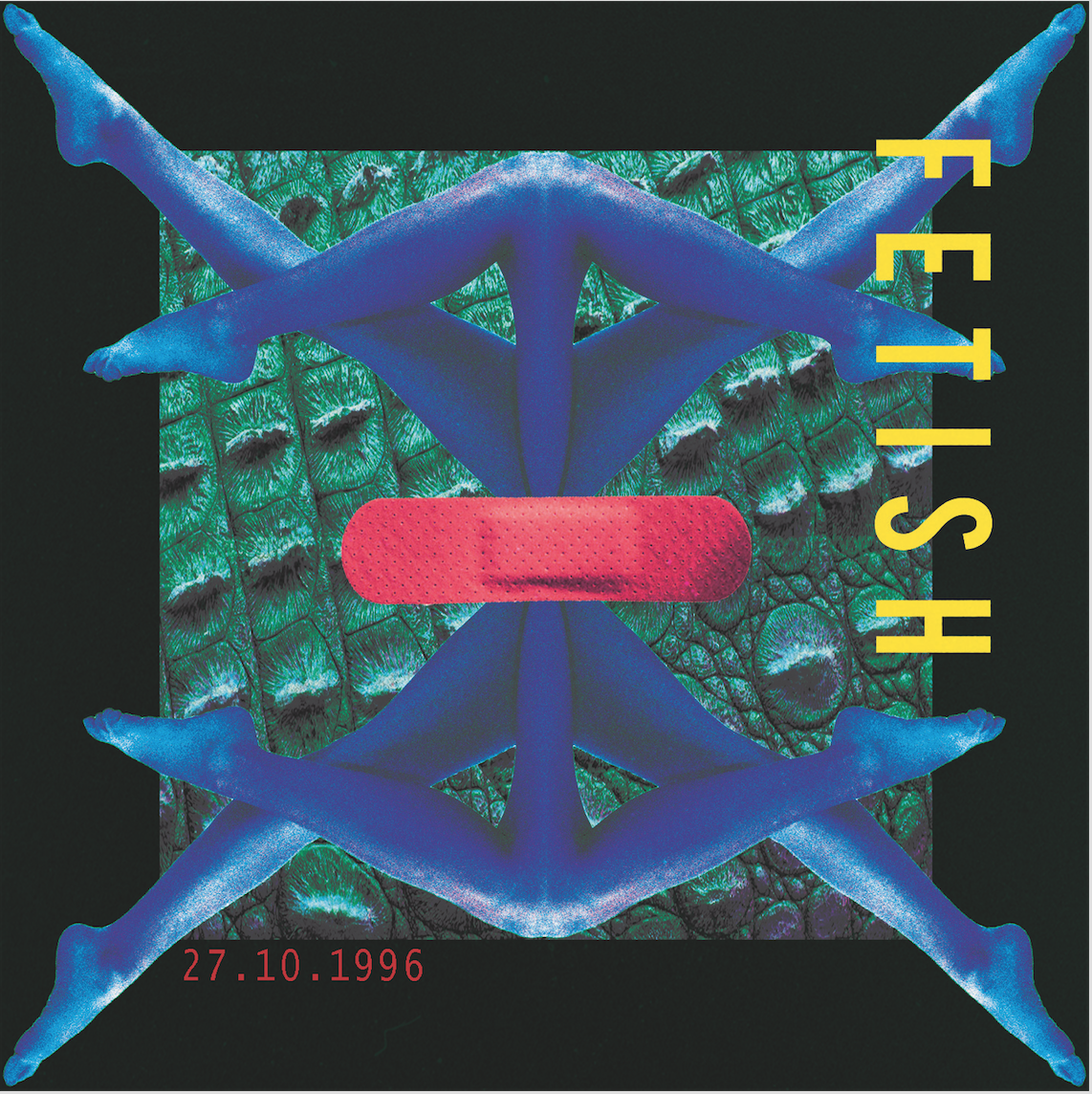
I may be repeating myself here from the first series but I just wanted to emphasise it again, while I wanted to be cool, I wanted to keep my weirdness too. I actually don’t find myself weird but in the context of everyone else, I’m aware why they would think I’m weird. For this album, I was not inspired by any genre but just did it according to instinct. I like how it looks slightly bizarre yet familiar at the same time. I believe that’s how weirdness is, not totally unfamiliar, its that slight familiarity that makes it strange. Anyway, I titled it Fetish cause that’s how the overall look feels like to me based on the glossy legs, crocodile skill texture and plaster which were things that came into my head so I decided to put them together…hmm don’t ask why…
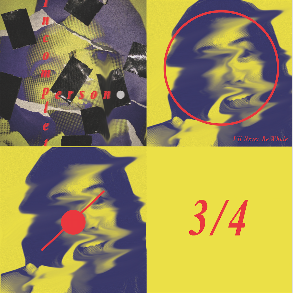
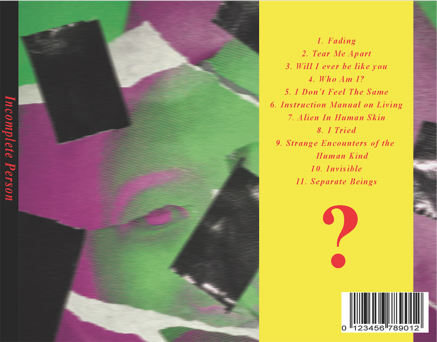
Incomplete Me
Initially, I thought the ideal me would be a combination of cool and weird but as I thought about it more, I realise I don’t really know what my ideal me would be cause I always felt incomplete as a person and I believe that I’ll probably be that way forever. I always felt a little separate from the rest of humanity and it does worry me quite a lot especially when some things make me feel strongly about…a reminder that I’ll never completely fit in with everyone else. So yeah, an ideal me does not exist in my mind at the moment, rather its this feeling of being incomplete prevents me from seeing one but at the same time could represent an ideal me too. While incomplete does have its negative connotations, it also means I’m in the constant state of changing since I’m never complete, I can constantly add on to myself.I think the inside cover is quite self-explanatory and 3/4 cause once again, I’m incomplete.
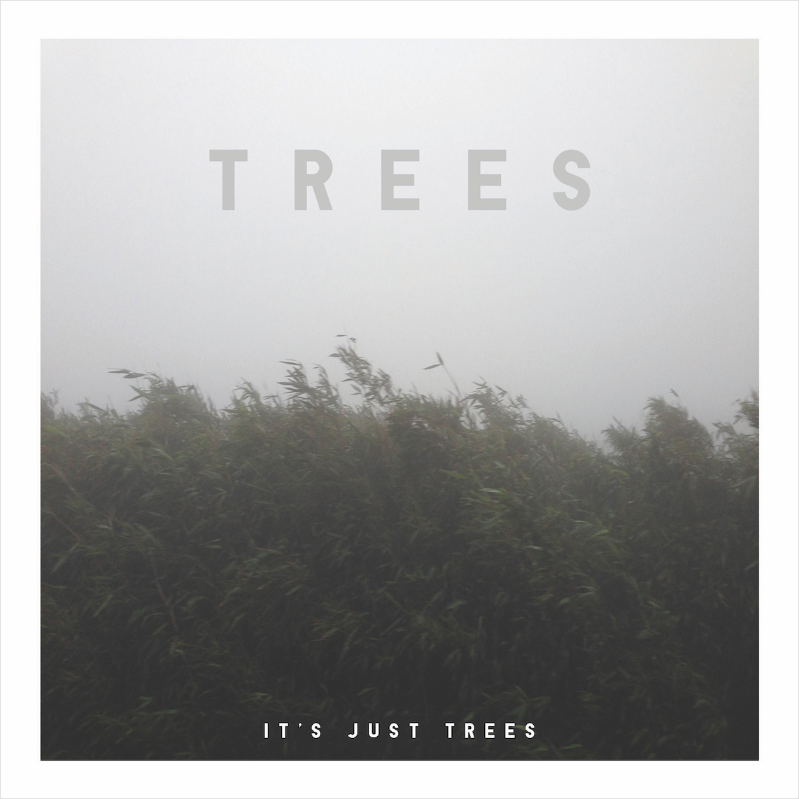
The Minimalist
As the series progresses, my designs become more and more minimalistic and there is a reason behind this. This leads up to my fear of mine in 5 years. I’m not entirely against minimalist designs but it being the trend does kind of affect me, especially when you consider that my style is pretty much the very opposite. I based this on the super minimal album cover designs that are currently trending at the moment. It represents the need of having to force myself to change and do things according to what society wants to see at the moment, which is personally undesirable but practical and as much as it is important to “stay true to art”, taking in practical considerations is really unavoidable as we grow up. What I mean by practical considerations would be monetary gains and career stability which most artists or students in art school might consider ridiculous and against the very nature of an artist. However, I’m sorry to say I have to disagree, as much as I’m into the weird and wild, I’m still quite a realist at heart so I still consider these things important to me not just in 5 years but even now I’m thinking about how to achieve them. The best case scenario would be a nice compromise between my own artistic vision and career stability but I still do fear that it might not happen and I might have to sacrifice 90% of it for the sake of career stability…
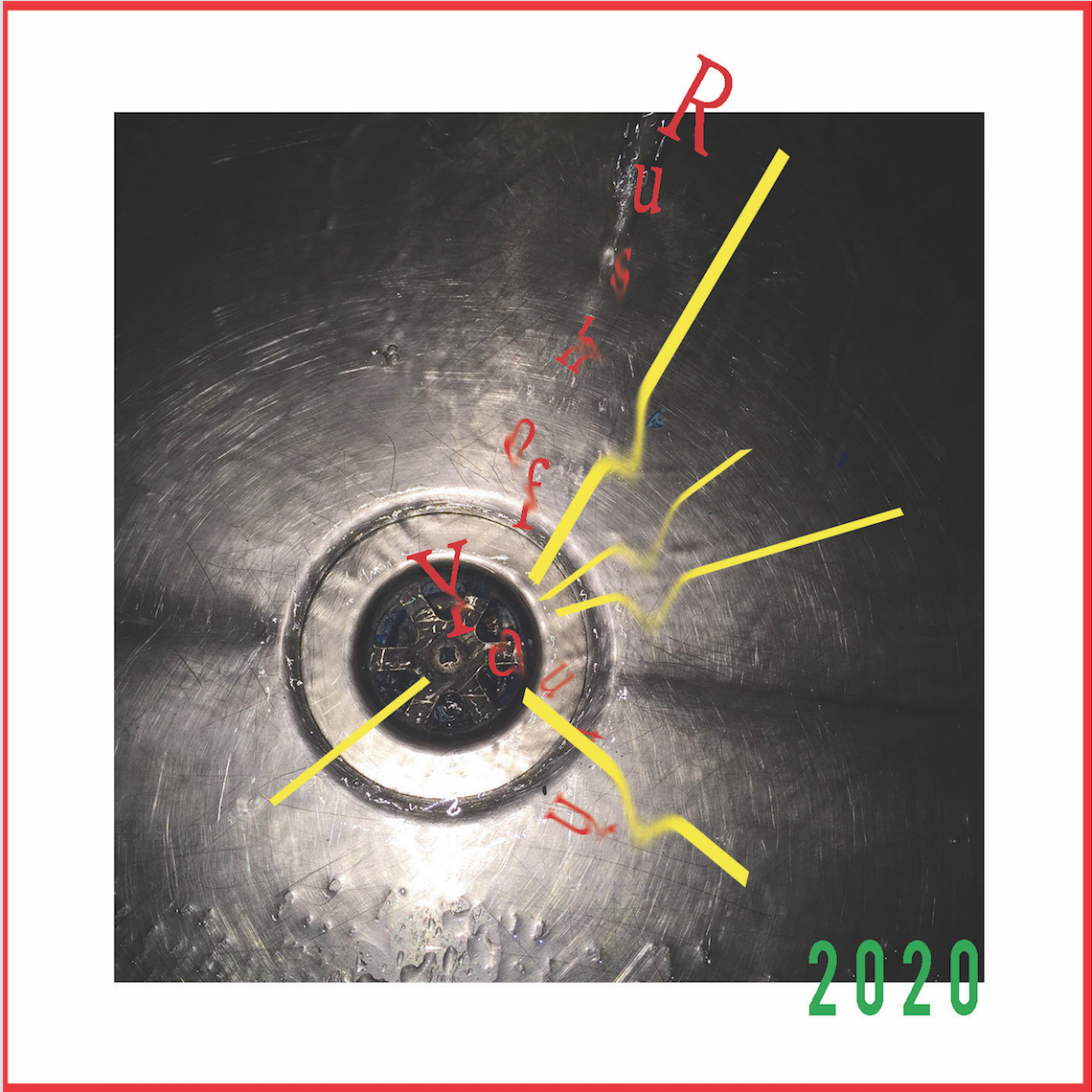
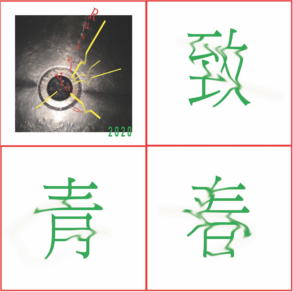
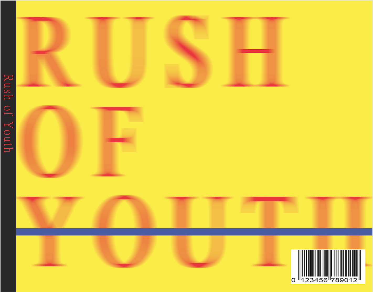
Rush of Youth
Another of my fears would be that my creativity and artistic vision is just a passing phase, a result only possible due to the adrenaline from being young and wild, thus “Rush of Youth”. Pardon the awkward phrasing cause I can’t really think of a more eloquent way to put it other than the Chinese phrase 致青春. To represent the idea of being drained of creativity and imagination, I literally took a photo of a drain and match the fonts to it to give the feeling of being sucked away. Once again, its very minimalistic due to the same reasons as explained in the previous album. Interesting to note, Prof Ina mentioned to me how one of her students who had potential to be an animator ended up being a policeman…just goes to show how the fear is real…
Emptiness
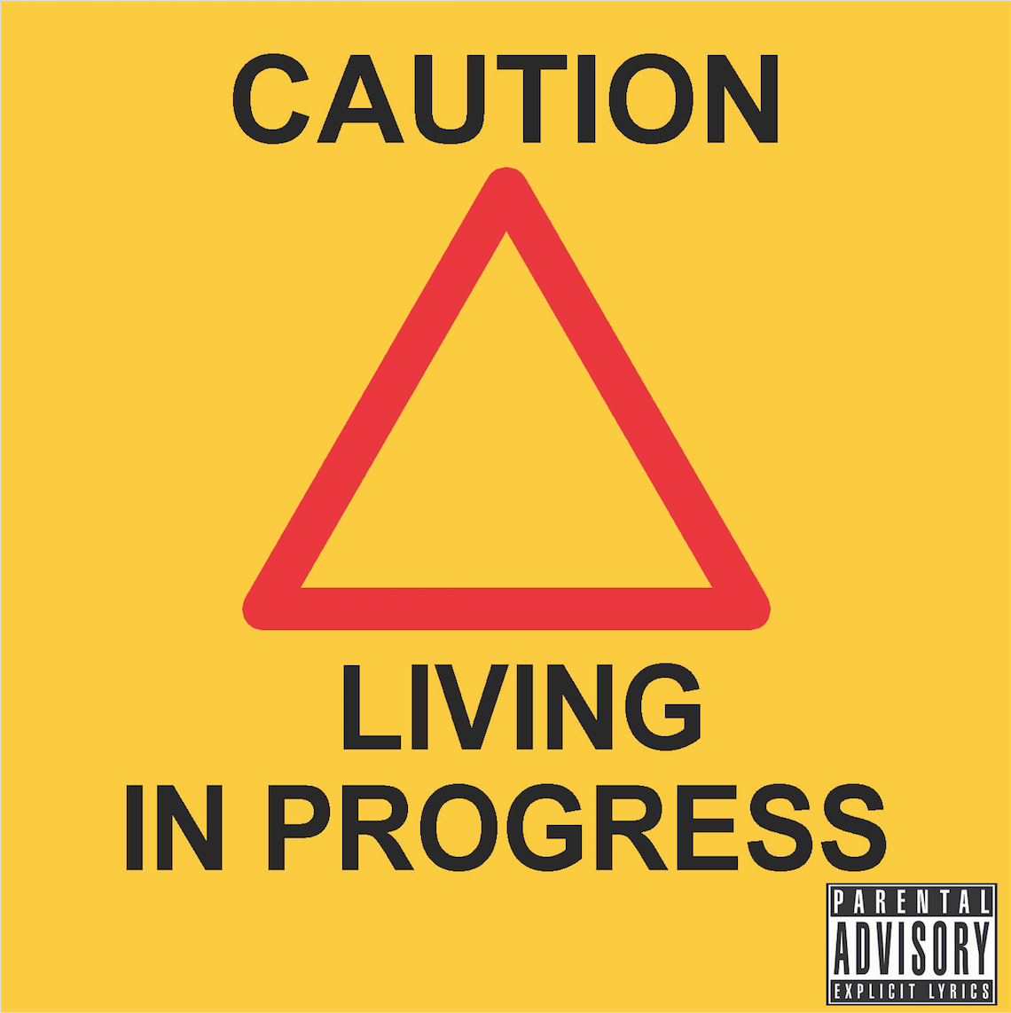
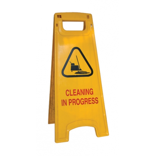
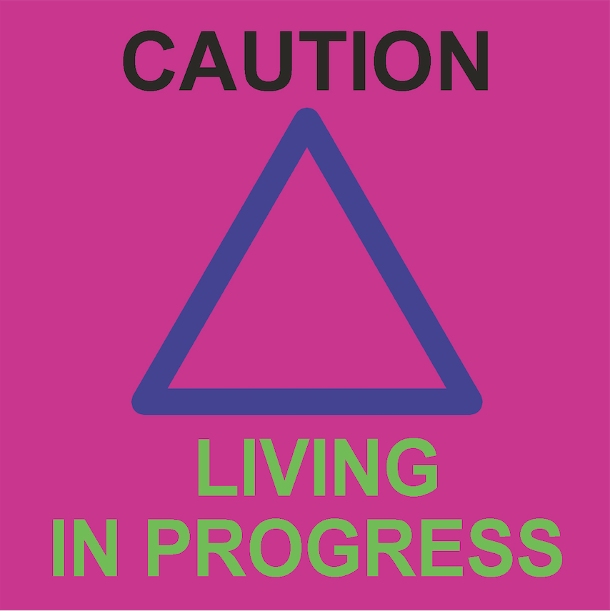
The need to change and fit in combined with the rush of youth eventually boils down to emptiness and that is exactly what I fear in 5 years to come. I based this last album cover on a cleaning signboard and it isn’t entirely random since I have indeed worked as a food court cleaner in the past so its quite personal. When I was 16, I worked as a cleaner in a food court due to family reasons. By cleaner, I really mean the cleaner who clears the dishes and wipes the tables. I could have done other jobs but I decided to help my grandpa since he needed manpower and I thought it would be an interesting experience. It definitely was not the most pleasant experience working with people much older than you and hearing them talk about their life stories all day. However, it did make me realise I do want to work hard and not end up doing such a job in the future. I do not look down on these people who do such a job since its still hard earned money but they all believe in better opportunities out there so that’s what I’m aiming for. I did a parody of the cleaning signboard and instead of “Cleaning In Progress”, I went with “Living In Progress” and an empty triangle. I fear that in 5 years my priorities would drastically change such that all I care is about living and nothing else. My life would just become very empty and I as a person would also become empty inside, drained of everything I was before and eventually lose myself. Basically, I would return to a state of tabula rasa and become an empty vessel…as thought the me inside never really existed and that is one of my greatest fears.
So yeah, thanks for taking the time to read this lengthy post…
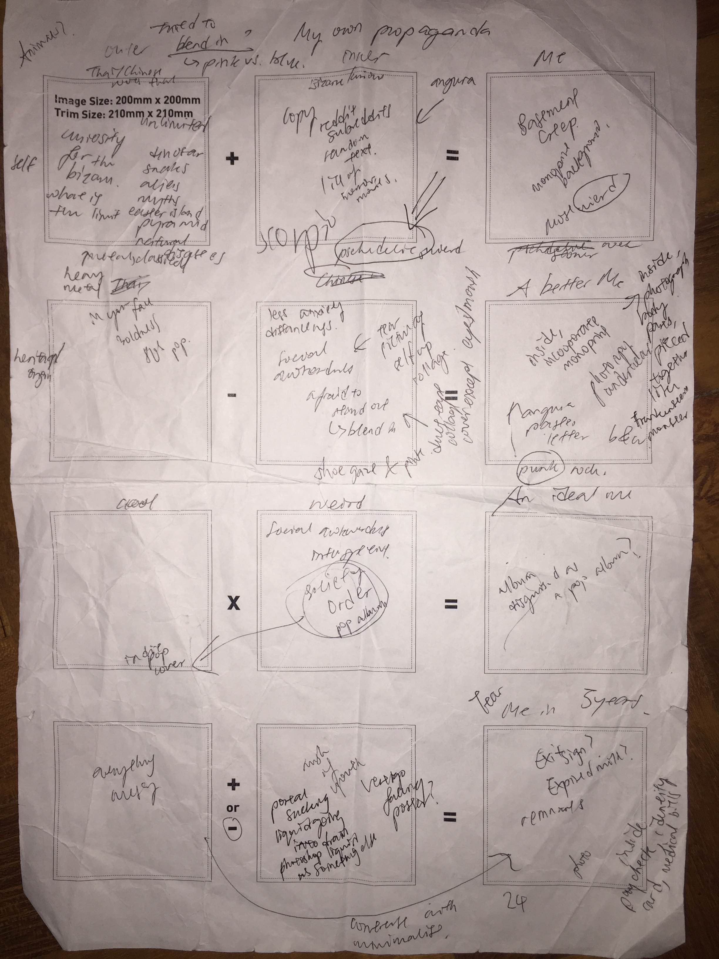
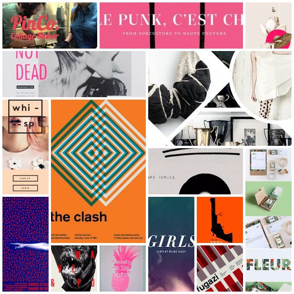
Heavily relied on Pinterest to organise my references for each series since I plan to have a different style for each one in relation to the meaning of each square (album cover). Yes, I plan to have my squares be the CD album covers and actually put them in CDs complete with inside and the back printed…so yes extra work indeed…will elaborate on why the CD concept in later posts.
For the first series about “Me”, the ‘equation’ goes as follows (the equation thing seems kind of silly when you think about it)
Fascination with the Bizarre + Love for the unusual = Basement Creep
The equation can be further simplified into traits which are “Fascination” and “Love”, two main things that drive me and I just heavily identify with the stereotypical Basement Creep so why not. I mean fascination and love when taken to the extreme kind of sums up a Basement Creep.
I initially wanted to have all my squares to be in the style of Japanese Angura Posters (underground avant-garde theatre posters from 1960-70s) such as those by Tadanori Yokoo and Shuji Teriyama and 80s pop album covers (I find the design elements really strong during that era for album covers).
Shuji Teriyama
Tadanori Yokoo
Shuji Teriyama
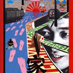
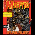
However, as I started to explore and play around with images, I found it hard to stick to one style strictly so I decided to have a different style for each one. For “Fascination with the bizarre”, I wanted to try the style of heavy metal albums mashed up with all the weird horror, erotic, sci-fi stuff that I was fascinated by. Heavy metal is quite broad so yeah I was thinking of combining a few looks like the horror of Misfits with the bizarreness of Scorpions.
However, my tendency to make things as messy as possible got the better of me until I lost sight of how it was suppose to be like a heavy metal album cover so it did not end up as dark as it was suppose to be and lacked certain elements and frames that were intrinsic to the “heavy metal” style. It ended up looking like some pop punk cover on drugs with just a slight tinge of “heavy metal”…so much for trying…
I tried a few effects such as with texture and without texture overlaid. To ensure the elments blended well together instead of looking too photoshopped, I felt that texture was necessary to make sure they all seem like they were all the same plane. However, took much texture tended to darken the entire image and make the font look dull so I had to play with the order of the texture and font and the opacity of the texture as well.
The images inside range from a snake, Egypt’s pyramids, tentacles, Easter Island statues, valley, women’s face in pain, legs, water spash emoji which takes on a different meaning given the context when placed near legs if you get what I mean hmmm…There’s quite a lot going on so I was pretty unsure if the colours work but Prof Ina assured me and said it did so I hope its ok. It seems well to me hmm..
As for the inside cover (and this is where the extra not required for the assignment but I’m still doing it cause I want to part comes in), I started out playing with some nice legs I found. I really like the collage of body parts in this book called Fotoshock (will add in image when I get back to hall) so I tried to do something similar. I duplicated it and arranged it symmetrically to create the impression of some other being.
The initial design was to make it look as human as possible and include some fleshy tones to make it look really raw. However, it ended up looking quite plain with just the plaster and legs so I felt the need to add more elements. (Oh yeah, Mountain Tampon doesn’t mean anything, it was just random words I ask Nat to give me…some dada going on)
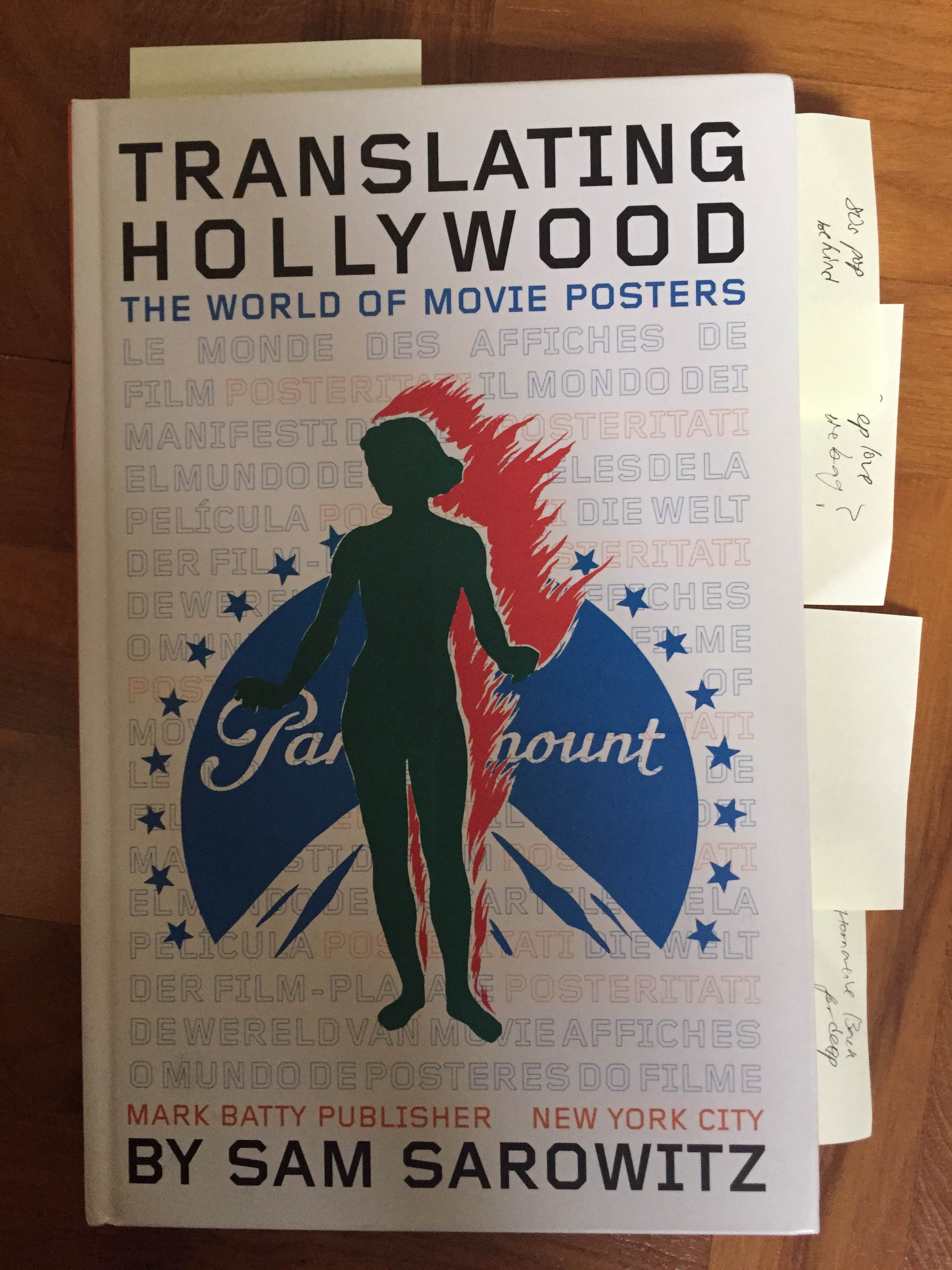
I looked through my book on old movie posters and came across one with this interesting palette of blue and a pink that looked quite bizarre.
I referred to this book for colour schemes.
I decided to try it out on the legs and added in the crocodile skin texture since the idea of female legs and rough crocodile skin suddenly came into my mind. I wanted to add lightbulbs too but decided enough was enough. I guess for the layout I was inspired by recent designs on Japanese magazine covers but really I usually just go with instinct so I’m not exactly sure what I come up with.
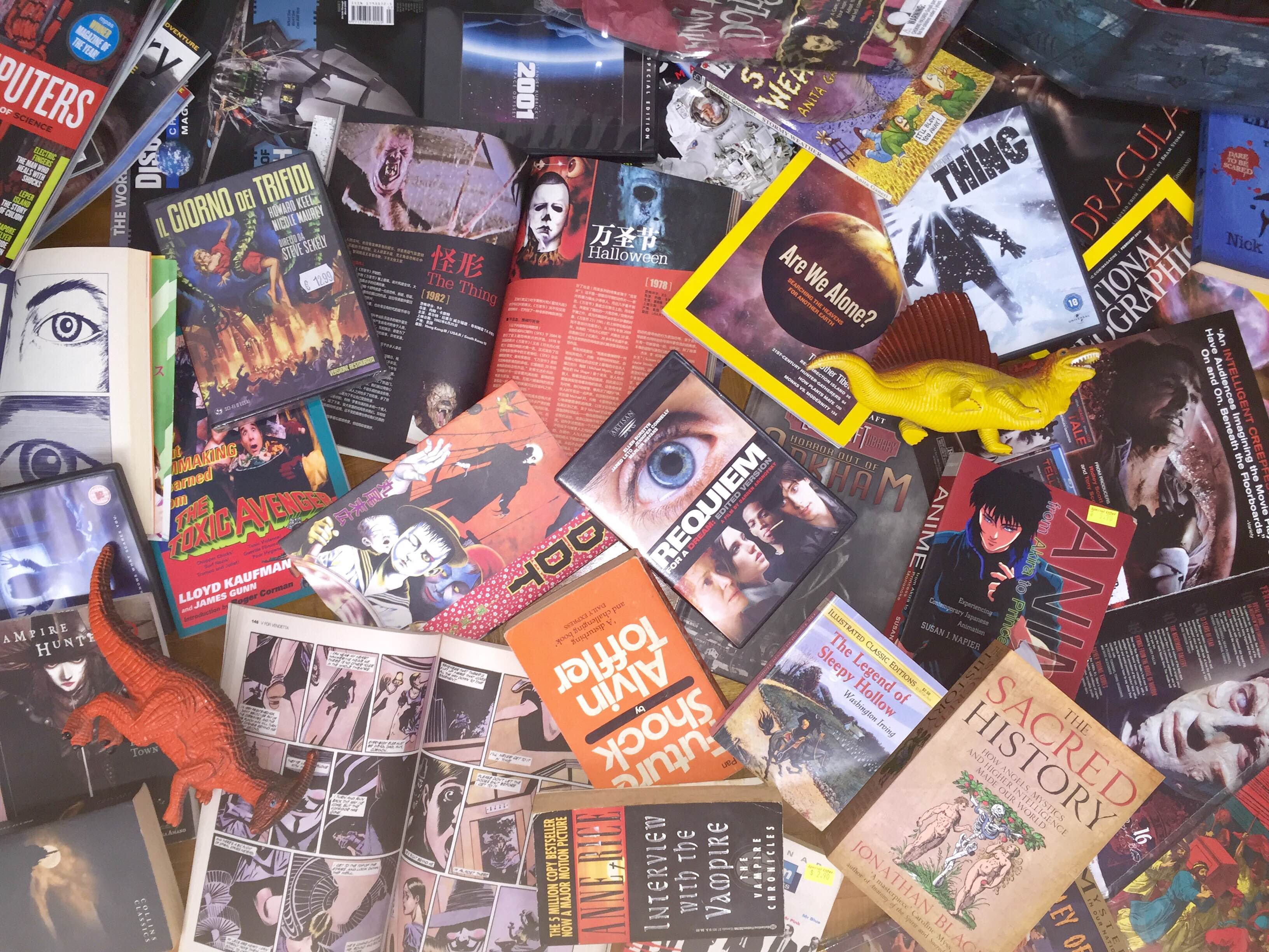
and here’s the front cover that will be folded and inserted into the CD! I gathered all my weird books, DVDs, Dolls and stuff, took a pic and edited it with some glitch.
Here’s the original images before I edited them
I proceeded to play with the cyan and magenta levels to get a more blue-ish red tint to contrast against the yellow font. I did the same for the back with the tracklist. I kind of like how the edited image looks like here. and yeah the tracklist…hehe…
As for “Love for the unusual”, I looked back at my previous Rhymes assignment and decided to work with one of my favourite halftone images.
Here’s my rough journal plan once again…
Below is the original image
The Front cover that will be folded. I wanted to work with images that conveyed a really raw feel so I found this slaughtered chicken and edited it to make it look really saturated and intense. I deliberately tried to connect the body of the chicken with the points where the female’s head ends in the front cover to connect them…not sure if it works.
As for the inside, I wanted to include an alternate version of the front cover. These two are some of the possible ideas.
An alternate title I had in mind was Explore Me which Prof Ina said worked too but I decided on Deep love in the end.
As for the back cover, I used this image of cut papayas I took a few months back. I edited it to look really saturated to convey the raw feel and make it seem almost like blood and flesh. Anyway, the back cover will not follow the square format since its another extra thing I will be printing to add on to the CD concept (the things I do to myself sigh)
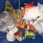
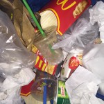
Next up, what does Fascination and Love lead to?? Me as a Basement creep and we all know what basement creeps are usually seen as so I went to collect some trash (mainly food and tissues), dump it all in a bin, took a shot and edited it to make it look as raw as possible.
Original image before editing, chose this after a few attempts.
I tried to make it look like bad pizza advertisement or some menu from a cheap Italian restaurant.
Direct (True to self) – Need to conform (blend in) = Raw Self
For the album on being True to self, I plan to based it on some 80s pop album cover since they had really bold designs and at the same time most of them had a collage effect. I also like listening to 80s pop whenever I felt high and it just gave me a lot of confidence to be myself.
I started out with this strange selfie of mine (I’m still quite disturbed as to why I did that but oh well it looks fun enough for an 80s pop cover), then I cut it out and added in the basic elements. To ensure everything blended well with each other, I used some slight motion blur and added noise so that the elements seem as if they were all of similar resolution. The rest is just experimenting with the exposure, order of layers so see which fit best, with and without the green frame. I added in the hearts emoji for added cheesiness and to contrast with the straight edges and lines.
For the album on the need to conform and social insecurities, I wanted to create one that contrasts with the “true to self” album, which means to be very reserved rather than bold and much more organised. I was thinking of Shoegaze albums as that’s what I tend to listen to when I feel down and not completely there.
I started out with this selfie and to show how awkward I was, I decided to crop out half my face and use one of my monoprints from the first assignment. I like how this monoprint had this gradient effect which gives this uncertain feeling as well. The main challenge with this composition was how to blend the roman pillar in with the rest of the images. I played with the cyan, magenta, yellow levels to achieve the chromatic effect and used motion blur to create the blurry effect which goes with the idea of not being entirely there. The roman pillar represents order and is placed in this very strange composition to show my incompatibility with order yet desire to be part of it at the same time.
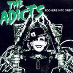
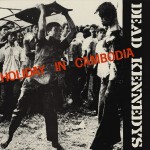
As for the album about the raw honest self, I intend to go for a punk album inspired look since punk was about the bare necessities and being able to create music based on knowing a few chords and without the glitz and glamour of 70s glam rock or even 80s pop. Punk bands have a very raw sound and direct lyrics that just get to you immediately so i thought it would be fitting this album. Took inspiration from some of my favourite bands like The Dead Kennedys, The Adicts…
I edited this photo of myself, printed it out, used staple bullets and duct tape to evoke the stereotypical punk look…but then again punk can be shown in many ways so I decided to opt for some other look instead of the conventional one.
I used the same picture but decided to not rely on pink but just the placement of fonts. I was partially inspired by German magazine designs so I went with standard Helvetica and deliberately put the Das me out of frame in a really awkward position. I also made it as simple as possible and added “nothing else”. and that was my interpretation of a somewhat punk look.
For the cool album, I looked at indie pop album covers since they were what’s trending at the moment.
For the ideal me, I initially wanted to do a combination of cool and weird but as I thought about it further I realised it would be quite impossible to truly create such a combination since one would definitely overpower the other and the whole thing may just look quite pretentious. I mean I actually thought of doing a weird album disguised as a pop album but that idea has been done before quite a few times such that it now sounds quite pretentious?? (The 1975’s Love Me is one recent example) I decided to just portray that feeling of being incomplete instead.
I started out with that same selfie (I feel really uncomfortable taking any more for this project so yeah same one), halftone the image and played with the hues, tore it apart, put it back together again using duct tape in a messy fashion before editing the whole thing on photoshop again. I deliberately made the word incomplete out of frame cause incomplete (LOL okay) and pinched the eye to foreshadow the melting in the following series.
For the inside cover, the melting is now more full blown and I played with the contrast between the complete circle and my melting face to show how I’ll never fit in the “circle” which I see as complete and the complete human being. I went with 3/4 cause of the division of squares and adding in a fraction makes it all look quite mathematical and almost mechanic and cold as I see myself melt away slowly.
Everything that I am – Rush of Youth = Emptiness (blank slate)
more like fear of what I might become in 5 years…
However, when I re-looked at the other squares I realised that doing an album based on everything that I am will probably end up looking like a repeat of the first series so I changed it to
Minimalist + Rush of youth = Emptiness (blank slate)
For the minimalist, I did a rather sarcastic take on it since I was not very fond of the style. I understand it has its own beauty but when the style becomes ubiquitous such that it loses its original shine…it starts to become kind of irritating and even ridiculous..
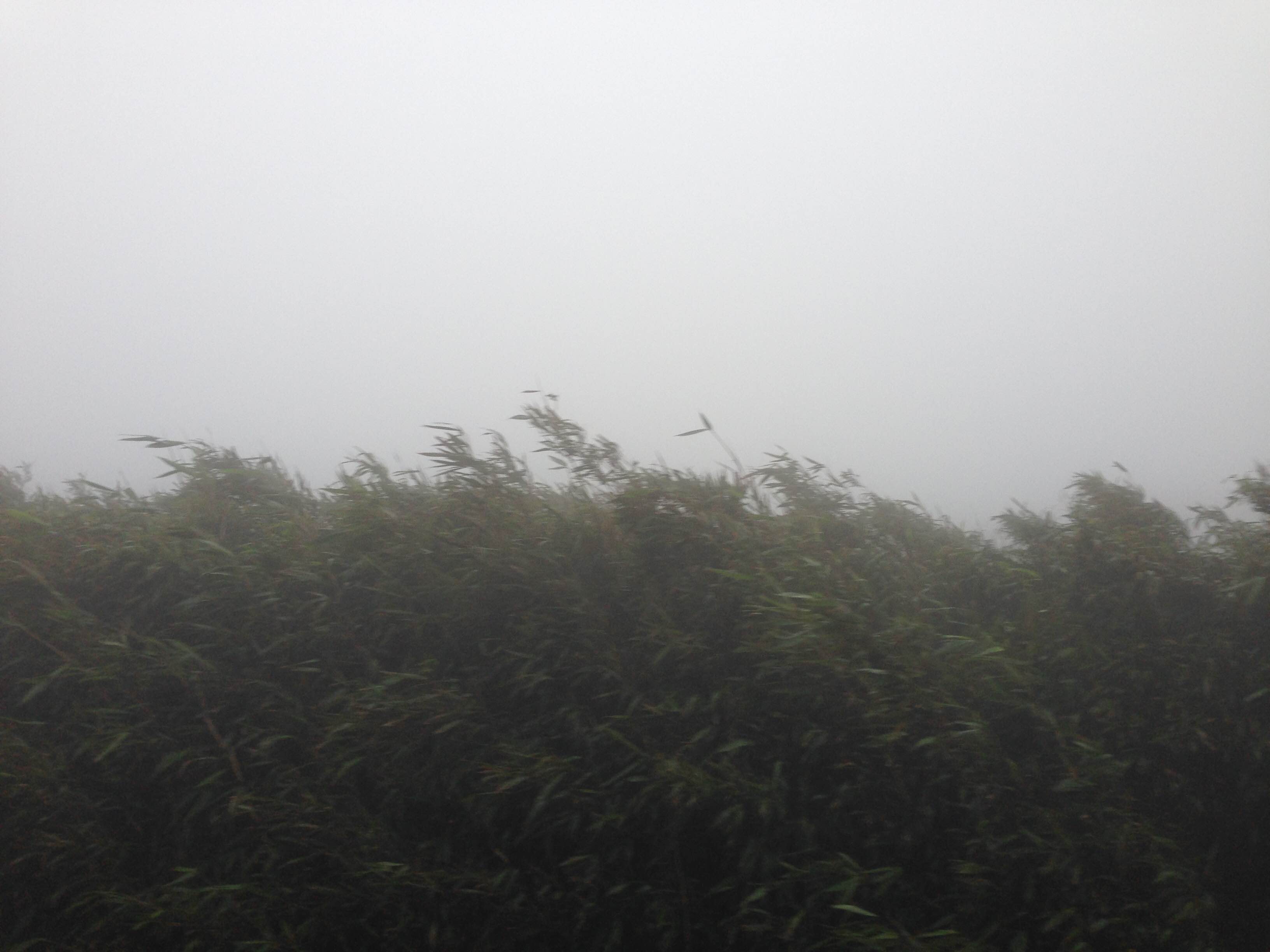
This is the original image of some bushes/trees/ferns I captured on some foggy mountain…seems like something suitable for a minimalist indie album cover so…
Strange enough, photos like these get lots of likes on Instagram yet if you think about it…it’s just bushes or trees…seriously…and think about how much effort went into making this design…I honestly don’t mind revealing that I put in little effort for this square since its part of the overall concept so even such designs are still important.
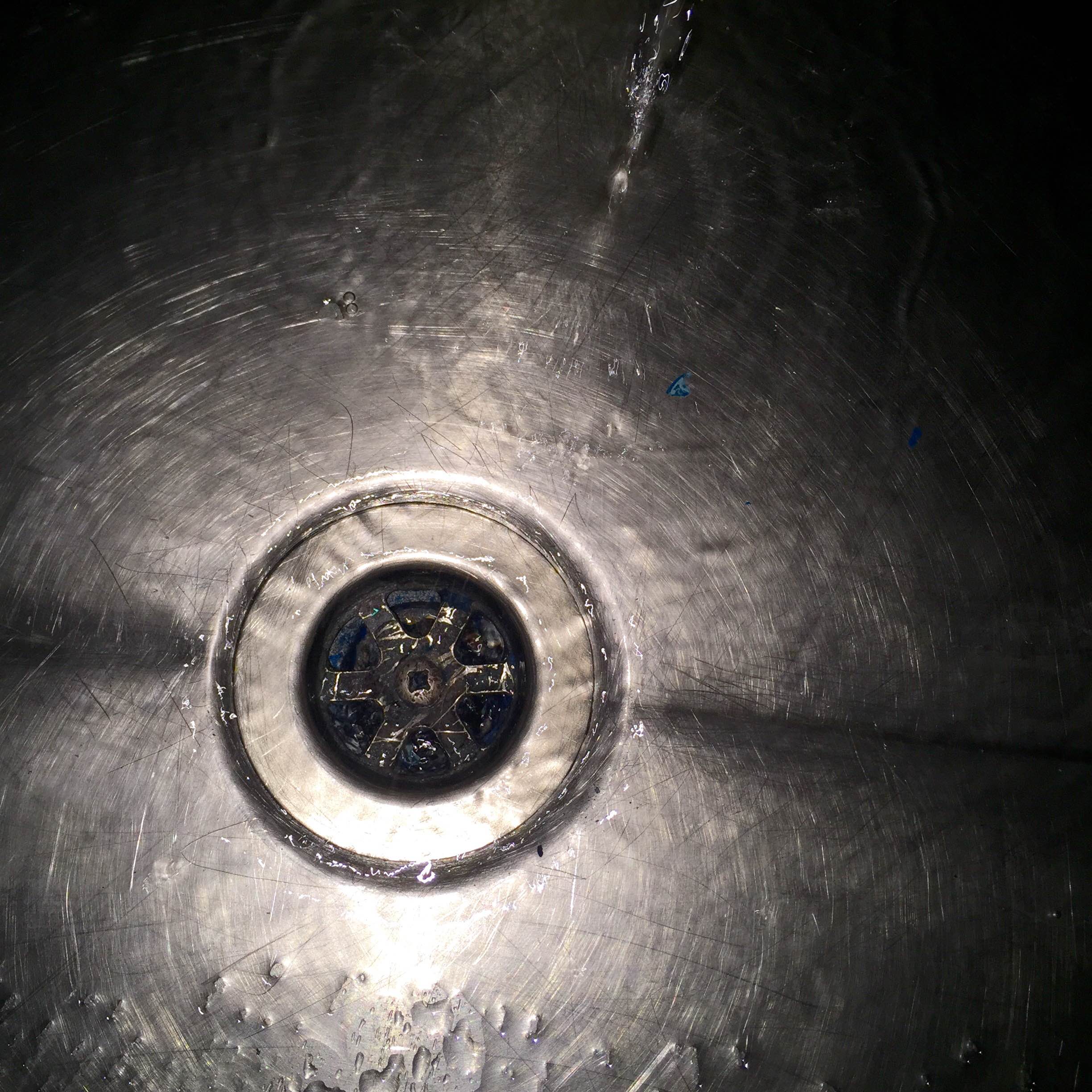
For Rush of Youth, I had the idea of wanting to show something being drained away or sucked away yet at the same time keep a very minimalist design to show the gradual loss of style as I progress (fear in 5 years). I started with this photograph I took of a sink in the 2D monoprint room.
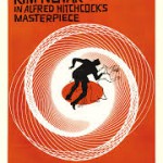
As for the design, I wanted to try added lines in a circular motion after looking at the effect it created in the Peeping Tom poster. I also thought of going for the circular motion effect as seen in Saul Bass’s famous Vertigo poster and one of Hannah Hoch’s collage where the text goes in a circular motion along with the character to reinforce the falling effect. The lines of building contrast nicely with the circular motion and add to the effect of vertigo so i wanted to try something similar.
As for the inside, I was inspired by Faye Wong’s song so I added in the words 致青春 and used the pinch tool to drag it out and make it look like its melting away.
For the back cover, I played with the motion blur took again to convey the effect of rush while the sudden blue line strikes the words youth out to create a jarring effect, a harsh reminder of youth being erased.
For the last one as I reach the final state of emptiness in 5 years as I fear, I based it on the design of the standard cleaning signboards.
I thought of adjusting the hues at first but decided not to in the end, since the idea here was to have as little artistic touch and creativity as possible so I just ripped the design and made it my own. The process showing just how drained of creativity I fear I might become. Moreover, I felt the usage of the cleaning board design should relate directly back to the cleaning board due to my cleaner past rather than to manipulating it “artistically” and having too much focus on its design. Basically, the subject matters more than the design for this last piece.