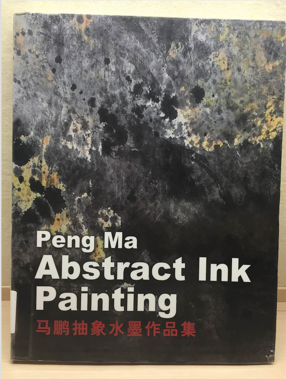

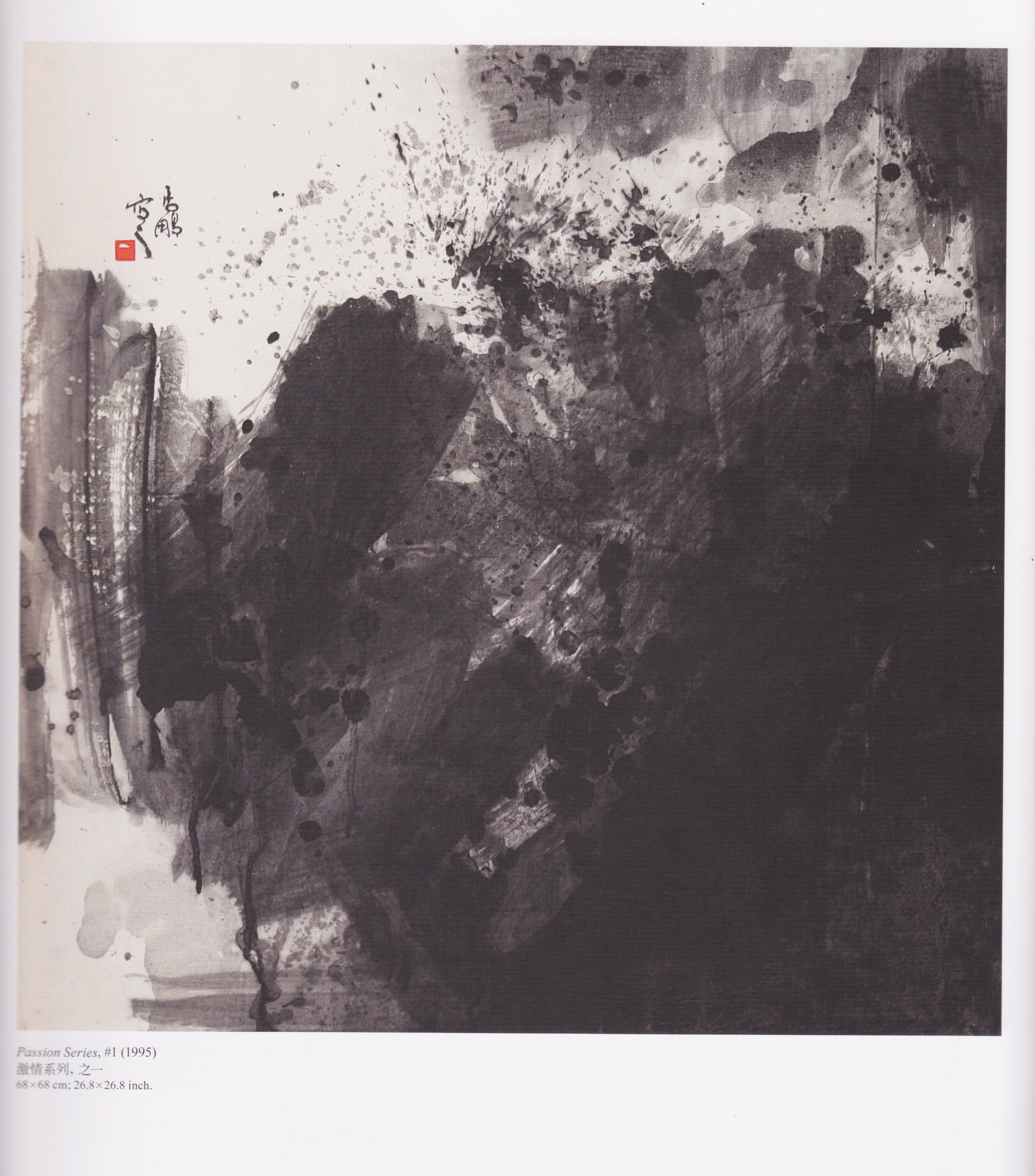
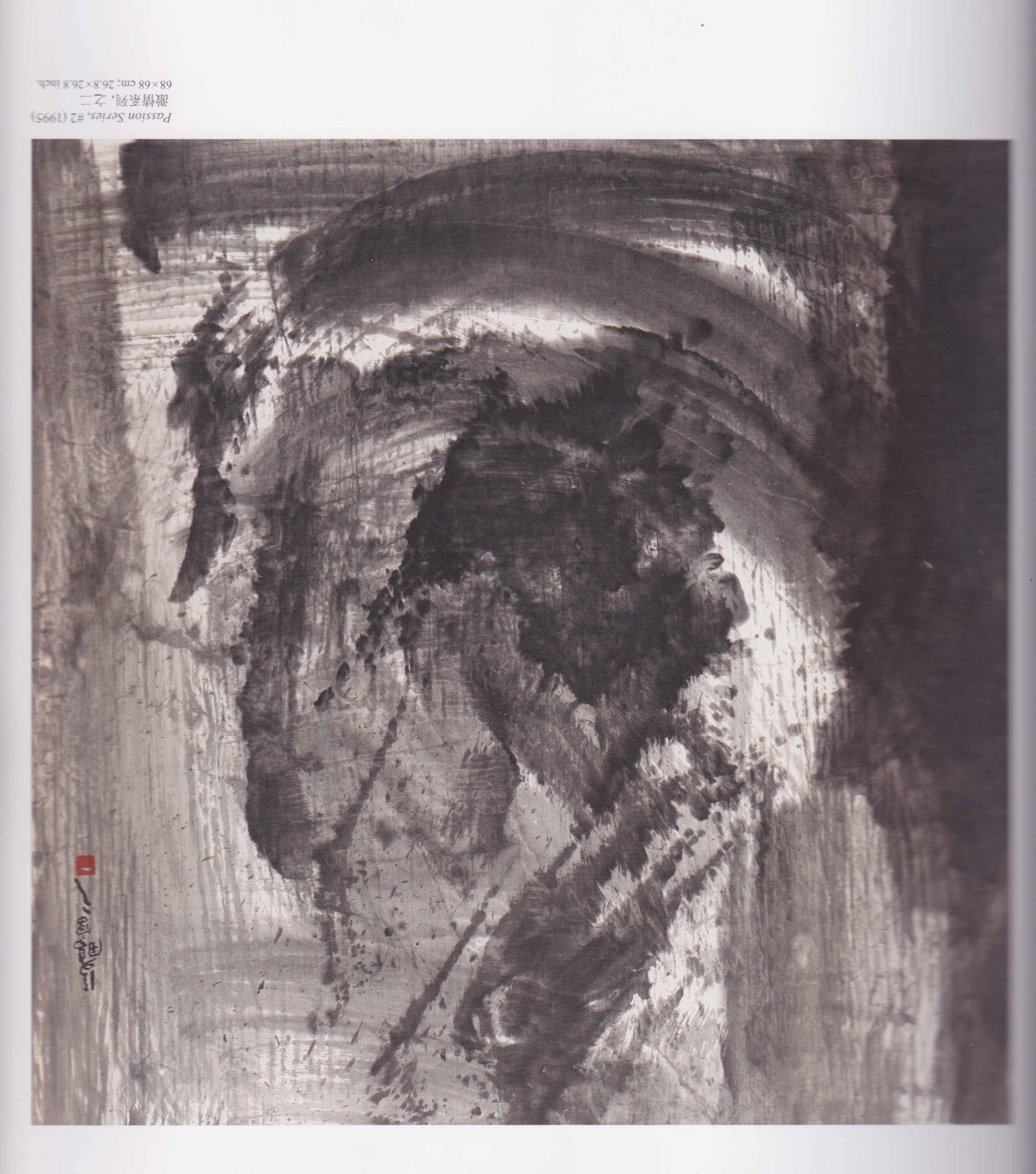
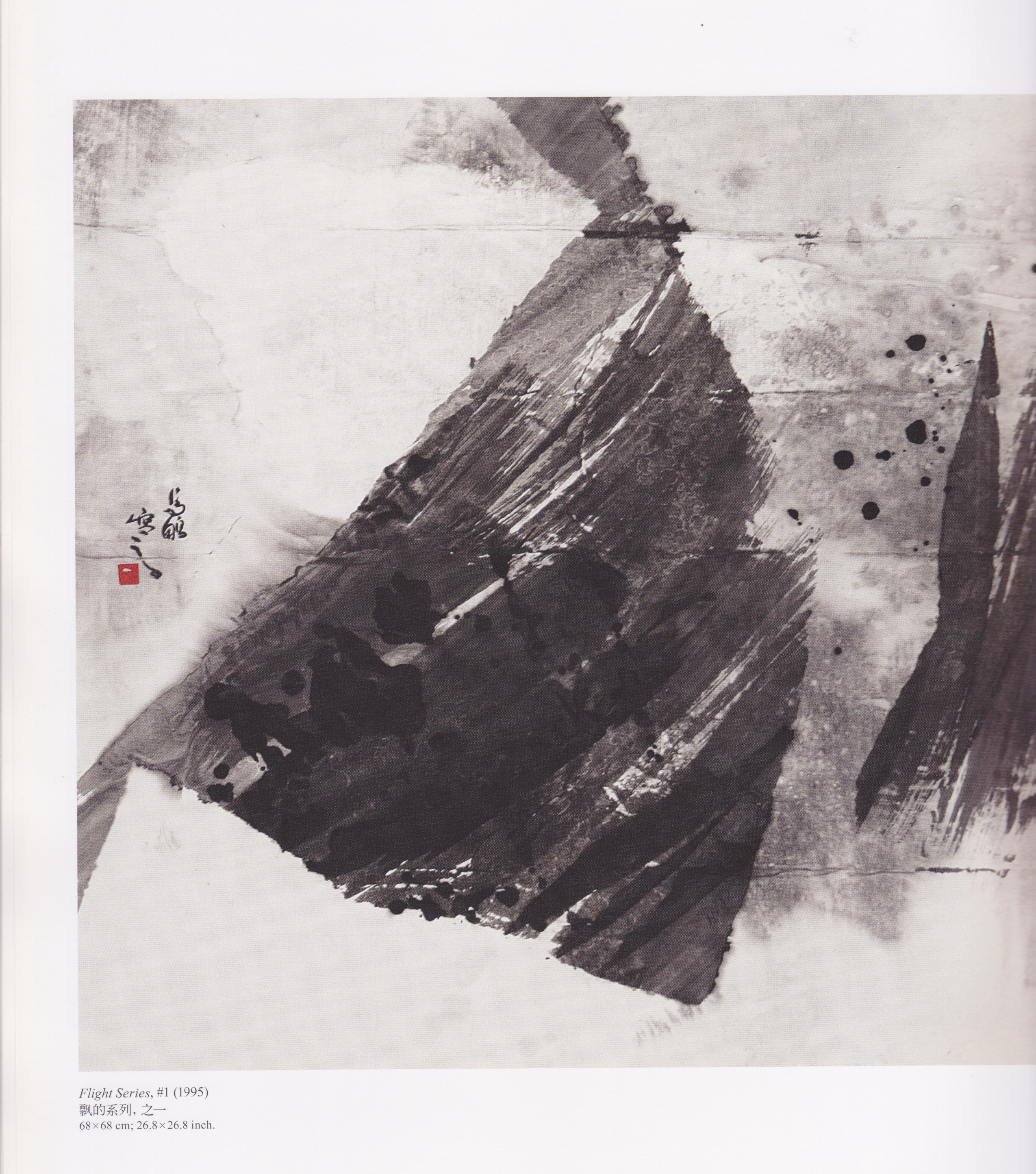
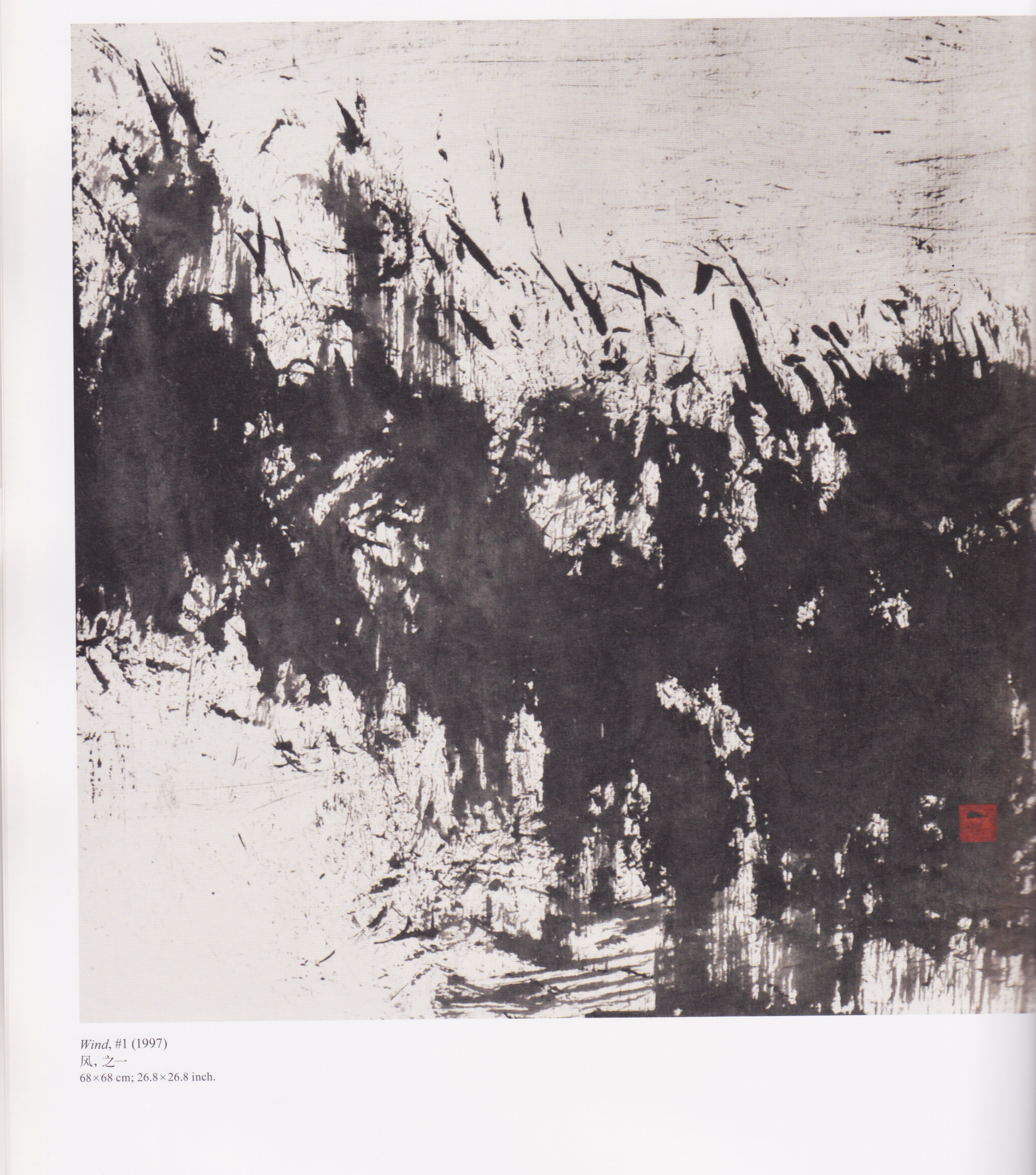
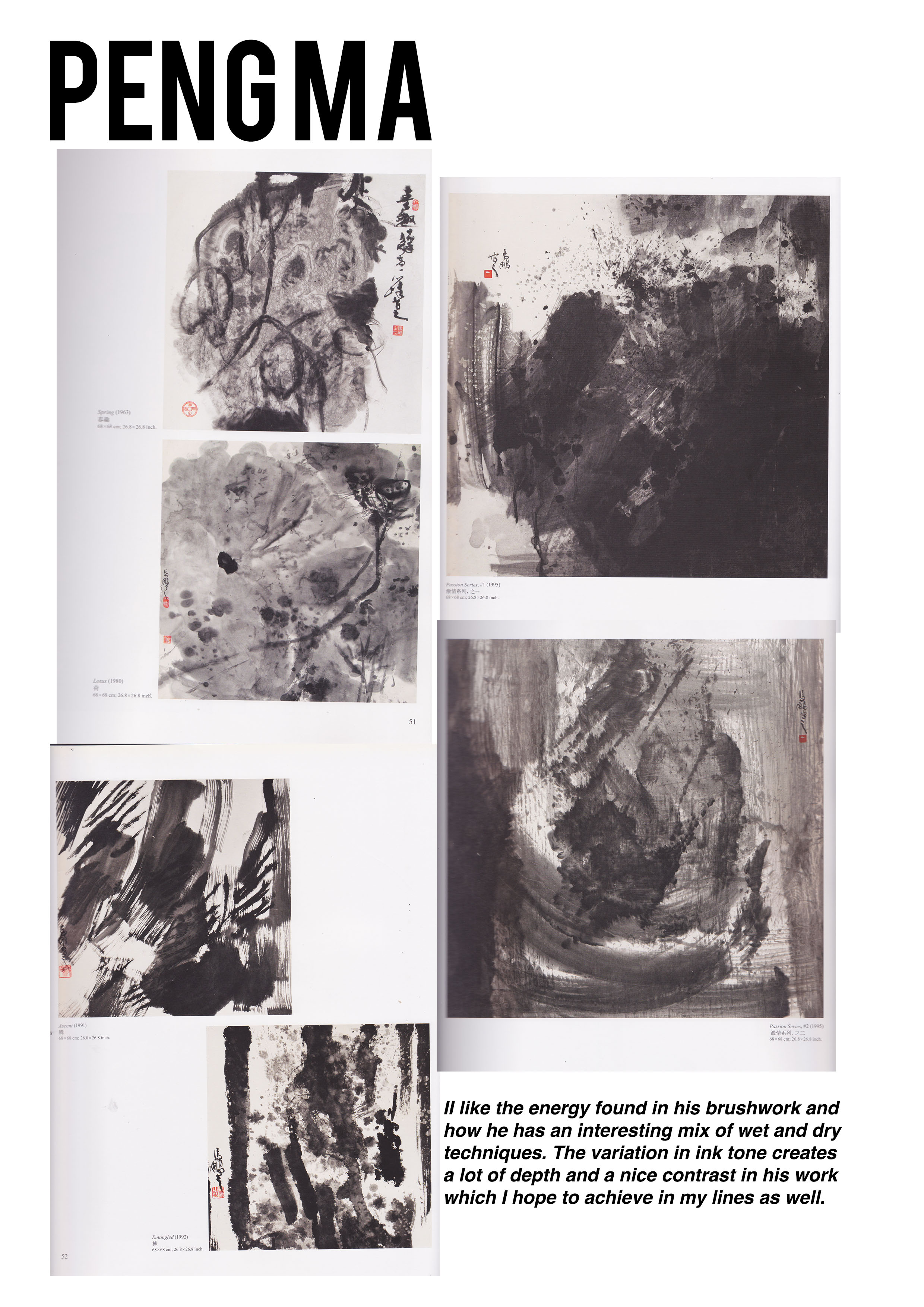
As mentioned in my previous post, one of the artists I was inspired by is Peng Ma, a Chinese artist. I was at the ADM Library one week ago and I chanced upon this book. I found the paintings inside to be very relevant to our assignment and I was amazed at how he managed to incorporate abstract elements into traditional Chinese Ink Painting.
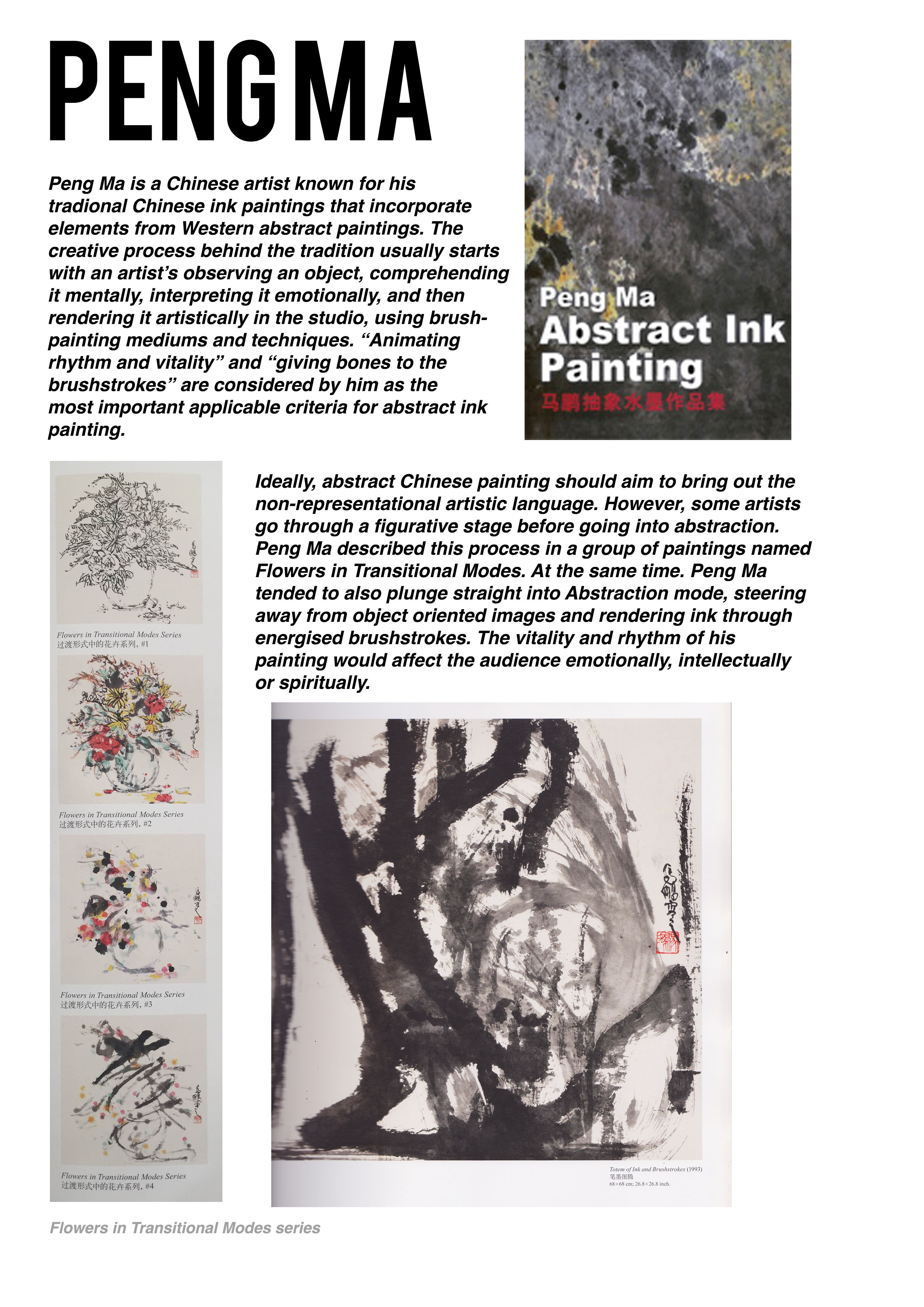
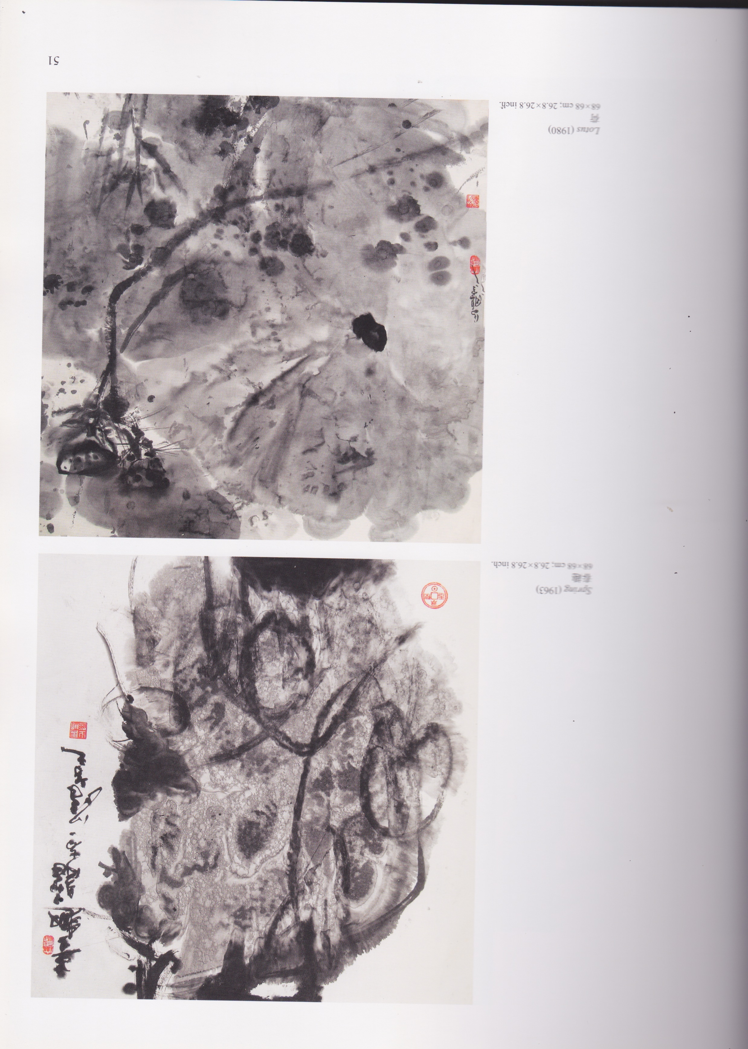
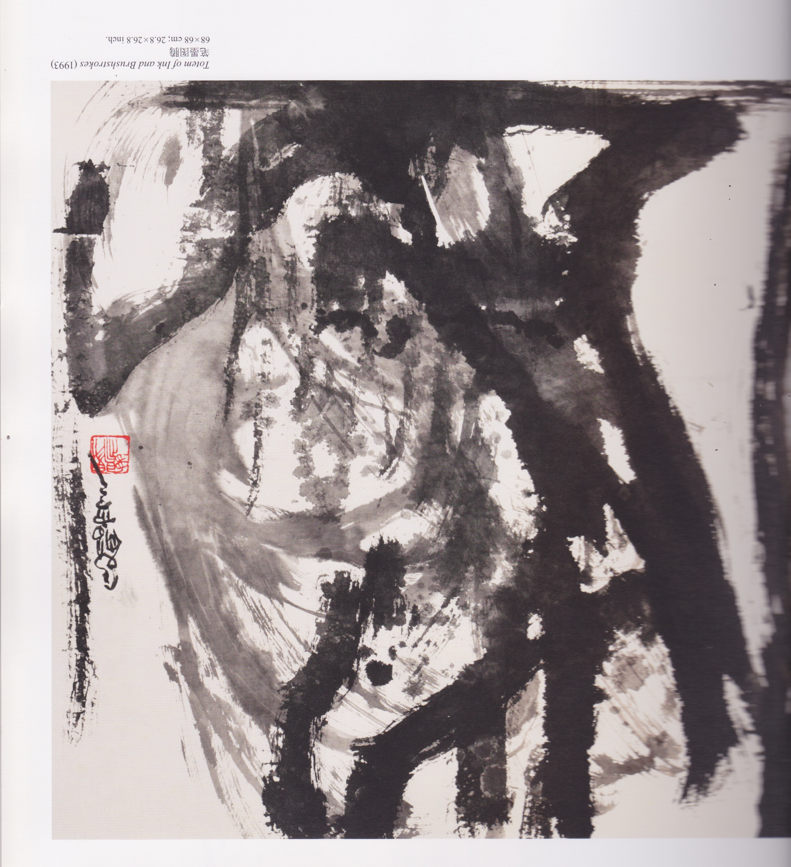
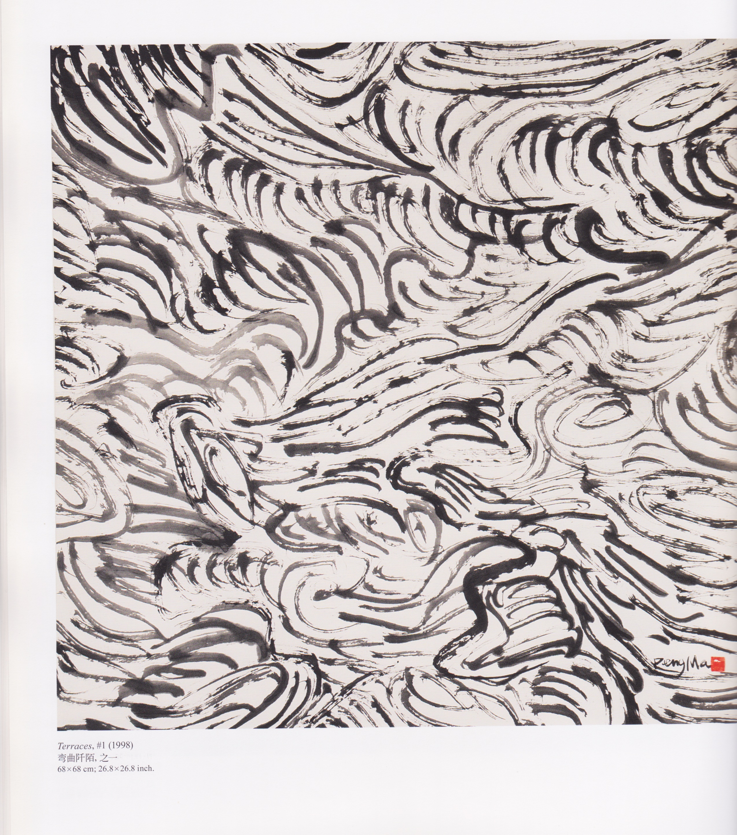
I like the energy found in his brushwork and how he has an interesting mix of wet and dry techniques. The variation in ink tone creates a lot of depth and a nice contrast in his work which I hope to achieve in my lines as well.

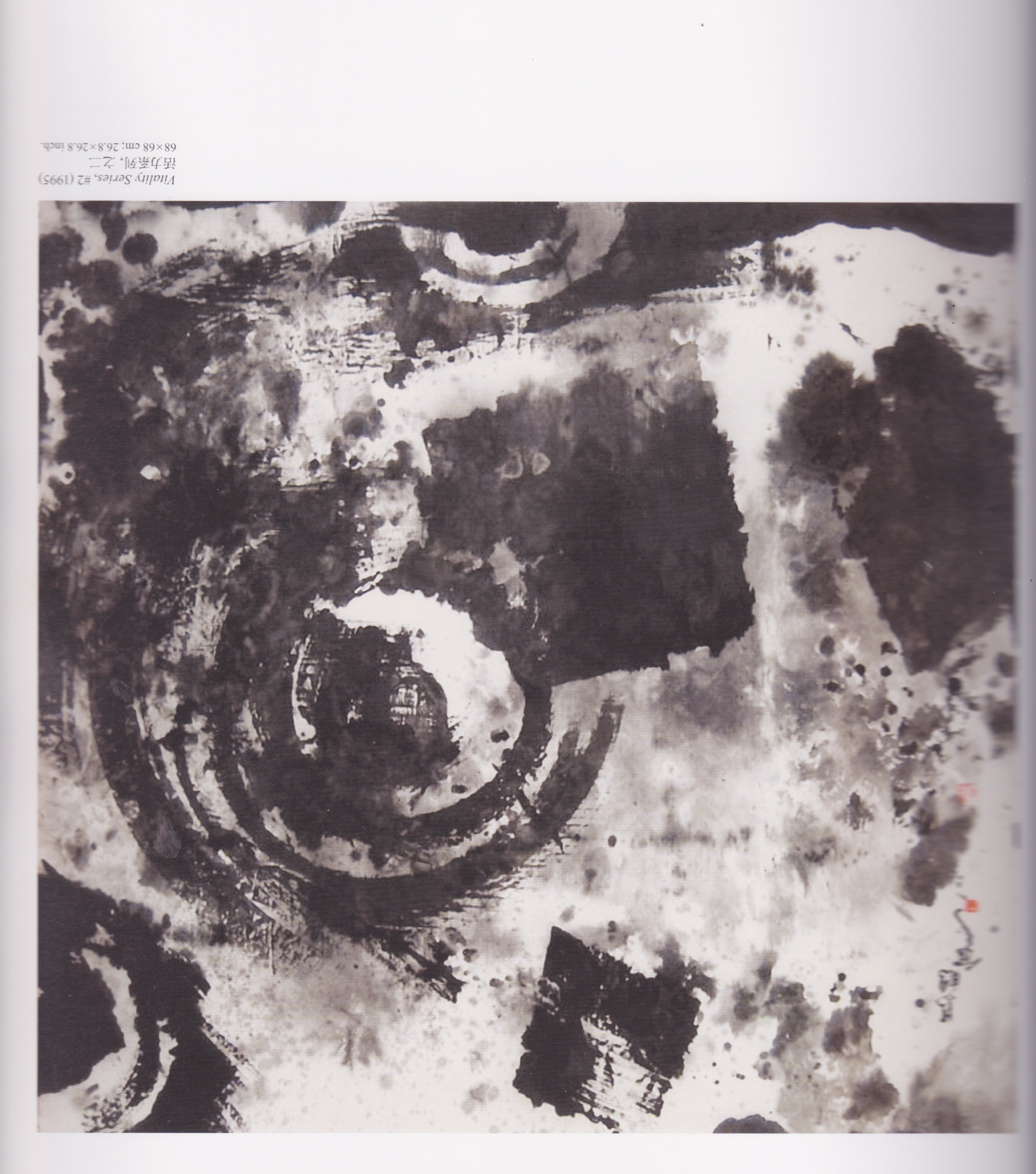
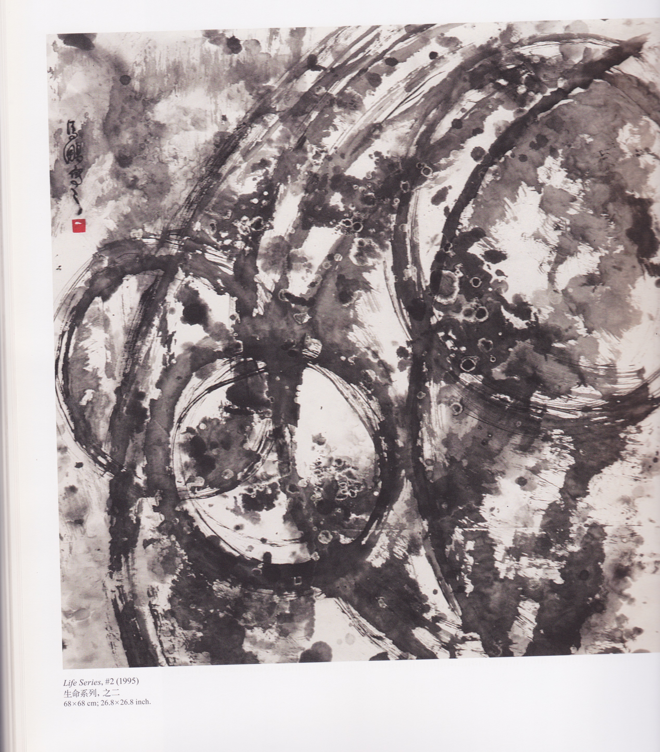
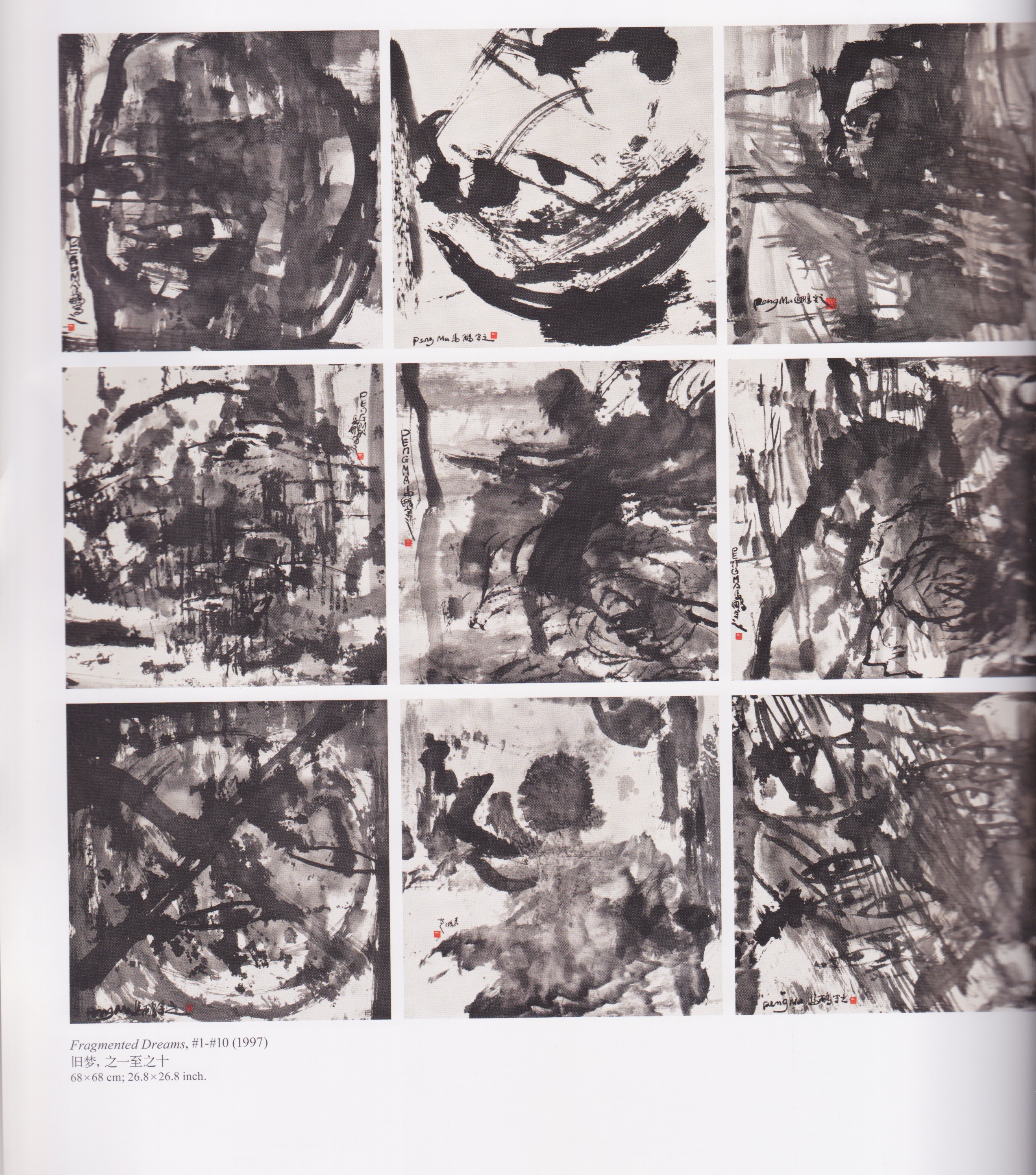
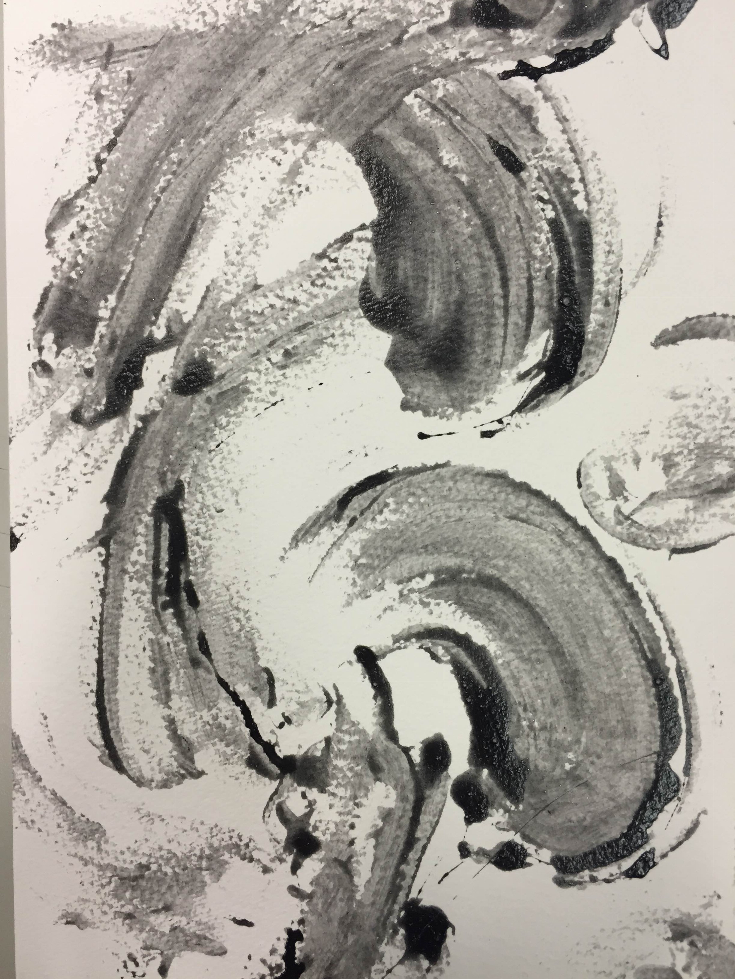
I also found it interesting how he used circles as a way to symbolise vitality and life. With these elements in mind, I attempted my own Peng Ma inspired works.

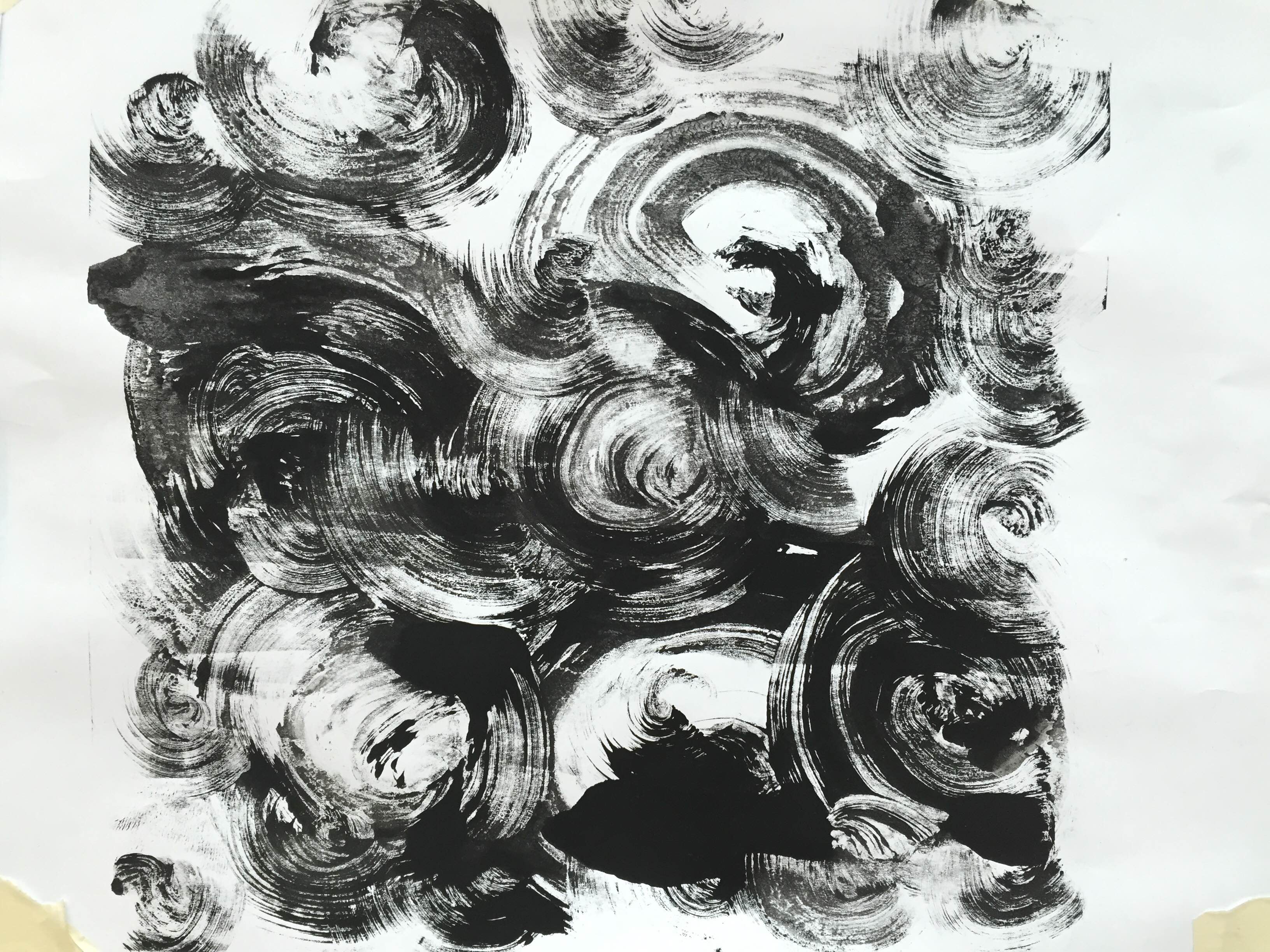
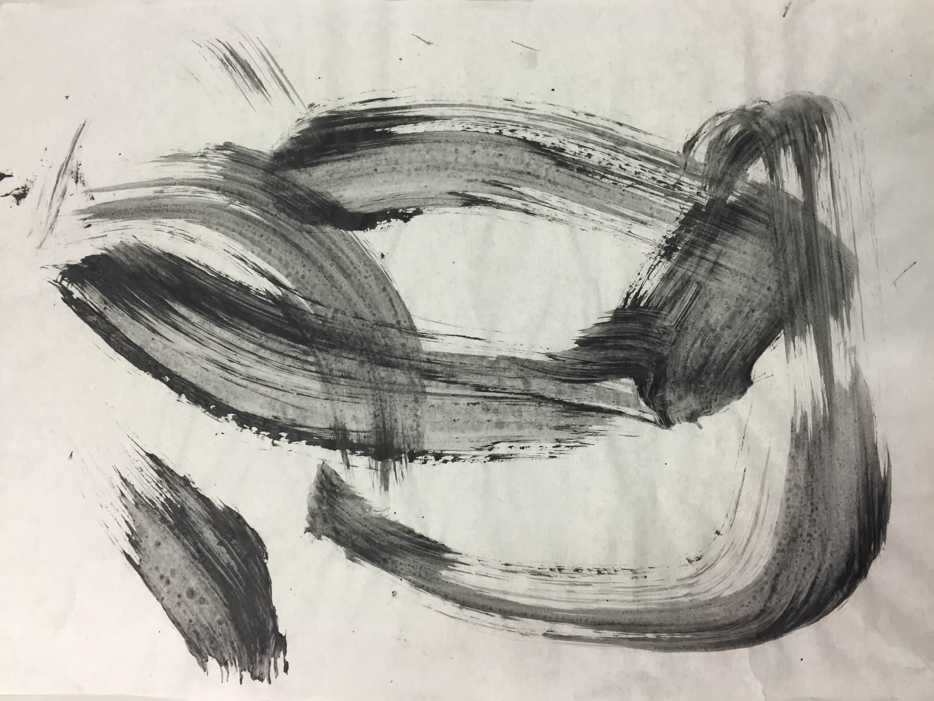
I tried doing a circular pattern repeatedly and made them really concentrated while varying the sizes to see what I could create. I did this by removing ink from the lino using varying sizes of paintbrushes. I like how using the big paintbrush, the contrast is really high and it creates a rhythmic effect while the effect created by the smaller paintbrush looks messier and feels more aggressive/ anxious.
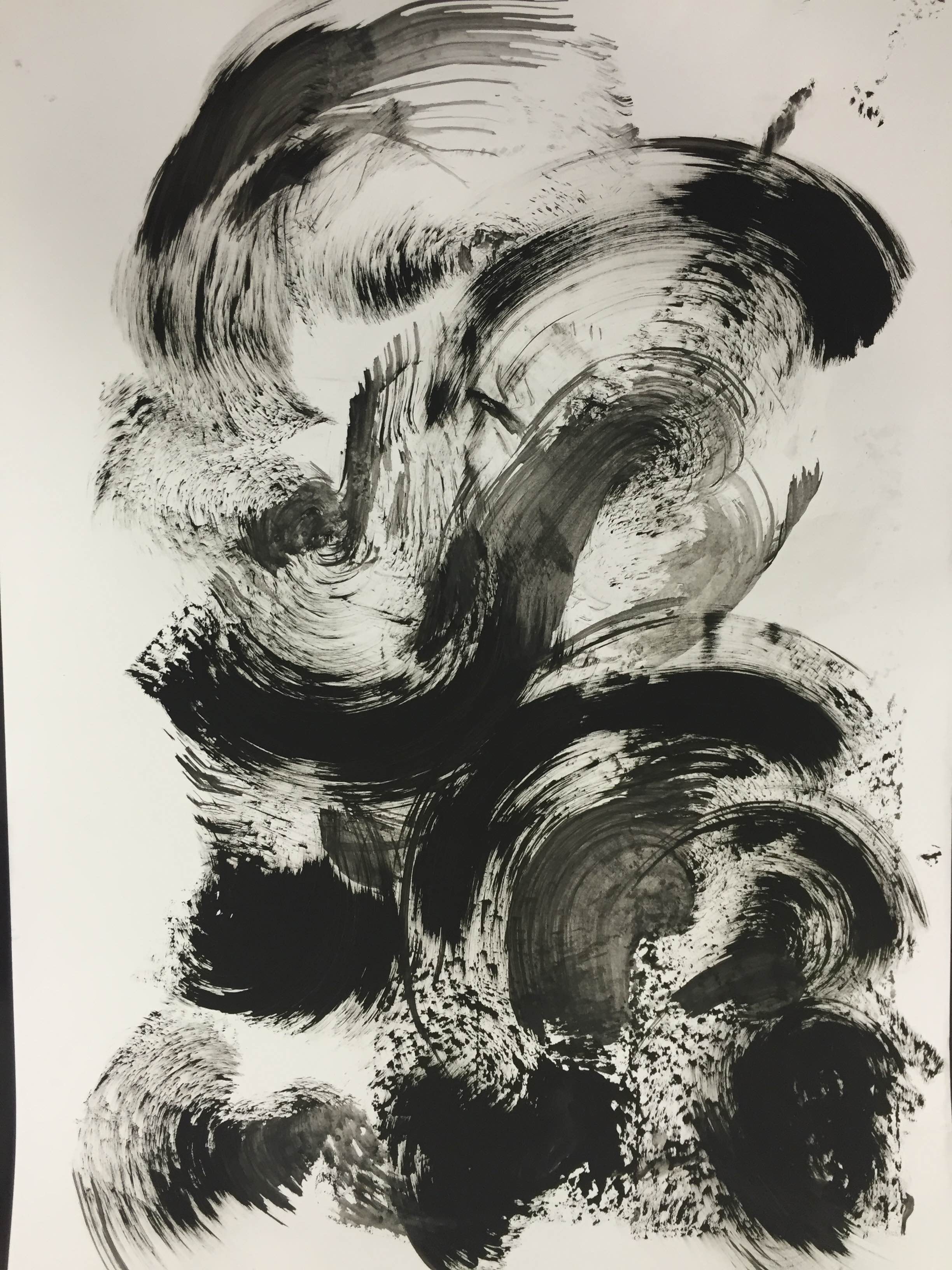
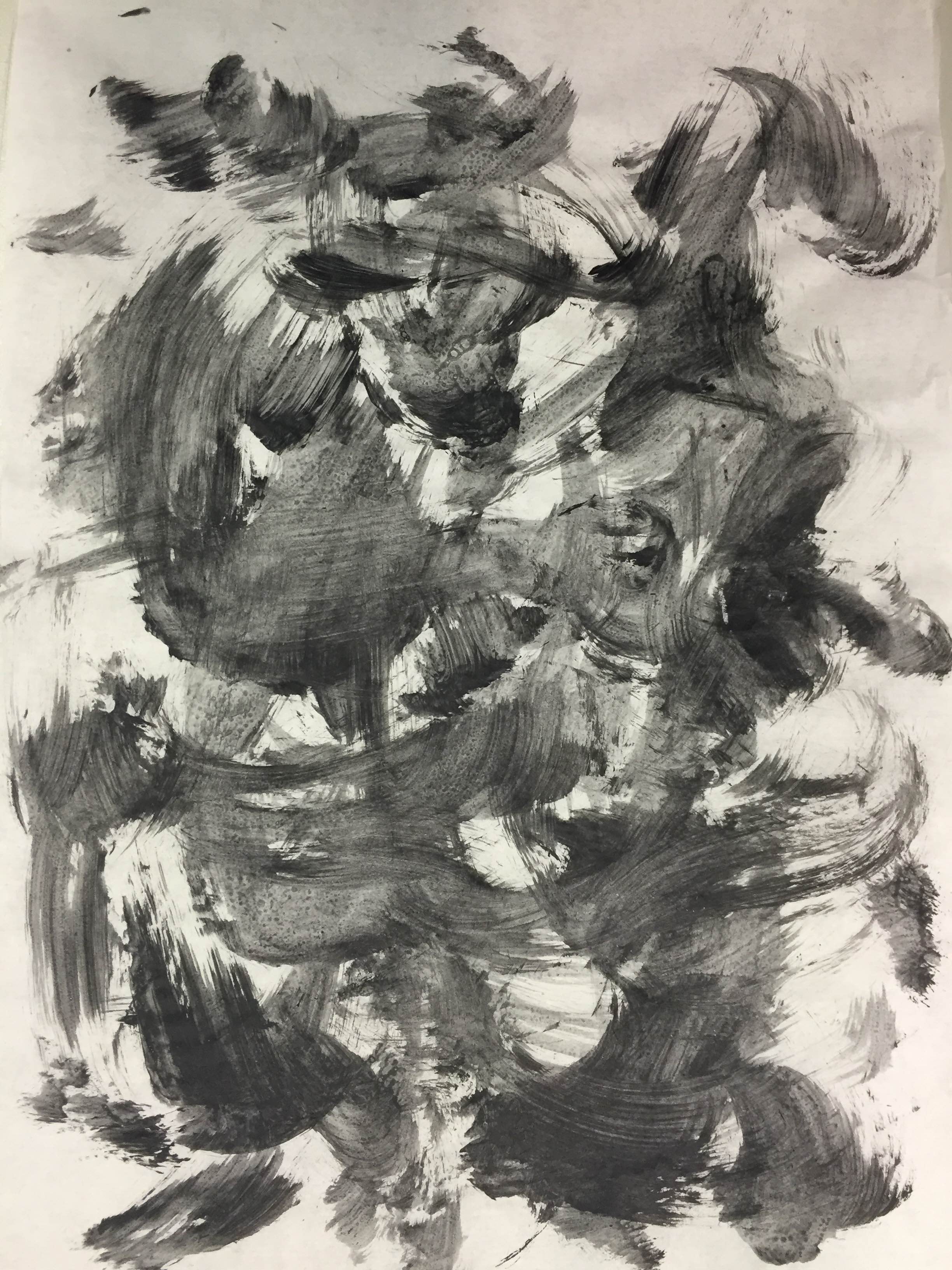
Since I liked the effect of the larger paintbrush, I experimented with an even larger paintbrush and I think I managed to get a look thats closer to some of Peng Ma’s works. I like how the brushstrokes look more obvious here and almost glossy.
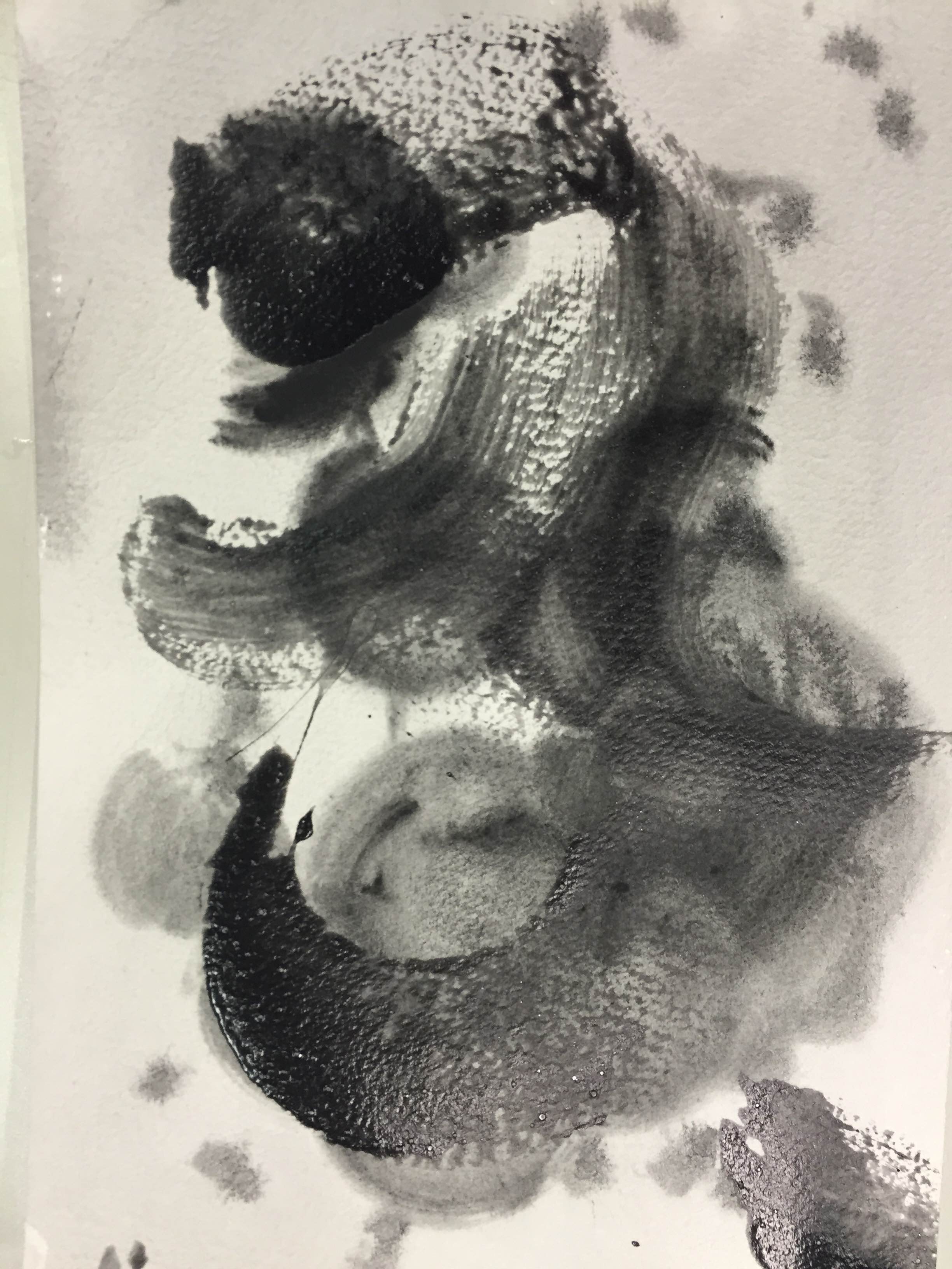
Using quick energetic brush strokes, I also tried to recreate the impression of violent waves.I did this by using a sponge which gave a dapping effect at the end that looked like water splashes.
I also tried switching to tracing paper which is closer to the paper used in traditional Chinese Ink drawings. The paper absorbed the ink in a different way from normal printing paper, allowing the brush strokes to be seen more clearly. I also mixed glue and acrylic paint for this piece and was satisfied with the effect as it allowed the paint to be more translucent in some parts and created tiny bubbles in some of the strokes, giving the paint strokes some texture. In the piece above, I tried for quick fast strokes in random directions while overlapping them, creating some sense of depth and energetic feel.
Additionally, I also tried using a larger brush and less brush strokes, creating large expressive strokes. I really liked this effect a lot as it really showed the energy in the well defined brush strokes. The combination of glue and acrylic also helped the paint to concentrate at particular ends of each stroke, giving a sense of depth to each brush stroke.
I also tried using both mediums together to recreate the combination of wet-on-wet technique and dry-on-wet. I like how the texture of watercolour looks much flatter compared to acrylic-glue paint, creating a nice contrasts between the black strokes.
 I also tried experimenting by varying the amount of glue in the paint. For the above piece, I mixed in more glue such that the paint became more translucent and tended to clump more at the ends creating a 3D effect for each brush stroke. I tried this on water colour paper instead and this gave the strokes even more texture. It created a fading out effect at the end of each brush stroke.