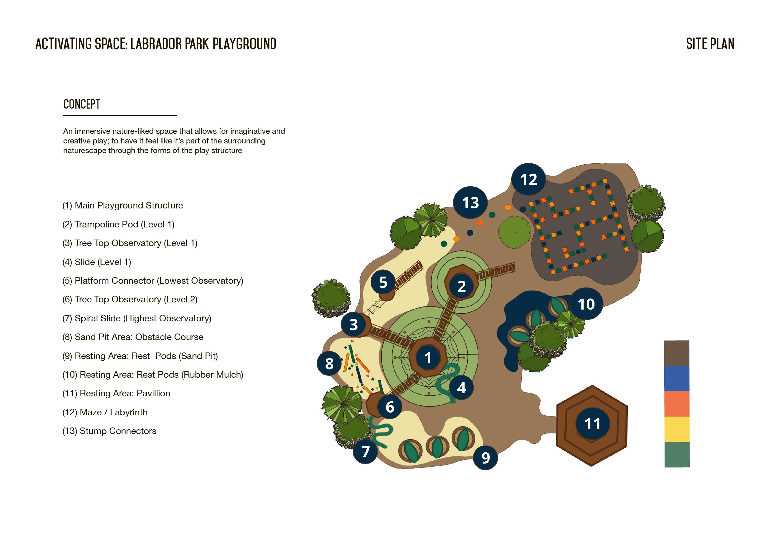
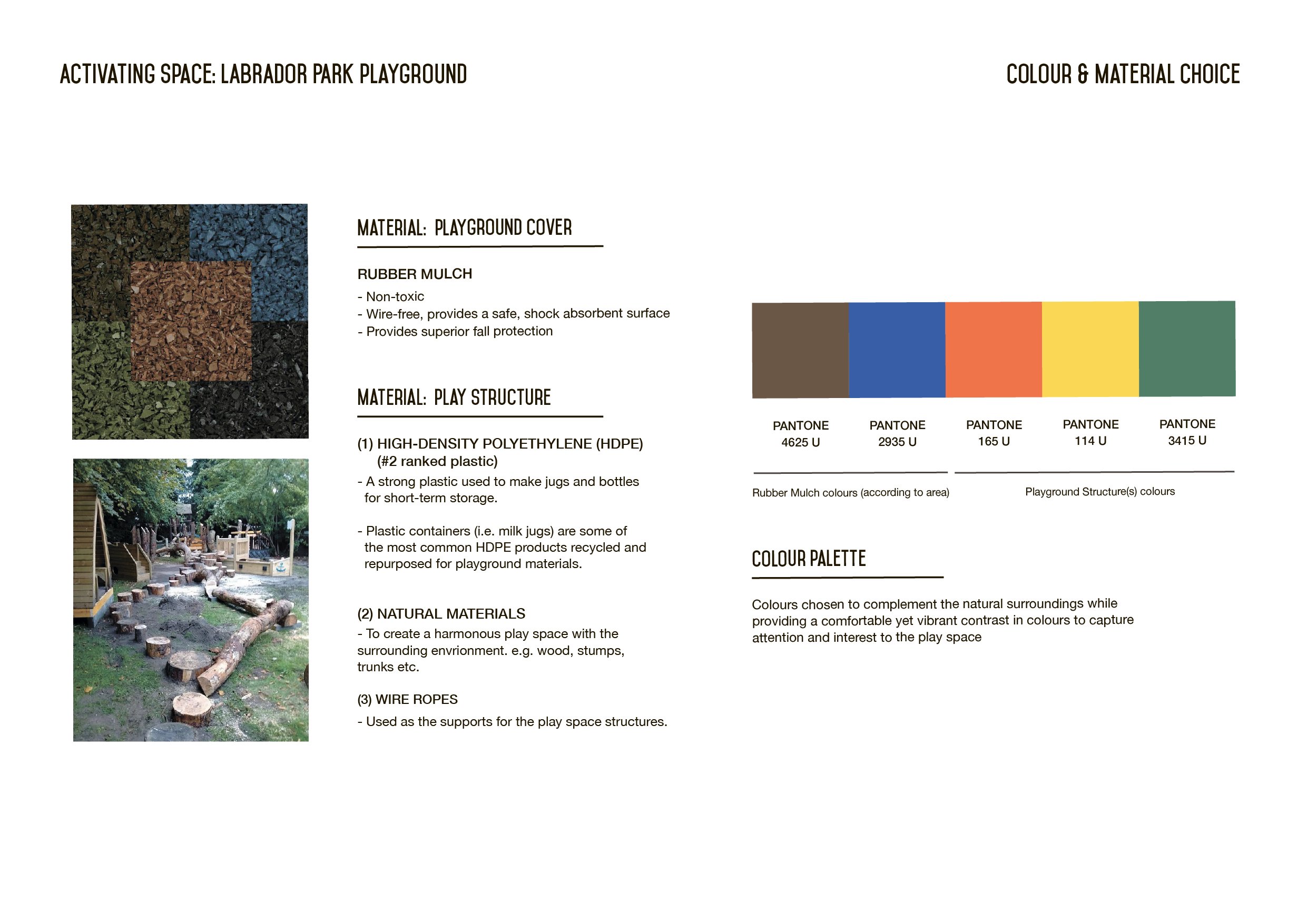
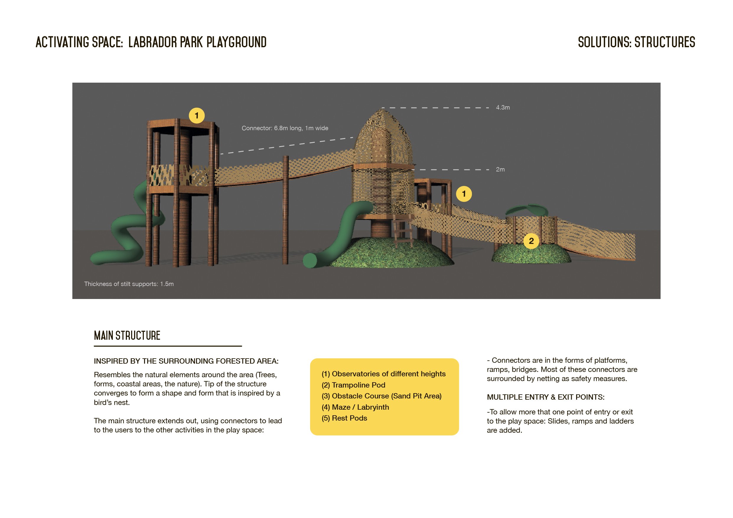
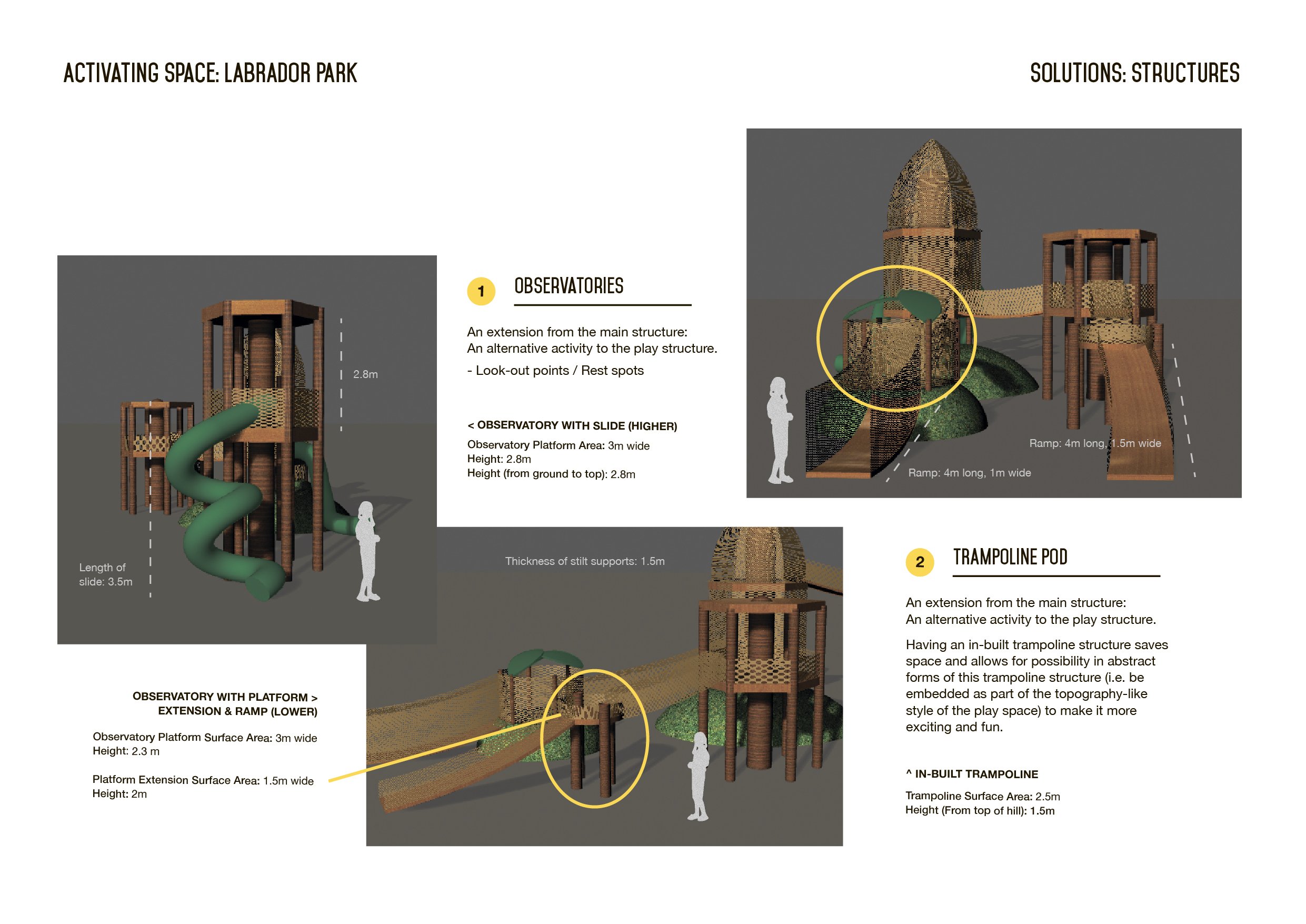
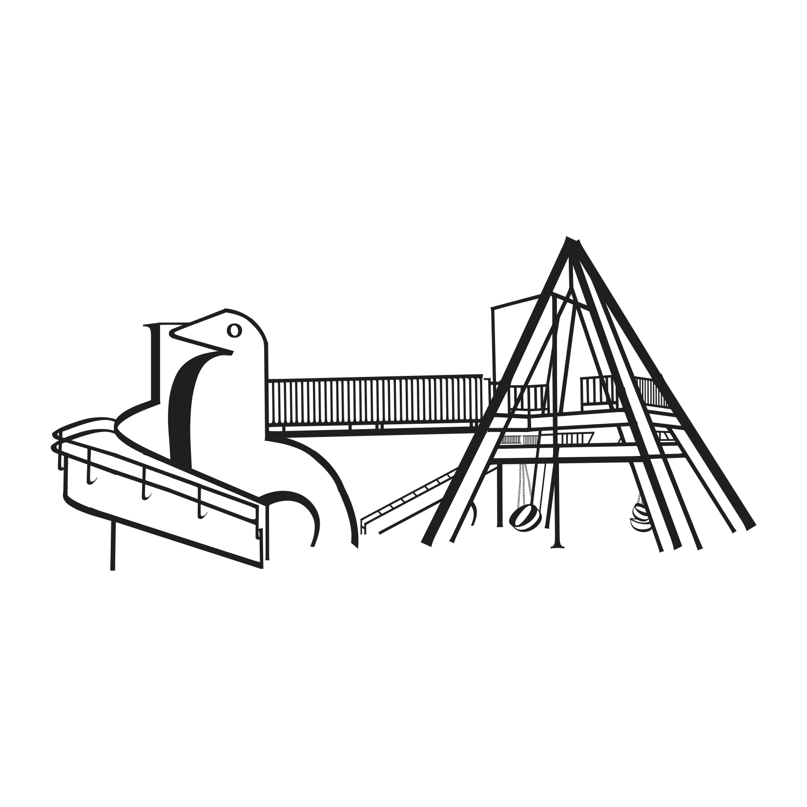
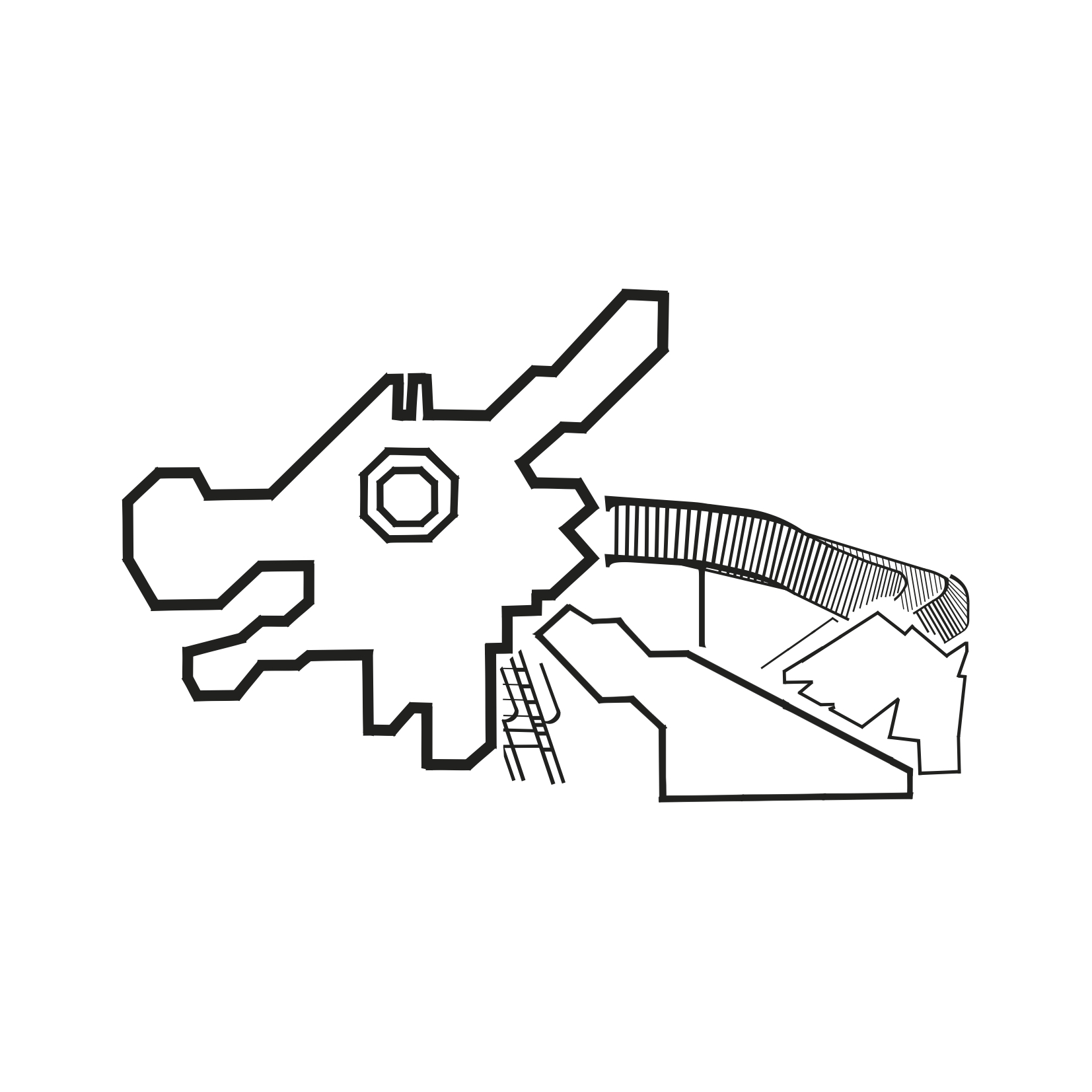
By: Charlotte & Jane

Link to research and development of project: https://drive.google.com/open?id=1Fx4K48Hh_3htUWrdHrAhKPe-LWyhPWjf

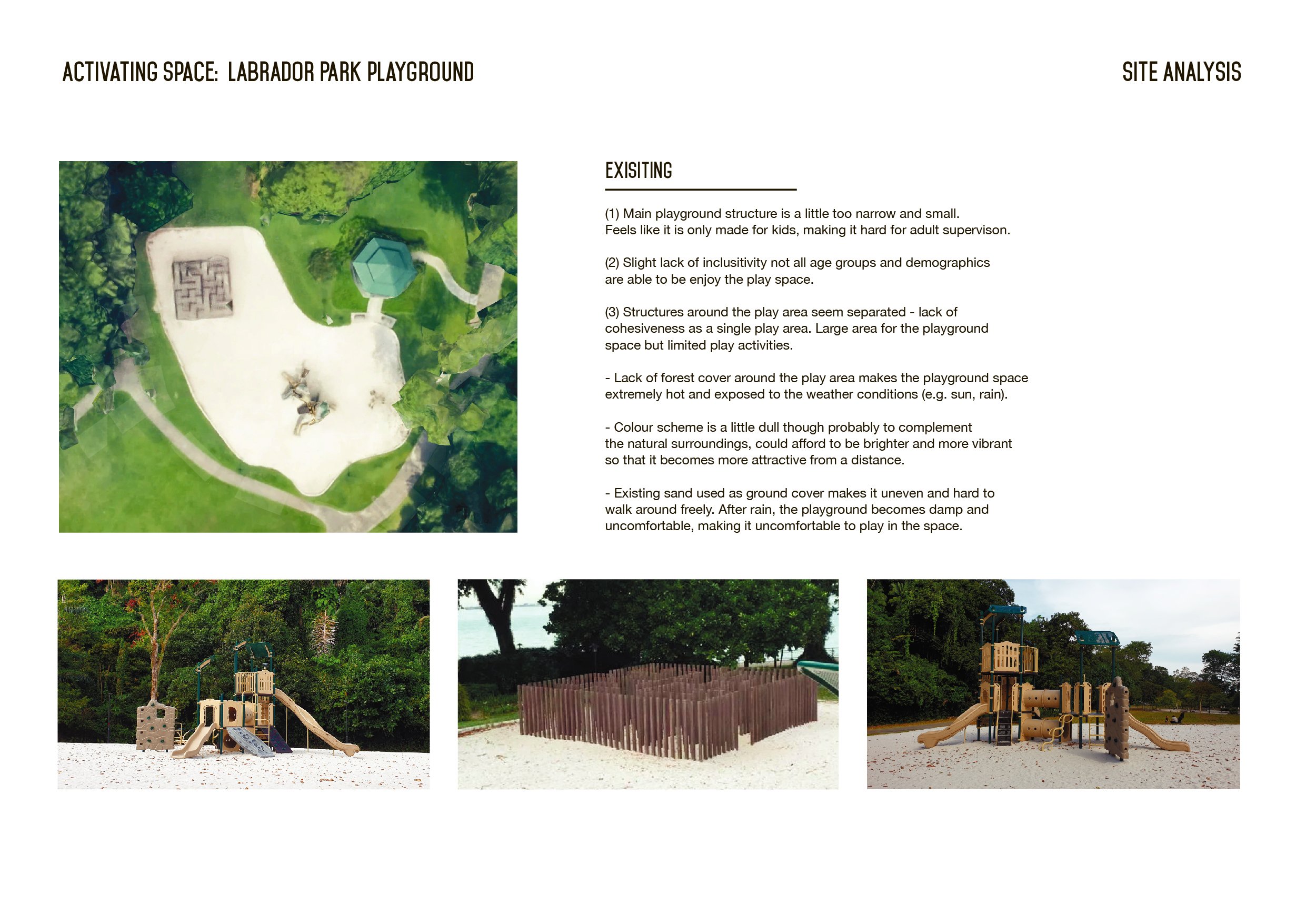
A quick site analysis of our identified site for this project


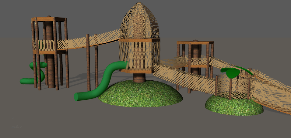
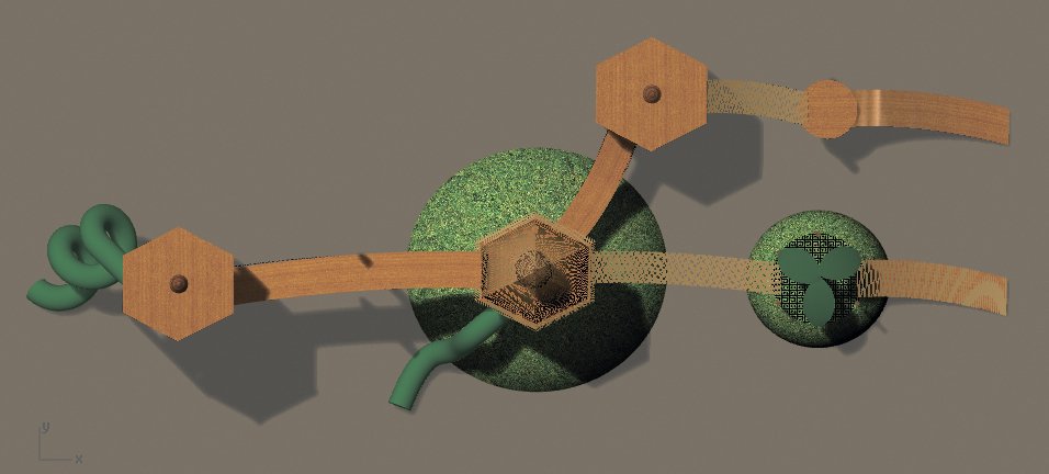
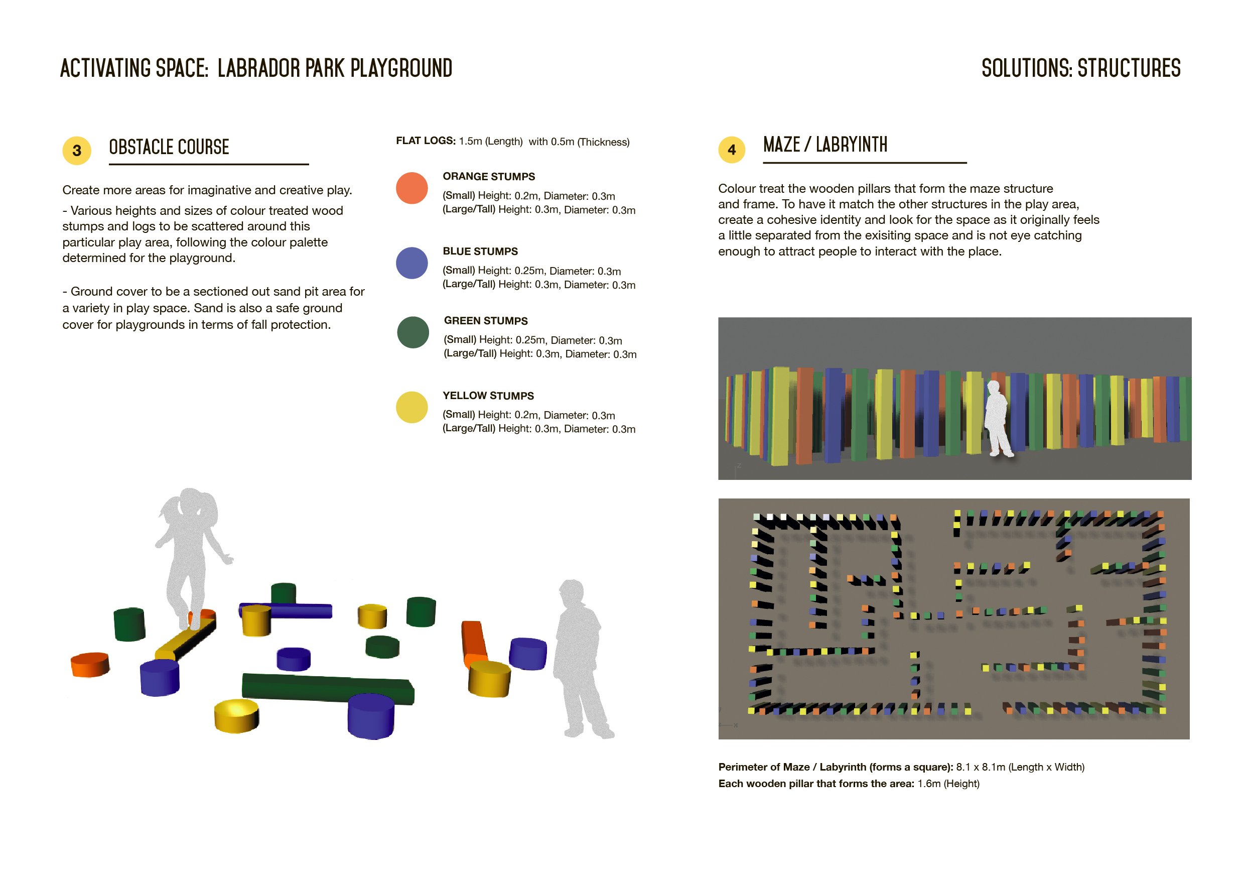
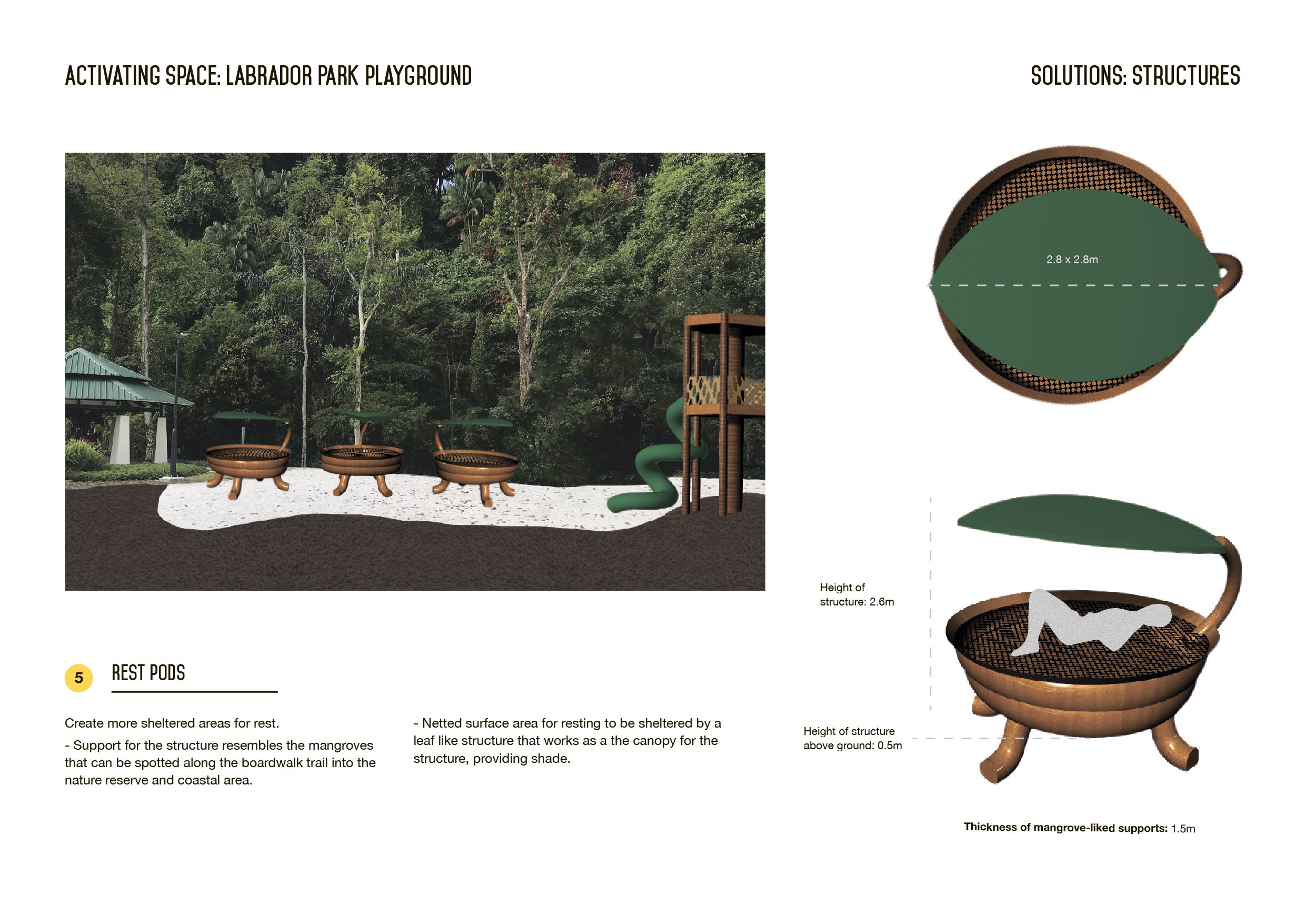
Below are the final presentation boards of our project with in-depth descriptions and explanations included:

Feedback for the above was that the colour palette could possibly be toned down. It came off a little way too bright and vibrant and somehow might draw attention away from some of the structures (i.e. The Main Structure) as the Main Structure was primarily going to be constructed with natural materials (e.g. wood) so the colours were going to be very earthly and brown especially with the brown rubber mulch ground cover as well. Thus with the sudden pop of colour in the space with the obstacle courses etc. the attention seems to be drawn away / there is too much contrast.

A suggestion was that we could possibly just do away with the bright colours and just work with a nature coloured palette instead since our concept was pretty much nature-liked as well.

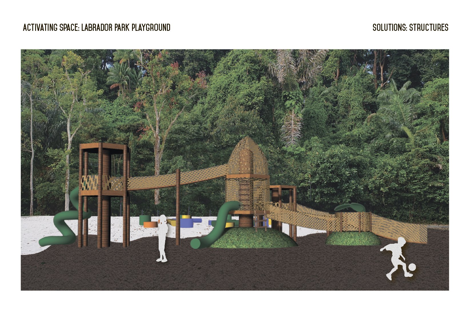
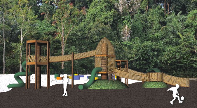
Another superimposed image of the structures at the identified site.


Overall, it was a really interesting project for both of us as we got to look into a specific site thoroughly, coming up with a placemaking solution for our identified site within the location – The playground area. Through this project we have also learnt a lot along the way with regards to the technical aspect of things and more, how we could possibly look into our various  Also hearing the feedback from our peers during the critique and sharing sessions also provided us with many valuable insights and suggestions to improvements for our proposed idea, opening up more possibilities of the project.

Our site visit to Labrador Park last lesson had us exploring the space within the park and doing a sensory ethnography exercise within the space. We recorded down our findings and eventually came up with a presentation deck to document our journey to and inside the park.

The route we took for our site visit that lesson had us exploring from:
Labrador Park MRT > Berlayer Creek Boardwalk > Park Trail

Here’s a reference from the circulation analysis we did of the site, mapping out the route we travelled in highlighted yellow:


For the first half of the walk into the park from Labrador Park MRT to along the Berlayer Creek Boardwalk had us taking turns to be blindfolded as we were guided along the path by each other – making stops along the way to feel and sense our surroundings. We made use of a lot of our hearing, touch, and smell since we were blindfolded and our sense of sight is completely removed. This exercise alone made us realise how our other senses were heightened and how more aware we were about our surroundings in that moment – it was pretty amazing.

Later on we arrived at the coastal part of the trail that slowly led us further deeper into the nature reserve where all the historical elements that made this park unique in its own way slowly made their appearance which we felt added a nice touch to the whole park atmosphere.

We spotted a variety of signs along the way and were able to make many interesting observations along the way, taking into consideration the original functions of the park how the objects/elements may have been placed that way etc.

Here’s our presentation:
https://docs.google.com/presentation/d/1427G2bPtQM8DUU6Q-j1vrsWn-UOQO21c97HVadMtFbk/edit?usp=sharing 


Banner


Media Art Nexus / Panorama Banner


3840 x 480 pixels

LED 15m by 2m
North Spine Plaza Media Art Nexus
NTU Singapore
16 November 2017


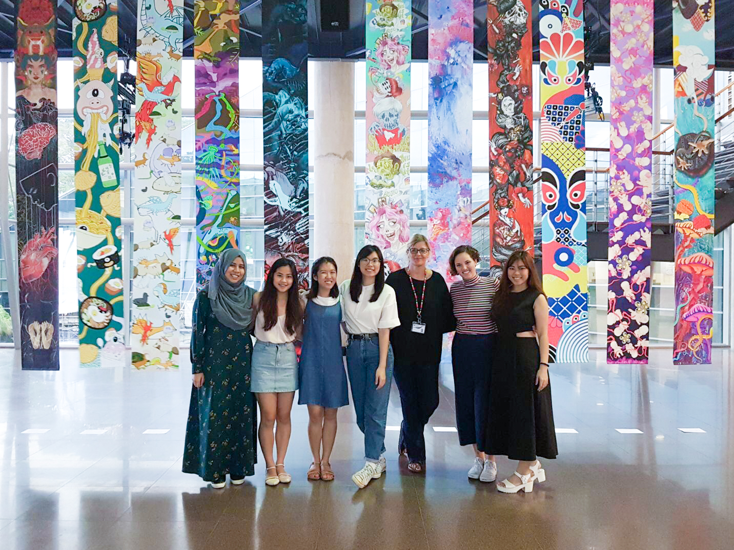
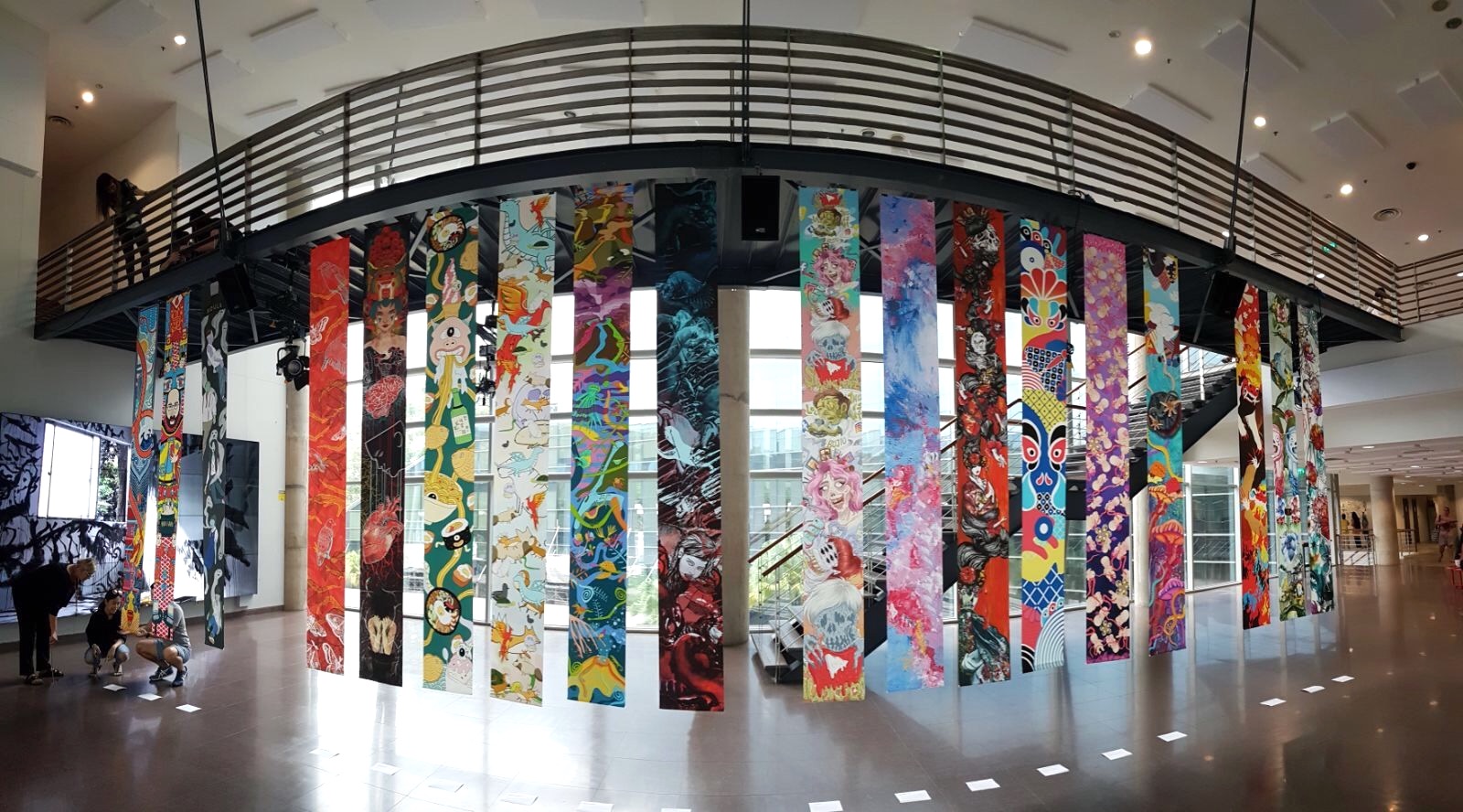
Panorama Banner at the Media Wall


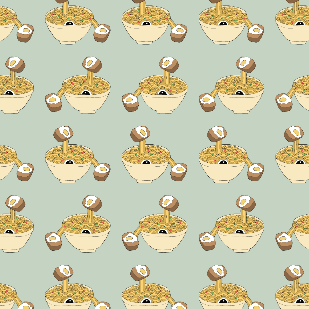
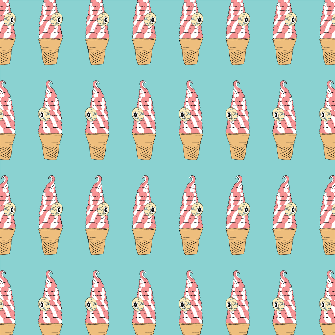
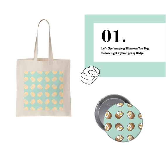
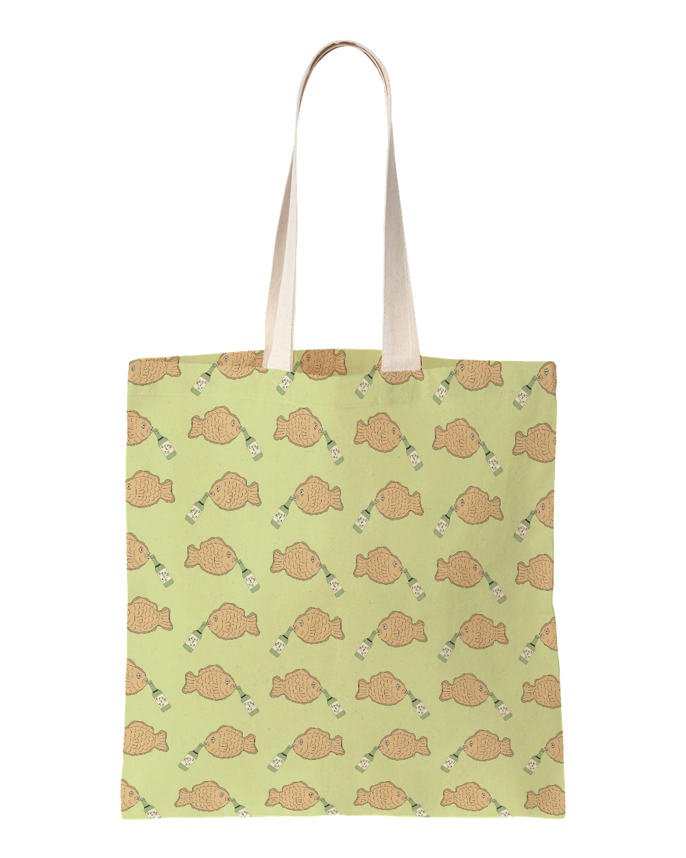
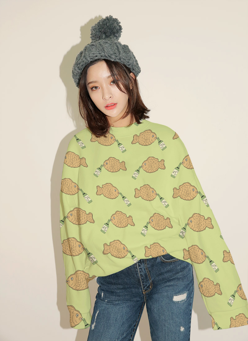
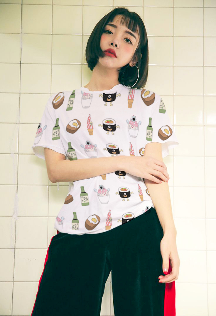
Application examples of the pattern swatches

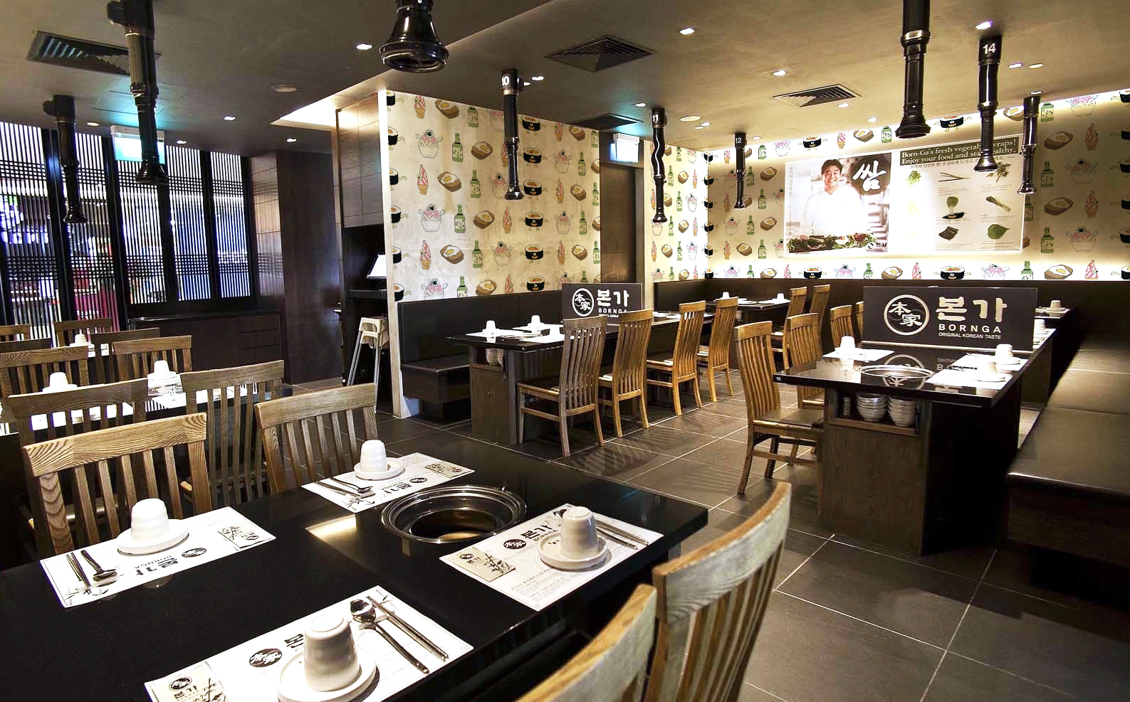
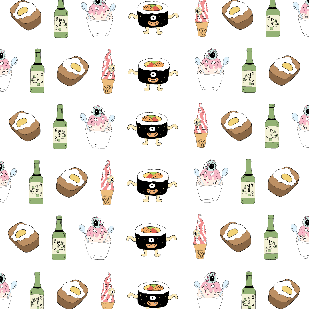
Food Monster Wallpaper Design for a Korean Restaurant

  • More swatches and their application examples here

Swatch Book Soft Copy


Earlier process documentation

On to the final deliverable, the swatch book! As with any pattern project I struggled to come up with the pattern swatches for the book as you always need that one starting point/spark of idea (well for me at least). True enough, when I started on one more and more patterns came and it became like a churning factory haha. Even just changing the hue was considered as a swatch, the possibilities were endless and it was pretty fun process!

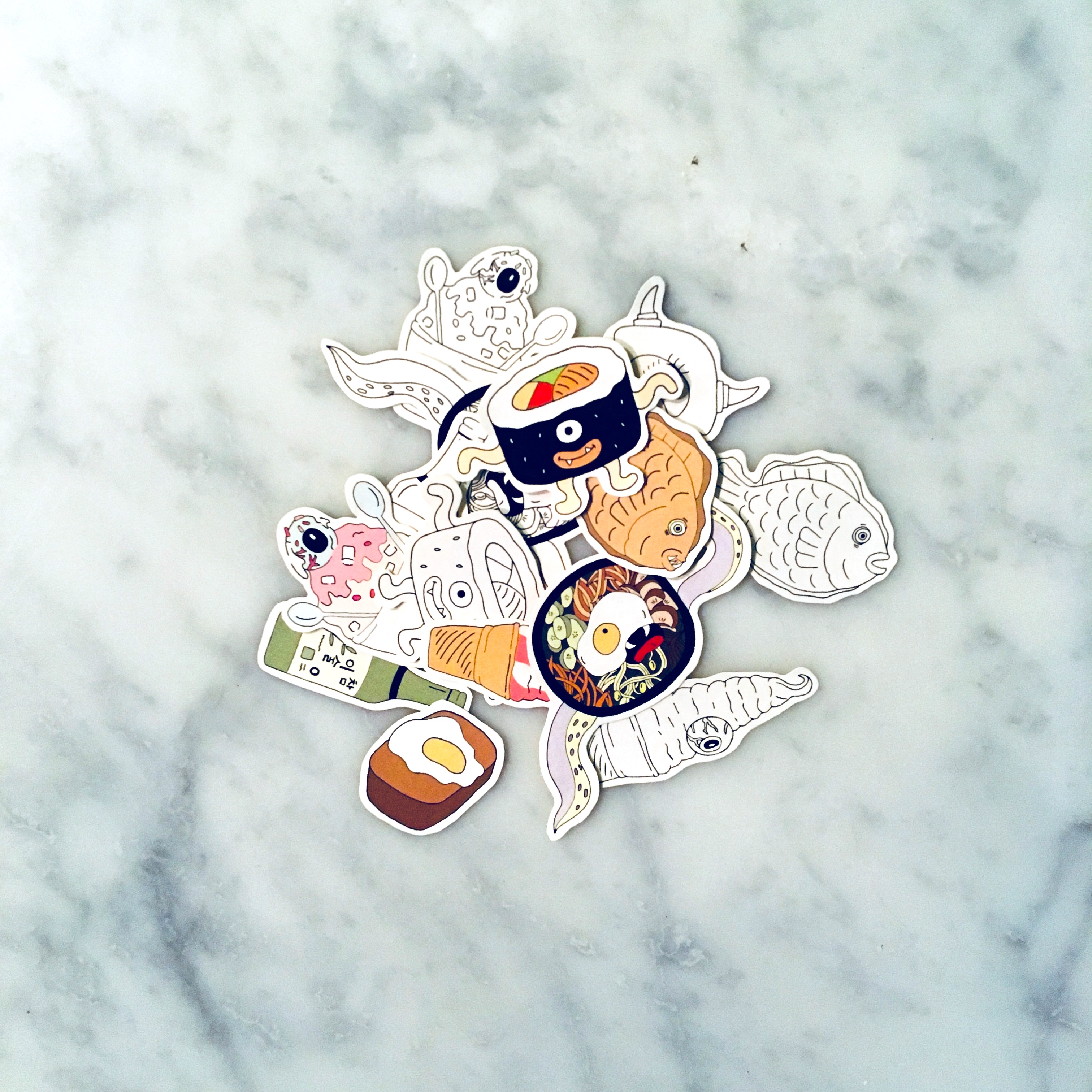
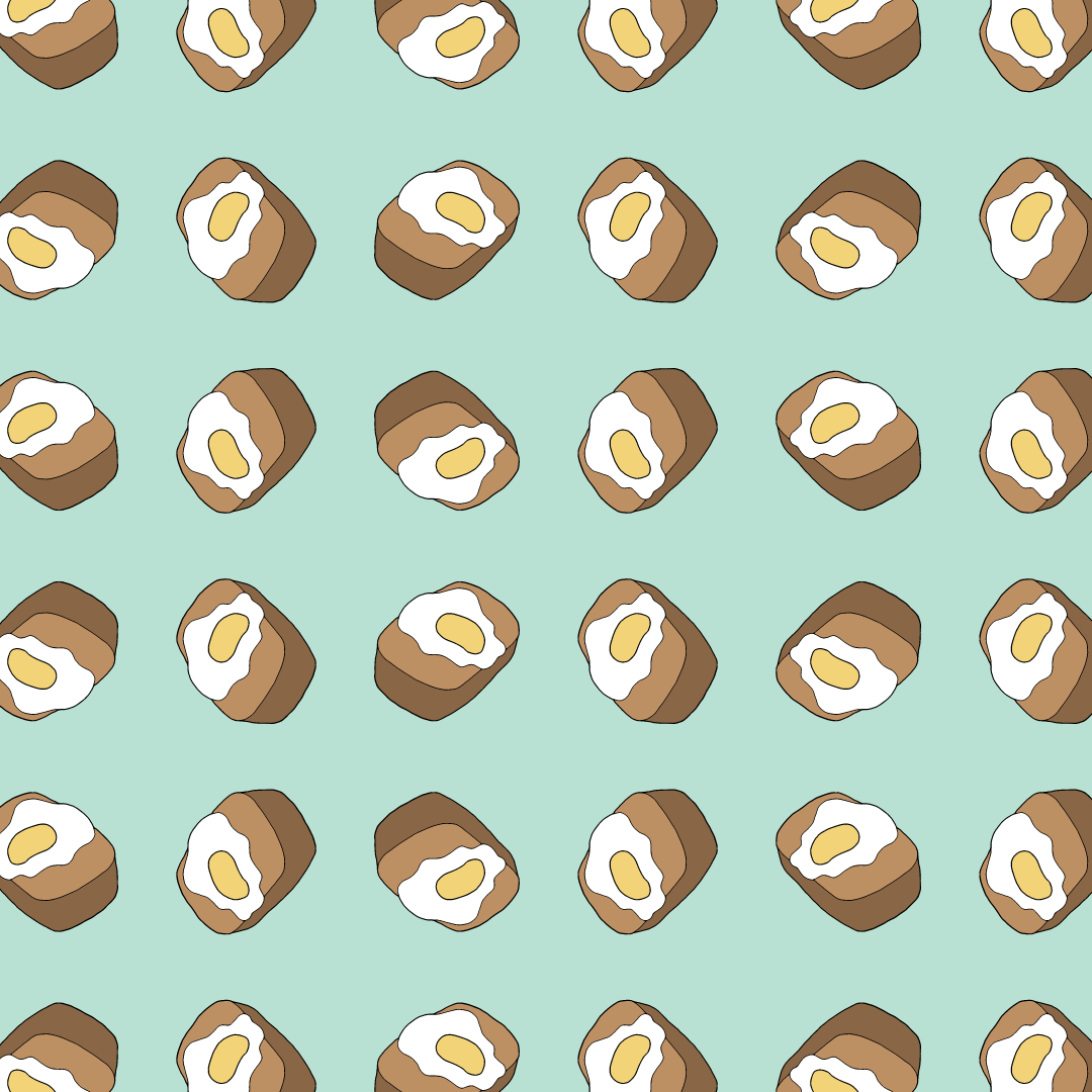
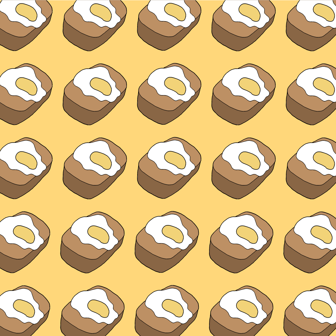
I eventually did about 22 variation of swatches for the submission and superimposing it onto several items/products for possible application visuals: (click on the images to view the swatches and application as an enlarged slideshow)

Swatches

Application

Tried out application in space too but I think my designs were more suitable for potential merchandising of apparels, bags, badges etc.

I kind of have the urge to translate them into actual products in the future if the opportunity arises; the superimposing/mock-up process was pretty tedious but fun!


Swatch Book

Here’s the final documentation of the big project that contains the banner, the swatches, application, everything you need to know about Dokkae-blin!


Final post coming up as a gallery series for an overview of the project (or if you wish to call it, a visual summary)
Thanks for sticking around 🙂

The next thing on the list of deliverables once the banners went up for was to design a horizontal digital composition for the Media Art Nexus at North Spine!! For those who had abstract/paint-looking banner designs were abstract, it was easier for them to come up with their compositions for the media wall – Simply just by rotating their banner design to a horizontal layout.

On the other hand, it was quite a struggle for mine as I was working with a really vertical design composition initially. But I eventually figured my composition layout eventually so all’s good 🙂

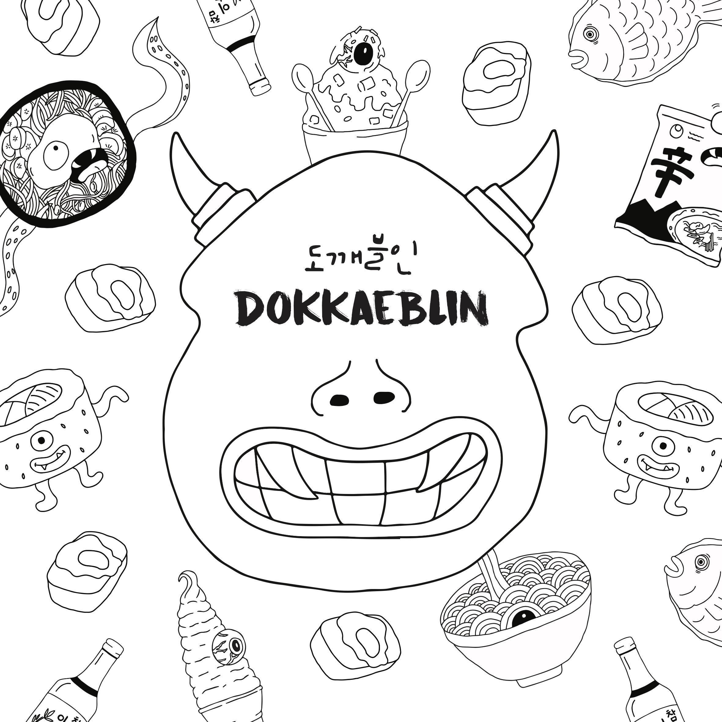
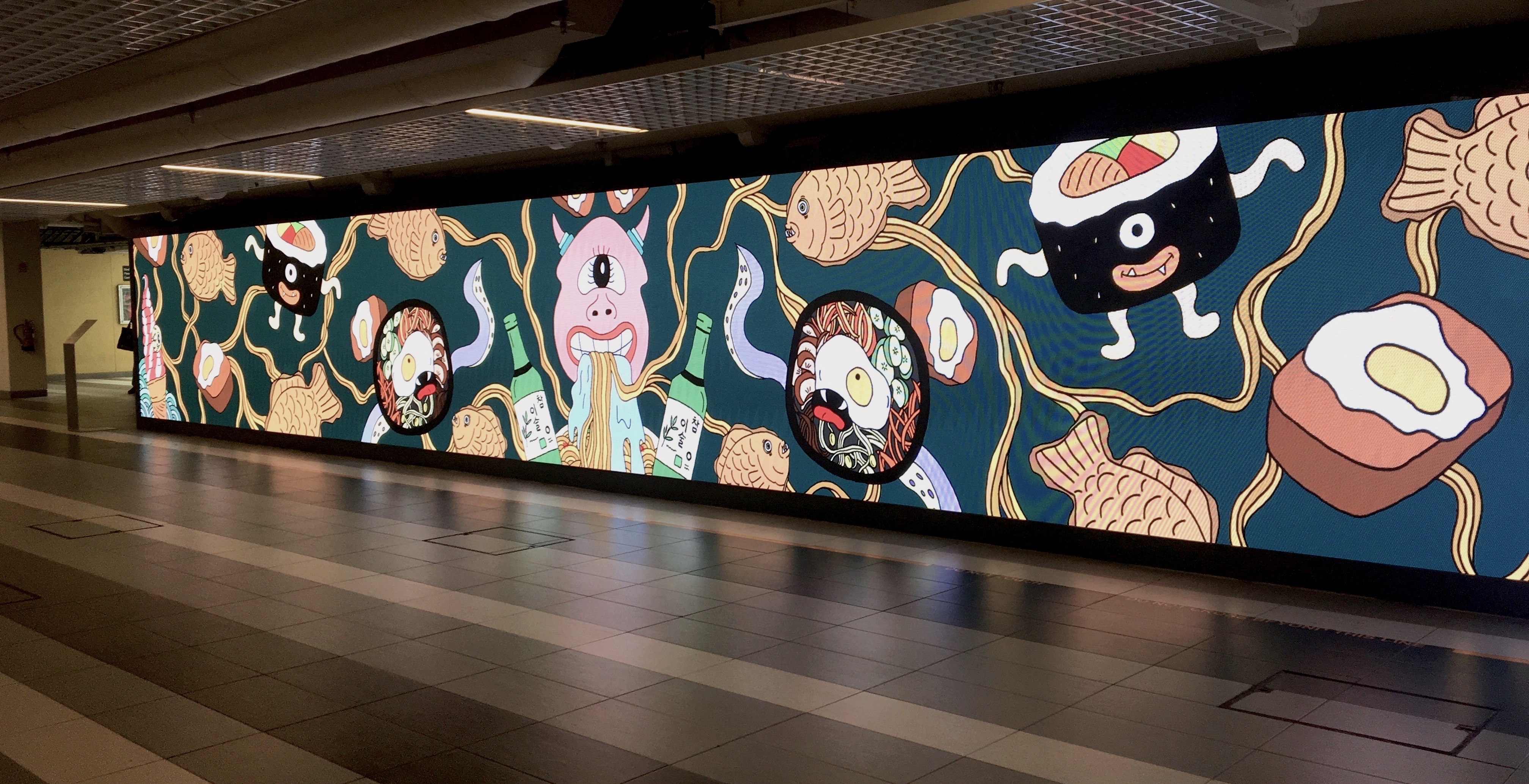
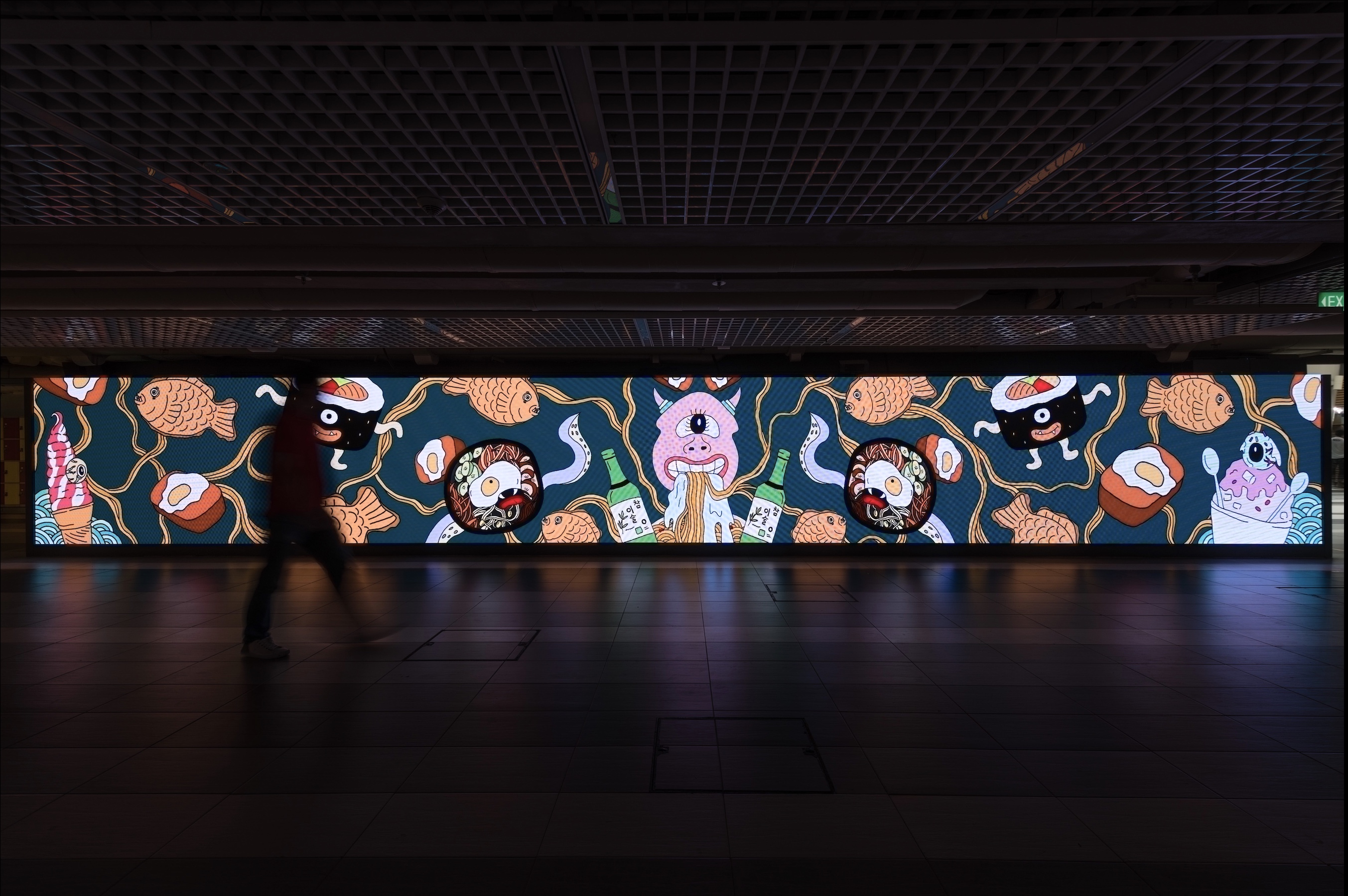
Keeping the consistency of my vertical banner design with this horizontal digital composition, the central motif remains as the One-Eyed Goblin with the other Food Monsters motifs flanking its sides. The composition I went for took on an almost symmetrical look and it was a rather spontaneous decision. For the arrangement and placement of these motifs. With the most bit being just a reflected side of the other thus the symmetry. The organic wavy linework in the background that mimics the noodle strands of the Ramyeon (Korean instant noodles) similarly suggest and provide movement and flow in this composition while somewhat creating a cohesive, connected composition altogether.  The composition for this turned out unexpectedly well and I was satisfied with it! 🙂 For the colours, I kept it exactly the same with the banner’s for consistency.

Version 1 (used for the preview)

The week after in-class viewing of these compositions for the Media Art Nexus, we head down to the actual place for the preview of it on the actual screens and below was how it looked like: BAM, another surprise!! I guess there’s always this wow factor when your work gets blown up and viewed across various types of medium. On the LED screen it was really another kind of beauty with all that illumination :’)

The only qualm that I had when the preview for my composition came up on the screen was that compared to others, mine came out slightly dull. The same problem I had for my banner composition initially during test prints. Hence I went with increasing its saturation and contrast just like what I did for my banner eventually! Hope it turns out better!!

Version 2 (with increased brightness and saturation)


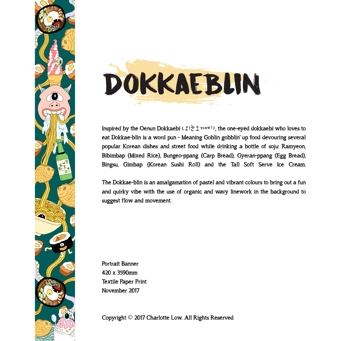
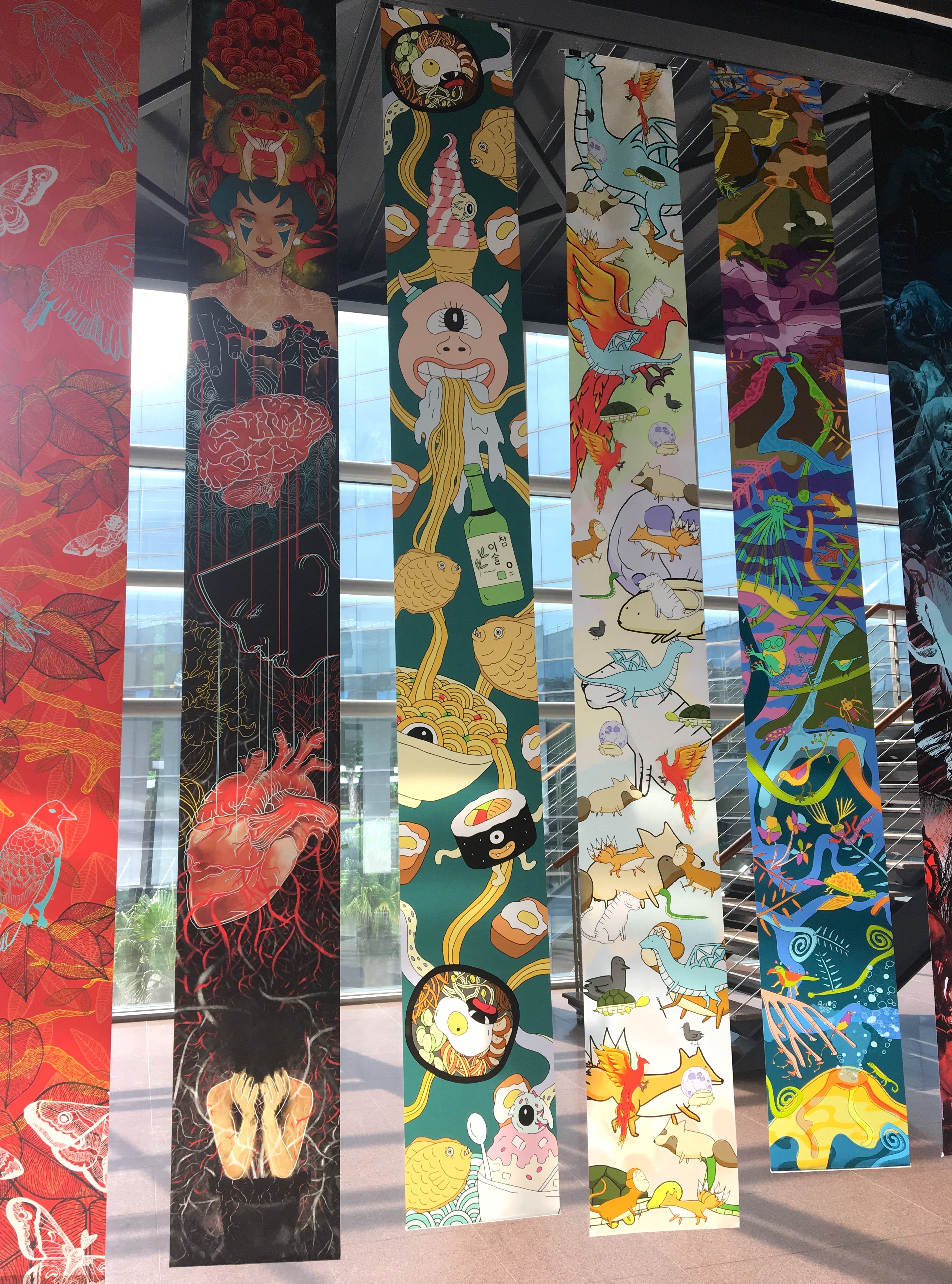
After an insane but exciting four months working on this Dokkaebi design, the time has finally come for it to be printed into a banner and displayed for the annual end of semester showcase!! Here’s a breakdown of the process leading up to exhibition day starting with the printing process:

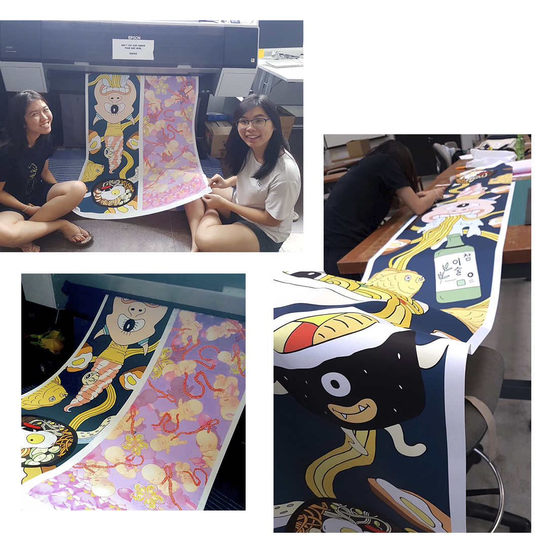
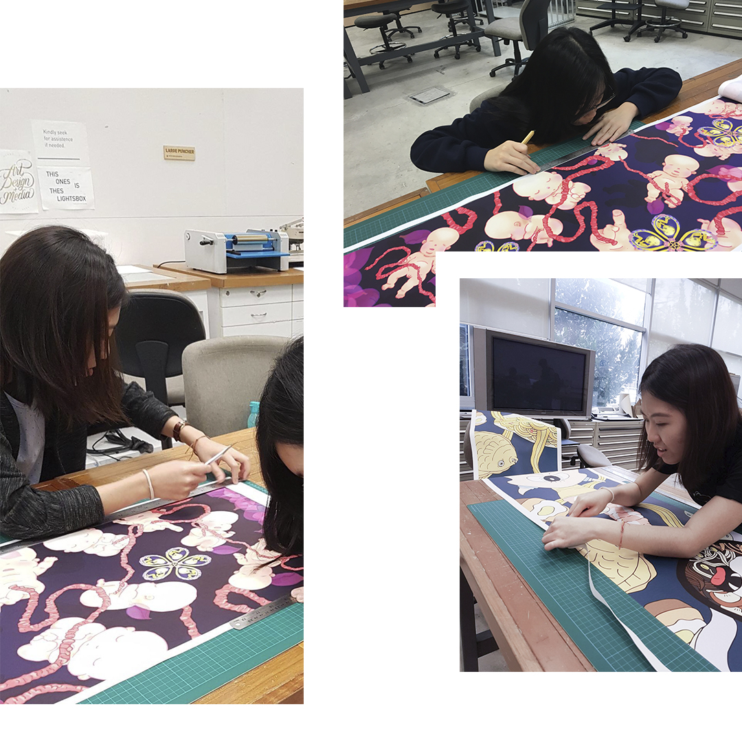
Time to print our banners and I couldn’t be more thankful to have paired up with Yi Ling as my printing partner! It was such a sight seeing the banner slowly coming to “life” bit by bit from the printer and it was HUGE. We were obviously really excited but unfortunately met with printing mishaps – The colour of our banner didn’t turn out like we wanted it to / as seen in our test prints a week earlier. Turned out the printer had colour calibration problems but luckily we could reprint our banners! Below, pictures of behind-the-scenes to getting the banner up. We had to trim the edges on our own and surprisingly Yi Ling and I complemented each other’s cutting styles well haha. One more reckless and one slightly way too OCD so eventually we balanced out our styles by trimming each other’s banner and eventually working together on trimming each side of one banner simultaneously.

Thanks for a fun printing experience, partner-in-crime 😉


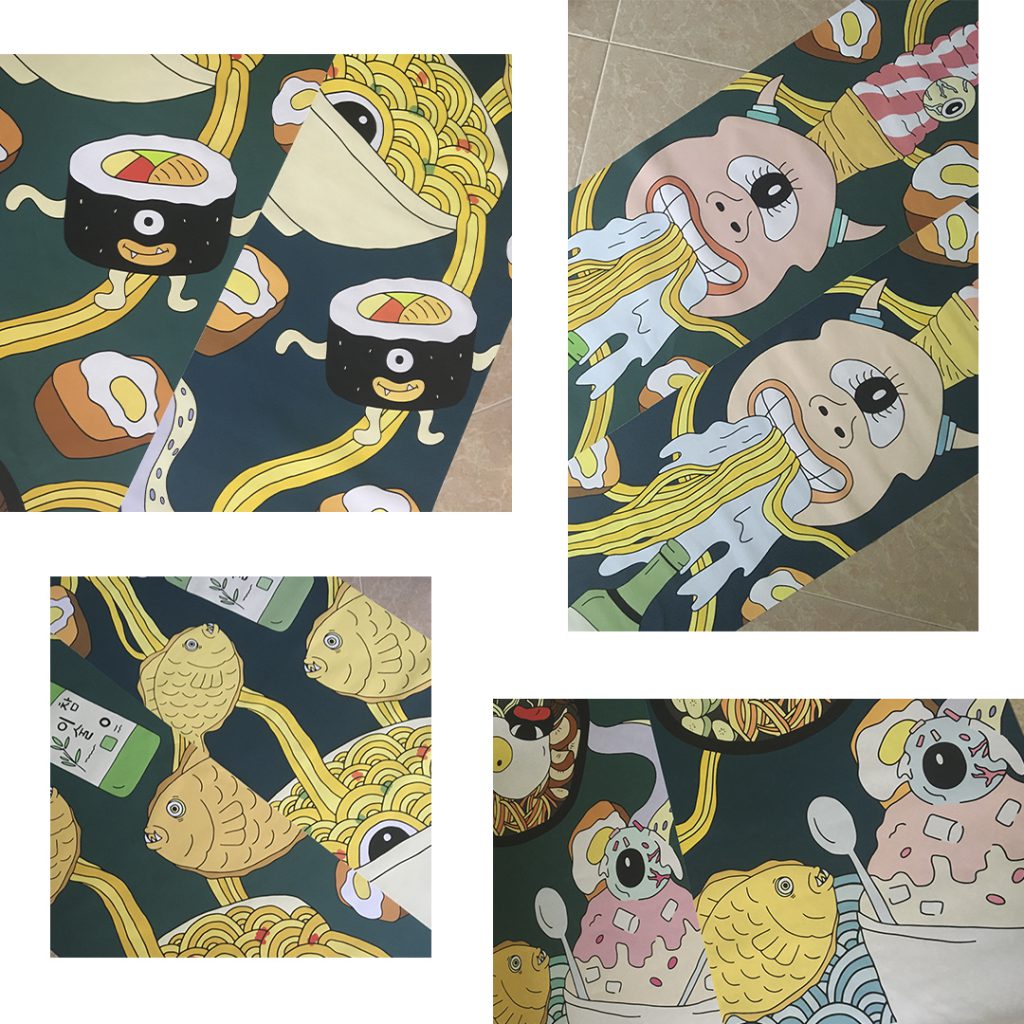
Below was the disparity in the banner colours from the first print vs the second. The very first print that we did when my colours came out wrong, the background became more dark navy rather than a teal colour and the motifs came out very neon. As quoted by some of my peers “the food looks uncooked”  haha (as I was working with motifs that were created based on Korean food)

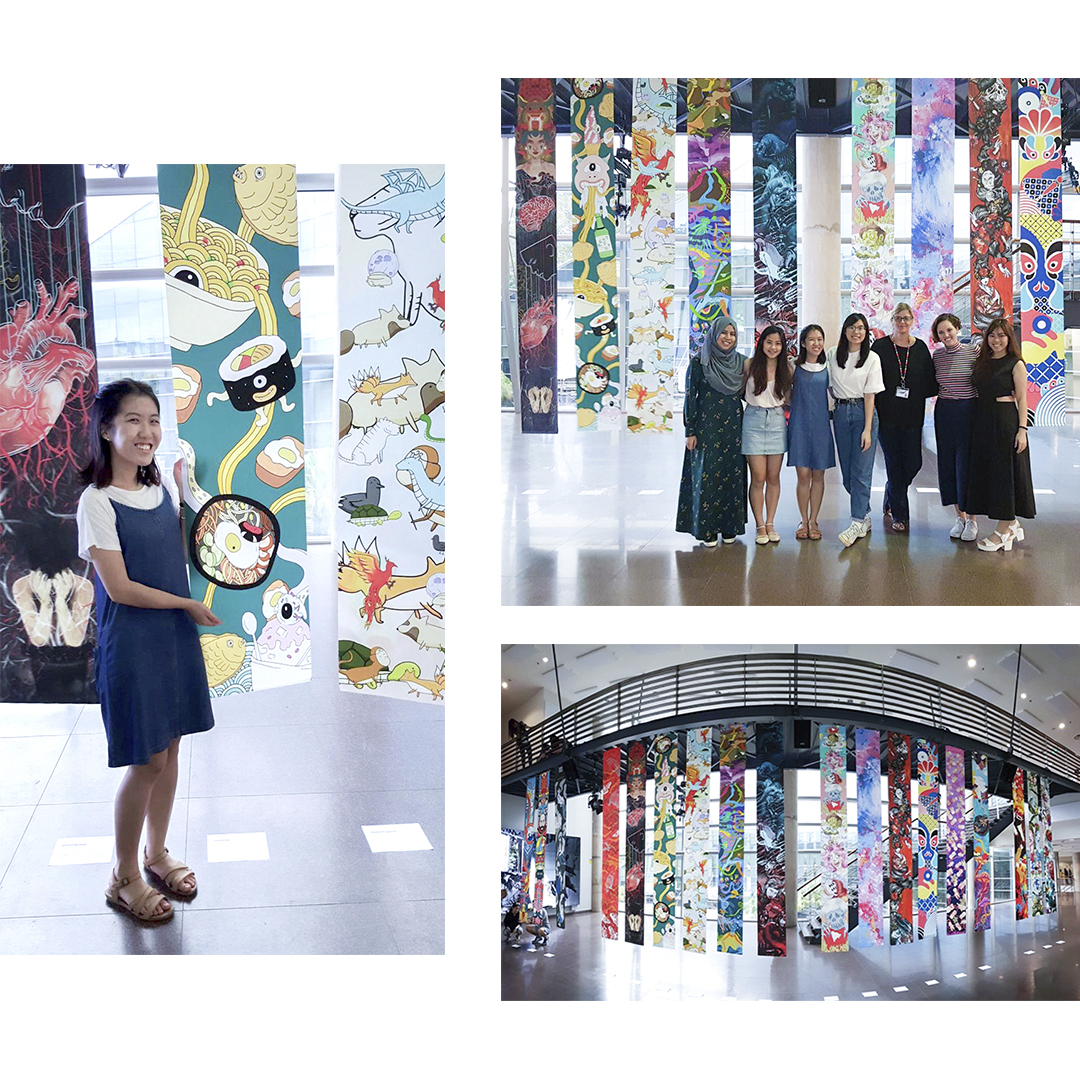
Showed Ina the banner of the first round of printing and surprisingly she was okay with it! However I would’ve liked the colour saturation of several motifs to come out more saturated as intended especially for the One-Eyed Goblin as the intention was to have it be like the ‘central figure/motif’ of the banner thus we concluded that a reprint should be done and YES!!! IT WAS SO MUCH BETTER THE SECOND TIME ROUND. Both of our banners (Yi Ling’s and mine) turned out GREAT 😀


More cutting again, but this time round with the better final banners!


Set-up Day

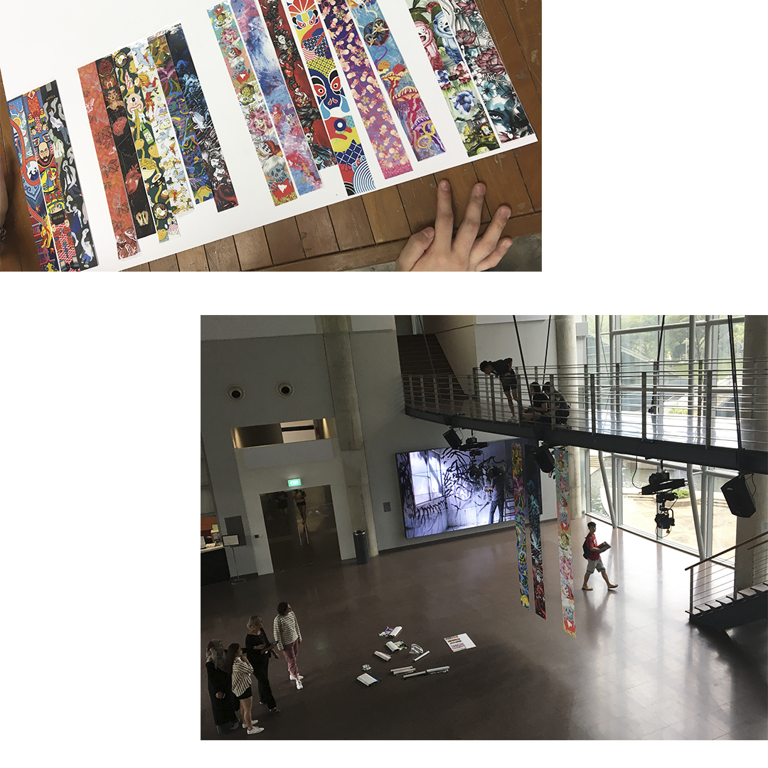
The following week was set-up day; super exciting times. We laid out our test prints in class first to get a sense of which banner should go where for the exhibition set-up. But at the end of the day I really think that no matter how the banners were arranged, all turned out really pretty and complemented each other’s so well!!

More documentation to come in the next post!

Time really flies, the end of the semester is here and so are all the final submission deadlines! For this final project, we were  really “free” in the sense that we got to explore any area of our interest, a physical product/publication etc. produced as an expansion of one of our past few projects – 2A: Vernacular Type / 2B: Organic Type/ 3A: Type As Image / 3B: Type As Pattern / 3C: Type As Emotion

I eventually went ahead with an expansion of Project 3A out of subject interest – A zine titled: Playground of Our Yesteryears and here’s my journey at arriving at my final idea:

Ideation

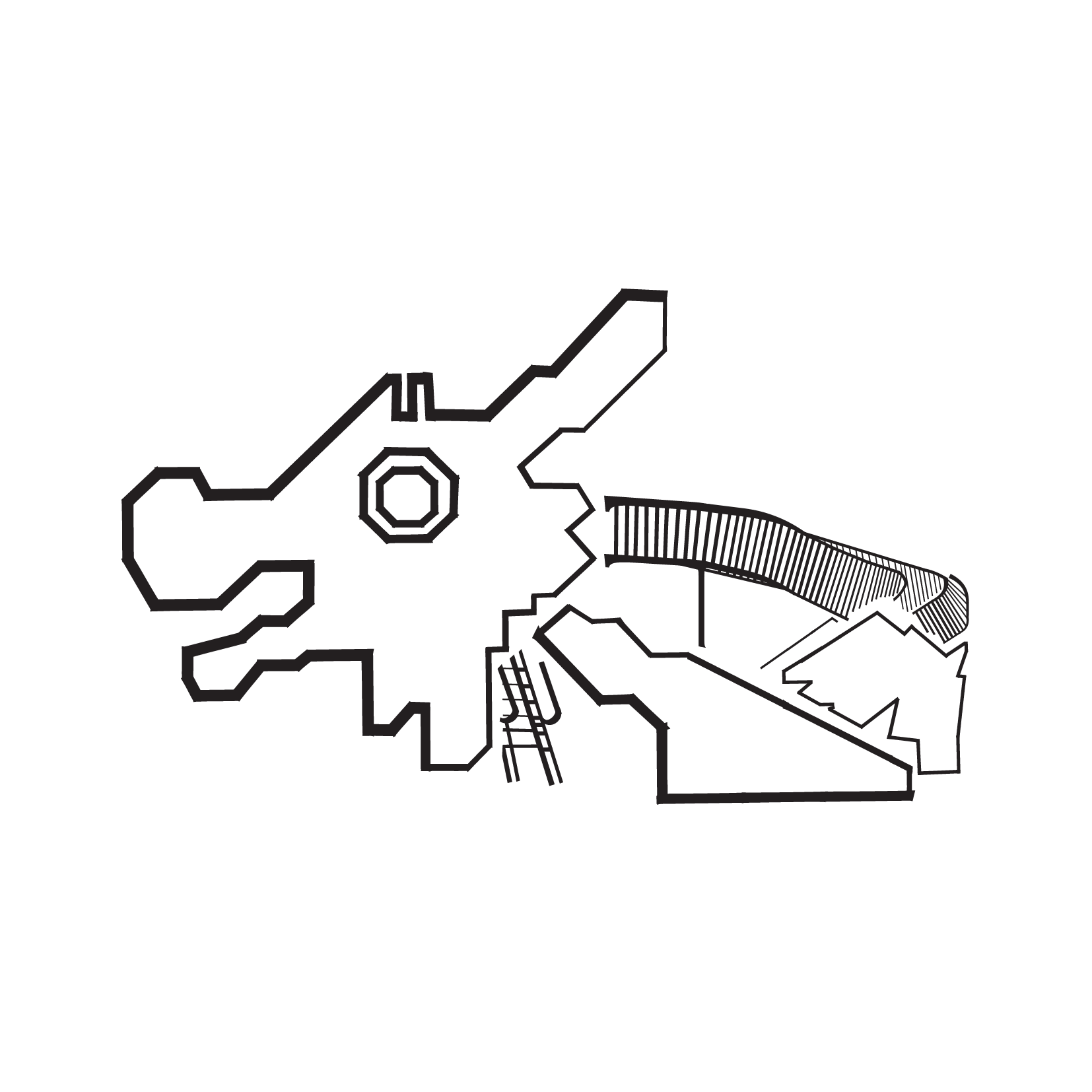
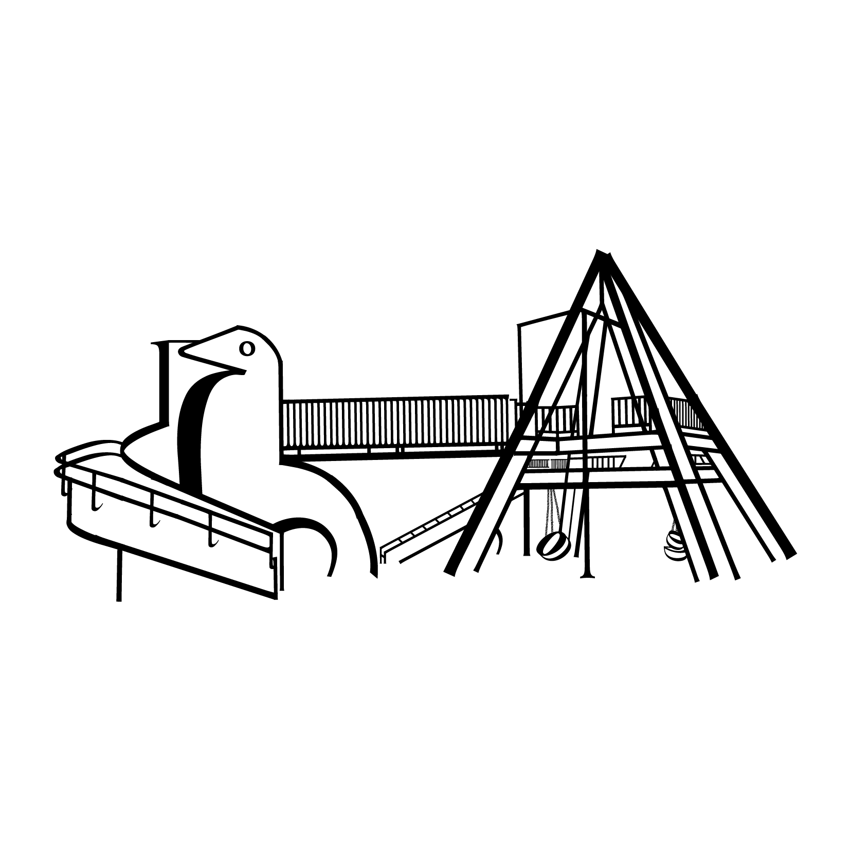
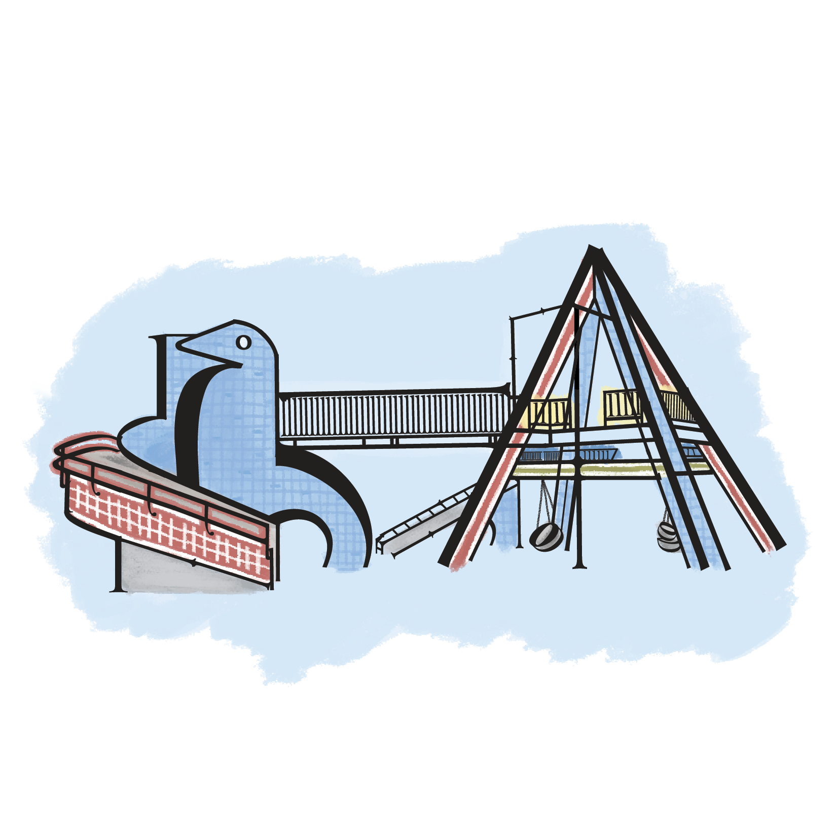
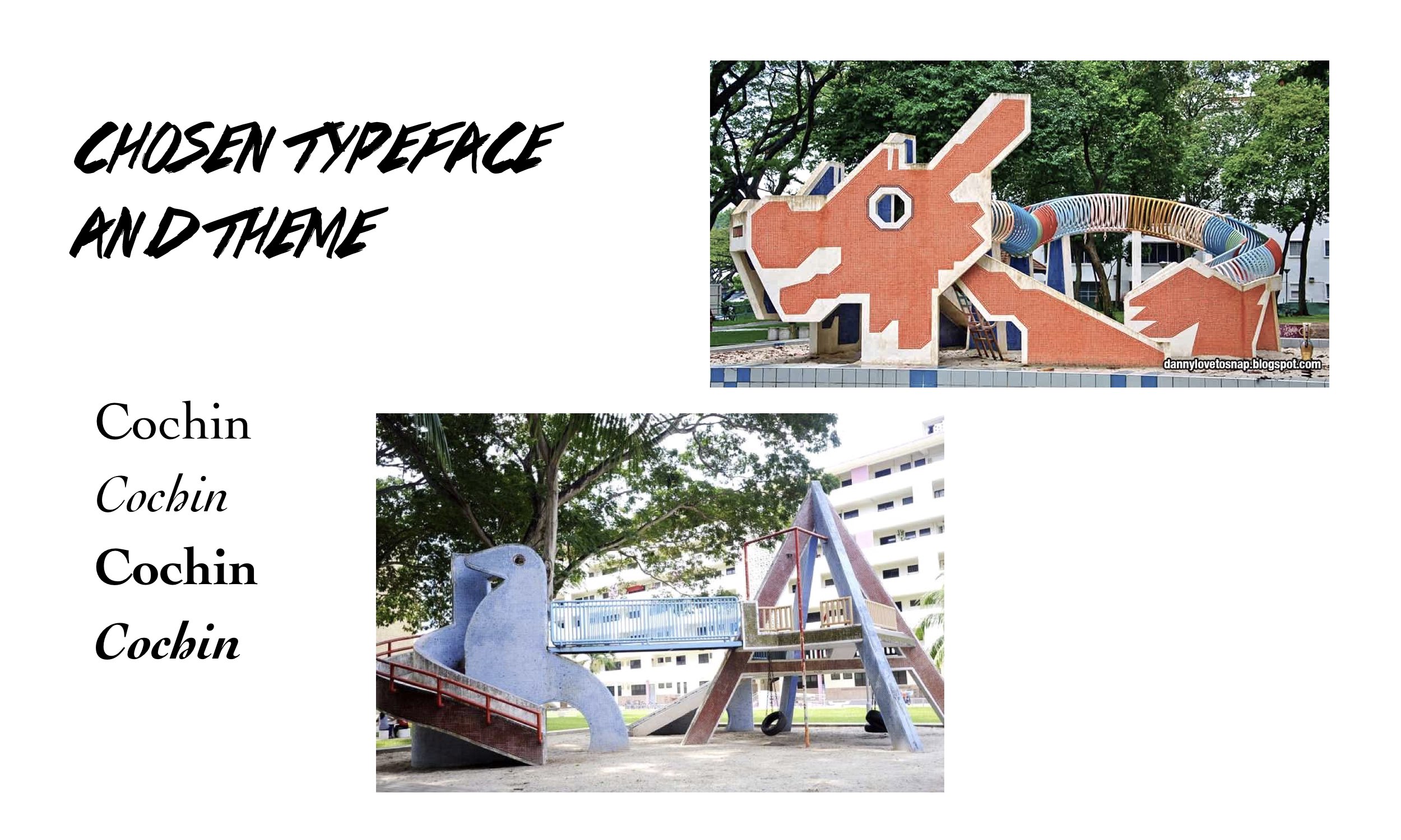
This final project being an expansion of Project 3A, the subject matter I based my compositions on were the iconic mosaic playgrounds in Singapore – the Dragon Playground and Dove Playground respectively. For reference:

3A: Type as Image

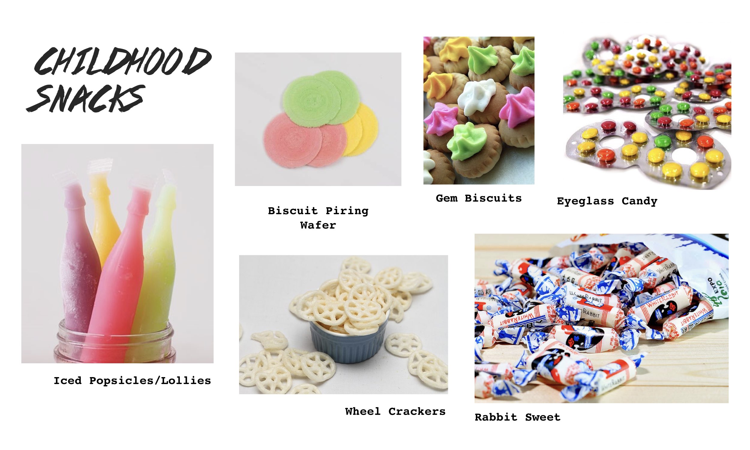
As mentioned in that process documentation, I was naturally drawn to these playgrounds and always had this “something” for nostalgic stuff. I wanted to explore this theme of nostalgia again for this final project. Thus I was considering to create a zine that’s a collection of typographic compositions of several popular childhood snacks or stick with the same mosaic playgrounds.

After much thinking, the playgrounds it was! I initially wanted to have the zine include a little of Project 2A (Vernacular Type) as well, coming up with quotes related or said about the playgrounds and formed with Vernacular Type as observed from the form of the playground structures to strengthen/solidify the concept further. Even with the title of the zine as well on the cover page, I wanted to incorporate the techniques of Project 2A. However after much consideration, it was not practical at all given the tight deadline that we were given for this final project – 3 weeks.

How unfortunate! But I’ll definitely keep this idea in mind if I were to ever expand further on this project 🙂


Choice of Typeface

I stuck through with the previous typeface used for Project 3A, Cochin reason being that it evoked a nostalgic vibe and I liked how it had various weights and its Italic font had a unique anatomy to it. Unlike Project 3A where our reasoning for choosing the typeface could be just as simple as this, for this final project the rationale had to be deeper. It must be related/be of significance to the subject matter that the compositions are based on. In this case, the typeface Cochin had to be related to these mosaic playgrounds – The feedback I received during the first consultation for the project.

Thus I had to do further research to see if I could find similarities. If not, I have to change my typeface. Thankfully there were some connections! This was what I found:

In 1977, Cochin was later adapted an expanded for Linotype that is used as a system font that can be found in our MacBooks. This 70’s period that it was adapted is the same period when these mosaic playgrounds were created around the various HDB estates in Singapore

Therefore that similarity, and additionally the typeface has an old text feel that evokes a feel of nostalgia to which I feel is an apt tone to convey with these iconic mosaic playgrounds of the past as they were part of most people’s childhood.

Reference: https://www.fonts.com/font/linotype/cochin/story 


The Zine Format
I wanted to opt for the normal staple bind zine, working with page spreads and all but I was thinking further on how I could make it less “dull”. After much digging around online I found out that there’s really a wide variety of zine formats and actually it’s really up to one’s preference, how they want their zine to look like.

Then I chanced upon the one-page mini zine template! Pretty decent and quite an interesting layout to work with. There’s a slit in the middle though.


Looking further, I came across this typography publication that was one-paged as well just not 8-page and mini. It had a poster on the flip-side (back-side) of it’s front which sparked the idea of packaging it to come with a freebie of sorts in poster form (folded). The contents of the zine and the poster would be further elaborated later on.

Cr: https://www.behance.net/gallery/33539703/Typographic-Zine 


The Compositions

THE BIGGEST STRUGGLE OF THIS PROJECT. Going ahead with the project as an expansion of Project 3A, I could foresee it was going to be quite a struggle as I already was that time during the project. This was the first version of compositions I came up with:

Went in to consultations and sure enough, I struggled. Sure the compositions came out, the respective playgrounds can be identified. However, feedback was that similar to the two that were created in Project 3A, the compositions looked quite flat and way too simplified. The reader would not be able to identify the letters used/see the typeface and the compositions could easily pass off as being drawn using the pen tool.

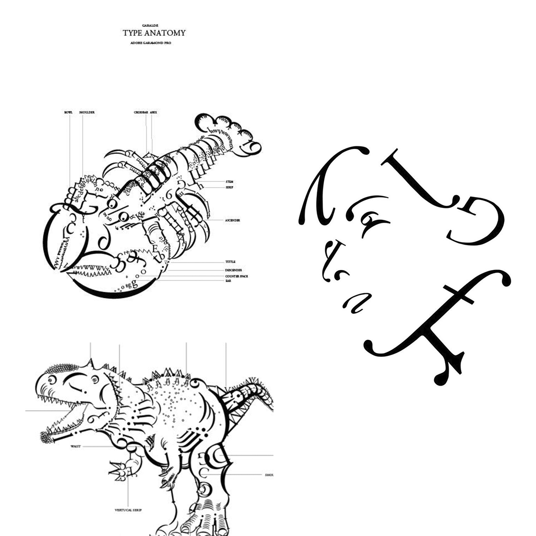
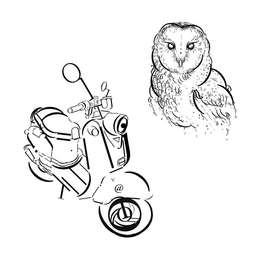
Shirley suggested to search online for examples of Type as Image  to get a better sense of how the compositions when formed should look like – Definitely the anatomy of the letters could still more or less be identified and that should be the way to go!


^ Reference Works

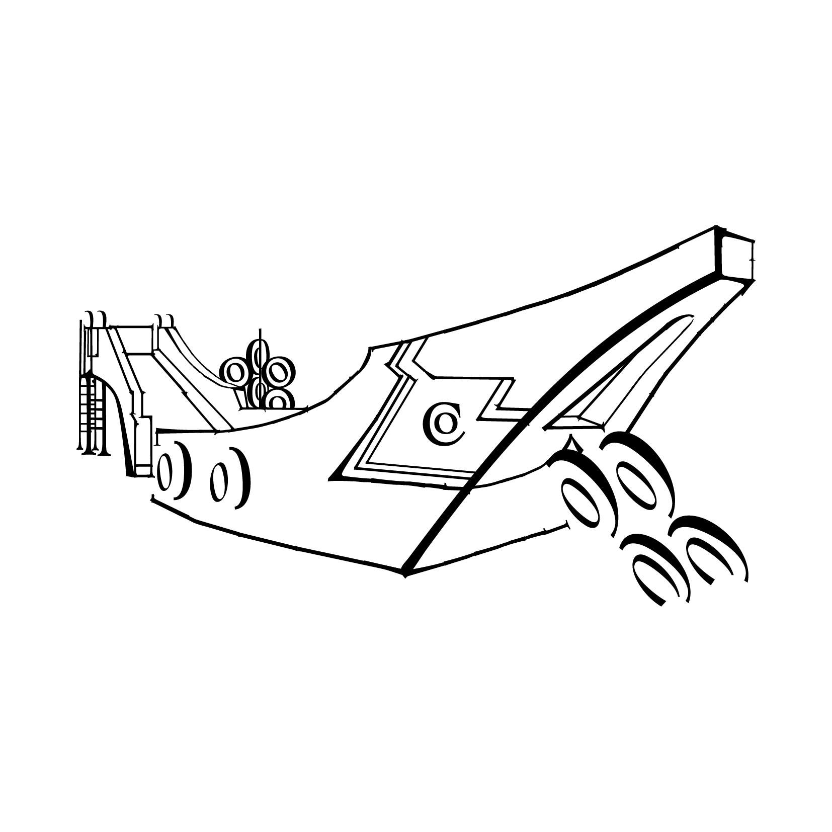
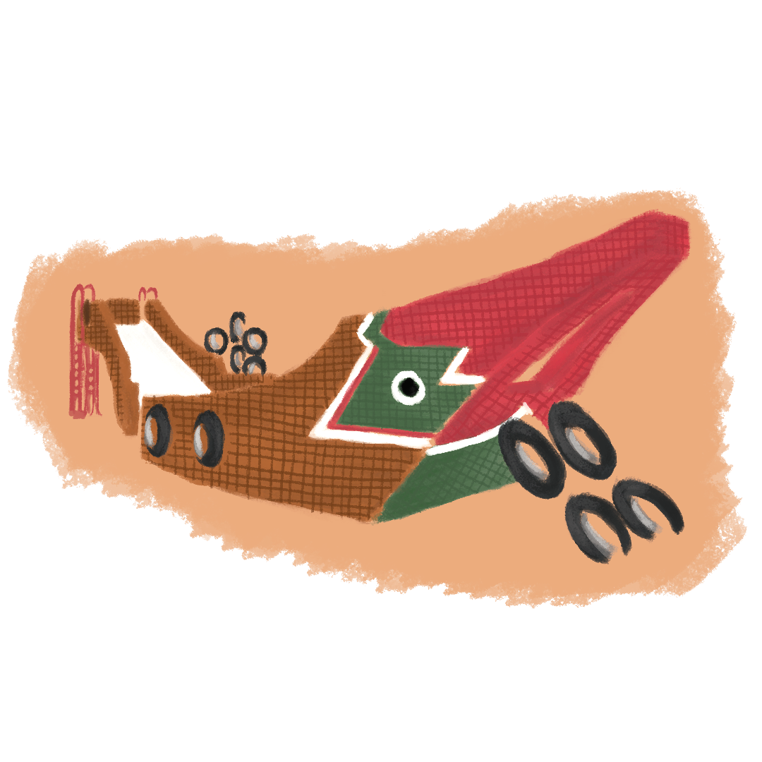
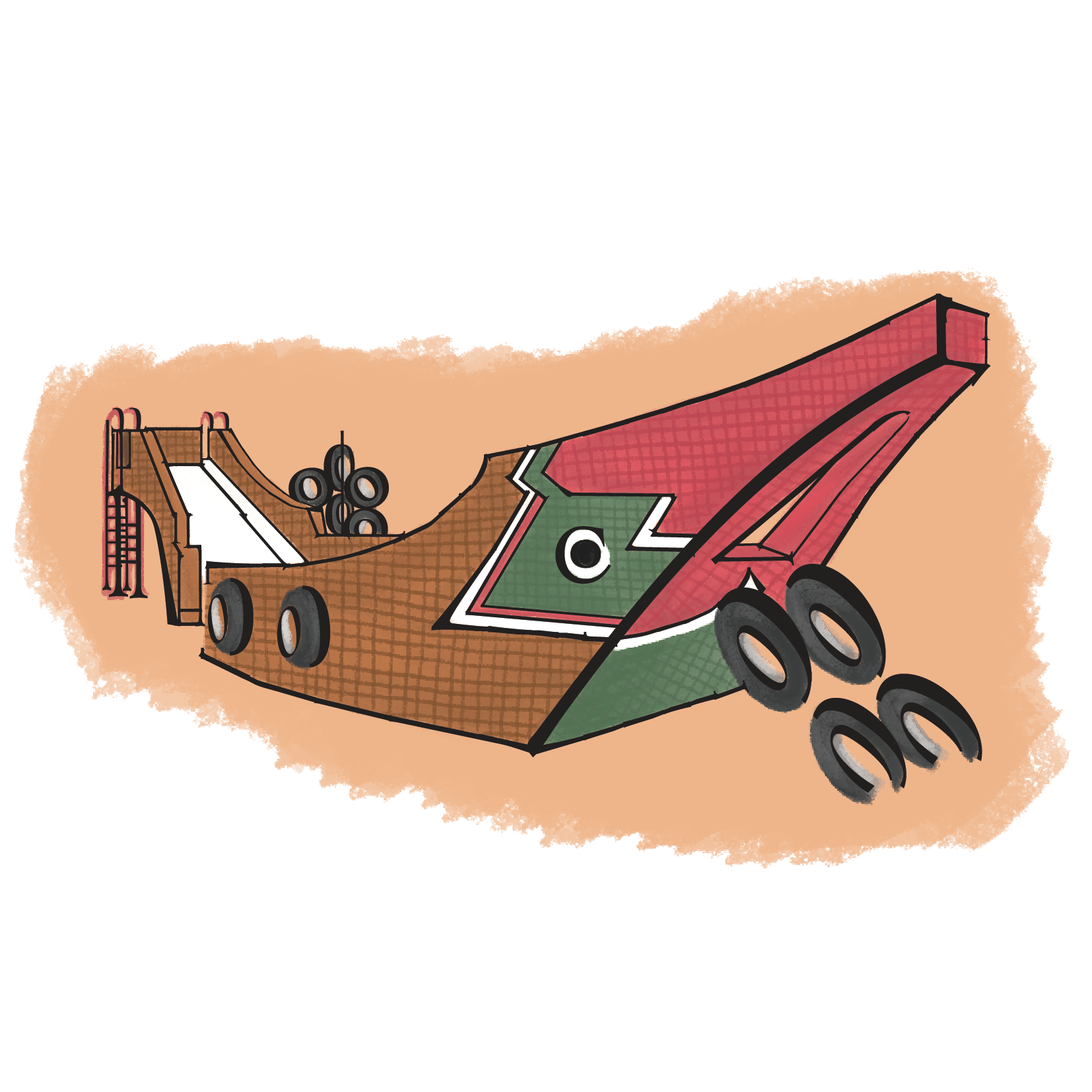
Thus I changed up the compositions a little by cutting up the anatomy less, some retaining it’s full form and the use of the letter’s descenders and ascenders rather than it’s stems. The list of mosaic playgrounds around Singapore is pretty long and people might ask, why feature just these mosaic playgrounds and not all of them? My reason for choosing these playgrounds to be featured is because these seven I personally believe are the more iconic ones around, I see them popping up/being mentioned in most if not all the articles/materials I’ve read about these playgrounds. Furthermore, several of these playgrounds were popular designs till they had replicas of it built about Singapore but these selected ones are the original ones that were created, the first version to exist.

Below, each revised composition labelled as follows in a gallery of its own and the process of getting to the final composition used in the zine with the colouring for some: (click on the images to enlarge as slideshow)

DRAGON PLAYGROUND


DOVE PLAYGROUND


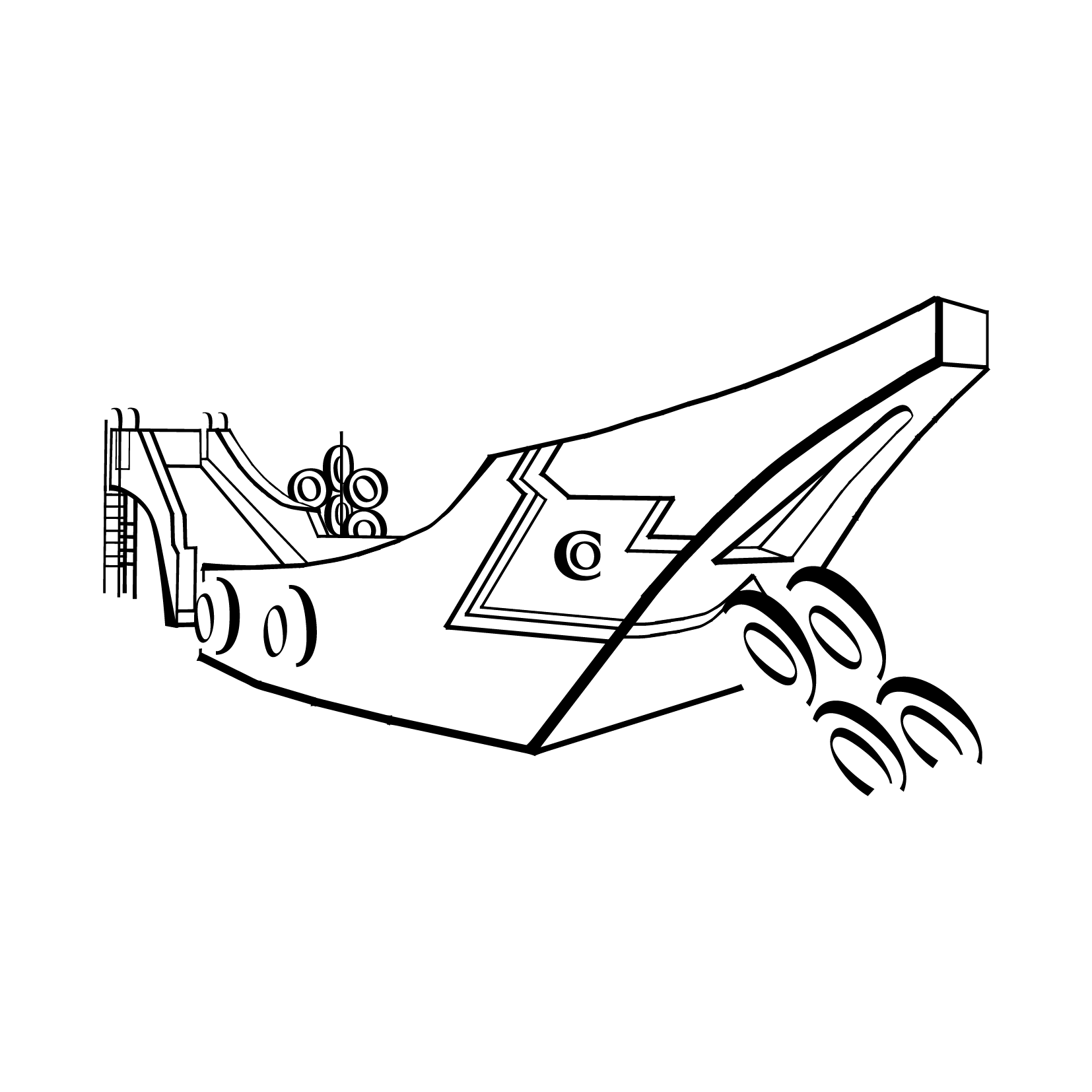
SAMPAN PLAYGROUND


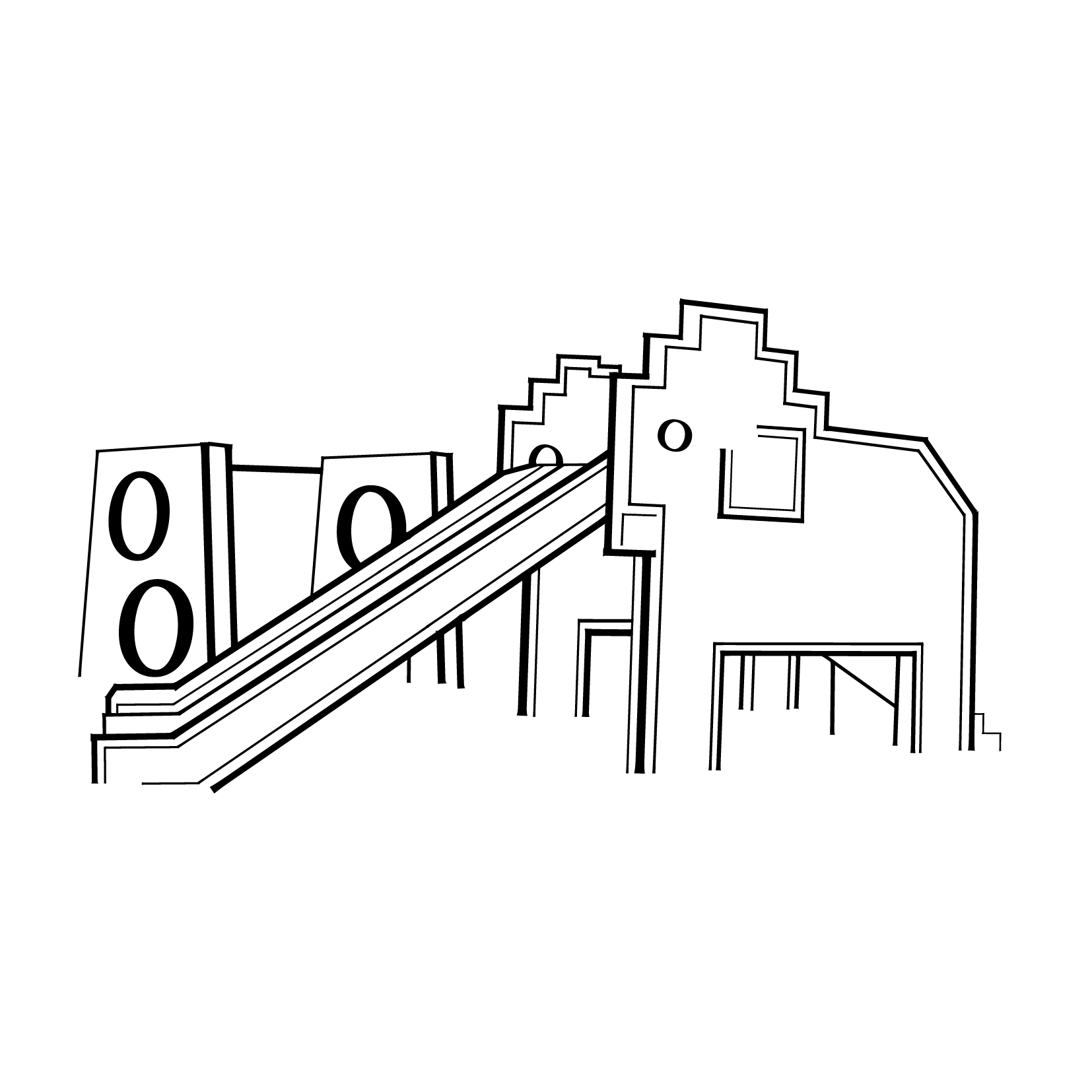
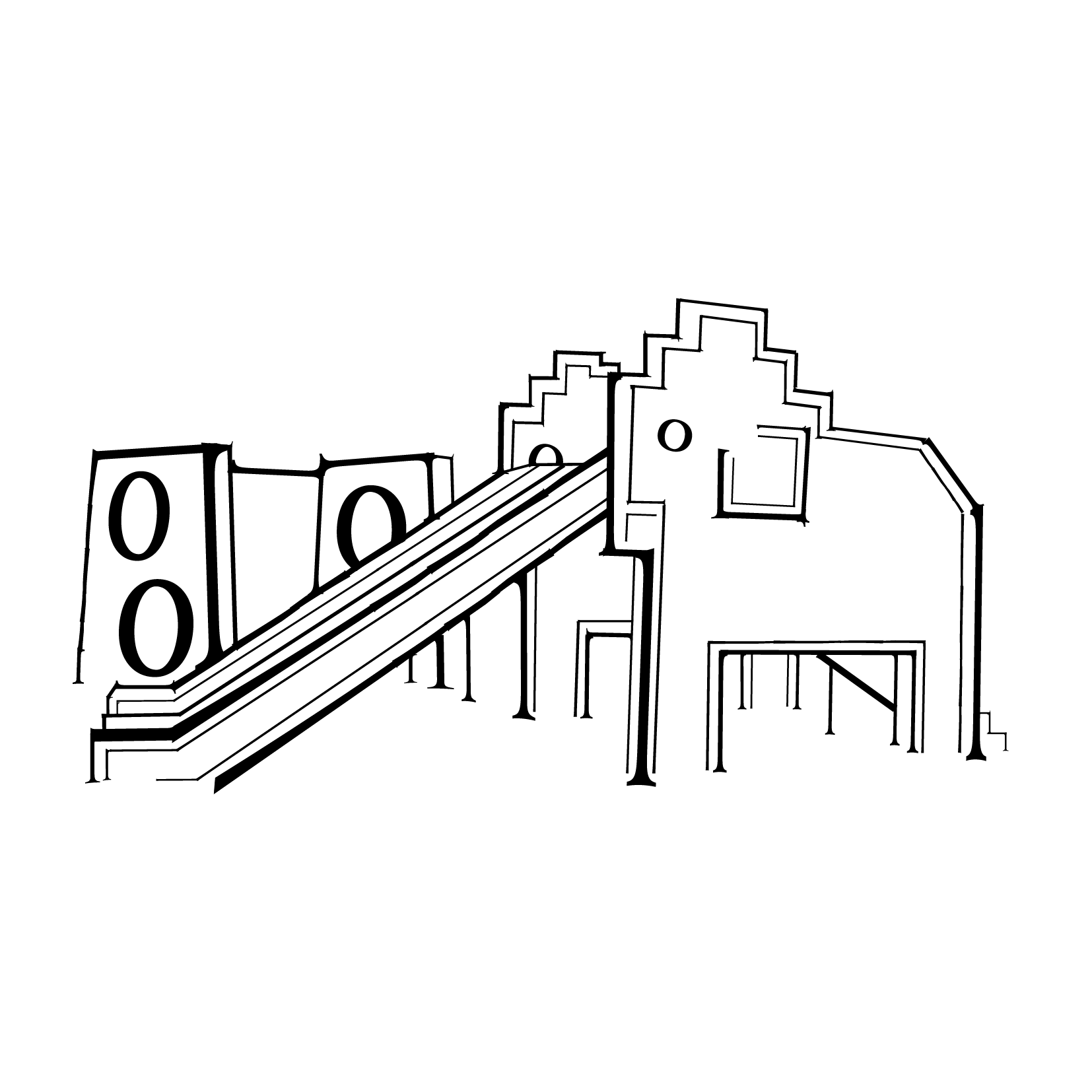
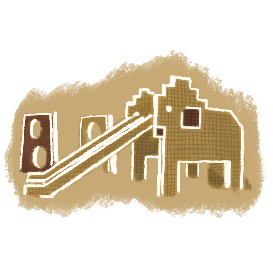
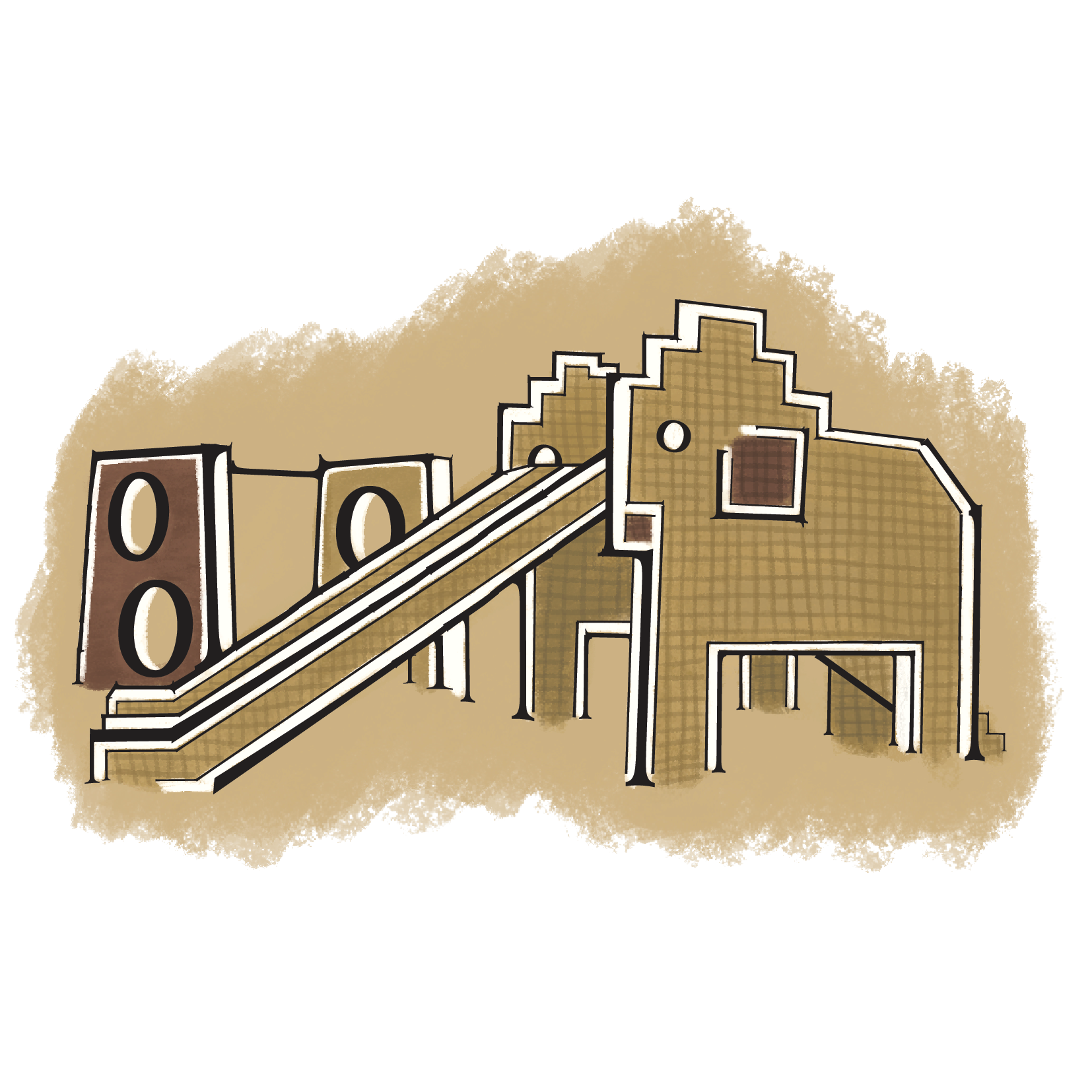
ELEPHANT PLAYGROUND


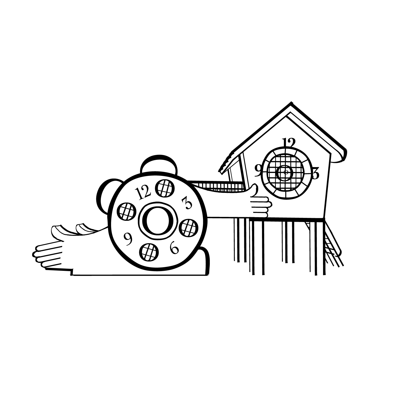
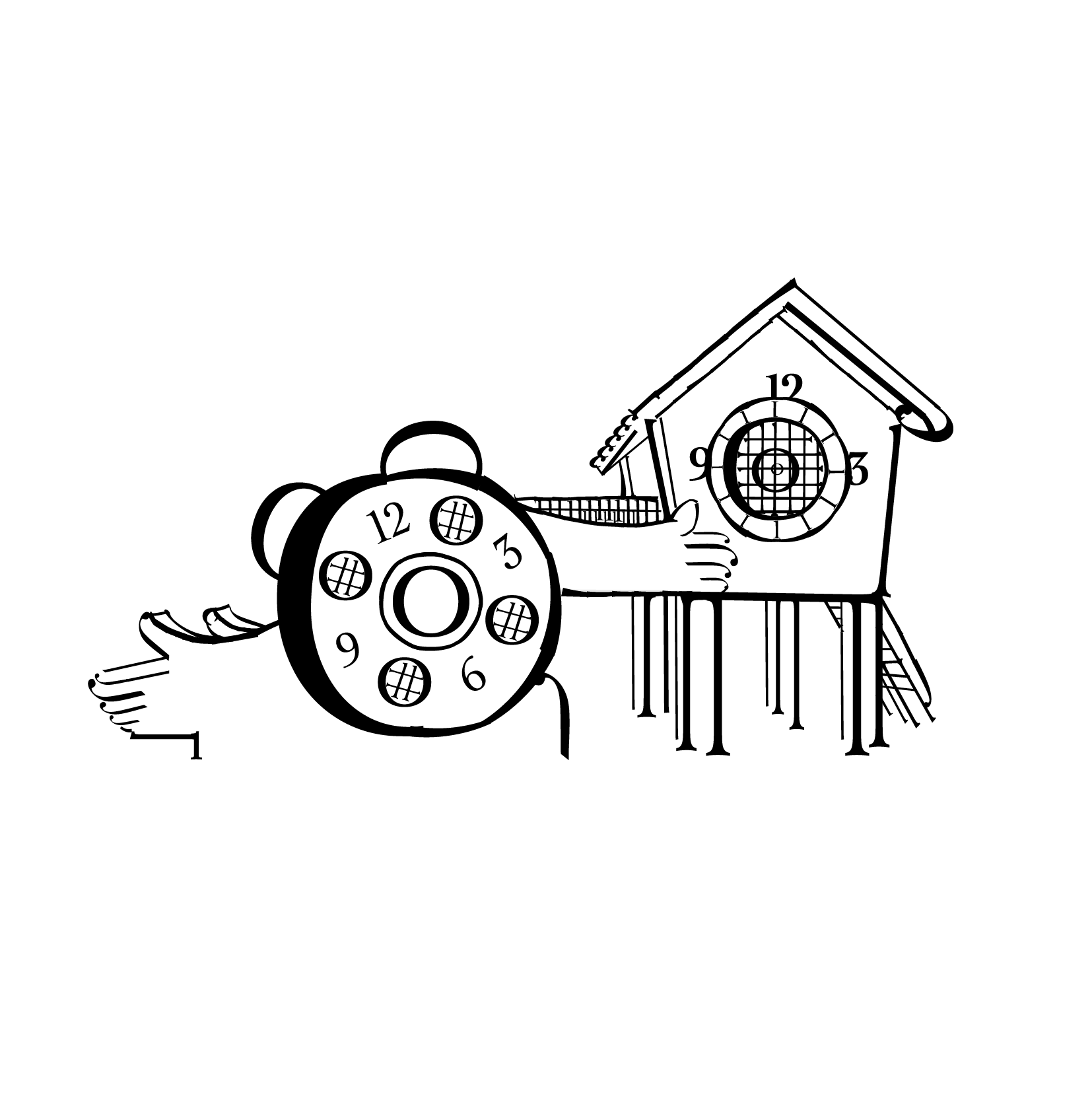
CLOCK PLAYGROUND


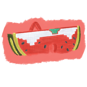
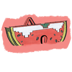
WATERMELON PLAYGROUND


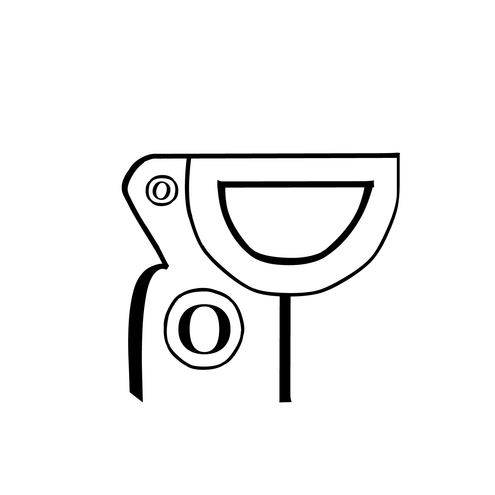
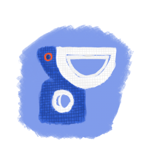
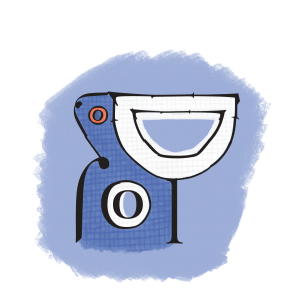
PELICAN PLAYGROUND


Content

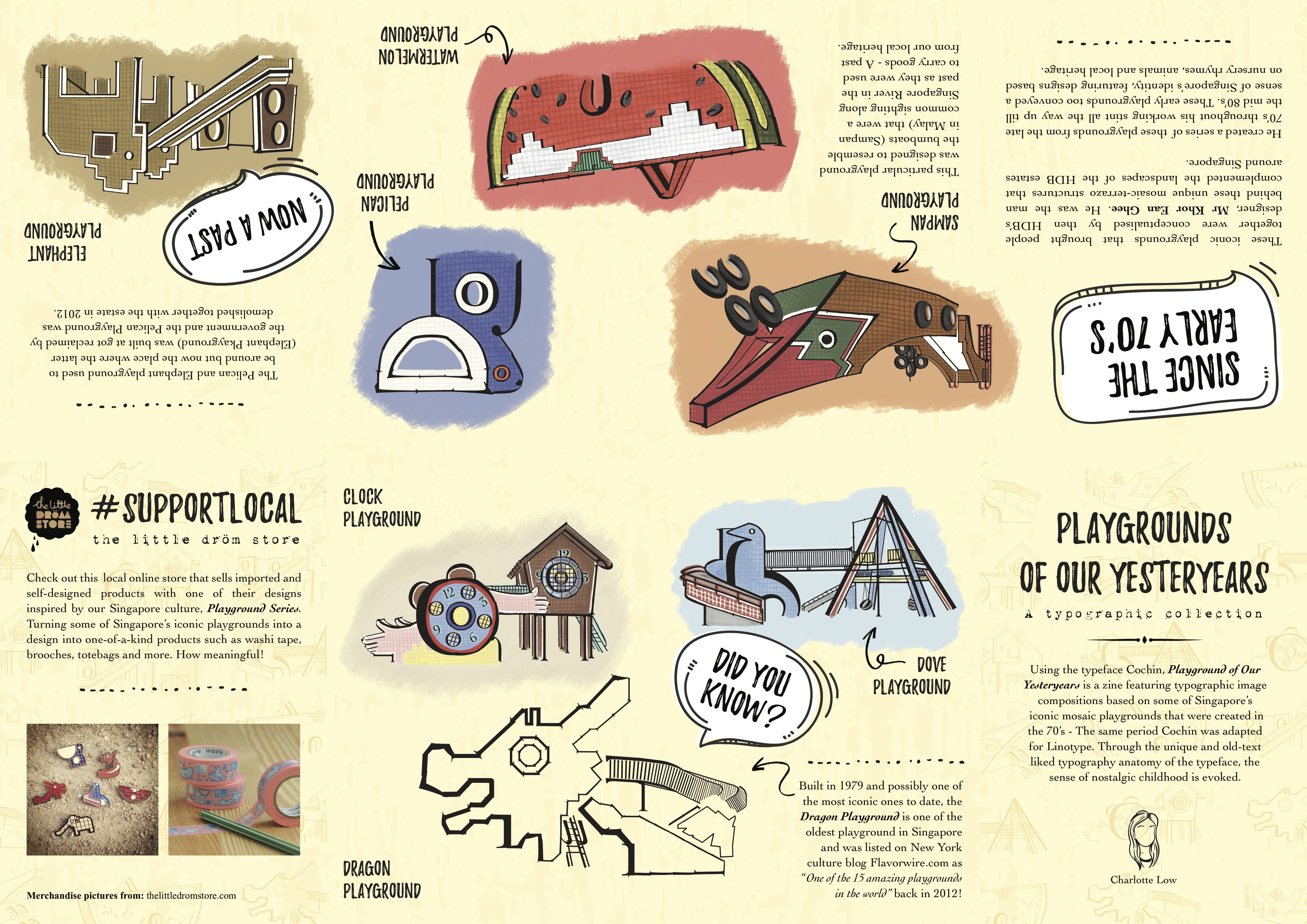
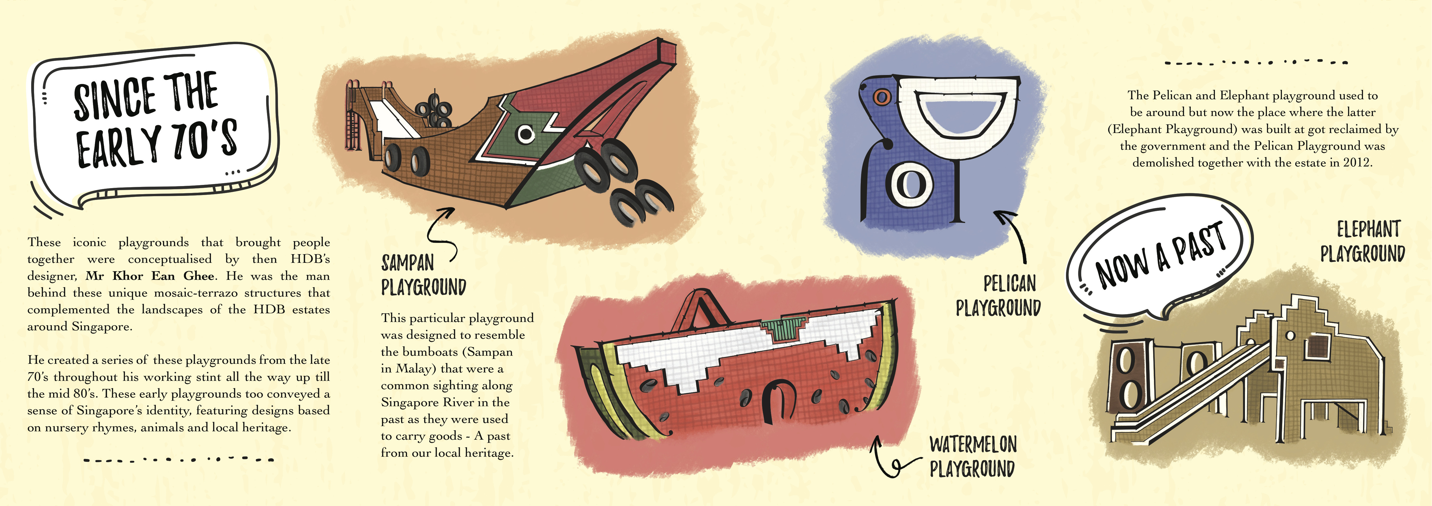
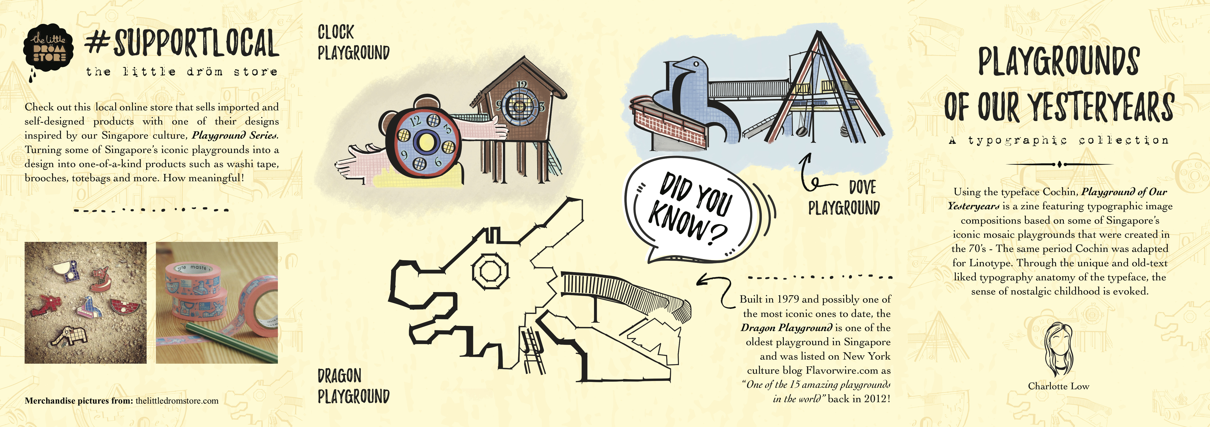
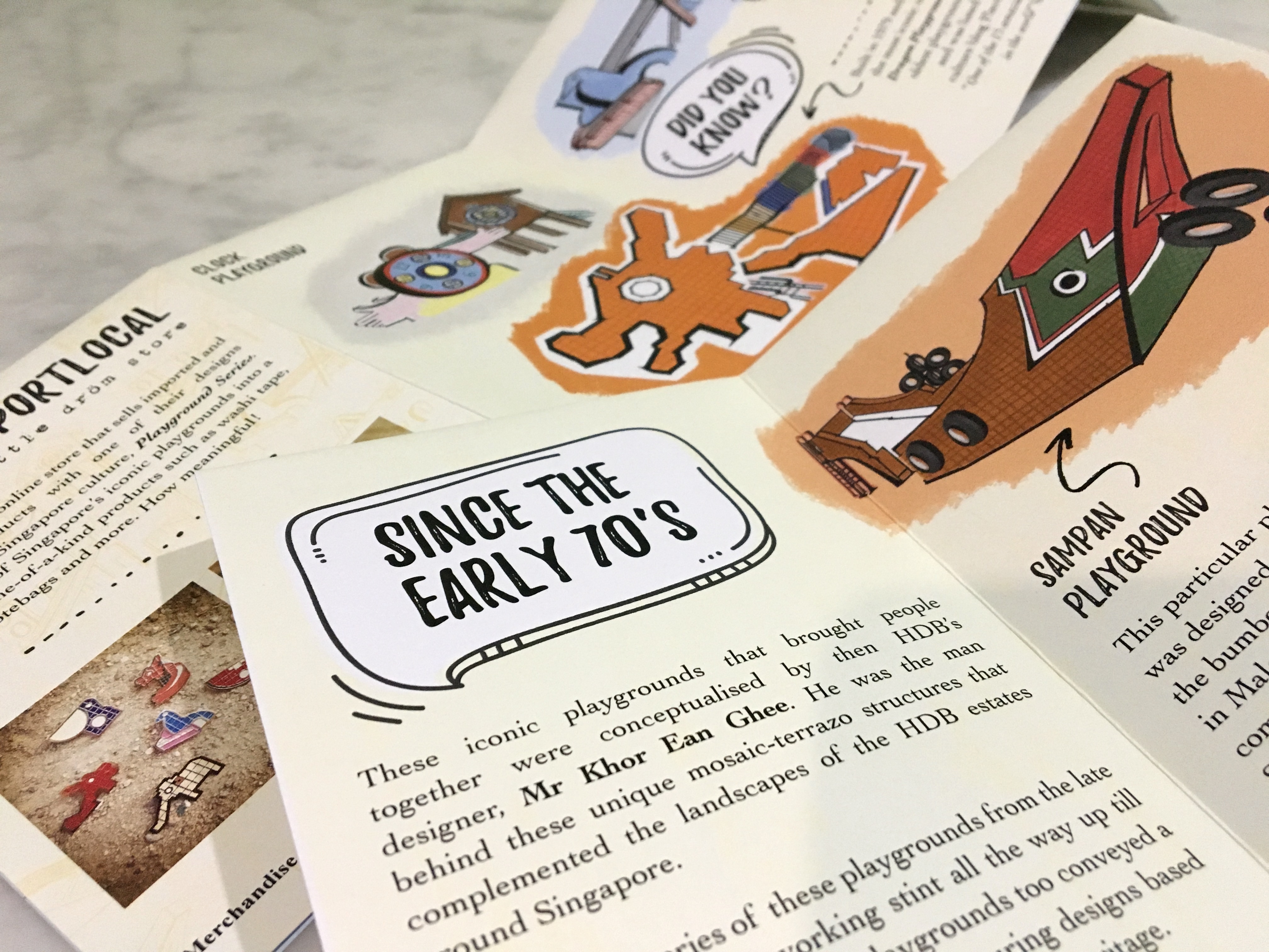
As I felt that it would be rather boring to just have the typographic image compositions make up the content of the zine, I eventually decided to include several fun facts/information that readers will not likely be aware of about these playgrounds complement the compositions.

I have to say, bulk of my inspiration on what should be included in the zine came from this digital pdf that I chanced upon while researching on the playgrounds (link): Mosaic Memories – Singapore Memory Project

From there I got the inspiration for the main content to complement the compositions:

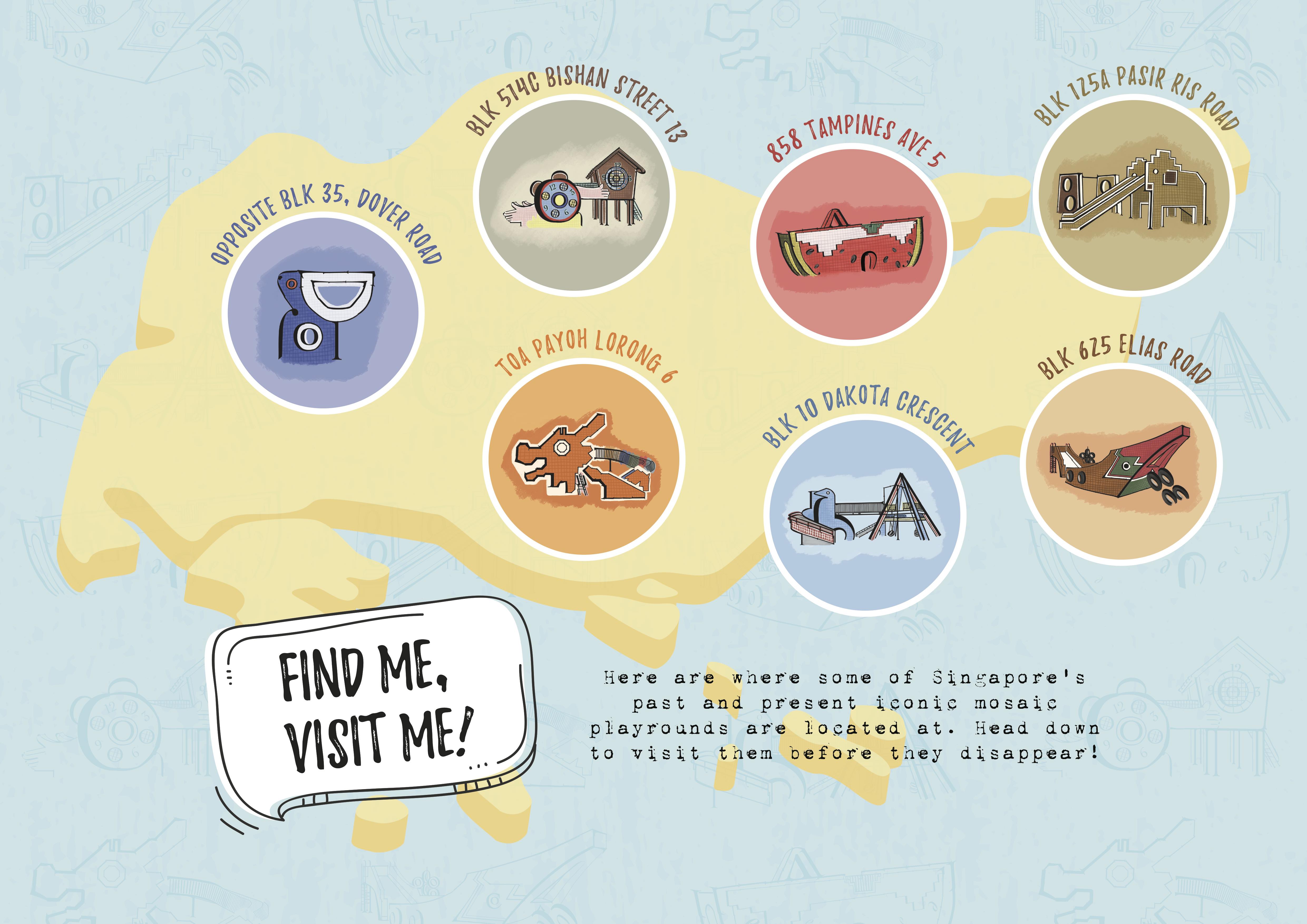
And the poster: Somewhat like the map as seen in the Mosaic Memories project referenced, but in my own take and style. The map that the designer came up with for that project featured way more playgrounds and it was even more detailed with a  descriptive paragraph beside each playground. As for mine, I decided to have it just feature the playgrounds that I’ve created compositions for on a map silhouette of Singapore. The playgrounds placed roughly at where it’s located across the island (North, South, East, West side) with simple header text above it made up of their addresses’. The poster works as a tiny prompt/suggestion for readers to visit/re-visit their childhood while they still can (the design can be seen later on below)

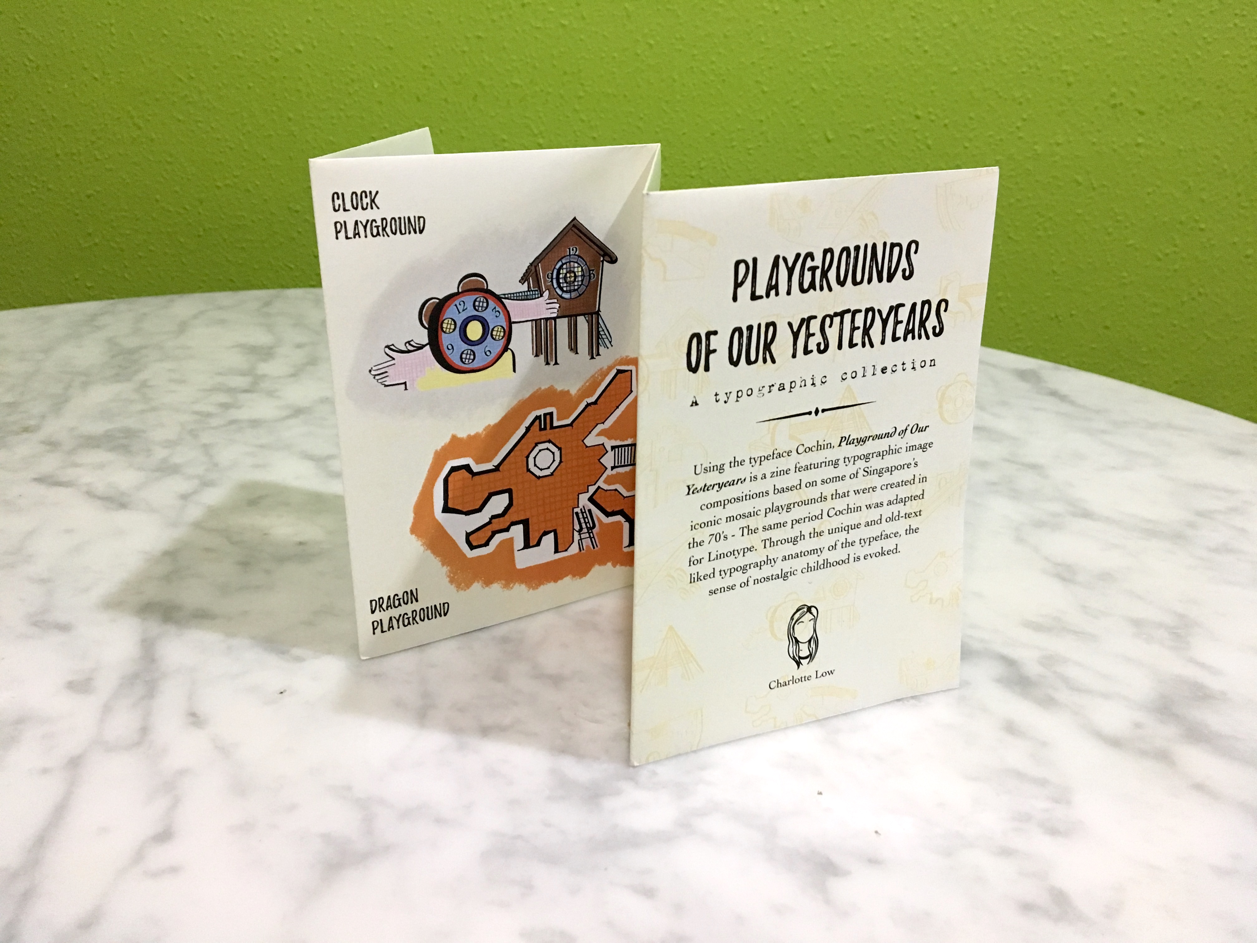
And after much revising and printing…. here’s the final look of the zine 🙂

To make the background of the zine look less flat, I added texture to create a vintage rustic look that somewhat gives a nostalgic feel and also something spontaneous; a pattern like wallpaper design overlay on the already textured background with lowered opacity 🙂

HERE IT IS!!

(click on images to enlarge as slideshow) 

References:


Overall, I’ve learnt A LOT from this project and module. Not just applying the usual typography concepts that we’ve learnt so far, but in this case to even analyse how the choice of typeface can affect the readers’ interpretation of the work. Also, layout and almost every design aspect needs to be taken into consideration. In fact, all the projects we had throughout this module had its own learning points. But if there’s one biggest learning point/takeaway at the end of the day, I would say is that my observation skills and appreciation for typefaces/fonts have really grown 😀

Looking forward to what Typography II has to offer!!
 

By this part of the project, I’m pretty convinced that it each part gets tougher and this was the one I struggled the most with. Unlike the first two parts – 3A & 3B where there was so much freedom, (for a lack of a better explanation) based more on the aesthetics we were going for rather than having an intended message/concept behind the composition.. This was the total opposite, the composition needed to make sense and translate the emotion with the word.

To begin, I misread the brief entirely thinking that we could come up with our own emotions when actually we could only chose 4 to work on from a list that was given in the project brief. Similarly like the first two parts of the project, using just one typeface we had to come up with four compositions expressing the word ‘HELLO’ in black and white, varying the weights, caps, spacing, sizing etc.of the typeface. Basically exploring techniques that do not involve manipulation of the typeface.

Once again, I’ve decided to use HELVETICA NEUE for my typeface reason simply being: There’s so many fonts that I can use from just this one typeface! But eventually I didn’t use that many, sticking to a few of the same fonts like Bold, Condensed Bold and Condensed Black as the thin weight fonts were really way too thin and I couldn’t figure out how to make use of Italics in this case.

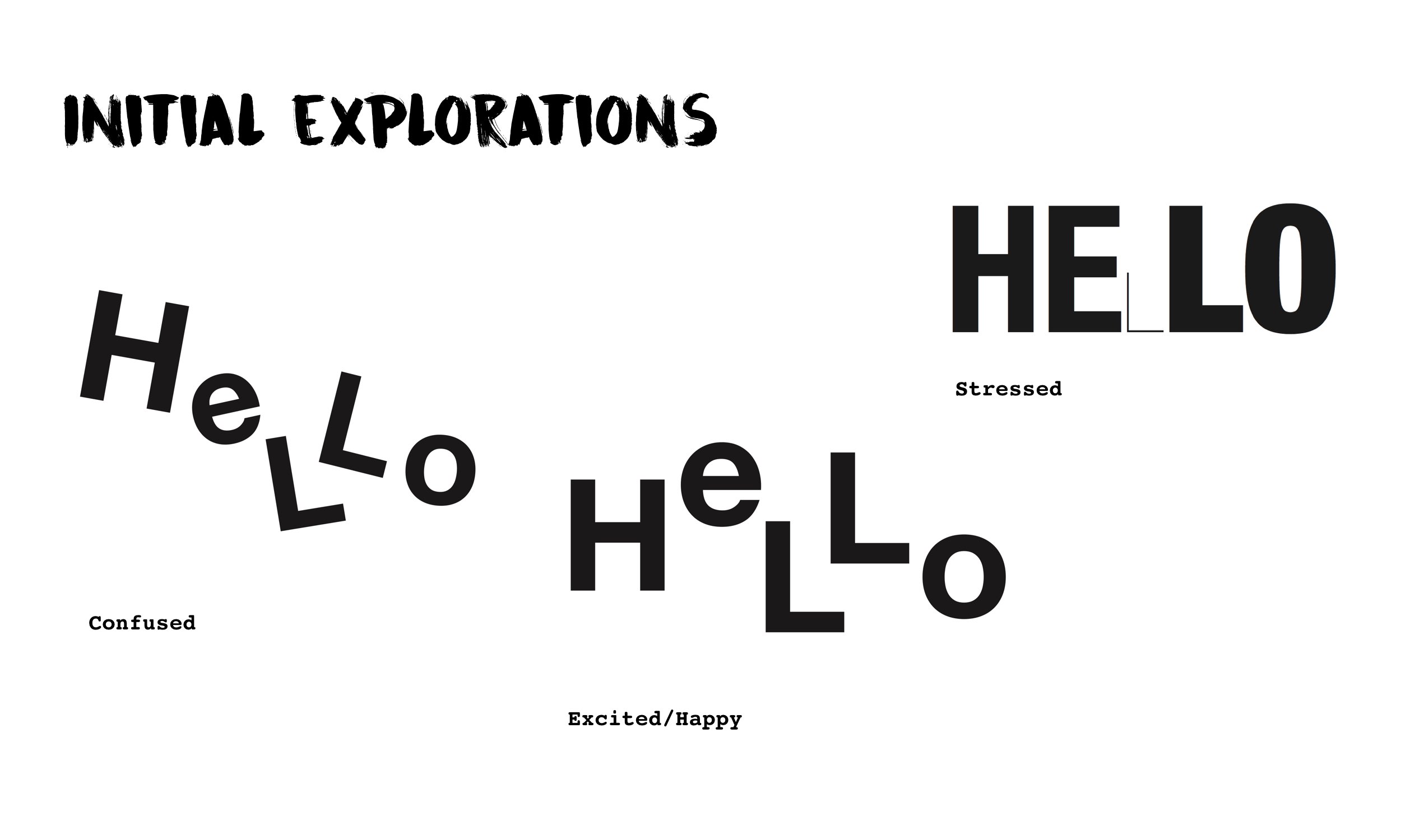
So… as a result of misreading the project brief, blur me came up with experimentations on emotions that weren’t usable but I figured no harm documenting them. Luckily some could be further revised/explored as the emotions I had in mind were pretty similar to the list.

The emotions that eventually followed up with the initial explorations or settled on doing later on were: CONFUSED | ARROGANT | ANNOYED | DEPRESSED


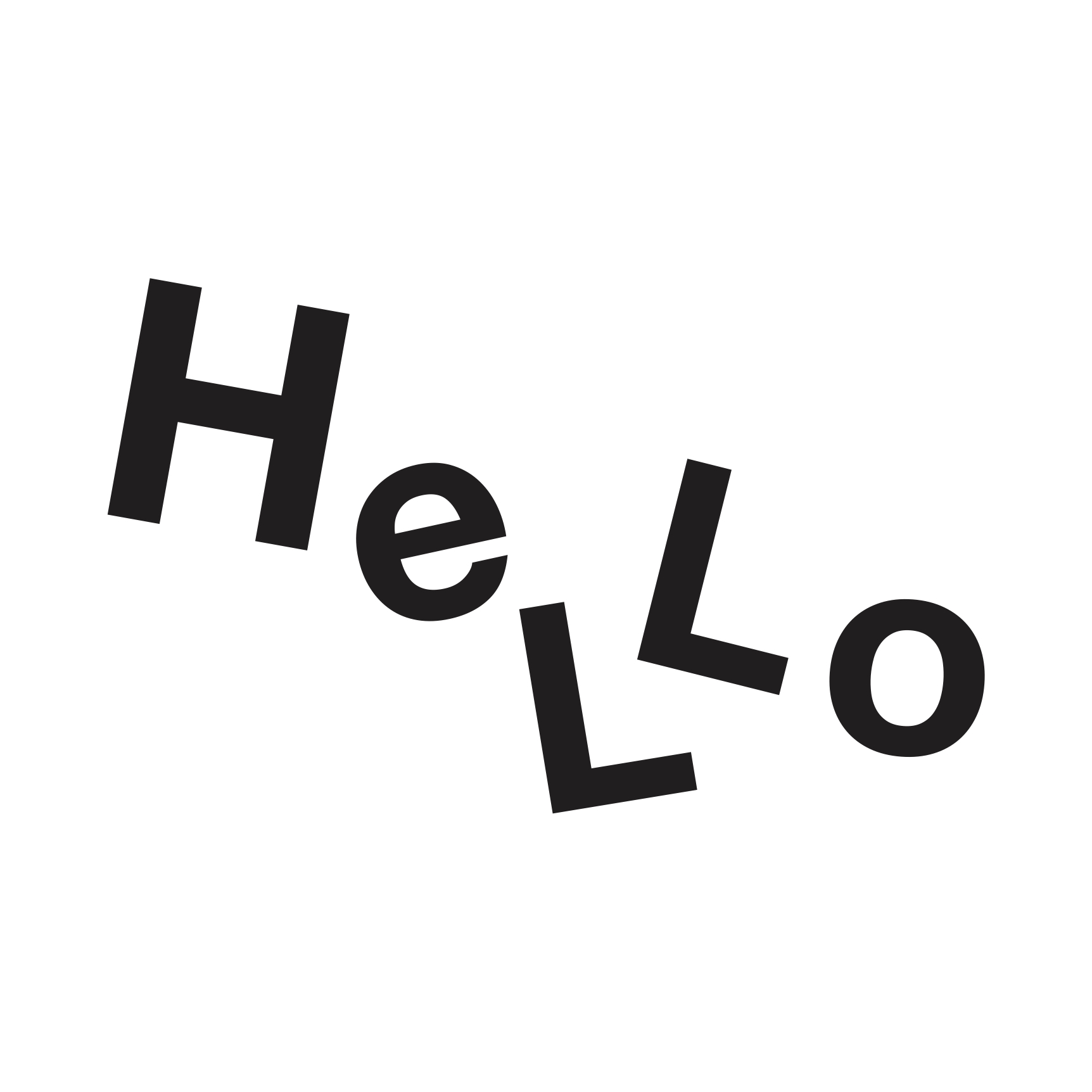
1. CONFUSED

For Confused,  I already had it under my initial explorations. My idea to express the emotion was to not have all the letters of the word not sitting on the same baseline and tilted in various angles.

Original Version of Emotion: Confused

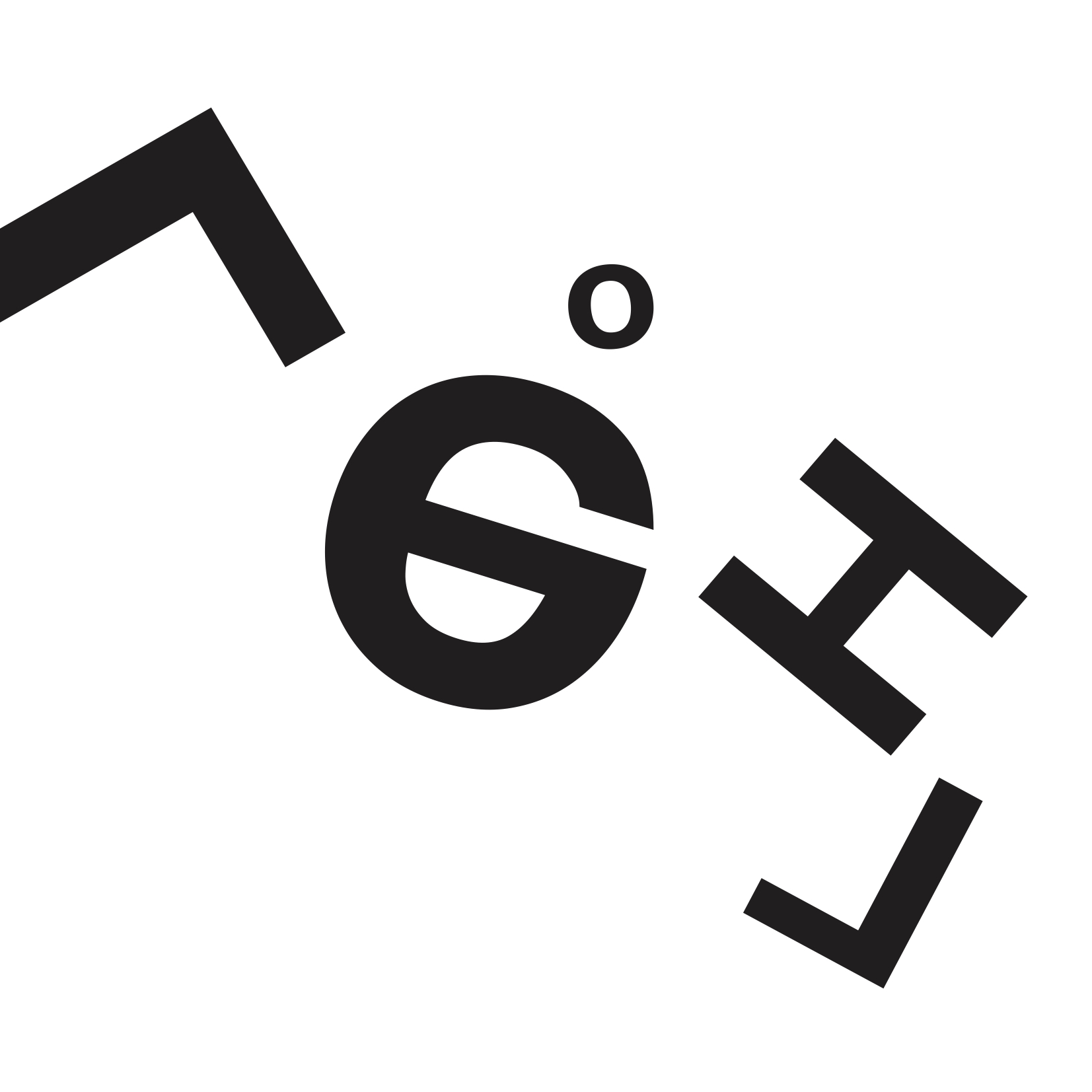
However after consulting with Shirley, she felt that the emotion could be better conveyed prompting me with questions like What would make you confused? to even popping ideas on how the image of confusion can be conveyed which led to this, a revised from my initial:

Final Version of Emotion: Confused

The new idea was to have the word jumbled up so much until it doesn’t make sense. Not sure if the emotion was thus brought across but I definitely felt that this revised is way less comprehensible and straightforward as compared to my initial one which creates that sense of confusion!


2. ANNOYED

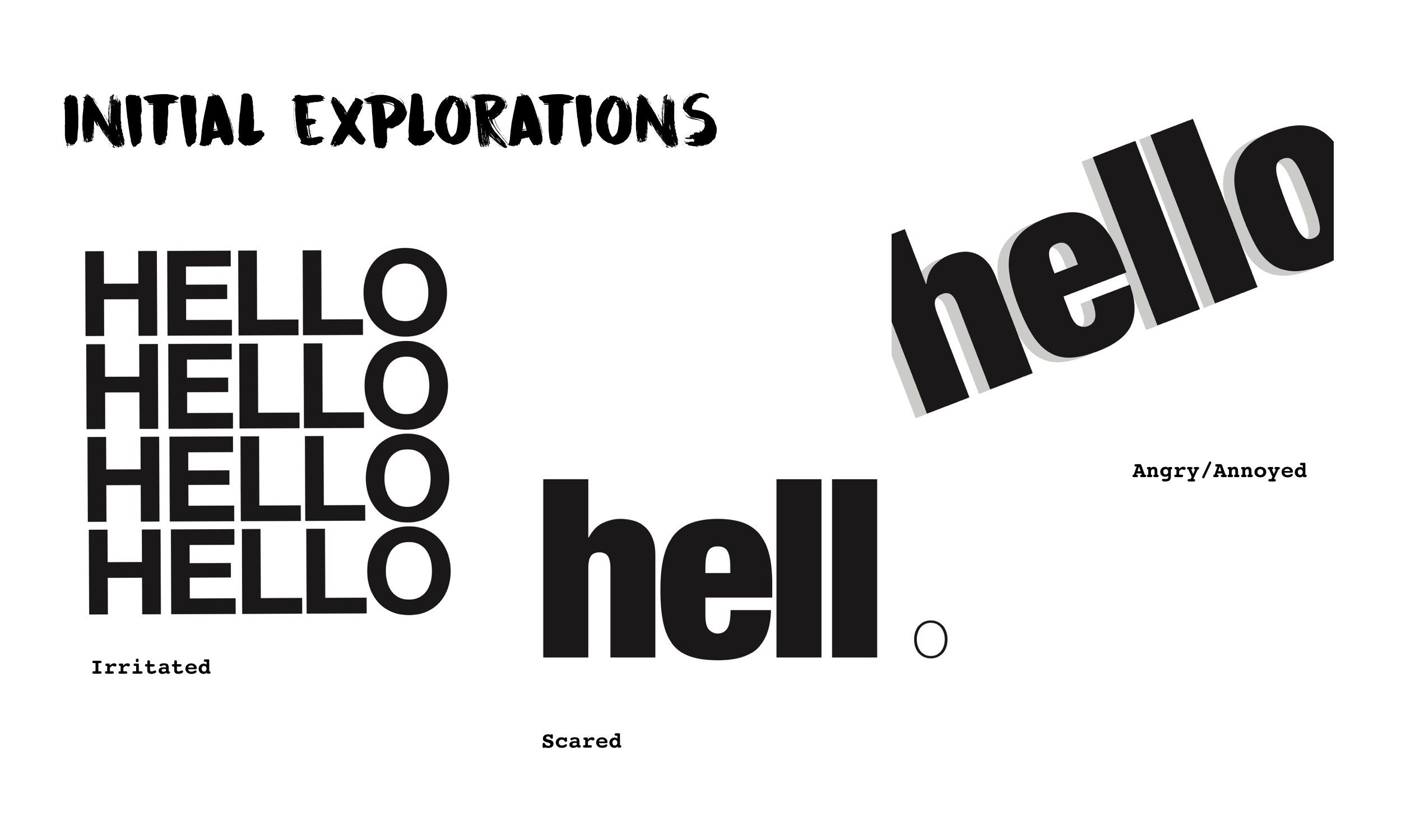
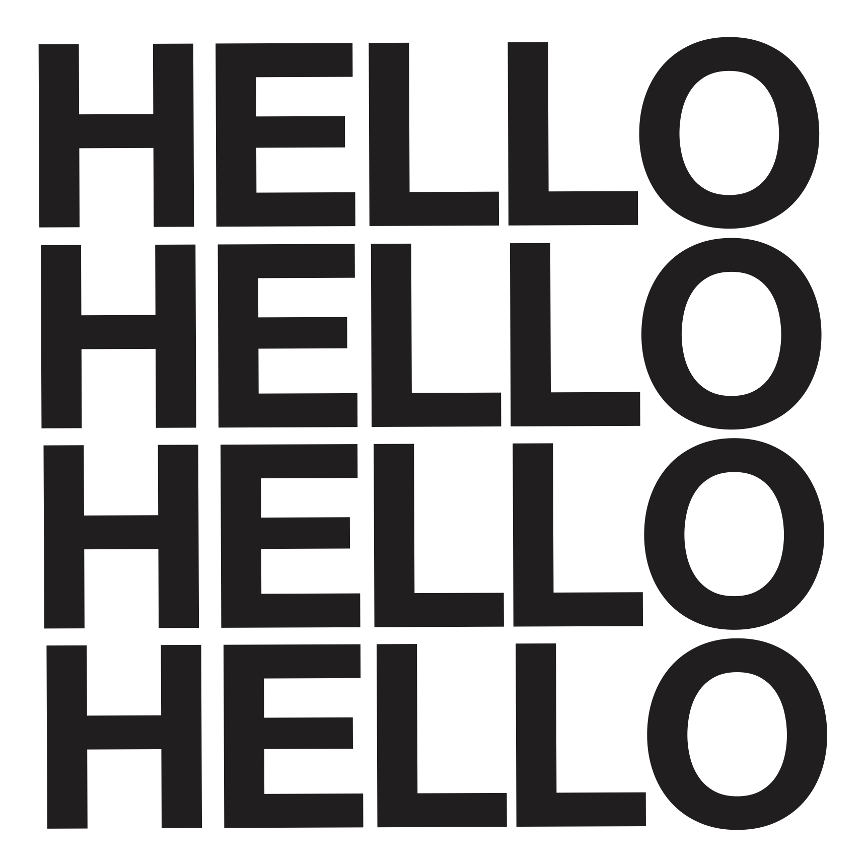
Under initial explorations I somehow tried creating a composition for this emotion too despite having misread the brief as mentioned. Between the one labelled Irritated and Angry/Annoyed  I was leaning more towards the one below that was labelled Irritated:

Original Version of Emotion: Annoyed

With the repeated uppercase ‘HELLO’ stacked above one another with tight leading, I was hoping to create a sense of annoyance, making one Annoyed. However feedback from Shirley was that the composition was very stagnant, it didn’t give such a feel as the leading intervals were really consistent. The words spaced out well. It would’ve probably been better if the leading was tighter? But way more room for improvement on this one! With her feedback in mind, here’s the final revised version:

Final Revised of Emotion: Annoyed

Pretty much stacking the repeated ‘hello’ word over one another after majorly reducing the kerning between the letters first. Some of the ‘hello’ words are inverse as well. I’m not sure if the emotion is better brought across this way as I was concerned that it might come off as the emotion of Confused as well. But this was my take on the emotion and idea of what might seem annoying!


3. ARROGANT

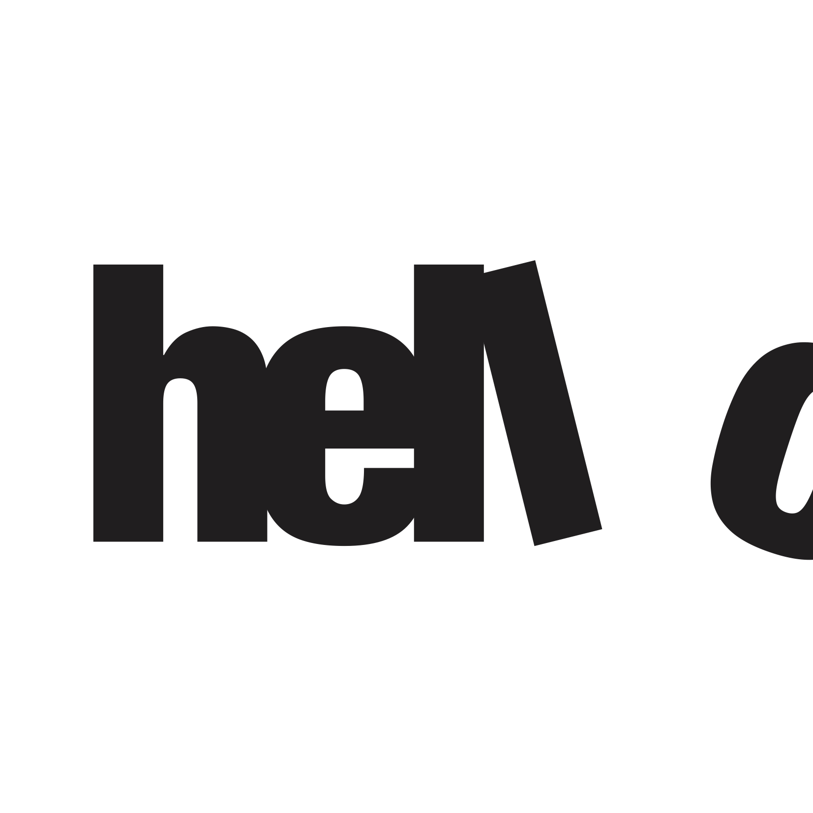
The composition idea for this emotion came after realising that I had misread the brief but looking back at the initial explorations I had, I felt that I was able to develop from the one that I had the initial emotion of Scared (which was unfortunately not in the list that we could choose from) to express it for this emotion:

From initial exploration of Emotion: Scared

With this composition form that I had for another emotion, on adapting it to suit the emotion of Arrogant.. I thought to retain the condensed and bold font of the word, isolating the letter ‘o’ as well. The ideation of this composition form is based of what I think about the emotion reflected on an Arrogant person in the context of thinking that he/she is better than others hence the exclusion from a group or something. Something like the idea of “you cannot be part of this” – leaning more towards a narrative/contextual intention behind it:

Final Revised of Emotion: Arrogant

So you can see how tight knitted the other letters are (expressed through a tight kerning) with the letter ‘o’ seemingly excluded by having it half out of the frame and the letter ‘l’ looking like a ‘kicking’ action.


4. DEPRESSED

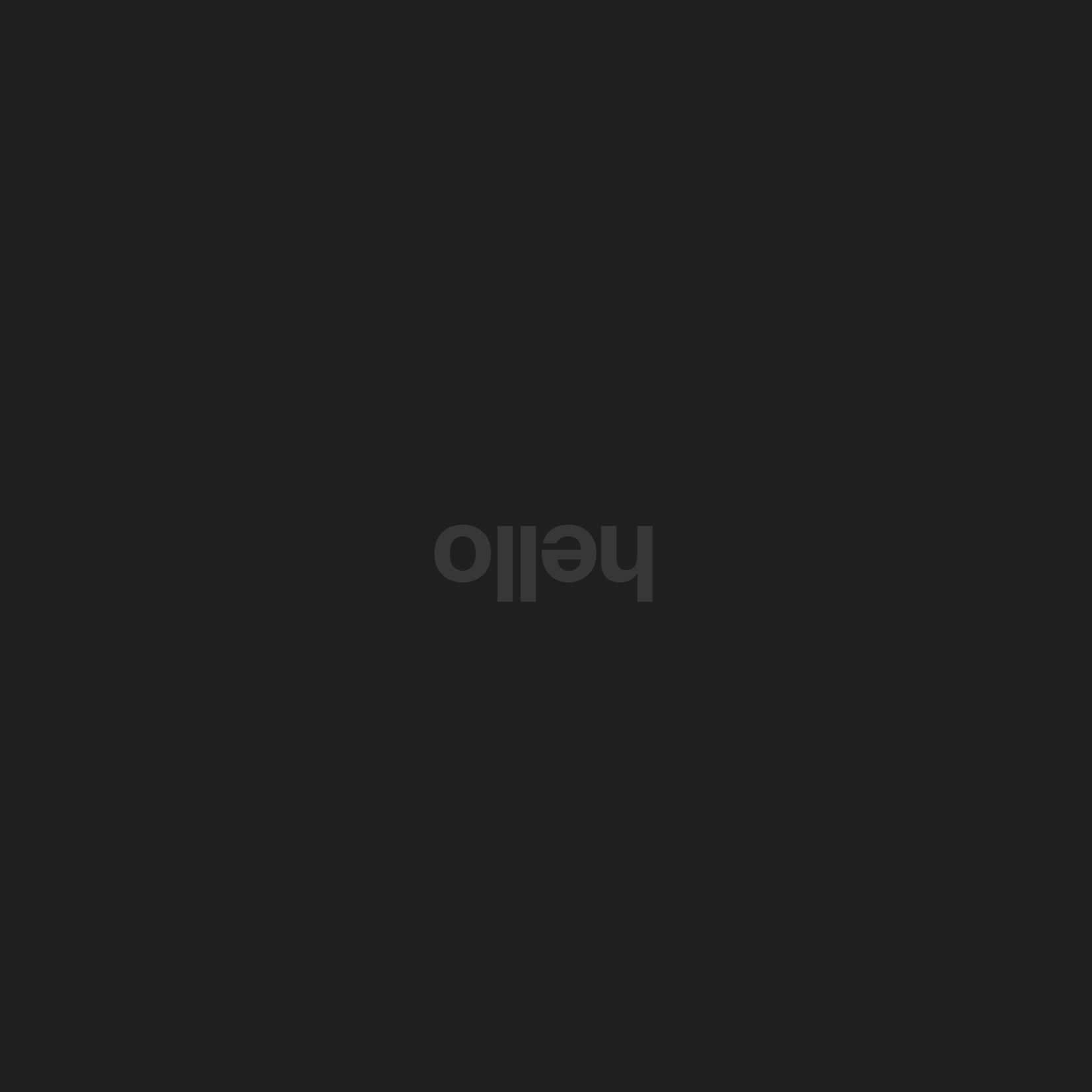
For this last emotion, the composition idea was from scratch but I really went simple and literal for this based on my interpretation of the emotion – Everything, the mood is just dull, bleak, and dark hence the black background and the word ‘hello’ inversed to bring across that opposite mood from a happy and cheerful one and in a tonal range that’s almost close to the black background, and small in scale to show like it’s being drowned, engulfed by the surrounding.

Final Version of Emotion: Depressed


For this project I had my parents, friends looking at the compositions; asking them what emotion they could derive from it. Some were successful, they guessed a similar if not exact emotion I was trying to convey but some didn’t. On the idea of interpretation, I feel it’s really subjective. What one person thinks of this may not necessarily be felt the same by another and perhaps the only way to overcome it sometimes in our works is to be quite literal I guess. In terms of expression. (sometimes simple really does work best!)

Overall I felt that this project though challenging, was a really interesting way to push and train us to communicate a message through typography. Something which I haven’t tried before! 🙂

For this project, we had to create a series of patterns just by using a single letter of any traditional typeface and this time round I chose to go with a san-serif typeface for variation. We could play around with spacing of the letters to create variations, repetition of rows/columns or even overlapping of the letters to create the form.

Funnily for this particular project, when first heard of the brief I thought it was going to be real fun and easy to create the pattern compositions since right away when patterns were mentioned I had the preconceived idea that it would just be tessellations and more tessellations. Which wasn’t exactly wrong but that would be the easier way out to approaching this project I guess. Furthermore, we had so many things which could play around with. But I guess that was the struggle for me, the same with the other two projects – The freedom that came with it. I guess I was so used to having projects that had to be conceptualised beforehand, a message to be brought across and with restrictions but on the contrary all the three projects were rather free and easy with little limitations except maybe for the last one!

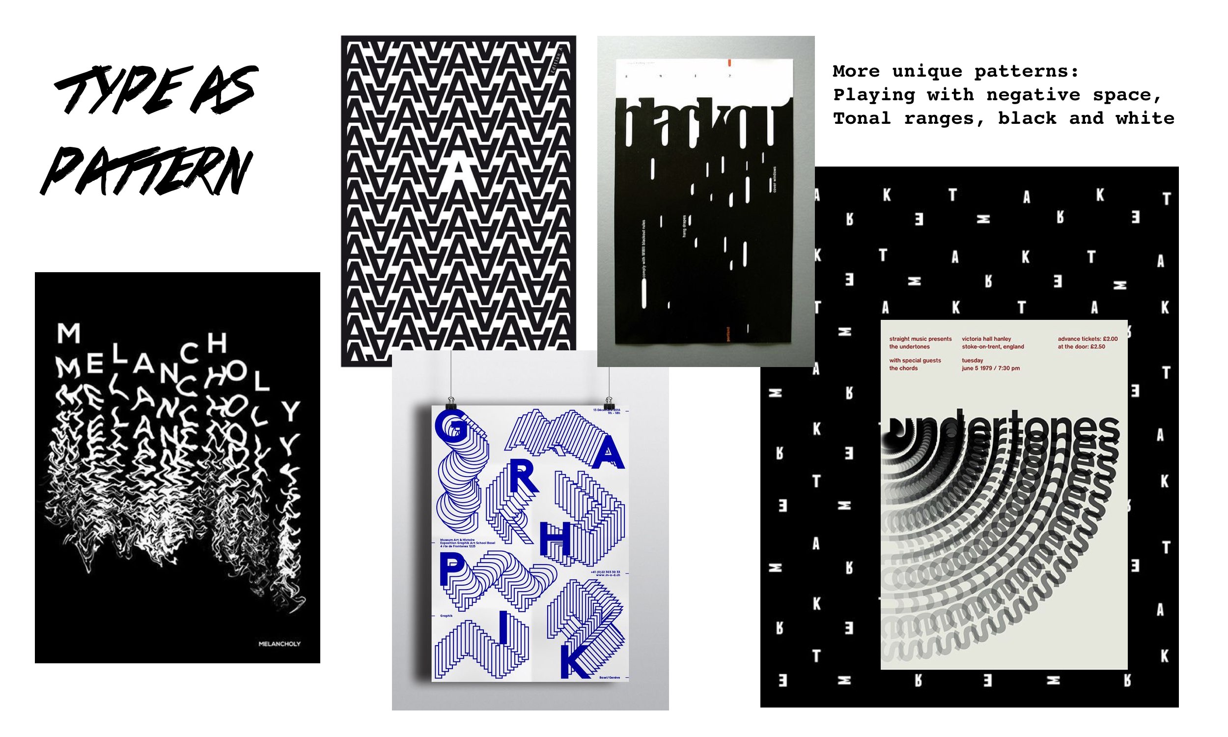
Anyway back to the process, prior to getting started on my patterns here were some inspirations I had in mind:

I kind of wanted to veer away from the usual tessellation kind of pattern but I guess it was inevitable at some point as my brain was already adjusted to that as what a pattern would look like. Surprisingly, I managed to get a composition that I really liked. Here are some of the explorations I had before narrowing down to the best two for submission (click on image to enlarge):

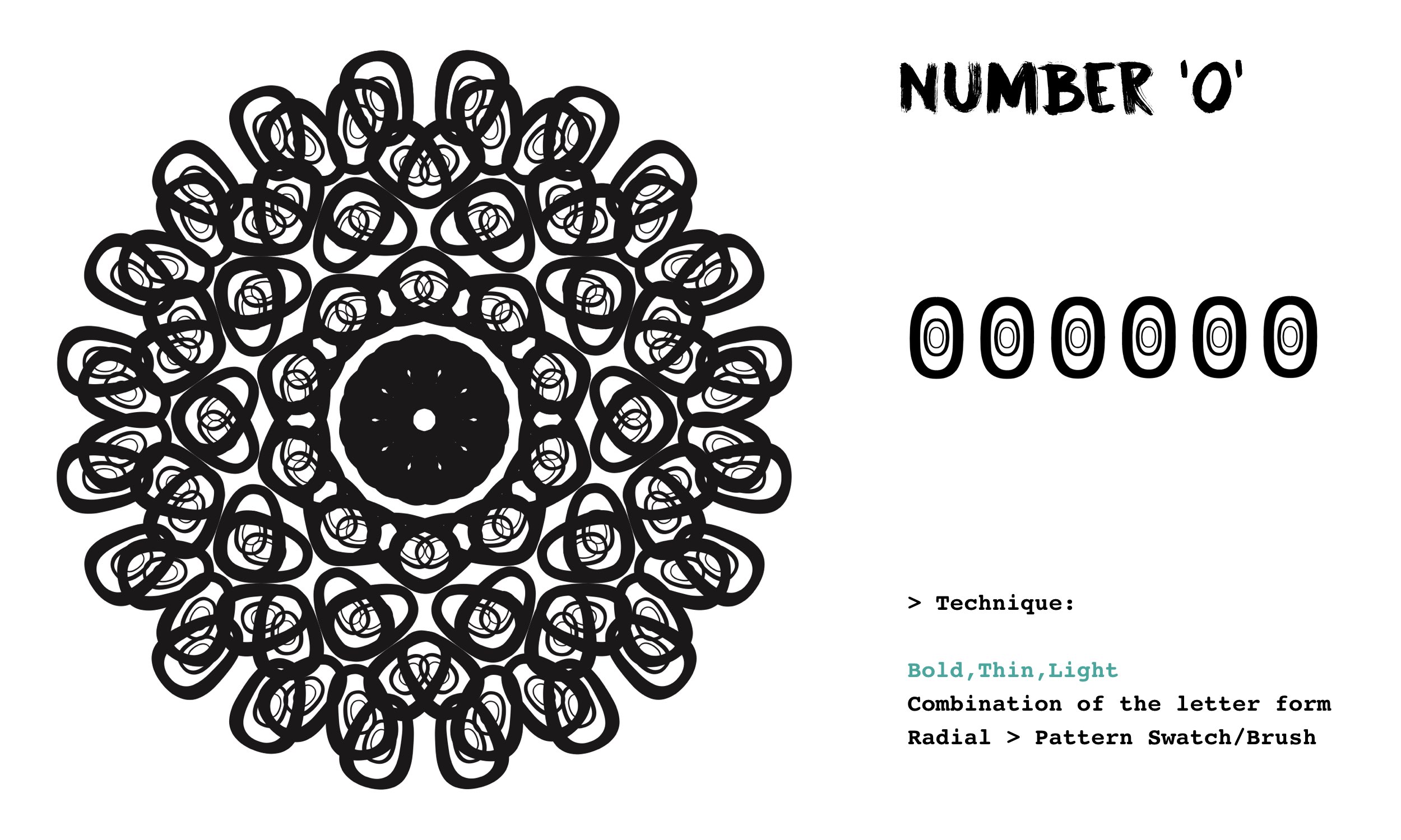
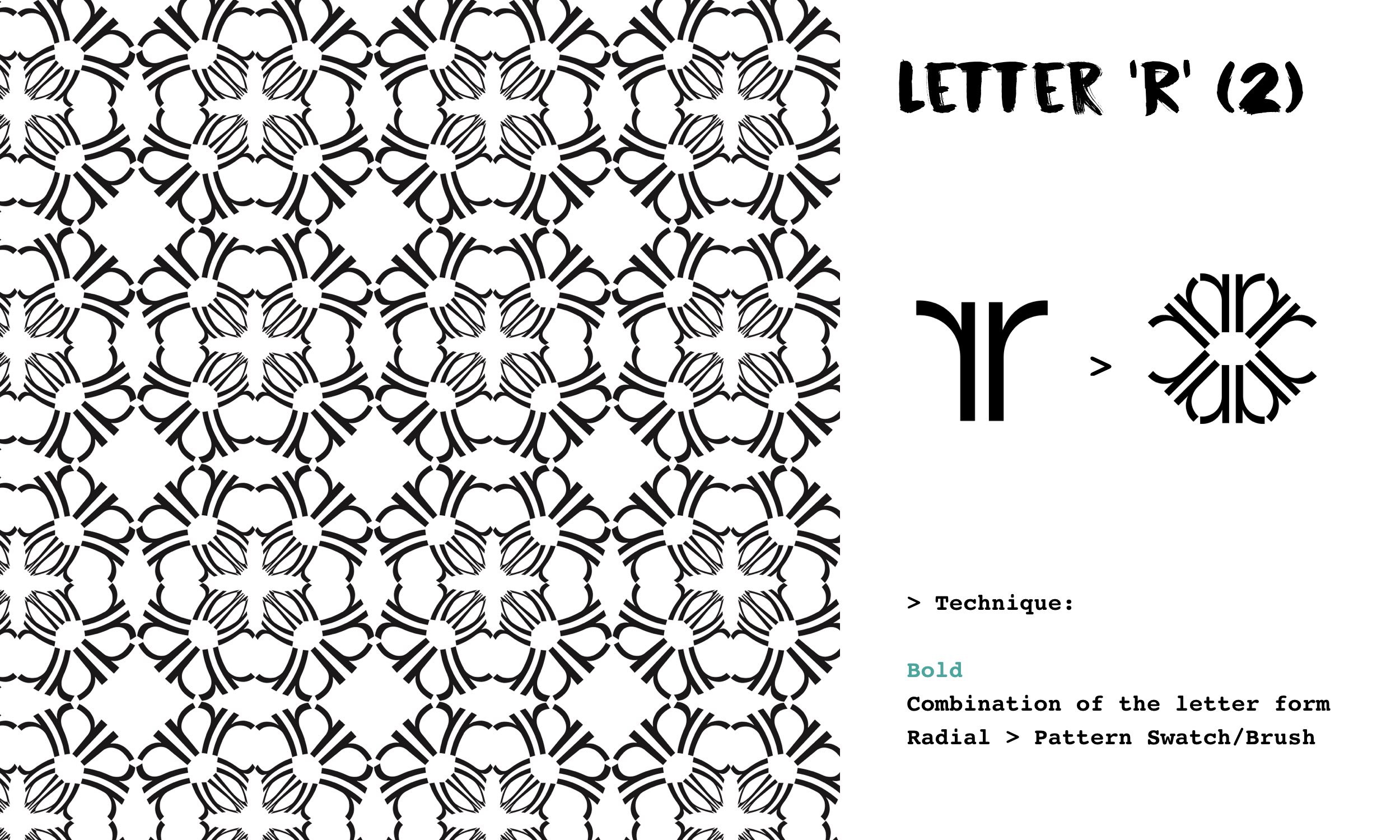
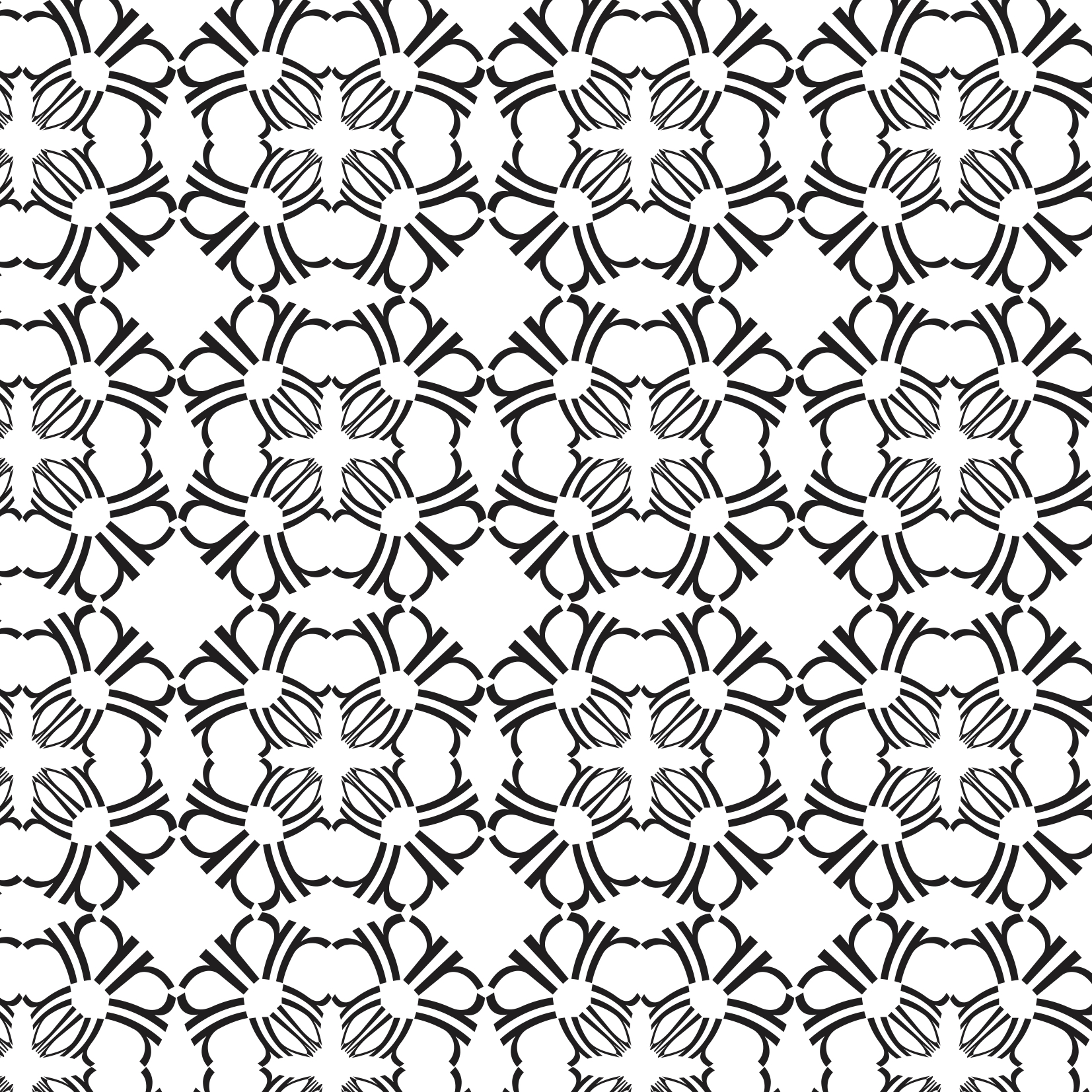
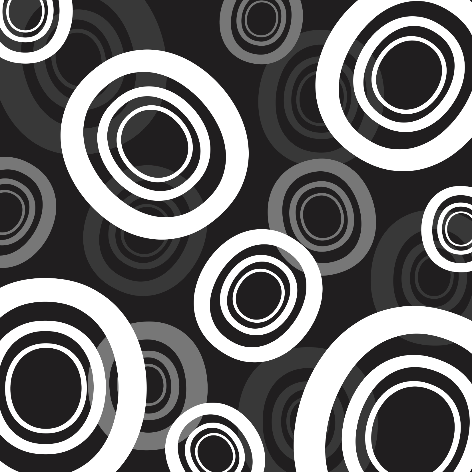
I struggled to even come up with one pattern initially but I think for me it was the momentum. Once I got a pattern out, I realised it could go another way to form way more. Just like the explorations I had for two of the letters/number used: ‘R’ and ‘0’. With just one combined form and the application of different techniques, I was able to create 2 entirely different pattern compositions for each respective letterform. I realised with that endless patterns could be churned out and I’m pretty sure even before looking that everyone’s compositions would be VERY different, unique and one-of-a-kind even though we may use the same letterform and typeface. Super amazing.

The typeface that I went with for this project was HELVETICA NEUE – I love its variety of fonts

And these were the two compositions that I eventually went with for submission reason being for the tessellation looking one using the letter ‘r’, it looks simple yet I liked how there’s thick and thin lines involved thanks to the convergence of the letterform in the centre that was created with the radial method and the application of the swatch onto it.

Using the Letter ‘r’


As for the second composition (below),  using the letter ‘o’ in varied fonts of the typeface (bold, thin and light) I created a simple motif of sorts and was randomly playing around with scale, overlapping of motifs and angling them differently. Also, I suddenly remembered how we could play with negative spaces and tonal range as well! Played around a bit more and somehow got this!! I liked how it created a 3D kind of effect and dimensionality to the pattern composition thanks to the tonal range. The white motifs would be the foreground and then slowly the others repeated but fading and shrinking in size.
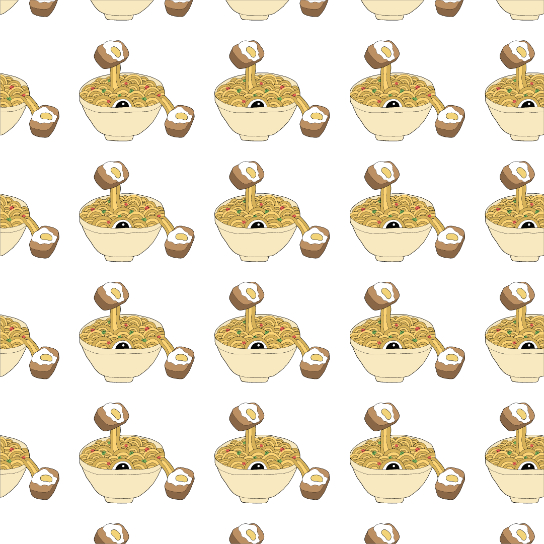
Using the Letter ‘O’


Overall this project was slightly on the challenging side but I’m really happy with all the experimentation especially with the pattern using the letter ‘O’ (above). I was pleasantly surprised by its unexpected outcome, achieving a pattern without the default use of tessellation 🙂

For this project, we had to select a traditional typeface and create a series of composition explorations from it using the varied fonts from that one typeface to create variations in thickness for dimension of the image form. Basically we could ‘dismember’ the anatomy of each letter of the font, combine them to form our image composition which I thought sounded pretty fun but at the same time worrisome since the possibilities were endless! The end deliverable was two best compositions and I thought it would be nice if I could have it as a series/themed kind of sorts rather than two compositions that are entirely different 🙂
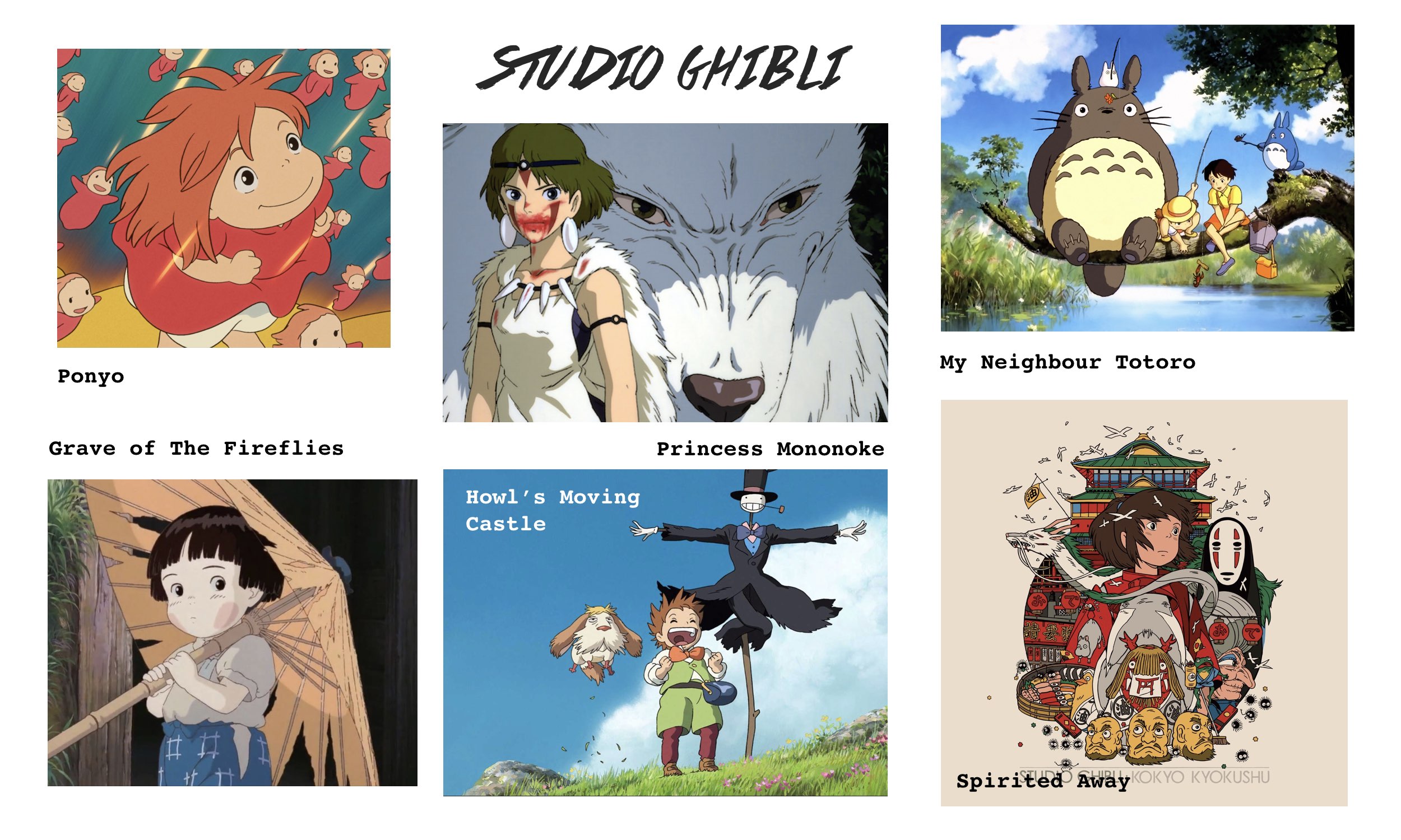
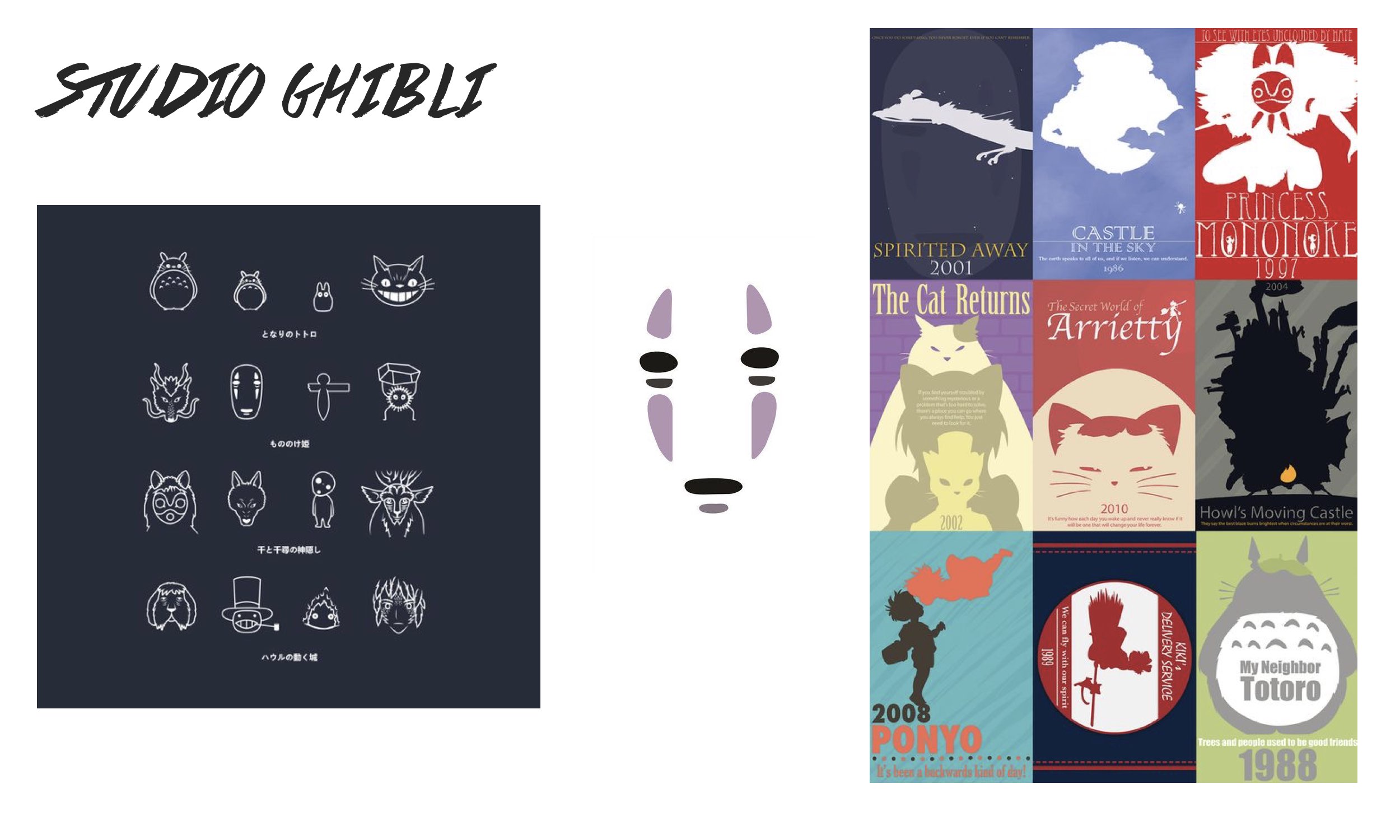
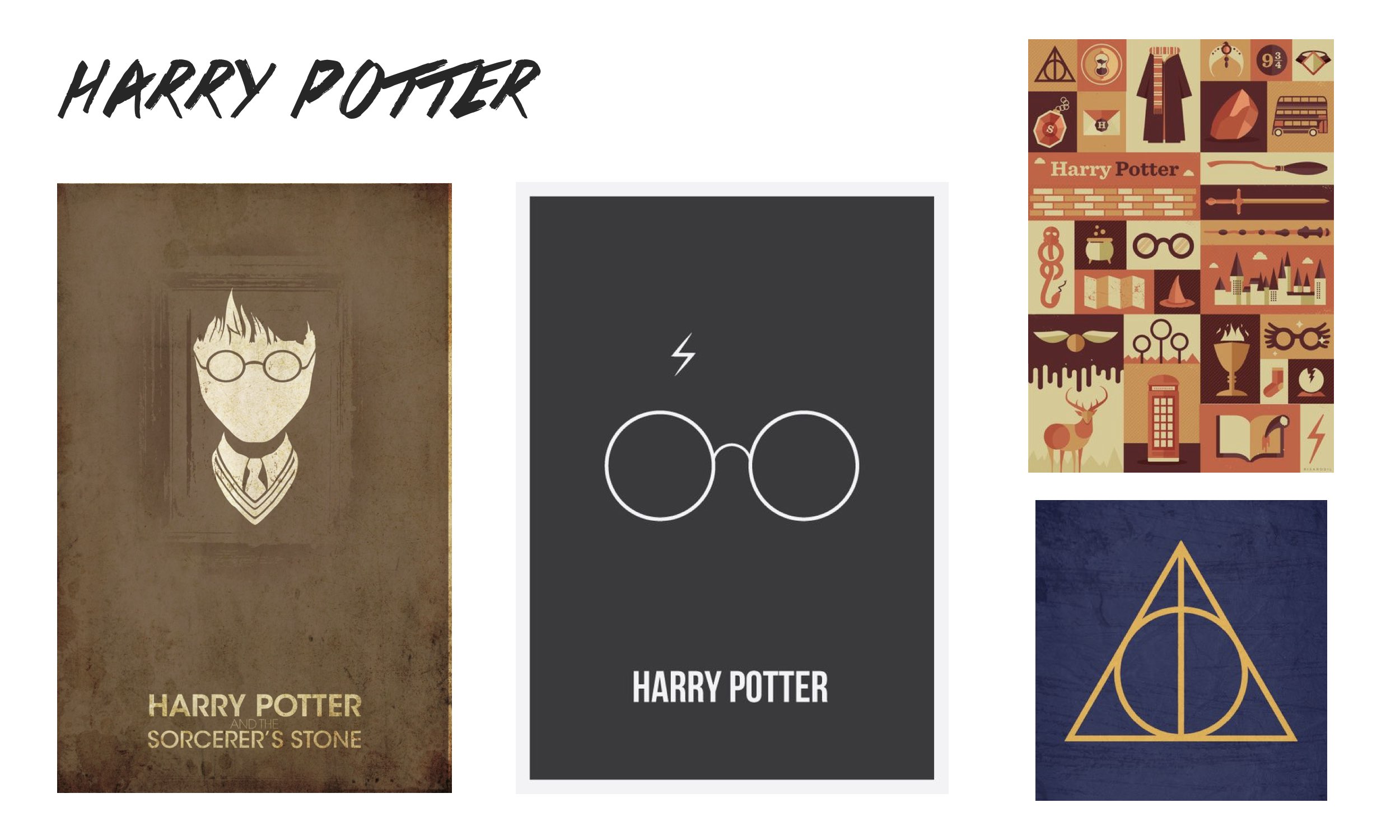
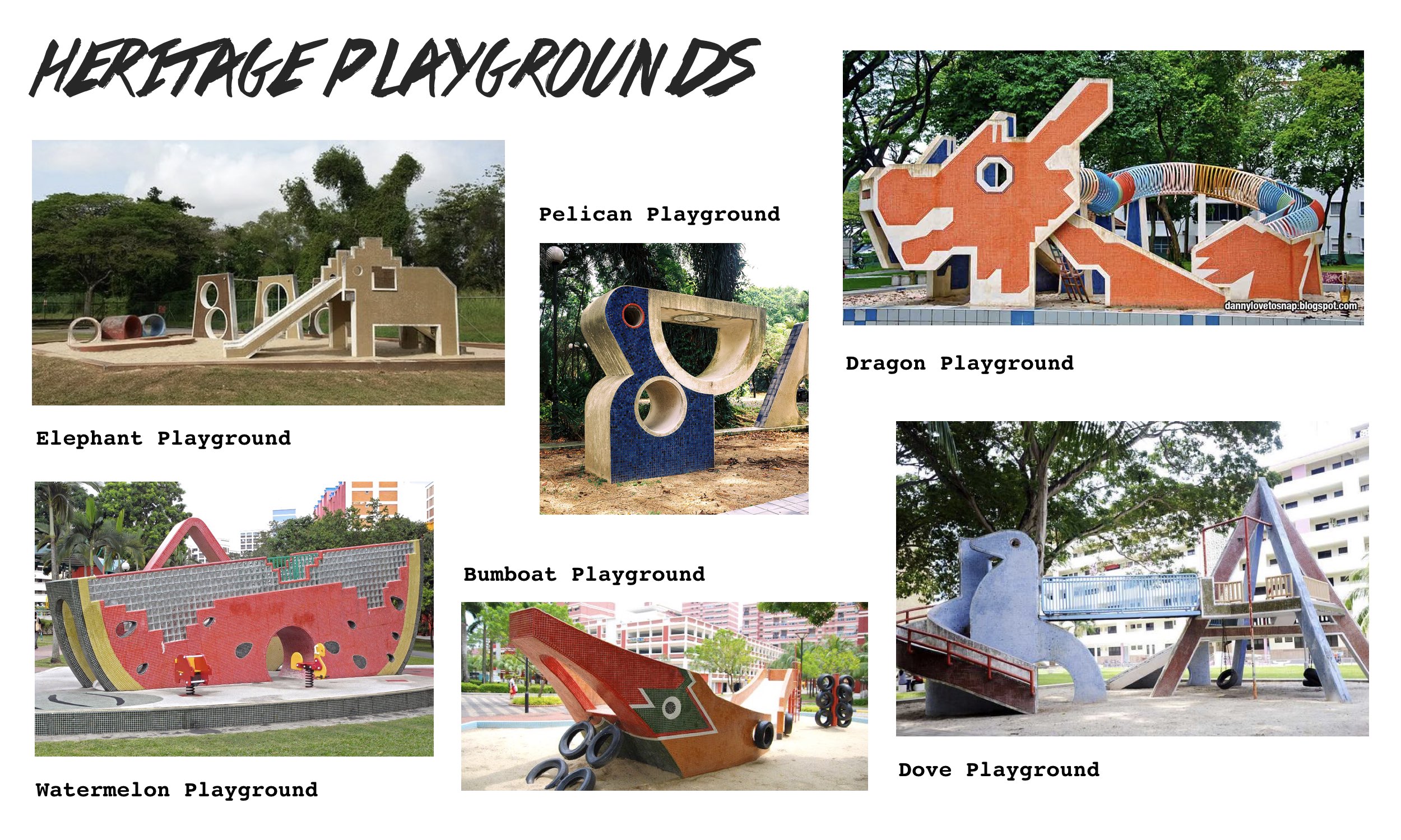
On to brainstorming the themes for this project, I had way too many in mind of my favourite things – Studio Ghibli animation films, Harry Potter (I liked the minimalistic designs I found online), and of course Singaporean things. Here were those I wanted to explore (click on image to enlarge and view):

I had to narrow the themes down somehow and since I felt like doing something more close to heart and more iconic it was down to the last two ideas and my determining factor was since I’ve been drawn to those iconic heritage playgrounds of Singapore having worked on it for an art project last year… the Singapore heritage playgrounds it is!
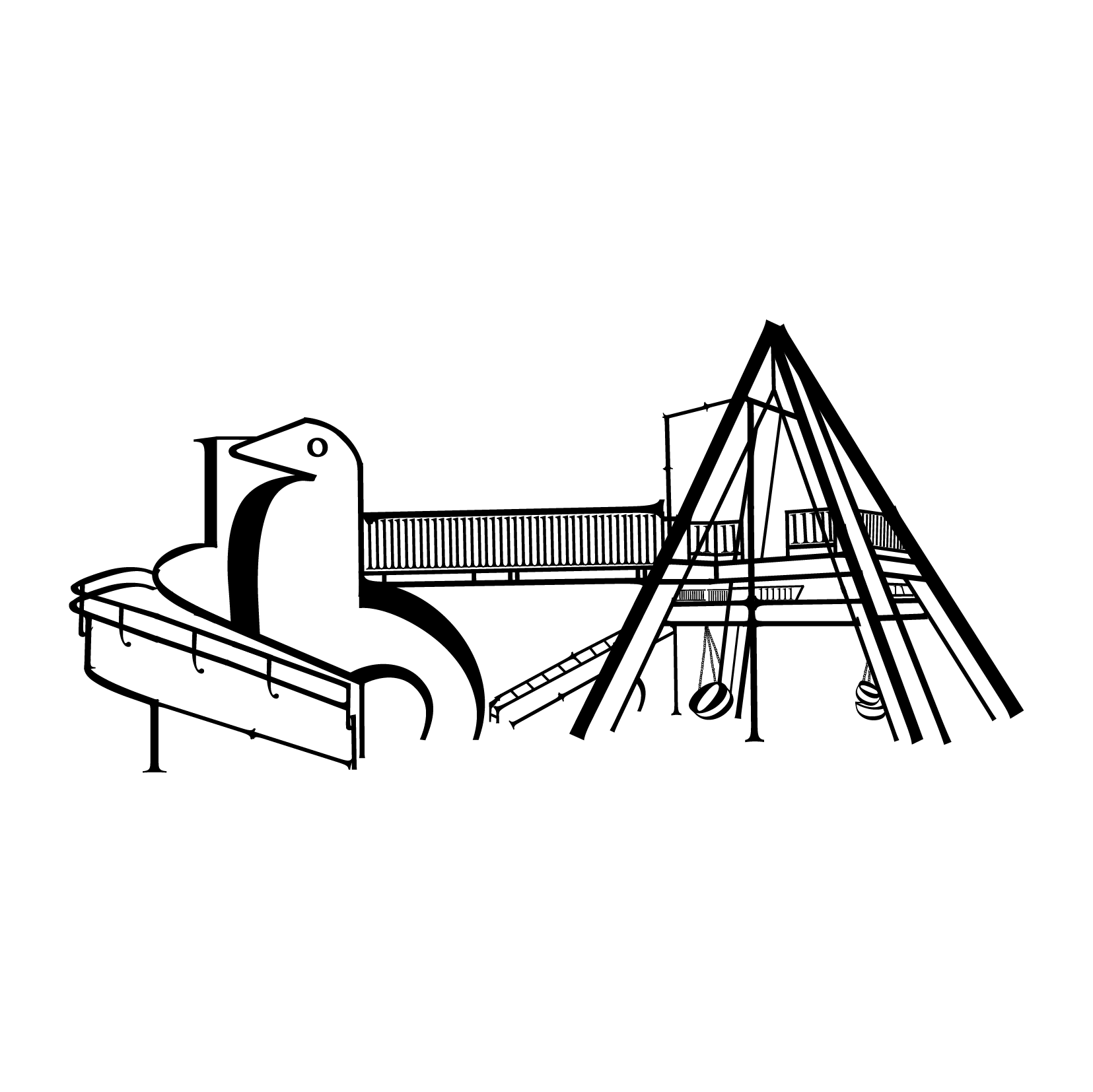
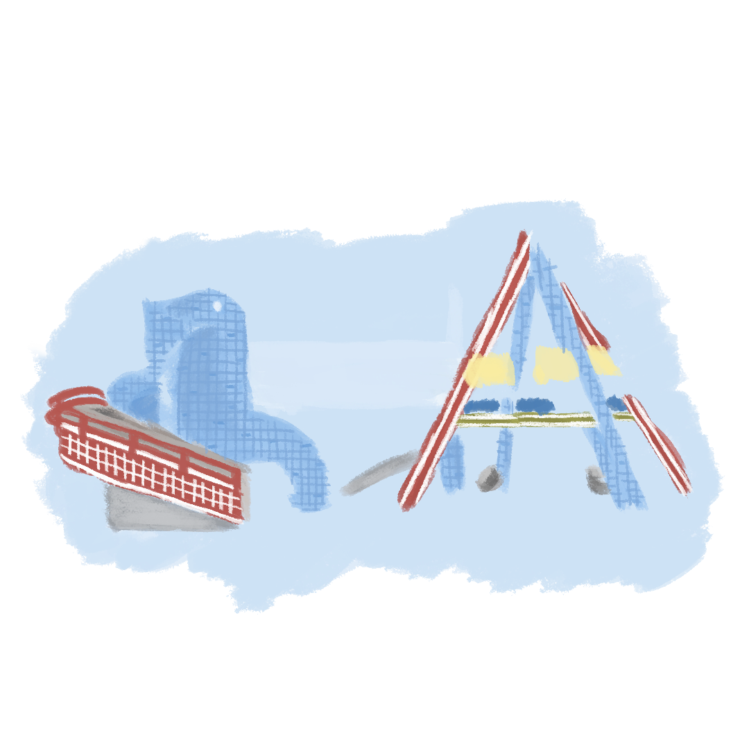
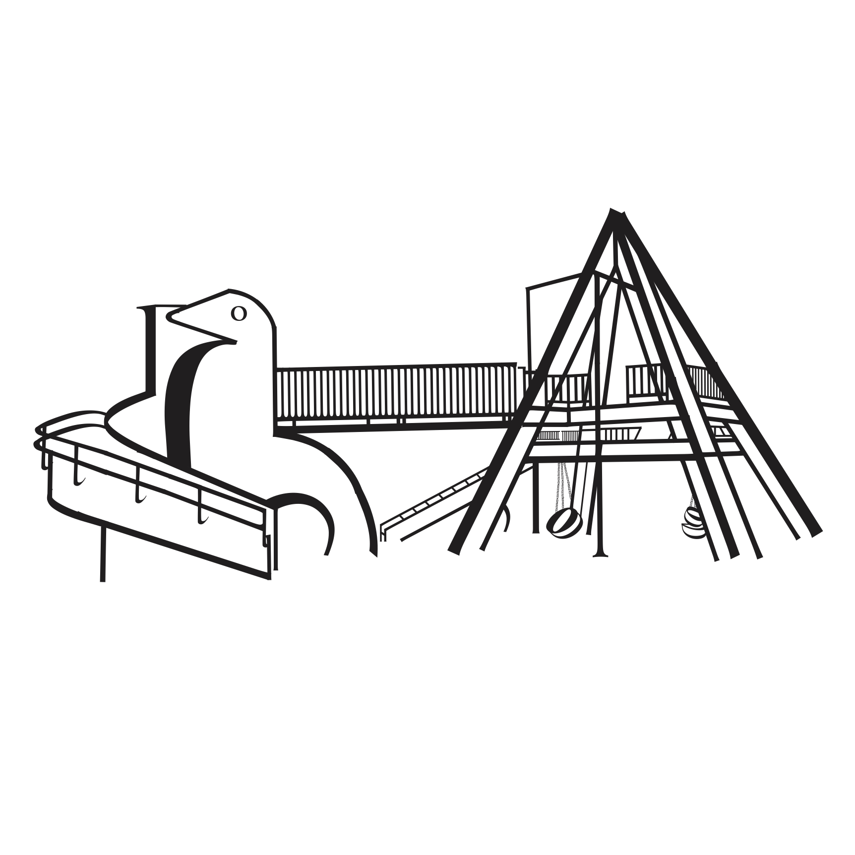
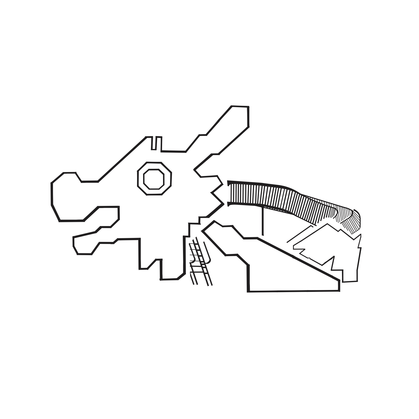
I chose both the Dragon playground at Toa Payoh and the Dove playground at Dakota Crescent reason being that these two stood out to me most in terms of their iconic feel and rich heritage of the location they are located at. Also, there’s just something beautiful, nostalgic and iconic about these playgrounds though I haven’t been to any yet and some are soon to be demolished/have been. Just seeing them in images, the rustic mosaic design and brilliance of incorporating playground elements like the slide/see-saw to its form it’s pretty intriguing.

As for the choice of typeface, advice given was to use a serif font as it allows for strokes that go from thick to thin, basically variations in thickness of lines which actually helps to create dimension for the image composition. The typeface I chose was Cochin and I particularly liked the Italic font of the typeface because of its unique curvature at the ears and tails for some of the letters.

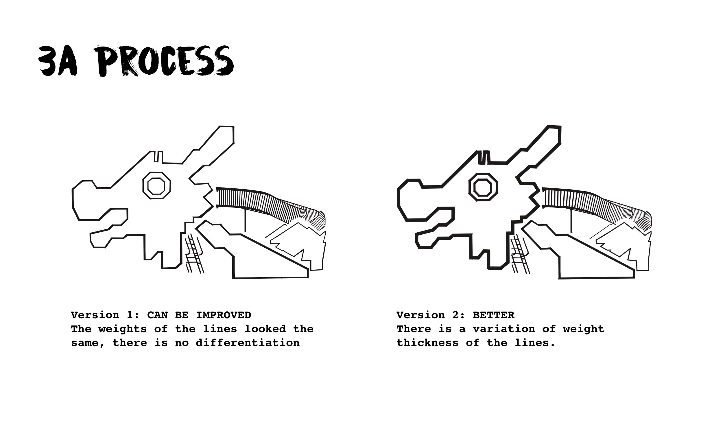
This was the first version I had for both playground compositions and for the subsequent consultation it was said that the Dragon playground composition pale in comparison to the Dove one in the sense that the Dragon playground’s looked flat unlike the Dove one whereby there were variations in the thickness of the playground structure using the Bold Italic/Italic fonts of the typeface and breaking up of the individual letters.

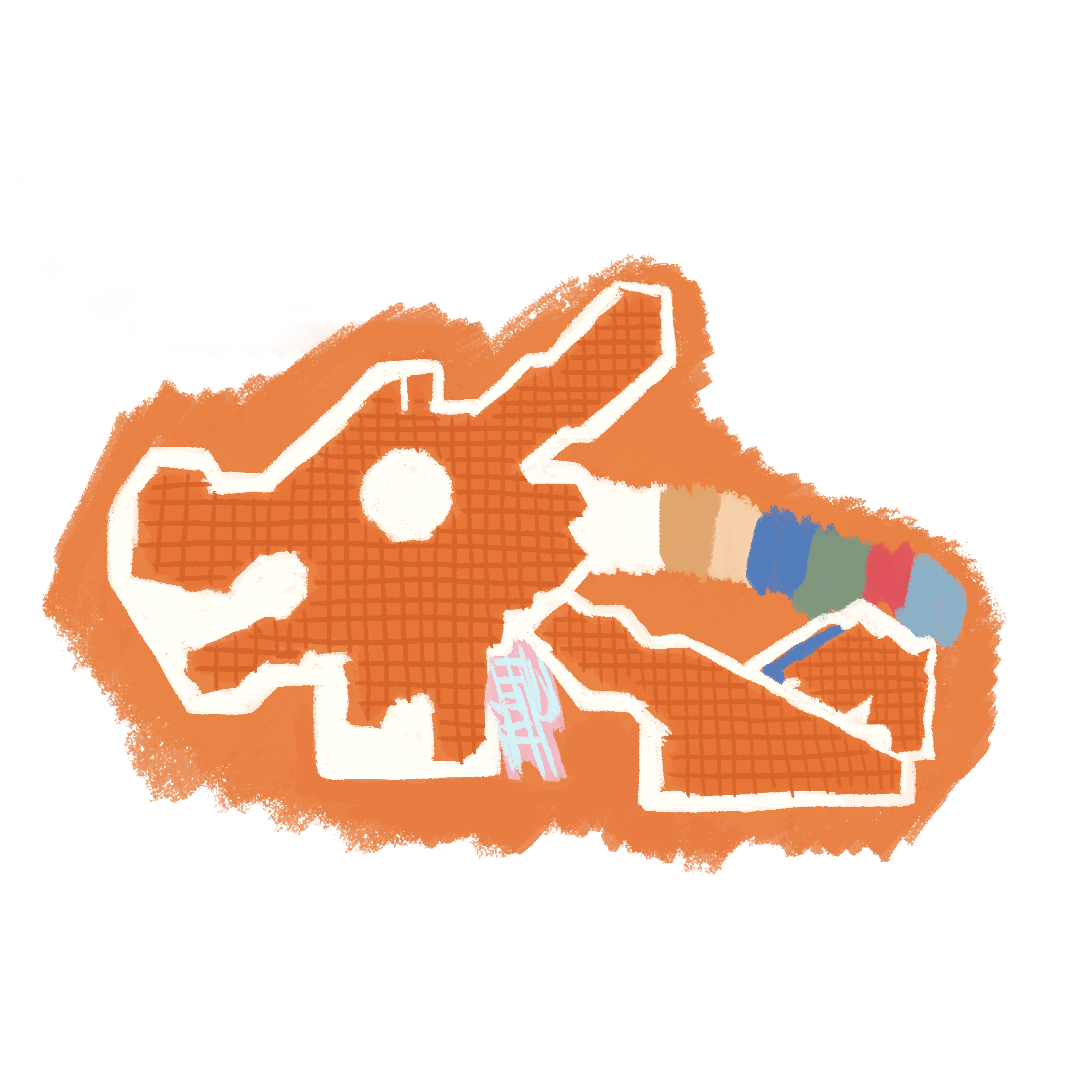
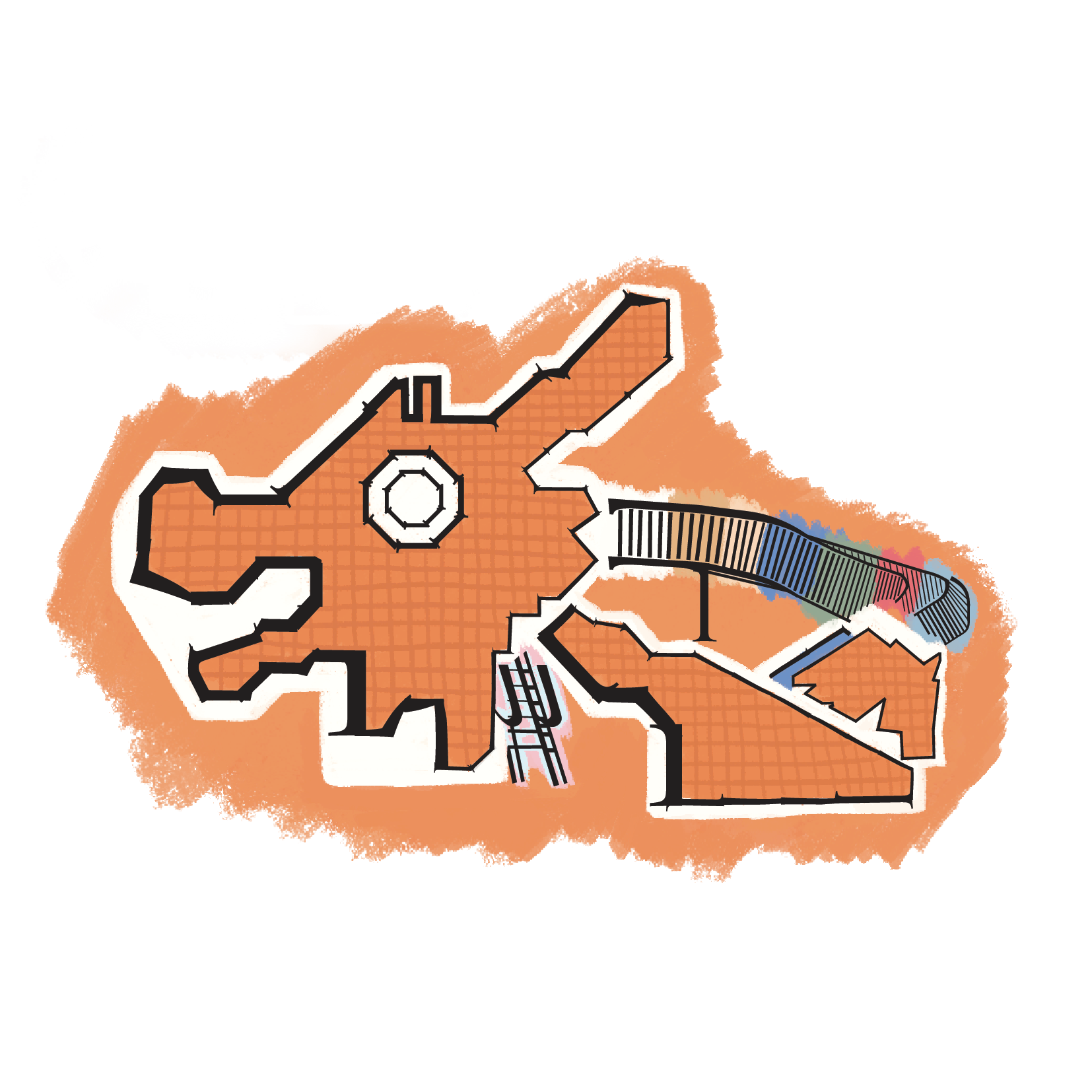
Following the feedback from Shirley and after further refining, I managed to achieve the variation in thickness for the Dragon playground composition playing with the idea of depth as the three different parts forming the Dragon’s body fall under foreground, mid-ground and background – I thought it’d be cool to bring out my observation that way and at the same time to create dimension within the composition. The final revised look of the Dragon playground below:

And these were the final two compositions I had for Project 3A:


Overall the project was really fun and the process of bits and pieces of the various letters from the typeface to form the composition was rather therapeutic, almost like putting together a puzzle I feel! For some unexplainable reason I love this theme so much that I’m already considering to expand on it for the next and final project for Typography! We shall see 🙂