On to the next and final project for 2D II which is probably the most intense too. Each student is assigned a neighbourhood and my assigned area was Outram. Before heading down to the place for a visit, I searched online for possible places around Outram I could explore (so as to save time) and had an individual consultation with Joy prior to my site visit.
It’s probably because these sites were often seen on Instagram feeds for being rather ‘insta-worthy’ that made me notice them more and wanted to explore/delve deeper into since they would be more recognisable in a way. Each site had their own unique rich history and heritage which I found interesting and had potential to be featured in the zine. However, I figured focusing on just one site/neighbourhood would be better since the zine would only be 8 pages thick.
The more known areas/iconic buildings around Outram that caught my attention were:
1. Keong Saik Road
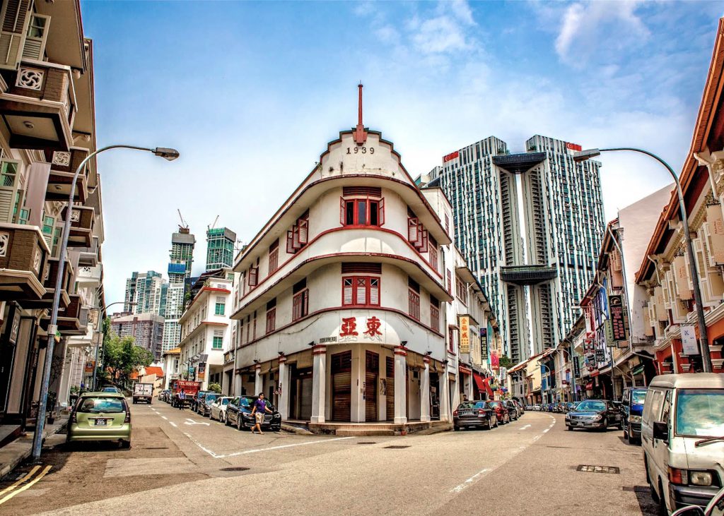
Img Source: http://gastronautdiary.blogspot.sg/2013/07/growing-up-uniquely-on-keong-saik-street.html
This place once used to be a famous red-light district back in the 60s but is now transformed into a popular hip and cool enclave lined with food outlets ranging from restaurants to cafes and bars and it’s a rather happening place at night.
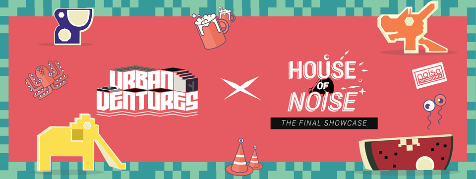
Also there’s this group of people, Lopelab that looks into creating events that allows for human and space interaction. The most known event being the road closure at Keong Saik Road project – Urban Ventures where the street is transformed into a platform for arts, culture and people to gather to enjoy free music performances, art and more. The first event was successful and another just happened last evening, how cool!
2. Pearl’s Hill City Park
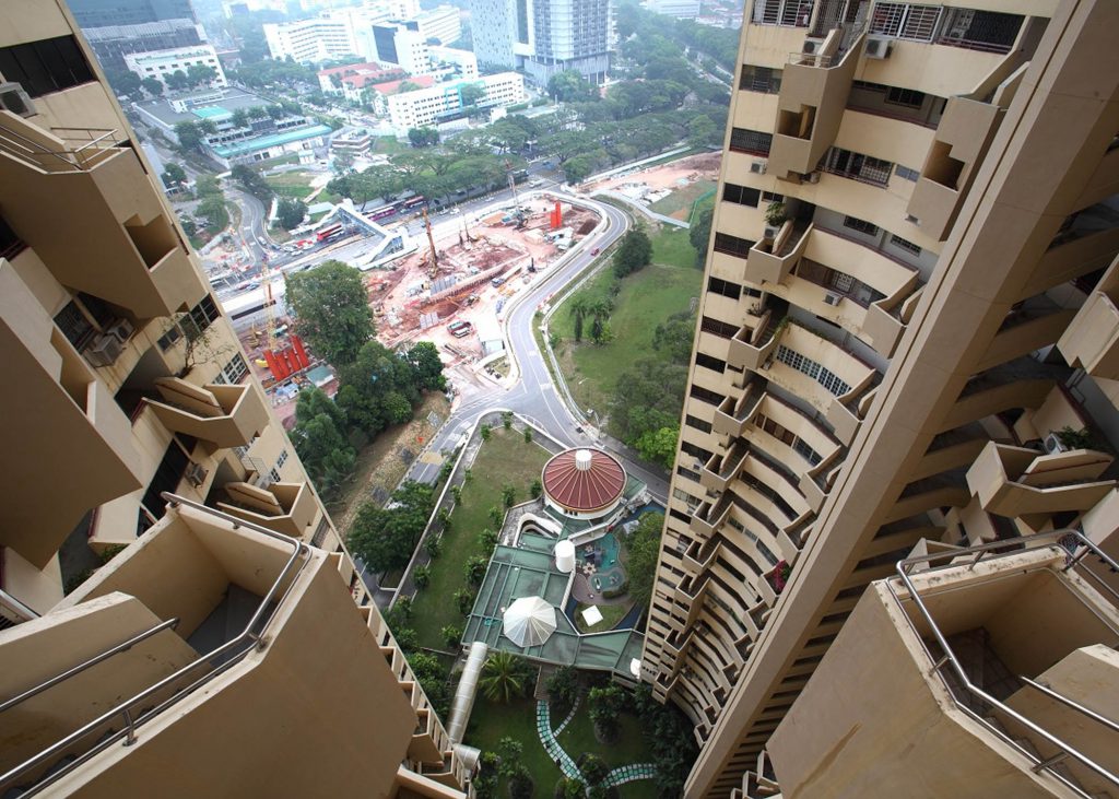
Where the famous iconic Pearl Bank Apartments were located. It’s one of Singapore’s pioneers of high-rise buildings and one of the tallest and densest to date. The architecture of this building is an interesting one but not ideal for those who have vertigo cause of how the building’s extremely vertically structured and tall. It was built in 1976 as part of the Government’s attempt to push for condominiums catering to the middle and upper-middle classes back then.
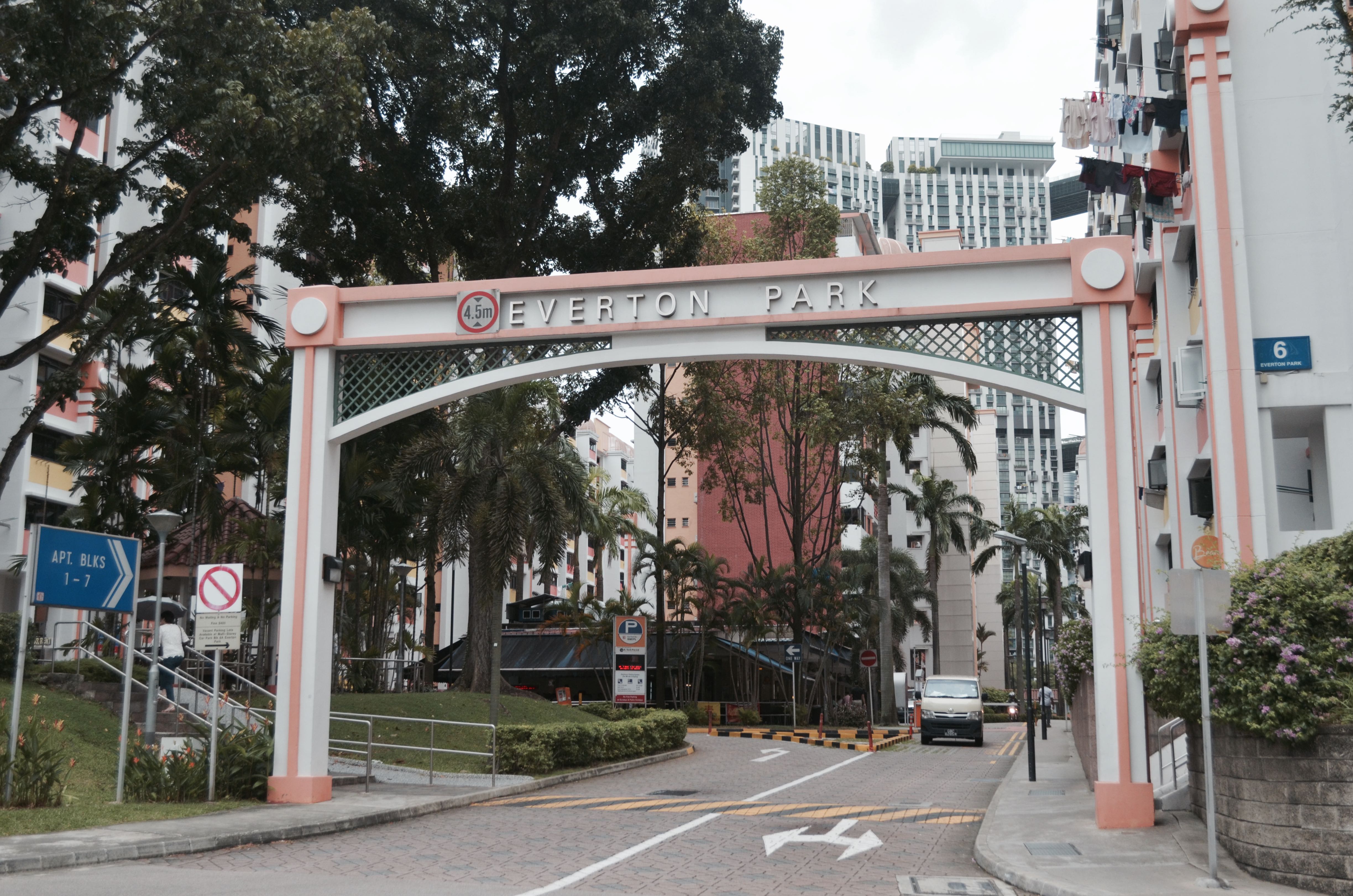
3. Everton Park
After weighing my options, I’m was kind of settled for featuring this place for my zine, having it as the sole subject particularly because of it’s quiet charm and the chance to explore the idea of New & Old with a tinge of nostalgia. More to be explained about this neighbourhood below.
QUICK HISTORY/BACKGROUND OF MY CHOSEN NEIGHBOURHOOD:
EVERTON PARK
It’s a quaint 50-year-old HDB estate that’s one of Singapore’s earliest neighbourhoods around. It’s also walking distance from the nearest MRT station (Outram Park) and the estate is located directly opposite The Pinnacle at Duxton just across the road. Despite being one of Singapore’s earliest neighbourhoods, it’s slowly becoming a rising hipster enclave and present among the estate are several new and old generation business owners.
So I headed down to location after consult on Thursday afternoon (no time to lose! this first oss post is due on Sunday!) and the research I’ve got so far are mostly secondary research from online together with a little bit of primary research having had the chance to talk to several business owners there that day. However most bosses of the shops/cafes I found interesting and wanted to approach weren’t around that day so I’m planning to go down some other day this week.
And yes, interviewing residents too are on my list. Coincidentally I have a distant relative who lives there and has been living there for many years already. My family and I would come by here every year for Chinese New Year visitations. So that’s great, I’ve got one more interviewee. 🙂
Here were some of my findings from my visit to the neighbourhood on Thursday:
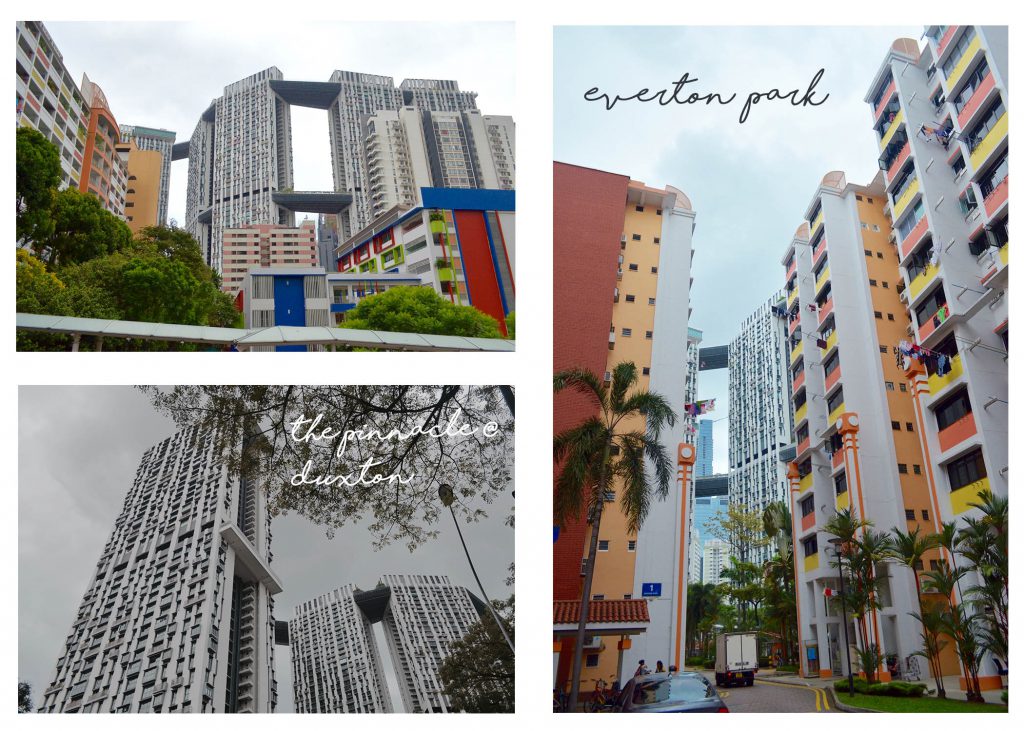
I find it interesting how there was a contrast of a modern 50-storey high-rise building and an 50 year-old HDB estate located just opposite each other across the road. Managed to capture a few shots of how they are located so near each other with both buildings in frame. I loved the contrast and had the sudden thought of including this in my infographic as a quirky fact since both have the numbers ’50’ in them haha…
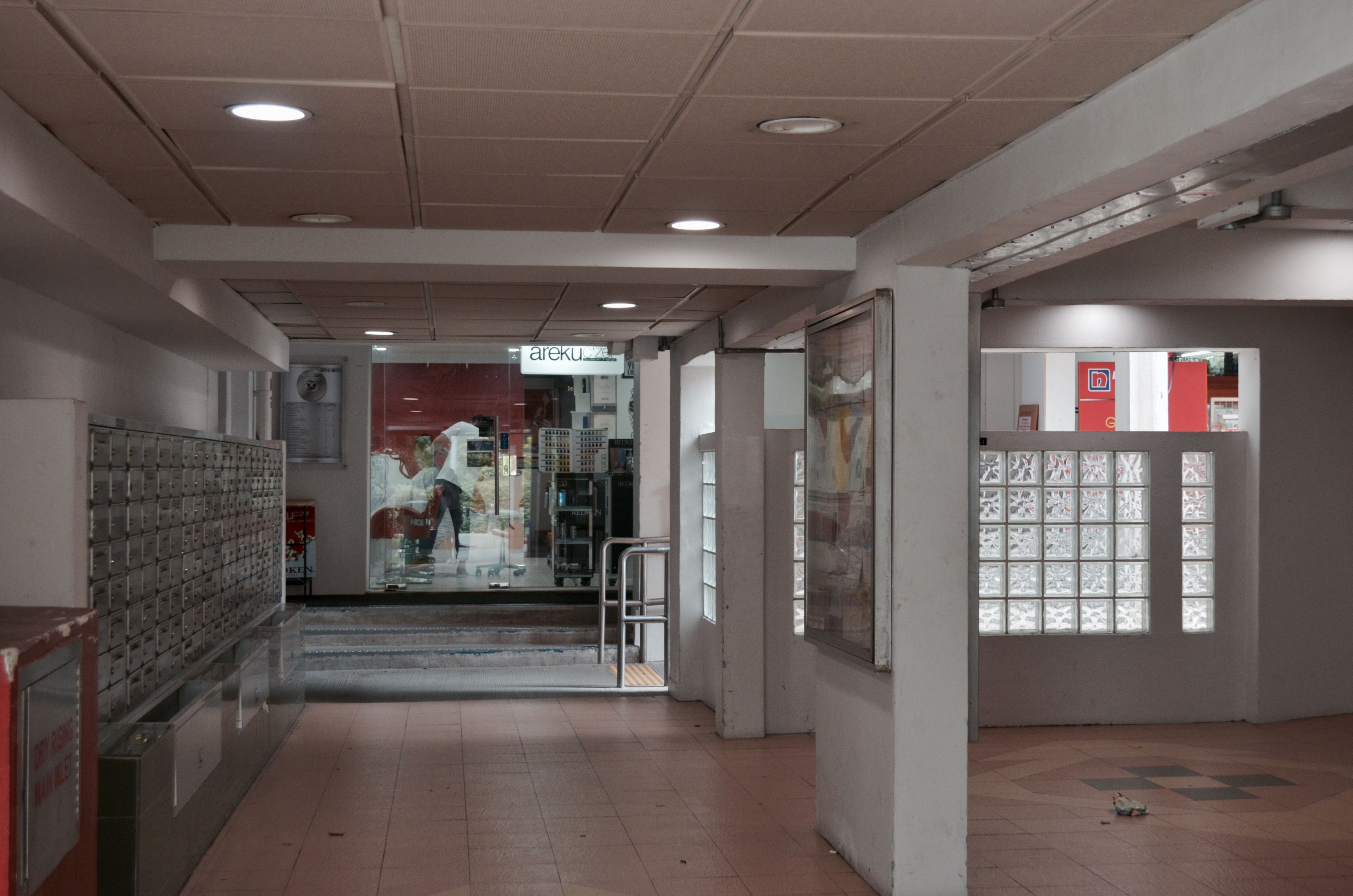
As I explored the perimeters of the small cosy 7 block HDB estate, I noticed how just below each block there would be a line of various cafes and other businesses and some of the businesses that are located beside each other were like new (a cafe) vs. old (a provision shop etc.) Below was one such example, the first block I went to. Located almost just beside each other is a cafe and a confectionery shop that has been selling traditional Ang Ku Kueh here for many years already. It was an interesting sight!


The staff at the confectionery shop selling traditional Ang Ku Kueh were real friendly and nice. They were open to me taking pictures and invited me in to take pictures of them making the kueh too. Unfortunately they were done with production for that day and they were really apologetic about it as they told me to come on another day instead. When asked if I could interview the store owner, they told me that I could search up their website and contact this person who’s the son of the store owner as he would be able to help me more with the questions and all. How nice of them!
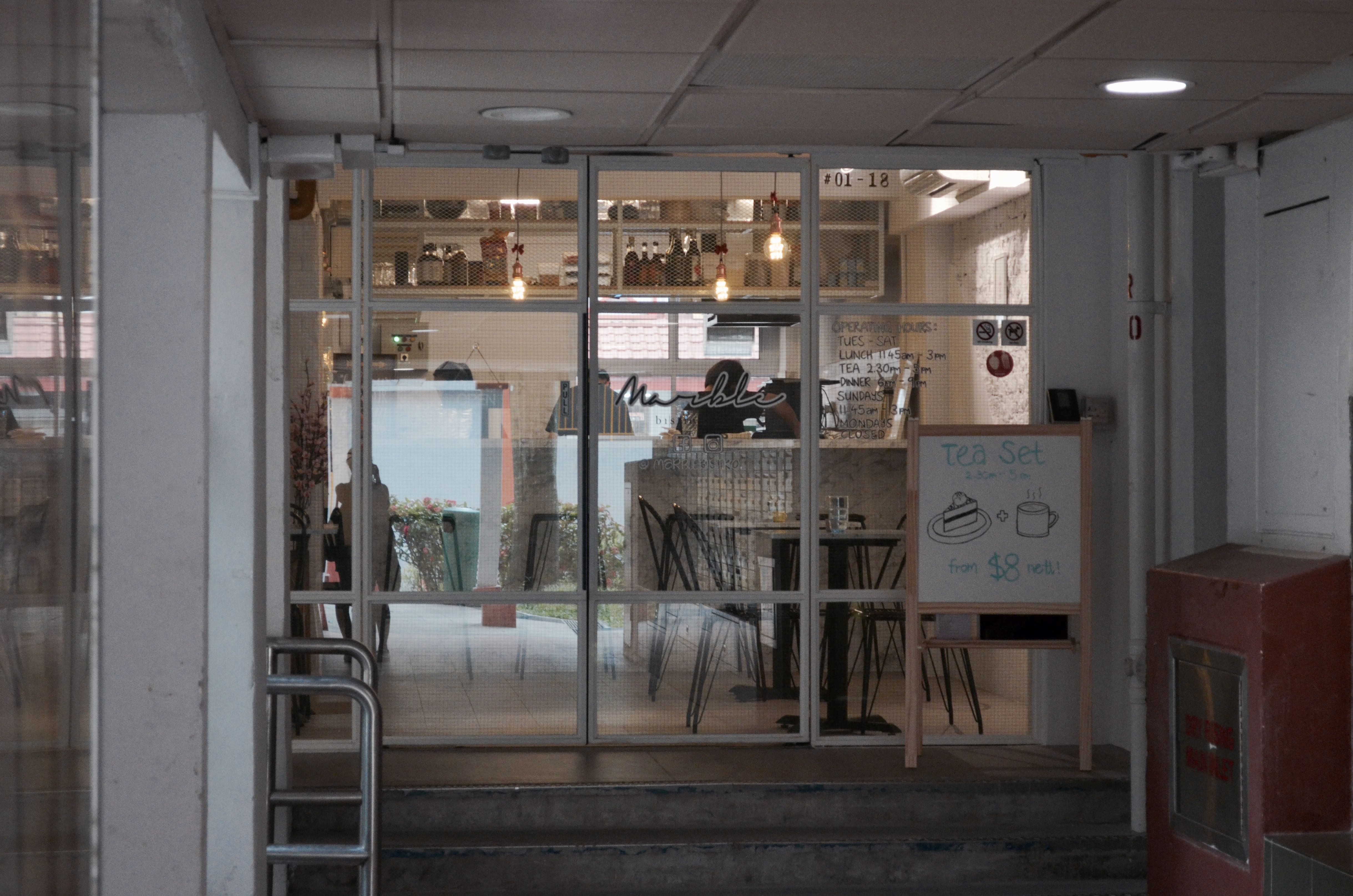
Marble Bistro at Block 6
Walking deeper into the estate, I spotted more cafes and businesses. This time round the locations were interesting – They were rather hidden, located just beside the lift lobbies and letter box area of the blocks but still drew business. I would think that most of their customers were old patrons or residents living there. (see above and below images) I’ll probably try to get an interview with one of these stores!
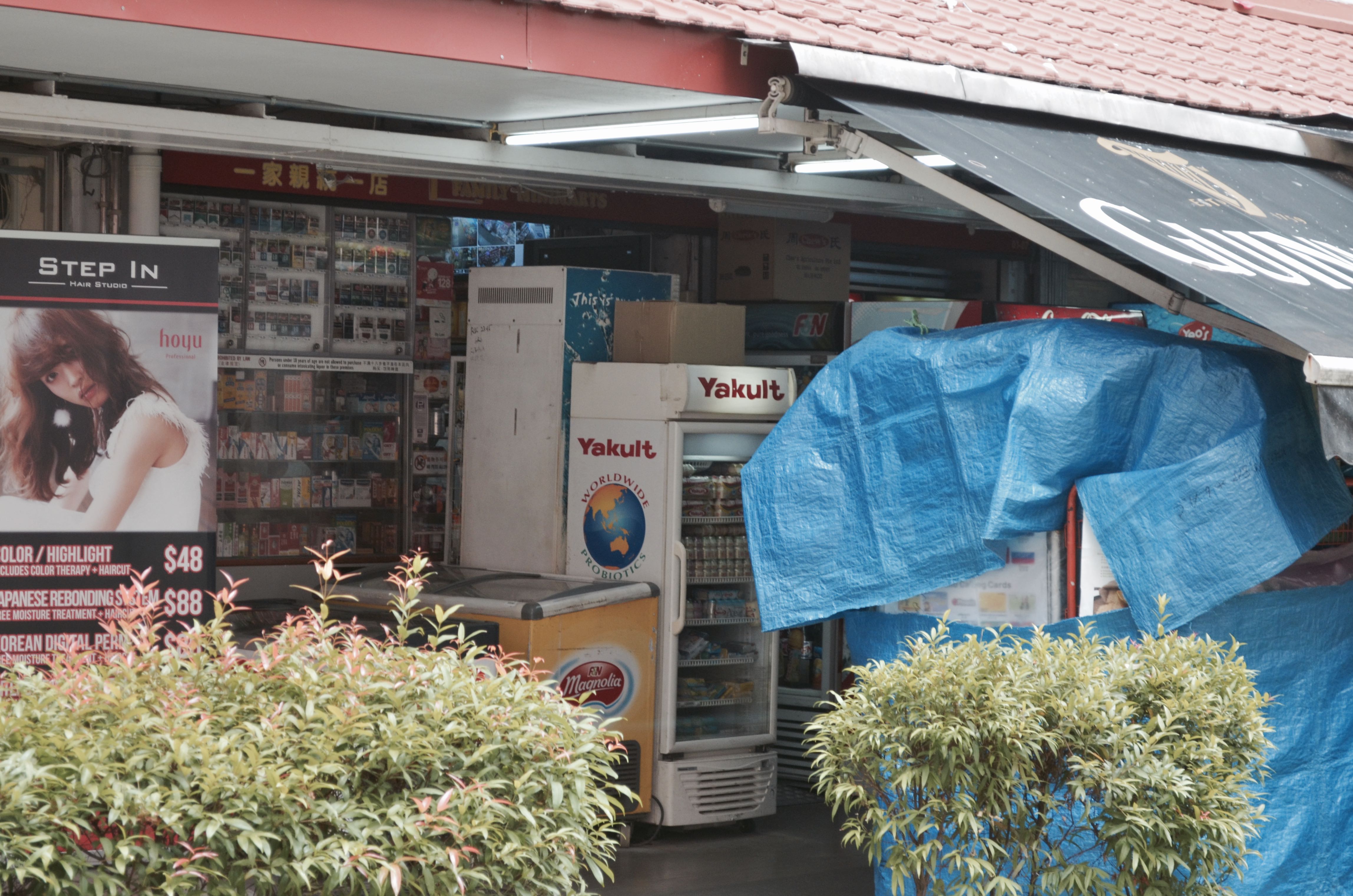
Exploring further, I finally managed to speak to several shop owners. One of which was the store owner of this fruit store as seen in the image below. Looking at the facade of the store, I thought there’s a chance that it might have been around for quite sometime already thus I approached the store. I was wrong, the store owner told me that they weren’t as old as some of the businesses around. They only started business here about 4 years ago after seeing a newspaper listing that the place was up for rental.
Oh based on research done, I learnt that store rental here at Everton was considerably cheap hence the reason for most choosing to open their business here unless they had personal reasons like they used to live here.

Img Source: https://www.travelfish.org/sight_profile/singapore/central_region/central_area/downtown_singapore/2098
I was then kindly referred by the fruit store owner to perhaps try the minimart next door as it had been around for rather long. I managed to strike up a conversation with the uncle, Mr Yap from the store (the store owner wasn’t around that day but he was kind enough to answer my questions in between serving customers) and found out that it has been around for 10 over years, not exactly considerably long. To my surprise, he lives in the area and has been working for this business till now.
He mentioned that business was competitive as there were about 4 provision shops around in the neighbourhood. He went on to share his thoughts about the area place he lives here, saying how it’s moving along with the times with more cafes popping up over the years. He also voiced his opinion on how the area might eventually end up being claimed and have to make way for redevelopment plans just like what’s happening with the other old estates in Singapore – Rochor Centre and Dakota Crescent.
But personally, I feel that it won’t be anytime soon for Everton Park especially now when people are coming by on weekends for the cafes and when it’s known to be “the next Tiong Bahru”.
Everton Minimart at Block 7
What I particularly love about this neighbourhood was it’s quaint, quiet charm. Not many sightings of people around but it gives off a really warm feeling. Maybe it’s because of how closely placed everything is – the businesses, apartments and all; the architecture of the neighbourhood. I felt it especially when walking through this walkway pictured below.

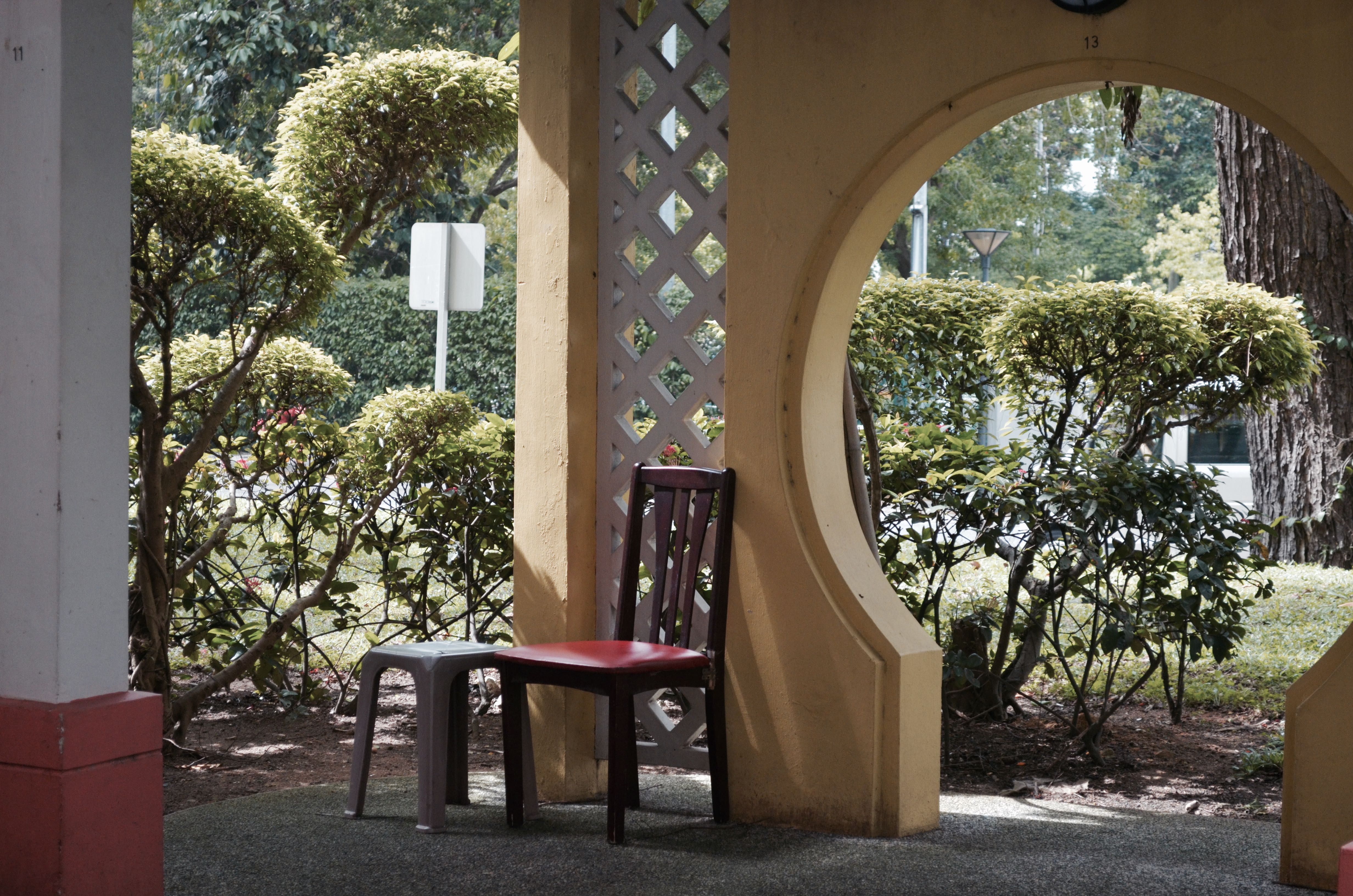
While exploring, I noticed an old uncle walking to and fro the above shown walkway settling down at one spot of the stretch of marbled bench and shortly after he stood up and shifted to another spot. He even shifted over to this area with chairs (see image above). It gave me the impression that he was a resident there but when I approached to strike up a conversation after a little hesitation I found out that he was just here for exercise. And being an old folk I thought he would know this area well but apparently he only came by twice, wrong judgement… but it was nice striking up conversations with friendly old folks. I remembered he asked what I was doing here too.
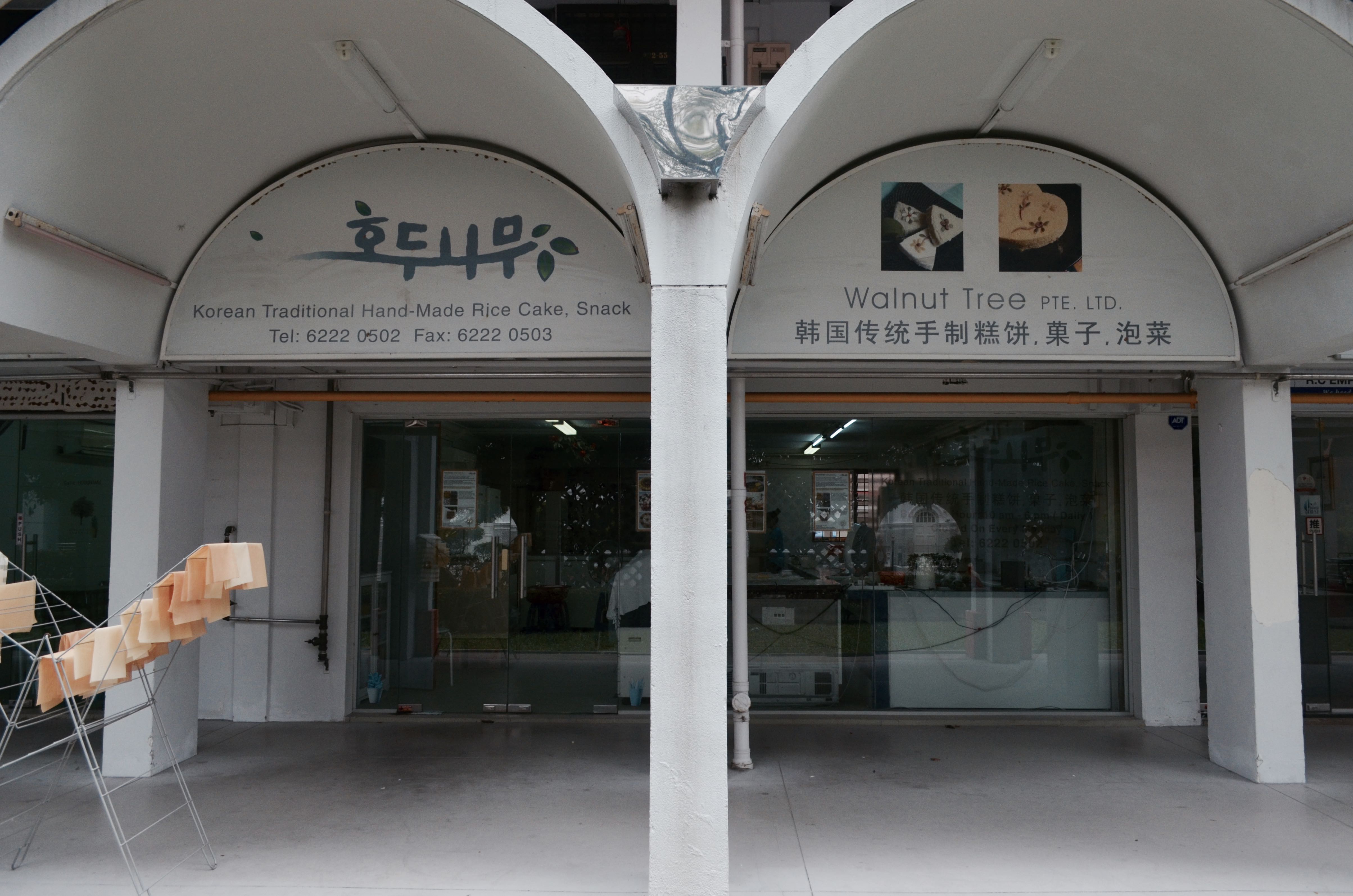
Came by this Korean confectionery that sold traditional hand-made Korean rice cakes and snacks after researching online. I particularly wanted to interview the owner of this business as it was an interesting sighting – A Korean business among a neighbourhood that’s highly populated with residents who belong to the older generation. I would think once again that it’s because of the rent but I may be wrong! Unfortunately I was told that the lady boss of the store wasn’t around too so I’m coming back another day I guess!
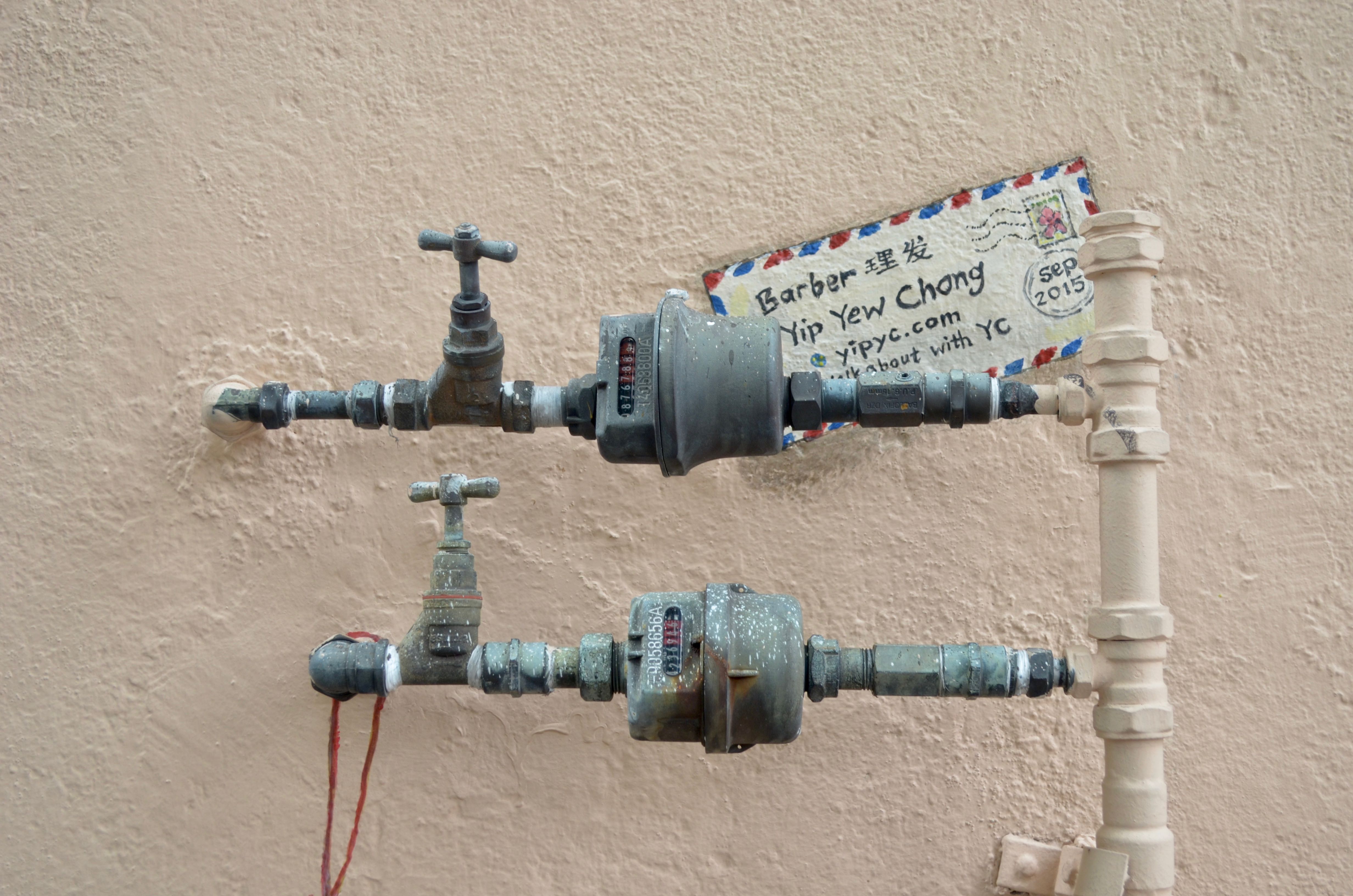
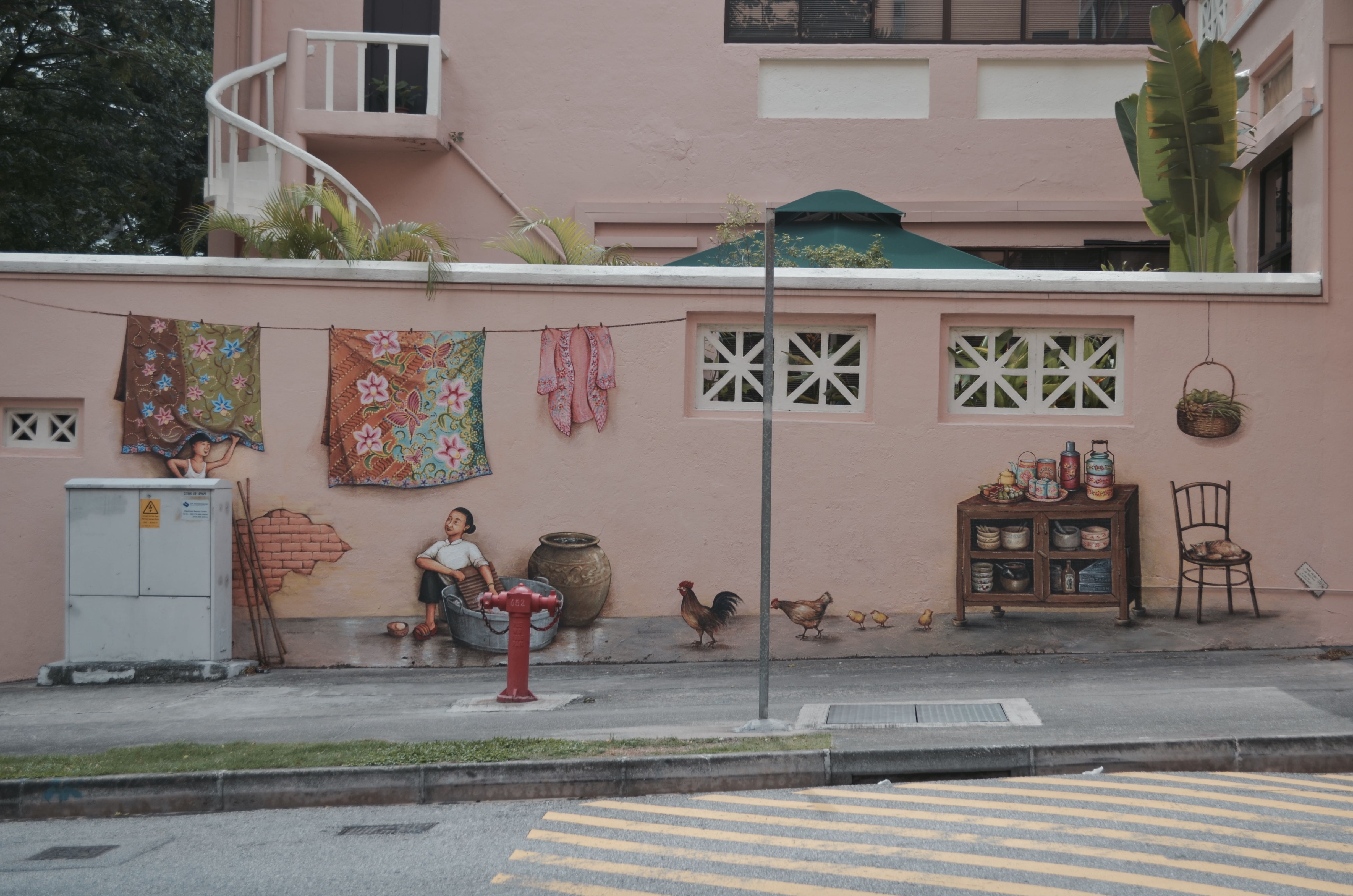
Last stop for my first visit to the place was this area located just opposite Everton Park. There were 2 series of wall murals done by this local artist, Mr Yip Yew Chong back in 2015. I’ve read up online about them, how it seemingly has a story behind each and why they were placed there – Mr Yip used to live near Everton Road and walked along that same road every day for about 20 years.
I’ve seen people interacting with the wall murals before, taking photos beside it and posting them on their socials but never knew it was located here until that day. But when I went by on Thursday there wasn’t anyone around that area so I guess maybe I’ll go by on one of the weekends to see if there are any and could probably do a timelapse of sorts as suggested by Joy to capture their interactions and maybe I could even interview the people then to get some thoughts as well.
Amah by Yip Yew Chong

Barber by Yip Yew Chong
Coincidentally he’s having an upcoming talk this coming Tuesday evening at the National Library about his series of wall murals across Singapore (including these two) and I thought it would be a perfect opportunity to sit in and hear the stories behind it and gain some insights to his works which might be beneficial for the zine. I was thinking to even approach him after the session and speak to him a little if possible, to gain more insight.
Am most likely heading back on more weekday and a weekend to conduct more interviews and at the same time observe the weekend crowd since I heard that more people are heading over to the cafes there more now because it’s less crowded as compared to the Tiong Bahru.
Would probably be a good idea to call up the shop prior my next visit to arrange or ask if I could interview them as some businesses there were second generation/the owners live in the estate. It would be great to get their thoughts on the community, how the place as changed over the years etc.
ETHNOGRAPHY: First look at the word ethnography and I thought, this research method must be related to ethnicity. Well if you search up the definition not related to research, it’s somewhat there! But in research terms, it’s meant to be a form of qualitative primary research done with the intention to provide detailed in-depth descriptions of everyday life and practices by others.
PARTICIPANT-OBSERVATION:
Similarly, participant-observation is another form qualitative data collection method. It often takes place in community settings (like this project for example) and requires the researcher to approach people (as participants) in the environment and learn about what their lives are like as an outsider. The researcher are more often than not recording down what they observe and get through interactions and conversations with the members of the community (participants). It’s one research method that is based heavily on observations and interpretations.
Collecting data can also be done through other forms such as conducting questionnaires or surveys.
QUALITATIVE DATA: This kind of data obtained from research is not in numerical form/numbers. They are usually more descriptive unlike quantitative data and are useful for finding out how people feel about a particular subject.
E.g.: Through conducting interviews, questionnaires/surveys
QUANTITATIVE DATA: This kind of data obtained from research is in numerical form/numbers. They can be translated into categories, ranked in order, measured in units and of course presented visually through infographics and other forms of visual data representation.
E.g. Through conducting surveys that require the participant to rate something on a scale of maybe 1-10 / Yes or No questions – Basically questions that would generate numerical data.
Primary sources of data are the kind that you personally obtain it through your efforts. It can be through interviews, or the above mentioned two other forms of data collection – ethnography and participant-observation. Put it simple, original data. On the other hand, Secondary sources of data are those you get from other existing sources. It can be from books, magazines, articles be it in electronic forms or print form.
INFOGRAPHICS
Infographics are ways of simplifying complicated subjects/topics/statistics into an interesting visual representation of various types (charts the most common type) for viewers. It especially helps turn boring subjects into something interesting if done right. A good infographic would be one where the presentation of data of your subject matter is visually engaging and appealing to your target audience.
Happen to chance upon this infographic of sorts (see below) that shows the many other ways we can visually represent our data besides through infographics which now looking at it I perceive it to be a sometimes mixture of many various types of these visual analogies combined together with annotations.

There’s just so many ways we can visually represent our data! From the usual charts to having vectorised graphics reflective as symbols of the subject matter with related annotations, the possibilities are endless and I guess we can really exercise our creativity here. But at the end of the day, main point again is to really boil down these data, simplifying it and making it interesting for your target audience.
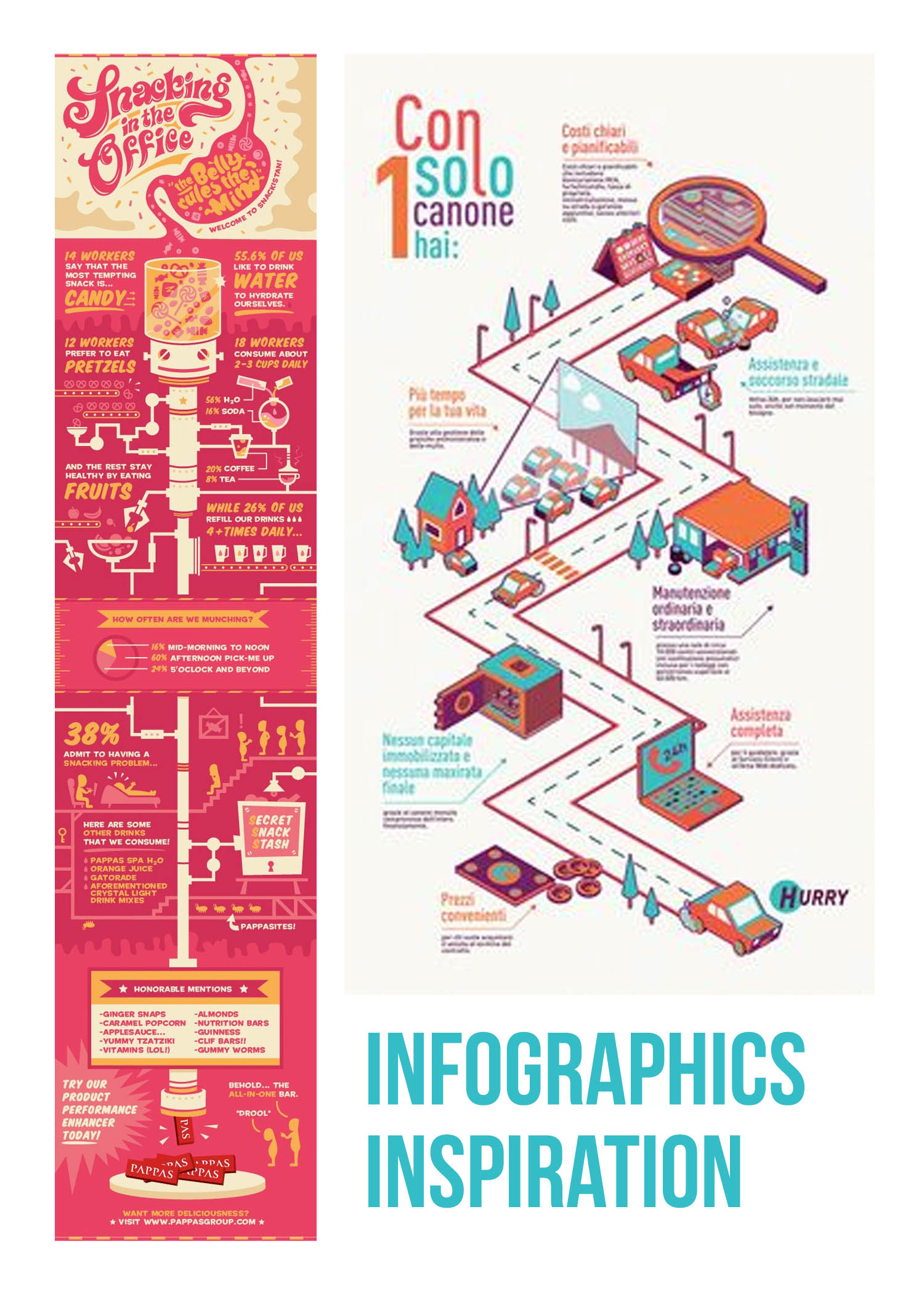
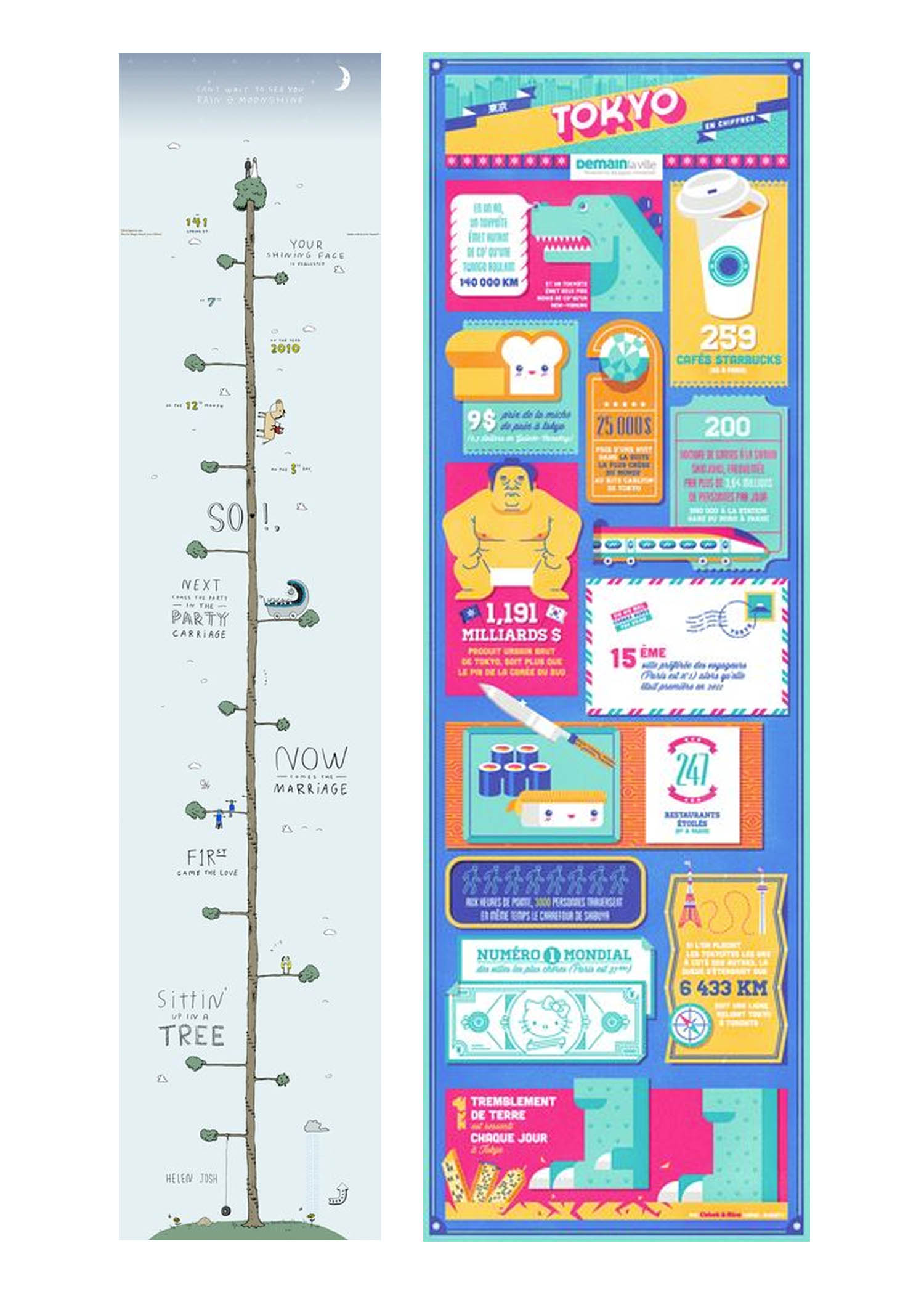
Here were some infographics I found while browsing through Pinterest for the next deliverable part of the project. Figured they could help me get inspired with mine when the time comes. I really like the use of colours, the quirkiness and the way data is presented. Will be browsing through Pinterest again for more inspiration!
REFERENCES:
- https://www.lopelab.com/
- https://lionraw.com/2014/07/15/a-journey-up-pearl-bank-apartments/
- http://psc.dss.ucdavis.edu/sommerb/sommerdemo/observation/partic.htm
- http://www.museum.red-dot.sg/design-district-singapore/everton-park/
- http://brianhoey.com/research/ethnography/
- https://assessment.trinity.duke.edu/documents/ParticipantObservationFieldGuide.pdf
- http://www.simplypsychology.org/qualitative-quantitative.html
- https://www.customermagnetism.com/infographics/what-is-an-infographic/
- http://designtaxi.com/news/376549/Infographic-72-Ways-To-Think-Present-Your-Ideas/