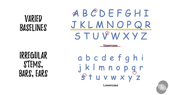
Project 2B on the other hand had us exploring freeform type. Sounds fun but at the same time a little daunting… Similarly, we had to think of a phrase/quote/memory/lyric and create our very own organic typeface in relation to the quote and we could only use traditional medium. After creating the type, we have to apply it onto something tangible.
PROCESS
WEEK 2: In-Class Experimentation
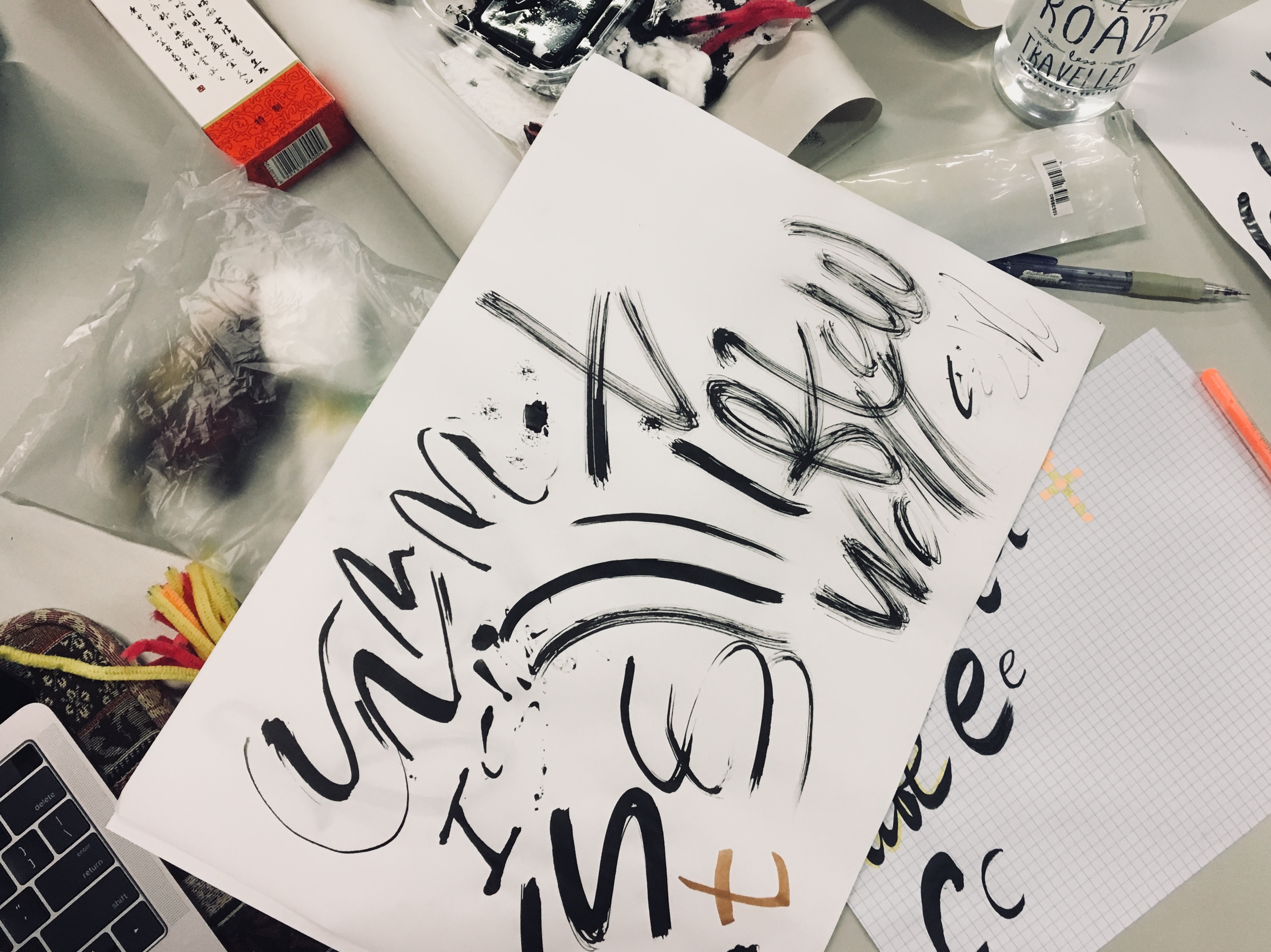
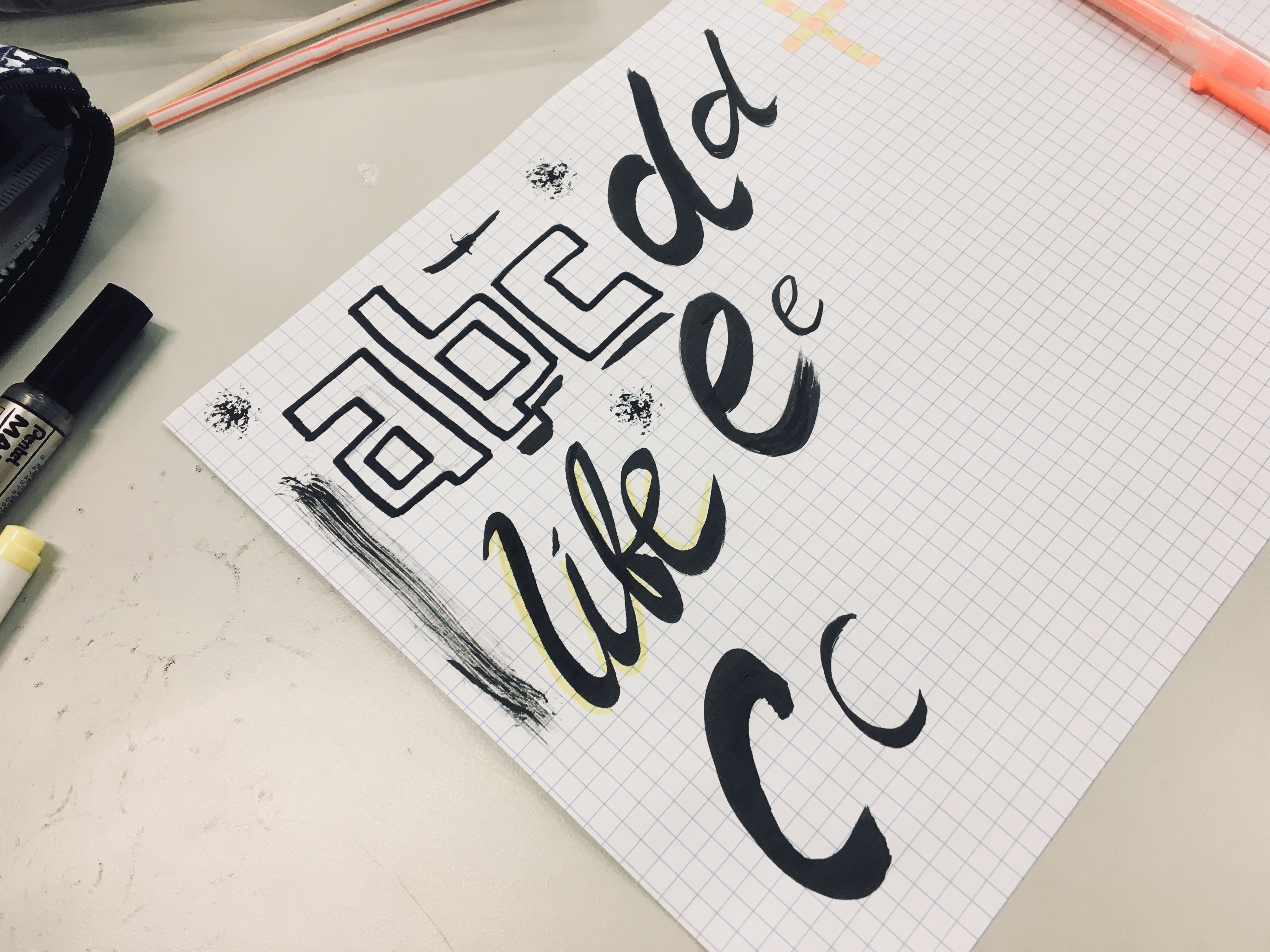
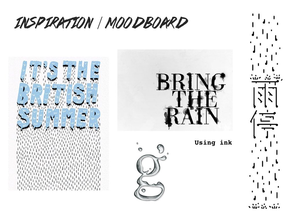
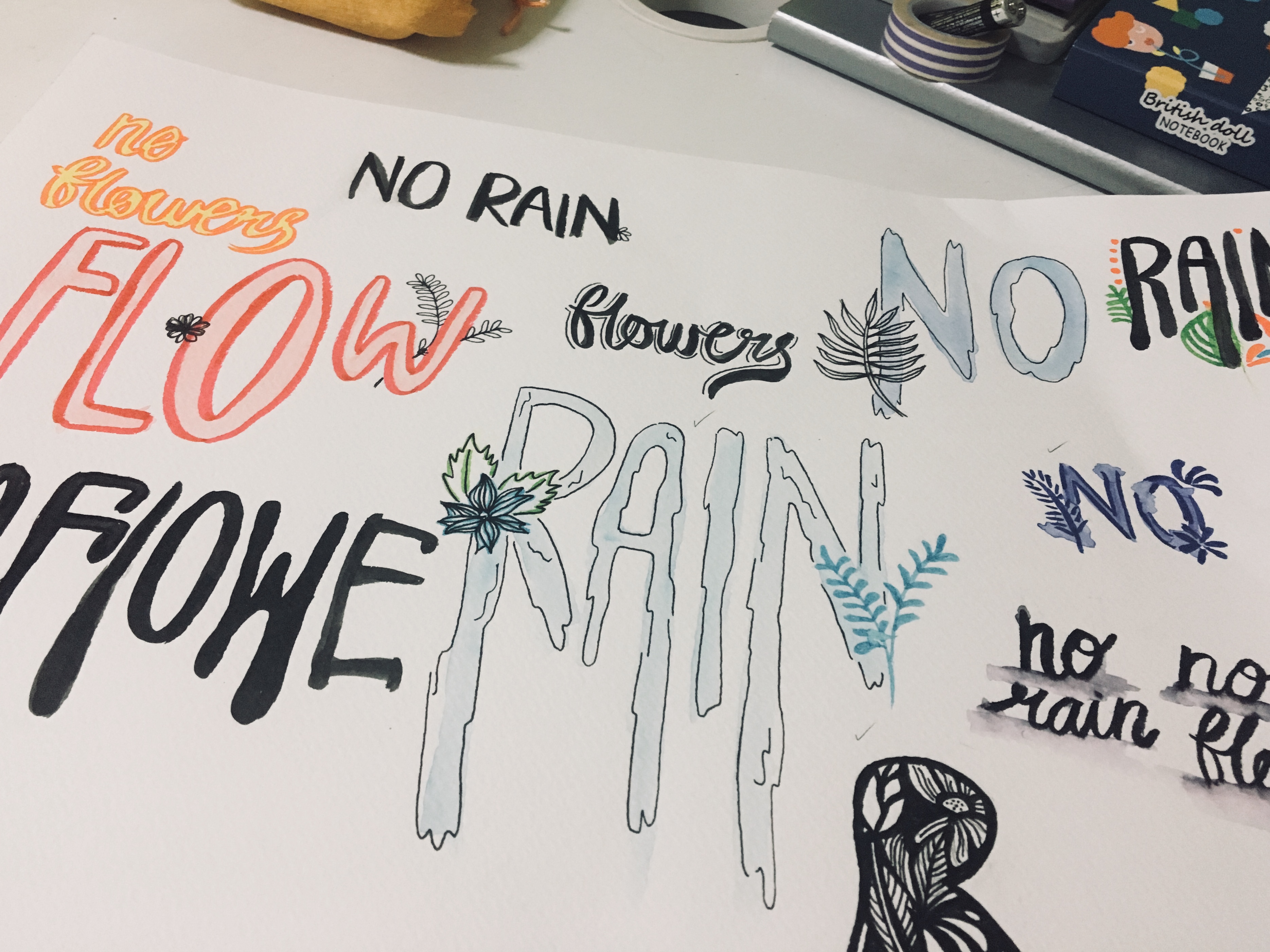
The following week after getting our assignment brief we did some in-class typeface exploration with a wide range of materials we brought from home and found in class to create our typeface. Ideally, we had to come to class with a quote in mind so that we could start exploring and creating a typeface that suited our chosen quote. However I was still undecided (just like Project 2A, my ideas just refused to come easily…) so it was really just freestyle exploration for me that week. I experimented with ink, creating thick and thin strokes with a brush/felt marker, blocking letters, writing in cursive etc. and below were some of the outcomes:
While exploring, a quote ‘Take Heart, Be Kind’ suddenly came to mind. It is more of a catchphrase that was used by the host of a YouTube series that I’ve been following. As I wanted to go for a “spread positive vibes” kind of feel I was thinking that this could be a possible quote to use.
However after exploring with various original typefaces for the quote I realised that it was hard to create one that exudes a “positive vibes” feel. Possibly by playing with colours, but I felt that the shape of letters of the typeface had to play a part the sense that for instance: If the type had to be created in black and white, the vibe of the quote should still be visible too. Also, I did not help that the typefaces from the experimenting was all leaning towards the now commonly seen calligraphy look. It did not come off unique:

WEEK 3&4: Slowly Getting There…
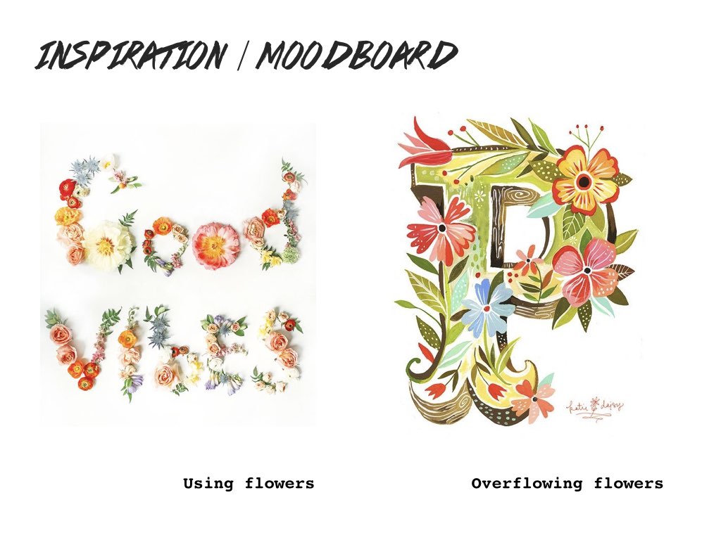
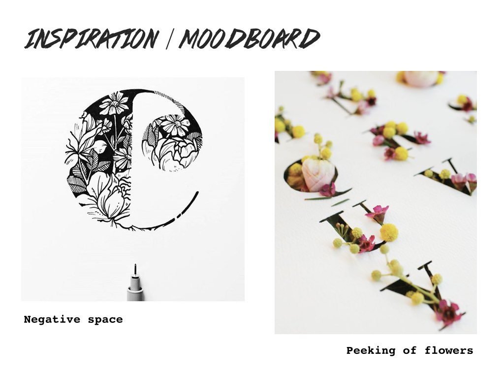
Thus I gave up on that quote and went online to search for more. Another challenge faced was that we had to limit our quote/phrase between 15 to 25 characters. I was still leaning towards to the idea of creating an organic typeface for inspiring quotes and I kind of wanted to play with the idea of incorporating flowers since it was my kind of ‘thing’/aesthetic.
By chance, the quote ‘No Rain, No Flowers’ came up and I felt it was a really simple yet powerful quote that I think everyone would resonate well with, even myself. I feel it speaks of how everything is cause and effect and life’s not all rainbows and butterflies, just like the flowers, we will definitely experience the “rain” – the bad days in order to grow as a person. And they key to overcoming these ups and downs is to embrace it. It felt meaningful. Additionally, I realised that I could incorporate flowers in the organic typeface too 🙂 Here were some of the works I found online and got inspired by / referenced a little:

I then proceeded to experiment on the typeface for this quote at home and came up with a few ideas:
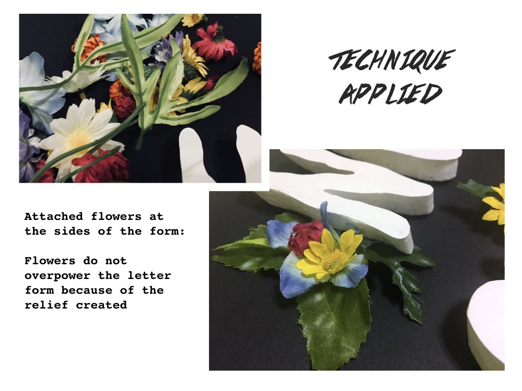
Then came the problem, I could not seem to execute my idea of having the flowers line the sides of the letter while retaining the visibility of the letters (as seen in the image below). The flowers seem to overpower the letter instead of my intention of having it complement the typeface in the sense that it subtly depicts the meaning of the quote as well of how without rain there would be no flowers, the flowers will not bloom. I wanted the letters in the organic dripping-looking form to stand out more than the flowers reason being that it is the rain is the cause of the flowers. It allowed the flowers to grow.

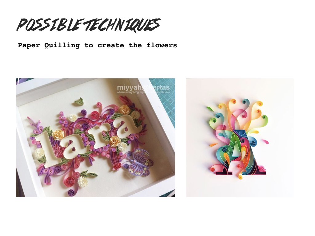
Brought my experimentations to class for the following week of consultation to see how I could tackle this problem and the suggestions given by my peers were really helpful!! They suggested that I could perhaps melt wax crayons / use the glue gun to create give the letters more dimension so that it stands out from the flowers. As for the flowers, I could perhaps do paper folding or another technique I thought of – paper quilling.
WEEK 5: It’s Finally a Work-In-Progress!!
Now that my final execution direction was clearer, I went into creating the typeface based on the suggestions received that week. For the letters, I tried out the Glue Gun method eventually as I already had the materials at home but unfortunately it failed to create the depth and I did not like the uneven texture it created as I had to layer the glue over and over again because of its little output each time.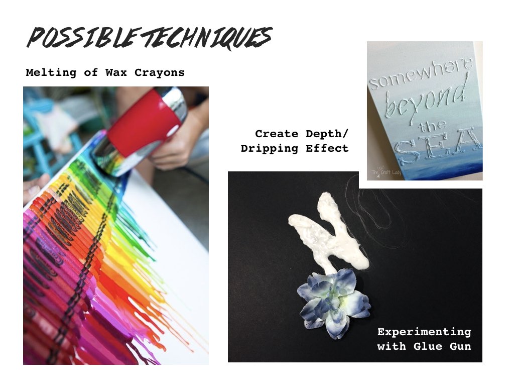
Managed to resolve the problem by using some leftover styrofoam I had at home from past projects (perks of being a hoarder after each art project haha)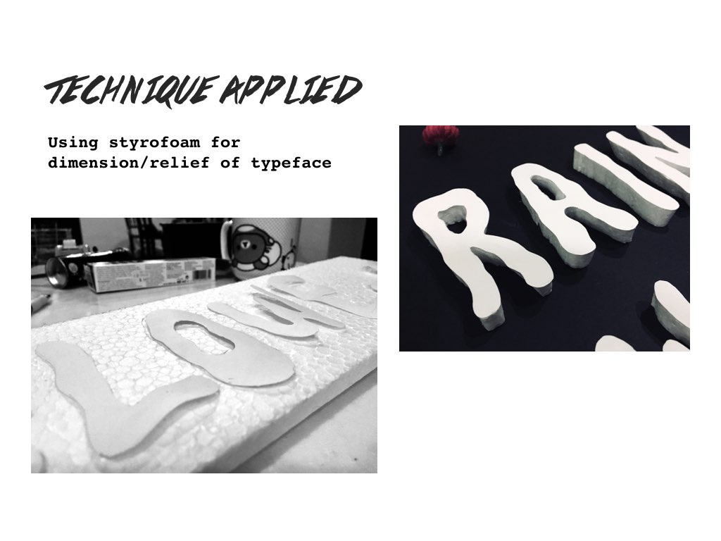
And it worked!!! YESSS. As for the flowers to surround the typeface… due to the little time I had left to work on the typeface, realistically it was not possible to continue with my initial technique of folding /paper quilling the flowers as both techniques required quite a bit of time and cost of course.
Hence I went with the idea of using of fake flowers instead. It was a much cheaper and faster alternative too!! I got them from Daiso and boy their selection of flowers was huge! I was initially at a loss to which kinds of flowers I should choose, which would actually complement the typeface. I eventually went with a vibrant mix of flowers since anything colourful doesn’t hurt right!! Especially since the letters were white in colour.


Here’s how the typeface turned out:
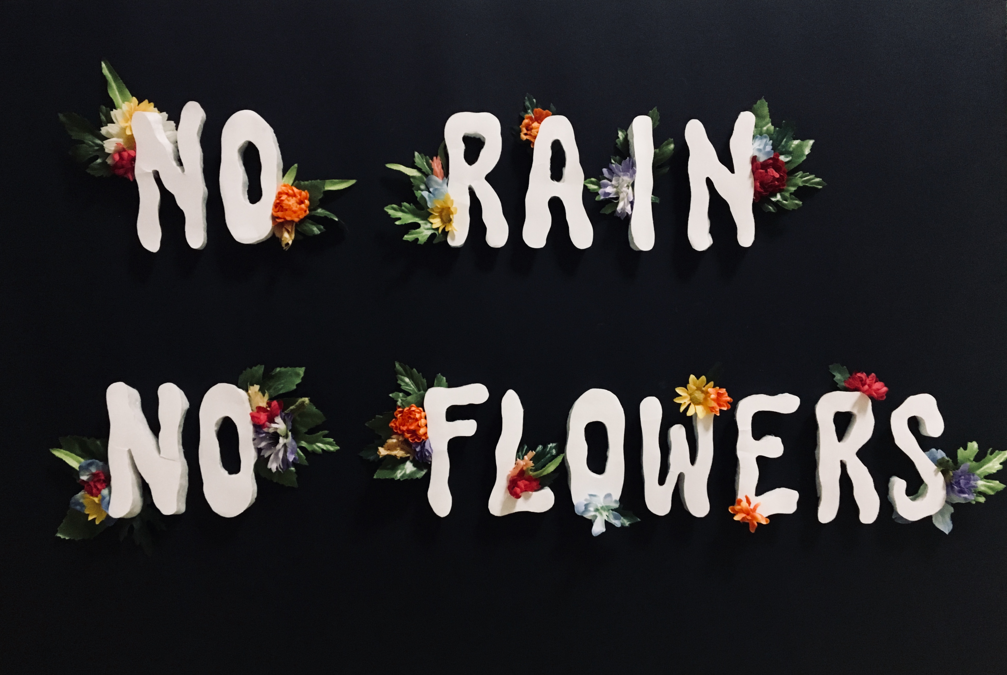
Look of the typeface before digitalising
Thanks to the styrofoam that created the dimension for the letters, the flowers were able to be placed around its sides without overpowering it as initially if both letter and flowers were on the same level, the flowers would definitely have stood out (as seen earlier).
As another requirement of the project was to have the typeface applied onto something tangible, I had to have the typeface digitalised in order for that to happen. Scanning was not an option for me as the typeface had dimension. It was not fully flat and some details of the typeface would have been lost. I did try to scan though! But as anticipated, some details were lost. Thus, I had to take pictures of the letters individually against a black sheet of paper/background and then manually photoshop erase the background of each letter and rearrange them on a blank canvas thereafter. Individual letters reason being that I had to create large letters of the typeface in order for the flowers to surround each letter nicely without looking too crammed or sparse.
The editing process after shooting the letters individually:
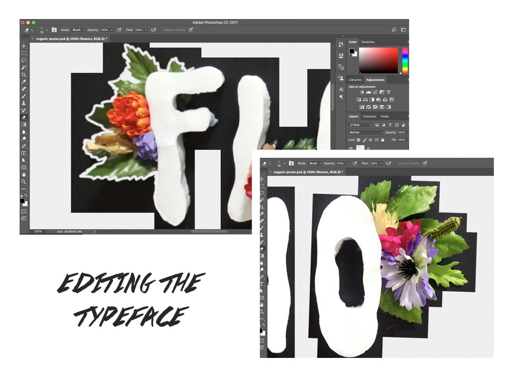 It was a rather strenuous process of zooming in, removing the black areas bit by bit and arranging them thereafter on a blank black canvas to achieve a clean finished typeface. And voilà!

APPLICATION TIME!
As mentioned, part two of the assignment was to have this typeface be applied onto something tangible and I came up with a few ideas! It being kind of like an inspiration quote, the options were endless. Here were some ideas but I eventually went with the poster 🙂
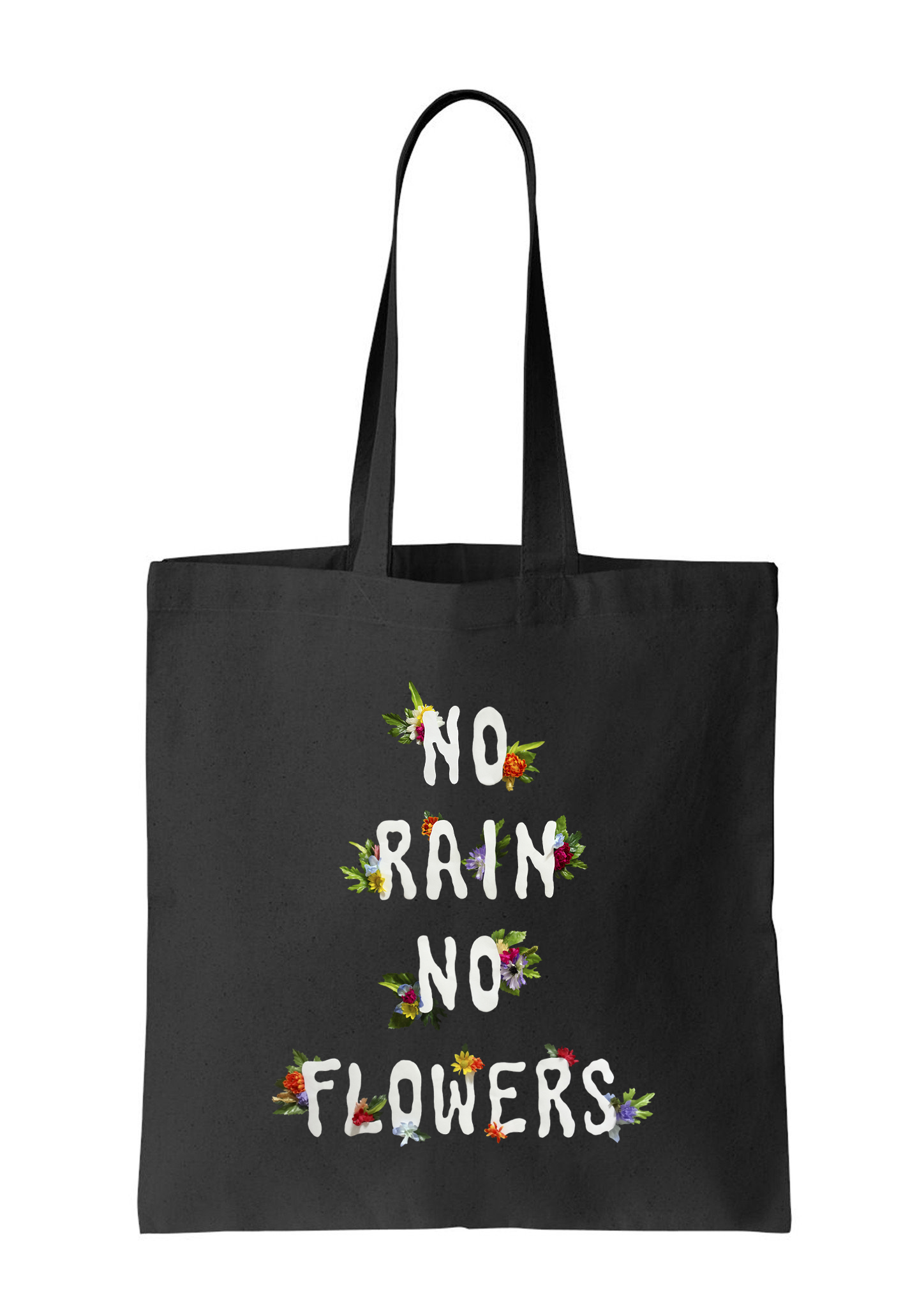
Tote Bag Design
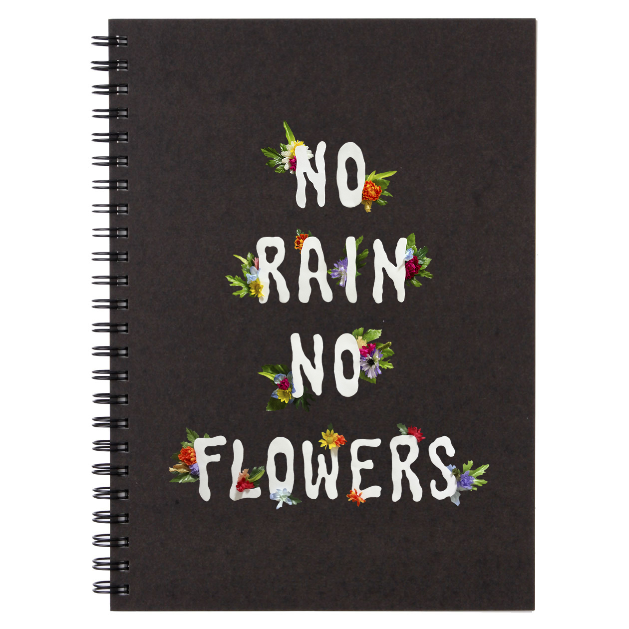
Notebook Design

Poster (Final Selected)
So glad the ideas finally came through! Being a person who really enjoys doing craftwork, creating the typeface was an extremely fun process and I would love to try my hands at such a project again in the future!!