
For this project, we had to select a traditional typeface and create a series of composition explorations from it using the varied fonts from that one typeface to create variations in thickness for dimension of the image form. Basically we could ‘dismember’ the anatomy of each letter of the font, combine them to form our image composition which I thought sounded pretty fun but at the same time worrisome since the possibilities were endless! The end deliverable was two best compositions and I thought it would be nice if I could have it as a series/themed kind of sorts rather than two compositions that are entirely different 🙂
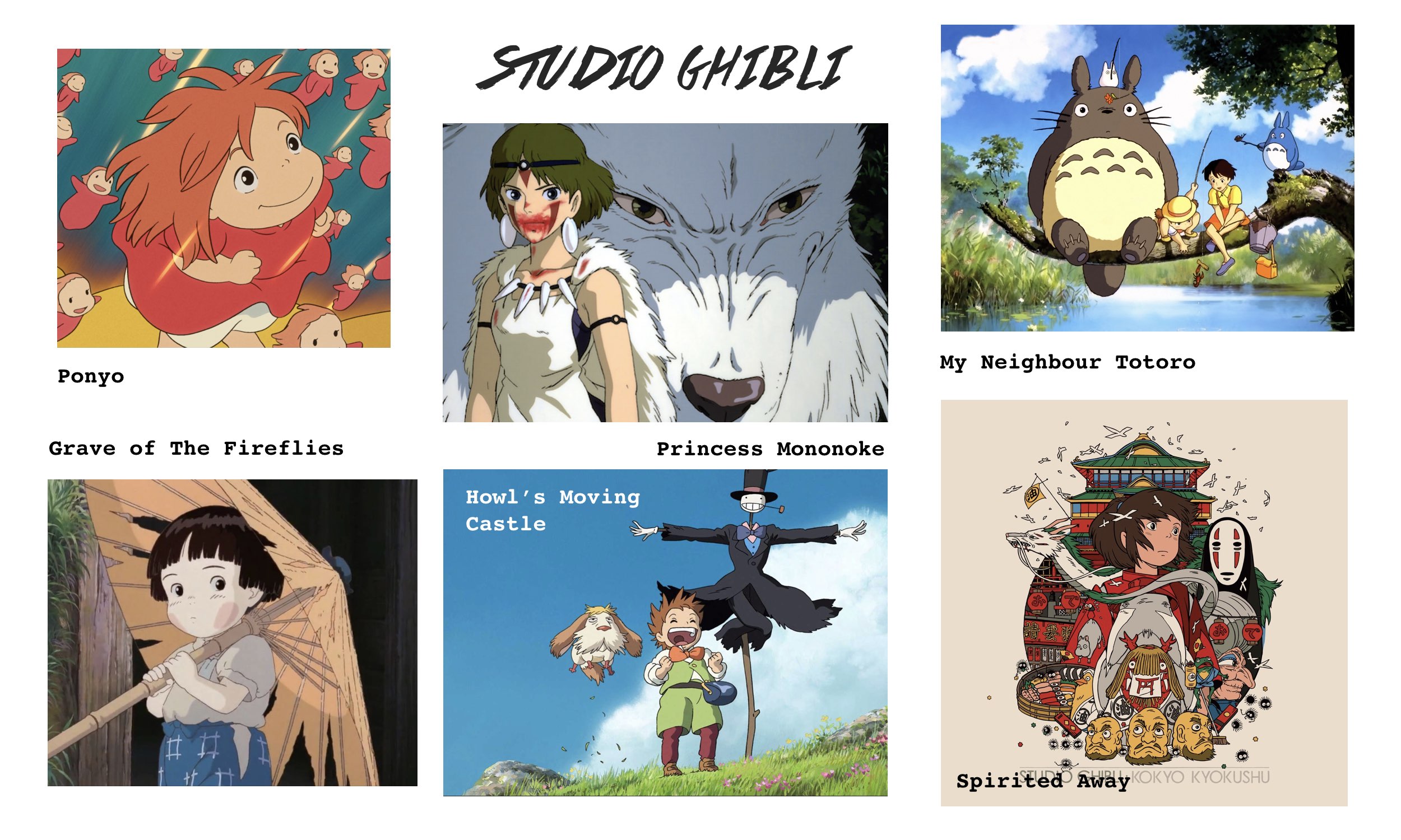
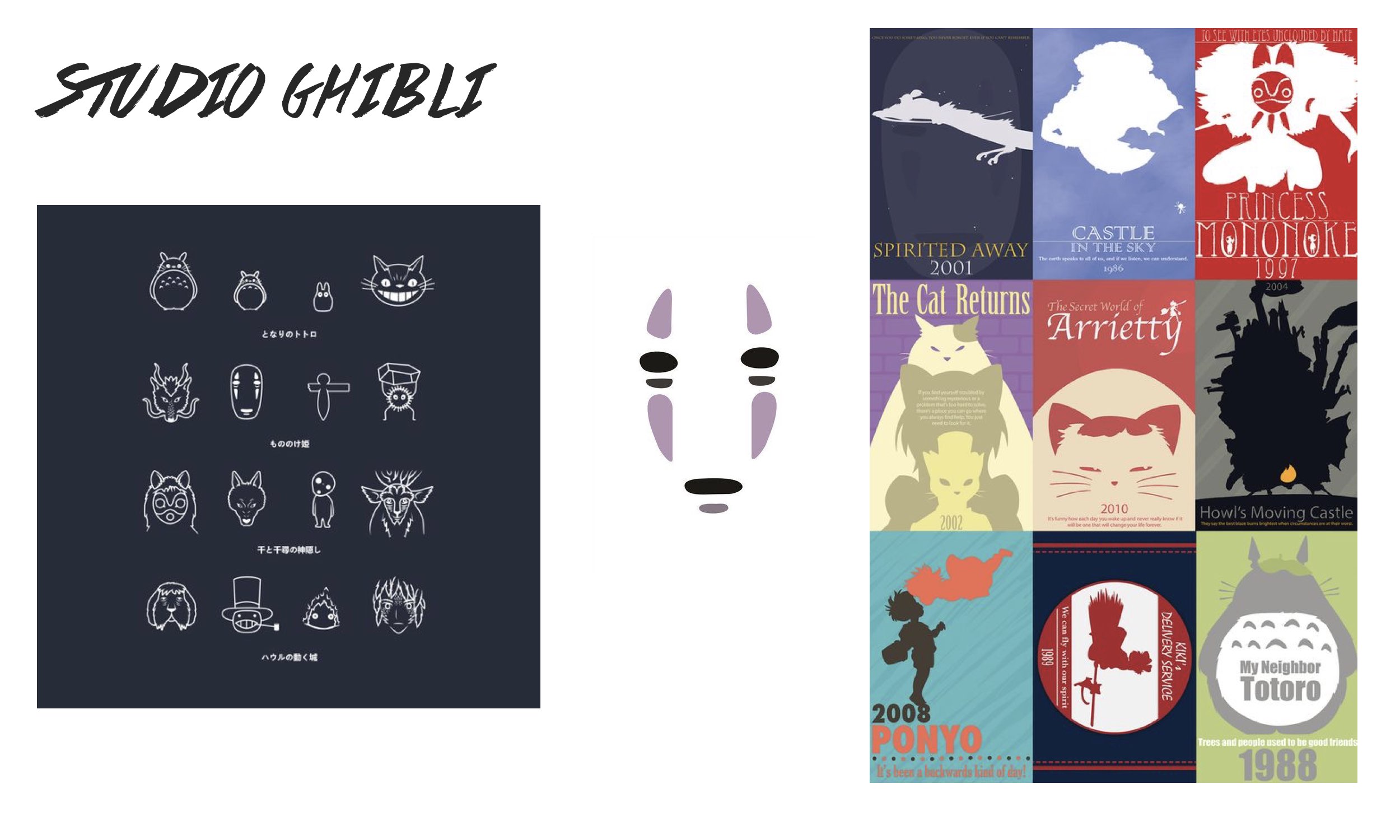
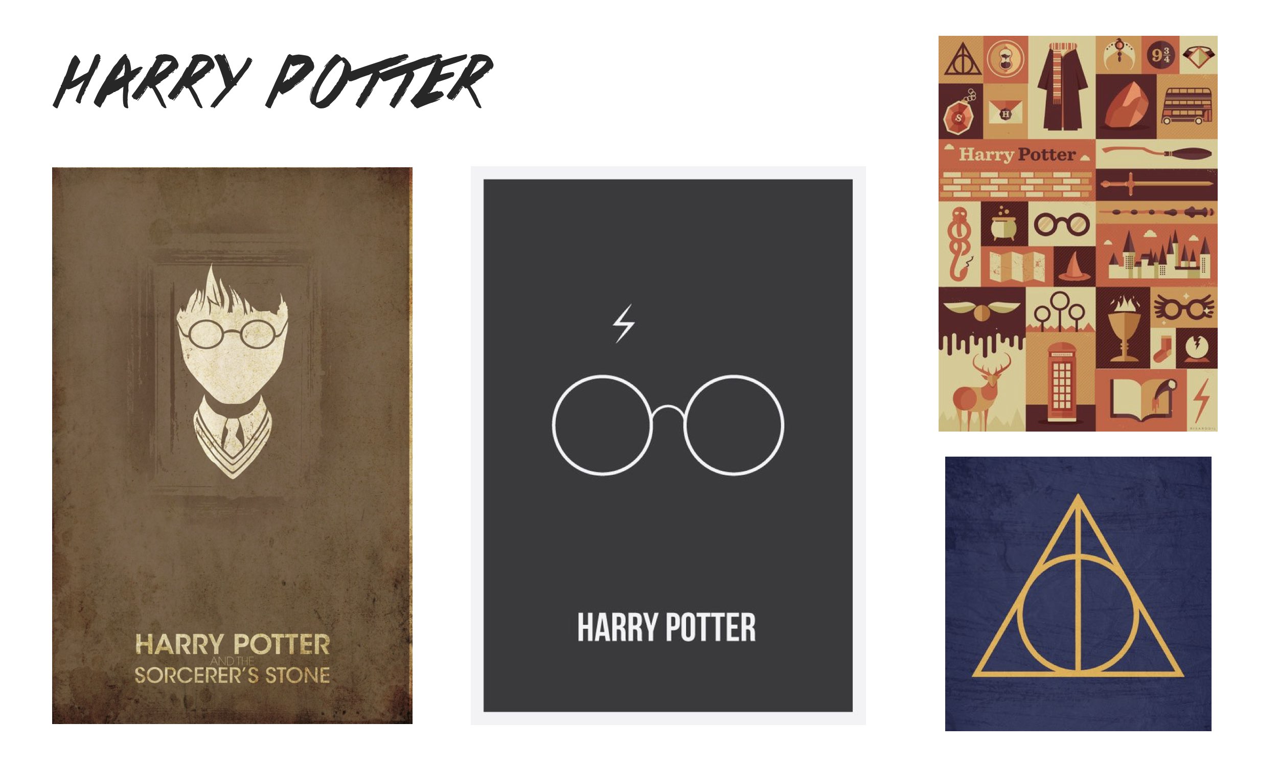
On to brainstorming the themes for this project, I had way too many in mind of my favourite things – Studio Ghibli animation films, Harry Potter (I liked the minimalistic designs I found online), and of course Singaporean things. Here were those I wanted to explore (click on image to enlarge and view):

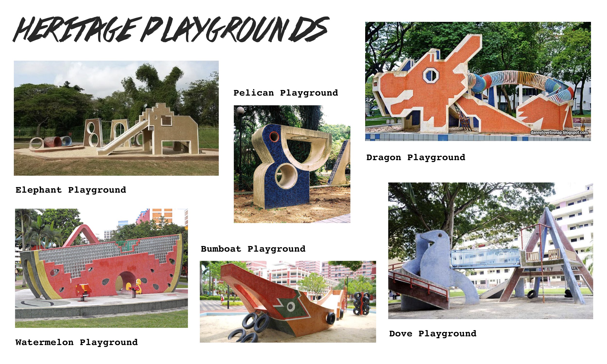
I had to narrow the themes down somehow and since I felt like doing something more close to heart and more iconic it was down to the last two ideas and my determining factor was since I’ve been drawn to those iconic heritage playgrounds of Singapore having worked on it for an art project last year… the Singapore heritage playgrounds it is!
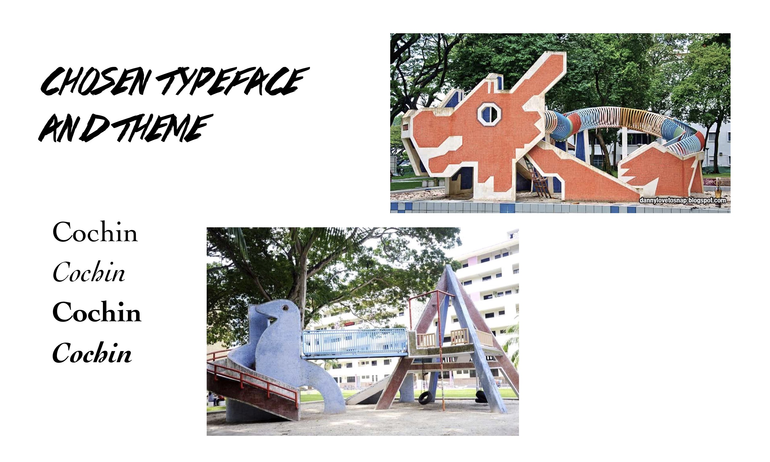
I chose both the Dragon playground at Toa Payoh and the Dove playground at Dakota Crescent reason being that these two stood out to me most in terms of their iconic feel and rich heritage of the location they are located at. Also, there’s just something beautiful, nostalgic and iconic about these playgrounds though I haven’t been to any yet and some are soon to be demolished/have been. Just seeing them in images, the rustic mosaic design and brilliance of incorporating playground elements like the slide/see-saw to its form it’s pretty intriguing.
As for the choice of typeface, advice given was to use a serif font as it allows for strokes that go from thick to thin, basically variations in thickness of lines which actually helps to create dimension for the image composition. The typeface I chose was Cochin and I particularly liked the Italic font of the typeface because of its unique curvature at the ears and tails for some of the letters.
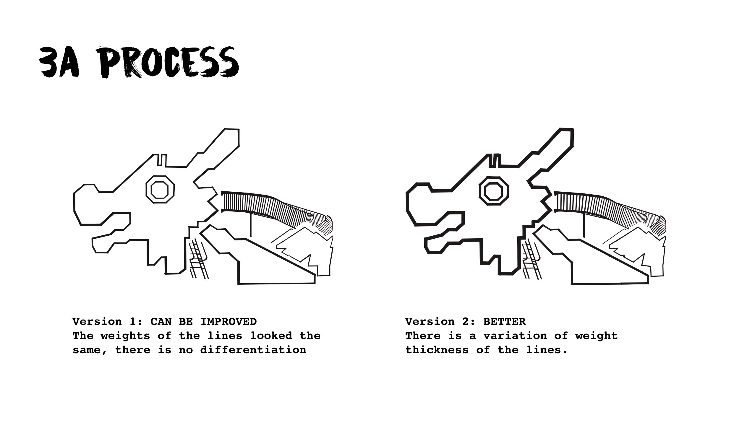
This was the first version I had for both playground compositions and for the subsequent consultation it was said that the Dragon playground composition pale in comparison to the Dove one in the sense that the Dragon playground’s looked flat unlike the Dove one whereby there were variations in the thickness of the playground structure using the Bold Italic/Italic fonts of the typeface and breaking up of the individual letters.
Following the feedback from Shirley and after further refining, I managed to achieve the variation in thickness for the Dragon playground composition playing with the idea of depth as the three different parts forming the Dragon’s body fall under foreground, mid-ground and background – I thought it’d be cool to bring out my observation that way and at the same time to create dimension within the composition. The final revised look of the Dragon playground below:
And these were the final two compositions I had for Project 3A:
-
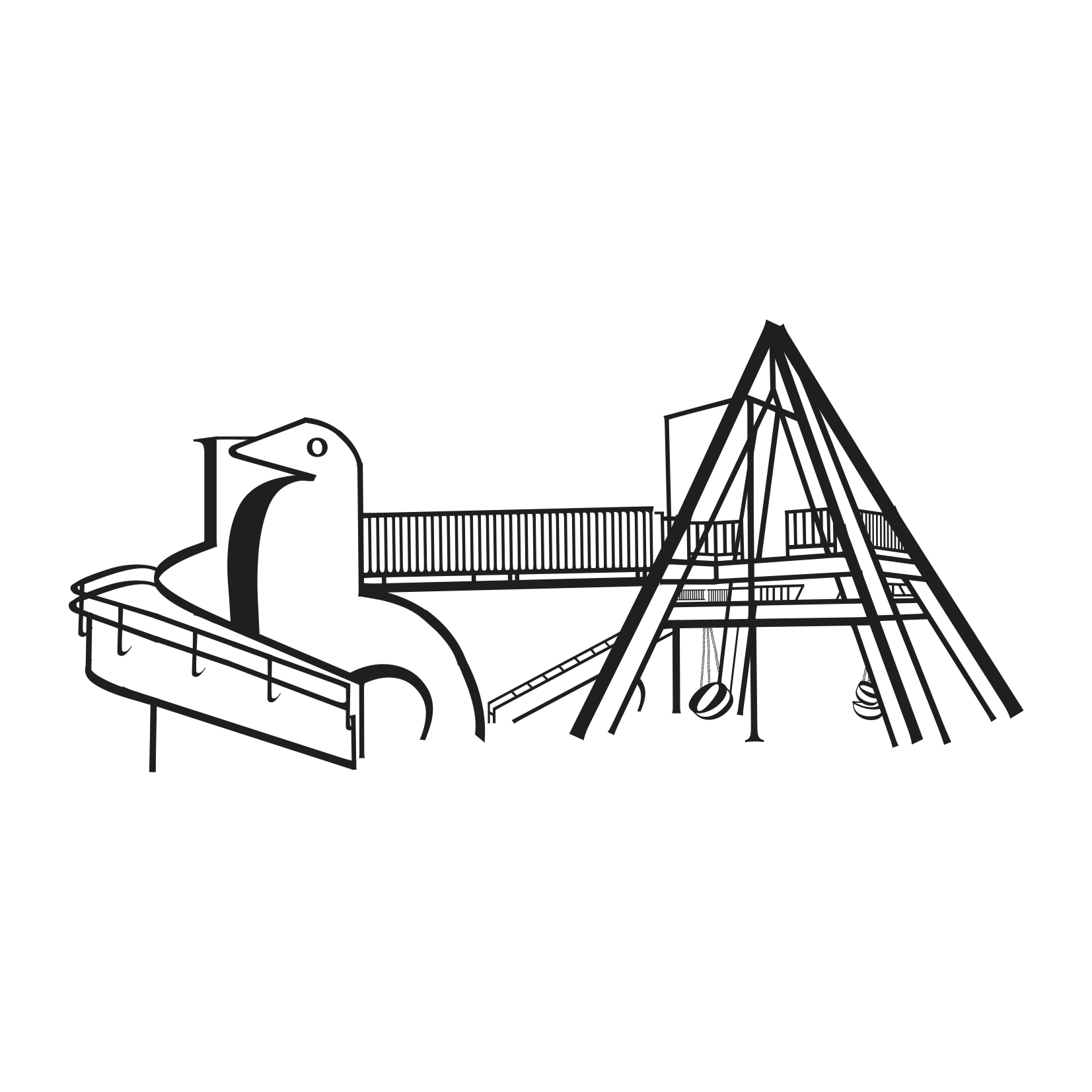
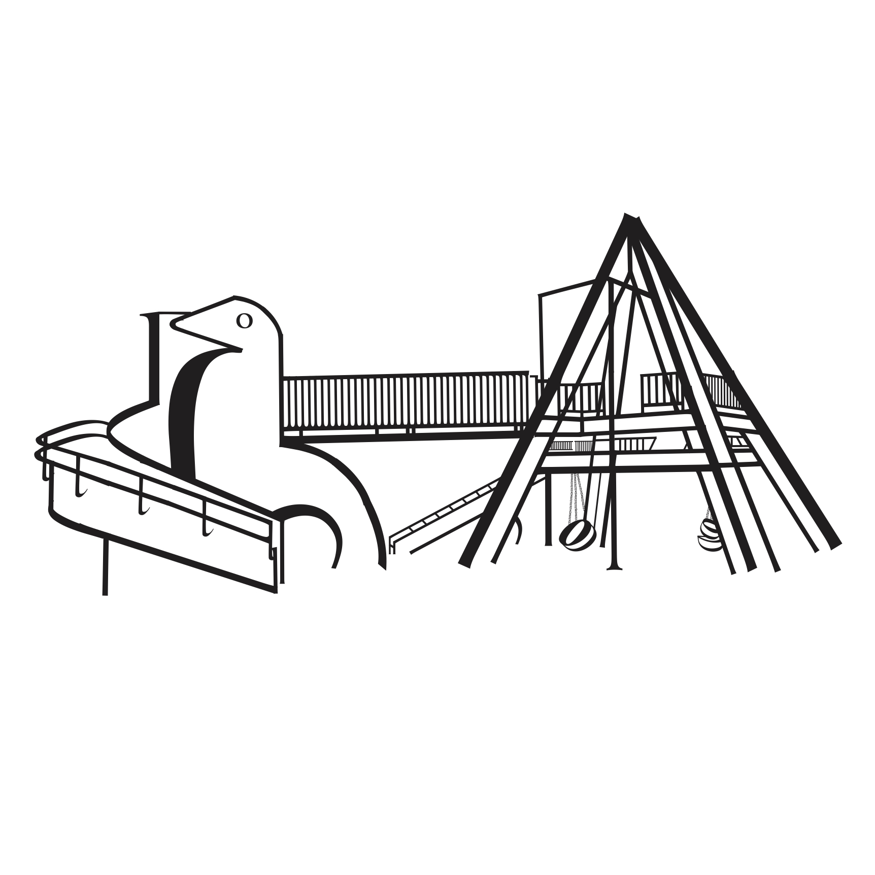
- Dove Playground at Dakota Crescent
-
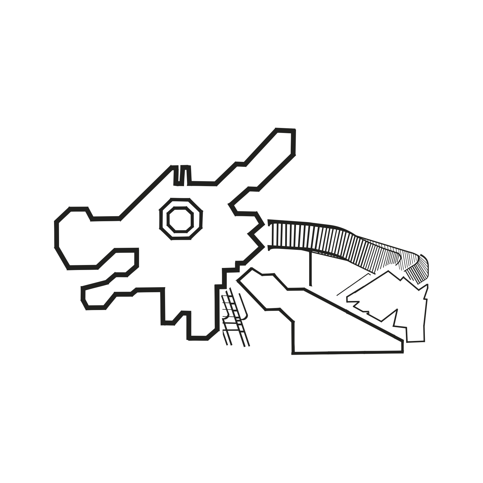
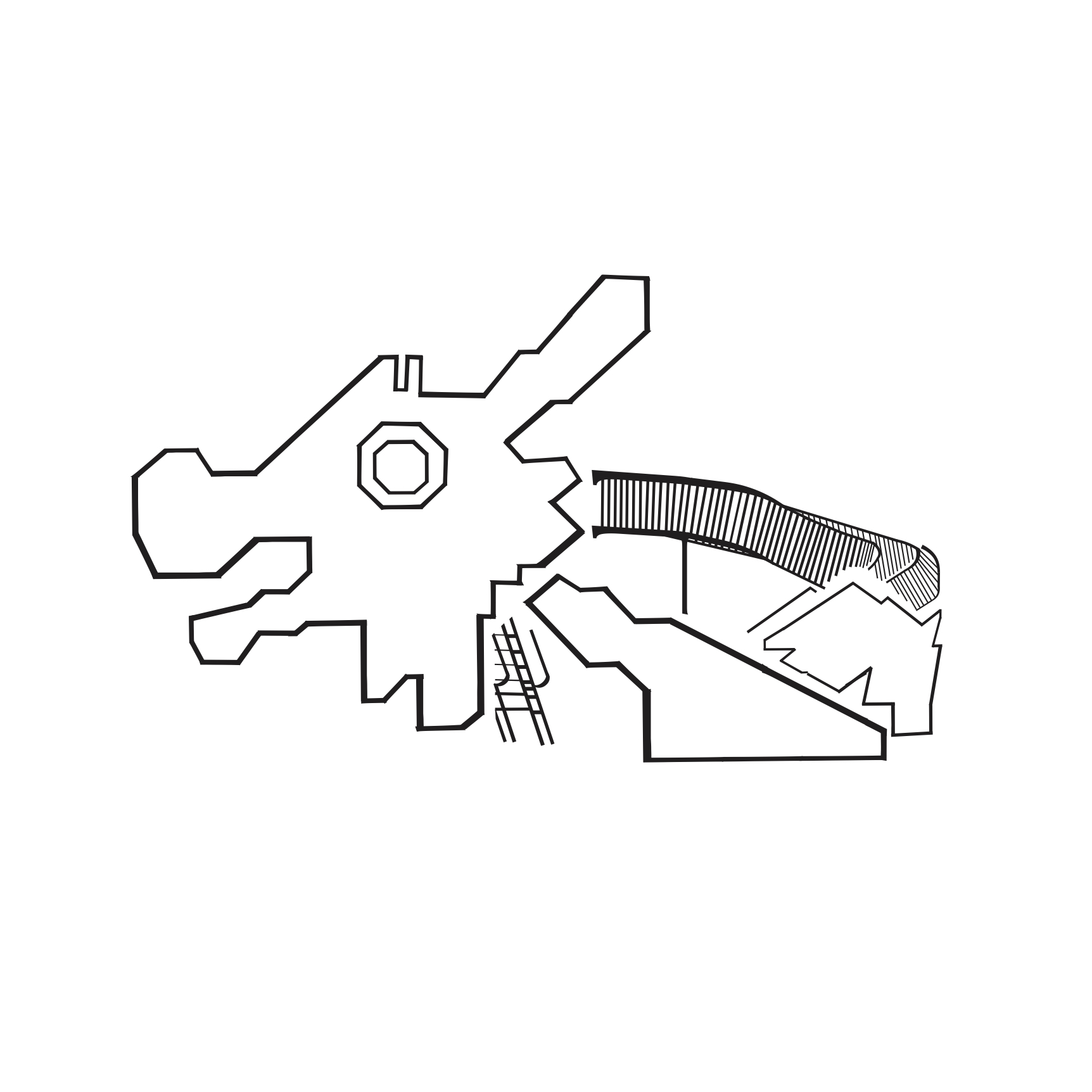
- Dragon Playground at Toa Payoh
Overall the project was really fun and the process of bits and pieces of the various letters from the typeface to form the composition was rather therapeutic, almost like putting together a puzzle I feel! For some unexplainable reason I love this theme so much that I’m already considering to expand on it for the next and final project for Typography! We shall see 🙂