Concept: An informative guide to bring out the best of Everton park, its quaint charm and how it boasts a mix of old and new businesses. The purpose of the guide is to entice people to come visit Everton Park, showing readers what they can check out there, do there and also some facts about the place so that they will have a better understanding of the place as well.

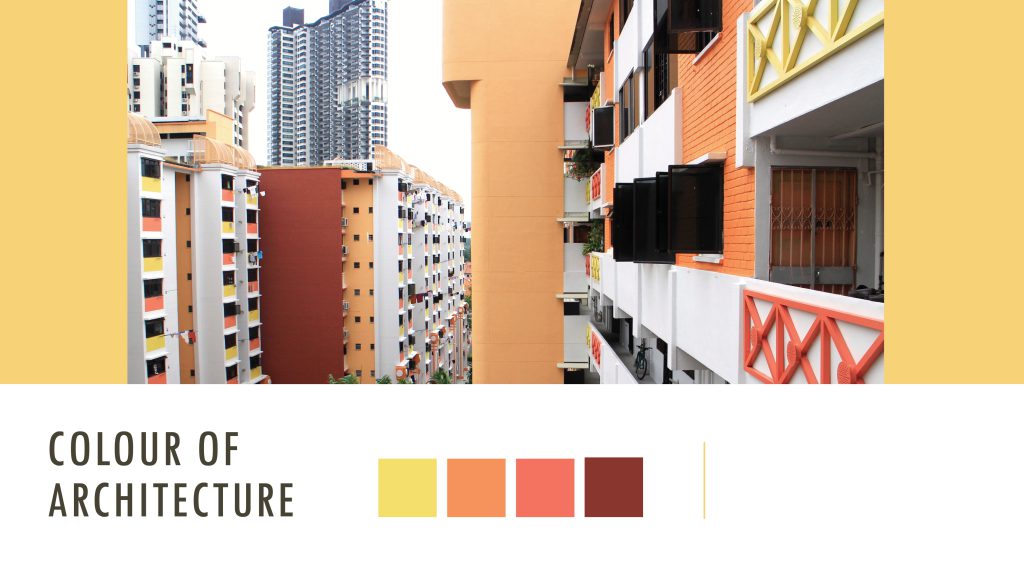
Art direction: Overall I took on a consistent pastel colour scheme for the zine and the original colours were inspired by the architecture colours of Everton Park. However, the original colours of the architecture seemed a little too bright and a bit of mismatch as a publication look thus I took to playing around with the intensity and colour harmonies and went for a more pastel and warm colour scheme eventually. (see image below)

Apart from the use of a consistent colour scheme throughout the zine, you will notice later on that I have also used speech bubbles on most of the pages and spreads for some of the headers and subheaders to bring out the personal touch even further.

Content – I felt that the mix of old and new businesses in this quaint neighbourhood, Everton Park was definitely one of it’s unique charm and I wanted to feature it in my zine so I brainstormed a little and listed down a few things that could be worth including in the zine prior:

  • Ji Xiang Ang Ku Kueh Confectionery
  • The various cafes
  • Unique stores
  • Anecdotes from the residents (for that personal touch)

Curation – I decided to go from broad to narrow after consults and finalising the content I wanted to have in the zine. As for imagery to complement the content, I decided to go for a mix of digital photographs to retain the textures of the food features and used illustrations for the rest.

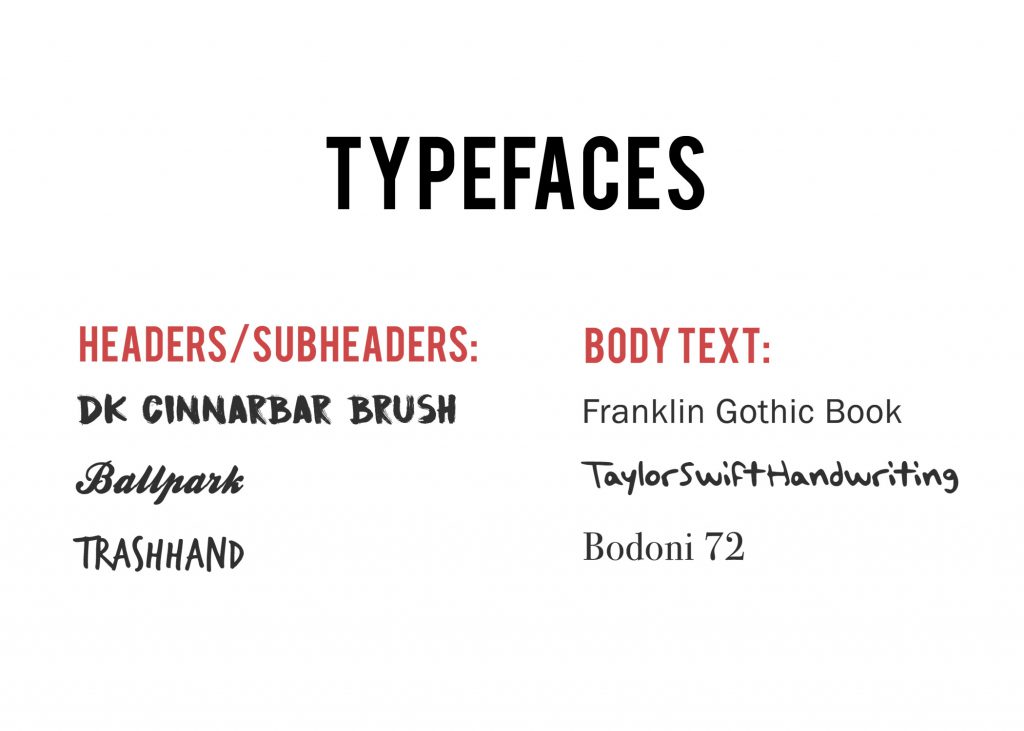
Typeface – For the typefaces used, I was going for those that were more nostalgic/handwritten to complement the warm colour scheme of the zine.
 

Inspiration (aka Moodboard)

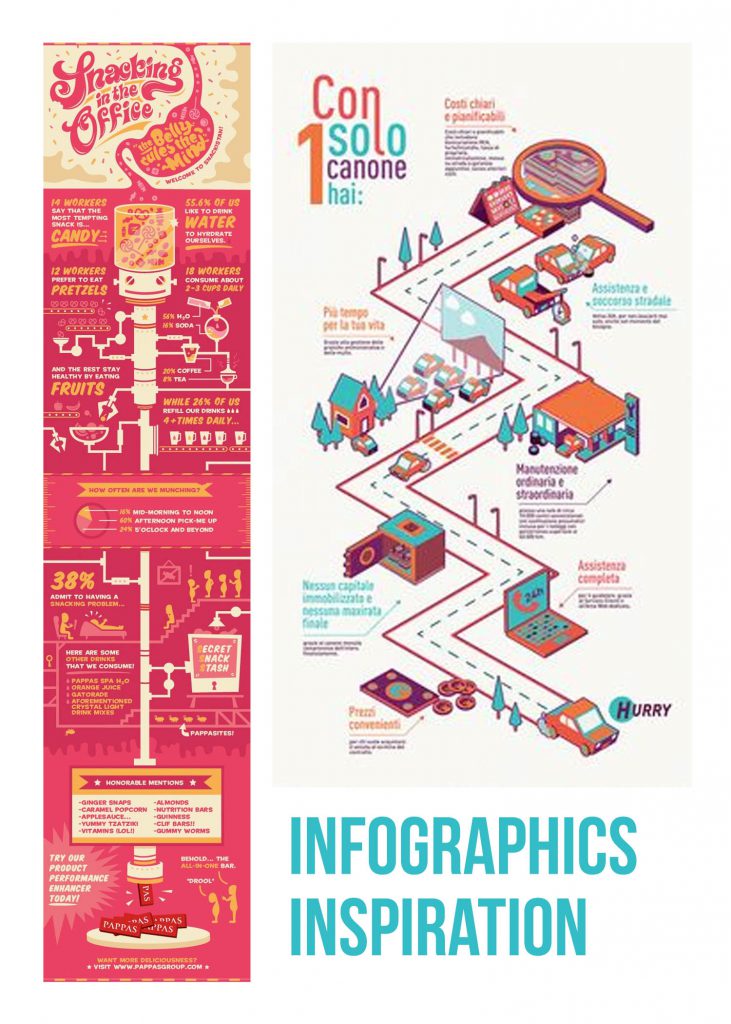
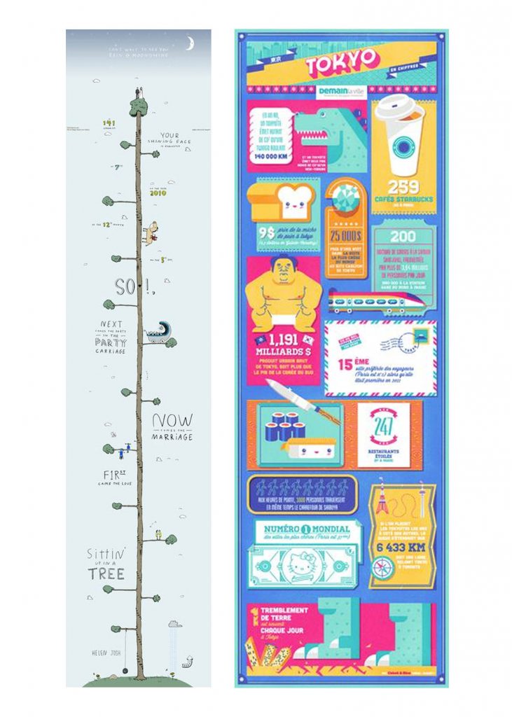
These were some of the inspirations i got from pinterest to help with the designing of my covers and design layout of the pages and spreads:

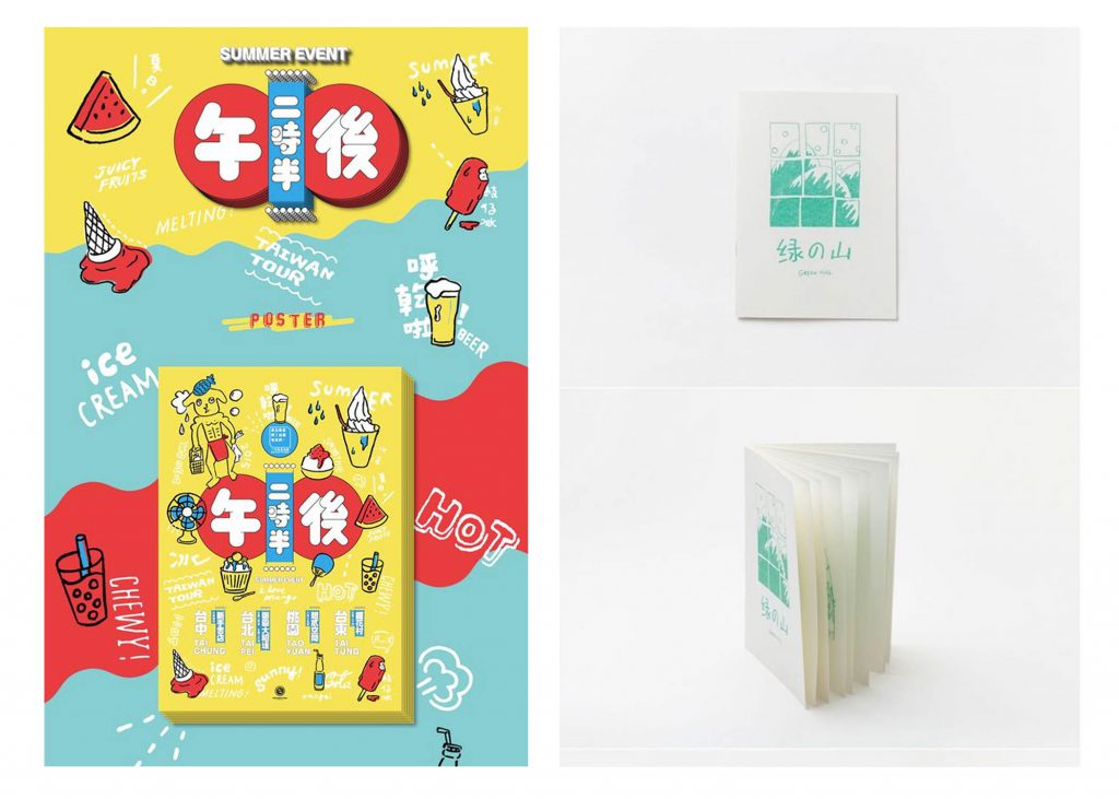
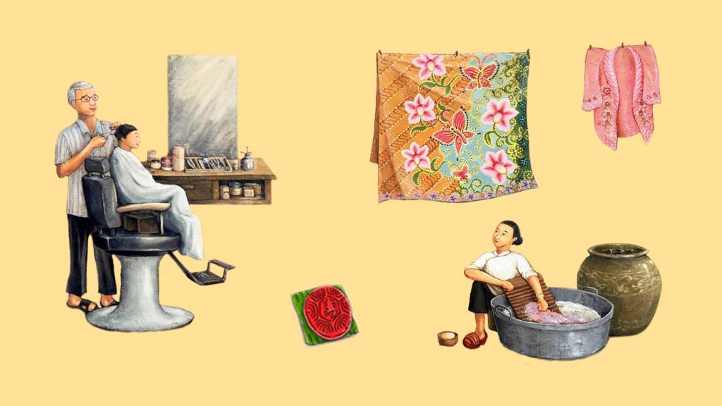
The above are some examples of illustration styles I wanted to try out in my zine and the image on the right was an early inspiration I had for the cover design – something simple and minimalistic. Riding on that idea, I came up with a cover design as seen later on in the next section.

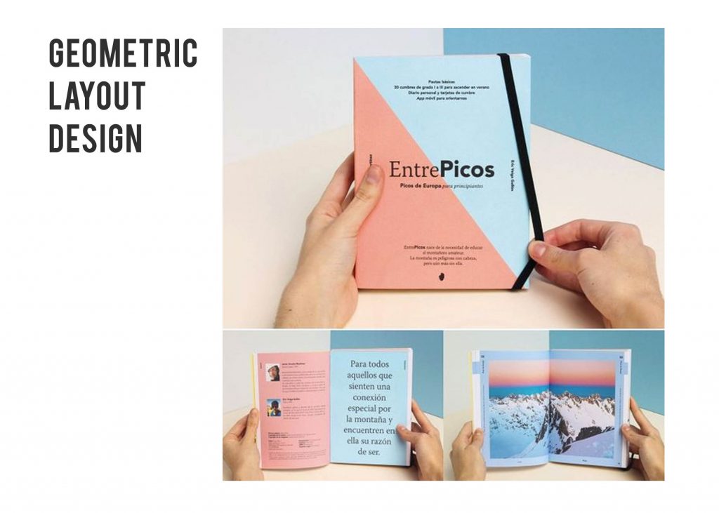
As for the above inspiration, it was for the layout design in particular the background. Since I was going for a illustrative look I felt that the background should be left simple and I happened to chance upon this inspiration – geometric looking borders and dual-colour background fills which you can see appearing in my zine later on.

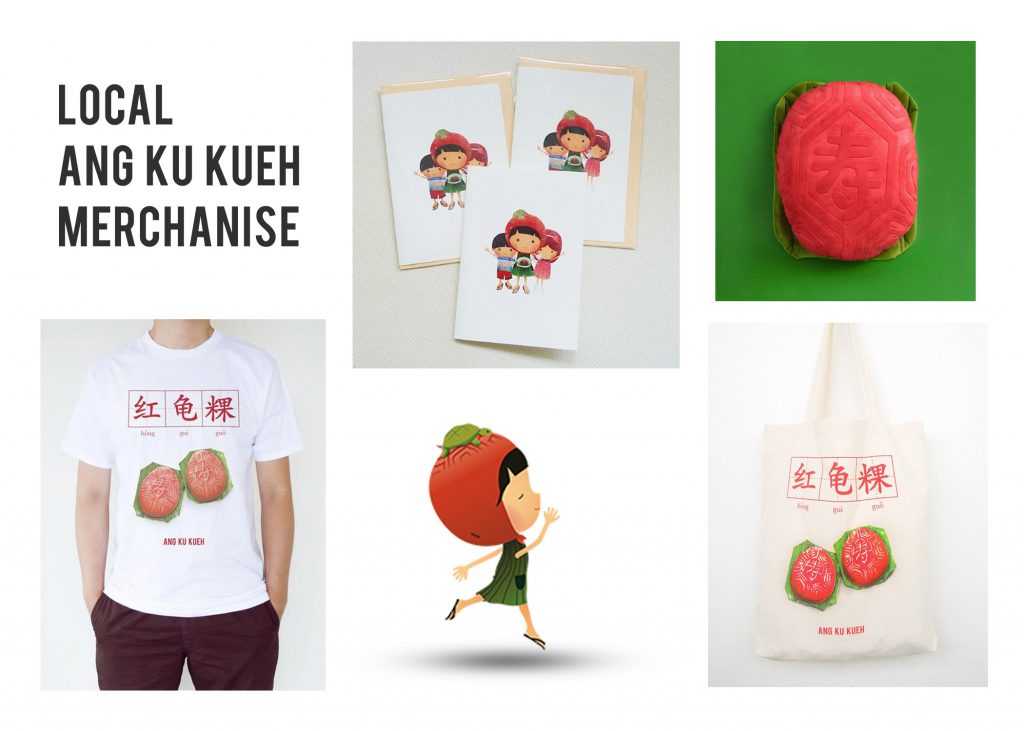
Some more inspirations for the colour and design. I initially wanted to go for a risograph feel you can see but after hearing how it costs a bomb, maybe not. But I really like the neon colours and the very comic/sketchy feel of it. Next section will be the digital look of my zine.


Flow of Zine (What each page/spread features)

  • The Front Cover (right) and Back Cover (left)
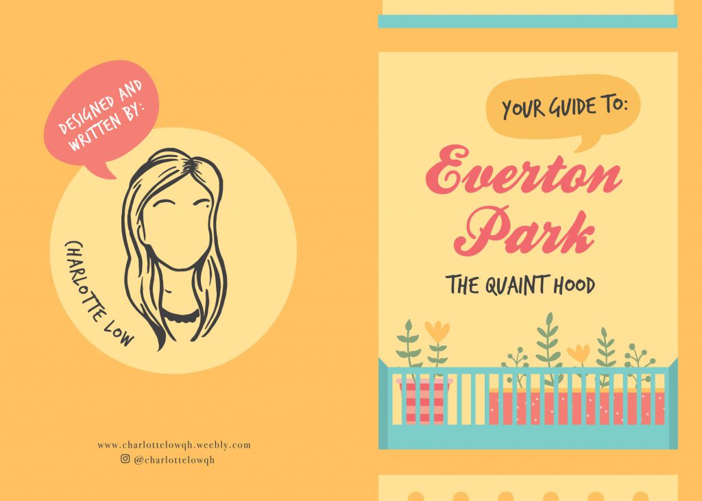
For the front and back cover design I initially intended to have it look like a cropped/framed view of one of the HDB block floor in the front with the hint of potted plants and all with the back cover a back view of the block like what you would see – the hanging of laundry, balcony etc. but eventually felt that by having such a design the architecture thing would be too overwhelming as you can tell that on the subsequent pages there’ll be hints of the HDB block again. Plus, doing up the details would’ve been too time consuming and having too many objects to look at takes away the main focus on the covers – the credits and title of the zine.

Thus I only kept the idea same for the front cover, suggesting more levels of the HDB block in the design instead of going with my original look which made the design look more like a frame/border surrounding the potted plants. As for the back cover, I decided to go with just a simple look, the credits: my social media handles and something like a logo design? (i’m not sure what that looks like but i’m very sure i’ve been excessively using that silhouette of mine since last semester’s final project for 2d; i think it’s becoming like an identity of sorts hahaha).

  • Now diving into the contents of the zine. When you flip the cover, the first 2 pages you see forms a spread layout with the contents presented as an infographic.

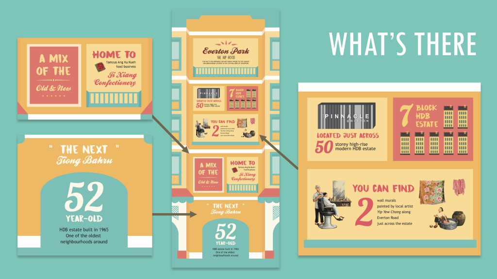
Going with the idea of having the content flow from broad to narrow, the first spread featured an overview of Everton Park, what the place has to offer in a quirky fun infographic form using phrases, quotes and numbers and making use of the box grids from the architecture silhouette of the HDB block. You would have probably realised that this is an expansion of my earlier infographic for Part 1 of this project (visit the link at the bottom of the post to read more). In addition There’s also a small part which provides readers with directions on how to get to the place by MRT and what they should look out for in order to find the place after.

  • The next spread. Instead of having a second spread, I decided to make them as pages. Continuing the flow of content, from an overview I started narrowing down firstly to a brief history of Everton Park for the page on the left and Ang Ku Kueh for the page on the right.

For the left page, I felt it would be pretty nice to start off with a brief history of Everton Park as with all other publications or anything whenever there’s a subject involved, there would be background information about it in the beginning. As the year it was established and how old the HDB estate was was pretty much all the historical information I could gather online about the place, I decided to pair it up with some anecdotes from the residents who have lived there, store owners and those who are living there to make it more personal and a little nostalgic. One of the interviewees I managed to get an anecdote from was Mr Yip Yew Chong, the local artist whom I have constantly mentioned throughout my past few posts because of the 2 wall murals he has painted just round Everton Park – They look super gorgeous!!

Whereas for the right page, I decided to do a feature solely on Ang Ku Kueh. Why Ang Ku Kueh you may ask, it is because of an observation I gathered. I realised when mentioning Everton Park to others, first thing they would mention about the place would be that it is home to the famous Ang Ku Kueh confectionery, Ji Xiang Confectionery that has been around for close to 30 years to date (since 1988). And rather than having a full boring page of information just dedicated to the store like an interview feature of quotes by the store owners, reviews and what flavours they have to offer etc. I thought it would be more fun to have it as a thematic feature page with Ang Ku Kueh as the theme. So I started with a brief description of the confectionery followed by fun facts and Ang Ku Kueh related content after. How I came up with the fun fact idea was from online research I chanced upon on Ang Ku Kueh. Turns out the Ang Ku Kuehs that you receive at a baby’s full month comes in different shapes and it is determined by the newborn’s gender! For baby boys, the Ang Ku Kuehs you get are in a simple pointed shape whereas for the baby girls, the couple will give out the normal round ones with the intricate mould design that you will usually see when you buy the confectionery. Thought it would be an interesting fun fact to know! I personally was fascinated by it! For the remaining space, I featured some Ang Ku Kueh themed merchandises like keychains, totes, plushies from local designers and their brands like Ang Ku Kueh Girl, wheniwasfour etc.

  • The final spread and the last content for the whole zine features 5 cafes to check out at Everton Park. As simple as it looks, it is really just a quick food guide to follow up on the previous page’s theme of food.
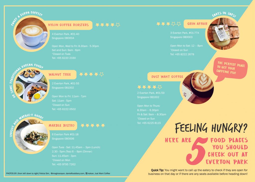
Curation of the content on this page wise is really just the address of the place, its opening hours, and ratings shown through the commonly used stars symbol. I had intended to add descriptions of what each cafe has to offer but to prevent the page from looking too wordy and making the information hard to digest, I settled for simple and short phrases to describe the food place and it surrounds the circle-cropped image for each cafe. As to how I decided on these 5 cafes to feature: Uniqueness (e.g. different country’s cuisine how they prepare their food) and of course, the ratings! This definitely required some researching… and ah, spot the speech bubble that I mentioned early on under art direction too!

Change(s) in idea/execution 

Actually there weren’t much changes in ideas and execution along the way. Overall it was more of change in the order of content (going for a old to new/broad to specific), which content goes onto which page and also playing around with the design layout.

If there were any major changes it would be for this page as during group consults, most of my classmates and Joy brought up the issue of not knowing where to look (the visual hierarchy was missing). The “Did You Know” seemed like the header for both the fun-fact and the “Ang Ku Kueh Companion” bit.  Eventually I went ahead with a classmates’ suggestion of colour blocking since I had this consistent geometric background thing going on as my background and it worked! Thanks Yi Ling 🙂

Challenges

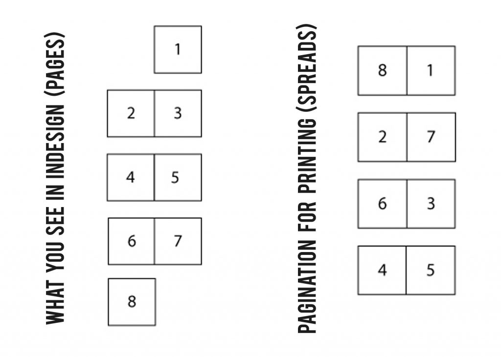
One of the challenges faced was definitely printing the zine. Having printed a publication before in polytechnic, I thought printing wouldn’t be a problem at all.  As mentioned during the inDesign workshop, some printing shops are able to help you settle printing just by saving in pages but some you had to save in spreads and with spreads came proper visualisation of the pagination like which page match would match with which.

A visual aid for better visualisation – Basically what you see in inDesign vs the layout you’re supposed to have when you export as spreads to achieve the correct pagination:

A HUGE HUGE PITY: Firstly, I think I’ve wasted quite a bit of money as I couldn’t get the printing right in terms of alignment (the bulk of it) and pagination (initially) and because of these continuous errors, I eventually got so focused on getting them right that I overlooked if all my content was printed out properly. Only till presentation day and after the silent round-table peer critique did I realise that an image on my first spread got cut off after reading my classmates comments AHHH. Internal panic but I guess I had to acknowledge that, if not the zine would’ve been perfect. The printing shop was super nice to actually help manually align the pages for me so that when printing on double sides, the alignment wouldn’t be off. Lesson learnt!

Enjoyable moments, etc.

Pretty sure that majority would’ve found this particular part of the zine project rather dreadful but as much as inDesign was a “pain” I believe to many, I really enjoyed the process! And especially when you print the zine, that feeling when you see your own fruit of labour… :”) Personally I really enjoy designing, editorial design so this project felt like my way to destress except since we were given a tight deadline it felt rather pressing at times when you get art blocks.

All in all, I really enjoyed 2d so much, those sweet post-it messages of feedback my classmates for every critique session, and being under Joy for the past 2 semesters have been so fruitful. I’ve learnt so much. Thank you Joy for being so encouraging and nice!!

I’m bummed, my utmost favourite foundation module is officially over 🙁

And finally, here you go! The links to Part 1 my of Zine: Neighbourhood Explorer (Infographic): 
Research: https://oss.adm.ntu.edu.sg/char0066/neighbourhood-explorer-zine-research/
Final: https://oss.adm.ntu.edu.sg/char0066/neighbourhood-explorer-infographic/
Timeline was a little tight for this one. One site visit, following week was group consultation and the week after (last Thursday was presentation day)! But on the bright side, Part 1 of the zine project is down so yay! Here’s the infographic that I came up with based on my assigned neighbourhood area, Outram and more to the ideation process shared below.

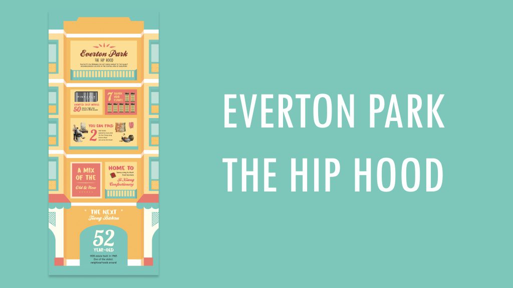
INFOGRAPHIC: EVERTON PARK, THE HIP HOOD


How the infographic came about was by translating some of the sightings I’ve spotted during my site visit there into numerical fun facts and also phrases/quotes about the place found through qualitative research and research done online from credible sources. With the intention of making the infographic, simple, straightforward and easy to digest for viewers. Basically it’s an infographic of things unique to Everton Park.

Target audience wise, as mentioned in the previous post I guess it could be for anyone. If it was chanced upon by tourists and fellow Singaporeans who have yet to explore the neighbourhood I hope that it could provide them with a general overview of what the neighbourhood has to offer and at the same time entice them to come visit and explore the place

And as to why I named it Everton Park – The Hip Hood, it’s because the quaint neighbourhood has been called “The Next Tiong Bahru” in news articles because of the cafes around and its quaint charm.


SIGHTINGS AROUND EVERTON PARK

So as shared in the previous post about the buildings and shops spotted, the facts discovered during my site visit, these were the ones that really stood out to me; those I found unique to Everton Park. And thus I decided to feature them in my infographic.

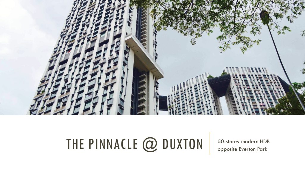
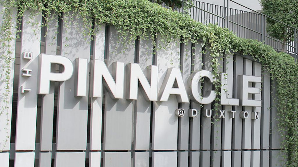
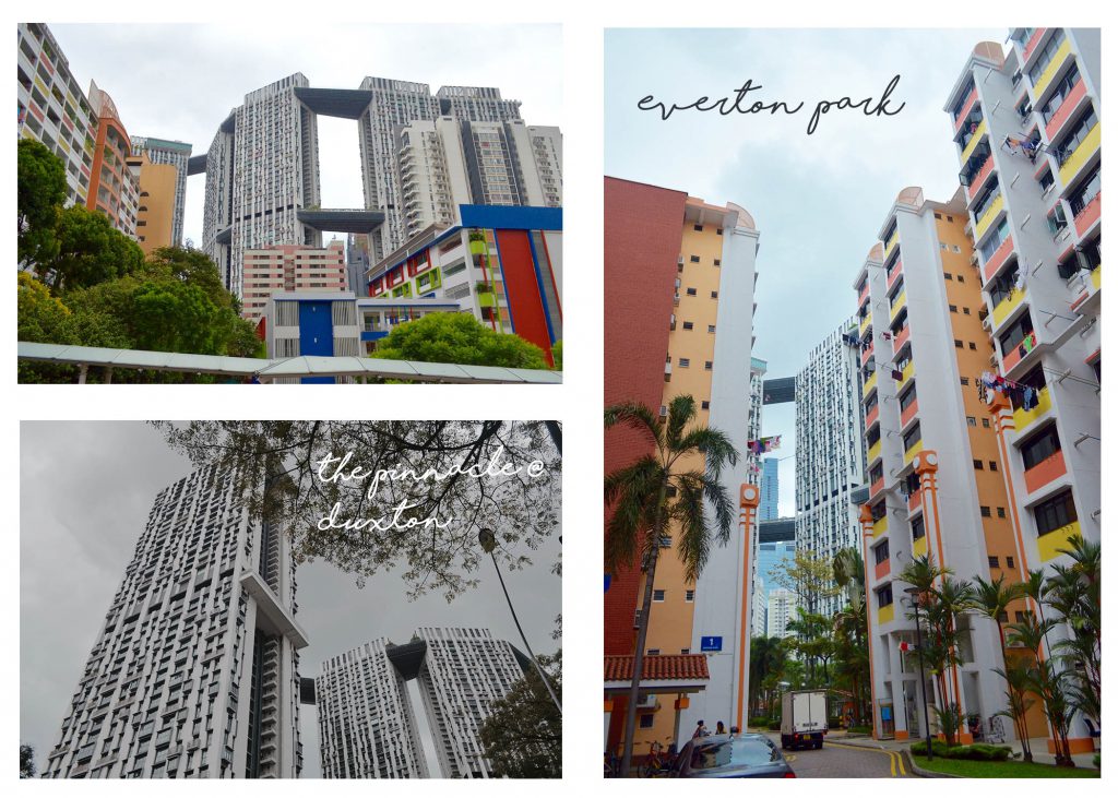
First up, The Pinnacle @ Duxton that’s located just directly across the road from Everton Park HDB estate. As to why I chose it as a place and fact to feature, it’s because of how the presence of the HDB estate feels like a contrast to Everton Park as the latter is an old estate while The Pinnacle is a modern one.

Next would be Ji Xiang Confectionery, the famous traditional handmade Ang Ku Kueh stall of close to 30 years. Funnily, if you mention Everton Park to the adults, first response you’ll get to the place is “Oh, that place that sells the famous Ang Ku Kueh right?” To me, this confectionery store feels like an icon of Everton Park therefore the feature.

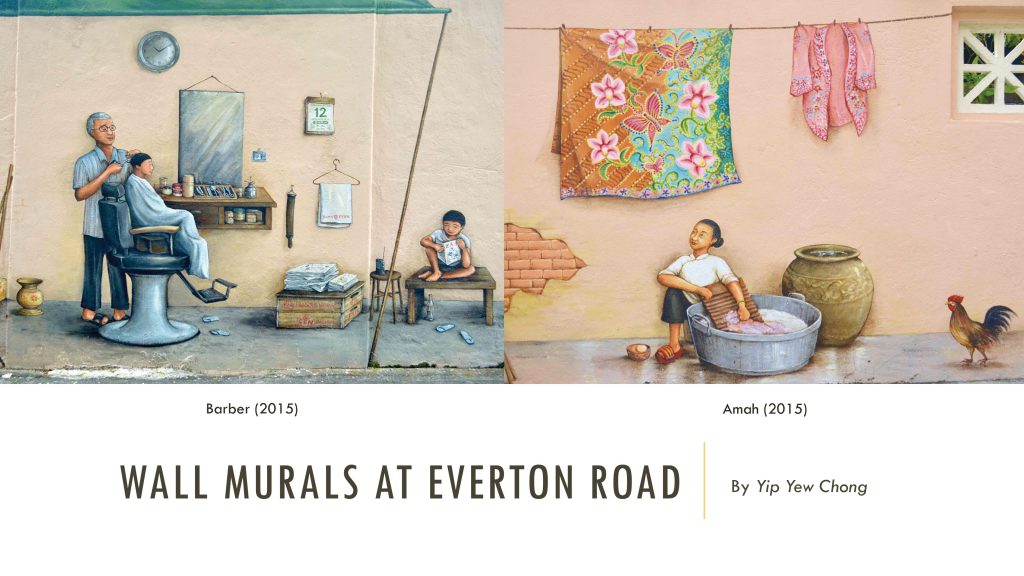
The next thing that sighting that caught my attention would be the 2 wall murals found on the other side of the Everton Park HDB estate across the road (Everton Road) on the walls along the alley and walkway of the private housing apartments. Particularly because there is 2 and also how the murals evoke a sense of nostalgia too as shared by the artist through a sharing session I got to attend about 2 weeks back. They were painted based on his experiences as a child growing up and fun fact, he used to stay around Everton when he was younger for about 20 years!

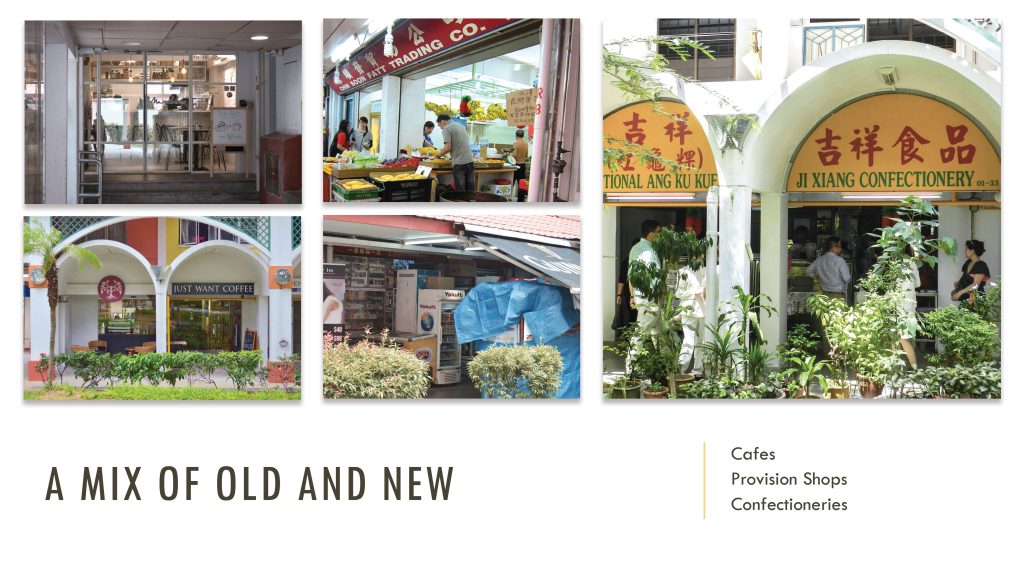
What stood out for me most about the neighbourhood was how the place had a nice mix of old and new businesses around, the most unique. As shared, shops are lining the perimeters just below each block and it can be a old business and then a hip cafe located just side by side. Some were even hidden from sight close to the lift lobbies and letterboxes. These were some of the things I featured in the infographic put together.

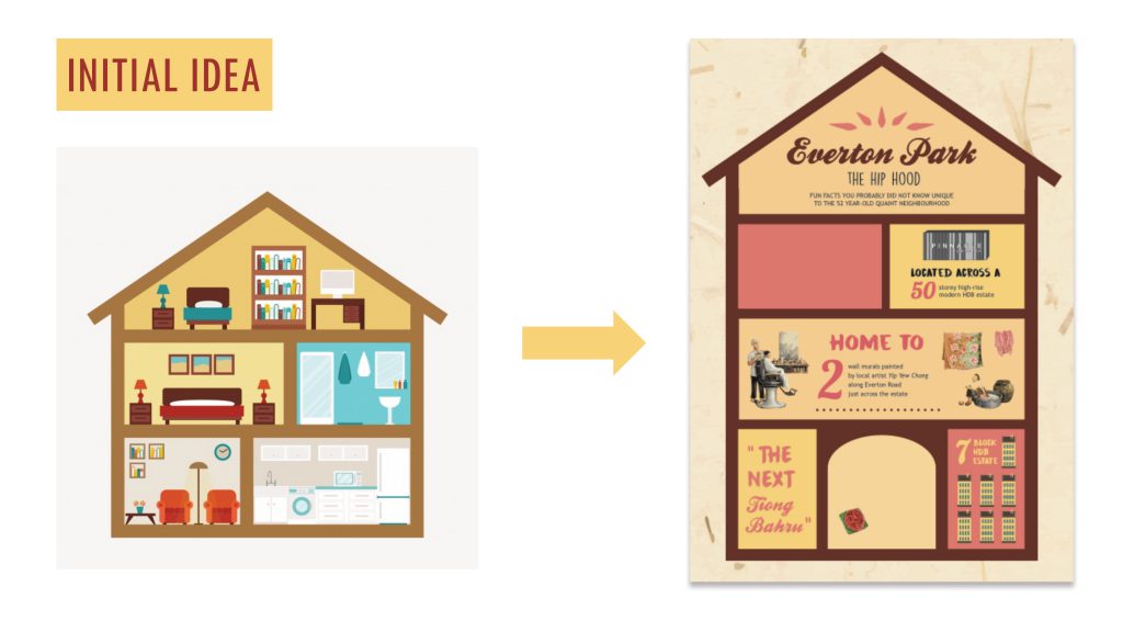
For my initial idea, I got inspiration from a vector image I found online while searching for building illustrations to use for the infographic. I chanced upon this layout of the interior of a house apartment with different levels and thought it’ll work great as boxes for the various information to include for the infographic and at the same time making the whole infographic resemble a HDB flat since my focus was on the Everton Park HDB estate.

The above image on the left was the vector I chanced upon and on the right, the initial design I came up with for the infographic to share during consultation. Feedback received from Joy and my peers was that the roof-like architecture as layout did not suit the architecture appearance of Everton Park. Instead, they suggested that I could incorporate some iconic architecture elements of the estate into the house layout of the infographic which would be explained further later on.

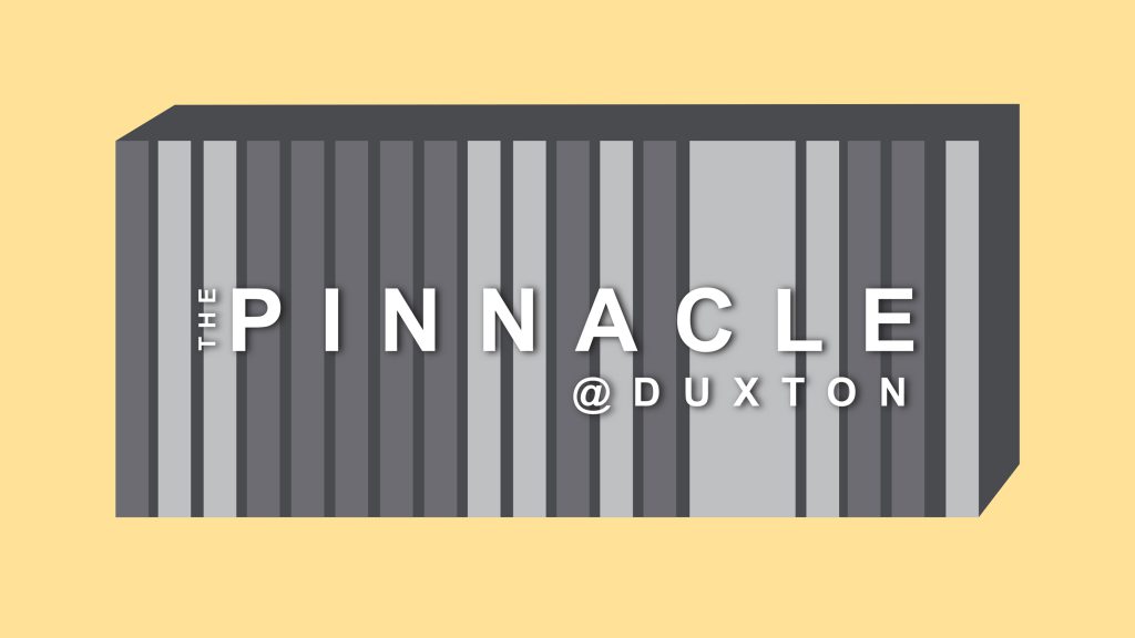
Below are some of the vectors I’ve created or traced out and vectorised to include as visuals for my infographic. How the vector illustration of The Pinnacle @ Duxton came about was interesting. I had intended to trace out the whole building, adding the details and all but realised that the box I allocated for the infographic fact didn’t allow the space and the building would’ve looked way to complicated. Also since it would be tiny, the details would’ve have gone to waste. Thus I settled for the HDB estate name sign located at the side facing the traffic junction.

The vector illustration for The Pinnacle @ Duxton

As for the 2 wall murals I traced out murals from the photos I took on site, image traced them on illustrator to give it a finished vector illustration look. What could’ve been done better based on feedback received after the presentation/critique session we had for our infographics last week was that these two had a stark contrast in comparison to the rest of the vectors/illustrations in the infographic. Suggestion was to perhaps add a vector wall as the background as these two vectorised mural had a lot of detail and depth to them, it being adapted from its original image.


REFERENCES AND INSPIRATION

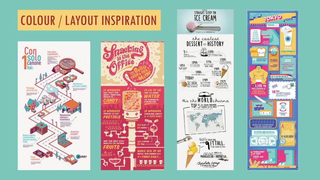
As for the references and inspiration I had for my infographic, below were those I eventually got inspired by (in my previous post I actually shared a few but these were the ones I eventually took reference from). The ice-cream one in particular, for its typefaces and arrangement of text. The rest were more of inspiration for layouts and colour palettes to use for the infographic. Ultimately I was going for a vertical looking kind of infographic.

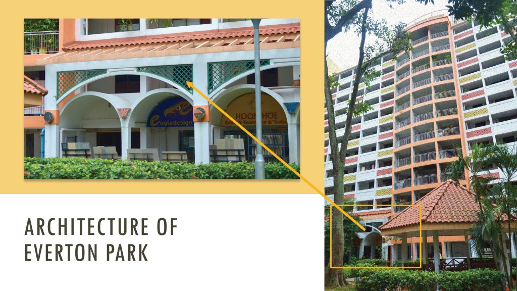
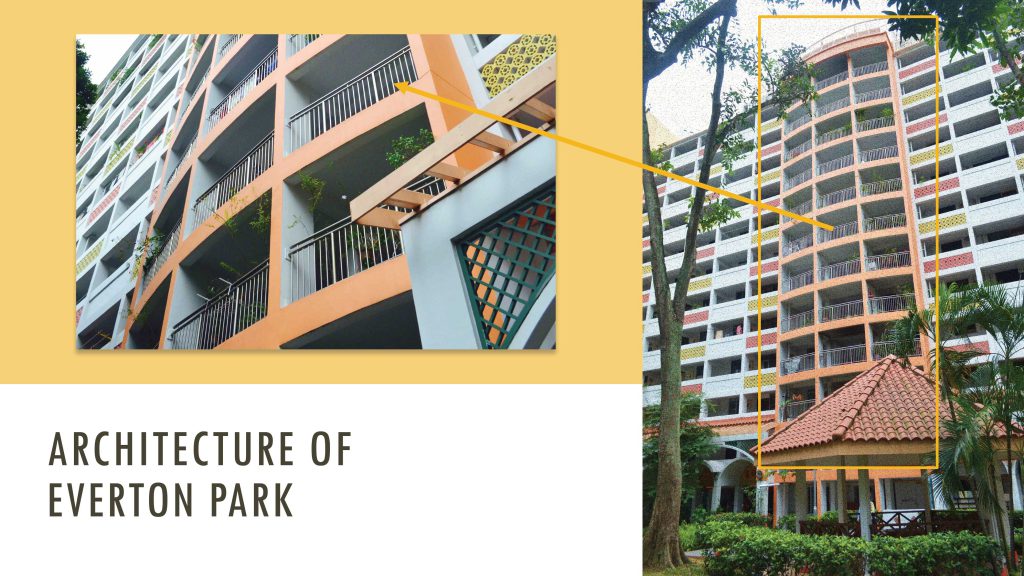
And as mentioned earlier, taking Joy’s and my peers’ suggestion of looking into incorporating the unique architecture look of Everton Park into the infographic I went to examine the architectural details of the place and added railings, chinese-looking patterns to the landings etc. of some of the floors to make it resemble a flat at Everton Park more. Below are images of the architecture details of the place that I analysed and incorporated into my infographic.

As for the colour palette I thought, why not make the infographic even more “Everton Park-like” so I picked out the colour scheme of the HDB estate as seen below.

That was the initial colour scheme I went ahead with especially with the first design but after much contemplation and shifting around of layouts and all, I realised that the original intended colour scheme might not really go well with the layout. Thus I went to play around with the shades and hues of the colour scheme, toning down some and also adding some new colours applying colour harmonies such as complementary and analogous to make the infographic stand out and look more aesthetically/visually pleasing.

The comparison below: Initial & Final. It turned out rather pastel looking which I was rather happy with as it was almost similar to the colours I was inspired by by the infographics found on Pinterest.

Left: Initial colour scheme | Right: Final colour scheme


CHALLENGES FACED & OVERALL THOUGHTS

Initially, I was unsure of what to make my infographic about or how I wanted it to look like. I did consider making it very statistical based as with all the typical infographics – numbers and more numbers but realised that Everton Park itself, you couldn’t really get hold of accurate numbers. Searched online, there weren’t any websites that provided the numbers either. I could’ve gone to town council for the figures but in the end I guessed it would’ve been too much of a trouble, I think it’ll take forever to get the stats I want since we don’t have the authority and wouldn’t be of priority. Also there would be too many “levels” to clear too, too much email corresponding. The content in the infographic would’ve turned out rather boring for my intended target audience.

I think things turned out for the better though, seeing to how my infographic turned out. I’m pleased with the outcome :).

This project has been going well so far, the first part being this infographic we had to put together. As draining as it was creating the infographic, I really enjoyed the process. I really missed the digital side of creating back during poly days, good to back on Illustrator. I especially can’t wait to put together the final zine for Part 2 of the project, have been loving the publication/editorial side of things of late. Till then!


Update: Here’s the link to Part 2 of the project – The Final Product aka the zine
https://oss.adm.ntu.edu.sg/char0066/neighbourhood-explorer-zine-final/

On to the next and final project for 2D II which is probably the most intense too. Each student is assigned a neighbourhood and my assigned area was Outram. Before heading down to the place for a visit, I searched online for possible places around Outram I could explore (so as to save time) and had an individual consultation with Joy prior to my site visit.

It’s probably because these sites were often seen on Instagram feeds for being rather ‘insta-worthy’ that made me notice them more and wanted to explore/delve deeper into since they would be more recognisable in a way. Each site had their own unique rich history and heritage which I found interesting and had potential to be featured in the zine. However, I figured focusing on just one site/neighbourhood would be better since the zine would only be 8 pages thick.

The more known areas/iconic buildings around Outram that caught my attention were:

1. Keong Saik Road

This place once used to be a famous red-light district back in the 60s but is now transformed into a popular hip and cool enclave lined with food outlets ranging from restaurants to cafes and bars and it’s a rather happening place at night.

16649269_1732563773720632_8017385927518994262_n

Also there’s this group of people, Lopelab that looks into creating events that allows for human and space interaction. The most known event being the road closure at Keong Saik Road project – Urban Ventures where the street is transformed into a platform for arts, culture and people to gather to enjoy free music performances, art and more. The first event was successful and another just happened last evening, how cool!

2. Pearl’s Hill City Park

pearlbankapt

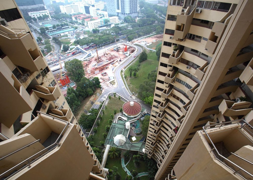
Where the famous iconic Pearl Bank Apartments were located. It’s one of Singapore’s pioneers of high-rise buildings and one of the tallest and densest to date. The architecture of this building is an interesting one but not ideal for those who have vertigo cause of how the building’s extremely vertically structured and tall. It was built in 1976 as part of the Government’s attempt to push for condominiums catering to the middle and upper-middle classes back then.

3. Everton Park

evertonpark

After weighing my options, I’m was kind of settled for featuring this place for my zine, having it as the sole subject particularly because of it’s quiet charm and the chance to explore the idea of New & Old with a tinge of nostalgia. More to be explained about this neighbourhood below.


QUICK HISTORY/BACKGROUND OF MY CHOSEN NEIGHBOURHOOD:
EVERTON PARK

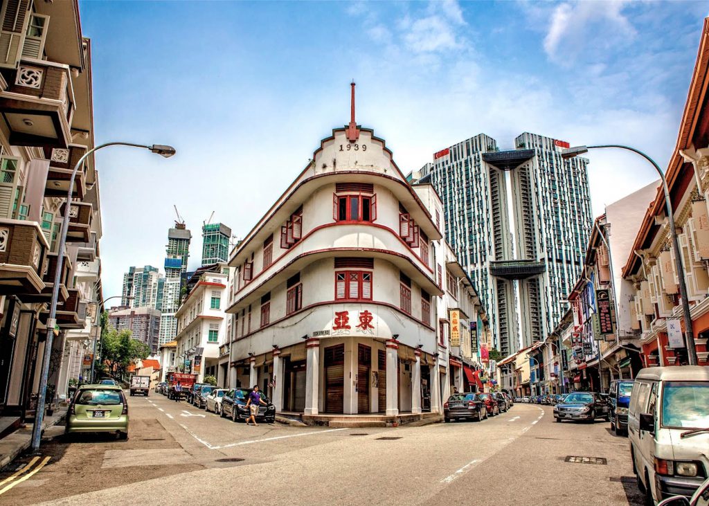
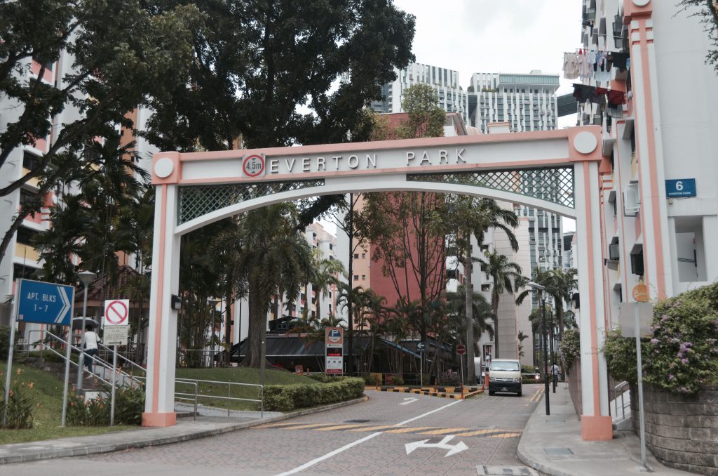
It’s a quaint 50-year-old HDB estate that’s one of Singapore’s earliest neighbourhoods around. It’s also walking distance from the nearest MRT station (Outram Park) and the estate is located directly opposite The Pinnacle at Duxton just across the road. Despite being one of Singapore’s earliest neighbourhoods, it’s slowly becoming a rising hipster enclave and present among the estate are several new and old generation business owners.

So I headed down to location after consult on Thursday afternoon (no time to lose! this first oss post is due on Sunday!) and the research I’ve got so far are mostly secondary research from online together with a little bit of primary research having had the chance to talk to several business owners there that day. However most bosses of the shops/cafes I found interesting and wanted to approach weren’t around that day so I’m planning to go down some other day this week.

And yes, interviewing residents too are on my list. Coincidentally I have a distant relative who lives there and has been living there for many years already. My family and I would come by here every year for Chinese New Year visitations. So that’s great, I’ve got one more interviewee. 🙂

Here were some of my findings from my visit to the neighbourhood on Thursday:

comparison

I find it interesting how there was a contrast of a modern 50-storey high-rise building and an 50 year-old HDB estate located just opposite each other across the road. Managed to capture a few shots of how they are located so near each other with both buildings in frame. I loved the contrast and had the sudden thought of including this in my infographic as a quirky fact since both have the numbers ’50’ in them haha…

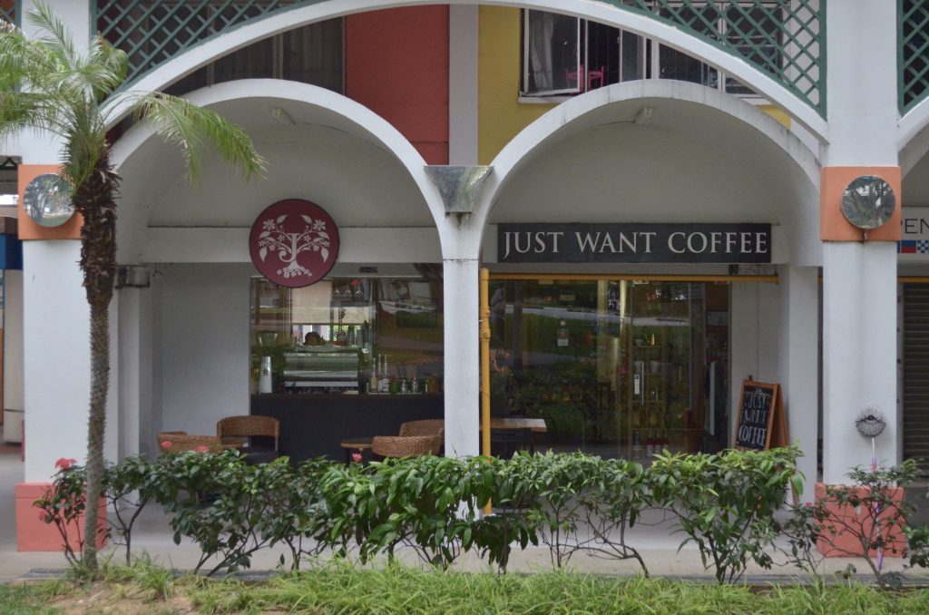
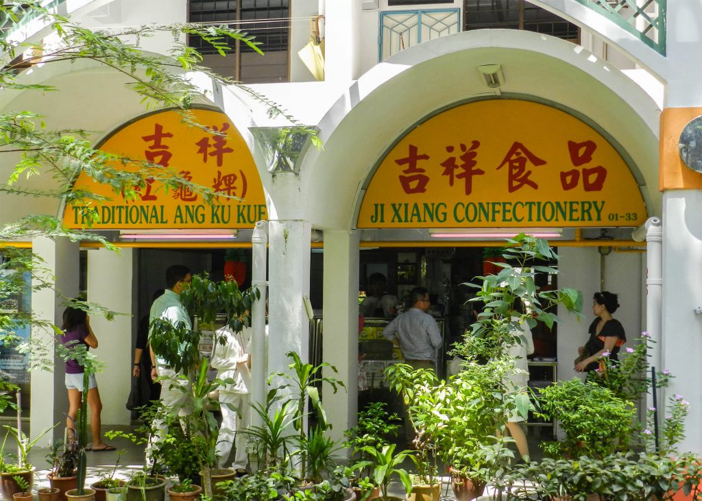
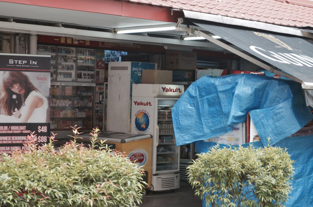
As I explored the perimeters of the small cosy 7 block HDB estate, I noticed how just below each block there would be a line of various cafes and other businesses and some of the businesses that are located beside each other were like new (a cafe) vs. old (a provision shop etc.) Below was one such example, the first block I went to. Located almost just beside each other is a cafe and a confectionery shop that has been selling traditional Ang Ku Kueh here for many years already. It was an interesting sight!

dsc_0037


The staff at the confectionery shop selling traditional Ang Ku Kueh were real friendly and nice. They were open to me taking pictures and invited me in to take pictures of them making the kueh too. Unfortunately they were done with production for that day and they were really apologetic about it as they told me to come on another day instead. When asked if I could interview the store owner, they told me that I could search up their website and contact this person who’s the son of the store owner as he would be able to help me more with the questions and all. How nice of them!

dsc_0042

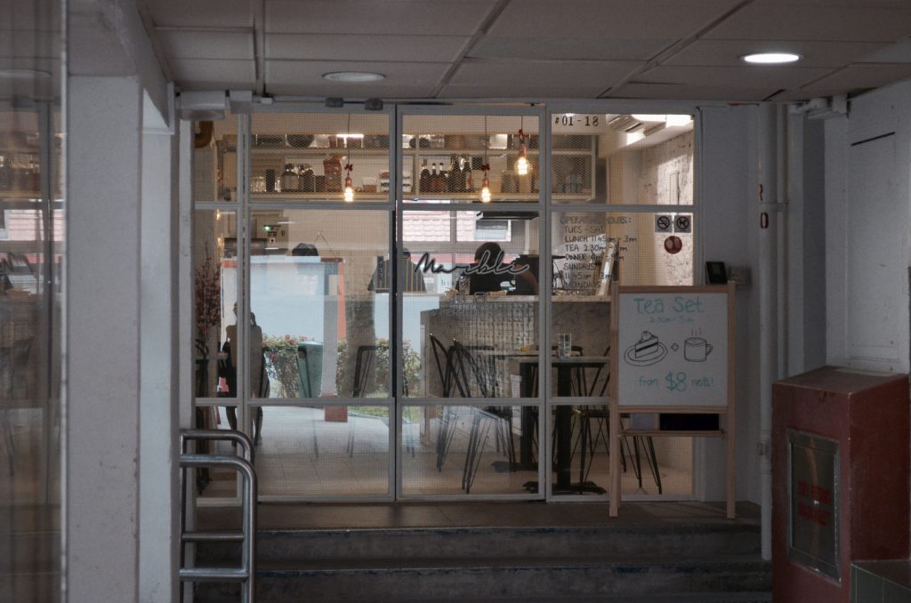
Marble Bistro at Block 6

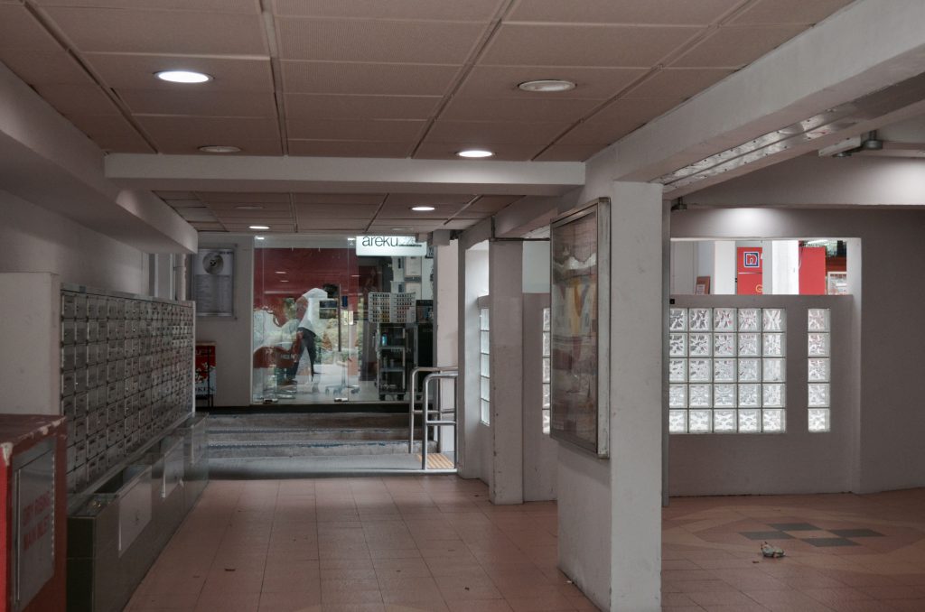
Walking deeper into the estate, I spotted more cafes and businesses. This time round the locations were interesting – They were rather hidden, located just beside the lift lobbies and letter box area of the blocks but still drew business. I would think that most of their customers were old patrons or residents living there. (see above and below images) I’ll probably try to get an interview with one of these stores!

dsc_0035

Exploring further, I finally managed to speak to several shop owners. One of which was the store owner of this fruit store as seen in the image below. Looking at the facade of the store, I thought there’s a chance that it might have been around for quite sometime already thus I approached the store. I was wrong, the store owner told me that they weren’t as old as some of the businesses around. They only started business here about 4 years ago after seeing a newspaper listing that the place was up for rental.

Oh based on research done, I learnt that store rental here at Everton was considerably cheap hence the reason for most choosing to open their business here unless they had personal reasons like they used to live here.

I was then kindly referred by the fruit store owner to perhaps try the minimart next door as it had been around for rather long. I managed to strike up a conversation with the uncle, Mr Yap from the store (the store owner wasn’t around that day but he was kind enough to answer my questions in between serving customers) and found out that it has been around for 10 over years, not exactly considerably long. To my surprise, he lives in the area and has been working for this business till now.

He mentioned that business was competitive as there were about 4 provision shops around in the neighbourhood. He went on to share his thoughts about the area place he lives here, saying how it’s moving along with the times with more cafes popping up over the years. He also voiced his opinion on how the area might eventually end up being claimed and have to make way for redevelopment plans just like what’s happening with the other old estates in Singapore – Rochor Centre and Dakota Crescent.
But personally, I feel that it won’t be anytime soon for Everton Park especially now when people are coming by on weekends for the cafes and when it’s known to be “the next Tiong Bahru”.

dsc_0067

Everton Minimart at Block 7

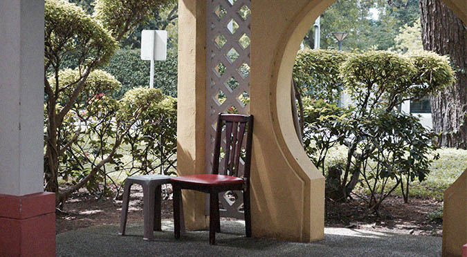
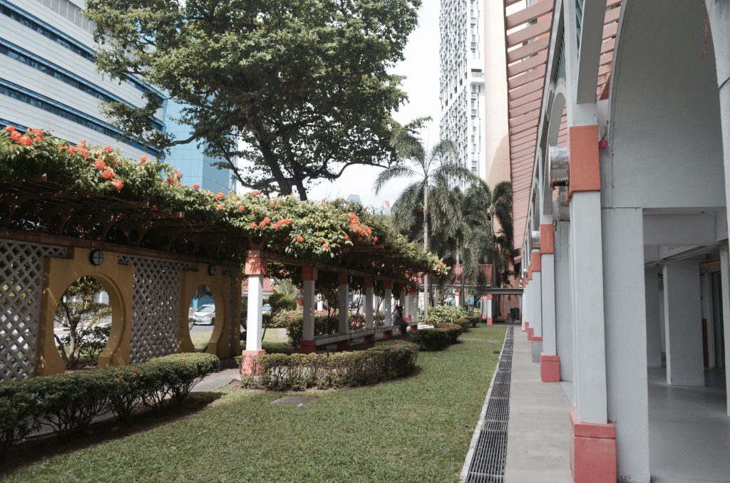
What I particularly love about this neighbourhood was it’s quaint, quiet charm. Not many sightings of people around but it gives off a really warm feeling. Maybe it’s because of how closely placed everything is – the businesses, apartments and all; the architecture of the neighbourhood. I felt it especially when walking through this walkway pictured below.

dsc_0142

dsc_0144

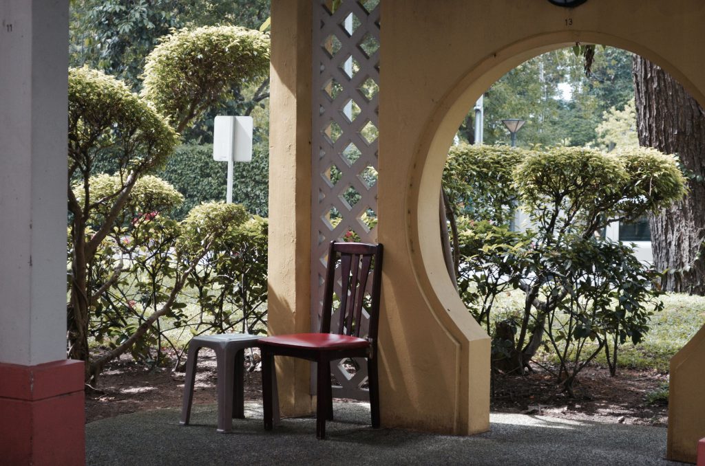
While exploring, I noticed an old uncle walking to and fro the above shown walkway settling down at one spot of the stretch of marbled bench and shortly after he stood up and shifted to another spot. He even shifted over to this area with chairs (see image above). It gave me the impression that he was a resident there but when I approached to strike up a conversation after a little hesitation I found out that he was just here for exercise. And being an old folk I thought he would know this area well but apparently he only came by twice, wrong judgement… but it was nice striking up conversations with friendly old folks. I remembered he asked what I was doing here too.

walnut

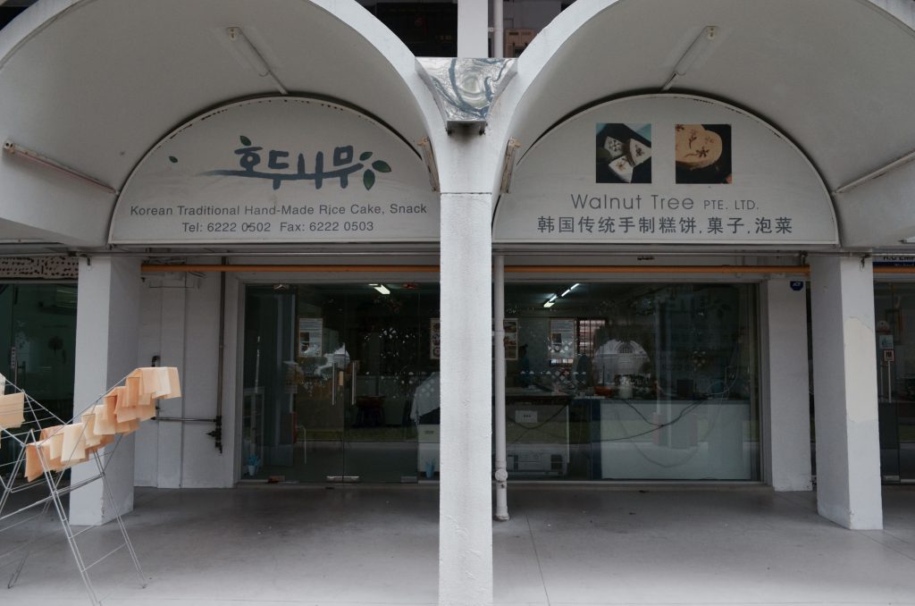
Came by this Korean confectionery that sold traditional hand-made Korean rice cakes and snacks after researching online. I particularly wanted to interview the owner of this business as it was an interesting sighting – A Korean business among a neighbourhood that’s highly populated with residents who belong to the older generation. I would think once again that it’s because of the rent but I may be wrong! Unfortunately I was told that the lady boss of the store wasn’t around too so I’m coming back another day I guess!

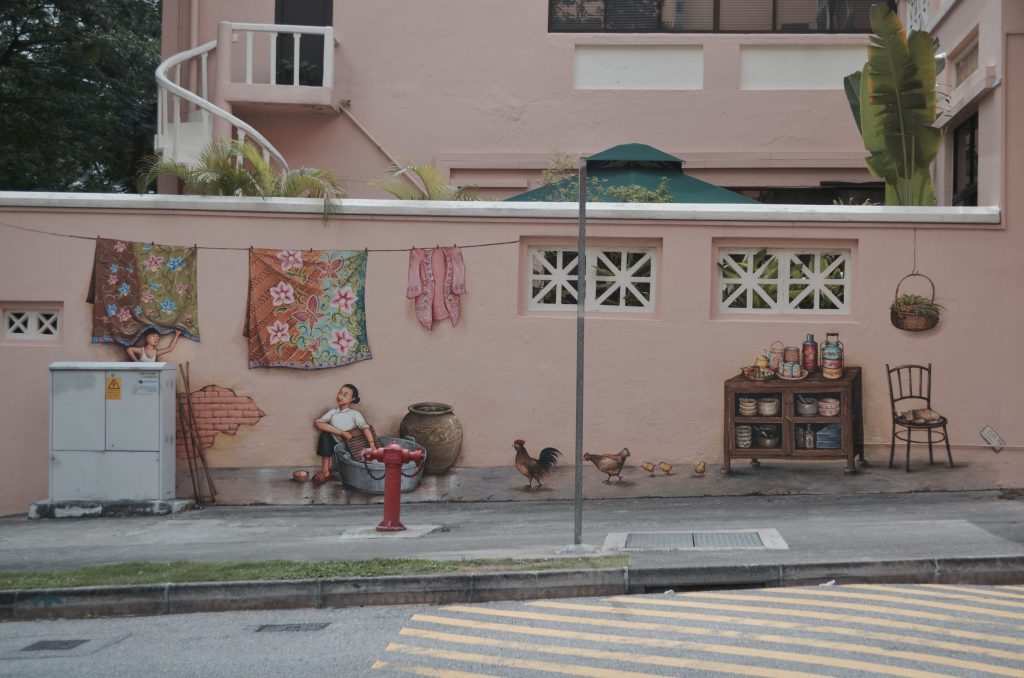
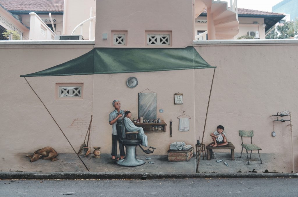
Last stop for my first visit to the place was this area located just opposite Everton Park. There were 2 series of wall murals done by this local artist, Mr Yip Yew Chong back in 2015. I’ve read up online about them, how it seemingly has a story behind each and why they were placed there –  Mr Yip used to live near Everton Road and walked along that same road every day for about 20 years.

I’ve seen people interacting with the wall murals before, taking photos beside it and posting them on their socials but never knew it was located here until that day. But when I went by on Thursday there wasn’t anyone around that area so I guess maybe I’ll go by on one of the weekends to see if there are any and could probably do a timelapse of sorts as suggested by Joy to capture their interactions and maybe I could even interview the people then to get some thoughts as well.

mural

mural01

Amah by Yip Yew Chong

mural02

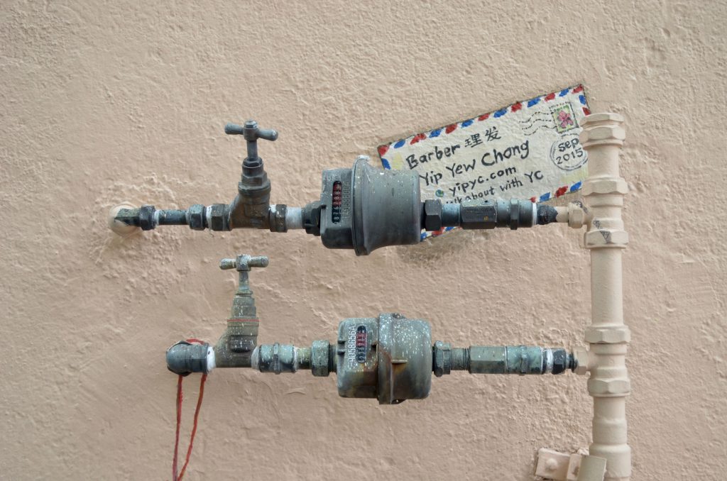
Barber by Yip Yew Chong

Coincidentally he’s having an upcoming talk this coming Tuesday evening at the National Library about his series of wall murals across Singapore (including these two) and I thought it would be a perfect opportunity to sit in and hear the stories behind it and gain some insights to his works which might be beneficial for the zine. I was thinking to even approach him after the session and speak to him a little if possible, to gain more insight.

Am most likely heading back on more weekday and a weekend to conduct more interviews and at the same time observe the weekend crowd since I heard that more people are heading over to the cafes there more now because it’s less crowded as compared to the Tiong Bahru.

Would probably be a good idea to call up the shop prior my next visit to arrange or ask if I could interview them as some businesses there were second generation/the owners live in the estate. It would be great to get their thoughts on the community, how the place as changed over the years etc.


ETHNOGRAPHY: First look at the word ethnography and I thought, this research method must be related to ethnicity. Well if you search up the definition not related to research, it’s somewhat there! But in research terms, it’s meant to be a form of qualitative primary research done with the intention to provide detailed in-depth descriptions of everyday life and practices by others.

PARTICIPANT-OBSERVATION: 

Similarly, participant-observation is another form qualitative data collection method. It often takes place in community settings (like this project for example) and requires the researcher to approach people (as participants) in the environment and learn about what their lives are like as an outsider. The researcher are more often than not recording down what they observe and get through interactions and conversations with the members of the community (participants). It’s one research method that is based heavily on observations and interpretations.

Collecting data can also be done through other forms such as conducting questionnaires or surveys.


QUALITATIVE DATA: This kind of data obtained from research is not in numerical form/numbers. They are usually more descriptive unlike quantitative data and are useful for finding out how people feel about a particular subject.

E.g.: Through conducting interviews, questionnaires/surveys

QUANTITATIVE DATA: This kind of data obtained from research is in numerical form/numbers. They can be translated into categories, ranked in order, measured in units and of course presented visually through infographics and other forms of visual data representation.

E.g. Through conducting surveys that require the participant to rate something on a scale of maybe 1-10 / Yes or No questions – Basically questions that would generate numerical data.

Primary sources of data are the kind that you personally obtain it through your efforts. It can be through interviews, or the above mentioned two other forms of data collection – ethnography and participant-observation. Put it simple, original data. On the other hand, Secondary sources of data are those you get from other existing sources. It can be from books, magazines, articles be it in electronic forms or print form.


INFOGRAPHICS

Infographics are ways of simplifying complicated subjects/topics/statistics into an interesting visual representation of various types (charts the most common type) for viewers. It especially helps turn boring subjects into something interesting if done right. A good infographic would be one where the presentation of data of your subject matter is visually engaging and appealing to your target audience.

Happen to chance upon this infographic of sorts (see below) that shows the many other ways we can visually represent our data besides through infographics which now looking at it I perceive it to be a sometimes mixture of many various types of these visual analogies combined together with annotations.

visualdata

There’s just so many ways we can visually represent our data! From the usual charts to having vectorised graphics reflective as symbols of the subject matter with related annotations, the possibilities are endless and I guess we can really exercise our creativity here. But at the end of the day, main point again is to really boil down these data, simplifying it and making it interesting for your target audience.

Here were some infographics I found while browsing through Pinterest for the next deliverable part of the project. Figured they could help me get inspired with mine when the time comes. I really like the use of colours, the quirkiness and the way data is presented. Will be browsing through Pinterest again for more inspiration!

info info01


REFERENCES:

  1. https://www.lopelab.com/
  2. https://lionraw.com/2014/07/15/a-journey-up-pearl-bank-apartments/
  3. http://psc.dss.ucdavis.edu/sommerb/sommerdemo/observation/partic.htm
  4. http://www.museum.red-dot.sg/design-district-singapore/everton-park/
  5. http://brianhoey.com/research/ethnography/
  6. https://assessment.trinity.duke.edu/documents/ParticipantObservationFieldGuide.pdf
  7. http://www.simplypsychology.org/qualitative-quantitative.html
  8. https://www.customermagnetism.com/infographics/what-is-an-infographic/
  9. http://designtaxi.com/news/376549/Infographic-72-Ways-To-Think-Present-Your-Ideas/
 

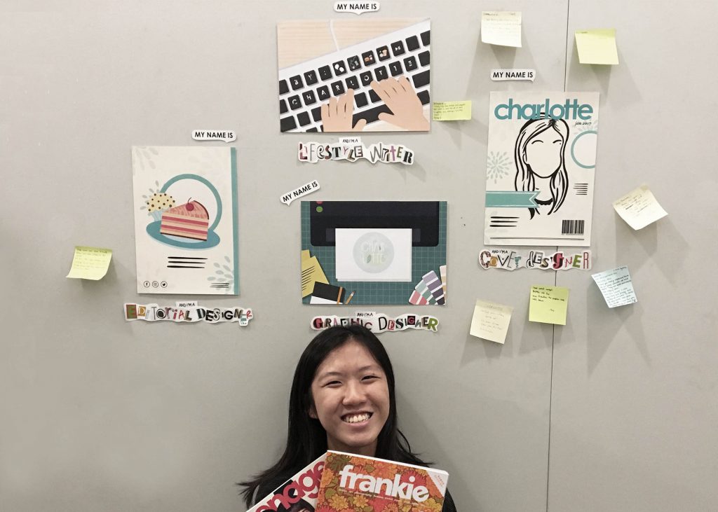
Finally the compositions have come together!  So for this project I finally veered away from traditional (okay maybe not, a little towards the end) and went full on illustration style. Since it was a project to introduce our future jobs through 4 different typographic compositions, I figured taking a personal approach would be nice; sharing my story.

final

CONCEPT & MESSAGE

Concept of my project: Growing up, the different job aspirations I had.

The main subject matter for inspiration and spur of the job aspirations for this project was magazines. Magazines I grew up reading. 

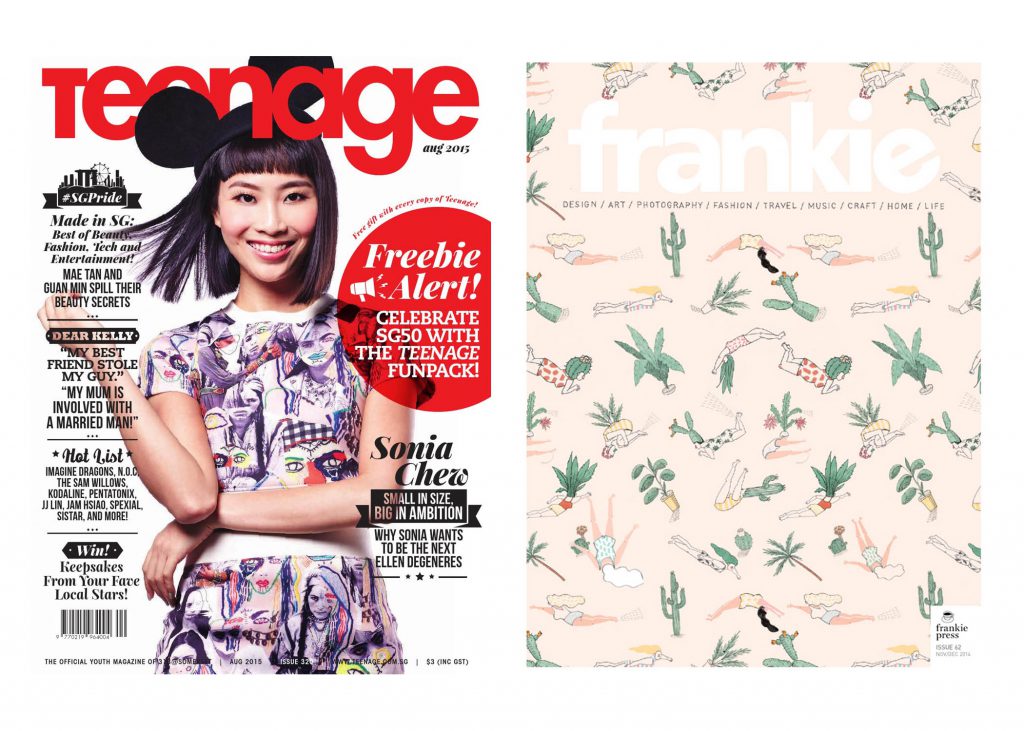
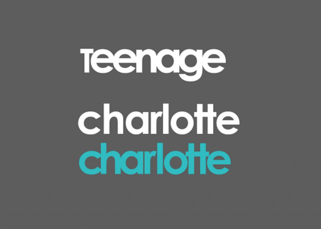
Teenage when I was much younger. Actually I still do now only because I really love their editorial style and I’ve always dreamed of joining their publication if I were to ever go into an editorial job in the future. The first publication I’d want to work for. Also, more recently frankie, because of its content (art, design, photography, craft..) Both are lifestyle magazines.

teenage

Message of my project: Growing up, my perceptions and sensitivity towards things change. I paid attention to specific parts of a magazine which led me to the different job aspirations as shown in the four different compositions.


EXECUTION

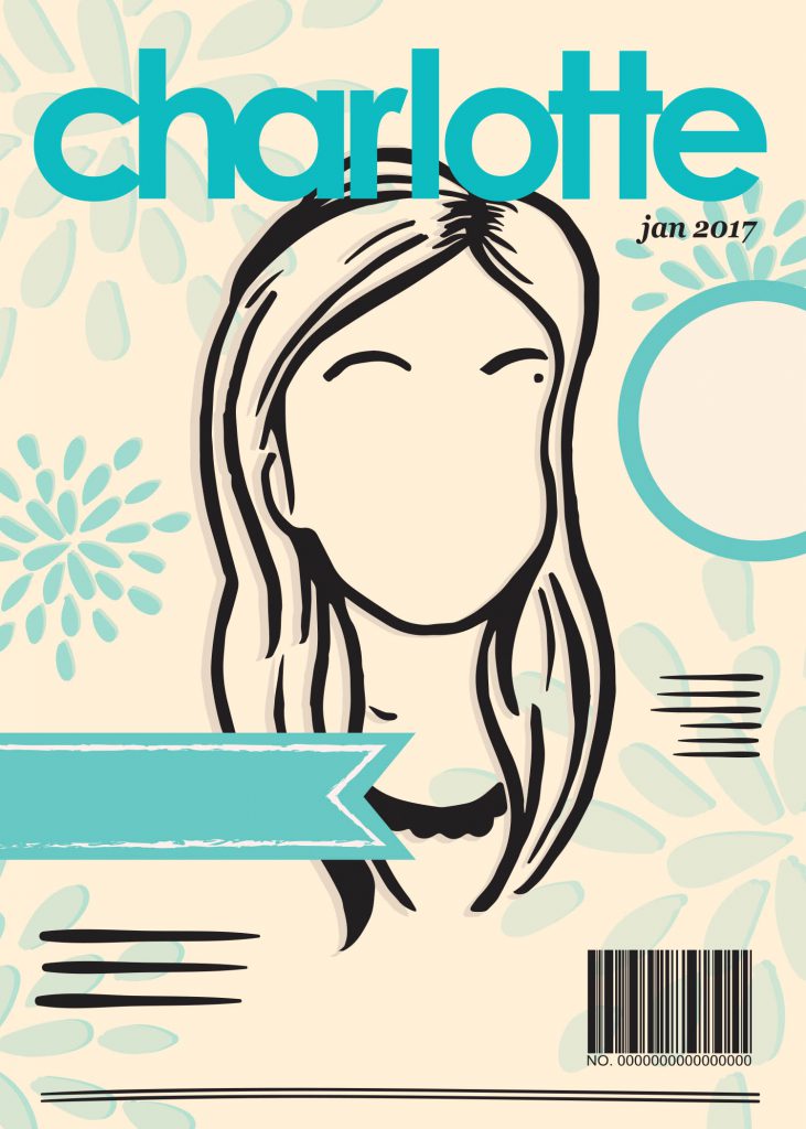
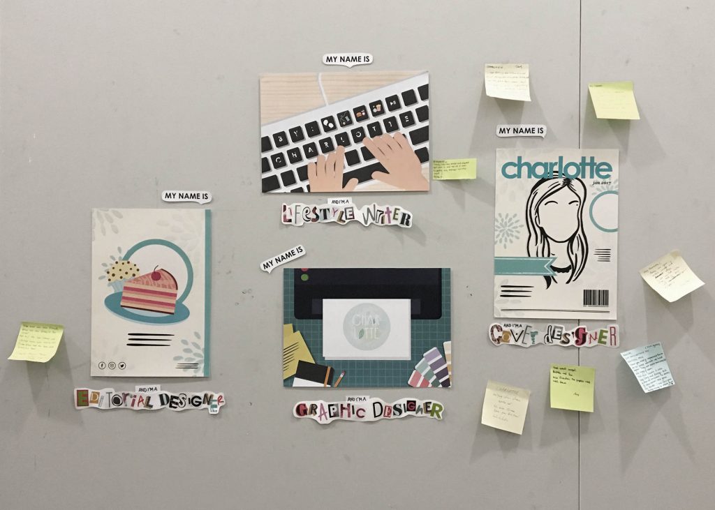
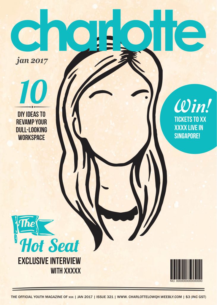
#1 My name is Charlotte and I’m a Cover Designer.

cover-final

For the first composition, it’s inspired by that one time as I read my very first magazine, Teenage. I was immediately drawn to the magazine cover. You know how sometimes when browsing books in the library and deciding which ones to borrow? The factors for consideration were usually the synopsis, and book cover (though yes, never judge a book by it’s cover but you can’t lie. appearance matters yeah) So I thought to myself, one day I want to design the covers of magazines and this publication’s in particular.

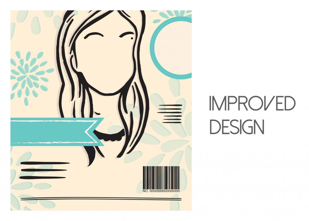
Through feedback and suggestions received during past consultations, here’s what I ended up with. The final improved version. Used the simple vector shapes, a silhouette of myself that I came up with for the final 2D I project last sem (Ego In Different Settings) to depict/mimic the cover of a magazine. Teenage in particular.

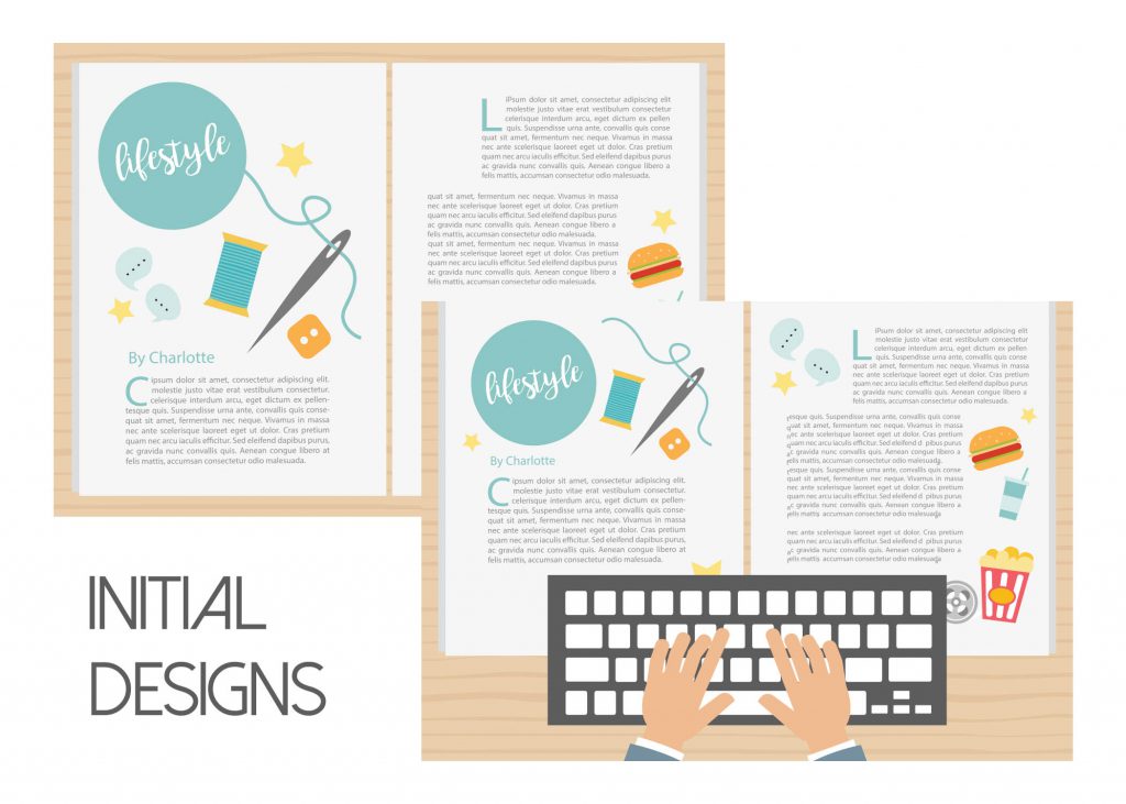
#2 My name is Charlotte and I’m a Lifestyle Writer

lifestyle-final

The story behind this composition: Back in poly days for final year we had to take this online journalism whereby we wrote for a school publication, e-magazine (online). So we wrote lifestyle articles. I enjoyed the various categories a lifestyle magazine was made up of – film, reviews, music, entertainment, DIY & craft even. At this point, I felt like I paid more attention to the content in magazines, which what led on to this particular job aspiration I had.

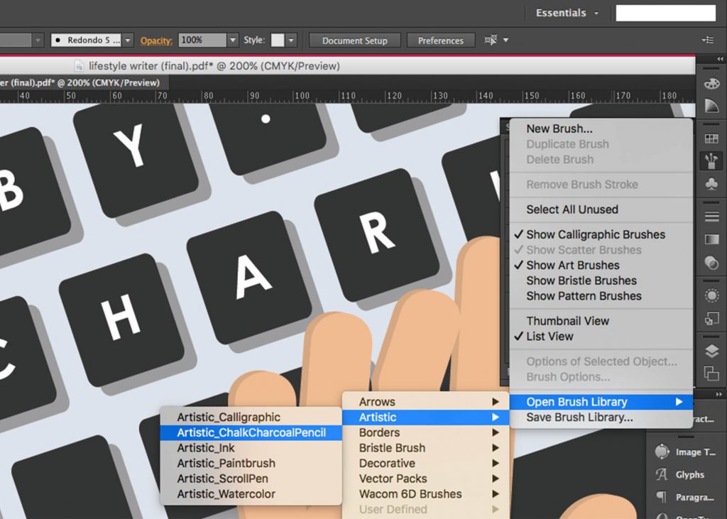
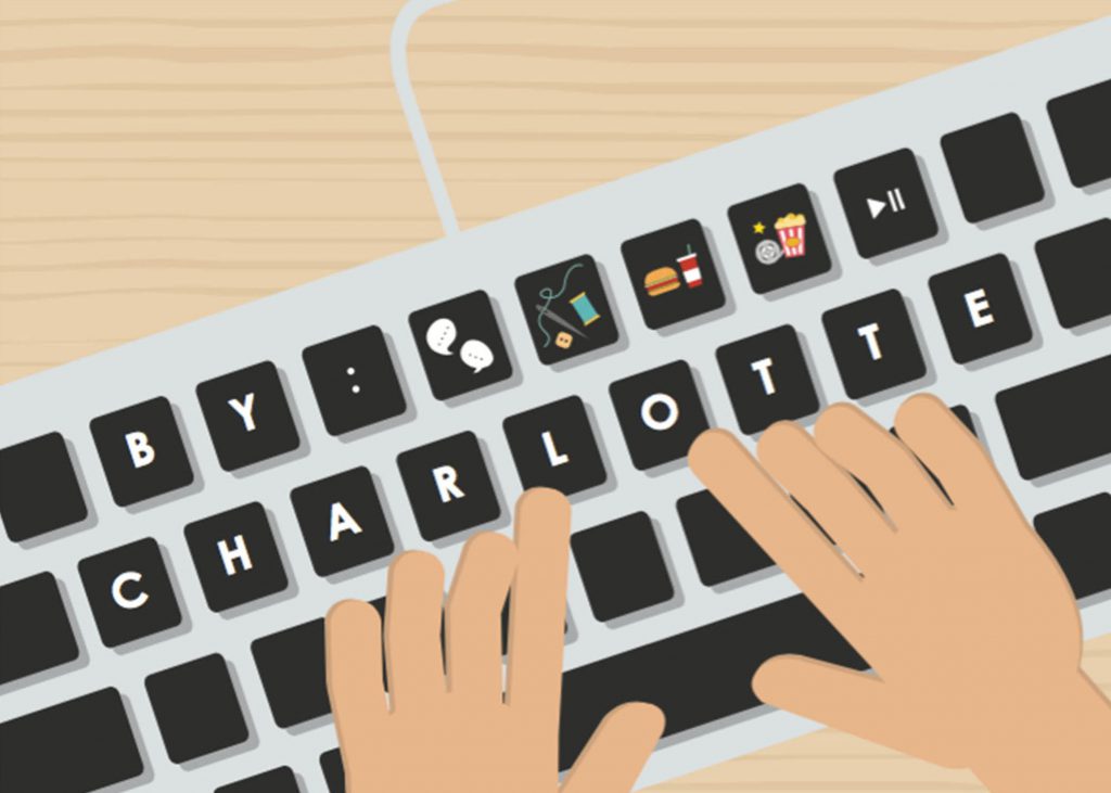
So based on the conventional look of a keyboard; the characters on each key, I replaced them with the characters of my name taking the form of a byline with illustration of the various categories in a lifestyle magazine at the top row.

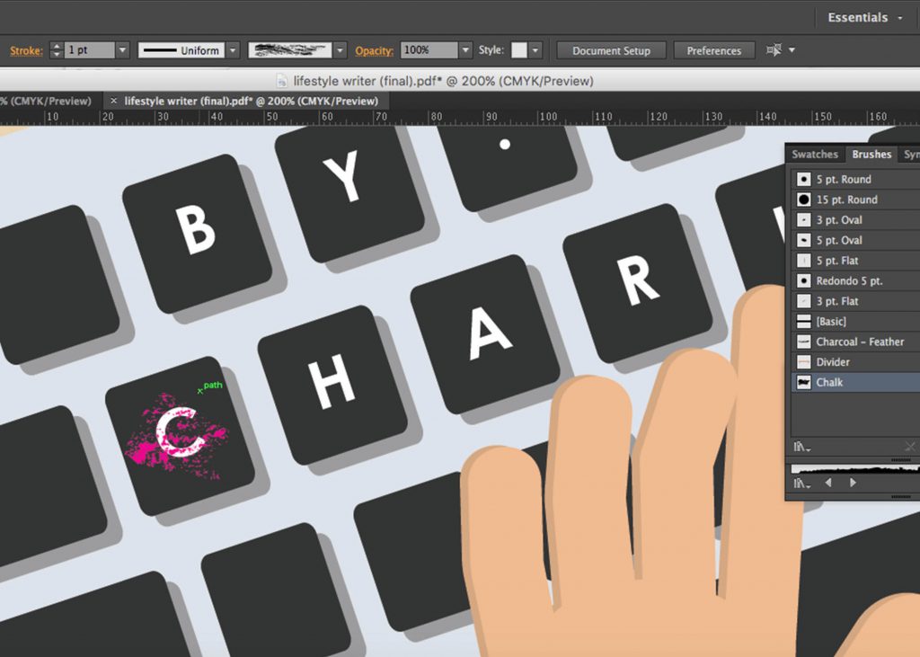
Following Joy’s suggestion on creating several stains on the keyboard or making the characters on the keys look faded so that the composition doesn’t look so flat, has more added meaning like I’ve been hard at work with this dream job of mine… I went with the latter suggestion. Chanced upon the technique online to create a ‘distressed’ look to objects on photoshop. It gave the effect of fading I guess which eventually worked well! (see below)

lifestyle-process

Step 1

lifestyle-process02

Step 2

That’s how I achieved the faded look on the keys and the site where I learnt how to: https://gomedia.com/zine/tutorials/distressing-techniques-in-adobe-illustrator/
#3 My name is Charlotte and I’m a Graphic Designer.

graphic-final

So after Teenage underwent a revamp in terms of the layout of their spreads, type of paper used for printing, style of publication a few years back I realised they started to have illustrations in their spreads which caught my eye. And ah, I also chanced upon frankie magazine where they had a lot of illustration based layout aesthetics and I started noticing those which led me to this job aspiration I had.

Following the suggested idea of having my name incorporated into a logo design, that’s (above) the final outcome of this composition! The idea behind my logo design is a combination of the things I love and see myself as – A nature loving artsy wallflower. Which explains the little nature looking illustrations, leafs replacing parts of my name, splashes in as the background.

Felt that I could’ve done better with the logo design especially with the colours. It looked alright on screen but when printed it came off way too light. Sizing was a bit funny too. During critique Joy suggested that the composition might have worked better if the logo came off as a half-done/unfinished one giving of a work-in-progress feel and I thought that was a really nice suggestion!

#4 My name is Charlotte and I’m an Editorial Designer

editorial-final

Final composition! I still feel amused at myself for coming up with the composition idea. This was the hardest to do too for me in terms of coming up with a design for it and how I could incorporate my name within.

As mentioned in the process post, I wanted the composition to resemble a back cover of the magazine, tying back to my whole concept and my realisation that cover design is covered under the job scope of an Editorial Designer too. I guess looking back now, present day I still really would love to explore the editorial side of a magazine publication one day. Especially working for the publication I grew up reading – Teenage.

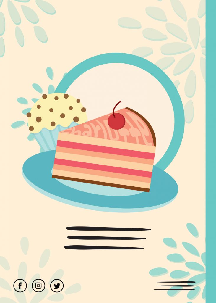
So for a back cover, looking at past magazines I own I realised they are all if not mostly ads. Advertorials mostly of various sorts – food, products, lifestyle related basically. I had no idea. What kind of ad should I come up with? Joy suggested I could promote my “future publication/design company” hahaha. It was a really good suggestion but I thought it’d be nice to have something lifestyle. Name… name.. name. Not sure how or where to begin with this composition, I then searched the meaning of my name, the first meaning to pop-up was that my name’s some sort of a dessert that can be in cake form?! Okay so a food ad it is!!

The meaning I saw:

charlotte
ˈʃɑːlət
noun1. a pudding made of stewed fruit with a casing or covering of bread, sponge cake, biscuits, or breadcrumbs.

Embedded my name within a cake slice using the warp/clipping function (http://www.vectordiary.com/illustrator/warp-text-inside-a-heart-shape-tutorial/), felt it kind resembled the glaze/marbling of a cake? Similarly, I used lines to mimic the text of the ad so as to avoid the problem of typefaces and too many fonts used.

Feedback gotten on this during critique was that since the characters of my name were mostly longish, I could’ve used it to create the shape/outline of the cake or have it incorporated into the layers of the cake rather than having it warped into the top layer of the cake as it didn’t came off clear that it was made up of my name until I mentioned it.

Oh right, I also had the compositions printed on different paper types.

The “front” and “back cover” on thicker gsm paper – 230/gsm art paper partially glossy whereas the lifestyle writer and graphic designer compositions were printed on 160/gsm matte paper.

Not sure if they were obvious during presentation and yikes I forgot to mention this then.


CURATION

curation

For curation, I wanted to place my compositions as such that it looked like a magazine and I went in that order for presenting my compositions as well.

  • Front Cover
  • Spreads
  • Back Cover

And as mentioned from the start, I still couldn’t veer away from traditional. Couldn’t stop my itchy hands from doing a little bit of tactility haha. So since there wasn’t any restrictions on how we should do up the labels so long we had them for each composition, I purposely cut out characters from past magazines I owned, pasting together in collage style to spell out each of my future jobs to link back my whole theme/concept of magazines.

CHALLENGES & OVERALL THOUGHTS

All in all, this project wasn’t as easy as I imagined it to be at the start. The possibilities were endless and I struggled most at the start when conceptualising but slowly, the compositions came together so all’s good! First time going full illustration for 2D too! Something I’ve always wanted to try since I’ve worked mostly on traditional for the 2D projects last semester, especially the last one.

Can’t wait to get started on the next project since it explores the areas which I’m really intrigued in and wanna go into – Editorial and Publishing 😉 Plus exploring and working on a neighbourhood to put together a zine sounds like a really cool idea, hopefully everything goes well!!


Update time! Had to bid my favourite traditional approach goodbye this time round because of my concept. Bye paper cutting and layering techniques…☹️ Will be sharing more about individual and group consults we had for the project.

INDIVIDUAL CONSULTATION

The week after getting our project briefs we were already down for first consultation, individual first. Having a concept and message in mind for the project, we had to share them with Joy and bounce off some ideas. I roughly had one in mind already, going along the lines of growing up and how I had different job aspirations at different points in my life. However I was unable to establish a message for my concept and Joy gave me a few suggestions. Eventually went ahead with the message of how growing up, my perceptions and sensitivity towards things change. I paid attention to specific parts of a magazine which led me to the different job aspirations that would be shown in the four different compositions.

The jobs I decided on were:

  1. Cover Designer
  2. Lifestyle Writer
  3. Graphic Designer
  4. Editorial Designer

FIRST GROUP CONSULTATION

For the first group consultation in the following week, we had to come up with 2 done compositions and I did up those for Cover Designer and Lifestyle Writer.

More on each individual composition’s conceptualisation will be explained in the final post

Cover Designer

cover-initial

For the cover designer composition there was too many typefaces involved for the first cut as I tried to replicate the different features of a cover. I manage to resolve the problem by representing the text as lines and the features as simple shapes resembling the headlines etc.

Lifestyle Writer – for this I came up with 3 different designs, two of which were similar.

 I came up with the second design as based on the same job aspiration as I suddenly had an inspiration to have my curation to be in a magazine form: magazine spread. But the problem once again, clutter and too many typefaces going on at once.There was no focus. Here’s what they looked like initially.

lifestylewriter

Joy said I was taking a step forward going into the second project already because the next project involves layouts etc. Was asked to keep this as reference for our next project instead ?

lifestyle-01

The design i eventually went with.

The final one I went with after suggestions from the group is the one just above (the one with a close-up on the hands and keyboard).

FINAL GROUP CONSULTATION

Final week of consults before submission week! By then, we were supposed to have 3/4 of our compositions test printed (if doing digital) or done up (if doing traditional). The additional composition I came up with for the consult was the one on being a Graphic Designer.

graphicdesigner-initial

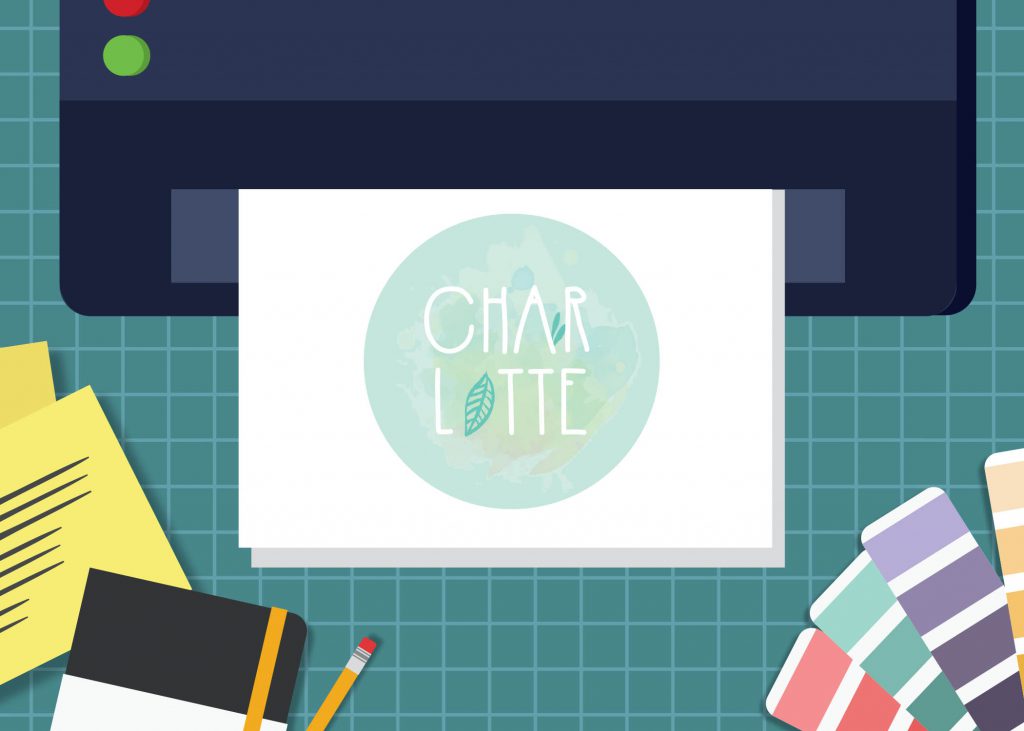
Suggestions were given by Joy and friends to play around with scaling to create more focus and perhaps have my name incorporated into a logo form to further to bring out the job essence as it would be something you’ll associate with a Graphic Designer’s job scope. Rather than having my name appear/stretch across various items that a Graphic Designer usually would use and work with (printer, pantone swatches, notebook-pencil, post-its etc.)

As for the revisions on the first two compositions as suggested in the previous week… for Cover Designer, it worked well after changing the text and features to lines and simple vector forms.

cover-improved

But new problem. As I was trying to replicate the title style of the magazine referenced (there’s a meaning behind it, more explanation in the final post!) the kerning suited the title of that magazine but not my name. My name started to look a little different and off because of the kerning. The ‘r’ , ‘l’ and ‘o’ looked like joined alphabets – ‘l’ and ‘o’ was starting to look like a ‘b’. So the suggestion to increase the kerning further was given by Joy for the final composition if not that was pretty much good to go!

How I tried to replicate the style of the magazine title:

As small as this may seem, I sure felt like a million bucks when I managed to figure out the similar if not exact same font and character style they used for their magazine’s title. Oh, the magazine I’m referencing is Teenage Magazine, the very first publication I bought with my own savings.

cover-designer-typography

Playing with kerning and using the font Century Gothic

As for the Lifestyle Writer composition sticking with the composition where it’s the close-up of supposedly “my hands” typing on the keyboard, Joy mentioned that the design looked a little… flat.

lifestyle-01-draft

She thus suggested that I could make the characters on the keyboard slightly faded or add some stains to the keyboard so that the composition doesn’t look too static. The final look to be revealed in the final post!

For the final composition, Editorial Designer was still a work in progress. I was still unsure on how to go about it still but already had a visualisation that I’d want it to resemble a back cover of the magazine, tying back to my whole idea of my job aspirations being influenced by magazines and also my late silly realisation that a Cover Designer job doesn’t exist but such a job scope is covered under that of an Editorial Designer whereby they will oversee the appearance and layout of a magazine.

More to be shared in the final post!

By Carol, Xuan Fei and Charlotte

Here’s what that my group and I came up with for our presentation topic for 2D class which would be rather helpful for our first project, Que Sera.

We covered areas namely:
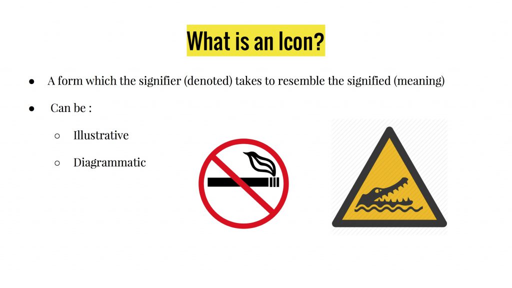
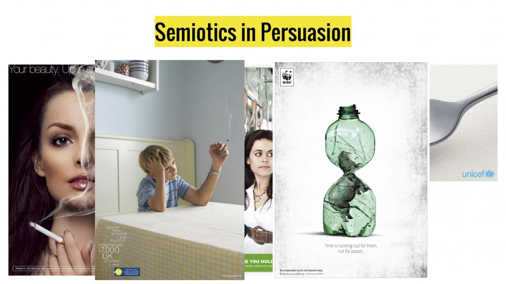
Semiotics – Signifier, Signified, the Triadic Relationship in Semiotics
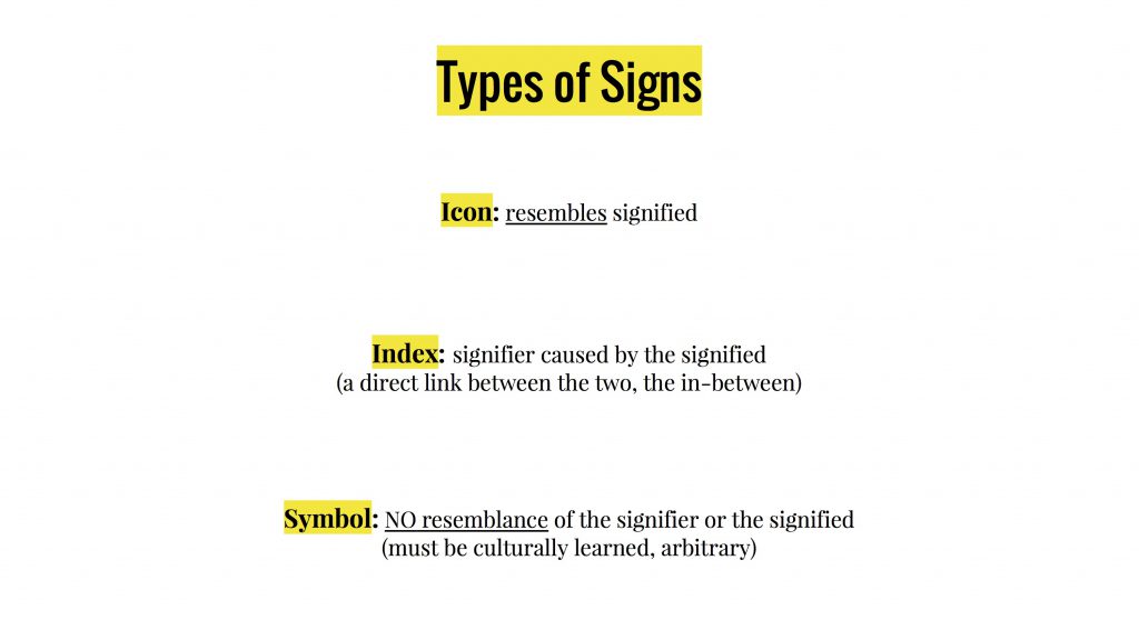
Types of Signs – Icon (the different types of Icons), Index, Symbol
Examples in Typography, Advertising, Daily Life

1 2 3 4 5 6 7 8 9 10 11 12

13
14 15 16 17 18 19 20 21 22 23 24 25 26 27

Hannah Höch

hh

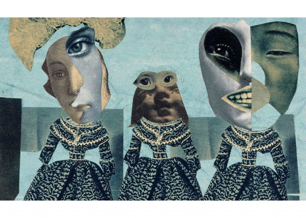
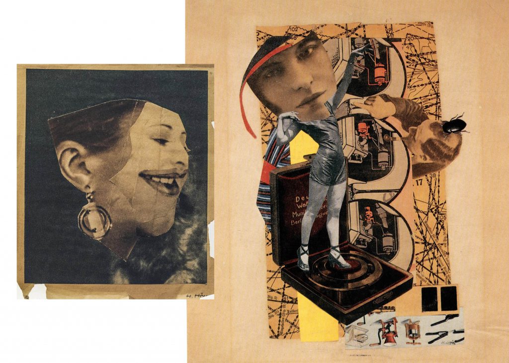
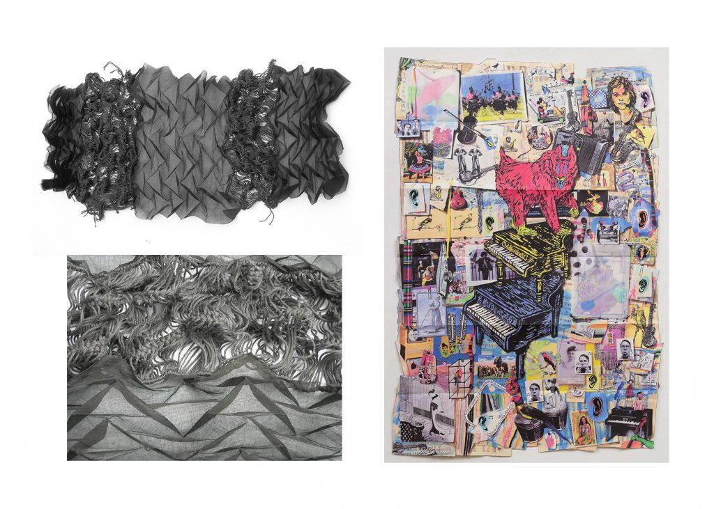
Still one of my favourite artists I’ve come across last semester for 2D while researching for technique inspirations for our final project (Ego In Different Settings). I love how Höch uses the photomontage and collage technique to create those abstract yet quirky looking artworks of hers.

The overlapping of images, and different compositions/angles of the different pieces of the photomontage helps to create some dimension and a dynamic feel to her works which is definitely something I can explore once again in this project since I really enjoy working with textures & tactility.

hh1


DADA

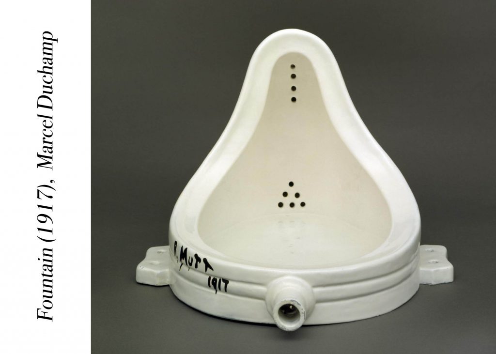
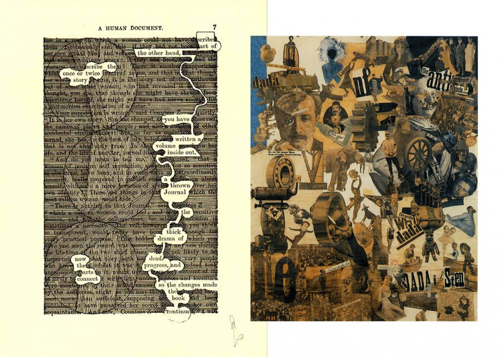
To sum up, an art movement that was meant to go against the values of culture of what was believed to have caused the First World War. DADA eventually became recognised an a type of avant-garde art which included works in mediums of visual, literary, music, collage, cut-up writings and more.

One famous DADA art would be the Fountain (1917) by Marcel Duchamp

dada

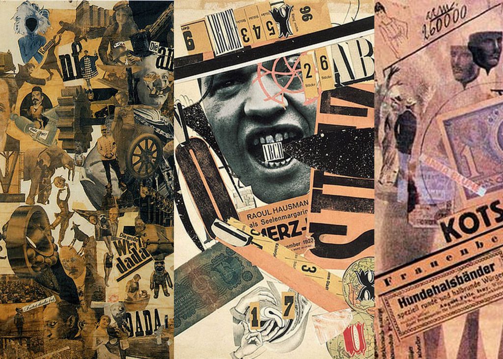
But in this case for our project, I think the more relevant forms of DADAism that we’ll be able to adapt would be the collage and cut-up writings technique of creating art. Back to artist Höch, she too had works that likened to the DADA art movement. Below are more examples during DADA:

dada2 dada1


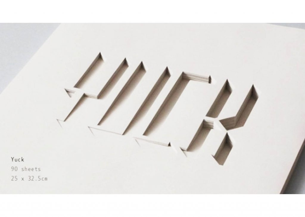
Paper Cut-Outs

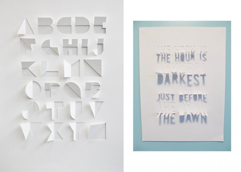
papercutAnother technique I found interesting and a possible exploration for this project, paper cut-outs! They can help create some sort of spatial depth and achieve a really cool effect. Not sure if this would work for the concept I’m going for but definitely keeping this in mind 🙂 I particularly like how it creates texture and at the same time a minimalistic feel (for the designs below)

papercut1


Layering

The last technique I found interesting, pretty much the same idea of treating surfaces but in this case it’s layering – Done through various mixed mediums. For example, it can be all embroidery based (layering threads over one another layer after layer to achieve more dimensionality) or doing it through painting.

Basically it’s just going over layer after a layer (if that makes sense…)
This technique just screams tactility and textures 😀

layering1 layering


So after much researching, what you see above are the artists, art movements and techniques I found interesting for this project. As I enjoy exploring the idea of tactility in my works, guess the research below would be helpful!

Seems like I can’t escape the idea… but treating the surfaces to achieve tactility in my compositions would probably only be for one or two as I intend to somehow create a link between the technique used with the job I’ve selected – Saving the further explanation for the process post later on!

Charlotte 🙂 It’s back to the grind of conceptualisation and we’re greeted with our first project brief and an in-class assignment already, talk about uni life!

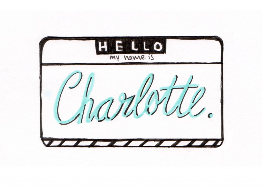
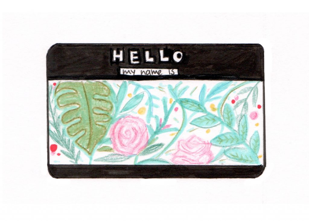
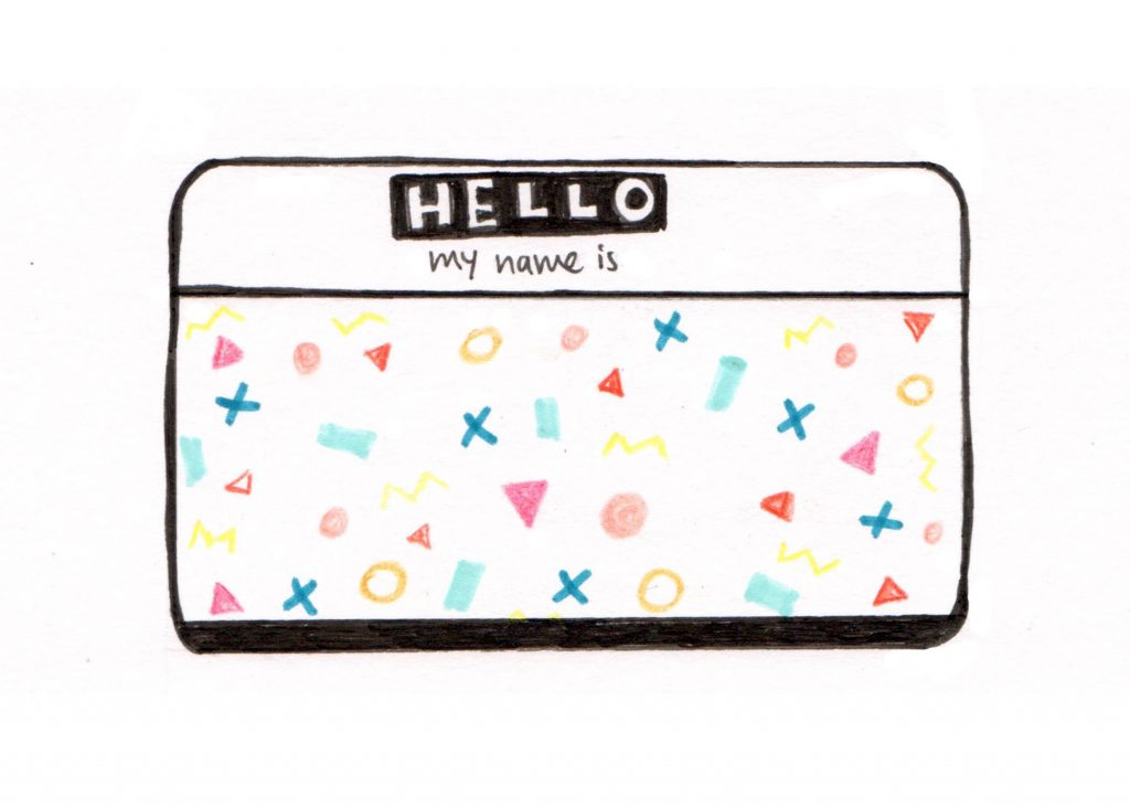
We had to introduce ourselves by coming up with 3 different Hello My Name Is… name tags with the drawing materials that we were asked to bring before class on Thursday.

hellotag

If I knew we the colouring/painting/drawing materials we were asked to bring was for such an in-class exercise I would’ve brought more! No choice, I had to work with whatever I had. There was definitely a period of artist block for a while but alas I came up with my 3 name tags just in time for the sharing session.

To be very honest, I am pretty sure the ideas behind each of my name tag was only conceived as I was designing it but somehow they clicked. On hand I had markers and pens in my favourite colours plus colour pencils. So I started off by deciding to have the three name tags someone consistent in colour and it’s probably pretty obvious what my favourite colour is – Teal/Turquoise/Mint (along these lines)

#1: Hello My Name Is Charlotte

hellomynameis1

Story behind this first name tag… Over the holidays I got intrigued by the fine details of hand-lettering and decided to try my hand a little at it especially the letter shadowing bit. Something I’ve always been curious about and could never figure out without the help of the internet. So here’s my name in a handwritten, calligraphy style to reflect the story. Conclusion on my hand-lettering skills: Not there yet, needs way more practice.


#2: Hello My Name Is Charlotte

hellomynameis2

This second design was pretty much conceived from my favourite mediums and environment (nature). I love watercolours and nature and more often than not the combination you get out of these two are watercolour florals found mostly in hand-lettering border designs for cards, invitations, motivational quote designs etc.

Was trying to achieve the watercolour effect by blending colours and using really lightly coloured felt markers which helped create the translucent/transparent effect of watercolours.


#3: Hello My Name Is Charlotte

hellomynameis3

For the third and final name tag, it was really pure doodling, something I often find myself habitually doing and of late it’s always memphis inspired patterns or geometric shapes thus what you see in the above name tag; another of my favourite thing.

Well I guess one can conclude that my sharing was about a few of my favourite things 🙂