I’ve really been lagging behind this whole OSS posting of our process but now that it’s recess week… time to catch up!! Definitely way more progress since the last post! So picking up from where I last left off: My motifs. They’ve evolved quite a huge bit. This was how it looked like back in Week 4 and I ought to have updated about it after consultation with Gillian but…
Anyhow, here’s what went down and how the motifs have progressed since then:
From the consult with Gillian a few weeks back, I solidified my concept further with the idea of having food monsters and food distributed /peeping/playing hide and seek in the background in different scales based on different types of Korean foods (sticking true to the Korean essence as the inspiration was heavily influenced from the Korean mythology of the one-eyed Dokkaebi and how it has this characteristic in which it likes to eat.
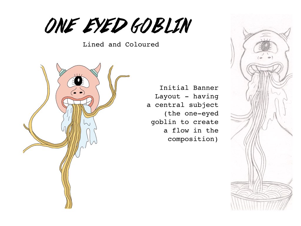
Other than the food motifs, I was thinking of coming up with my own interpretation of the one-eyed goblin as the central motif, the largest in scale and centralised as the main motif/element of the banner composition. The idea came about after seeing Gillian‘s banner in class that week – Hers had a central motif (I liked that aspect!) and the composition flowed down nicely with the other motifs complementing the flow .
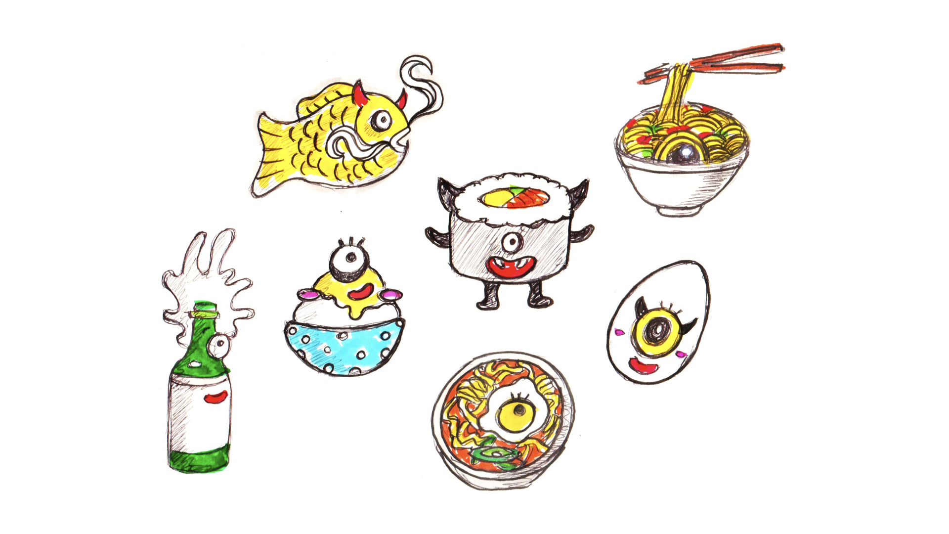
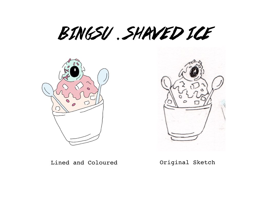
Layout aside and back to the motifs, Gillian said that they could be more simplified in the sense that currently there’s too much sketchy linework going on (as seen above) and that they could be as simple as placing the eyes and body parts at just random places. As I was sharing how I observed the food form and identified possible spots that for example, where the eye could be at – replacing the egg in the ramen, etc. she said that actually creating the food monster motif can be as simple as just adding body parts to the existing look of the Korean food.
Thus I went to make the changes, drew more motifs and picked out the colours I wanted to use for the banner. The colour palette and drawing styles I referenced:

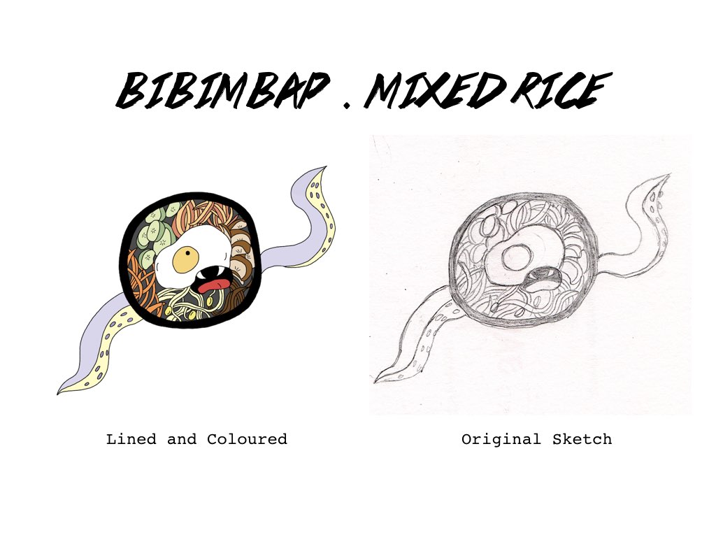
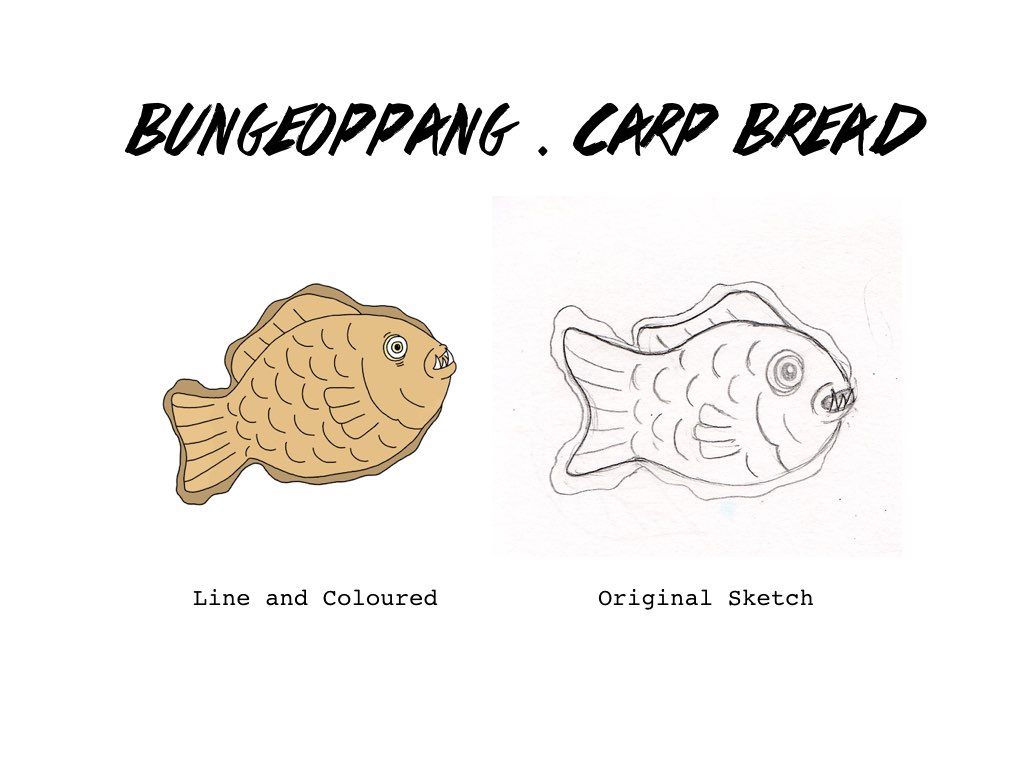
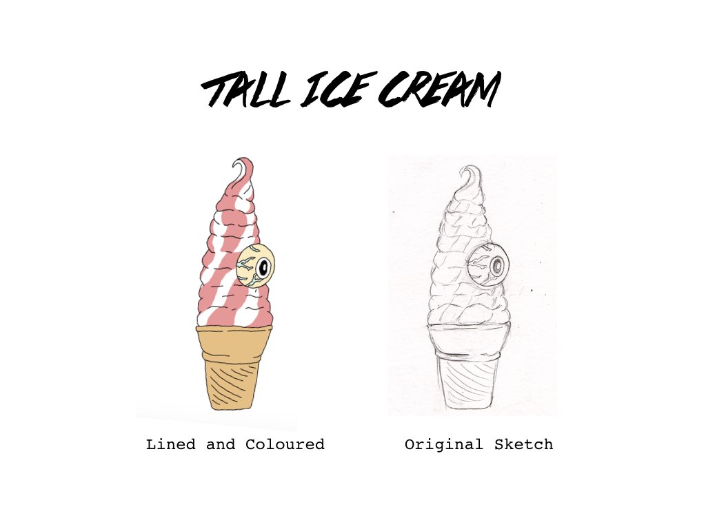
Overall I was going for a more cute-grotesque look. What i did next was to sketch out the food items/monsters and traced over it using the Wacom tablet over in photoshop which I managed to achieve a cleaner finish. Here are some of the original sketches and it’s final look after blocking in the colours:
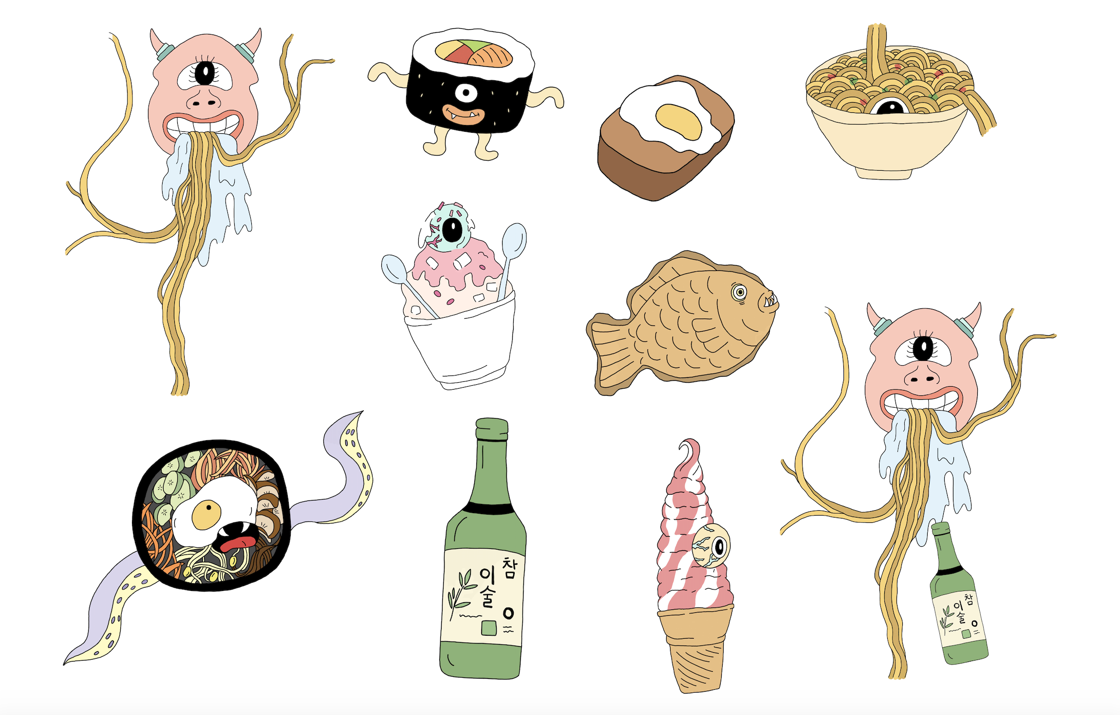
Refined food (monsters) motifs


More about the banner layout in the next post!