Timeline was a little tight for this one. One site visit, following week was group consultation and the week after (last Thursday was presentation day)! But on the bright side, Part 1 of the zine project is down so yay! Here’s the infographic that I came up with based on my assigned neighbourhood area, Outram and more to the ideation process shared below.
INFOGRAPHIC: EVERTON PARK, THE HIP HOOD

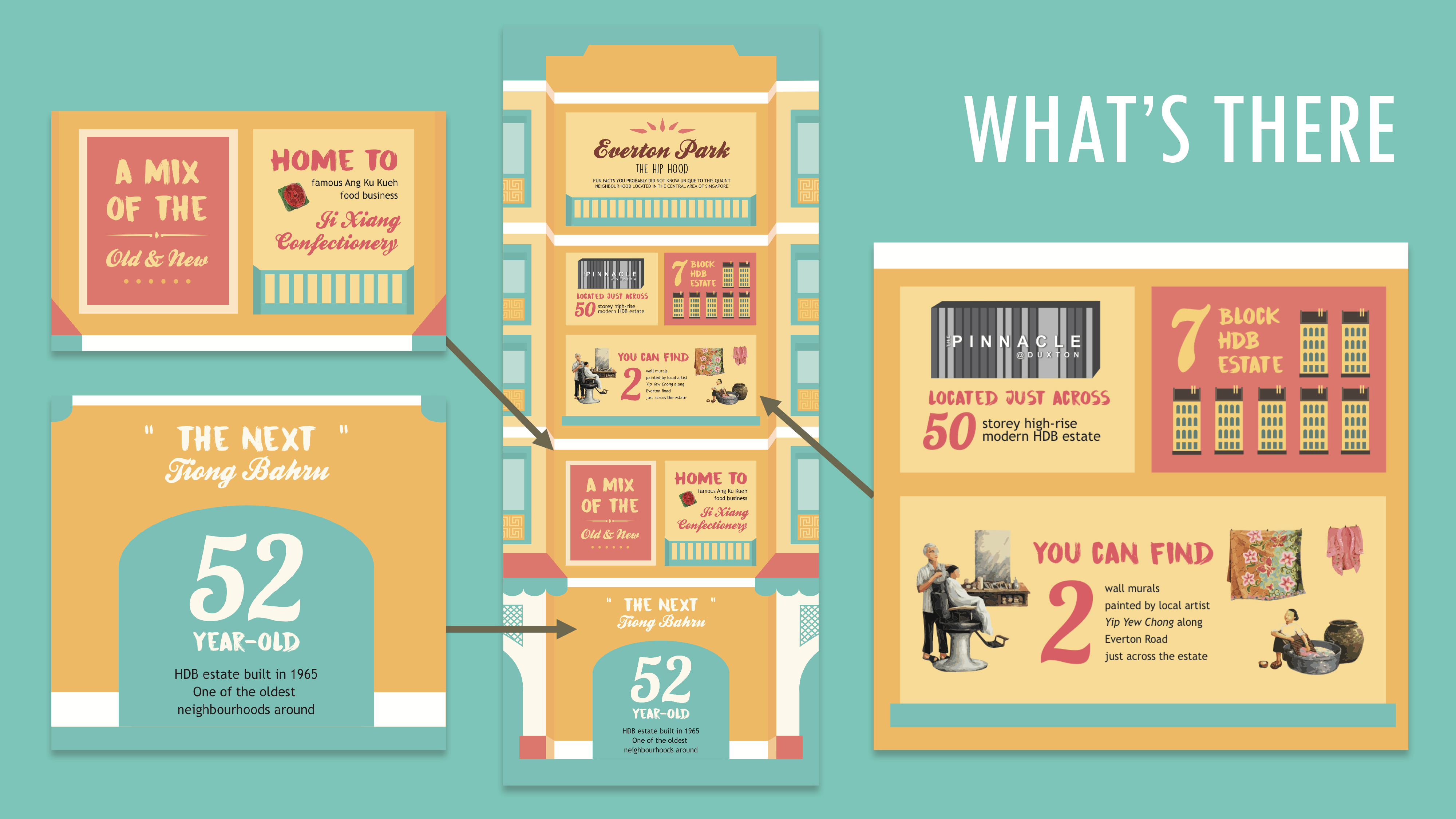
How the infographic came about was by translating some of the sightings I’ve spotted during my site visit there into numerical fun facts and also phrases/quotes about the place found through qualitative research and research done online from credible sources. With the intention of making the infographic, simple, straightforward and easy to digest for viewers. Basically it’s an infographic of things unique to Everton Park.
Target audience wise, as mentioned in the previous post I guess it could be for anyone. If it was chanced upon by tourists and fellow Singaporeans who have yet to explore the neighbourhood I hope that it could provide them with a general overview of what the neighbourhood has to offer and at the same time entice them to come visit and explore the place
And as to why I named it Everton Park – The Hip Hood, it’s because the quaint neighbourhood has been called “The Next Tiong Bahru” in news articles because of the cafes around and its quaint charm.
SIGHTINGS AROUND EVERTON PARK
So as shared in the previous post about the buildings and shops spotted, the facts discovered during my site visit, these were the ones that really stood out to me; those I found unique to Everton Park. And thus I decided to feature them in my infographic.
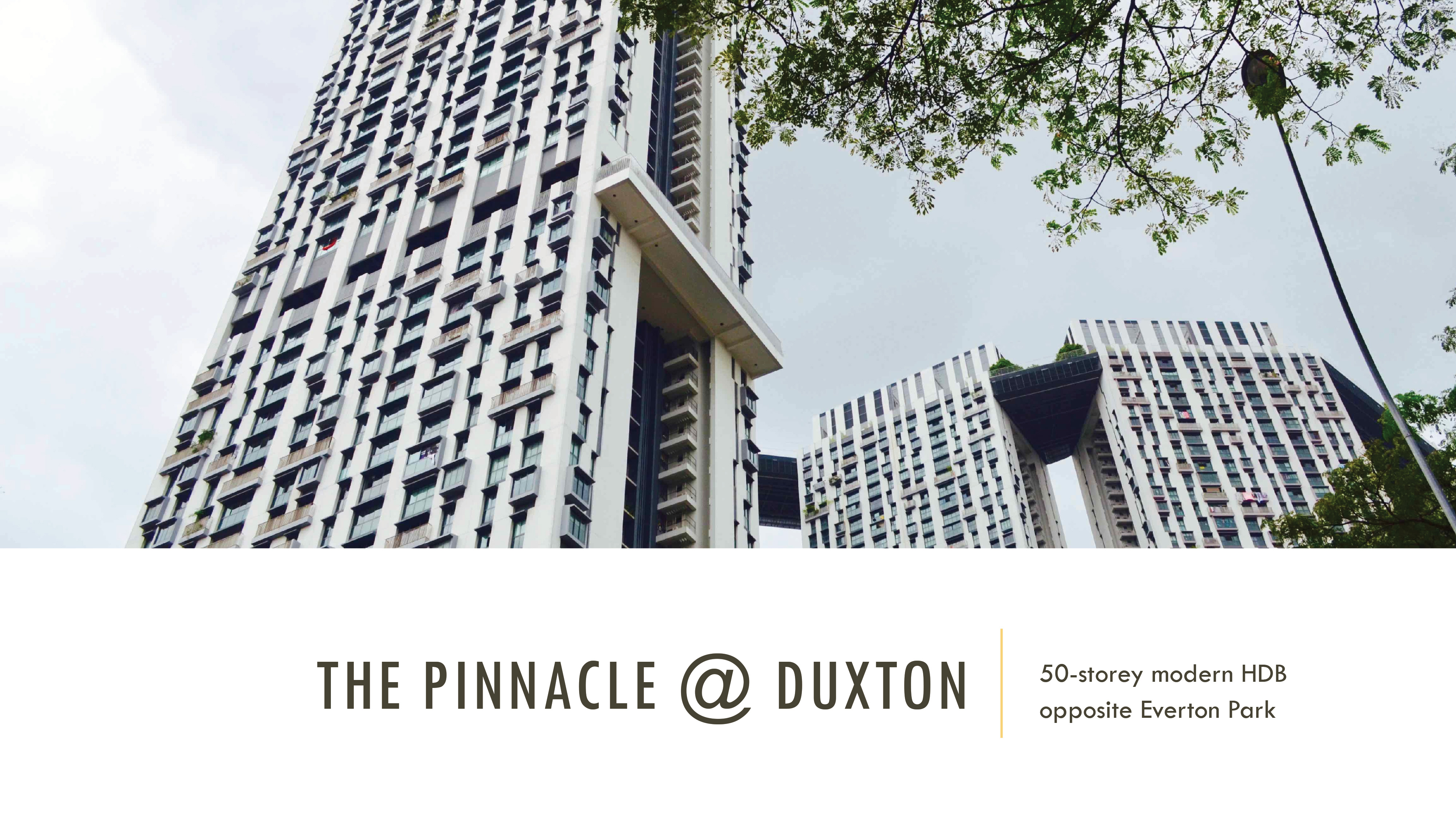
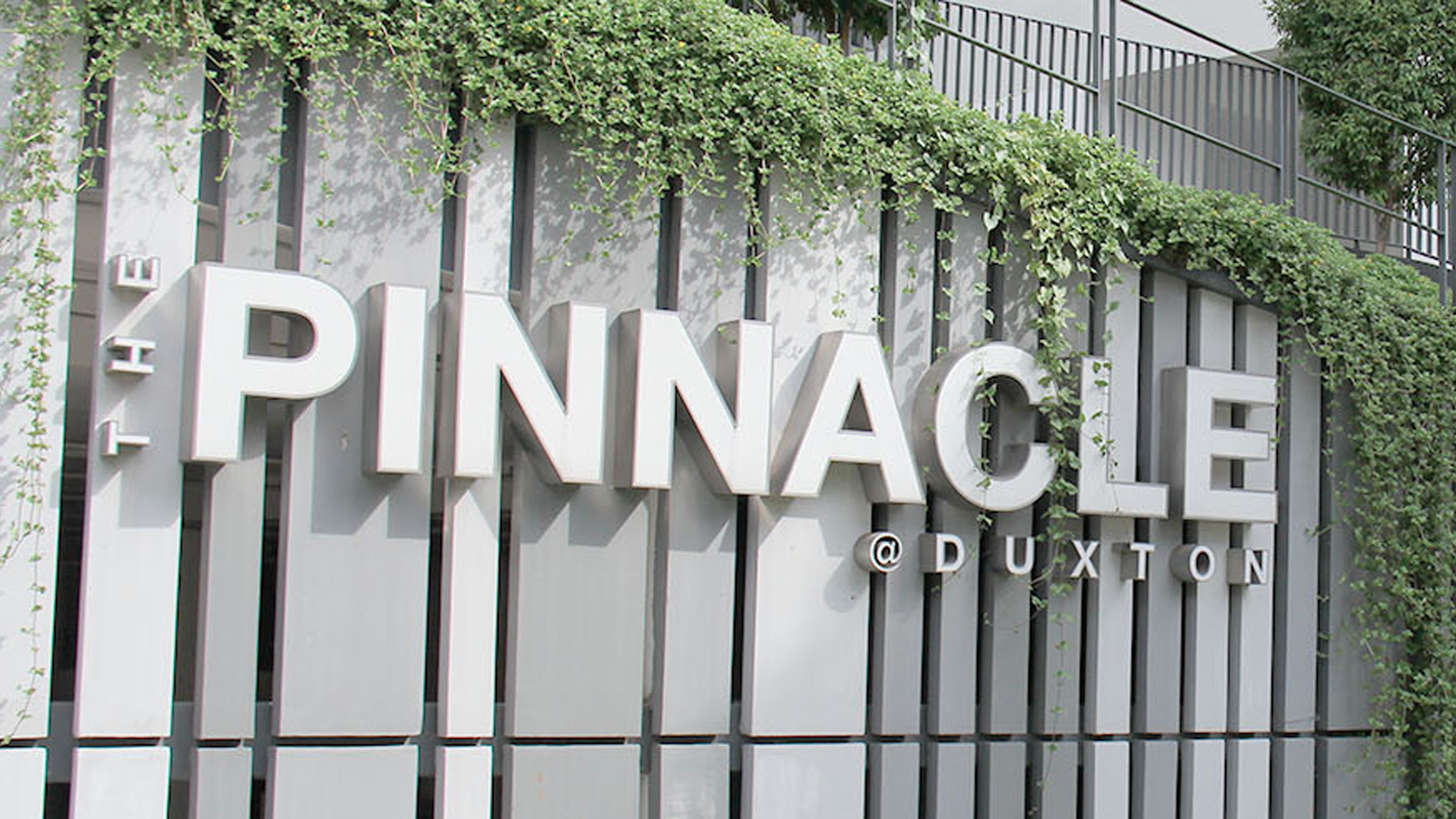
First up, The Pinnacle @ Duxton that’s located just directly across the road from Everton Park HDB estate. As to why I chose it as a place and fact to feature, it’s because of how the presence of the HDB estate feels like a contrast to Everton Park as the latter is an old estate while The Pinnacle is a modern one.
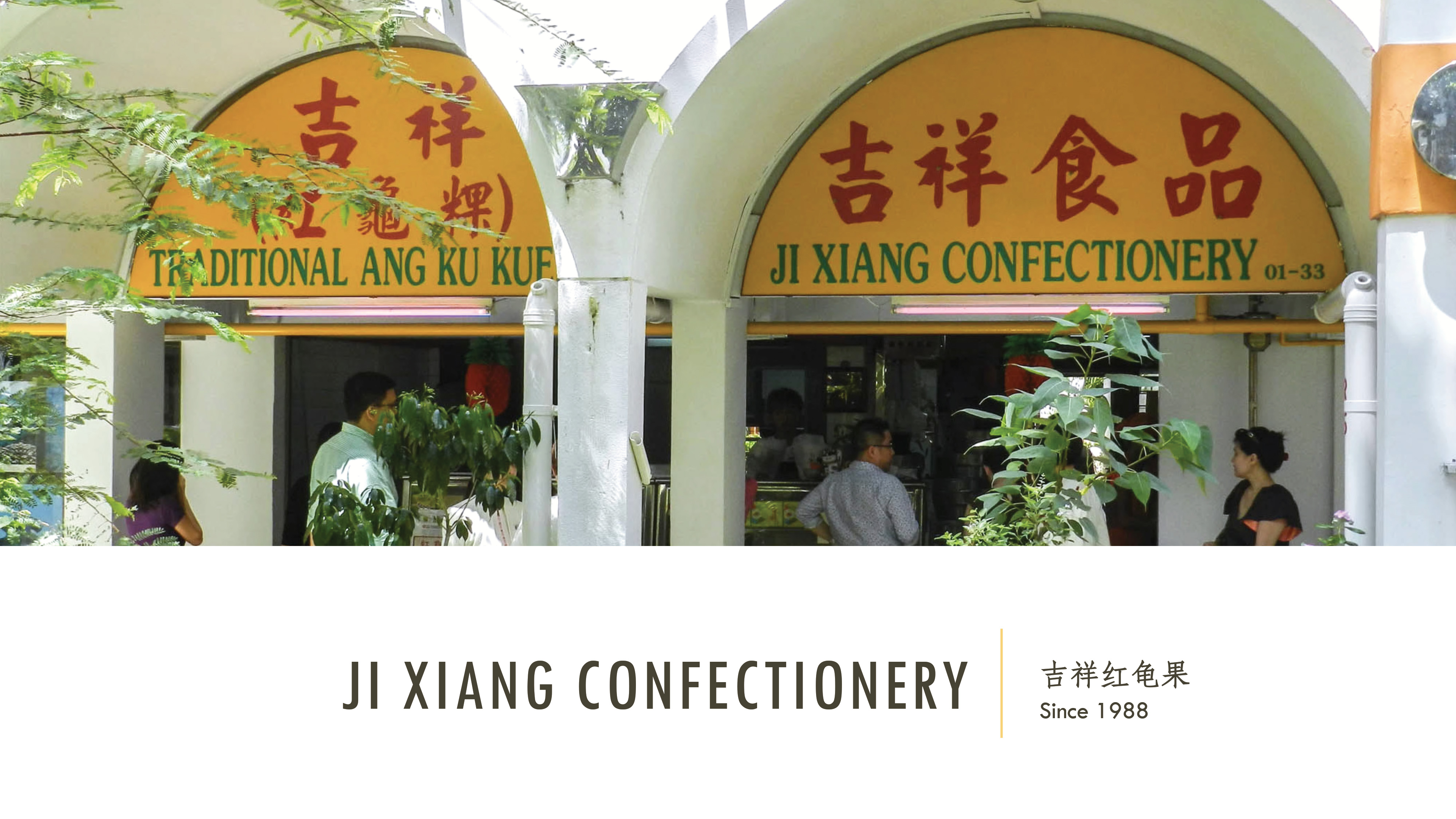
Next would be Ji Xiang Confectionery, the famous traditional handmade Ang Ku Kueh stall of close to 30 years. Funnily, if you mention Everton Park to the adults, first response you’ll get to the place is “Oh, that place that sells the famous Ang Ku Kueh right?” To me, this confectionery store feels like an icon of Everton Park therefore the feature.

The next thing that sighting that caught my attention would be the 2 wall murals found on the other side of the Everton Park HDB estate across the road (Everton Road) on the walls along the alley and walkway of the private housing apartments. Particularly because there is 2 and also how the murals evoke a sense of nostalgia too as shared by the artist through a sharing session I got to attend about 2 weeks back. They were painted based on his experiences as a child growing up and fun fact, he used to stay around Everton when he was younger for about 20 years!
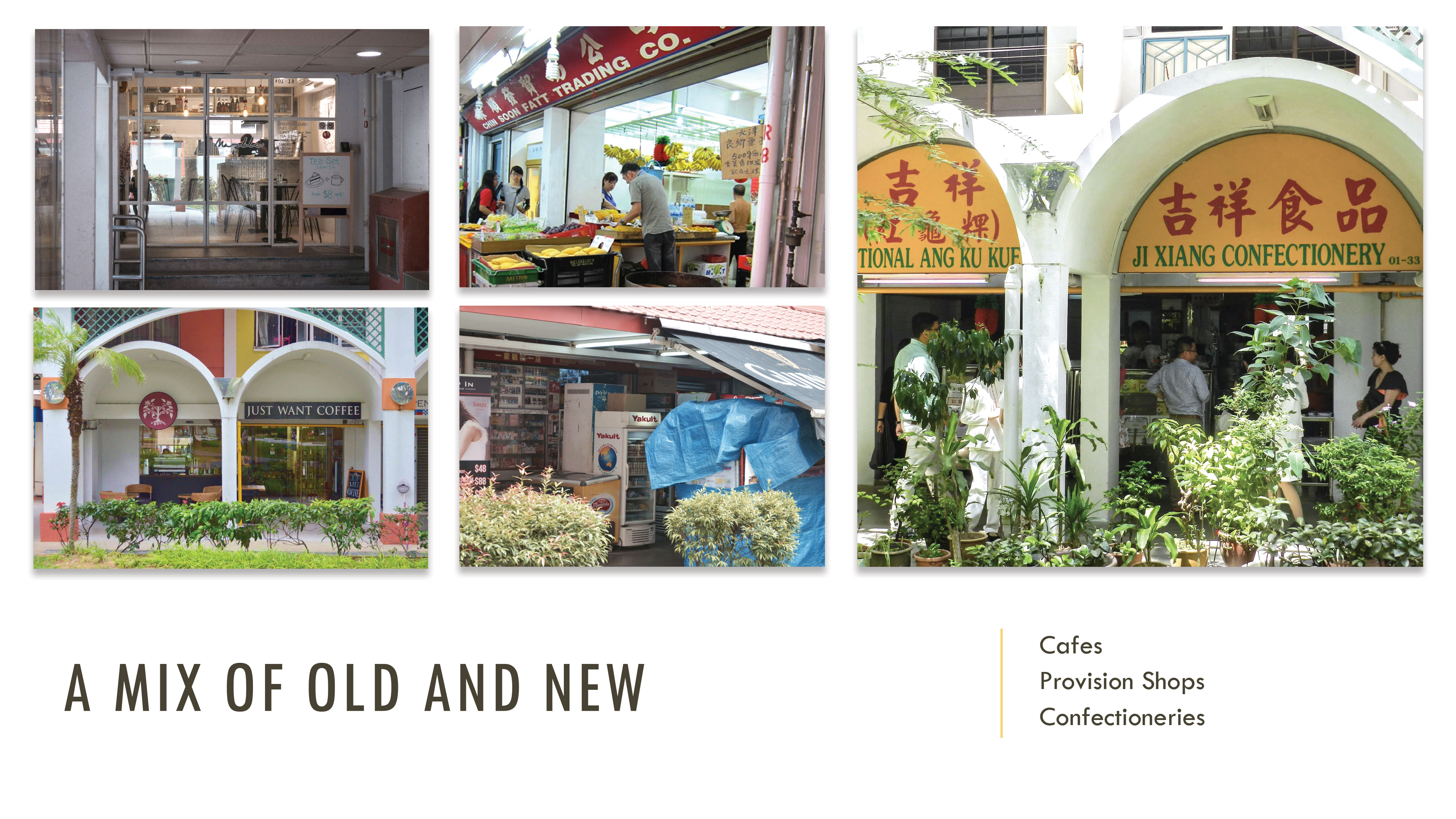
What stood out for me most about the neighbourhood was how the place had a nice mix of old and new businesses around, the most unique. As shared, shops are lining the perimeters just below each block and it can be a old business and then a hip cafe located just side by side. Some were even hidden from sight close to the lift lobbies and letterboxes. These were some of the things I featured in the infographic put together.
For my initial idea, I got inspiration from a vector image I found online while searching for building illustrations to use for the infographic. I chanced upon this layout of the interior of a house apartment with different levels and thought it’ll work great as boxes for the various information to include for the infographic and at the same time making the whole infographic resemble a HDB flat since my focus was on the Everton Park HDB estate.
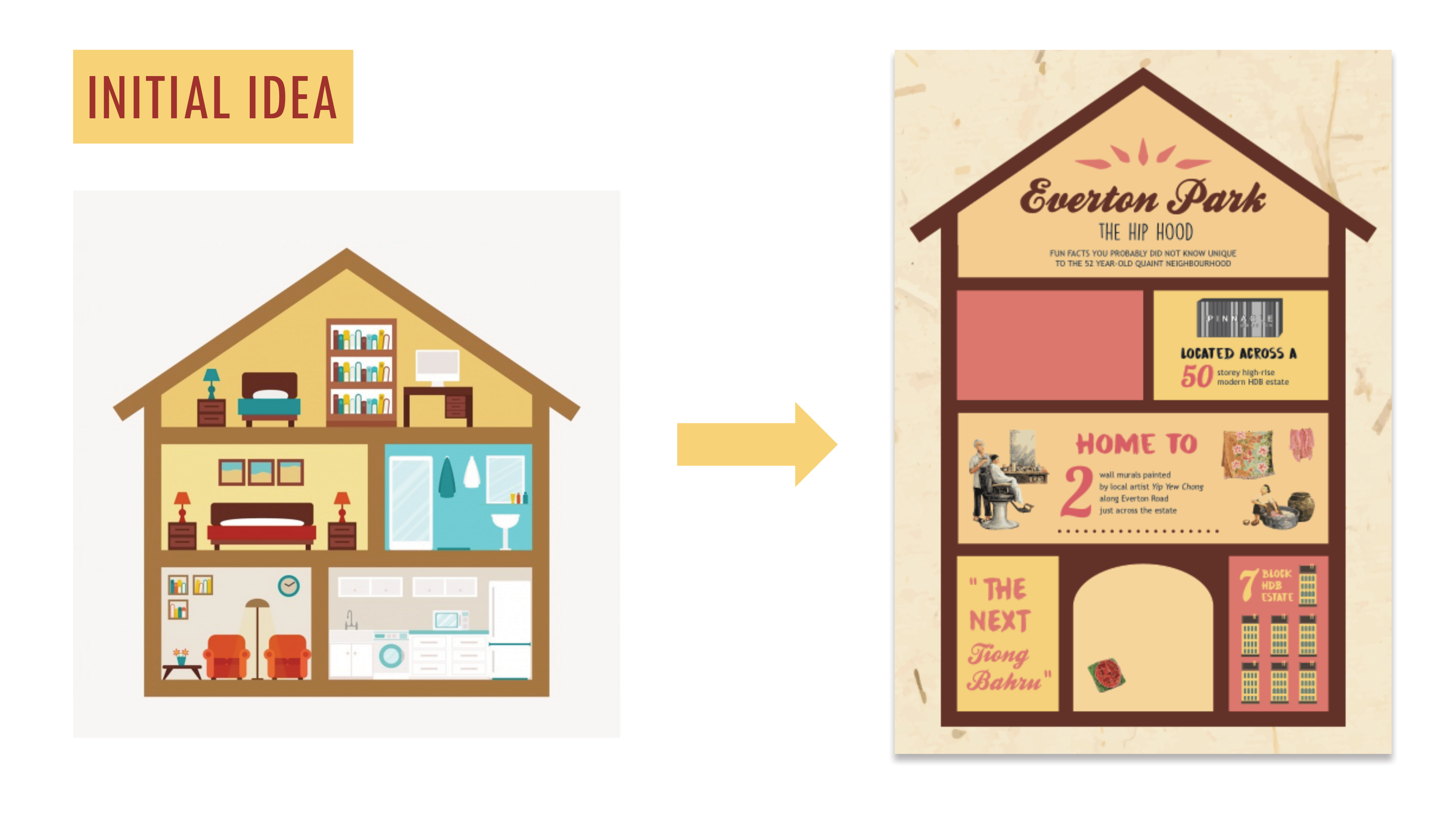
The above image on the left was the vector I chanced upon and on the right, the initial design I came up with for the infographic to share during consultation. Feedback received from Joy and my peers was that the roof-like architecture as layout did not suit the architecture appearance of Everton Park. Instead, they suggested that I could incorporate some iconic architecture elements of the estate into the house layout of the infographic which would be explained further later on.
Below are some of the vectors I’ve created or traced out and vectorised to include as visuals for my infographic. How the vector illustration of The Pinnacle @ Duxton came about was interesting. I had intended to trace out the whole building, adding the details and all but realised that the box I allocated for the infographic fact didn’t allow the space and the building would’ve looked way to complicated. Also since it would be tiny, the details would’ve have gone to waste. Thus I settled for the HDB estate name sign located at the side facing the traffic junction.
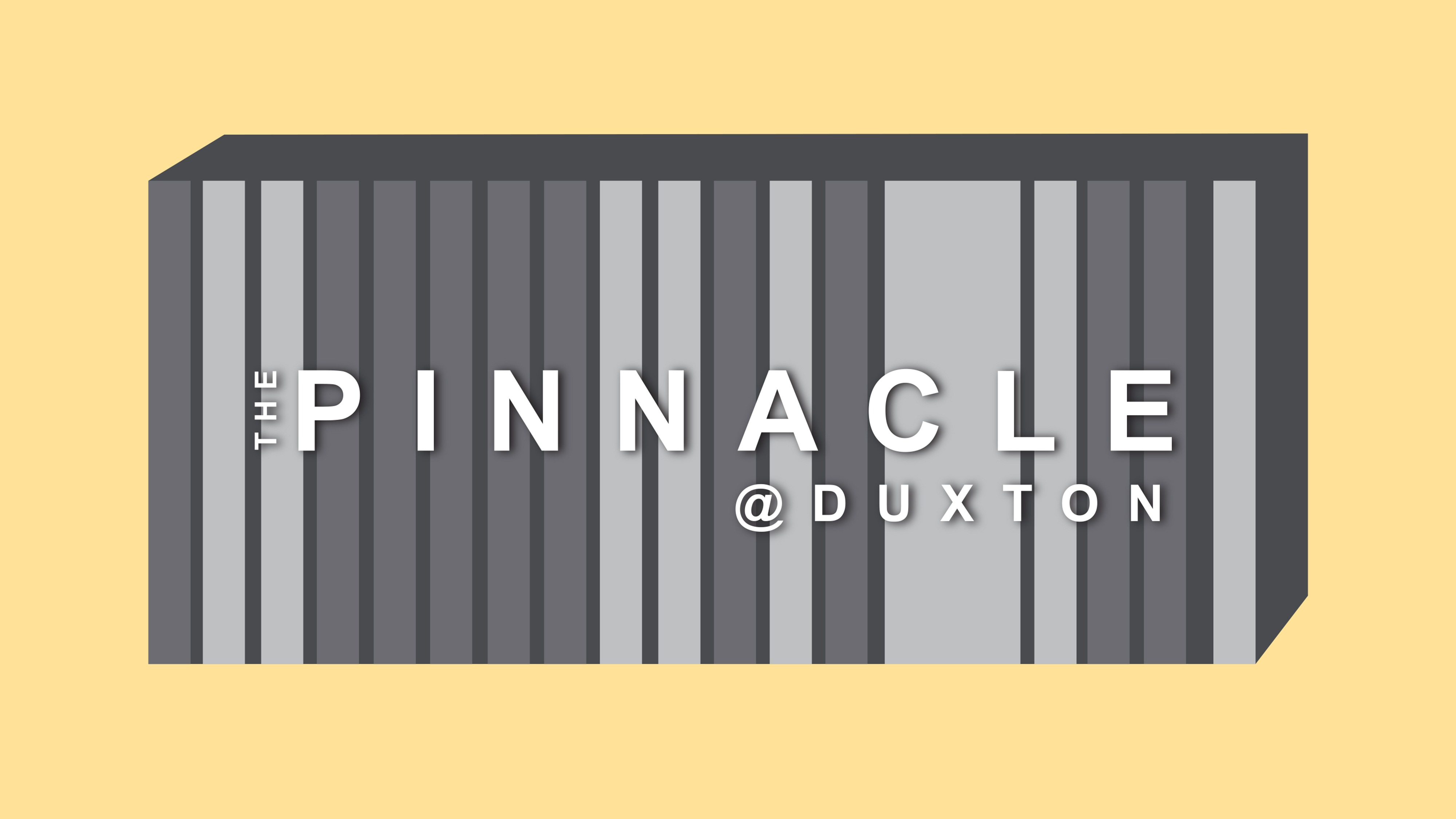
The vector illustration for The Pinnacle @ Duxton
As for the 2 wall murals I traced out murals from the photos I took on site, image traced them on illustrator to give it a finished vector illustration look. What could’ve been done better based on feedback received after the presentation/critique session we had for our infographics last week was that these two had a stark contrast in comparison to the rest of the vectors/illustrations in the infographic. Suggestion was to perhaps add a vector wall as the background as these two vectorised mural had a lot of detail and depth to them, it being adapted from its original image.

REFERENCES AND INSPIRATION
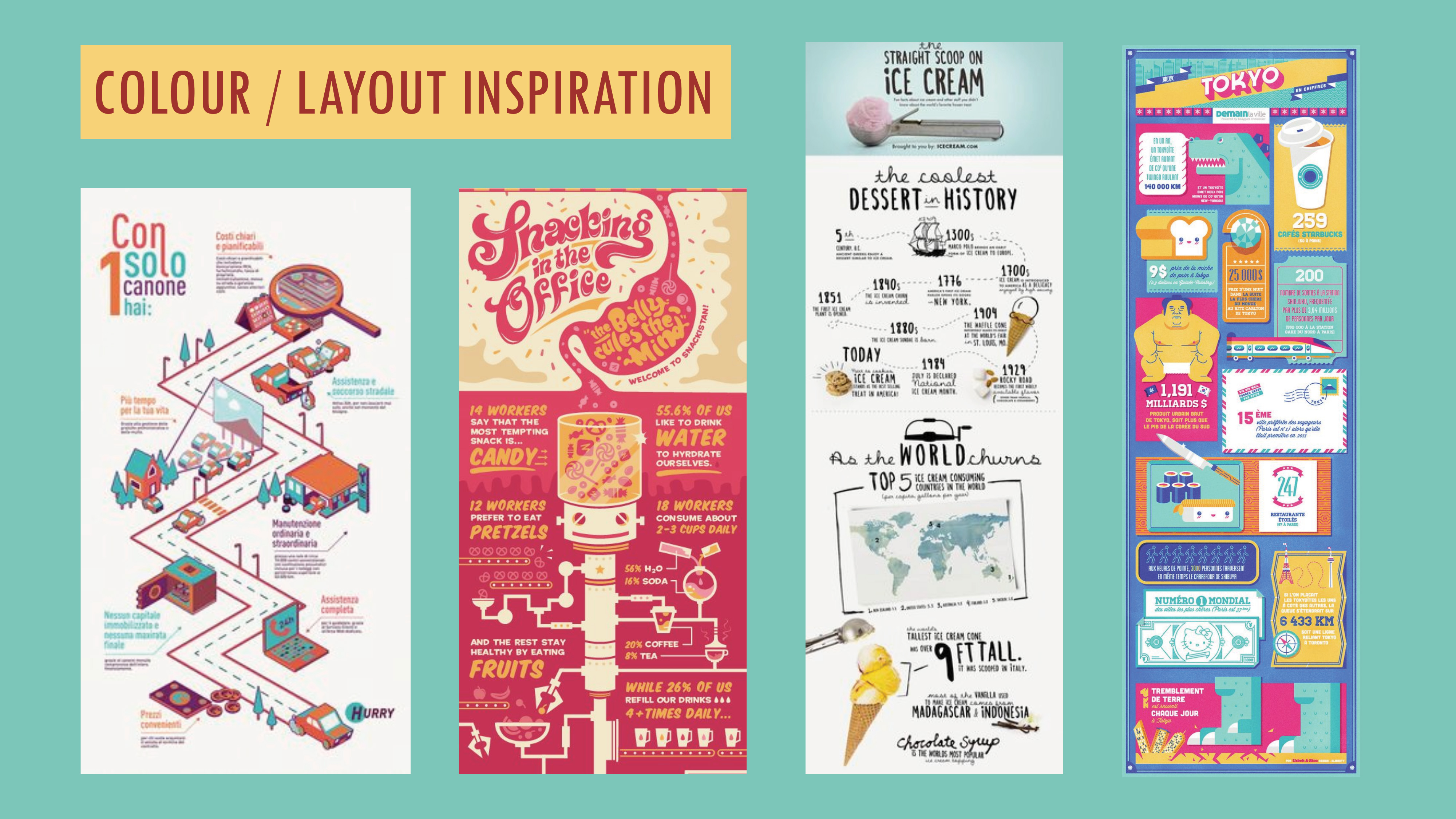
As for the references and inspiration I had for my infographic, below were those I eventually got inspired by (in my previous post I actually shared a few but these were the ones I eventually took reference from). The ice-cream one in particular, for its typefaces and arrangement of text. The rest were more of inspiration for layouts and colour palettes to use for the infographic. Ultimately I was going for a vertical looking kind of infographic.
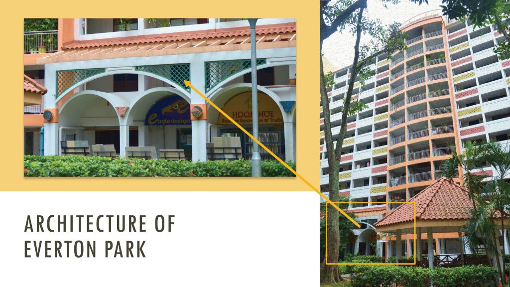
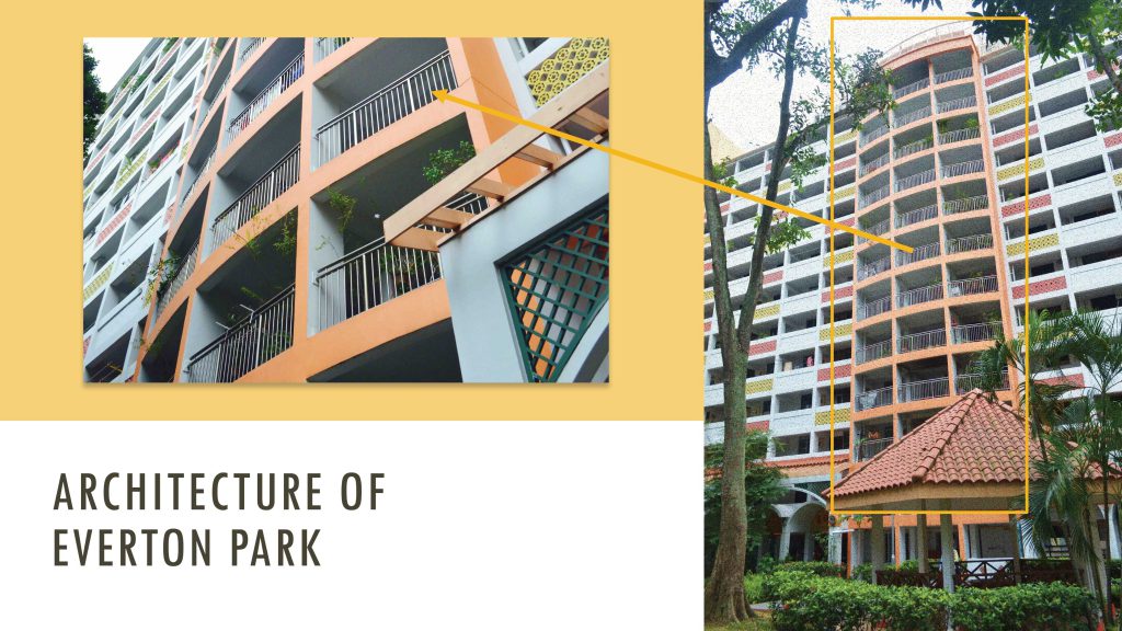
And as mentioned earlier, taking Joy’s and my peers’ suggestion of looking into incorporating the unique architecture look of Everton Park into the infographic I went to examine the architectural details of the place and added railings, chinese-looking patterns to the landings etc. of some of the floors to make it resemble a flat at Everton Park more. Below are images of the architecture details of the place that I analysed and incorporated into my infographic.

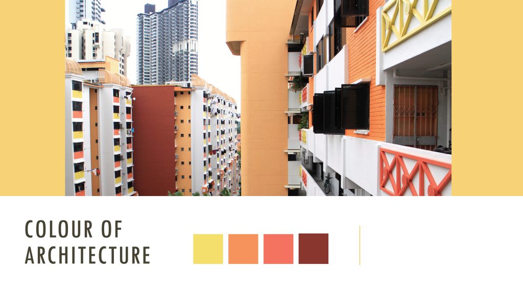
As for the colour palette I thought, why not make the infographic even more “Everton Park-like” so I picked out the colour scheme of the HDB estate as seen below.
That was the initial colour scheme I went ahead with especially with the first design but after much contemplation and shifting around of layouts and all, I realised that the original intended colour scheme might not really go well with the layout. Thus I went to play around with the shades and hues of the colour scheme, toning down some and also adding some new colours applying colour harmonies such as complementary and analogous to make the infographic stand out and look more aesthetically/visually pleasing.
The comparison below: Initial & Final. It turned out rather pastel looking which I was rather happy with as it was almost similar to the colours I was inspired by by the infographics found on Pinterest.

Left: Initial colour scheme | Right: Final colour scheme
CHALLENGES FACED & OVERALL THOUGHTS
Initially, I was unsure of what to make my infographic about or how I wanted it to look like. I did consider making it very statistical based as with all the typical infographics – numbers and more numbers but realised that Everton Park itself, you couldn’t really get hold of accurate numbers. Searched online, there weren’t any websites that provided the numbers either. I could’ve gone to town council for the figures but in the end I guessed it would’ve been too much of a trouble, I think it’ll take forever to get the stats I want since we don’t have the authority and wouldn’t be of priority. Also there would be too many “levels” to clear too, too much email corresponding. The content in the infographic would’ve turned out rather boring for my intended target audience.
I think things turned out for the better though, seeing to how my infographic turned out. I’m pleased with the outcome :).
This project has been going well so far, the first part being this infographic we had to put together. As draining as it was creating the infographic, I really enjoyed the process. I really missed the digital side of creating back during poly days, good to back on Illustrator. I especially can’t wait to put together the final zine for Part 2 of the project, have been loving the publication/editorial side of things of late. Till then!
Update: Here’s the link to Part 2 of the project – The Final Product aka the zine
https://oss.adm.ntu.edu.sg/char0066/neighbourhood-explorer-zine-final/