The next thing on the list of deliverables once the banners went up for was to design a horizontal digital composition for the Media Art Nexus at North Spine!! For those who had abstract/paint-looking banner designs were abstract, it was easier for them to come up with their compositions for the media wall – Simply just by rotating their banner design to a horizontal layout.
On the other hand, it was quite a struggle for mine as I was working with a really vertical design composition initially. But I eventually figured my composition layout eventually so all’s good 🙂
Keeping the consistency of my vertical banner design with this horizontal digital composition, the central motif remains as the One-Eyed Goblin with the other Food Monsters motifs flanking its sides. The composition I went for took on an almost symmetrical look and it was a rather spontaneous decision. For the arrangement and placement of these motifs. With the most bit being just a reflected side of the other thus the symmetry. The organic wavy linework in the background that mimics the noodle strands of the Ramyeon (Korean instant noodles) similarly suggest and provide movement and flow in this composition while somewhat creating a cohesive, connected composition altogether. The composition for this turned out unexpectedly well and I was satisfied with it! 🙂 For the colours, I kept it exactly the same with the banner’s for consistency.

Version 1 (used for the preview)
The week after in-class viewing of these compositions for the Media Art Nexus, we head down to the actual place for the preview of it on the actual screens and below was how it looked like: BAM, another surprise!! I guess there’s always this wow factor when your work gets blown up and viewed across various types of medium. On the LED screen it was really another kind of beauty with all that illumination :’)
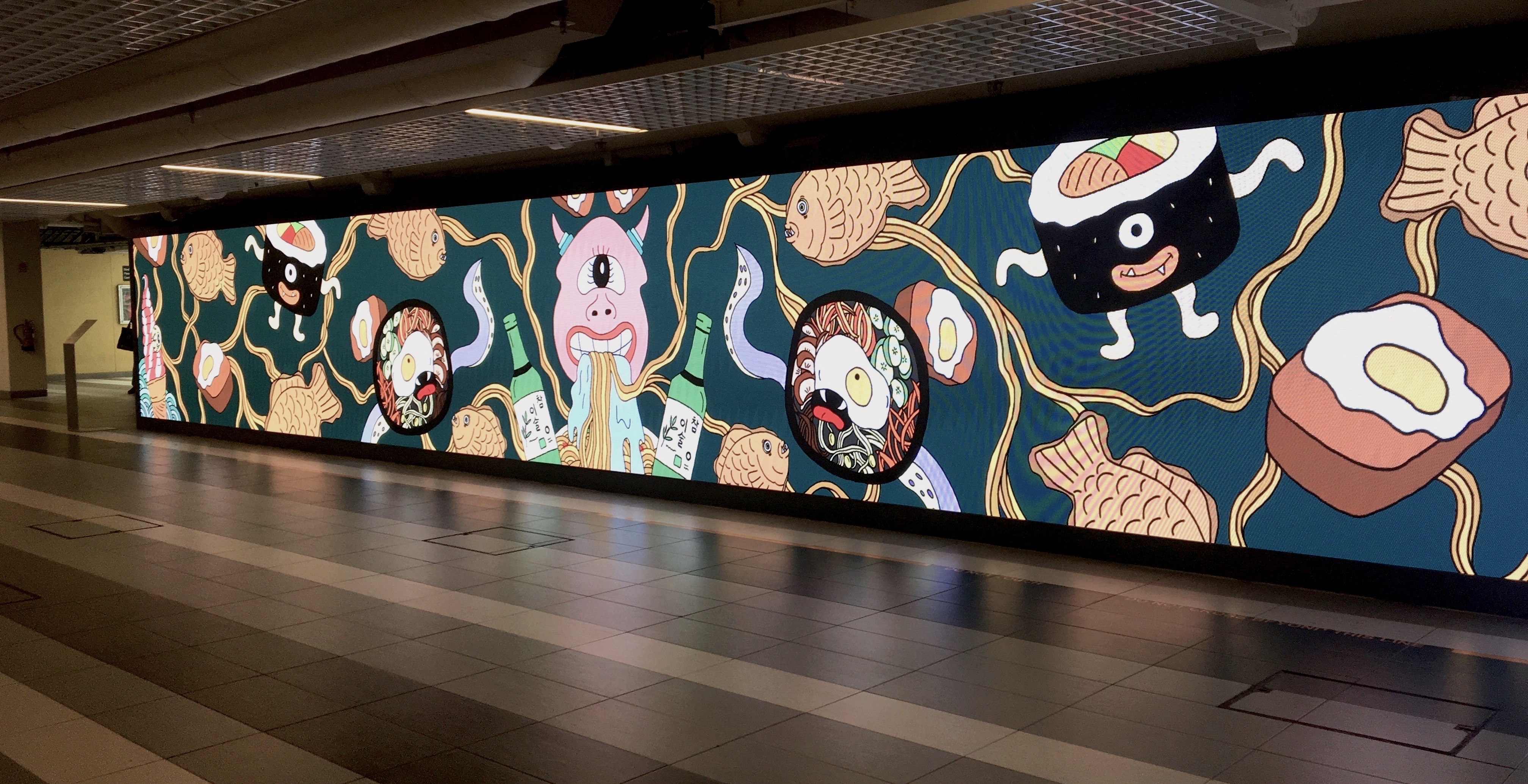
The only qualm that I had when the preview for my composition came up on the screen was that compared to others, mine came out slightly dull. The same problem I had for my banner composition initially during test prints. Hence I went with increasing its saturation and contrast just like what I did for my banner eventually! Hope it turns out better!!
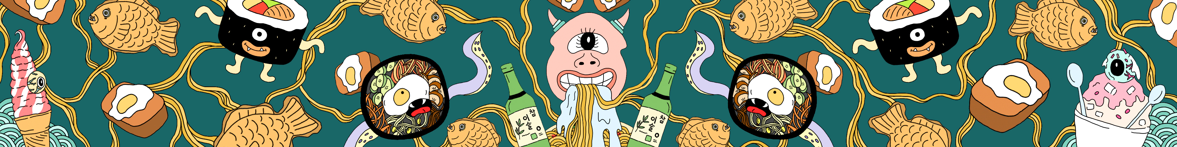
Version 2 (with increased brightness and saturation)
