For Project 2A we’re tasked to head down to a favourite area of ours and create a typographic composition that reflects the spirit of the chosen area. The typographic composition should be a phrase, quote, memory or lyric that we would associate with the area. When I first heard about it and when examples were shown to us in class, it looked like a lot of fun! Especially if we took up the challenge to identify letters of our selected quote through the structures, objects, almost about anything and everything that can be found at the place to capture it’s essence instead of just looking out for found letters on signs.
RESEARCH & IDEATION
The following week after getting the assignment brief, we dived into our first week of consultations for the assignment together with Project 2B which I will share more about in a separate post so as not to confuse.
Back to Project 2A here, I went in still unsure about my choice of place and the quote to resonate/capture the essence of it for the assignment on the day of consultations but somehow after the consult with Shirley, I managed to lock down my idea! I was deciding between two places and it was funny how they suddenly came to mind – Botanic Gardens and Haw Par Villa.
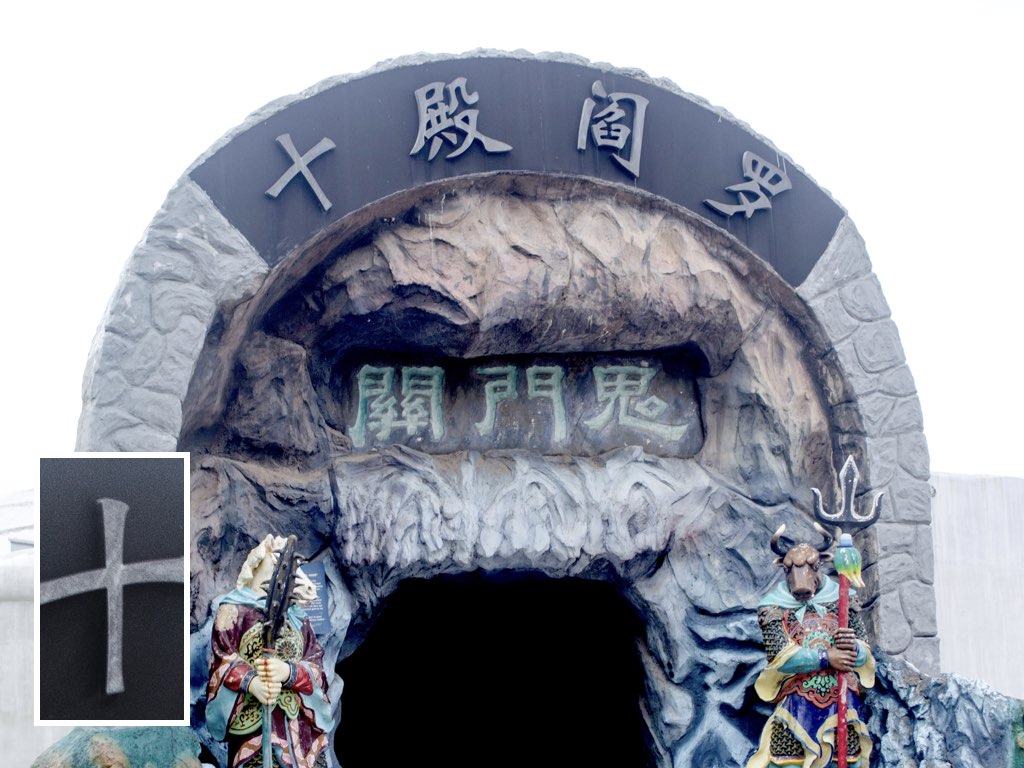
Botanic Gardens reason being how I really like the flora and fauna there, the quiet yet scenic view I get every time I am there; healing. On the other hand Haw Par Villa, a place that I have never been to but heard so much about as it is known for featuring giant dioramas of the Chinese folklore, mythology, history and more. The theme park used to be bustling with visitors in the past but have now resided to a quiet place of visit in Singapore. It’s most famous attraction would probably be the 10 Courts of Hell which features gruesome depictions of Hell in Chinese mythology and Buddhism for various kinds of sins committed by people, how they would get punished for it. I guess the colourful dioramas and mystical vibe of the place overall was what eventually led me to deciding on this place for my project.
The quote I had for the typographic composition of this place was largely inspired by it’s famous attraction (stated earlier) and also because growing up, my parents and grandparents would occasionally share with me stories of these mythologies so I already had vague ideas of it prior to visiting and researching. Especially when we were much younger, they would scare us off us with these tales – telling us not to lie and all if not we would end up like what is depicted in the 10 Courts of Hell.
Hence the quote: “Do Not Commit Sin”
PROCESS

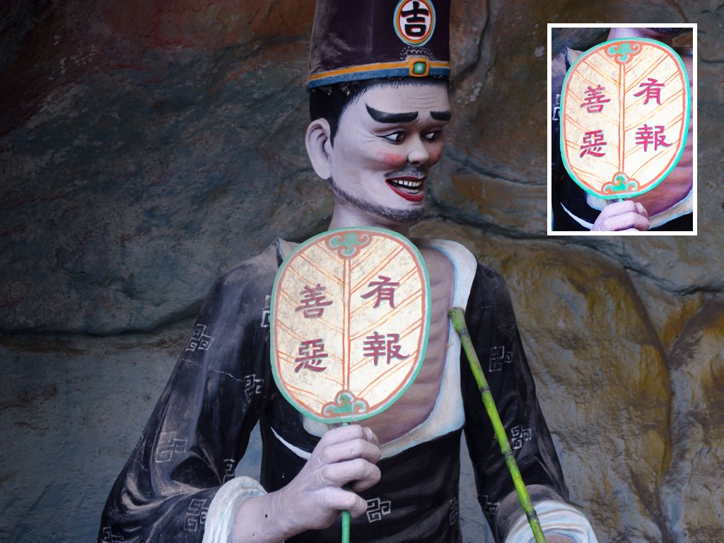
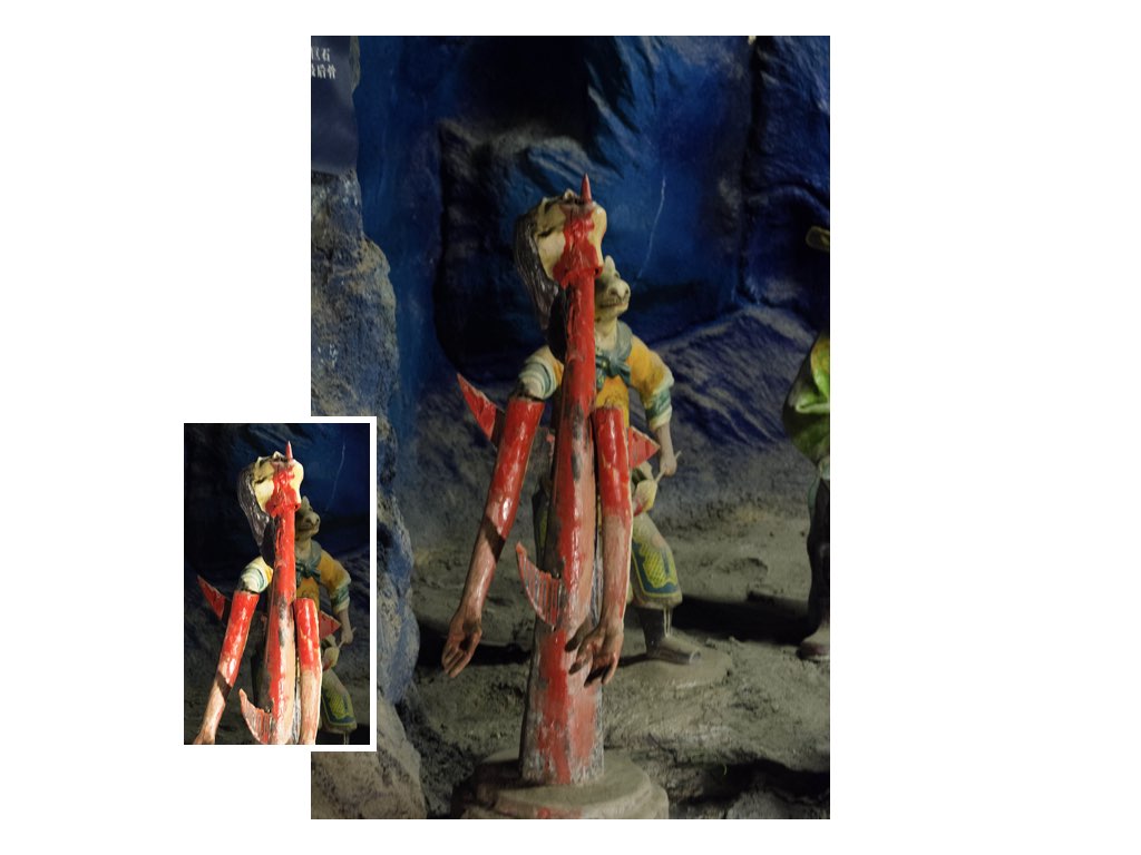
Off to shoot the typographic composition that same weekend on a Saturday morning. First thing that caught my eye about the place or rather the first impression I got of the place was: Colourful, majestic, yet scary. The sculptures and architecture were really vibrantly coloured and intricately crafted!!
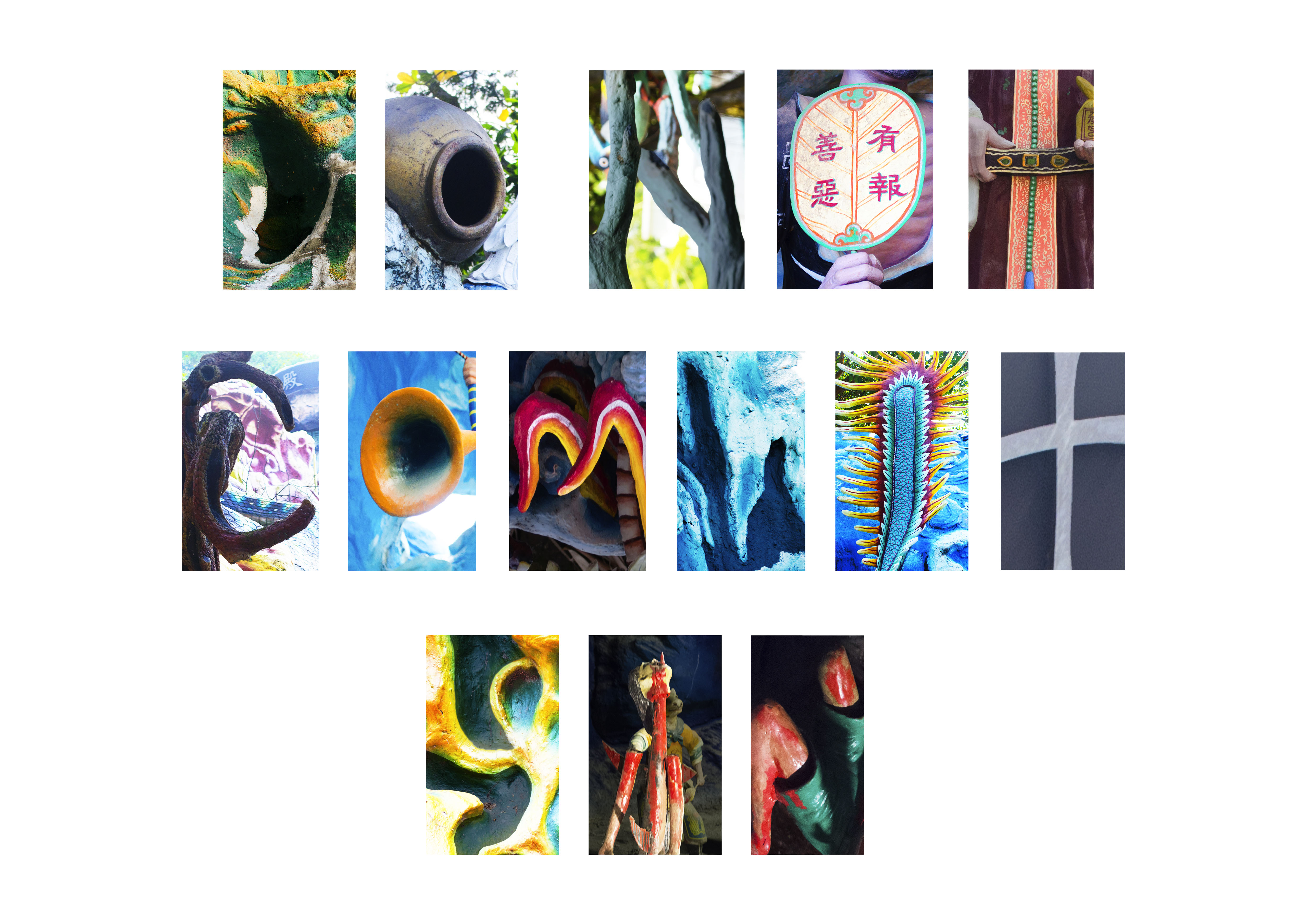
These were the few images that I took eventually to use for cropping to form the letters of the composition (click on image to enlarge and view):
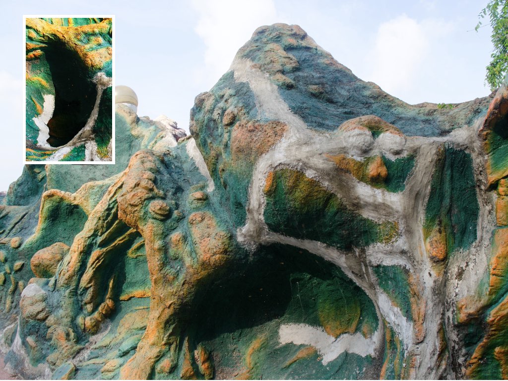

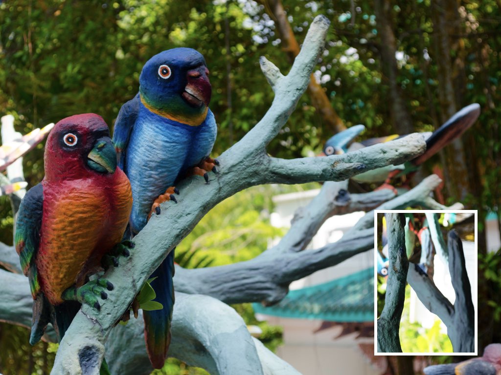


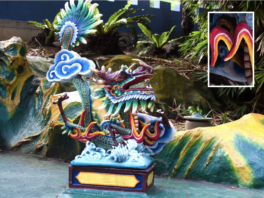
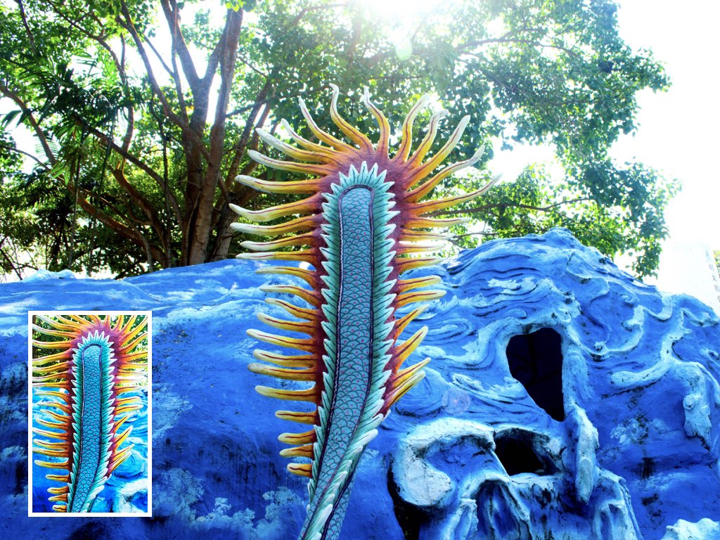
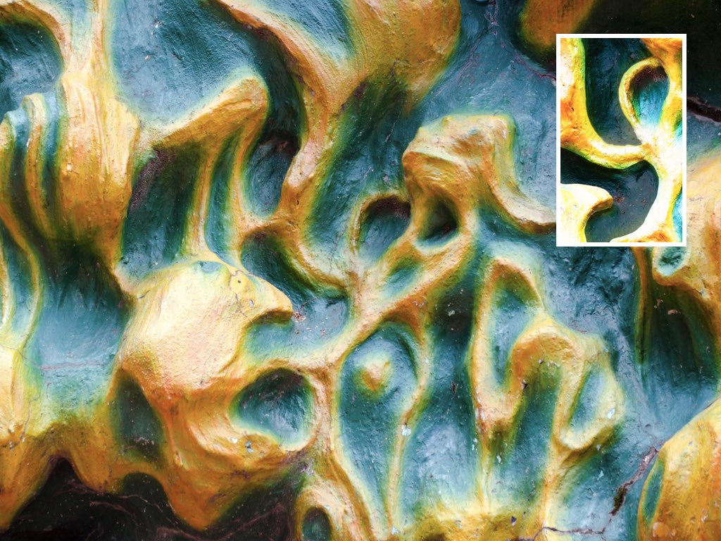
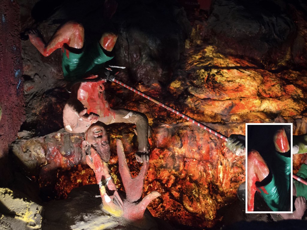
The biggest challenge while shooting at Haw Par Villa was to avoid continously shooting and using the organic wavy looking forms there for the composition as they were just everywhere since most of these forms were used as decorative elements to complement the sculptures and structures or used as platforms to raise them up. But I went ahead using some anyway as the wavy organic design it had helped with wavy letters like ‘S’ in my quote. Otherwise, it was really fun trying to spot letters for the quote through observing the form, structures and sculptures at Haw Par Villa 🙂
Now that the shoot’s done, time to get started on the typographic composition and put the quote together! As I was doing, I realised that some of the objects that I shot did not exactly show the intended letter of the quote and I had to fall back on other images taken. Luckily, apart from only shooting forms for the letters for my quote I was shooting everything and almost anything I could spot at Haw Par Villa from various angles – That meant I had other pictures to fall back on. Phew!!
Here’s the first version of my typographic composition:

The problem about some of the letters not being that visible in the composition as mentioned above was addressed during the second week of consultations as well by Shirley when we showed her our progress for the composition. She shared about the Gestalt principle, how when seeing things we tend to group them together by colours to for easier and quicker viewing. Hence if there are too many things going on in that cropped frame, it will be hard for the viewer to identify the letter as compared to a frame with only probably two colours involved (less details/a contrast in the background and foreground).
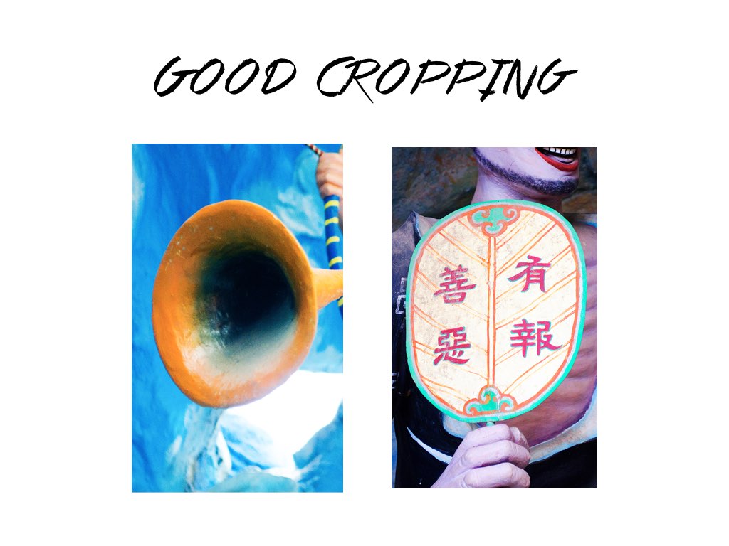
She pointed out that these two Letter ‘O’s in the composition were cropped well and good examples of that because of the clear contrast/distinction between the letter and its background in terms of colours and little details:
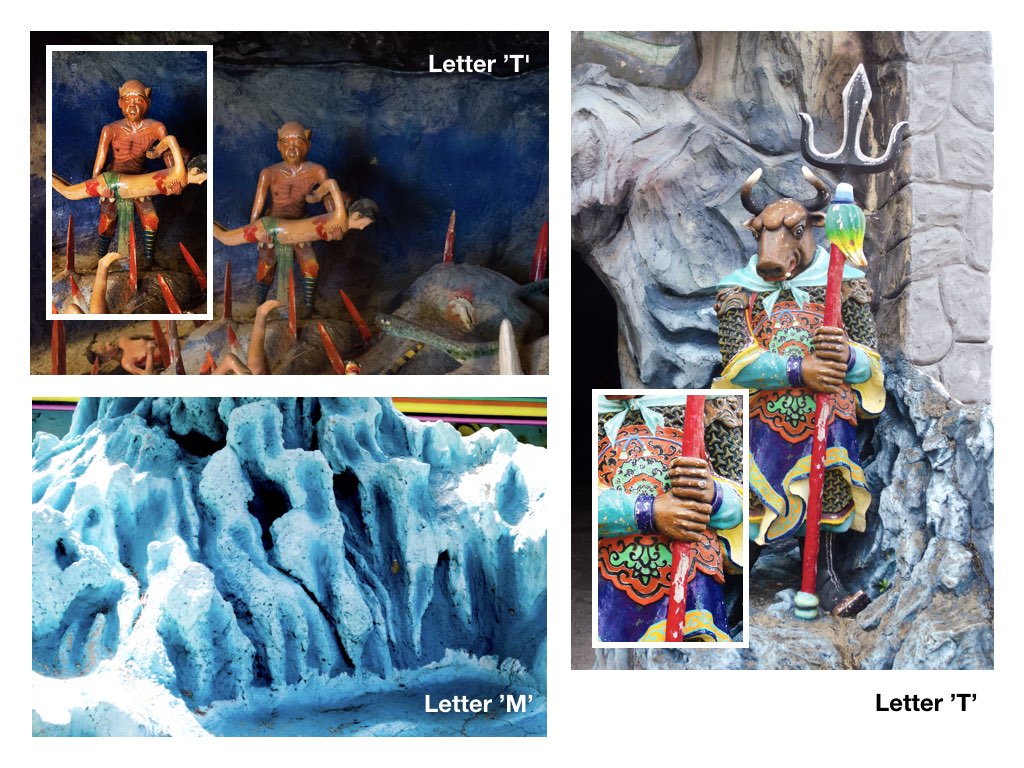
Bulk of the advice given for the first version was either to crop the image of each letter tighter, make the background/foreground of the letter’s cropped frame lighter/darker to help better distinguish the letter form. Also, it was mentioned that the image used for the Letter ‘T’s were unable to stand out based on the same principle. There was just too many things going on so it would be good to use other images for those letters. Probably just working with images that are made up of subjects/objects that uses just one to two main colours. These were the changes made:

And here’s the the revised version done based on the previous week of consultation (a week before submission):
Shirley and my peers’ feedback helped! I do get the feeling that the letters of the typographic composition looked way clearer than it was before now! Just some slight amendments, a bit more cropping to be made for some of the letters and I was good to go 🙂
FINAL
Here’s the final look of the typographic composition for submission: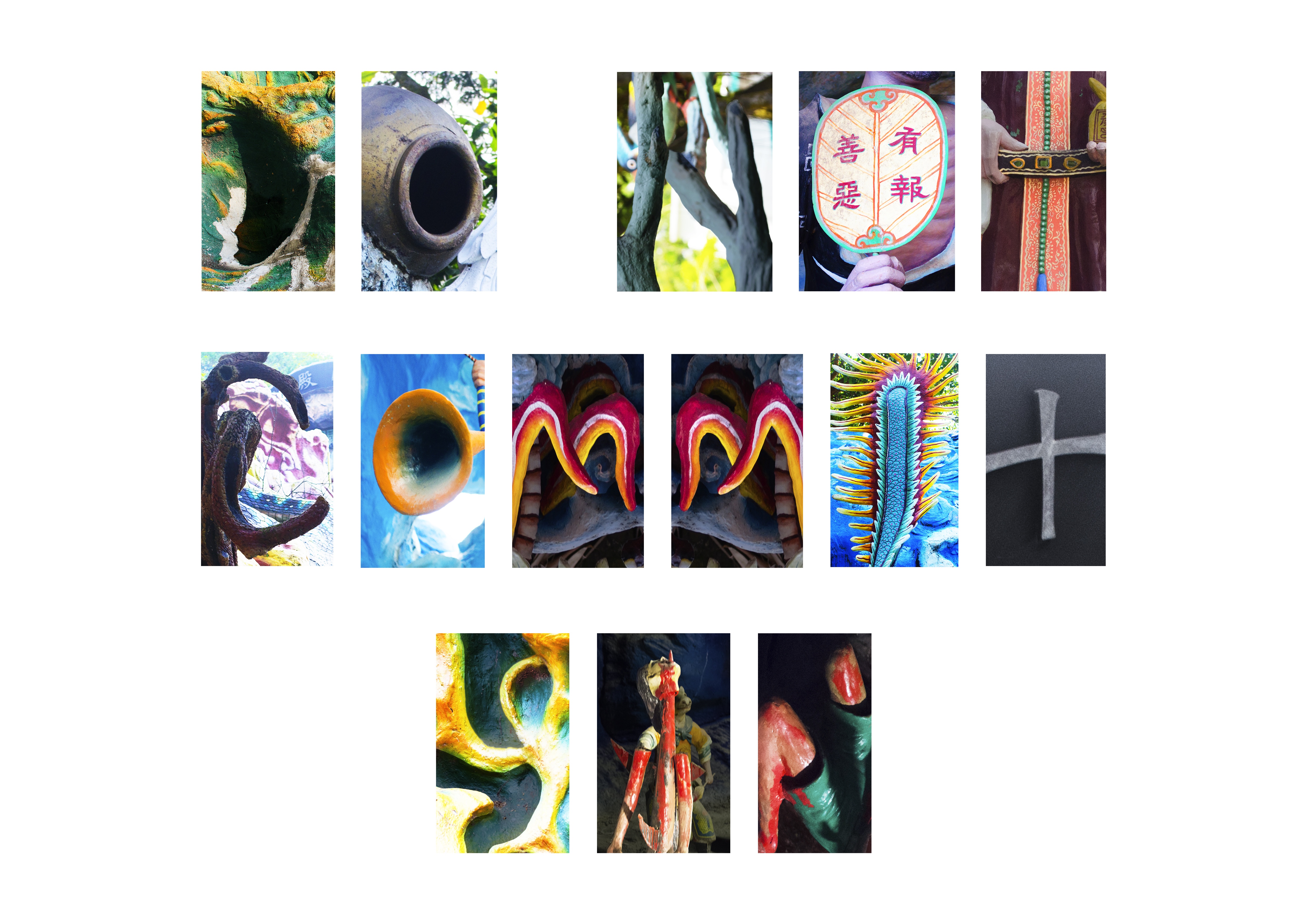
I was a little reluctant to repeat the image used for letter ‘m’ but eventually I guess I did not have a choice as some letters were really hard to picture. Some letters that did not make the cut as seen below:
Overall I enjoyed working on the project and it really trained my observation skills, to constantly be aware of my surroundings while at Haw Par Villa in order to identify my letters for the typographic composition. Also, thanks to that trip, I now have a better insight of the place too!